


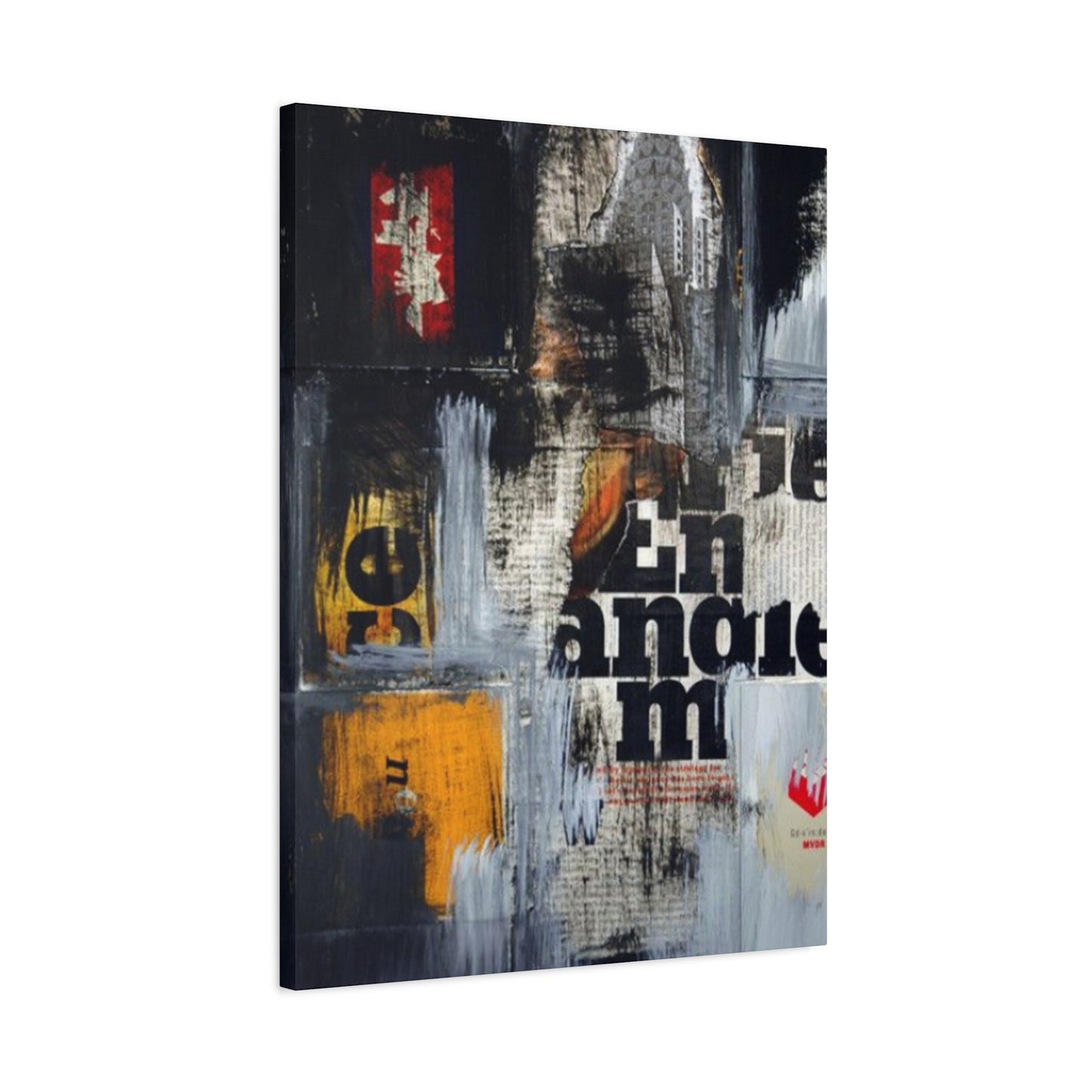
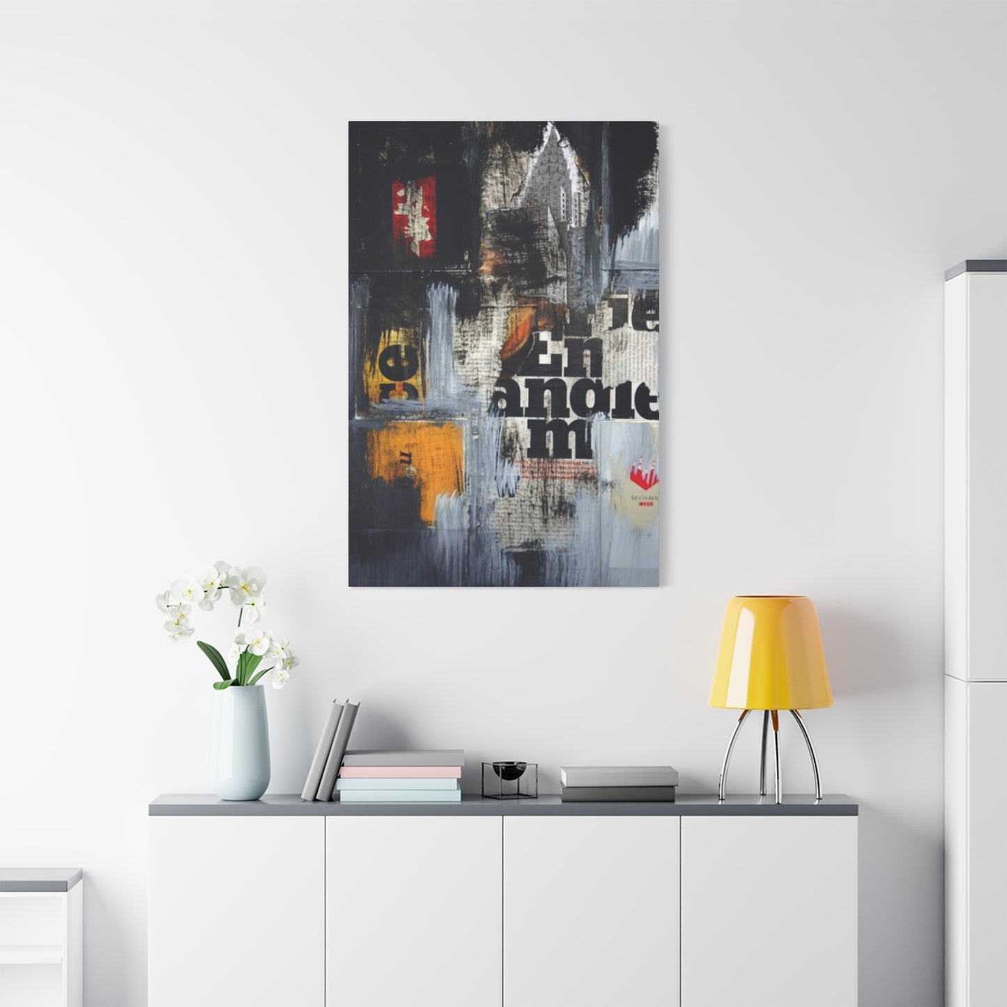
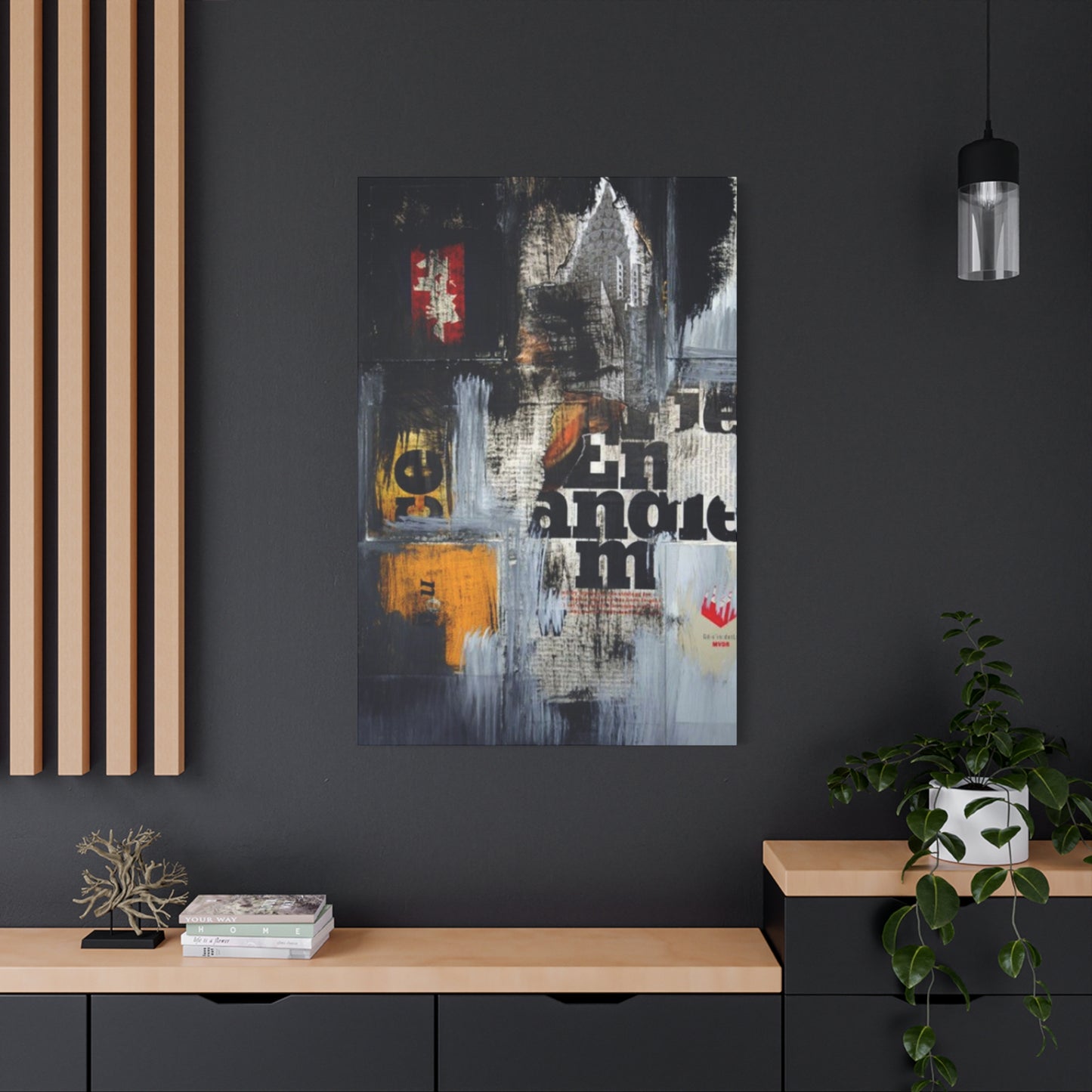
Newspaper Cuttings Modernism Wall Art & Canvas Prints
Newspaper Cuttings Modernism Wall Art & Canvas Prints
Couldn't load pickup availability


Newspaper Cuttings Art: Bringing Graphic History and Typography Into Modern Wall art
The intersection of journalism, history, and visual design has given rise to a fascinating art movement that transforms printed media into stunning decorative pieces. This creative approach takes fragments of newspapers, headlines, typography, and vintage imagery to craft compelling visual narratives that resonate with contemporary audiences. The marriage of historical documentation and modern aesthetic principles creates an art form that is simultaneously nostalgic and forward-thinking, offering homeowners and art enthusiasts a unique way to celebrate both the written word and visual culture.
This artistic style draws inspiration from the rich legacy of print journalism while embracing the clean lines and bold statements characteristic of contemporary design philosophy. By repurposing elements that once served to inform and communicate daily news, artists and designers have discovered a medium that carries inherent meaning and texture. Each piece of newspaper art becomes a conversation starter, a window into the past, and a reflection of our ongoing relationship with information and media in the digital age.
The appeal of newspaper-inspired artwork extends beyond mere aesthetics. It represents a tangible connection to history, a celebration of the printed word, and an acknowledgment of the evolving nature of how we consume information. In an era dominated by digital screens and fleeting social media posts, these physical representations of news and typography offer a grounding presence that reminds us of journalism's enduring impact on society and culture.
Modernism Captured in Newspaper Cuttings Art
The modernist movement of the early twentieth century revolutionized how artists approached composition, form, and meaning. This radical shift in artistic thinking found an unexpected ally in the everyday newspaper, which provided both material and inspiration for groundbreaking works. Artists during this period recognized the inherent visual power of newspaper layouts, with their bold headlines, dramatic photography, and varied typography creating a dynamic visual language that perfectly aligned with modernist principles.
The technique of incorporating newspaper elements into artwork began as a revolutionary statement against traditional fine art conventions. Early modernist pioneers saw newspapers as the perfect medium to challenge the boundaries between high art and popular culture. The ephemeral nature of daily newspapers, meant to be read and discarded, contrasted sharply with the permanence traditionally associated with fine art. This juxtaposition created a powerful commentary on consumerism, mass media, and the democratization of information.
Newspaper cuttings offered modernist artists a ready-made vocabulary of images and text that reflected contemporary life in ways that traditional painting could not. The fragmented, collaged nature of these works mirrored the fractured experience of modern urban existence, where individuals were bombarded with information from multiple sources simultaneously. This technique allowed artists to capture the rhythm and pace of modern life, creating compositions that felt urgent and immediate.
The visual grammar of newspapers provided modernist artists with a rich palette of design elements. Bold sans-serif headlines conveyed authority and immediacy, while body text created texture and depth. Photographs brought documentary realism into the artwork, while advertisements and classifieds added layers of social commentary. Together, these elements formed a complex visual tapestry that reflected the multifaceted nature of contemporary experience.
Contemporary artists working with newspaper cuttings continue this modernist tradition while bringing their own perspectives and techniques to the practice. They recognize that newspapers themselves have become historical artifacts in many ways, as digital media increasingly dominates news consumption. This adds another layer of meaning to newspaper art, transforming it from simply modern to postmodern, as the medium itself becomes a commentary on media evolution and cultural change.
The process of creating newspaper cutting art requires careful selection and arrangement of elements to achieve desired aesthetic and conceptual effects. Artists must consider not only the visual impact of individual clippings but also how they interact with one another to create meaning. A headline placed next to a particular image can create new narratives, while layering different text fragments can produce unexpected poetic or political statements.
Working with authentic newspaper materials brings inherent challenges related to preservation and longevity. The acidic nature of newsprint causes yellowing and deterioration over time, which some artists embrace as part of the work's evolution, while others take measures to stabilize and protect the materials. This tension between preservation and natural decay adds conceptual depth to newspaper art, raising questions about permanence, memory, and the passage of time.
The color palette of traditional newspapers, limited primarily to black, white, and various shades of gray, creates a striking aesthetic that feels both classic and contemporary. This restrained color scheme allows the composition, typography, and imagery to take center stage without the distraction of competing hues. When artists do introduce color through painted elements or colored newsprint, it creates dramatic focal points that draw the eye and emphasize particular aspects of the composition.
Newspaper cutting art serves as a bridge between different artistic disciplines, combining elements of graphic design, collage, assemblage, and conceptual art. This interdisciplinary nature makes it accessible to a wide range of artists and audiences, from trained fine artists to self-taught creators exploring visual expression. The relative availability of materials and the straightforward nature of cutting and pasting techniques lower barriers to entry while still allowing for sophisticated artistic outcomes.
The cultural significance of newspaper cutting art extends beyond the gallery wall into broader conversations about literacy, media consumption, and information access. In societies where newspapers played a central role in shaping public opinion and documenting events, artwork made from newspapers becomes a meta-commentary on the power and influence of the press. It asks viewers to consider how information is packaged, presented, and consumed, and how these factors shape our understanding of the world.
Bold and Graphic Newspaper Inspired Wall Art
The visual impact of graphic newspaper inspired wall art lies in its ability to command attention through strong compositional elements and striking contrasts. This style embraces the inherent drama of newspaper design, where headlines must grab readers' attention in a crowded newsstand, and layouts must guide the eye efficiently through complex information. When translated into wall art, these design principles create pieces that function as powerful focal points in any interior space.
Typography plays a central role in bold graphic newspaper art, with letterforms becoming visual elements in their own right rather than simply vehicles for conveying text. Large display typefaces, often in bold or condensed styles, create architectural structures within the composition. These typographic elements can be arranged to create rhythm, movement, and hierarchy, guiding viewers through the artwork in deliberate sequences. The interplay between large and small text, between headlines and body copy, creates visual texture that rewards close examination.
The graphic quality of this art style often involves a reduction of visual elements to their essential components, stripping away unnecessary detail to create clean, impactful compositions. This reductionist approach echoes principles of modernist design, where clarity and efficiency of communication are paramount. Artists working in this vein might isolate a single powerful headline, enlarge a fragment of newspaper photography, or create geometric arrangements of text blocks that emphasize form over literal meaning.
Contrast serves as a fundamental tool in creating bold graphic newspaper art. The stark black-and-white palette of traditional newspapers provides natural high contrast that immediately catches the eye. Artists can enhance this contrast through techniques like increasing the scale of certain elements, creating negative space around key components, or using repetition to create visual rhythm. The interplay between dark and light areas creates dynamic tension that energizes the composition and prevents visual monotony.
Layering techniques add depth and complexity to graphic newspaper art while maintaining boldness of impact. Artists might overlay transparent or translucent materials over newspaper elements, creating ghost images that suggest multiple narratives or temporal layers. They might also layer actual newspaper clippings in collage form, with edges torn or cut precisely, creating both visual and physical depth. These layering strategies invite viewers to look beyond the surface to discover hidden elements and meanings.
The integration of photographic imagery from newspapers adds documentary power to graphic wall art. Historical photographs carry their own weight and significance, bringing real events and real people into the artistic composition. When combined with text elements, these images can create powerful juxtapositions that comment on the relationship between image and word, between what we see and how it's described. The grainy quality of newspaper photography also adds textural interest that complements typographic elements.
Scale manipulation creates dramatic effects in newspaper inspired wall art. Taking elements that appeared small in their original newspaper context and enlarging them to fill substantial wall space transforms their impact and meaning. A single letter from a headline might become a bold abstract form when scaled up dramatically. Similarly, small classified advertisements or stock market listings can become intricate patterns when viewed at larger scales, revealing unexpected beauty in mundane information.
Geometric organization brings order and structure to newspaper art compositions. Artists might arrange clippings in grids, creating systematic layouts that echo the structured nature of newspaper page design itself. Alternatively, they might use diagonal arrangements, concentric patterns, or radiating compositions that add dynamism while maintaining graphic clarity. These organizational strategies help unify diverse elements into coherent wholes that read as single, powerful statements.
The bold graphic approach to newspaper art makes it particularly suitable for contemporary interiors with minimalist or industrial aesthetics. The clean lines, high contrast, and lack of fussy detail complement spaces that favor simplicity and strong statements over ornate decoration. A large-scale newspaper inspired piece can anchor a room, providing visual weight and interest without overwhelming the space with color or complex imagery.
Creating effective bold graphic newspaper art requires understanding of fundamental design principles including balance, proportion, and visual hierarchy. Artists must decide which elements deserve prominence, how different components should relate spatially, and how the overall composition guides the viewer's eye. These decisions involve both intuitive aesthetic judgments and deliberate planning, resulting in artworks that feel both spontaneous and carefully considered.
Vintage Vibes with a Modern Twist
The combination of vintage newspaper elements with contemporary design sensibilities creates a unique aesthetic that appeals to those who appreciate both historical character and current style. This approach recognizes the nostalgic power of old newspapers while refusing to be bound by historical presentation methods. The result is artwork that feels rooted in the past yet undeniably of the present, creating a temporal dialogue that enriches both the vintage and modern components.
Aged newspaper materials bring inherent visual qualities that contemporary reproductions cannot replicate. The yellowing of paper over time creates warm tones that soften the stark contrast of black and white. Wear patterns, including creases, tears, and stains, tell stories of use and survival, adding authenticity and character. These signs of age become design elements themselves, contributing texture and visual interest that enhance rather than detract from the overall composition.
Selecting newspaper materials from specific historical periods allows artists to evoke particular eras and their associated cultural moments. Headlines from significant historical events carry weight and recognition that resonate with viewers' collective memory. Fashion advertisements from decades past reveal changing social attitudes and aesthetic preferences. Sports results, entertainment listings, and weather reports become time capsules that transport viewers to specific moments in history, creating emotional connections through shared cultural knowledge.
The modern twist in vintage newspaper art often comes through contemporary framing and presentation choices. A collection of aged newspaper clippings might be mounted in sleek acrylic frames with minimalist hardware, creating a deliberate contrast between old content and new presentation. Alternatively, vintage newspaper elements might be digitally reproduced and printed on contemporary materials, preserving the aged aesthetic while ensuring durability and allowing for precise color correction and sizing.
Combining vintage newspaper elements with modern graphic elements creates dynamic visual conversations between past and present. An artist might overlay contemporary geometric shapes on historical newspaper pages, or integrate vintage headlines into otherwise modern compositions. This mixing of temporal elements prevents the work from becoming purely nostalgic or historical, instead positioning it as a contemporary commentary on the relationship between past and present.
The typography of vintage newspapers offers distinct characteristics that differ from contemporary newspaper design. Older newspapers often used more ornate serif typefaces with classical proportions, creating a formal, dignified appearance. Display typography might include decorative elements and flourishes rarely seen in modern newspaper design. These typographic qualities contribute significantly to the vintage aesthetic and can be played against cleaner modern typefaces for striking contrast.
Color treatment offers another avenue for blending vintage and modern sensibilities. While working with actual aged newspapers provides authentic color, artists can also manipulate colors digitally or through hand-applied media to enhance vintage qualities or introduce contemporary elements. Sepia tones can be intensified for nostalgic effect, or selective color might be introduced to highlight specific elements while maintaining overall vintage character. Some artists embrace intentional color shifts that couldn't occur naturally, creating surreal vintage aesthetics that acknowledge their contemporary creation.
The content selection from vintage newspapers requires sensitivity to historical context and contemporary sensibilities. While many historical newspaper elements provide fascinating windows into the past, others may contain outdated language, perspectives, or imagery that require thoughtful consideration. Artists must navigate these complexities, deciding whether to present historical materials uncritically, to contextualize them explicitly, or to select materials that avoid problematic content while still achieving vintage aesthetic goals.
Vintage newspaper art with modern twists appeals to diverse audiences for different reasons. Older viewers may appreciate nostalgic connections to newspapers they remember from their youth, while younger audiences might find fascination in pre-digital media they never experienced firsthand. Interior designers value these pieces for their ability to add character and warmth to spaces that might otherwise feel too sterile or contemporary. Collectors appreciate the uniqueness of pieces incorporating authentic historical materials.
The tension between preservation and presentation challenges artists working with vintage newspaper materials. Original newspapers are fragile and require careful handling and proper conservation techniques to prevent further deterioration. This practical concern becomes part of the artistic decision-making process, influencing choices about whether to use originals or reproductions, how to mount and protect materials, and how to balance authenticity with longevity. These considerations add layers of meaning to the work, raising questions about value, originality, and the nature of art itself.
Wall Art That Tells a Story Through Print
Narrative potential distinguishes newspaper inspired wall art from purely decorative or abstract works. Newspapers exist primarily to tell stories, to document events, and to communicate information. When newspaper elements are repurposed into wall art, they carry these narrative qualities with them, even when taken out of their original journalistic context. This inherent storytelling capacity makes newspaper art uniquely engaging, inviting viewers to read, interpret, and construct meaning from the visual and textual elements presented.
The juxtaposition of different newspaper elements creates new narratives that didn't exist in the original publications. A headline from a political story placed next to an advertisement for household products might comment on the intersection of public and private life. Sports results alongside weather reports could suggest themes of predictability and chance. These new narratives emerge from the relationships between elements rather than from the elements themselves, requiring active viewer participation in meaning-making.
Sequential arrangements of newspaper clippings can tell linear stories or document progression over time. An artist might arrange headlines chronicling a particular historical event, showing how the story developed across days, weeks, or months. Alternatively, advertisements from different decades might be arranged to show the evolution of product marketing, social attitudes, or design aesthetics. These sequential narratives make explicit the temporal dimension inherent in newspaper materials, emphasizing their role as historical documents.
Personal stories emerge when artists incorporate newspapers from significant dates in their own lives or the lives of those for whom they create art. A piece featuring newspapers from a birth date, wedding day, or other meaningful occasion becomes a personalized historical marker. These works function simultaneously as art objects and as memory keepers, embedding personal history within broader social and historical contexts. They create intimate connections between individual experience and collective events.
The fragmentary nature of newspaper cutting art mirrors how we experience and remember history itself. Just as our memories are fragmentary and selective rather than complete recordings, newspaper art presents partial views, selected moments, and disconnected pieces that viewers must assemble into coherent understanding. This fragmentation can be more truthful to actual experience than comprehensive documentation, acknowledging the gaps, selections, and interpretations inherent in all historical understanding.
Typography contributes to storytelling by conveying tone, urgency, and emphasis. Bold headlines shout importance, while fine print whispers secondary information. Display typefaces suggest editorial attitude, whether sensational, serious, or playful. When artists arrange typographic elements, they control the pace and rhythm of visual reading, determining which stories demand immediate attention and which reveal themselves more slowly. This typographic choreography guides viewers through the narrative journey the artist has constructed.
Photographic elements from newspapers add visual storytelling power that text alone cannot achieve. Faces show emotion and personality, bringing human dimension to abstract stories. Action photographs capture moments of drama, triumph, or tragedy. Documentary images provide evidence and authenticity. When combined with text elements, photographs and illustrations create multimedia narratives that engage viewers on multiple levels simultaneously, appealing to both visual and textual literacy.
Thematic organization allows artists to tell stories about particular subjects or ideas rather than chronological events. A piece might gather newspaper elements related to technological progress, social movements, economic changes, or cultural phenomena. By curating content around themes rather than timelines, artists create conceptual narratives that make arguments or raise questions about their chosen subjects. These thematic approaches invite viewers to consider patterns, connections, and meanings that span different times and places.
The background and context surrounding newspaper elements contribute to their storytelling potential. Artists might include visible page numbers, section headers, or dates that situate clippings within their original publications. Alternatively, they might strip away such contextual markers, allowing elements to float free of their origins and invite new interpretations. These choices about how much context to preserve or remove significantly affect how viewers understand and engage with the narrative dimensions of the work.
Interactive elements can enhance the storytelling potential of newspaper art. Some artists create pieces with movable components, allowing viewers to rearrange elements and create their own narratives. Others incorporate digital elements like QR codes linking to additional information about the newspaper sources or historical events referenced. These interactive approaches acknowledge viewers as active participants in storytelling rather than passive recipients, democratizing the meaning-making process and creating opportunities for ongoing engagement with the work.
Newspaper Clippings Meet Modern Design
The convergence of traditional newspaper clippings with contemporary design principles creates hybrid artworks that honor historical materials while embracing current aesthetic values. Modern design emphasizes clarity, functionality, and intentional use of negative space, principles that might seem at odds with the dense, information-packed nature of newspapers. However, thoughtful integration of these approaches yields compelling results that demonstrate the compatibility of seemingly contradictory design philosophies.
Minimalist framing and presentation methods allow newspaper content to speak without visual competition. Simple, clean frames in neutral colors or natural materials direct attention to the artwork itself rather than its surroundings. Floating mounts create shadow depth that adds dimension without decorative distraction. Edge-to-edge presentation, where newspaper elements extend to the physical edges of the mounting surface, creates bold, confident statements that feel contemporary despite historical content.
Grid-based layouts bring modernist organizational strategies to newspaper clipping arrangements. By positioning elements according to systematic geometric grids, artists create visual harmony and balance that feels orderly and intentional. This approach contrasts with the sometimes chaotic appearance of actual newspaper pages while still utilizing newspaper materials. The tension between systematic organization and the organic, varied nature of newspaper content creates dynamic visual interest.
Negative space functions as a crucial design element in modern newspaper art, giving compositions room to breathe and allowing individual elements to achieve greater impact. Rather than filling every available space with content, modern approaches leave substantial areas empty, creating dramatic focus on selected clippings. This generous use of negative space feels contemporary and allows the textural qualities of newspaper materials to register more powerfully against clean backgrounds.
Monochromatic color schemes align newspaper art with modern design sensibilities. The natural black-and-white palette of newspapers fits seamlessly into contemporary interiors that favor neutral colors and restrained palettes. When additional color appears in newspaper elements, such as vintage color comics or advertisements, it can be either preserved for its historical authenticity or desaturated to maintain monochromatic unity. Some artists introduce single accent colors through mounting backgrounds or framing choices, creating subtle contemporary touches.
Digital manipulation techniques allow artists to work with newspaper content in ways impossible with physical clippings alone. Scanning and digital editing enable precise color correction, contrast adjustment, and resolution enhancement. Elements can be scaled, rotated, and arranged with mathematical precision. Imperfections can be repaired or intentionally emphasized. Digital tools also permit hybrid approaches where some elements exist as physical clippings while others are digitally printed reproductions, offering flexibility while maintaining cohesive aesthetic.
Modular compositions reflect contemporary preferences for flexible, reconfigurable design. Rather than creating single large pieces, artists might develop series of smaller works designed to be displayed together in various configurations. These modular approaches allow viewers to customize arrangements according to their space and preferences, creating participatory relationships between artwork and audience. The modular strategy also permits expansion over time as additional pieces are added to existing collections.
Contemporary materials and substrates provide new possibilities for presenting newspaper content. Acrylic panels, metal surfaces, and wood panels offer alternatives to traditional paper mounting. Each substrate brings distinct qualities that interact differently with newspaper materials. Transparent acrylic creates floating effects and allows light to interact with paper fibers. Metal provides industrial aesthetic and structural stability. Wood adds warmth and natural texture that complements aged newsprint.
Repetition and pattern-making strategies drawn from modern design create rhythmic visual effects with newspaper elements. An artist might repeat a single headline multiple times in grid formation, transforming text into pattern. Classified advertisements might be arranged to create textile-like visual textures. Stock market listings could be used as abstract linear patterns. These approaches emphasize formal visual qualities over literal content, creating semi-abstract works that hover between representation and abstraction.
Integration with other contemporary art forms creates multimedia pieces that position newspaper elements within broader creative contexts. Newspaper clippings might be combined with painting, drawing, or digital prints to create layered works that blend different media and techniques. This integration acknowledges that contemporary art rarely observes strict media boundaries, instead embracing hybrid approaches that utilize whatever materials and methods best serve artistic intentions. Newspaper elements become one component in rich visual conversations rather than the sole focus.
A Unique Take on Modernism for Your Walls
Modernism as an artistic and cultural movement fundamentally changed how we think about art, design, and visual communication. Its emphasis on abstraction, formal experimentation, and engagement with contemporary life created foundations that continue influencing art production today. Newspaper cutting art represents a particular strand of modernist thinking that embraced everyday materials and popular culture as legitimate artistic media, challenging hierarchies that privileged certain materials and subjects over others.
The democratic impulse of modernist newspaper art resonated with broader social and political movements seeking to break down elitist structures. By using newspapers, materials accessible to everyone and associated with daily life rather than rarefied artistic tradition, artists made statements about who could make art, what art could be made from, and whom art could address. This democratic spirit remains relevant today as contemporary artists continue exploring relationships between high and low culture, between elite and popular forms.
Abstract possibilities emerge when newspaper elements are treated primarily as visual forms rather than carriers of specific information. Text blocks become geometric shapes, headlines become bold linear elements, and photographs dissolve into tonal variations. This abstraction doesn't completely erase the newspaper origins of materials, but it shifts emphasis from content to form, from meaning to aesthetics. The tension between these approaches creates conceptual richness as viewers navigate between reading and looking, between understanding and experiencing.
Modernist newspaper art often contained implicit or explicit political dimensions, using news content to comment on power, ideology, and social structures. Headlines about political events could be arranged to reveal bias or propaganda. Juxtapositions of news stories and advertisements might expose contradictions in social values. These critical approaches transformed newspaper art from merely aesthetic practice into social commentary, using the tools and materials of mass media to critique mass media itself.
The material honesty valued in modernist thinking finds expression in newspaper art that doesn't disguise or transform its materials beyond recognition. The newspaper source remains visible and identifiable, with its particular textures, typefaces, and physical qualities apparent. This honesty contrasts with illusionistic artistic traditions that use materials to create convincing representations of other things. Modernist newspaper art celebrates what newspapers actually are rather than using them to depict something else.
Experimentation with composition and structure characterizes modernist approaches to any medium, and newspaper art is no exception. Artists have explored countless ways of arranging clippings, from carefully balanced asymmetrical compositions to dense all-over patterns, from stark minimal arrangements to complex layered assemblages. This ongoing experimentation reflects modernist belief in progress and innovation, in the possibility of discovering new visual solutions and creating unprecedented aesthetic experiences.
The relationship between text and image, between word and picture, becomes particularly rich territory in newspaper art. Modernist artists investigated how these two modes of communication interact, complement, and sometimes contradict each other. They explored whether images illustrate text, whether text explains images, or whether both can exist in productive tension without resolving into single unified messages. These investigations remain relevant as we continue navigating increasingly complex multimodal communication environments.
Historical awareness in modernist newspaper art creates temporal dialogues between when newspapers were originally published and when artworks are created and viewed. A piece made today from newspapers from decades ago necessarily comments on the passage of time, on how events and concerns that once seemed urgent may now appear quaint or prophetic. This temporal dimension adds conceptual depth, encouraging reflection on change, continuity, and the relationship between past and present.
Conceptual approaches to modernist newspaper art prioritize ideas over purely aesthetic concerns. Artists might establish systematic rules for selecting and arranging materials, following predetermined procedures regardless of aesthetic outcomes. These rule-based approaches shift emphasis from subjective artistic taste to objective predetermined criteria, democratizing art practice by removing the mystique of artistic genius. The results can be surprising and fresh precisely because they emerge from processes rather than individual aesthetic decisions.
Contemporary revivals and reinterpretations of modernist newspaper art demonstrate the enduring vitality of these approaches. New generations of artists discover newspaper materials and modernist strategies, bringing fresh perspectives while building on historical foundations. These contemporary practices prove that modernist newspaper art isn't merely historical curiosity but living tradition that continues generating meaningful artistic production. The conversation between historical precedent and contemporary innovation enriches both, creating continuity across time while allowing for evolution and change.
Graphic Art from Vintage Headlines
Headlines represent perhaps the most dramatic and visually powerful elements of newspaper design. Their large scale, bold typography, and urgent content make them natural focal points for artistic appropriation. When isolated from their original contexts and treated as graphic elements, headlines reveal aesthetic qualities that often go unnoticed when they're simply being read for information. The transformation from functional communication to visual art requires only a shift in perception, seeing familiar elements with fresh eyes.
The typography of vintage headlines carries distinct period characteristics that immediately signal temporal and cultural contexts. Headlines from the early twentieth century often used serif typefaces with classical proportions and formal appearance. Mid-century headlines might employ bold sans-serif types that conveyed modernist confidence and clarity. Headlines from different decades can be identified by their typographic choices even before content is read, making typography itself a carrier of historical meaning.
Content selection from vintage headlines offers enormous creative possibilities. Historic event headlines document watershed moments in collective history, from political upheavals to technological breakthroughs, from natural disasters to cultural phenomena. These headlines carry inherent drama and significance that translates into artistic impact. Artists might choose headlines for their historical importance, their visual qualities, their poetic or ironic potential, or their ability to create meaningful juxtapositions with other elements.
Scale manipulation transforms the impact of headline text dramatically. A headline that occupied inches of space in its original newspaper might be enlarged to fill several feet on a wall, creating monumental impact. This dramatic scaling elevates mundane communication to architectural presence, demanding attention and consideration. Conversely, reducing headlines to smaller scales creates intimate, jewel-like works that reward close examination and detailed study.
Arrangement strategies for headline-based art range from simple single-headline presentations to complex multi-headline compositions. A single powerful headline might stand alone, its message and typography providing sufficient interest without additions. Multiple headlines can be arranged chronologically to document unfolding events, thematically to explore particular subjects, or aesthetically to create pleasing visual patterns and rhythms. These arrangement choices significantly affect how viewers engage with and interpret the work.
Color treatments add another dimension to headline art. While maintaining the original black on white or white on black contrast preserves authentic newspaper aesthetics, introducing color creates contemporary twists. Background colors can enhance mood, with dramatic blacks suggesting gravity, bright colors adding energy, or subtle neutrals maintaining sophistication. Colored headlines themselves create bold statements, though they sacrifice some historical authenticity for increased visual impact.
Layering techniques create depth and complexity in headline art. Transparent overlays allow multiple headlines to exist simultaneously in single compositions, their messages interweaving and creating new meanings through combination. Physical layering of actual newspaper clippings produces dimensional relief that casts shadows and creates tangible presence. These layered approaches reflect the complexity of information environments where multiple messages compete for attention simultaneously.
Fragmenting headlines creates abstracted compositions that balance between legibility and pure form. Letters might be separated and scattered across compositions, challenging viewers to reconstruct messages. Words might be isolated from their original phrases, removing context and allowing new interpretations. Portions of letters might be cropped, creating partial shapes that suggest complete forms. These fragmenting strategies emphasize visual over literal communication while maintaining connections to original textual sources.
Contrast and negative space function critically in headline art, where bold letters need adequate surrounding space to achieve maximum impact. Generous white space allows typography to breathe and prevents visual crowding. Strategic contrast between filled and empty areas creates dynamic push-pull relationships that energize compositions. Artists must carefully balance the weight and presence of headline typography against quieter surrounding areas to achieve satisfying overall effects.
Contemporary reproductions of vintage headlines raise interesting questions about authenticity and originality. Digital scanning and printing allow faithful reproductions that are practically indistinguishable from originals while offering advantages in terms of stability, consistency, and scale flexibility. However, something arguably is lost when actual historical newspapers are replaced by contemporary reproductions, even perfect ones. Artists and collectors must navigate these considerations when deciding whether to work with originals or reproductions, weighing practical advantages against intangible qualities of authentic materials.
Modernist Prints Inspired by Newspaper Style
The visual language of newspapers offers rich inspiration for modernist printmaking, even when prints don't incorporate actual newspaper materials. Artists working in various print media including lithography, screenprinting, etching, and relief printing have developed aesthetic strategies that reference newspaper design while existing as original prints. These newspaper-inspired prints demonstrate how design principles from one medium can productively inform another, creating works that feel related to newspapers without being constrained by newspaper materials.
Typographic prints draw directly from newspaper headline and text design, using letterforms as primary visual elements. Artists might compose abstract arrangements of different typefaces, mixing styles and scales to create dynamic visual textures. Words and phrases can be selected for their visual impact, sonic qualities, or semantic meanings, or they might be used purely as shapes without concern for readability. The printed surface becomes a field for typographic play that references newspapers while pursuing independent aesthetic goals.
Photographic screenprints adapt newspaper photography's grainy, high-contrast appearance through printmaking processes. By converting photographs to high-contrast black-and-white images with limited tonal ranges, printmakers achieve effects similar to newspaper reproduction while creating original artworks. These prints capture newspaper photography's raw, documentary quality while allowing for large-scale presentation and artistic manipulation unavailable in actual newspapers. The translation from photographic to printed media adds layers of transformation and interpretation.
Compositional strategies borrowed from newspaper page design inform print layouts that balance multiple elements within unified frameworks. Grid systems organize diverse content into coherent wholes. Column structures create vertical rhythms. Headers and footers provide compositional anchors. These organizational strategies, evolved over centuries of newspaper design, offer proven solutions for managing complex visual information that printmakers can adapt to their purposes.
Text and image integration explores relationships between verbal and visual communication central to newspaper design. Prints might combine photographic or illustrative imagery with text elements, investigating how each mode affects the other. Text might provide context for images, images might contradict text, or both might coexist in productive tension. These explorations reflect ongoing cultural conversations about how we process and integrate different types of information.
Serial approaches to printmaking align with the ongoing, episodic nature of newspaper publication. Rather than creating single resolved images, artists might develop series of prints that unfold over time, with each print relating to others while standing independently. This serial structure mirrors how newspapers deliver ongoing streams of information rather than comprehensive, definitive accounts. The individual print becomes one moment in longer sequences, suggesting both continuity and change.
Found text incorporation brings actual language from various sources into prints, much as newspapers collect language from multiple contributors. Artists might use text from newspapers, advertisements, personal correspondence, literary sources, or original writing. This textual collaging creates linguistic textures and unexpected juxtapositions that generate meaning through combination rather than authorial intention alone. The democratic mixing of different voices reflects the pluralistic nature of newspapers themselves.
Edition strategies in printmaking create interesting parallels with newspaper distribution. Both involve multiple identical copies distributed to diverse audiences. However, while newspapers are ephemeral disposable items, prints are collectible art objects. This tension between multiplicity and value, between democratic distribution and exclusivity, creates productive contradictions that artists can explore through their practice. Limited editions with higher values contrast with larger editions at lower prices, raising questions about access and elitism.
Process visibility in certain print media echoes the transparency of newspaper production. Unlike painting where processes are often hidden beneath finished surfaces, printmaking frequently reveals its methods through visible plate marks, registration marks, or ink textures. This honest acknowledgment of how images are made connects to documentary traditions in journalism and to modernist values of material honesty. Viewers can understand and appreciate the craft involved in creating what they see.
Contemporary digital printing technologies offer new possibilities for newspaper-inspired prints while raising questions about what constitutes printmaking. Digital processes allow for photographic quality, perfect registration, and essentially unlimited color ranges. They also permit seamless integration of digital manipulation and photo editing. However, traditional printmakers sometimes question whether digital printing maintains connections to printmaking's handcraft traditions. These debates reflect larger cultural conversations about technology, tradition, and authenticity.
Turn History into Art with Newspaper Cuttings
Newspapers function as daily recordings of history, documenting events as they unfold and preserving information about social conditions, cultural phenomena, political developments, and countless other aspects of human experience. When artists use newspaper cuttings in their work, they're transforming these historical records into aesthetic objects, asking viewers to consider the past not just intellectually but visually and emotionally. This transformation from document to art adds dimensions of interpretation, feeling, and personal connection to historical information.
Selecting specific historical moments or periods allows artists to focus attention on particular aspects of the past they find significant, problematic, or fascinating. An artist might gather newspapers from a single momentous day, creating concentrated examinations of how that event was reported and understood in real time. Alternatively, they might collect materials spanning decades to show evolution and change. These curatorial choices shape how viewers encounter and think about history through the art.
Personal connections to history emerge when artists or viewers recognize events they lived through or that affected their families and communities. A newspaper headline about a distant political event becomes more meaningful when someone remembers where they were when they heard that news. Advertisements for products no longer available evoke memories of daily life in particular times. This personal dimension transforms abstract history into lived experience, creating emotional resonance that purely intellectual approaches to history may lack.
Material evidence of history appears in the physical properties of newspaper cuttings themselves. The quality of paper, the printing technology, the type of ink, and the design conventions all provide information about the period when newspapers were produced. Deterioration patterns tell stories of storage and survival. Stains, tears, and other damage become part of the object's history, showing what happened after original publication. These material aspects make newspaper art not just representations of history but actual historical artifacts.
Social history emerges from newspaper content beyond major headline news. Classified advertisements reveal what people bought and sold, their economic concerns, and their personal situations. Entertainment listings show what cultural activities were available and popular. Fashion advertisements document changing styles and social attitudes. Sports coverage reflects which activities mattered to communities. Weather reports, advice columns, comic strips, and countless other newspaper features provide windows into daily life that complement traditional historical focus on major events.
Comparative historical perspectives become possible when newspaper cuttings from different times address similar subjects. Headlines about economic conditions from various decades can be compared to see recurring patterns and evolving language. Coverage of social movements across time reveals changing attitudes and strategies. International stories show how global events were understood in different periods. These comparisons encourage viewers to think about historical patterns, progress, and cycles rather than viewing history as simple linear progression.
Conclusion
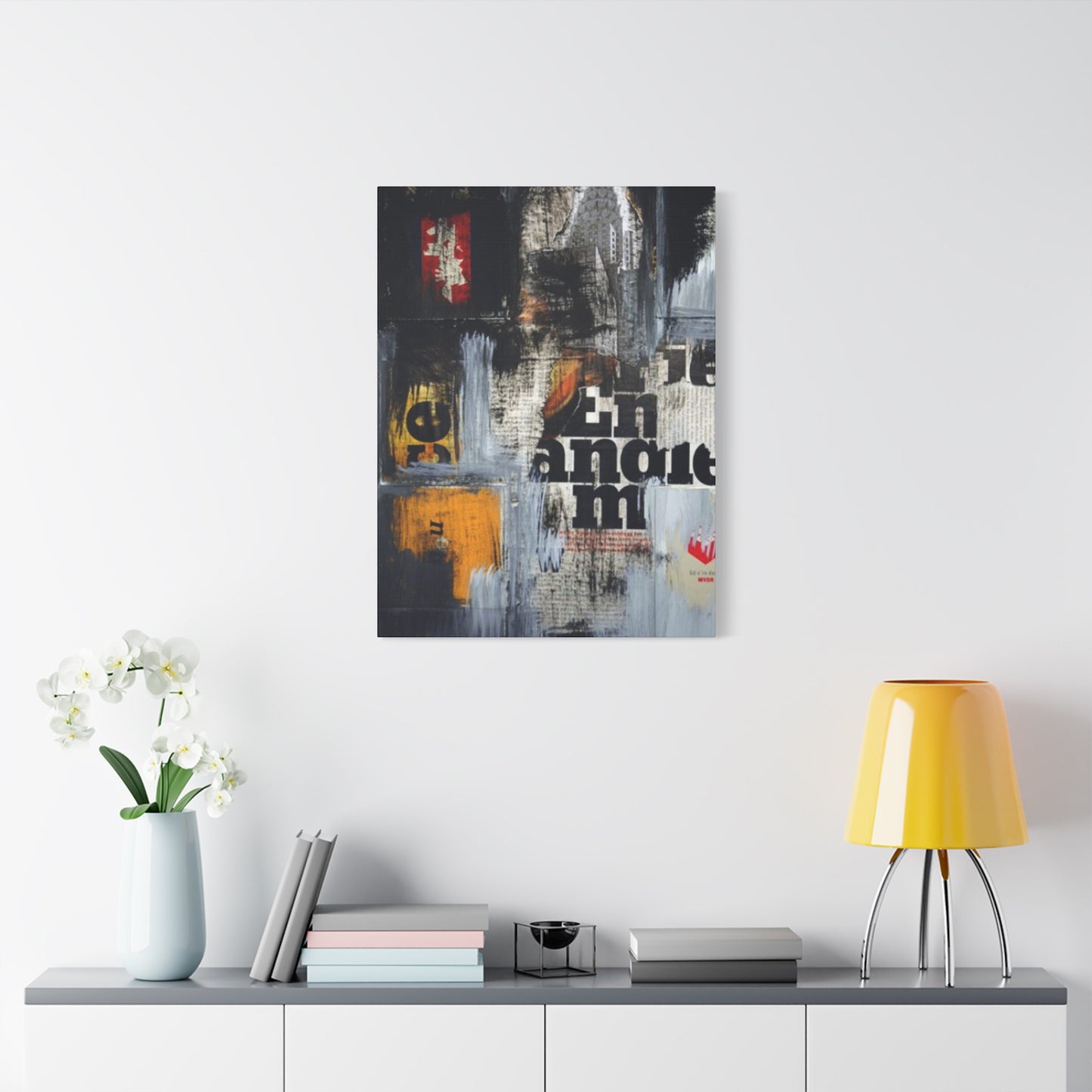
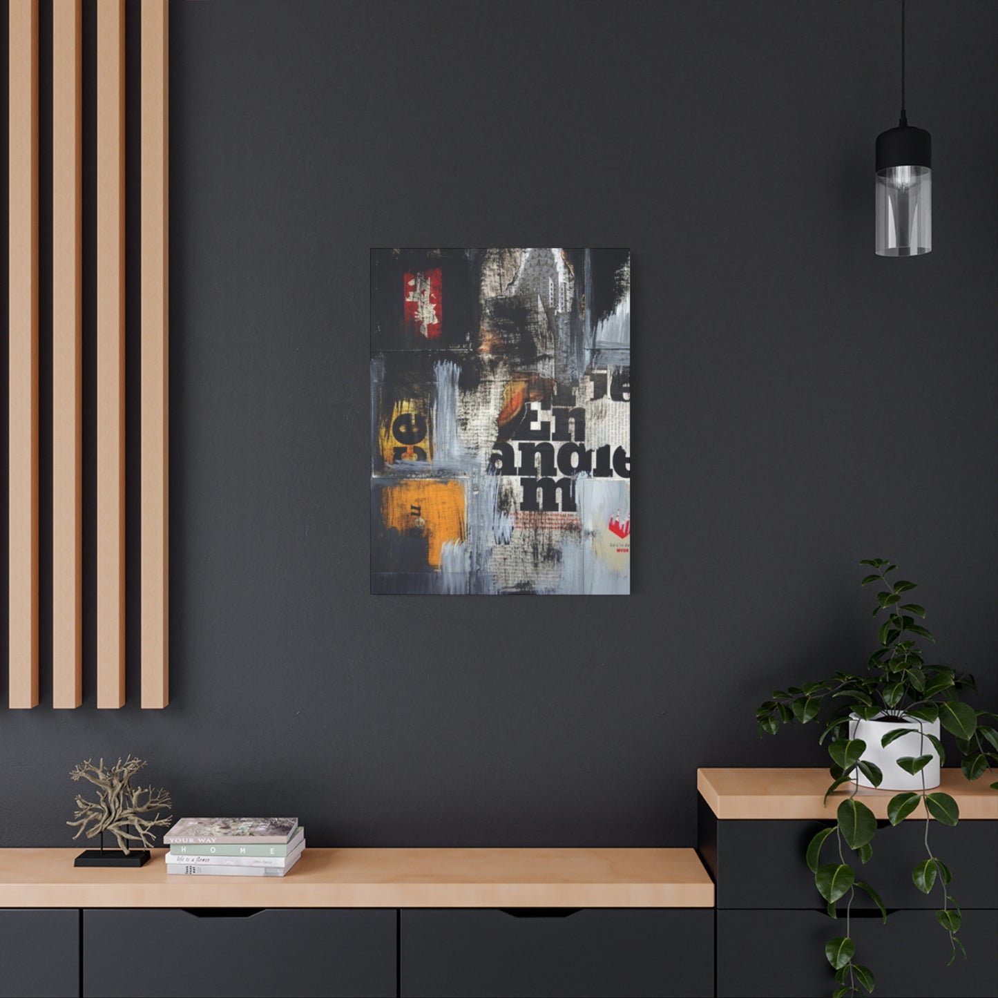
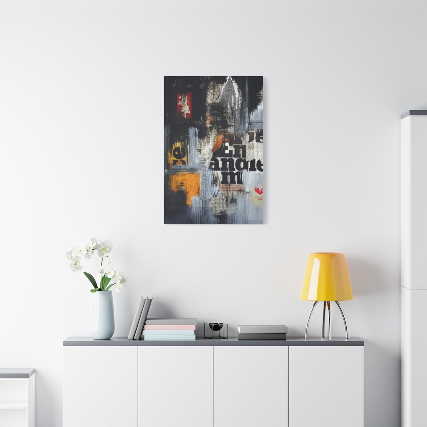
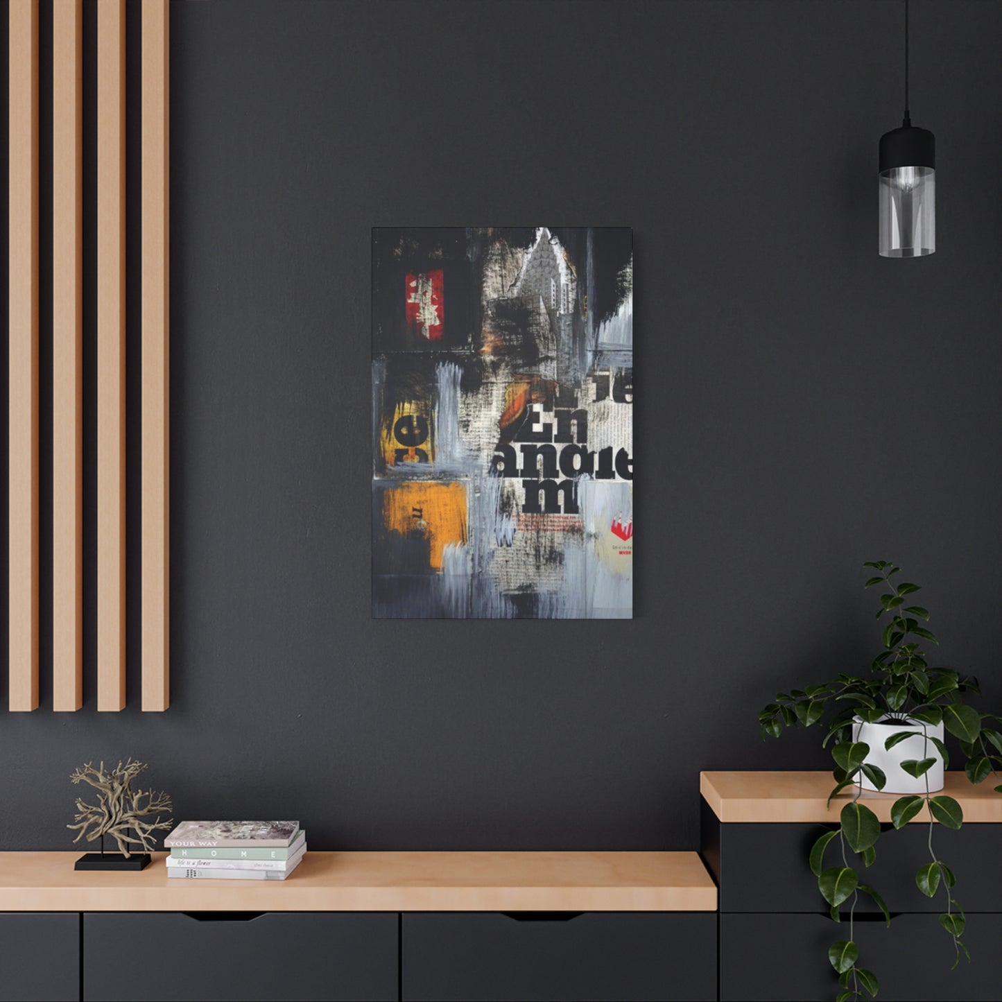
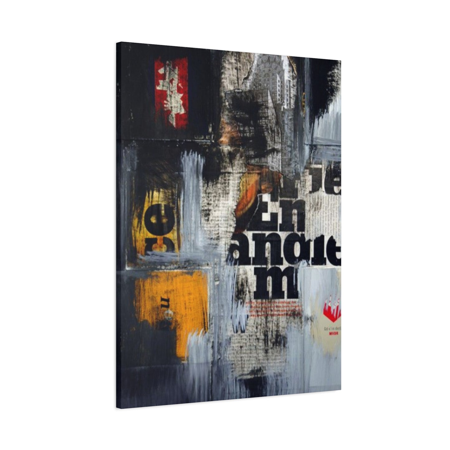
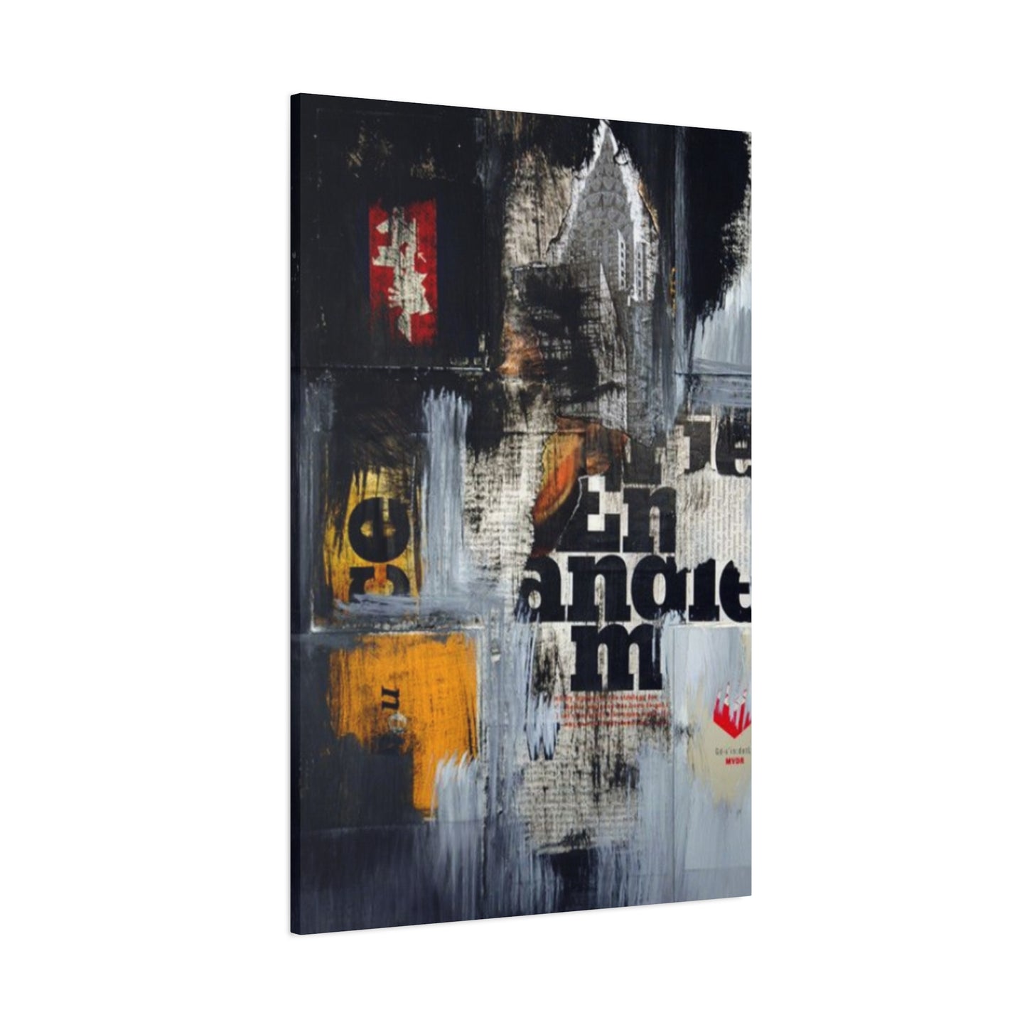
Newspaper cuttings wall art stands at the intersection of history, typography, and visual design, offering a compelling medium that speaks both to the past and the present. Through the use of torn headlines, clipped articles, bold typography, and textured layers, this art form taps into the collective memory—reviving moments, ideas, and styles that shape cultural identity. The piece “Newspaper Cuttings Modernism Wall Art & Canvas Prints” from Wallpics epitomizes how graphic history can be transformed into something beautiful, stylish, and deeply meaningful for modern interiors.
The traditions of 20th‑century modernist printmaking also help illuminate why newspaper‑based art resonates so well in contemporary décor. Exhibitions like “Cutting Edge: Modernist British Printmaking” at Dulwich show how linocuts and graphic prints drew inspiration from bold typography, geometric shapes, and simplified imagery. These elements are echoed in newspaper cuttings art, where headlines and layout become compositional tools as much as sources of information.
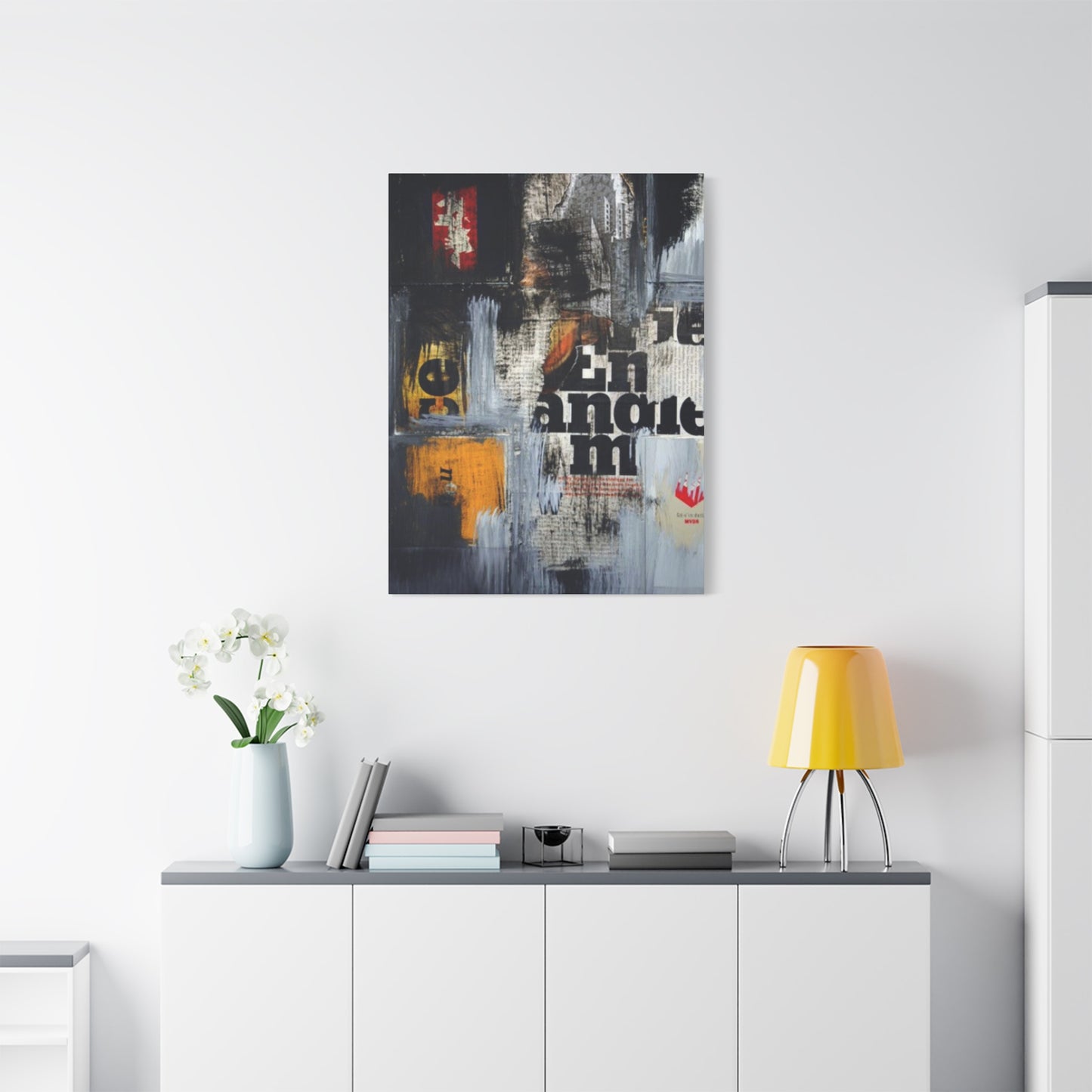
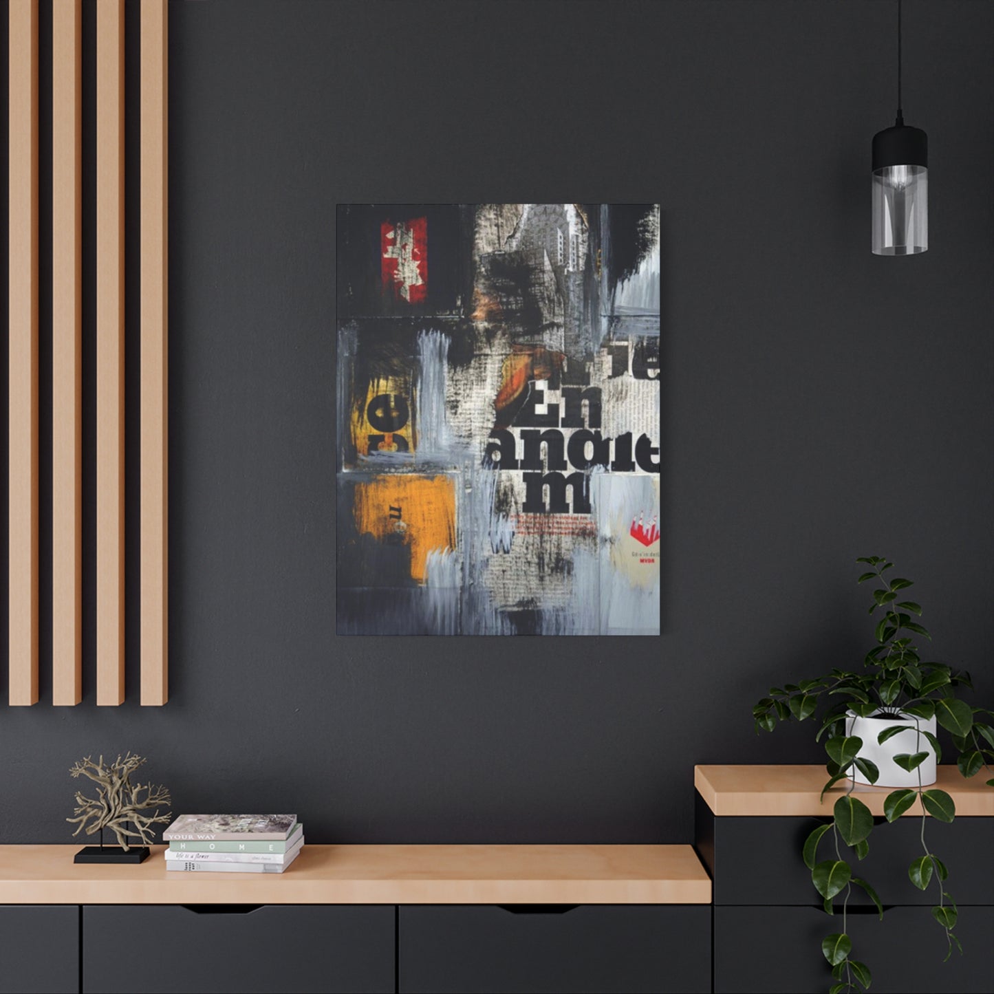
Incorporating newspaper cuttings into wall art offers versatility. It works beautifully as a statement focal piece—large scale prints or canvases acting as centerpieces in living rooms, studios, or home offices. At the same time, smaller framed cuttings or montage‑style collages provide layered texture on gallery walls or narrow hallways. The monochrome (or limited‑palette) aesthetics often associated with newspaper art allow it to blend with many décor styles—minimalist, industrial, mid‑century modern, or eclectic—while adding contrast and intrigue.
Beyond its aesthetic appeal, newspaper cuttings art also carries narrative weight. It invites reflection on the past—events, social issues, popular culture—and how typography and media have shaped public discourse. In doing so, it can become more than décor; it becomes conversation, memory, activism, or even a personal archive. For many, displaying such art is a way to honor both the form and the content—the design and the message.
In conclusion, newspaper cuttings art is a powerful medium that fuses typography, history, and modern design in ways that evoke both visual drama and emotional resonance. Whether through bold modernist implementations or layered collage treatments, this art form allows interiors to tell stories—not just about style, but about time, culture, and the human impulse to record and remember. For anyone seeking wall art that is both striking and thoughtful, newspaper cuttings provide a rich, textured way to bring graphic history into the home.
