Olive Green Pattern Poster Wall Art & Canvas Prints
Olive Green Pattern Poster Wall Art & Canvas Prints
Couldn't load pickup availability

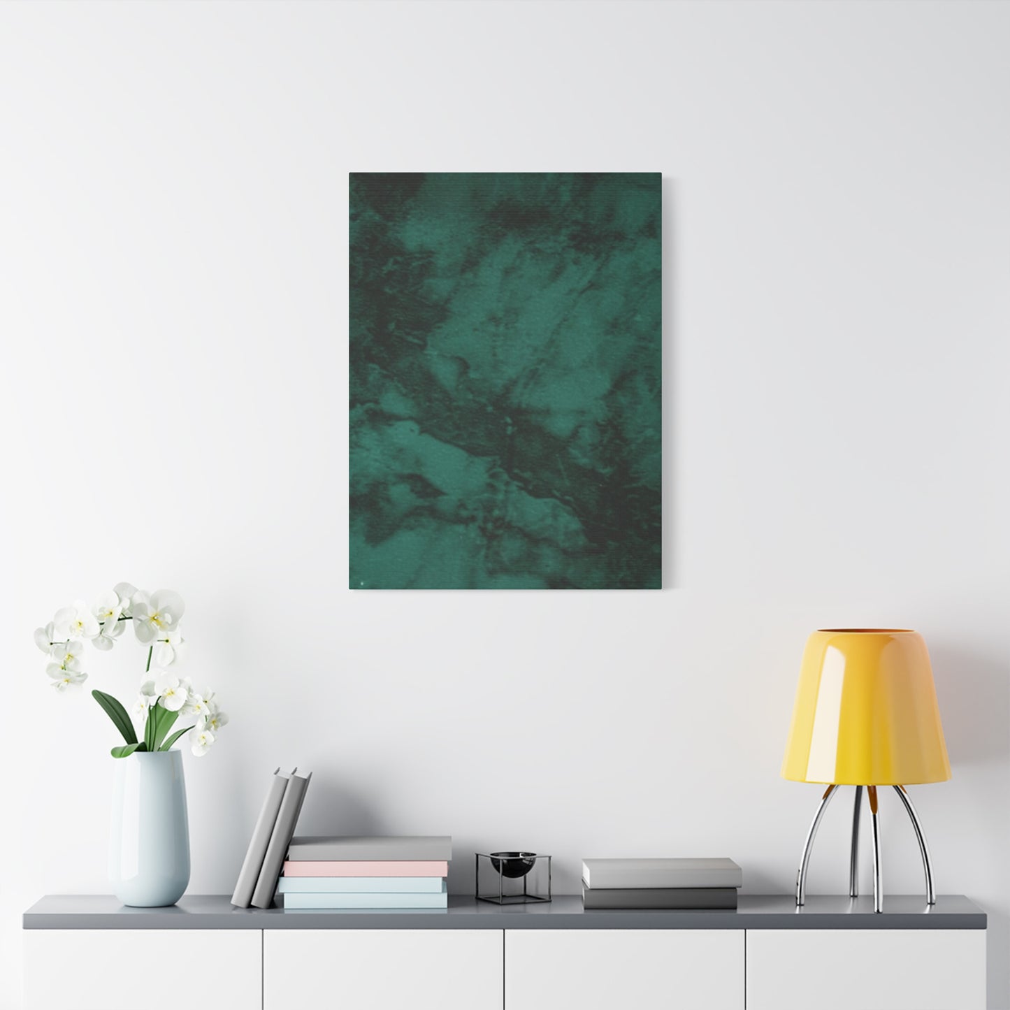
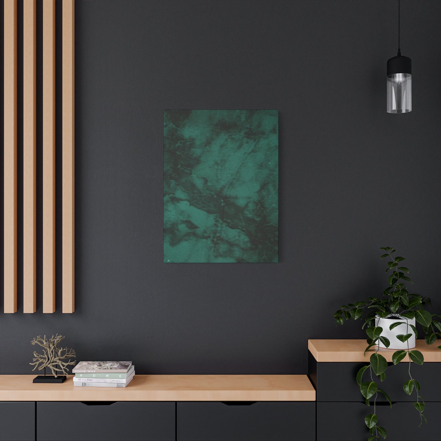
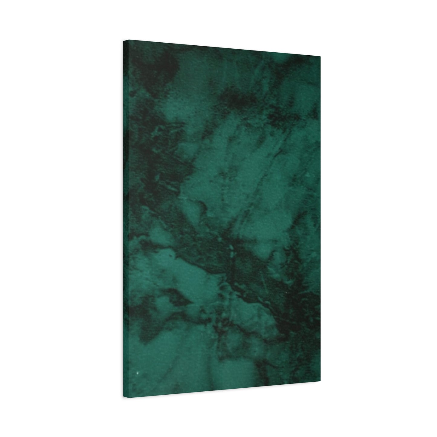
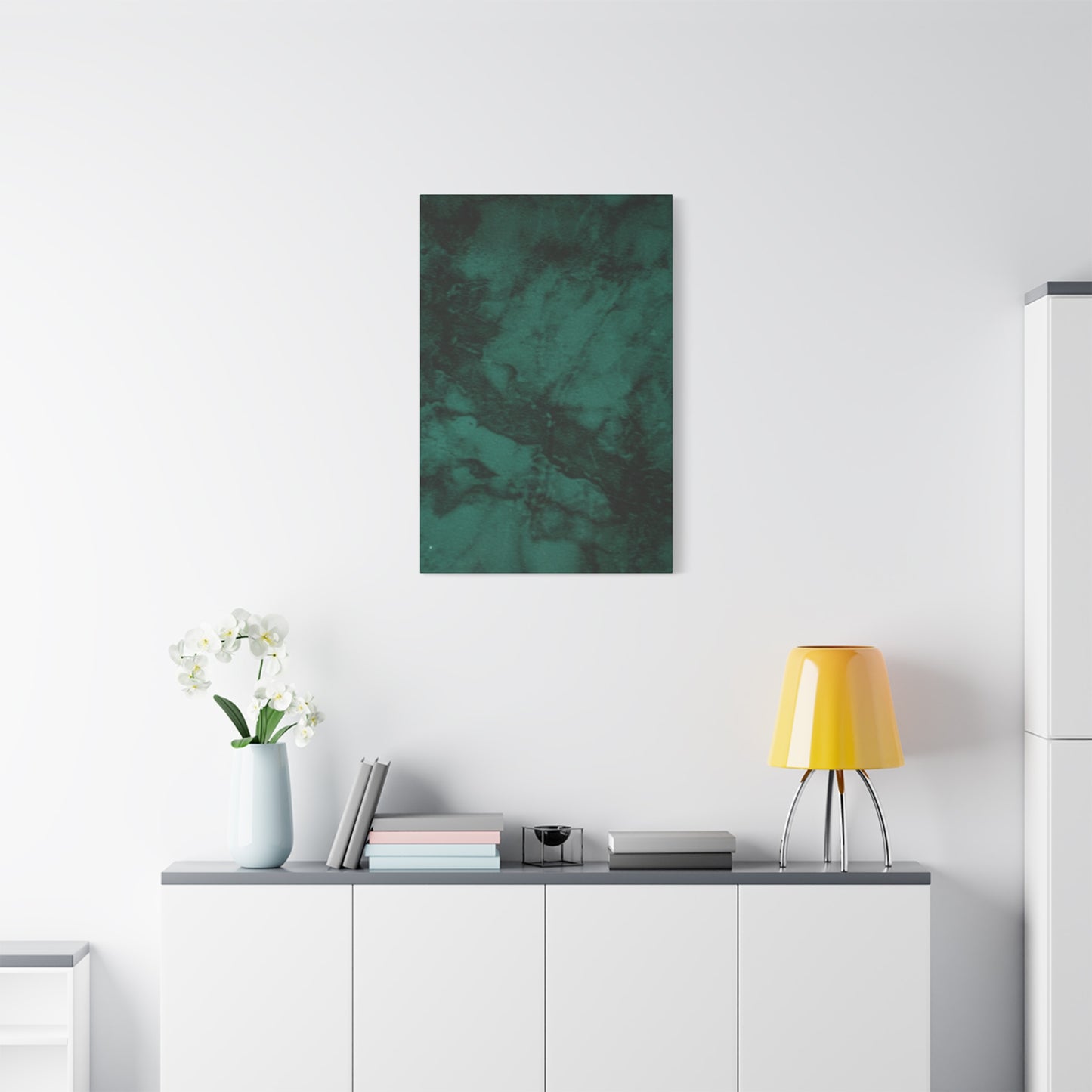
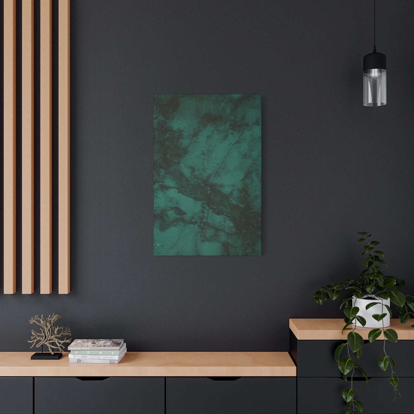

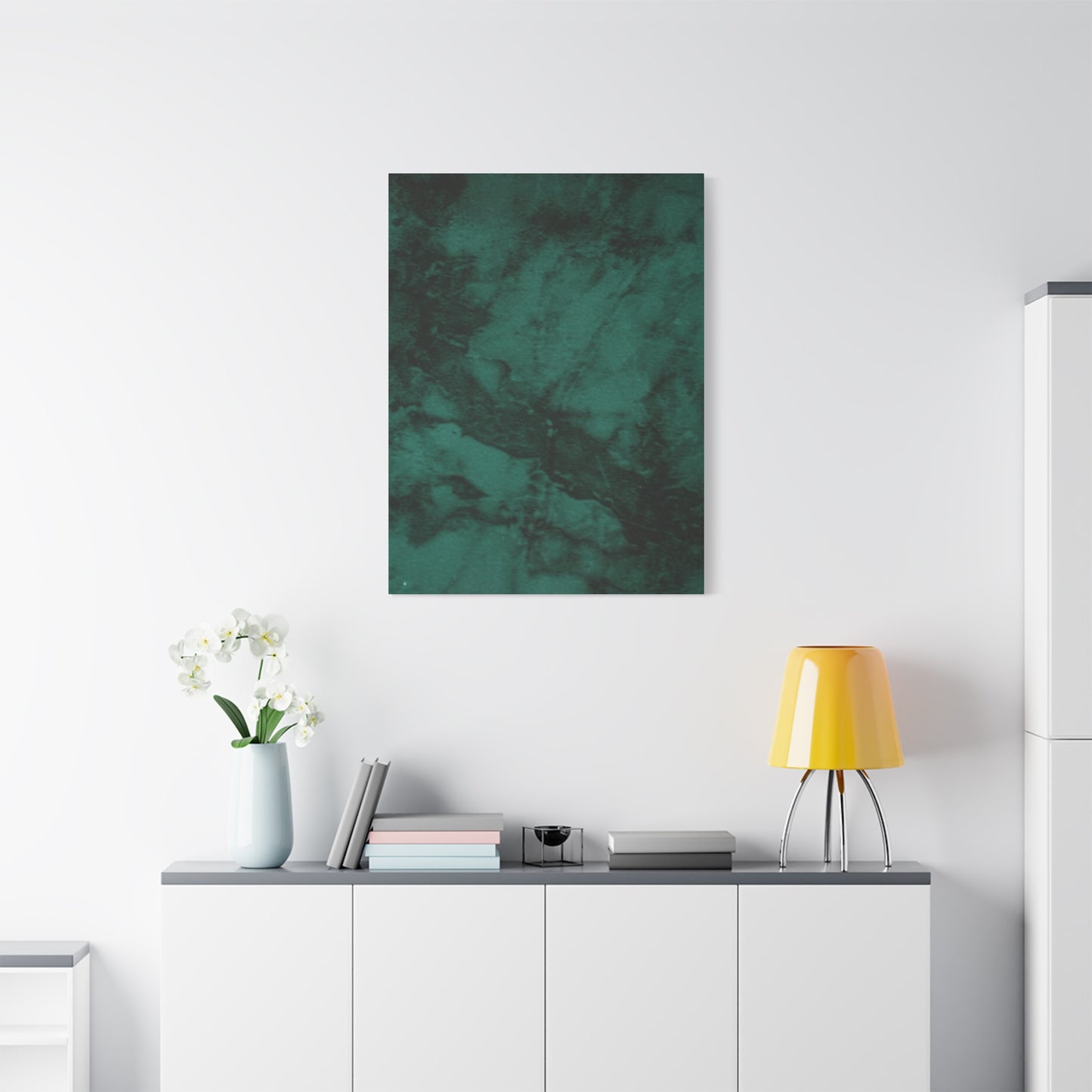
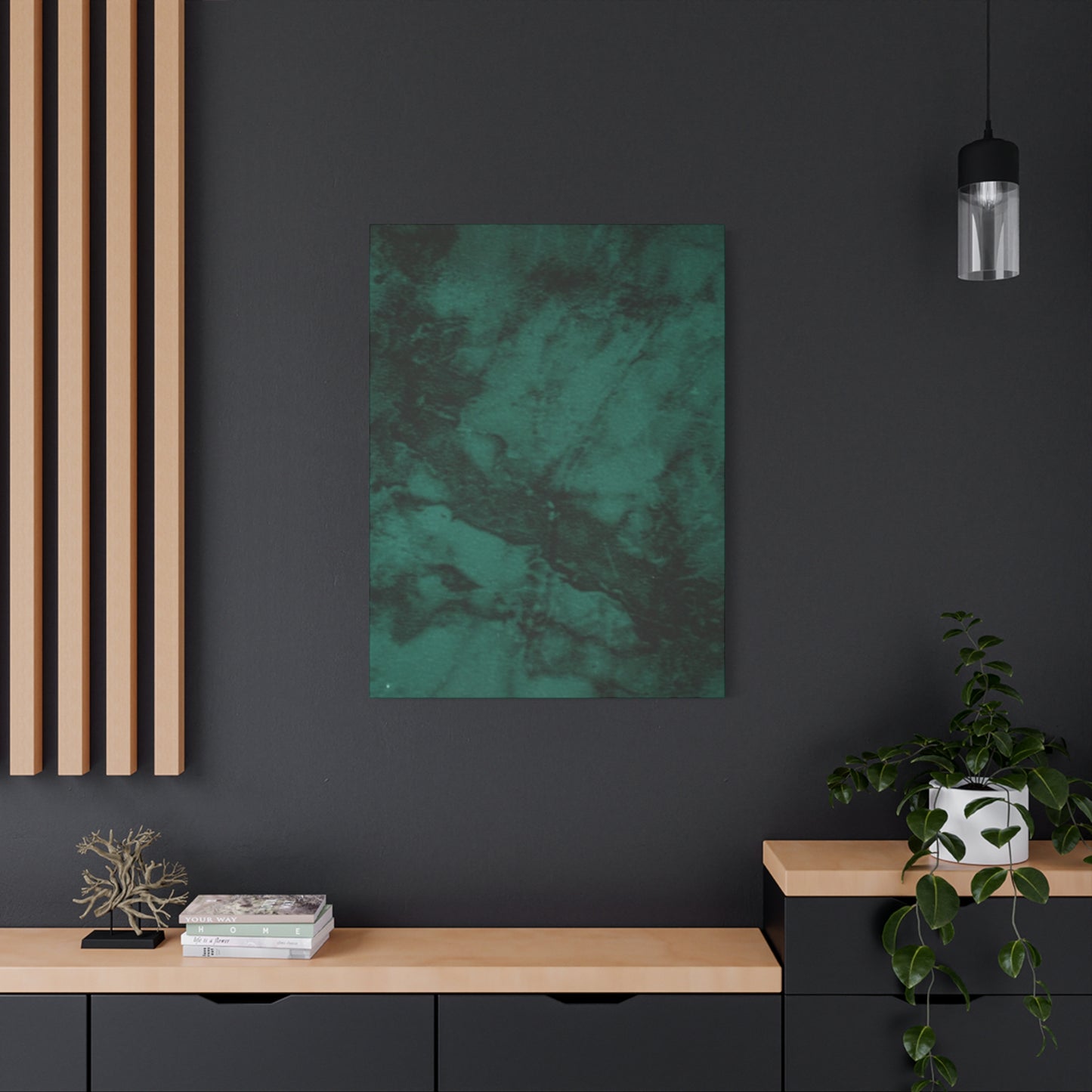

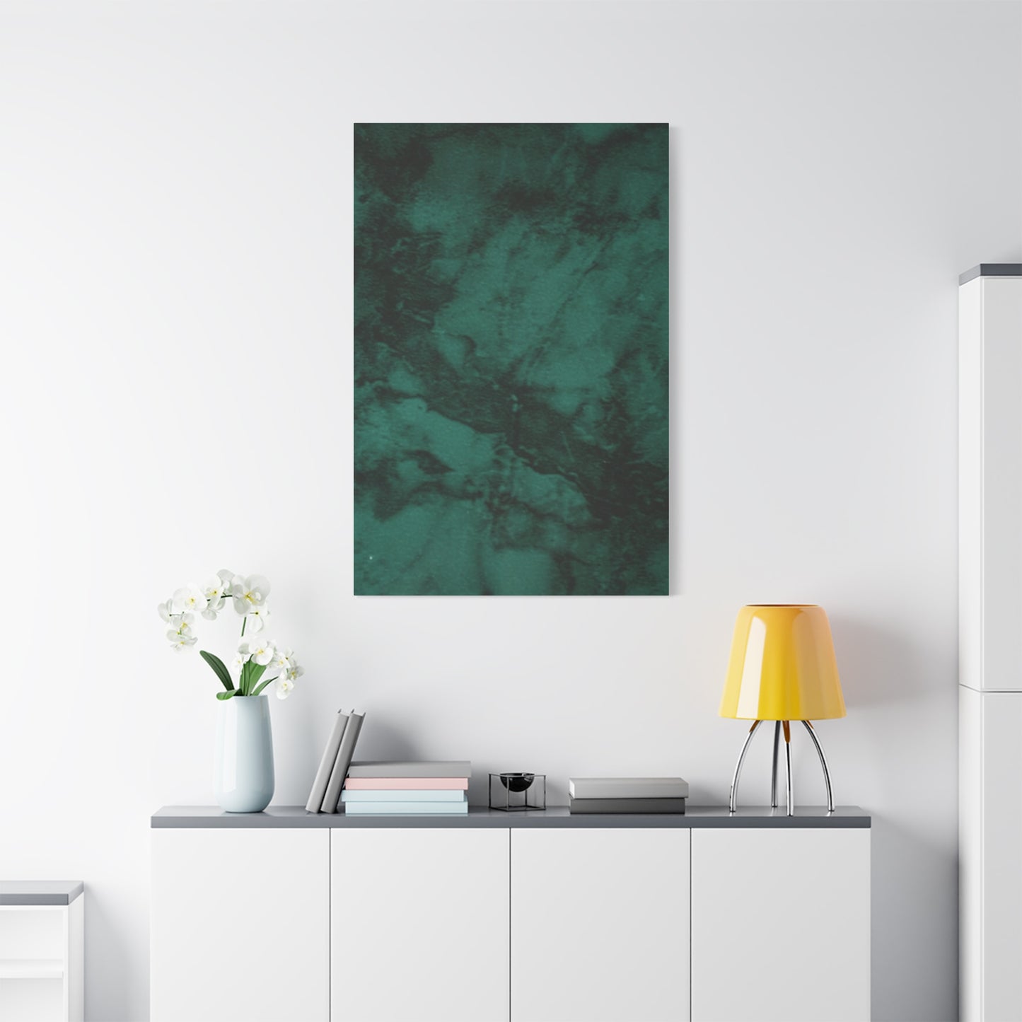

Serenity in Design: Olive Green Pattern Wall Art for Relaxed and Elegant Interiors
The world of interior decoration has witnessed a remarkable shift toward earthy, organic color palettes that bring the serenity of nature indoors. Among these trending hues, olive green has emerged as a particularly versatile and sophisticated choice for wall art enthusiasts and interior designers alike. This warm, muted shade of green carries with it associations of natural landscapes, peaceful olive groves, and the timeless beauty of Mediterranean scenery. When incorporated into pattern poster wall art, olive green creates visual interest while maintaining a calming, grounded atmosphere that works beautifully across various design styles and room types.
Pattern posters featuring olive green tones offer homeowners and decorators an accessible way to introduce this elegant color into living spaces without the commitment of paint or permanent fixtures. These artistic pieces serve multiple purposes within a room, acting as focal points, conversation starters, and cohesive elements that tie together different aspects of interior design. The patterns themselves range from geometric shapes and abstract forms to botanical illustrations and vintage-inspired motifs, each bringing its own character and energy to the space it inhabits.
Understanding the appeal of olive green pattern poster wall art requires exploring both the psychological effects of color and the practical considerations of modern interior design. This shade occupies a unique position in the color spectrum, sitting between yellow and green with undertones that can lean toward brown or gray depending on the specific formulation. This complexity makes olive green remarkably adaptable, allowing it to complement warm wood tones, cool metallic accents, neutral backgrounds, and even bolder accent colors with equal success.
Emotional Impact of Olive Green in Interior Spaces
Color psychology plays a fundamental role in how we experience our living environments, and olive green offers a particularly rich emotional palette. This nature-derived hue connects us to the outdoors, evoking feelings of stability, growth, and renewal that humans instinctively associate with plant life and natural landscapes. Unlike brighter greens that can feel energizing or even overwhelming in large doses, olive green maintains a subdued quality that promotes relaxation and contemplation without inducing drowsiness or lethargy.
The calming properties of olive green make it especially suitable for spaces designed for rest and rejuvenation. Bedrooms featuring olive green pattern poster wall art often feel more serene and conducive to quality sleep, as the color lacks the stimulating qualities of warmer hues like red or orange. Similarly, living rooms and reading nooks benefit from the contemplative atmosphere this shade creates, encouraging conversation, creativity, and peaceful reflection.
Research in environmental psychology suggests that colors associated with nature can reduce stress levels and promote mental wellbeing. Olive green, with its direct connection to vegetation and earth, taps into this biophilic response, creating interiors that feel inherently more comfortable and welcoming. This makes pattern posters in these tones particularly valuable for home offices, meditation spaces, and any area where reducing anxiety and promoting focus are priorities.
Beyond its calming effects, olive green also conveys sophistication and maturity. Unlike pastels or primary colors that might feel juvenile or overly cheerful, this muted green carries connotations of refinement and thoughtfulness. Spaces decorated with olive green pattern poster wall art often appear more curated and intentional, suggesting that the occupant has considered not just aesthetics but also the emotional atmosphere they wish to create.
The versatility of olive green extends to its ability to shift perception based on lighting conditions. In bright natural light, the color may appear fresher and more vibrant, highlighting its green undertones and creating an energized yet still peaceful atmosphere. As evening approaches and artificial lighting takes over, the same olive green can appear warmer and cozier, with its brown and yellow undertones becoming more prominent. This dynamic quality means that pattern posters in this color palette remain interesting throughout the day, never appearing flat or one-dimensional.
Historical Context and Cultural Significance of Olive Green in Design
The use of olive green in decorative arts has deep historical roots stretching back centuries across multiple cultures. Ancient civilizations around the Mediterranean region, where olive trees grew abundantly, incorporated this color into textiles, pottery, and architectural elements. The Romans and Greeks particularly valued the olive tree for its practical uses, and this reverence extended to the aesthetic incorporation of its characteristic green-gray hue into artistic expressions.
During the Arts and Crafts movement of the late nineteenth and early twentieth centuries, designers rebelled against industrial mass production by returning to nature-inspired motifs and earthy color palettes. Olive green featured prominently in the work of influential designers like William Morris, who created intricate patterns combining botanical elements with this sophisticated shade. These historical precedents established olive green as a color associated with artistic integrity, craftsmanship, and a thoughtful approach to design.
The mid-century modern era saw another resurgence of olive green, particularly in the decades following World War Two. Designers embraced this color as part of a broader palette that included mustard yellow, burnt orange, and rich browns. The patterns of this period often featured geometric shapes, atomic-age motifs, and stylized natural forms, all rendered in these earthy tones. Today, vintage-inspired olive green pattern poster wall art draws on this heritage, appealing to those who appreciate retro aesthetics and the optimistic design philosophy of that era.
In military contexts, olive drab became a standard color for uniforms and equipment during the twentieth century, lending the shade associations with utility, durability, and practicality. While this might seem at odds with decorative applications, it actually contributes to olive green's perception as a serious, grounded color suitable for adult spaces. This historical use has also influenced fashion and streetwear, where olive green remains a popular choice, further cementing its cultural relevance across different domains.
Different cultures have attached varying symbolic meanings to shades of green, including olive tones. In many Asian traditions, green represents growth, harmony, and balance, principles that align well with contemporary wellness-focused interior design. Middle Eastern cultures, where olive cultivation has been central to agriculture for millennia, view the olive tree and its colors as symbols of peace, wisdom, and abundance. These layered cultural associations enrich the use of olive green in pattern poster wall art, adding depth of meaning beyond pure aesthetics.
Exploring Various Pattern Types in Olive Green Wall Art
Geometric patterns represent one of the most popular categories for olive green poster wall art, offering clean lines and structured designs that appeal to contemporary sensibilities. These patterns might include chevrons, hexagons, triangles, circles, or more complex tessellations that create visual rhythm across the poster surface. The use of olive green in geometric designs feels particularly modern, as the earthy tone tempers what might otherwise be a stark, cold aesthetic. The repetition inherent in geometric patterns creates a sense of order and predictability that many find psychologically comforting, especially in spaces that might otherwise feel chaotic or overstimulated.
The interplay between positive and negative space in geometric olive green patterns creates visual interest without overwhelming the viewer. Some designs feature olive green shapes against neutral backgrounds like cream, beige, or soft gray, while others reverse this relationship, presenting light geometric forms against deeper olive fields. More complex variations might incorporate multiple shades of olive green, creating depth through tonal variation rather than contrasting colors. This subtlety allows the pattern to remain engaging over time without becoming tiresome or dated.
Botanical and floral patterns offer another rich category for olive green wall art, directly connecting to the natural origins of the color itself. These designs might depict stylized leaves, ferns, olive branches, or more elaborate garden scenes rendered in various shades of olive green. Some botanical patterns take a scientific illustration approach, presenting detailed, accurate representations of plant structures, while others embrace abstraction, reducing botanical forms to their essential shapes and gestures. The organic, flowing nature of botanical patterns provides an excellent counterpoint to the straight lines and hard surfaces prevalent in modern furniture and architecture.
The use of olive green in botanical patterns feels inherently authentic, as the color naturally occurs in many plant species. This authenticity creates a harmonious visual experience where color and subject matter reinforce each other. Eucalyptus leaves, sage plants, succulent varieties, and various herbs all display olive green tones in nature, making them popular subjects for this type of wall art. The patterns might show these plants in their natural growing patterns or arrange them in more stylized, decorative compositions that prioritize aesthetic appeal over botanical accuracy.
Abstract patterns in olive green offer maximum creative freedom, eschewing recognizable forms in favor of color, shape, and composition as primary elements. These designs might feature brushstrokes, splatters, gradient transitions, or undefined organic shapes that evoke emotional responses without depicting specific objects. Abstract olive green pattern posters work particularly well in contemporary and minimalist interiors where representational art might feel too busy or literal. The ambiguity of abstract patterns allows viewers to project their own interpretations onto the work, creating a more personal connection with the art.
Selecting the Right Olive Green Pattern Poster for Different Rooms
The bedroom serves as a personal sanctuary where restfulness and tranquility are paramount, making it an ideal space for olive green pattern poster wall art. In this intimate setting, the calming properties of olive green help create an environment conducive to relaxation and quality sleep. Patterns for bedroom spaces should generally lean toward the simpler, less busy end of the spectrum, as overly complex or vibrant designs can feel stimulating rather than soothing. Subtle botanical patterns featuring delicate leaves or abstract compositions with gentle movement work particularly well above headboards or on walls facing the bed.
The size of pattern posters in bedrooms should be considered carefully in relation to the furniture and overall room dimensions. A large-scale pattern poster can serve as a dramatic focal point above a bed, especially in master bedrooms with high ceilings and substantial wall space. Smaller bedrooms might benefit from more modestly sized posters or series of smaller coordinating pieces that create visual interest without overwhelming the space. The olive green tones should harmonize with bedding, curtains, and other textile elements, creating a cohesive color story that feels intentional rather than accidental.
Living rooms and family rooms offer more flexibility for bolder, more complex olive green pattern posters, as these spaces are designed for social interaction and activity rather than rest. Geometric patterns with stronger visual impact can energize these gathering spaces while the olive green color maintains an overall sense of sophistication and groundedness. Living room walls often accommodate larger artwork, making them perfect for statement pieces that showcase intricate patterns or multiple panels that work together as a cohesive installation.
The placement of pattern posters in living spaces should consider sightlines, seating arrangements, and the room's architectural features. A large olive green pattern poster positioned above a sofa creates a natural focal point that anchors the seating area and provides something interesting for guests to view during conversation. Alternatively, pattern posters can be arranged gallery-style on a feature wall, mixing various sizes and complementary patterns to create a curated, collected look. The key is ensuring that the olive green tones coordinate with upholstery, throw pillows, rugs, and other decorative elements.
Home offices and creative workspaces benefit from olive green pattern posters that stimulate creativity while maintaining focus. Abstract patterns or geometric designs provide visual interest during moments of contemplation without distracting from work tasks. The connection between olive green and nature can help reduce the stress and mental fatigue associated with demanding cognitive work, making it an excellent choice for spaces where concentration is essential. Patterns that incorporate subtle movement or rhythm can inspire creative thinking without causing restlessness or inability to focus.
Coordinating Olive Green Pattern Posters with Various Interior Design Styles
Scandinavian design, with its emphasis on simplicity, functionality, and connection to nature, provides an excellent framework for incorporating olive green pattern poster wall art. This design philosophy embraces neutral color palettes punctuated with natural materials and carefully selected decorative elements. Olive green fits perfectly within this aesthetic, adding warmth to the typically cool-toned Scandinavian palette while maintaining the clean, uncluttered look characteristic of the style. Pattern posters in Scandinavian interiors should favor geometric or minimalist botanical designs that echo the style's appreciation for form and function.
The Scandinavian approach to wall art emphasizes quality over quantity, with each piece serving a specific purpose within the overall design scheme. An olive green pattern poster in a Scandinavian space might be the only artwork on a wall, allowing it to shine without competition from other decorative elements. The frame selection typically leans toward light wood or simple black options that don't distract from the poster itself. This restrained approach allows the olive green and its pattern to make a statement through subtlety and thoughtful placement rather than bold impact.
Modern farmhouse style combines rustic agricultural elements with contemporary design sensibilities, creating spaces that feel both comfortable and current. Olive green pattern posters work beautifully in farmhouse interiors, connecting to the agricultural roots of the style while providing a more sophisticated alternative to the ubiquitous white and weathered wood palette. Botanical patterns featuring herbs, garden plants, or vintage seed packet designs feel particularly at home in farmhouse settings, reinforcing the connection to cultivation and natural living.
The layered, collected aesthetic of farmhouse design allows for creative arrangements of olive green pattern posters combined with other vintage-inspired elements. A wall might feature pattern posters alongside antique farm implements, botanical prints, or vintage photographs, creating a gallery wall that tells a story about connection to land and heritage. The warmth of olive green complements the reclaimed wood, galvanized metal, and worn leather often found in farmhouse interiors, adding to the overall sense of comfort and authenticity.
Bohemian or eclectic interiors thrive on mixing patterns, colors, and cultural influences to create spaces that feel personal and collected over time. Olive green pattern posters contribute to bohemian schemes by adding earthy grounding to what can sometimes become visually chaotic combinations. The key to successfully incorporating olive green patterns into boho spaces is ensuring they harmonize with the room's other elements without becoming lost in the visual noise. Bold geometric or abstract patterns in olive green can hold their own among vibrant textiles and global-inspired decorative objects.
The free-spirited nature of bohemian design allows for experimental approaches to displaying olive green pattern posters. They might be casually propped on shelves or mantels rather than formally hung, mixed with other artwork in salon-style arrangements, or even partially obscured by trailing plants or textile hangings. This relaxed approach to display reflects the bohemian philosophy of personal expression over rigid design rules, allowing the olive green pattern posters to feel integrated into the lived experience of the space rather than being precious objects separated from daily life.
Industrial design style, characterized by exposed structural elements, raw materials, and a somewhat masculine aesthetic, benefits from the softening influence of olive green pattern posters. The organic quality of olive green provides relief from the hard edges, cold metals, and concrete surfaces typical of industrial spaces without compromising the style's essential character. Geometric patterns or abstract designs in olive green work particularly well in industrial interiors, maintaining the contemporary edge of the style while introducing natural warmth.
Understanding Color Theory and Complementary Palettes with Olive Green
Color theory provides valuable frameworks for understanding how olive green interacts with other hues and how to build cohesive palettes around pattern posters in this sophisticated shade. Olive green occupies a unique position on the color wheel, sitting between pure green and yellow-green while incorporating brown or gray tones that affect its saturation and value. This complexity gives olive green remarkable versatility, as it can be paired with colors from various families while maintaining visual harmony.
Complementary colors sit opposite each other on the color wheel and create high-contrast, vibrant pairings. The complementary color to olive green falls in the red-violet to purple range, though exact placement depends on the specific olive green formulation. In practice, muted purples, dusty roses, and burgundy tones create striking yet sophisticated combinations with olive green pattern posters. These pairings work particularly well in spaces where visual drama is desired, as the complementary relationship creates natural focal points that draw the eye.
The use of complementary colors with olive green pattern posters requires balance to avoid overwhelming a space. Often, one color dominates while the other serves as an accent. An olive green pattern poster might be the primary wall art in a room with burgundy throw pillows, or a dusty purple wall might showcase a large olive green geometric pattern as a focal point. The muted nature of olive green generally prevents complementary pairings from feeling too intense or childlike, maintaining an adult sophistication even with these high-contrast combinations.
Analogous color schemes use colors that sit adjacent on the color wheel, creating harmonious, low-contrast palettes. For olive green, analogous colors include yellow-greens, pure yellows, and yellow-oranges moving in one direction, or blue-greens and teals moving in the other. These combinations feel naturally cohesive because they share underlying pigments. An interior featuring olive green pattern posters alongside mustard yellow textiles and teal accent pieces, for example, creates a rich, layered look without jarring contrasts.
The subtlety of analogous palettes allows for complex, nuanced interiors where color creates atmosphere through gentle transitions rather than bold statements. Multiple shades and tones within the analogous range add depth without introducing visual conflict. This approach works particularly well in spaces designed for relaxation, as the color harmony promotes a sense of peace and coherence. Olive green pattern posters serve as anchor points within these schemes, their patterns adding visual interest while the color maintains the analogous relationship.
Monochromatic color schemes use variations in lightness and saturation of a single hue, creating cohesive, sophisticated interiors. With olive green pattern posters as a starting point, a monochromatic scheme might incorporate pale sage walls, deeper forest green textiles, and various middle-value olive tones throughout the space. Pattern posters in this context might use tonal variations of olive green within the design itself, or the poster might provide one value while the room's other elements supply lighter and darker versions.
Framing and Presentation Options for Olive Green Pattern Posters
The frame surrounding an olive green pattern poster significantly influences how the artwork is perceived and how it integrates into the overall interior design. Frame selection involves considering material, color, width, and style to complement both the poster's design and the room's aesthetic. The right frame enhances the artwork, drawing attention to its strengths while providing structural support and protection. Conversely, poorly chosen frames can diminish even exceptional posters, creating visual discord or failing to provide adequate emphasis.
Wood frames represent the most traditional and versatile option for olive green pattern posters. The natural quality of wood resonates with the organic character of olive green, creating an inherent harmony between artwork and presentation. Light wood options like oak, ash, or birch provide a Scandinavian-inspired look that feels fresh and modern, while darker woods like walnut or mahogany offer traditional sophistication suitable for more formal interiors. The grain and texture of wood add subtle visual interest that complements rather than competes with the poster's pattern.
The width of wood frames affects the overall presence of the framed poster. Thin frames create a minimal, contemporary look that focuses attention on the artwork itself, while wider frames make bolder statements and can bridge scale differences between smaller posters and large walls. Very wide frames, sometimes called gallery frames, create substantial visual weight that transforms even modest-sized posters into significant wall features. The choice depends on the poster's design, the room's proportions, and the desired level of impact.
Metal frames offer a contemporary, industrial aesthetic that pairs beautifully with geometric olive green patterns. Aluminum, steel, and brass each bring different qualities to the presentation. Simple aluminum frames in black or silver provide clean, modern edges that feel current and unpretentious. Brass and gold-toned metal frames add warmth and can reference vintage or Art Deco influences, particularly effective with retro-inspired olive green patterns. The sleek, refined quality of metal frames suits minimalist and contemporary interiors where unnecessary ornamentation is avoided.
The thin profile characteristic of most metal frames creates a subtle boundary between artwork and wall without adding significant visual weight. This allows the olive green pattern poster to feel integrated into the space rather than isolated as a separate decorative element. Metal frames also offer practical advantages, including durability, moisture resistance, and minimal maintenance requirements that make them suitable for various environments including bathrooms and kitchens where wood might be problematic.
Floating frames create the illusion that the poster hovers within the frame, with visible space between the artwork and the frame edge. This contemporary presentation style adds dimensionality and draws attention to the poster as an object rather than simply an image on a wall. Floating frames work particularly well with olive green pattern posters that have interesting edges or where the full paper surface contributes to the overall design. The shadow gap created by the float adds subtle depth that catches light and creates visual interest from multiple viewing angles.
The sophistication of floating frames makes them suitable for showcasing high-quality posters in prominent locations. The presentation style suggests that the artwork is valued and worth displaying thoughtfully, elevating the perceived importance of the piece. This works particularly well in formal living rooms, offices, and entryways where first impressions matter. However, the contemporary nature of floating frames makes them less suitable for traditional or vintage-inspired interiors where more conventional framing would feel more appropriate.
Frameless presentation options have gained popularity in contemporary design, where minimal aesthetics and cost-effectiveness are valued. Methods include mounting posters directly to walls with adhesive, clipping them between sheets of glass or acrylic, or displaying them on ledges and shelves. These approaches work best with high-quality olive green pattern posters printed on substantial paper stock, as the absence of framing support makes any printing or paper deficiencies more apparent. Frameless display creates casual, lived-in environments where art feels accessible rather than precious.
Creating Gallery Walls and Multiple Poster Arrangements with Olive Green Patterns
Gallery walls have become increasingly popular as homeowners seek to create personalized, curated displays that reflect their interests and aesthetic preferences. Olive green pattern posters work beautifully in gallery wall arrangements, either as unifying elements within diverse collections or as the primary focus with supporting pieces. The key to successful gallery walls lies in creating visual balance while maintaining enough variety to keep the arrangement interesting. Planning involves considering size relationships, frame styles, color harmony, and the overall shape of the arrangement on the wall.
When olive green pattern posters form the foundation of a gallery wall, they provide color consistency that allows for variation in other elements. Different patterns in similar olive green tones create unity through color while offering visual diversity through design. The patterns might include geometrics, botanicals, and abstracts in various sizes, all tied together by their shared color palette. This approach creates sophisticated gallery walls that feel collected and intentional rather than random or chaotic.
The arrangement pattern of gallery walls significantly impacts their overall effect. Grid arrangements, where frames of identical size are hung in neat rows and columns, create order and contemporary polish. This format works particularly well with a series of olive green pattern posters designed as a set or sharing similar design characteristics. The regularity of grid arrangements complements geometric patterns while providing structured contrast to more organic botanical or abstract designs. The precision required for grid arrangements makes them more challenging to execute but results in particularly striking visual impact.
Salon-style gallery walls embrace asymmetry and varied frame sizes, creating more relaxed, collected arrangements. This traditional approach allows for mixing olive green pattern posters with other artwork, photographs, and decorative objects. The key is identifying a visual center for the arrangement and building outward, maintaining relatively consistent spacing between elements while varying their sizes and orientations. Salon-style walls benefit from laying out the entire arrangement on the floor before hanging, allowing for adjustments that ensure visual balance across the complete composition.
The use of identical frames throughout gallery walls creates cohesion even when artwork varies significantly. All frames in the same wood tone, metal finish, or painted color unify diverse olive green pattern posters and any accompanying pieces. This approach simplifies decision-making and creates a custom, commissioned appearance. Alternatively, varied frames can add character and casual charm, particularly in bohemian or eclectic interiors where mixing styles is celebrated. When varying frames, maintaining some consistent element, such as all wood frames even if different tones, or all metal frames in different finishes, prevents the arrangement from feeling disjointed.
Spacing between frames in gallery wall arrangements affects the overall impact. Closer spacing, around one to two inches between frames, creates dense, collections that read as single large installations. This approach suits smaller individual pieces that might feel lost in isolation. Wider spacing, three to four inches between frames, creates more breathing room and allows each piece to maintain individual identity within the larger grouping. The wall color between frames becomes part of the composition, either receding into the background with neutral tones or actively participating with bolder colors.
Themed gallery walls centered on olive green pattern posters might explore specific subjects like botanical collections, geometric variations, or abstract expressions. A botanical theme might combine olive green pattern posters of various plants with pressed botanical specimens, vintage seed packets, or nature photography. Geometric themes could progress from simple to complex patterns or explore how different geometric forms interact with the same olive green palette. Abstract themes allow for maximum creative freedom, grouping pieces that share emotional qualities or compositional elements rather than literal subjects.
Seasonal Decorating and Updating Spaces with Olive Green Pattern Posters
The versatility of olive green pattern posters makes them excellent anchors for seasonal decorating strategies that refresh spaces throughout the year without requiring complete redesigns. Unlike more specifically seasonal colors like pastels for spring or deep reds for winter, olive green maintains year-round relevance while offering enough flexibility to support seasonal accent colors and decorative elements. This allows homeowners to invest in quality olive green pattern posters that remain appropriate through all seasons while updating less expensive accessories to reflect changing times of year.
Spring decorating traditionally emphasizes renewal, growth, and fresh beginnings, themes that align naturally with the nature-based character of olive green. Pattern posters in this color feel inherently spring-appropriate, particularly those featuring botanical subjects. To enhance the seasonal feeling, spring updates might include adding fresh flowers in complementary colors, introducing lighter textiles in cream or pale yellow, or incorporating nest motifs and other spring symbols. The olive green pattern posters provide continuity from winter while feeling perfectly suited to spring's themes of new life and outdoor connection.
The specific patterns chosen for year-round display in spaces with spring decorating priorities might lean toward botanical illustrations, leaf patterns, or abstract designs with organic, flowing qualities. These patterns reinforce spring associations with plant growth while remaining sophisticated enough to work through other seasons. Pairing olive green pattern posters with touches of coral, blush pink, or soft lavender creates fresh spring palettes that feel current and cheerful without veering into overly sweet or juvenile aesthetics.
Summer decorating often embraces brighter, more saturated colors and tropical or coastal themes. Olive green pattern posters might seem too subdued for traditional summer palettes, but they actually provide sophisticated foundations for these brighter seasonal updates. Geometric patterns in olive green create contemporary coolness that contrasts refreshingly with summer's heat, while botanical patterns can incorporate tropical plant subjects that feel seasonally appropriate. Pairing olive green pattern posters with bright white, sunny yellow, or even bold coral creates summer freshness without the clichéd quality of traditional nautical themes.
The earthy quality of olive green also supports less conventional summer decorating approaches focused on garden themes, herb cultivation, or outdoor living. Pattern posters featuring herbs, vegetables, or garden florals in olive green tones celebrate summer's abundance while maintaining sophisticated restraint. Natural materials like woven baskets, ceramic planters, and unfinished wood accessories complement olive green pattern posters while reinforcing connections between indoor and outdoor spaces that summer decorating often emphasizes.
Combining Olive Green Pattern Posters with Living Plants and Natural Elements
The connection between olive green and nature makes pattern posters in this color particularly compatible with living plants and organic materials. This combination creates layered, biophilic interiors that promote wellbeing through multiple connections to the natural world. The static pattern on the poster and the living, growing plant create an interesting dialogue between representation and reality, art and life. This approach to decorating acknowledges that while artwork can reference nature, nothing fully replaces the psychological benefits of actual living plants.
Trailing plants like pothos, philodendron, or string of pearls can be positioned on shelves or hooks near olive green pattern posters, allowing their cascading growth to partially frame or interact with the artwork. This creates dynamic compositions that change as plants grow, with the static pattern providing consistent structure while the plant introduces organic unpredictability. The living green of plants adds vibrancy that complements the more subdued olive green of the poster, creating depth through color variation within a harmonious palette.
Large floor plants like fiddle leaf figs, rubber plants, or monstera deliciosa can be positioned beside or near walls featuring olive green pattern posters, creating substantial green presence in a room. The bold, architectural quality of these plants complements geometric patterns while their organic shapes provide beautiful contrast. The scale of large floor plants matches that of significant wall art, creating balance and visual weight distribution throughout the room. This combination works particularly well in contemporary and minimalist interiors where each element, whether plant or poster, is carefully considered for maximum impact.
Smaller potted plants arranged on surfaces below olive green pattern posters create cohesive vignettes that combine functional decoration with aesthetic appeal. Succulents, herbs, or small ferns in decorative containers might sit on console tables, mantels, or floating shelves beneath framed posters, creating visual connections between the wall art and three-dimensional space below. The repetition of green tones in different values and saturations adds richness and complexity to the overall composition.
The care requirements of plants should be considered when positioning them near olive green pattern posters. Plants requiring frequent watering or misting pose potential risks to unprotected paper artworks. Maintaining appropriate distance between plants and posters, using protective framing with sealed backs, or choosing low-maintenance plants like succulents or cacti minimizes these risks. The goal is creating harmonious combinations without compromising either the artwork's preservation or the plants' health.
Natural materials beyond living plants also complement olive green pattern posters beautifully. Wood furniture, baskets, ceramic vessels, stone objects, and natural fiber textiles all share organic origins that resonate with the earthy quality of olive green. A room featuring olive green pattern posters alongside a live-edge wood coffee table, jute area rug, linen curtains, and ceramic pottery creates a cohesive natural aesthetic without feeling themed or heavy-handed. The variety of textures within natural materials prevents the space from appearing flat despite the relatively restrained color palette.
Dried botanicals offer another way to bridge living plants and pattern artwork. Dried pampas grass, preserved eucalyptus, or dried flower arrangements in neutral vases create sculptural elements that reference plant life without requiring ongoing care. These arrangements can be positioned near olive green botanical pattern posters to reinforce plant themes or near geometric patterns to provide organic contrast. The muted tones of dried botanicals coordinate beautifully with olive green, creating sophisticated, gallery-like presentations.
Lighting Considerations for Showcasing Olive Green Pattern Posters
Lighting profoundly affects how olive green pattern posters are perceived, influencing both color accuracy and pattern visibility. Natural daylight brings out the truest colors of olive green, revealing its complex composition of yellow, green, and brown undertones. However, few homes can rely solely on natural light, making artificial lighting choices crucial for proper artwork display. Understanding how different light sources affect olive green helps in selecting and positioning lighting fixtures that showcase pattern posters to their best advantage.
Natural light varies throughout the day in both quantity and quality. Morning light tends toward cooler tones, while afternoon and evening natural light becomes warmer. These shifts cause olive green to appear slightly different at various times, with cooler light emphasizing green undertones and warmer light bringing out yellow and brown notes. Positioning olive green pattern posters on walls that receive indirect natural light generally provides the most consistent, flattering illumination throughout the day. Direct sunlight can cause colors to appear washed out and may fade artwork over time, making it undesirable despite its abundance.
North-facing walls in the northern hemisphere receive the most consistent, indirect natural light, making them ideal locations for artwork. The cooler quality of northern light suits olive green well, keeping it fresh and crisp without the warmth that southern exposure provides. South-facing walls receive the most intense direct sunlight, requiring careful consideration of placement to avoid sun damage while still benefiting from the abundant light. East and west exposures experience dramatic changes between morning and afternoon, creating dynamic lighting conditions that cause olive green to shift appearance throughout the day.
Incandescent lighting produces warm, yellow-toned light that emphasizes the brown and yellow undertones in olive green. This creates cozy, intimate atmospheres suitable for relaxation spaces like bedrooms and living rooms. The warmth of incandescent light can make olive green appear richer and more saturated, though it may reduce the distinction between olive green and other warm colors in patterns that incorporate multiple hues. While incandescent bulbs have become less common due to energy efficiency concerns, their light quality remains a standard against which other sources are judged.
LED lighting offers tremendous variety in color temperature, measured in Kelvins. Warm white LEDs around 2700-3000K produce light similar to incandescent bulbs, creating cozy environments where olive green appears warm and inviting. Neutral white LEDs around 3500-4100K provide balanced light that renders colors more accurately without strong warm or cool bias. Cool white LEDs above 5000K create crisp, energizing light that emphasizes the green component of olive green, suitable for work spaces and contemporary interiors. Selecting LED color temperature based on the room's purpose and desired atmosphere ensures olive green pattern posters appear as intended.
The color rendering index (CRI) measures how accurately a light source displays colors compared to natural daylight. High CRI bulbs, rated 90 or above, show colors most truthfully, making them ideal for showcasing artwork including olive green pattern posters. Lower CRI lighting can make colors appear dull or distorted, potentially causing olive green to look muddy or undefined. Investing in high CRI bulbs for fixtures that illuminate artwork ensures the complex, nuanced color of olive green displays properly and patterns remain clearly visible.
Picture lights mounted directly above or below framed posters provide focused illumination that highlights artwork while creating ambient wall-washing effects. Battery-operated or hardwired picture lights come in various finishes to coordinate with frame styles. The key is selecting lights with appropriate color temperature and CRI for olive green, ensuring the illumination enhances rather than distorts the artwork's colors. Picture lights work particularly well for showcasing important pieces in areas like entryways or above fireplace mantels where the artwork serves as a focal point.
Track lighting and adjustable spotlights offer flexibility in directing light exactly where needed. This system works well for gallery walls of olive green pattern posters or situations where lighting needs may change as artwork is rotated or rearranged. The ability to adjust both direction and often intensity allows for customized lighting solutions that accommodate different poster sizes and positions. Modern track lighting systems have evolved beyond industrial appearances, with sleek options suitable for contemporary residential interiors.
Size and Scale Considerations for Olive Green Pattern Posters in Different Spaces
Selecting appropriately sized olive green pattern posters for specific spaces involves understanding both the physical dimensions of walls and the psychological impact of artwork scale. Oversized posters can overwhelm small rooms while undersized pieces may appear lost on expansive walls. The relationship between artwork size and surrounding architectural elements, furniture, and other decorative objects determines whether the poster feels integrated and intentional or awkward and ill-considered. Developing an eye for appropriate scale comes with experience but following established guidelines provides useful starting points.
The rule of thirds suggests that wall art should occupy approximately two-thirds to three-quarters of the width of the furniture piece it hangs above. This proportion creates visual balance without the artwork appearing cramped or dwarfed by the furniture below. For example, a sofa measuring seventy-two inches wide would be well-served by artwork spanning forty-eight to fifty-four inches. This might be accomplished with a single large olive green pattern poster or multiple smaller posters arranged as a gallery wall with that total width. The principle creates cohesive visual units that connect furniture and art.
Single large-scale olive green pattern posters make dramatic statements suitable for spacious rooms with high ceilings and substantial wall expanses. Pieces measuring forty by sixty inches or larger command attention and serve as primary focal points around which other design elements organize. The patterns on large posters should be bold enough to remain visually coherent from distance, as very delicate, intricate patterns may appear muddy when scaled up. Geometric patterns often work particularly well at large scales, as their structural clarity maintains visual impact across significant dimensions.
DIY and Custom Design Options for Olive Green Pattern Posters
The democratization of design tools and affordable printing services has made creating custom olive green pattern posters increasingly accessible to individuals without professional design training. Digital design software, pattern generators, and online printing services allow for personalized artwork that precisely matches specific color preferences, pattern styles, and size requirements. This DIY approach appeals to those seeking truly unique pieces that reflect personal creativity while coordinating perfectly with existing decor. The process can be as simple or complex as desired, accommodating various skill levels and time commitments.
Free and low-cost design software provides capable tools for creating olive green pattern posters. Programs like Canva offer user-friendly interfaces with pre-made templates, design elements, and pattern tools that simplify the creation process. More advanced free options like GIMP provide extensive capabilities similar to professional software, though with steeper learning curves. These programs allow users to select precise olive green shades, create geometric patterns through shape tools, incorporate botanical imagery, or develop abstract designs. The digital format means unlimited experimentation without material waste, encouraging creative exploration until achieving desired results.
Understanding basic design principles improves DIY poster outcomes significantly. Concepts like repetition, rhythm, balance, and focal points guide pattern creation toward professional-looking results. Repetition of shapes, colors, or motifs creates visual unity and pattern recognition. Rhythm develops through varying the size, position, or orientation of repeated elements. Balance ensures no single area overwhelms the composition. Focal points provide visual interest and entry points into the pattern. Applying these principles consciously while designing prevents random, chaotic results and creates intentional, sophisticated patterns.
Color selection tools within design software help ensure consistent olive green tones throughout custom posters. Hex codes specify exact digital colors, allowing users to find pleasing olive green shades and save them for repeated use. Color palette generators suggest harmonious combinations by showing complementary, analogous, or monochromatic options based on a selected olive green. This takes guesswork out of color coordination and helps create cohesive designs where multiple colors interact successfully. Testing various olive green values, from lighter sage tones to deeper forest shades, reveals which works best for the intended space.
Pattern templates and generators accelerate the design process by providing starting points that users can customize. Geometric pattern generators create seamless repeating designs from basic shapes, which can then be colored in selected olive green shades. Botanical illustration libraries offer plant imagery that can be incorporated into poster designs, either maintaining original colors or recoloring to olive green palettes. Abstract brush packs provide textural elements that add visual interest to custom posters. These resources allow non-designers to achieve polished results by building on professional foundations.
Conclusion
Serenity in Design: Olive Green Pattern Wall Art for Relaxed and Elegant Interiors encapsulates the power of color, pattern, and composition to transform any living space into a haven of tranquility and refinement. Olive green—a hue that balances nature’s calm with timeless sophistication—has become a defining choice for those seeking interiors that evoke comfort, connection, and understated beauty. When integrated into patterned wall art, this color breathes life into spaces with a soothing rhythm, creating a perfect blend of natural warmth and modern elegance.
The allure of olive green pattern wall art lies in its subtle versatility. Unlike more dominant shades, olive green carries a quiet strength—it grounds the room without overwhelming it. Its earthy undertones resonate with natural textures such as wood, linen, and stone, allowing it to blend seamlessly into diverse design themes, from rustic and bohemian to modern minimalist. The inclusion of intricate patterns—whether geometric, botanical, or abstract—adds visual depth and structure, transforming simple walls into captivating focal points that exude harmony and balance.
In contemporary interiors, olive green pattern wall art serves as both an aesthetic and emotional anchor. The color’s inherent calmness creates an atmosphere conducive to relaxation, while its connection to nature fosters a sense of wellness and grounding. The soft repetition of patterns enhances this effect, introducing a sense of continuity and flow that mirrors the gentle rhythm of natural landscapes. Whether displayed in bedrooms, living rooms, or tranquil reading nooks, these artworks create environments that encourage mindfulness and ease.
Lighting plays an essential role in revealing the full beauty of olive green patterned art. Natural light brings out the warmth and organic richness of the hue, while ambient or directional lighting emphasizes texture and pattern detail. When paired with complementary tones—such as beige, ivory, terracotta, or gold—the result is an elegant and cohesive palette that radiates sophistication. Even in minimalist settings, a single olive-patterned piece can act as a statement of serenity, bridging the gap between simplicity and visual interest.
Texture and medium also add dimension to this aesthetic. Canvas prints with subtle grain, embossed paper artworks, or mixed-media pieces incorporating metallic or matte finishes introduce tactile richness that invites closer engagement. These textural variations not only enhance the art’s visual impact but also contribute to the sensory experience of the room, making the space feel layered, lived-in, and comforting.
The symbolic qualities of olive green further enrich its presence in interior design. Traditionally associated with peace, renewal, and wisdom, this color encourages introspection and emotional clarity. In patterned compositions, it transforms into a metaphor for balance—between structure and softness, stillness and vitality. As such, olive green pattern wall art resonates deeply in modern homes that value not just visual beauty but also emotional well-being.
Functionally, these artworks are remarkably adaptable. Large-scale pieces can serve as commanding focal points that define a room’s character, while smaller prints or pattern clusters can add charm to transitional areas like hallways or study corners. Grouped in symmetrical arrangements, they convey order and grace; when displayed asymmetrically, they create organic movement that feels both spontaneous and natural. This flexibility allows homeowners to experiment creatively, designing walls that reflect personal style while maintaining a unified atmosphere.


