


Olive Green Texture Patterns Wall Art & Canvas Prints
Olive Green Texture Patterns Wall Art & Canvas Prints
Couldn't load pickup availability


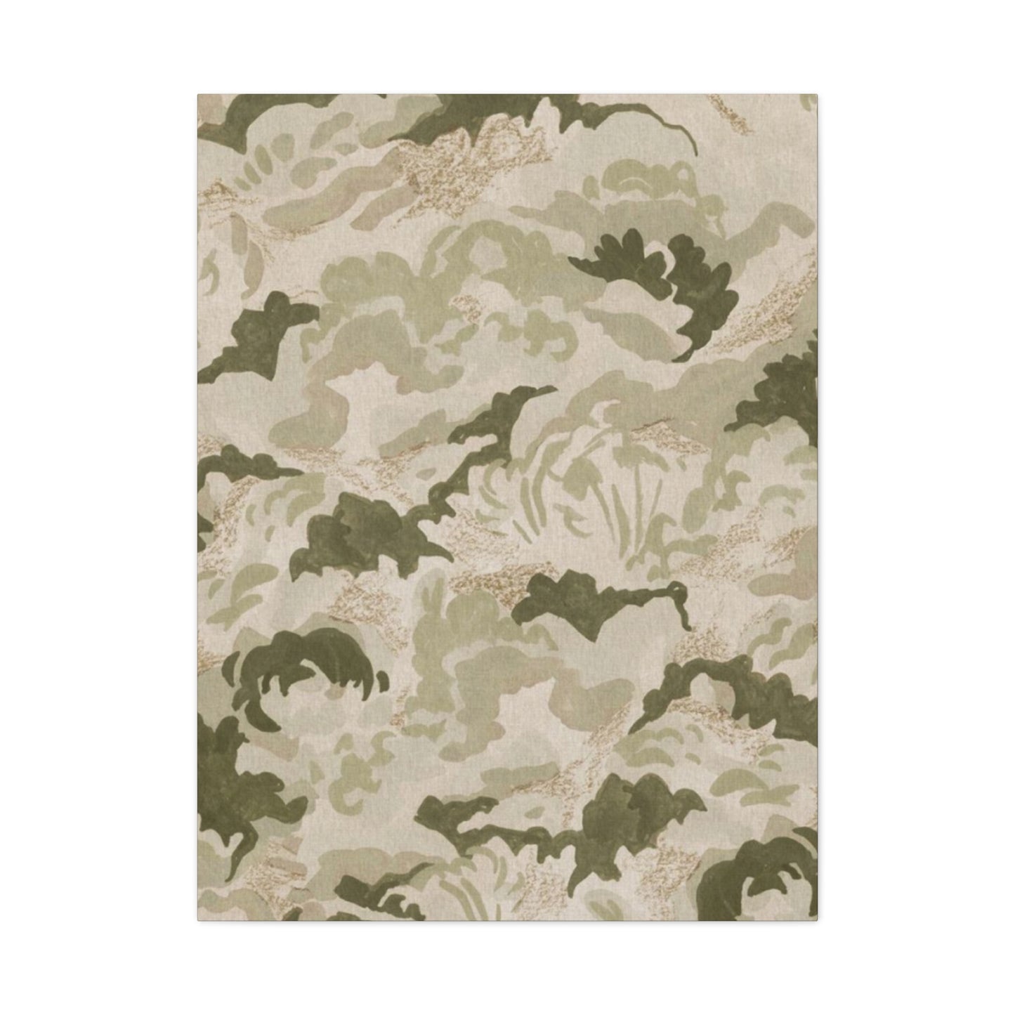

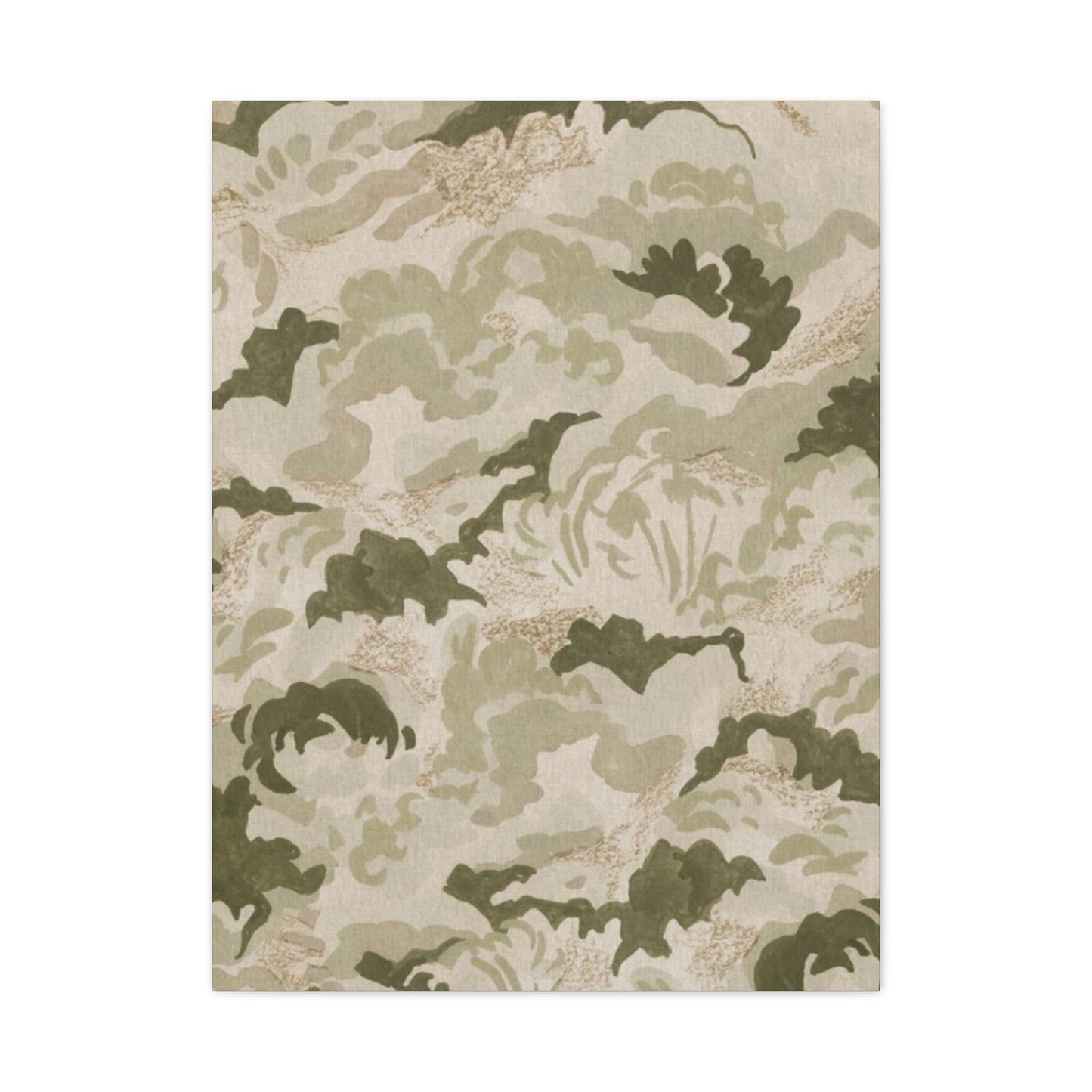


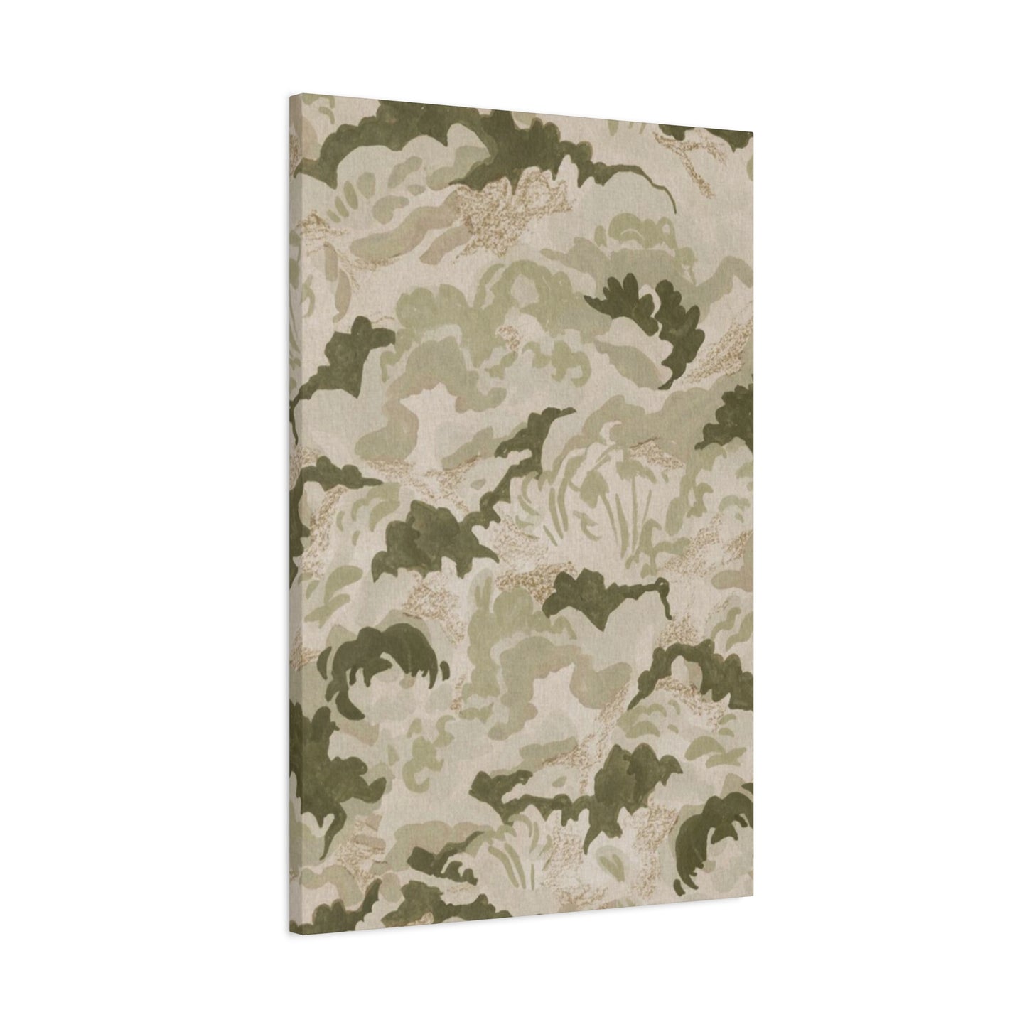


Elevated Styling with Olive Green Textured Wall Art and Earthy Patterns
The world of interior design has witnessed a remarkable shift toward nature-inspired aesthetics that bring warmth, sophistication, and tranquility into living spaces. Among the most captivating trends emerging in contemporary home decor is the integration of olive green textured wall art combined with earthy patterns that evoke the serene beauty of natural landscapes. This design movement celebrates the understated elegance of muted tones, organic textures, and geometric patterns that transform ordinary walls into captivating focal points. The appeal of these artistic elements lies in their versatility, allowing them to complement various design styles while maintaining a timeless quality that transcends fleeting trends.
Homeowners and interior designers alike are discovering the transformative power of incorporating nature-inspired color palettes and textured surfaces into residential and commercial spaces. The subtle sophistication of olive green hues paired with intricate patterns creates an atmosphere of refined comfort that appeals to modern sensibilities. These artistic expressions draw inspiration from the natural world, featuring elements reminiscent of moss-covered stones, weathered bark, and sun-drenched foliage. The beauty of this design approach lies in its ability to create visual interest without overwhelming the senses, offering a perfect balance between artistic expression and functional decor.
The resurgence of earth-toned aesthetics reflects a broader cultural movement toward sustainable living and biophilic design principles. People are increasingly seeking connections with nature within their built environments, and textured wall art featuring organic patterns serves as a bridge between indoor spaces and the natural world. This design philosophy recognizes the psychological benefits of surrounding ourselves with elements that remind us of forests, meadows, and natural landscapes. The calming effect of these nature-inspired pieces contributes to creating sanctuary-like spaces where occupants can retreat from the demands of modern life.
Olive Green Texture Art
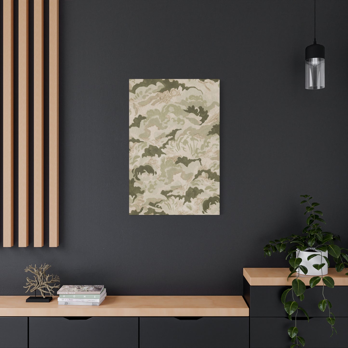
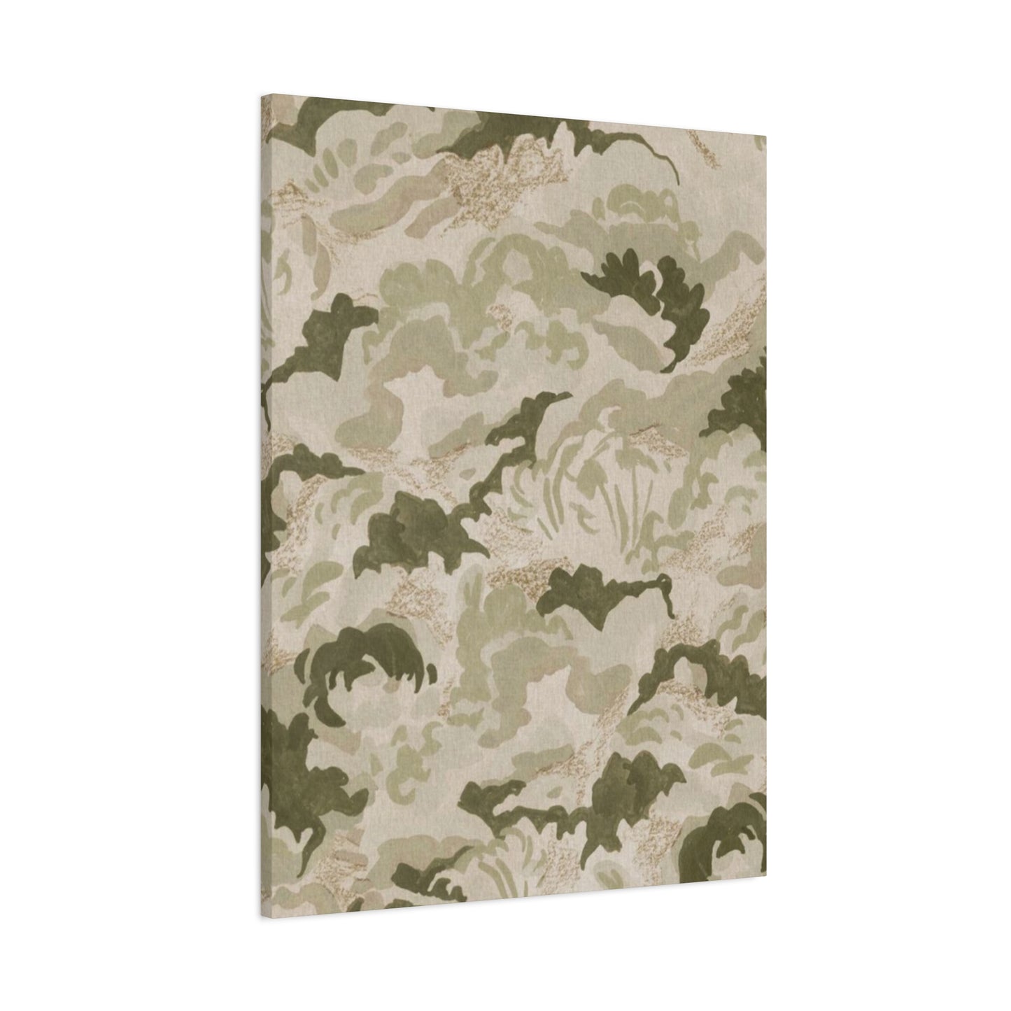
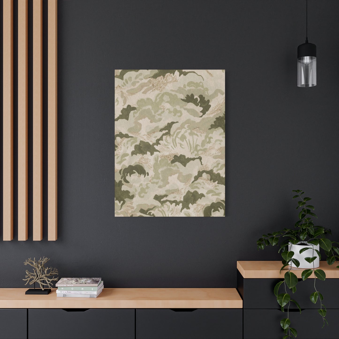
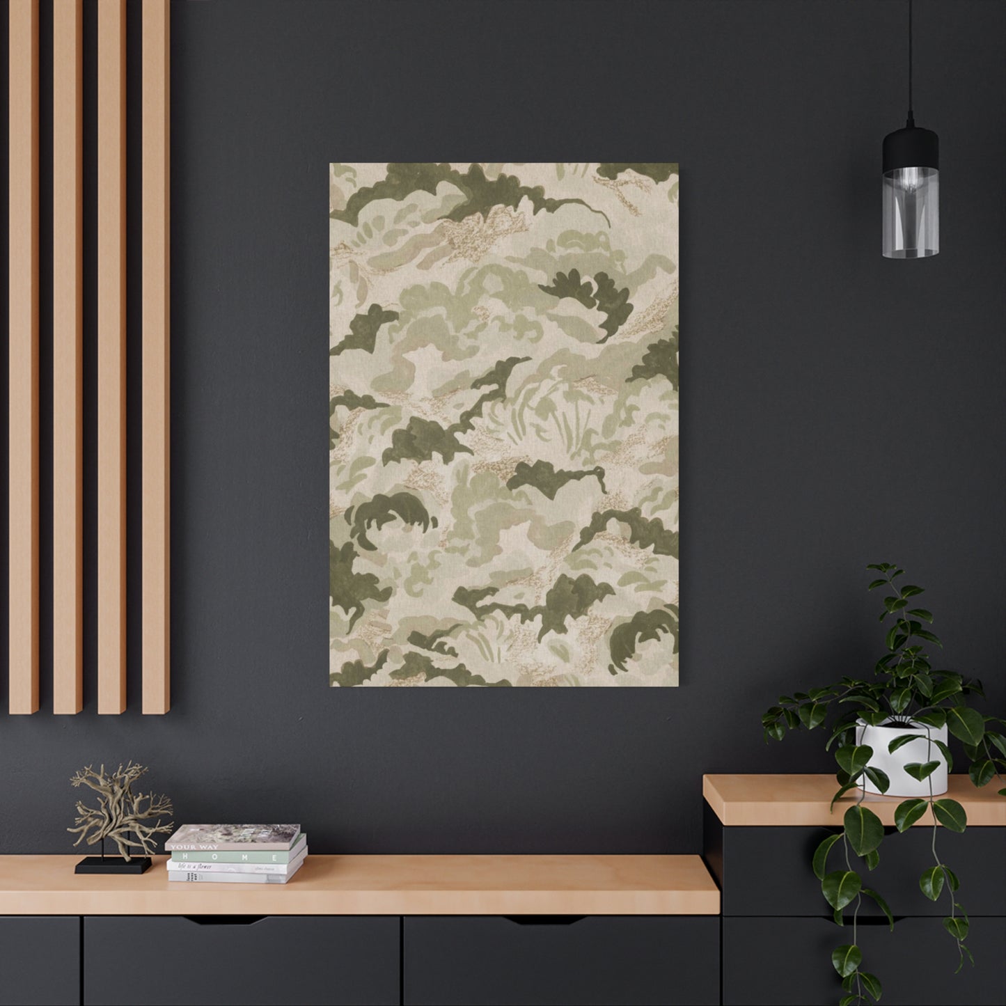
The distinctive appeal of olive green texture art lies in its ability to introduce depth and dimension to interior spaces through both color and surface variation. This artistic category encompasses a wide range of pieces that feature the sophisticated olive green palette combined with tactile elements that create visual and physical texture. The color itself occupies a unique position in the spectrum, neither fully green nor completely brown, but rather existing in that beautiful intersection where botanical freshness meets earthy warmth. This nuanced hue carries associations with Mediterranean landscapes, ancient olive groves, and the timeless beauty of natural elements that have weathered gracefully over time.
Artists working in this medium employ various techniques to achieve textured surfaces that capture light differently throughout the day. Some pieces feature raised surfaces created through impasto techniques, where thick applications of paint create three-dimensional relief on the canvas. Others incorporate mixed media elements such as fabric, paper, or natural materials that add authentic texture to the composition. The interplay between smooth and rough surfaces creates visual intrigue that invites closer inspection and rewards viewers who take time to appreciate the craftsmanship involved in creating these pieces.
The psychological impact of olive green textured art extends beyond mere aesthetic appreciation. Research in environmental psychology suggests that exposure to natural colors and textures can reduce stress levels and promote feelings of well-being. The muted, organic quality of olive green creates a sense of groundedness and stability, while the textured surfaces engage our tactile sensibilities even when we're simply viewing them from a distance. This multi-sensory engagement makes these pieces particularly effective in spaces designed for relaxation and contemplation, such as bedrooms, reading nooks, and meditation areas.
When selecting olive green textured art for a space, consideration should be given to the existing lighting conditions and surrounding color scheme. These pieces tend to be remarkably versatile, working equally well in spaces with abundant natural light and those with more subdued illumination. In brightly lit rooms, the textured surfaces cast subtle shadows that change throughout the day, creating a dynamic visual experience that evolves with the movement of the sun. In spaces with softer lighting, the olive green tones create an intimate, cocooning atmosphere that feels both sophisticated and welcoming.
The scale of textured art pieces plays a significant role in their impact within a space. Large-scale works can serve as commanding focal points that anchor an entire room, while smaller pieces work beautifully in gallery wall arrangements or as complementary elements within a larger design scheme. The beauty of this artistic style lies in its scalability and adaptability to various spatial contexts. Whether displayed individually as statement pieces or grouped in collections that create visual narratives, olive green textured art offers endless possibilities for creative expression and interior enhancement.
Earthy Pattern Wall Decor
Earthy pattern wall decor represents a design category that celebrates the organic geometries and natural motifs found throughout the physical world. These decorative pieces draw inspiration from formations observed in nature including rock strata, tree bark patterns, water ripples, and the intricate arrangements of leaves and petals. The term earthy refers not only to the color palette typically employed in these works but also to the fundamental connection these patterns have with natural processes and organic growth. This category of decor speaks to a deep human need to surround ourselves with representations of the natural environment, particularly in urban settings where direct contact with nature may be limited.
The patterns featured in this decor style range from subtle and abstract to more recognizable natural motifs. Some pieces feature irregular, organic patterns that mimic the randomness found in natural formations, while others employ more structured geometric arrangements that reference the underlying mathematical principles governing natural growth patterns. The color palette typically includes shades of olive, sage, moss, clay, sand, and stone, creating cohesive compositions that feel inherently connected to the earth. These tones work harmoniously together, creating depth and visual interest without the jarring contrasts sometimes found in more vibrant color schemes.
One of the most appealing aspects of earthy pattern wall decor is its ability to create visual rhythm within a space. The repetition and variation within patterns create a sense of movement that guides the eye across the surface of the artwork, encouraging prolonged engagement with the piece. This quality makes pattern-based decor particularly effective in spaces where people spend extended periods, as the patterns reveal new details and relationships upon repeated viewing. The mathematical precision underlying many natural patterns creates a sense of order and harmony that many people find inherently pleasing and psychologically satisfying.
The production methods for earthy pattern wall decor vary widely, from traditional printmaking techniques to digital reproductions of original artwork. Hand-blocked prints offer a unique quality with slight variations that speak to the human touch involved in their creation. Screen-printed pieces provide bold, graphic interpretations of natural patterns with crisp edges and saturated colors. Digitally created patterns offer precision and the ability to scale designs without loss of quality, making them accessible at various price points. Each production method brings its own aesthetic qualities to the finished piece, allowing consumers to select options that align with their preferences and budget considerations.
Incorporating earthy pattern wall decor into an interior design scheme requires thoughtful consideration of pattern scale and density. Large-scale patterns make bold statements and work well in spacious rooms where they can be appreciated from a distance. Smaller, more intricate patterns create visual texture and work beautifully in intimate spaces or when viewed up close. The density of the pattern also affects the overall impact of the piece, with tightly packed patterns creating busier, more energetic compositions, while patterns with generous negative space feel more restful and contemplative. Balancing these elements with the other design components in a room ensures cohesive and harmonious results.
Subtle Green Wall Textures
Subtle green wall textures represent a refined approach to incorporating color and dimension into interior spaces without overwhelming the visual field. This design category emphasizes restraint and sophistication, featuring gentle variations in tone and surface that create interest through nuance rather than bold contrast. The green hues employed in these pieces typically fall within the muted range, including sage, celadon, eucalyptus, and faded olive tones that evoke aged botanical specimens and weathered natural materials. The subtlety of these works lies in their ability to make a meaningful aesthetic contribution while maintaining a quiet, understated presence that complements rather than dominates surrounding decor elements.
The creation of subtle texture in wall art requires considerable technical skill and artistic sensitivity. Artists must master techniques that build depth gradually, layering translucent glazes or working with restricted color palettes to achieve the desired effect. Some works feature barely perceptible variations in surface height, with gentle undulations that catch light at certain angles while appearing nearly flat from others. This ephemeral quality gives the artwork a mysterious, changeable character that reveals different aspects depending on viewing conditions and time of day. The sophistication of this approach appeals to design enthusiasts who appreciate understatement and the beauty of things that reward careful observation.
The psychological effect of subtle green wall textures differs significantly from more dramatic or colorful artwork. Rather than demanding attention or making bold statements, these pieces create ambient visual interest that influences the overall atmosphere of a space without drawing conscious focus. This quality makes them particularly well-suited for environments where concentration and calm are priorities, such as home offices, libraries, and wellness spaces. The gentle green tones have been shown to reduce eye strain and promote mental clarity, making them practical choices for spaces where people engage in focused work or reading for extended periods.
When integrating subtle green wall textures into an interior design scheme, consideration should be given to the relationship between the artwork and surrounding surfaces. These pieces work particularly well in spaces with neutral wall colors, where their gentle chromatic contribution adds warmth without introducing jarring color contrasts. They also complement natural materials such as wood, stone, and linen, creating cohesive environments that feel organically unified. The textural qualities of these artworks can be enhanced through strategic placement relative to light sources, with side lighting particularly effective in revealing subtle surface variations and creating dimensional interest.
The versatility of subtle green wall textures extends to their compatibility with various design styles. These pieces feel equally at home in minimalist contemporary interiors, where their restraint aligns with the principles of simplicity and essentialism, and in more traditional settings, where they provide gentle modernization without disrupting established aesthetic themes. Their ability to bridge different design approaches makes them valuable tools for designers working to create spaces that honor architectural heritage while incorporating contemporary elements. This adaptability ensures their continued relevance regardless of shifting design trends and personal style evolution.
Organic Olive Pattern Prints
Organic olive pattern prints represent a fascinating intersection between botanical illustration traditions and contemporary graphic design sensibilities. These artistic works celebrate the irregular, asymmetrical beauty inherent in natural forms, translating the visual language of olive branches, leaves, and fruit into stylized pattern compositions. The organic quality of these prints lies in their embrace of imperfection and variation, rejecting the rigid geometry of mechanical patterns in favor of arrangements that feel spontaneous and alive. The olive motif carries rich cultural and historical associations, having served as a symbol of peace, wisdom, and abundance across Mediterranean civilizations for thousands of years.
The design process for organic olive pattern prints typically begins with careful observation and documentation of actual olive plant materials. Artists may work from botanical specimens, photographs, or field sketches, capturing the distinctive characteristics of olive foliage including the silvery undersides of leaves, the gnarled textures of branches, and the elliptical forms of the fruit. These observations are then translated into pattern elements that can be arranged in various configurations to create cohesive compositions. Some designers maintain naturalistic rendering in their patterns, while others abstract the forms into simplified shapes that suggest rather than literally depict their botanical origins.
The color palette employed in organic olive pattern prints typically centers on various shades of olive green, often complemented by accent colors drawn from the natural world. Silver-grays echo the distinctive leaf color of olive trees, while warm browns reference bark and earth. Some designers incorporate touches of black for definition and contrast, while others employ cream or off-white tones that suggest sunlight or the pale coloration of young olive wood. The thoughtful selection and combination of these colors creates depth and visual interest while maintaining the cohesive, nature-inspired aesthetic that defines this artistic category.
The application of organic olive pattern prints extends beyond traditional framed artwork to include a wide range of decorative objects and surfaces. These patterns translate beautifully onto textiles including pillows, curtains, and upholstery, where they introduce pattern and color to functional elements within a space. They also appear on wallcoverings, where pattern repeats create immersive environments that surround occupants with botanical imagery. The versatility of these patterns allows for coordinated design schemes that incorporate the olive motif across multiple elements, creating thematic coherence throughout a space without becoming monotonous or overwhelming.
When selecting and displaying organic olive pattern prints, consideration should be given to the scale of the pattern relative to the viewing distance and size of the space. Larger pattern repeats make bold visual statements and work well in spacious rooms where they can be appreciated from a distance. Smaller, more detailed patterns create intricate visual texture and are particularly effective in intimate spaces or when viewed up close. The organic nature of these patterns makes them forgiving companions to other decorative elements, as their irregular forms and natural color palettes rarely clash with other design components, instead creating harmonious relationships that enhance overall aesthetic coherence.
Minimalist Green Texture Art
Minimalist green texture art represents a refined distillation of aesthetic elements, focusing on the essential qualities of color, texture, and form while eliminating extraneous detail. This artistic approach aligns with the broader minimalist movement in design, which emphasizes simplicity, restraint, and the careful consideration of every element included in a composition. Within this context, green serves as the primary chromatic element, typically presented in subtle variations that create visual interest through tonal shifts rather than dramatic contrasts. The textural component introduces physical dimension that prevents the work from feeling flat or austere, adding tactile interest that enriches the minimalist composition without compromising its essential simplicity.
The creation of minimalist green texture art requires exceptional discipline and refined aesthetic judgment. Artists must resist the temptation to add decorative elements or complexity, instead focusing on perfecting the fundamental qualities of surface, color, and composition. Some works achieve texture through the application of thick paint that creates relief on the canvas surface, while others incorporate unconventional materials that introduce varied tactile qualities. The green palette may be restricted to a single hue with variations only in value and saturation, or it may encompass a narrow range of related tones that create subtle chromatic progression across the surface. The resulting works possess a meditative quality that invites contemplation and rewards sustained attention.
The philosophical underpinnings of minimalist green texture art connect to broader concepts about the relationship between art, space, and consciousness. These works often function as visual anchors within a room, providing focal points that ground the space without dominating it. Their simplicity creates psychological space for occupants, offering visual respite from the complexity and stimulation that characterizes much of modern life. The green color component introduces associations with nature and growth, softening the potentially austere quality of minimalist abstraction and making these pieces feel more approachable and livable than some minimalist works executed in more industrial or neutral palettes.
The display context for minimalist green texture art significantly influences its impact and effectiveness. These works typically benefit from generous surrounding space that allows their essential qualities to be appreciated without visual competition from neighboring elements. Clean, unadorned walls provide ideal settings, as do spaces with minimal decorative clutter where the artwork can serve as a primary visual focus. Lighting plays a crucial role in revealing textural qualities, with directional lighting particularly effective in creating shadows that emphasize surface variation. The interaction between light, surface, and color creates a dynamic viewing experience that changes throughout the day, adding temporal dimension to the spatial qualities of the work.
The appeal of minimalist green texture art extends across diverse demographic groups and design preferences. For those who appreciate minimalist principles, these works represent pure expressions of the aesthetic philosophy they value. For others who might find strict minimalism too austere, the textural elements and green color palette provide enough visual interest and natural association to make the works feel accessible and welcoming. This broad appeal, combined with the versatility of these pieces in terms of their compatibility with various design styles, accounts for their growing popularity in both residential and commercial interior design applications.
Layered Greens for Your Walls
Layered greens for walls represent a sophisticated approach to color application that creates depth, richness, and visual complexity through the thoughtful combination of multiple green tones. This technique moves beyond single-color application to embrace the subtle variations and nuanced relationships possible when different green hues are combined in layered compositions. The layering approach may involve physical stratification of paint or materials, where earlier layers remain partially visible beneath subsequent applications, or it may refer to compositional arrangements where different green tones occupy distinct areas that interact visually to create cohesive yet varied color fields. The resulting works possess a dimensional quality that flat color application cannot achieve, with depths that seem to extend beyond the physical surface of the artwork.
The selection of green tones for layered compositions requires careful consideration of how different hues relate to one another and contribute to the overall atmospheric quality of the work. Cool green tones with blue undertones create fresh, vibrant effects that evoke growing foliage and new growth. Warm greens with yellow undertones suggest sunlight and mature vegetation. Neutral greens balanced between warm and cool create versatile foundations that can accommodate accents from both warm and cool green families. Gray-greens and olive tones add sophistication and complexity, preventing layered compositions from feeling juvenile or overly simple. The thoughtful orchestration of these various green tones creates visual interest that rewards extended viewing, as the eye discovers new relationships and subtleties within the layered color field.
The technical execution of layered green artwork employs various methods depending on the medium and desired effect. Translucent glazing techniques allow underlying layers to show through subsequent applications, creating optical color mixing that generates additional hues beyond those physically present. Impasto layering builds dimensional surfaces where earlier layers remain visible at the edges of later strokes, creating physical as well as optical depth. Collage approaches combine papers or fabrics in different green tones, with overlapping elements creating layered effects. Digital processes allow for precise control of opacity and layering order, creating effects that would be difficult to achieve through traditional media. Each approach brings distinct qualities to the finished work, offering artists and consumers options suited to different aesthetic preferences and technical contexts.
The psychological and emotional impact of layered green compositions relates to the complexity and depth that characterization human experiences of natural environments. Natural landscapes rarely present as simple, uniform color fields; rather, they consist of countless subtle variations in tone, value, and saturation that create the rich visual experiences we associate with forests, meadows, and gardens. Layered green artwork captures something of this complexity, creating visual experiences that feel authentically connected to nature despite their abstraction from specific representational content. This quality makes layered green works particularly effective in creating calming, restorative environments that support well-being and mental clarity.
The application of layered green artworks in interior design contexts offers opportunities to introduce sophisticated color without overwhelming spaces with intensity or saturation. These works provide visual richness and complexity while maintaining the essentially calm character of green tones. They work particularly well in spaces where occupants spend extended time, as the layered complexity provides enough visual interest to prevent monotony without becoming tiresome through excessive stimulation. The various green tones within layered compositions can pick up and echo other green elements throughout a space, creating color connections that enhance overall design coherence. This integrative quality makes layered green works valuable tools for designers seeking to create unified yet interesting interior environments.
Earth-Inspired Patterned Prints
Earth-inspired patterned prints celebrate the rich visual vocabulary of geological formations, mineral structures, and terrestrial landscapes. These artistic works translate the patterns, colors, and textures of earth materials into two-dimensional compositions that bring the grounding presence of stone, soil, and sediment into interior spaces. The color palettes employed in these prints typically draw from the warm to neutral range, including ochres, siennas, umbers, grays, and olive tones that echo the natural colors of various earth types and rock formations. The patterns featured in these works may reference the stratification visible in sedimentary rock, the crystalline structures of minerals, the weathering patterns on stone surfaces, or the organic curves of erosion and water movement across land.
The design process for earth-inspired patterned prints often begins with direct observation and documentation of actual geological formations and earth materials. Artists may photograph rock faces, collect mineral specimens, or sketch landscapes to capture the visual character of earth elements. These reference materials inform the development of pattern elements that abstract and stylize natural formations while maintaining their essential visual character. Some designers maintain relatively naturalistic representations of earth patterns, creating prints that read as abstracted landscapes or geological studies. Others take more interpretive approaches, extracting formal elements such as lines, shapes, and color relationships from earth sources and reorganizing them into non-representational pattern compositions.
The symbolic and psychological resonance of earth-inspired patterns connects to fundamental human experiences and archetypal associations with earth as a primal element. Earth represents stability, groundedness, and material reality in many cultural and psychological frameworks. Surrounding ourselves with earth-inspired imagery can create feelings of security and connection with fundamental aspects of existence. The patterns and colors of geological formations carry temporal dimensions as well, referencing the vast time scales over which rock forms and landscapes evolve. This temporal depth can provide perspective that helps contextualize the rapid pace and ephemeral concerns of contemporary life within broader frameworks of geological time and natural processes.
The production methods for earth-inspired patterned prints span traditional and contemporary techniques. Lithography, a printmaking method originally developed to reproduce the textures of stone drawings, offers natural affinity for earth-inspired imagery. Digital printing allows for precise color matching to reference materials and the ability to scale patterns to various sizes without loss of detail. Hand-printing techniques including block printing and screen printing introduce slight variations between impressions that echo the natural variability found in actual geological formations. Mixed media approaches may incorporate actual earth materials including crushed stone, sand, or pigments derived from colored earths, creating prints with authentic textural and material connections to their subject matter.
The integration of earth-inspired patterned prints into interior design schemes creates opportunities to ground spaces literally and metaphorically through visual references to fundamental earth elements. These prints work particularly well in spaces where a sense of stability and permanence is desired, including entryways that welcome people into homes, and living areas where families gather. The warm to neutral color palettes of earth-inspired prints provide versatility in design contexts, complementing both warm and cool color schemes without introducing jarring chromatic notes. The patterns themselves add visual interest without the busy quality that can characterize some pattern types, maintaining enough regularity and structure to feel organized while incorporating enough variation to avoid monotony.
Neutral Green Texture Vibes
vibes represent a design aesthetic that emphasizes subtlety, sophistication, and the harmonious blending of color and surface variation. This approach centers on green tones that have been neutralized through the addition of gray, creating hues that sit comfortably between chromatic intensity and pure neutral grays. These muted green tones possess a refined quality that allows them to function almost as neutrals within color schemes while still contributing the psychological benefits and natural associations of green. The textural component adds dimension and visual interest that prevents neutral color palettes from feeling flat or lifeless, creating surfaces that engage the eye and invite closer examination through subtle variations in relief, sheen, and material quality.
The development of neutral green tones requires careful color mixing that balances the natural vibrancy of green with desaturating elements that soften and sophisticate the hue. Too much neutralization results in colors that read primarily as gray with minimal green character, while insufficient neutralization maintains chromatic intensity that contradicts the neutral aesthetic. Successful neutral greens retain enough color identity to be recognizable as green while possessing the restraint and versatility that characterizes effective neutral tones. These colors often incorporate complex undertones that shift subtly under different lighting conditions, appearing warmer in some contexts and cooler in others, adding to their chameleon-like adaptability within diverse design environments.
The textural elements that define this aesthetic category encompass a wide range of surface treatments and material choices. Matte finishes provide subtle sophistication that absorbs rather than reflects light, creating quiet surfaces that don't compete for attention. Low-luster sheens add gentle visual interest through their interaction with light without the potentially distracting quality of high-gloss surfaces. Physical texture through raised surfaces, woven materials, or applied elements introduces dimensional variation that creates shadow patterns and tactile interest. The combination of neutral green tones with thoughtful textural development results in artwork and design elements that possess remarkable depth and complexity despite their restrained color palette and understated presence.
The psychological impact of neutral green texture vibes relates to their ability to create environments that feel simultaneously calm and interesting, restful yet engaging. The neutral quality of the colors provides visual respite and reduces stimulation, supporting relaxation and concentration. The green component introduces associations with nature and growth while maintaining enough restraint to avoid overwhelming the senses. The textural elements engage visual and imaginative tactile senses, preventing the potentially stark quality that can characterize purely minimal neutral environments. This combination of qualities makes the aesthetic particularly valuable in contemporary life, where many people seek refuge from constant stimulation while still desiring beauty and visual interest in their surroundings.
Olive Green with a Twist
Olive green with a twist represents an innovative approach to working with this classic color, introducing unexpected elements that refresh and contemporize the traditional olive palette. The twist may manifest through unusual color combinations that pair olive with unexpected partners, unconventional applications that place olive in contexts where it hasn't traditionally appeared, or technical treatments that transform the character of olive tones through special effects and innovative processes. This approach honors the inherent sophistication and natural appeal of olive green while preventing it from feeling predictable or dated, creating works that surprise and delight viewers who thought they knew what to expect from this familiar hue.
The color pairings that constitute a twist on traditional olive applications often involve juxtapositions that wouldn't occur in conventional design thinking. Olive paired with vibrant coral creates energizing contrast that plays warm against warm in unexpected ways. Olive combined with deep navy generates sophisticated depth with a contemporary alternative to traditional green and brown partnerships. Olive alongside soft blush pink creates gentle, romantic compositions that challenge gendered color associations and conventional botanical color schemes. Olive with metallic gold or copper introduces luxury and refinement while maintaining earthy groundedness. These unconventional partnerships demonstrate the versatility of olive tones and their ability to function successfully across diverse aesthetic contexts.
The technical twists applied to olive green artwork may involve specialized processes that alter the visual character of the color in surprising ways. Iridescent treatments create surfaces where olive appears to shift and change as viewing angles and lighting conditions vary, adding mysterious, ephemeral qualities to stable earth tones. Metallic pigments introduce reflective qualities that make olive surfaces shimmer and glow, transforming matte natural tones into glamorous design elements. Textural applications that build extreme relief transform olive from a purely chromatic element into a sculptural presence with dramatic shadows and dimensional impact. Digital manipulations including pixelation, distortion, or layering create effects that challenge perceptions about how olive should appear and behave in visual compositions.
The conceptual framework for olive green with a twist involves questioning assumptions and pushing boundaries while maintaining recognition of what makes olive appealing in the first place. This approach requires understanding both the traditional associations and applications of olive tones and the contemporary design contexts where innovation is valued and expected. Artists and designers working in this mode must possess enough command of color theory and design principles to break rules effectively, creating work that reads as intentional innovation rather than mistakes or poor judgment. The most successful examples of twisted olive applications maintain the grounding, sophisticated qualities of traditional olive use while introducing enough novelty to feel fresh and contemporary.
Pattern Play in Earth Tones
Pattern play in earth tones celebrates the creative possibilities inherent in combining organic color palettes with diverse pattern structures and arrangements. Earth tones encompass the warm to neutral range of browns, tans, ochres, siennas, and olive greens that reference natural materials including soil, stone, wood, and vegetation. The pattern play component introduces visual rhythm, repetition, and structured organization that contrasts with the organic origins of the color palette, creating interesting tensions between natural and constructed elements. This approach allows designers to explore the full range of pattern possibilities from simple geometric grids to complex tessellations and organic flowing forms while maintaining the grounded, natural quality that earth tone palettes provide.
The design process for pattern play in earth tones typically involves extensive exploration of pattern types, scales, and arrangements to discover combinations that feel both coherent and interesting. Simple stripe patterns in varied earth tones create linear rhythm with minimal visual complexity, working well in contexts where restful order is desired. Checkerboard and grid patterns introduce two-dimensional organization while maintaining clarity and legibility. More complex geometric patterns including hexagonal tessellations, Islamic-inspired star patterns, or modern parametric designs create intricate visual fields that reward extended viewing. Organic patterns based on natural forms including waves, branches, or cellular structures maintain stronger connections to the natural origins of earth tone palettes while still providing structured visual organization.
The scale of pattern elements significantly affects the visual impact and appropriate applications of earth tone patterned designs. Large-scale patterns with substantial repeating units create bold, graphic effects that read clearly from a distance and work well in spacious environments. Medium-scale patterns provide visual interest without overwhelming spaces, functioning effectively in most residential and commercial contexts. Small-scale patterns with tiny repeating elements create visual texture that reads almost as solid color from a distance while revealing intricate detail upon close examination. The layering of patterns at different scales creates additional complexity, with large structural patterns overlaid with smaller detail patterns generating rich, multidimensional visual experiences.
The psychological effects of pattern play in earth tones combine the grounding, stabilizing qualities of earth-connected colors with the cognitive engagement prompted by pattern recognition and interpretation. The human visual system naturally seeks patterns and organization within visual fields, finding satisfaction in discovering regularities and relationships. Patterns provide this satisfaction while the earth tone palette prevents pattern recognition from becoming overstimulating or mentally exhausting. The combination creates visual experiences that are simultaneously engaging and restful, activating perception and cognition without overwhelming or fatiguing viewers. This balance makes earth tone patterned designs particularly appropriate for spaces where people spend extended time and need environments that support both alertness and comfort.
Olive Meets Abstract Forms
The intersection of olive color and abstract forms creates compelling artwork that combines natural color associations with non-representational visual structures. Abstract forms liberated from the need to represent recognizable objects allow artists to explore pure formal relationships including shape, line, composition, and spatial arrangement. When executed in olive tones, these abstract explorations gain natural warmth and organic associations that prevent purely formal abstraction from feeling cold or overly intellectual. The olive palette provides chromatic unity that helps organize complex abstract compositions, creating coherence even when formal elements vary dramatically in size, orientation, and character.
The creative development of olive abstract form artwork often involves intuitive processes where artists respond to emerging compositions through addition, subtraction, and reorganization of formal elements. Some artists begin with predetermined compositional structures based on geometric systems or mathematical relationships, then introduce variation and spontaneity through the application of olive tones. Others work more intuitively from the start, allowing forms to develop organically through the physical process of mark-making and paint application. Both approaches can yield successful results, with the choice of method depending on individual artistic temperament and the specific aesthetic qualities desired in finished works. The olive color palette serves as a through-line regardless of process, providing visual continuity that unifies diverse formal explorations.
The interpretive openness of abstract form artwork creates space for viewers to bring personal associations and meanings to their encounters with these pieces. Without predetermined representational content, viewers are free to perceive landscapes, organic forms, architectural structures, or purely formal relationships according to their individual perspectives and experiences. Some viewers appreciate this interpretive freedom, finding engagement in discovering personal meanings within abstract compositions. Others may find the lack of clear subject matter frustrating or alienating, preferring artwork with more obvious representational content. The olive color palette can help bridge this divide, providing natural associations that give viewers an entry point for engagement even when formal content remains abstract and open-ended.
The display and presentation of olive abstract form artwork benefits from consideration of how formal relationships will be perceived under different viewing conditions and spatial contexts. Abstract compositions with strong directional elements may influence how viewers visually navigate spaces, with vertical elements drawing eyes upward and horizontal elements creating calm, grounded feelings. Radial compositions with elements emanating from central points create focal areas that anchor attention. Asymmetrical compositions introduce dynamic tension that can energize spaces. The olive color palette modulates these formal effects, adding warmth and natural association that tempers potentially aggressive formal dynamics. Thoughtful placement relative to architectural features and lighting sources enhances the effectiveness of these abstract works within designed environments.
Sophisticated Texture Decor
Sophisticated texture decor represents an elevated approach to interior enhancement that prioritizes tactile quality and surface variation as primary aesthetic elements. This design philosophy recognizes that visual appeal encompasses more than color and form, extending to include the rich sensory dimensions provided by textured surfaces and materials. Sophisticated texture decor moves beyond basic smooth surfaces to incorporate varied tactile qualities including rough and smooth contrasts, woven and carved patterns, raised and recessed areas, and combinations of matte and lustrous finishes. The sophistication lies in the thoughtful selection and arrangement of textures that create cohesive yet interesting environments without descending into chaotic mixing of incompatible elements.
The development of sophisticated textural schemes requires understanding how different surface qualities relate to one another and contribute to overall spatial character. Rough, unfinished textures create casual, approachable feelings while highly polished surfaces suggest formality and refinement. Woven and fabric textures introduce softness and comfort while carved or molded textures add architectural interest and historical reference. The strategic combination of contrasting textures creates dynamic visual and tactile experiences, with smooth backgrounds that emphasize textured focal elements, or textured environments punctuated by smooth accent pieces. The most successful sophisticated texture schemes demonstrate clear intention and compositional coherence, with textural choices supporting overall design objectives rather than appearing arbitrary or confused.
The role of color in sophisticated texture decor requires special consideration, as color and texture interact in complex ways that affect perception. Highly saturated colors can overwhelm texture, drawing attention away from surface variation toward chromatic intensity. Neutral and muted colors allow texture to emerge as the primary visual element, with surface variation creating interest that bright colors might otherwise provide. This relationship explains why sophisticated texture decor often employs restrained color palettes including earth tones, grays, and muted greens that support rather than compete with textural elements. The olive and neutral green tones discussed throughout this exploration exemplify colors that provide enough chromatic interest to prevent monotony while maintaining enough restraint to allow textural qualities to receive appropriate attention.
The practical implementation of sophisticated texture decor extends across multiple design elements and surfaces within interior spaces. Wall treatments including textured plasters, dimensional wallcoverings, and fabric panels introduce architectural texture that establishes environmental character. Furnishings upholstered in tactile fabrics including velvets, linens, and textured weaves add comfortable, inviting texture at human scale. Accessories including textured artwork, sculptural objects, and natural materials provide accent texture that creates focal points and visual interest. Flooring materials ranging from smooth polished surfaces to textured carpets and natural fiber rugs establish foundational textural character that influences the entire space. The orchestration of these diverse textural elements requires careful consideration of scale, contrast, and relationship to create sophisticated results rather than textural chaos.
Gentle Greens, Strong Design
The pairing of gentle green tones with strong design principles creates a fascinating dialogue between soft color and assertive form. Gentle greens encompass the lighter, more delicate range of the green spectrum including pale sage, soft mint, light celadon, and faded olive tones that suggest new growth, morning light, and the ephemeral quality of spring foliage. These colors possess an inherent softness and approachability that could potentially read as weak or insignificant in design contexts. However, when combined with strong design principles including bold compositional structures, confident scale, and clear formal relationships, gentle greens gain unexpected power and presence. The contrast between soft color and strong form creates visual tension that engages viewers and prevents gentle colors from fading into insignificance.
Strong design principles that effectively support gentle green color palettes include bold scale that gives gentle colors commanding presence through sheer size. Large-scale artwork or design elements in pale greens refuse to be ignored despite their color delicacy, asserting themselves through physical presence rather than chromatic intensity. Clear geometric organization provides structural strength that contains and emphasizes gentle colors, with crisp edges and defined shapes preventing pale greens from appearing washed out or indefinite. High contrast value relationships between gentle greens and surrounding darks or lights create definition and clarity that strengthens visual impact. Confident negative space usage allows gentle greens room to breathe and be appreciated rather than being crowded or overshadowed by competing elements.
The psychological dynamics of gentle greens paired with strong design combine the calming, hopeful qualities of soft green tones with the confidence and clarity provided by assured design execution. Gentle greens alone might read as tentative or hesitant, while strong design principles without color softening could feel aggressive or harsh. The combination achieves balance, offering visual experiences that feel simultaneously peaceful and purposeful, gentle and intentional. This quality makes the pairing particularly appropriate for spaces where both calm and focus are desired, including professional environments that need to project competence while remaining approachable, and residential spaces that should feel restful yet well-designed and intentional.
The historical precedents for combining gentle colors with strong design extend through various design movements and cultural traditions. Scandinavian design has long paired soft, nature-inspired colors with clean-lined modern forms, creating the gentle yet assured aesthetic that characterizes this influential design tradition. Japanese design philosophy embraces the combination of subtle color with strong compositional principles, finding power in restraint and beauty in understatement. Mid-century modern design frequently employed soft colors within bold architectural and furniture forms, creating looks that feel both playful and sophisticated. These historical examples demonstrate the enduring appeal and effectiveness of balancing gentle color with design strength.
Conclusion:
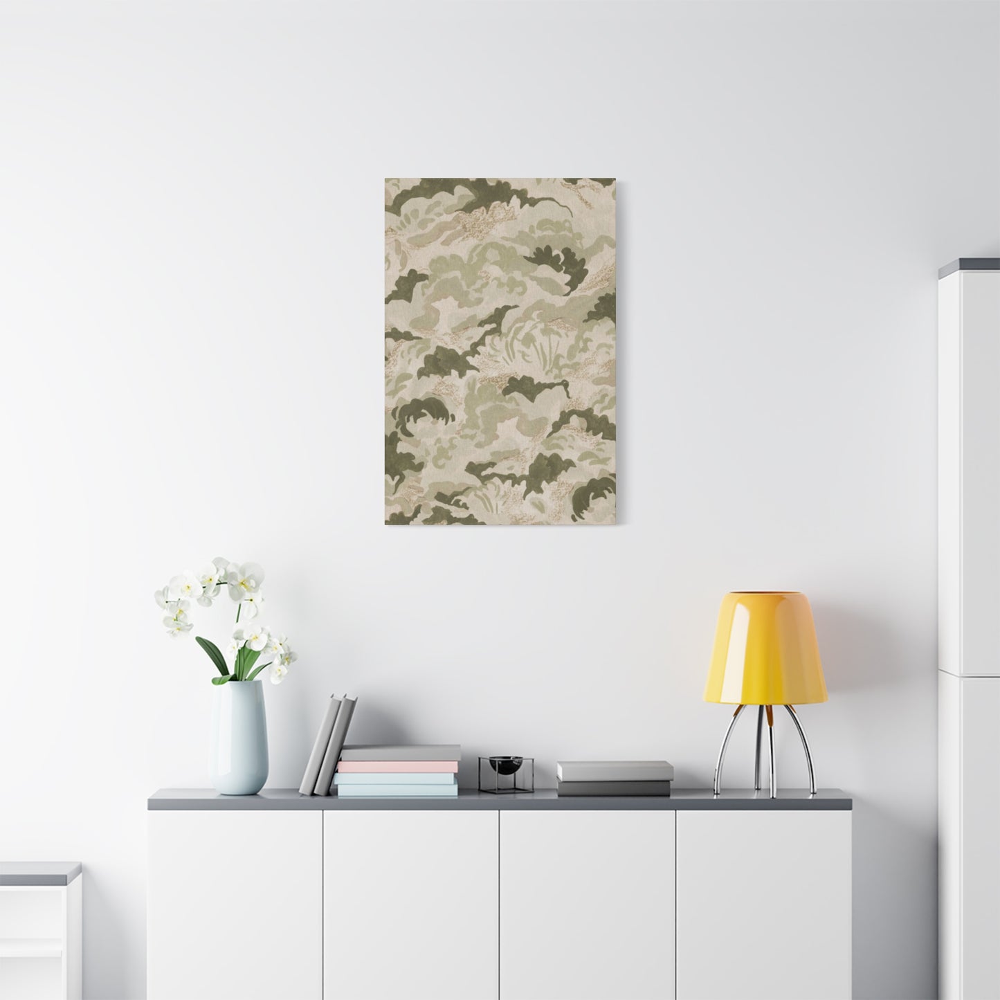
In conclusion, olive green textured wall art combined with earthy patterns offers a sophisticated yet grounded approach to elevating interior styling. This design trend masterfully blends natural tones and tactile elements to create spaces that feel both warm and refined. Olive green, with its rich, organic hue, brings a calming presence that complements a wide range of earthy patterns—from geometric motifs to organic, nature-inspired forms—resulting in a harmonious balance between subtlety and visual interest.
The strength of olive green textured wall art lies not only in its color but also in the depth and dimension it adds to walls. Textured canvases, whether through layered paint, mixed media, or fabric-inspired techniques, invite a tactile experience that draws the eye and encourages closer inspection. When paired with earthy patterns, this textural richness is amplified, creating a dynamic yet soothing visual narrative that enhances the overall ambiance of any room.
Such combinations are highly versatile, fitting seamlessly into various interior styles. Whether your aesthetic leans toward modern bohemian, rustic chic, mid-century modern, or even Scandinavian minimalism, olive green and earthy patterns bring a natural elegance that feels timeless and fresh. These elements work especially well in living rooms, bedrooms, and dining areas, where a connection to nature and a sense of tranquility are desired.
Choosing the right complementary decor is key to maximizing the impact of olive green textured art and earthy patterns. Natural materials such as wood, stone, jute, and linen enhance the organic feel, while metal accents in matte gold or black add contrast and sophistication. Layered textiles like woven rugs, throw pillows, and curtains with subtle patterns echo the wall art’s motifs, creating a cohesive and inviting space.
Lighting also plays a crucial role in showcasing the texture and colors of the artwork. Soft, warm lighting accentuates the dimensional qualities and enriches the olive tones, fostering a cozy and intimate atmosphere. Strategic placement—such as above a sofa, mantelpiece, or console table—ensures the artwork anchors the room while complementing other design elements.
Ultimately, olive green textured wall art paired with earthy patterns is a powerful tool for creating interiors that embody balance, warmth, and refined natural beauty. By thoughtfully integrating these elements into your design, you craft a living environment that not only looks stunning but also feels welcoming and grounded—offering a serene retreat from the bustle of everyday life.
