


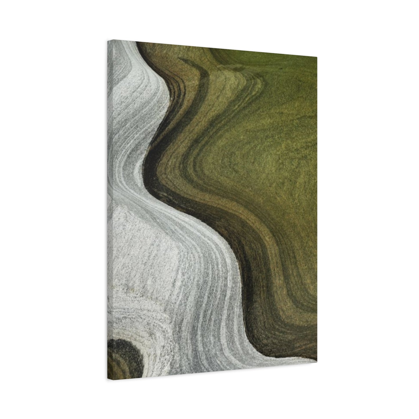
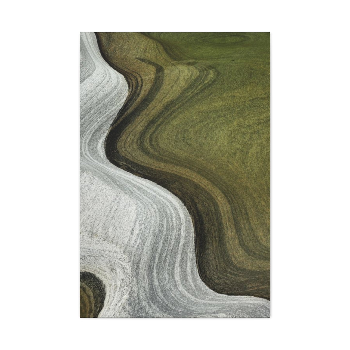
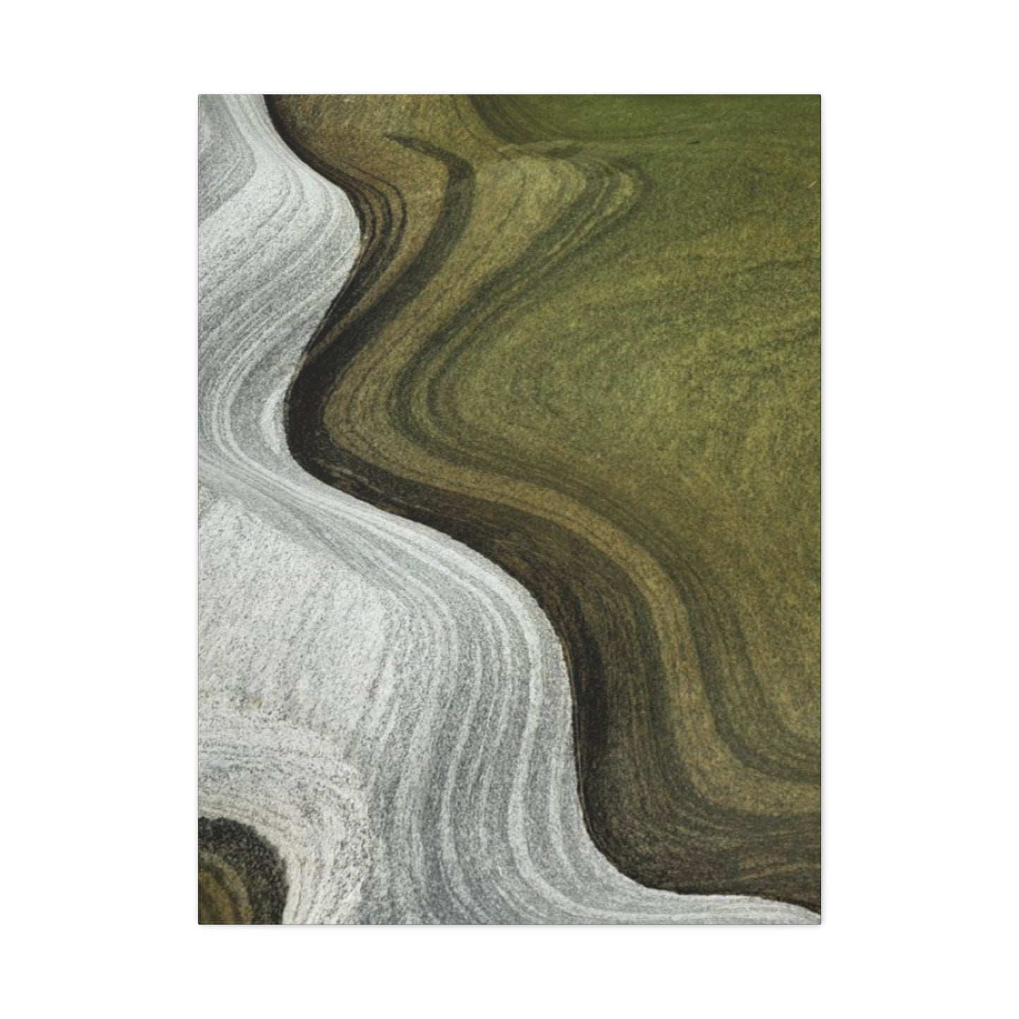
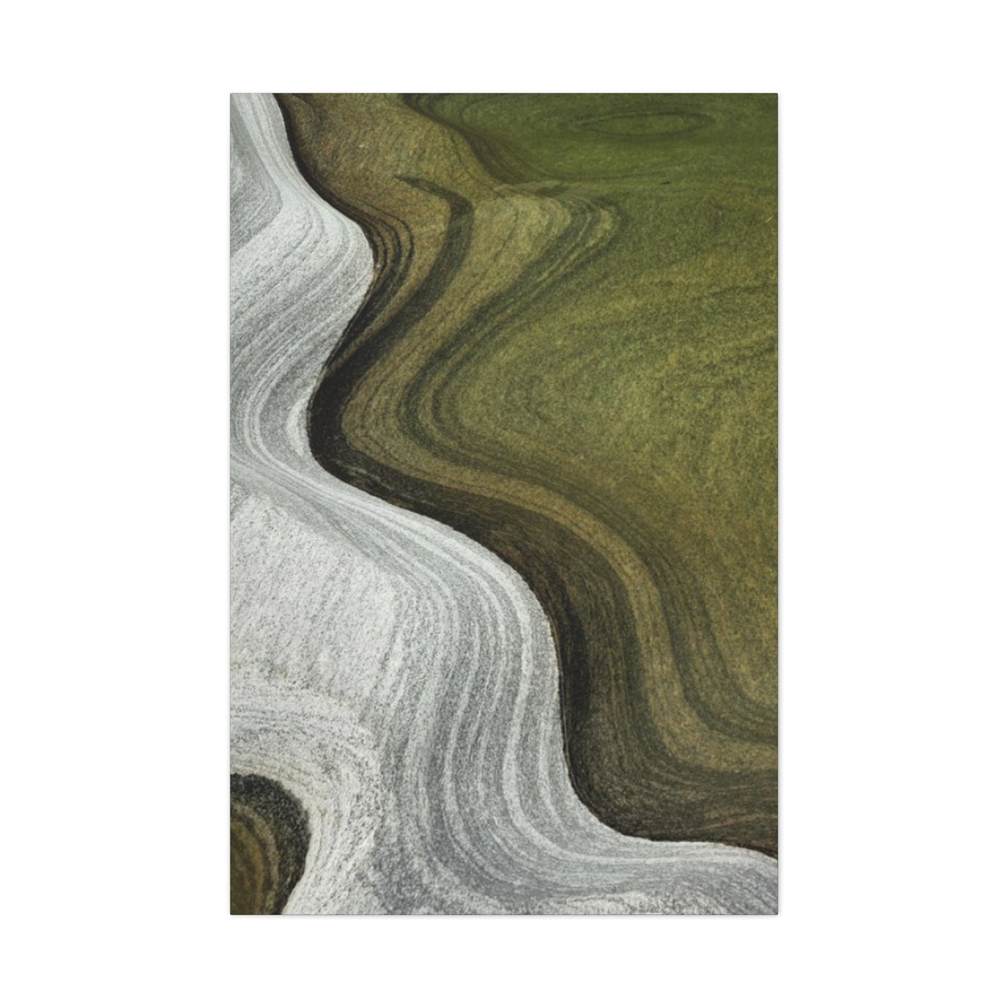
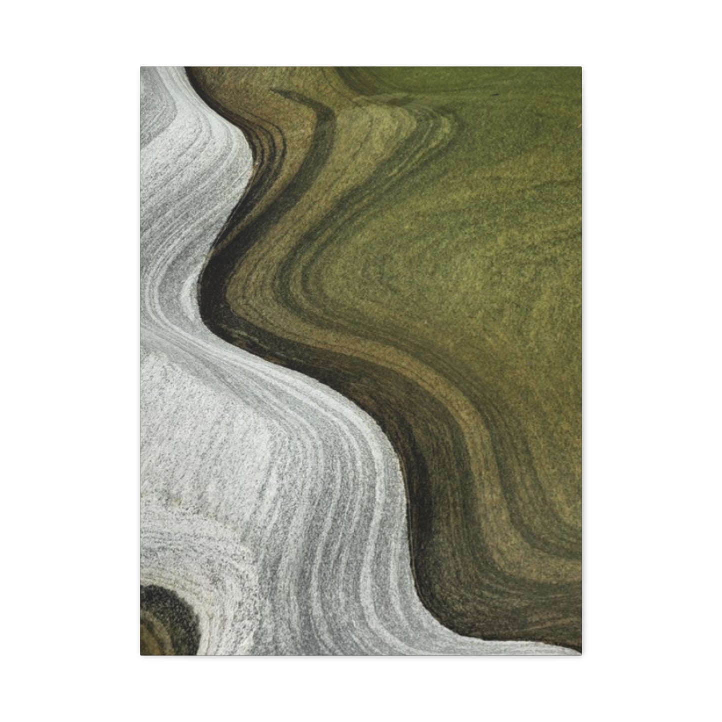
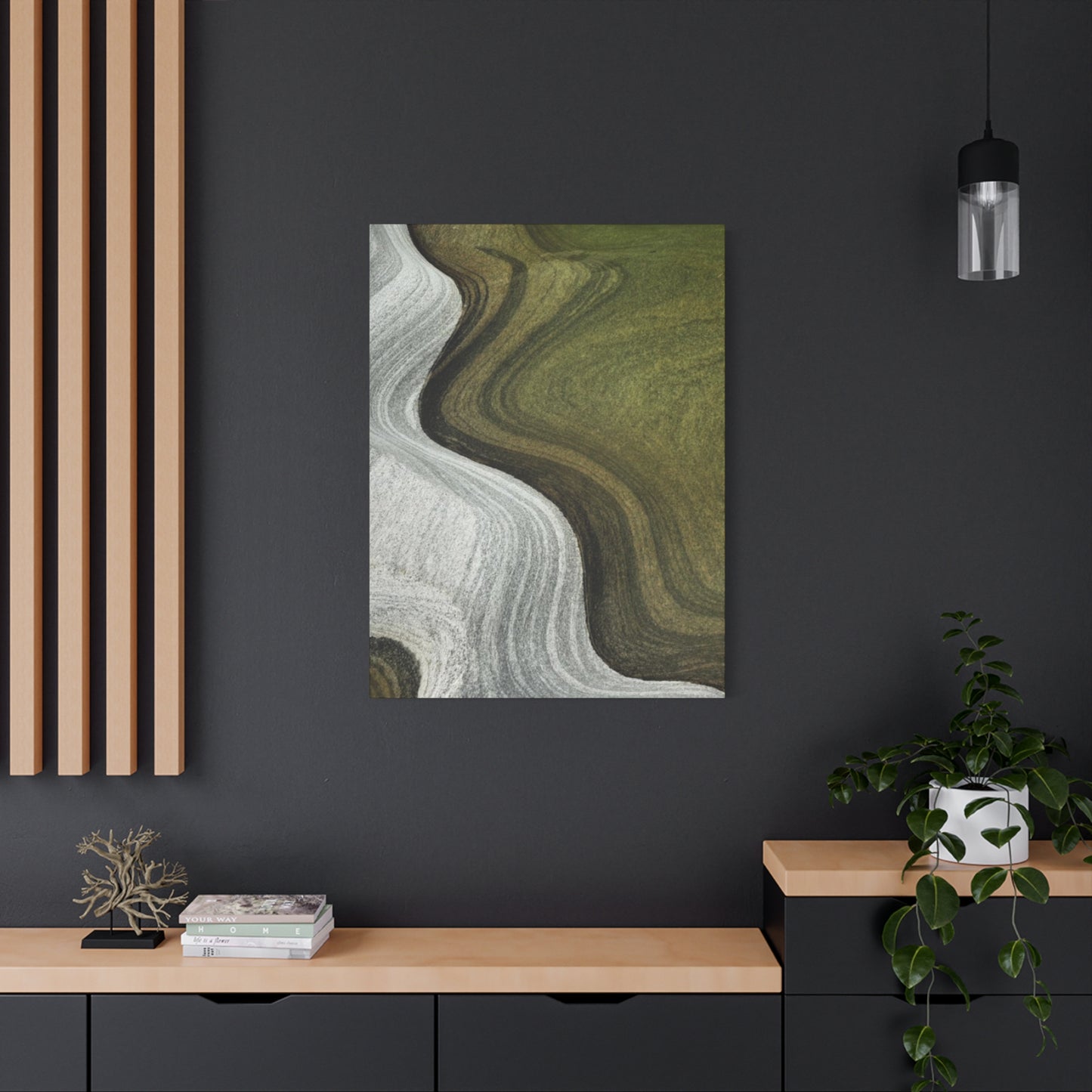
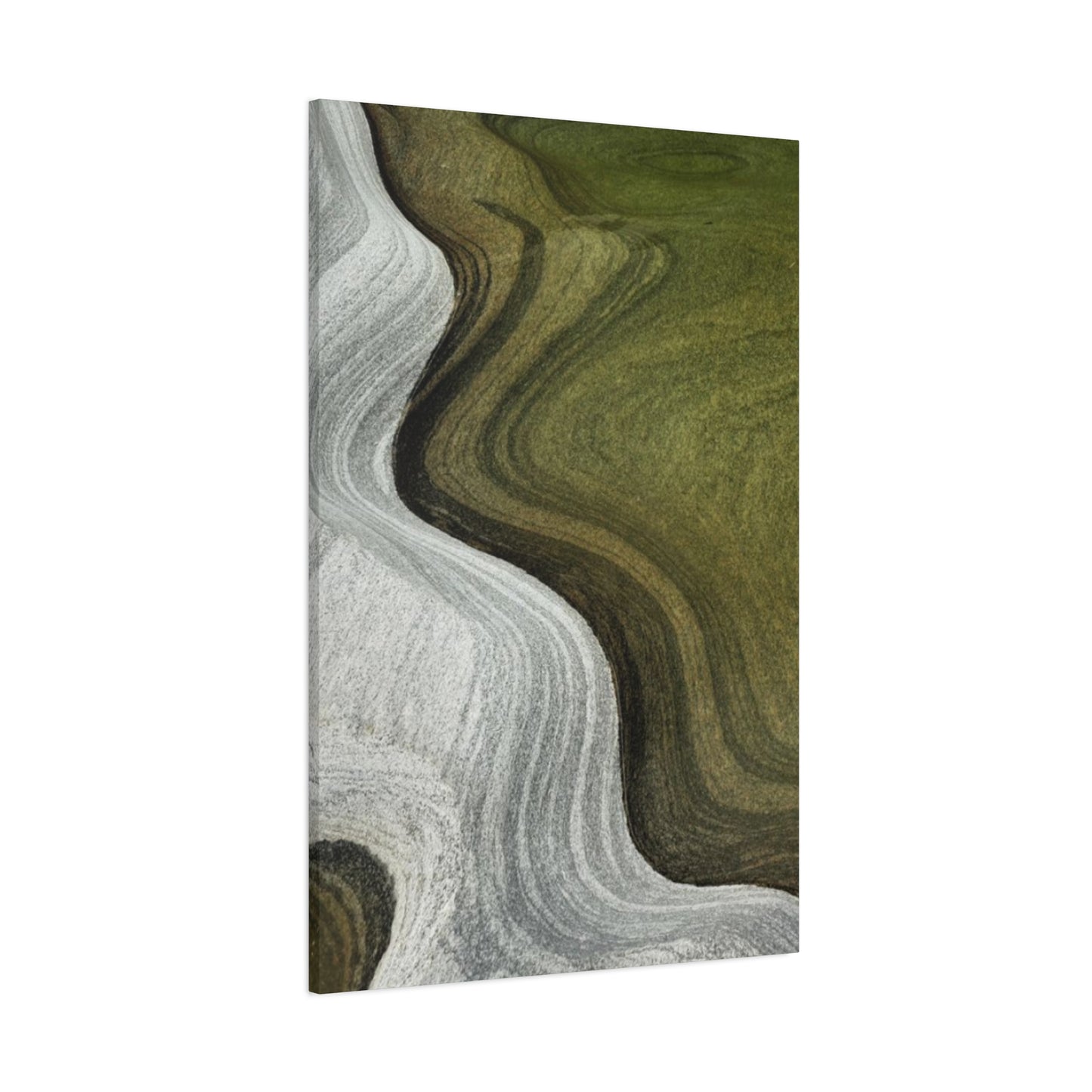
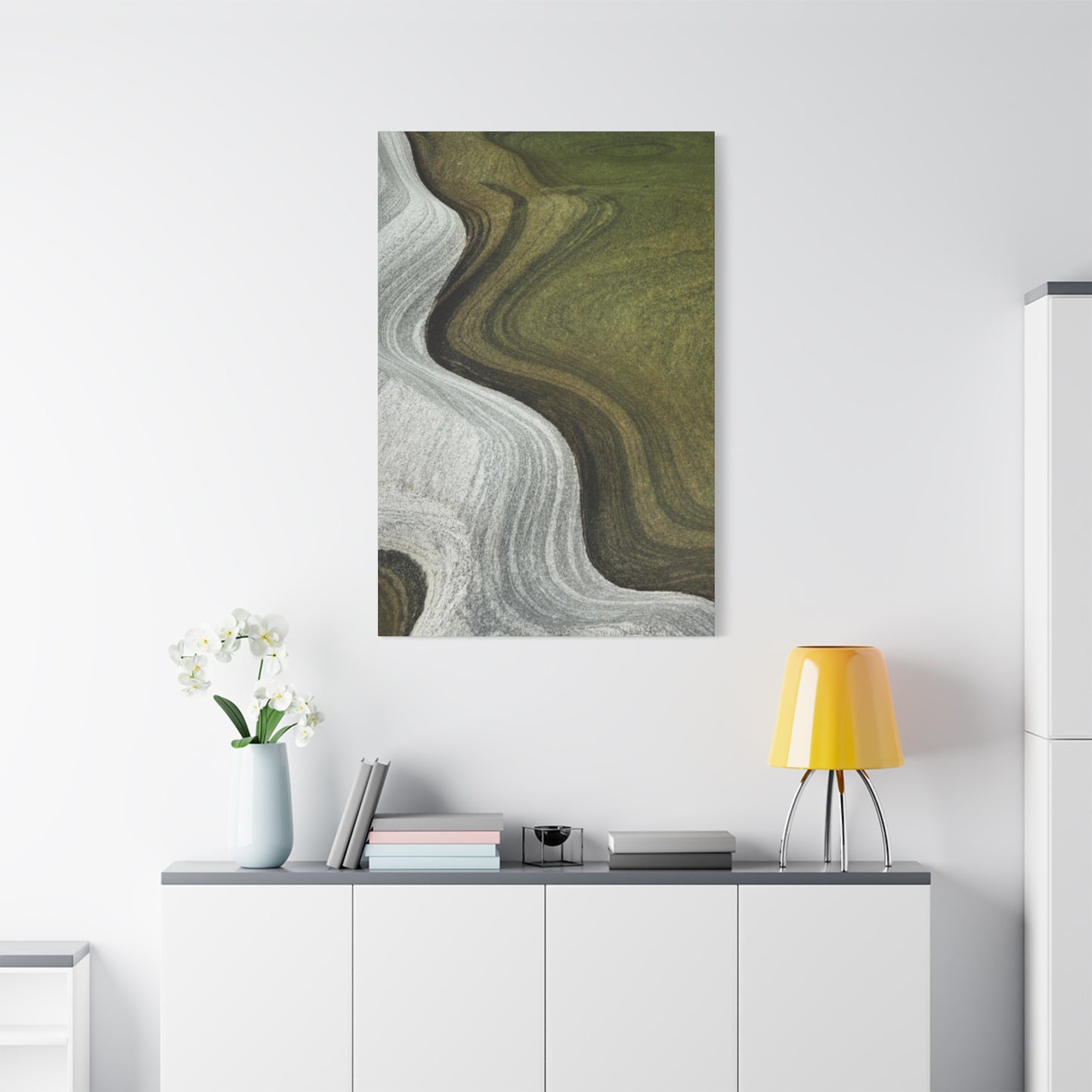
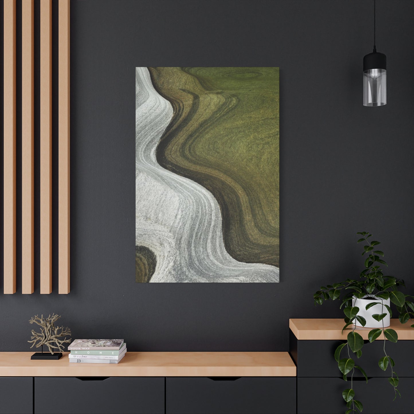
Olive Green & White Waves Wall Art & Canvas Prints
Olive Green & White Waves Wall Art & Canvas Prints
Couldn't load pickup availability
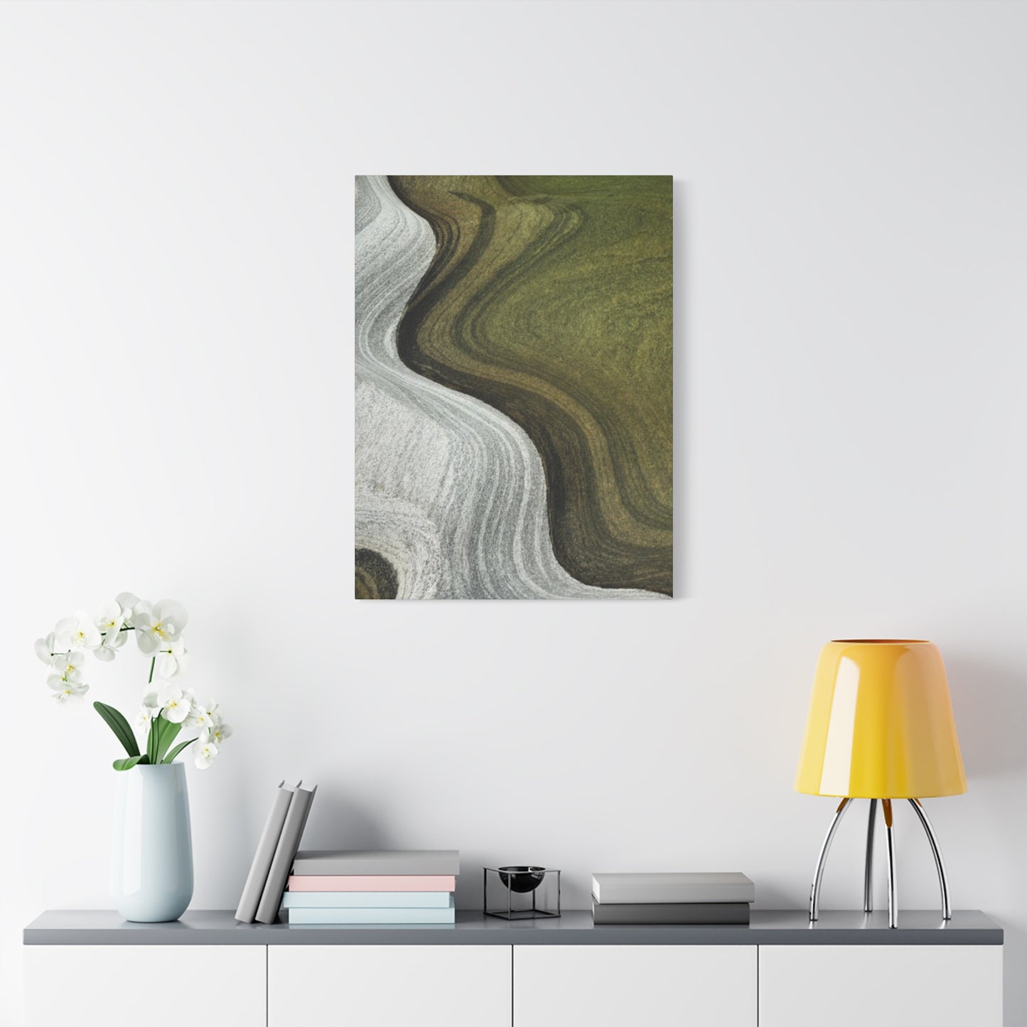
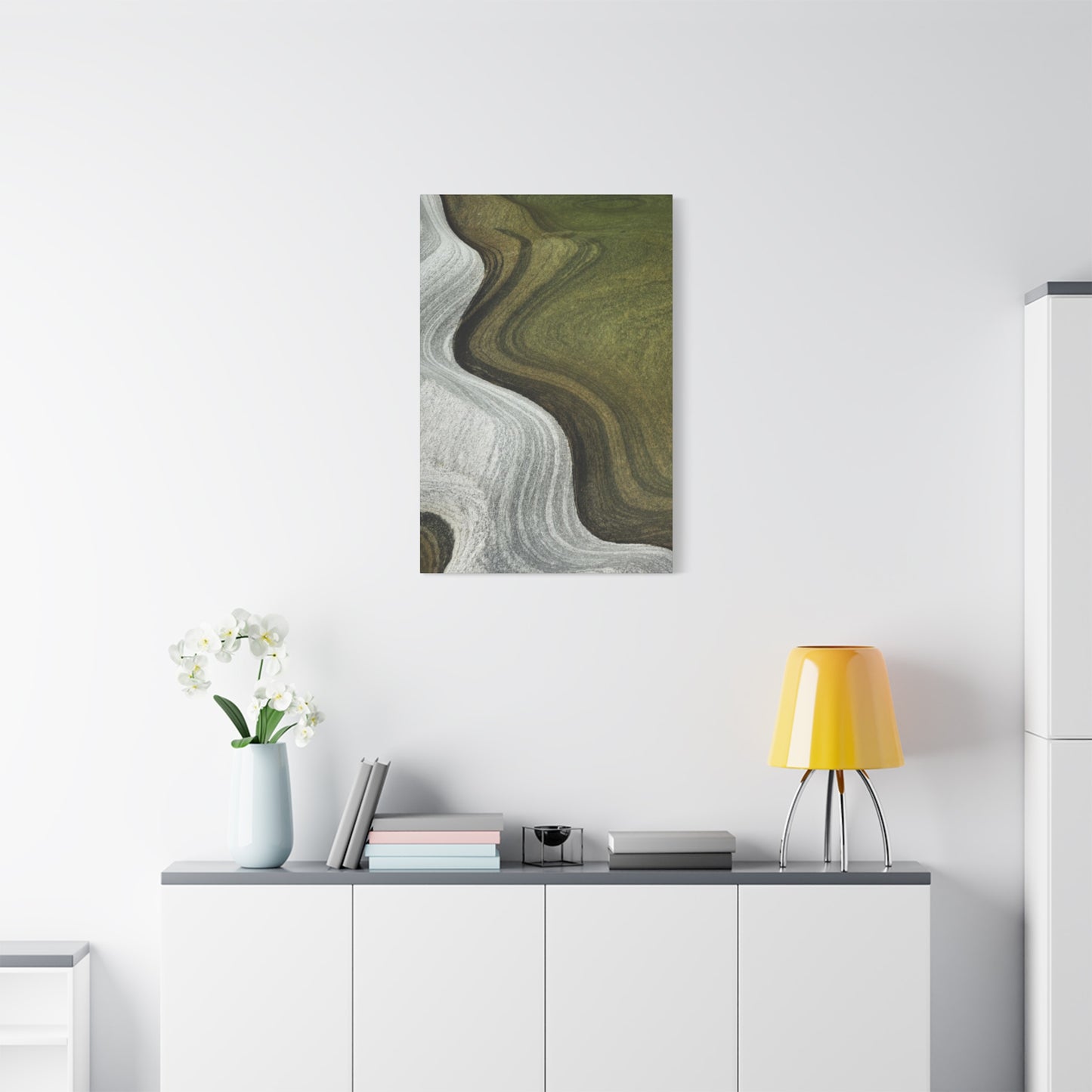
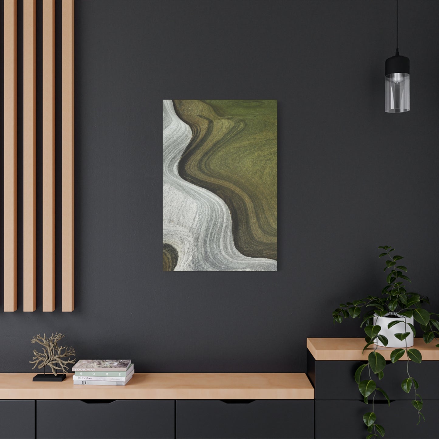

Decorating Your Living Space with Organic Green and Neutral Waves Wall art
The modern interior design landscape has witnessed a remarkable surge in the popularity of wave-inspired artwork, particularly pieces that combine earthy green hues with crisp neutral tones. This artistic movement celebrates the natural beauty of flowing forms while maintaining a sophisticated aesthetic that complements contemporary living spaces. Whether you're drawn to the calming presence of ocean-inspired imagery or simply appreciate the visual harmony of undulating patterns, incorporating wave-themed artwork into your home offers endless possibilities for creating environments that feel both peaceful and stylish.
Wave artwork has transcended traditional maritime themes to become a versatile design element that resonates with diverse aesthetic preferences. The combination of organic green shades with pristine neutral backgrounds creates a visual language that speaks to our innate connection with nature while satisfying our desire for clean, modern design. These pieces serve as more than mere decorative accents; they function as focal points that can transform entire rooms, establishing mood, defining color palettes, and creating visual interest without overwhelming the senses.
The appeal of wave-themed artwork lies in its ability to evoke multiple sensory experiences simultaneously. When we observe flowing patterns in earthy green tones, our minds naturally associate these forms with peaceful natural settings, from rolling hills covered in vegetation to the gentle movement of ocean waters reflecting coastal plant life. This psychological connection makes such artwork particularly effective in spaces where relaxation and tranquility are desired, though their versatility allows them to enhance virtually any room in your home.
Organic Green and Neutral Wave Artwork
The marriage of organic green hues with neutral backgrounds represents a design philosophy that honors both natural beauty and contemporary minimalism. This combination creates artwork that feels simultaneously grounded and ethereal, substantial yet delicate. The green tones bring life and energy to a space, while the neutral elements provide breathing room and prevent visual overwhelm. Together, these colors form a balanced composition that can anchor a room's design scheme or serve as a complementary element within a more complex decorative arrangement.
When selecting pieces that feature this color combination, consider how the specific shade of green interacts with your existing decor. Deeper, more saturated greens create dramatic statements and pair beautifully with rich wood tones and leather furnishings, while lighter, more muted greens offer subtlety and work well in spaces dominated by pale woods and fabric upholstery. The neutral component of these artworks provides flexibility, allowing the piece to integrate seamlessly with various design styles from Scandinavian minimalism to modern farmhouse aesthetics.
The flowing nature of wave patterns adds dynamic movement to static wall spaces, creating visual pathways that guide the eye across the canvas. This sense of motion prevents artwork from feeling flat or lifeless, instead imbuing it with energy that keeps spaces feeling fresh and engaging. The curves and swells of wave forms soften the angular lines common in architectural features and furniture, providing necessary contrast that makes rooms feel more balanced and welcoming. This softening effect is particularly valuable in contemporary spaces that might otherwise feel too rigid or sterile.
Flowing Green Wall Design
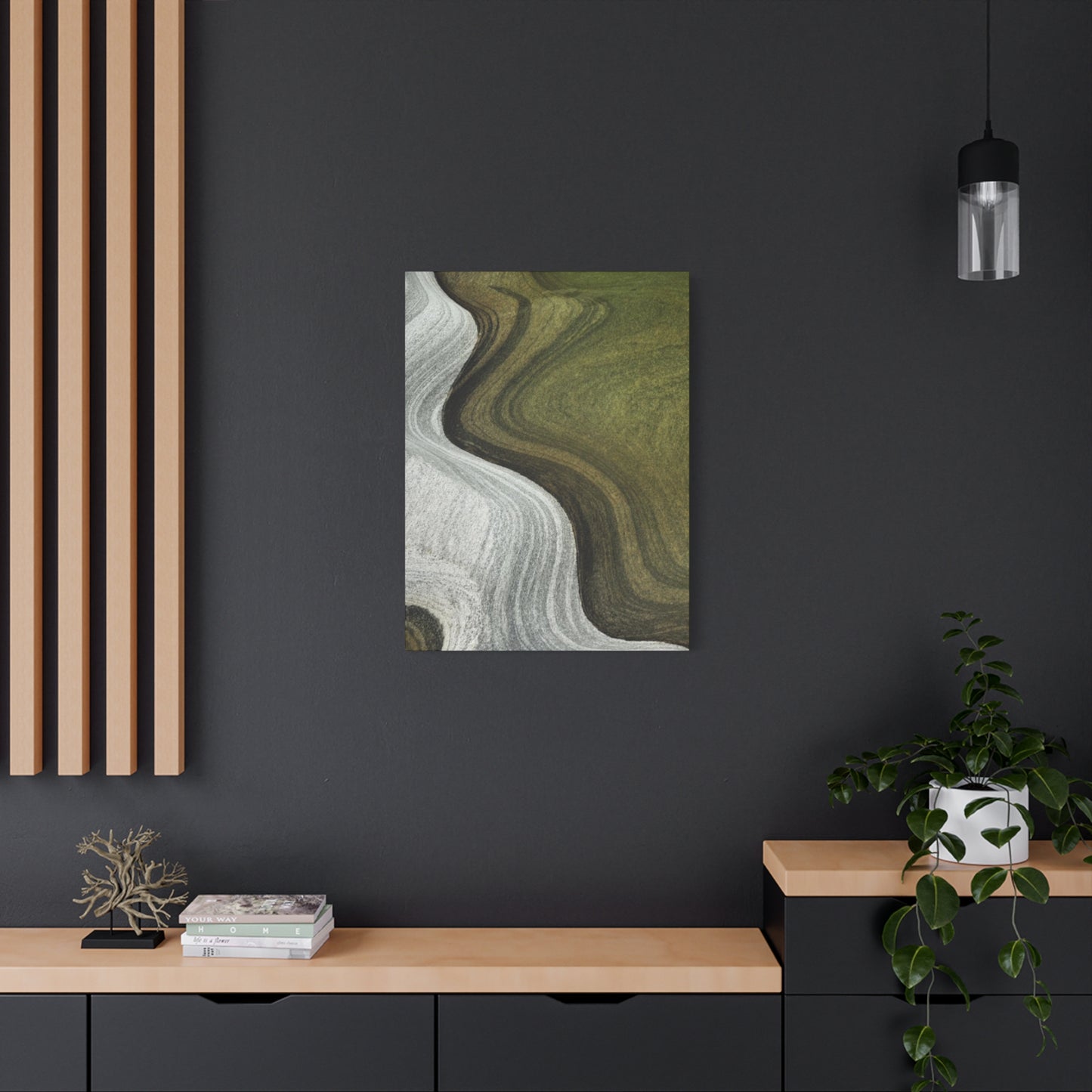
Creating a cohesive wall design around flowing green patterns requires thoughtful consideration of scale, placement, and surrounding elements. Large-scale pieces with prominent wave motifs can serve as commanding focal points, particularly effective above sofas, beds, or dining tables where they can be appreciated from comfortable viewing distances. The flowing nature of these designs naturally draws attention and holds interest, making them ideal candidates for feature wall treatments in living rooms, bedrooms, or home offices where you want to establish a specific aesthetic tone.
When incorporating flowing green wall designs into your space, think about the directional flow of the waves within the artwork. Horizontal wave patterns tend to create a sense of calm and stability, making them excellent choices for bedrooms and meditation spaces. Vertical wave movements can make ceilings appear higher and add elegance to narrow spaces like hallways or entryways. Diagonal flows create dynamic energy and visual excitement, perfect for creative spaces, home gyms, or areas where you want to inspire activity and engagement.
The texture implied by wave patterns adds dimensional interest to walls without requiring actual three-dimensional elements. This textural quality creates depth perception that makes rooms feel larger and more complex. When light hits these artworks at different angles throughout the day, the perceived movement of the waves can change, providing evolving visual interest that keeps your space feeling dynamic. This quality makes flowing green wall designs particularly valuable in rooms with ample natural light, where the interplay between illumination and shadow enhances the artwork's impact.
Serene Waves in Organic Green Tones
Serenity is perhaps the most sought-after quality in modern home design, as our living spaces increasingly serve as sanctuaries from the demands of contemporary life. Wave patterns rendered in organic green tones naturally evoke feelings of peace and tranquility, tapping into deep psychological associations between these colors and calming natural environments. The gentle rise and fall of wave forms mimic the rhythmic patterns found in nature, from breathing to tidal movements, creating subconscious connections that promote relaxation and stress reduction.
The specific shade of green employed in wave artwork significantly influences the emotional response it generates. Sage greens with gray undertones create sophisticated, meditative environments ideal for adult bedrooms and reading rooms. Brighter, more vibrant greens inject energy and vitality while maintaining an overall sense of calm, making them suitable for family rooms and kitchens where you want to encourage both relaxation and social interaction. Deeper forest greens provide grounding stability and work beautifully in home libraries, offices, or any space where concentration and focus are priorities.
Serene wave artwork functions effectively as visual anchors during mindfulness practices and meditation sessions. The flowing patterns provide gentle focal points that help calm racing thoughts without creating distracting complexity. Many people find that incorporating such artwork into dedicated wellness spaces enhances their ability to achieve relaxed, centered mental states. Even in everyday contexts, glancing at these peaceful designs throughout the day can provide micro-moments of calm that accumulate to reduce overall stress levels and improve emotional wellbeing.
Abstract Wave Canvas in Organic Green
Abstract interpretations of wave forms offer artistic freedom that representational artwork cannot match, allowing for creative expressions that push beyond literal ocean imagery. These pieces maintain the essential character of flowing, undulating patterns while incorporating stylistic elements that elevate them into purely artistic territory. The abstraction allows viewers to project their own interpretations and emotional responses onto the artwork, creating more personal and meaningful connections than might develop with straightforward representational pieces.
The organic green palette grounds abstract wave compositions in natural associations while the abstraction prevents them from reading as overtly themed or literal. This balance makes such artwork remarkably versatile, capable of complementing everything from rustic farmhouse interiors to sleek modern lofts. The abstract nature also ensures these pieces won't clash with patterned textiles or other decorative elements, as their non-representational quality allows them to coexist harmoniously with diverse design elements.
When selecting abstract wave canvas art, consider how the level of abstraction aligns with your personal taste and the overall aesthetic of your space. Highly abstract pieces with suggestion of wave forms rather than clear representation work well in contemporary and minimalist settings where they contribute visual interest without competing with clean-lined furniture and architectural features. More moderately abstract pieces that retain recognizable wave characteristics suit transitional spaces that blend traditional and modern elements, providing a bridge between different design vocabularies present in the room.
Nature-Inspired Wave Patterns
Nature has always been humanity's greatest teacher in matters of beauty and design, and wave patterns drawn from natural inspiration carry this wisdom into our living spaces. These designs might reference ocean swells, wind patterns moving across grasslands, the layered topology of hillsides, or the flowing movement of rivers and streams. By bringing these natural patterns indoors, we create environments that feel connected to the broader natural world, satisfying our biophilic needs without requiring extensive incorporation of actual natural materials.
The organic quality of nature-inspired wave patterns creates visual softness that counterbalances the hard surfaces and geometric forms prevalent in built environments. Our eyes and minds find comfort in these natural curves and flows, which lack the precision and rigidity of manufactured elements. This comfort translates into spaces that feel more welcoming and less stressful to inhabit. Research in environmental psychology consistently demonstrates that exposure to natural patterns and forms reduces stress markers and improves overall mood and cognitive function.
Incorporating nature-inspired wave patterns into your decor creates conversation starters that go beyond surface aesthetics. Guests and family members often find themselves drawn to these pieces, prompting discussions about favorite natural settings, travel experiences, or personal connections to outdoor environments. This social dimension adds value beyond the purely visual, making the artwork a catalyst for meaningful interactions and shared experiences. The pieces become repositories of memories and associations that deepen their significance over time.
Motion in Organic Green with Neutral Space
The relationship between positive space and negative space is fundamental to visual art, and wave artwork that balances organic green elements with substantial neutral areas demonstrates sophisticated understanding of this relationship. The green wave forms provide visual weight and interest, while the neutral space offers rest areas for the eye and prevents the composition from feeling crowded or overwhelming. This balance creates artwork that remains engaging through repeated viewing, as the eye can alternate between focusing on the waves themselves and appreciating the shapes created by the space between them.
Motion depicted through organic green tones feels particularly appropriate because green is strongly associated with life, growth, and vitality. When we see movement rendered in green hues, our minds naturally associate this with the constant motion present in living natural systems, from plants responding to wind and sun to the flow of water through vegetated landscapes. This association adds layers of meaning to the artwork beyond its purely formal qualities, making it resonate on both intellectual and emotional levels.
The presence of substantial neutral space within wave compositions serves practical decorative purposes beyond aesthetic considerations. This space provides visual breathing room that prevents walls from feeling too busy, particularly important in smaller rooms or spaces with multiple decorative elements. The neutral areas also offer flexibility in how the artwork interacts with surrounding decor, as these spaces can visually recede or come forward depending on wall color, lighting conditions, and adjacent furnishings. This adaptability makes such pieces valuable long-term investments that can work across different decorative contexts.
Gentle Waves on Canvas
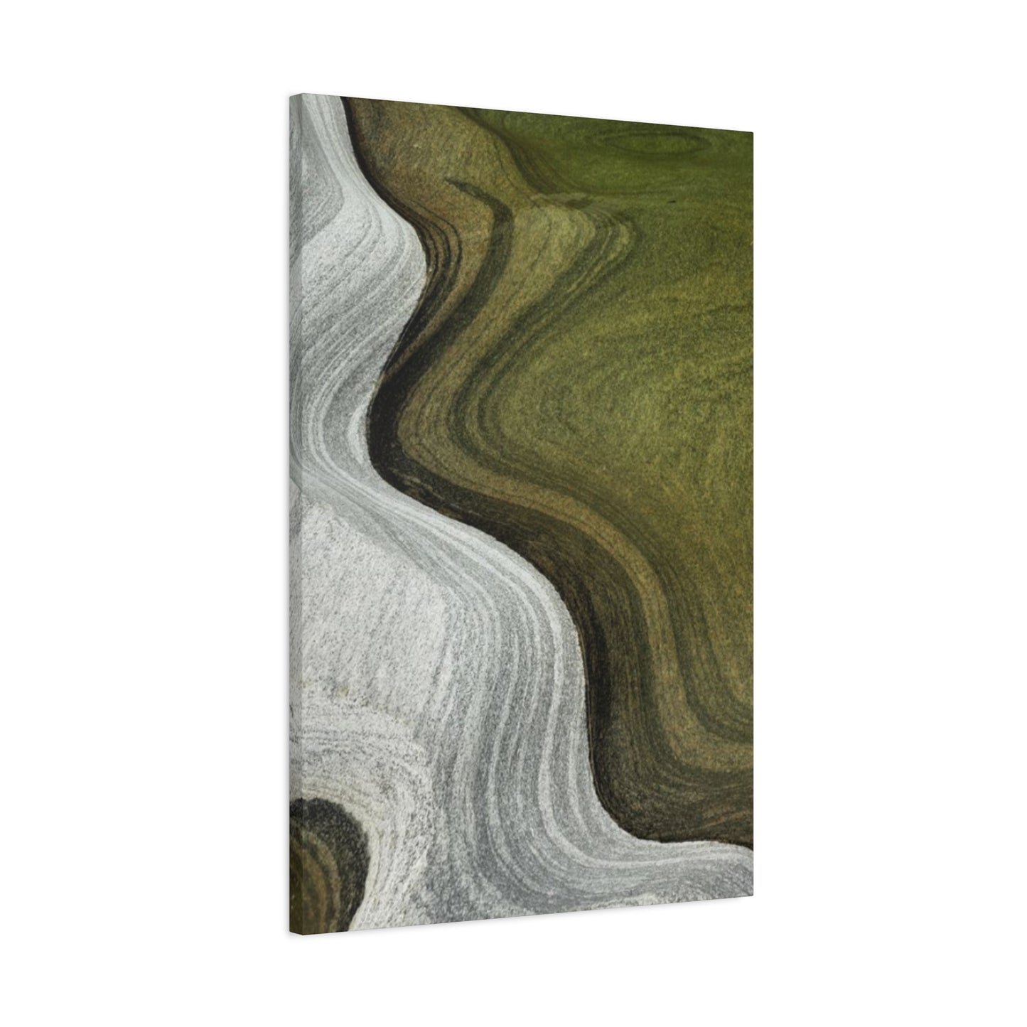
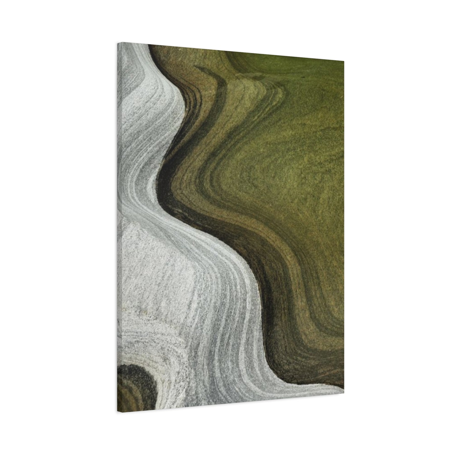
Canvas as a medium brings particular qualities to wave artwork that other surfaces cannot match. The slight texture of canvas adds dimensional interest that interacts beautifully with wave forms, creating subtle variations in how light reflects off the surface. This textural quality enhances the sense of movement within the waves, as the eye perceives slight variations in tone and brightness created by the canvas weave. The result is artwork that feels more dynamic and alive than perfectly smooth surfaces might provide.
Gentleness in wave depiction suggests subtle curves, soft color transitions, and an overall sense of ease and flow. These gentle qualities make such artwork particularly appropriate for private spaces like bedrooms and bathrooms where harsh visual elements would feel inappropriate. The soothing character of gentle waves creates environments conducive to relaxation and self-care, supporting the functional purposes of these spaces while contributing aesthetic value. This alignment between artistic character and spatial function exemplifies thoughtful, intentional design.
The canvas format also offers practical advantages for displaying wave artwork in residential settings. Canvas pieces are typically lighter than framed works under glass, making hanging easier and reducing concerns about wall support capacity. The lack of glass eliminates glare issues that can interfere with viewing artwork in rooms with significant natural light or multiple light sources. Additionally, canvas has a more casual, approachable quality than formal framed pieces, making it particularly well-suited to contemporary and transitional design schemes that value comfort and livability over formality.
Flowing Organic Green Art
Flow as a visual concept encompasses multiple dimensions including directional movement, rhythm, and the relationship between elements within a composition. Artwork that successfully captures flow creates visual pathways that guide the eye through the piece, establishing patterns of viewing that feel natural and satisfying. In organic green pieces, this flow often mimics patterns observed in nature, creating familiar rhythms that resonate with our evolutionary heritage and feel intuitively comfortable to observe.
The organic green palette brings associations of growth, renewal, and vitality to flowing artwork, infusing movement with life force that purely abstract or monochromatic pieces might lack. This color choice transforms flow from mere visual movement into something that feels purposeful and alive, as if the waves depicted are part of living systems rather than static design elements. This quality of aliveness makes such artwork particularly effective in spaces where you want to maintain a sense of energy and vitality, from home offices to exercise areas.
Incorporating flowing organic green art into your home creates opportunities to establish visual rhythms that extend beyond the artwork itself. The colors and patterns in the piece can be echoed in textiles, accent pieces, and even floral arrangements, creating cohesive design schemes that feel intentional and sophisticated. The flow within the artwork can inform furniture placement and traffic patterns, with curves in the artwork balanced by angular furniture arrangements or vice versa. This integration of artwork into broader design thinking elevates decoration from surface treatment to comprehensive environmental design.
Ocean-Inspired Green Waves
Ocean imagery holds universal appeal, tapping into deep associations with vastness, power, mystery, and life itself. When ocean inspiration is filtered through a green palette rather than traditional blues, the result is artwork that feels fresh and unexpected while maintaining connection to aquatic themes. This approach might suggest coastal waters rich with plant life, views of ocean surfaces reflecting green landscapes, or more abstract interpretations that capture oceanic energy and movement without literal representation.
The choice to render ocean-inspired waves in green tones rather than blues creates distinctive artwork that stands out in a crowded marketplace of ocean-themed decor. This color choice prevents the artwork from reading as overtly nautical or themed, allowing it to work in contexts where traditional ocean art might feel too literal or decorative. The green palette also creates more versatile pieces that can complement a wider range of color schemes, from warm earth tones to cool grays and everything in between.
Ocean-inspired artwork carries emotional and psychological benefits beyond its aesthetic contributions. Studies consistently show that viewing ocean imagery reduces stress, lowers blood pressure, and promotes feelings of calm and wellbeing. These effects appear to persist even when the imagery is stylized or abstracted rather than photorealistic, suggesting that our responses operate at a fundamental level that recognizes essential patterns and characteristics rather than requiring literal representation. By bringing ocean-inspired elements into your home, you create daily opportunities to access these beneficial effects without needing to visit actual coastal environments.
Soft Waves with Bold Color
The combination of soft, gentle wave forms with bold, saturated color creates dynamic tension that makes artwork visually compelling. The softness of the waves prevents bold colors from feeling aggressive or overwhelming, while the color intensity ensures the gentle forms don't read as weak or timid. This balance creates pieces with presence and impact that nonetheless maintain the calming, peaceful qualities that make wave art so desirable for residential settings. The result is artwork that commands attention without demanding it, creating focal points that enhance rather than dominate spaces.
Bold organic green tones bring particular energy to wave compositions, suggesting the vibrancy of new growth, the richness of mature forests, or the intensity of certain ocean and coastal environments. These colors inject life and vitality into spaces, making them feel more dynamic and engaging. Unlike pastels or muted tones that recede visually, bold greens come forward, ensuring the artwork maintains presence even in large rooms or when competing with other visual elements. This characteristic makes bold-colored wave art excellent for making statements in spaces where you want artwork to function as a primary design feature.
When incorporating soft waves in bold colors into your decor, consider the emotional temperature you want to create in the space. Bold greens in gentle wave patterns can energize without overstimulating, making them appropriate for spaces ranging from bedrooms to kitchens. The softness of the forms provides visual comfort that balances the intensity of the color, creating artwork that feels both exciting and restful. This duality makes such pieces particularly valuable in multi-purpose rooms where the space needs to support different activities and moods throughout the day.
Swirling Green Wall Accent
Swirling patterns add complexity and visual interest beyond simple wave forms, creating compositions that reward closer inspection and prolonged viewing. These more intricate designs suggest greater movement and energy, with multiple directional flows creating dynamic interactions within the artwork. As wall accents, swirling green pieces create focal points that naturally draw the eye and hold attention, making them effective tools for establishing visual hierarchy within rooms and guiding how spaces are experienced and understood.
The organic green palette grounds swirling patterns in natural associations, preventing them from feeling too abstract or disconnected from familiar visual experience. Swirls in nature appear in everything from water vortices to wind patterns to the arrangement of leaves around plant stems, so these forms register as recognizably natural even in highly stylized interpretations. This natural familiarity makes swirling patterns feel comfortable and appropriate in residential settings, unlike purely geometric or mechanical patterns that might feel cold or institutional.
Swirling green wall accents work particularly well in transitional spaces like entryways, hallways, and stairway landings where people pass through rather than lingering. The energetic quality of swirling patterns suits these active spaces, while the presence of compelling artwork transforms potentially neglected areas into interesting parts of the home. The movement within swirling designs also mirrors the physical movement of people through these spaces, creating harmony between the artwork and the spatial function. This alignment of visual and functional elements demonstrates sophisticated design thinking that elevates ordinary spaces into intentional, well-considered environments.
Contemporary Wave Art Print
Contemporary art embraces current aesthetic sensibilities, technical innovations, and cultural contexts, creating work that speaks to present-day viewers in relevant, resonant ways. Wave patterns interpreted through contemporary lenses incorporate modern color theories, current design trends, and production techniques that distinguish them from traditional or historical approaches to similar subjects. These pieces feel current and fresh, avoiding the dated quality that can make older art styles feel inappropriate in modern interiors.
Print technology has revolutionized art accessibility, allowing high-quality reproductions of original works to reach broader audiences at affordable price points. Contemporary wave art prints leverage advanced printing techniques that capture subtle color gradations, fine details, and textural qualities that earlier reproduction methods could not achieve. The result is artwork that maintains artistic integrity and visual impact while remaining accessible to people across various budget ranges. This democratization of art allows more people to create personally meaningful, aesthetically sophisticated living environments.
When selecting contemporary wave art prints, consider edition size and print quality alongside aesthetic factors. Limited edition prints retain more collectible value than open editions, though both can serve decorative purposes equally well. High-quality giclée prints on archival paper or canvas offer longevity and color stability that ensures your artwork will look beautiful for years to come. Understanding these technical considerations helps you make informed choices that balance immediate aesthetic appeal with long-term satisfaction and value retention.
Coastal Calm in Organic Green Tones
Coastal environments evoke powerful associations with relaxation, vacation, and escape from daily pressures. Artwork that captures coastal calm brings these associations into your home, creating spaces that feel like retreats even when you're managing everyday responsibilities. The use of organic green tones rather than traditional coastal blues creates a fresh interpretation that references coastal vegetation, algae-tinted waters, or the interplay of land and sea rather than pure ocean imagery. This approach feels more sophisticated and less thematically obvious than conventional coastal decor.
The calming effects of coastal imagery are well-documented in environmental psychology research, with studies showing that even simulated coastal environments can reduce stress and promote recovery from mental fatigue. By incorporating coastal calm artwork into your living spaces, you create readily available sources of these beneficial effects. Glancing at peaceful coastal scenes throughout the day provides mini mental breaks that can help manage stress accumulation and maintain emotional equilibrium during challenging periods.
Organic green tones in coastal artwork create connections to specific coastal environments that differ from typical beach scenes. These might suggest marshlands, coastal forests, rocky shorelines covered in seaweed, or tidal pools rich with plant life. These less commonly depicted coastal environments offer richness and specificity that generic beach imagery cannot match, creating more interesting and personally meaningful artwork. The specificity also makes such pieces excellent conversation starters, as people often enjoy sharing their own experiences with diverse coastal ecosystems.
Linear Neutrals with Organic Green Depth
The interplay between linear elements and organic forms creates visual tension that keeps artwork engaging and prevents it from settling into predictable patterns. Neutral lines provide structure and order while organic green depth suggests complexity and natural irregularity. This combination appeals to people who appreciate both organization and spontaneity, offering artwork that satisfies multiple aesthetic preferences simultaneously. The lines guide viewing and create compositional framework, while the depth in green tones provides richness that rewards closer examination.
Depth in artwork creates dimensional illusion that makes two-dimensional surfaces feel three-dimensional, adding sophistication and interest to wall displays. Organic green tones are particularly effective for creating depth because our eyes naturally perceive color value changes as dimensional information. Darker greens recede while lighter ones advance, allowing artists to create complex spatial relationships within flat compositions. This dimensional quality makes rooms feel larger and more complex, as the eye perceives additional depth beyond the physical wall surface.
Linear elements in neutral tones provide rest areas within compositions that might otherwise feel too complex or visually demanding. These lines create pathways for the eye to follow, establishing viewing patterns that make artwork easier to process and understand. The neutrality of these lines ensures they support rather than compete with the organic green elements, maintaining clear hierarchical relationships within the composition. This thoughtful balance between different formal elements demonstrates artistic sophistication that elevates decorative artwork into pieces worthy of serious aesthetic consideration.
Wavy Patterns for Modern Walls
Modern interior design emphasizes clean lines, functional beauty, and uncluttered spaces that support contemporary lifestyles. Wavy patterns bring organic movement into modern contexts without introducing the busy complexity that would contradict modern design principles. The flowing nature of waves softens modern interiors that might otherwise feel too stark or rigid, providing necessary visual relief while maintaining overall aesthetic coherence. This balancing act makes wavy patterns valuable tools for humanizing modern spaces and making them feel more livable and welcoming.
The specific characteristics of wavy patterns that work best in modern settings differ from those appropriate for traditional or eclectic interiors. Modern spaces benefit from wavy patterns with clear, defined edges rather than soft, blurred transitions. The waves should feel intentional and controlled rather than random or chaotic, reflecting the purposefulness valued in modern design thinking. Color palettes should be limited and sophisticated, avoiding the multicolor complexity that suits other design styles but would feel inappropriate in modern contexts.
Incorporating wavy patterns into modern walls requires attention to scale and placement. Oversized patterns make bold statements appropriate for feature walls in living rooms or bedrooms, while smaller-scale patterns work well in more intimate spaces or as parts of gallery wall arrangements. The waves should relate proportionally to the room size and ceiling height, with larger spaces accommodating bigger, more dramatic patterns while smaller rooms benefit from more modest scales. This attention to proportional relationships demonstrates design sophistication that separates thoughtful decoration from arbitrary artwork placement.
Fluid Forms in Organic Green Canvas
Fluidity as a visual quality suggests ease of movement, lack of resistance, and natural grace. Artwork that captures fluid forms creates a sense of effortless beauty that makes spaces feel calm and harmonious. The organic green palette emphasizes the natural character of these fluid forms, suggesting water, plant growth patterns, wind movements, or other natural phenomena characterized by smooth, unimpeded flow. This naturalness prevents fluid artwork from feeling too abstract or disconnected from human experience, keeping it accessible and emotionally resonant.
Canvas as a substrate for fluid artwork provides textural richness that enhances the sense of movement within the piece. The slight tooth of canvas creates micro-variations in how paint or ink adheres and how light reflects off the surface, adding visual complexity that makes the artwork more engaging through repeated viewing. These subtle variations suggest the complexity present in actual fluid movements, where no two moments are exactly identical and where small-scale turbulence adds interest to larger flow patterns.
Fluid forms in organic green canvas artwork work particularly well in spaces where you want to encourage relaxation and release of tension. The visual ease of fluid movements can help viewers mentally release their own holding patterns and stress responses, promoting physical and emotional relaxation. This makes such artwork valuable in bedrooms, bathrooms, meditation spaces, and anywhere else you want to support unwinding and recovery from daily demands. The presence of compelling artwork transforms these functional spaces into intentional environments designed to support wellbeing.
Organic Green Breeze Wall Art
Breeze suggests gentle, comfortable movement that refreshes without overwhelming. Artwork capturing this quality creates a sense of airiness and lightness that makes spaces feel more open and comfortable. The organic green palette suggests breezes moving through vegetated landscapes, carrying the scent and visual movement of plant life. This specificity creates richer associations than generic movement patterns, connecting viewers to memorable sensory experiences and natural environments they've encountered or imagined.
The visual representation of breeze in artwork requires careful balance between suggesting movement and maintaining compositional stability. Too much movement can feel chaotic or unsettling, while too little fails to capture the essential character of breeze. Successful breeze artwork achieves this balance through thoughtful manipulation of line weight, color intensity, and compositional rhythm. The result is pieces that feel dynamic without being restless, active without being agitated.
Organic green breeze wall art brings particular benefits to rooms that lack actual air circulation or windows, helping these spaces feel less stuffy and enclosed. The suggested movement in the artwork creates psychological impressions of airflow that can make enclosed spaces feel more comfortable and pleasant to inhabit. This effect makes breeze-themed artwork valuable for interior rooms, basements, or any space where physical limitations prevent optimal ventilation and natural light access. The artwork cannot replace actual air quality improvements, but it can make spaces feel more welcoming while you work on environmental upgrades.
Soothing Movement in Green
Movement in artwork prevents it from becoming static and boring, but not all movement is equally appropriate for residential settings. Soothing movement suggests gentle, predictable patterns that feel comfortable rather than startling or disruptive. Green tones enhance this soothing quality through their associations with nature, growth, and renewal. The combination creates artwork that maintains visual interest through movement while supporting the peaceful atmospheres most people want in their homes.
The psychological effects of soothing movement in artwork are well-documented, with studies showing that viewing gentle, rhythmic patterns can reduce heart rate, lower blood pressure, and promote relaxed mental states. These effects make such artwork particularly valuable in our stress-filled modern world, where opportunities for genuine relaxation are increasingly precious. By creating home environments that support rather than undermine relaxation, we protect our health and wellbeing while making our living spaces more enjoyable to inhabit.
Soothing movement in green artwork can be incorporated throughout the home rather than being limited to traditional relaxation spaces. Kitchen artwork with gentle movement can make meal preparation feel more meditative and pleasant, while similar pieces in home offices can provide visual breaks that help prevent screen fatigue and mental exhaustion. Even high-traffic areas like hallways benefit from soothing artwork that helps regulate household energy and prevents spaces from feeling too chaotic or overwhelming. This holistic approach to artwork placement creates more cohesive, supportive living environments.
Earthy Waves with Elegant Look
Earth tones ground artwork in natural associations while suggesting stability, comfort, and authenticity. Wave patterns rendered in earthy green tones combine these grounding qualities with the movement and dynamism that make wave art engaging. The addition of elegant design elements elevates these pieces beyond casual decoration into artwork that feels sophisticated and refined. This combination appeals to people who want their homes to feel both comfortable and stylish, achieving the difficult balance between approachability and sophistication.
Elegance in artwork comes from restraint, careful composition, and attention to refined details rather than from elaborate decoration or complex execution. Earthy wave artwork achieves elegance through simple color palettes, clean lines, and balanced compositions that demonstrate artistic discipline and thoughtfulness. The earth-toned greens provide richness without gaudiness, while the wave forms add interest without busyness. This restrained approach creates timeless artwork that won't feel dated as design trends evolve.
Incorporating earthy waves with elegant aesthetics into your home creates environments that feel simultaneously grounded and aspirational. The earth tones keep spaces feeling comfortable and livable, while the elegant execution demonstrates your appreciation for beauty and quality. This combination works across various design styles from modern farmhouse to contemporary traditional, making such artwork versatile investments that can transition through different decorative phases. The timeless quality of elegant, earthy design ensures these pieces will remain relevant and beautiful for years to come.
Green Wave Wall Statement
Statement artwork serves as the primary visual focus within a space, anchoring the room's design scheme and establishing its aesthetic character. Wave patterns in bold green tones make excellent statement pieces because they combine visual impact with versatility. The waves provide dynamic interest that commands attention, while the green palette works with diverse color schemes and design styles. Unlike highly specific or literal imagery that might limit decorative flexibility, wave statements pieces enhance without constraining your broader design choices.
Creating effective wall statements requires understanding of scale, placement, and compositional impact. Statement pieces should be appropriately sized for their spaces, generally filling sixty to seventy-five percent of the wall area they occupy. Placement should consider viewing distances and angles, with artwork positioned at heights that allow comfortable viewing from primary seating or standing positions. The composition should be strong enough to hold its space without becoming overwhelming or visually exhausting through prolonged exposure.
Green wave wall statements work particularly well in neutral or minimally decorated spaces where they can serve as the primary source of color and visual interest. The green introduces natural vitality while the wave forms add movement and dynamism that prevent neutral spaces from feeling flat or boring. This approach allows you to maintain the clean, uncluttered aesthetic many people desire while avoiding the coldness or sterility that can result from overly minimal decoration. The result is spaces that feel both calm and alive, sophisticated and welcoming.
Soft Motion in Abstract Style
Abstract art frees viewers from literal interpretation, allowing personal responses and associations to shape how pieces are experienced and understood. When abstract artwork incorporates soft motion through wave-like forms, it creates accessible entry points into abstraction that might otherwise feel too conceptual or removed from everyday experience. The motion provides visual interest and compositional structure, while the softness ensures the artwork feels inviting rather than challenging or confrontational.
The abstract style allows wave artwork to transcend specific natural references, becoming more about essential qualities of movement, rhythm, and flow than about representing particular environments or phenomena. This universality makes abstract wave art remarkably versatile, capable of working in contexts ranging from beach houses to mountain cabins to urban apartments. The lack of specific reference points prevents the artwork from feeling thematically mismatched with its surroundings, allowing it to adapt to diverse settings.
Soft motion in abstract style creates artwork that supports multiple viewing experiences and interpretations. Initial encounters might focus on overall composition and color impact, while subsequent viewings reveal subtler details and relationships. This depth ensures the artwork remains engaging over time rather than exhausting its interest through a few viewings. The abstract nature also allows the artwork to evolve in meaning as your own life experiences and perspectives change, making it a dynamic presence in your home rather than a static decoration.
Color Psychology in Wave Artwork
Understanding color psychology helps explain why certain artwork resonates emotionally while other pieces leave us unmoved. Green occupies a special place in color psychology, associated with balance, harmony, growth, and renewal. These associations stem from green's prevalence in natural environments where it signals healthy vegetation and life-sustaining resources. When we encounter green in artwork, these deep associations activate automatically, influencing our emotional responses and physiological states even when we're not consciously aware of the effects.
The specific shade of green employed in wave artwork significantly influences its psychological impact. Bright, vibrant greens stimulate energy and vitality, making viewers feel more alert and engaged. These shades work well in spaces where you want to encourage activity and social interaction. Muted, grayed greens promote calm and contemplation, ideal for bedrooms and meditation spaces. Deep forest greens suggest stability and grounding, excellent for studies and workspaces where focus is required. Understanding these distinctions allows you to select artwork that supports the functional and emotional purposes of different rooms.
Neutral colors partnered with green in wave artwork provide balance that prevents green from becoming overwhelming or monotonous. White creates clean, fresh feelings and enhances perceptions of spaciousness. Grays add sophistication and prevent excessive brightness that might feel uncomfortable in some settings. Beiges and tans warm compositions and strengthen connections to earth and natural materials. The interplay between green and various neutrals creates complex emotional responses that make artwork feel richer and more satisfying than single-color pieces might achieve.
Selecting the Right Size for Your Space
Artwork sizing represents one of the most common mistakes in home decoration, with pieces frequently too small for their intended spaces. Undersized artwork creates scattered, incomplete feelings rather than cohesive design impact. As a general rule, artwork should fill sixty to seventy-five percent of the wall space it occupies, creating sufficient presence without overwhelming the room. For pieces hung above furniture, width should be two-thirds to three-quarters of the furniture width to create balanced proportions.
Ceiling height significantly influences appropriate artwork sizing, with standard eight-foot ceilings accommodating different proportions than nine or ten-foot heights. Higher ceilings allow for taller artwork or vertical arrangements that draw the eye upward, making rooms feel even more spacious. Standard ceiling heights benefit from horizontal orientations that emphasize room width rather than competing with limited vertical space. Understanding these relationships helps you select artwork that enhances rather than fights your room's natural proportions.
Consider viewing distances when selecting artwork sizes, as pieces meant to be viewed from across large rooms require different scaling than artwork in intimate spaces. Living room artwork viewed from twelve to fifteen feet away needs to be substantially larger than bedroom pieces typically viewed from six to eight feet. Detail level should also vary with viewing distance, with more intricate compositions reserved for closer viewing distances where details remain visible and appreciable. This attention to viewing context ensures your artwork creates optimal impact in its specific location.
Creating Gallery Walls with Wave Art
Gallery walls allow creative expression through curated collections of multiple artworks arranged in cohesive compositions. When building gallery walls around wave artwork, consider how individual pieces relate to each other in terms of color, style, and movement direction. Repetition of the wave motif creates thematic unity while variations in scale, color intensity,
Retry
M
Continue
Edit
and composition prevent monotony. The result is wall displays that feel intentional and sophisticated rather than random or haphazard.
Successful gallery wall arrangements balance symmetry and asymmetry to create visual interest without chaos. Perfectly symmetrical arrangements can feel too rigid and formal for most residential settings, while completely asymmetrical compositions risk feeling disorganized. A middle approach uses loose symmetry where elements balance visually without being mirror images. For wave artwork, this might mean placing larger pieces on alternating sides of a central axis while maintaining overall equilibrium through color distribution and visual weight.
When incorporating wave artwork into gallery walls, consider the negative space between pieces as carefully as the artwork itself. Consistent spacing creates order and prevents the display from feeling cluttered, with two to four inches between frames being standard for most residential applications. The outer edges of the gallery wall should align with furniture or architectural features to create clear boundaries that make the arrangement feel purposeful rather than arbitrary. Templates made from craft paper allow you to experiment with arrangements before committing to nail holes, saving time and preventing wall damage from trial and error.
Pairing Wave Art with Furniture Styles
The relationship between artwork and furniture significantly influences overall room aesthetics, with successful pairings creating harmony while unsuccessful combinations generate visual discord. Wave artwork in organic green tones demonstrates remarkable versatility, working with furniture styles ranging from mid-century modern to contemporary farmhouse. The key lies in identifying shared characteristics between the artwork and furniture that create visual bridges connecting these elements into cohesive compositions.
Mid-century modern furniture with its clean lines and organic forms pairs beautifully with wave artwork, as both celebrate natural shapes and minimal ornamentation. The warm wood tones common in mid-century pieces complement organic greens, while the furniture's low profiles prevent visual competition with wall-mounted artwork. Tapered legs and curved forms in mid-century furniture echo the flowing movements in wave art, creating stylistic consonance that makes spaces feel thoughtfully designed rather than arbitrarily decorated.
Contemporary furniture characterized by neutral colors and streamlined forms provides perfect backdrops for wave artwork to shine. The furniture's restraint allows the artwork to serve as the primary source of color and visual interest, creating clear focal points and design hierarchy. Upholstered pieces in light grays, beiges, or whites won't compete with green-toned artwork, while the clean lines of contemporary furniture complement rather than clash with organic wave forms. This combination creates sophisticated interiors that feel current and stylish without being trendy or likely to date quickly.
Traditional furniture with its richer ornamentation and darker woods can successfully incorporate wave artwork when the pieces share organic qualities. Look for traditional pieces with curved elements, carved details inspired by natural forms, or wood grains that echo wave-like patterns. Deeper green tones in the artwork coordinate better with dark woods than lighter shades, creating color relationships that feel intentional rather than coincidental. The contrast between traditional furniture's formal character and wave artwork's flowing nature creates dynamic tension that adds interest to spaces that might otherwise feel too uniform in style.
Lighting Considerations for Wave Artwork
Lighting dramatically affects how artwork appears, with the same piece looking vastly different under various lighting conditions. Natural light changes throughout the day, altering color perception and creating moving shadows that can enhance or detract from artwork's impact. Morning light tends toward cooler tones that can make organic greens appear more blue-tinged, while afternoon and evening light warms colors and intensifies green's yellow undertones. Understanding these shifts helps you predict how artwork will appear during different times when you'll be using the space.
Artificial lighting offers more control but requires careful selection to properly illuminate artwork without distorting colors or creating glare. LED technology has revolutionized art lighting, offering adjustable color temperatures that can be tuned to display artwork optimally. Warm white LEDs around 2700-3000K enhance the cozy, inviting qualities of organic greens, while neutral white around 3500-4000K provides more accurate color rendering. Avoid cool white LEDs above 5000K for residential settings, as these create harsh, institutional feelings that undermine the warmth most people want in their homes.
Directional lighting allows you to highlight specific artworks while creating ambient illumination that makes entire rooms comfortable and functional. Picture lights mounted directly above or below artwork provide focused illumination that makes pieces stand out while minimizing glare from reflective surfaces. Track lighting systems offer flexibility to adjust beam angles and intensities as your artwork changes or as you refine your preferences. Avoid placing artwork opposite windows or bright light sources where glare will interfere with viewing, and consider UV-filtering glazing or protective sprays to prevent light damage to valuable pieces over time.
Wave Art in Commercial Spaces
While this discussion has focused primarily on residential applications, wave artwork also functions effectively in commercial contexts from corporate offices to hospitality environments. The calming qualities that make wave art valuable in homes translate well to commercial settings where stress reduction and positive emotional responses benefit both employees and customers. Organic green palettes in particular offer professional appearance while maintaining approachability that pure neutrals might lack.
Healthcare environments increasingly incorporate nature-inspired artwork based on research showing positive impacts on patient outcomes, stress levels, and even pain perception. Wave artwork in medical offices, hospitals, and therapeutic settings provides gentle visual interest without the literal nature imagery that some patients find distressing or the abstract work that might feel cold or alienating. The universally recognizable yet non-specific character of wave forms makes them culturally appropriate for diverse patient populations.
Hospitality venues including hotels, restaurants, and spas use wave artwork to create destination-appropriate atmospheres that enhance guest experiences. Coastal properties naturally gravitate toward ocean-inspired pieces, while inland locations might use wave artwork to suggest luxury, vacation mindsets, or connection to distant coastal environments. The scalability of wave art from intimate small-scale pieces to monumental installations accommodates diverse hospitality applications from boutique bed-and-breakfasts to major resort properties.
Corporate environments benefit from wave artwork that balances professionalism with humanity, avoiding the sterile coldness of purely minimal decoration while maintaining appropriate workplace dignity. Conference rooms, reception areas, and private offices all suit wave artwork displays that contribute to positive work environments without creating distraction or frivolity. The nature associations of organic green wave art subtly support corporate sustainability messaging and biophilic design principles increasingly valued in progressive workplace design.
Conclusion
The enduring appeal of wave artwork rendered in organic green tones reflects fundamental human needs for connection with nature, beauty in our built environments, and spaces that support our psychological and emotional wellbeing. These pieces function simultaneously as decorative elements that enhance aesthetic appeal and as environmental factors that influence how we feel and function within our homes. The versatility of wave forms and organic green palettes allows such artwork to complement diverse design styles from modern minimalism to traditional elegance, making these pieces valuable investments that can adapt as your tastes and living situations evolve.
Thoughtful artwork selection requires consideration of multiple factors including spatial requirements, viewing distances, color coordination, and functional purposes of different rooms. Taking time to evaluate these considerations before purchasing prevents costly mistakes and ensures your artwork enhances rather than merely occupies your walls. The investment of attention during the selection process pays dividends through years of enjoyment and the psychological benefits documented to flow from well-designed, nature-connected living environments.
Beyond individual aesthetic pleasure, artwork contributes to creating homes that reflect your values, experiences, and aspirations. Wave pieces collected during memorable travels or commissioned from admired artists carry significance that transcends pure decoration, becoming tangible representations of important life moments and meaningful relationships. These personal dimensions transform artwork from commodities into treasured possessions that gain rather than lose meaning over time.
The practice of intentionally curating your living environment through thoughtful artwork selection represents an act of self-care and investment in quality of life. Creating spaces that feel beautiful, calm, and personally meaningful supports daily wellbeing in countless small ways that accumulate to significant impacts on life satisfaction and happiness. Wave artwork in organic green tones offers accessible entry points into this practice, providing widely available options at various price points while delivering sophisticated aesthetic results and measurable psychological benefits.
As you consider incorporating wave artwork into your home, remember that perfect choices matter less than authentic ones that genuinely resonate with your sensibilities and circumstances. Trust your instincts and responses to different pieces, selecting artwork that draws you in and creates positive emotional responses rather than simply following trends or others' recommendations. Your home should reflect your unique personality and support your specific needs, with artwork serving as powerful tools for creating environments that feel genuinely yours.
