


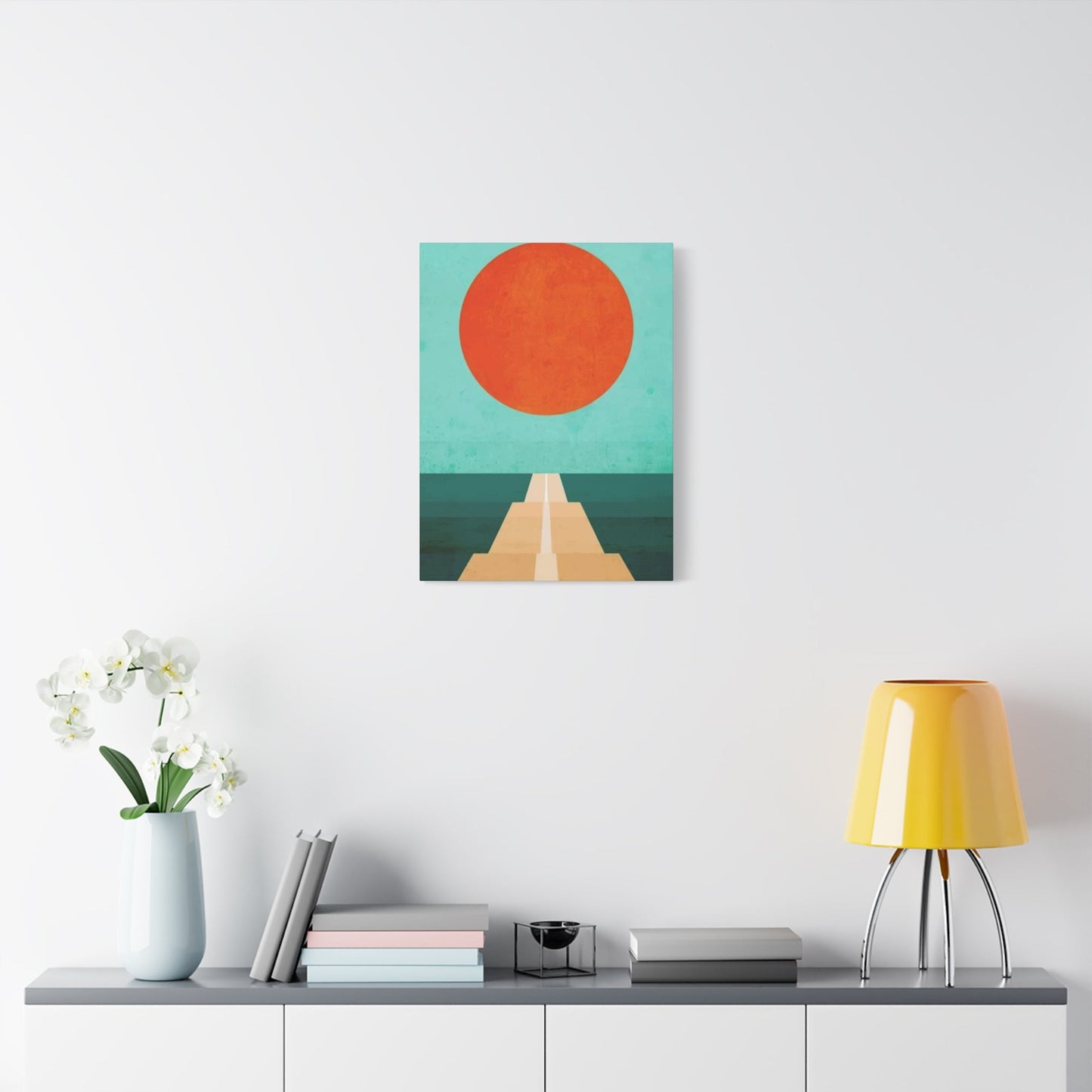
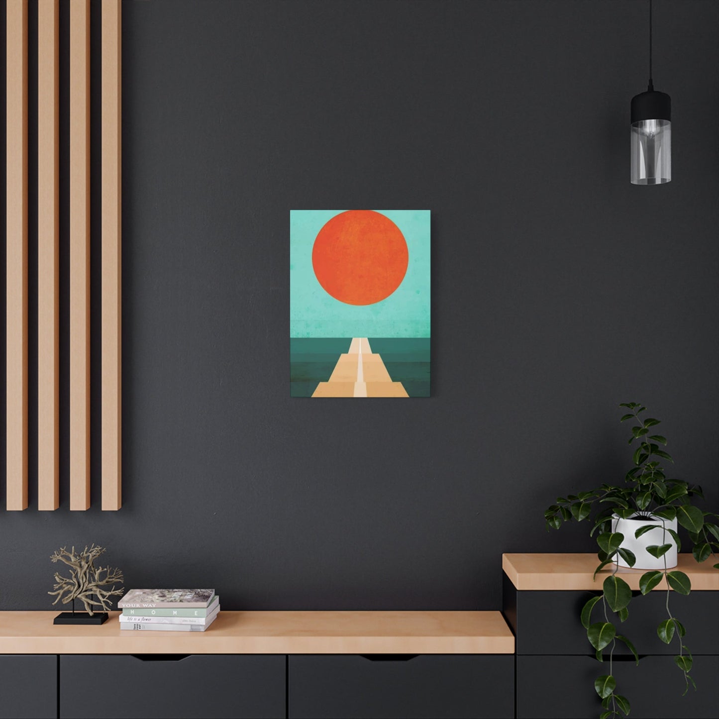
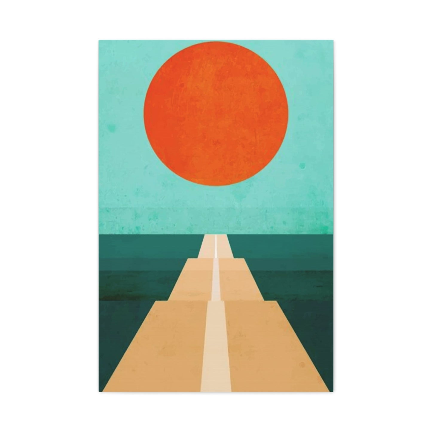
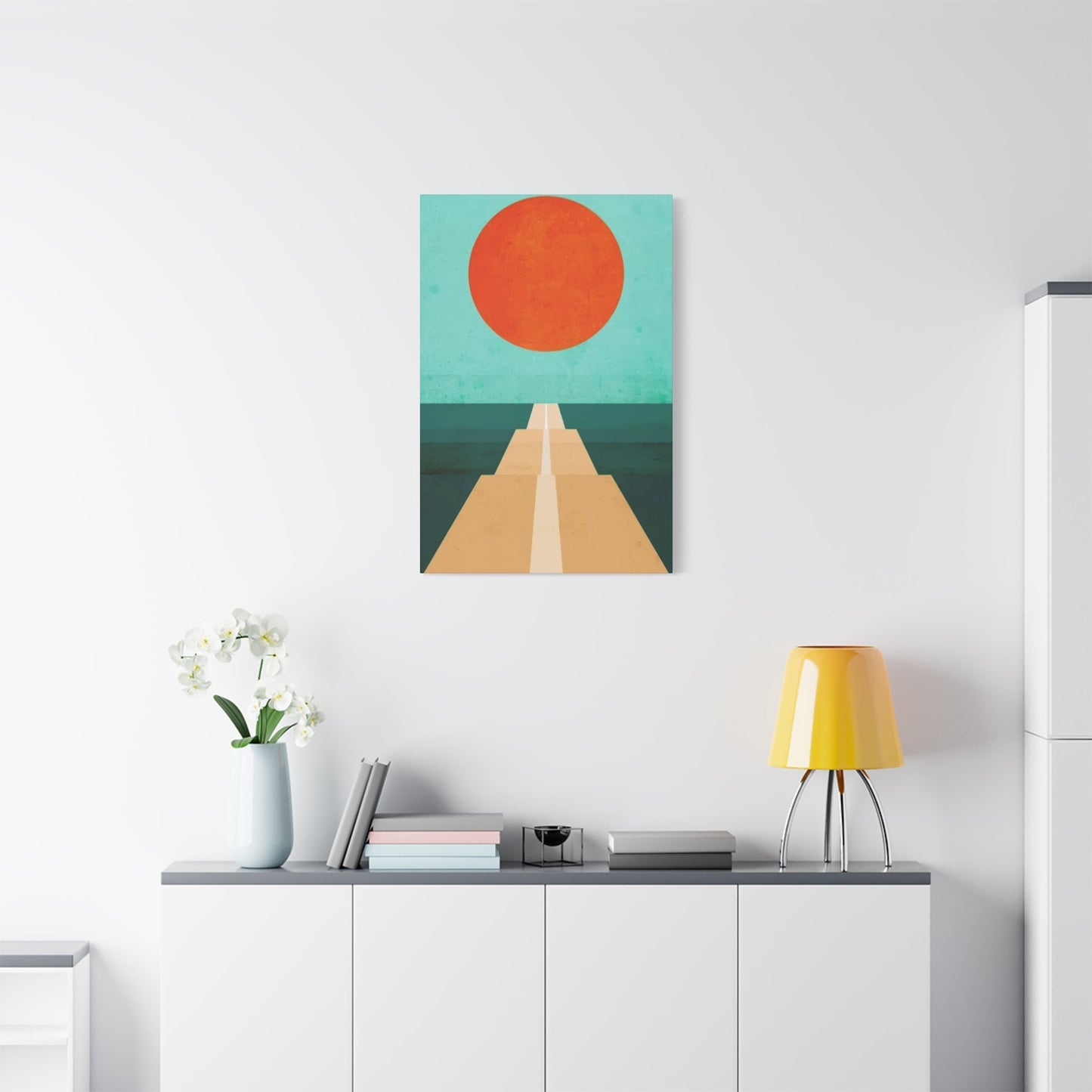
Orange Wall Art & Canvas Prints
Orange Wall Art & Canvas Prints
Couldn't load pickup availability
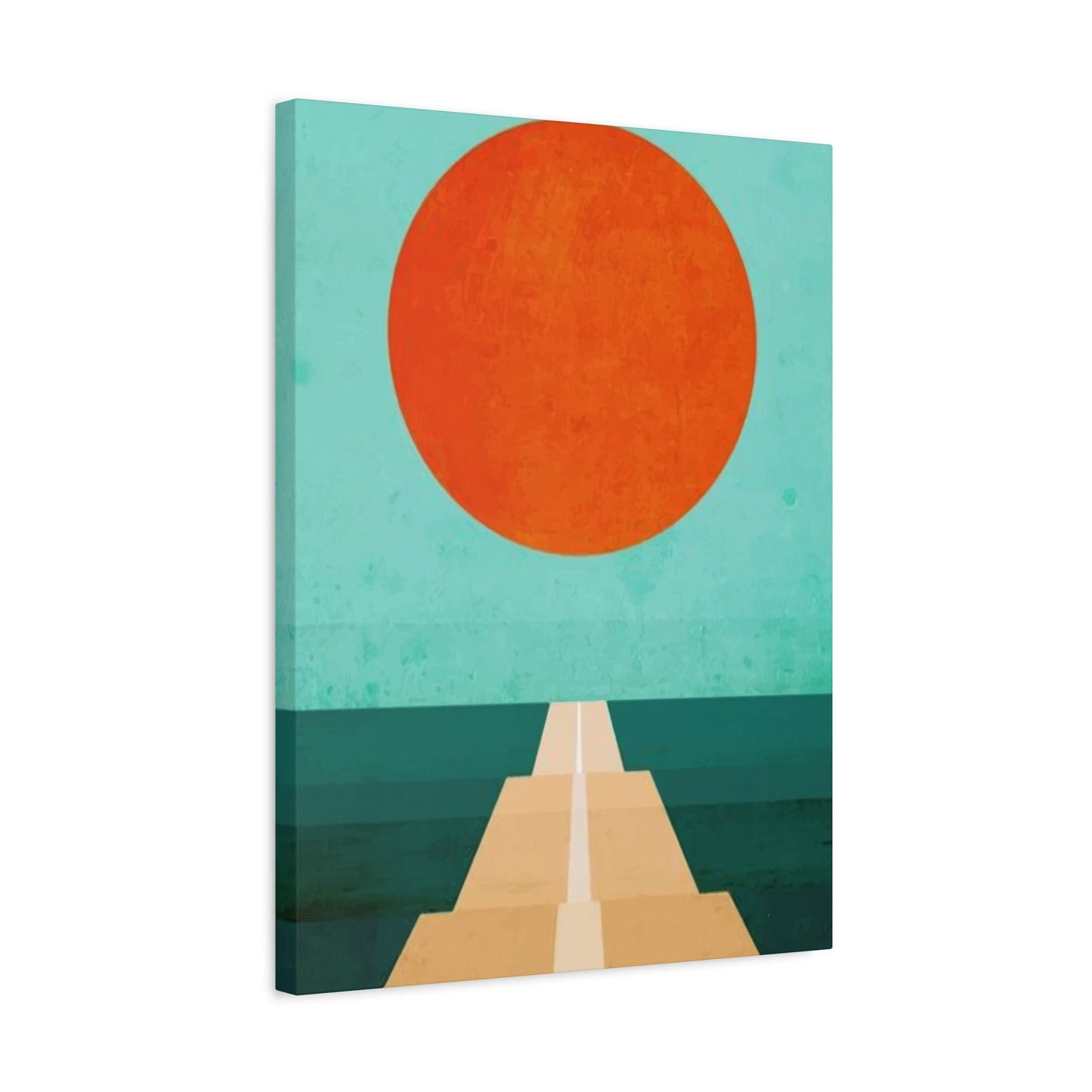
Orange Wall Art: Energizing Your Home with Vibrant Color Psychology
The transformative power of orange artwork extends far beyond simple decoration, creating an atmosphere that radiates warmth, energy, and sophisticated style throughout any home environment. This vibrant hue possesses unique qualities that can instantly elevate the mood of a room while establishing a welcoming ambiance that draws people together. When strategically incorporated into living areas, orange wall art serves as more than mere decoration – it becomes a powerful tool for enhancing natural lighting, creating visual interest, and establishing focal points that anchor entire room designs.
The luminous quality of orange pigments naturally reflects light in ways that can make even the smallest or darkest rooms feel more spacious and inviting. This optical illusion occurs because orange wavelengths stimulate the eye's perception of brightness and warmth, creating an effect similar to having additional natural lighting sources. Professional interior designers frequently recommend orange artwork for north-facing rooms or areas with limited windows, as these pieces can compensate for the lack of natural sunlight while maintaining a cheerful, uplifting atmosphere throughout the day.
Different shades and tones of orange offer varying degrees of brightness enhancement, from soft peach tones that provide gentle luminosity to bold tangerine hues that create dramatic lighting effects. The texture and finish of the artwork also play crucial roles in light reflection, with glossy or metallic orange pieces creating more pronounced brightening effects than matte finishes. Understanding these nuances allows homeowners to select pieces that not only complement their existing decor but actively improve the lighting conditions within their living environments.
The placement of orange artwork requires careful consideration of natural light patterns throughout the day, as the interaction between sunlight and orange pigments can create stunning visual effects at different times. Morning light tends to enhance the golden undertones in orange pieces, while afternoon light brings out the red undertones, creating a dynamic display that changes throughout the day. This natural variation adds an element of living art to rooms, where the same piece can appear dramatically different depending on the time and quality of light hitting its surface.
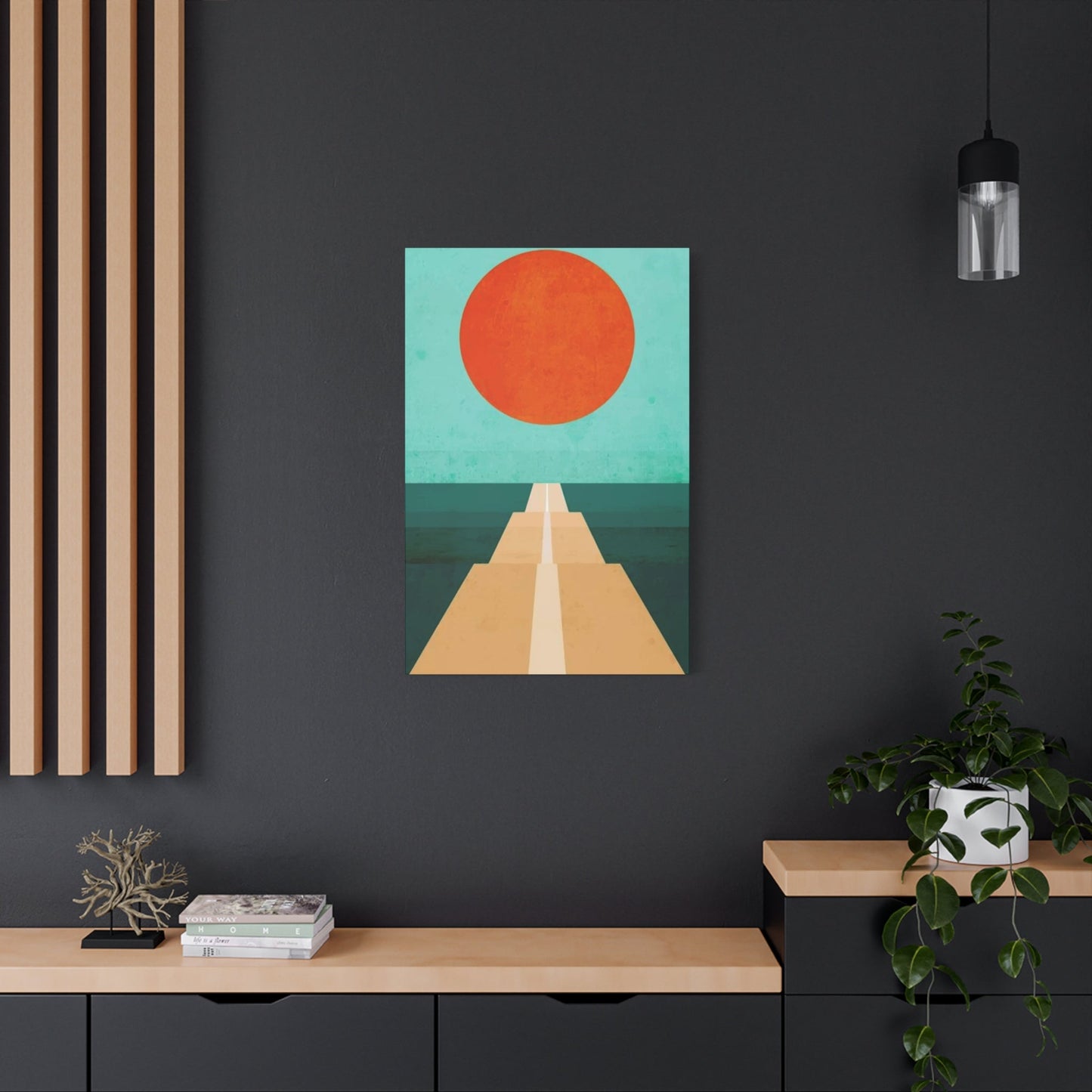
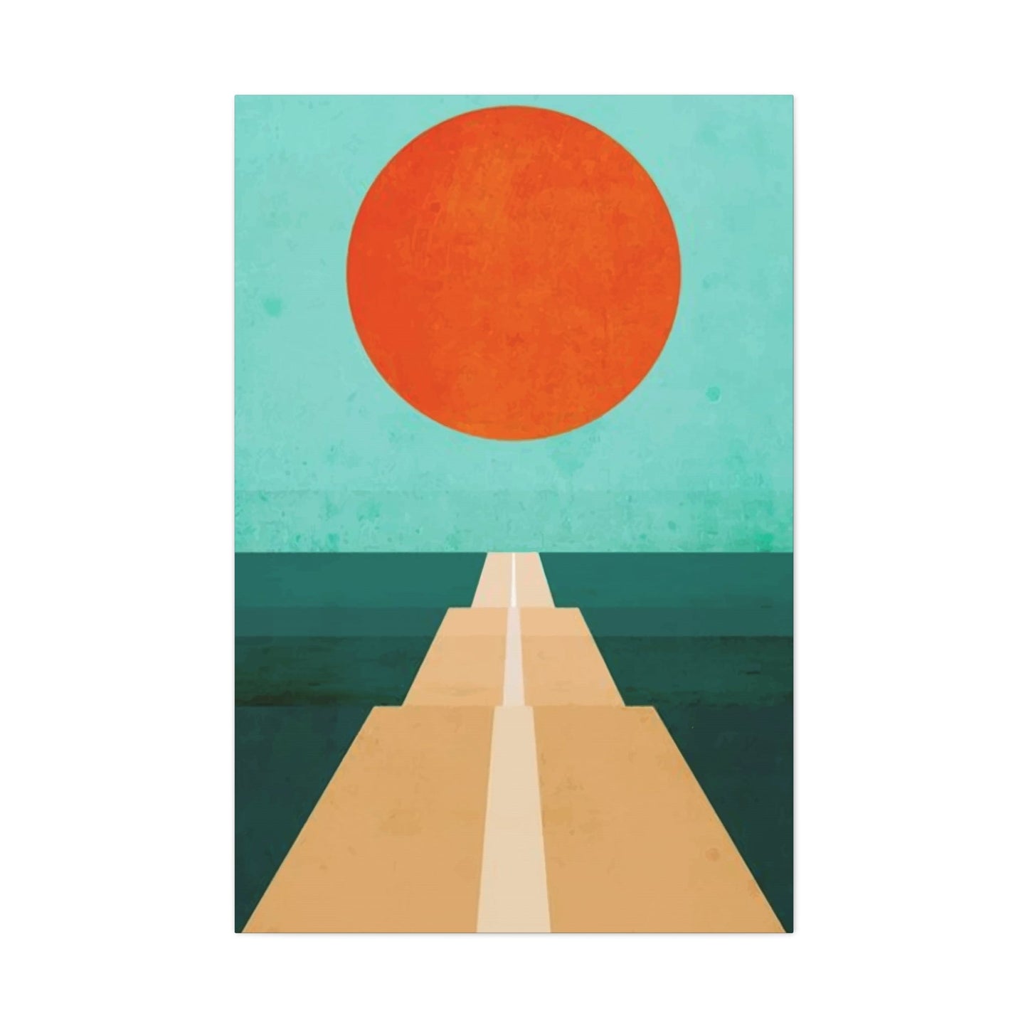
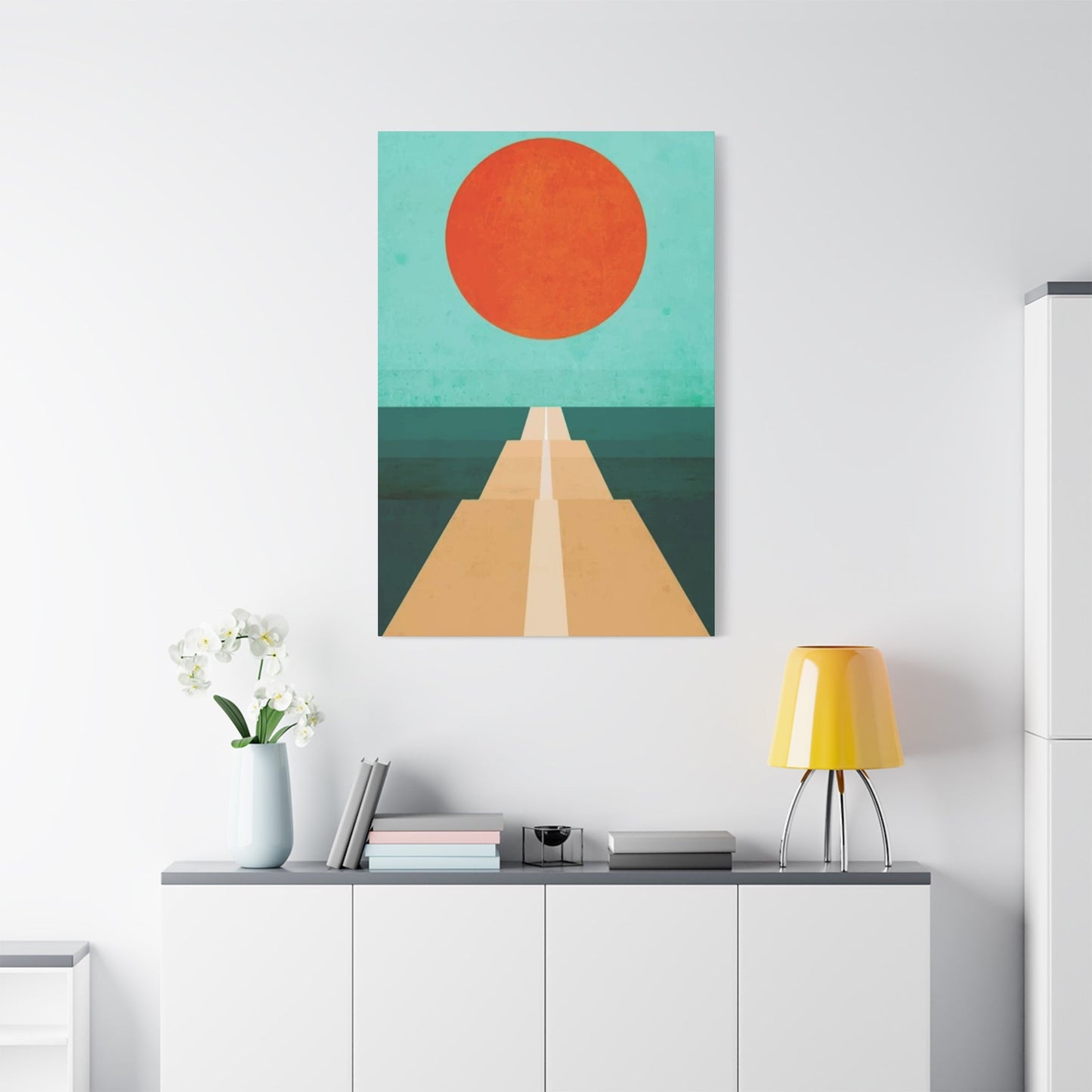
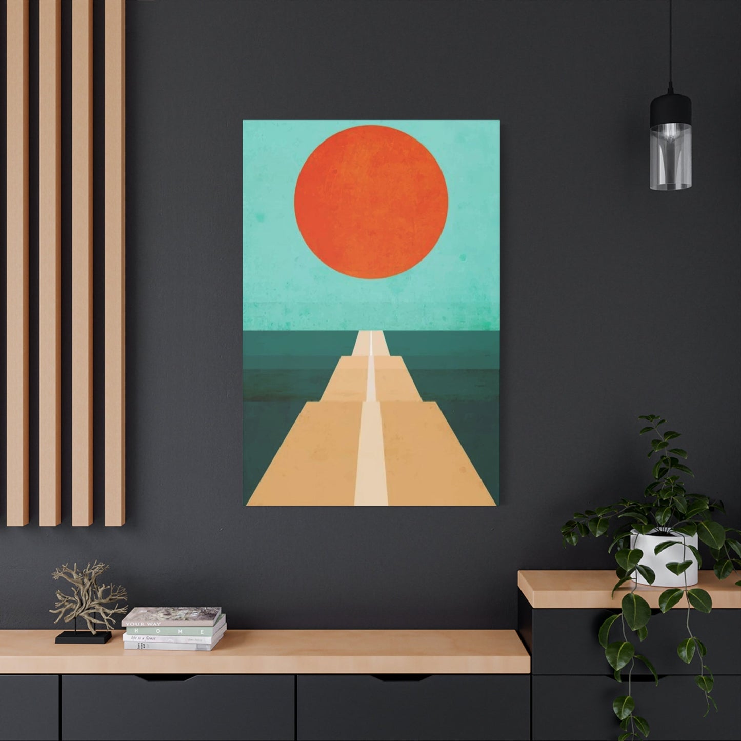
Orange: Warmth and Energy
The psychological impact of orange extends deep into human consciousness, triggering responses that are both immediate and profound in their effects on mood, energy levels, and social interaction. This powerful hue sits perfectly balanced between the passion of red and the optimism of yellow, creating a unique combination that stimulates both physical and emotional responses. Scientific studies in color psychology have consistently demonstrated that exposure to orange wavelengths increases heart rate, stimulates appetite, and promotes feelings of enthusiasm and sociability among viewers.
The warmth associated with orange artwork stems from its connection to natural elements that humans have evolved to associate with comfort and security. Fire, sunsets, autumn leaves, and ripe fruits all share this vibrant hue, creating subconscious associations with abundance, harvest, and the life-giving properties of the sun. These deep-seated connections explain why orange art can instantly make a room feel more welcoming and inhabited, even when the actual temperature remains unchanged.
Energy enhancement through orange artwork manifests in both subtle and dramatic ways, depending on the specific shade and application chosen. Bright, saturated oranges like vermillion or cadmium create immediate stimulation that can energize conversation areas and social gathering spots. These intense hues work particularly well in dining rooms, where they can enhance the enjoyment of meals while encouraging lively discussion among guests. Conversely, softer orange tones like coral or salmon provide gentler energy enhancement that promotes relaxation without creating overstimulation.
The cultural significance of orange varies across different societies, but the association with energy and vitality remains remarkably consistent worldwide. In Eastern traditions, orange represents spiritual energy and transformation, while Western cultures often associate it with creativity, enthusiasm, and adventure. These universal positive associations make orange artwork an excellent choice for creating environments that feel both globally inspired and locally appropriate, regardless of the specific cultural context of the home.
Modern neuroscience research has revealed fascinating insights into how orange wavelengths affect brain chemistry and cognitive function. The color stimulates the production of certain neurotransmitters associated with alertness and positive mood, while also promoting increased blood flow to areas of the brain responsible for creativity and problem-solving. This scientific understanding validates what artists and designers have long known intuitively – that orange art can genuinely enhance both the aesthetic and functional qualities of living environments.
Orange Art for Modern Spaces
Contemporary design principles embrace orange artwork as a sophisticated element that can bridge traditional warmth with cutting-edge aesthetics, creating environments that feel both current and timeless. Modern applications of orange art often focus on clean lines, geometric forms, and innovative materials that showcase the color's versatility in contemporary settings. The key to successful integration lies in understanding how orange interacts with other elements of modern design, including minimalist furniture, industrial materials, and open floor plans.
The industrial aesthetic that characterizes many modern homes provides an excellent backdrop for orange artwork, as the color's warmth creates a striking contrast against materials like steel, concrete, and exposed brick. This juxtaposition prevents modern environments from feeling cold or sterile while maintaining their sophisticated edge. Large-scale orange pieces work particularly well in loft-style apartments or open-concept homes, where they can serve as room dividers or focal points that define different functional areas within a single large room.
Geometric orange art forms align perfectly with modern design sensibilities, offering clean lines and structured compositions that complement contemporary furniture and architectural elements. Abstract pieces featuring orange gradients or color-blocking techniques can create visual interest without overwhelming minimalist design schemes. These works often incorporate other modern materials like metal, glass, or acrylic, creating mixed-media pieces that reflect the innovative spirit of contemporary design while harnessing orange's energizing properties.
The scale of orange artwork in modern environments deserves special consideration, as contemporary design often favors bold, statement pieces over collections of smaller works. A single large orange painting or sculpture can anchor an entire room's design scheme while providing the color impact needed to energize modern's often neutral color palettes. This approach aligns with the "less is more" philosophy of modernism while ensuring that the chosen pieces have maximum visual impact.
Technology integration in modern orange art opens exciting possibilities for dynamic displays that can change throughout the day or respond to environmental conditions. LED-backlit orange panels, digital art displays featuring orange compositions, and interactive installations represent the cutting edge of how this timeless color can be incorporated into tomorrow's living environments. These innovative approaches maintain orange's psychological benefits while pushing the boundaries of what wall art can achieve in modern homes.
Pair Orange with Neutrals
The strategic combination of orange artwork with neutral color schemes creates sophisticated and balanced environments that harness the energy of orange while maintaining visual harmony throughout the room. Neutral foundations provide the perfect canvas for orange art to shine without competing with other bold colors, allowing the warm tones to take center stage while creating a cohesive design narrative. This pairing approach works exceptionally well in both traditional and contemporary settings, offering flexibility and timeless appeal.
Gray serves as one of the most effective neutral partners for orange artwork, creating a modern and refined combination that feels both professional and inviting. The cool undertones of gray provide an excellent counterbalance to orange's warmth, preventing the color from becoming overwhelming while allowing its energy to remain prominent. Light grays work well with softer orange tones, while deeper charcoal grays can support more vibrant orange hues, creating dramatic contrast that enhances both colors' individual qualities.
Beige and cream neutrals offer a more traditional pairing approach that creates warm, welcoming environments perfect for family gathering areas and bedrooms. These earth-tone neutrals share some of orange's inherent warmth, creating a harmonious color relationship that feels natural and comfortable. The subtle undertones in different beige shades can either enhance or contrast with orange artwork, depending on whether they lean toward pink, yellow, or brown bases, allowing for fine-tuning of the overall color temperature.
White walls provide the most dramatic backdrop for orange artwork, creating maximum contrast that allows every nuance of the orange pigments to be fully appreciated. This classic combination works particularly well in gallery-style displays or when showcasing high-quality art pieces that deserve focused attention. The clean, fresh feeling of white backgrounds prevents orange from feeling dated or overpowering while creating an environment that feels both sophisticated and energetic.
The texture and finish of neutral elements play crucial roles in successful orange and neutral pairings, with matte finishes typically providing more subtle interactions while glossy or metallic finishes create more dynamic contrasts. Natural materials like wood, stone, and fiber can add depth to neutral foundations while complementing orange artwork's organic warmth. These textural elements prevent neutral color schemes from feeling flat or sterile while providing interesting visual variety that enhances the overall design composition.
Abstract Orange Wall Prints
Abstract orange compositions offer unlimited creative possibilities for incorporating this energizing color into home environments while allowing personal interpretation and emotional connection to guide the selection process. Unlike representational artwork, abstract orange pieces focus purely on the emotional and aesthetic impact of color, form, and composition, creating opportunities for viewers to project their own meanings and experiences onto the work. This interpretive freedom makes abstract orange art particularly effective in personalizing living environments.
The movement and flow possible in abstract orange compositions can create dynamic visual experiences that change depending on viewing angle and lighting conditions. Brushstrokes, color gradients, and textural elements combine to produce pieces that feel alive and engaging, drawing viewers into deeper contemplation while energizing the surrounding environment. These qualities make abstract orange prints excellent choices for areas where people spend extended periods, such as home offices or reading nooks.
Color interaction within abstract orange compositions allows artists to explore the full spectrum of orange possibilities, from pure hues to complex mixtures that incorporate related colors like red-orange, yellow-orange, and burnt orange variants. These subtle color relationships create depth and sophistication that can support viewing over extended periods without becoming tiresome or predictable. The layering of different orange tones can also create optical effects that add movement and interest to static wall displays.
Scale and proportion in abstract orange prints provide opportunities for creating dramatic focal points or subtle accent elements, depending on the specific needs of the room and existing design elements. Large abstract pieces can serve as the primary design anchor for entire rooms, while smaller works can be grouped to create gallery walls or used as accent pieces that support other design elements. The flexible nature of abstract art makes it easy to find pieces that fit specific size requirements while maintaining artistic integrity.
The production methods available for abstract orange prints have expanded dramatically with advances in digital printing technology, allowing for reproduction of original works in various sizes and on different materials. Canvas prints, metal panels, acrylic displays, and traditional paper prints each offer different aesthetic qualities that can be matched to specific room requirements and design preferences. These options make abstract orange art accessible to a wide range of budgets while maintaining high artistic standards.
Orange in Living Rooms
Living room applications of orange artwork require careful consideration of the room's multiple functions, from daily family activities to formal entertainment, ensuring that color choices support all intended uses while maintaining visual appeal throughout different times of day and seasons. The living room serves as the primary gathering area in most homes, making it an ideal location for orange art that can energize social interactions while creating a welcoming atmosphere for both family members and guests.
Seating arrangement considerations become crucial when placing orange artwork in living rooms, as the pieces should be visible and appreciated from all major seating positions while avoiding placement that might create glare or visual obstruction during television viewing or conversation. The relationship between orange art and natural light sources requires particular attention in living rooms, where large windows and varied lighting conditions throughout the day can dramatically affect how the artwork appears and feels.
The psychological impact of orange in living rooms extends to promoting conversation and social bonding, as research indicates that warm colors like orange encourage people to spend more time in shared areas and engage more actively with others present. This social enhancement makes orange artwork particularly valuable in living rooms designed for entertainment and family gathering, where the goal is to create an environment that naturally draws people together and encourages positive interactions.
Color coordination with existing living room elements requires balancing orange artwork with furniture, textiles, and other decorative elements to create a cohesive design scheme that feels intentional rather than accidental. Orange pairs well with many popular living room color schemes, from neutral palettes to bold contemporary combinations, but the specific shades and placement require careful consideration to avoid overwhelming the primary function areas of the room.
Seasonal flexibility in living room orange art selection allows for pieces that maintain appeal throughout the year while potentially offering opportunities for temporary additions during autumn months or holiday seasons. The warm qualities of orange make it particularly appropriate for creating cozy winter environments, while its energetic aspects support spring and summer entertainment activities. This year-round appropriateness makes orange artwork a practical long-term investment for living room enhancement.
Psychology of Orange Art
The scientific foundation of orange's psychological effects reveals fascinating insights into how this powerful color influences human behavior, mood, and cognitive function at both conscious and subconscious levels. Research in environmental psychology has consistently demonstrated that orange wavelengths stimulate the sympathetic nervous system, resulting in measurable increases in heart rate, blood pressure, and metabolic activity that translate into feelings of energy and alertness among viewers.
Emotional responses to orange artwork tend to be immediate and positive, with most individuals reporting feelings of warmth, enthusiasm, and optimism when exposed to well-designed orange compositions. These responses appear to be largely universal across different cultural backgrounds, suggesting that orange's psychological impact stems from fundamental human neurological responses rather than learned cultural associations. However, the intensity and duration of these responses can vary significantly based on the specific shade of orange, the size of the artwork, and the viewing context.
Cognitive enhancement through orange exposure has been documented in several research studies, with participants showing improved performance on creative problem-solving tasks and increased willingness to engage in social activities when working in environments containing orange elements. The mechanism behind these improvements appears to involve increased blood flow to brain regions associated with creativity and social cognition, suggesting that orange artwork can genuinely improve both individual and group performance in home environments.
The appetite stimulation effects of orange make it particularly appropriate for dining areas and kitchens, where the color can enhance the enjoyment of meals while encouraging family gatherings around food. This physiological response has been utilized by restaurants and food marketers for decades, but recent research suggests that the effects are even more pronounced in intimate home environments where people feel more relaxed and receptive to environmental influences.
Stress reduction through orange art represents a more subtle but equally important psychological benefit, as the color's association with natural elements like sunsets and autumn foliage can trigger relaxation responses that counteract the effects of daily stress. This calming aspect of orange is most effective when the color is presented in softer tones and natural compositions that evoke peaceful outdoor environments rather than intense, stimulating presentations that might increase rather than decrease stress levels.
Orange and Blue Combo
The complementary relationship between orange and blue creates one of the most dynamic and visually striking color combinations available in art and design, offering opportunities for high-impact wall displays that energize rooms while maintaining sophisticated color balance. This pairing harnesses the psychological benefits of both colors, combining orange's warmth and energy with blue's calming and focusing properties to create environments that feel both stimulating and balanced.
Color theory principles underlying orange and blue combinations explain why this pairing feels both natural and exciting to most viewers, as complementary colors create maximum contrast while maintaining harmonious relationships that prevent visual tension. The high contrast between warm orange and cool blue creates visual vibration that draws attention and maintains interest over time, making pieces featuring this combination excellent focal points for any room design.
Balance considerations in orange and blue artwork require careful attention to the proportion and intensity of each color to prevent one from overwhelming the other while maintaining the dynamic tension that makes the combination so effective. Generally, equal proportions of intense orange and blue can create overwhelming visual experiences, so successful pieces typically feature one color as the dominant element with the other serving as accent or supporting color.
Natural inspiration for orange and blue combinations can be found in sunsets over water, desert landscapes under blue skies, and tropical bird plumage, providing artistic reference points that feel familiar and appealing to most viewers. These natural color relationships offer guidance for creating orange and blue art pieces that feel harmonious rather than artificial, drawing on millions of years of human evolution in environments containing these color combinations.
Contemporary applications of orange and blue in wall art include abstract expressionist pieces, photographic landscapes, and mixed-media installations that explore the interaction between these powerful colors. Modern printing techniques allow for precise color reproduction that maintains the vibrancy of both colors while preventing the muddiness that can occur when orange and blue pigments are mixed rather than placed in proximity to each other.
Creative Orange Wall Ideas
Innovative approaches to orange wall art extend far beyond traditional framed paintings, encompassing three-dimensional installations, mixed-media compositions, and interactive elements that transform entire walls into artistic statements. These creative applications allow homeowners to express personal style while maximizing the energizing benefits of orange in ways that complement their specific architectural and design preferences.
Textural orange wall treatments can include fabric art, carved wood panels, metal sculptures, and ceramic tiles that add dimensional interest while incorporating orange's warm energy. These three-dimensional approaches create varying shadow patterns throughout the day as lighting conditions change, adding an element of temporal variation that keeps the wall display interesting over extended periods. The tactile qualities of textural elements also invite closer inspection and physical interaction, creating more engaging relationships between viewers and the art.
Modular orange wall systems allow for flexibility in creating custom arrangements that can be modified over time as tastes and needs change. These might include removable panels, magnetic elements, or interlocking pieces that enable homeowners to create unique compositions while maintaining the ability to rearrange or expand their displays. This approach is particularly valuable for renters or individuals who frequently update their home decor.
Lighting integration with orange wall art creates opportunities for dramatic effects that can transform the appearance and impact of pieces throughout different times of day and for different occasions. Backlighting, spotlighting, and color-changing LED systems can enhance orange artwork while creating ambient lighting effects that support the overall room design. These technological additions require careful planning to ensure that wiring and control systems are properly concealed and accessible.
DIY orange wall art projects offer cost-effective opportunities for creating custom pieces that perfectly match specific color preferences and size requirements while providing the satisfaction of personal creative expression. These projects can range from simple painted canvases to complex mixed-media installations, depending on the maker's skill level and available resources. The key to successful DIY orange art lies in understanding color mixing, composition principles, and appropriate materials for the intended display location.
DIY Orange Wall Decor
Creating personalized orange wall decor through DIY projects offers unique opportunities to develop custom pieces that perfectly match individual style preferences while developing creative skills and achieving significant cost savings compared to purchasing original artwork. The process of creating orange art also provides therapeutic benefits through color interaction and creative expression, making the journey as valuable as the final product.
Material selection for DIY orange projects spans a wide range of possibilities, from traditional painting mediums like acrylics and oils to unconventional materials like fabric, paper, metal, and found objects. Each material offers different aesthetic qualities and working properties that can be matched to specific project goals and skill levels. Understanding the characteristics of different orange pigments and their interactions with various substrates is crucial for achieving desired color effects and ensuring long-term durability.
Technique exploration in DIY orange art can include traditional painting methods, collage approaches, printing techniques, and mixed-media combinations that create unique textural and visual effects. Experimentation with different application methods, from brushwork to palette knife techniques to spray applications, can yield surprising and delightful results that add personal character to finished pieces. The freedom to experiment without commercial constraints allows for discovery of individual artistic voice and style.
Color mixing for orange DIY projects requires understanding both additive and subtractive color principles, as well as the specific properties of different pigments and their interactions when combined. Creating custom orange shades through mixing allows for precise color matching to existing decor while developing deeper understanding of color relationships. Documentation of successful color recipes ensures repeatability and enables creation of series or matching pieces over time.
Project planning for DIY orange wall decor should include consideration of available workspace, time requirements, skill development needs, and integration with existing home decor. Starting with simpler projects and gradually building complexity allows for skill development while ensuring early success that encourages continued creative exploration. Planning also involves considering maintenance requirements and longevity expectations for different materials and techniques.
Cozy with Orange Art
The creation of cozy environments through orange artwork involves understanding how warm colors interact with lighting, textures, and architectural elements to produce feelings of comfort, security, and intimate warmth. Orange's natural association with fire, candlelight, and sunset creates immediate cozy associations that can transform even large or austere rooms into inviting gathering areas that encourage relaxation and social connection.
Texture coordination with orange art enhances the cozy factor by incorporating materials that invite touch and create visual warmth through surface variation. Soft fabrics, natural wood grains, woven materials, and other tactile elements complement orange artwork while reinforcing the comfortable, lived-in feeling that defines truly cozy environments. The interplay between smooth and textured surfaces creates visual interest that prevents cozy rooms from feeling monotonous or sleepy.
Lighting considerations for cozy orange art focus on creating warm, diffused illumination that enhances the color's natural warmth while avoiding harsh or clinical lighting effects. Layered lighting approaches that combine ambient, task, and accent lighting allow for adjustment throughout different times of day and various activities, maintaining the cozy atmosphere while providing functional illumination. Warm color temperature lighting sources work particularly well with orange artwork, avoiding the cool blue tones that can counteract orange's warming effects.
Scale and proportion in cozy orange art typically favor more intimate sizing that creates personal connections rather than grand statements. Smaller pieces or collections of related works can create gallery walls that invite close inspection and contemplation, supporting the intimate atmosphere that defines cozy environments. However, the specific scale should be proportionate to the room size and furniture arrangement to maintain visual balance.
Seasonal enhancement through orange artwork supports the cozy aesthetic by providing connections to autumn and winter seasons when cozy feelings are most desired and appreciated. The ability to add seasonal orange elements through removable pieces or temporary displays allows for enhanced coziness during colder months while maintaining flexibility for lighter, airier feels during warmer seasons.
Autumn Vibes with Orange
Capturing the essence of autumn through orange wall art allows homeowners to bring the season's warmth, richness, and natural beauty indoors while creating environments that celebrate the transitional period between summer's energy and winter's contemplation. The deep connection between orange hues and autumn imagery creates immediate emotional responses that evoke memories of harvest time, changing leaves, and cozy preparation for winter months.
Natural inspiration from autumn landscapes provides endless artistic possibilities, from abstract interpretations of fall foliage to realistic depictions of harvest scenes and seasonal transitions. The varied orange tones found in autumn nature, from bright maple reds to deep pumpkin oranges to golden oak yellows, offer a rich palette for creating artwork that feels authentically connected to the season while providing year-round visual appeal.
Seasonal flexibility in autumn-inspired orange art allows pieces to serve double duty by providing appropriate seasonal atmosphere during fall months while contributing warm energy to home environments throughout the year. The key lies in selecting or creating pieces that capture autumn's essence without being so literal or specific that they feel inappropriate during other seasons. Abstract interpretations and subtle seasonal references often work better than obvious autumn symbols.
Texture incorporation in autumn-themed orange art can include materials that evoke fall experiences, such as rough bark textures, leaf patterns, harvest imagery, or rustic finishes that suggest outdoor environments and natural processes. These textural elements add depth and authenticity to autumn-themed pieces while creating sensory connections that enhance the emotional impact of the artwork.
Color progression in autumn orange art can mirror the natural seasonal transition from bright summer colors through the warm oranges of early fall to the deeper, more muted tones of late autumn. This progression can be reflected in individual pieces that show color gradation or in collections of pieces that represent different aspects of the seasonal change, creating dynamic displays that capture autumn's temporal movement.
Minimalist Orange Prints
The integration of orange into minimalist design principles requires careful consideration of how bold color can coexist with simplified forms and reduced visual complexity while maintaining the clean, uncluttered aesthetic that defines minimalist approaches. Orange's inherent energy and warmth can actually enhance minimalist environments by preventing them from feeling cold or sterile, provided the application is restrained and purposeful.
Color purity in minimalist orange art focuses on clean, unadulterated orange hues rather than complex color mixtures or gradations that might create visual complexity contrary to minimalist principles. Single-color compositions or very limited color palettes allow orange to make its statement without competing with other design elements for attention. This approach creates powerful focal points that anchor minimalist room designs while maintaining visual simplicity.
Geometric simplicity in minimalist orange prints emphasizes clean lines, basic shapes, and mathematical relationships that complement the ordered approach of minimalist design. Square, circular, and rectangular compositions work particularly well, as do patterns based on grids or modular systems. The challenge lies in creating visual interest through color and form without adding decorative complexity that contradicts minimalist principles.
Scale considerations for minimalist orange art often favor larger pieces that make strong statements without requiring multiple elements or complex arrangements. A single large orange print can serve as the primary art element in a minimalist room, providing color impact and visual interest while maintaining the simplified approach that minimalist design demands. This approach also reduces visual clutter by consolidating artistic elements into fewer, more powerful pieces.
Material selection for minimalist orange art should complement the clean aesthetic of minimalist environments, with preferences for simple frames or frameless mounting, high-quality printing on archival materials, and presentation methods that don't detract from the artwork itself. The goal is to let the orange color and composition speak without interference from decorative mounting or framing elements that might compromise the minimalist aesthetic.
Orange as Gallery Focal Point
Establishing orange artwork as the central focus of gallery-style wall displays requires understanding how color psychology and visual hierarchy work together to create compelling compositions that guide viewer attention while maintaining overall design coherence. Orange's natural tendency to advance visually and demand attention makes it an excellent choice for focal point applications, but successful implementation requires careful consideration of surrounding elements and viewing contexts.
Compositional strategies for orange focal points often involve asymmetrical arrangements that create visual tension while maintaining balance through careful distribution of visual weight. The vibrant nature of orange means that relatively small pieces can serve as focal points when surrounded by more neutral elements, while larger orange pieces can anchor entire wall displays or room designs. Understanding these relationships allows for flexible approaches to gallery wall creation.
Lighting design for orange focal points requires special attention to color temperature and intensity to ensure that the artwork appears at its best under various viewing conditions. Orange pigments can appear dramatically different under warm versus cool lighting, with warm lighting generally enhancing the color's appeal while cool lighting can make it appear muddy or unpleasant. Adjustable lighting systems allow for optimization of orange artwork display throughout different times of day and for different occasions.
Supporting element selection around orange focal points should complement rather than compete with the central piece while providing enough visual interest to create dynamic gallery displays. Neutral pieces, monochromatic works, or pieces that contain orange accent colors can support the focal point without overwhelming it. The goal is to create a cohesive gallery narrative that leads the eye to and from the orange focal point while maintaining overall visual harmony.
Viewing distance considerations for orange focal points account for the color's high visibility and emotional impact, ensuring that pieces are positioned where they can be appreciated from multiple viewpoints while avoiding placement that might create overwhelming visual experiences in intimate settings. The psychological intensity of orange means that focal point pieces should be positioned to enhance rather than dominate the user experience of the room.
Conclusion
Orange wall art emerges as a powerful and versatile design element that transcends simple decoration to become a transformative force in home environments, offering unique combinations of psychological benefits, aesthetic appeal, and practical functionality that few other color choices can match. The scientific foundation underlying orange's effects on human psychology validates what artists and designers have long understood intuitively – this warm, energizing hue possesses genuine power to enhance mood, stimulate creativity, and promote positive social interactions within living areas.
The versatility demonstrated throughout this exploration reveals orange's remarkable adaptability to various design styles, room functions, and personal preferences, from minimalist contemporary applications to cozy traditional settings, from bold focal points to subtle accent pieces. This flexibility makes orange artwork an excellent long-term investment for homeowners seeking to create environments that remain fresh and engaging over time while supporting the practical and emotional needs of daily life.
The practical applications discussed throughout this comprehensive examination provide concrete pathways for incorporating orange art into real-world living situations, whether through professional artwork acquisition, DIY creative projects, or strategic combinations with existing design elements. These approaches acknowledge the diverse needs, budgets, and skill levels of homeowners while maintaining high standards for aesthetic achievement and psychological benefit.
The psychological and physiological benefits of orange artwork extend far beyond mere visual appeal, encompassing measurable improvements in energy levels, creativity, social interaction, and overall environmental satisfaction. These scientifically-documented effects transform the selection and placement of orange art from arbitrary decorative decisions into strategic choices that can genuinely improve quality of life within home environments.
The future possibilities for orange art applications continue to expand with advancing technologies, new materials, and evolving design philosophies that push the boundaries of what wall art can achieve in modern homes. From interactive digital displays to sustainable materials to customizable modular systems, the evolution of orange art reflects broader trends in how we understand the relationship between color, psychology, and environmental design. As our knowledge of color's effects on human wellbeing continues to grow, orange artwork stands positioned to play an increasingly important role in creating homes that truly serve the complex needs of contemporary life, providing not just shelter and function but active support for human flourishing through thoughtful application of color psychology and aesthetic principles.
