


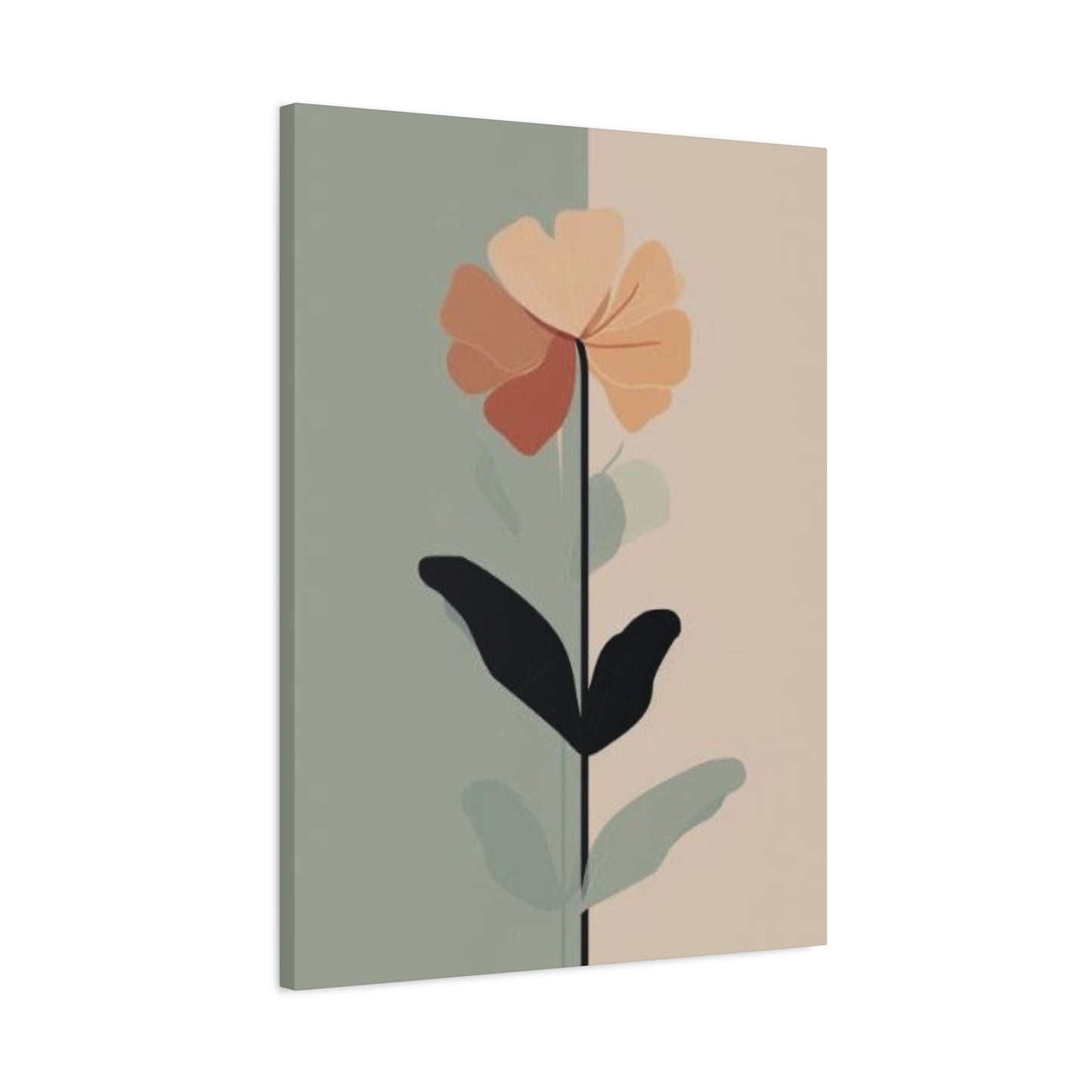
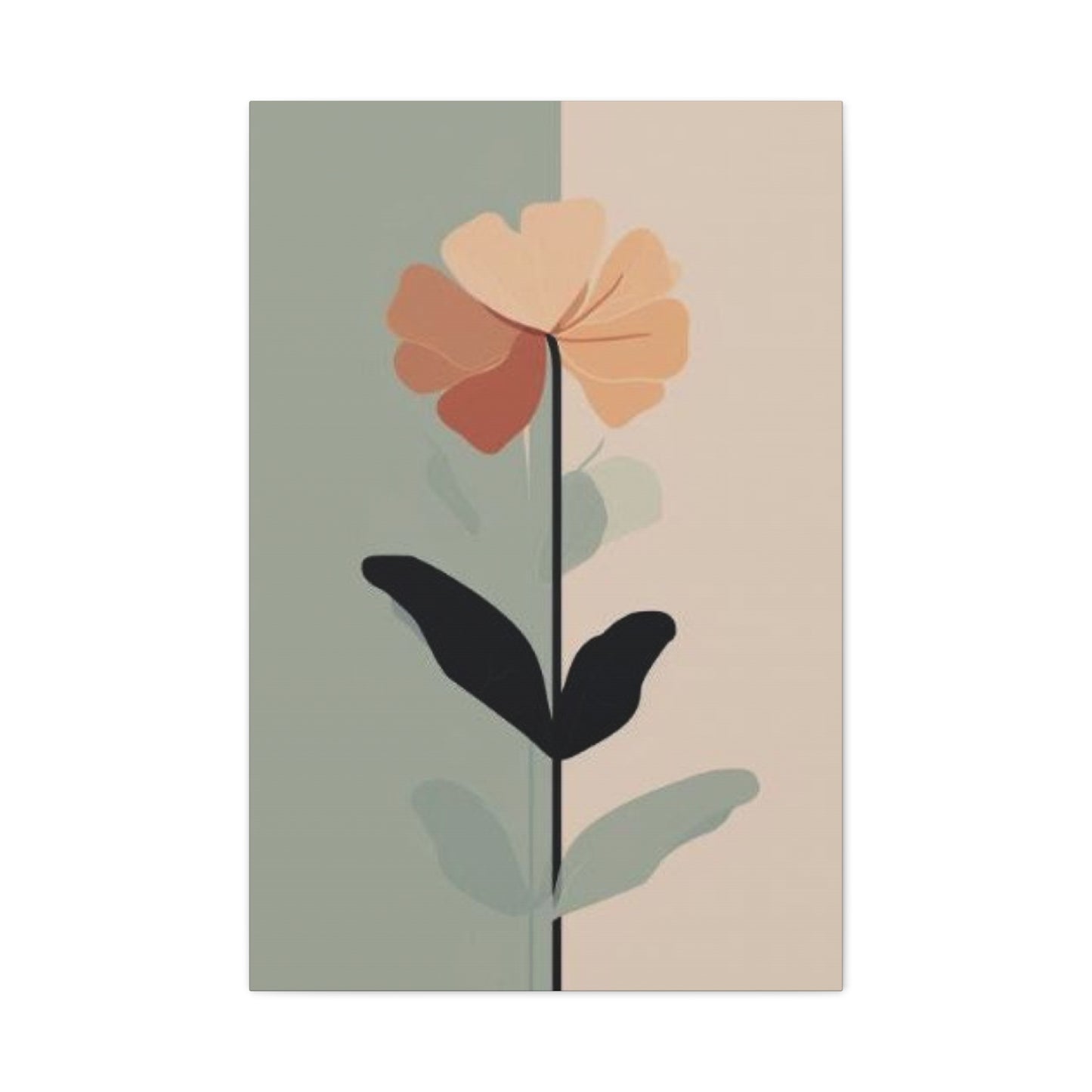
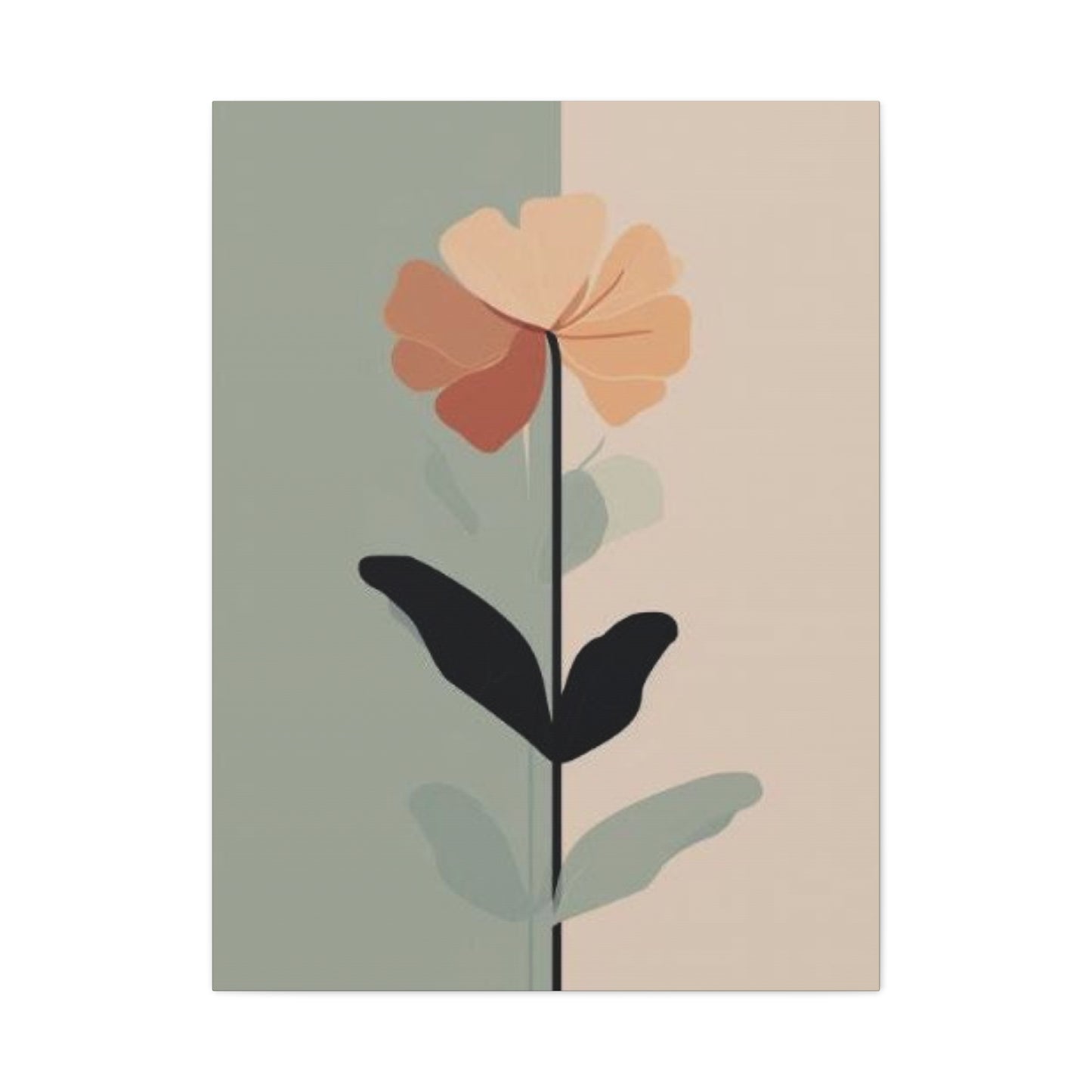
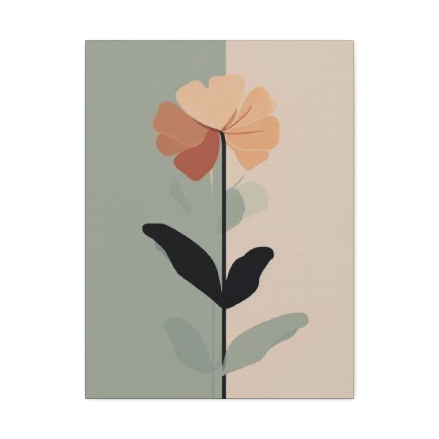
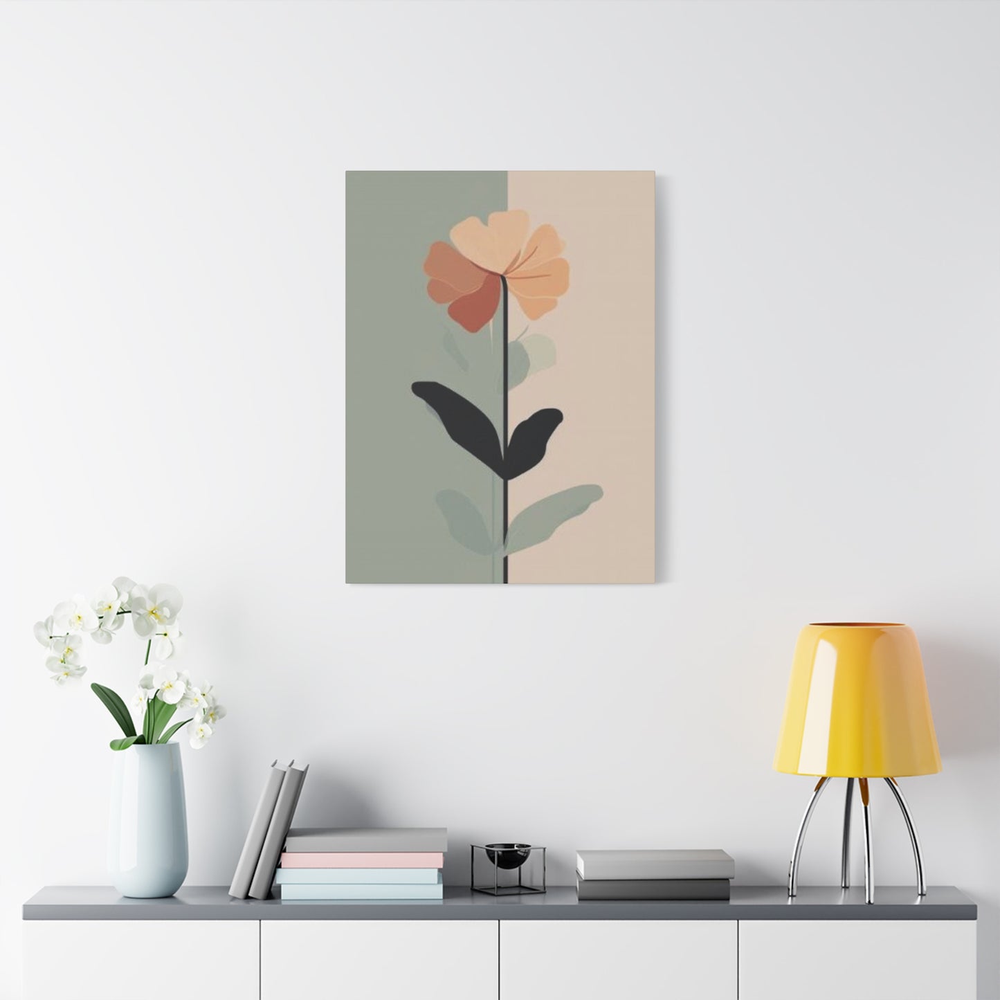
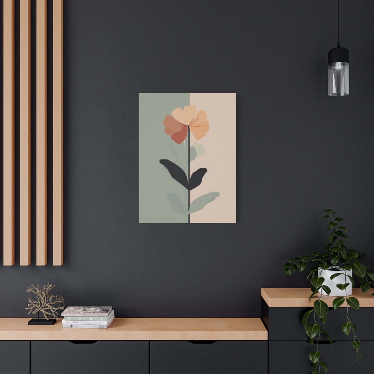
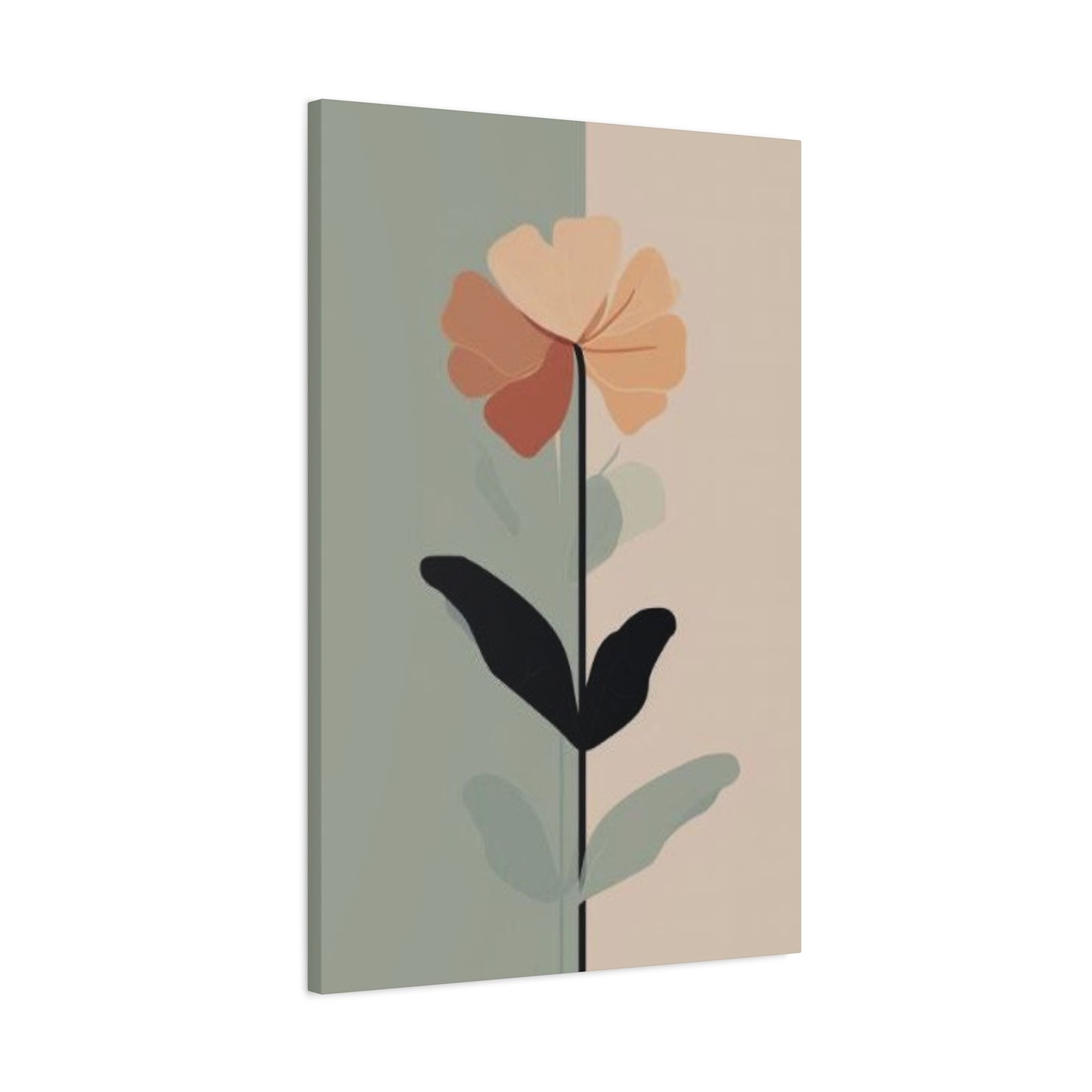
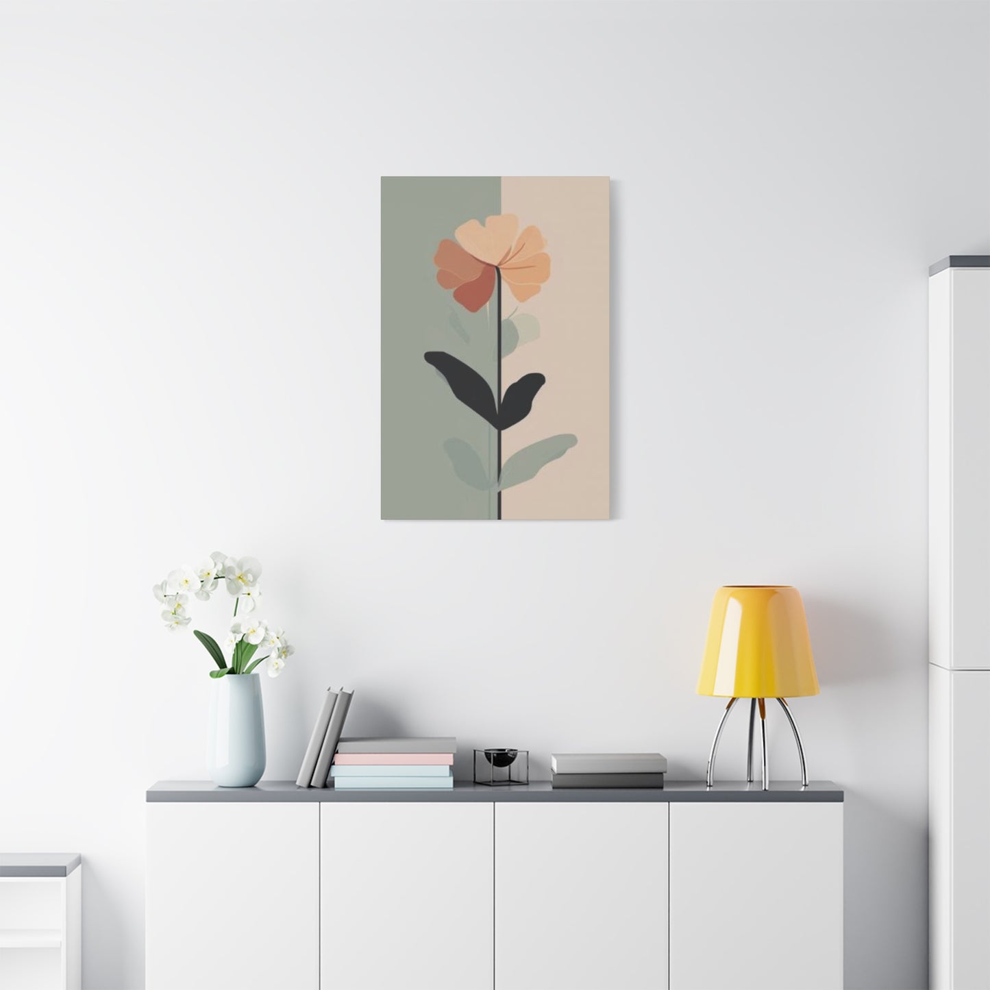
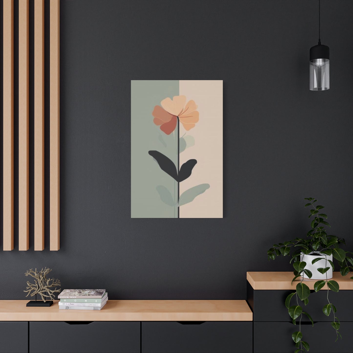
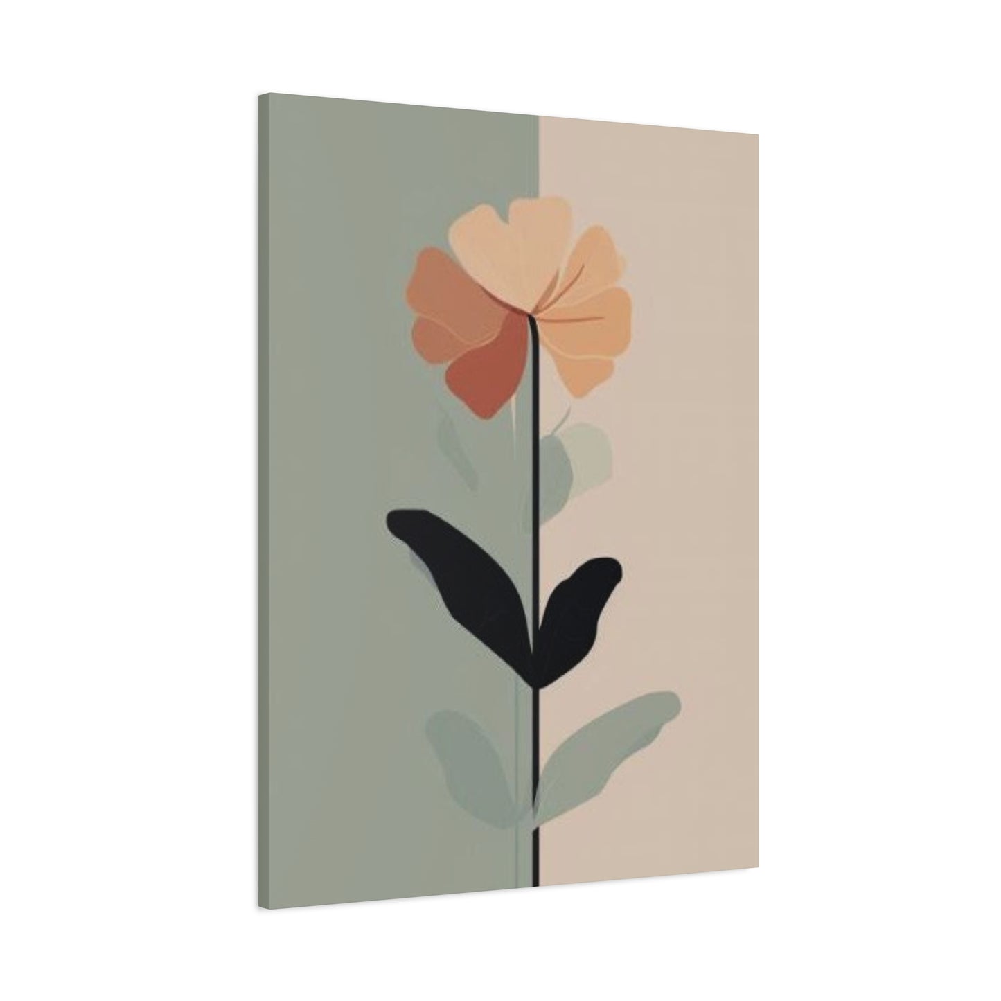
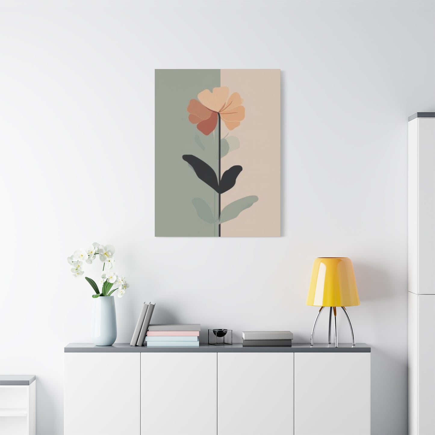
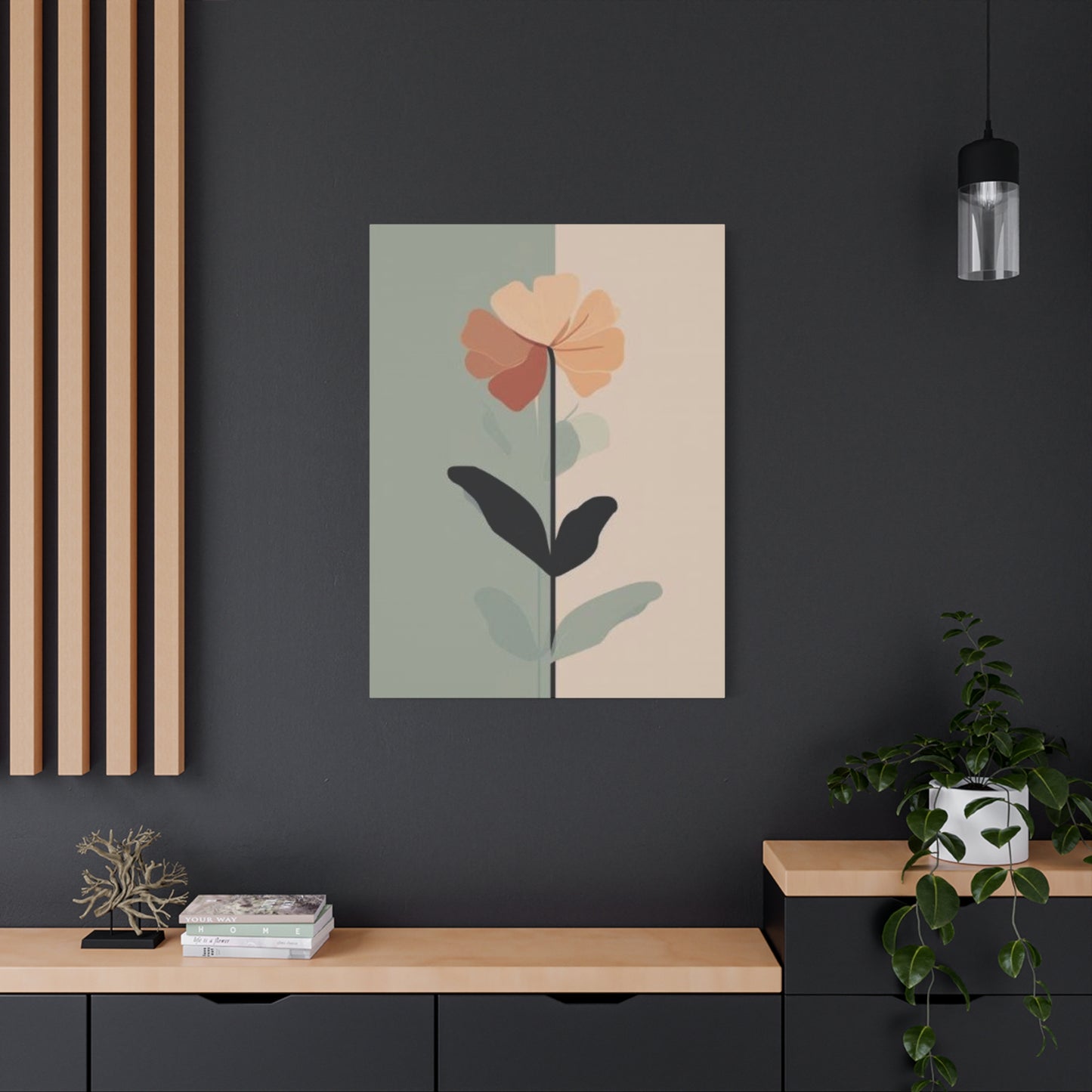
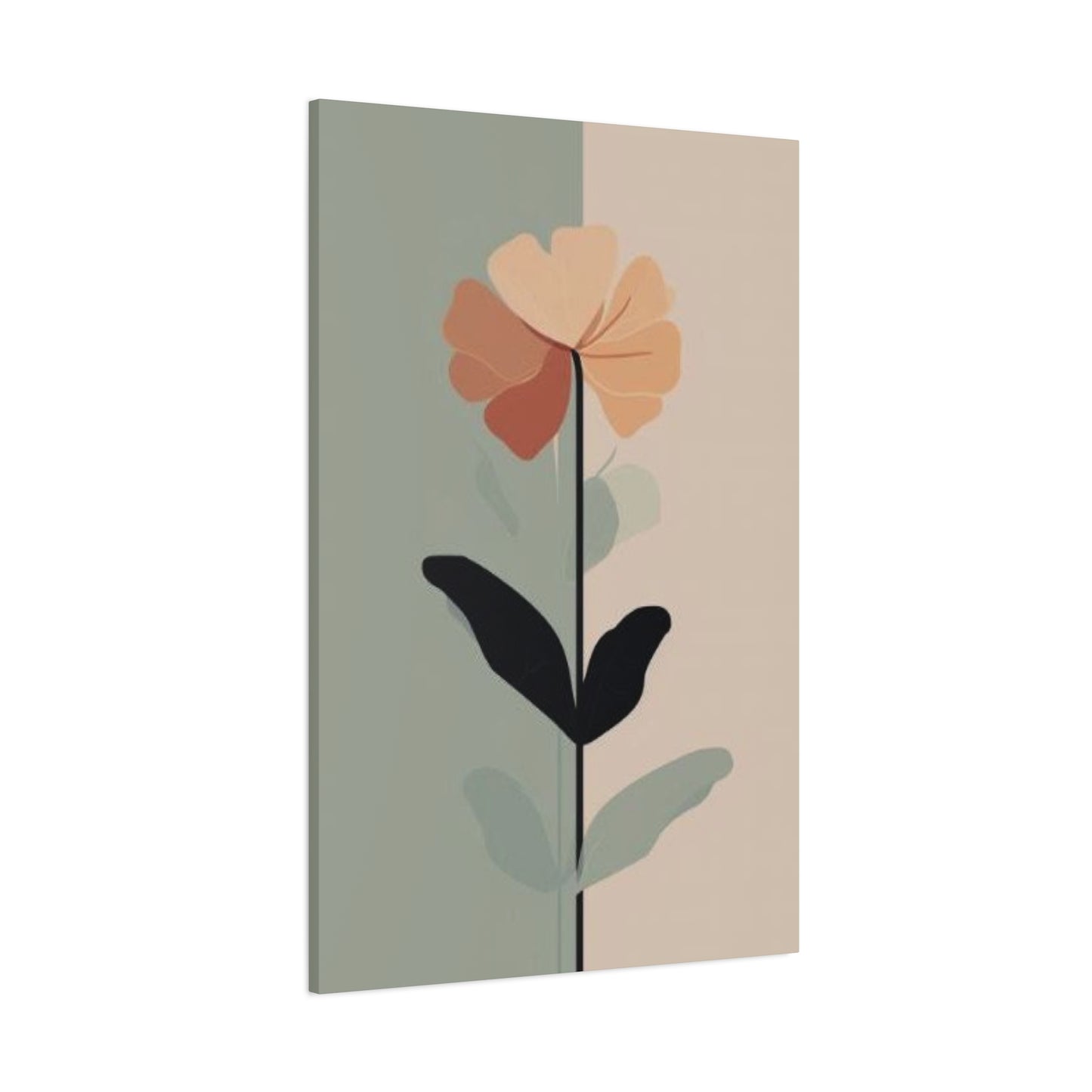
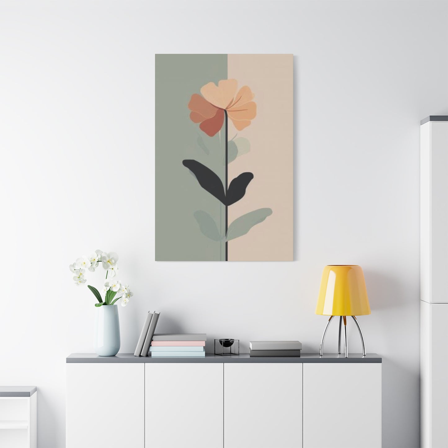
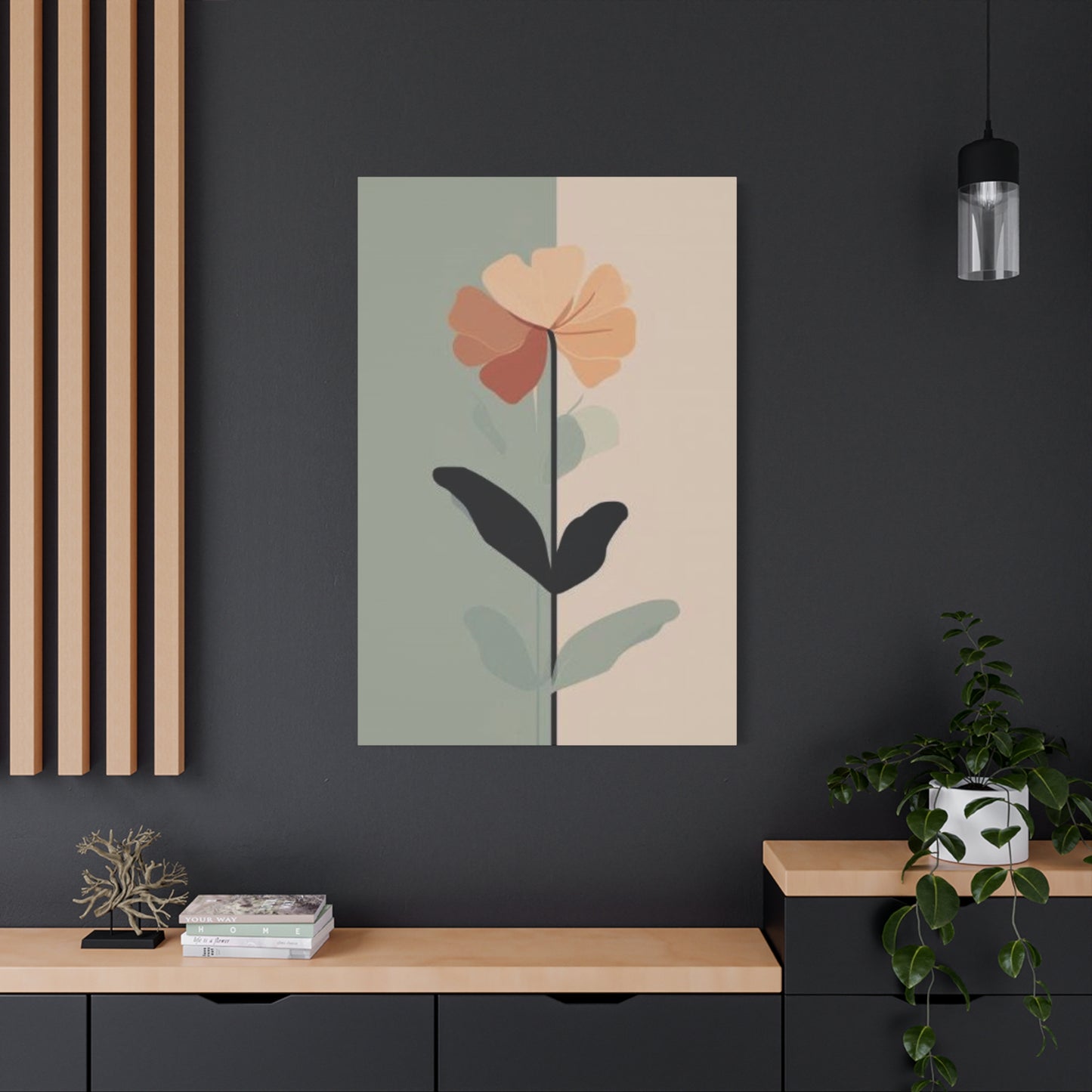
Pink Flower Entryway Wall Art & Canvas Prints
Pink Flower Entryway Wall Art & Canvas Prints
Couldn't load pickup availability

Brighten Your First Impression with Stunning Pink Flower Entryway Wall Art
The entryway of your home serves as the first impression for guests and sets the tone for the rest of your living space. Incorporating pink floral elements into this crucial area can create an inviting, warm, and stylish atmosphere that welcomes everyone who crosses your threshold. Pink flowers, whether displayed in artwork, canvas prints, or decorative arrangements, bring a sense of freshness, romance, and vitality to what might otherwise be a neglected transitional space. This comprehensive exploration delves into various approaches to integrating pink floral aesthetics into entryway design, offering practical advice, creative inspiration, and detailed guidance for transforming your entrance into a stunning focal point.
Pink Flowers for Your Entryway
Selecting the right pink flowers for your entryway involves understanding both the aesthetic impact and practical considerations of different floral varieties. The entrance to your home deserves thoughtful attention, as it creates the initial emotional response for anyone entering your space. Pink flowers offer a versatile palette ranging from soft blush tones to vibrant magenta hues, each conveying different moods and complementing various interior design styles.
When choosing pink floral elements for your entrance, consider the natural lighting conditions of the space. North-facing entryways typically receive cooler, indirect light throughout the day, making them ideal candidates for warmer pink tones like coral or salmon that can compensate for the lack of natural warmth. Conversely, south-facing entrances bathed in abundant sunlight can accommodate cooler pink shades like rose or mauve without appearing washed out. The interplay between natural light and color temperature significantly affects how your pink floral decor will be perceived throughout different times of day.
The size of your entryway should also inform your selection of pink floral artwork or decorative elements. Compact entryways benefit from strategically placed medium-sized pieces that provide visual interest without overwhelming the limited square footage. Larger entrance halls can accommodate more substantial installations, including multiple coordinated pieces that create a cohesive narrative. Consider the vertical space available as well, as tall, narrow floral canvases can draw the eye upward, creating an illusion of greater height in rooms with standard ceiling measurements.
Different pink flower varieties convey distinct emotional resonances that can align with your personal aesthetic preferences. Peonies, with their lush, voluminous blooms, suggest abundance, prosperity, and romantic sensibilities. Cherry blossoms evoke ephemeral beauty, cultural refinement, and the transient nature of life itself. Roses remain timeless symbols of love, passion, and classic elegance. Tulips communicate cheerfulness, spring renewal, and understated sophistication. Orchids represent exotic luxury, delicate beauty, and contemporary refinement. Understanding these associations allows you to select pink floral imagery that resonates with your desired emotional atmosphere.
The medium through which pink flowers are represented in your entryway also matters considerably. Fresh floral arrangements provide dynamic, living beauty that changes throughout their lifecycle, requiring regular maintenance and replacement. Dried flowers offer longevity and vintage charm, developing deeper, more muted pink tones over time. Silk flowers provide consistent appearance without maintenance requirements, though they may lack the organic irregularity of natural blooms. Artwork depicting pink flowers offers permanence, scalability, and protection from the deterioration that affects actual botanical specimens.
Consider also the seasonal appropriateness of different pink flower varieties. While artwork allows you to display any flower regardless of season, being mindful of natural blooming periods can create harmony between your interior decor and the outdoor environment. Spring naturally calls for tulips, cherry blossoms, and early peonies. Summer welcomes roses, hydrangeas, and dahlias. Even autumn and winter can incorporate pink floral elements through artwork featuring camellias, hellebores, or stylized interpretations that transcend seasonal boundaries.
The background context surrounding your pink floral imagery significantly impacts the overall aesthetic. White or cream backgrounds create clean, minimalist presentations that allow the pink tones to become the undisputed focal point. Darker backgrounds in charcoal, navy, or black create dramatic contrast, making pink flowers appear luminous and jewel-like. Subtle backgrounds in complementary colors like soft green or muted gold provide naturalistic settings that contextualize the flowers within a broader landscape or garden scene.
Textural considerations extend beyond the flowers themselves to encompass the surfaces on which they're displayed or from which they're constructed. Smooth, glossy finishes on canvas or acrylic create contemporary, polished presentations suitable for modern interior schemes. Matte finishes offer sophistication and reduce glare, making them practical for entryways with challenging lighting situations. Textured canvas or paper introduces tactile dimension that can be appreciated up close, adding layers of visual interest that reward closer examination.
The frame or presentation method for pink floral artwork constitutes an essential component of the overall design statement. Traditional ornate frames in gold, silver, or distressed finishes complement vintage or classical interior styles. Simple, sleek frames in black, white, or natural wood support contemporary, minimalist, or Scandinavian aesthetics. Frameless presentations, including gallery-wrapped canvases where the image extends around the edges, create seamless, modern installations that maximize the visual impact of the flowers themselves.
Color harmony principles guide the successful integration of pink floral elements within your existing entryway color scheme. Monochromatic approaches using various shades and tints of pink create sophisticated, cohesive presentations with subtle depth. Analogous color schemes incorporating neighboring hues like purple, red, or orange generate warm, harmonious environments with gentle transitions. Complementary approaches pairing pink with green leverage the natural color relationship between flowers and foliage, creating balanced, naturalistic presentations. Triadic schemes incorporating pink alongside other equidistant colors on the color wheel produce vibrant, energetic compositions suitable for bold, eclectic interiors.
Scale and proportion deserve careful consideration when introducing pink floral elements into your entryway. A single oversized statement piece can anchor the space and establish immediate visual dominance, working particularly well in minimalist interiors where restraint and impact coexist. Multiple smaller pieces arranged in considered relationships create rhythmic visual movement, encouraging the eye to travel across the composition and discover new details. The relationship between the size of your artwork and surrounding architectural features like doorways, windows, and furniture determines whether the overall effect feels balanced or discordant.
Brighten Entryways with Pink Art
The transformative power of pink art in entryway spaces extends beyond mere decoration to fundamentally alter the perceived brightness, warmth, and welcoming quality of these transitional zones. Pink, occupying a unique position in the color spectrum as a tint of red, carries inherent associations with light, delicacy, and approachability that make it particularly effective in entrance applications. Understanding how to strategically deploy pink artwork can convert even the most challenging entryway into a luminous, inviting threshold.
The psychological impact of pink in interior spaces has been extensively documented, with research consistently demonstrating its ability to reduce stress, promote calmness, and create feelings of security and nurturing. When guests encounter pink artwork immediately upon entering your home, they subconsciously receive these positive signals, establishing an emotional foundation for their entire visit. This makes pink particularly valuable in entryways, where first impressions form rapidly and influence subsequent perceptions of your entire home.
Different intensities of pink produce varying effects on perceived brightness and spatial quality. Pale, whisper-soft pinks in artwork act almost as neutral tones, reflecting considerable light while maintaining subtle color presence. These lighter variations work exceptionally well in small or naturally dim entryways, where they contribute to an airy, expanded feeling without introducing overwhelming color saturation. Medium-toned pinks in the rose or coral range provide more assertive color presence while still maintaining considerable light-reflective qualities, striking a balance between color impact and brightness enhancement.
Saturated, vivid pinks demand more careful consideration regarding their brightening effects. While deep magenta or hot pink artwork unquestionably creates visual impact and energy, these intense hues absorb rather than reflect light, potentially darkening rather than brightening your space. However, when used strategically as accent elements within predominantly lighter compositions, vibrant pink can create dynamic focal points that draw attention and inject personality without compromising overall luminosity. The key lies in balancing proportions so that lighter, reflective elements dominate while deeper tones provide punctuation and emphasis.
The composition and subject matter of pink artwork significantly influence its brightening capacity. Floral subjects with substantial negative space, where large areas of light background surround pink blossoms, maximize light reflection and create an open, airy aesthetic. Dense, all-over floral patterns in pink tones create richer, more enveloping atmospheres with greater color saturation but potentially less dramatic brightening effect. Abstract pink compositions can be manipulated to emphasize either quality depending on the ratio of pink to neutral tones and the distribution of visual weight across the canvas.
Glazing techniques in paintings, where thin, translucent layers of pink pigment build gradually over lighter underlayers, create luminous effects that seem to emanate light from within the artwork itself. This approach, historically employed by master painters to render glowing skin tones and delicate flowers, produces particularly effective results in entryway art where creating an impression of radiance enhances the welcoming atmosphere. When selecting pink artwork, examining the technique and layering approach used by the artist can reveal pieces with exceptional luminous qualities.
The interaction between pink artwork and various lighting types deserves careful attention. Natural daylight, particularly the cool, bluish light of north-facing exposures or overcast conditions, can shift pink tones toward purplish or mauve ranges, potentially cooling rather than warming your space. Warm incandescent lighting enhances the warmth inherent in pink tones, creating cozy, inviting effects particularly valuable during evening hours. LED lighting varies widely in color temperature, with warm white options supporting pink's natural warmth while cool white varieties may create less harmonious interactions. Testing your chosen pink artwork under your actual entryway lighting conditions before final installation ensures the desired effect is achieved.
Strategic placement of pink artwork relative to light sources amplifies brightening effects. Positioning artwork to catch and reflect light from windows, skylights, or artificial fixtures maximizes its contribution to overall space illumination. Conversely, placing pink art in shadowed areas can create subtle, glowing accents that draw the eye into darker corners, perceptually expanding the space by distributing visual interest more evenly. Understanding the light patterns in your entryway throughout different times of day allows you to optimize artwork placement for maximum impact.
The finish applied to pink artwork affects both its light-reflective properties and maintenance requirements. Glossy finishes, whether varnish on paintings or gloss on prints, create highly reflective surfaces that contribute significantly to space brightness while also risking glare under direct lighting. Satin finishes provide moderate reflection with reduced glare, offering a practical compromise for many applications. Matte finishes minimize reflection, creating sophisticated, glare-free presentations that may contribute less to overall brightness but offer easier viewing from various angles and under diverse lighting conditions.
Combining pink artwork with reflective accessories amplifies its brightening effect through light multiplication. Positioning mirrors, metallic console tables, or glass decorative objects near pink floral art creates opportunities for light to bounce between surfaces, increasing overall illumination and adding dynamic visual interest. The pink tones reflect onto adjacent surfaces, subtly tinting the light and creating atmospheric cohesion that unifies disparate elements into a coordinated whole.
Seasonal variation in natural light patterns may necessitate adjusting your approach to pink artwork throughout the year. The intense, high-angle sunlight of summer creates different lighting conditions than the weak, low-angle light of winter. Some homeowners rotate artwork seasonally, displaying lighter, brighter pink pieces during darker months to compensate for reduced natural light, while transitioning to richer, more saturated pink tones during brighter seasons when additional brightness enhancement is less critical. This rotating approach keeps your entryway feeling fresh and responsive to natural cycles.
Chic Pink Floral Wall Decor
Achieving chic sophistication with pink floral wall decor requires understanding the delicate balance between feminine romanticism and contemporary restraint. The challenge lies in harnessing pink's inherent softness and floral subjects' natural beauty while avoiding overly saccharine or outdated presentations. Modern approaches to pink floral decor emphasize clean lines, considered compositions, and unexpected juxtapositions that refresh traditional motifs for contemporary sensibilities.
The concept of chicness in interior design centers on effortless elegance, cultivated taste, and understated confidence. Chic pink floral decor avoids obvious or literal interpretations, instead favoring stylized representations, unexpected color combinations, or innovative presentation methods that signal design awareness. This might manifest as oversized, cropped floral photographs that abstract the subject into pure form and color, graphic line drawings of flowers in single pink tones, or contemporary paintings that deconstruct traditional bouquets into geometric patterns and fields of color.
Material selection significantly impacts the perceived chicness of pink floral wall decor. Traditional canvas prints remain popular and versatile, but exploring alternative substrates can elevate the sophistication quotient. Metal prints create luminous, contemporary presentations with saturated colors and modern sheen. Acrylic face-mounting produces gallery-quality presentations with exceptional depth and clarity. Wood-mounted prints introduce organic warmth and textural interest. Fabric wall hangings in pink floral patterns, particularly in materials like linen or raw silk, offer textural sophistication and softer visual presence than hard-surface options.
Scale manipulation represents a powerful tool for creating chic pink floral presentations. Dramatically oversizing a single bloom so it fills an entire large-format canvas transforms a familiar subject into an immersive, abstract experience. The viewer confronts pure color, form, and texture rather than simply recognizing a flower, creating more sophisticated visual engagement. Conversely, featuring numerous tiny pink flowers in repeating patterns creates graphic impact through multiplicity and rhythm rather than individual detail, another approach that signals contemporary design thinking.
Color palette refinement distinguishes chic pink floral decor from more conventional alternatives. Rather than straightforward pink-and-green combinations, sophisticated approaches incorporate unexpected complementary colors. Pairing blush pink blooms with charcoal or navy backgrounds creates elegant contrast and contemporary edge. Combining coral pinks with terracotta or rust tones produces warm, earthy sophistication. Mixing cool rose tones with sage green or eucalyptus creates subtle, organic harmony. Monochromatic pink schemes using only various tints and shades of pink demonstrate restraint and cohesion that reads as intentionally curated.
Styling context determines whether pink floral wall decor achieves chic sophistication or falls into predictable territory. Surrounding artwork with carefully edited accessories, minimal furniture, and considered color palettes allows the floral elements to shine without competition. Conversely, cluttered, over-decorated environments can overwhelm even the most sophisticated artwork, negating its inherent chicness through contextual chaos. The principle of negative space applies not just within artworks themselves but throughout the broader spatial context.
Contemporary art movements and trends inform current approaches to chic pink floral decor. Minimalist influences encourage pared-back compositions with substantial white space and simplified forms. Scandinavian design principles promote organic subjects rendered with restraint and connected to natural materials. Mid-century modern aesthetics favor stylized, graphic interpretations with bold composition and limited color palettes. Understanding these movements helps in selecting or creating pink floral decor that feels current and sophisticated rather than dated or generic.
Mixed media approaches can elevate pink floral wall decor into territory of greater artistic complexity and interest. Combining photography with painted elements, integrating metallic leaf or texture paste, or layering printed imagery with hand-drawn details creates depth and uniqueness that mass-produced prints cannot match. These techniques signal artistic authenticity and individual expression that aligns with chic sensibilities valuing originality and craftsmanship.
Framing choices dramatically impact perceived sophistication. Ultra-slim metal frames in brass, copper, or matte black create contemporary, gallery-inspired presentations. Wide mat borders in coordinating or contrasting colors provide breathing room and formal structure. Floating frames that create space between artwork and frame add dimensional interest and modern refinement. Natural wood frames in light oak or walnut connect pink florals to organic, Scandinavian-influenced aesthetics. The key lies in ensuring frame selection enhances rather than competes with or contradicts the artwork itself.
Typography integration, when executed thoughtfully, can enhance the chicness of pink floral wall decor. Pairing floral imagery with inspirational quotes, poetry excerpts, or single evocative words in sophisticated typefaces creates layered meaning and visual interest. The typography should complement rather than dominate, using sizes, placements, and font selections that harmonize with the floral elements. This approach works particularly well in entryways, where welcoming words combined with beautiful imagery create multifaceted first impressions.
Quality standards separate truly chic presentations from mediocre alternatives. High-resolution imagery with sharp detail and accurate color reproduction indicates attention to quality. Professional-grade printing processes using archival inks ensure longevity and color stability. Proper mounting and finishing with attention to edges, corners, and overall construction quality demonstrate craftsmanship that sophisticated viewers recognize and appreciate. Investing in fewer, higher-quality pieces typically produces more satisfying results than accumulating numerous lower-quality alternatives.
Entryway Makeover: Pink Blooms
Transforming an entryway using pink blooms as the central design element represents an accessible yet impactful renovation approach. Unlike major structural modifications or expensive furniture replacements, introducing carefully selected pink floral artwork and complementary accessories can dramatically refresh your entrance while remaining budget-conscious and non-permanent. This section explores comprehensive strategies for leveraging pink blooms to execute a complete entryway transformation.
Beginning with spatial assessment establishes the foundation for successful transformation. Carefully examine your entryway's current condition, identifying strengths to emphasize and weaknesses to address. Architectural features like attractive moldings, interesting ceiling heights, or beautiful flooring deserve highlighting through your design choices. Problematic elements like awkward proportions, inadequate lighting, or damaged surfaces require strategic approaches to minimize their visual impact. Pink floral elements can serve both functions, drawing attention to positive features while providing distracting focal points that direct attention away from flaws.
Establishing a cohesive color story ensures your pink bloom makeover feels intentional and professional. Begin by selecting a primary pink tone that will dominate your floral selections. Soft blush pink creates serene, romantic ambiance with universal appeal. Warm coral pink introduces energy and contemporary vibrancy. Cool rose pink offers sophisticated restraint. Deep magenta pink makes bold, confident statements. Once your primary pink is established, identify two to three supporting colors that will appear in smaller quantities. These might include various green tones to represent foliage, neutral whites or creams for balance, and perhaps metallic accents in gold or brass for subtle glamour.
Wall treatment decisions significantly impact how pink floral elements register within your space. Fresh paint in coordinating colors provides the cleanest backdrop for showcasing artwork. Soft white walls allow pink blooms maximum impact and provide versatile foundations for future changes. Pale gray walls create sophisticated neutrality that makes pink tones appear more vibrant. Subtle blush or barely-there pink walls create tonal harmony with pink floral art in more saturated shades. For rental situations or commitment-averse homeowners, removable wallpaper in complementary patterns offers temporary transformation potential without permanent alteration.
Lighting transformation constitutes a critical component of successful entryway makeovers. Replacing outdated fixtures with contemporary alternatives that complement your pink bloom theme ensures cohesive results. Consider fixtures in finishes that harmonize with your color palette, such as brushed brass, polished nickel, or matte black. The quality and color temperature of bulbs matters as much as fixture style. Warm white LEDs between 2700K and 3000K enhance pink tones beautifully, creating inviting warmth. Installing dimmer switches allows lighting adjustment for different times of day and occasions.
Furniture selection or refinishing contributes substantially to makeover success. Console tables anchor entryways while providing surface area for displaying accessories that reinforce your pink bloom theme. Consider refinishing existing pieces in colors that coordinate with your scheme, or shop secondhand markets for affordable furniture with good bones that can be transformed through paint or new hardware. Benches provide seating functionality while offering opportunities to introduce upholstered elements in pink florals or coordinating solid fabrics.
Flooring considerations, while often representing more significant investment, can be addressed with area rugs that introduce additional pattern, texture, and color coordination. Vintage Persian or Turkish rugs often incorporate pink tones within complex patterns that add character and warmth. Contemporary geometric rugs in pink and neutral combinations create modern foundations. Natural fiber rugs in jute or sisal provide organic texture that grounds floral elements without competing for attention.
Accessorizing represents the final layer that transforms individual elements into cohesive environments. Decorative objects displayed on console tables should reinforce your pink bloom theme without literal repetition. Consider pink-toned ceramics, books with pink spines arranged by color, small sculptural objects in coordinating hues, or natural elements like rose quartz crystals. Living plants, particularly varieties with pink foliage or blooms, extend the botanical theme into three dimensions. Mirrors with frames matching your metallic accent choice amplify light while adding functional value.
Practical considerations ensure your makeover withstands daily use. Entryways endure considerable traffic, exposure to outdoor elements, and functional demands that other rooms escape. Selecting durable artwork formats like canvas rather than paper prevents damage from humidity fluctuations. Positioning delicate elements away from direct contact with door operation prevents accidental impacts. Choosing washable paint finishes for walls facilitates maintenance. Incorporating closed storage solutions like baskets or cabinets maintains visual order while accommodating the shoes, bags, and everyday items that accumulate in entryways.
Phased implementation allows budget spreading and refinement. Begin with the most impactful element, typically the primary pink floral artwork, and live with that change before proceeding. This approach prevents costly mistakes and allows your vision to evolve organically. Many successful makeovers develop over months as perfect accessories appear, ideal furniture emerges at estate sales, or budget allows incremental improvements. The gradual approach often produces more considered, personal results than rushed, complete overhauls.
Documentation throughout the transformation process provides valuable perspective. Photograph your entryway in its original condition, then capture subsequent stages as elements are added. These images reveal how individual changes accumulate into transformation, help you assess progress objectively, and create satisfying before-and-after comparisons. Sharing on social platforms can generate feedback, suggestions, and encouragement while inspiring others contemplating similar projects.
Pink Canvas Ideas for Foyers
Canvas artwork offers exceptional versatility for introducing pink floral themes into foyers, combining visual impact with practical advantages of durability and easy installation. Understanding the diverse possibilities within canvas-based pink florals empowers homeowners to select or commission pieces that perfectly align with their aesthetic vision and spatial requirements. This exploration covers technical considerations, creative approaches, and strategic selection criteria for maximizing the impact of pink canvas art in foyer applications.
Canvas as an artistic substrate provides unique textural qualities that enhance floral subjects. The woven texture of canvas creates subtle surface interest visible upon close inspection, adding depth and authenticity that flat photographic prints cannot replicate. This texture particularly benefits paintings, where visible brushstrokes interacting with the canvas weave create additional layers of visual information. Even high-quality digital prints gain character from canvas texture, which softens overly precise digital edges and introduces organic variation.
Gallery-wrapped canvases, where the printed or painted image continues around all four edges, eliminate framing requirements and create contemporary, streamlined presentations. This approach works particularly well with all-over floral compositions or close-cropped individual blooms where the continuous image creates immersive effects. The depth of stretcher bars varies, with thicker profiles creating more dimensional, sculptural presence on walls. When selecting gallery-wrapped options, examining edge finishing ensures images wrap cleanly without distortion or awkward cropping at corners.
Multiple canvas arrangements create opportunities for creative composition and scaled impact. Triptychs, with three related canvases displayed horizontally or vertically, work well in foyers with expansive wall space. Each panel might feature different pink flowers, various views of the same bloom, or a single image divided across all three for panoramic effect. Polyptychs extend the concept beyond three panels, creating larger, more complex installations. Grid arrangements with multiple same-sized canvases in regular patterns create contemporary, gallery-inspired presentations with strong graphic impact.
Vertical versus horizontal canvas orientations dramatically affect spatial perception. Vertical canvases draw eyes upward, creating impressions of greater ceiling height while occupying minimal horizontal wall space, making them ideal for narrow foyers. Horizontal canvases encourage lateral eye movement and work well above console tables or along corridor walls. Square canvases offer balanced neutrality that works in various applications. Mixing orientations within multi-piece arrangements creates dynamic rhythm and visual interest.
Size selection requires balancing impact with proportion. In foyers with significant wall space, undersized artwork appears tentative and fails to anchor the space effectively. The standard recommendation suggests artwork spanning two-thirds to three-quarters of the furniture width beneath it, though foyer applications without furniture allow more flexibility. Dramatic oversized canvases, particularly those extending floor-to-near-ceiling, create impressive statements appropriate for generous spaces with high ceilings. Conversely, modest foyers require restraint, with medium-sized canvases that provide presence without overwhelming limited square footage.
Mixed-media canvas techniques combine painting, printing, and surface embellishments for unique results. Base-printed floral images might be enhanced with hand-painted details, adding texture and artistic authenticity. Metallic leaf applications create shimmering accents on petals or backgrounds. Gel medium or texture paste builds dimensional surface variation. Glitter or rhinestone embellishments add sparkle and glamour. These techniques transform standard printed canvases into unique art pieces with greater perceived value and visual interest.
Abstract interpretations of pink florals on canvas offer sophisticated alternatives to literal botanical portraits. Impressionistic approaches capture the essence and color of flowers through loose brushwork and color-focused compositions. Expressionistic versions emphasize emotional response over accurate representation, using exaggerated colors and distorted forms. Geometric abstractions reduce flowers to fundamental shapes and color blocks. Splatter and drip techniques create energetic, modern compositions loosely suggesting floral forms. These abstract approaches typically register as more contemporary and artistic than photographic florals.
Commissioned original artwork provides ultimate customization, allowing you to collaborate with artists in creating perfect pink canvas florals for your specific foyer. Working with local artists supports creative communities while enabling in-person consultations and adjustments. Online platforms connect clients with global artists offering diverse styles and price points. Clear communication regarding size, color preferences, style direction, and timeline expectations ensures satisfying results. While original artwork requires greater investment than prints, the uniqueness and quality often justify the expense for discerning homeowners.
Reproductions of classic botanical art offer timeless elegance with historical pedigree. Many museums provide high-quality reproductions of botanical illustrations from their collections, featuring scientifically accurate yet artistically beautiful depictions of pink flowers. These pieces bring educational interest alongside aesthetic appeal, creating conversation opportunities while demonstrating cultural sophistication. Vintage botanical prints from the eighteenth and nineteenth centuries, reproduced on canvas, create charming, nostalgic presentations particularly suitable for traditional or cottage-style interiors.
Seasonal canvas rotation keeps foyer presentations fresh and responsive to annual cycles. Maintaining a collection of pink floral canvases featuring different seasonal blooms allows periodic changes that prevent visual stagnation. Spring tulips or cherry blossoms give way to summer roses or peonies, then transition to autumn dahlias before winter hellebores or forced paperwhites. This rotating approach maximizes your investment by creating multiple decorating schemes from a single collection while maintaining the cohesive thread of pink florals throughout.
Minimalist Pink Flower Walls
Minimalism and floral decoration might initially seem contradictory, given minimalism's emphasis on restraint and florals' association with abundance. However, carefully considered approaches successfully merge these aesthetics, creating entryway walls that honor minimalist principles while incorporating the beauty and warmth of pink flowers. This synthesis requires understanding minimalism's core tenets and strategically applying them to floral elements.
Minimalist philosophy prioritizes essentialism, removing everything unnecessary to reveal what truly matters. Applied to pink flower wall decor, this means selecting single, perfect blooms over complex bouquets, embracing substantial negative space over all-over coverage, and limiting color palettes to carefully edited schemes. Each element present must justify its existence through beauty, function, or meaning, with arbitrary decoration eliminated entirely.
The concept of negative space becomes paramount in minimalist pink flower presentations. Rather than filling every available area with imagery or color, minimalist approaches allow emptiness to provide breathing room, focus attention, and create calm. A single pink peony floating in a sea of white background exemplifies this principle, with the flower's beauty amplified rather than diminished by surrounding space. The ratio of subject to background heavily favors emptiness, creating contemplative rather than stimulating visual experiences.
Monochromatic or severely limited color palettes maintain minimalist restraint. Rather than combining multiple pink shades with various greens, neutrals, and accent colors, minimalist presentations might feature a single pink tone against pure white or soft gray. This restraint creates sophisticated harmony and prevents visual complexity that conflicts with minimalist goals. When additional colors appear, they do so sparingly and with clear justification, such as minimal green stems supporting pink blooms.
Line quality in minimalist pink flower presentations emphasizes clean, decisive marks over elaborate detail. Simple line drawings capturing the essential form of pink flowers with minimal strokes embody minimalist ideals. Photographic images cropped tightly to eliminate extraneous detail, focusing on fundamental shape and color, similarly align with minimalist principles. The goal involves distilling flowers to their essence rather than reproducing every petal texture and stamen detail.
Scale and proportion receive careful attention in minimalist contexts. Oversized, singular elements often work better than collections of smaller pieces, as they maintain simplicity while providing adequate visual presence. A single large canvas featuring one or few pink flowers makes a stronger minimalist statement than multiple small prints, even if the total wall coverage is similar. The eye registers the single element as simple and focused, while multiple pieces register as busier and more complex.
Material honesty aligns with minimalist values, suggesting preference for canvas, paper, or other substrates presented without excessive embellishment or framing. Simple floating frames, minimal metal frames, or frameless presentations maintain material integrity and avoid decorative excess. The artwork itself provides all necessary visual interest without requiring ornate surrounds or complicated mounting systems.
Functional integration supports minimalist philosophy by ensuring decorative elements serve purposes beyond pure aesthetics. Pink flower artwork might conceal storage access, incorporate organizational features like hidden key hooks, or serve as room dividers in open-plan entries. This multipurpose approach justifies the element's presence through utility alongside beauty, satisfying minimalist demands for purpose and efficiency.
Curatorial approach matters enormously in minimalist contexts. Rather than displaying everything available or frequently changing displays, minimalist practice involves careful selection of the single best piece, displayed indefinitely. This requires investment in quality over quantity and confidence in choices made. The discipline of living with limited options develops aesthetic discernment and prevents the accumulation that conflicts with minimalist goals.
Spatial relationships in minimalist pink flower walls emphasize isolation and careful positioning. Artwork floats on walls with generous clearance from architectural features and furniture. Centered placement creates formal balance and calm symmetry. Asymmetric positioning follows rule-of-thirds guidelines, maintaining mathematical precision that feels ordered rather than random. The relationship between the artwork and surrounding emptiness receives as much consideration as the artwork itself.
Maintenance of minimalist presentations requires ongoing discipline to prevent clutter accumulation. Entryways naturally collect everyday items that can quickly undermine minimalist aesthetics. Implementing systems that corral these necessities, whether through hidden storage, designated furniture pieces, or ruthless purging habits, ensures your minimalist pink flower wall maintains its intended impact. Regular editing sessions remove items that have crept into the space, restoring the intentional simplicity that defines minimalist design.
Pink Flowers: Small Space Impact
Small entryways present unique challenges and opportunities when incorporating pink floral elements. Limited square footage requires strategic approaches that maximize visual impact while respecting spatial constraints. Understanding how to leverage pink flowers effectively in compact entries can transform cramped, forgettable spaces into charming, memorable first impressions that defy their modest dimensions.
Vertical emphasis represents the primary strategy for small entryway enhancement. When horizontal space is limited, drawing eyes upward creates impressions of greater volume and reduces feelings of confinement. Tall, narrow pink floral canvases or vertically oriented prints emphasize ceiling height while occupying minimal wall width. Stacking smaller pieces vertically rather than arranging them horizontally achieves similar effects, directing attention along the vertical axis.
Light reflection assumes critical importance in small spaces where natural light may be limited. Pink floral artwork in lighter tones, particularly blush and pale rose shades, reflects available light rather than absorbing it, contributing to brighter, more open feelings. Glossy or metallic finishes further enhance light-reflective properties. Positioning artwork to catch and redirect light from windows, transoms, or artificial sources amplifies these effects, essentially using your pink floral decor as secondary light sources that illuminate surrounding areas.
Scale manipulation can produce counterintuitive but effective results in small entries. Rather than selecting tiny artwork that matches the room's modest size, choosing one substantial piece creates a focal point that anchors the space and provides memorable visual impact. This approach, sometimes called "decorating bold," gives viewers something significant to focus on rather than emphasizing the space's limitations through undersized, apologetic design choices.
Simplicity in composition prevents visual overcrowding that exacerbates small-space claustrophobia. Pink floral imagery with substantial negative space, featuring single blooms or spare arrangements rather than dense bouquets, maintains openness within the artwork that extends to the spatial experience. Complex, busy compositions can make small entryways feel even more cramped, while clean, simple presentations preserve visual breathing room.
Color psychology supports specific pink choices for small entryways. Cooler pink tones with blue undertones, such as certain rose or mauve shades, tend to recede visually, creating impressions of greater depth. Warmer pinks with orange or coral undertones advance visually, creating cozier but potentially more confining feelings. For most small entryways seeking to appear larger, cooler pinks offer strategic advantages, though warmer tones work well when creating intimate, welcoming cocoon-like atmospheres is the goal.
Multi-functional elements serve small spaces particularly well, as every item must justify its presence through multiple contributions. Pink floral artwork might incorporate organizational features like attached hooks for keys or mail. Mirror integration within or adjacent to floral art serves functional needs while creating spatial expansion through reflection. Fold-down or flip-up elements might conceal storage while displaying pink florals when closed, maximizing utility within minimal footprints.
Corner utilization capitalizes on often-neglected areas in small entryways. Corner-specific artwork, whether custom-shaped pieces designed for these angles or standard pieces positioned to span corner walls, activates awkward spaces while drawing attention to the room's full perimeter. This distributes visual interest throughout the available area rather than concentrating it on a single wall, creating more thorough engagement with the space.
Continuity with adjacent spaces prevents small entryways from feeling disconnected or awkwardly distinct from the rest of your home. If pink floral themes continue into visible adjoining rooms, the entry reads as an integrated component of a larger whole rather than an isolated pocket. This visual flow creates impressions of greater overall space by preventing abrupt transitions that psychologically segment your home into smaller units.
Conclusion
The entryway of a home is much more than just a transitional space—it serves as the initial impression guests receive and a reflection of the homeowner’s personality and aesthetic sensibilities. Choosing the right decor to adorn this vital area can dramatically influence the mood and ambiance of the entire home. Among the myriad options available, pink flower entryway wall art stands out as a compelling choice that brings warmth, charm, and an inviting atmosphere to any entryway. The inclusion of pink floral art is more than a mere decorative decision; it is a deliberate statement that celebrates beauty, tranquility, and the delicate balance of nature within a living space.
Pink flowers symbolize a variety of sentiments such as love, grace, happiness, and calmness. These associations make pink floral art an ideal choice to create a serene and welcoming vibe as soon as one steps into the home. The gentle and soothing qualities of pink hues are known to evoke feelings of comfort and relaxation, setting a positive emotional tone right at the doorstep. Whether it’s a soft pastel rose, vibrant peony blossoms, or whimsical cherry blossoms, pink floral artwork captures the essence of natural beauty and pairs it with a palette that is universally pleasing.
One of the greatest strengths of pink flower entryway art is its versatility. This style can seamlessly integrate into various interior design themes—be it classic, modern, bohemian, or rustic. For instance, a minimalist home might benefit from a single framed print of a delicate pink blossom, which adds a touch of color without overwhelming the space. In contrast, more eclectic or traditional interiors could feature bold floral murals or a series of coordinated canvases that create a dramatic focal point. This adaptability ensures that pink floral art can enhance any entryway, regardless of size or decor style.
In addition to the aesthetic appeal, pink flower wall art holds a powerful symbolic value. Flowers, in general, are often linked to growth, renewal, and the cyclical nature of life. Placing floral art in an entryway serves as a daily reminder of these themes, encouraging inhabitants and visitors alike to appreciate the fleeting beauty of life and the importance of embracing new beginnings. The old adage that “home is where the heart is” resonates particularly well when the first visual greeting is a calming and joyful image like pink flowers. It speaks to a nurturing environment and the idea of the home as a sanctuary.
From a design perspective, incorporating pink flower art in the entryway offers many creative opportunities. One can play with contrast by positioning these pieces against neutral walls, such as whites, grays, or beiges, which allows the pink tones to pop and command attention. Alternatively, pairing pink floral prints with complementary colors such as soft greens, gold accents, or even darker hues can create a more sophisticated or layered look. Lighting also plays a crucial role—strategically placed lighting can highlight the texture, colors, and intricate details of the floral art, making the entryway feel vibrant and dynamic throughout the day and evening.
Furthermore, pink flower art offers a perfect blend of modern and timeless appeal. Floral motifs have been cherished for centuries across cultures, symbolizing everything from love and beauty to hope and peace. Today’s artists and designers have taken these traditional symbols and reinterpreted them with contemporary styles, abstract forms, and vibrant palettes. This fusion of old and new means that pink flower entryway art can be both a nod to history and a fresh, modern statement piece. This timelessness is invaluable when considering home decor that should remain stylish and relevant over time.
Beyond its decorative and symbolic functions, pink flower entryway art can have a subtle yet powerful psychological impact. Studies in color psychology suggest that pink hues promote relaxation and reduce feelings of aggression or anxiety. This calming effect is especially beneficial in an entryway, a place where people often transition between the outside world and their private sanctuary. The welcoming sight of a beautiful pink floral piece can immediately soften stress and foster a sense of peace, making everyone feel more at ease as they enter or leave the home.
Moreover, these artworks often become conversation starters, enriching social interactions. Guests are naturally drawn to striking art, and pink floral prints, with their vibrant yet gentle appeal, invite compliments and discussions. This creates an opportunity to share personal stories or tastes related to the art and the home, strengthening connections and making the entryway a place not only of first impressions but also of meaningful engagement.
In conclusion, stunning pink flower entryway art is a transformative choice that brightens and enhances the very first impression of your home. Its ability to blend aesthetic beauty with symbolic meaning, its versatile compatibility with various decor styles, and its psychologically soothing effects make it a uniquely powerful addition to any entryway. By selecting the right piece—whether a bold mural, delicate print, or a coordinated gallery wall—you can create a welcoming, serene, and visually captivating space that reflects your personality and invites warmth into your home. Pink flower art is more than decoration; it’s an expression of life’s delicate beauty and a celebration of home as a place of comfort, joy, and inspiration.
Investing in such artwork not only elevates your entryway but also enriches your everyday experience, reminding you and your guests that even the simplest elements—like a flower in bloom—hold the power to transform and uplift. So, brighten your first impression today with the timeless elegance and heartfelt warmth of stunning pink flower entryway art.
