


Pink Resort In Spain Wall Art & Canvas Prints
Pink Resort In Spain Wall Art & Canvas Prints
Couldn't load pickup availability
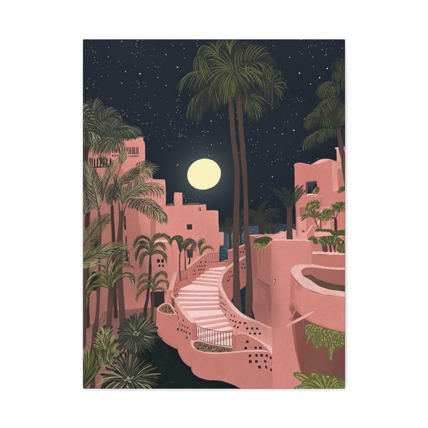
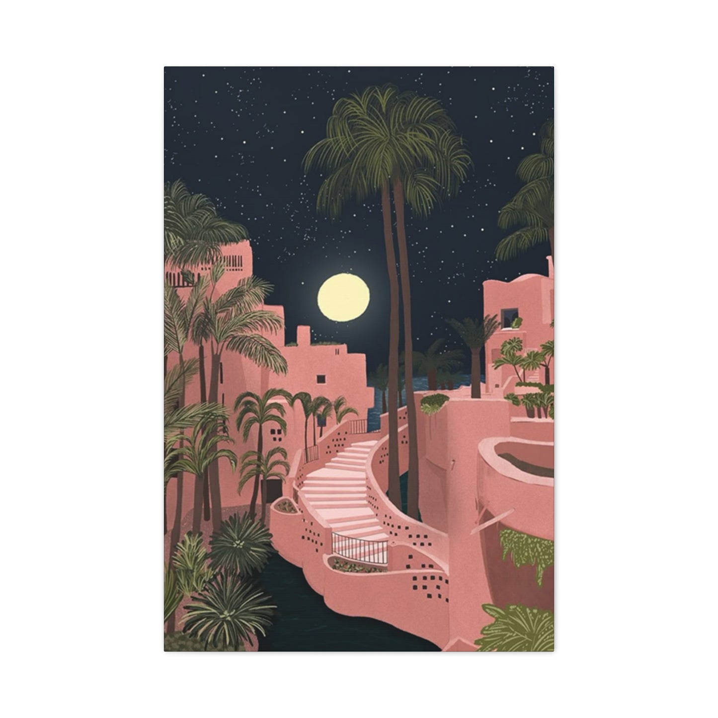
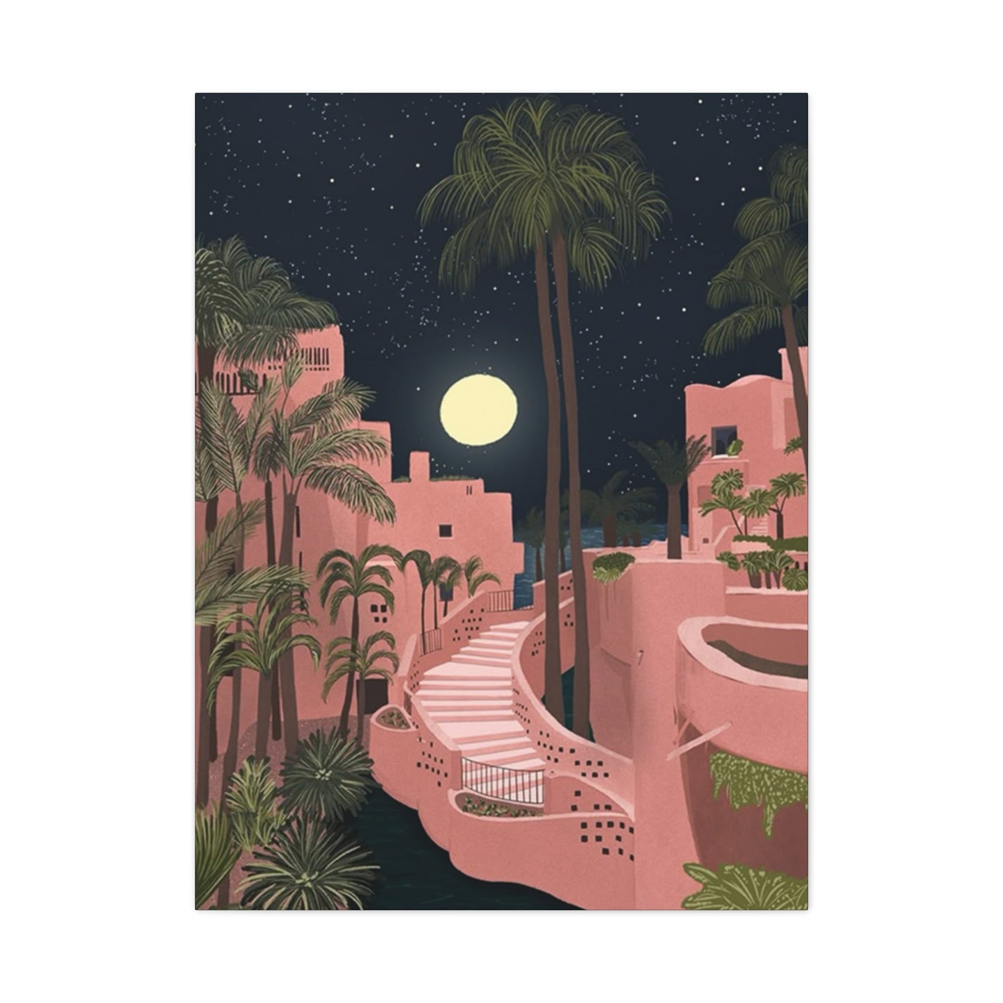
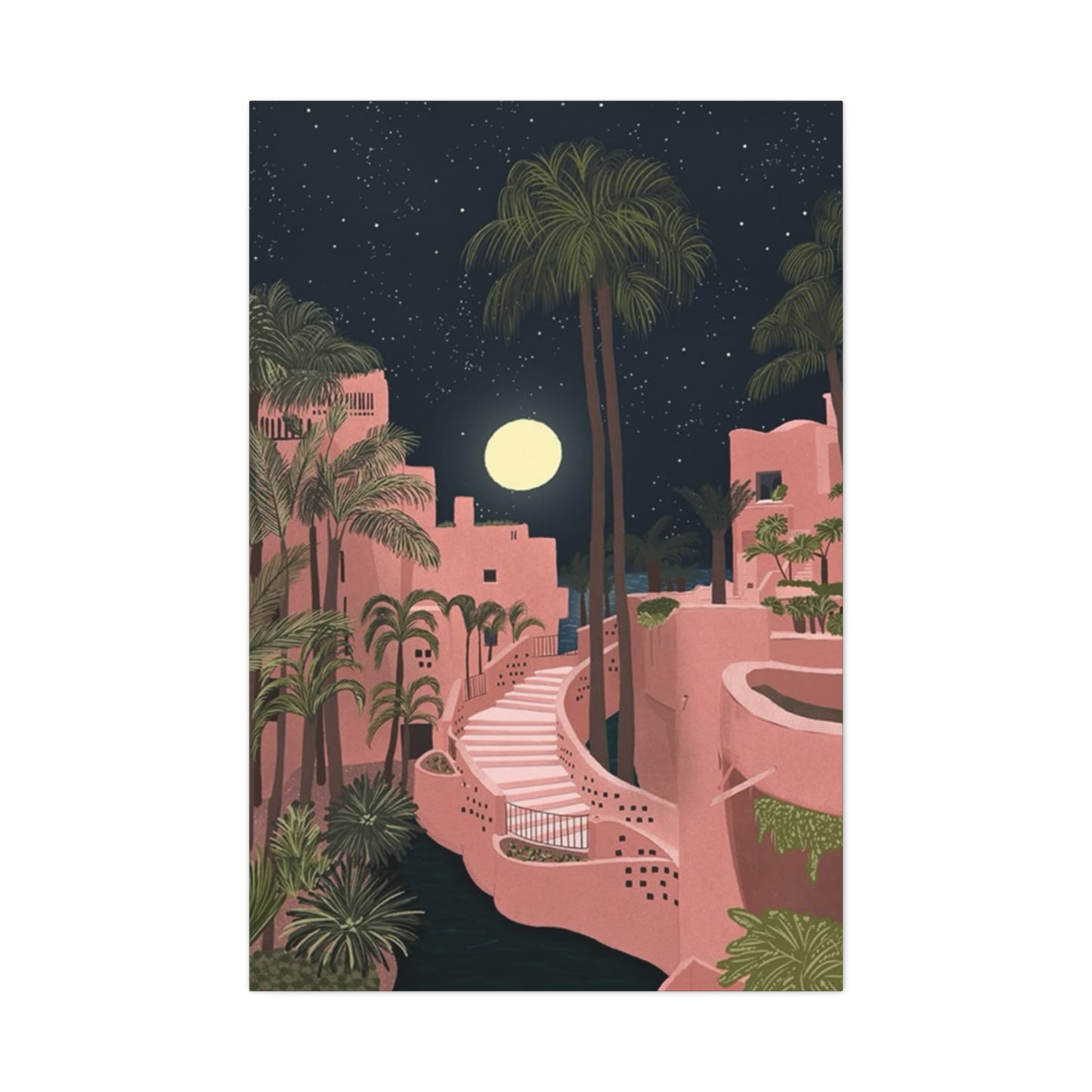
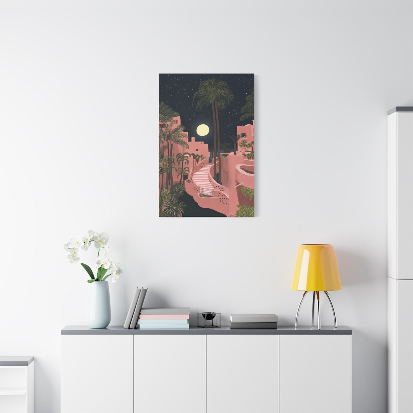

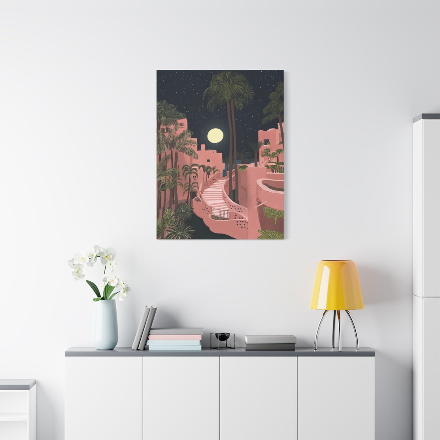
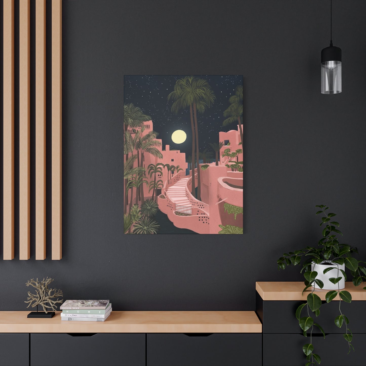
Spanish Resort Décor: Pink Resort in Spain Wall Art Canvas Prints That Inspire Relaxation
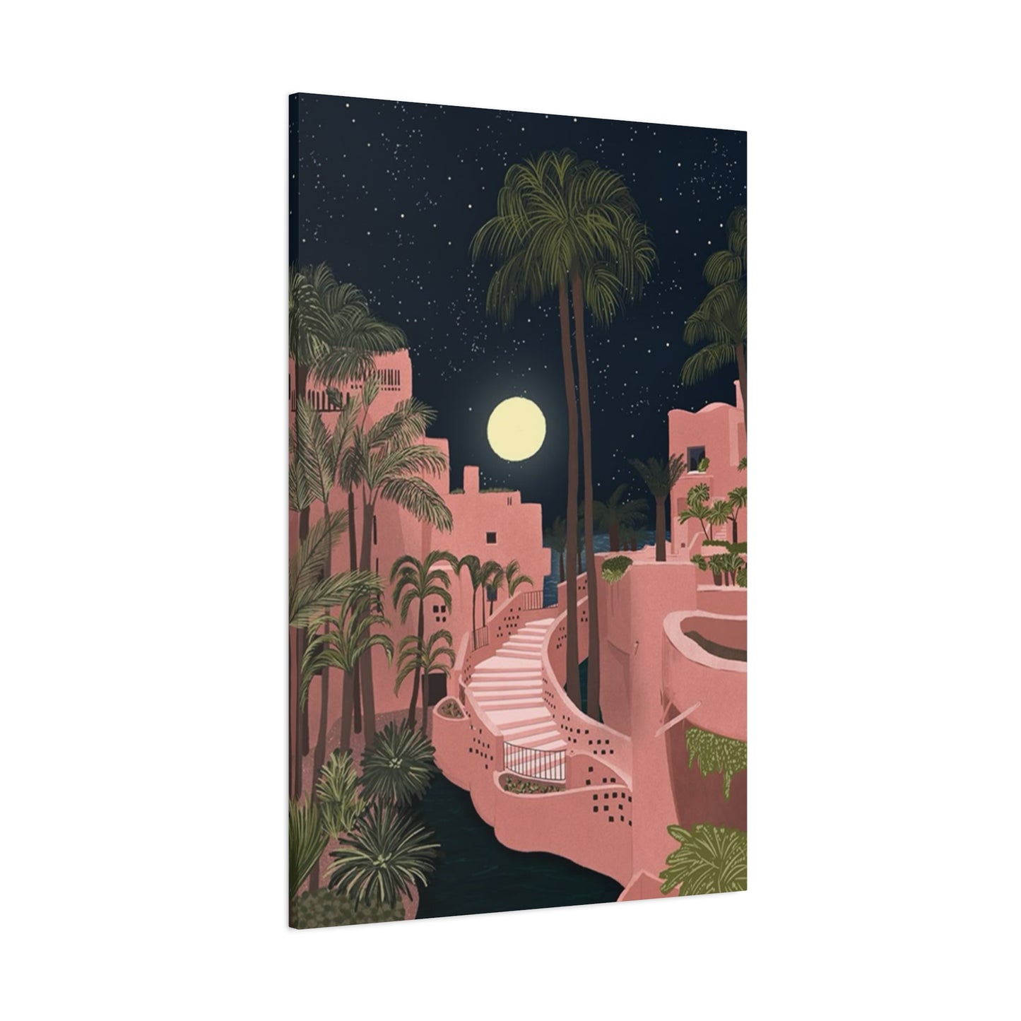
The aesthetic of pink resorts in Spain has captured the imagination of interior designers, travel enthusiasts, and home décor lovers around the world. This particular style represents a fusion of Mediterranean elegance, contemporary design, and the romantic essence of Spanish coastal living. When we talk about pink resort wall art canvas prints, we're discussing a sophisticated approach to home décor that brings the warmth, charm, and vibrant energy of Spain's most coveted vacation destinations directly into your living spaces. These canvas prints serve as windows into a lifestyle that embodies relaxation, luxury, and artistic expression.
The pink resort aesthetic has become increasingly popular over the past several years, particularly among people seeking to create peaceful sanctuaries within their homes. Whether you're decorating a bedroom, living room, bathroom, or any other space, these canvas prints offer a versatile solution that works with various interior design styles. The beauty of pink resort wall art lies in its ability to transport you mentally to serene Spanish coastal environments, complete with the architectural beauty, landscape features, and atmospheric qualities that make these destinations so special. Understanding what makes these prints special requires examining their origins, their cultural significance, and the way they've evolved within contemporary home décor trends.
Spanish resorts, particularly those known for their distinctive pink architecture and design elements, represent a unique blend of traditional Mediterranean charm and modern luxury. The pink resort phenomenon gained significant momentum following the rise of luxury travel culture and the Instagram era, when visually stunning travel destinations became aspirational lifestyle markers. This pink architectural style reflects both historical influences and contemporary design preferences that favor softer, more romantic color palettes. When these visual elements are captured in wall art canvas prints, they create powerful design statements that speak to comfort, style, and sophistication.
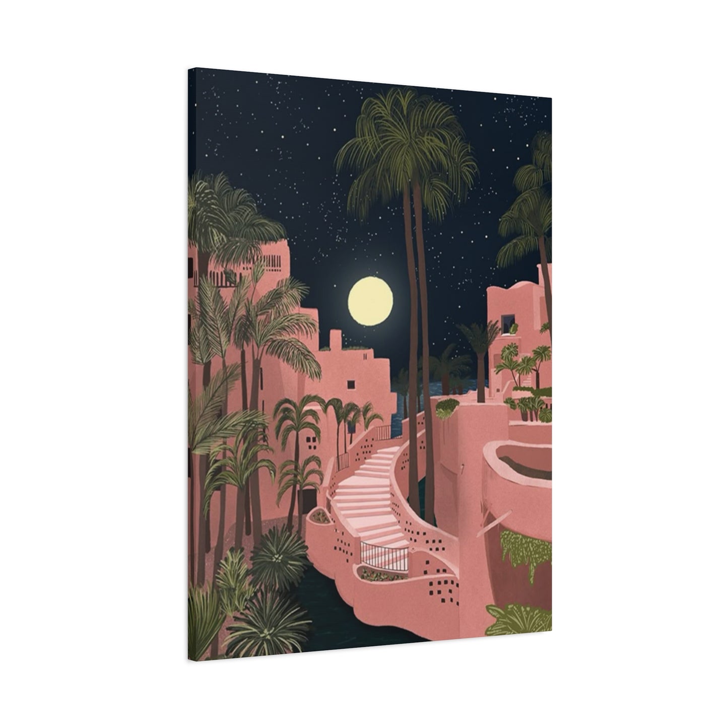
The process of transforming photographic or artistic representations of pink resorts into canvas prints involves several sophisticated techniques. Modern printing technology allows for incredibly detailed reproductions that capture the nuances of color, texture, and light that make these destinations so visually compelling. Canvas as a medium has particular advantages over other printing materials because it provides texture, durability, and a more sophisticated aesthetic that complements both traditional and contemporary interiors. The canvas surface diffuses light slightly differently than prints on paper or other materials, creating a more gallery-quality appearance that enhances the overall impact of the artwork.
Understanding consumer preferences for pink resort wall art requires acknowledging the broader trends in interior design that have emerged over recent years. There's been a significant shift away from stark, minimalist approaches toward more emotionally engaging designs that incorporate color, warmth, and personal meaning. Pink, in particular, has experienced a major renaissance in design circles, moving away from its historical associations with overly feminine or childish spaces and instead being recognized as a sophisticated, versatile color that works beautifully in adults' spaces. When combined with resort imagery from Spain, pink becomes a statement about sophistication, travel aspirations, and personal style preferences.
The Architecture and Design Elements of Spanish Pink Resorts
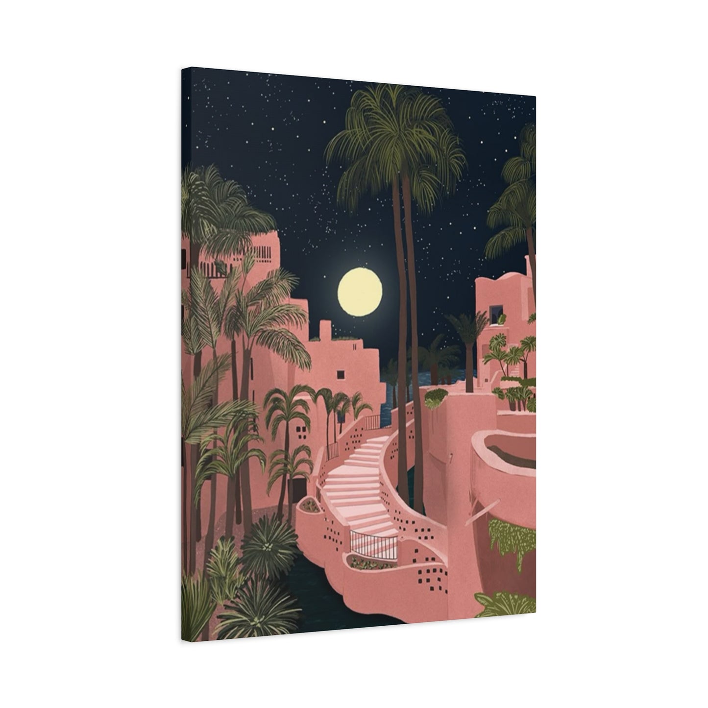
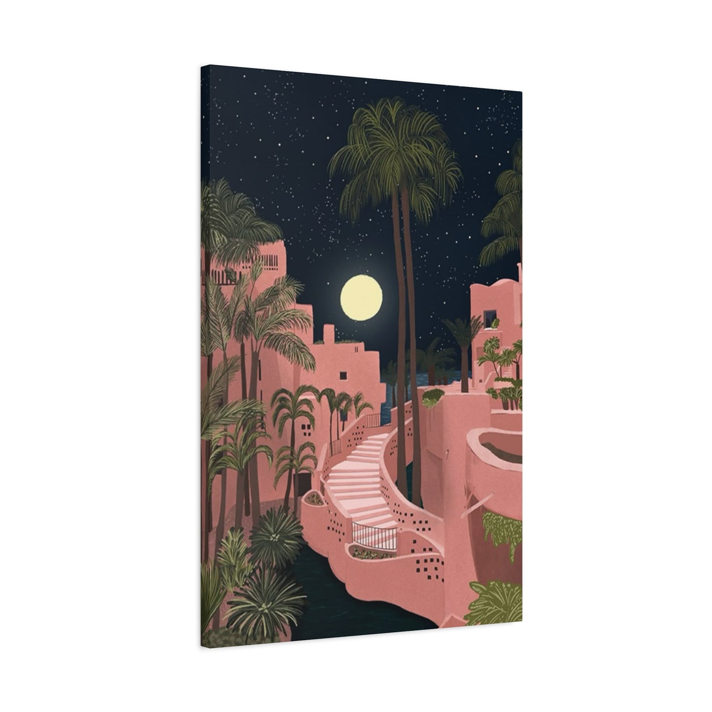
Spanish resorts that feature prominent pink architectural elements represent a fascinating intersection of tradition, innovation, and aesthetic vision. These buildings often incorporate design principles that draw from both the Mediterranean vernacular traditions and contemporary luxury hospitality standards. The pink color itself is rarely a simple, uniform shade; instead, it typically represents a carefully selected palette that ranges from soft peachy tones to more saturated rose hues, with various undertones that shift throughout different times of day as light conditions change. This complexity in coloration is one reason why canvas prints of these resorts prove so visually interesting and engaging.
The architectural features that define Spanish pink resorts typically include rounded edges, arched doorways and windows, curved balconies, and flowing interior spaces that prioritize both aesthetics and functionality. Many of these resorts draw inspiration from traditional Spanish colonial architecture, which featured these rounded, organic shapes as practical responses to climate conditions while also creating distinctly beautiful visual effects. The exterior walls of these buildings often incorporate specialized materials and finishes that contribute to the pink appearance, including certain types of stucco, paint formulations, and sometimes natural stone elements that have pink undertones. Understanding these architectural elements helps explain why representations of these buildings in wall art hold such significant visual appeal.
The landscape integration around pink resorts represents another crucial design element that affects how these spaces appear in canvas prints. Spanish resorts are typically situated in environments that complement their architectural character, whether that means Mediterranean gardens with olive trees and flowering shrubs, views of dramatic coastal cliffs, proximity to azure waters, or incorporation of architectural heritage elements. The designers of these resorts understand that the building itself is only one component of the overall aesthetic experience; the surrounding environment, including vegetation, water features, pathways, and exterior furnishings, all contribute to creating cohesive visual narratives. When captured in canvas prints, these broader landscape and architectural contexts become essential elements that communicate the full experience of these special spaces.
Interior design elements within pink resorts also influence how these spaces are represented in wall art. The color palette used inside these facilities typically complements the exterior pink tones, incorporating neutral backgrounds that allow accent colors to create visual interest. Common interior design features include marble or stone flooring, ornate light fixtures, carefully selected furniture pieces, and artwork displays that collectively create an impression of refined luxury. These interior elements are often featured in canvas prints that capture specific rooms, corridors, or architectural details, allowing people to bring interior resort aesthetics into their own homes. The psychological effect of viewing these interior spaces in art form is substantial, as they evoke feelings of peace, luxury, and aspiration.
The role of natural light in creating the visual character of pink resorts cannot be understated. Spanish coastal environments typically receive abundant natural light throughout most of the year, and resort architecture is often designed to maximize and showcase this lighting. The way sunlight interacts with pink architectural surfaces creates dynamic visual effects throughout the day, with the color shifting from warmer, more saturated tones during golden hour to cooler, more subtle shades during midday. This interplay between light and color is something that skilled photographers and artists capture when creating images that are later reproduced as canvas prints. The lighting conditions present in the original images significantly impact how the prints will appear when hung in various home environments with different natural and artificial lighting conditions.
Exploring Different Styles and Artistic Interpretations of Resort Wall Art
The representation of Spanish pink resorts in wall art encompasses a surprisingly diverse range of artistic styles and interpretations, each offering distinct visual and emotional experiences. Photorealistic representations form one category of these artistic approaches, where the goal is to create an image as visually accurate as possible to how an actual resort appears. These photographs typically capture specific moments in time, freezing particular lighting conditions, atmospheric qualities, and architectural details that make the subject compelling. Photorealistic canvas prints of pink resorts appeal to people who want an authentic representation of these spaces, often because they've visited the resort themselves or aspire to do so in the future.
Artistic interpretations and stylized representations comprise another significant category of pink resort wall art. These pieces might employ techniques such as watercolor effects, impressionistic approaches, minimalist line drawings, or abstract interpretations that capture the essence of a space without necessarily representing it literally. An artist might take the core elements of a pink resort—the distinctive color, the curved architectural forms, the surrounding landscape—and create a composition that emphasizes certain elements while minimizing others. This approach appeals to people seeking artwork that makes a unique statement or that complements specific interior design aesthetics. Stylized representations often feel more contemporary and less tied to specific locations, making them more versatile in terms of where and how they're displayed.
Panoramic and wide-angle interpretations of resort spaces represent another distinct approach to capturing these environments in canvas print form. Wide-angle photography or artwork offers viewers a comprehensive sense of place, showing how spaces relate to their surroundings and providing context that helps communicate the full experience of being in these environments. Panoramic representations of pink resorts might capture expansive courtyard spaces, sweeping water views, or the relationship between buildings and landscape features. These wider perspectives work particularly well in spaces where larger canvases can be displayed, as they take advantage of the expanded visual field to communicate immersive environments. The scale and scope of panoramic representations contribute to their impact in interior spaces, making them focal points that command attention and engage viewers in meaningful ways.
Detail-focused artwork represents yet another approach to pink resort wall art, where photographers and artists zoom in on specific architectural elements, decorative details, or landscape features rather than capturing entire spaces. A canvas print might focus on an ornate doorway, a section of curved architecture, flowering plants in a resort garden, or reflections in water features. These detail-oriented compositions appeal to people who appreciate the craftsmanship and design elements that contribute to resort environments. Detail-focused artwork often works beautifully in smaller spaces or as part of gallery wall arrangements where multiple pieces work together to create a comprehensive narrative about place and design.
Contemporary and modern artistic interpretations of pink resorts often employ bold color choices, geometric compositions, or mixed media approaches that reinterpret the subject matter in unexpected ways. An artist might enhance the pink tones to create a more saturated, visually striking composition, or they might combine photographic elements with illustrative or graphic design elements. Modern interpretations often feel fresh and current, appealing to people seeking art that comments on contemporary culture or that brings fashionable sensibilities to their home environments. The flexibility of canvas printing technology makes it possible to produce these creative reinterpretations while maintaining excellent image quality and color fidelity.
The Role of Color Psychology in Pink Resort Wall Art
The color pink carries significant psychological and cultural meanings that influence how people respond to pink resort wall art. In contemporary design, pink is associated with calm, sophistication, playfulness, and emotional warmth. Research in color psychology suggests that exposure to pink can have subtle but meaningful effects on mood and perception of space. Pink tones are believed to have mildly sedative properties, contributing to feelings of relaxation and comfort. This psychological dimension of the color is one reason why pink resort wall art proves particularly effective in bedrooms, bathrooms, living rooms, and other spaces where people seek to create peaceful, welcoming environments.
The specific shade of pink used in resort wall art significantly impacts the psychological and aesthetic effects of these pieces. Soft, peachy pinks tend to feel warm, approachable, and friendly, making them ideal for creating welcoming spaces that feel comfortable and intimate. These lighter, warmer pinks work well in spaces where you want to encourage relaxation and social connection. Deeper rose or mauve tones communicate more sophistication and elegance, making them appropriate choices for spaces meant to convey refined taste and luxury. Coral-tinged pinks bring energy and vibrancy, making them appropriate for spaces meant to feel dynamic and inspiring. Understanding these nuances in pink coloration helps people select canvas prints that align with their specific design intentions and the psychological effects they wish to create in their spaces.
The interaction between pink tones and other colors in the surrounding environment influences how pink resort wall art is perceived. Pink works beautifully with neutral backgrounds including white, cream, beige, and soft gray, which allow the pink tones to stand out while maintaining a sophisticated aesthetic. The pairing of pink with soft blues and greens creates harmonious combinations that evoke the serene qualities associated with coastal environments. When displayed against warmer background colors such as terracotta or warm brown, pink takes on different qualities, sometimes becoming more muted and sophisticated or, depending on the shades, more dynamic and warm. Understanding color harmony and how pink relates to surrounding hues helps people make informed decisions about where and how to display their pink resort wall art.
The cultural evolution of pink as a design color has significant implications for how contemporary audiences respond to pink resort imagery. Historically, pink was strongly gendered as a feminine color, leading many adults to avoid it in their personal spaces. Over the past decade, however, designers and cultural commentators have increasingly challenged these associations, recognizing pink as a sophisticated, versatile color appropriate in spaces regardless of the user's gender identity or age. This cultural shift has made pink resort wall art increasingly appealing across broader demographics. The rise of millennial and Gen Z design preferences, which often incorporate bold colors and reject traditional gender-based color coding, has accelerated acceptance of pink in sophisticated interior design contexts. Pink resort art now appeals to diverse audiences seeking to create spaces that reflect contemporary sensibilities while conveying luxury and refined taste.
The way natural and artificial light affects the perception of pink in wall art deserves careful consideration. In natural daylight, especially in warm afternoon or golden hour light, pink tones become more saturated and warm, creating dramatic visual effects. In cool morning light, the same pink tones may appear more muted and sophisticated. Under artificial lighting, the color temperature of the light source significantly impacts how pink appears; warm incandescent or soft white LED lighting enhances pink tones and contributes to an intimate, comfortable atmosphere, while cool white or blue-toned lighting can make pink appear more subdued or even slightly washed out. People designing spaces with pink resort wall art should consider the specific lighting conditions in their spaces throughout the day and evening to ensure the artwork achieves the desired visual and emotional effects.
Selecting the Perfect Pink Resort Canvas Print for Your Space
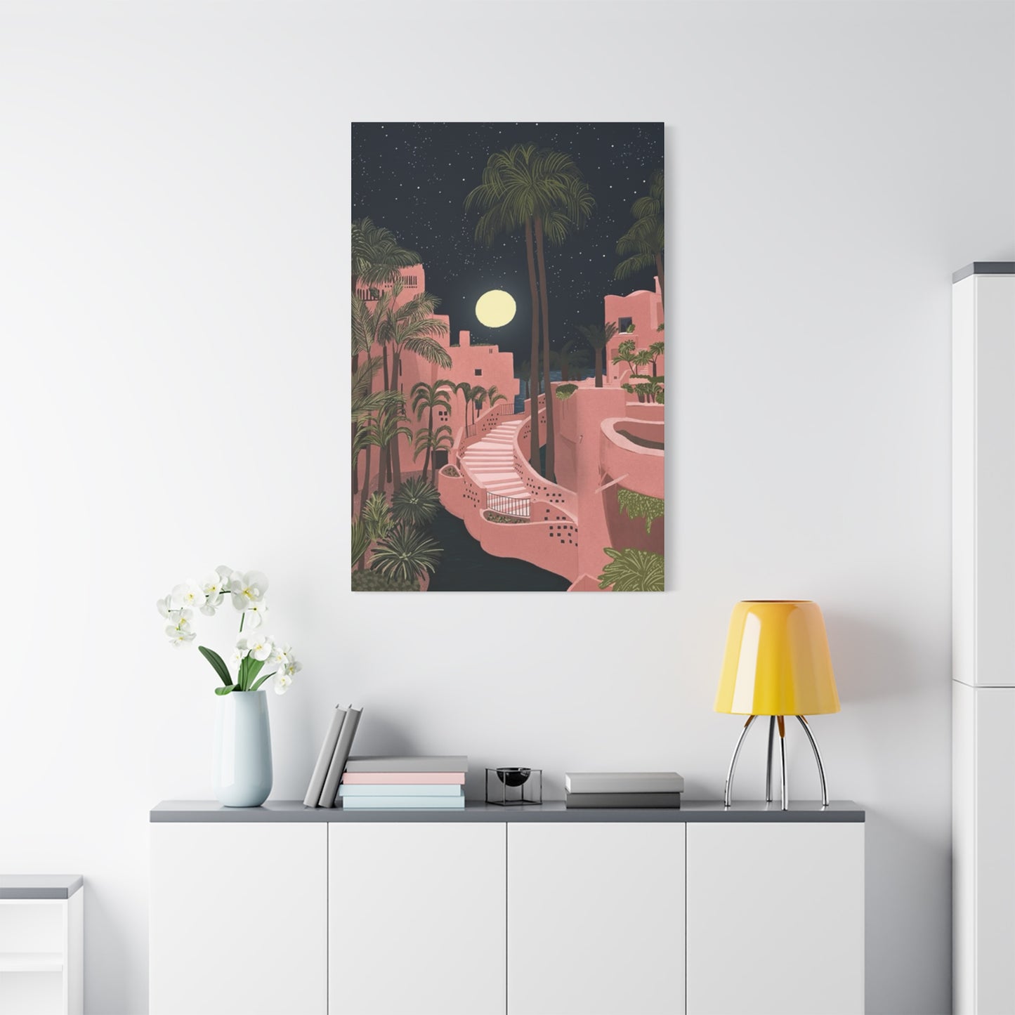
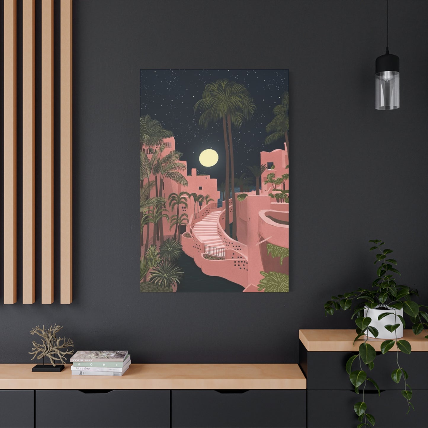
Choosing an appropriate pink resort canvas print for a particular space requires considering multiple factors including room size, existing décor, lighting conditions, personal style preferences, and the specific purpose the artwork will serve within the space. The first consideration involves assessing the size of the wall space where the canvas will be displayed. Large, open wall spaces can accommodate substantial canvas prints that serve as focal points, drawing attention and anchoring the room's design scheme. Smaller spaces might benefit from more modestly sized canvases that provide visual interest without overwhelming the space. Professional design advice suggests that artwork should occupy roughly 50 to 75 percent of the wall space it's displayed on, creating a balanced visual presentation that integrates the art into the overall room design.
The existing color palette and design style of a room significantly influences which pink resort canvas prints will work effectively. In rooms with neutral backgrounds and minimal color, a vibrant pink resort canvas can serve as the primary color statement, with other furnishings and décor elements coordinated to complement the artwork. In rooms that already incorporate color and pattern, more subtle or sophisticated representations of pink resorts might work better, providing visual interest without competing with existing design elements. The style of furnishings and décor present in the space should also inform canvas selection; contemporary minimalist spaces benefit from sleek, modern interpretations of resort imagery, while traditional or eclectic spaces might accommodate more detailed, photorealistic representations or artistic interpretations.
Lighting conditions in the space where the canvas will be displayed deserve careful evaluation, as light significantly impacts how artwork appears. Spaces with abundant natural light can display canvas prints with richer, more saturated colors, as the natural light complements and enhances the artwork. Spaces with limited natural light might benefit from canvas prints in slightly lighter, warmer tones that feel less heavy. The presence of artificial lighting also matters; warm lighting creates intimate, comfortable atmospheres that enhance the appeal of warm pink tones, while cooler lighting might require adjusting color selection accordingly. Consider the time of day when you most often view the artwork; a canvas that looks beautiful in morning light might appear different in evening artificial light, so aim for pieces that maintain appeal across various lighting conditions.
Personal style preferences and emotional connections to the subject matter should guide canvas print selection. If you've visited a particular pink resort in Spain and experienced a meaningful connection to the place, purchasing canvas art depicting that specific location creates personal significance beyond the aesthetic appeal. Alternatively, if you're drawn to the general aesthetic of pink resorts without connection to any specific location, selecting artwork that captures the essence of the style rather than a particular place might be more appropriate. Consider what emotional response you want to experience when viewing the artwork; do you want to feel transported to a vacation destination, inspired by architectural beauty, or comforted by soft, warm colors? Different representations of pink resorts will trigger different emotional responses based on their specific aesthetic qualities.
The quality of the canvas print itself represents an important consideration that impacts both the initial appearance and long-term durability of the artwork. High-quality canvas prints employ superior printing techniques and materials that result in vibrant colors, sharp details, and accurate color reproduction. The canvas material itself should be durable and resistant to fading, especially in spaces where the artwork will receive direct sunlight. Professional printing techniques such as giclee printing ensure that subtle color variations and details from the original image are faithfully reproduced. When selecting a canvas print, inquire about the printing process, canvas type, and UV protection features to ensure you're investing in artwork that will maintain its appearance for years to come. The weight of the canvas and the quality of the stretching and framing around the edges also impact the overall appearance of finished pieces.
Creating Cohesive Design Schemes with Pink Resort Wall Art
Integrating pink resort canvas prints into cohesive room design schemes requires thoughtful consideration of color relationships, complementary furnishings, and the overall visual narrative created through multiple design elements. One approach involves building an entire design scheme around a pink resort canvas print, using the artwork as inspiration for selecting paint colors, furnishings, and accessories that complement and enhance the piece. If the canvas features specific colors beyond pink—perhaps green foliage, blue water, or neutral architectural elements—these secondary colors can be incorporated into the room's broader palette through furniture selection, textiles, and decorative objects. This approach creates visual harmony where the room feels intentionally designed rather than randomly assembled.
Gallery wall arrangements represent another effective approach to incorporating pink resort canvas prints within interior design schemes. By combining multiple pieces of varying sizes and perhaps different artistic styles or interpretations of resort imagery, you create a comprehensive visual narrative that commands attention. Gallery walls work particularly well in entryways, living rooms, hallways, and bedroom spaces. The selection of frames, matting, and spacing between pieces influences the overall impact of gallery arrangements. When combining pink resort artwork with other pieces, maintaining a cohesive color palette helps create a unified, intentional appearance. Some people prefer matching frames that create a formal, structured appearance, while others favor varied frames and matting styles that feel more eclectic and collected.
Layering pink resort canvas prints with complementary textiles creates richness and complexity within interior spaces. Soft furnishings such as throw pillows, blankets, area rugs, and curtains can incorporate pink tones and resort-inspired patterns that echo themes present in the wall art. Textiles provide texture and softness that complements the smooth, graphic quality of canvas prints. Mixing different shades of pink within the space—perhaps a deeper rose tone in the artwork combined with softer peachy pinks in textiles—creates visual depth while maintaining design coherence. Incorporating natural textures such as woven materials, wood elements, and plants contributes to the resort aesthetic that pink artwork evokes, creating spaces that feel like personal retreats inspired by vacation destinations.
The selection and placement of decorative accessories around pink resort canvas prints influences how the artwork functions within the broader interior space. Metallic accents including gold, brass, or copper elements coordinate beautifully with pink and warm tones, adding sophistication and glamour. Mirrors positioned near canvas prints reflect light and expand visual perception of space while creating interesting interplay with the artwork. Carefully selected vases, books, sculptures, and other objects arranged on shelves or surfaces near displayed artwork contribute to creating spaces that feel curated and intentional. However, avoiding excessive clutter that competes with the artwork is important; the canvas should remain the primary focal point, with accessories providing subtle support rather than distraction.
The role of furniture in creating cohesive design schemes with pink resort wall art involves selecting pieces that complement the artwork in style and color without overwhelming the space. Neutral or warm-toned furniture allows pink artwork to remain visually prominent while maintaining overall design harmony. Furniture selections should reflect the style communicated by the canvas—contemporary furnishings work better with modern interpretations of resort imagery, while traditional or bohemian furniture styles complement more artistic or detailed representations. The scale of furnishings should also be considered; in spaces with large canvas prints, slightly larger or more substantial furniture pieces maintain visual balance, while modest artwork benefits from more delicate or streamlined furnishings.
The Impact of Pink Resort Wall Art in Different Room Settings
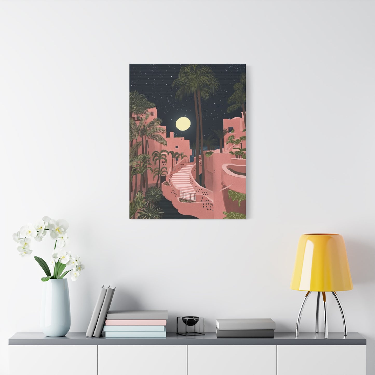
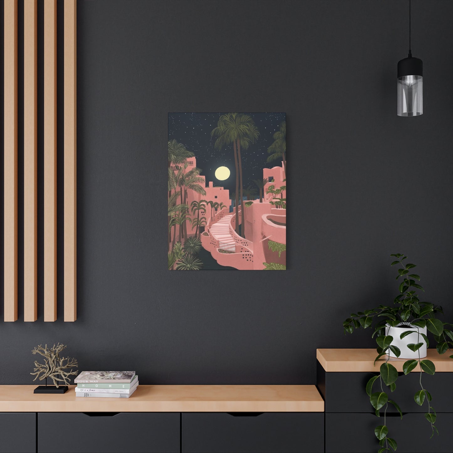
Bedrooms represent spaces where pink resort wall art creates particularly meaningful impacts, given the associations between pink tones, relaxation, and restorative sleep. In bedroom settings, soft, warm pink tones from canvas prints contribute to creating peaceful, intimate environments that support healthy sleep and relaxation. Displaying pink resort artwork in bedrooms connects the space conceptually to vacation destinations known for providing respite and renewal. The calming visual qualities of resort imagery—whether featuring architectural elements, water features, or landscape elements—encourage mental relaxation and transportation away from daily stresses. Positioning canvas prints where they're visible when settling into bed creates an opportunity for peaceful contemplation before sleep. Many people report that beginning their evenings by visually connecting with representations of peaceful resort spaces contributes to improved sleep quality and more pleasant dreams.
Living rooms and family spaces benefit from pink resort canvas prints through different mechanisms. In shared family spaces, artwork depicting beautiful destinations provides conversation starters and connects household members to shared aesthetic interests and travel aspirations. Living room artwork often serves a social function, communicating something about the inhabitants' taste, interests, and design sensibilities to visitors. Pink resort canvas prints positioned as focal points in living rooms create inviting atmospheres that encourage relaxation and social connection. The visual impact of these pieces draws attention, making spaces feel more intentionally designed and sophisticated. For people who frequently entertain guests, displaying pink resort artwork signals an appreciation for beauty, travel, and refined design sensibilities.
Bathroom spaces offer excellent opportunities for displaying pink resort canvas prints, as the moisture and humidity in these spaces don't adversely affect properly produced canvas artwork. Bathrooms are private spaces where people spend time alone, engaged in self-care activities that benefit from peaceful, beautiful surroundings. Pink resort imagery in bathrooms creates spa-like environments that enhance the experience of bathing or grooming activities. The soft pink tones associated with many resort representations contribute to creating spaces that feel luxurious and indulgent. Canvas prints in bathrooms should be positioned away from direct water spray to maximize durability, but they can otherwise serve similar aesthetic functions as artwork in other areas of the home. Many people deliberately design their bathrooms as personal retreats, and pink resort artwork supports this intention by creating visually beautiful, emotionally supportive environments.
Home offices and workspace areas gain from the inclusion of pink resort canvas prints by creating environments that feel welcoming and inspiring while supporting productivity. While overly distracting artwork could undermine focus, carefully selected pink resort imagery positioned outside the direct line of sight when engaged in work provides pleasant visual interest during breaks. The presence of beautiful artwork in work spaces subtly communicates that the user values aesthetics and personal well-being alongside professional achievement. Research suggests that viewing images of nature and beautiful environments during work breaks enhances mental restoration and supports sustained productivity. Pink resort artwork serves this restorative function while also personalizing professional spaces in ways that feel sophisticated and intentional. In home offices designed to impress visiting clients or collaborators, pink resort artwork contributes to creating professional yet personable environments.
Entry hallways and foyer spaces provide excellent opportunities for pink resort canvas prints to create strong first impressions when guests enter homes. Entry spaces often set the tone for visitors' overall perception of a home's design aesthetic. Large canvas prints positioned prominently in entry areas communicate that the inhabitants value beauty, art, and thoughtful design. Pink resort artwork in entryways creates welcoming, sophisticated impressions that predispose visitors to perceive homes as well-designed and reflective of refined taste. The visual impact of substantial artwork in entry spaces helps these often-overlooked areas function as significant design statements. Lighting entry spaces strategically to highlight artwork displayed there ensures maximum visual impact while creating attractive, inviting environments for both residents and guests.
Dining rooms and spaces associated with gathering and nourishment benefit from pink resort canvas prints that create convivial, sophisticated atmospheres. The aesthetic of fine dining and entertaining connects naturally to the luxury and beauty associated with resort destinations. Pink resort artwork in dining rooms creates visual interest that engages guests while also supporting the creation of memorable dining experiences. The warm, welcoming qualities of pink contribute to environments where people feel comfortable sharing meals and conversation. In dining spaces, artwork positioned at eye level when seated allows guests to appreciate details and color nuances during meals. The presence of beautiful artwork in dining areas elevates the overall experience of sharing meals, suggesting intentionality and care in creating special occasions.
Understanding Canvas Print Production and Quality Factors
Modern canvas print production involves sophisticated processes that transform digital images into physical artworks displaying remarkable fidelity to original sources. The first step in the production process typically involves selecting an image and having it professionally prepared for printing, which may include color correction, resolution optimization, and ensuring the image is appropriately sized for the intended canvas dimensions. The preparation process is crucial because even small errors at this stage can result in printed canvases that fail to meet quality standards. Professional printing facilities employ specialists who understand how digital images translate to physical media and who can adjust settings to optimize color accuracy and detail reproduction.
Giclee printing represents the most sophisticated and widely used method for producing high-quality canvas prints. Giclee technology involves using inkjet printing systems that spray microscopic droplets of pigment-based ink onto canvas surfaces with extreme precision. The term giclee comes from a French word meaning "to spray," accurately describing the technology involved. Unlike some printing methods that use a limited number of colors to create images through overlapping dots, giclee printing uses a broader spectrum of colors, sometimes twelve or more different ink colors, to achieve subtle gradations and nuanced color reproduction. This technology allows for exceptional detail and color accuracy, making giclee-printed canvases essentially indistinguishable from fine art paintings in many cases.
Canvas material selection significantly impacts the final appearance and durability of printed artwork. Canvas production typically involves weaving cotton or linen fibers into structured fabrics that provide appropriate texture and stability for ink application. Canvas weight, measured in ounces per square yard, influences durability and appearance; heavier canvases generally provide superior stability and longer-lasting performance. The weave pattern of canvas affects how light interacts with the surface and how colors appear; tighter weaves create smoother surfaces that can show fine detail more clearly, while looser weaves create more pronounced texture. Some canvas options feature specially prepared surfaces designed to enhance ink adhesion and color vibrancy. Understanding these technical details helps people appreciate why higher-quality canvas prints command premium prices and deliver superior visual results compared to budget options.
Ink selection and color accuracy are crucial factors that determine how accurately canvas prints represent original images. Pigment-based inks, which are suspended in liquid carriers, are preferred for fine art reproduction because they provide superior color longevity and resistance to fading compared to dye-based inks. Professional printing facilities typically use ink sets that include multiple colors, allowing for sophisticated color mixing that achieves subtle variations and realistic representations of complex visual scenes. The archival quality of inks refers to their ability to resist fading when exposed to light and air over extended periods. High-quality pigment-based inks can maintain their color intensity for decades or even centuries when properly stored and displayed, ensuring that canvas prints retain their visual beauty throughout their lifespan.
UV protection represents an important consideration in canvas print production and display. Ultraviolet light exposure causes fading in printed materials over time, particularly in pigments susceptible to photochemical degradation. Quality canvas prints are typically produced with UV-resistant coatings applied to the canvas surface or use ink formulations specifically designed to resist UV damage. Additionally, protecting canvas prints from direct, prolonged exposure to sunlight by positioning them away from windows or using UV-filtering window treatments helps extend their color longevity. Understanding UV protection mechanisms helps people make informed decisions about displaying their canvas prints and implementing preservation strategies that maintain visual quality.
Stretching and mounting processes represent the final steps in producing finished canvas prints ready for display. Canvas is stretched over wooden frames, typically constructed from pine or other stable woods, and secured using staples or other fastening methods that ensure tautness and stability. Professional stretching ensures that canvas remains flat and wrinkle-free while remaining appropriately tight without being so taut that the material becomes stressed. The depth of the stretcher bars (typically ranging from 0.75 to 1.5 inches) influences the visual profile of the finished artwork and how it interfaces with walls. Some canvases feature wraparound printing where the image extends around the sides of the stretcher bars, creating a gallery-quality appearance, while others feature white or colored sides. Understanding these finishing details helps people select prints that align with their aesthetic preferences and interior design intentions.
Caring for and Preserving Pink Resort Canvas Prints
Proper care and maintenance of pink resort canvas prints ensures they maintain their visual beauty and longevity for many years. Regular dusting using soft, dry cloths prevents accumulation of dust particles that can dull the canvas surface and affect color perception. Gentle dusting should be performed using lint-free cloths and light pressure that doesn't risk damaging the canvas surface or the print layer. Avoid using feather dusters or cloths with rough textures that could scratch the canvas. Dusting should be performed infrequently enough to maintain cleanliness without excessive handling that might contribute to wear. For canvas prints with particularly valuable or delicate imagery, some conservation specialists recommend avoiding dusting altogether and instead allowing dust to settle naturally, as the risks of damaging artwork through cleaning sometimes exceed the risks posed by dust accumulation.
Positioning and protection from environmental factors represents a crucial aspect of canvas preservation. Canvas prints should be positioned away from direct sunlight, which causes fading and photochemical degradation of both canvas material and pigmented inks. North-facing walls provide ideal locations in many climates, as they receive reflected rather than direct sunlight. In spaces where direct sunlight cannot be avoided, UV-protective window treatments such as specialized films, coatings, or window coverings can significantly reduce UV exposure while maintaining visibility of displayed artwork. Canvas prints should also be kept away from sources of heat and moisture that could contribute to material degradation or mold growth. In bathrooms where humidity levels are elevated, positioning canvases away from water sources and ensuring adequate ventilation help prevent moisture-related damage.
Environmental conditions within homes significantly impact canvas longevity and visual stability. Temperature fluctuations cause expansion and contraction in both canvas material and wood stretcher frames, potentially leading to warping or stress fractures if changes are extreme. Maintaining relatively stable indoor temperatures helps preserve canvas integrity. Humidity levels that are too high promote mold and mildew growth and can cause canvas to warp, while humidity levels that are too low can cause canvas to become brittle and prone to damage. Most conservation specialists recommend maintaining indoor humidity between 30 and 50 percent, which also aligns with optimal conditions for most furnishings and building materials. Installing humidifiers or dehumidifiers as needed helps maintain appropriate humidity levels that support both artwork preservation and comfortable living conditions.
Handling canvas prints with care prevents accidental damage that can compromise their appearance and value. When moving or repositioning canvas prints, supporting them from the frame rather than the canvas itself prevents stress on the stretched material. Avoiding pressure or impact to the canvas surface protects against dents, creasing, or punctures that would be difficult or impossible to repair. When installing canvas prints on walls, using appropriate hanging hardware rated for the weight of the artwork ensures secure mounting that prevents falls or shifting. Professional installation by picture hanging specialists is recommended for particularly large or valuable pieces, as proper installation requires appropriate hardware selection and precise placement that ensures both safety and aesthetic presentation.
Addressing damage and performing conservation requires specialized expertise when damage occurs. Small areas of paint flaking or canvas damage might be addressed by conservation professionals who use techniques appropriate for protecting and preserving the artwork. However, most home owners cannot effectively repair canvas artwork without risking further damage. In cases where canvases are damaged by water, mold, or other significant issues, replacement often proves the most practical solution. Keeping records of where canvases were sourced helps facilitate reordering if original pieces become damaged beyond repair. Insurance coverage for artwork provides additional protection against losses from theft, accidents, or environmental damage, giving peace of mind for valuable pieces.
Incorporating Pink Resort Wall Art into Rental Spaces and Temporary Installations
For people renting apartments, houses, or other residential spaces, displaying personal artwork including pink resort canvas prints requires different approaches than in owned residences. Rental agreements sometimes restrict modifications to walls, limiting hanging options for artwork. Damage to walls from hole drilling or nail placement can result in loss of security deposits or additional rental charges. However, many wall-mounting options exist that allow temporary installation without leaving permanent marks. Adhesive picture hanging strips provide secure support for lightweight artwork without requiring nails or wall anchors. Magnetic hanging systems work in spaces with metal walls or surfaces, though residential spaces typically don't feature magnetic walls. Removable picture hangers specifically designed for rental spaces offer alternatives that hold artwork securely while leaving walls intact when removed.
Freestanding options for displaying pink resort canvas prints provide additional flexibility for rental or temporary spaces. Canvas prints can be leaned against walls on shelves, mantels, or furniture rather than being hung, creating casual gallery-like displays. This approach works well in spaces where wall art is desired but installation options are limited. Freestanding displays of canvas prints create easy-to-modify arrangements that can be adjusted or changed without any wall impact. Some people use easels or picture stands specifically designed to display canvas prints in upright positions, creating sculptural presentation that works well in entryways or prominent room locations. These temporary display methods provide aesthetic benefits similar to permanently installed artwork while maintaining flexibility appropriate for rental situations.
Moving considerations become important when people wish to relocate with their pink resort canvas collection. Unlike artwork that's been professionally installed with specialized framing and mounting, most canvas prints can be easily removed and relocated by homeowners. Canvas prints hanging from hooks or adhesive strips come down quickly with minimal wall impact. Before moving, protecting canvas prints with plastic coverings or bubble wrap prevents damage during transit. Properly wrapped canvases can be safely transported in vehicles or shipping containers without specialized art handling services, making relocation of canvas artwork much more practical than moving traditionally framed pieces. The portability of canvas prints appeals to people who anticipate moving or relocating, as investment in artwork doesn't become problematic when life circumstances change.
Creating gallery walls in rental spaces presents particular challenges but remains possible with creative approaches. Using adhesive picture hanging strips, removable painting tape, or magnetic systems, people can create temporary gallery arrangements that don't require permanent wall modifications. Some renters photograph the walls before installation to guide repositioning when moving and ensure walls are returned to original condition. Creating gallery arrangements with canvas prints of varying sizes and orientations establishes visually interesting compositions that command attention even when using temporary installation methods. The advantage of gallery walls in rental spaces is that they can be easily modified or completely removed when relocating, making rental-appropriate artwork display much more flexible than permanent installations might suggest.
Commercial applications of pink resort canvas prints in rental or temporary settings include hotels, boutique accommodations, corporate offices, and other commercial spaces. Canvas prints offer an affordable alternative to commissioning custom artwork for commercial environments. The ability to quickly install, modify, or replace canvas prints makes them ideal for commercial spaces undergoing frequent design updates or seasonal décor changes. Commercial applications often involve displaying multiple coordinated canvas prints throughout spaces, using the artwork to establish cohesive design themes and reinforce brand aesthetics. The durability and low-maintenance characteristics of canvas prints make them practical choices for high-traffic commercial environments where extensive wear and damage might occur. Canvas prints provide the visual sophistication of fine art displays while offering practical and economic advantages for temporary or frequently updated commercial spaces.
Conclusion
Spanish Resort Décor: Pink Resort in Spain Wall Art Canvas Prints That Inspire Relaxation captures the essence of tranquility, sunlight, and Mediterranean artistry through a visual journey that merges culture, architecture, and emotion. Spanish resort-inspired wall art, particularly in pink tones, transforms ordinary interiors into spaces that breathe serenity and sophistication. These artworks encapsulate the warm allure of Spanish coastal life — the golden light of seaside mornings, pastel-toned villas basking under the sun, and the rhythmic charm of ocean breezes whispering through open terraces. Through pink resort-themed canvas prints, homeowners can bring the timeless elegance of Spain’s resort ambiance into their homes while cultivating a visual atmosphere steeped in relaxation and warmth.
At its heart, this style of décor celebrates the art of slowing down — an aesthetic and emotional retreat that draws inspiration from Spain’s coastal paradises such as Marbella, Costa del Sol, and Ibiza. The soft pink palette mirrors the blush hues of sunset skies and rose-tinted stucco walls that line the Mediterranean coastline. It evokes feelings of peace, comfort, and effortless luxury. Whether through watercolor landscapes, minimalist architectural renderings, or impressionistic seascapes, pink resort art offers a sense of escape without leaving the room. It invites the mind to wander, to imagine the hush of waves and the perfume of bougainvillea carried by a gentle breeze.
In modern interior design, pink resort-themed art serves as both statement and sanctuary. Its color language — a harmony of coral, peach, and blush — exudes warmth while maintaining subtlety, making it an ideal complement to neutral spaces. When paired with ivory walls, light wood furnishings, or sandy-toned textiles, it creates an atmosphere reminiscent of sunlit Mediterranean villas. For contemporary settings, framed pink resort canvases can balance minimalist compositions, softening clean lines with emotional warmth. Even in urban apartments, these artworks introduce a coastal calm that diffuses stress and replaces it with gentle optimism.
Lighting plays a crucial role in amplifying the charm of pink resort art. Natural light highlights its luminosity, emphasizing texture and tone transitions within the canvas. Soft artificial lighting — especially warm LED or ambient glow — enhances the pink undertones, allowing the artwork to radiate quiet sophistication even after sunset. Strategic placement above a sofa, in a hallway, or within a bedroom creates a focal point that subtly transforms spatial mood, offering a daily reminder of serenity and escape.
The pink resort theme also reflects cultural artistry deeply rooted in Spanish aesthetics. Traditional Spanish design values craftsmanship, warmth, and texture — elements that carry over into contemporary art interpretations. From stucco textures and terracotta rooftops to reflective sea horizons, these visual cues symbolize the nation’s deep connection to its coastal heritage. A pink resort wall print often merges architectural precision with emotional softness, celebrating balance — between built form and natural beauty, between human creativity and the timeless tranquility of the sea.
Beyond visual pleasure, such art nurtures emotional well-being. The soothing qualities of pink, scientifically associated with calmness and positivity, interact with the relaxed imagery of coastal life to reduce visual tension and stimulate mindfulness. Hanging these artworks in living rooms, reading corners, or bedrooms introduces subtle cues for relaxation — an aesthetic form of self-care that enhances both mood and environment.
For collectors and decorators, Pink Resort in Spain Wall Art offers versatility. Some pieces highlight the grandeur of luxury resorts and scenic coastlines, while others focus on the poetic simplicity of Mediterranean alleys bathed in pastel sunlight. Whether framed photographs, acrylic paintings, or digital compositions, they maintain a consistent essence: a sense of timeless leisure and refined elegance. The adaptability of this theme ensures harmony across design styles — from bohemian coastal to Scandinavian modern, from contemporary urban to rustic-chic.
Ultimately, Spanish Resort Décor is not just about beautifying walls — it’s about transporting the spirit. A pink resort canvas invites calm introspection and aesthetic pleasure, turning rooms into emotional landscapes where light and color dance in quiet harmony. Each artwork becomes a window to coastal Spain, reminding us that beauty thrives in simplicity, and tranquility lies in color and composition.
In essence, Pink Resort in Spain Wall Art Canvas Prints encapsulate more than the beauty of place; they embody the rhythm of relaxation, the poetry of Mediterranean living, and the emotional ease that comes from balanced design. They transform homes into sanctuaries that mirror the charm of sunlit balconies, the whisper of tides, and the peace found in pastel horizons. Through every hue and brushstroke, these artworks deliver a visual retreat — a timeless invitation to pause, breathe, and embrace the soft luxury of Spanish serenity.
