


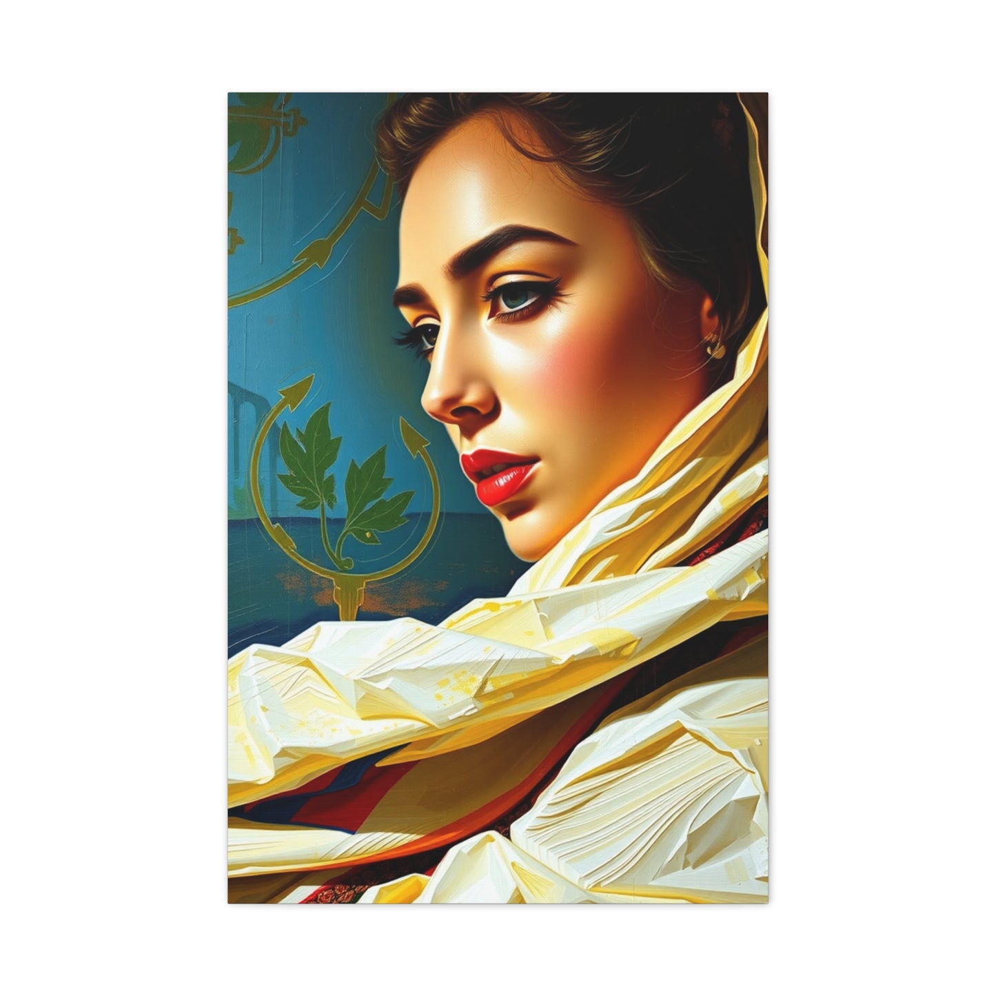
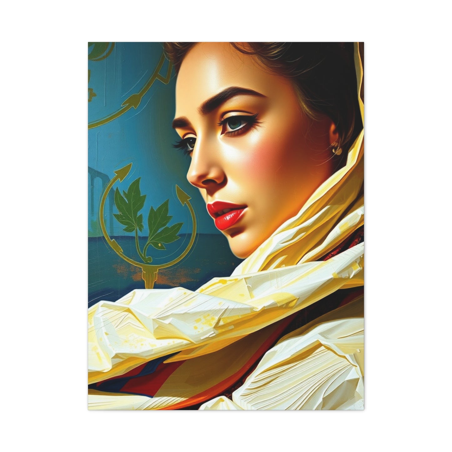
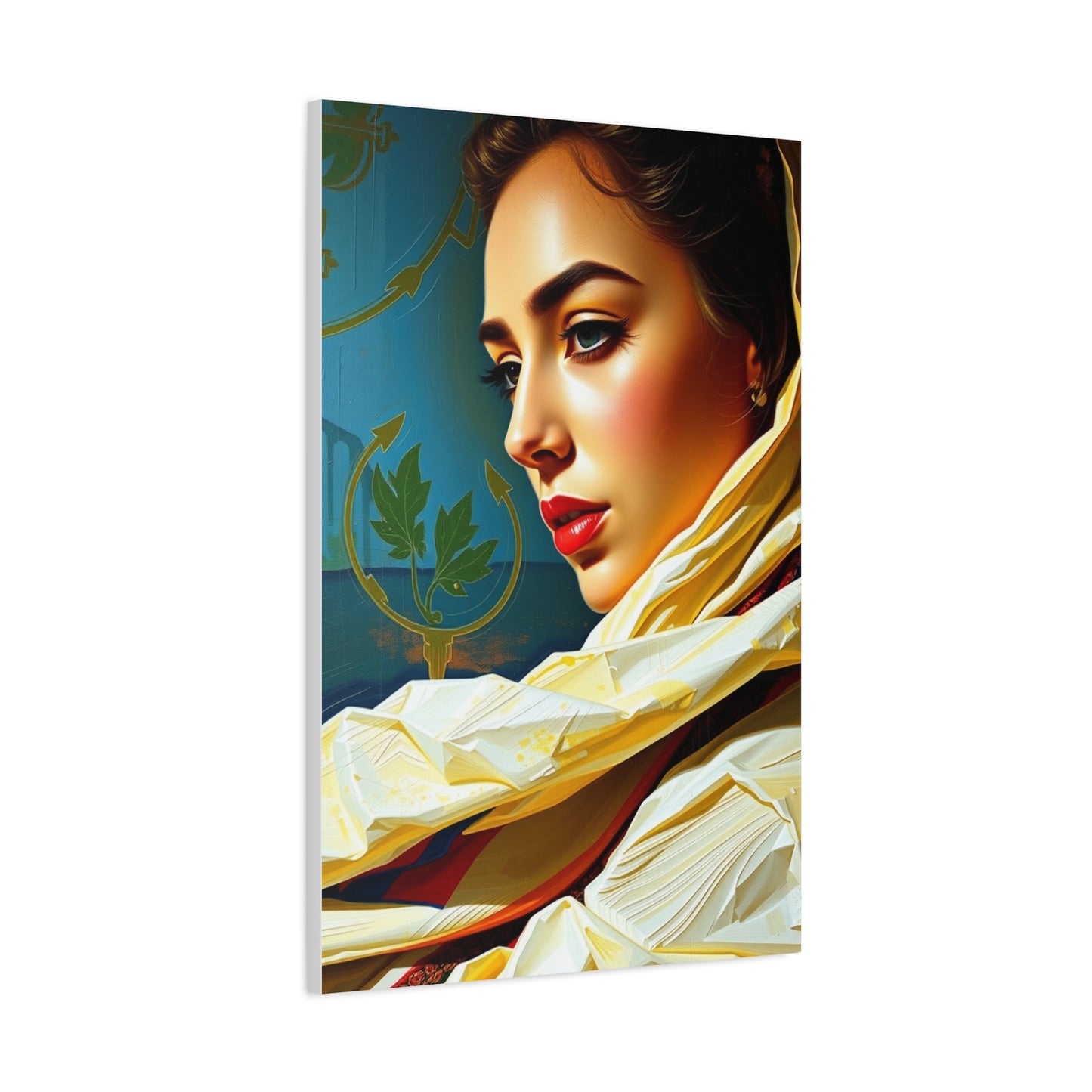
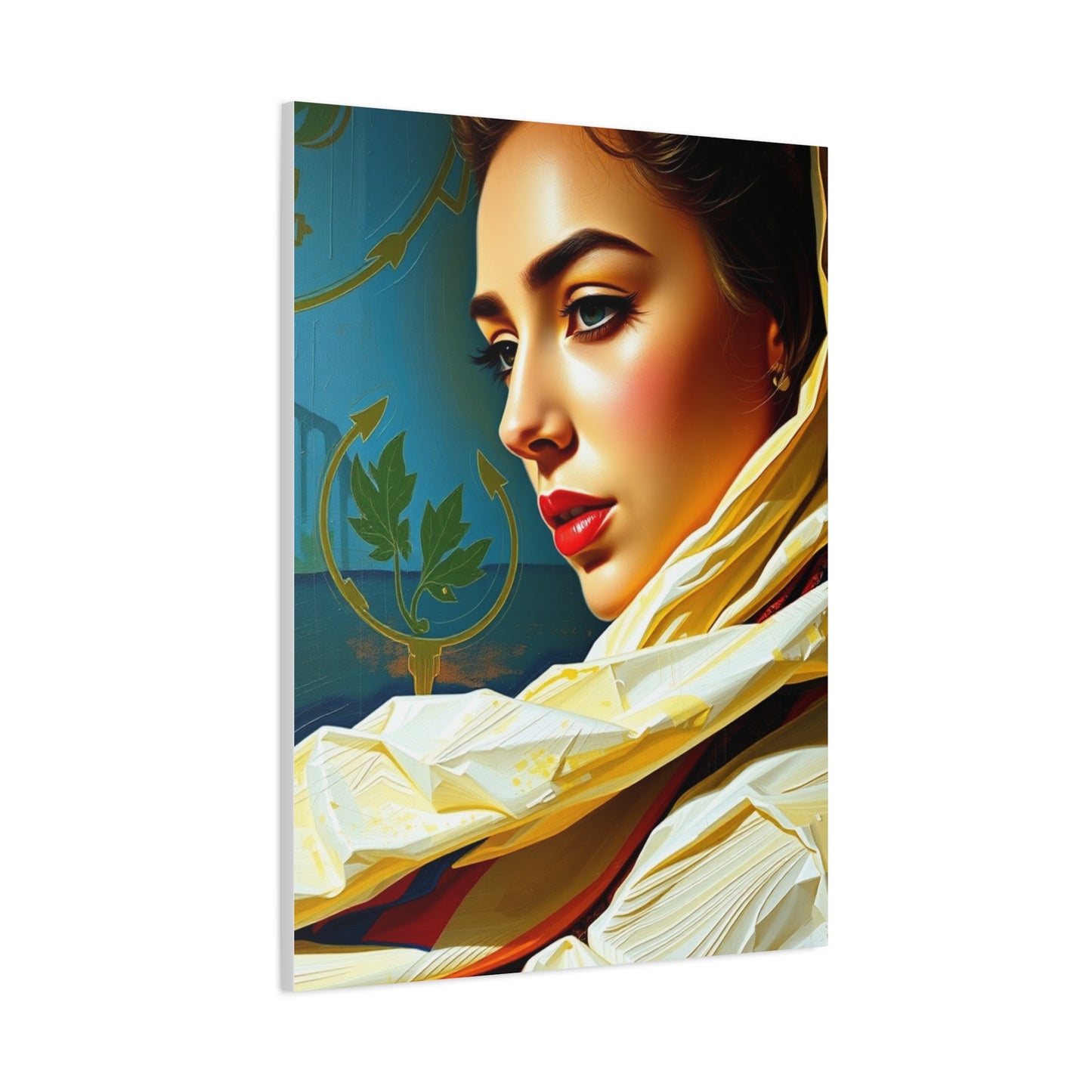
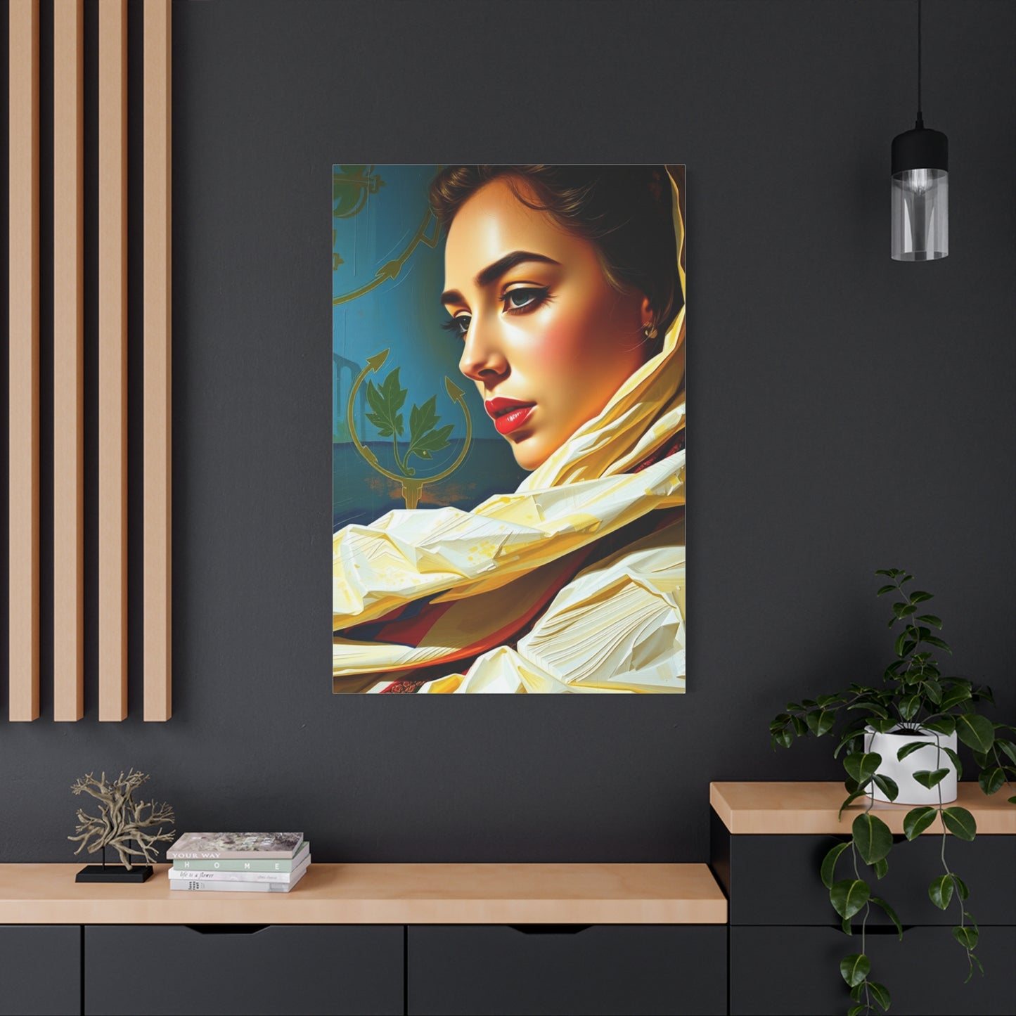
Regal Hue Reverie
Regal Hue Reverie
Couldn't load pickup availability


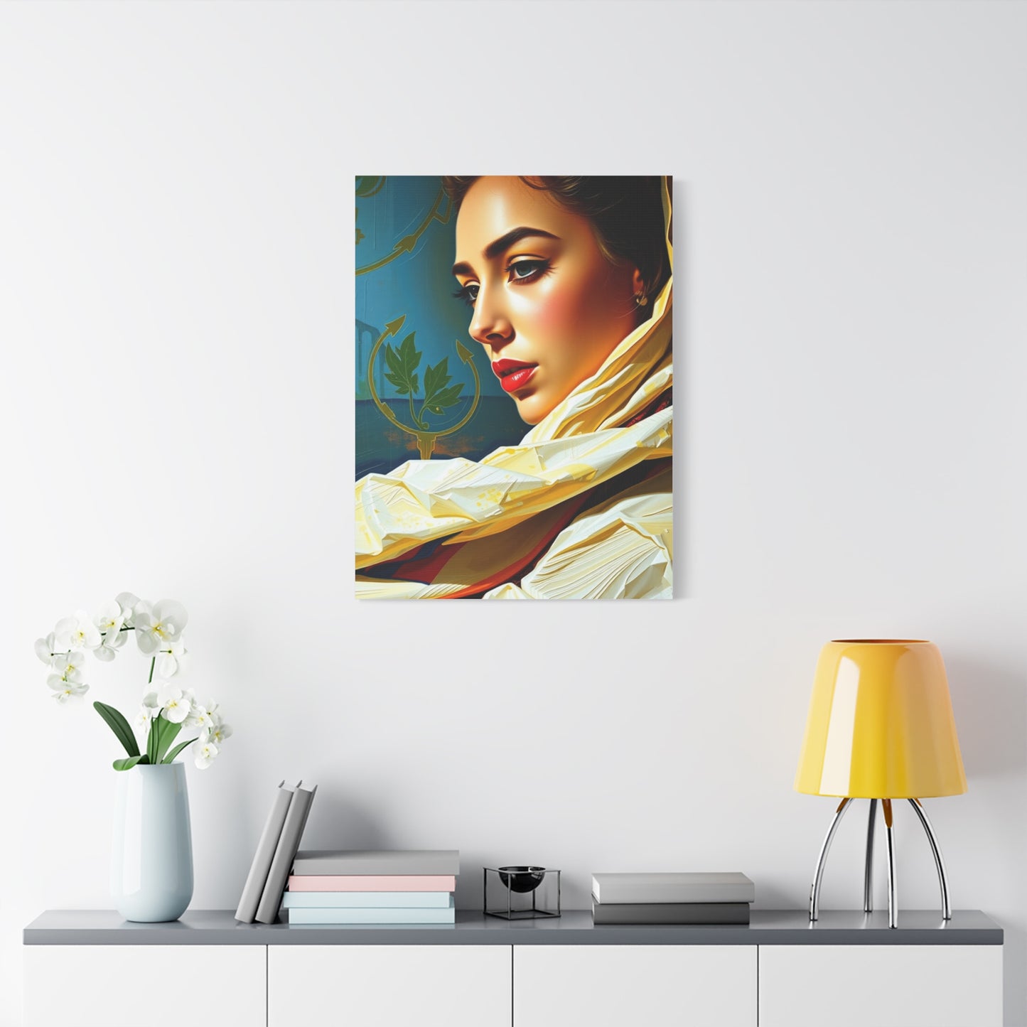
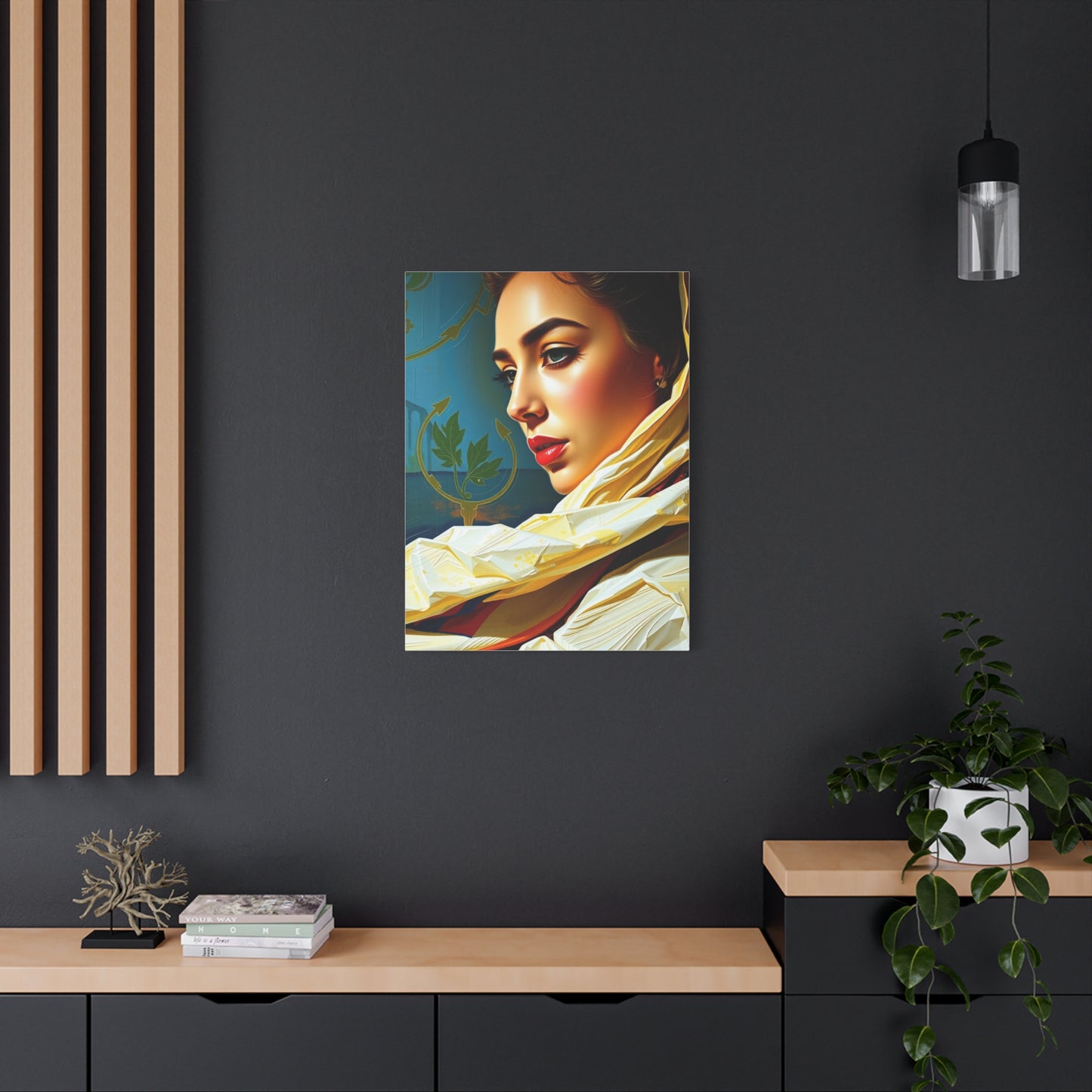
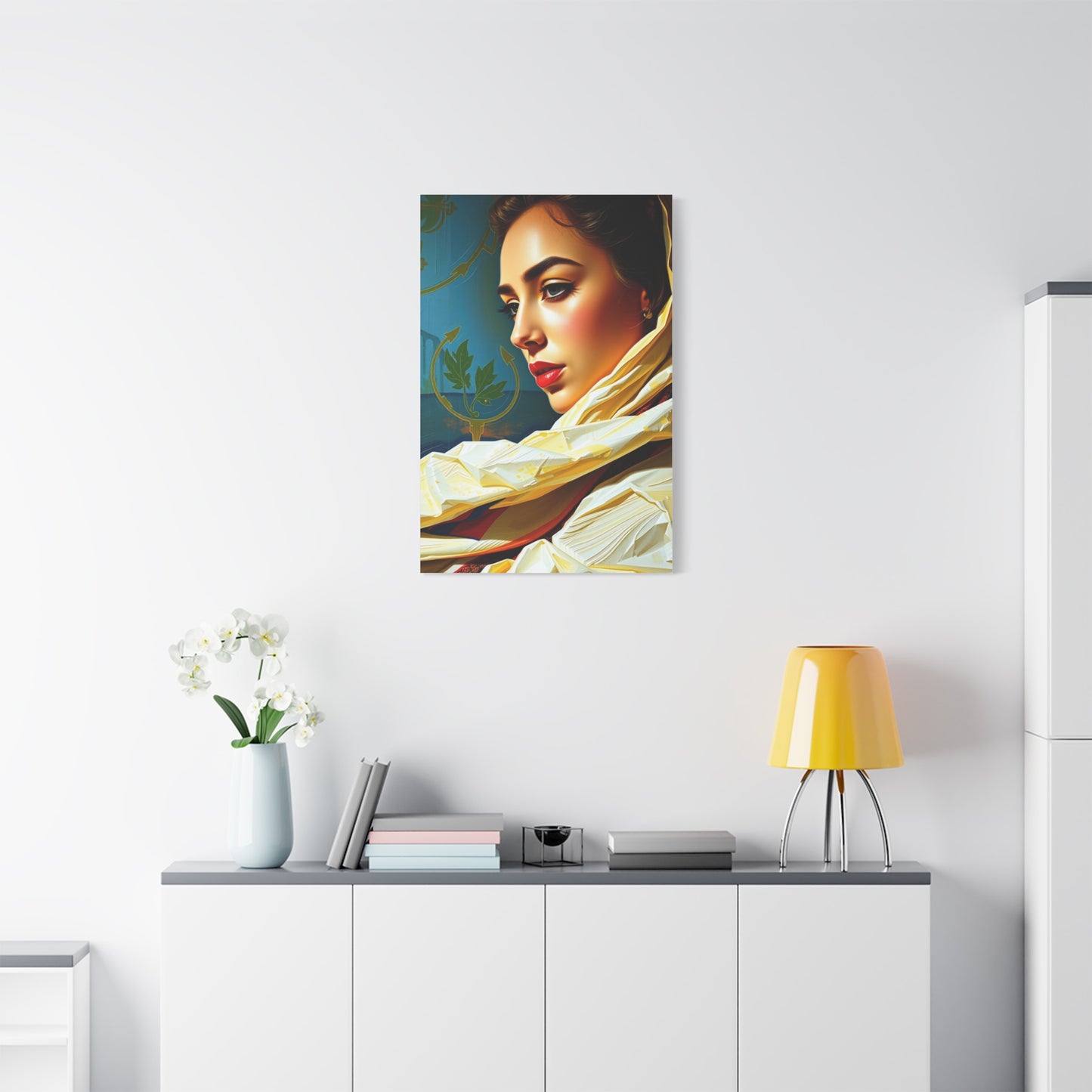
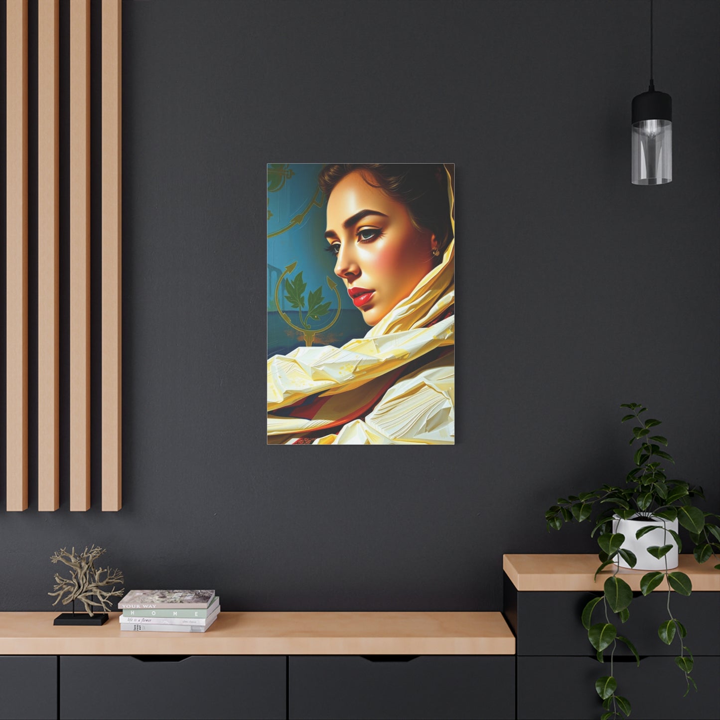
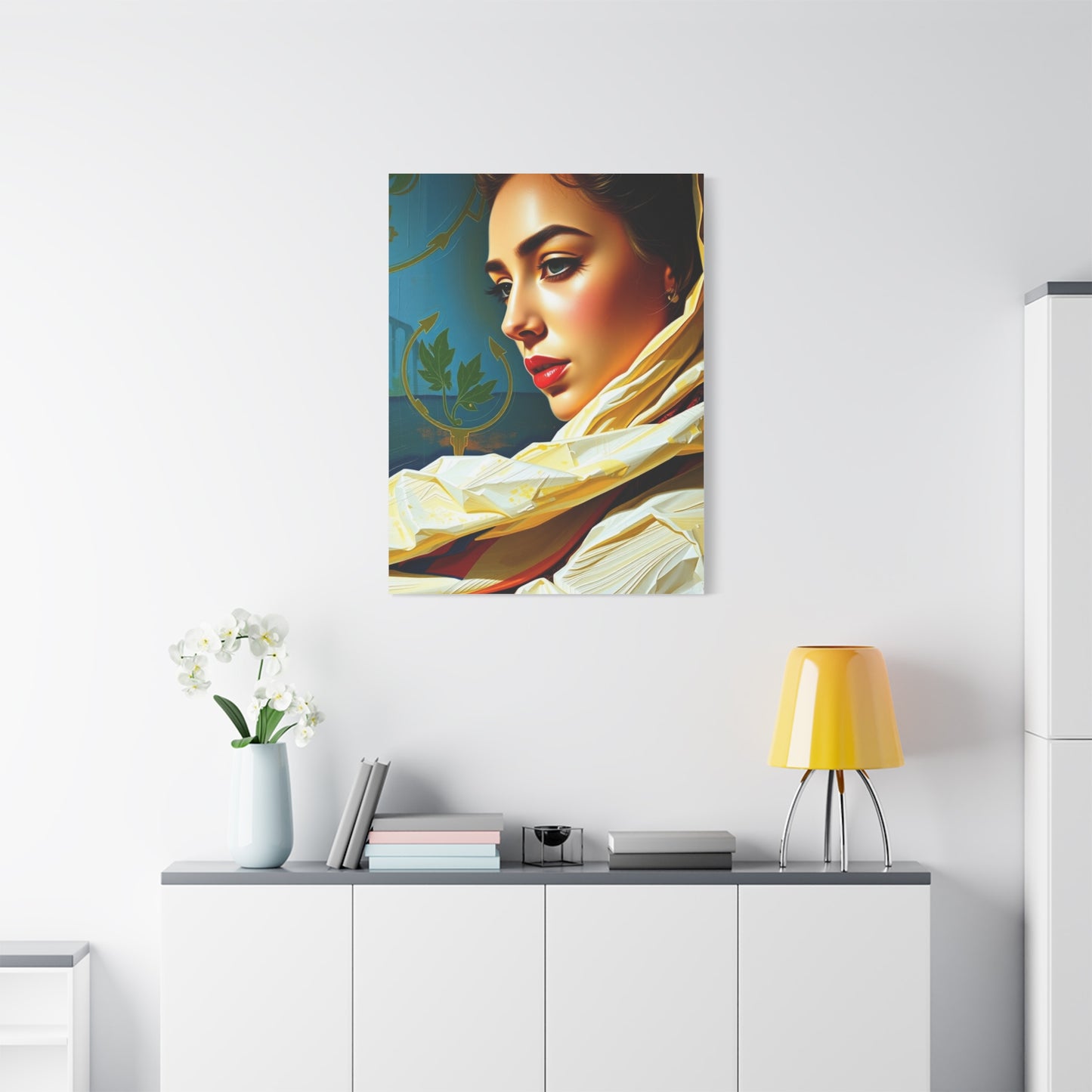
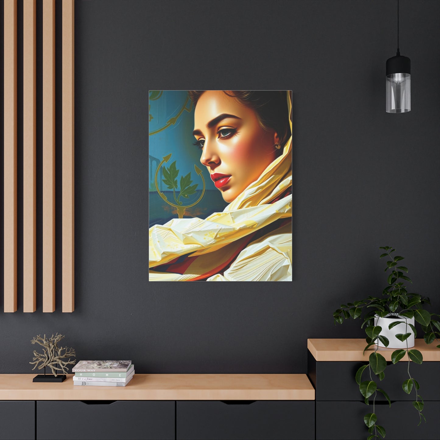
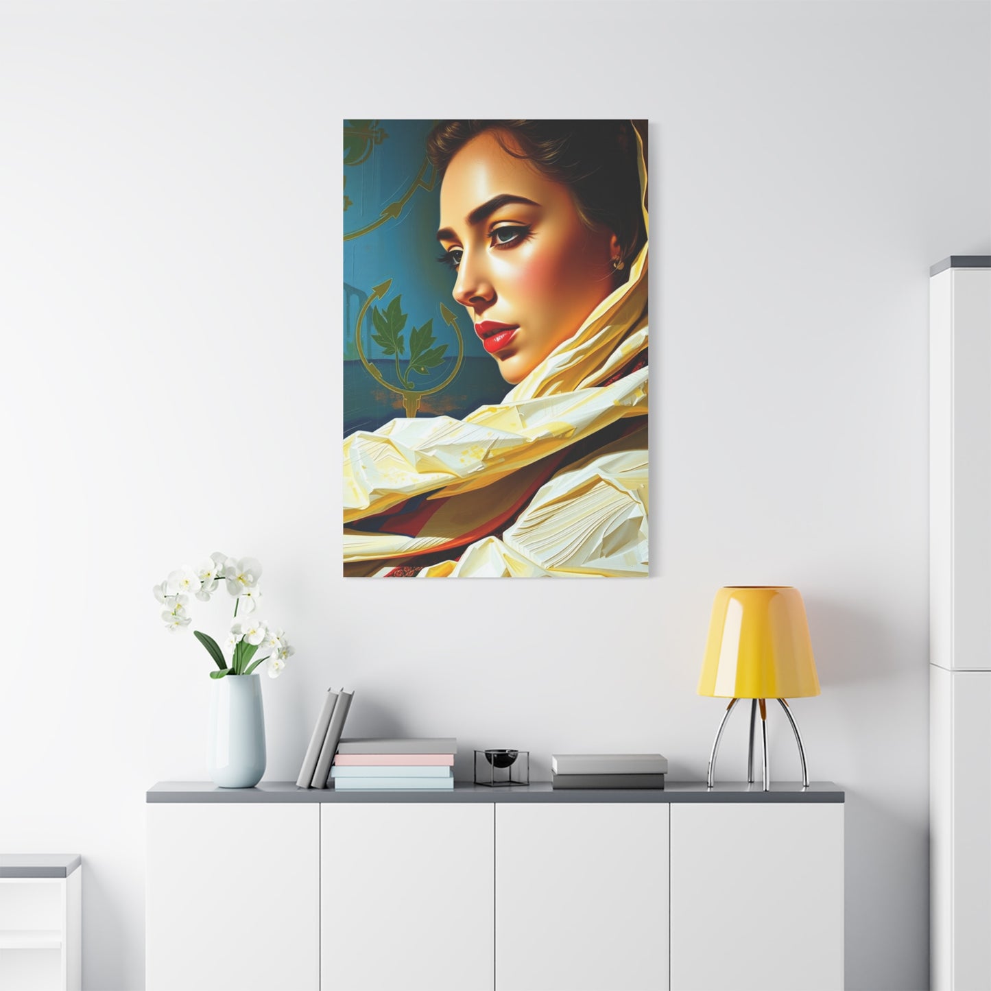
Using Regal Hue Reverie Art to Create a Luxurious Bedroom Ambiance
The allure of color is one of the most fundamental aspects of human aesthetic appreciation. It speaks a language that transcends words, evoking emotions, memories, and aspirations. Within the vast spectrum of color, there exists a particular category of hues that carry an intrinsic weight of history, power, and sophistication. These are the regal hues—the deep sapphires, rich emeralds, royal purples, and burnished golds that have adorned the courts of kings and queens for millennia. When these majestic tones are translated onto a canvas, they create more than just a decorative piece; they forge a statement. This exploration delves into the captivating world of wall art that harnesses the power of these noble colors.
It is a journey through compositions that are at once bold and serene, vibrant and elegant. We will examine how artists use these palettes to create works that inspire awe, cultivate tranquility, and add a profound sense of character to any environment. This is not merely about decorating a room; it is about curating an atmosphere, telling a story, and celebrating the timeless beauty of colors that have been synonymous with greatness throughout history. The wall art discussed herein is a testament to the enduring power of a majestic palette, offering a visual feast that enriches the soul and elevates the surroundings.
The Ethereal Allure of Majestic Tones in Wall Art
There is a certain dreamlike quality, an ethereal allure, that is intrinsically linked to majestic tones when they are applied to the creation of compelling wall art. These are not the commonplace, everyday colors that fade into the background of our perception. Instead, they are hues that command attention and stir the imagination, transporting the viewer to a realm of fantasy and opulence. Think of the deep, velvety ultramarine of a twilight sky, a color once more precious than gold, ground from lapis lazuli to adorn sacred manuscripts and royal portraiture. When a contemporary artist employs this color in an abstract wall art piece, it carries with it the echoes of that history, lending the work a sense of profound depth and timeless significance.
The allure lies in this very connection to something grander than the present moment. These colors feel aspirational. A splash of amethyst purple doesn't just add a pop of color; it invokes notions of royalty, spirituality, and creative wisdom. A flowing composition dominated by this shade can create a focal point in a room that is both calming and mentally stimulating, encouraging contemplation and a sense of wonder. Similarly, the use of emerald green, with its associations with lush landscapes, precious jewels, and rejuvenation, can introduce a feeling of vibrant life and natural elegance. In wall art, these tones are rarely used in isolation. Their ethereal quality is often magnified through their interaction with light and texture.
An artist might use a high-gloss finish to make a sapphire blue seem as if it is a liquid, bottomless pool, or they might employ thick, impasto techniques to give a ruby red the faceted, light-catching quality of a gemstone. This interplay creates a multi-sensory experience, where the color is not just seen but almost felt. The dreamlike state they induce is a form of escapism, offering a visual sanctuary from the mundane. A large-scale wall art piece featuring a celestial swirl of gold and midnight blue can transform a simple wall into a gateway to the cosmos, prompting daydreams of starlit voyages and forgotten constellations. It is this capacity to elevate the ordinary and inspire the imagination that constitutes the truly magical and ethereal allure of majestic tones in the world of artistic expression for our environments.
A Contemplation on Graceful Color Palettes
The concept of grace in the visual arts is a subtle yet powerful one. It speaks of elegance, fluidity, and a sense of effortless beauty. When this quality is translated into a color palette for wall art, the result is a composition that is both visually pleasing and emotionally resonant. A graceful color palette does not shout for attention; it beckons with a quiet confidence. It is a departure from jarring contrasts and overwhelming saturation, favoring instead a sophisticated interplay of harmonious or subtly complementary hues. These palettes often draw from the regal spectrum but interpret it with a softer touch. For instance, instead of a bold, primary red, a graceful palette might feature a deep crimson or a muted rose, colors that possess a rich history and a sense of refined passion without being aggressive.
These shades can be paired with creamy ivories, soft dove grays, or muted gold tones to create a wall art piece that exudes warmth and understated luxury. The contemplation of such a palette is an exercise in appreciating nuance. The beauty lies in the gentle transitions between colors, the way a soft teal might blend seamlessly into a smoky lavender, creating a mood of tranquil reverie. This approach is particularly effective in abstract art, where color and form are the primary storytellers. An artist might create a large canvas where washes of pearlescent white and pale silver flow over a background of deep indigo, suggesting the gentle movement of clouds across a moonlit sky.
The effect is profoundly calming, encouraging the viewer to pause and lose themselves in the subtle dance of colors. The grace of the palette is also determined by its balance. It is not about an absence of strong color, but rather the judicious use of it. A wall art composition might be predominantly neutral, featuring shades of beige, taupe, and charcoal, but be brought to life by a single, elegant stroke of peacock blue or a delicate vein of copper. This focal point of color is all the more impactful because of its restraint, drawing the eye and adding a layer of complexity to the piece without disrupting its overall serenity. Contemplating wall art created with such a palette is a restorative experience. It offers a visual respite, a quiet corner of beauty that softens the hard edges of daily life and reminds us of the power of subtlety and elegance in a world that is often loud and chaotic.
Royal Shades Brought to Life on Artistic Mediums
The journey of a royal shade from a mere pigment to a living, breathing entity on an artistic medium is a testament to the transformative power of creative expression. These colors—the indigos, the crimsons, the malachites, and the golds—are inherently potent, but it is the artist's choice of medium and technique that truly brings them to life, imbuing them with texture, dimension, and a unique personality. A canvas is perhaps the most traditional medium, but its versatility is boundless. An artist might use oil paints to render a deep sapphire blue with a luminous, almost internal glow. The slow-drying nature of oils allows for meticulous blending, creating seamless gradients where a dark navy can fade into a lighter cerulean, evoking the vastness of the deep ocean or an evening sky.
The texture of the canvas itself can play a role, its woven surface catching the light and adding a subtle tactile quality to the finished wall art. Conversely, acrylic paints can bring a different kind of life to these royal shades. Their quick-drying properties are ideal for creating sharp, defined shapes and bold, graphic compositions. A splash of vibrant magenta or a crisp line of emerald green rendered in acrylic has an immediacy and energy that is palpable. On a large-scale wall art piece, this can create a dynamic and modern interpretation of a traditionally regal palette. Beyond the canvas, other mediums offer exciting possibilities. Watercolor on heavy paper allows royal hues to bleed and blend in unpredictable and beautiful ways.
A wash of royal purple might diffuse at the edges into a delicate lilac, capturing a sense of fluidity and impermanence. The transparency of the medium gives the colors a radiant quality, as if they are being illuminated from behind. Metal as a medium offers another dimension entirely. A piece of wall art crafted from brushed aluminum or steel can be treated with chemicals or heat to produce stunning patinas of bronze, copper, and deep oceanic blues. The way these metallic surfaces reflect ambient light means the artwork is constantly changing, its royal shades shifting and shimmering as the viewer moves or as the light in the room changes throughout the day. Even textiles can serve as the medium for bringing these hues to life.
The Dynamic Energy of Rich, Royal Colors
While regal colors are often associated with solemnity and tradition, they also possess a formidable and dynamic energy that can electrify a piece of wall art and, by extension, the environment it inhabits. This vitality stems from their inherent depth and saturation. These are colors that are unambiguous, confident, and full-bodied. They do not whisper; they proclaim. A bold, cadmium red, for example, is a color of passion, power, and action. When used as a dominant force in a large abstract wall art piece, it can infuse a room with a sense of vigor and excitement. It is a color that stimulates and energizes, making it an excellent choice for social areas where conversation and activity are desired.
The dynamism is not just in the individual color but in the relationships between them. The classic pairing of royal blue and gold is a prime example of energetic harmony. The cool, stable depth of the blue provides a perfect foundation for the warm, radiant energy of the gold. In a piece of wall art, this combination can create a visual vibration, a sense of tension and release that is incredibly engaging. Gold leaf catching the light against a matte navy background is not a static image; it is an active, sparkling dance of light and shadow. Artists can harness this energy through their compositional choices. Swift, gestural brushstrokes can make a splash of emerald green feel like it is moving across the canvas. Geometric patterns using sharp, clean lines of purple and turquoise can create a sense of rhythm and pulse.
The energy can be explosive, as in a chaotic splatter-style painting that uses a regal palette to convey a sense of creative outburst, or it can be a more controlled, focused energy, like the radiating lines of a sunburst motif rendered in bronze and burgundy. This dynamic quality ensures that the wall art is a continuous source of visual interest. It is a piece that does not fade into the background but remains an active participant in the atmosphere of the room. It can serve as a motivational force, a visual representation of strength and ambition. For anyone seeking to create an environment that feels alive, vibrant, and full of potential, wall art that leverages the powerful, dynamic energy of rich, royal colors is an unparalleled choice.
Creative Interpretations of Color and Light
The interplay between color and light is the very soul of visual art. No color exists in a vacuum; its appearance is entirely dependent on the light that reveals it. In the context of wall art featuring regal palettes, artists who masterfully manipulate this relationship create works of extraordinary depth and brilliance. A creative interpretation of this dynamic goes far beyond simply painting a color on a surface. It involves considering how that surface will react to the light sources within a room, and how the artist's technique can enhance or even alter our perception of the chosen hues. One of the most fascinating interpretations involves the use of metallic pigments and leafing.
A streak of gold leaf applied over a deep crimson background does more than just add a second color; it introduces a new surface that interacts with light in a completely different way. The crimson might absorb light, appearing deep and velvety, while the gold reflects it, creating a dazzling point of brilliance that moves and changes as the viewer walks past. This creates a living piece of wall art, one that performs a subtle show throughout the day as the natural light shifts. Similarly, artists can use varnishes and glazes to manipulate light. A thick, glossy varnish over a field of sapphire blue can make it look like a polished gemstone, with light reflecting off its smooth surface. In contrast, a matte finish on the same color would give it a softer, more introspective quality, absorbing light and drawing the viewer into its depths.
The texture is another powerful tool. An artist might use a palette knife to apply thick layers of paint, a technique known as impasto. This creates a three-dimensional surface with peaks and valleys. When light hits this textured surface, it creates tiny highlights and shadows, making the color appear more vibrant and complex. A royal purple rendered in this way is no longer a flat plane of color; it becomes a miniature landscape of light and shade. Some contemporary artists are even incorporating light sources directly into their wall art. Hidden LED strips can be used to backlight a piece, causing translucent colors to glow with an otherworldly luminescence. A pane of colored resin, for example, can be transformed from a dark, solid mass into a radiant jewel when illuminated from behind.
Cultivating Tranquility with a Noble Color Scheme
In a world filled with constant stimuli and demands on our attention, the desire for tranquility and peace within our personal environments has never been greater. Wall art that employs a noble color scheme can be a powerful tool in cultivating this sense of serenity. While regal colors are often associated with power and dynamism, they also possess a deep, grounding quality that can be profoundly calming to the human spirit. The key to unlocking this tranquil potential lies in the selection and combination of specific hues. The colors of the sky and the sea are classic examples. Deep blues, from indigo to navy, have a scientifically recognized ability to lower blood pressure and slow respiration.
They are colors of stability, depth, and quiet contemplation. A large wall art piece dominated by these shades can act as a visual anchor in a room, creating a feeling of boundless calm. Imagine an abstract seascape, where layers of blue are blended with soft whites and grays to suggest mist over water. Such a piece does not demand attention; it invites a gentle, meditative gaze. Greens, particularly the deeper, more majestic shades like emerald and forest green, also contribute to a tranquil atmosphere. These colors connect us to the natural world, evoking the quiet stillness of a dense wood or a lush, shaded garden.
A piece of wall art that celebrates these tones can bring the restorative qualities of nature indoors. The composition can be abstract, focusing on the interplay of different green shades, or it can be a stylized representation of botanical forms. The effect is one of rejuvenation and peace. Even warmer colors, often considered energizing, can be used to cultivate tranquility when chosen carefully. A deep, muted burgundy or a rich aubergine purple, for instance, can create a sense of warmth, comfort, and introspection. These colors feel enveloping and secure, like a soft, heavy blanket. When paired with neutral tones in a piece of wall art, they can foster an atmosphere that is both cozy and sophisticatedly serene. The composition of the artwork is as important as the color choice. To promote tranquility, artists often use soft edges, flowing lines, and balanced, harmonious arrangements.
Daydreams Painted in the Colors of Majesty
Wall art possesses a unique ability to serve as a portal, a visual catalyst that can transport us from our immediate surroundings into the limitless realms of our imagination. When that art is painted in the colors of majesty, the daydreams it inspires are often ones of grandeur, fantasy, and epic narratives. These are not quiet, pastoral reveries but bold, vivid explorations of what could be. A piece of wall art dominated by a brilliant, sun-like gold and a deep, celestial blue might spark daydreams of ancient mythologies. One might gaze into its depths and imagine forgotten gods, celestial chariots, and epic battles fought amongst the stars. The richness of the colors lends a sense of weight and importance to these imagined stories, making them feel more real, more significant.
The colors themselves become characters in the narrative. Purple, a color historically reserved for emperors and royalty, can evoke fantasies of opulent courts and magical kingdoms. An abstract composition that swirls with shades of amethyst, lavender, and royal purple could become the backdrop for a daydream about a powerful sorceress or a lost, enchanted city. The color’s association with mystery and magic fuels the imaginative fire, allowing the mind to wander down paths of wonder and intrigue. Similarly, a canvas drenched in the fiery tones of ruby and garnet can inspire daydreams of passion, courage, and adventure. It might call to mind the image of a dragon’s hoard, a heroic quest, or a passionate flamenco dancer, her skirt a blur of vibrant red.
The intensity of the color translates directly into the intensity of the daydream, creating an experience that is both exhilarating and deeply personal. The power of this type of wall art lies in its abstract or semi-abstract nature. By not depicting a specific, recognizable scene, it gives the viewer the freedom to project their own stories and emotions onto the canvas. The artist provides the palette—the majestic, evocative colors—and the viewer becomes the storyteller. A sweeping brushstroke of emerald green is not just a mark of paint; it could be a rolling hill in a fantasy landscape, the flash of a magical spell, or the eye of a mystical beast. This collaborative process between artist and viewer is what makes the experience of owning such a piece so rewarding. It is more than a static object; it is a continuously unfolding story, a painted daydream that offers a new adventure with every glance.
The Duality of Power and Poise in Color
The most compelling regal colors often embody a fascinating duality: they project an undeniable sense of power while simultaneously maintaining an aura of perfect poise and elegance. This inherent balance is what makes them so enduringly captivating in wall art. They make a strong statement without being ostentatious, and they command respect without being intimidating. This duality is a delicate dance, and artists who capture it successfully create works of profound sophistication. Consider the color black. When used expansively in a piece of wall art, particularly a deep, matte black, it is the epitome of power. It is absolute, mysterious, and all-encompassing. It can suggest the infinite void of the cosmos or the unshakeable foundation of the earth. However, this power can be tempered with poise through its application and combination with other elements.
A single, thin line of gold cutting across a black canvas introduces an element of grace and refinement. The power of the black is not diminished; rather, it is focused and given context by the delicate elegance of the gold. The result is a composition that feels both strong and exquisitely balanced. Royal blue is another color that perfectly illustrates this duality. Its depth and saturation speak of authority, stability, and wisdom—qualities associated with power. Yet, it is also a color of serenity and calm, suggesting a poised and controlled strength rather than a volatile or aggressive one. In a piece of wall art, an artist might contrast a large, stable field of royal blue with a flurry of delicate, calligraphic strokes in white or silver. The blue provides the powerful foundation, while the intricate white lines add a layer of graceful complexity, suggesting intellectual or spiritual poise.
This interplay between strength and elegance can also be achieved through texture. A background rendered in a rough, powerful texture—perhaps by mixing sand or other materials into the paint—can be overlaid with a smooth, polished element in a contrasting regal hue. For example, a textured, charcoal gray surface could feature a perfectly smooth, high-gloss circle of deep burgundy at its center. The raw power of the texture is contained and refined by the perfect poise of the geometric shape and its flawless finish. This duality makes the wall art endlessly interesting. It reflects the complexities of human nature itself—our capacity for both great strength and great tenderness, for ambition and for grace. A piece of art that embodies this balance serves as a sophisticated mirror, a visual representation of a well-rounded and mature ideal. It does not just decorate a room; it imparts a sense of gravitas and refined character, celebrating the beautiful tension between power and poise.
Masterworks Forged from a Kingly Spectrum
The creation of a true masterwork of wall art is a rare and remarkable event. It requires not only technical skill but also a profound sensitivity to the emotional and symbolic power of color. When an artist chooses to work with a kingly spectrum—that collection of hues historically associated with nobility, wealth, and power—they are tapping into a deep well of collective human consciousness. The resulting masterpieces are forged not just from pigment and canvas, but from history, mythology, and the very essence of aspiration. A masterwork built on a kingly spectrum uses color as its primary language. The artist understands that a specific shade of purple is not merely a visual sensation but a symbol of royalty and spirituality that stretches back to ancient Phoenicia.
They know that a true ultramarine blue carries the weight of the Renaissance, where its costliness meant it was reserved for the most sacred figures. By wielding these colors with intention, the artist creates a dialogue with history, producing a piece that feels both contemporary and timeless. The forging of such a work involves a masterful control of composition. A truly great piece of wall art using these colors is never chaotic. Even in the most energetic abstract expressionist work, there is an underlying structure, a deliberate balance that prevents the powerful colors from becoming overwhelming. The artist might use the "golden ratio" to place a focal point of radiant gold against a field of deep crimson, creating a composition that is mathematically and aesthetically satisfying.
This hidden order is part of what separates a simple painting from a masterwork; it feels right on a subconscious level. Texture and finish are the final elements in this artistic alchemy. A master artist will labor over the surface of their work, knowing that the way light interacts with the piece is crucial to its success. They might apply dozens of thin glazes of oil paint to create a sense of luminous depth, making a field of emerald green seem to glow from within. They might burnish a section of gold leaf until it achieves a mirror-like shine, or they might contrast a smooth, glossy area with a rough, matte one to create a dynamic tactile and visual experience. These masterworks are more than decorative objects; they are artifacts of culture. They are forged with an understanding of the immense power that color holds over our emotions and our perceptions.
Visions of Grandeur in a Kaleidoscope of Color
The word "kaleidoscope" evokes images of shifting patterns, vibrant fragments, and endless, surprising combinations. When this concept is applied to wall art that utilizes a regal palette, the result is a breathtaking vision of grandeur. This style of artwork moves beyond simple color blocking or gentle gradients and embraces a more complex, multifaceted celebration of color. It is a dynamic and often intricate approach that captures the opulence and complexity of a royal court or a treasure chest overflowing with jewels. Imagine a large-scale canvas where geometric shards of color are pieced together like a mosaic. A triangle of sapphire blue might be set next to a sliver of emerald green, which in turn borders a trapezoid of amethyst purple. These shapes are then outlined with fine lines of liquid gold or silver, creating a stained-glass effect.
The overall impression is one of incredible richness and detail. The eye is constantly moving across the canvas, discovering new combinations and relationships between the colors. This kaleidoscopic approach is not limited to hard-edged geometry. It can also be achieved through more organic, flowing forms. An artist might use a fluid pouring technique, allowing different majestic hues of acrylic paint to run and mingle on the canvas, creating cells and tendrils of color that interlock in complex, mesmerizing patterns. A swirl of ruby red might get trapped in a river of indigo, with veins of metallic bronze running through the mixture. This method produces visions of grandeur that feel cosmic and elemental, like a nebula being born or a cross-section of a rare mineral.
The grandeur of these pieces comes from their complexity and their refusal to be simple. They suggest a world of infinite possibility and abundant beauty. They are a visual feast, offering a level of detail that rewards close inspection. From a distance, the overall impression is one of vibrant, powerful color. But as the viewer moves closer, they are drawn into a miniature world of intricate patterns and subtle color shifts. This style of wall art is a bold statement piece. It is unapologetically decorative and celebratory. It is perfect for an environment that is meant to feel lively, creative, and inspiring. It turns a wall into a source of constant visual delight and wonder. Owning such a piece is like having a fragment of a beautiful, ever-changing dream captured and held still, a vision of grandeur made tangible in a kaleidoscope of majestic color.
The Calming Influence of Stately Wall Art Compositions
While the term "stately" can imply grandeur and formality, it also carries connotations of dignity, grace, and a calm, unhurried presence. In the realm of wall art, a stately composition is one that possesses a sense of inherent balance and order. When this compositional strength is combined with a regal color palette, the artwork can exert a profoundly calming influence on its surroundings. It offers a visual anchor of stability in a chaotic world. A key characteristic of a stately composition is its sense of structure. This doesn't necessarily mean rigid geometric lines, although that can be one approach. More often, it refers to a clear and deliberate arrangement of visual elements that feels balanced and intentional. An artist might employ principles of symmetry or near-symmetry to create this effect.
For example, a large diptych—two separate canvases intended to be hung together—can create a powerful sense of order. If each canvas mirrors the other in its color distribution, perhaps with a deep navy on the outer edges moving towards a lighter silver-gray in the center, the brain perceives this balance and finds it soothing. The composition might also be based on a strong horizontal or vertical axis. A piece of wall art dominated by long, horizontal bands of color—perhaps a strip of deep charcoal gray at the bottom, followed by a band of muted teal, and topped with a sliver of pale gold—can evoke the feeling of a calm landscape or a serene horizon. The eye is encouraged to move slowly and steadily across the canvas, a movement that is inherently relaxing. The calming influence also comes from a sense of spaciousness within the composition.
A stately piece is not cluttered or overly busy. It allows for areas of "visual rest," where a single, beautiful color is allowed to breathe. A large, unbroken field of a deep, mossy green, for example, can be incredibly restorative to look at. It gives the mind a place to settle, free from the need to process complex information. The artist's brushwork can further enhance this calming effect. Smooth, deliberate strokes that show a confident and controlled hand translate into a feeling of stability for the viewer. Conversely, chaotic, frenetic brushwork would undermine the stately quality of the composition. By combining a noble palette with these principles of balance, structure, and intentionality, an artist can create a piece of wall art that is more than just beautiful. It becomes a source of quiet strength and composure, a visual representation of grace under pressure.
Achieving Perfect Balance with Harmonious Tints
Harmony, in both music and art, refers to the pleasing combination of different elements. In the context of wall art, achieving perfect balance with harmonious tints is a sophisticated art form. It involves moving beyond the use of pure, saturated regal colors and exploring their subtler variations—tints, tones, and shades. A tint is created by adding white to a pure hue, resulting in a lighter, softer version. By skillfully composing a piece using these harmonious tints, an artist can create a work that feels cohesive, elegant, and perfectly balanced. The beauty of a harmonious tint-based palette is its subtlety. Instead of the high contrast of a pure royal blue next to a bright white, an artist might compose a piece using various tints of blue.
This could include a deep navy, a classic royal blue, a softer periwinkle, and a pale, almost-white sky blue. When these tints are layered and blended together in a single piece of wall art, the effect is one of extraordinary depth and unity. The eye moves smoothly from one shade to the next, creating a sense of visual flow and tranquility. The composition feels complete and self-contained, as if all the colors belong to the same family. This approach allows for complexity without chaos. An artist can create an incredibly detailed and intricate piece of wall art that still feels calming and balanced because the underlying palette is so cohesive. Imagine an abstract piece that suggests a misty morning. It could be built from harmonious tints of gray, from a deep charcoal to a pale silver, with subtle hints of lavender tints woven throughout.
The overall impression would be one of quiet, atmospheric beauty. Balance is achieved not just through the choice of tints but through their distribution within the composition. An artist might use the darkest shade to ground the piece, perhaps along the bottom edge, and then gradually introduce lighter and lighter tints as the eye moves upward. This creates a natural sense of lift and lightness, preventing the artwork from feeling heavy or oppressive. Alternatively, a central mass of a mid-tone tint could be surrounded by lighter variations, creating a focal point that gently radiates outwards. Wall art created with this focus on harmonious tints is the epitome of understated elegance. It demonstrates a refined color sense and an appreciation for nuance. It doesn't rely on bold, shocking colors to make an impact, but rather on the quiet power of a perfectly balanced and unified palette. It is a choice for a sophisticated environment where the goal is to create an atmosphere of serene and timeless grace.
Meditations on the Deep and Noble Shades
There is a profound, almost spiritual quality to the deepest and most noble shades of the regal spectrum. These are the colors of introspection, of quiet contemplation, and of the vast, unknowable mysteries of the universe. Wall art that focuses on these shades invites us to do more than just look; it encourages us to meditate, to pause our racing thoughts and sink into the silent, resonant depths of the color itself. A canvas saturated with a deep, velvety indigo, for instance, is not just a blue painting. It is a visual representation of the midnight sky, the abyssal ocean, or the quiet space between thoughts. Gazing into such a piece can be a meditative practice. The color is so all-encompassing that it can quiet the visual noise of the surrounding environment, creating a focal point for concentration. The lack of distracting patterns or bright contrasts allows the mind to settle, to simply be present with the color. Burgundy and oxblood are other examples of these meditative shades.
They are colors of deep, slow-burning passion and ancient wisdom. A piece of wall art that explores the subtle variations within this color family can evoke a feeling of warmth, history, and seriousness. It might call to mind the interior of an old library, filled with leather-bound books, or the rich color of aged wine. Meditating on such a piece can foster a sense of grounding and connection to the past, a reminder of the enduring traditions and knowledge that have shaped our world. The power of these deep shades is often enhanced by the artist's use of texture and finish. A matte finish, for example, can make a deep forest green seem to absorb all light and sound, creating a zone of profound silence on the wall.
The viewer is drawn inward, into the heart of the color. Conversely, a subtle, satin finish might give a deep aubergine a soft, gentle sheen, suggesting a hidden life or a quiet energy just beneath the surface. This type of wall art is not for a place of bustling activity. It is for a personal sanctuary, a reading nook, a quiet office, or any environment where contemplation and focus are desired. It serves as a visual mantra, a constant and unassuming invitation to look deeper, both at the canvas and within oneself. It is a testament to the idea that the most powerful statements are often made not with a shout, but with a deep and resonant silence. These are meditations in pigment, offering a quiet and noble beauty that nourishes the soul.
The Artful Arrangement of Sophisticated Colors
Sophistication in art, as in life, is often about knowing what to leave out. It is a quality of refinement, intelligence, and nuance. In wall art, an artful arrangement of sophisticated colors is not about using the brightest or the most colors, but about using the right colors in the right way. It involves a deep understanding of color theory, an intuitive sense of balance, and a commitment to elegance over ostentation. A sophisticated palette often eschews primary colors in favor of more complex, tertiary hues. Instead of a simple red, an artist might choose a carnelian, a coral, or a terracotta. Instead of a basic blue, they might opt for a slate, a teal, or a cadet blue. These colors have more gray or brown mixed in, giving them a muted, more worldly quality. They feel less naive and more considered. The arrangement of these colors is where the true artistry lies.
A sophisticated composition might be based on an analogous color scheme, where colors that are next to each other on the a color wheel are used together. For example, a piece of wall art might explore the subtle shifts between a deep forest green, a lighter olive green, and a warm, golden ochre. The transitions are gentle and pleasing to the eye, creating a sense of harmony and completeness. Another sophisticated approach is the use of a complementary color scheme, but in a very controlled and deliberate way. Instead of pairing a bright orange with a bright blue, which can be jarring, an artist might pair a muted, burnt orange with a deep, dark navy. The inherent contrast is still there, creating a point of visual interest, but it is tempered and refined. The "arrangement" also refers to the proportions of each color used.
Motivational Power Within Kingly Color Choices
Colors have a profound psychological impact, capable of influencing our moods, our energy levels, and even our a sense of self-worth. Kingly color choices—the deep blues, rich reds, stately greens, and luminous golds—are particularly potent in this regard. Historically, these colors were worn and displayed to project power, authority, and confidence. Wall art that harnesses this palette can serve as a powerful motivational tool, subtly reinforcing these same qualities within the viewer on a daily basis. Consider the color red. A deep, rich crimson is a color of action, ambition, and determination. It is associated with courage and leadership. A piece of wall art that features this color prominently can serve as a daily visual cue to be bold and to pursue one's goals with passion. Placed in an office or a workspace, it can help to foster an atmosphere of dynamism and drive.
It is a visual shot of adrenaline, a reminder of one's own inner strength and potential. Royal blue, on the other hand, motivates in a different way. It is a color of wisdom, stability, and focus. It encourages clear thinking and strategic planning. A large, abstract piece dominated by shades of navy and sapphire can have a centering effect, helping to cut through mental clutter and promote a sense of calm authority. It is a motivational tool for the intellect, encouraging a measured and confident approach to challenges. Gold is perhaps the most obvious motivational color in the kingly spectrum. It is the universal symbol of success, achievement, and excellence. The presence of gold in a piece of wall art is a constant reminder of the highest standards. It can inspire one to strive for the best, to reach for the "gold standard" in their own endeavors.
Whether it's a few shimmering highlights or a large, burnished field, the color gold speaks a language of aspiration and triumph. The motivational power of this wall art is not necessarily conscious. It works on a subconscious level, creating an environment that feels empowering and supportive of one's ambitions. The daily act of living and working in the presence of these colors can subtly shape one's mindset, reinforcing a sense of capability and purpose. It is more than just decoration; it is a form of environmental psychology. By choosing wall art that employs this kingly palette, one is curating not just a visual aesthetic, but a motivational landscape, a personal space that constantly and quietly encourages them to be their most powerful, focused, and successful self.
A Fantastical Journey Through Stately Pigments
To engage with a piece of wall art that is rich with stately pigments is to embark on a fantastical journey, a voyage into a world painted with the colors of myth, legend, and imagination. These are not the colors of the everyday; they are the hues of coronation robes, enchanted forests, and dragon's scales. An artist who works with this palette becomes a world-builder, and their canvas is a portal, inviting the viewer to step into a narrative of their own creation. The journey often begins with a single, dominant color. A canvas saturated with a deep, majestic emerald green might transport the viewer to the heart of an ancient, magical wood. The color itself is so evocative that one can almost smell the damp earth and hear the rustle of unseen creatures.
The artist might add veins of gold or silver to the green, suggesting shafts of sunlight breaking through the dense canopy or the glint of a hidden elven city. The artwork becomes a map to a fantasy realm, a starting point for a story that unfolds in the viewer's mind. A piece dominated by deep sapphire and indigo blues, flecked with shimmering white, can launch a journey into the cosmos. It is a voyage through nebulae and starfields, a silent drift through the infinite. The stately nature of the blue lends a sense of awe and reverence to the experience. It is not a frightening void, but a majestic and orderly universe, filled with silent, celestial wonders. The fantastical journey can also be one of history and legend. A composition of rich crimson, burnished bronze, and charcoal black might evoke the world of ancient Rome or a heroic Arthurian legend.
The colors are so steeped in historical and mythological association that they bring these stories to life. The viewer might imagine themselves in a Roman villa, a medieval great hall, or on a legendary battlefield. The abstract nature of the wall art allows for this imaginative freedom; it provides the emotional and atmospheric cues, and the viewer's mind fills in the details of the narrative. This type of wall art is a powerful form of escapism. It offers a retreat from the mundane and a gateway to a world of heightened beauty, drama, and magic. It is a constant source of inspiration, a reminder that even within the four walls of a room, the potential for grand adventure and fantastical journeys is limitless, sparked by the evocative power of a few well-chosen, stately pigments.
Conclusion
The exploration of majestic hues in wall art reveals a universe of profound emotional depth, historical resonance, and aesthetic power. This journey through twenty distinct facets of a regal palette demonstrates that the impact of such artwork extends far beyond mere decoration. It is a deliberate act of curating an atmosphere, of infusing an environment with specific qualities, whether that be the dynamic energy of vibrant royal colors or the deep, meditative calm of noble shades. We have seen how these colors—the sapphires, emeralds, rubies, and golds—carry an intrinsic authority, a visual weight that commands attention and speaks a universal language of significance. When an artist brings these royal shades to life on various artistic mediums, from the traditional canvas to modern brushed metal, they are not just applying pigment; they are channeling centuries of human association with power, spirituality, and beauty. The resulting masterworks are forged from this kingly spectrum, becoming timeless statements that can anchor and define a cultivated environment.
Furthermore, the versatility of this palette is truly remarkable. It can be wielded to create visions of grandeur in a kaleidoscopic explosion of jewel tones, inspiring daydreams of opulence and fantasy. Yet, in the hands of a different artist, the very same family of colors can be used to cultivate tranquility. Through stately compositions, harmonious arrangements of tints, and a focus on balance and poise, these powerful colors can be tamed to exert a soothing, centering influence. This duality—the capacity for both immense power and perfect poise—is perhaps the most compelling aspect of the regal palette. It allows for a rich and varied emotional landscape, enabling the wall art to be motivational and inspiring, or to serve as a quiet backdrop for contemplation. The artful arrangement of these sophisticated colors, avoiding the simplistic in favor of the complex and nuanced, results in pieces that are intellectually stimulating and aesthetically enduring.
Ultimately, the choice to incorporate wall art featuring majestic hues is a choice to engage with a richer, more intentional form of living. It is about recognizing that the colors that surround us have a tangible effect on our psyche and our spirit. It is an investment in an environment that can inspire ambition, foster peace, spark imagination, and provide a constant, silent affirmation of quality and grace. From the ethereal allure that sparks our initial attraction to the fantastical journeys these stately pigments can inspire, this artistic tradition remains one of the most powerful ways to transform a simple dwelling into a place of profound character and timeless elegance. The enduring appeal of these majestic colors in wall art is a testament to their deep connection to our collective aspirations for beauty, strength, and a life lived with purpose and passion.
