


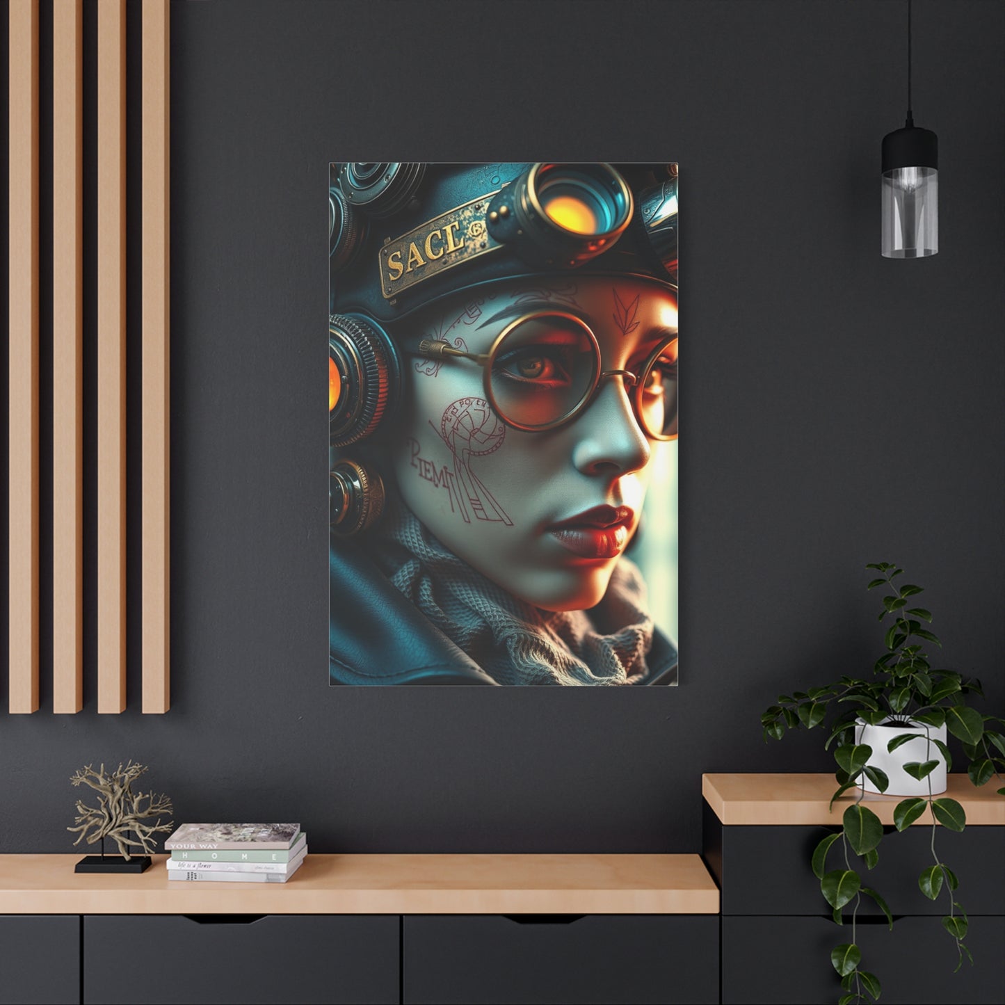
Retro-Futurist Opulence Art wall art & canvas print
Retro-Futurist Opulence Art wall art & canvas print
Couldn't load pickup availability


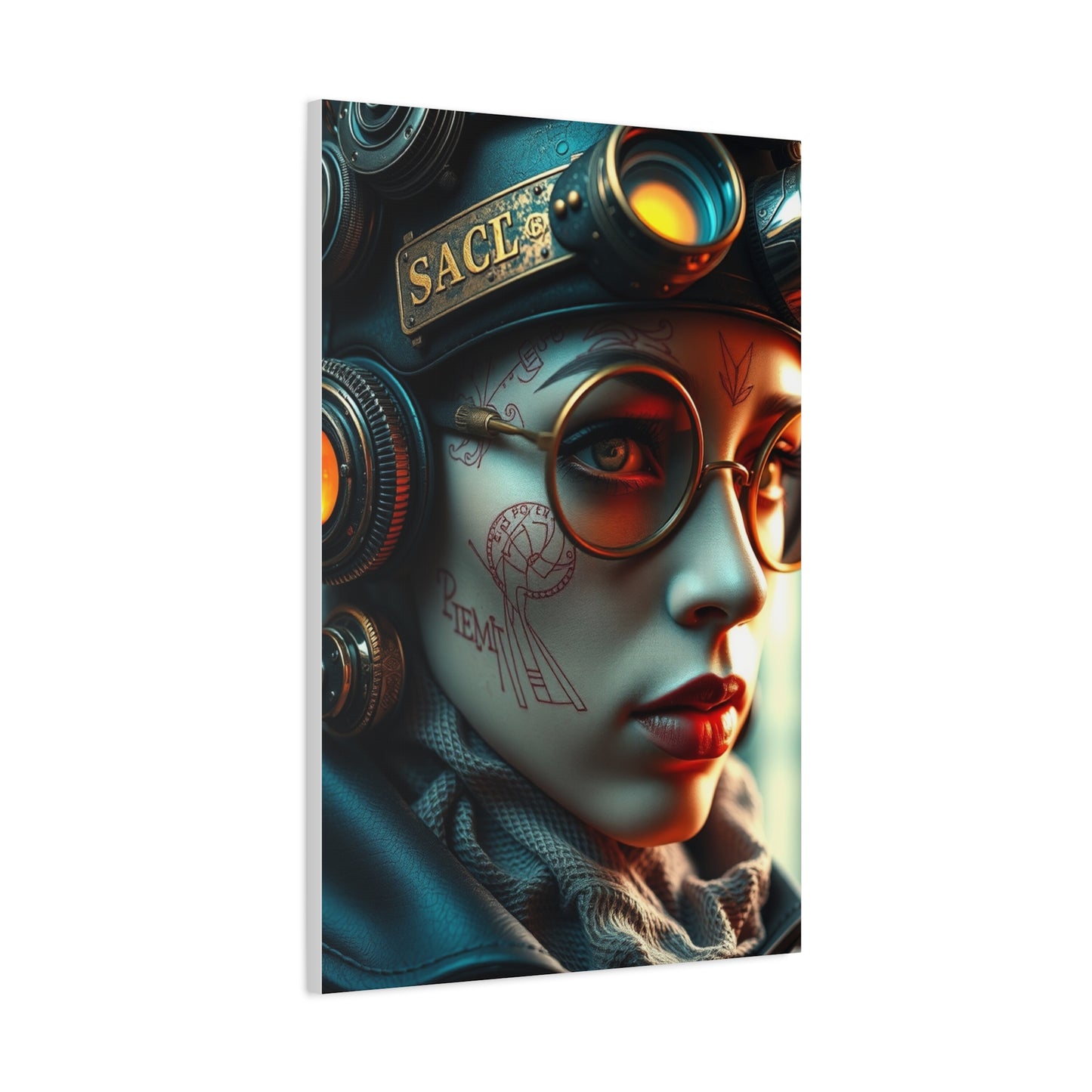
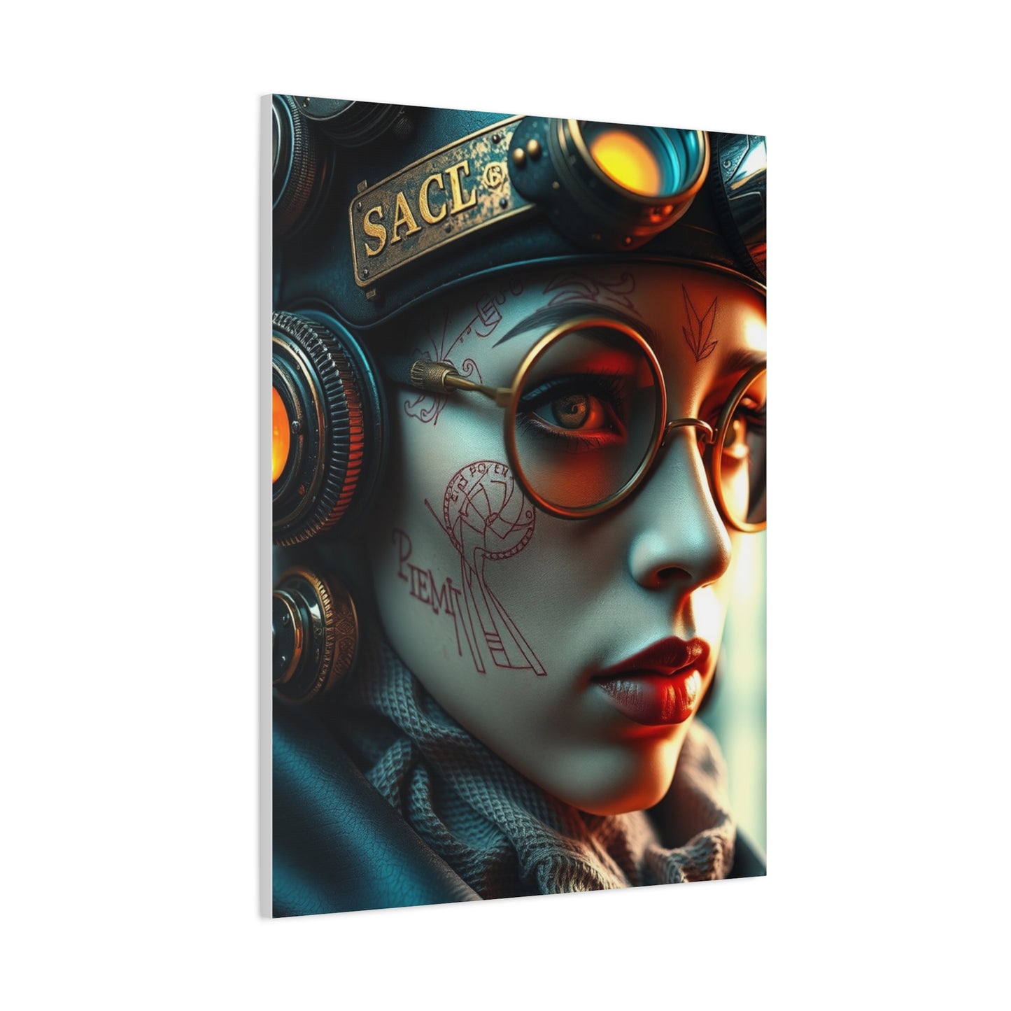
Vintage Meets Visionary: Futurist Opulence Wall Art for Your Walls
The convergence of nostalgic aesthetics and forward-thinking design philosophies has created a remarkable visual movement that captivates contemporary audiences. This artistic approach combines the optimistic visions of past decades with cutting-edge interpretations, resulting in visually stunning compositions that serve as powerful focal points in residential and commercial settings. Canvas prints featuring this distinctive style offer an accessible way to incorporate these bold, imaginative concepts into everyday environments, creating atmospheres that feel both familiar and daringly innovative.
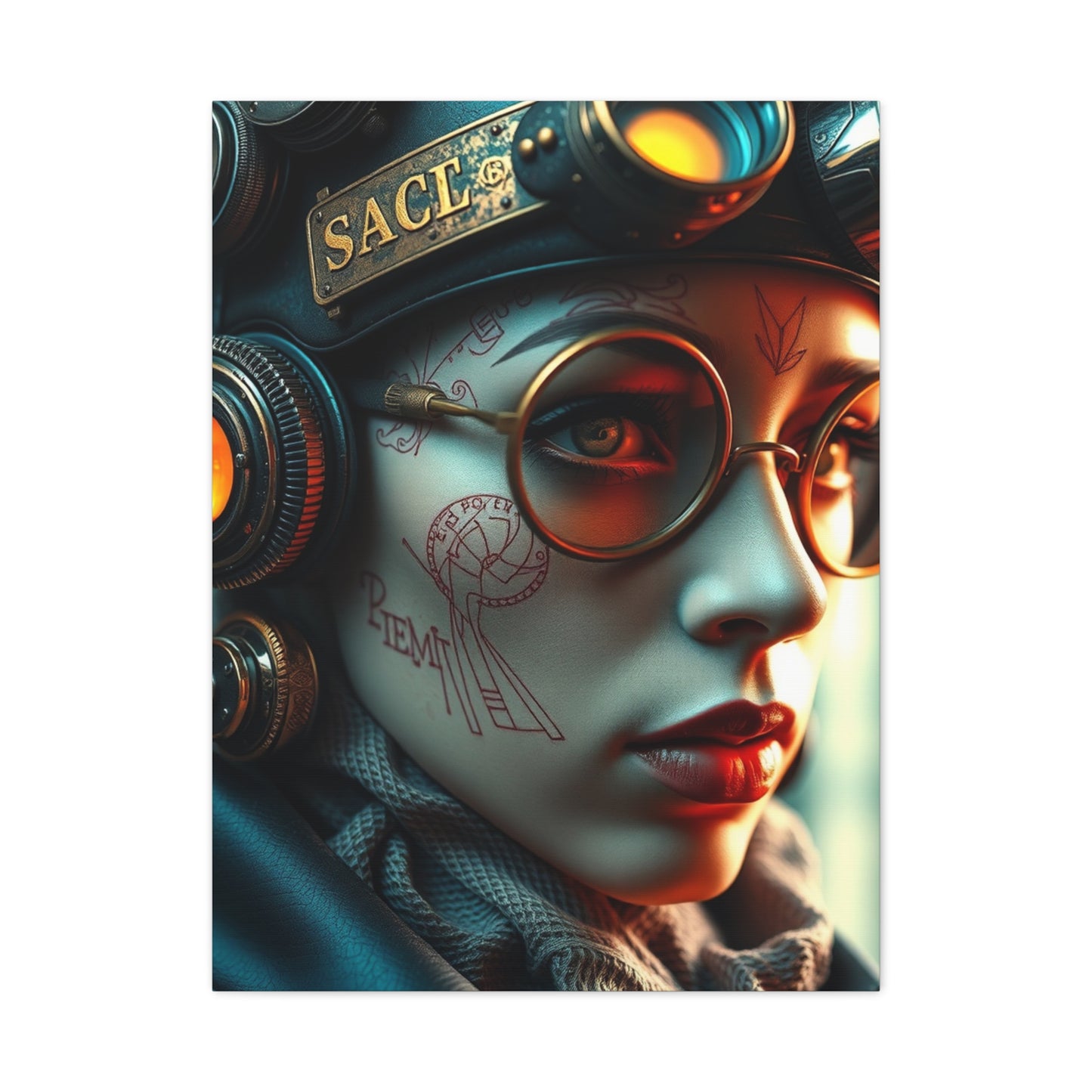
The appeal of this aesthetic lies in its ability to transport viewers to imagined futures as conceived through the lens of earlier eras. These artworks typically showcase sleek geometric forms, metallic finishes, vibrant color palettes, and architectural elements that suggest advanced civilizations and technological progress. When rendered on high-quality canvas material, these images gain texture and depth that enhance their visual impact, making them ideal for those seeking to make confident aesthetic statements in their living or working areas.
The Historical Roots of Retro Futurism in Visual Arts
The conceptual foundation for this artistic movement emerged during the mid-twentieth century when designers, illustrators, and visionaries began imagining what the coming decades and centuries might bring. This period, particularly the 1950s through 1970s, witnessed unprecedented optimism about technological advancement and societal progress. Artists created visions of gleaming cities, advanced transportation systems, and luxurious lifestyles enabled by scientific breakthroughs. These imaginative renderings appeared in popular magazines, world's fair exhibitions, advertising campaigns, and science fiction publications, capturing the collective imagination of entire generations.
What makes these historical visions particularly compelling today is the contrast between their ambitious predictions and our actual technological trajectory. Some envisioned elements never materialized as expected, while others manifested in completely different forms. This gap between prediction and reality creates a fascinating tension that contemporary artists explore in their work. By revisiting these vintage futuristic concepts through modern artistic techniques, creators generate compositions that feel simultaneously nostalgic and innovative, familiar yet exotic.
The resurgence of interest in these aesthetic principles reflects broader cultural trends toward examining our relationship with technology, progress, and the future itself. As society grapples with rapid changes in artificial intelligence, biotechnology, and digital connectivity, looking backward at how previous generations imagined tomorrow provides both comfort and perspective. Canvas prints featuring these themes serve as conversation starters, inviting viewers to reflect on their own assumptions about progress and possibility.
Defining Characteristics of Opulent Retro Futuristic Imagery
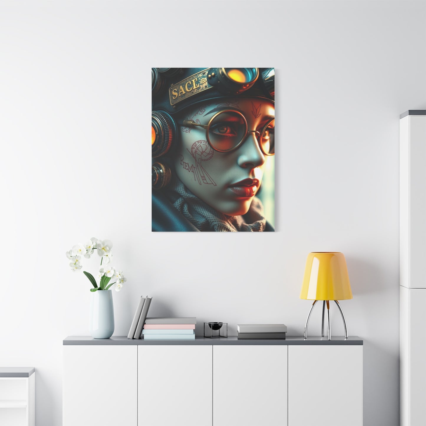
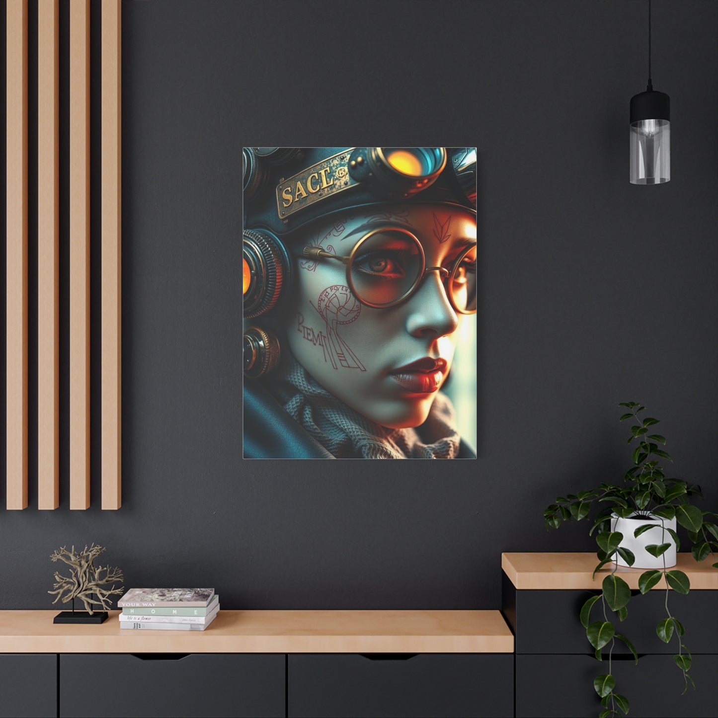
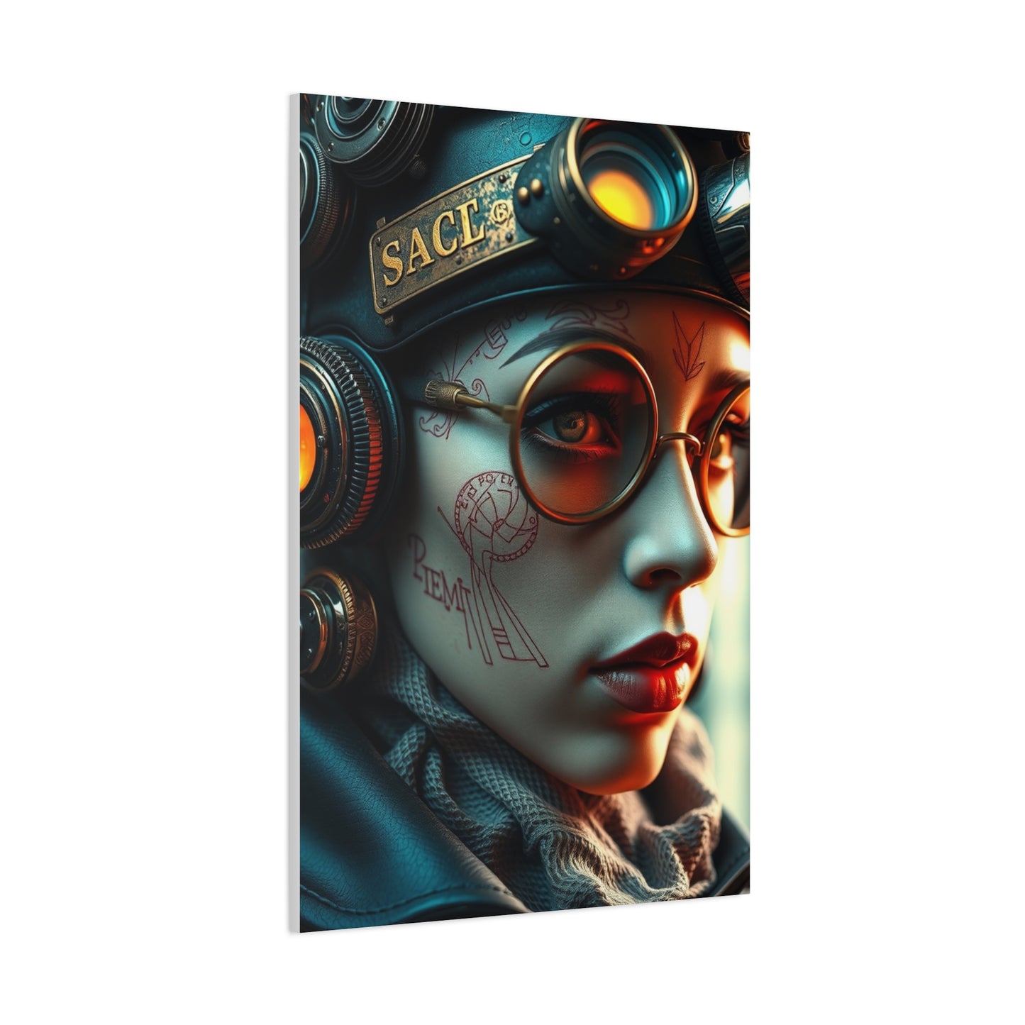
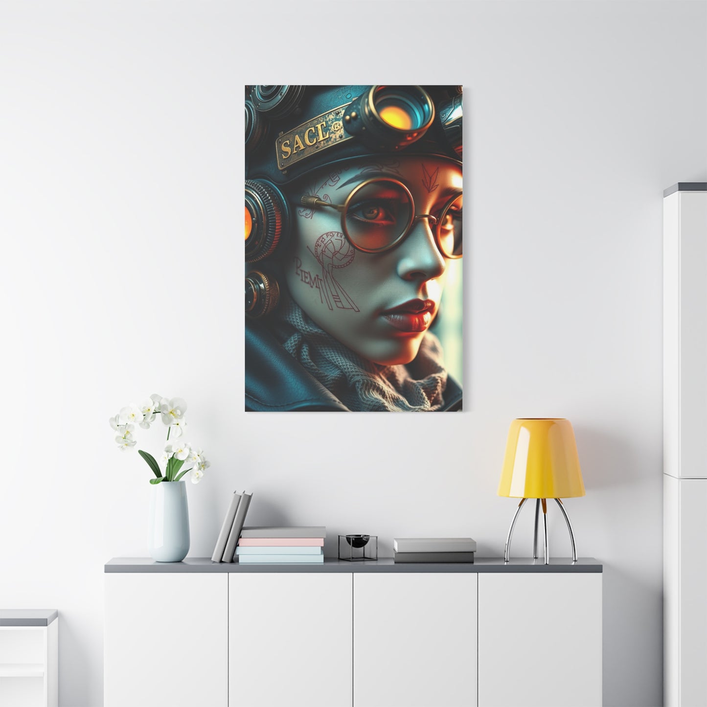
Artwork embodying this aesthetic typically features several distinctive visual elements that set it apart from other artistic styles. Understanding these characteristics helps in selecting pieces that authentically represent the movement and create maximum visual impact when displayed. The most recognizable feature involves streamlined, aerodynamic shapes that suggest motion and efficiency. These forms draw inspiration from mid-century automotive design, aerospace engineering, and architectural movements like Googie and Brutalism, all filtered through an imaginative lens that exaggerates and idealizes their most dramatic qualities.
Color palettes tend toward bold, saturated hues that evoke both luxury and technological sophistication. Deep jewel tones like emerald, sapphire, and ruby often appear alongside metallic shades of gold, silver, chrome, and copper. These rich colors create a sense of opulence and grandeur that elevates the artwork beyond simple nostalgic reference into the realm of genuine luxury aesthetics. Turquoise, coral, and burnt orange frequently feature as accent colors, referencing the popular palettes of mid-century modern design while maintaining contemporary relevance through thoughtful application and balance.
Geometric precision represents another hallmark of this visual language. Clean lines, perfect circles, precise angles, and symmetrical compositions create a sense of order and intentionality that suggests advanced planning and technological capability. These geometric elements might appear as architectural details, decorative patterns, or abstract compositions that emphasize mathematical harmony and visual balance. The geometric approach contrasts sharply with organic, naturalistic artistic styles, instead celebrating human ingenuity and manufacturing capability.
Lighting effects play a crucial role in establishing the futuristic atmosphere these works aim to create. Glowing neon accents, dramatic spotlights, lens flares, and luminous surfaces suggest advanced lighting technologies and create dynamic visual interest. These lighting elements add depth and dimensionality to compositions, guiding the viewer's eye through the artwork and highlighting key features. When reproduced on canvas, these lighting effects can create remarkable visual depth, especially when the print receives proper gallery lighting that enhances its inherent luminosity.
Material Considerations for Canvas Print Production
The physical substrate on which these images are reproduced significantly impacts their final appearance and longevity. High-quality canvas material provides several advantages over paper prints or other reproduction methods. Canvas texture adds tactile dimension that complements the visual content, creating a more engaging sensory experience. The slightly rough surface catches light differently than smooth paper, generating subtle variations in how colors appear from different viewing angles and under various lighting conditions.
Professional-grade canvas typically consists of cotton, polyester, or cotton-polyester blends, each offering distinct characteristics. Pure cotton canvas provides the most traditional fine art appearance with natural texture variations and excellent color absorption. This material ages gracefully and maintains archival quality when properly treated with protective coatings. Polyester canvas offers superior durability and moisture resistance, making it ideal for environments where humidity or temperature fluctuations might affect pure cotton. Blended materials attempt to combine the aesthetic advantages of cotton with the practical benefits of synthetic fibers.
The weight and weave of canvas fabric influence both appearance and structural integrity. Heavier canvas with tighter weave patterns provides a smoother printing surface that captures fine details with greater precision. This becomes particularly important for complex geometric compositions where crisp lines and precise color boundaries contribute significantly to the overall impact. Lighter canvas with more pronounced texture creates a painterly quality that can enhance certain artistic styles but might obscure delicate details in others.
Printing technology represents another critical factor in final print quality. Giclée printing processes utilizing archival inks produce museum-quality reproductions with exceptional color accuracy and longevity. These pigment-based inks resist fading from ultraviolet light exposure much more effectively than dye-based alternatives, ensuring that vibrant colors maintain their intensity for decades when properly displayed. The high resolution capabilities of professional giclée printers capture subtle gradations and fine details that lesser reproduction methods might miss entirely.
Gallery wrap construction, where the printed canvas extends around the edges of a wooden stretcher frame, creates a finished appearance that eliminates the need for traditional framing. This presentation method works particularly well for bold, contemporary compositions where the image continues seamlessly around the sides of the piece. The depth of the stretcher frame, typically ranging from three-quarters of an inch to several inches, affects the sculpture-like quality of the finished piece and its visual prominence on the wall.
Color Psychology in Retro Futuristic Compositions
The emotional and psychological impact of color choices in these artworks extends far beyond simple aesthetic preference. Research in environmental psychology and design theory demonstrates that color significantly influences mood, perception, and even behavior within built environments. Understanding these principles helps in selecting artwork that not only looks appealing but also creates desired atmospheric effects in specific settings.
The metallic gold and brass tones frequently featured in opulent retro futuristic imagery evoke feelings of luxury, success, and timelessness. These warm metallic shades create inviting atmospheres while suggesting value and sophistication. Gold particularly carries strong associations with achievement, celebration, and prestige across numerous cultures, making it an effective choice for settings where confidence and accomplishment should be emphasized. When combined with deeper jewel tones, these metallic elements provide luminous highlights that enliven compositions and create visual focal points.
Deep blues ranging from navy to cobalt communicate stability, intelligence, and calm authority. These colors often appear in architectural elements and sky backgrounds within retro futuristic compositions, providing grounding elements that balance more vibrant accent colors. Blue's universal appeal and association with both technology and tranquility make it particularly effective in professional environments where focus and contemplation are valued. The cooler temperature of blue tones creates visual recession, adding perceived depth to compositions and enhancing three-dimensional illusions.
Vibrant oranges, corals, and reds inject energy and warmth into compositions while maintaining the optimistic character central to this aesthetic. These hues stimulate conversation and activity, making them ideal for social areas where engagement and liveliness are desired outcomes. In the context of retro futurism, these warm tones often reference the sunset palettes popular in mid-century design while maintaining contemporary relevance through careful saturation and balance with cooler complementary colors.
Purples and magentas occupy a unique position in the retro futuristic color vocabulary, suggesting both luxury and technological advancement. These colors rarely appear in nature with high saturation, giving them an artificial, manufactured quality that reinforces futuristic themes. Purple particularly bridges warm and cool color families, allowing it to harmonize with diverse palette combinations while maintaining distinct visual presence. When rendered with metallic sheen or neon luminosity, purple tones create otherworldly effects that enhance the fantastical qualities of imagined futures.
Architectural Elements in Retro Futuristic Canvas Art
The built environment features prominently in artwork exploring these themes, with architectural forms serving as primary visual subjects and symbolic representations of societal values. These structures typically exhibit characteristics that diverge dramatically from conventional building design, instead embracing bold experimental forms that prioritize visual drama over practical constraints. Sweeping curves, dramatic cantilevers, soaring towers, and unconventional geometric configurations suggest advanced engineering capabilities and freedom from traditional limitations.
Dome structures appear frequently, referencing both ancient architectural traditions and mid-century visions of climate-controlled environments. These hemispherical forms suggest completeness and protection while demonstrating structural efficiency. In retro futuristic contexts, domes often appear as transparent or translucent elements allowing views of impossible skies or cosmic phenomena, merging architectural shelter with visual connection to larger universes. Multiple interconnected domes create complex compositions suggesting sophisticated urban planning and communal organization.
Vertical emphasis characterizes many architectural elements in this visual language, with towers and spires reaching toward idealized skies. This upward thrust symbolizes aspiration, progress, and human ambition to transcend current limitations. These vertical elements often feature tapering profiles or stacked geometric forms that create dynamic silhouettes against dramatic backgrounds. The emphasis on height reflects mid-century fascination with skyscraper construction and space exploration, both representing humanity's desire to overcome gravitational constraints.
Platforms, walkways, and elevated structures create layered compositions that suggest complex three-dimensional urban environments. These elements often float impossibly in atmospheric or cosmic settings, freed from conventional structural logic by implied advanced technologies. The intersection of multiple platforms at varying heights creates visual rhythm and suggests bustling activity even when human figures are absent from the composition. These architectural layers provide artists with opportunities to explore perspective, depth, and spatial relationships in sophisticated ways.
Monumental staircases, ramps, and other circulation elements frequently serve as central compositional features rather than merely functional necessities. These oversized elements reference classical architectural traditions while incorporating streamlined modern forms and futuristic materials. The prominence given to these circulation features suggests societies where movement, progress, and journey hold cultural significance beyond mere practical transportation needs.
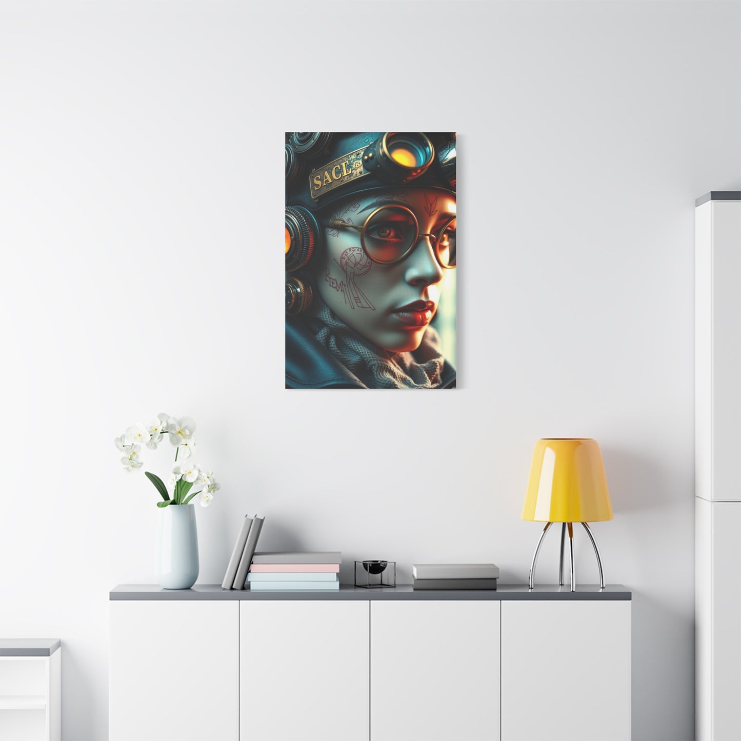
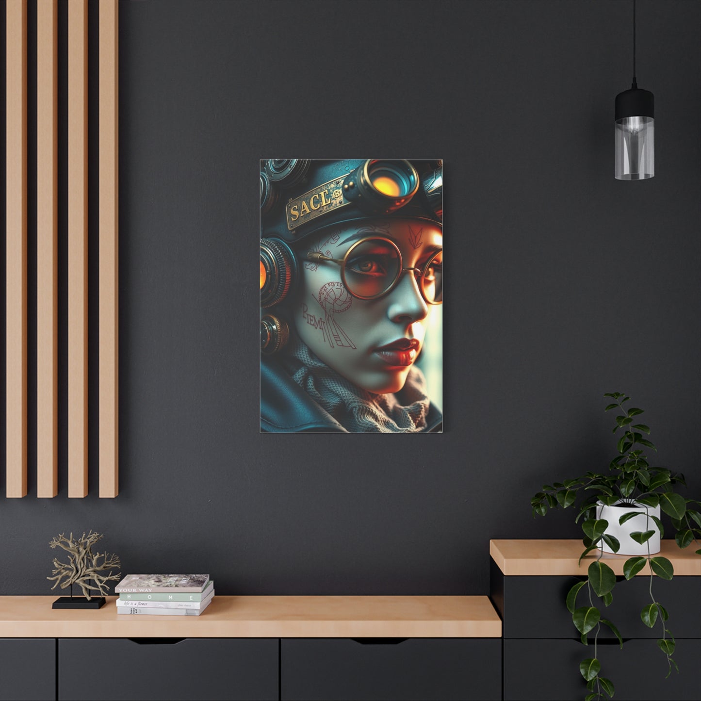
Incorporating Large Scale Canvas Prints into Residential Settings
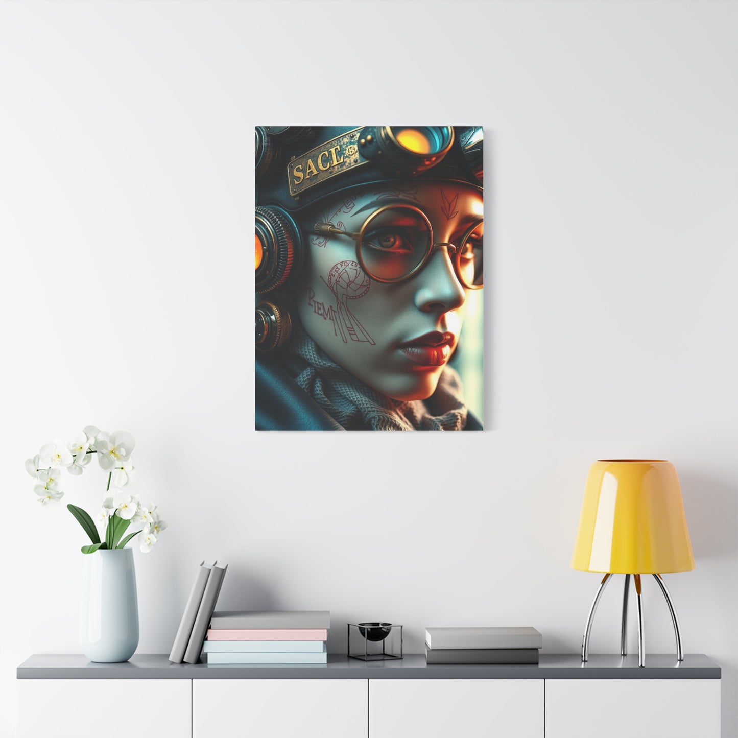
Successfully integrating substantial artwork into living environments requires consideration of multiple factors beyond simple aesthetic preference. The physical dimensions of the piece must relate appropriately to the wall dimensions and overall room proportions to avoid overwhelming smaller areas or appearing insignificant in expansive ones. General design principles suggest that artwork should occupy roughly two-thirds to three-quarters of the available wall width in focal point applications, though these guidelines flex based on ceiling height, furniture arrangement, and desired visual impact.
Placement height significantly affects both aesthetic impact and viewing comfort. The center of the artwork should typically align with average eye level, approximately 57 to 60 inches from the floor, though this guideline adjusts when furniture beneath the piece establishes a different visual baseline. In rooms with seating areas, considering sight lines from typical seated positions ensures the work remains visually accessible and comfortable to view during extended periods. Above furniture pieces like sofas or consoles, maintaining 6 to 12 inches of separation prevents the artwork from appearing to merge with the furniture while maintaining visual connection.
Lighting dramatically influences how canvas prints present in residential settings. Natural daylight brings out subtle color variations and creates dynamic viewing experiences as light quality changes throughout the day, but direct sunlight accelerates fading even in archival prints and should be avoided. Diffused natural light from north-facing windows provides ideal illumination in spaces where artificial lighting can supplement during evening hours. Dedicated picture lights or adjustable track lighting allows precise illumination control, highlighting the artwork's best qualities while adding ambient lighting to the overall environment.
The surrounding color palette influences how the artwork's colors appear and interact with the overall environment. Neutral wall colors provide versatile backgrounds that allow bold artwork to dominate visually without color clashing. Lighter wall tones enhance color brightness and create clean contemporary presentations, while deeper wall colors can create dramatic effects that emphasize metallic elements and luminous highlights within the artwork. Pulling accent colors from the artwork into textiles, decorative objects, or smaller furniture pieces creates cohesive designed environments where the canvas print functions as the visual anchor for the entire color scheme.
Balancing the artwork with other decorative elements prevents visual chaos while maintaining interesting composed environments. The bold geometric nature of retro futuristic imagery pairs well with clean-lined furniture and minimal decorative clutter that doesn't compete for visual attention. Mid-century modern furniture complements these artworks naturally, creating harmonious environments that feel intentionally curated rather than accidentally assembled. Metallic finishes in furniture hardware, lighting fixtures, and decorative accessories echo the metallic elements often present in this artwork style, reinforcing thematic consistency.
Commercial Applications for Retro Futuristic Canvas Artwork
Professional environments benefit significantly from thoughtful art selection that enhances brand identity while creating memorable atmospheric experiences for clients and employees. Retro futuristic imagery communicates innovation, forward-thinking approaches, and confidence in progress—qualities many businesses wish to associate with their brands. The bold visual nature of these artworks creates immediate impact in reception areas, conference rooms, and client-facing environments where first impressions carry significant weight.
Technology companies and startups find particular alignment with this aesthetic vocabulary. The imagery's emphasis on innovation, possibility, and ambitious vision mirrors the ethos of organizations working at the cutting edge of their fields. Large-scale canvas prints in communal areas and meeting facilities reinforce company culture while providing visual interest that stimulates creative thinking and conversation. The optimistic tone of vintage futuristic imagery can counterbalance the pressure and uncertainty inherent in rapidly evolving industries, offering aspirational visions that energize rather than intimidate.
Hospitality venues including hotels, restaurants, and entertainment establishments use art to create distinctive atmospheres that differentiate their offerings from competitors. Retro futuristic artwork supports various thematic approaches from sophisticated metropolitan luxury to playful nostalgic charm. In hotel lobbies and guest corridors, these images provide talking points and Instagram-worthy backdrops that encourage social media sharing and word-of-mouth promotion. Restaurant and bar environments benefit from the energetic color palettes and dynamic compositions that stimulate conversation and create memorable dining experiences.
Professional services firms including law offices, consulting practices, and financial institutions sometimes avoid bolder artistic choices, but carefully selected retro futuristic pieces can communicate progressive thinking without sacrificing professional credibility. More subdued compositions emphasizing architectural elements and metallic palettes maintain sophisticated appearances while suggesting innovation and strategic foresight. In these contexts, the artwork signals that the firm embraces contemporary approaches while maintaining the reliability and stability clients expect from professional service providers.
Retail environments use visual merchandising to create branded experiences that encourage longer dwell times and increased purchasing. Canvas artwork contributes to these environments by reinforcing brand aesthetics and creating photo-worthy settings that customers associate with positive shopping experiences. For retailers targeting style-conscious consumers, retro futuristic imagery signals cultural awareness and design sophistication that elevates the entire brand perception. The artwork becomes part of the product offering itself, contributing to the overall value proposition rather than merely decorating empty walls.
The Role of Nostalgia in Contemporary Design Preferences
Understanding why mid-century futuristic visions resonate so powerfully with contemporary audiences requires examining the complex psychology of nostalgia and its influence on aesthetic preferences. Nostalgia serves multiple psychological functions including providing comfort during uncertain times, connecting individuals to cultural heritage, and offering perspective on current circumstances through comparison with past perspectives. The longing for imagined pasts or futures that never materialized represents a particular form of nostalgia that cultural theorists term "retrofuturism" or "nostalgic futurism."
The mid-twentieth century represents a period of remarkable optimism about humanity's trajectory, before many of the environmental, social, and political challenges that characterize contemporary consciousness became widely acknowledged. The futuristic visions created during this era reflected genuine belief in technology's potential to solve problems and improve lives without the skepticism and awareness of unintended consequences that colors current perspectives. This uncomplicated optimism provides psychological relief for audiences fatigued by complex global challenges and constant awareness of systemic problems.
Nostalgia also functions as a response to rapid technological and social change. When external environments transform quickly, individuals often seek stability and connection through engagement with past aesthetics and cultural touchstones. The dramatic pace of digital transformation over recent decades has created conditions where people actively seek anchoring in recognizable historical periods, even as they simultaneously embrace new technologies. Retro futuristic imagery serves this dual need perfectly, offering familiar vintage aesthetics while celebrating technological advancement and innovation.
The specific appeal of mid-century futurism relates partially to demographics, as it references the childhood or young adult experiences of influential consumer segments. However, its popularity extends well beyond those with personal memories of the era, suggesting the aesthetic succeeds on its own merits rather than purely through personal nostalgia. Younger audiences respond to the bold graphic qualities, optimistic messaging, and departure from both minimalist contemporary trends and traditional classical styles. The look feels fresh and distinctive precisely because it differs from prevailing contemporary aesthetics while avoiding the seriousness of historical fine art traditions.
Creating Gallery Wall Arrangements with Multiple Canvas Pieces
While single large-scale canvas prints create powerful focal points, arrangements of multiple coordinated pieces offer flexibility and visual complexity that single artworks cannot achieve. Gallery walls featuring retro futuristic imagery in various scales and orientations create dynamic compositions that can adapt to challenging architectural features like windows, doorways, and irregular wall dimensions. Successful multi-piece installations require careful planning regarding visual balance, thematic cohesion, and spatial relationships between individual elements.
Thematic consistency ensures that multiple pieces read as an intentional collection rather than random assembly. This doesn't require identical imagery across all pieces, but rather shared elements like color palette, stylistic approach, subject matter, or conceptual themes. A gallery wall might feature various architectural subjects rendered in consistent color schemes, or different compositional approaches to similar geometric forms. The visual variety maintains interest while underlying consistency creates cohesion that unifies the arrangement.
Scale variation adds visual interest and prevents monotonous grid arrangements that can appear stiff and institutional. Combining larger anchor pieces with smaller complementary images creates hierarchy and guides viewer attention through the composition. The largest piece typically occupies a central or weighted position, with smaller elements arranged around it in balanced but not necessarily symmetrical patterns. Varying both the dimensions and orientation of pieces—mixing horizontal, vertical, and square formats—increases dynamic energy and prevents predictable arrangements.
Spatial relationships between pieces significantly impact overall effect. Consistent spacing creates clean, organized presentations appropriate for formal settings, while varied gaps generate more casual, collected-over-time aesthetics. Most professional arrangements maintain spacing between 2 and 6 inches depending on overall scale and desired effect. Tighter spacing emphasizes the relationship between pieces and creates unified larger compositions, while generous spacing allows each piece to maintain more individual presence while contributing to the overall arrangement.
Planning gallery wall arrangements before installation prevents costly errors and unnecessary wall damage. Creating full-scale paper templates of each piece allows experimentation with various configurations directly on the floor or wall before committing to hanging hardware placement. Many designers photograph various arrangements during the planning phase, viewing images at reduced scale to assess overall visual balance more objectively than possible when standing directly in front of full-scale pieces. Digital planning tools and apps also facilitate this process, allowing virtual experimentation with various configurations.
Technical Specifications for Professional Quality Canvas Prints
Achieving gallery-worthy results requires attention to technical specifications throughout the image selection, printing, and finishing processes. Resolution stands as the most critical factor determining print quality, with higher resolution images containing more information for faithful reproduction at large sizes. For canvas printing, minimum resolution should be 150 pixels per inch at final print dimensions, though 300 pixels per inch produces superior results with sharper details and smoother tonal transitions. Attempting to print low-resolution images at large dimensions results in visible pixelation, blurred details, and unprofessional appearance.
Color space and profile management ensure that colors in the final print match the artist's intentions and appear consistent across different viewing conditions. Professional printing facilities work in color-managed workflows using standardized color spaces like Adobe RGB or ProPhoto RGB that capture wider color gamuts than standard sRGB. Proper color profile embedding and conversion prevents unexpected color shifts during printing. Soft proofing—digitally simulating how colors will appear in print before actual production—allows adjustments that compensate for differences between backlit screen display and reflective printed material.
Ink quality directly impacts both initial color accuracy and long-term print stability. Pigment-based archival inks resist fading dramatically better than dye-based alternatives, maintaining color integrity for 100 years or more under proper display conditions. These inks achieve fade resistance through larger pigment particles that resist breaking down under light exposure compared to dye molecules that degrade more readily. The expanded color gamut of professional printer systems with additional ink colors beyond basic cyan, magenta, yellow, and black allows more accurate color reproduction, particularly in challenging ranges like vibrant oranges, deep blues, and neutral grays.
Canvas coating and finishing treatments protect the printed image while affecting final appearance characteristics. Protective coatings guard against moisture, airborne contaminants, and minor abrasions while providing either matte or satin finish options. Matte coatings minimize glare and reflections, creating subdued presentations that work well in brightly lit environments or where multiple viewing angles make glare problematic. Satin finishes provide slight sheen that enhances color vibrancy and creates more luxurious appearance while maintaining better glare resistance than high-gloss alternatives.
Stretcher frame quality impacts both the structural integrity of the finished piece and the professional appearance of gallery-wrapped edges. Premium stretcher bars feature precise dimensioning, stable kiln-dried wood, and proper corner bracing that prevents warping over time. The depth of stretcher frames ranges from standard three-quarter inch profiles appropriate for most applications to gallery-depth options of 1.5 or 2 inches that create more substantial sculptural presence. Deeper frames work particularly well for larger canvases where increased depth balances the expanded face dimensions, preventing the piece from appearing flat despite its size.
Maximizing Visual Impact Through Strategic Lighting Design
Even the most stunning canvas print underperforms visually without proper illumination that reveals its full color depth and dimensional qualities. Lighting design for artwork involves balancing adequate illumination levels for comfortable viewing with protecting the piece from light-induced degradation over time. This balance requires understanding both the technical aspects of lighting and the aesthetic qualities of different lighting approaches.
Picture lights mounted directly above or beside artwork provide focused illumination that highlights the piece while minimizing light spill onto surrounding walls. Traditional picture lights featured incandescent bulbs that generated significant heat potentially damaging to artwork, but contemporary LED options produce minimal heat while offering excellent color rendering and energy efficiency. Adjustable picture lights allow fine-tuning of beam angle and direction, ensuring even illumination across the entire canvas surface without hot spots or shadowed corners.
Track lighting systems offer flexible solutions where multiple artworks require illumination or where architectural constraints prevent dedicated picture light installation. Adjustable track heads allow precise aiming toward specific pieces with control over beam spread and intensity. Contemporary LED track systems provide dimming capability that adapts to changing natural light levels and different usage scenarios throughout the day. The visible presence of track systems varies from minimalist contemporary designs that nearly disappear to more substantial architectural fixtures that become design elements in their own right.
Recessed ceiling fixtures create clean, unobtrusive illumination particularly effective in contemporary settings where visible light fixtures might conflict with minimal aesthetic preferences. Adjustable recessed fixtures with directional capabilities allow artwork lighting from ceiling positions, though ceiling height and artwork placement relative to walls affect feasibility. Wall-washing techniques using recessed fixtures create even illumination across entire walls, appropriate when artwork forms part of larger architectural presentations rather than functioning as isolated focal points.
Natural light provides beautiful illumination that changes throughout the day, creating dynamic viewing experiences as light quality and intensity shift with sun position and weather conditions. However, direct sunlight contains ultraviolet radiation that accelerates fading even in archival prints, making UV-filtering window treatments essential for protecting displayed artwork. Sheer curtains, solar shades, or UV-filtering window films reduce harmful radiation while allowing natural light transmission. Positioning artwork away from direct sun paths provides additional protection while still benefiting from diffused daylight that reveals subtle color variations impossible to see under artificial lighting alone.
Color temperature of light sources dramatically affects how artwork colors appear. Warm white light sources around 2700 to 3000 Kelvin create cozy, inviting atmospheres but shift color perception toward yellow and orange tones. Cool white and daylight-balanced sources around 5000 to 6500 Kelvin provide more neutral color rendering appropriate for color-critical applications but can feel stark in residential settings. Many contemporary LED fixtures offer tunable white capability that adjusts color temperature for different times of day or usage scenarios, providing warm inviting light for entertaining while offering color-accurate illumination for focused artwork viewing.
Symbolic Meanings Embedded in Retro Futuristic Imagery
Beyond their immediate visual appeal, artworks in this style carry layered symbolic meanings that resonate with contemporary cultural concerns and philosophical questions. Unpacking these symbolic dimensions reveals why these images exert such powerful attraction beyond simple aesthetic pleasure, connecting with deeper psychological and cultural needs.
The emphasis on technological advancement and scientific progress reflects utopian aspirations that dominated mid-century Western culture. These visions imagined technology as fundamentally beneficial, capable of solving social problems and improving human conditions without the complications and trade-offs we now associate with technological change. This uncomplicated faith in progress offers psychological comfort in an era characterized by technological anxiety and awareness of unintended consequences. The imagery doesn't deny contemporary challenges but provides imaginative relief through connection with more optimistic historical perspectives.
Architectural monumentality and geometric precision suggest human mastery over natural environments and confidence in rational planning approaches. The ordered, designed quality of these environments contrasts with the complexity and apparent chaos of actual contemporary cities, offering fantasies of control and organization. This symbolic dimension resonates particularly strongly during periods of social and political turbulence when external circumstances feel unpredictable and beyond individual control. The artwork provides aesthetic experiences of order and intentionality even as daily life remains messy and uncertain.
The frequent absence of human figures in many retro futuristic compositions creates ambiguous narrative spaces. These empty architectural and environmental settings might suggest utopian societies where advanced automation has freed humanity from labor, or dystopian scenarios where human presence has vanished entirely. The ambiguity allows viewers to project their own interpretations and emotional responses, engaging more actively with the imagery than would occur with more prescriptive narratives. Some viewers experience these empty futures as peaceful and contemplative, while others find them unsettling or melancholic.
Metallic surfaces and reflective materials symbolize both luxury and technological sophistication. These materials suggest advanced manufacturing capabilities and departure from natural materials that dominated pre-industrial societies. In retro futuristic contexts, metallics often appear in impossible applications or configurations that emphasize their symbolic rather than functional roles. The prevalence of gold specifically connects technological futurism with ancient associations of this precious metal with divine power, permanence, and supreme value, creating interesting tensions between primitive and advanced, ancient and futuristic.
Cosmic and celestial elements—stars, planets, space scenes—reference the space age that defined mid-century technological imagination. Space exploration represented the ultimate frontier and symbol of human ambition to transcend earthly limitations. Contemporary inclusion of these elements carries additional resonance as actual space technology advances toward new milestones including Mars exploration and commercial space flight. The imagery connects past dreams with emerging realities while maintaining the aspirational and adventurous qualities that made space exploration such a powerful cultural touchstone.
Curatorial Approaches for Building Themed Art Collections
Developing cohesive art collections around retro futuristic themes allows for more sophisticated aesthetic statements than single pieces can achieve alone. Strategic collection building considers how pieces relate to each other while maintaining sufficient variety to prevent redundancy. Whether assembling artwork for residential environments, commercial installations, or investment purposes, thoughtful curatorial approaches enhance both the aesthetic impact and potential value of the collection.
Establishing clear collecting parameters provides direction while allowing flexibility as opportunities arise. These parameters might define specific sub-themes within the broader retro futuristic category, such as focusing exclusively on architectural subjects, cosmic scenes, or transportation concepts. Alternatively, collectors might establish technical criteria regarding color palette, compositional style, or printing quality. Clear parameters prevent collections from becoming unfocused assemblages while allowing enough latitude that collecting remains enjoyable rather than restrictively narrow.
Understanding different artists and studios working within this aesthetic vocabulary helps collectors make informed decisions about artistic merit and investment potential. Some creators work in purely digital mediums, using 3D modeling and rendering software to create impossible architectural visions. Others employ traditional illustration techniques subsequently digitized for reproduction. Photography-based approaches might involve extensive digital manipulation of captured images, creating surreal compositions that maintain photographic foundations. Recognizing these different technical approaches and their varying aesthetic qualities allows collectors to appreciate the craft involved and make comparisons across different works.
Balancing well-known pieces with lesser-known discoveries creates collections with both immediate recognizability and intriguing depth. Iconic retro futuristic images function as anchor pieces that clearly establish the collection's aesthetic direction, while more obscure works reward extended attention and repeated viewing. This balance prevents collections from appearing purely derivative while establishing clear thematic consistency. The juxtaposition of familiar and novel creates dynamic viewing experiences where returning to the collection reveals new relationships and details previously unnoticed.
Considering scale and format diversity adds visual interest to collections while accommodating different display contexts. Very large statement pieces command attention in primary viewing areas, while smaller works suit more intimate settings or create density in gallery wall arrangements. Varying orientations—horizontal, vertical, square, and panoramic formats—provides flexibility when adapting the collection to different architectural constraints. Sculptural or three-dimensional interpretations of retro futuristic themes can provide compelling counterpoints to flat canvas works, adding literal dimension that emphasizes the aesthetic's concern with form and volume.
Maintenance and Conservation of Canvas Art Prints
Preserving the appearance and integrity of canvas prints over decades requires understanding both immediate maintenance practices and long-term conservation principles. While quality canvas prints with archival inks demonstrate excellent inherent stability, environmental factors and handling practices significantly impact actual longevity. Implementing proper care protocols ensures these artworks remain vibrant focal points for generations.
Dust accumulation represents the most common maintenance challenge for canvas artwork. Unlike glass-covered prints where dust settles on the protective glazing, canvas textures trap airborne particles that can eventually dull colors and become embedded in the surface. Regular gentle dusting using clean, soft microfiber cloths or dedicated art dusters prevents significant accumulation. Dusting strokes should follow the weave direction when possible and use minimal pressure to avoid grinding particles into the canvas texture. Feather dusters should be avoided as they redistribute dust rather than removing it and can catch on canvas texture.
Environmental control prevents numerous potential problems including fading, canvas expansion and contraction, and material degradation. Stable temperature and humidity levels preserve canvas dimensional stability and prevent protective coatings from cracking or delaminating. Ideal conditions maintain temperatures between 65 and 75 degrees Fahrenheit with relative humidity between 40 and 55 percent. Extreme fluctuations cause more damage than absolute values outside these ranges, making consistency the primary goal. Artwork displayed near heating vents, air conditioning registers, or exterior walls experiences greater environmental variation requiring additional monitoring.
Light exposure management extends print longevity dramatically. While archival pigment inks resist fading far better than dye-based alternatives, all colorants show some degradation under sufficient light exposure over time. Ultraviolet radiation causes the most rapid damage, making UV filtration the single most important protective measure. Window films or UV-filtering glazing on windows, combined with avoiding direct sunlight on artwork, provides excellent protection while maintaining natural lighting benefits. Artificial light sources should use low-UV LED bulbs rather than halogen or fluorescent alternatives that emit more harmful radiation.
Physical damage from impacts, abrasions, or improper handling threatens canvas artworks more than environmental factors in many settings. Canvas stretched over wooden frames shows some give when pressed, but sharp impacts can tear material or dislodge it from stretcher bars. Maintaining clearance behind the artwork prevents contact with wall irregularities during normal thermal expansion and contraction cycles. When moving artwork, handling the stretcher frame edges rather than touching the canvas surface prevents oil transfer from hands and distributes weight appropriately. Storage should position pieces vertically rather than stacking them horizontally where weight can damage lower pieces.
Professional conservation services become necessary when damage exceeds simple surface soiling or when valuable pieces require specialized treatment. Conservators can repair tears, restabilize loose canvas, address failing protective coatings, and remove deeply embedded soiling that resists standard cleaning approaches. Selecting conservators with appropriate credentials and specific experience with contemporary canvas prints ensures work meets professional standards. Documentation of conservation interventions maintains provenance records important for valuable pieces and helps future caretakers understand the work's treatment history.
Psychological Impact of Bold Geometric Compositions
The formal qualities of retro futuristic artwork—its geometric precision, symmetry, and bold forms—produce specific psychological responses that extend beyond the imagery's thematic content. Environmental psychology research demonstrates that geometric qualities in visual environments influence cognitive processing, emotional states, and even behavior patterns. Understanding these effects helps in selecting artwork that produces desired psychological outcomes in specific settings.
Geometric regularity and symmetry create perceptions of order, stability, and intentionality. These qualities produce calming effects and suggest environments under control rather than subject to random forces. In residential settings, this can provide psychological refuge from the complexity and unpredictability of external circumstances. Professional environments benefit from similar effects, as geometric regularity subconsciously communicates organizational competence and systematic approaches. The strong geometric character of retro futuristic imagery makes it particularly effective for these applications.
Curved lines and forms generate different psychological responses than angular geometries. Curves feel more organic, flowing, and dynamic, suggesting movement and natural forces even within obviously manufactured contexts. The streamlined curves characteristic of mid-century design communicate efficiency and forward motion, qualities that translate into psychological sensations of progress and possibility. These forms feel optimistic and energizing, contrasting with the more static, stable qualities of rectilinear compositions.
Scale relationships within compositions affect perceived importance and viewer relationships to depicted subjects. Monumental architecture presented from low viewpoint creates sensations of awe and emphasizes human smallness relative to built environments. This can feel either inspiring or intimidating depending on the viewer's psychological orientation and the specific manner of presentation. More humanly-scaled architectural presentations create accessible, inhabitable feelings that invite imaginative exploration rather than passive admiration.
Color combinations interact with geometric forms to modify psychological effects. Geometric precision combined with cool color palettes produces intellectual, contemplative atmospheres appropriate for focused work or serious contemplation. The same geometric structures rendered in warm, vibrant colors feel more energetic and emotionally engaging, stimulating social interaction and creative ideation. Understanding these interactions allows strategic artwork selection that supports specific functional goals within different environments.
Complexity and visual density influence cognitive engagement and emotional response. Highly complex compositions with numerous geometric elements and intricate details reward extended viewing and repeated examination but can feel overwhelming in contexts where calm simplicity better serves occupants' needs. Simpler, more minimalist interpretations of retro futuristic themes provide bold visual impact without cognitive overload, functioning effectively in environments where artwork supports rather than dominates activities.
Digital Art Acquisition and Reproduction Rights
The digital nature of contemporary art creation and distribution introduces considerations regarding reproduction rights, ownership, and authentication that differ from traditional physical art markets. Understanding these issues helps buyers make informed decisions about what they're actually purchasing and their rights regarding the acquired artwork.
Most canvas print purchases convey only the physical object itself—the printed canvas stretched over its frame—without transferring underlying reproduction rights or digital files. The buyer owns that specific physical manifestation but typically cannot legally create additional reproductions, adapt the image, or use it commercially without additional licensing. This resembles traditional art purchases where buying a painting conveys ownership of that specific physical object but not reproduction rights. Clear purchase agreements.
Conclusion
In the evolving world of interior design, the combination of vintage charm and futuristic vision in wall art creates an extraordinary blend that speaks to both nostalgia and innovation. Futurist opulence, as a distinctive style, bridges the gap between the grandeur of bygone eras and the limitless possibilities of tomorrow. By integrating vintage motifs with visionary aesthetics, this genre of wall art allows collectors and enthusiasts to craft spaces that are rich in history yet undeniably contemporary.
Choosing vintage-inspired pieces infused with futuristic elements means embracing complexity in art. The ornate details, luxurious textures, and classic motifs evoke a sense of timeless elegance. At the same time, these are often contrasted or enhanced with sleek, modern lines, metallic finishes, bold colors, and abstract shapes that signal progress and innovation. This dynamic tension between old and new not only creates visual interest but also invites viewers to reflect on the evolution of art, culture, and technology.
One of the key advantages of Futurist Opulence wall art is its versatility. Such pieces can complement a variety of interior styles—from traditional, Victorian, and Art Deco settings to ultra-modern, minimalist, and industrial spaces. They serve as statement focal points that elevate a room’s atmosphere and convey a layered narrative. Whether hung above a mantel, featured in a gallery wall, or showcased as a standalone piece, these artworks bring an aura of sophistication and creative daring.
Collectors should also consider the materiality and craftsmanship behind these pieces. High-quality finishes like gold leaf, lacquer, or chrome plating often highlight the luxurious nature of the artwork. Meanwhile, innovative mediums such as digital prints on metallic canvases or mixed-media sculptures can push boundaries even further. Understanding the balance between technique and theme enriches the appreciation of each work and helps in selecting pieces that align with personal taste and space requirements.
Moreover, the symbolism embedded within Futurist Opulence art invites deeper engagement. Vintage elements often represent tradition, memory, and heritage, while futuristic features embody ambition, progress, and hope for what lies ahead. This duality can inspire reflection on where we come from and where we are going—making the art not just decoration, but a conversation starter and a source of inspiration.
Ultimately, embracing vintage meets visionary wall art means welcoming a sophisticated dialogue between past and future into your home. It celebrates artistic innovation while honoring historical beauty, creating an environment that is both luxurious and thought-provoking. By thoughtfully selecting pieces that resonate with your unique style and values, you will not only enhance your living space but also foster a meaningful connection to art’s evolving journey. In this way, Futurist Opulence wall art is more than just visual decor—it’s a testament to the enduring power of creativity across time.
