


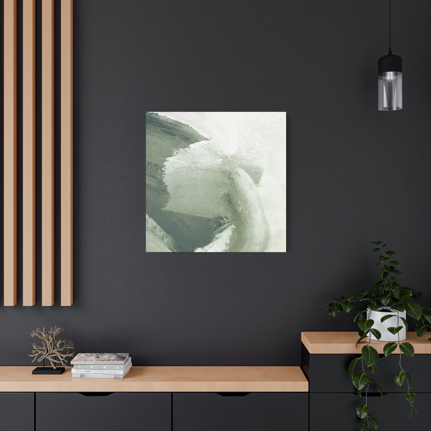
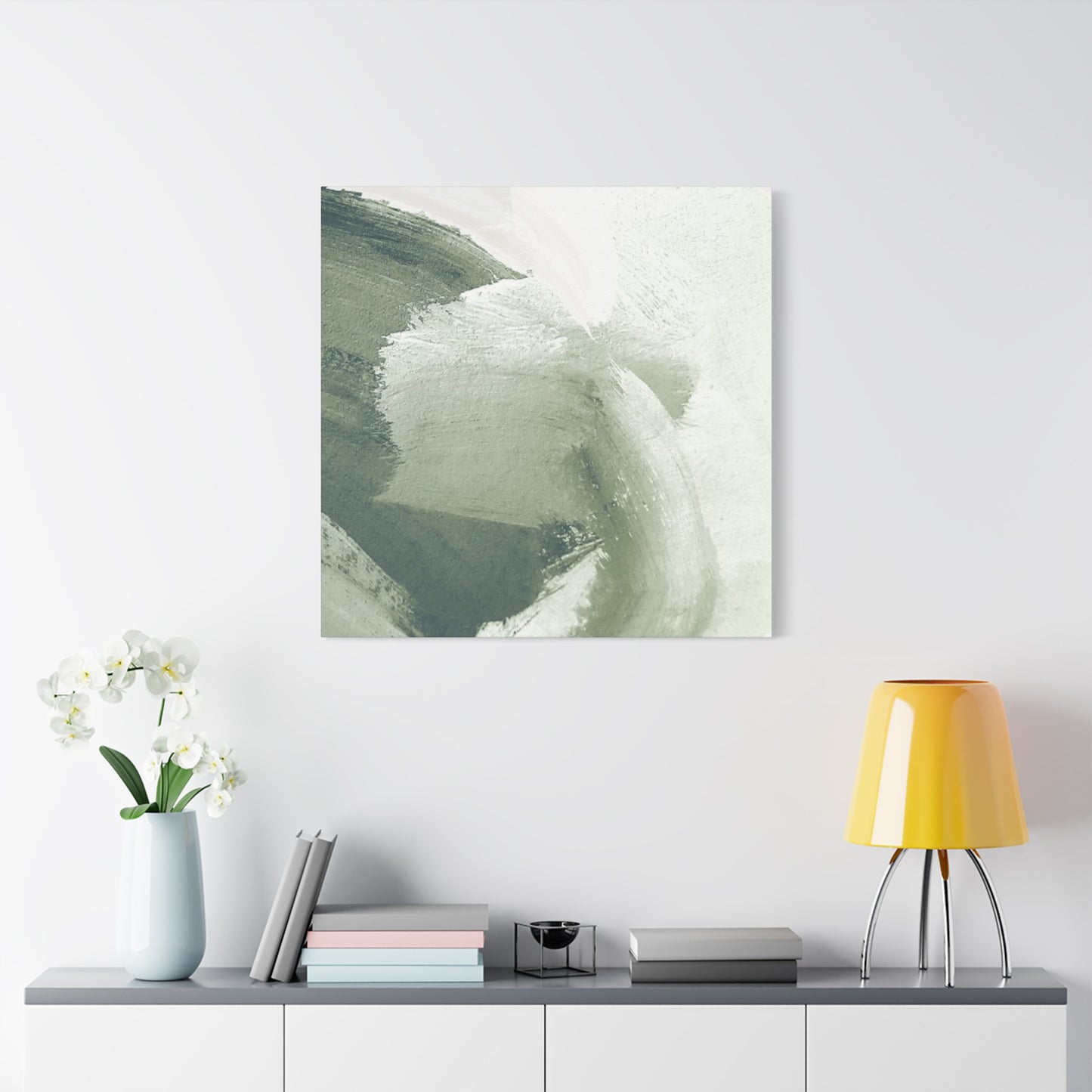
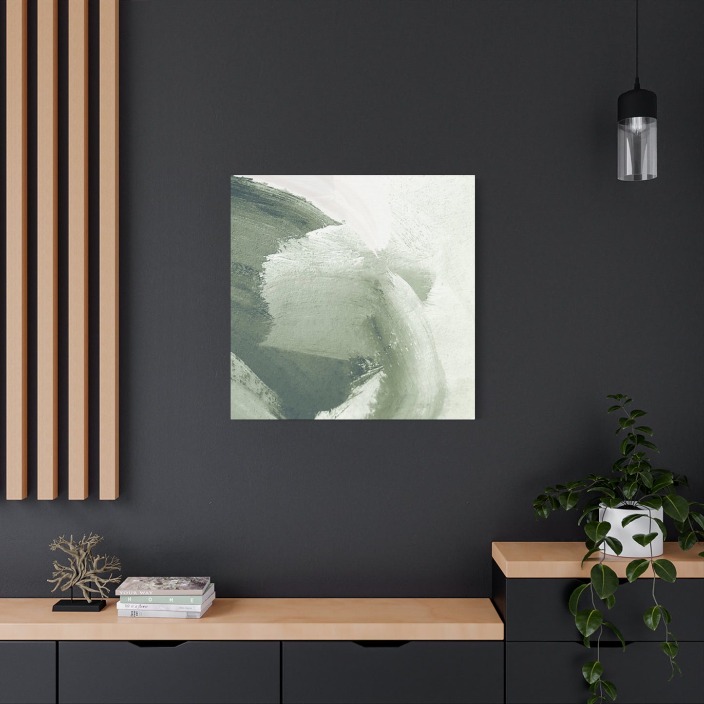
Shades Of Olive Green Brush Paint Wall Art & Canvas Prints
Shades Of Olive Green Brush Paint Wall Art & Canvas Prints
Couldn't load pickup availability
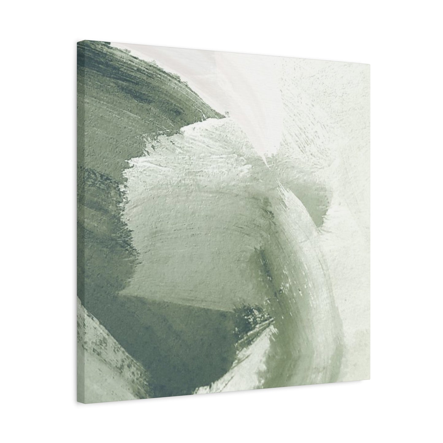

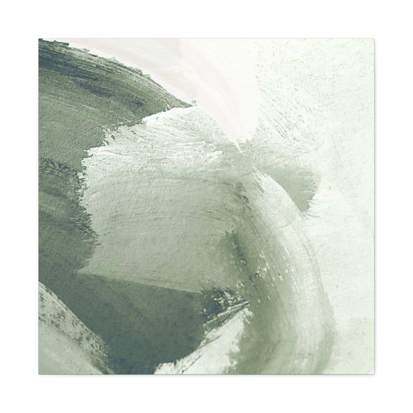
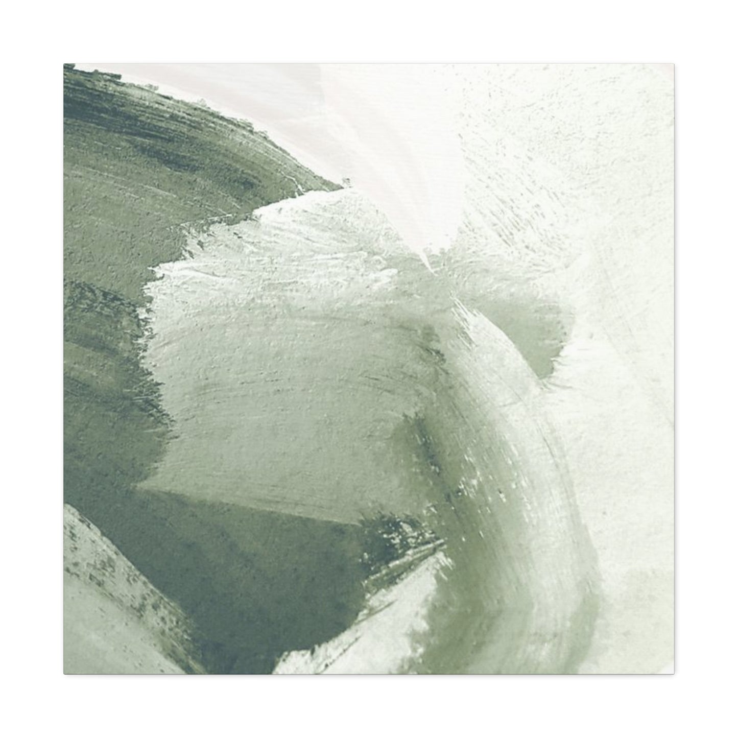
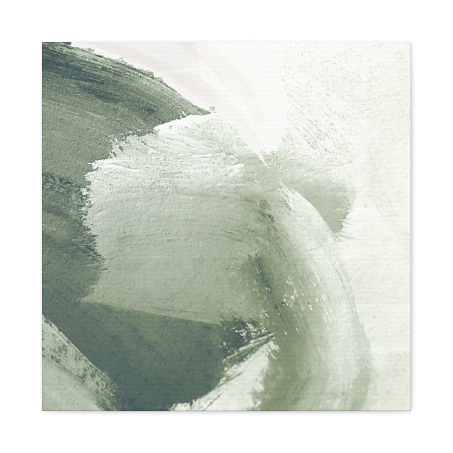
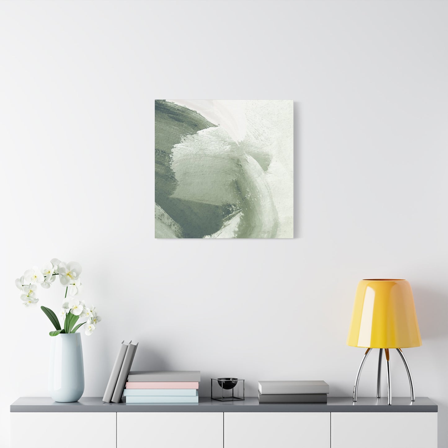


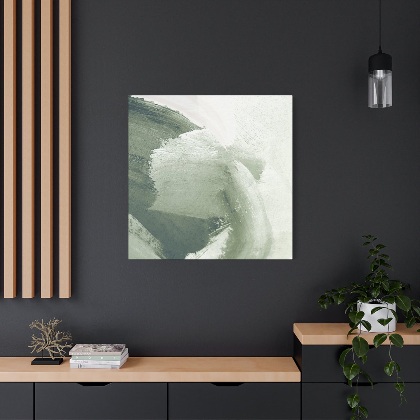
Olive Green Brush Paint Wall Art: Your Complete Interior Design Resource for Stylish Home
The evolution of interior design continues to embrace natural color palettes that bring warmth and sophistication to modern homes. Among the most compelling color choices emerging in contemporary design is the use of olive green in various artistic applications. This particular shade represents a convergence of nature-inspired aesthetics with modern sensibilities, creating spaces that feel both grounded and refined. When applied through brushwork and canvas applications, olive green becomes more than a color choice; it transforms into an artistic statement that speaks to both the visual and emotional dimensions of your living environment.
The adoption of olive green in residential spaces reflects a broader cultural shift toward sustainability, nature appreciation, and mindful living. Homeowners increasingly recognize that the colors surrounding them influence their psychological well-being, their sense of calm, and their overall satisfaction with their living spaces. Olive green, with its subtle complexity and earthy undertones, offers a sophisticated alternative to more conventional color schemes. Unlike more saturated greens that can feel overwhelming or artificial, this muted tone maintains a connection to nature while remaining versatile enough to complement diverse design philosophies and existing decor elements.
Professional interior designers have noted a significant uptick in requests for olive green canvas works and painted accents. This trend extends beyond merely painting walls in a solid color; instead, it encompasses textured brushwork, abstract representations, and layered applications that create depth and visual interest. The beauty of employing olive green through brushstrokes lies in how the technique adds dimensionality to walls. Rather than presenting a flat, uniform surface, brushwork creates movement and subtle variations in tone that catch light differently throughout the day, ensuring your space never appears static or monotonous.
The psychology behind choosing olive green for your interior reflects thoughtful decision-making about what environment supports your daily life. This particular shade carries associations with growth, renewal, and balance. When incorporated into your home through artistic applications, it serves as a daily reminder of these principles. The presence of olive-toned artwork can reduce visual noise in your space, allowing your mind to settle into a state of relaxation and focus. For individuals managing stress or seeking to create a sanctuary within their homes, this color choice offers practical benefits alongside aesthetic appeal.
Understanding how to effectively incorporate olive green brush strokes into your existing decor requires knowledge of color theory, spatial dynamics, and design principles. Many homeowners hesitate to introduce bold color statements into their spaces due to uncertainty about execution and integration. However, when approached strategically, olive green works harmoniously across virtually every design aesthetic, from minimalist contemporary spaces to traditionally appointed rooms filled with classic furnishings. The key lies in understanding the specific undertones within your chosen shade of olive and how these undertones interact with existing elements in your space.
Palette Composition: Understanding the Depth and Elegance Within Olive Tones
The world of olive green encompasses a fascinating spectrum of shades, each carrying distinct personality traits and design applications. Rather than viewing olive as a single, monolithic color, it's more accurate to conceptualize it as a family of related hues, each with unique characteristics that suit different purposes and preferences. Some olive greens lean toward warm golden undertones, while others possess cooler, more muted blue-gray components. Understanding these variations allows you to select the specific shade that best aligns with your vision for your space and your existing color palette.
Cool olive greens feature subtle blue and gray undertones that create a more sophisticated, muted aesthetic. These shades work exceptionally well in spaces with minimalist design sensibilities or contemporary decor approaches. When you choose cool olive greens, you're selecting a color that intentionally steps back rather than commands attention. This allows other elements in your room, such as furniture, lighting, or architectural features, to take center stage while benefiting from the calm, composed backdrop that cool olive provides. This particular undertone family proves especially effective in bedrooms, bathrooms, and home offices where creating a serene, focused atmosphere is prioritized.
Warm olive greens incorporate golden, ochre, and slightly brownish undertones that create a more inviting, enveloping quality. These warmer variations feel more approachable and comfortable, making them excellent choices for gathering spaces like living rooms and dining areas. When warm olive greens grace your walls through brushwork applications, they create an atmosphere of comfort and abundance. The warmth in these shades seems to interact with natural and artificial lighting in ways that enhance the entire room's ambiance. Spaces featuring warm olive tones often feel more intimate and connected to natural environments, even when located in urban settings.
Mid-tone olive greens represent a balanced middle ground between cool and warm variations. These versatile shades adapt gracefully to numerous design contexts and color combinations. Whether you're working with a predominantly neutral palette or incorporating bolder accent colors, mid-tone olives serve as diplomatic choices that facilitate cohesion across your space. Their neutrality shouldn't be confused with blandness; rather, mid-tone olives possess a quiet confidence that allows them to integrate smoothly while still contributing meaningful visual presence.
The saturation level of your chosen olive green significantly impacts how the color functions within your space. Highly saturated olive greens make bold declarations and work best as accent features rather than dominant wall colors. Less saturated, dusty versions of olive green create a softer, more subtle aesthetic that can work as a primary wall color while still maintaining visual interest through brushwork texture and application technique. Understanding saturation helps you make choices aligned with your comfort level regarding color intensity and your space's existing light conditions.
Light conditions profoundly influence how olive green appears within your environment. Spaces receiving abundant natural light showcase olive green's complexity and depth, with the color shifting throughout the day as the angle of sunlight changes. In rooms with limited natural light, warmer olive green tones prove more effective than cooler versions, as they actively contribute warmth to the space rather than appearing dull or listless. Northern-facing rooms benefit particularly from warm olive applications, while southern-facing spaces can accommodate cooler olive tones without risk of the room feeling cold. When considering brushstroke applications specifically, the interplay of light and shadow created by textured application becomes even more significant in shaping how your chosen olive appears.
The visual weight of olive green in any given space depends on how extensively you employ it. A single accent wall featuring olive brushwork creates focal point interest without overwhelming the room. Conversely, applying olive green across multiple walls, combined with olive-toned furnishings and accessories, creates a fully immersive environment that demands commitment to the color story. Many design professionals recommend introducing olive green progressively, starting with a single brushed artwork piece and observing how your space responds before expanding the application. This measured approach allows you to develop confidence in the color choice and ensures you're moving in a direction that genuinely pleases you rather than following trends without personal connection.
Minimalist Design Approaches Utilizing Olive Greens as Primary Elements
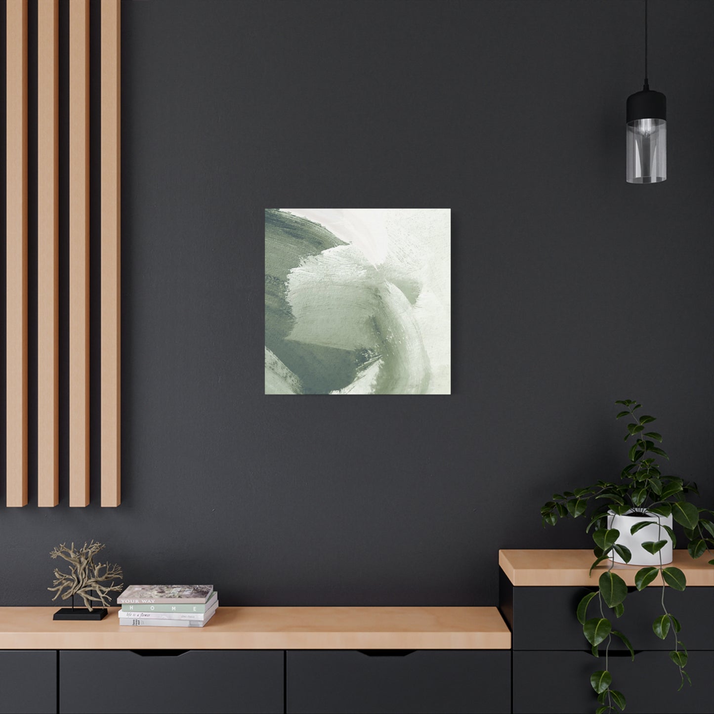
Minimalist design philosophy emphasizes reduction, intentionality, and the power of negative space to create visual impact. When olive green wall art enters a minimalist composition, it must justify its presence through authentic contribution rather than decorative excess. The intersection of minimalism and olive green aesthetics produces environments of remarkable restraint and refinement. In these spaces, a single brushstroke artwork becomes a meditation on color, form, and the relationship between object and environment.
Implementing olive green within minimalist frameworks requires thoughtful curation of supporting elements. The principle of less is more means that every item occupying visual space must earn its place through genuine necessity or meaningful contribution to the overall design narrative. A singular piece of olive green brush artwork mounted on an otherwise neutral wall becomes far more powerful than multiple pieces competing for attention. This focused approach allows visitors to approach your artwork without visual interference, engaging more deeply with the artist's intended message and the emotional resonance of the color itself.
The relationship between negative space and olive green artwork becomes particularly pronounced in minimalist settings. Expansive empty wall space surrounding a brushstroke piece creates breathing room that enhances the artwork's visual prominence. This spatial generosity ensures the olive green tones appear refreshing and intentional rather than cramped or desperate for attention. Minimalist spaces often employ white or off-white wall surfaces as their primary backdrop, which provides remarkable contrast potential for olive green works. The cool neutrality of white walls allows warm olive tones to project warmth into the space, while conversely, warm white walls create sophisticated sophistication when paired with cool olive greens.
Color harmonization in minimalist olive green spaces typically follows restrained palettes featuring the olive tone plus one or two supporting colors. This might mean pairing olive green with warm neutrals like cream, sand, or pale taupe, or combining it with cooler neutrals like soft gray or warm white. The strategic introduction of warm wood tones, such as light oak or pale walnut, adds natural texture without compromising minimalist principles. These supporting colors allow the eye to move through the space in organized patterns while the olive brushwork remains the primary focal point around which the entire composition organizes.
Furniture selection within minimalist olive green spaces demands equal intentionality as artwork selection. Pieces should feature clean lines, avoid excessive ornamentation, and demonstrate quality craftsmanship evident through materials and construction. When furniture features olive green tones, it typically appears as a subtle component rather than a dominant design element. An olive green upholstered chair might anchor a living room while surrounding pieces in neutral tones ensure visual rest and prevent sensory overload. The furniture itself becomes a secondary declaration of the color story initiated by the wall artwork.
Lighting design significantly influences how minimalist olive green spaces function practically and aesthetically. Layered lighting incorporating ambient, task, and accent illumination allows you to adjust your environment's mood and functionality throughout the day. Positioned lighting can highlight olive green brushwork, casting subtle shadows that enhance the texture and dimensionality of the application. In minimalist spaces where visual simplicity reigns, skillful lighting becomes a primary tool for creating visual interest and directing attention. A well-designed lighting scheme can make the difference between a minimalist olive green space feeling serene and harmonious versus barren and austere.
Abstract Artistry: Exploring How Brushwork Techniques Create Visual Depth and Movement
Abstract art embraces representation through non-literal forms, color relationships, and compositional dynamics rather than depicting recognizable subjects. When abstract principles inform olive green brushwork, the result transcends traditional wall decoration to become genuine artistic expression. The beauty of abstract olive green applications lies in their ability to suggest landscapes, emotions, and concepts without explicitly representing them. A viewer standing before a brushstroke composition featuring various olive tones might perceive rolling hills, ocean depths, or simply experience an emotional response to the color and form relationships without articulating what they see.
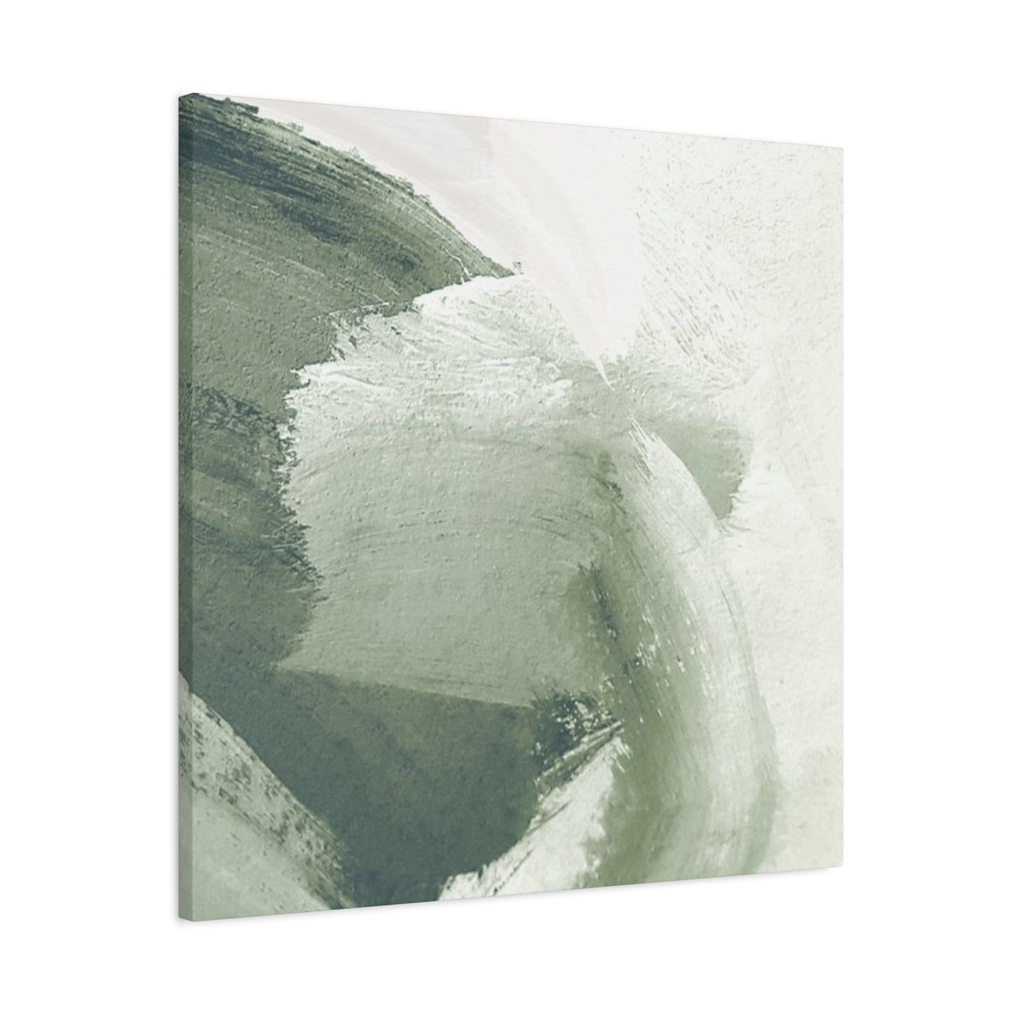
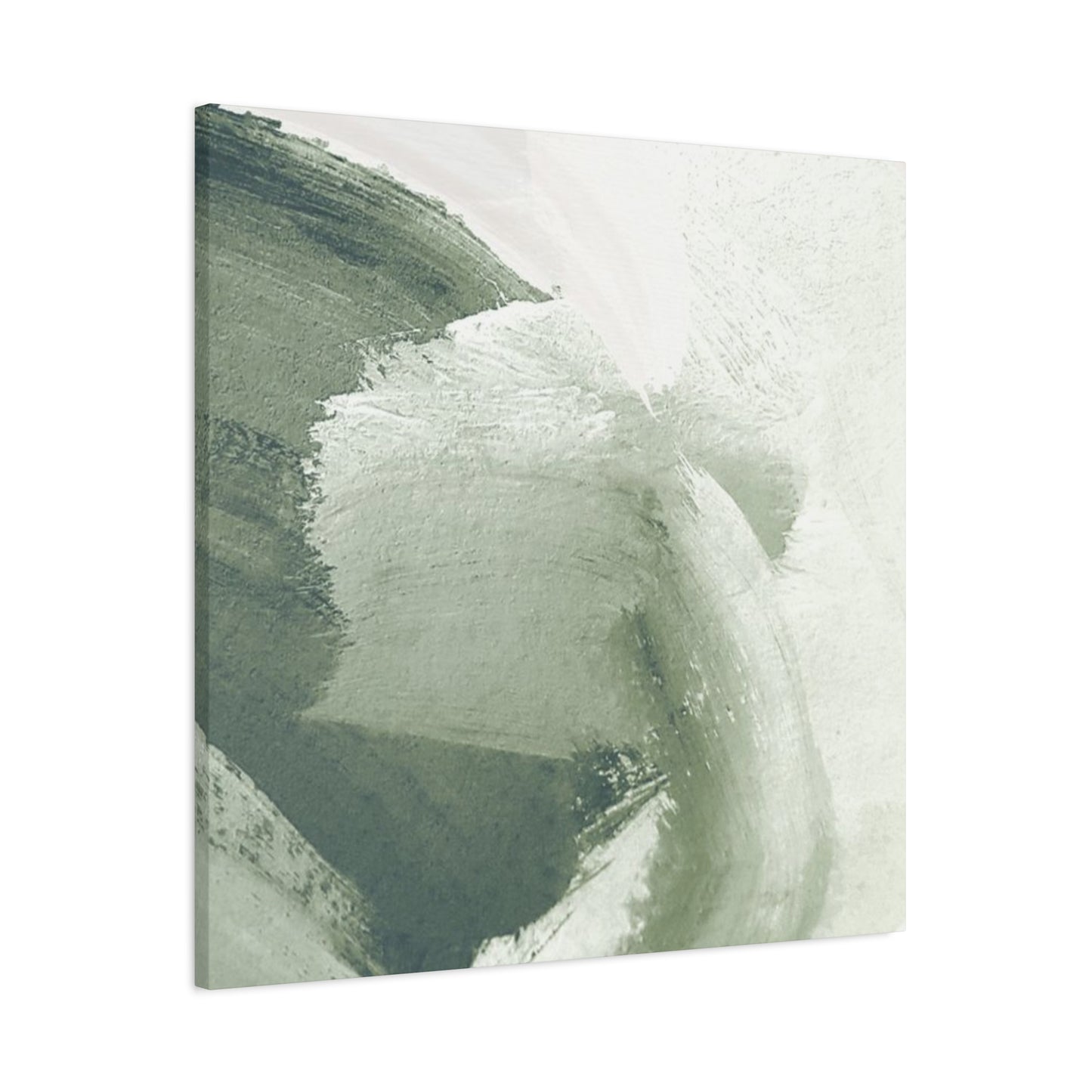
The technical execution of abstract olive brushwork requires understanding how various application methods produce different visual effects. Traditional brush techniques create directional strokes that guide the viewer's eye through the composition. Cross-hatching techniques layer opposing stroke directions, producing areas of visual complexity and depth. Dry brushing methods, where minimal paint is applied to bristles before application, create textured surfaces with visible variations in color intensity. Stippling techniques employ repeated points of color to build up tones gradually, producing impressionistic effects. Each technique contributes distinct personality to the finished work, and professional artists often combine multiple techniques within a single piece to maximize visual interest and compositional sophistication.
The interplay of light and shadow becomes crucial in appreciating textured brushwork. As daylight moves across your walls throughout the day, the physical dimensionality of brushstroke application creates constantly shifting patterns of light and shadow. Morning light might emphasize certain stroke directions while minimizing others, whereas evening light repositions these shadows entirely. This dynamic quality ensures your abstract olive green artwork never feels static or repetitive, even though the underlying composition remains unchanged. Viewers discover new details and relationships with each observation, making the artwork feel fresh even in spaces where residents encounter it daily.
Color theory principles inform successful abstract olive green compositions. Monochromatic approaches employ various values and saturations of olive within a single artwork, creating visual interest through tonal variation rather than color contrast. Analogous color schemes pair olive greens with neighboring colors on the color wheel, such as soft yellows or warm browns, creating harmonious compositions that feel cohesive. Complementary approaches, though riskier, incorporate colors opposite olive on the color wheel, such as terracotta or warm browns, creating dynamic visual tension that energizes spaces. Understanding these relationships allows you to select abstract olive works that harmonize with your existing palette or intentionally introduce considered color contrast.
Composition and balance within abstract olive brushwork determine whether viewers experience the piece as successful and satisfying. Symmetrical compositions create stability and predictability, often evoking feelings of security and formality. Asymmetrical compositions introduce visual surprise and informal energy, making spaces feel more dynamic and contemporary. Focal point development guides viewer attention through the composition, often placing the most visually complex or intensely colored areas at strategic positions within the frame. Successful abstract olive work demonstrates thoughtful consideration of these compositional principles, resulting in pieces that engage viewers aesthetically and emotionally.
The scale and proportion of abstract olive brushwork relative to your wall space significantly influence its visual impact. A small abstract piece on an expansive wall might appear lost or insufficient, failing to establish meaningful presence. Conversely, an oversized piece in a modest room might overwhelm the space and create visual claustrophobia. Generally, artwork should occupy approximately thirty to forty percent of the wall space it adorns, though this represents guideline rather than absolute rule. Larger rooms accommodate bigger pieces, while intimate spaces benefit from more modest dimensions. The ideal scale makes the artwork feel appropriately prominent without dominating the entire room or appearing decorative rather than significant.
Building Sophisticated Interiors: Strategic Placement and Room-Specific Applications
Every room within your home serves distinct purposes and supports different activities, suggesting that olive green brushwork applications should be tailored to specific spaces and their functional requirements. The sophistication of olive-inspired interiors emerges through careful consideration of how each room's purpose, lighting conditions, existing elements, and anticipated use patterns influence appropriate olive applications. This customized approach ensures cohesion across your home while allowing each space to benefit optimally from olive's unique qualities.
Living room environments function as social centers where families gather and guests are entertained, making them ideal locations for olive green focal point artwork. A substantial olive brushstroke piece positioned above a sofa, fireplace, or entertainment center establishes the room's color story while providing beautiful visual interest during moments of relaxation and social interaction. In living rooms, warmer olive tones generally prove more inviting and conducive to gathering, though cool olives work beautifully in contemporary or transitional spaces. The size of your living room influences artwork scale recommendations; generous rooms can accommodate larger pieces, while intimate living spaces benefit from more proportionate dimensions.
Bedroom applications of olive green brushwork emphasize relaxation and restorative sleep quality. Bedrooms benefit from softer, less saturated olive tones that create calm backdrops without visual agitation. A single piece of olive art positioned opposite the bed allows peaceful observation during moments before sleep or upon waking. Alternatively, installing olive brushwork on the wall behind the bed creates an enveloping backdrop that makes the bedroom feel like a dedicated sanctuary. The cool or warm undertones within your chosen olive shade influence the bedroom's overall mood; cool olives promote deeper relaxation, while warm olives create cozy comfort. Lighting in bedrooms should be adjustable, allowing you to modify brightness as day transitions to evening.
Home office spaces benefit tremendously from olive green's concentration-supporting properties. The color's association with nature and growth creates an environment conducive to focused work and creative thinking. A brushstroke piece positioned at eye level when seated at your desk provides visual rest during work breaks while the color itself supports sustained attention and reduces mental fatigue. Some professionals choose to incorporate olive throughout their home offices through both artwork and accent walls, creating immersive environments that feel separate from the rest of their homes. The stability and groundedness associated with olive particularly supports professionals in creative fields seeking inspiration combined with rational thinking.
Kitchen and dining spaces present interesting opportunities for olive green incorporation through artwork that celebrates food, nourishment, and gathering. While painting entire kitchen walls olive might feel overwhelming, a single beautiful brushstroke piece or a gallery arrangement featuring olive-toned artwork creates visual interest while respecting the kitchen's functional purpose. Dining rooms pair particularly well with olive greens, as the color's subtle sophistication complements the social intimacy of shared meals. Positioning artwork at eye level when seated allows diners to engage with the piece during meals, making the artwork an active part of the communal experience rather than merely decorative background.
Bathroom applications of olive green require thoughtful consideration of humidity, lighting, and space constraints. While small bathrooms might feel overwhelmed by extensive olive applications, a single carefully selected brushstroke piece above a vanity creates spa-like sophistication. Ensuite bathrooms in generous master bedrooms accommodate larger installations, transforming utilitarian spaces into extensions of bedroom sanctuary aesthetics. Bathroom lighting often consists of overhead fixtures that create unflattering light quality, making the consideration of warm versus cool olive tones particularly important. Warm olives tend to counteract cool bathroom lighting, creating more natural-looking color tones.
Entryways and hallways benefit from olive brushwork that establishes your home's design narrative while transitioning visitors between different spaces. A compelling olive piece positioned prominently in entryways sets the tone for the entire home, signaling to visitors that thoughtfulness and sophistication inform your design choices. Long hallways present opportunities for gallery-style arrangements featuring multiple pieces incorporating olive, creating visual interest during transitions between rooms. The size and proportions of these transitional spaces typically suit modestly scaled artwork rather than oversized installations.
Textured Applications and Dimensional Techniques for Enhanced Visual Appeal
The physical texture of brushstroke application transforms olive green from a simple color choice into a multisensory experience. Viewers don't merely observe textured brushwork; they perceive depth, movement, and craftsmanship that elevates the piece beyond flat, uniform color applications. Understanding the various textural techniques available empowers you to select artwork that creates precisely the visual and tactile experience you desire within your space.
Impasto techniques involve applying paint thickly enough that individual brushstrokes remain visible and create actual physical texture across the surface. When olive green is applied using impasto methods, the raised paint catches light and shadow differently than smoother applications, creating stunning visual dimension. As light angles change throughout the day, these textured surfaces appear to shift and transform, making the artwork feel dynamic and alive. Impasto applications particularly suit abstract olive compositions, where the physical texture complements the non-representational approach. The visible artist's hand evident in impasto work reinforces the piece's authentic, handcrafted nature.
Glazing techniques build translucent layers of color, allowing underlying tones to show through upper applications while creating rich, complex color development. An artist might apply a warm olive base layer, then glaze with cooler olive tones, producing finished work that contains surprising depth and visual complexity. Multiple glazing layers create color richness impossible to achieve through single applications. This technique particularly suits sophisticated interiors where subtlety and refinement are valued. Glazed olive brushwork might appear initially monochromatic but reveals its internal complexity upon closer inspection.
Scumbling techniques use minimal paint loaded onto stiff brushes, dragging across the canvas surface to create broken color effects. Rather than producing smooth coverage, scumbling creates areas where underlying color shows through overlapping marks. This technique excels at creating atmospheric effects and suggesting movement. An artist might scumble lighter olive over darker olive backgrounds, or introduce warm olive scumbles over cool olive bases. The resulting texture creates visual interest that rewards close observation while maintaining the sophisticated calm associated with olive greens.
Dry brushing applies paint with minimal water or medium, creating striations and irregular patterns that suggest texture and movement. This technique proves particularly effective for creating landscape-like suggestions within abstract work, where subtle horizontal strokes might evoke horizons or subtle atmospheric effects. Dry brushing's broken color application maintains the olive tone while preventing it from appearing flat or uniform. The technique works especially well when creating visual depth through layered applications, with lighter olive dry brushed over darker bases, suggesting distance and atmospheric perspective.
Stippling builds images through repeated points or dabs of paint rather than continuous strokes. When applied with olive green, stippling creates impressionistic effects where form emerges from accumulated color rather than explicit rendering. From a distance, stippled surfaces appear coherent and complete, but closer inspection reveals the individual marks comprising the image. This technique appeals to viewers who appreciate the evidence of artist engagement and the organic qualities of handmade work. Stippled olive applications create surfaces with surprising visual activity and complexity despite appearing calm and restrained from typical viewing distances.
Combing and scratching techniques use tools other than traditional brushes to create patterns and texture. Combed surfaces create regular striations, while scratched surfaces produce irregular marks suggesting spontaneity and energy. These techniques work particularly well in contemporary and modern spaces where evidence of process and unconventional approaches is valued. Applied to olive greens, combing and scratching techniques create visual interest that complements minimalist and abstract design philosophies without introducing representational imagery.
Neutral Backdrops and Complementary Furnishings: Creating Cohesive Design Narratives
The success of olive green brushwork within your interior depends substantially on the surrounding context. Thoughtfully selected neutral tones and complementary furnishings create environments where olive applications function optimally, enhancing the color's qualities while ensuring overall design coherence. Understanding which neutral palettes work best with various olive undertones allows you to make confident selections that feel intentional and sophisticated.
Warm neutrals including cream, ivory, sand, and warm beige work beautifully with both cool and warm olive greens, though they particularly complement warm-undertoned olives. These neutral options provide visual rest while allowing olive artwork to claim appropriate attention. Warm neutral walls create the perception of spaciousness and light, making rooms feel open and inviting. Furnishings in warm neutrals, such as natural linen upholstery or light wood pieces, echo the wall tones while maintaining visual variety through texture and form. Layering warm neutrals at different saturation levels and value ranges creates sophisticated interiors that feel professionally curated without appearing sterile or impersonal.
Cool neutrals including soft gray, greige, and warm white create sophisticated backdrops that make cool-undertoned olive greens particularly prominent. Gray tones provide enough visual weight to balance deep olive brushwork without competing for attention. The neutral quality of gray allows olive to remain the color story's primary element while grounding the composition. Furnishings featuring cool neutral upholstery, such as soft gray linens or cooler-toned wood finishes, reinforce the sophisticated aesthetic established through color selections. Cool neutrals work especially well in contemporary and transitional spaces where clean lines and restrained color palettes are valued.
Natural wood finishes serve as bridges between cool and warm neutral palettes, adapting to either context while introducing organic warmth. Light wood tones in honey or blonde finishes complement warm olives wonderfully, creating approachable, comfortable spaces. Medium and darker wood tones work beautifully with both warm and cool olives, providing visual grounding that makes spaces feel established and secure. Wood's inherent texture and natural variation prevent spaces featuring wood furnishings from appearing flat or one-dimensional. Mixing wood tones, such as pairing lighter wood cabinetry with darker wood tables, creates visual richness while maintaining cohesion through wood's common natural appearance.
White and off-white applications create maximum contrast with olive greens, allowing the color to appear particularly vibrant and prominent. These bright neutrals work exceptionally well with substantial or bold olive brushwork that benefits from dramatic contrast. However, extensive white backgrounds can feel stark or clinical if not tempered with textural elements and warm materials. Combining white walls and woodwork with warm wood furnishings, natural textiles, and olive artwork creates balanced interiors that avoid austerity. Off-white variations, which incorporate subtle warm undertones, often prove more forgiving and livable than pure whites, creating the brightness of white while softening its potential coolness.
Warm wood tones introduce depth, richness, and organic connection within olive-inspired interiors. Dark walnut, espresso, or deep oak finishes create dramatic contrast with lighter olive tones, making pale olives appear almost luminous. These darker wood furnishings ground spaces that might otherwise feel too ethereal or floating. The depth of dark woods prevents interiors featuring olive and light neutrals from appearing too lightweight or insubstantial. Balancing dark wood with ample light-toned elements ensures spaces don't feel heavy or oppressive despite the presence of darker furnishings.
Layering textural elements through furnishings and accessories prevents olive-inspired spaces from feeling too color-focused and one-dimensional. Natural materials including linen, cotton, wool, leather, and jute introduce tactile variety that engages multiple senses. A space might feature olive brushwork combined with warm neutral walls, light wood cabinetry, natural linen upholstery, a jute area rug, and leather accessories, creating visual interest through material variation rather than excessive color introduction. This textural layering appeals to sophisticated design sensibilities while maintaining the calm, grounded quality associated with olive tones.
Natural Materials and Organic Elements: Reinforcing the Earth-Inspired Aesthetic
Olive green's organic origins suggest pairing it with natural materials and earth-inspired elements that reinforce the color's connection to the natural world. When olive brushwork coexists with authentic natural materials, the entire interior gains coherence and purpose that feels intentional rather than randomly assembled. This approach to design celebrates the beauty of natural elements while leveraging their sensory and aesthetic qualities.
Stone and slate elements, whether employed as fireplace surrounds, accent walls, or sculptural accessories, complement olive greens beautifully while introducing the geological richness of the earth. Gray and beige stones create sophisticated contrast, while warm-toned sandstones echo and amplify the warmth of warm olive applications. Stone's inherent texture and variation prevent rooms from appearing too uniform, adding visual complexity that rewards close attention. When combined with olive brushwork, stone creates environments that feel architecturally grounded and naturally sophisticated.
Natural wood elements range from wall treatments to furniture to decorative accents, each contributing organic warmth and variation. Exposed wood beams, if present in your home's architecture, create stunning backdrops for olive artwork. Wood shelving displays natural materials while providing surfaces for carefully selected decorative objects. Wood flooring grounds spaces featuring olive greens and neutral palettes, introducing warmth and establishing visual weight at the floor level. Reclaimed or aged wood introduces character and history, creating interiors that feel settled and established rather than newly decorated.
Living plants and botanical elements introduce active natural connection within olive-inspired interiors. A carefully placed plant positioned near olive brushwork creates visual harmony through color echo while bringing living elements into your space. Potted plants with variegated foliage featuring olive tones in their leaves create subtle color connections that feel organic and intentional. Plants also improve air quality and introduce gentle movement as foliage responds to air currents. The psychological benefits of living plants combine with their visual contributions to make them valuable additions to interiors featuring natural color palettes.
Natural fiber textiles including jute, sisal, wool, and linen introduce tactile richness that complements olive's organic qualities. A jute area rug defines floor space while introducing natural texture underfoot. Linen curtains filter light naturally while adding soft fabric presence to windows. Wool throw blankets draped across seating introduce comfort and casual elegance. These natural fibers feel authentic and genuine in ways synthetic materials struggle to replicate. Their variations in color and texture, which result from natural processes, prevent spaces from appearing overly controlled or artificial.
Water elements, when incorporated thoughtfully, introduce movement and sensory richness. A tabletop fountain creates gentle sound while introducing water's reflective qualities into your space. Coastal elements such as driftwood or river stones introduce the beauty of water-shaped materials. Artwork featuring water themes or water-inspired colors creates suggested connection to aquatic environments without requiring actual water installation. These elements work particularly well with cool-undertoned olives, which contain subtle blue associations connecting them to water imagery.
Lighting that mimics natural daylight creates optimal conditions for appreciating olive greens' full complexity. Full-spectrum lighting reveals the subtle undertones and variations within olive tones that warmer or cooler electric lighting might obscure. Warm incandescent lighting emphasizes warm olive undertones while potentially making cool olives appear flat. Cool LED lighting makes cool olives more prominent while potentially washing out warm olive richness. Thoughtful lighting design employing various sources and color temperatures allows you to experience your space's olive palette at its best while creating flexibility to adjust the environment's mood.
Pairing Olive with Warm Neutral Tones: Creating Visual Harmony and Comfort
The relationship between olive greens and warm neutral colors represents one of the most naturally harmonious color combinations available to designers. Warm neutrals such as cream, sand, warm taupe, and beige possess inherent warmth that resonates with warm-undertoned olives. This sympathetic relationship creates interiors that feel cohesive and intentional without requiring stark contrast or dramatic color interaction. Understanding how to leverage this relationship allows you to create sophisticated spaces that feel comfortable and lived-in rather than laboriously designed.
Cream and ivory represent the lightest warm neutrals, providing maximum brightness and openness when paired with olive greens. These nearly-white tones create visual contrast that allows olive brushwork to command attention while bright walls reflect light throughout the space. The simplicity of cream-and-olive combinations appeals to contemporary and minimalist sensibilities while remaining accessible to traditional design approaches. Cream's visual clarity prevents it from overwhelming despite its brightness, making it ideal for spaces where simplicity and openness are valued. When paired with soft, warm olive tones, cream creates interiors that feel refined without austerity.
Sand and beige tones introduce slightly more visual weight than cream while maintaining significant brightness and openness. These warm neutrals contain subtle earthy undertones that harmonize with olive greens, creating composed color stories where both elements feel naturally compatible. Sand-toned walls provide enough visual substance to prevent rooms from appearing too stark while still showcasing olive artwork effectively. The warmth within sand and beige makes them particularly suitable for creating comfortable living spaces where visitors and residents feel welcomed and at ease. Layering sand-toned furnishings with cream trim and olive artwork creates sophisticated depth without visual cacophony.
Warm taupe introduces more personality than lighter warm neutrals while maintaining neutral functionality. Taupe's complexity, which comes from its combination of warm brown, gray, and sometimes purple undertones, creates visual interest that prevents the color from disappearing into the background. This more assertive neutral pairs beautifully with both warm and cool olives, though it harmonizes particularly well with warm olive undertones. Spaces featuring taupe walls and olive artwork feel more designed than those using strictly light neutrals, suggesting purposeful curation and aesthetic consideration. Taupe works especially well in spaces where some visual weight and depth are desired alongside the calm, grounded qualities of olive greens.
Warm grays, which incorporate brown and sometimes slightly yellow undertones, bridge the gap between pure gray and warm taupe. These complex neutrals provide enough warmth to feel approachable while maintaining enough neutrality to avoid specific color associations. Warm gray walls allow olive brushwork to become the primary color element while providing visual grounding and stability. The sophistication of warm gray suggests contemporary or transitional design sensibilities, making it particularly suitable for modern interiors where classic and current aesthetics blend. Furnishings in warm gray upholstery create subtle continuity with walls while maintaining distinct visual elements through form and texture.
Layering multiple warm neutral values within a single space creates visual depth and interest that prevents mono-colored interiors from appearing flat. A space might feature warm taupe walls, cream trim, sand-colored upholstery, and oatmeal-colored textiles, with olive brushwork serving as the composed, sophisticated focal point. This approach to neutral layering creates richness through value variation and textural contrast rather than color introduction. The resulting interiors feel developed and intentional while maintaining the calm, grounded aesthetic associated with warm neutrals and olive greens.
The interplay of natural and artificial lighting significantly influences how warm neutral-and-olive combinations appear throughout the day. Warm incandescent lighting enhances the warmth within both warm neutrals and warm-toned olives, creating environments that glow with comfortable richness in evening hours. Bright daytime light reveals the full complexity of color relationships, showing how warm neutrals provide visual rest while olive artwork maintains appropriate prominence. Understanding these changing conditions allows you to appreciate your designed interior across different times of day and lighting scenarios, ensuring you remain satisfied with your choices under all conditions.
Strategic Focal Point Development Using Olive Brushwork as Primary Attractions
Every well-designed interior benefits from intentional focal points that organize visual attention and establish the space's design narrative. When olive brushwork functions as a primary focal point, it immediately communicates your sophistication and your space's design philosophy. Understanding how to develop and position focal points ensures that your olive artwork receives appropriate attention and contributes meaningfully to the room's overall composition.
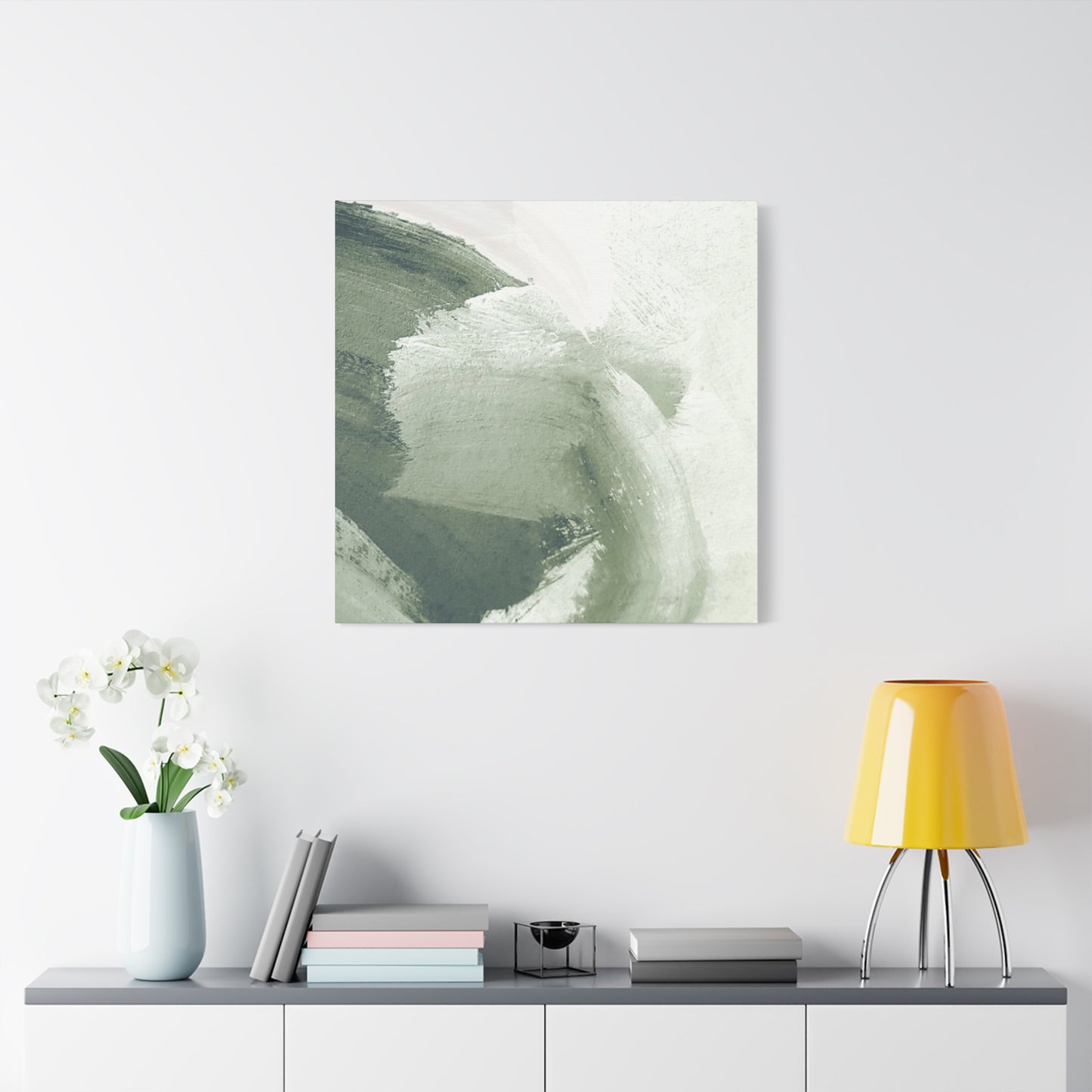
Focal point positioning determines whether your olive brushwork functions effectively or gets overlooked within the larger composition. Above a fireplace mantel, olive artwork immediately claims visual attention when entering the room, establishing the design story right away. Positioned above a bed, olive brushwork becomes the last thing you see before sleep and the first thing upon waking, creating intimate connection through repeated viewing. Above a sofa or seating arrangement, artwork becomes part of the social gathering experience, visible to both seated residents and standing guests. These naturally prominent locations require less additional development to function as successful focal points.
Sizing your focal point artwork appropriately ensures it commands sufficient attention without appearing oversized or overwhelming. A piece positioned above a sofa typically measures about two-thirds to three-quarters the sofa's width, creating visual proportion that feels intentional and balanced. Artwork above a fireplace mantel usually measures about three-quarters of the mantel's width, allowing the mantel to maintain some independent presence while the artwork dominates visual attention. Above a bed, artwork typically measures about three-quarters of the bed's width when the bed's headboard is against the wall. These proportions represent guidelines rather than rigid rules, and variations work beautifully when intentional.
Creating visual isolation around focal point artwork through negative space and color choices ensures the piece maintains its primary status. Substantial empty wall space surrounding olive brushwork emphasizes its importance and allows the eye to focus without competing visual elements. If the wall surrounding your artwork features pattern or strong color, the artwork must be appropriately scaled to compete for visual attention. Neutral wall colors provide less distraction, allowing modestly-scaled artwork to function successfully as focal points. The concept of visual weight applies here; darker, more saturated, or larger elements claim attention, while lighter, less saturated, or smaller elements recede.
Directional elements within your interior should guide the eye toward your focal point artwork. Sightlines created by furniture arrangement, architectural features, and floor patterns should naturally direct attention toward your chosen focal point. If someone enters a room, their natural path of visual attention should lead them toward your olive artwork. This occurs when furniture is arranged to face the artwork, when flooring patterns or area rugs direct attention appropriately, and when architectural elements like fireplaces or windows don't compete for visual primacy. Understanding these sight line relationships ensures your focal point functions effectively regardless of the room's size or the visitor's position within it.
Lighting design can dramatically enhance focal point artwork through strategic illumination. Picture lights mounted above artwork frame and illuminate the piece, creating visual separation from surrounding surfaces. Track lighting allows you to position light precisely, ensuring shadows cast by the artwork's texture enhance rather than diminish its appearance. Ambient lighting should be sufficient to reveal the artwork clearly without bright spots or glare that would distract from the image. Considering how lighting changes throughout the day allows you to ensure your focal point remains appropriately illuminated under all conditions.
Supporting elements throughout the room should reinforce rather than compete with your primary focal point. Secondary artwork, if present, should be smaller and positioned subordinately to your main olive piece. Furniture placement should encourage viewing of the primary artwork, with seating oriented toward the piece. Accessories and decorative elements should relate to the artwork's color palette or thematic content, creating visual continuity without distraction. When all elements support your chosen focal point, the room feels cohesive and intentionally designed rather than haphazardly assembled.
Conclusion
Olive green brush paint wall art represents more than just a decorative accent—it embodies balance, sophistication, and timeless style. Its earthy, calming tone allows it to seamlessly blend with a wide variety of interior design themes, making it an exceptional choice for homeowners seeking elegance and versatility. Whether displayed as a bold statement piece or as part of a curated gallery wall, olive green art has the unique ability to ground a space while infusing it with a subtle, organic charm.
One of the greatest strengths of olive green as a design element is its natural harmony with both modern and classic interiors. Its muted, warm undertones create a tranquil environment that pairs beautifully with neutrals like beige, cream, gray, and white, while also complementing richer hues such as gold, navy, and black. This adaptability makes olive green brush paint wall art a perfect fit for living rooms, bedrooms, kitchens, offices, and even entryways. It effortlessly adds a layer of depth and visual interest without overpowering the room’s existing character.
Beyond its aesthetic appeal, olive green carries meaningful psychological and emotional associations. As a color rooted in nature, it evokes feelings of peace, stability, and renewal. Incorporating it into your decor can subtly influence the atmosphere of your home, creating a sanctuary-like space that encourages calmness and focus. This makes olive green wall art especially valuable in areas where relaxation or productivity is key, such as bedrooms, reading nooks, or home offices.
Moreover, olive green brush paint art complements a variety of artistic styles, including abstract expressionism, minimalist compositions, textured canvases, and botanical-inspired designs. Whether you prefer soft, fluid brush strokes or bold, structured patterns, the richness of this shade ensures a polished and cohesive look. Its understated elegance allows the artwork to feel sophisticated yet approachable, making it a versatile investment piece that can evolve alongside your changing decor tastes.
In addition to its visual and emotional benefits, olive green wall art can enhance the overall sense of harmony within a home. When strategically placed, it can serve as a unifying design element, tying together different color schemes and furnishings to create a balanced aesthetic. Whether displayed above a sofa, on an accent wall, or in a hallway, its presence elevates the space while maintaining a warm and welcoming atmosphere.
In conclusion, olive green brush paint wall art is a timeless interior design resource that combines elegance, versatility, and emotional depth. Its natural tones bring tranquility and sophistication to any environment, making it an ideal choice for homeowners and designers who value both beauty and balance. By incorporating this hue into your decor, you can create spaces that feel harmonious, stylish, and thoughtfully curated.
Whether you prefer a single statement canvas or a series of coordinated pieces, olive green wall art offers endless possibilities to express your personal style while enhancing the ambiance of your home. It’s more than just a color—it’s a refined design choice that effortlessly bridges the gap between modern trends and classic elegance, ensuring your space remains stylish and inviting for years to come.
