


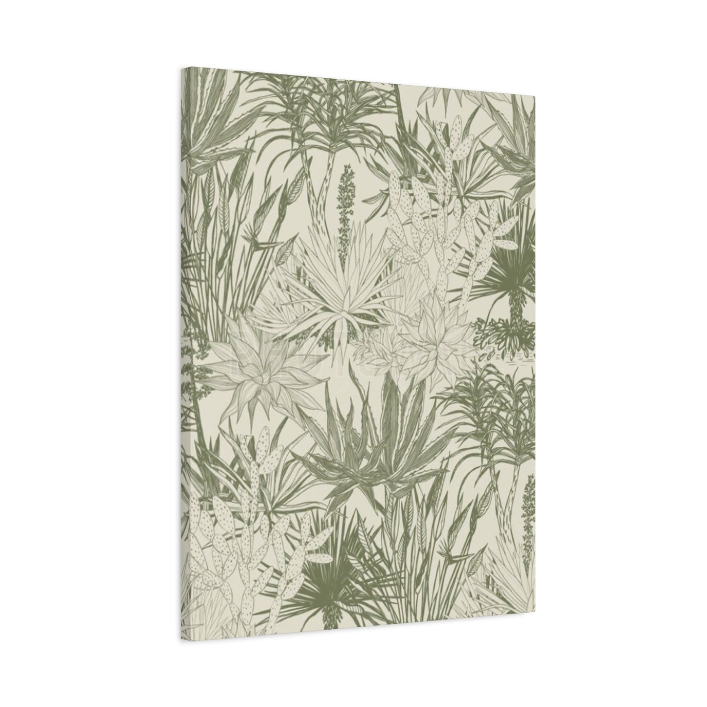
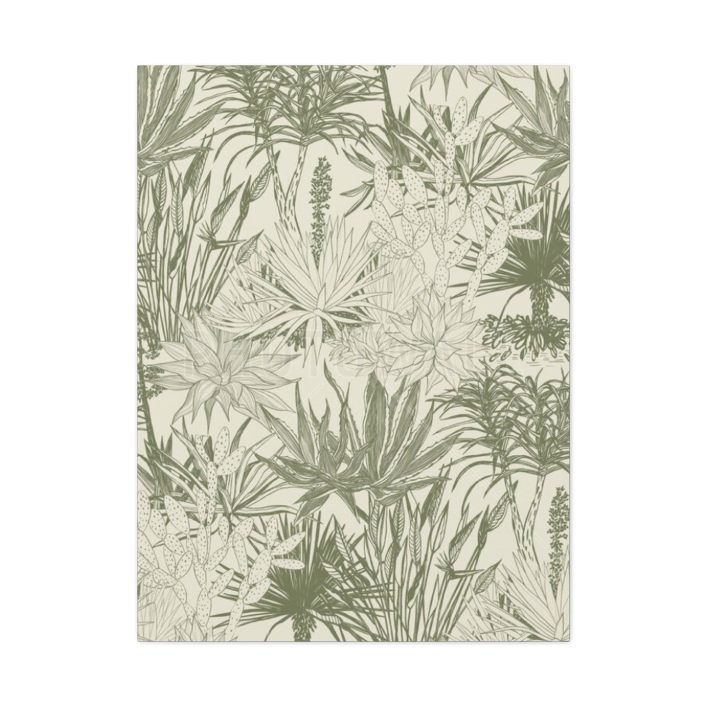
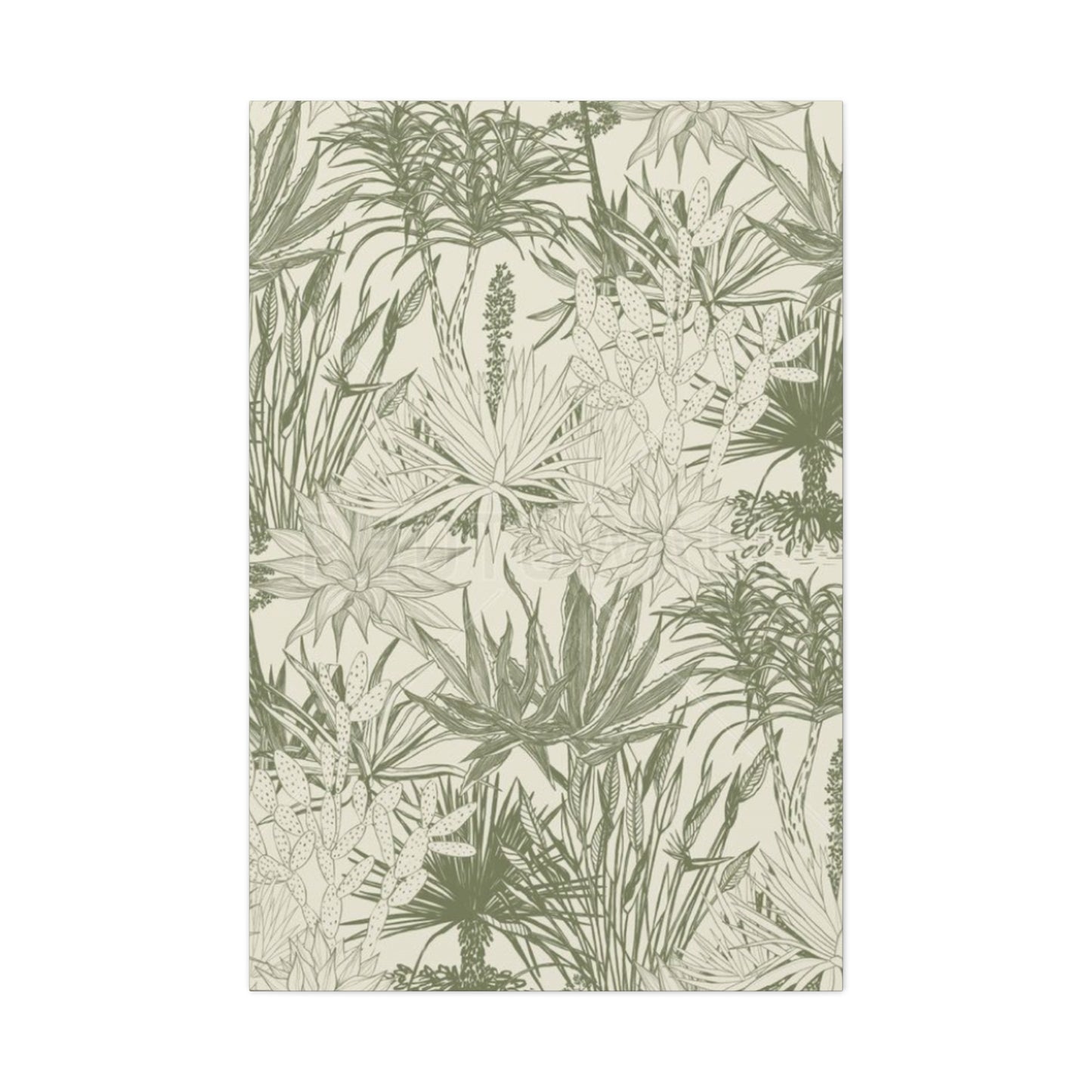
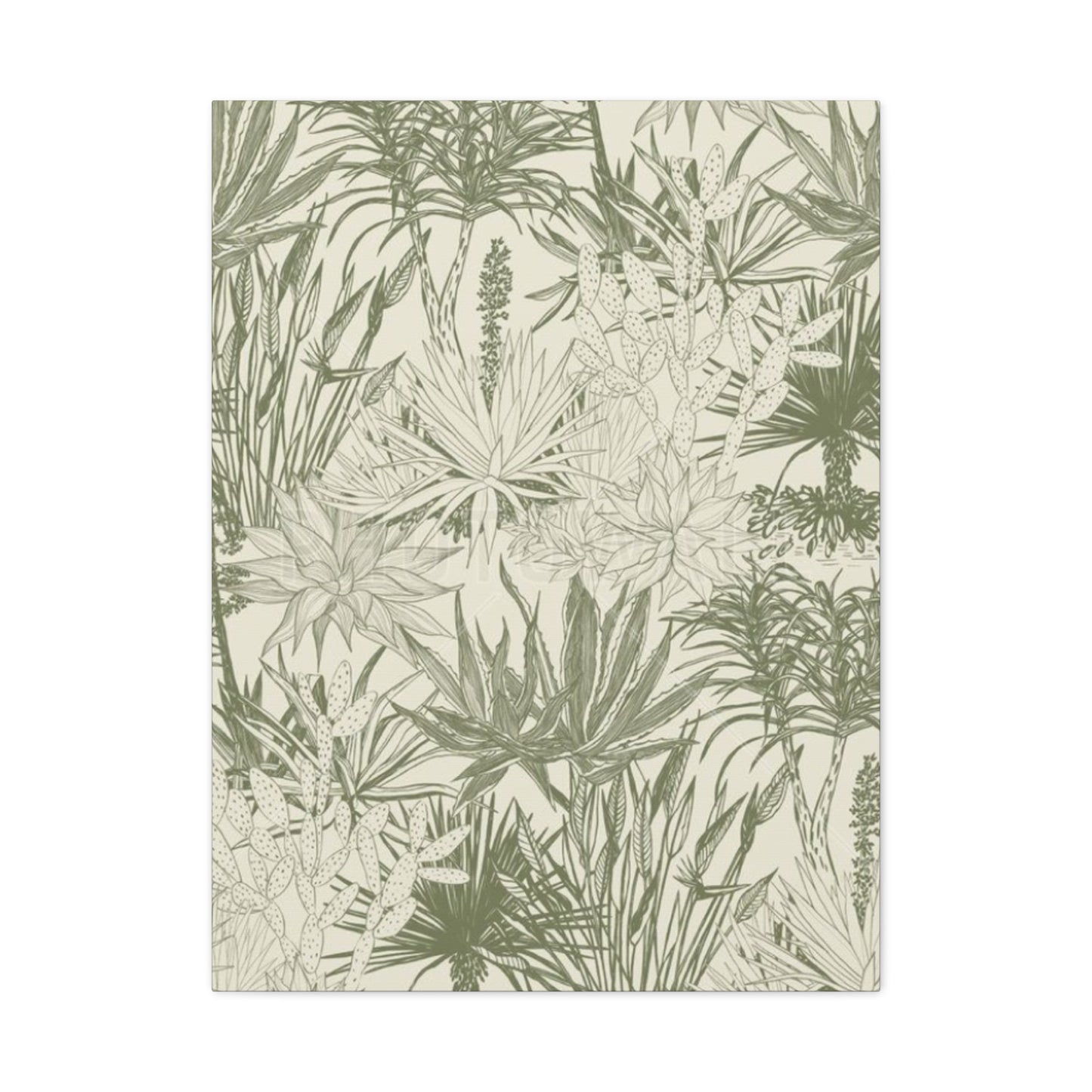
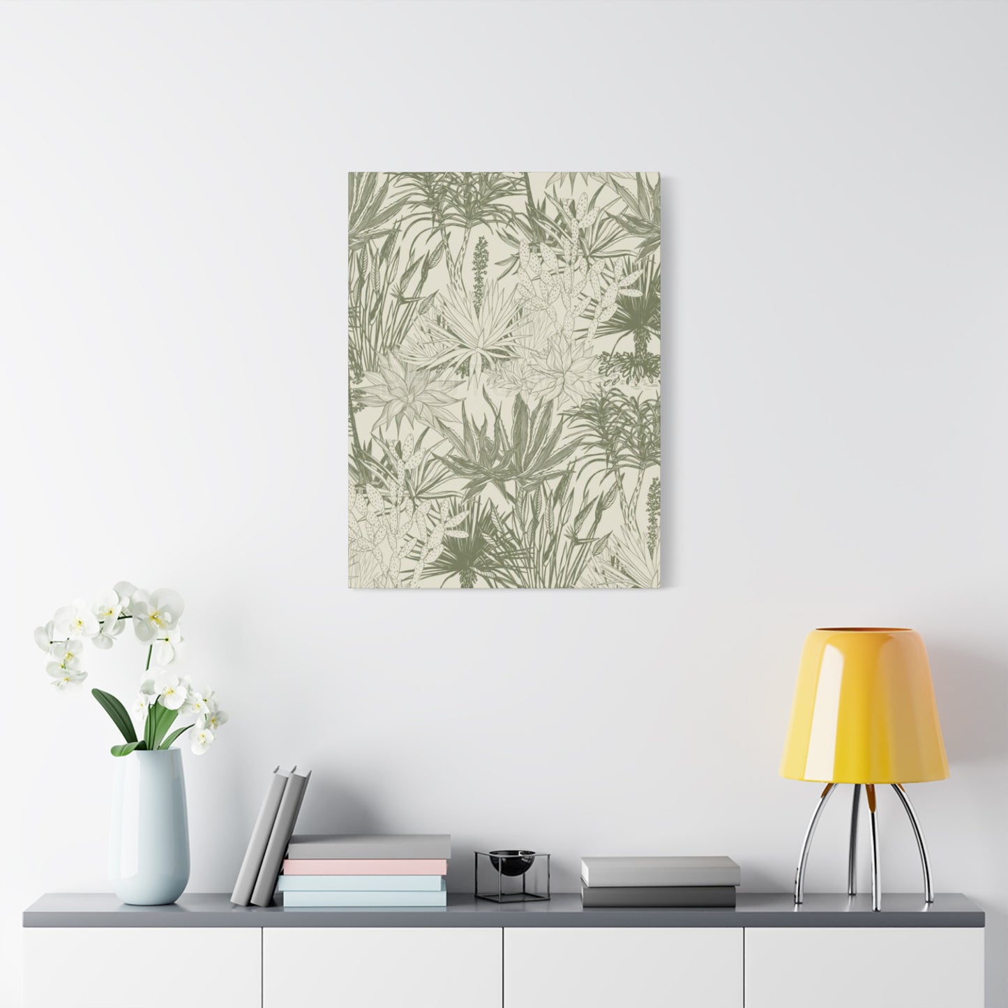
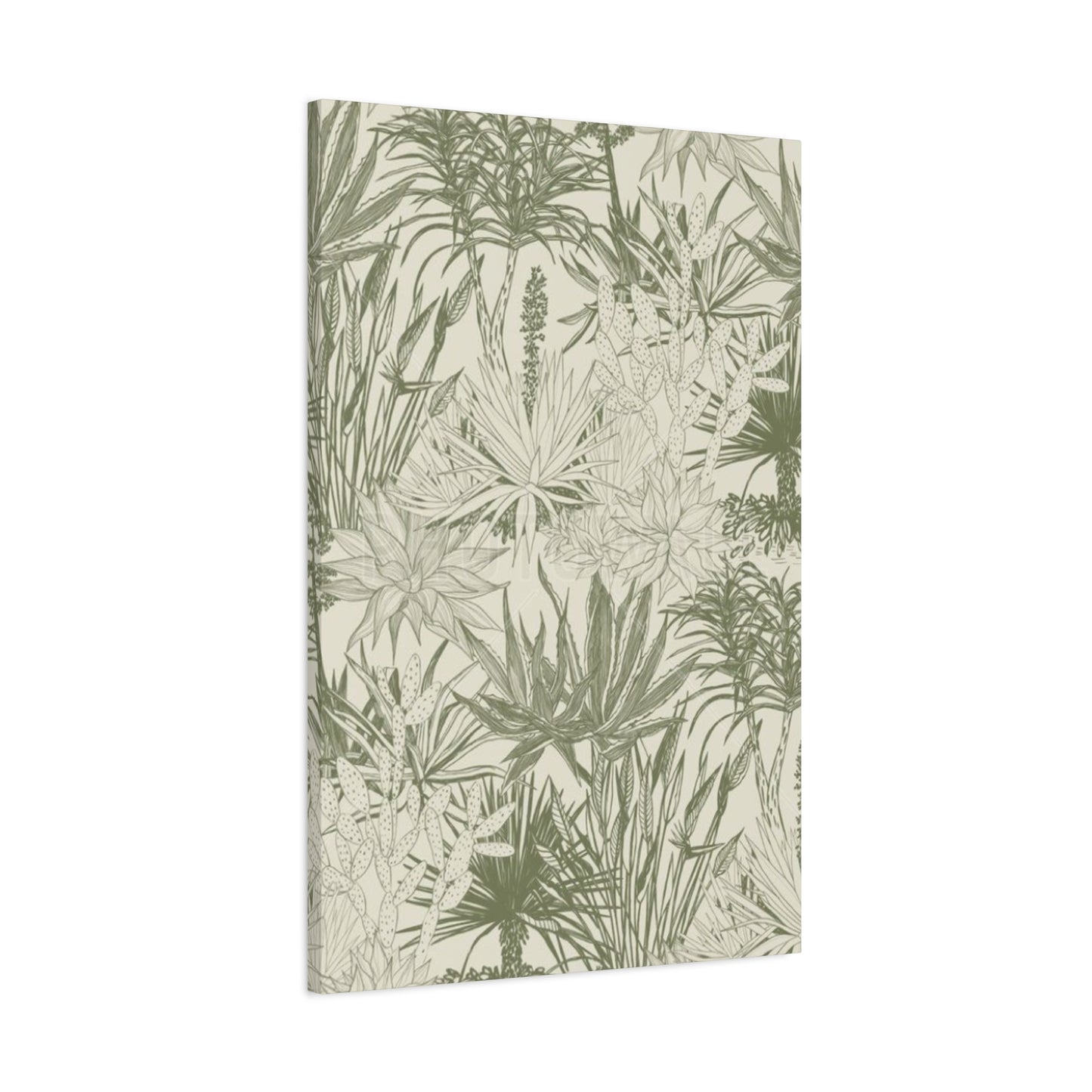
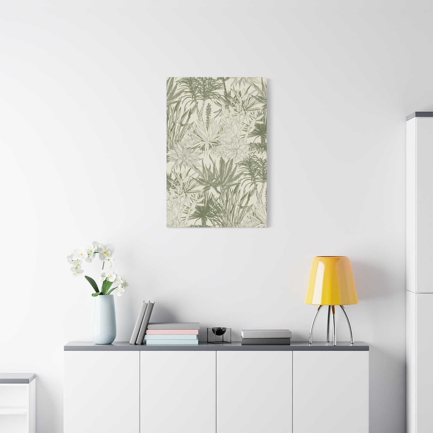
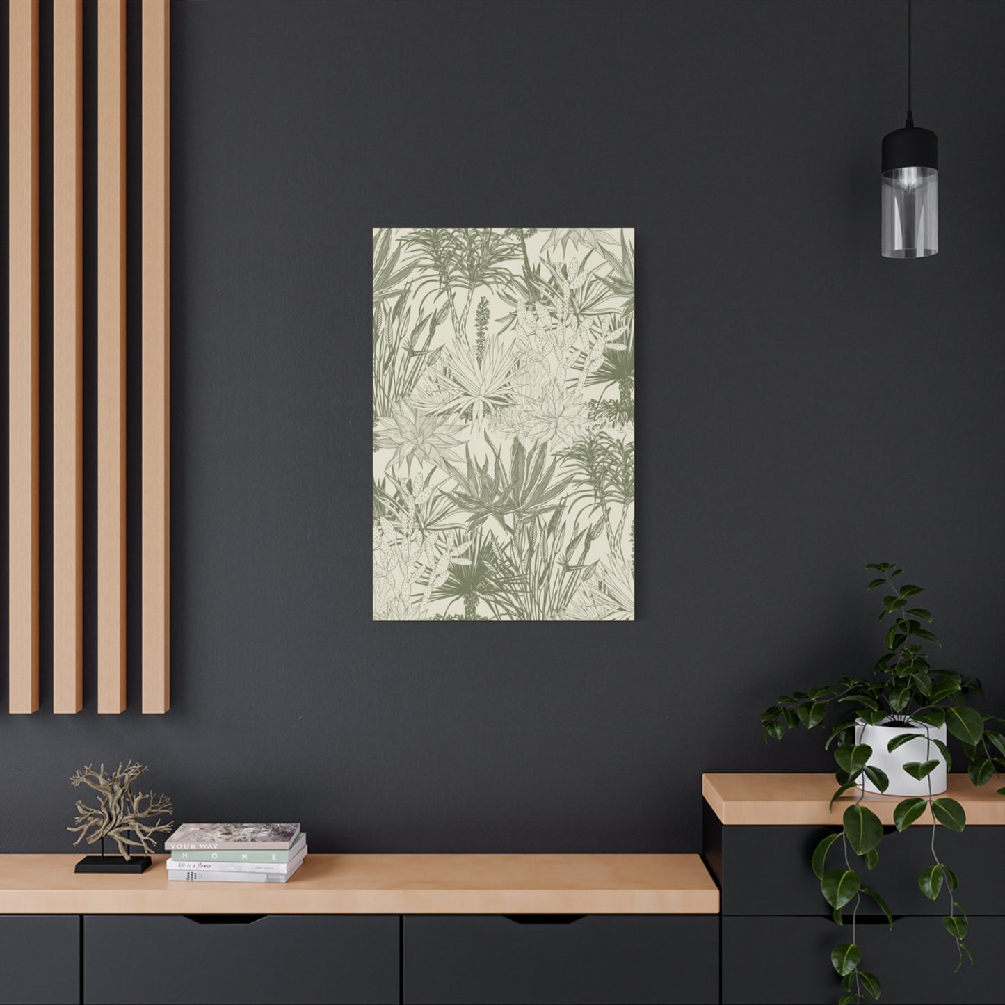
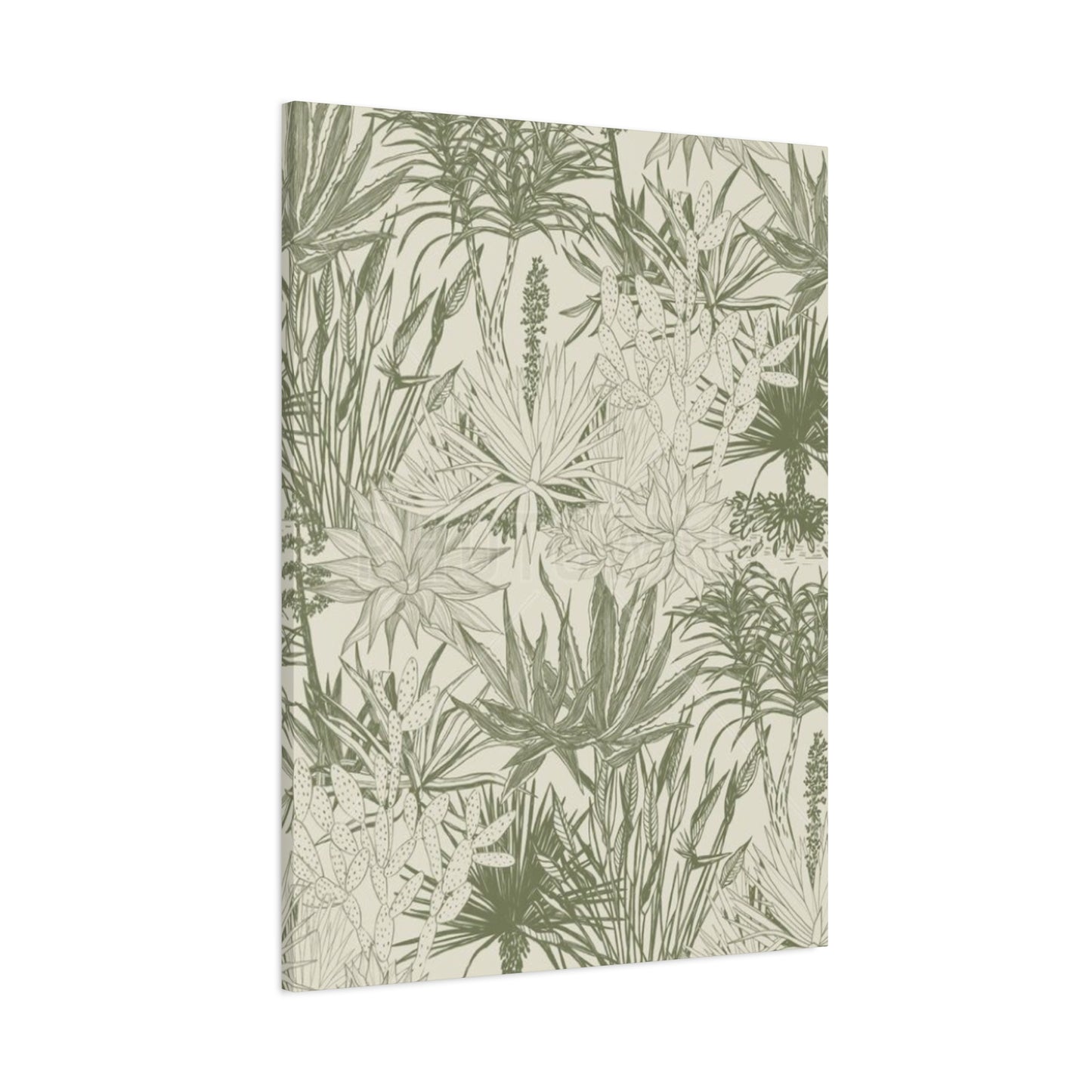
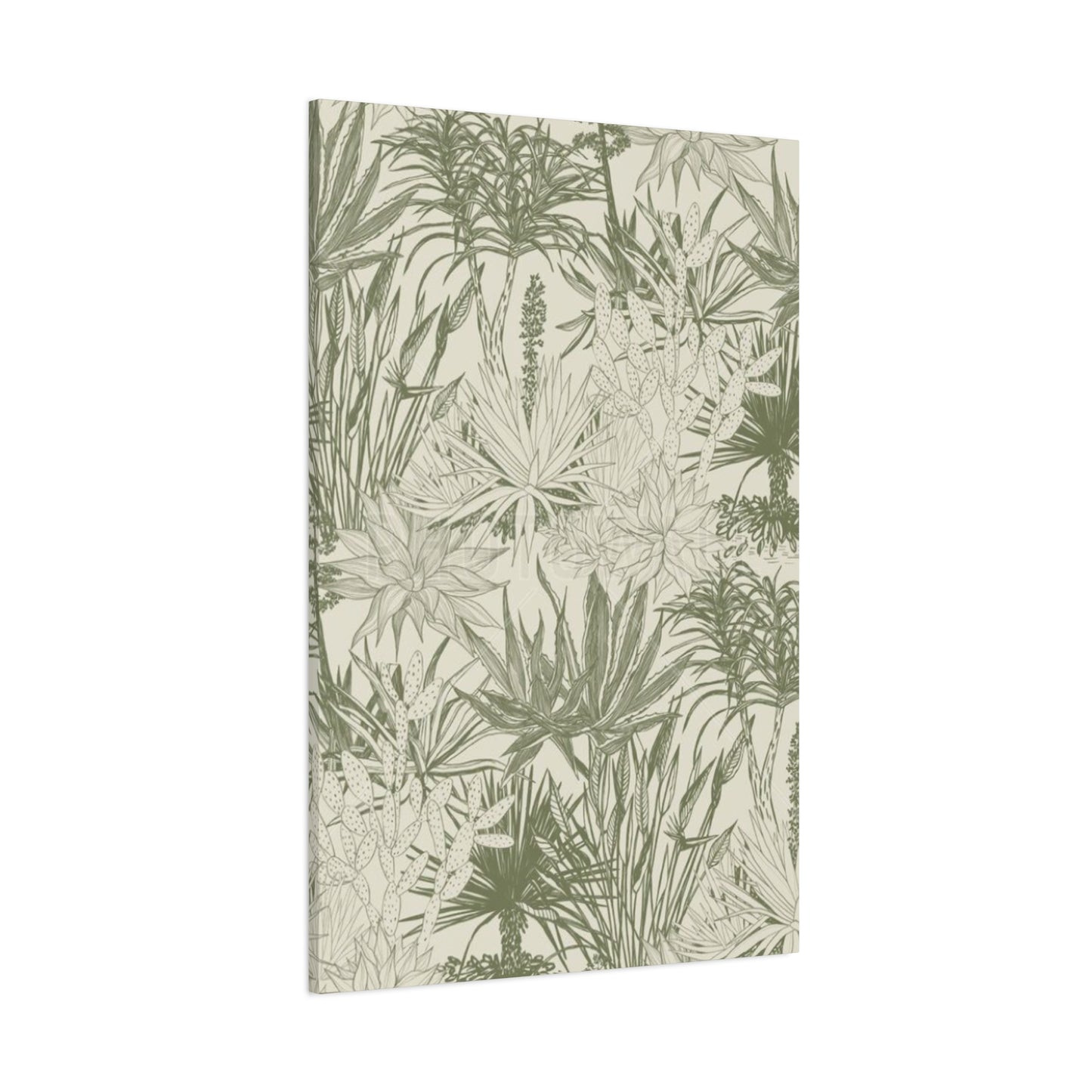
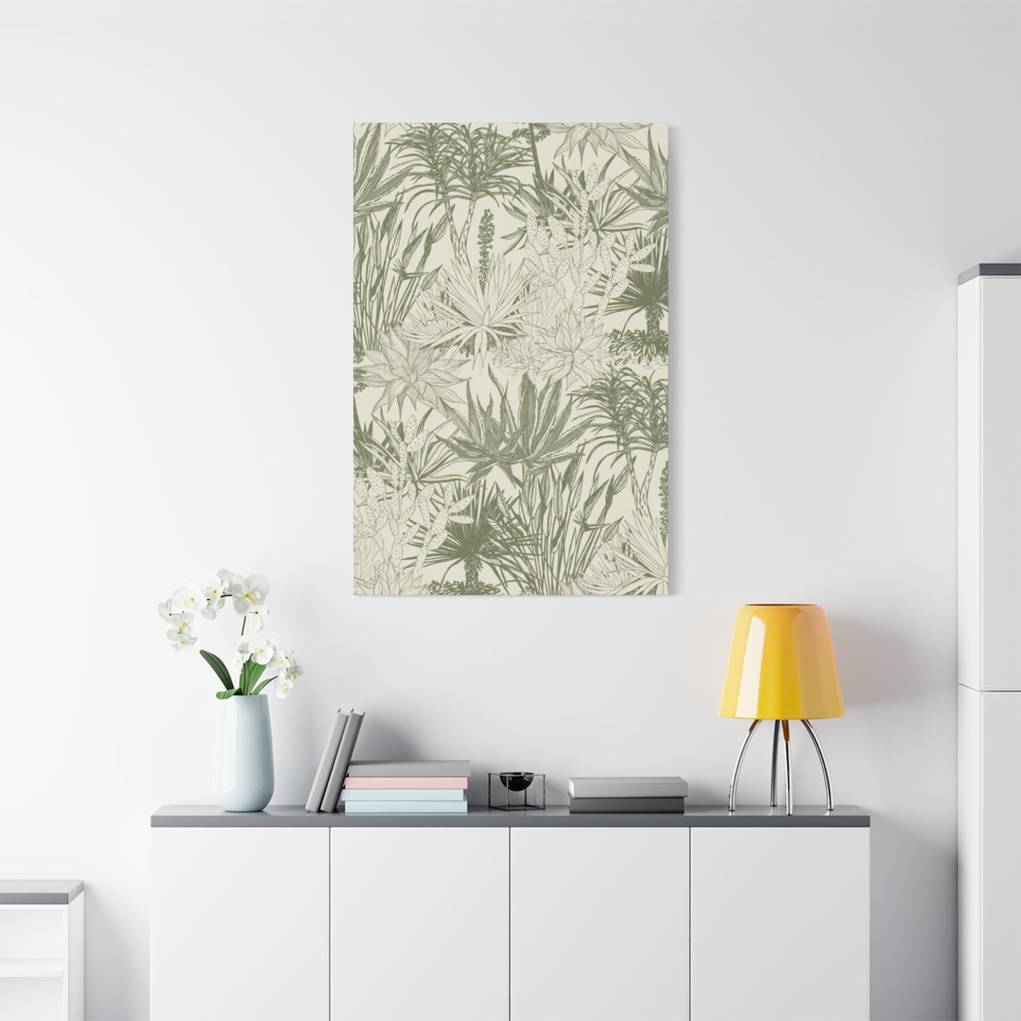
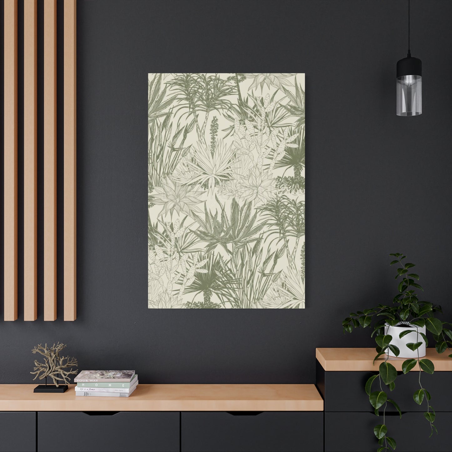
Shades Of Olive Green Plant Leaves Wall Art & Canvas Prints
Shades Of Olive Green Plant Leaves Wall Art & Canvas Prints
Couldn't load pickup availability


Botanical Elegance: Decorating Your Space with Plant Leaves Wall art in Earthy Green Tones
The desire to connect with nature has never been stronger in our modern world. As urban living becomes increasingly prevalent, people are seeking creative ways to introduce organic elements into their homes and workspaces. One of the most effective methods for achieving this connection involves incorporating botanical artwork featuring foliage in earthy, muted green tones. This design approach transforms ordinary rooms into serene sanctuaries that reflect the calming influence of the natural world.
When you step into a space adorned with nature-inspired artwork, the immediate effect is transformative. The gentle hues reminiscent of Mediterranean landscapes create an atmosphere of tranquility and sophistication. These artistic pieces serve multiple purposes beyond simple decoration. They anchor rooms with their grounding presence while simultaneously adding layers of visual interest that capture attention without overwhelming the senses.
The choice to incorporate botanical artwork represents more than following interior design trends. This decision reflects a deeper understanding of how our environments affect our wellbeing and productivity. Research consistently demonstrates that visual connections to nature reduce stress levels, improve focus, and enhance overall life satisfaction. By selecting artwork that captures the essence of plant life in subtle, earthy tones, homeowners create spaces that nourish both body and mind.
The versatility of these design elements allows them to complement various aesthetic preferences. Whether your home embraces contemporary minimalism, rustic farmhouse charm, or eclectic bohemian style, botanical artwork in muted green shades integrates seamlessly. The neutral quality of these earth tones functions similarly to traditional neutrals like grey or beige, yet they bring an additional warmth and personality that makes spaces feel more inviting and lived-in.
Understanding the psychology behind color choices helps explain the enduring popularity of these natural tones. Green sits in the center of the visible light spectrum, making it one of the easiest colors for the human eye to process. This physiological fact contributes to the restful quality that green spaces provide. When rendered in more muted, olive-inspired tones, this calming effect becomes even more pronounced, creating environments where people naturally feel more relaxed and centered.
The artistic representation of foliage carries cultural significance that spans centuries and civilizations. From ancient botanical illustrations used for scientific documentation to contemporary abstract interpretations, leaf imagery has maintained its relevance across time periods and artistic movements. This enduring appeal stems from the universal recognition of plants as symbols of growth, renewal, and life itself. Incorporating these motifs into living spaces taps into this deep-rooted symbolic meaning.
Exploring Color Variations in Nature-Inspired Art
The spectrum of green tones found in botanical artwork offers remarkable diversity. While many people initially think of bright, vibrant greens when imagining plant life, nature actually presents an incredible range of subtle variations. Understanding these nuances allows for more sophisticated design choices that create cohesive, harmonious spaces.
Earth-toned greens possess unique characteristics that distinguish them from brighter alternatives. These shades typically contain varying amounts of yellow or brown undertones, which contribute to their warm, grounding quality. This composition gives them a complex character that changes subtly in different lighting conditions throughout the day. Morning light may emphasize their golden undertones, while evening illumination brings out deeper, more contemplative tones.
The psychological impact of these muted tones differs significantly from their brighter counterparts. Bright, saturated greens can energize and invigorate spaces, making them excellent choices for areas where activity and creativity are encouraged. In contrast, softer, more subdued green tones promote relaxation and contemplation. They create environments where the mind can rest and restore itself, making them particularly valuable in bedrooms, reading nooks, and meditation spaces.
Regional variations in plant life inspire different interpretations of green in artwork. Mediterranean vegetation, adapted to hot, dry climates, often displays silvery, grey-toned greens that help plants reflect intense sunlight. Tropical foliage, benefiting from abundant rainfall and humidity, tends toward deeper, lusher green tones. Desert plants may show olive-tinged greens that help them conserve water. Artists drawing inspiration from these diverse ecosystems create works that carry the essence of specific landscapes and climates.
The interplay between light and pigment in these earthy tones creates visual depth that flat colors cannot achieve. When artists layer different shades or use techniques that allow underlying tones to show through, the resulting artwork gains a luminous quality that draws viewers in. This depth makes pieces more engaging over time, as viewers continue discovering new subtleties with repeated observation.
Seasonal changes in natural environments demonstrate how green tones shift throughout the year. Spring brings fresh, yellow-tinged greens as new growth emerges. Summer deepens these tones as plants mature and photosynthesize actively. Autumn introduces bronze and gold notes as chlorophyll breaks down. Even winter, in evergreen landscapes, presents unique grey-green and blue-green variations. Artwork capturing these seasonal nuances brings temporal dimension to spaces.
Understanding undertones proves crucial when selecting botanical artwork for specific spaces. Some green shades lean toward warm, yellow undertones that pair beautifully with wood elements and earthy materials. Others contain cool, blue undertones that complement metal finishes and contemporary materials. Grey undertones create particularly versatile options that bridge warm and cool palettes effectively. Brown undertones ground spaces with their earthiness and pair excellently with leather, stone, and natural fiber textures.
Color Coordination and Palette Development
Building effective color schemes around botanical artwork requires understanding how different hues interact and influence each other. The earthy green tones present in nature-inspired pieces offer excellent starting points for developing cohesive, sophisticated color palettes throughout spaces.
Monochromatic schemes built around various green tones create serene, unified environments. Layering different values from pale sage to deep forest within the same green family produces depth without visual chaos. This approach works particularly well in bedrooms and bathrooms where tranquility is prioritized. Introducing different textures in similar tones adds interest while maintaining the calming, cohesive effect.
Analogous color schemes incorporate hues adjacent to green on the color wheel. Blue-greens and yellow-greens create harmonious palettes with subtle variation. This approach brings more color diversity while maintaining overall harmony. In spaces with botanical artwork featuring olive tones with brown undertones, incorporating more yellows and golds creates warmth. For cooler green artworks, blues and blue-violets extend the palette naturally.
Complementary contrast pairs green with colors opposite on the color wheel. Red and green create strong contrast, though in earthy tones, this combination becomes more sophisticated. Dusty rose or terracotta paired with olive green produces warmth and visual interest without overwhelming spaces. These combinations work particularly well in eclectic or bohemian interiors where bolder color choices feel appropriate.
Neutral foundations allow botanical artwork to shine without competition. Walls in warm white, cream, greige, or soft gray provide clean backdrops that emphasize artwork without distraction. Wood tones in furniture add warmth and natural material connection. This approach suits contemporary, minimalist, and Scandinavian aesthetics where restraint and simplicity guide design decisions.
Metallic accents add sophistication and light reflection that enlivens botanical color schemes. Gold and brass tones bring warmth that enhances olive and earth-toned greens beautifully. Silver and chrome offer cooler counterpoints suitable for spaces with blue-green or sage tones. Bronze provides middle ground with both warm and cool qualities. Frame choices, lighting fixtures, and accessories in these finishes elevate overall sophistication.
Unexpected color pairings can create memorable, personal spaces when handled with confidence. Dusty pink alongside muted green brings softness and romance. Navy blue provides grounding depth that allows lighter green tones to glow. Burnt orange creates energizing contrast while maintaining natural, earthy feeling. The key to success with bolder combinations lies in using them in appropriate proportions, often allowing one color to dominate while others accent.
Seasonal palette adjustments keep spaces feeling fresh throughout the year. Spring and summer might emphasize lighter, brighter greens with white and yellow accents. Fall and winter could introduce deeper greens with rust, burgundy, and gold tones. Changing throw pillows, blankets, and small accessories allows these seasonal shifts without replacing major elements like artwork and furniture.
Testing color combinations before committing to large purchases prevents costly mistakes. Paint samples on poster board can be moved around rooms to see colors in different lights. Fabric swatches help evaluate how textiles will interact with artwork. Digital tools and apps allow virtual experimentation with different combinations. Taking time for this testing phase ensures final selections create the desired atmosphere and aesthetic.
Frame Selection and Presentation Methods
The frame surrounding artwork significantly influences how pieces are perceived and how successfully they integrate into spaces. Understanding framing options and their effects guides selections that enhance rather than detract from the artwork itself.
Wood frames offer versatility spanning from rustic to refined depending on finish and profile. Natural wood with visible grain brings organic warmth that complements botanical subject matter beautifully. Light woods like oak, ash, or maple suit Scandinavian and coastal aesthetics. Darker woods including walnut, mahogany, and espresso-stained finishes add richness appropriate for traditional and transitional spaces. The wood texture creates visual and conceptual connections between frame and nature-inspired artwork content.
Metal frames provide clean, contemporary alternatives with minimalist appeal. Simple black metal frames offer neutral borders that don't compete with artwork while adding definition. Brass and gold-toned metal frames bring glamour and warmth suitable for eclectic and maximalist spaces. Silver and chrome frames maintain cooler, more industrial aesthetics. The slim profiles typical of metal frames suit modern and contemporary interiors where simplicity is valued.
The choice between matting and no matting affects both artwork presentation and overall cost. Matting creates breathing room between artwork and frame, allowing eyes to focus on the image without distraction. White and cream mats suit most applications, providing clean, gallery-like presentation. Colored mats can enhance specific tones within artwork but risk dating or overwhelming images. For budget-conscious projects, frameless options or simple frames without matting offer acceptable alternatives.
Float mounting creates sophisticated presentation where artwork appears suspended within the frame. A small gap between the image and frame creates shadow depth that adds visual interest. This technique works particularly well for photographs and modern prints where the artwork edges themselves become design elements. The effect suggests gallery-quality presentation and suits contemporary and transitional spaces.
Shadow box frames accommodate three-dimensional elements including pressed specimens, dried plants, and sculptural pieces. The depth these frames provide creates opportunities for more complex, layered presentations. Botanical collections arranged in shadow boxes become artistic specimens worthy of display. This presentation style bridges the gap between art and natural history, appealing to those who appreciate both aesthetic beauty and scientific interest.
Gallery walls require consistent framing approaches to achieve cohesion despite varied artwork. Choosing frames in similar finishes even if profiles differ creates unity. Alternatively, mixing frame styles while maintaining consistent matting creates different but equally effective cohesion. Planning layouts before hanging ensures balanced, intentional arrangements. Templates cut from paper allow experimenting with different configurations without putting unnecessary holes in walls.
Placement Strategies for Maximum Impact
Strategic artwork placement transforms spaces from merely decorated to thoughtfully designed. Understanding how placement affects room flow, functionality, and atmosphere enables decisions that maximize both aesthetic appeal and practical benefits.
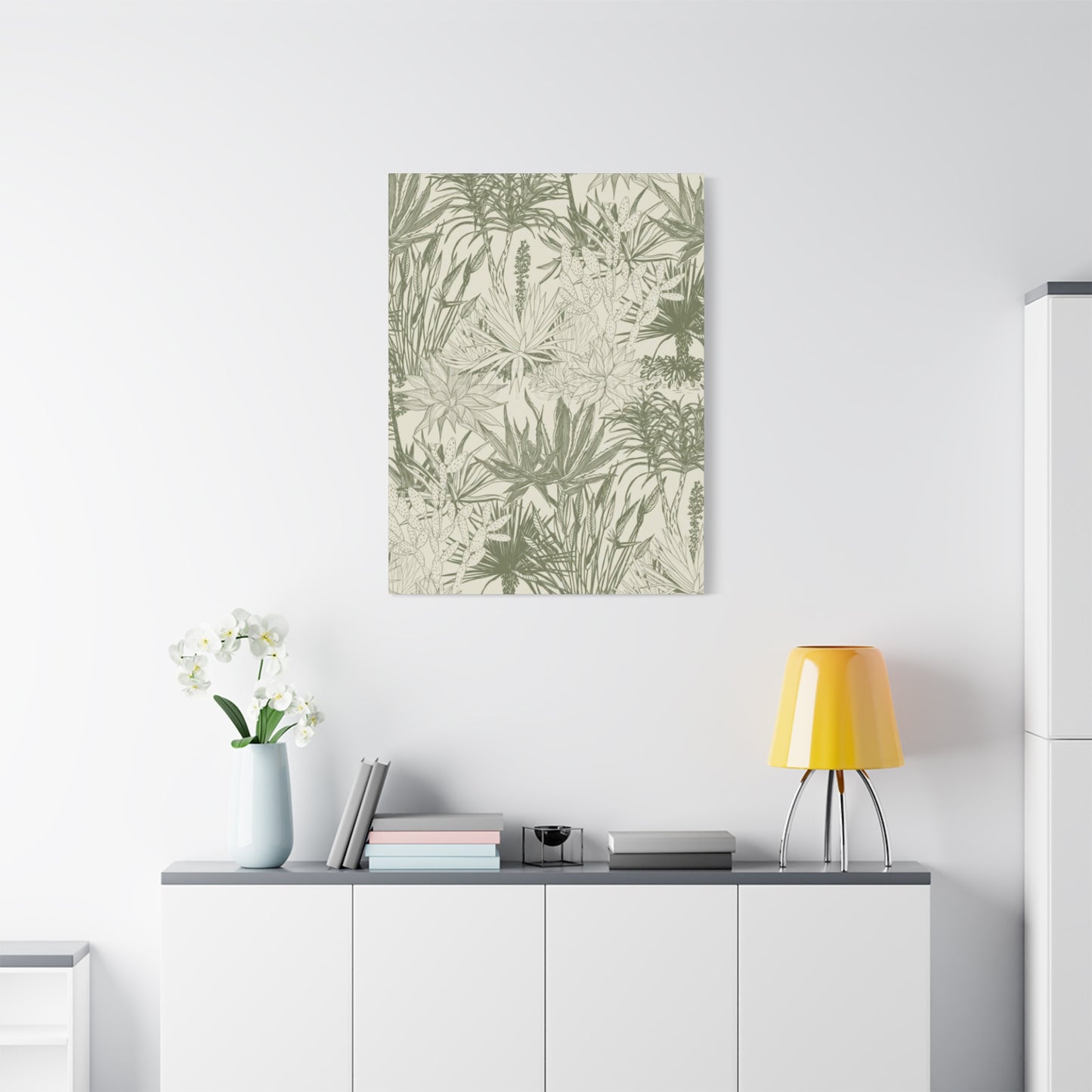
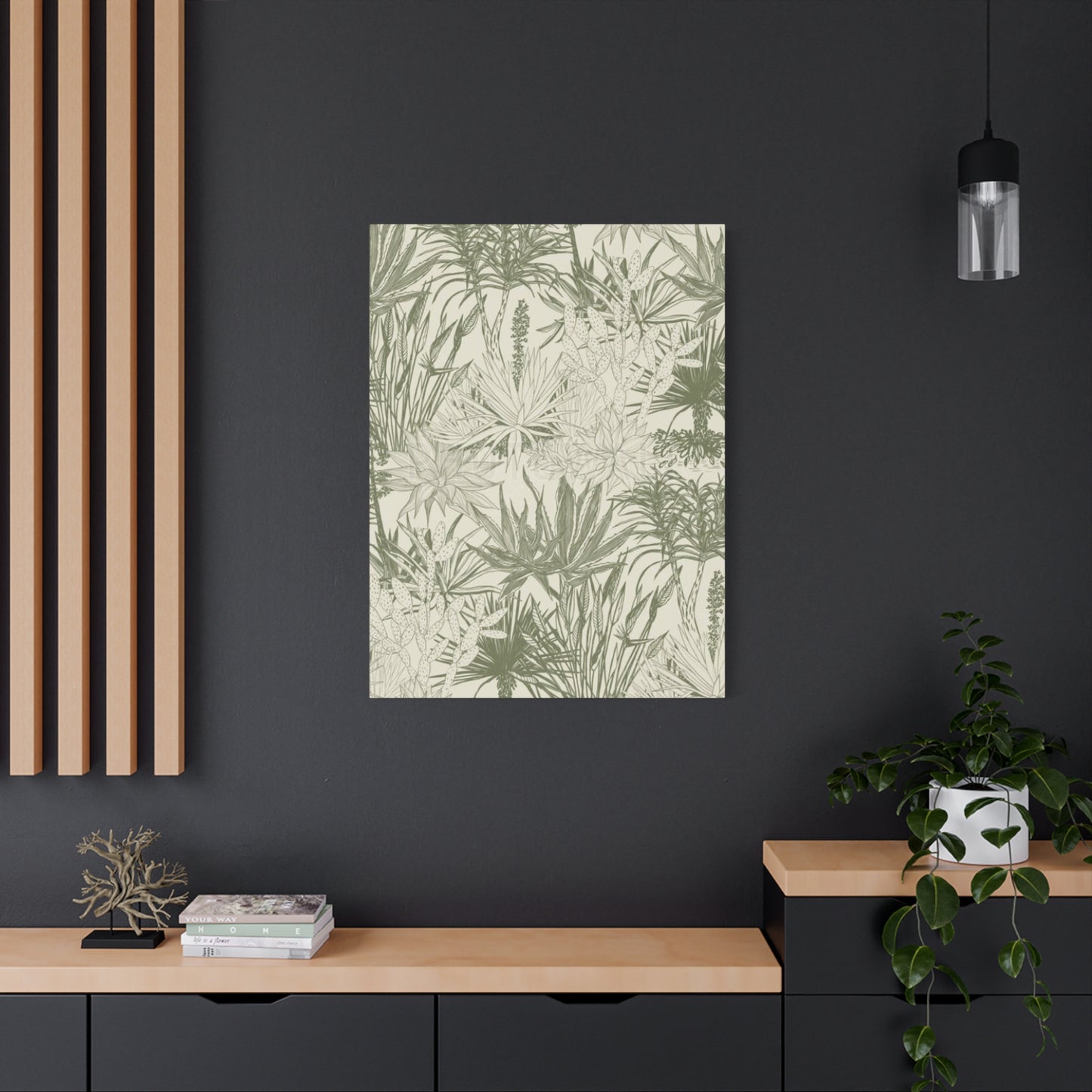
Living room placement typically centers on focal points like fireplaces or primary seating areas. Large botanical pieces above mantels anchor these important architectural features. Artwork behind sofas creates backing that grounds furniture groupings while adding color and interest to what might otherwise be blank walls. In rooms without obvious focal points, substantial artwork creates them, directing attention and establishing visual hierarchy.
Bedroom artwork placement serves both aesthetic and functional purposes. Above beds, pieces should relate proportionally to headboard or bed width without overwhelming the space. The subject matter and color choices influence mood and atmosphere, with calming botanical themes in soft tones promoting restful environments. Additional artwork on adjacent walls creates gallery-like spaces without competing with the bed wall for visual dominance.
Dining areas benefit from artwork that enhances rather than distracts from the social nature of these spaces. Pieces above sideboards or credenzas add interest without interfering with views across tables. In formal dining rooms, artwork selections might reference culinary or agricultural themes that connect to dining activities. More casual spaces allow greater freedom in subject matter and presentation style.
Home office placement should consider both personal enjoyment and professional appearance. Artwork visible during video calls creates backgrounds that appear polished and intentional. Pieces within view while working provide opportunities for visual breaks that help prevent eye strain and mental fatigue. The calming influence of botanical imagery makes it particularly suitable for home offices where stress reduction supports productivity.
Hallway and entryway artwork creates first impressions and guides movement through homes. Long hallways suit gallery wall treatments or series of similarly framed pieces creating rhythm and visual interest along the passage. Entryways benefit from substantial pieces that make immediate statements and set tones for the entire home. These transitional spaces often receive less natural light, requiring consideration of how artificial lighting will illuminate artwork.
Bathroom artwork placement requires attention to humidity and moisture exposure. Prints in sealed frames suit these environments better than original paintings or unprotected papers. Placement away from direct water sources protects artwork while still allowing decorative impact. The smaller scale of most bathrooms makes them suitable for smaller pieces that might disappear in larger rooms.
Kitchen placement faces similar moisture and heat considerations as bathrooms. Artwork positioned away from cooking areas avoids splatter and excessive heat exposure. Pieces above tables in breakfast nooks or along walls away from work zones add personality and warmth. Herb and vegetable botanical prints create thematic connections to cooking activities while maintaining sophistication.
Stairwell placement presents both opportunities and challenges. Long vertical spaces suit tall, narrow pieces or vertical arrangements of multiple works. Ascending arrangements where artwork rises as the stairs climb creates dynamic visual movement. The varying viewing distances as one moves up or down stairs requires selecting pieces that read well from multiple perspectives.
Creating Gallery Walls with Botanical Themes
Gallery walls offer opportunities for personal expression and creativity that single pieces cannot match. Understanding composition principles and planning approaches ensures gallery walls appear intentional and sophisticated rather than haphazard.Symmetrical arrangements create order and formality appropriate for traditional and transitional spaces. Grid layouts with evenly spaced, similarly sized pieces produce clean, organized looks. Centered arrangements radiating from a central piece create balanced compositions suitable for spaces above furniture or between architectural elements. The challenge with symmetrical approaches lies in finding sufficient compatible pieces to complete the pattern.
Asymmetrical arrangements allow greater flexibility and often feel more dynamic and contemporary. Balancing visual weight rather than mirror-image symmetry creates interest while maintaining overall harmony. Starting with the largest piece and building around it provides a logical approach. Varying sizes and orientations adds rhythm and prevents monotony. The key lies in maintaining relatively consistent spacing between pieces for cohesion.
Salon-style arrangements embrace density and variety, filling walls with artwork in tight, overlapping configurations. This maximalist approach suits eclectic and bohemian interiors where abundance and collected looks are desired. Varying frame styles and periods adds to the collected-over-time aesthetic. Despite apparent randomness, successful salon walls maintain underlying structure through consistent spacing and balanced distribution of visual weight.
Horizontal arrangements work well above long, low furniture like sofas and console tables. Maintaining consistent horizontal alignment along bottom or top edges creates visual stability. Varying heights within this horizontal arrangement adds interest while the overall effect elongates spaces. This approach suits contemporary and mid-century modern aesthetics where horizontal lines are emphasized.
Vertical arrangements draw eyes upward, emphasizing ceiling height and creating impressions of taller spaces. These work particularly well on narrow wall sections between windows or doors. Stacking similarly sized pieces directly above one another creates strongest vertical emphasis. Varying widths while maintaining vertical alignment offers subtle variation within the vertical theme.
Color story development throughout gallery walls creates cohesion among diverse pieces. Selecting works sharing similar color palettes ensures unity despite varied subjects or styles. The earthy green tones common in botanical artwork provide natural threads connecting different pieces. Adding works with complementary colors creates accent without losing overall harmony. Metallic frames in consistent finishes further unify collections.
Incorporating Three-Dimensional Botanical Elements
Moving beyond two-dimensional artwork to include sculptural and three-dimensional botanical elements adds depth and textural interest that flat images cannot achieve. These elements create layered, sophisticated spaces with strong connections to the natural world.
Pressed botanical specimens under glass combine scientific collection aesthetics with artistic presentation. Leaves, ferns, and flowers preserved and mounted in shadow boxes become botanical artwork with historical museum-quality appeal. The three-dimensional nature created by the depth of shadow boxes adds visual interest while protecting delicate specimens. This presentation style particularly suits traditional, transitional, and cottage-core aesthetics.
Sculptural representations of leaves and plant forms in metal, wood, or ceramic become wall-mounted art pieces. Metal leaves finished in bronze, copper, or painted surfaces add industrial or rustic elements depending on execution. Wood carvings bring organic warmth and showcase craftsmanship. Ceramic pieces offer opportunities for color and surface treatment variety. These three-dimensional pieces cast shadows that change with lighting throughout the day, creating dynamic visual interest.
Living wall installations transform actual plants into growing artwork. While requiring maintenance including watering and light exposure, the vitality of living plants cannot be replicated by any other medium. Modular systems make installation and care more manageable than earlier living wall approaches. Selecting appropriate plant species for available light conditions ensures long-term success. The combination of living plants and complementary botanical artwork creates layered, immersive environments.
Macrame wall hangings incorporating plants or plant themes bridge textile arts and botanical design. The boho-chic aesthetic of macrame pairs naturally with trailing plants or dried botanical elements woven into designs. The textural quality of knotted cord adds tactile dimension while the organic forms echo natural growth patterns. This approach suits eclectic, bohemian, and casual coastal interiors.
Woven and textile pieces featuring botanical motifs introduce fabric texture and softness to wall treatments. Tapestries depicting garden scenes or plant life create substantial focal points with fabric's inherent warmth. Fiber art pieces using plant-based materials or plant-inspired forms connect conceptually and materially to botanical themes. The movement and texture of textiles contrasts effectively with smoother wall surfaces.
Mixed media presentations combining pressed specimens, photography, painting, and found objects create rich, layered artworks. Shadow boxes allow arranging diverse elements into cohesive compositions that tell stories or explore themes. This approach particularly appeals to crafters and those who enjoy creating personal artwork. The uniqueness of handmade pieces adds character impossible to achieve with mass-produced artwork.
Digital Art and Photography Options
Technological advances have expanded options for obtaining and displaying botanical artwork beyond traditional mediums. Understanding these contemporary approaches opens new possibilities for personalizing spaces while managing budget considerations.
Digital photography allows capturing plant details with unprecedented clarity and control. Macro photography reveals intricate structures invisible to casual observation, transforming simple leaves into abstract compositions of line and form. Professional photographers specializing in botanical subjects create images suitable for large-format printing. The digital nature allows sizing images to specific dimensions, solving fit challenges that sometimes arise with standard artwork sizes.
Digital manipulation and editing enable creative interpretations that begin with photographic captures but extend into artistic realms. Adjusting colors to enhance or shift tones creates moods impossible in straight photography. Combining multiple images into composites produces surreal or fantastical botanical scenes. Filtering and effects transform photographic realism into painterly or illustrative styles. These techniques democratize artistic creation, allowing those without traditional art skills to produce sophisticated imagery.
Print-on-demand services make professional-quality printing accessible at reasonable costs. Large-format printing produces museum-quality images on various substrates including canvas, fine art paper, metal, and acrylic. The ability to upload custom images means personalized artwork featuring plants from one's own garden or meaningful locations becomes practical. This customization creates emotional connections impossible with generic artwork.
Online marketplaces and digital download sites provide access to thousands of botanical images available for immediate download and printing. This accessibility allows rapidly changing artwork seasonally or as tastes evolve without significant financial investment. The ability to preview images in virtual room settings helps ensure selections will work in intended spaces. Digital file ownership enables reprinting at different sizes or substrates as needs change.
Licensing considerations require attention when using botanical photography and digital art. Understanding whether purchased digital files allow personal use only or extend to commercial applications prevents legal complications. Reputable sources clearly specify usage rights included with purchases. For commercial or public spaces, ensuring proper licensing protects against copyright infringement claims.
Seasonal Variations and Rotating Displays
Changing artwork seasonally keeps spaces feeling fresh and responsive to natural cycles. This practice prevents visual habituation while allowing more extensive collections to receive display time. Understanding approaches to seasonal rotation enables this practice efficiently.Spring celebrations of renewal and growth find natural expression in botanical artwork. Imagery of fresh growth, blossoms, and bright green foliage captures the season's optimistic energy. Lighter frames and mounting methods like picture ledges facilitate easier rotation. Pastel accents in surrounding decor complement soft spring greenery. The psychological uplift of spring themes helps shake off winter dormancy.
Summer's abundance lends itself to lush, verdant botanical imagery. Deeper greens representing full foliage and active growth reflect the season's vitality. Tropical plant themes bring vacation and relaxation associations. Larger-scale pieces suit the expansive feeling of summer. Outdoor entertaining areas benefit from weather-resistant botanical artwork that extends interior design themes to exterior spaces.
Autumn transitions introduce warmer tones as chlorophyll breaks down revealing underlying pigments. Botanical artwork showing olive tones with bronze and gold highlights captures this seasonal shift. Incorporating imagery of seed heads, dried grasses, and preserved foliage connects to harvest themes. Richer, deeper frames in wood tones harmonize with autumn's warmth. The cozy, contemplative mood of fall finds expression in more muted, sophisticated color palettes.
Winter presents opportunities for emphasizing evergreen plants and the structural beauty of bare branches. Artwork featuring pine, cedar, holly, and other plants that remain green year-round maintains connection to living nature during dormant months. Studies of branch architecture without foliage reveal elegant linear qualities. Silvery grey-green tones suit winter's cooler palette. Metallic frames in silver or pewter finishes echo winter's crystalline quality.
Storage solutions for off-season artwork require protection from damage while maximizing space efficiency. Acid-free tissue wrapping prevents surface scratches and degradation. Flat storage in portfolios or under beds keeps pieces safe without requiring dedicated storage rooms. Climate-controlled areas prevent moisture damage and temperature-related warping. Careful labeling systems allow quickly locating specific pieces when rotation time arrives.
Lighting Considerations for Artwork Display
Proper illumination transforms adequate artwork displays into stunning focal points while protecting valuable pieces from light damage. Understanding lighting principles ensures artwork receives attention it deserves without compromising longevity.Natural light provides ideal color rendering that allows viewing artwork as artists intended. Positioning pieces to benefit from natural illumination without direct sun exposure prevents fading while providing excellent viewing conditions. North-facing windows in the northern hemisphere provide consistent indirect light ideal for artwork. East and west exposures require more careful positioning to avoid direct sun angles that can damage work. South-facing walls may need UV-filtering window films to protect artwork from intense light.
Ultraviolet radiation causes the most damaging light-related deterioration in artwork. Fading, discoloration, and material breakdown result from extended UV exposure. UV-filtering glass in frames provides frontline protection for valuable pieces. Window films reduce UV transmission while maintaining visible light transparency. LED lighting produces minimal UV radiation compared to incandescent and fluorescent sources, making it safer for illuminating artwork.
Accent lighting creates dramatic effects that draw attention and enhance artwork impact. Track lighting offers flexibility for directing light precisely where needed. Picture lights mounted above frames provide dedicated illumination that creates gallery-quality presentation. Spotlights recessed in ceilings can be aimed at artwork without visible fixtures competing visually. The key lies in avoiding glare and hot spots that create viewing discomfort or obscure portions of images.
Light color temperature affects how artwork colors appear. Warm white light around 2700-3000 Kelvin emphasizes yellow and red tones while slightly muting blues. Neutral white around 3500-4100 Kelvin provides balanced color rendering suitable for most applications. Cool white above 5000 Kelvin emphasizes blues while muting warm tones. Selecting bulb color temperatures matching natural daylight typically provides most accurate color representation.
Dimming capability allows adjusting light levels for different activities and times of day. Bright illumination during active periods ensures artwork remains visible and impactful. Reduced evening lighting creates ambiance while preventing glare from screens and windows. Smart lighting systems enable programming custom scenes that optimize for various uses. This flexibility maximizes both artwork visibility and overall space functionality.
Budget-Friendly Approaches to Botanical Decor
Creating beautiful spaces with nature-inspired artwork needn't require substantial financial investment. Understanding economical sources and DIY approaches makes botanical decor accessible regardless of budget constraints.
Printable digital downloads from online marketplaces provide instant access to botanical artwork at minimal cost. Files purchased for a few dollars can be printed at home using quality inkjet printers or through local print shops. This approach allows experimenting with different images and sizes without significant financial commitment. The variety available spans from vintage botanical illustrations to contemporary photography and abstract interpretations.
Thrift stores and secondhand shops frequently stock framed botanical prints at fraction of original retail costs. Frames alone often justify purchase prices, making artwork essentially free. Dated or damaged artwork can be replaced while retaining frames. Estate sales and garage sales similarly offer opportunities for finding quality pieces inexpensively. The hunt becomes enjoyable activity that occasionally yields remarkable discoveries.
Public domain resources including government databases and museum collections provide free access to thousands of historical botanical illustrations. Many prestigious institutions have digitized their collections, making them available for download and printing. These images offer historical authenticity and artistic merit without cost. The expired copyright status allows unlimited personal use without licensing concerns.
Creating personal botanical artwork through pressing flowers and leaves produces unique pieces with sentimental value. The process requires minimal equipment including heavy books or flower presses and patience while specimens dry. Arranging pressed botanicals on acid-free paper or cardstock creates compositions suitable for framing. This craft activity provides both creative outlet and decorative results while connecting directly with plant materials.
Photography excursions to gardens, parks, and natural areas generate raw material for botanical artwork. Even smartphone cameras now capture sufficient quality for small to medium prints. Editing apps allow enhancing and adjusting images to achieve desired aesthetics. Local print shops or online services produce physical prints affordably. The personal connection to photographed locations and plants adds meaning impossible with purchased generic artwork.
Paint and other art supplies enable creating original botanical paintings and drawings. Watercolors suit botanical subjects beautifully while remaining affordable and accessible to beginners. Online tutorials teach techniques for rendering leaves, flowers, and plants. Imperfect results possess charm and authenticity that mass-produced items lack. The creative process provides satisfaction beyond merely decorating walls.
Sourcing Authentic and Quality Pieces
Finding botanical artwork that meets aesthetic, quality, and budget requirements requires knowing where to look and what to evaluate. Understanding sourcing options and quality indicators ensures satisfactory purchases.Online marketplaces specializing in art prints and original work provide vast selections searchable by style, color, size, and subject. Customer reviews and seller ratings help evaluate reliability and product quality. Detailed product descriptions including materials and dimensions prevent surprises. Return policies protect against pieces that don't meet expectations or appear different than online images suggested.
Local galleries and art fairs allow viewing work in person before purchasing. The ability to see actual colors, textures, and quality enables confident decisions. Building relationships with gallery owners provides access to new works matching established preferences. Supporting local artists contributes to community cultural vitality while acquiring unique pieces unavailable elsewhere.
Artists' personal websites and social media accounts offer direct purchasing without intermediary markups. Commission opportunities allow requesting specific sizes, colors, or subjects tailored to particular spaces. Direct relationships with artists provide insights into their processes and intentions. Supporting working artists through direct purchases helps sustain careers enabling continued creation.
Museum gift shops curate selections of reproduction prints from their collections. These pieces carry prestige of association with respected institutions while remaining affordable. The quality typically meets high standards maintained by museum merchandising departments. Proceeds support museum operations and acquisitions, allowing purchases to contribute to arts preservation.
Interior designers and decorators often have access to trade sources and can procure artwork through their industry channels. Their expertise in selecting pieces appropriate for specific spaces adds value. The ability to return or exchange items through trade accounts reduces risk. Design fees may be offset by trade discounts passing savings to clients.
Auction houses from major international firms to local estate sales offer opportunities for acquiring quality artwork at competitive prices. Understanding auction processes including bidding increments, buyer premiums, and payment terms prevents surprises. Previewing items in person when possible reveals condition details not apparent in catalog images. Research on artists and similar works establishes reasonable value expectations.
Quality indicators help distinguish well-made pieces from inferior products. Print quality should show crisp detail without visible dot patterns unless intentionally halftone effects. Colors should appear vibrant and accurately rendered without muddiness. Materials including paper weight and canvas quality affect both appearance and longevity. Frame construction should be sturdy with properly mitered corners and secure backing.
Authentication concerns apply particularly to works claimed as originals or vintage prints. Signatures should be examined for consistency with known examples. Papers and printing techniques should match claimed dates. Provenance documentation adds credibility to assertions of authenticity. When in doubt, consulting experts prevents purchasing misrepresented works.
Botanical Artwork in Commercial and Office Spaces
Workplace environments benefit from thoughtful botanical artwork integration that supports employee wellbeing and projects desired brand images. Understanding commercial applications and requirements guides appropriate selections.Reception areas and lobbies create first impressions influencing how clients and visitors perceive organizations. Large-scale botanical artwork establishes welcoming, professional atmospheres. The universal appeal of nature imagery transcends cultural and demographic differences, making it safe choice for diverse clienteles. Quality materials and presentation convey attention to detail and professionalism extending throughout organizations.
Conference rooms and meeting spaces benefit from artwork that promotes creativity and collaboration without distraction. Botanical themes in calming tones reduce tension and encourage open communication. Placing pieces away from screen walls prevents visual competition during presentations. Selecting work at appropriate scales for room sizes ensures presence without overwhelming spaces designed for groups.
Individual offices and workstations personalized with botanical artwork improve employee satisfaction and productivity. Allowing staff input on selections increases sense of ownership and connection to spaces. The stress-reducing properties of nature imagery support mental health in demanding professional environments. Maintenance requirements for living plants make artwork practical alternative for bringing nature into workplaces.
Healthcare facilities use botanical artwork to reduce patient anxiety and support healing environments. Research demonstrates that nature imagery accelerates recovery, reduces pain medication requirements, and improves patient satisfaction scores. The non-threatening, universally positive associations of botanical themes suit medical contexts. Durable materials withstand cleaning protocols required in healthcare environments.
Hospitality spaces including hotels, restaurants, and spas use botanical artwork to create atmosphere and reinforce brand identity. Luxury establishments might feature original artwork or high-quality large-scale pieces. Budget-conscious venues achieve similar effects with quality reproductions and creative framing. Thematic consistency throughout properties creates cohesive experiences guests remember and appreciate.
Retail environments employ botanical artwork to enhance shopping experiences and merchandise presentation. The calming effect of nature imagery encourages browsing and extends dwell time. Color coordination between artwork and merchandise creates visual harmony that showcases products effectively. Seasonal rotation opportunities allow refreshing spaces regularly to maintain customer interest.
Educational facilities from elementary schools to universities incorporate botanical artwork for both aesthetic and educational purposes. Accurate botanical illustrations support science curricula while beautifying spaces. Student artwork incorporating botanical themes can be displayed alongside professional pieces. The connection to growth and learning makes botanical themes particularly appropriate for educational settings.
Building codes and safety requirements affect artwork selection and installation in commercial spaces. Fire ratings for materials may be specified in certain occupancies. Secure mounting prevents pieces from falling in high-traffic areas or during seismic events. Accessibility standards ensure artwork placement doesn't create obstacles for people with disabilities. Working with professional installers familiar with commercial requirements ensures compliance.
The Relationship Between Real Plants and Botanical Art
Combining living plants with botanical artwork creates layered, immersive environments that maximize benefits of nature connection. Understanding how these elements interact enables cohesive designs where each enhances the other.Living plants provide dynamic elements that change over time, growing, flowering, and responding to care. This vitality cannot be replicated by any artwork. The air quality improvements and humidity regulation plants offer practical benefits beyond aesthetics. However, plants require ongoing maintenance including watering, feeding, pruning, and pest management. Artwork requires minimal maintenance while providing consistent visual impact.
Strategic placement of real plants near botanical artwork emphasizes the connection between living and represented nature. A fiddle leaf fig positioned near artwork featuring similar foliage creates conceptual and visual continuity. Trailing pothos vines softening artwork edges blend the boundary between living and depicted plants. This integration makes entire environments feel more connected to nature rather than having separate living plant and artwork zones.
Color coordination between living plants and artwork selections creates cohesion throughout spaces. While most plants feature some shade of green, the specific tones vary dramatically. Matching artwork greens to actual plant foliage strengthens visual relationships. Alternatively, selecting artwork in complementary colors creates pleasing contrast that makes both plants and art more impactful.
Scale relationships between real plants and botanical artwork require consideration. Oversized artwork depicting plant details at scales larger than life creates interesting juxtapositions with actual plants shown at true size. Matching scales where artwork shows plants at approximately actual size creates different effects emphasizing realism. Mixing scales throughout spaces adds variety and visual interest.
Artwork fills spaces where living plants cannot thrive due to insufficient light, excessive moisture, or other environmental limitations. Bathrooms with inadequate light for plant growth still benefit from botanical artwork bringing nature themes into these spaces. Dark hallways unsuitable for plants become opportunities for illuminated botanical art. This strategic use of artwork extends nature connection throughout homes despite practical limitations on plant placement.
Theme consistency between selected plants and featured botanical artwork strengthens design narratives. Tropical plants paired with botanical artwork depicting exotic foliage creates cohesive aesthetic. Herb gardens complemented by vintage herbal botanical prints connects growing and historical documentation. Native plants combined with artwork featuring local flora celebrates regional natural heritage.
Seasonal coordination opportunities exist when plants and artwork are considered together. Spring bulbs blooming alongside artwork depicting similar flowers celebrates the season. Summer's lush growth mirrors verdant artwork selections. Autumn plant dormancy can be complemented by artwork showing preserved or dried botanical specimens. This coordination creates harmony between indoor and outdoor natural cycles.
Care stations for plants can become opportunities for displaying botanical artwork and related objects. Watering cans, pruning shears, and fertilizers arranged on shelves with botanical prints creates garden-room aesthetics. Plant care becomes more pleasant when performed in thoughtfully designed spaces. This approach particularly suits dedicated plant rooms or sunroom areas.
Cultural Significance of Plant Imagery Across Traditions
Plants carry symbolic meanings across cultures that enrich the experience of living with botanical artwork. Understanding these traditions adds depth and intentionality to selections while respecting diverse cultural perspectives.Eastern traditions assign specific meanings to particular plants that inform artwork interpretation. Bamboo represents resilience and flexibility, bending without breaking during storms. Lotus symbolizes purity and enlightenment, rising clean from murky water. Chrysanthemum signifies longevity and rejuvenation in Chinese culture. Pine, bamboo, and plum together form the Three Friends of Winter, representing steadfastness through adversity. Artwork featuring these plants carries these traditional associations.
Western botanical symbolism developed through herbalism, Christian iconography, and the Victorian language of flowers. Olive branches signify peace and wisdom dating to ancient Greek traditions. Oak leaves represent strength and endurance. Laurel crowns honor achievement and victory. Rose varieties convey different emotions from love to friendship. Understanding these associations allows selecting artwork that communicates specific intentions or values.
Indigenous peoples worldwide maintain deep knowledge of plants' medicinal, nutritional, and spiritual properties. Many traditional cultures view plants as relatives rather than resources, maintaining respectful relationships with plant communities. Contemporary botanical artists from indigenous backgrounds sometimes incorporate traditional knowledge and perspectives into their work. Collecting such pieces supports indigenous artists while learning about different ways of understanding human-plant relationships.
Religious and spiritual traditions often feature specific plants in symbolic roles. The Tree of Life appears across multiple faith traditions representing connection between earth and heaven. Sacred groves and specific species carry religious significance in many traditions. Buddhist art frequently features the bodhi tree under which Buddha achieved enlightenment. Christian art incorporates numerous plant symbols from the lily of the annunciation to the palm fronds of entry into Jerusalem.
Herbal and medicinal plant documentation created botanical illustration traditions spanning cultures and centuries. Ancient Chinese medical texts included detailed plant illustrations for identification. Medieval European herbals combined medical information with increasingly accurate botanical art. Islamic Golden Age scholars produced magnificent botanical manuscripts. These historical traditions influenced modern botanical art while serving practical purposes of plant identification and use documentation.
The Victorian language of flowers assigned specific meanings to numerous species allowing coded communication through floral arrangements. These tussie-mussie messages could express sentiments from romantic love to friendship to rejection. While most people today don't actively use this language, awareness adds enjoyment when encountering botanical artwork from or inspired by this period. Some contemporary artists deliberately reference these historical meanings in their work.
DIY Projects for Creating Personal Botanical Art
Hands-on creation of botanical artwork provides both creative satisfaction and personalized decor perfectly tailored to individual spaces and preferences. These accessible projects require minimal specialized skills or expensive equipment while producing results worthy of display.
Pressed flower and leaf art utilizes plant materials from gardens, parks, or florist trimmings. Collecting specimens at peak condition ensures best results. Pressing between heavy book pages or in flower presses requires several weeks for complete drying. Arranging dried specimens on cardstock or watercolor paper allows compositional experimentation before securing with glue. Sealing finished pieces with clear acrylic spray protects delicate materials. Framing under glass completes the presentation while protecting artwork.
Botanical photography requires only cameras now available in smartphones. Macro or close-up modes reveal plant details often overlooked. Morning light provides soft, directional illumination ideal for photography. Overcast days create natural diffusion eliminating harsh shadows. Editing apps allow adjusting exposure, contrast, and color to achieve desired effects. Printing through local photo services or online companies produces quality suitable for framing and display.
Cyanotype printing creates distinctive blue and white botanical images through photographic processes requiring no darkroom. Fabric or paper coated with light-sensitive chemicals places in contact with plant specimens. Sun exposure creates prints where plants blocked light, leaving plant silhouettes in white against blue backgrounds. The process suits outdoor activities and produces unique pieces impossible to replicate exactly. Multiple prints from the same specimen show interesting variations.
Watercolor botanical painting combines scientific observation with artistic interpretation. Beginner tutorials teach techniques for rendering leaves, flowers, and stems. Starting with simple subjects like single leaves builds skills and confidence. The transparent qualities of watercolor suit botanical subjects beautifully. Imperfect results possess charm and authenticity. The meditative quality of careful observation and painting provides stress relief beyond the decorative results.
Botanical printing with actual plants creates impressions on fabric or paper. Collecting leaves with interesting shapes and textures provides printing materials. Inking leaves with acrylic paint or printing ink and pressing onto surfaces transfers their forms. Multiple prints in different colors create diverse collections. This process suits creating custom fabric for pillows or small framed pieces. The directness of plant-to-surface contact creates authenticity and connection.
Digital art creation using tablets and stylus pens enables botanical illustration without traditional art supplies. Programs offer brushes simulating watercolor, pencil, and ink effects. Layers allow non-destructive experimentation and corrections impossible with physical media. Online tutorials teach digital botanical illustration techniques. Finished work exports for printing at any desired size. This approach suits those comfortable with technology who want to avoid physical art supply management.
Conclusion
In conclusion, the exploration of this topic highlights the interconnected nature of knowledge, innovation, and human progress. Throughout the discussion, several key themes have emerged, emphasizing the significance of critical thinking, collaboration, and the continuous pursuit of improvement. By examining various perspectives, we can better understand not only the direct outcomes of decisions and actions but also their wider implications on society and the environment.
A well-structured conclusion does more than simply restate what has been said—it synthesizes the main arguments, reinforces the central message, and inspires further reflection. In this context, the key insights discussed reveal how deliberate strategies and thoughtful planning can lead to meaningful outcomes. When individuals, communities, and institutions work together with a shared vision, they create pathways that lead to sustainable and impactful change.
Another crucial element in drawing effective conclusions is recognizing the ongoing nature of growth and discovery. Knowledge does not end with a single project or study; rather, it evolves continuously through questioning, testing, and learning. This iterative process ensures that progress remains dynamic and adaptable to changing circumstances. By embracing flexibility and resilience, challenges can be transformed into opportunities for deeper understanding and greater success.
Furthermore, the conclusion underscores the value of ethical responsibility. Every action, decision, or innovation carries consequences that extend beyond its immediate context. A responsible and thoughtful approach ensures that advancement benefits not just a select few but society as a whole. It encourages the integration of equity, inclusivity, and sustainability into all aspects of development. This mindset fosters trust, collaboration, and long-term stability, which are essential for any thriving system.
Ultimately, a powerful conclusion acts as both a summary and a bridge. It connects the past with the future, reminding us of what has been accomplished while inspiring further exploration. It invites readers, researchers, and practitioners alike to take what they have learned and apply it meaningfully in real-world contexts. By doing so, the insights gained become not just theoretical concepts but catalysts for tangible progress.
In essence, the discussion reaffirms the importance of continuous learning, responsible innovation, and collective action. As we move forward, the commitment to these principles will shape not only the outcomes of individual efforts but also the broader trajectory of our shared future. Through dedication, creativity, and collaboration, meaningful change becomes not just possible but inevitable.
