


Sixth Sense Movie Poster Wall Art & Canvas Prints
Sixth Sense Movie Poster Wall Art & Canvas Prints
Couldn't load pickup availability

The Sixth Sense Movie Posters Wall Art: A Fusion of Iconic Imagery and Psychological Depth
The 1999 psychological thriller directed by M. Night Shyamalan left an indelible mark on cinema history, not only through its groundbreaking narrative but also through its visually stunning promotional materials. The film's promotional artwork has become a cultural touchstone, representing a perfect marriage of atmospheric tension and artistic excellence. These visual representations capture the essence of supernatural suspense while maintaining an aesthetic quality that transcends typical movie marketing. The imagery associated with this cinematic masterpiece continues to resonate with audiences decades after its initial release, making it a sought-after addition to personal collections.
The promotional materials created for this film demonstrate how effective visual storytelling can be when combined with thoughtful artistic direction. Each piece of artwork tells its own story while remaining faithful to the film's core themes of communication, fear, and revelation. The color palettes, compositional choices, and symbolic elements work together to create pieces that function both as nostalgic memorabilia and as standalone artistic statements. Collectors and film enthusiasts alike recognize the value of these visual representations, which have maintained their appeal across multiple generations of cinema lovers.
What makes these particular pieces of cinematic artwork so compelling is their ability to evoke emotional responses without relying on explicit imagery. The subtle use of shadows, the careful placement of figures, and the strategic employment of negative elements all contribute to an overall sense of unease that perfectly captures the film's atmosphere. This sophisticated approach to visual design has elevated these promotional pieces beyond mere marketing tools into the realm of genuine artistic achievement. The enduring popularity of these designs speaks to their universal appeal and timeless aesthetic quality.
Iconic Imagery in Sixth Sense Movie Posters
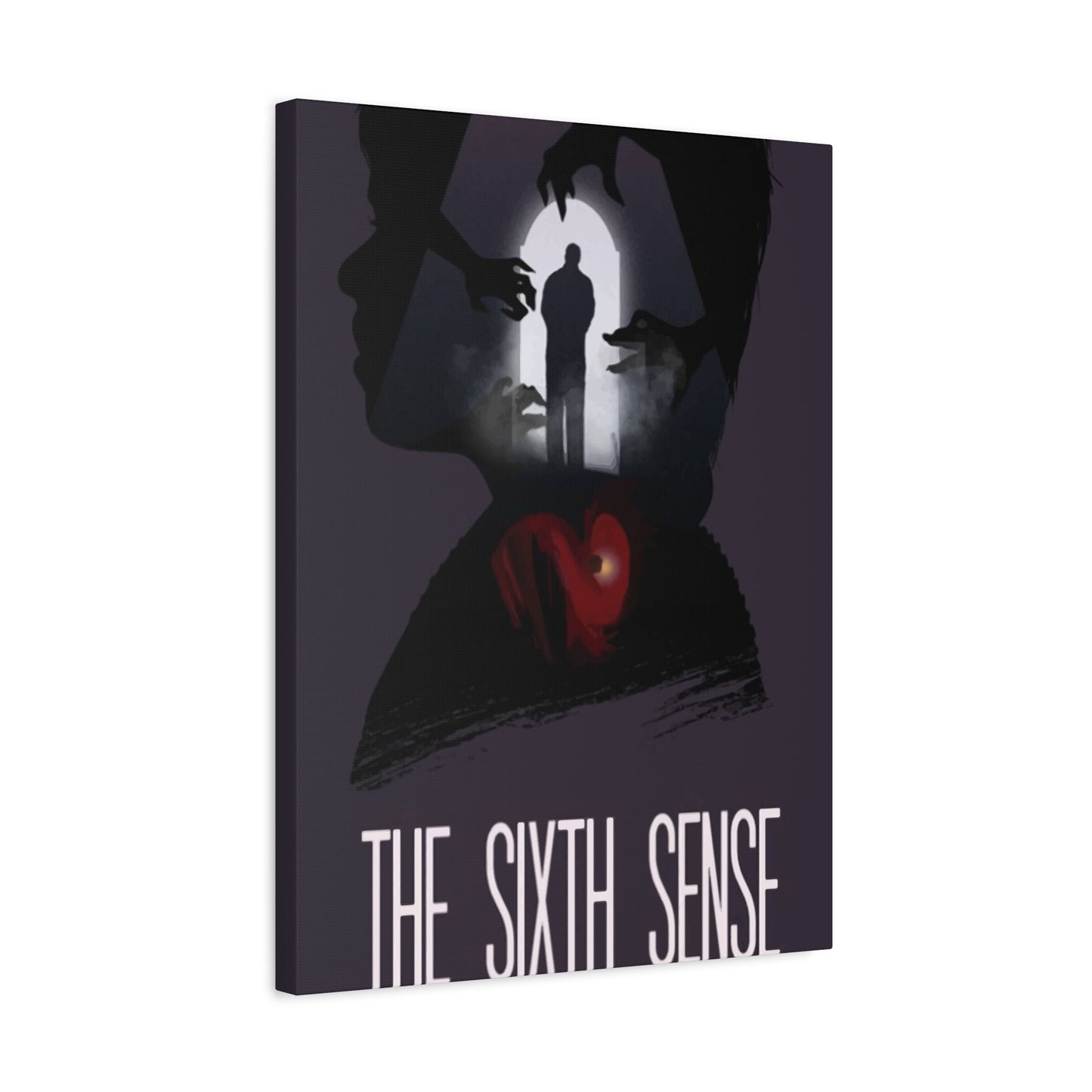
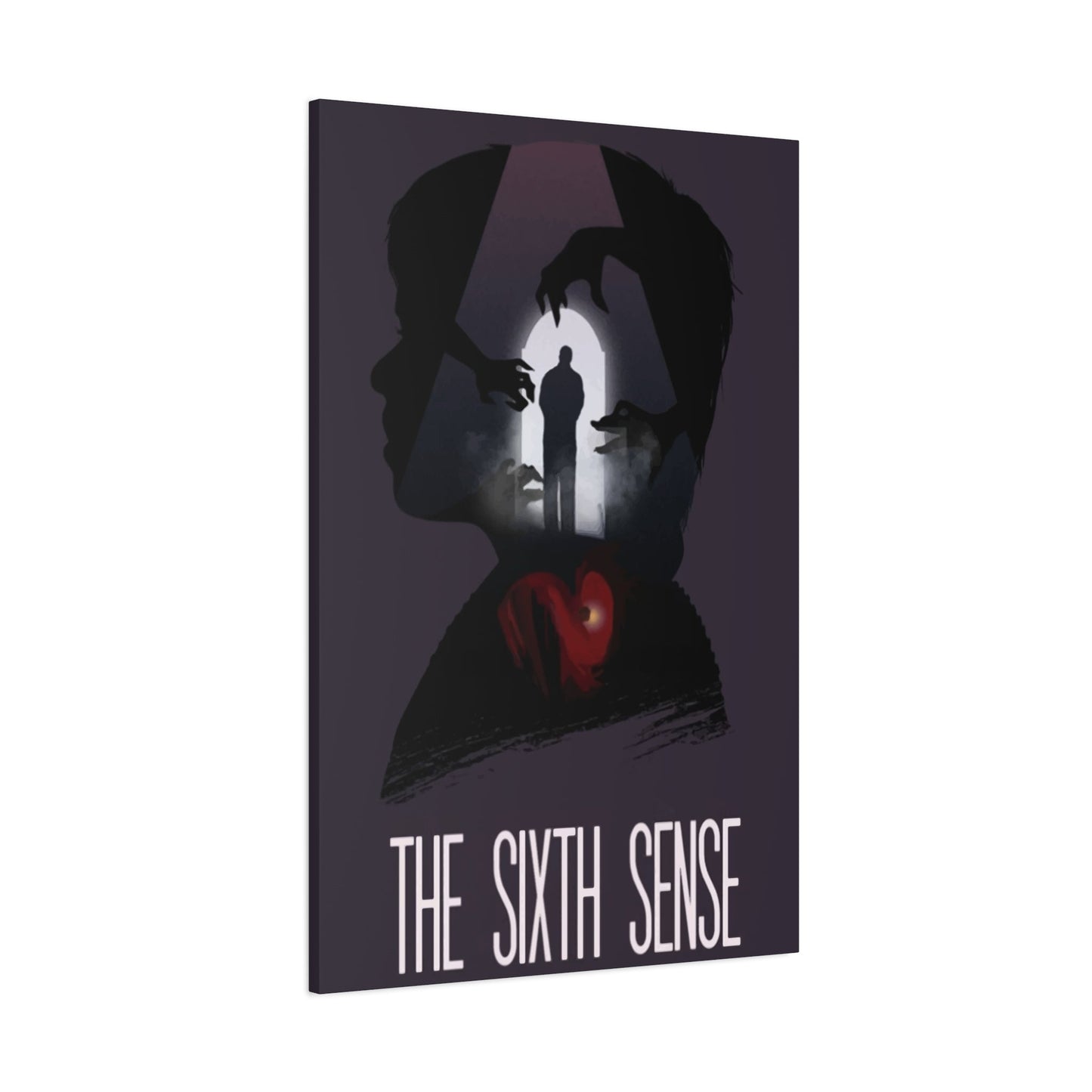
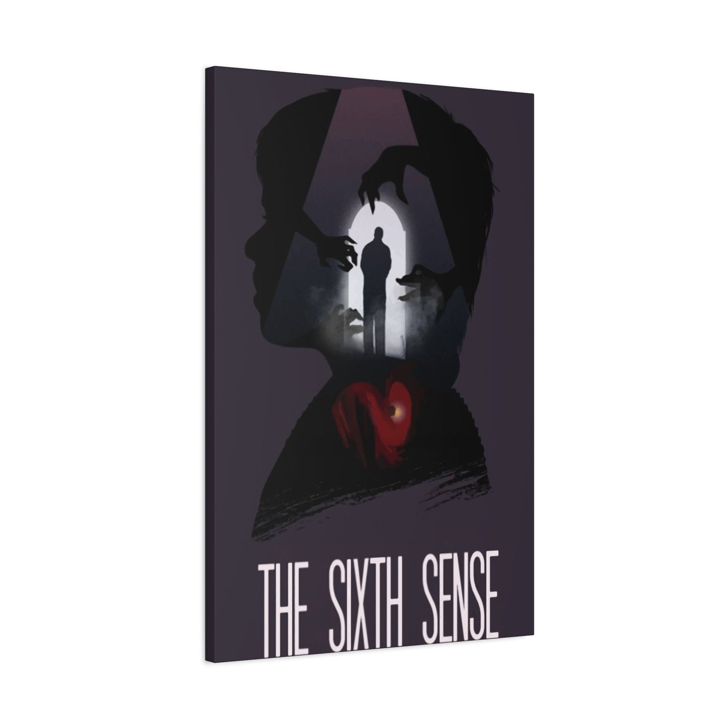
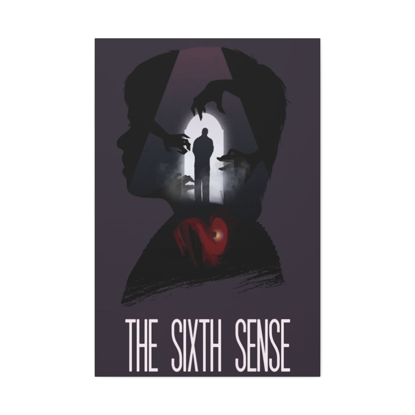
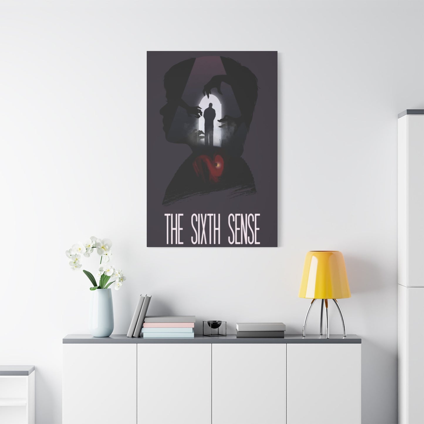
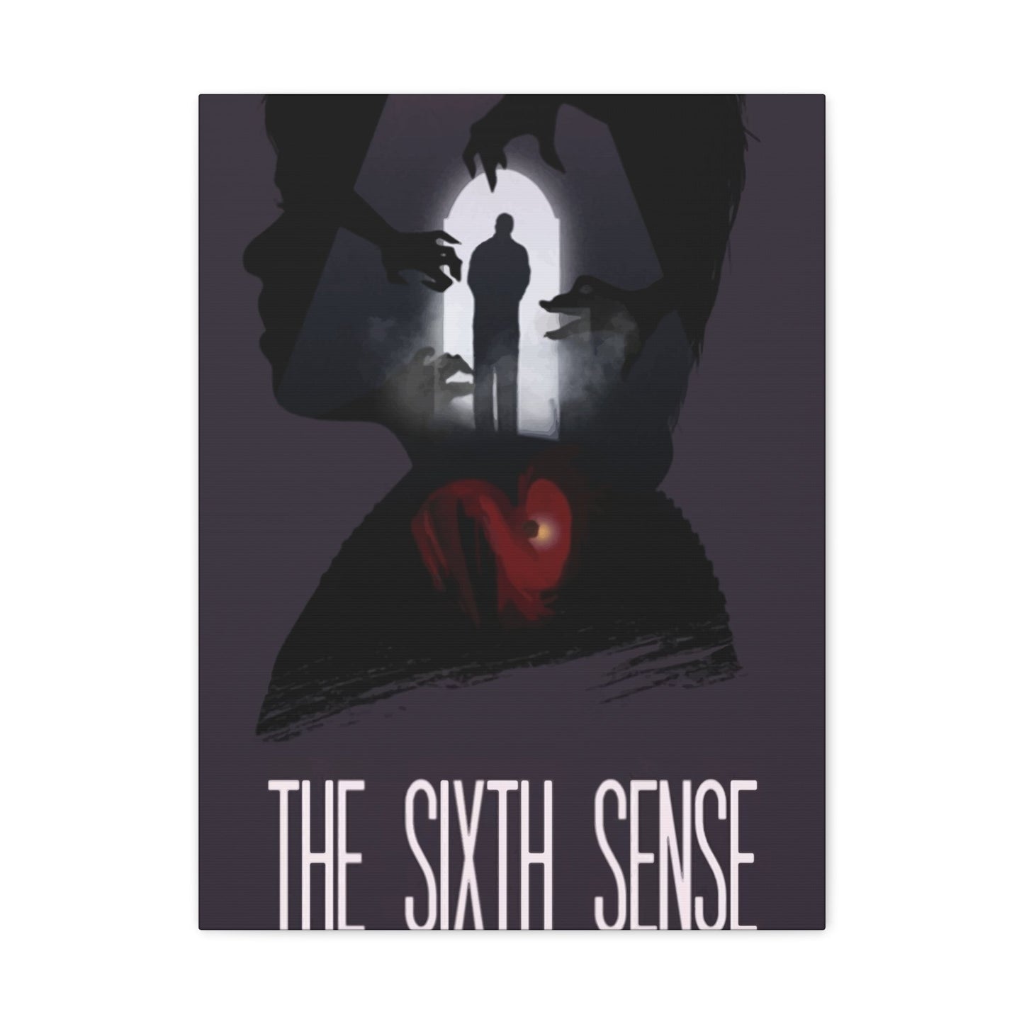
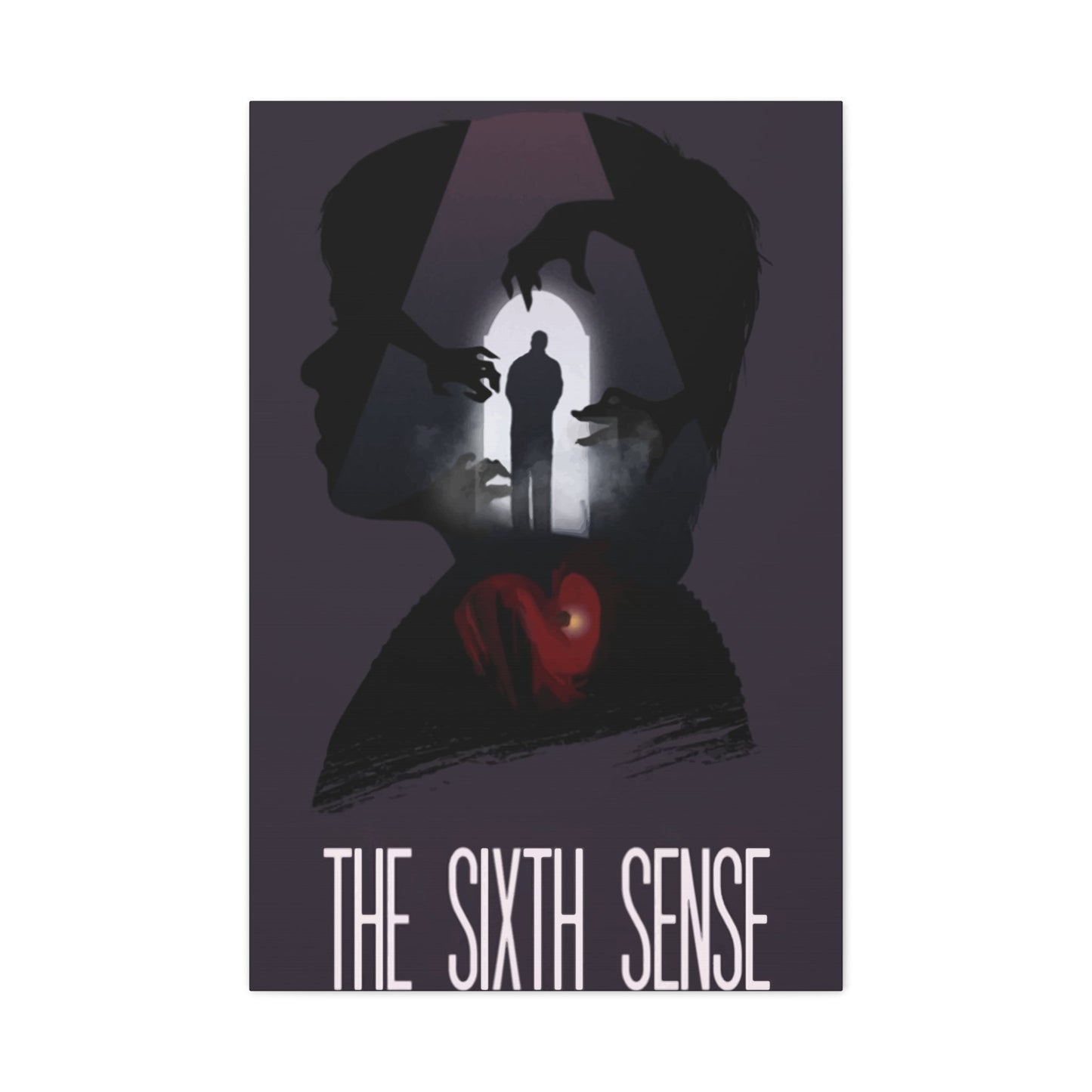
The visual language employed in the promotional artwork for this psychological thriller represents a masterclass in minimalist yet powerful design. The most recognizable imagery features a young protagonist set against backgrounds that suggest otherworldly presence without explicitly revealing supernatural elements. The artistic team behind these creations understood that suggestion and implication create far more tension than direct representation. This approach resulted in designs that continue to captivate viewers through their restraint and atmospheric quality.
Central to these iconic images is the use of color temperature to convey emotional states and thematic content. Cool blues and grays dominate many designs, creating an atmosphere of isolation and unease. These color choices reflect the emotional journey of the characters while also establishing a visual identity that became synonymous with the film itself. The deliberate avoidance of warm tones in primary design elements reinforces the sense of disconnection that permeates the narrative, making the artwork an extension of the storytelling rather than simply promotional material.
The compositional strategies employed in these designs demonstrate sophisticated understanding of visual hierarchy and viewer psychology. Figures are often positioned to create asymmetrical balance, drawing the eye across the composition while maintaining a sense of instability that mirrors the film's unsettling themes. The use of negative areas serves multiple purposes, providing breathing room that enhances the overall impact while also suggesting the unseen forces that drive the narrative. This careful attention to composition ensures that each piece remains visually engaging even after repeated viewing.
Facial expressions and body language captured in these promotional materials convey volumes about the film's emotional content. The young protagonist's expressions range from confusion to fear to determination, offering viewers insight into his psychological journey without revealing specific plot points. This careful balance between revelation and concealment makes the artwork effective both as marketing material and as artistic statement. The positioning of adult figures in relation to the child protagonist creates dynamic tension that hints at the complex relationships central to the film's narrative.
Typography plays a crucial role in establishing the overall aesthetic of these promotional pieces. The font choices and text placement complement rather than compete with the visual elements, creating unified compositions that communicate genre and tone effectively. The title treatment often incorporates subtle distressing or textural elements that reinforce the psychological thriller genre without becoming overly literal. This integration of text and image demonstrates professional graphic design principles that elevate the overall quality of the artwork.
Lighting effects in these designs create dramatic atmosphere through careful manipulation of highlights and shadows. The use of rim lighting and backlighting creates silhouettes and semi-obscured figures that suggest presence without full revelation. This technique builds tension and curiosity while maintaining visual interest through high contrast areas. The lighting choices also help direct viewer attention to key elements within the composition, ensuring that important details receive proper emphasis without overwhelming the overall design.
Symbolic elements woven throughout these designs add layers of meaning that reward careful observation. Recurring motifs such as doorways, windows, and staircases suggest transition and threshold crossing, themes central to the film's narrative. These architectural elements are never merely decorative but serve as visual metaphors for the psychological and supernatural boundaries explored in the story. The integration of these symbols demonstrates thoughtful artistic direction that considers both immediate visual impact and deeper thematic resonance.
The treatment of the supernatural elements in these designs shows remarkable restraint and artistic sophistication. Rather than relying on obvious ghostly imagery, the designers created atmosphere through suggestion and implication. Subtle visual distortions, unexpected color shifts, and carefully placed shadows hint at otherworldly presence without resorting to clichéd representations. This approach respects audience intelligence while creating more psychologically effective imagery that lingers in memory long after initial viewing.
Texture and surface quality contribute significantly to the overall impact of these promotional materials. Many designs incorporate grain, distressing, or layering effects that add visual complexity and suggest age or deterioration. These textural elements reinforce themes of memory, trauma, and the boundaries between different states of existence. The physical quality of the image surfaces becomes part of the artistic statement, adding depth that purely clean digital designs might lack.
The relationship between figure and ground in these compositions creates visual tension that mirrors the film's thematic concerns. Figures emerge from or recede into backgrounds in ways that blur boundaries and create ambiguity about presence and absence. This sophisticated approach to compositional depth ensures that viewers remain engaged with the imagery, discovering new details and relationships with each viewing. The artwork thus functions on multiple levels, providing immediate impact while also rewarding sustained attention and contemplation.
The Psychological Impact of Sixth Sense Posters
The emotional and psychological effects generated by these promotional artworks extend far beyond simple aesthetic appreciation. The visual strategies employed in these designs tap into fundamental human responses to ambiguity, isolation, and the suggestion of supernatural presence. Viewers often report experiencing unease or tension when engaging with these images, even in domestic settings far removed from theatrical contexts. This ability to evoke visceral responses demonstrates the power of well-executed visual design to affect viewers on psychological and emotional levels.
Color psychology plays a significant role in how these designs impact viewers. The predominant use of cool tones creates associations with coldness, distance, and emotional isolation. These color choices trigger subconscious responses that prepare viewers for the psychological themes explored in the film itself. The occasional use of warmer accent colors creates points of emphasis that draw attention while also providing relief from the overall cool palette. This strategic deployment of color creates emotional rhythms within the compositions that guide viewer responses in specific directions.
The treatment of human figures in these designs engages viewers' natural empathetic responses while also creating distance and ambiguity. Facial expressions convey genuine emotion that allows viewers to connect with the characters' psychological states, yet the overall compositional strategies often create barriers to full emotional access. This push-pull dynamic keeps viewers engaged while maintaining the sense of mystery essential to the thriller genre. The psychological sophistication of this approach elevates these promotional materials beyond typical marketing imagery.
Spatial relationships within these compositions affect how viewers process the visual information and respond emotionally to the content. The use of vast empty areas surrounding isolated figures creates feelings of loneliness and vulnerability that resonate with the film's themes. The positioning of figures at edges or corners of compositions creates tension and suggests instability, keeping viewers psychologically off-balance. These spatial strategies demonstrate understanding of how visual arrangements affect emotional and cognitive processing.
The suggestive rather than explicit approach to supernatural content in these designs engages viewers' imaginations in ways that explicit imagery cannot. By providing visual clues and atmospheric hints rather than clear representations, the artwork activates viewers' own fears and anxieties. This participatory element makes the experience more personal and psychologically potent, as viewers essentially collaborate in creating the threatening presence suggested by the imagery. The psychological effectiveness of this approach explains why these designs continue to affect viewers even after they know the film's story.
Memory and recognition play important roles in how returning viewers engage with these promotional materials. For those familiar with the film, the artwork triggers associations with specific scenes, emotional moments, and narrative revelations. This layering of remembered experience onto visual encounter creates rich, complex responses that go beyond simple aesthetic appreciation. The designs thus function as mnemonic devices that can instantly transport viewers back to their initial film-viewing experiences, complete with associated emotions and reactions.
The sense of anticipation and suspense built into these designs affects viewers even when they understand the film's narrative structure. The visual strategies employed create ongoing tension that doesn't resolve within the boundaries of the artwork itself. This open-ended quality keeps viewers engaged and creates lasting impressions that extend beyond the moment of initial viewing. The psychological sophistication of maintaining tension without resolution demonstrates advanced understanding of viewer engagement and emotional manipulation through visual means.
Identification and projection mechanisms allow viewers to insert themselves into the psychological scenarios suggested by these artworks. The universal themes of fear, isolation, and seeking understanding create entry points for personal engagement with the imagery. Viewers may see their own anxieties or experiences reflected in the visual narratives suggested by the compositions. This personal relevance increases emotional investment and explains why these particular promotional materials resonate so strongly with diverse audiences.
The balance between accessibility and ambiguity in these designs creates optimal conditions for psychological engagement. The imagery is clear enough to communicate genre and tone while remaining open to interpretation and personal meaning-making. This balance prevents the artwork from becoming either too obscure to engage or too explicit to maintain interest. The psychological sweet spot achieved by these designs contributes significantly to their lasting appeal and effectiveness as both promotional material and collectible artwork.
Repeated exposure to these designs can create conditioning effects where viewers associate the visual elements with specific emotional states or memories. This psychological linking makes the artwork increasingly powerful over time as personal history becomes intertwined with the visual experience. The cumulative effect of multiple viewings deepens the emotional resonance of the imagery, transforming simple promotional materials into personally significant objects with rich associative networks.
Using Sixth Sense Movie Posters to Enhance Walls
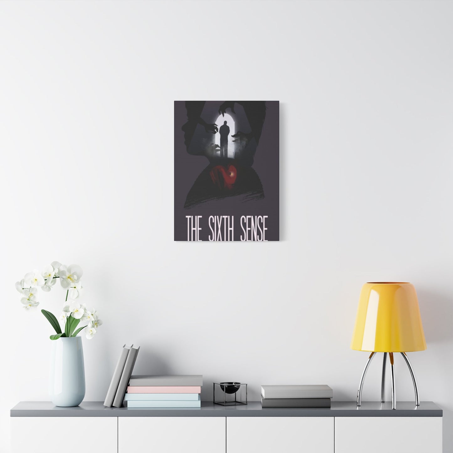
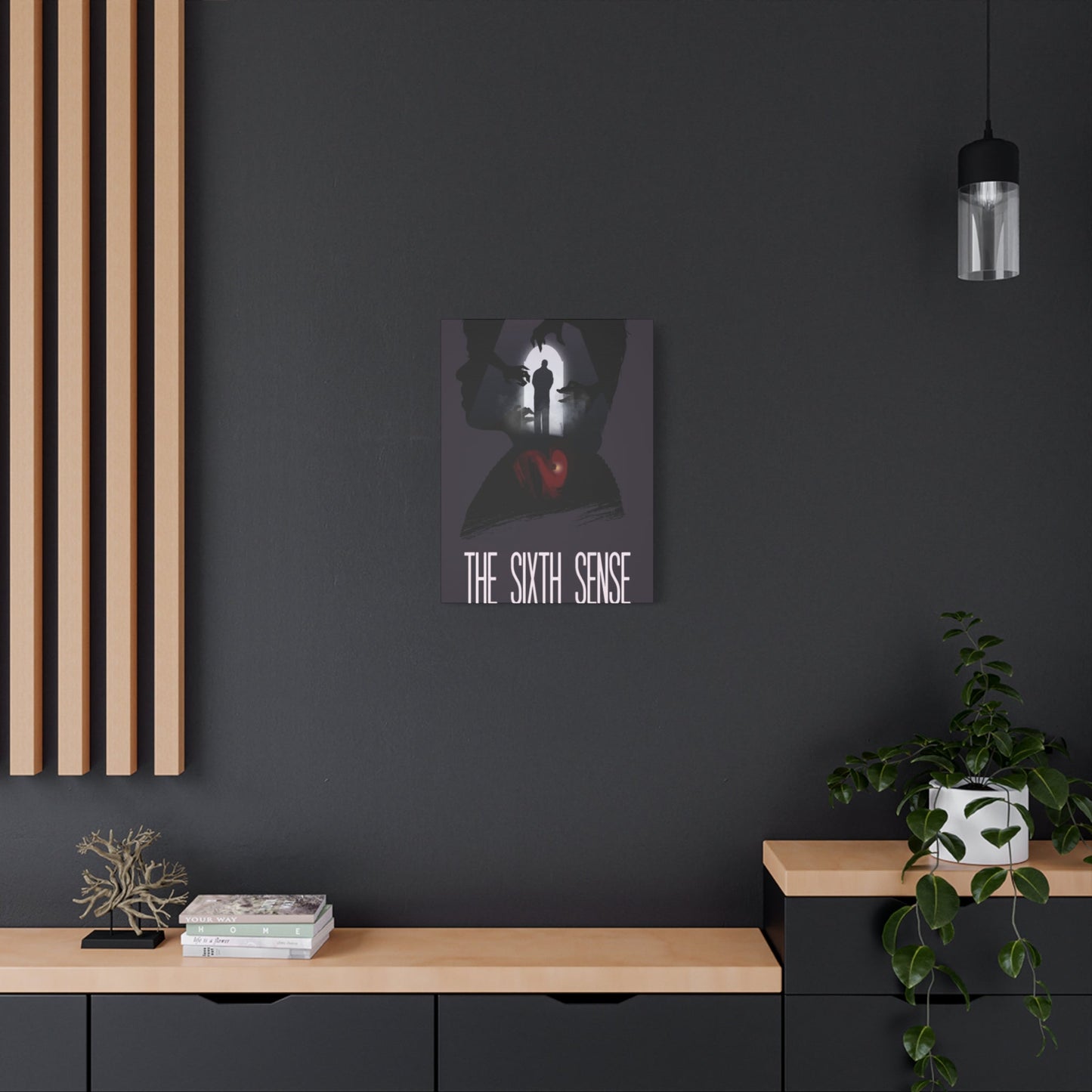
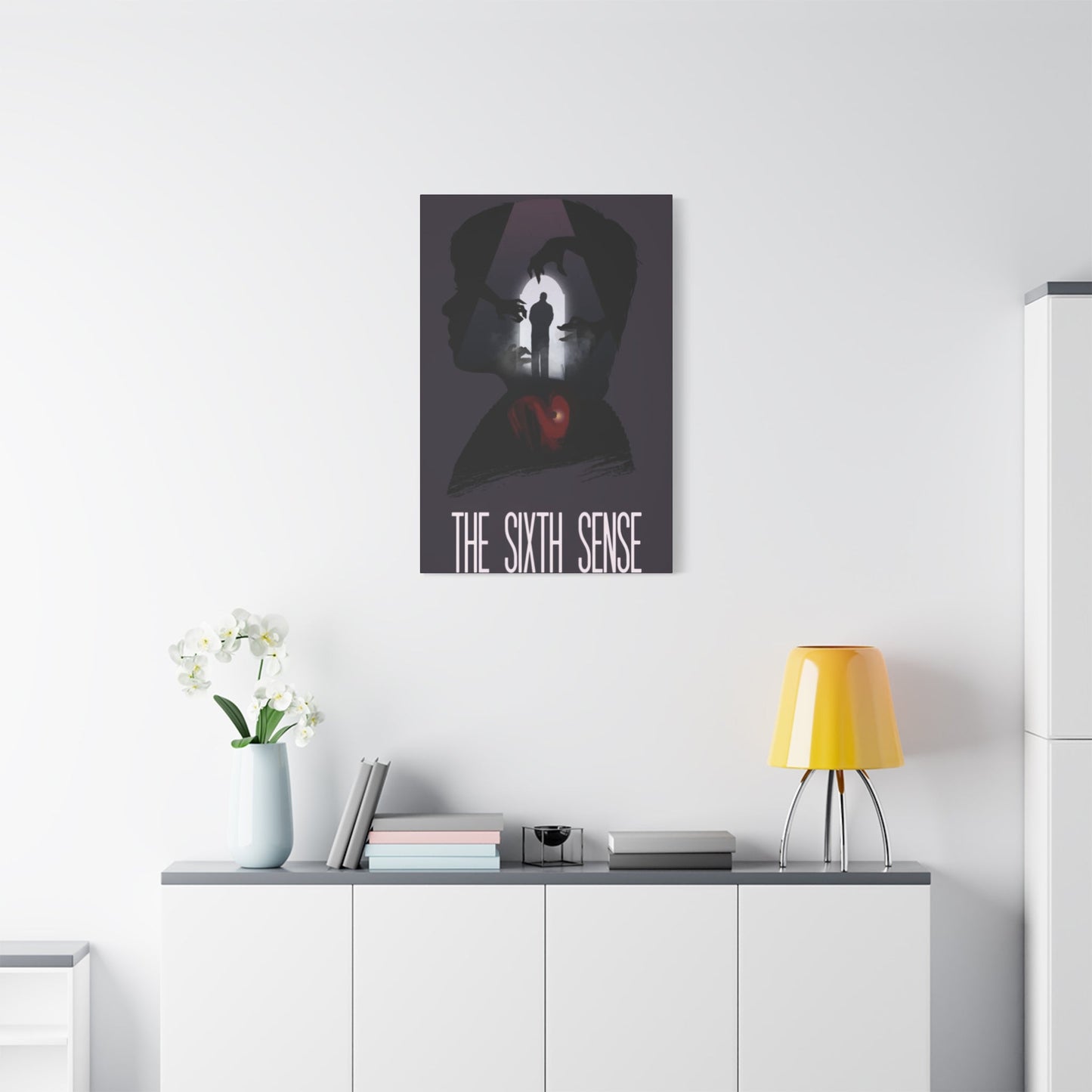
Incorporating these atmospheric artworks into living environments creates immediate visual impact while also introducing psychological and emotional dimensions to residential settings. The dramatic compositions and evocative imagery serve as focal points that anchor room designs and provide conversation opportunities. When thoughtfully placed, these pieces can completely transform the character and mood of an area, creating environments that reflect both personal taste and appreciation for cinematic artistry. The versatility of these designs allows them to function effectively in various settings, from entertainment areas to more formal living quarters.
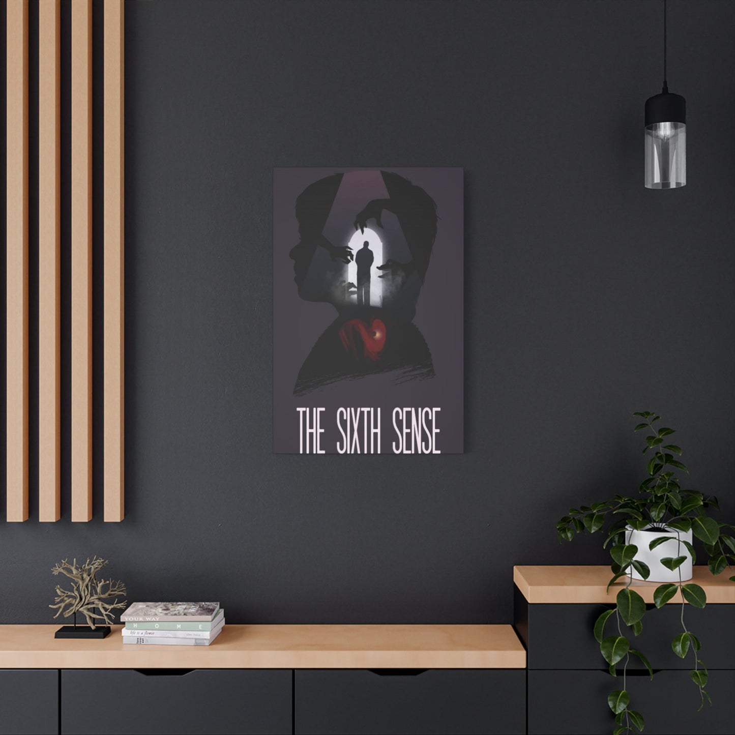
The selection of appropriate wall surfaces for displaying these artworks requires consideration of several factors including lighting conditions, wall color, and surrounding furnishings. Lighter wall colors provide maximum contrast for pieces dominated by darker tones, making the imagery stand out dramatically. Conversely, darker wall surfaces can create gallery-like presentations where the artwork appears to float mysteriously. The choice depends on desired effect and overall aesthetic goals for the environment. Proper placement relative to light sources prevents glare while ensuring the artwork receives adequate illumination to appreciate details.
Scale considerations significantly impact how these artworks function within residential environments. Larger format prints create commanding presence that can dominate an entire wall, making them ideal for primary focal points in entertainment areas or dedicated home theaters. Medium-sized pieces work effectively in groupings or as secondary focal points that complement other design elements. Smaller prints can be incorporated into gallery walls or used to create intimate vignettes in more confined areas. Understanding the relationship between artwork size and room proportions ensures optimal visual impact and environmental harmony.
The psychological atmosphere created by displaying these particular artworks adds layers of interest to living environments. The inherent tension and mystery in the imagery creates subtle emotional undertones that make environments feel more dynamic and engaging. Guests often find themselves drawn to these pieces, studying details and responding to the atmospheric qualities. This engagement transforms passive wall decoration into active focal points that contribute to memorable environmental experiences. The artwork becomes more than decoration, serving as catalyst for emotional response and intellectual engagement.
Grouping strategies for multiple pieces from this film franchise create opportunities for visual storytelling and thematic development. Arranging several related images in careful sequences can suggest narrative progression or thematic variations. The compositional relationships between grouped pieces should be considered carefully, with attention to how individual designs interact visually and thematically. Creating rhythm through varied sizes or maintaining consistency through uniform formatting both offer effective approaches depending on desired outcomes. These grouping decisions significantly impact overall visual effectiveness and environmental integration.
The relationship between these artworks and other decorative elements requires thoughtful consideration to avoid visual conflict or thematic confusion. The sophisticated, restrained aesthetic of these promotional materials works well with contemporary design approaches but may clash with overly ornate or heavily patterned surroundings. Complementary color schemes and sympathetic textures in surrounding furnishings help integrate the artwork into cohesive environmental designs. The goal is creating harmony where all elements support rather than compete with each other.
Lighting design specifically addressing these artworks enhances their visual impact and ensures proper appreciation of details and atmospheric qualities. Directional accent lighting can create dramatic presentations that emphasize the inherent theatricality of the imagery. Adjustable lighting allows for varied presentations depending on time of day or desired mood. Avoiding direct light sources that create glare or reflections preserves image quality and viewer experience. Professional lighting approaches used in gallery settings can be adapted for residential applications to achieve museum-quality presentations.
Seasonal and temporal considerations affect how these artworks function within living environments. The cooler color palettes and atmospheric qualities make these pieces particularly effective during autumn and winter months when their psychological resonance aligns with environmental conditions. However, their sophisticated design ensures year-round relevance and visual appeal. The unchanging nature of the artwork provides stability and continuity even as other environmental elements change seasonally. This reliability makes these pieces valuable long-term investments in environmental design.
The interaction between these artworks and natural light sources throughout daily cycles creates dynamic viewing experiences. Morning light may reveal details invisible in evening viewing, while twilight conditions can intensify the mysterious atmosphere inherent in the designs. This temporal variation adds interest and prevents the artwork from becoming visually stale through overfamiliarity. Positioning pieces to take advantage of natural light variations maximizes their visual potential and creates ongoing engagement with the imagery.
Personal collection development using these promotional materials allows for gradual environmental evolution as new pieces are acquired and displayed. Starting with a single favorite design and expanding over time creates opportunities for learning about effective display strategies and discovering personal preferences. The collecting process itself becomes part of the overall experience, adding layers of personal history and meaning to the physical objects. This developmental approach to environmental enhancement through artwork creates living spaces that evolve alongside their inhabitants' growing appreciation and understanding.
Symbolism and Themes in Sixth Sense Poster Art
The layered symbolic content embedded within these promotional designs rewards careful analysis and repeated viewing. Every compositional choice, color selection, and visual element carries potential thematic significance that connects to the film's complex narrative. The designers employed sophisticated visual language that communicates on both conscious and subconscious levels, creating imagery that functions as both immediate attention-grabber and subtle thematic statement. Understanding these symbolic dimensions deepens appreciation for the artistic achievement these designs represent.
The recurring motif of doors and thresholds appears throughout various versions of the promotional artwork, serving as visual metaphor for the boundary crossing central to the film's premise. These architectural elements represent transition points between different states of existence, knowledge, or understanding. The positioning of characters relative to these symbolic thresholds communicates their relationship to the film's central mysteries. Open doorways suggest possibility and danger simultaneously, while closed doors represent barriers and secrets. This symbolic vocabulary adds narrative dimension to what might otherwise be purely decorative design elements.
Color symbolism operates on multiple levels throughout these designs, with particular hues carrying specific thematic associations. The predominant cool tones represent emotional isolation, supernatural presence, and psychological distance. Occasional warm accents often associate with human connection, understanding, or revelation. The strategic deployment of red elements in certain designs connects to themes of violence, danger, or heightened emotional states. This sophisticated use of color psychology demonstrates how visual design can communicate complex thematic content without relying on explicit narrative information.
The treatment of light and shadow in these compositions carries symbolic weight beyond purely aesthetic considerations. Light often represents knowledge, understanding, or the natural world, while shadow associates with mystery, fear, or supernatural presence. The interplay between these opposing forces creates visual tension that mirrors the film's thematic concerns about perception and reality. Areas where light and shadow meet become particularly charged, representing liminal zones where different realities intersect. This symbolic use of value contrast adds philosophical dimension to the visual experience.
The positioning and scale of human figures within these compositions communicate thematic information about power dynamics, vulnerability, and isolation. Small figures in vast empty spaces symbolize the overwhelming nature of the supernatural forces encountered, as well as the isolation of those who perceive what others cannot. The relationship between adult and child figures reflects the film's exploration of mentorship, protection, and the burden of special knowledge. These symbolic spatial relationships allow viewers to grasp essential thematic content through visual rather than narrative means.
Eyes and acts of seeing feature prominently in several designs, connecting directly to the film's title and central premise. The treatment of eyes ranges from direct, confrontational gazes that challenge viewers to obscured or partially hidden eyes that suggest incomplete knowledge or hidden truths. This visual emphasis on perception and observation reinforces the film's exploration of different ways of seeing and understanding reality. The symbolic treatment of vision in these designs adds self-reflexive dimension, as viewers must see and interpret the artwork itself to access its meanings.
Temporal symbolism appears through various design choices that suggest past, present, and future coexisting or bleeding into each other. Layering effects, ghostly transparencies, and visual echoes create sense of temporal instability that mirrors the film's narrative structure. These temporal markers remind viewers that the present moment contains traces of past events and hints of future revelations. The visual representation of non-linear time adds complexity and rewards viewers familiar with the film's temporal manipulations.
The recurring presence of the color white in clothing and environmental elements carries symbolic associations with innocence, purity, and visibility. This symbolism becomes particularly poignant given the film's themes of childhood trauma and lost innocence. The contrast between white clothing and darker backgrounds creates visual drama while also emphasizing the vulnerability of innocent figures in threatening environments. This symbolic use of color and contrast demonstrates how design choices can communicate emotional and thematic content simultaneously.
Architectural spaces depicted in these designs often suggest imprisonment, isolation, or psychological confinement. Narrow corridors, enclosed stairwells, and claustrophobic rooms create visual equivalents for emotional and psychological states. These symbolic environments communicate the internal experiences of characters without resorting to explicit psychological visualization. The architecture becomes externalization of internal states, allowing viewers to understand character experiences through spatial metaphor.
The overall compositional structures of these designs often employ symbolic arrangements that suggest imbalance, instability, or transition. Asymmetrical compositions create visual tension that never fully resolves, keeping viewers in states of anticipation or unease. This symbolic use of compositional structure demonstrates sophisticated understanding of how formal visual elements affect emotional and psychological responses. The designs thus operate as carefully constructed symbolic systems that communicate on multiple levels simultaneously.
Choosing the Perfect Sixth Sense Wall Art Print
Selecting the ideal piece from the available range of promotional artwork requires consideration of multiple factors including personal taste, intended environment, and specific design characteristics. The variety of available designs ensures that collectors can find pieces matching their particular preferences while maintaining connection to the film's iconic visual identity. Understanding the distinguishing features of different designs helps buyers make informed decisions that result in satisfaction with their acquisitions. The selection process itself can be enjoyable journey of discovery as collectors explore available options and identify pieces that resonate most strongly.
Personal connection to specific scenes or moments from the film often guides selection decisions. Viewers typically have favorite sequences or images that made lasting impressions during theatrical viewing. Identifying promotional artwork that captures or references these preferred moments creates personal relevance beyond general aesthetic appeal. This emotional connection ensures long-term satisfaction with the selection and increases likelihood that the piece will remain valued part of personal collections. The storytelling dimension adds significance that purely decorative artwork may lack.
Color scheme considerations should account for existing environmental palettes and desired atmospheric effects. Pieces dominated by cool tones integrate effectively into contemporary design schemes or environments emphasizing calm and contemplation. Designs incorporating warmer accents may better suit settings where energy and visual warmth are priorities. Understanding how artwork colors will interact with wall colors, furnishings, and lighting helps ensure successful environmental integration. Taking environmental samples or photographs when evaluating options aids in making appropriate color-based decisions.
Compositional complexity represents another important selection criterion, with simpler designs offering immediate clarity while more complex compositions reward extended viewing. Collectors should consider viewing distance and duration when evaluating compositional complexity. Pieces intended for hallways or areas with brief viewing times benefit from clear, immediately comprehensible compositions. Artwork destined for living areas or entertainment rooms where extended viewing occurs can successfully handle greater visual complexity. Matching compositional complexity to viewing context ensures optimal viewer experience.
The presence or absence of text elements affects both aesthetic impact and functional versatility of promotional artwork. Designs featuring prominent title treatment provide clear identification and strong graphic impact but may feel overly commercial in some residential contexts. Versions minimizing text elements offer cleaner, more artwork-focused presentations that integrate more seamlessly into fine art collections. Personal preferences regarding text prominence should guide selection, with consideration given to how text elements affect overall composition and environmental compatibility.
Production quality significantly impacts both aesthetic presentation and long-term durability of acquired pieces. High-quality printing processes using archival inks and appropriate substrates ensure color fidelity and resistance to fading or deterioration. Investigating production specifications before purchase prevents disappointment with inferior products that fail to meet expectations. Investment in properly produced pieces pays dividends through enhanced visual quality and extended lifespan. Quality considerations become particularly important for larger format prints where production flaws become more visible.
Size selection requires careful evaluation of intended display location and surrounding context. Oversized prints create dramatic impact but demand adequate wall area and appropriate viewing distance. Undersized prints may disappoint by failing to create desired presence in larger environments. Accurate measurement of available wall dimensions combined with consideration of surrounding elements prevents size-related errors. Many sellers provide dimensional templates or visualization tools that aid in appropriate size selection.
Edition status and availability affect both current pricing and potential future value of promotional artwork. Limited edition releases may command premium prices but offer exclusivity and potential appreciation. Open edition prints provide accessibility and affordability while lacking collectibility premium. Understanding edition status helps buyers make informed decisions aligned with their collecting goals and budget constraints. Documentation of edition numbers and authenticity certificates should be verified for limited releases.
The reputation and reliability of sellers and production sources merit investigation before making purchase commitments. Established dealers with track records of quality service and authentic products provide security that unknown sources cannot match. Customer reviews and community recommendations help identify trustworthy sources while flagging problematic sellers. Investment in legitimate products from reputable sources ensures receipt of authentic, properly produced materials that meet quality standards.
Personal budget considerations should account for not only acquisition costs but also potential framing and display expenses. Setting realistic budget parameters prevents overspending while ensuring adequate resources for proper presentation of acquired pieces. Understanding that professional framing can equal or exceed print costs helps in establishing appropriate total budget allocations. Prioritizing fewer high-quality pieces over multiple inferior products generally results in more satisfying collections and better long-term value.
Caring for Sixth Sense Movie Poster Canvas Prints
Proper maintenance and care protocols significantly extend the lifespan and preserve the quality of these collectible artworks. Understanding appropriate handling, display, and cleaning procedures prevents accidental damage while ensuring that pieces remain in optimal condition for years or decades. Investment in quality artwork deserves commitment to proper care practices that protect both aesthetic qualities and financial value. Establishing good care habits from initial acquisition prevents problems that become difficult or impossible to correct after damage occurs.
Environmental conditions significantly impact artwork longevity, with temperature and humidity being primary concerns. Moderate, stable temperatures prevent physical stress on canvas materials and help preserve color integrity. Humidity control prevents mold growth, material warping, and adhesive deterioration that can compromise structural integrity. Avoiding locations near heating vents, air conditioning outlets, or exterior walls helps maintain stable environmental conditions. Monitoring devices provide data about environmental conditions and alert collectors to potentially harmful variations.
Light exposure represents perhaps the most significant threat to long-term preservation of these artworks. Both natural sunlight and certain artificial light sources contain ultraviolet radiation that degrades pigments and causes fading. Positioning artwork away from direct sunlight prevents accelerated deterioration while UV-filtering glass or acrylic in frames provides additional protection. Using LED lighting sources rather than incandescent or fluorescent bulbs minimizes harmful light exposure. Regular inspection for early signs of fading allows for corrective action before serious damage occurs.
Dust accumulation may seem minor but contributes to gradual degradation through multiple mechanisms. Dust particles can be abrasive when disturbed, potentially scratching surfaces during cleaning. Dust also attracts and holds moisture that can promote mold growth or material deterioration. Regular, gentle dusting using appropriate tools prevents buildup while minimizing surface contact and potential damage. Microfiber cloths or soft natural-bristle brushes remove dust effectively without introducing risks associated with more aggressive cleaning methods.
Canvas material requires specific care approaches that differ from paper-based prints. Canvas surfaces can be gently dusted but should never be exposed to moisture or liquid cleaning agents without professional consultation. The flexibility of canvas means it can be vulnerable to denting or creasing if improperly handled. Always supporting canvas prints from behind during handling prevents stress on the material and mounting systems. Understanding canvas-specific vulnerabilities helps prevent common mistakes that damage these particular types of artwork.
Handling protocols minimize risks of physical damage during relocation or maintenance activities. Clean, dry hands prevent transfer of oils and moisture that can stain or deteriorate materials. Lifting and supporting artwork by frames rather than canvas or paper prevents structural stress and material damage. Using appropriate numbers of handlers for larger pieces prevents accidents and ensures controlled movement. Establishing careful handling procedures and following them consistently prevents the majority of accidental damage incidents.
Storage considerations become relevant when rotating displayed pieces or during relocation. Vertical storage with adequate support prevents warping or bending that can occur in horizontal stacking. Protective covering prevents dust accumulation and physical contact damage during storage periods. Climate-controlled storage environments maintain stable conditions that prevent deterioration during extended storage. Proper storage protocols ensure that pieces remain in excellent condition even when not actively displayed.
Professional cleaning and conservation services should be utilized for significant issues or valuable pieces. Attempting ambitious cleaning or repair without appropriate expertise often results in additional damage rather than improvement. Establishing relationships with qualified conservators provides access to expert assistance when needed. Regular professional evaluation can identify developing problems before they become serious and provide guidance on appropriate care protocols. Investment in professional services protects investment in valuable artwork.
Frame and mounting system inspection should occur regularly to identify developing problems before they affect artwork. Loose hardware, degrading materials, or shifting mounts can all threaten artwork integrity. Addressing minor issues promptly prevents escalation into major problems requiring expensive intervention. Understanding how frames and mounting systems function allows collectors to identify problematic conditions and take appropriate action. Regular inspection becomes routine maintenance that prevents surprises and protects valuable pieces.
Documentation of condition and care history creates valuable records for insurance, resale, or conservation purposes. Photographs documenting original condition and any changes over time provide baseline references for evaluating deterioration. Records of cleaning, conservation, or repair work create transparency about artwork history. This documentation increases value and marketability while also guiding ongoing care decisions. Establishing documentation practices from initial acquisition creates comprehensive records that benefit all stakeholders in artwork lifecycle.
Limited Edition Sixth Sense Poster Collectibles
The collectibles market for promotional materials from this iconic film includes various limited edition releases that command premium prices and attract serious collectors. These special releases often feature enhanced production values, exclusive designs, or authenticated scarcity that distinguishes them from standard commercial products. Understanding the limited edition marketplace helps collectors make informed acquisition decisions while avoiding common pitfalls. The combination of artistic merit and manufactured scarcity creates investment opportunities alongside aesthetic appreciation.
Authentication and verification processes provide crucial protection against counterfeit or misrepresented materials. Limited edition releases should include certificates of authenticity documenting edition numbers, production details, and authorization chains. Researching legitimate release details before purchase allows comparison with offered materials to identify inconsistencies. Reputable dealers provide transparent documentation and welcome inquiries about authenticity. Skepticism about deals appearing too good to be true protects collectors from costly mistakes involving fraudulent materials.
Edition numbering systems communicate scarcity and position within production runs. Lower numbers sometimes command premiums based on perceived desirability, though actual visual differences between numbered pieces typically do not exist. Understanding that edition numbers primarily serve administrative and authentication purposes rather than affecting artistic quality helps collectors focus on appropriate evaluation criteria. The total edition size impacts scarcity and potential value more significantly than individual position within the numbered sequence.
Artist-signed editions represent premium tier within limited release categories. Signatures from key creative personnel involved in original artwork creation add provenance and collectibility. Verification of signature authenticity requires research into legitimate signing events and comparison with verified exemplars. Artist signatures significantly impact both current market value and potential appreciation. Collectors should understand authentication standards and verification processes when considering signed materials.
Production specifications for limited editions often exceed standard commercial releases through enhanced materials, printing processes, or finishing techniques. These quality improvements justify premium pricing while also affecting long-term durability and aesthetic presentation. Understanding production specifications allows collectors to evaluate whether premium pricing correlates with genuine quality improvements. Detailed product descriptions should document all production enhancements distinguishing limited from standard releases.
Market dynamics affecting limited edition values include both supply factors and demand variations over time. Initial release prices may or may not accurately reflect long-term market values depending on various unpredictable factors. Collector interest can fluctuate based on anniversary events, revival screenings, or broader cultural trends. Understanding that limited editions represent both aesthetic acquisitions and speculative investments helps collectors set appropriate expectations. Diversification across multiple pieces or properties reduces risk associated with value fluctuations.
Condition sensitivity increases for limited edition materials where pristine presentation affects desirability and value. Minor damage or deterioration that might be acceptable in standard prints significantly impacts limited edition marketability. Collectors should implement stringent care protocols and consider professional framing and conservation from initial acquisition. Understanding that condition directly affects value encourages investment in proper care and presentation systems. Protecting condition preserves both aesthetic qualities and financial value.
Release strategies by official licensors create various limited edition opportunities throughout years following initial theatrical release. Anniversary editions, special events, or promotional campaigns generate new limited releases appealing to collectors. Staying informed about upcoming releases allows collectors to make strategic acquisition decisions. Understanding release patterns helps anticipate future opportunities while also informing decisions about current market offerings. Active engagement with collector communities provides information about releases and market conditions.
Investment potential of limited edition promotional materials varies significantly based on multiple factors including cultural significance, production quality, and market dynamics. Some pieces appreciate substantially while others plateau or decline in value. Collecting primarily for investment purposes requires different strategies than collecting for aesthetic enjoyment. Understanding personal motivations and goals helps establish appropriate acquisition criteria and expectations. Most collectors balance investment considerations with aesthetic appreciation to create personally meaningful collections.
The provenance and ownership history of limited edition pieces can affect both value and collectibility. Materials with documented ownership by notable collectors or appearance in significant exhibitions carry enhanced prestige. Creating and maintaining documentation of ownership history adds value for future transactions. Understanding that collectibles exist within broader cultural and historical contexts adds depth to collecting activities beyond simple acquisition and ownership. Engagement with provenance narratives enriches the collecting experience.
Sixth Sense Posters as Conversation Starters
The striking visual qualities and cultural recognition of these promotional materials naturally generate interest and discussion among visitors to residential environments. The artwork serves as accessible entry point for conversations spanning film appreciation, artistic analysis, personal experiences, and cultural impact. This social dimension adds functionality beyond pure aesthetic contribution, making the artwork active participant in social interactions. The universal familiarity with the film creates common ground that facilitates engagement even among casual acquaintances.
Recognition factor provides immediate connection point that lowers barriers to initial engagement. Most visitors will recognize the imagery even if they cannot immediately place its source. This recognition triggers memory and association that naturally lead to conversation. The familiar yet distinctive nature of the designs creates comfort while also providing interesting talking points. Hosts can leverage this recognition to guide conversations in various directions depending on guest interests and conversational dynamics.
The psychological thriller genre appeals to broad demographics while also offering depth for serious discussion. Casual viewers can share basic impressions and favorite moments while film students or serious cinephiles can engage with technical and thematic analysis. This accessibility across knowledge levels makes the artwork effective conversation starter for diverse guest lists. The ability to modulate discussion depth based on participant interest and expertise ensures engaging exchanges regardless of audience composition.
Personal viewing experiences create shareable narratives that connect individuals through common cultural touchstones. Discussions about initial theatrical experiences, plot revelations, or emotional responses provide insight into individual perspectives and preferences. These shared experiences create bonds and reveal personality dimensions that might not emerge in more superficial social interactions. The artwork thus facilitates meaningful connection beyond surface-level pleasantries common in social situations.
Thematic discussions prompted by the artwork can explore substantive topics including mortality, communication, perception, and belief systems. The film's content provides rich material for philosophical and psychological discussion that extends beyond simple entertainment value. Thoughtful hosts can guide conversations toward deeper engagement with ideas and themes that interest participants. The artwork becomes catalyst for intellectually stimulating exchanges that guests find memorable and meaningful.
The design and artistic qualities of the promotional materials themselves offer discussion topics for visually oriented participants. Conversations about compositional strategies, color theory, symbolic content, or graphic design principles allow guests with relevant interests to share expertise and perspectives. These discussions democratize art appreciation by focusing on accessible visual materials rather than intimidating fine art contexts. The artwork becomes educational tool that develops visual literacy and critical thinking skills.
Collecting stories and acquisition narratives add personal dimension to discussions about the displayed materials. Sharing how specific pieces were located, acquired, or integrated into collections provides insight into collector motivations and experiences. These narratives humanize the artwork and reveal aspects of host personality and values. Guests often respond with their own collecting experiences, creating reciprocal exchanges that deepen relationships and understanding.
Cultural impact discussions examine how the film and its associated imagery influenced subsequent entertainment, affected popular culture, or reflected social conditions. These conversations situate the artwork within broader cultural and historical contexts that add significance beyond individual appreciation. Understanding the film's place in cinema history and its ongoing influence provides perspective that enriches engagement with the promotional materials. The artwork becomes entry point for cultural analysis and historical reflection.
Generational perspectives create interesting discussion dynamics as different age groups relate to the film and its imagery through varied contexts. Older participants may remember theatrical release and cultural moment while younger viewers encountered the film through streaming or repertory screenings. These different relationships to the material generate productive exchanges that illuminate how cultural artifacts function across temporal and generational boundaries. The artwork thus facilitates intergenerational dialogue and understanding.
The social functionality of these promotional materials extends beyond single conversations to become defining elements of residential environments. Regular visitors develop familiarity with the displayed pieces that becomes part of their overall experience of the environment. The artwork contributes to environmental character and identity that guests associate with their hosts. This ongoing social dimension demonstrates how thoughtfully selected artwork enhances both aesthetic qualities and social functionality of living environments.
Popular Scenes Captured in Sixth Sense Wall Art
The most memorable and emotionally resonant moments from the film have been translated into various promotional designs that capture specific narrative beats or atmospheric qualities. These scene-specific artworks allow collectors to display references to particular moments that held special significance in their viewing experiences. Understanding which scenes receive representation in available promotional materials helps collectors identify pieces that match their personal preferences and memories. The diversity of represented moments ensures that various aspects of the film's narrative and emotional journey receive visual documentation.
The revelation sequence represents one of the most frequently depicted moments across various promotional designs. This climactic scene's emotional power and narrative significance make it natural choice for visual representation. Artists face challenges in capturing this moment's impact without spoiling the revelation for potential viewers. The resulting designs typically employ subtle visual strategies that suggest significance without explicit representation. Collectors who found this sequence particularly powerful naturally gravitate toward artwork capturing its essence.
Hospital corridor sequences provide atmospheric imagery that translates effectively to static visual representation. The institutional setting, dramatic lighting, and tension inherent in these moments create visually striking compositions. The architectural elements of corridors provide strong compositional structures that organize visual information effectively. These designs appeal to collectors drawn to the film's atmospheric qualities and visual style. The recurring motif of corridors in promotional materials reflects their importance in establishing the film's overall aesthetic.
Kitchen and domestic sequences ground the supernatural narrative in recognizable everyday environments. The contrast between ordinary domestic settings and extraordinary events creates compelling visual tension. Promotional designs capturing these moments appeal to viewers who appreciated the film's integration of supernatural elements into realistic contexts. The familiar domestic environments make the artwork accessible while the suggested supernatural presence adds intrigue and depth. These designs demonstrate effective balance between accessibility and mystery.
Conclusion:
In conclusion, The Sixth Sense movie posters wall art offers a compelling fusion of iconic imagery and psychological depth that resonates deeply with fans of the film and lovers of cinematic art alike. These posters capture not only the eerie and suspenseful atmosphere of the movie but also its profound themes of perception, mystery, and human connection. Displaying this art in your home or office creates a visually striking homage to a cult classic that continues to captivate audiences years after its release.
One of the most captivating qualities of The Sixth Sense movie posters is their ability to evoke emotion and intrigue through minimalist yet powerful design. The imagery often uses stark contrasts, haunting expressions, and symbolic elements—such as the unforgettable phrase “I see dead people”—to immerse viewers in the film’s psychological tension. This blend of subtle storytelling and visual artistry makes the posters much more than mere promotional materials; they become standalone pieces of art that provoke thought and spark conversation.
The psychological depth inherent in these posters mirrors the film’s exploration of perception and the unseen. By featuring motifs of ghosts, shadows, and the enigmatic young protagonist, the artwork taps into universal fears and curiosities about the unknown and the afterlife. This thematic richness adds layers of meaning to any space, inviting viewers to engage with the art on both an intellectual and emotional level.
Moreover, The Sixth Sense movie posters fit seamlessly into a variety of décor styles. Whether you have a modern, minimalist living room or a cozy, eclectic media room, these posters can serve as captivating focal points. Their moody palettes and striking compositions complement neutral tones while adding a dramatic flair, perfect for creating a cinematic ambiance at home.
Collectors and film buffs will also appreciate the range of designs available—from vintage original releases to contemporary reinterpretations by talented graphic artists. Each version offers a unique perspective on the film’s legacy, allowing you to select artwork that best reflects your personal style and connection to the story.
Ultimately, The Sixth Sense movie posters wall art transcends its origins as marketing material to become a meaningful expression of storytelling, art, and psychology. Incorporating these pieces into your space is a way to honor a film that redefined the thriller genre while enriching your environment with visual intrigue and emotional depth.
