


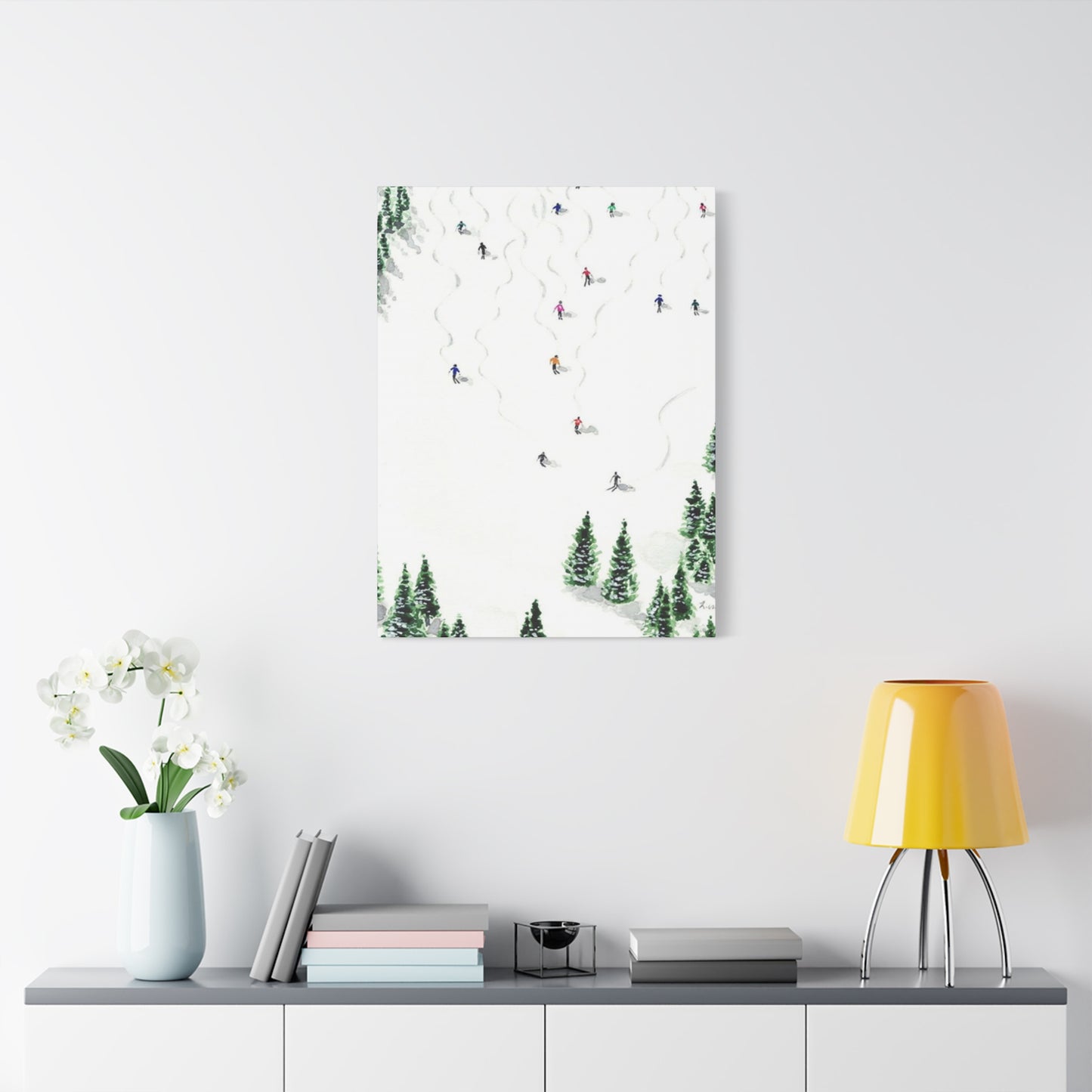
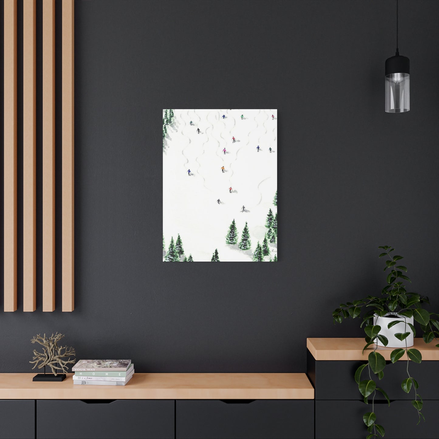
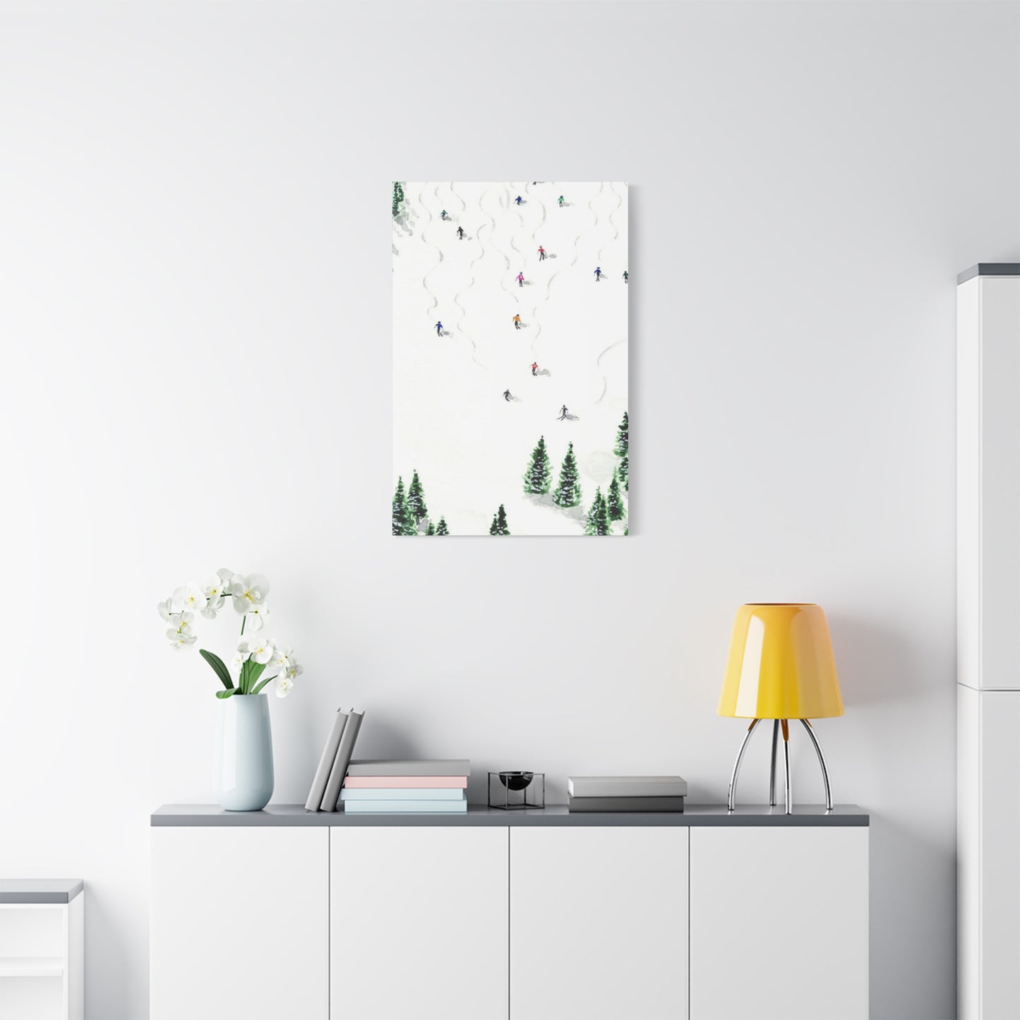
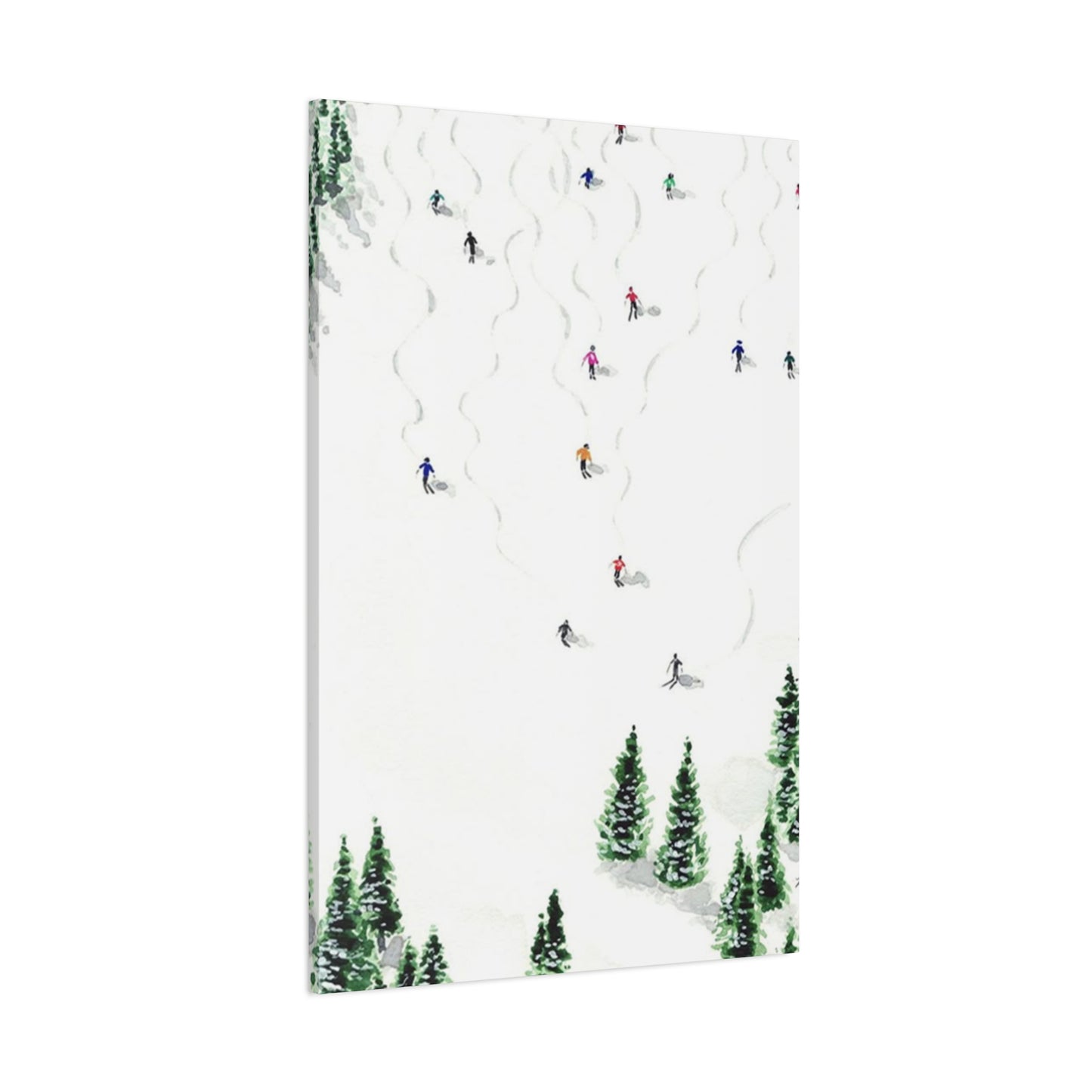
Skiing With Pine Trees Wall Art & Canvas Prints
Skiing With Pine Trees Wall Art & Canvas Prints
Couldn't load pickup availability

Skiing and Pine Tree Wall Art: Bringing Mountain Elegance Into Your Living Space
When it comes to decorating your home with nature-inspired artwork, few combinations capture the essence of winter wonderlands quite like skiing imagery paired with majestic pine trees. This pairing represents more than just aesthetic appeal; it embodies the spirit of alpine adventures, the tranquility of snow-covered forests, and the exhilarating freedom that comes with gliding down mountain slopes surrounded by evergreen sentinels. Whether you're an avid skier who wants to commemorate your passion or someone who simply appreciates the visual poetry of winter landscapes, incorporating these elements into your interior design can transform any space into a refined sanctuary that celebrates the natural world.
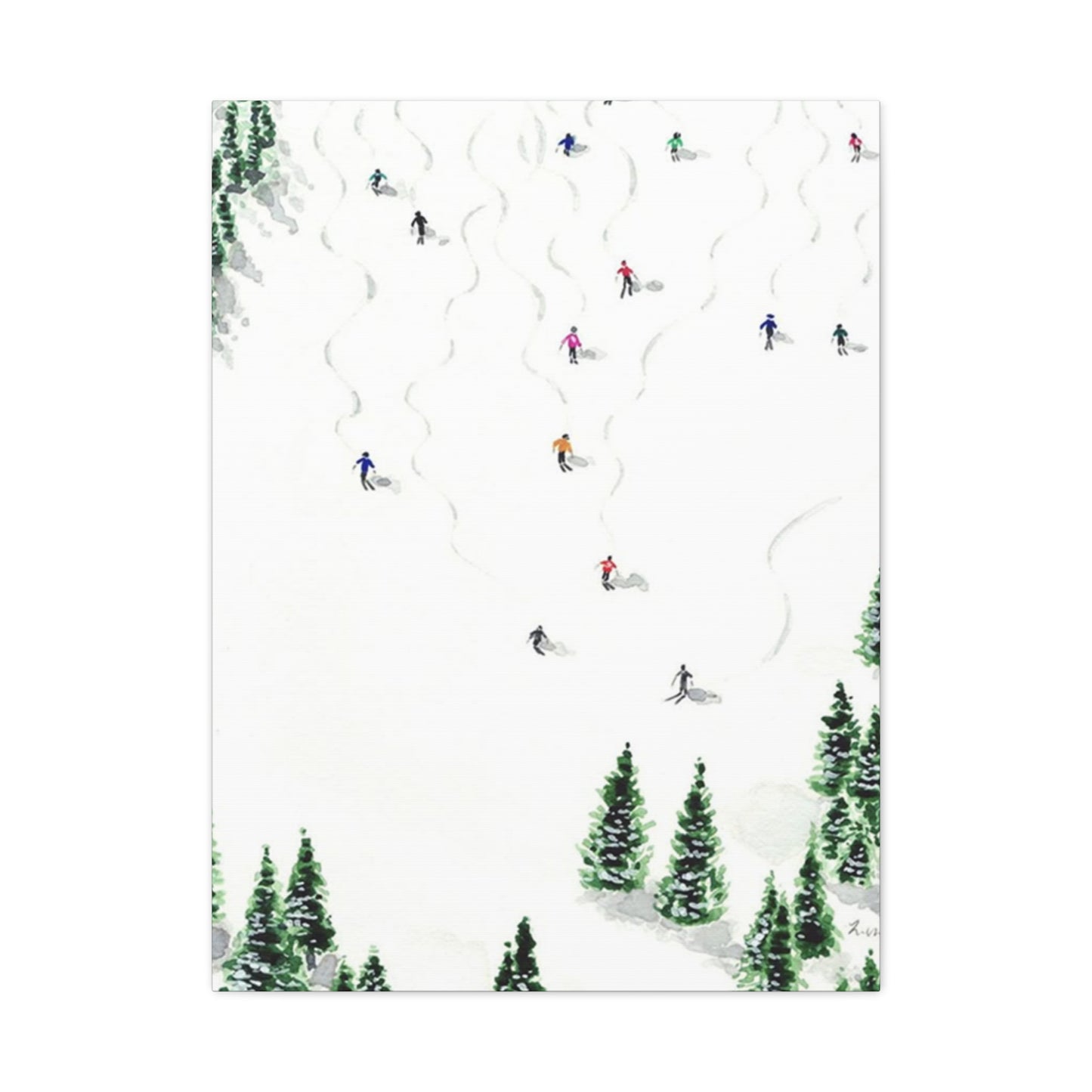
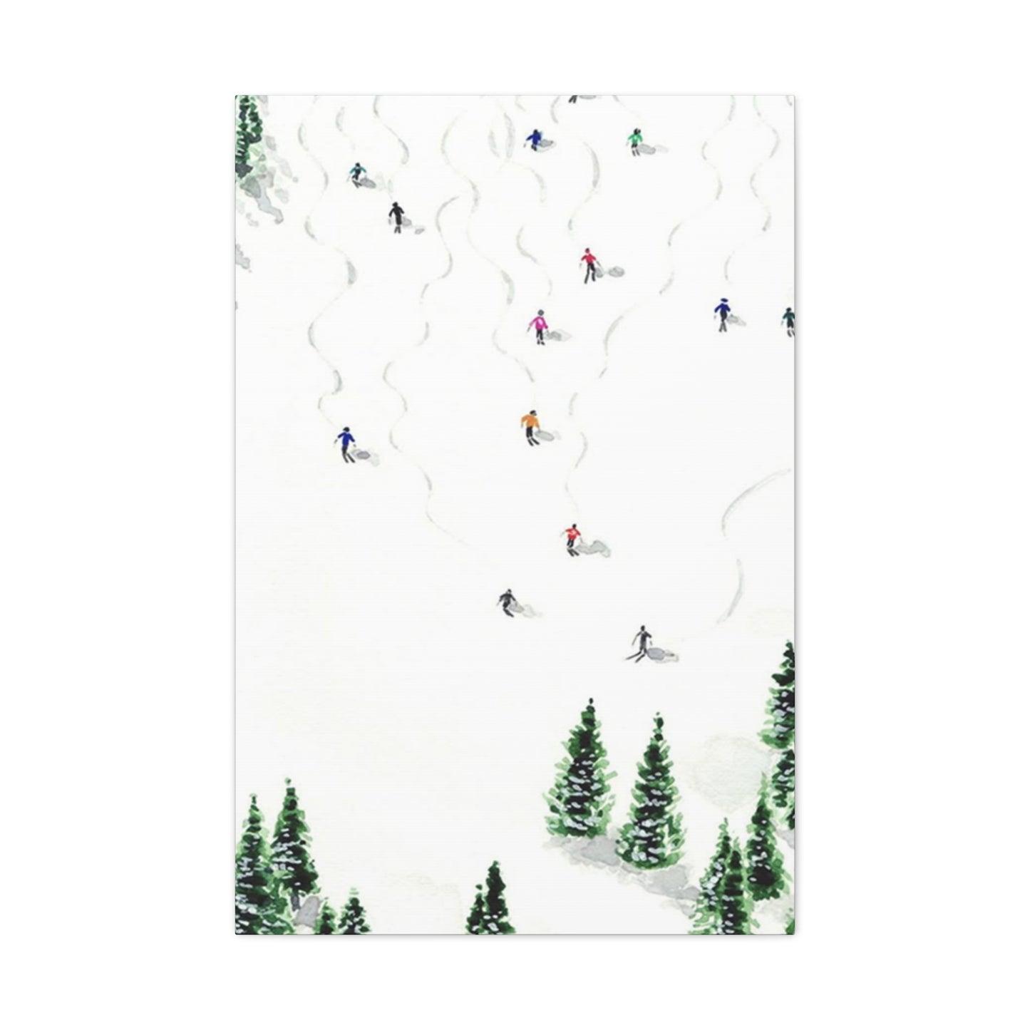
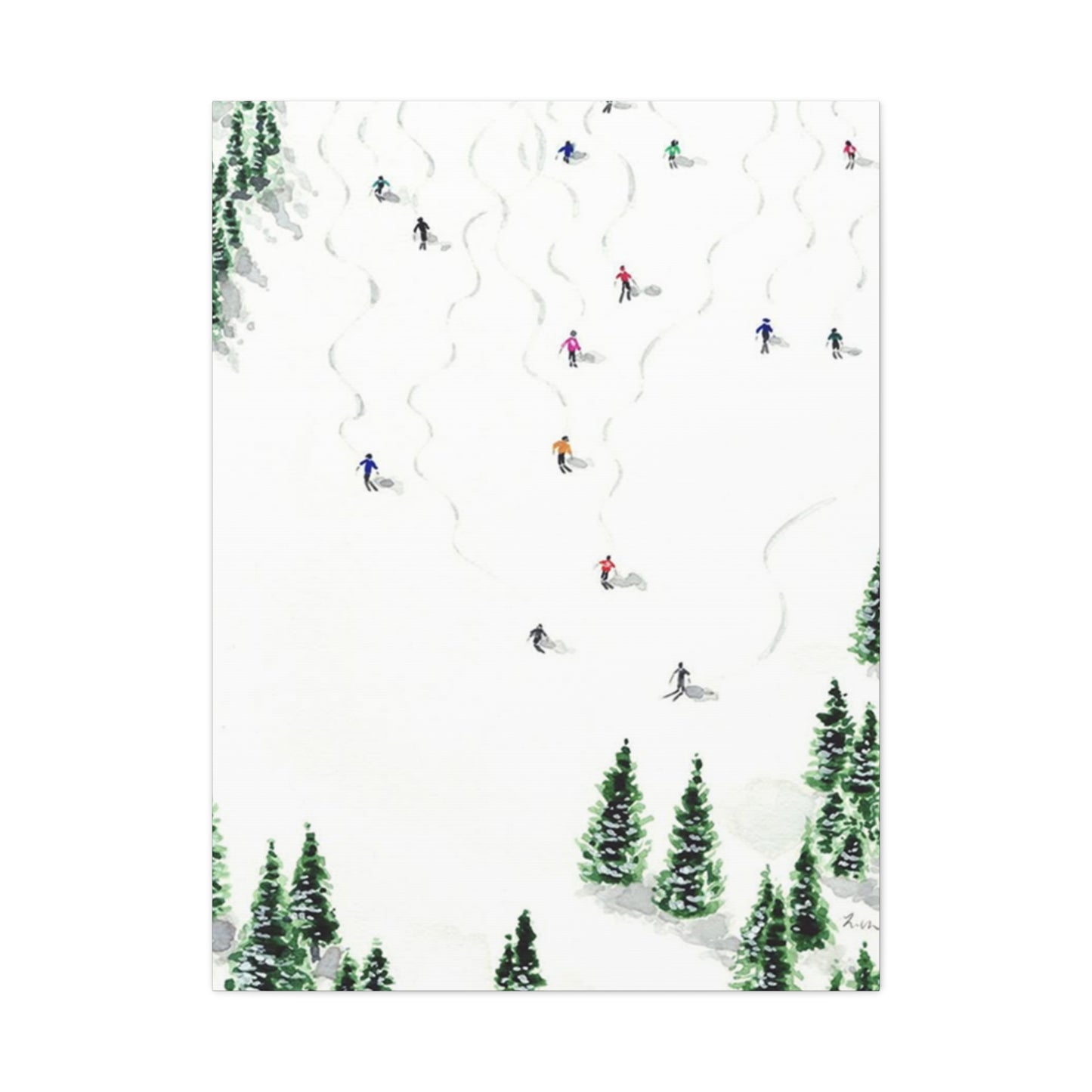
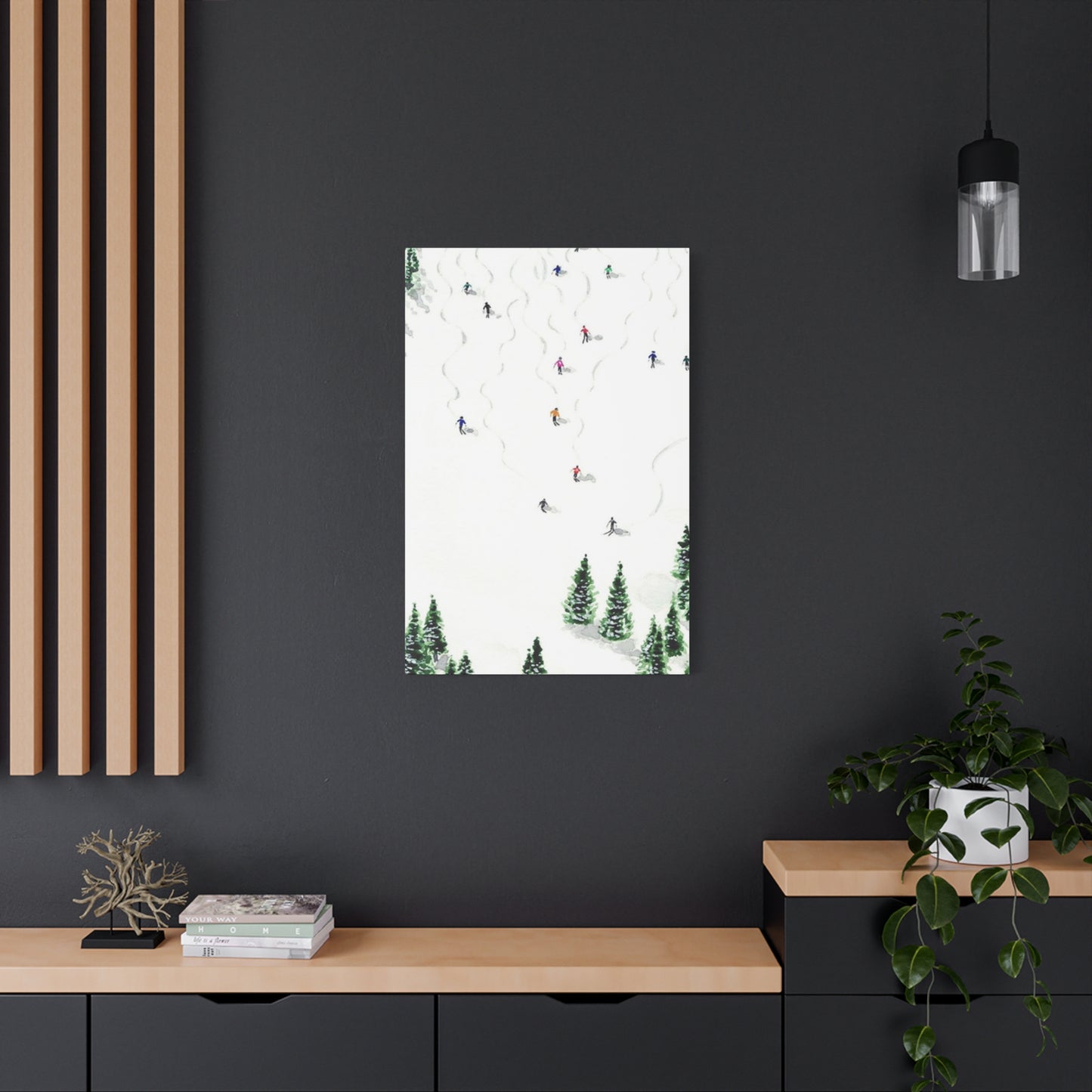
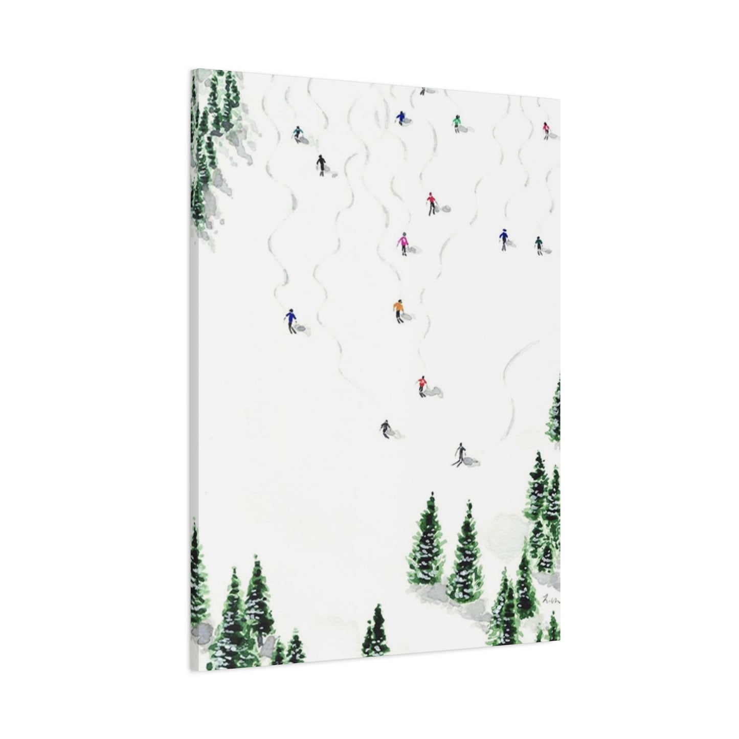
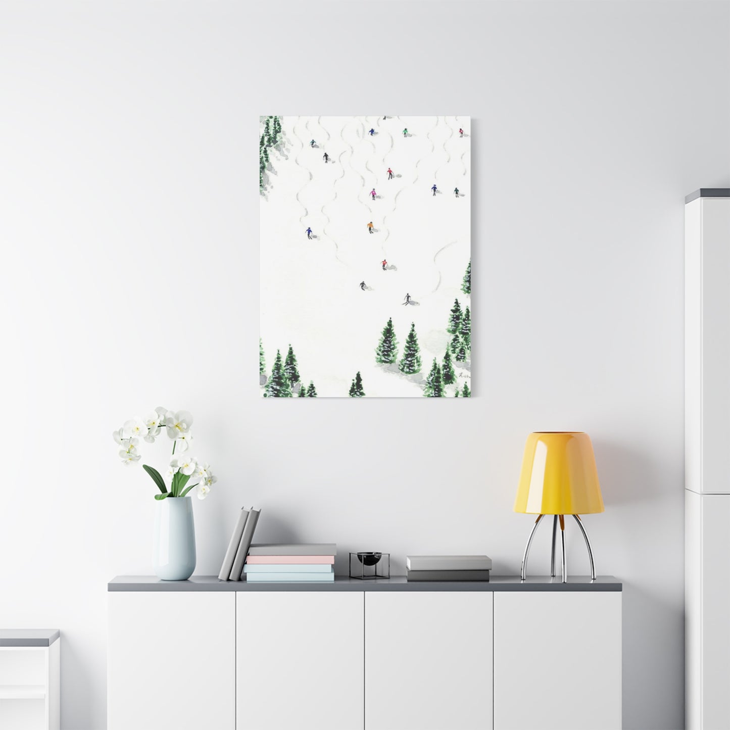
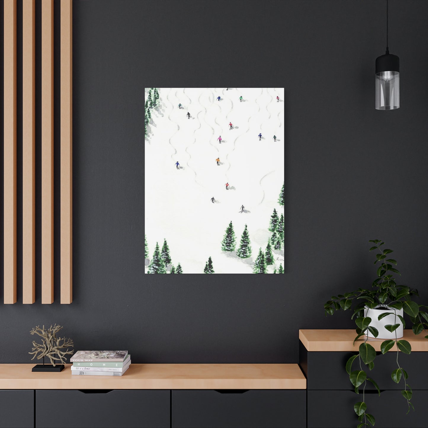
The marriage of skiing action and pine forest scenery creates a dynamic visual narrative that speaks to both adventure seekers and those who find peace in nature's quiet moments. Pine trees, with their year-round greenery and symbolic association with endurance and longevity, provide the perfect backdrop for the kinetic energy of skiing. This contrast between movement and stillness, between human achievement and natural permanence, creates artwork that engages viewers on multiple levels. The composition possibilities are endless, from dramatic action shots of skiers carving through powder with towering pines framing the scene, to serene silhouettes of lone skiers traversing through silent forests at twilight.
Mountain Sports Imagery Featuring Evergreen Landscapes
The visual impact of skiing artwork complemented by pine tree elements extends far beyond simple decoration. These pieces serve as windows into experiences many people cherish, evoking memories of crisp mountain air, the satisfying crunch of snow underfoot, and the profound silence that only a snow-blanketed forest can provide. For those who have experienced the thrill of descending a mountain run while weaving between ancient pines, such artwork becomes a tangible connection to those cherished moments. For others who may never have set foot on a ski slope, these images offer an invitation to imagine and dream about alpine adventures.
The aesthetic value of combining downhill sports with evergreen forest imagery lies in its universal appeal. Pine trees represent resilience, surviving harsh winters while maintaining their vibrant green color when everything else has surrendered to dormancy. This quality makes them powerful symbols in visual art, representing strength, persistence, and the beauty of constancy in changing seasons. When paired with the dynamic movement of skiing, you create a balanced composition that honors both the wild energy of outdoor sports and the grounding presence of nature's steady guardians.
From an artistic perspective, pine trees offer exceptional compositional elements. Their vertical lines create natural frames that draw the eye toward focal points, whether that's a skier in mid-turn or a distant mountain peak. The texture of pine needles and bark provides visual interest and depth, especially in close-up or detailed artwork. The organic shapes of pine branches contrast beautifully with the clean lines of modern skis and equipment, creating visual tension that makes artwork more engaging. Meanwhile, the negative space created by snow gathering on pine branches adds another layer of visual complexity, introducing patterns and shapes that break up what might otherwise be monotonous expanses of white snow.
Creating Peaceful Atmospheres Through Alpine Forest Imagery in Sports Posters
One of the most remarkable qualities of artwork featuring skiing scenes amid pine forests is its ability to instill a sense of calm despite depicting an inherently active pursuit. This paradox works because the composition balances elements of movement with elements of stillness. The skier represents action, progress, and human endeavor, while the surrounding pines symbolize permanence, peace, and the timeless quality of nature. This balance creates artwork that feels both energizing and soothing, making it appropriate for various spaces within your home.
The color psychology inherent in such imagery contributes significantly to its calming effect. The dominant palette typically includes cool blues and whites representing snow and sky, deep greens from the pine trees, and often warm earth tones from exposed bark, wood elements, or the golden glow of sunset or sunrise. Cool colors are known to have a tranquilizing effect on the nervous system, reducing stress and promoting relaxation. The green of pine trees specifically connects us to nature and has been shown in numerous studies to reduce anxiety and improve mood. When you introduce warm accent colors through strategic lighting in the image or through seasonal elements like golden hour sunlight, you add depth and prevent the overall effect from becoming too cold or clinical.
The subject matter itself invites contemplation. Unlike chaotic or busy scenes, skiing through a pine forest typically depicts wide, open spaces with clear sight lines. This openness in composition mirrors the mental openness and clarity many people seek in their living environments. The repetition of pine trees creates rhythm in the artwork without overwhelming the viewer, much like the steady rhythm of breathing during meditation. This rhythmic quality makes such artwork particularly suitable for spaces where you want to encourage relaxation, such as bedrooms, reading nooks, or meditation areas.
Another element that contributes to the serene quality of these images is their connection to seasonal cycles and natural rhythms. Winter, despite being harsh in many ways, offers a particular kind of peace. Snow muffles sound, creating a hushed quality that translates visually through artwork. Pine forests in winter become sanctuaries of quiet, and artwork depicting these scenes carries that quality of stillness into your living space. Even when the image shows active skiing, the surrounding environment frames that action within a larger context of natural tranquility, reminding viewers that moments of exertion exist within a broader landscape of peace.
Merging Athletic Energy with Forest Tranquility in Visual Art
One of the most compelling aspects of artwork that pairs skiing action with pine forest settings is how it bridges seemingly opposite qualities. Athletic pursuits like skiing represent human striving, skill development, risk-taking, and the pursuit of exhilaration. Forest settings represent peace, timelessness, natural order, and contemplation. When combined in a single image, these elements create a holistic vision that acknowledges different aspects of a fulfilling life.
This duality makes such artwork remarkably versatile in addressing different emotional needs. On days when you need motivation and energy, you can focus on the skiing element, the representation of human capability and the joy of physical challenge. On days when you need calm and grounding, you can focus on the pine trees, their steadfast presence and connection to natural cycles. The same piece of artwork serves different functions depending on what you bring to it, making it a dynamic rather than static element of your environment.
From a compositional standpoint, successful artwork in this genre carefully balances these opposing energies. Images where the skier dominates the frame with pine trees reduced to background elements lean more toward the energetic, athletic interpretation. Conversely, images where pine trees fill most of the composition with a skier as a small element emphasize the grandeur of nature and the humility of human presence within it. Balanced compositions that give roughly equal visual weight to both elements create that perfect tension between action and stillness, between human and nature, between the moment and the timeless.
Color choices in the artwork significantly influence how we perceive this balance. Vibrant, saturated colors emphasize energy and excitement. If the skier's clothing features bright reds, oranges, or yellows that contrast sharply with cool blues and greens of the environment, the human element demands attention and the overall feeling is more dynamic. Muted, tonal color palettes where differences between elements are more subtle create a more meditative quality. Black and white or sepia-toned images remove color distractions entirely, focusing attention on form, composition, and the interplay of light and shadow, which typically results in a more contemplative piece.
The technical aspects of the photography or illustration also communicate different qualities. Sharp focus throughout the image, high contrast, and crisp details create visual clarity and energy. Selective focus, where the skier might be sharp but the background pine trees soft, creates a sense of movement and immediacy. Soft focus throughout creates a dreamlike, nostalgic quality that emphasizes memory and emotion over documentary realism. Understanding these technical elements helps you choose artwork that delivers the specific emotional resonance you want in your space.
Winter Classics: Skiing Canvases Featuring Pine Forest Landscapes
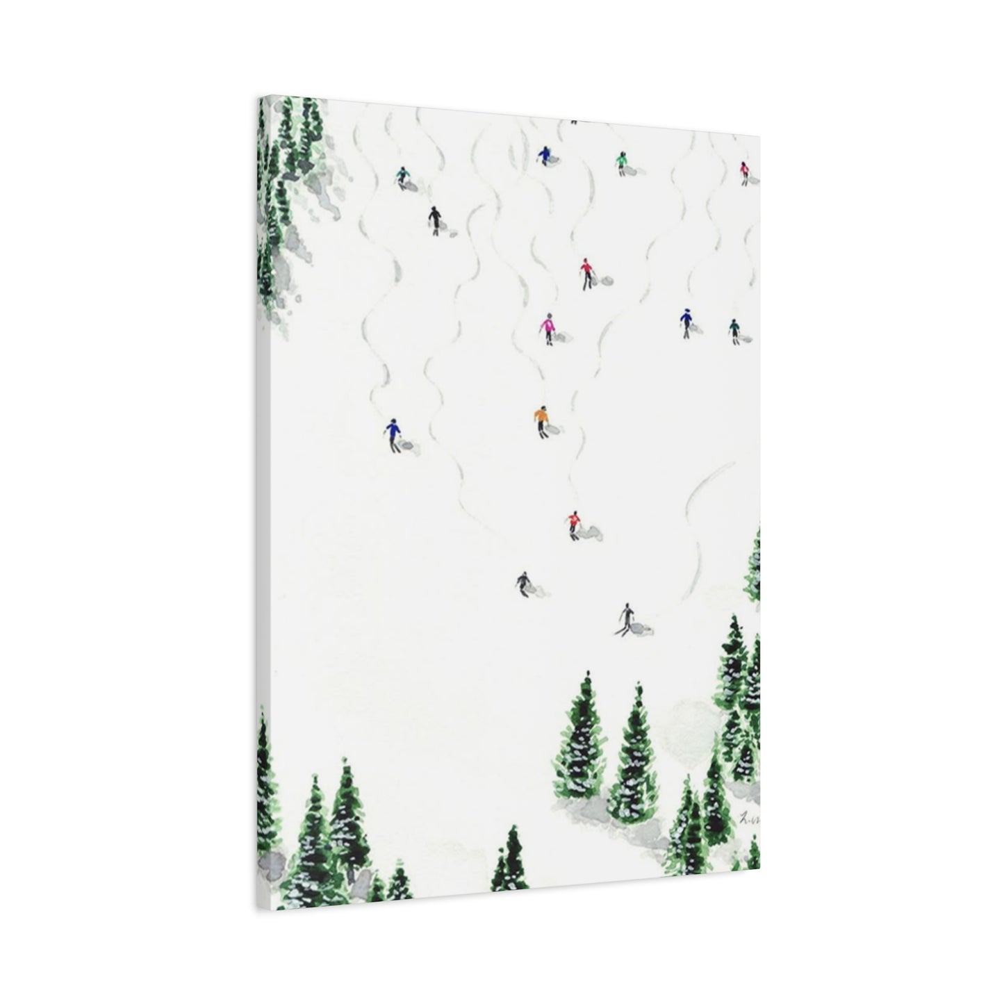
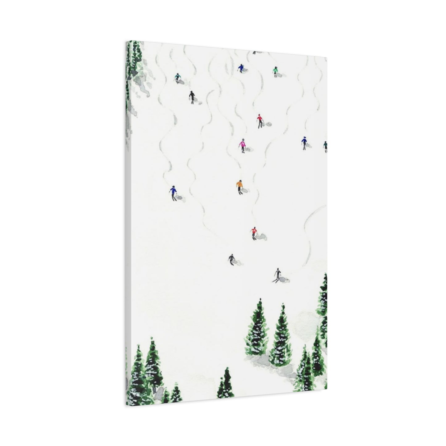
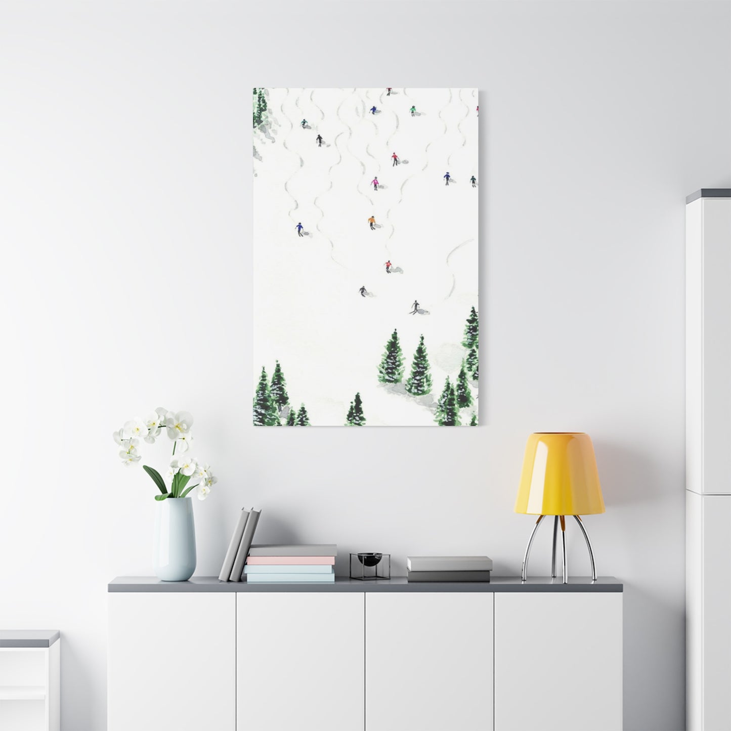
Canvas prints have become increasingly popular for displaying photography and artwork, and the medium is particularly well-suited to skiing and pine tree imagery. The texture of canvas adds depth and visual interest that flat paper prints cannot match, and the format allows for larger-scale displays without the expense and weight of traditional framed prints. Understanding how to select and display canvas artwork effectively ensures you get the maximum impact from your investment.
Gallery-wrapped canvases, where the image extends around the sides of the stretcher frame, offer a modern, clean presentation that eliminates the need for additional framing. This works especially well with skiing and pine tree imagery because it creates an immersive quality, as if the forest extends beyond the visible boundaries of the artwork. When hanging gallery-wrapped canvases, consider grouping multiple panels to create a panoramic effect. A three-panel triptych showing a progression through a pine forest, perhaps following a skier's journey down a slope, creates narrative interest while filling substantial wall space with impact.
The texture of canvas itself contributes to the artwork's character. Fine-weave canvas produces sharper detail and more accurate color reproduction, making it ideal for photography that emphasizes the crisp details of snow, pine needles, and skiing equipment. Medium-weave canvas adds a subtle texture that can enhance certain artistic styles, particularly painted or illustrated interpretations of skiing scenes. Heavy-weave canvas has a pronounced texture that works best with bold, impressionistic artwork where the texture becomes part of the artistic statement rather than a reproduction medium.
Canvas prints can be treated in various ways to achieve different aesthetic effects. Gloss finishes enhance color saturation and create a vibrant, energetic look that works well with action-oriented skiing imagery. Matte finishes reduce glare and create a more subdued, refined appearance appropriate for traditional or formal settings. Satin finishes split the difference, offering some color enhancement without the reflective quality of full gloss. Consider where you'll hang the artwork and how it will be lit when choosing a finish. Spaces with lots of natural light often benefit from matte finishes to avoid glare, while dimmer spaces can handle glossier finishes that help reflect available light.
The longevity of canvas prints makes them a worthwhile investment for artwork you love. Unlike paper prints that may fade or deteriorate over time, properly produced canvas prints on high-quality material with UV-resistant inks can maintain their appearance for decades. This durability is particularly appropriate for skiing and pine tree imagery because it mirrors the enduring quality of the landscapes themselves. Just as those pine forests return year after year, your artwork continues bringing that alpine atmosphere into your home through the years.
Interior Design Strategies for Alpine and Forest-Themed Artwork
Successfully incorporating skiing and pine tree artwork into your interior design requires more than simply hanging a print on an empty wall. Thoughtful consideration of placement, scale, surrounding elements, and overall design context ensures your artwork enhances rather than clutters your space. These strategies apply whether you're working with a single statement piece or creating a curated collection.
Scale is perhaps the most commonly misunderstood aspect of artwork selection. A frequent mistake is choosing pieces that are too small for the space they occupy. For skiing and pine tree artwork to create real impact, it needs sufficient size to draw the eye and create presence. A general guideline suggests artwork should occupy roughly two-thirds to three-quarters of the available wall space above furniture pieces like sofas or beds. A 60-inch wide sofa, for example, can accommodate artwork or a grouping of artwork spanning 40 to 45 inches. Larger pieces create drama and serve as focal points, while smaller pieces work better as parts of collections or in intimate spaces.
Placement height significantly affects how artwork is perceived and how well it integrates with your space. The standard rule of hanging artwork with the center at roughly 57 to 60 inches from the floor works well in most situations, but context matters. In dining rooms where viewers will be seated, slightly lower placement ensures the artwork remains at eye level for diners. In entryways where people are typically standing and moving, standard height works well. In bedrooms where you'll often view the artwork while lying down, consider hanging it slightly lower or positioning it on a wall opposite the bed where it's visible from that perspective.
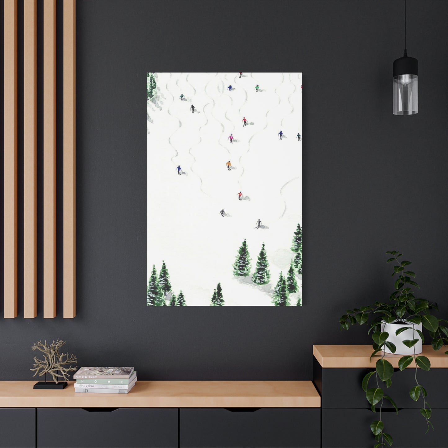
The wall color or treatment behind your skiing and pine tree artwork dramatically affects how the piece is perceived. White or light neutral walls create a gallery-like setting that puts all focus on the artwork itself, which works well if the piece has vibrant colors or striking composition that you want to showcase without competition. Darker walls can create a more intimate, cozy setting appropriate for lodge-style aesthetics, and they can actually make artwork with lighter tones pop dramatically. Feature walls painted in colors pulled from the artwork itself create cohesion but require careful balance to avoid overwhelming the space or making the artwork disappear into the wall.
Lighting transforms artwork from a daytime decorative element into a nighttime focal point. Picture lights mounted above artwork provide focused illumination that highlights details and creates ambiance. Track lighting offers flexibility, allowing you to adjust direction and focus to accommodate different pieces or rearrangements. Natural light is beautiful but requires consideration of UV exposure, which can fade artwork over time. If your skiing and pine tree artwork will hang in a location with significant sun exposure, ensure the print is produced with UV-resistant inks or consider UV-protective glazing if using traditional framing.
Pine Silhouettes Creating Dramatic Impact in Winter Sports Posters
Silhouette compositions offer a particularly striking approach to skiing and pine tree artwork. By reducing elements to their basic forms without interior detail, silhouettes create bold, graphic images with strong visual impact. This artistic choice emphasizes shape, composition, and negative space, resulting in artwork that reads clearly from a distance and makes a strong style statement.
The visual power of silhouettes comes from their simplicity and contrast. A black silhouette of pine trees against a vibrant sunset sky, with a skier's silhouette caught mid-jump, creates drama through stark contrast and minimal elements. This reduction to essentials eliminates distracting details, focusing attention on the story being told through form alone. The viewer's imagination fills in the missing details, making silhouette artwork engaging on a cognitive level beyond what more detailed images might achieve.
Silhouettes work exceptionally well with skiing imagery because skiing positions and movements are distinctive and recognizable even without detail. A skier leaning into a turn, launching off a jump, or carving through powder has characteristic body positions that communicate action and skill even when rendered as pure silhouette. Pine trees similarly have immediately recognizable shapes that translate beautifully to silhouette treatment. The vertical thrust of trunks, the layered branching patterns, and the overall triangular form of many pine species all create strong silhouettes that need no interior detail to be identified and appreciated.
Color choices in silhouette artwork dramatically affect mood and style. Traditional black silhouettes against white or light backgrounds create classic, timeless appeal that works in virtually any interior. Navy or deep charcoal silhouettes offer subtle sophistication, maintaining readability while softening the stark contrast of pure black and white. White silhouettes against dark or colored backgrounds create a reversed effect with its own distinctive appeal. Multi-colored approaches, where pine trees might be deep green silhouettes and the skier a bright red silhouette against a golden sky, maintain the graphic quality while adding visual interest through color relationships.
The minimalist aesthetic of silhouette artwork makes it particularly appropriate for modern and contemporary interiors. The clean lines and uncluttered composition align perfectly with minimalist design principles that emphasize quality over quantity, essential forms over decorative excess, and thoughtful curation over abundant display. A large silhouette print of skiing through pine trees can serve as the single art piece in a minimalist room, providing visual interest and connection to nature without compromising the uncluttered aesthetic that defines the space.
Palette Selection for Mountain and Forest Artwork
Understanding color theory helps you select skiing and pine tree artwork that harmonizes with your existing decor while creating the specific atmosphere you desire. Color combinations in artwork can energize, soothe, inspire, or ground a space, and different palettes communicate different messages and feelings. By considering the psychological and aesthetic effects of various color schemes, you make more informed choices that serve both your design goals and emotional needs.
Cool color palettes dominated by blues, blue-greens, and cool grays create the impression of space, distance, and tranquility. These colors recede visually, making rooms feel larger and more open. Artwork featuring skiing through pine forests often naturally incorporates these cool tones through snow, shadow, and evergreen foliage. Cool-toned skiing artwork works exceptionally well in rooms where you want to promote relaxation and calm, such as bedrooms, bathrooms, or meditation spaces. The colors evoke the crisp freshness of mountain air and the cool serenity of winter landscapes.
Warm color palettes featuring golds, oranges, warm browns, and red tones create feelings of intimacy, energy, and welcome. Skiing and pine tree artwork can incorporate these warmer tones through sunrise or sunset lighting, autumn-touched foliage still visible above snowline, or the warm wood tones of chalets and lodges visible in the scene. Warm-toned artwork energizes spaces like living rooms, dining rooms, and kitchens where you want to encourage social interaction and activity. These colors make spaces feel more intimate and cozy, counteracting the potential coldness of winter imagery.
Balanced palettes that incorporate both warm and cool tones offer versatility and visual interest. A skiing scene might feature cool blue shadows and white snow contrasted with warm golden sunlight filtering through pine branches, or a skier in warm-colored gear against a cool blue-white landscape. These balanced palettes work in a wider variety of spaces because they don't push the atmosphere strongly in either a calming or energizing direction, instead maintaining a comfortable middle ground that most people find pleasant.
Complementary color schemes using colors opposite each other on the color wheel create vibrant, energetic compositions. Orange skis or clothing against blue snow and sky, or red gear against the green of pine trees, produces high visual impact through color contrast. Complementary schemes work well in spaces where you want artwork to serve as a bold focal point, commanding attention and adding dramatic flair to the decor. However, complementary schemes can feel overwhelming if overused, so balance is important.
Analogous color schemes using colors adjacent on the color wheel create harmonious, cohesive compositions. Blues, blue-greens, and greens together create a naturally harmonious palette that appears frequently in mountain and forest scenes. These color schemes feel more subtle and sophisticated than complementary schemes, creating artwork that integrates smoothly with surrounding decor rather than demanding constant attention. Analogous schemes work well in spaces where you want artwork to contribute to overall atmosphere without dominating the visual field.
Monochromatic schemes using variations of a single color create sophisticated, unified compositions. Black and white photography of skiing through pine forests represents the most common monochromatic approach, but sepia tones, blue-tones, or green-tones offer interesting alternatives. Monochromatic artwork reads as cohesive and intentional, making it a strong choice for minimalist or highly curated interiors where color is used sparingly and deliberately.
Rustic Interior Design Enhanced by Framed Alpine Sports and Tree Imagery
Framing choices dramatically affect how skiing and pine tree artwork is perceived and how well it integrates with surrounding decor. The frame serves as a transition between the artwork and your wall, and selecting appropriate framing is particularly important for rustic and cabin-inspired interiors where authenticity and connection to natural materials matter.
Wood frames offer the most obvious choice for rustic settings, but wood comes in countless varieties with different characteristics. Reclaimed barn wood frames bring authentic history and character, with weathering, nail holes, and variations in color adding texture and interest that new materials cannot match. These substantial frames work beautifully with skiing and pine tree artwork because they echo the trees in the images, creating thematic continuity between content and presentation. The rough, unfinished quality of reclaimed wood frames feels honest and unpretentious, matching the straightforward appeal of mountain landscapes.
Pine frames specifically create a direct connection to the subject matter when framing pine tree imagery. The warm, honey tones of pine wood complement the colors typically found in skiing scenes, and the natural wood grain adds organic texture that enhances rather than competes with the artwork. Pine frames can be finished in various ways, from clear varnish that showcases natural color and grain, to dark stains that create richer, more dramatic presentation, to distressed finishes that add vintage character appropriate for retro-style skiing posters.
Log-style frames, created from actual branches or logs cut longitudinally and arranged around the artwork, make bold statements appropriate for cabins and lodges. These frames are unapologetically rustic, celebrating natural forms rather than imposing geometric precision. Log-style frames work best with larger artwork where the substantial frame doesn't overwhelm the piece, and they're particularly effective with photography that emphasizes the wildness and natural beauty of skiing locations.
Painted wood frames in colors pulled from your artwork or decor offer a more refined rustic aesthetic. A frame painted in the deep green of pine trees, the soft white of snow, or a warm red that echoes a skier's jacket creates color continuity between artwork and presentation. Painted frames can be smooth and polished for a cleaner look, or distressed through sanding and antiquing techniques for a vintage feel that suggests the piece has been treasured for years.
Metal frames should not be dismissed for rustic settings. While metal seems incompatible with organic, natural aesthetics, the right metal frames can work beautifully. Wrought iron frames with hand-forged textures and organic, slightly irregular forms complement rustic decor while adding an artisanal quality. Copper and bronze frames develop rich patinas over time that add warmth and character. Even simple black metal frames can work in rustic settings when the artwork itself is strong enough to bridge the style gap between the frame's modern simplicity and the room's rustic elements.
Bringing Outdoor Mountain Environments Inside Through Strategic Art Selection
The practice of bringing the outdoors inside through artwork and design choices addresses a fundamental human need for connection with nature. Even people who don't consider themselves particularly outdoorsy respond positively to natural elements in their living spaces. Skiing and pine tree artwork serves this biophilic design principle exceptionally well, offering a window to mountain environments that many people visit only occasionally or perhaps never at all.
The concept of prospect and refuge from evolutionary psychology helps explain why mountain and forest imagery appeals so broadly. Prospect refers to the ability to see clearly across open spaces, identifying opportunities and threats from a distance. Refuge refers to shelter and protection from elements and dangers. Skiing through pine forests offers both qualities: the open space of ski runs provides prospect, while the surrounding forest provides refuge. Artwork capturing this balance unconsciously satisfies deep-seated preferences that helped our ancestors survive, even though we now live in comparatively safe modern environments.
Seasonal representation in artwork helps maintain connection with natural cycles that urban living often obscures. Most people spend the majority of their time indoors, experiencing seasons primarily through weather reports and temperature changes rather than direct observation of nature's transitions. Winter skiing and pine tree artwork keeps winter's beauty present in your awareness, celebrating rather than merely enduring the cold season. This seasonal awareness contributes to well-being by maintaining connection with the cyclical nature of time and change, rather than the linear, schedule-driven experience of time that dominates modern life.
The scale of natural elements in skiing and pine tree artwork creates a valuable sense of perspective. Mountain landscapes remind us of our place within much larger systems and much longer timescales than our daily concerns typically acknowledge. Pine trees visible in skiing artwork might be centuries old, silent witnesses to countless winters and generations of human activity. Mountains took millions of years to form and will stand long after we're gone. This perspective doesn't diminish human life but rather places it in context, which many people find comforting and grounding.
Bringing outdoor environments inside through artwork also serves as a daily reminder of experiences, values, and priorities that might otherwise get lost in the busy-ness of everyday life. If skiing represents freedom, challenge, and joy in your life, artwork that depicts it keeps those associations present. If time in nature provides restoration and clarity, having natural scenes visible in your home extends those benefits beyond the actual time spent outdoors. The artwork becomes a touchstone, a visual reminder to maintain balance between work and recreation, between indoor and outdoor life, between achievement and restoration.
Minimalist Approaches to Winter Sports and Forest Wall Art
Minimalism in art and design emphasizes simplicity, essential forms, and thoughtful curation over abundant display. Minimalist skiing and pine tree artwork strips away unnecessary detail to focus on fundamental elements: the line of a ski track through snow, the vertical thrust of pine trunks, the silhouette of a skier against white space. This approach creates artwork with strong visual impact despite, or perhaps because of, its restraint.
Line drawings offer one effective minimalist approach. A few well-placed lines can suggest an entire pine forest, with individual trees indicated rather than fully rendered. A skier's form can be captured with a handful of curved lines that communicate movement and posture without detailed representation of equipment or clothing. The extensive negative space in minimalist line art creates breathing room that many people find refreshing after the visual complexity of daily life. These drawings work particularly well in modern and Scandinavian-inspired interiors where simplicity and function govern design choices.
Limited color palettes reinforce minimalist principles. Two-color prints, perhaps using only white and a single accent color like deep blue or forest green, create cohesive, unified artwork that makes a clear statement without visual clutter. Black and white photography naturally aligns with minimalist aesthetics, removing the distraction of color to focus attention on composition, form, and the interplay of light and shadow. When skiing through pine forests is rendered in high-contrast black and white, the essential drama of the scene becomes more apparent.
Negative space plays a crucial role in minimalist skiing and pine tree artwork. Rather than filling every inch of the composition with detail, minimalist approaches leave large areas undefined, using empty space as an active element in the design. A single pine tree silhouetted against vast white space suggests an entire forest without rendering every tree. A small skier figure in the corner of a large canvas, with the rest given over to white or subtle color fields, emphasizes the scale of the mountain environment and the individual's place within it.
Typography and graphic design elements sometimes appear in minimalist skiing posters, with simple text elements like coordinates of famous ski locations, elevation data, or single words like "powder" or "alpine" integrated into the composition. These text elements transform the artwork into a hybrid between poster and fine art, referencing vintage ski posters while maintaining contemporary minimalist aesthetics. The key is restraint: a single word or number carefully placed adds interest without cluttering the composition or detracting from visual elements.
The unframed canvas or simple mounting approach works beautifully with minimalist skiing and pine tree artwork. Without elaborate frames demanding attention, the artwork itself takes focus. Gallery-wrapped canvases with the image extending onto the sides eliminate the need for framing entirely. Simple floating frames that create a subtle shadow gap between artwork and frame add dimension without decorative distraction. Minimalist framing respects the artwork's aesthetic rather than imposing additional style elements.
Scenic Mountain Prints Surrounded by Evergreens for Nature Enthusiasts
Nature enthusiasts who collect outdoor imagery typically appreciate artwork that captures authentic moments and realistic representations of the environments they love. For this audience, skiing and pine tree artwork should prioritize accurate depiction of landscapes, authentic lighting conditions, and honest representation of the skiing experience rather than idealized or heavily manipulated imagery.
Photographic realism appeals to viewers who want to feel transported to actual locations. Detailed photography that captures the texture of bark, individual pine needles, the specific quality of light at different times of day, and the actual conditions of snow and weather creates an immersive experience. For nature enthusiasts, these details matter because they communicate respect for and understanding of the environment. A photograph that shows realistic tree spacing and forest ecology reads as more authentic than one where trees are arranged for purely compositional convenience.
Species accuracy matters to many nature enthusiasts. Pine is actually a general term covering many species with different characteristics, from the tall, straight-trunked Ponderosa Pines of western North American mountains to the distinctive Whitebark Pines found at high elevations to the Jack Pines of northern regions. Each species has characteristic form, bark texture, and growth patterns. Artwork that accurately depicts the specific pine species native to a particular ski region adds authenticity that knowledgeable viewers will recognize and appreciate. Similarly, artwork should respect the actual conditions of the location, showing appropriate snow depth, weather patterns, and seasonal characteristics for the region depicted.
Wildlife elements can enhance skiing and pine tree artwork for nature enthusiasts. While the primary focus remains on skiing and forest, the inclusion of wildlife tracks in snow, a bird perched in pine branches, or distant glimpses of mountain wildlife adds ecological context that resonates with viewers who understand mountain ecosystems as living communities rather than just scenic backdrops. These details need not dominate the composition, but their presence acknowledges the broader natural world that skiing takes place within.
Seasonal variations in pine tree appearance offer interesting possibilities for artwork collections. While evergreens maintain their needles year-round, they do change appearance with seasons. Fresh spring growth appears as lighter green tips on branches. Summer shows mature, deep green foliage. Autumn might reveal pine cones at different stages of development. Winter brings snow accumulation that weighs down branches and creates distinctive patterns. A collection of skiing images showing the same forest location across different winter conditions, from fresh powder to spring skiing, tells a richer story than a single image could achieve.
Canvas Artwork Depicting Winter Adventures Within Pine Forest Settings
The narrative potential of skiing through pine forests offers rich territory for artwork that tells stories rather than simply depicting scenes. Successful narrative artwork in this genre creates a sense of progression, suggests backstory, or invites viewers to imagine what happens beyond the frame. This storytelling dimension transforms decorative artwork into engaging visual literature that rewards extended viewing and contemplation.
Sequenced imagery creates explicit narrative through multiple related panels showing progression through time or space. A triptych might show a skier preparing at the top of a run surrounded by pine trees, executing a turn mid-slope with trees blurring past, and finally at rest in a clearing, steam rising from exertion in cold air. This sequential approach borrows from comic art and storyboarding, creating clear temporal progression that viewers naturally read from left to right. The narrative doesn't need to be dramatic; even simple progressions like different views moving deeper into a pine forest create a journey for the eye to follow.
Implied narrative within single images requires more subtle compositional strategies. Leading lines, such as ski tracks through snow, guide the viewer's eye and suggest movement through space and time. The position and posture of skier figures communicate whether they're beginning their run with fresh energy or nearing exhaustion at the end. Environmental details like footprints in snow, ski lift towers visible in the background, or a distant lodge peeking through trees suggest the broader context of the scene, inviting viewers to imagine the fuller story of which this image captures one moment.
Emotional narrative focuses less on physical journey and more on interior experience. A lone skier pausing in a silent pine forest might suggest contemplation, connection with nature, or the peace found in solitary outdoor activity. Multiple skiers visible at different distances could suggest camaraderie and shared experience. A child's small figure learning to ski near protective pine trees communicates vulnerability, growth, and the transmission of outdoor traditions across generations. These emotional narratives operate through suggestion and association rather than explicit depiction, allowing each viewer to project their own experiences and feelings into the scene.
Environmental narrative addresses the relationship between human activity and natural landscape. Artwork showing pristine pine forests with minimal human impact celebrates wilderness and suggests environmental preservation. Imagery showing ski infrastructure, tree clearing for runs, and developed mountain facilities might prompt reflection on how humans modify landscapes for recreation. The storytelling here operates at a conceptual level, raising questions about use and conservation, development and preservation, human enjoyment and environmental impact. This level of narrative makes artwork a starting point for deeper conversations about values and priorities.
Seasonal and temporal narrative can span longer timescales than single days or outings. A pine tree in winter skiing artwork is also a tree that has weathered countless storms, grown for decades or centuries, and will continue standing after the skier has passed. This temporal perspective, when consciously considered, adds gravitas to what might otherwise be simply attractive imagery. The juxtaposition of momentary human action against the slow time of tree growth and mountain formation provides philosophical depth that elevates artwork beyond decoration into meditation on impermanence, continuity, and our place in nature's much longer story.
Improving Lodge and Cabin Aesthetics with Mountain and Pine Tree Prints
Lodge and cabin interiors present unique design challenges and opportunities. These spaces typically feature natural materials like wood and stone, rustic furnishings, and architectural elements like exposed beams and large fireplaces. Skiing and pine tree artwork should complement and enhance these existing features rather than competing with them for attention. The goal is creating cohesive environments where every element reinforces the mountain lodge aesthetic.
Material harmony between artwork and interior elements creates visual unity. If your lodge interior features prominent pine paneling or furniture, artwork depicting pine trees establishes thematic continuity that feels intentional rather than coincidental. The visual rhythm of vertical tree trunks in artwork echoes the vertical lines of wood paneling, creating subtle repetition that unifies the space. Similarly, if your interior includes stone fireplaces or accent walls, choosing skiing and pine tree artwork with prominent rock formations or mountain peaks visible creates another connection between the artwork and architectural features.
Scale and proportion take on particular importance in lodge interiors, which often feature high ceilings, large rooms, and oversized architectural elements. Artwork must be sized appropriately to hold its own in these dramatic spaces. A small print that would work beautifully in a standard residential room gets lost in a great room with vaulted ceilings and expansive walls. Lodge settings often call for large-scale artwork, whether individual oversized pieces or substantial gallery walls that create visual weight proportional to the surrounding architecture.
Placement strategy in lodge interiors should consider viewing angles and focal points. Many lodges feature open floor plans where spaces flow into each other without clear walls defining separate rooms. Artwork should be positioned where it can be appreciated from multiple vantage points. Above a fireplace mantel creates an obvious focal point visible from anywhere in the main living area. On the wall opposite the primary seating area ensures the artwork is in the natural sight line for people using the space. At the landing of staircases places artwork where it will be noticed by everyone moving between levels.
Creating Gallery Walls with Winter Sports and Evergreen Themes
Gallery walls allow you to display multiple pieces of artwork in curated arrangements that create greater impact than the sum of individual pieces. Successfully executed gallery walls featuring skiing and pine tree themes can become defining elements of your interior design, transforming entire walls into engaging displays that showcase your appreciation for mountain sports and natural beauty. The key lies in planning, cohesion, and proper execution.
Thematic unity provides the foundation for successful gallery walls. When all pieces share the common thread of skiing and pine trees, you've established basic cohesion. Beyond this, consider additional unifying elements: Are all pieces the same medium, such as photography or vintage posters? Do they share a color palette, such as blue tones or sepia? Are they all from the same geographic region or ski area? Do they represent a particular era or style? The more unifying elements you incorporate, the more cohesive the overall display becomes. However, some variety within the unified theme prevents monotony and maintains visual interest.
Layout planning should happen before you put any holes in your walls. Create a scaled plan of your wall and paper templates matching your artwork dimensions. Arrange these templates on the floor, experimenting with different configurations until you find one that feels balanced and engaging. Common approaches include symmetrical grids that create formal, organized displays; salon-style arrangements with varied spacing and alignment that feel more organic; linear arrangements in single rows that work well in hallways or above furniture; and nucleus arrangements where one large central piece is surrounded by smaller complementary pieces.
Visual weight distribution ensures your gallery wall feels balanced even if asymmetrical. Larger, darker, or more vibrant pieces carry more visual weight than smaller, lighter, or more muted pieces. Distribute visual weight evenly across your arrangement so one area doesn't feel heavy while another feels empty. This doesn't mean everything must be equally weighted, but the overall arrangement should feel stable. If you have one particularly large or bold skiing piece, balance it with multiple smaller pieces on the opposite side rather than trying to match it with an equally large piece.
Spacing consistency contributes to professional-looking results. Maintain equal spacing between all pieces in your gallery wall, typically ranging from two to four inches depending on the overall scale and style. Consistent spacing creates rhythm and unity, making the collection read as a deliberate installation rather than random arrangement. Mark your spacing carefully during installation, using a level and measuring tape to ensure precision. The effort invested in accurate spacing pays dividends in the polished final appearance.
Frame consistency versus variety presents an important decision point. Matching frames in the same finish create unity and formality, allowing the varied content within the frames to take center stage. Mixed frames in different finishes and styles create more eclectic, collected-over-time aesthetics appropriate for casual spaces. A middle ground uses frames in the same general style but varied finishes, perhaps all natural wood frames in different wood tones, or all metal frames in different metallic finishes. Consider your overall interior style when making this choice; formal spaces typically benefit from matching frames while casual spaces can handle more variety.
Conclusion
Skiing and pine tree wall art is a beautiful way to infuse your living space with the serene elegance and invigorating spirit of the mountains. This style of art encapsulates not only the breathtaking beauty of alpine landscapes but also the dynamic energy and passion of skiing, seamlessly combining nature’s tranquility with the thrill of outdoor adventure. Whether you are an avid skier, a mountain lover, or someone who simply appreciates the calming presence of nature, incorporating skiing and pine tree-themed wall art into your décor can transform your home into a peaceful alpine retreat.
One of the most appealing aspects of skiing and pine tree wall art is its ability to create a harmonious balance between action and stillness. The imagery of skiers gliding down snowy slopes alongside towering pine trees evokes a sense of motion and excitement, while the evergreen forests symbolize endurance, peace, and natural beauty. This duality makes such artwork ideal for a variety of interior styles—from rustic cabins and cozy lodges to modern apartments seeking a touch of nature’s calm.
The color palette typically associated with skiing and pine tree wall art—soft whites, deep greens, cool blues, and occasional warm accents—offers a refreshing yet soothing visual experience. These hues work well to create a calming atmosphere that promotes relaxation, making them perfect for spaces intended for rest or reflection, such as living rooms, bedrooms, or reading nooks. The natural tones also blend effortlessly with materials like wood, stone, and leather, enhancing the overall alpine aesthetic.
Beyond aesthetics, skiing and pine tree wall art carries emotional and symbolic significance. For many, the mountains represent a place of escape, challenge, and personal growth. Skiing scenes often reflect determination, balance, and the joy of movement, while pine trees stand as symbols of resilience and renewal throughout the seasons. Together, these elements convey a narrative of harmony between human endeavor and nature’s enduring strength, inspiring viewers to find peace and motivation in their own lives.
When choosing skiing and pine tree wall art, expert insights suggest considering the mood you wish to evoke. Vintage ski posters and classic landscape paintings may offer nostalgic charm and historical resonance, while contemporary digital prints or abstract interpretations bring a modern edge and dynamic energy to the space. Selecting artwork that aligns with your personal story or connection to the mountains can deepen the emotional impact and create a truly personalized environment.
In terms of decoration strategies, placement and lighting play crucial roles in maximizing the effect of skiing and pine tree wall art. Large-scale pieces or panoramic murals can become breathtaking focal points in spacious rooms, immersing viewers in the alpine scene. Smaller prints or grouped collections add interest and cohesion in more intimate spaces. Accent lighting, such as spotlights or warm-toned lamps, can highlight textures and colors, enhancing the artwork’s depth and inviting closer appreciation.
Incorporating complementary décor elements further elevates the alpine vibe. Textiles with natural fibers, cozy throws, rustic wooden furniture, and nature-inspired accessories like pine cones or ski equipment create a cohesive theme that resonates with the wall art. The goal is to craft a space that not only looks beautiful but also feels inviting and authentic—an environment where the spirit of the mountains is felt in every detail.
Ultimately, skiing and pine tree wall art offers more than just visual appeal; it embodies a lifestyle and mindset centered around adventure, resilience, and a deep connection to nature. By thoughtfully selecting and displaying these artworks, you bring the majesty and tranquility of mountain life into your everyday surroundings. This transformation enriches your home, making it a sanctuary that inspires both relaxation and exhilaration.
