


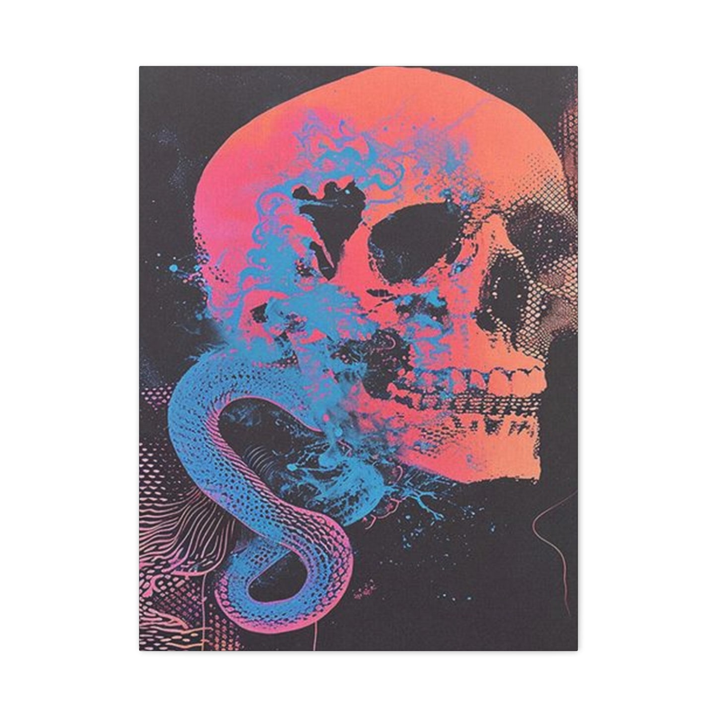
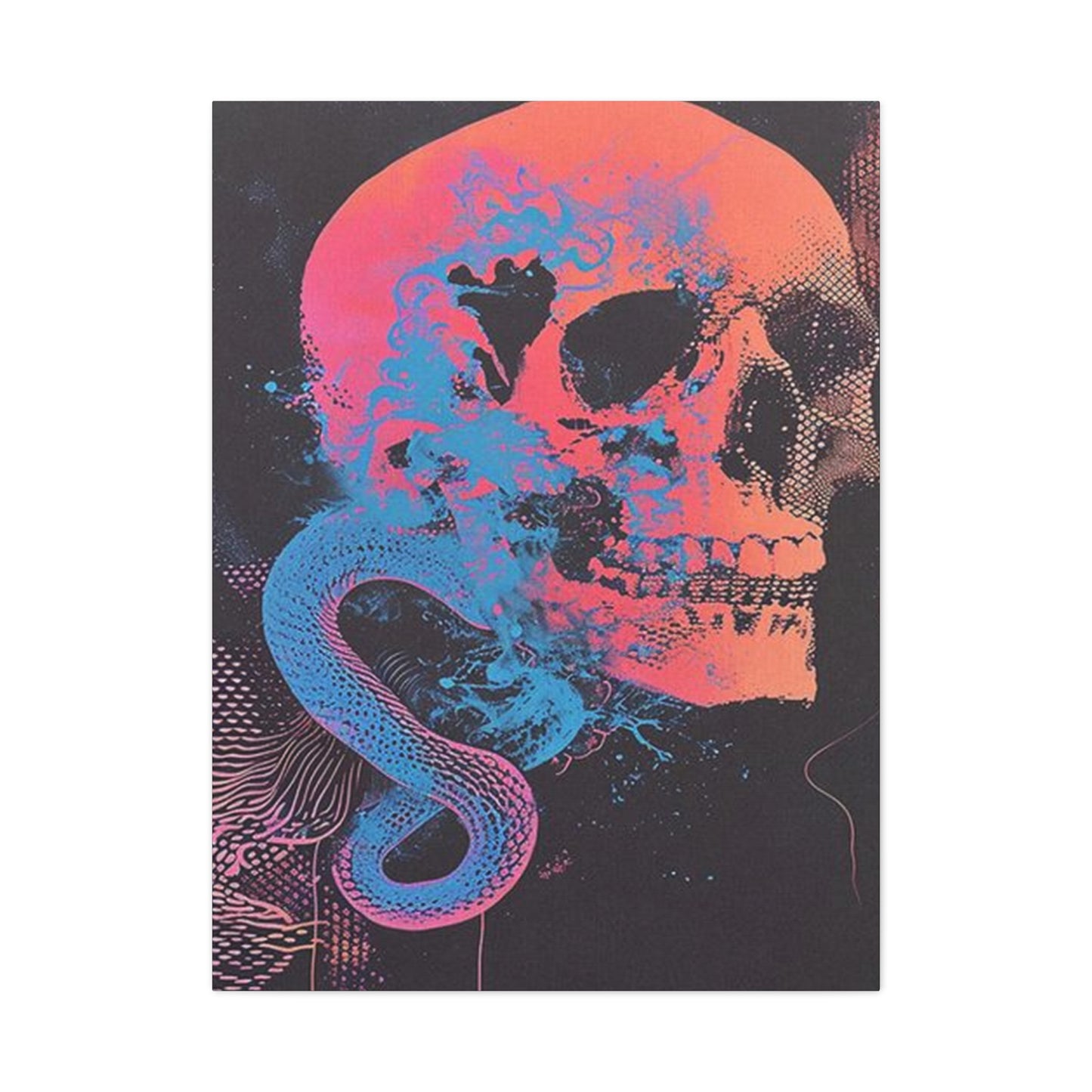
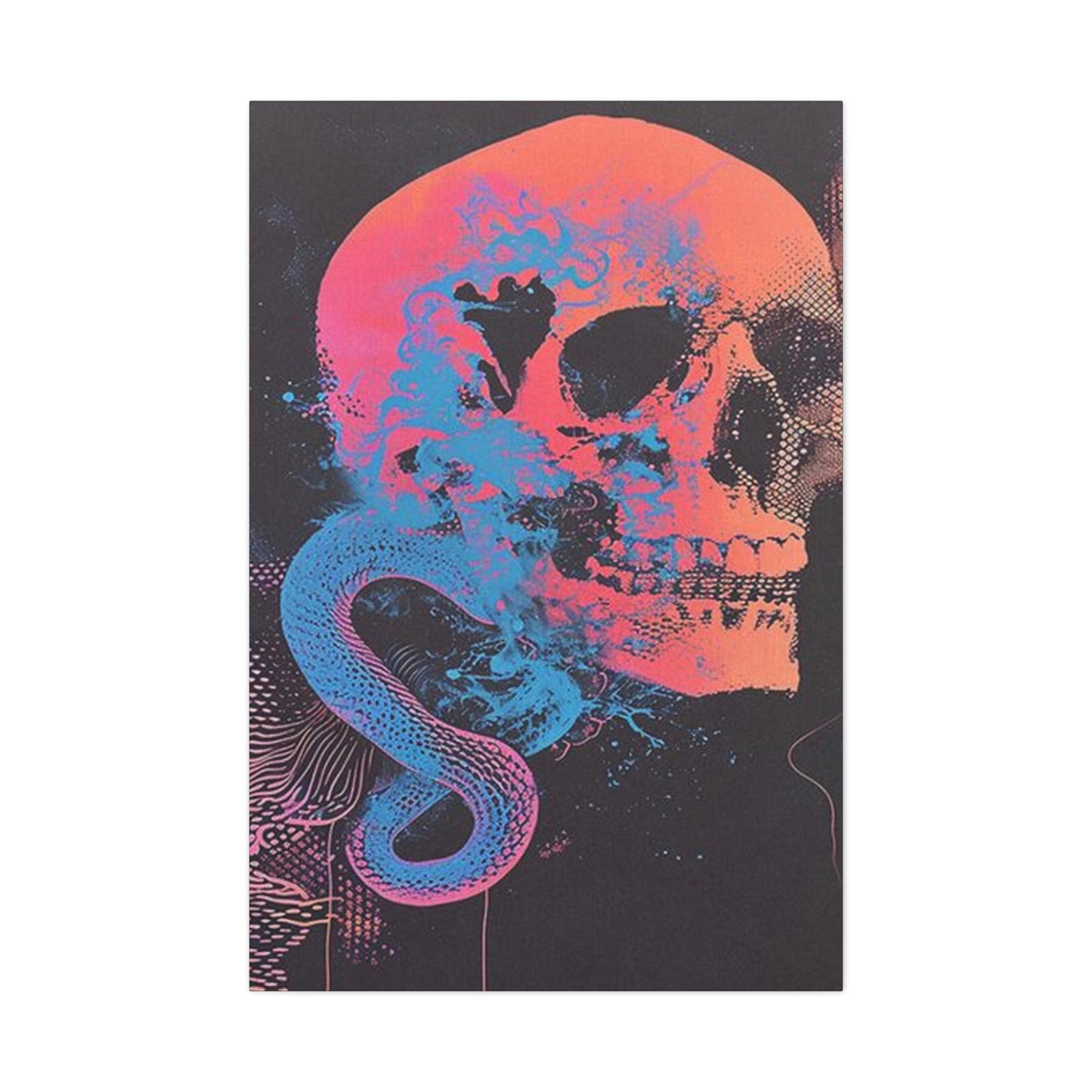
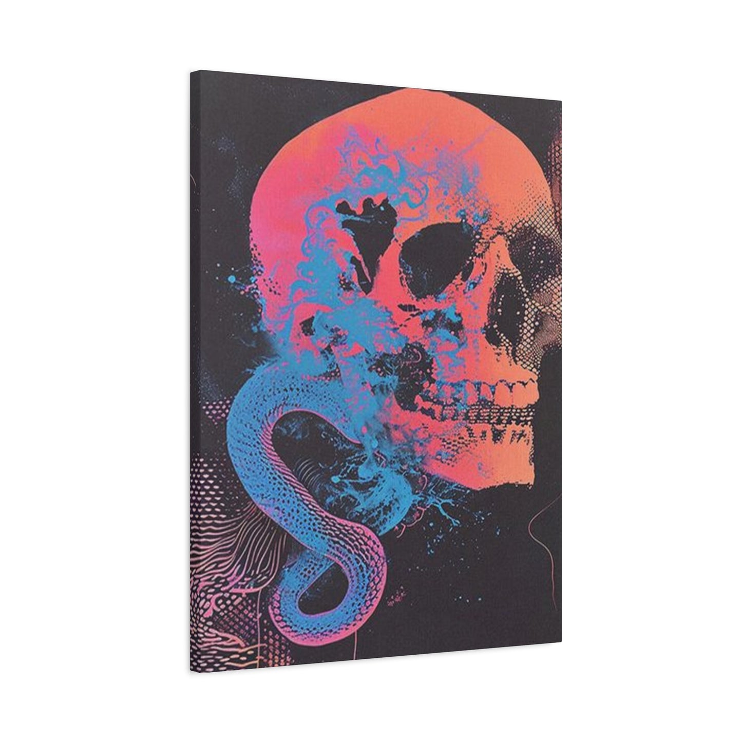
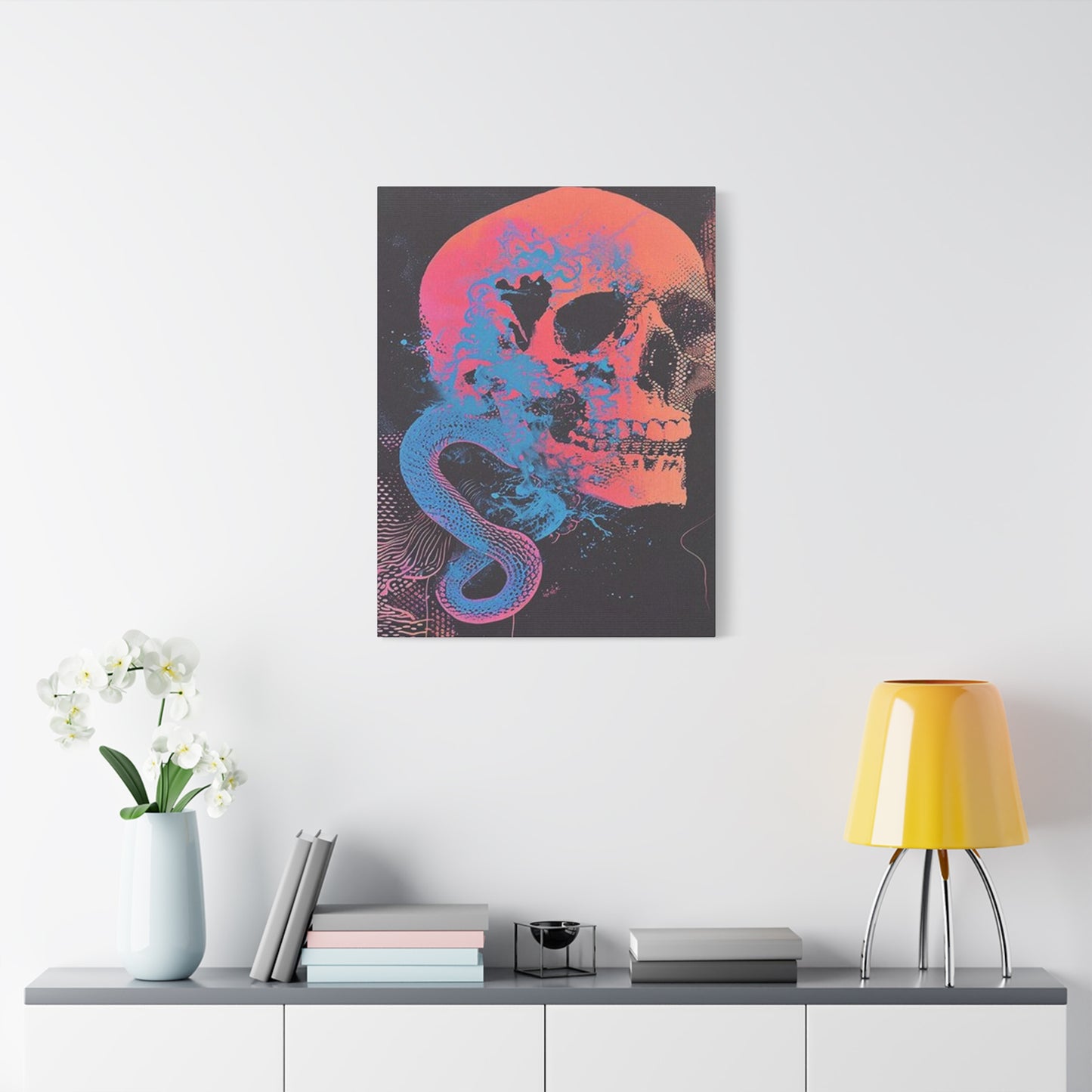
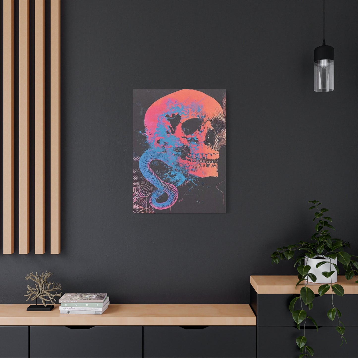
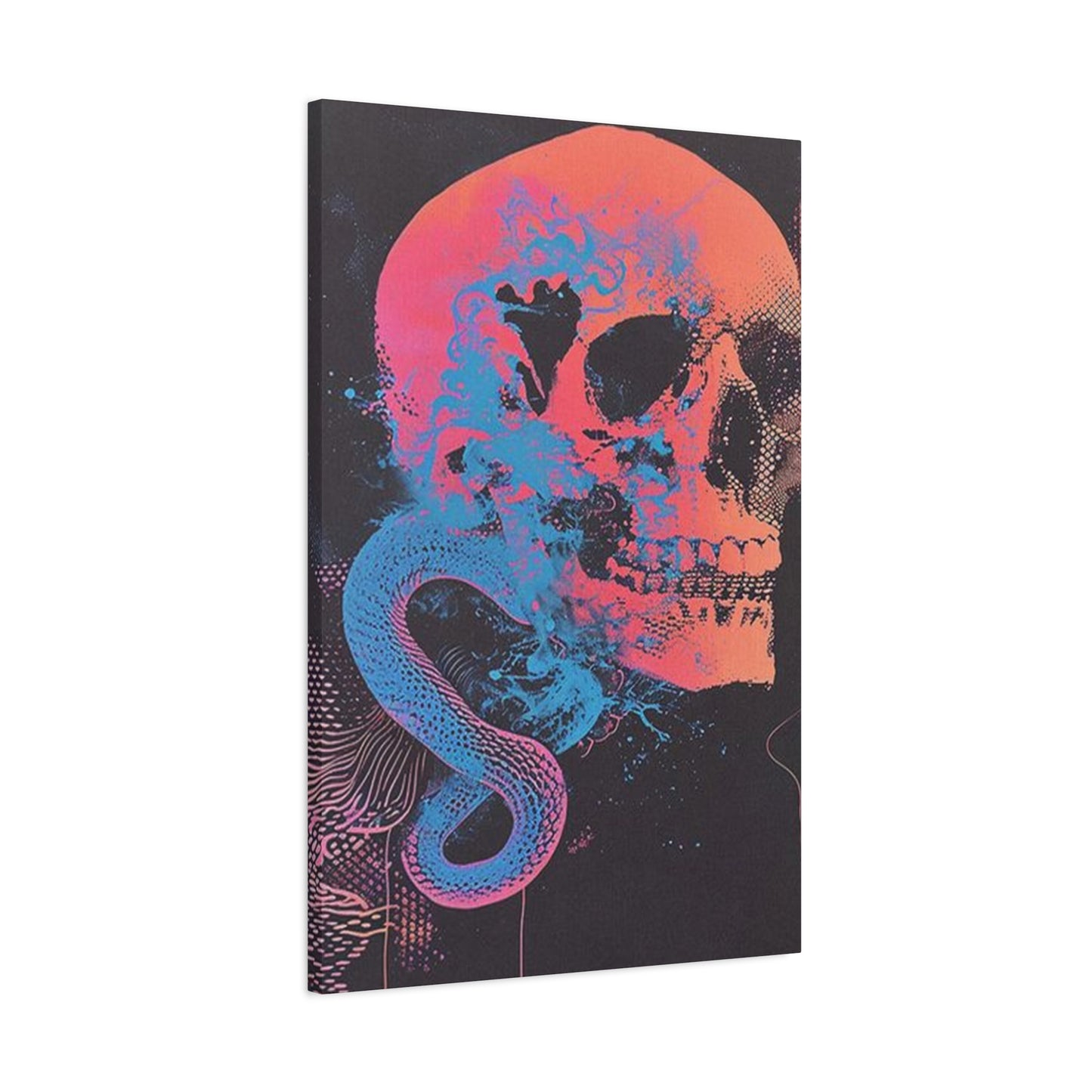
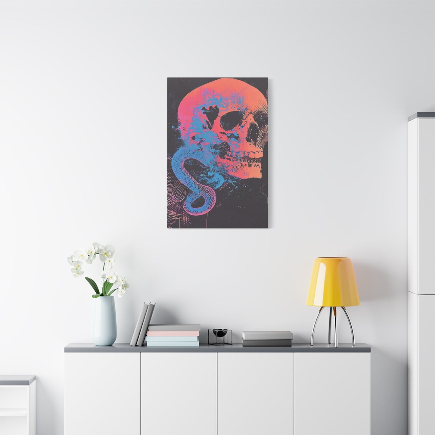
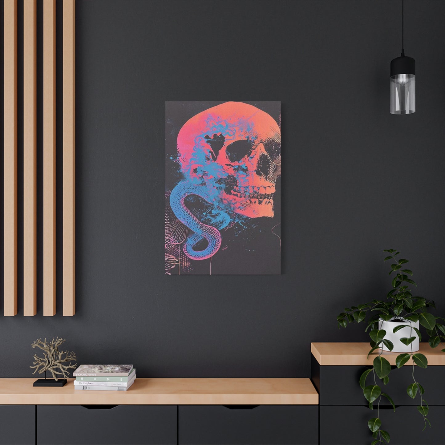
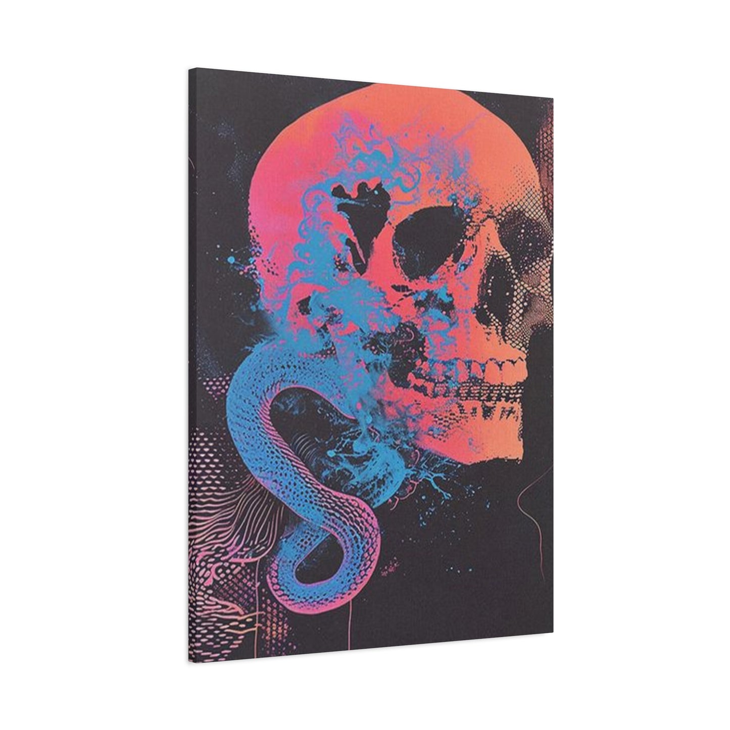
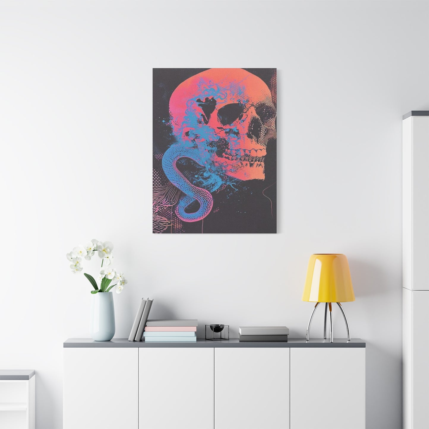
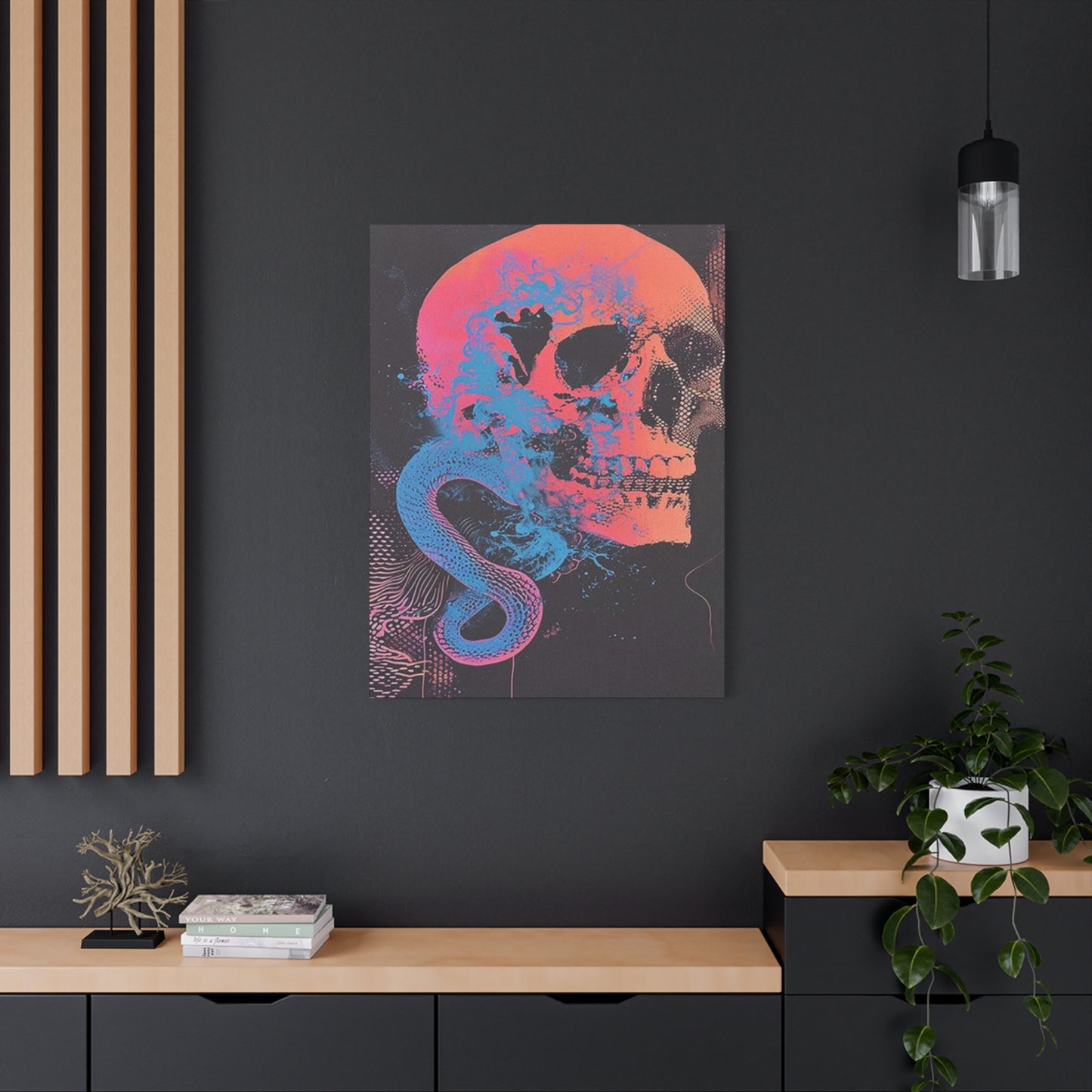
Skull And Snake Poster Wall Art & Canvas Prints
Skull And Snake Poster Wall Art & Canvas Prints
Couldn't load pickup availability

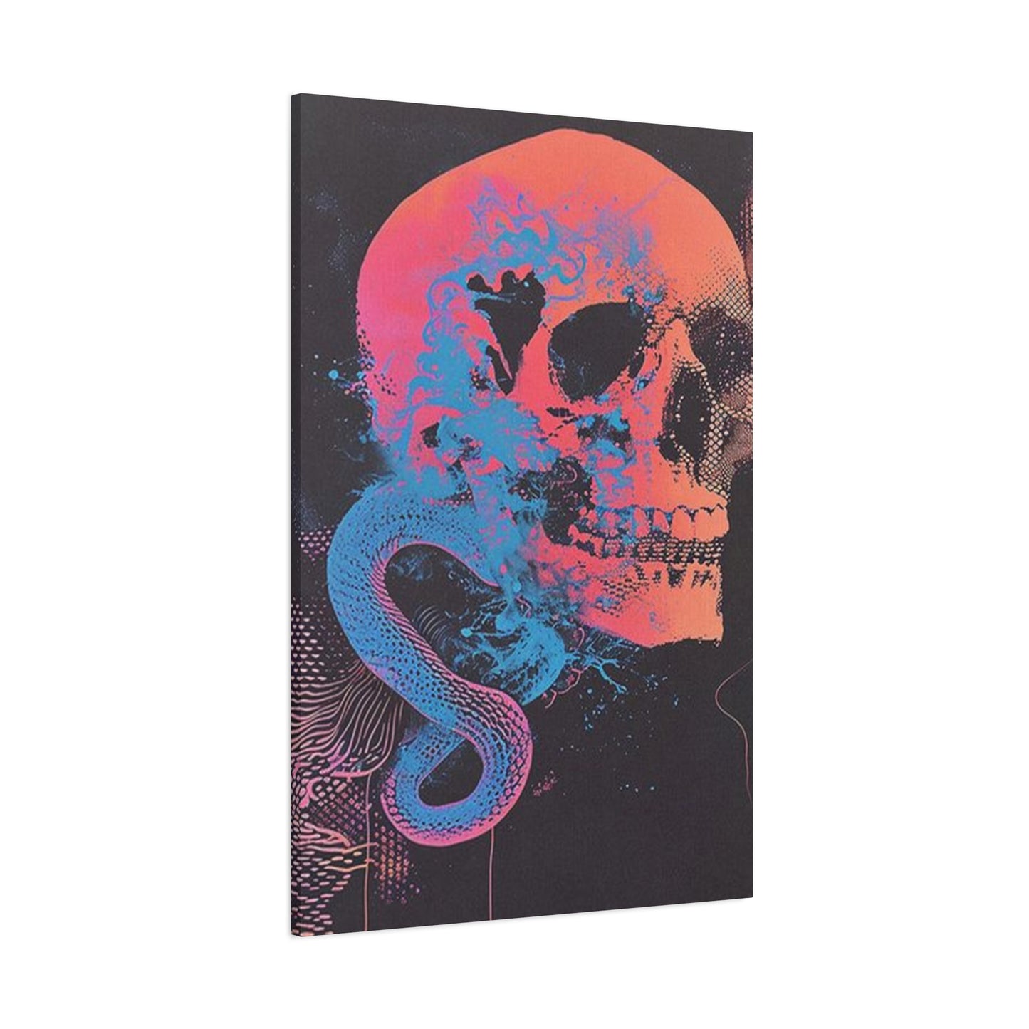
Exploring Gothic and Punk Aesthetics Through Skull and Snake Wall Art
The intersection of mortality symbolism and serpentine mystique has captivated artists and interior design enthusiasts for centuries. This powerful combination creates visually arresting imagery that transcends conventional decorative boundaries, offering a profound statement about life, death, transformation, and rebirth. When incorporated thoughtfully into living spaces, these artistic representations serve as more than mere decorations—they become conversation starters, philosophical touchstones, and expressions of personal identity that challenge traditional aesthetic norms.
The marriage of skeletal imagery with serpent motifs taps into deep-rooted archetypal symbolism found across diverse cultural traditions. From ancient Mesoamerican civilizations to European alchemical manuscripts, from Asian philosophical systems to contemporary underground art movements, this pairing has consistently represented the cyclical nature of existence, the duality of creation and destruction, and the transformative power of embracing our mortality. In today's design landscape, these themes resonate particularly strongly with individuals seeking to infuse their personal environments with meaning, mystery, and a touch of rebellion against mainstream decorating conventions.
Contemporary interpretations of this classic motif range from hyper-realistic anatomical studies to abstract expressionist renditions, from minimalist line drawings to maximalist compositions bursting with intricate details. The versatility of this theme allows it to complement various interior design philosophies, from industrial loft aesthetics to bohemian eclecticism, from modern minimalism with dark undertones to fully realized alternative lifestyle spaces. Understanding how to select, place, and integrate these powerful images into your home requires consideration of color theory, spatial dynamics, symbolic resonance, and personal aesthetic preferences.
This comprehensive exploration will guide you through the multifaceted world of mortality and serpent imagery in wall decorations, examining historical contexts, symbolic interpretations, design applications, styling strategies, and practical considerations for incorporating these striking visuals into your living spaces. Whether you're a longtime enthusiast of alternative aesthetics or newly curious about adding dramatic edge to your environment, you'll discover insights and inspiration for making these powerful artistic statements work in your unique context.
The Captivating Appeal of Mortality and Serpent Visual Expression
The enduring fascination with skeletal and serpentine imagery in artistic expression stems from humanity's oldest preoccupations: the nature of mortality, the promise of transformation, and the mysteries that lie beyond our everyday perceptions. These images speak to something primal within us, acknowledging uncomfortable truths about existence while simultaneously celebrating the beauty found in life's impermanence. Unlike cheerful, conventional decorative art that seeks to distract or prettify, these more confrontational images invite contemplation and self-reflection.
From a psychological perspective, surrounding ourselves with mortality-themed artwork serves multiple functions. For some, it operates as a memento mori—a reminder to live fully and authentically because our time is finite. This philosophical approach, rooted in ancient stoicism and medieval European traditions, suggests that acknowledging death's inevitability paradoxically enhances our appreciation for life's precious moments. Rather than creating morbid dwelling, this awareness can inspire gratitude, urgency, and intentionality in how we spend our days.
For others, the appeal lies in aesthetic rebellion. In a culture that often sanitizes death and hides aging, displaying these images represents a countercultural stance, a refusal to conform to comfortable illusions. This rebellious aspect connects to various subcultures—from punk rock to metal music scenes, from gothic fashion to biker culture—where embracing mortality symbols signifies authenticity, toughness, and independence from mainstream values. Choosing such artwork becomes a declaration of identity and a signal to like-minded individuals about shared values and sensibilities.
The serpent component adds layers of additional meaning to these compositions. Across world mythologies, snakes represent wisdom, healing, danger, temptation, eternity, and renewal through the shedding of skin. In ancient Greek medicine, the rod of Asclepius featured a single serpent and symbolized healing arts. In Hindu traditions, kundalini energy is depicted as a coiled serpent. In Christian iconography, serpents carry connotations of both temptation and, paradoxically, salvation when depicted on Moses's staff. This symbolic richness makes the snake a perfect companion to mortality imagery, suggesting that death itself is not an ending but a transformation.
The visual interplay between hard bone structure and fluid serpentine forms creates dynamic compositional interest. The rigid geometry of skeletal architecture contrasts beautifully with the organic curves and flowing movement of serpents. This juxtaposition generates visual tension that keeps the eye engaged, moving through the composition discovering new details with each viewing. Skilled artists exploit this contrast to create balanced yet energetic pieces that never become boring despite their often monochromatic or limited color palettes.
Furthermore, these images tap into our fascination with natural history and anatomy. The scientific accuracy in well-executed pieces can appeal to those interested in biology, medicine, or the natural sciences. The intricate structure of vertebrae, ribs, and cranial sutures provides fascinating geometric patterns, while serpent scales, fangs, and musculature offer their own complex visual textures. This educational dimension adds intellectual interest to the aesthetic appeal, making these pieces particularly suitable for spaces where contemplation and study occur.
Infusing Contemporary Spaces with Rebellious Visual Character
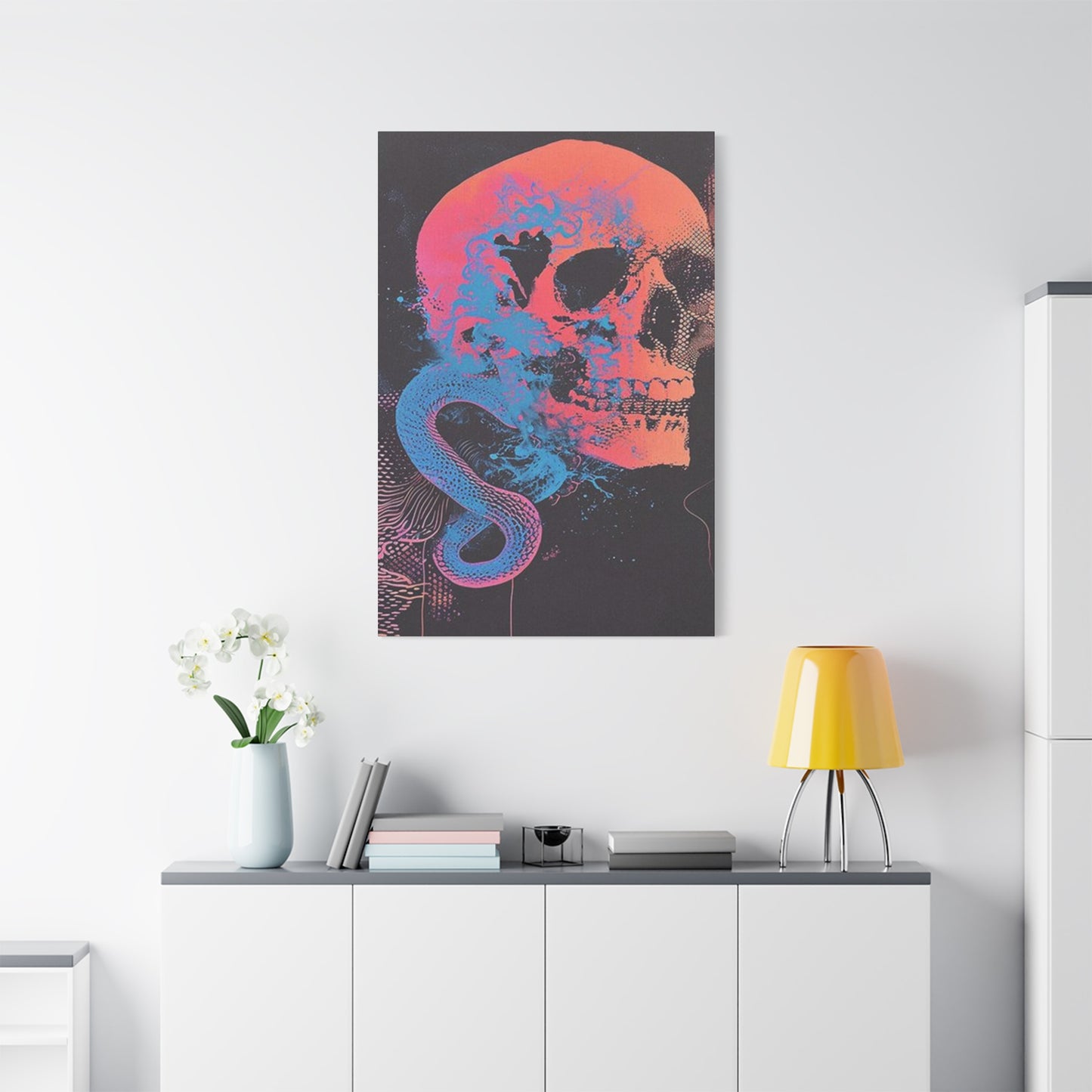
Incorporating mortality and serpent imagery into your living environment requires thoughtful consideration of how these powerful visuals will interact with existing design elements, spatial characteristics, and the psychological atmosphere you wish to create. Unlike neutral landscape photography or abstract color studies, these images carry significant symbolic weight and dramatic visual impact that can either enhance or overwhelm a space depending on implementation strategy.
The first consideration involves scale and placement. Large-format pieces demand attention and work best as focal points in rooms with adequate wall space and viewing distance. A massive canvas depicting an intricately detailed composition deserves breathing room—both surrounding wall space and physical distance for viewers to step back and appreciate the full composition. In smaller rooms or spaces with multiple visual competing elements, oversized pieces may create claustrophobic feelings or visual chaos rather than dramatic impact.
Conversely, smaller prints can be effective in intimate spaces or as part of larger gallery wall arrangements. A modestly sized framed piece above a reading nook, beside a doorway, or on a hallway wall creates points of interest without dominating. In gallery wall configurations, these images can dialogue with other artwork, creating narrative relationships and visual rhythms that guide the eye through the space. The key lies in intentional curation rather than haphazard accumulation.
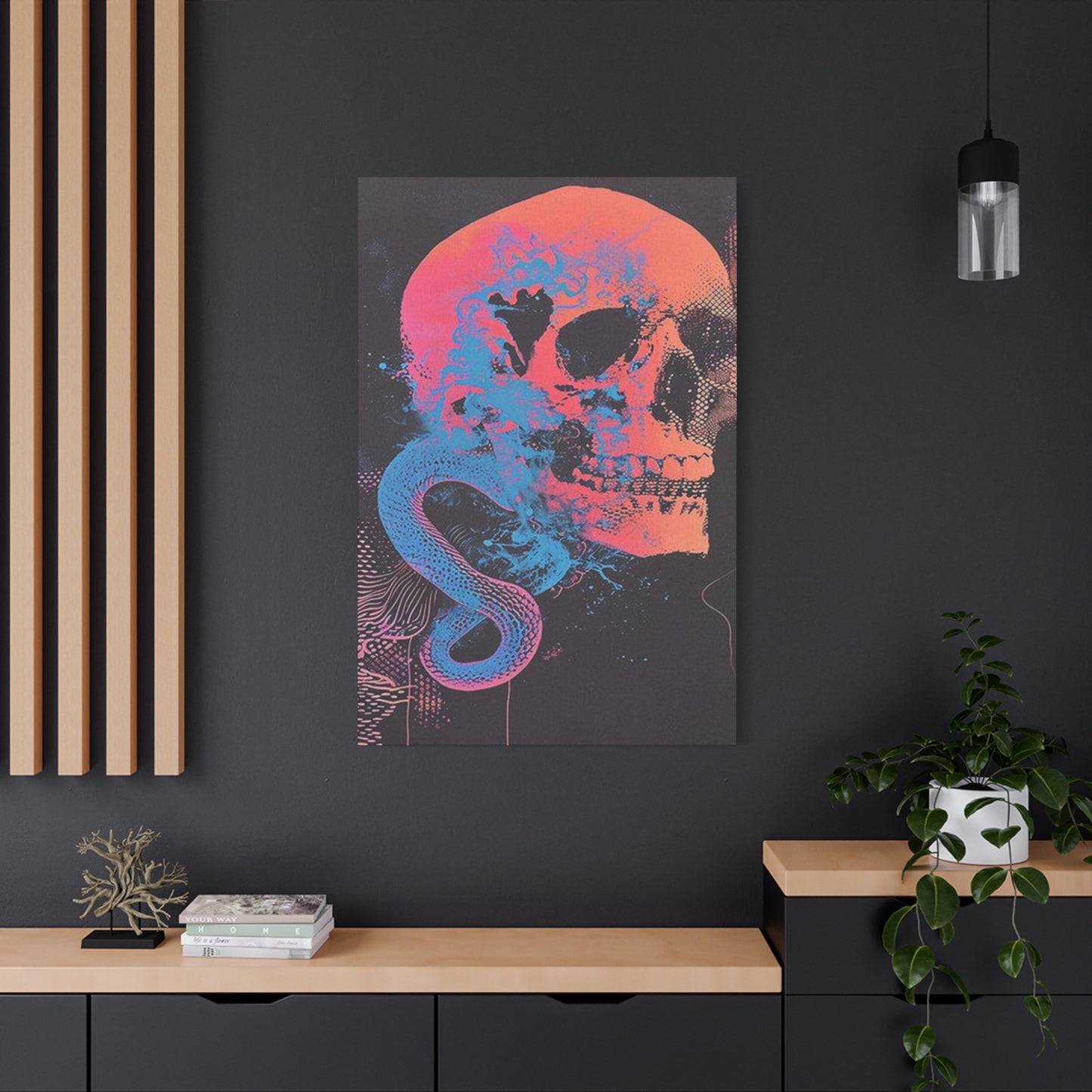
Lighting plays a crucial role in how these images read within a space. Dramatic side lighting can emphasize textures and create shadows that enhance the inherent darkness of the subject matter. Direct spotlighting treats the piece as a museum-worthy focal point, demanding attention and reverence. Ambient lighting allows the image to recede somewhat into the overall environment, present but not overwhelming. Natural lighting introduces variability—the same piece may appear softer in morning light versus more dramatic in afternoon shadows or evening dimness.
Color coordination between the artwork and surrounding environment significantly impacts overall cohesion. Monochromatic pieces featuring stark contrasts work beautifully in minimalist spaces with limited color palettes, reinforcing the clean lines and absence of clutter. In more colorfully decorated spaces, these images can serve as grounding elements, providing visual weight and anchoring brighter surrounding elements. Some compositions incorporate unexpected color accents—red, gold, turquoise, or purple elements—that can be echoed in textiles, accessories, or accent furniture to create intentional color stories throughout the room.
Mortality and Serpent Wall Displays: Cultural Meanings and Design Expression
The symbolic resonance of skeletal and serpentine imagery extends far beyond simple aesthetic preferences, tapping into archetypal patterns embedded in human consciousness across cultures and throughout history. Understanding these deeper meanings enriches our appreciation of the artwork and allows for more intentional selection of pieces that align with personal values, philosophical inclinations, and the messages we wish our spaces to communicate.
In European artistic traditions, mortality representations reached their apex in vanitas paintings of the Dutch Golden Age. These compositions featured meticulously rendered objects symbolizing life's transience—wilting flowers, extinguished candles, timepieces, and prominently, human remains. The message was explicitly religious and moral: earthly pleasures and achievements are temporary, so invest in spiritual rather than material pursuits. Contemporary iterations strip away the explicitly religious framework while retaining the fundamental reminder of impermanence, allowing secular audiences to engage with the same existential questions through a different interpretive lens.
Mexican cultural traditions, particularly Dia de los Muertos celebrations, approach mortality symbolism from a celebratory rather than morbid perspective. Decorated remains, often adorned with flowers, colors, and festive elements, honor deceased loved ones and acknowledge death as a natural continuation of life's cycle. This cultural context reframes what might otherwise be perceived as dark imagery into something joyful, communal, and life-affirming. Incorporating pieces influenced by this tradition brings warmth and cultural richness to spaces that might otherwise feel cold or purely rebellious.
In alchemical symbolism, serpents represent transformation, cyclical processes, and the unity of opposites. The ouroboros—a serpent consuming its own tail—symbolizes eternity, self-reflexivity, and the cyclical nature of creation and destruction. When paired with mortality imagery, this symbolism suggests death as transformation rather than ending, a philosophical perspective that offers comfort to some while challenging conventional religious narratives about afterlife and permanence.
Eastern philosophical traditions offer yet another interpretive framework. Buddhist meditation on impermanence uses mortality awareness not to promote fear or religious conversion but to encourage present-moment awareness and detachment from clinging to experiences, possessions, or even identity constructs. A contemplative space featuring such imagery might support meditation practices, philosophical study, or creative work that requires confronting difficult truths about existence.
Within biker culture and certain working-class communities, mortality symbolism signals toughness, fearlessness, and acknowledgment of life's risks. These communities often face physical danger through occupation or lifestyle choices, and embracing such imagery becomes a way of facing fear directly rather than denying it. For individuals from these backgrounds or those who identify with these values, such artwork represents authentic cultural expression rather than affected aesthetic choices.
Leading Design Examples for Daring Interior Atmospheres
The diversity of available designs spans from classical artistic approaches to cutting-edge contemporary interpretations, offering options for virtually any aesthetic preference within the broader mortality and serpent theme. Understanding design categories and their distinctive characteristics helps in selecting pieces that authentically resonate with your personal style while achieving the atmospheric goals you've set for your space.
Traditional anatomical illustration style brings scientific precision and educational value to the imagery. These compositions feature carefully rendered skeletal structures with accurate proportions, labeled parts, and diagrammatic presentation. The aesthetic recalls medical textbooks, natural history museum displays, and Victorian scientific illustration. This approach works beautifully in spaces with vintage, industrial, or academic aesthetics, adding intellectual gravitas alongside visual interest. The apparent objectivity of scientific presentation can make the mortality theme feel less confrontational while remaining visually compelling.
Realistic horror-influenced designs emphasize dramatic lighting, hyper-realistic rendering, and unsettling details that create visceral emotional responses. These pieces often feature partially decayed remains, exposed musculature, or disturbing juxtapositions that challenge comfortable viewing. This category appeals to horror film enthusiasts and those seeking maximum visual impact. When skillfully executed, these designs demonstrate remarkable artistic technique despite potentially disturbing subject matter. They work best in spaces where shock value and conversation-provoking content align with the household's overall vibe.
Abstract and expressionist interpretations dissolve literal representation into gestural marks, symbolic elements, and emotional resonance. These pieces prioritize mood and feeling over accurate depiction, using mortality and serpent motifs as jumping-off points for broader explorations. Loose brushwork, experimental techniques, and emphasis on artistic process itself characterize this approach. These designs integrate more easily into contemporary art-focused spaces and appeal to those who appreciate artistic innovation and emotional authenticity over illustrative precision.
Minimalist line-drawing approaches reduce the imagery to essential contours and negative space. Clean, elegant lines define form without shading or detail, creating sophisticated rather than heavy presentations. This aesthetic works brilliantly in modern minimalist spaces, Scandinavian-influenced interiors, or anywhere that uncluttered visual communication is valued. The simplicity allows these pieces to function almost as graphic design elements, providing structure and focal points without overwhelming minimal aesthetics.
Maximalist compositions layer intricate details, ornamental elements, and complex narratives into dense visual experiences. These pieces reward extended viewing, revealing new details and relationships with each examination. Ornate frames, gothic architectural elements, baroque flourishes, and meticulous rendering characterize this approach. These designs suit collectors and those who enjoy rich visual environments where abundant detail creates immersive experiences. They work particularly well in eclectically decorated spaces that embrace abundance over restraint.
Shadows and Enigma: Canvas Reproductions Exploring Finality
The specifically dark aesthetic associated with much mortality and serpent imagery deserves careful consideration regarding both its appeals and potential challenges within living spaces. Understanding how to harness darkness as a design element rather than simply tolerating it transforms these pieces from potentially oppressive presences into sources of richness, depth, and sophisticated atmosphere.
The color palette of many compositions centers around blacks, grays, deep browns, and other neutral darks. This limited palette creates inherent drama through strong value contrasts—bright highlights against deep shadows, white bone against black backgrounds. Learning to appreciate and work with these high-contrast images helps develop visual literacy and appreciation for how light and shadow create form, dimension, and emotional impact. The absence of chromatic color allows viewers to focus on compositional structure, tonal relationships, and form itself without distraction.
Black backgrounds in artwork create interesting perceptual effects within rooms. Unlike white or light-colored pieces that reflect light and visually expand space, dark artwork absorbs light and creates focal gravity—the eye is drawn inward rather than bounced outward. This quality makes dark pieces excellent anchoring elements in rooms that might otherwise feel visually scattered. The darkness provides weight and grounding, giving the space psychological foundation and stability.
However, exclusively dark imagery can indeed create oppressive atmospheres if not balanced carefully. Rooms with multiple large dark pieces, dark walls, limited natural light, and dark furniture may feel cave-like or oppressively heavy. The solution lies not in avoiding dark artwork but in creating intentional contrasts and balances. Light walls provide breathing room around dark pieces. Adequate lighting prevents spaces from feeling dim. Lighter furniture and textiles create visual relief. Strategic use of metallics, mirrors, or glass introduces reflectivity that breaks up darkness without compromising the overall aesthetic.
The mysterious quality that darkness imparts to imagery enhances narrative potential and interpretive openness. Partially obscured details invite closer examination. Shadows suggest rather than declare, leaving room for imagination and personal projection. This mystery creates ongoing interest—the piece never fully reveals itself, maintaining psychological engagement over time. In an era of information overload and constant visual stimulation, artwork that rewards patient, repeated viewing offers a different relationship to visual culture than instantly consumable imagery.
Seasonal considerations affect how dark imagery functions in spaces. During winter months when daylight is scarce and moods potentially lower, very dark artwork might compound seasonal affective symptoms for sensitive individuals. During summer months when abundant light floods spaces, the same pieces provide welcome visual coolness and refuge from brightness. Some enthusiasts practice seasonal rotation, storing darker pieces during winter and displaying them prominently during brighter months, maintaining freshness and preventing aesthetic fatigue.
Merging Shadowy Atmosphere with Macabre Visual Selections
The gothic aesthetic represents a coherent design philosophy that has evolved over centuries, offering a rich framework for integrating mortality and serpent imagery into holistic interior schemes. Understanding gothic design principles beyond surface-level clichés allows for sophisticated implementations that honor the tradition while avoiding costume-party pastiche that lacks authenticity or livability.
Architectural gothic elements in residential spaces include pointed arches, vaulted ceilings, ecclesiastical window shapes, and ornamental stonework or wood carving. Most contemporary homes lack these structural features, but similar effects can be suggested through furniture choices, decorative molding, wall decals, or strategically hung fabric that creates architectural illusion. Even subtle gothic architectural references create appropriate contexts for mortality-themed artwork, establishing visual coherence rather than isolated decorative decisions.
Color palettes in gothic interiors traditionally include deep jewel tones—burgundy, emerald, sapphire, amethyst—alongside blacks, grays, and metallic accents. These rich colors provide chromatic interest while maintaining the darker overall atmosphere. Mortality and serpent artwork in monochromatic schemes gains additional impact against these colored backgrounds, the neutrality of the imagery allowing it to work with various jewel tone combinations. Alternatively, selecting pieces with subtle color accents that echo room colors creates intentional coordination.
Gothic furniture typically features heavy construction, dark woods, ornate carving, and ecclesiastical or medieval-inspired forms. Tall-backed chairs suggest throne-like authority. Dark wood tables with turned legs and decorative carving provide visual weight. Ornately carved bed frames transform sleeping spaces into theatrical settings. These furniture pieces create appropriate contexts for similarly dramatic artwork, preventing the art from feeling isolated or randomly placed. The coordinated aesthetic signals intentional design thinking rather than accidental accumulation.
Textile choices significantly impact gothic atmospheres. Velvet upholstery and curtains provide luxurious texture while absorbing light and creating intimacy. Brocade, damask, and tapestry fabrics introduce pattern and historical association. Silk and satin add unexpected refinement and sheen. Leather introduces both luxury and slight danger. These varied textures prevent gothic spaces from feeling flat or one-dimensional, creating tactile richness that complements visual drama. Mortality artwork surrounded by these luxurious materials gains context and coherence.
Lighting in gothic spaces traditionally relied on candles, creating flickering, warm illumination that enhanced mystery and intimacy. Contemporary interpretations use dimmer switches, multiple light sources at various heights, and warm-toned bulbs to create similar effects. Chandelier lighting—whether authentic period pieces or contemporary interpretations—provides appropriate overhead drama. Wall sconces flanking artwork create museum-style presentation. Table and floor lamps at human scale provide functional task lighting while contributing to overall atmosphere. Avoiding harsh overhead fluorescent lighting preserves the carefully cultivated mood.
Striking Visual Declarations Through Symbolic Composition
The narrative quality of the specific composition affects its effectiveness as statement piece. Works that tell visual stories, pose questions, or suggest mysteries beyond their immediate subject matter invite prolonged engagement and contemplation. Simple illustrative renderings, however technically competent, may fail to sustain interest over years of daily viewing. Complex compositions with layered symbolism, ambiguous elements, or emotional depth reward repeated viewing, functioning as meditation objects rather than mere decorations.
Contrast with surrounding elements amplifies statement impact. A dark, dramatic mortality piece gains power when surrounded by lighter, calmer elements that provide visual breathing room and emphasize the artwork's intensity through contrast. Conversely, placing dramatic pieces alongside similarly intense works can create visual competition where individual pieces lose impact. Strategic isolation through surrounding negative space or contrasting contexts ensures your statement piece actually makes its statement rather than getting lost in visual noise.
The psychological phenomenon of anchoring suggests that the first significant visual element encountered in a space establishes expectations and frameworks for interpreting everything else. Positioning your statement piece to serve this anchoring function means all other design elements read in relation to that central work. This creates coherent narrative through visual hierarchy rather than leaving viewers uncertain about what they should notice or how to understand the space's overall intent.
Lighting dedicated specifically to highlighting the statement piece communicates its importance and ensures it receives proper visual attention. Picture lights mounted directly on frames, track lighting aimed specifically at the work, or even subtle uplighting creates both practical illumination and psychological emphasis. This dedicated lighting announces "this matters" without requiring verbal explanation, guiding visitors toward appropriate focus and appreciation.
The frame or presentation method for statement pieces deserves careful consideration as it significantly impacts overall effect. Museum-quality framing with archival materials, premium glass to prevent reflections, and professional mounting elevates the work's perceived value and importance. Custom framing that references the artwork's content or aesthetic through material choices, colors, or decorative elements creates cohesion between image and presentation. The investment in quality framing signals that you take the work seriously, encouraging others to do likewise.
Negative space surrounding statement pieces proves as important as the works themselves. Cramming frames edge-to-edge or filling every available wall surface dilutes impact regardless of individual piece quality. Intentional emptiness focuses attention, provides visual rest, and creates sophisticated restraint that paradoxically increases impact. The restraint to leave walls partially bare despite possessing other works demonstrates design maturity and confidence.
Conversation starter potential elevates artwork to genuine statement status. Pieces that prompt questions, spark discussions, or reveal aspects of your personality through visitors' reactions serve social functions beyond aesthetic ones. Mortality and serpent imagery naturally invites conversation about personal beliefs regarding death, artistic preferences, cultural backgrounds, and philosophical perspectives. This interactive dimension transforms passive decoration into active social tool that facilitates deeper connections and more interesting gatherings.
The relationship between statement pieces and personal evolution merits consideration. As you grow, change, and develop over years, does the artwork continue resonating, or does it represent a phase you've outgrown? The most enduring statement pieces possess sufficient complexity and depth to evolve with you, revealing different facets and meanings as your perspective matures. Simple shock-value selections often lose appeal quickly, while genuinely profound works deepen over time.
Arranging Living Spaces with Symbolic Mortality Compositions
Practical styling strategies transform mortality and serpent artwork from isolated decorative objects into integrated elements within holistic room designs. Successful integration requires understanding color theory, spatial relationships, stylistic coherence, and the interplay between two-dimensional artwork and three-dimensional furnishings and accessories. These technical considerations combined with personal taste create environments that feel intentional, cohesive, and authentically expressive.
Color bridging between artwork and surrounding elements creates visual coherence without requiring exact matching. If your mortality piece contains subtle red accents—perhaps in background elements or decorative details—echoing that red in throw pillows, book spines, ceramics, or fresh flowers establishes visual connections that tie the room together. These color bridges need not be obvious or extensive; even small repetitions of accent colors create subconscious coherence that makes spaces feel thoughtfully composed.
Furniture arrangement should accommodate optimal viewing of featured artwork. Seating positioned to face important pieces ensures they receive attention during room occupation. Furniture placement that blocks or minimizes artwork visibility wastes the piece's potential and suggests unconsidered design. Thinking through actual movement patterns and sight lines while arranging furniture ensures your mortality art actually impacts daily experience rather than existing as afterthought.
Height positioning follows general guidelines while allowing personal adjustment. The conventional center-at-eye-level rule works well for viewing while standing in galleries but may need modification in living spaces where you're often seated. Positioning pieces slightly lower ensures comfortable viewing from sofas and chairs, though this risks making them feel grounded rather than elevated. Experimentation with temporary hanging methods before final installation prevents commitment to suboptimal heights.
Layering decorative elements at various depths creates dimensional interest that two-dimensional artwork alone cannot provide. Placing furniture, plants, sculptures, or other objects at different distances from walls creates foreground, middle ground, and background layers that add complexity to spatial perception. Your mortality artwork functions as background layer, while carefully positioned three-dimensional objects in front add depth. Avoiding perfectly flat arrangements against walls makes spaces more visually engaging and sophisticated.
Shelf styling below or near mortality artwork extends the thematic and aesthetic territory. Displaying books about death studies, philosophy, anatomy, or related subjects reinforces intellectual engagement with the themes. Placing natural objects like minerals, fossils, dried flowers, or specimens creates dialogue between artwork and physical manifestations of mortality. These curated groupings demonstrate thoughtful engagement rather than random accumulation.
Plant selection near mortality imagery creates interesting philosophical juxtapositions. Lush, thriving plants symbolize life and growth, creating meaningful contrast with death symbolism. Alternatively, dried flowers, preserved botanical specimens, or sculptural dead branches might reinforce the mortality themes while maintaining visual interest. The specific choice depends on whether you prefer emphasizing life-death contrasts or creating thematic continuity.
Curated Frames and Boundaries for Distinctive Visual Enhancement
The often-overlooked role of framing in presenting mortality and serpent artwork deserves careful attention, as the frame functions not merely as protective border but as integral component of the piece's overall aesthetic impact and integration within living spaces. Understanding framing options, making informed selections, and considering the relationship between image and frame transforms acceptable presentations into exceptional ones that maximize both protection and visual effect.
Material selection for frames immediately establishes aesthetic direction and practical characteristics. Wood frames offer warmth, traditional associations, and considerable variety through different species, stains, and finishes. Dark walnut or ebony frames complement mortality themes through tonal similarity while maintaining organic warmth. Lighter woods like oak or maple create contrast that might feel incongruous or intentionally juxtaposed depending on overall design intent. Wood quality varies dramatically—cheap pine or MDF versus solid hardwoods—affecting both appearance and durability.
Metal frames bring contemporary associations, industrial aesthetics, and sleek profiles. Black metal frames offer minimalist elegance that doesn't compete with imagery for attention. Antique bronze, brass, or copper finishes add warmth while maintaining metal's structural character. Silver and chrome create modern, cool tones that work well in contemporary spaces. Metal's durability and slim profiles make it practical for larger pieces where wood might become prohibitively heavy or expensive.
Ornate decorative frames with carved details, gilded finishes, or baroque embellishments suit gothic or maximalist aesthetics perfectly. These theatrical frames make strong statements themselves, transforming simple prints into commanding presences. However, ornate frames risk overwhelming the artwork if not carefully matched in scale and intensity. The most elaborate frames work best with either very simple imagery they can elevate or equally complex compositions that warrant such presentation.
Frame width and depth create practical and aesthetic consequences. Narrow frames create sleek, minimal borders that disappear somewhat, keeping focus on imagery. Wide frames create substantial presence, adding significant visual weight and making even modest-sized artwork feel more important. Deep shadow-box style frames add literal dimension, creating space between artwork and wall that enhances perception of the piece as precious object rather than mere decoration.
Corner joinery quality indicates overall frame construction standards. Properly mitred corners with invisible joints indicate quality construction, while visible gaps or misaligned joints reveal cheap manufacturing. For valuable artwork or pieces you intend keeping long-term, investing in properly constructed frames protects your investment and maintains aesthetic integrity. Cheap frames may initially save money but often prove false economy through poor appearance and shortened lifespan.
Glass versus acrylic glazing presents tradeoffs worth understanding. Traditional glass offers superior clarity and scratch resistance but weighs significantly more and shatters dangerously if broken. Museum glass eliminates reflections and provides UV protection but costs substantially more. Acrylic or plexiglass weighs far less and shatters safely but scratches more easily and may develop static attraction to dust. For large pieces, acrylic's weight advantage proves decisive, while small precious works merit museum glass investment.
UV-protective glazing becomes essential for valuable pieces or those displayed in bright conditions. Ultraviolet light causes fading, discoloration, and paper degradation over time, eventually destroying unprotected artwork. UV-filtering glass or acrylic blocks harmful wavelengths while maintaining visual clarity. This protection proves particularly important for pieces with vibrant colors or original works where replacement isn't possible. The upfront cost prevents far greater loss from sun damage.
Matting decisions significantly impact presentation style and protective function. Mats create visual breathing room between image and frame while preventing artwork from touching glass where humidity might cause damage. White or cream mats create clean, gallery-style presentations suitable for contemporary or minimalist spaces. Black mats create dramatic, moody presentations that complement mortality themes while maintaining sophistication. Colored mats should echo tones within the artwork, creating color bridges that enhance overall coherence.
Double or triple matting adds depth and luxury to presentation. Multiple mat layers create dimensional interest visible when viewing at angles. Color combinations in layered mats can be used strategically—perhaps black top mat with red or purple reveal—to introduce color accents without overwhelming the piece. This technique elevates simple prints to more significant presentations worthy of prominent display.
Frameless mounting options suit ultramodern aesthetics and specific artwork types. Floating frames where the artwork appears suspended within clear space create contemporary, gallery-like presentations. Direct mounting to backing board without frames creates edge-to-edge presentations that maximize image impact. These approaches work best with pieces intended for modern minimalist contexts where traditional framing might feel inconsistent with overall design philosophy.
DIY framing versus professional services involves cost-benefit analysis. Custom professional framing delivers superior quality, expert advice, and perfect execution but costs substantially more than ready-made or DIY solutions. For precious original works or centerpiece presentations, professional framing proves worthwhile investment. For less significant pieces or temporary displays, quality ready-made frames or carefully executed DIY work serves adequately while managing costs.
Establishing Musical Aesthetic Through Symbolic Wall Displays
The powerful associations between mortality and serpent imagery and rock music culture create natural opportunities for styling spaces that celebrate musical identity alongside visual aesthetics. Understanding these connections allows intentional cultivation of environments that feel authentically connected to music subcultures rather than superficially referencing them through isolated decorative choices disconnected from deeper cultural engagement.
The historical relationship between rock music and mortality imagery traces to early rock and roll's rebellious positioning against conservative mainstream culture. As rock evolved into harder, darker subgenres, visual branding increasingly incorporated death symbolism to signal danger, transgression, and refusal of societal norms. By the heavy metal era of the seventies and eighties, skulls, serpents, and related imagery became nearly inseparable from the music itself, appearing on album covers, stage designs, merchandise, and even musicians' bodies through tattoos.
Album cover art represents a primary intersection of music and visual art, with countless classic rock and metal albums featuring stunning mortality and serpent compositions. Displaying framed album covers alongside standalone artwork creates obvious musical connections while celebrating specific recordings that hold personal significance. Original pressings or high-quality reproductions of significant album artwork function as legitimate art pieces that happen to carry additional musical associations, making them doubly meaningful for music enthusiasts.
Concert poster art, particularly from the psychedelic era forward, developed distinctive visual languages incorporating mortality and serpent motifs. Original vintage posters from significant concerts or tours carry both artistic and historical value, documenting specific cultural moments while demonstrating remarkable graphic design innovation. Reproduction posters from classic shows or tours you actually attended add personal narrative dimension, connecting visual display to lived experience and meaningful memories.
Musical instrument display alongside mortality artwork creates physical manifestation of the visual-audio connection. A guitar mounted on walls near related artwork doesn't simply signal musical interest—it demonstrates active participation in the culture rather than mere aesthetic appreciation. Whether vintage instruments with their own histories or current instruments you actually play, their presence authenticates the space as genuinely connected to music rather than merely styled to reference it.
Vinyl record storage and display serves both functional and aesthetic purposes in music-centered spaces. Floor-standing record storage units, wall-mounted racks, or record crates positioned near listening areas provide easy access while displaying album spines that add color, texture, and cultural signaling. The physical presence of substantial music collections demonstrates serious engagement rather than casual interest, lending authenticity to the overall environment.
Audio equipment quality signals priorities and values beyond mere decoration. Proper turntables, quality amplification, and serious speakers indicate that sound quality matters as much as visual aesthetics. This equipment need not dominate spaces but should be present and functional, enabling actual music listening that activates the space rather than existing purely as visual environment. Music-centered spaces should sound as good as they look.
Band merchandise beyond typical posters—vintage t-shirts framed as textile art, tour books, backstage passes, drumsticks, setlists, or other memorabilia—adds personal historical dimension. These objects tell stories about your specific relationship with particular music, concerts attended, or artists followed. Displayed thoughtfully, they transform from random fan accumulation into curated personal history that contextualizes your broader aesthetic choices.
Lighting design that references concert or venue atmospheres enhances the musical connection. Dimmer switches allowing variable mood lighting, colored LED options for dramatic effects, or even small stage-style lighting elements create environmental flexibility matching different musical moods. The ability to shift from bright working light to moody atmospheric lighting allows the space to transform for listening sessions or social gatherings.
Seating arrangements conducive to active listening rather than background music respect music's importance in the space. A primary listening position with optimal speaker placement, comfortable seating for extended sessions, and minimal distractions allows serious engagement with music. This doesn't preclude social furniture arrangements but ensures the space can accommodate focused listening when desired.
Alternative Living Spaces Enhanced by Dark Canvas Displays
The alternative lifestyle aesthetic encompasses various subcultures, philosophies, and design approaches unified by rejection of mainstream conventions and embrace of countercultural values. Mortality and serpent canvas prints align naturally with alternative sensibilities, serving as visual manifestations of values like authenticity, individuality, memento mori philosophy, and appreciation for beauty in unconventional places. Creating genuinely alternative interiors requires understanding both aesthetic principles and underlying philosophical commitments that differentiate alternative spaces from merely trendy or rebellious conventional ones.
Industrial aesthetic foundations characterize many alternative spaces, referencing warehouse lofts, artist studios, and underground venues where alternative cultures historically gathered. Exposed brick, visible ductwork, concrete floors, metal furniture, and utilitarian fixtures create appropriate contexts for mortality canvas prints. These raw, unfinished surfaces contrast beautifully with the refined artistry of well-executed prints, creating tension between roughness and sophistication that defines much alternative aesthetic theory.
Bohemian eclecticism offers another alternative approach, embracing abundance, global influences, vintage finds, and apparent chaos organized by personal logic rather than conventional rules. Mortality artwork within bohemian contexts becomes one element among many diverse cultural references, pattern mixing, and collected treasures. The key lies in curation that prevents randomness while avoiding matchy-matchy coordination. Each element should feel intentionally chosen yet comfortable alongside seemingly disparate companions.
Minimalist alternative spaces reject both conventional decoration and cluttered bohemianism, instead embracing radical simplicity that borders on asceticism. In these contexts, a single powerful mortality canvas might be the room's only decorative element, gaining tremendous impact through isolation and contrast with otherwise empty walls. This approach suits those valuing clarity, focus, and meditation on singular objects rather than visual abundance.
DIY and maker cultures influence alternative aesthetics through handcrafted elements, visible construction, and celebration of creative process over polished finish. Custom-built furniture, exposed joinery, works-in-progress, and tools as decorative elements all signal maker identity. Mortality artwork within these contexts often includes DIY elements—custom frames built in your shop, hand-modified prints, or even original artwork you created—demonstrating hands-on engagement rather than passive consumption.
Sustainable and ethical consumption principles increasingly influence alternative spaces. Vintage and secondhand furniture, reclaimed materials, plants throughout, natural fibers, and thoughtful purchasing all reflect environmental values. Mortality imagery's memento mori associations align philosophically with sustainability's core recognition that resources are finite and consumption has consequences. Canvas prints from ethical suppliers using sustainable materials integrate values throughout design decisions.
Conclusion
Exploring Gothic and Punk aesthetics through skull and snake wall art reveals a rich tapestry of symbolism, rebellion, and dark beauty that resonates deeply with fans of alternative culture. These motifs, steeped in history and subcultural significance, embody themes of mortality, transformation, and defiance, making them powerful visual statements in any living space. By incorporating skull and snake art into your décor, you invite an edgy, thought-provoking element that challenges conventional tastes and expresses individuality.
Skulls have long symbolized the fleeting nature of life and the inevitability of death, while snakes evoke transformation, danger, and mystique. Together, these images form a compelling juxtaposition that speaks to the Gothic fascination with darkness and the Punk ethos of nonconformity. The artwork not only captures these themes visually but also encourages viewers to confront deeper questions about existence, identity, and societal norms.
The fusion of Gothic and Punk styles in wall art creates a striking aesthetic that blends ornate, often macabre details with raw, rebellious energy. Whether rendered through intricate black-and-white illustrations, vibrant graffiti-inspired designs, or mixed media collages, skull and snake art adds texture, depth, and attitude to interiors. It offers a bold contrast to more traditional décor, making it a perfect choice for those seeking to create a unique, personal space that reflects their tastes and values.
Furthermore, this style of wall art often serves as a conversation starter, inviting guests to explore the meanings behind the symbols and the cultural movements they represent. It fosters a sense of community among like-minded individuals who appreciate the blend of art, music, and countercultural history embedded in these images.
In conclusion, skull and snake wall art offers a powerful avenue to explore and express Gothic and Punk aesthetics within your environment. It celebrates themes of mortality, transformation, and rebellion through visually compelling designs that challenge and inspire. Embracing this style transforms ordinary walls into bold statements of identity, artistry, and cultural pride—making your living space not just a home but a canvas for self-expression.
