


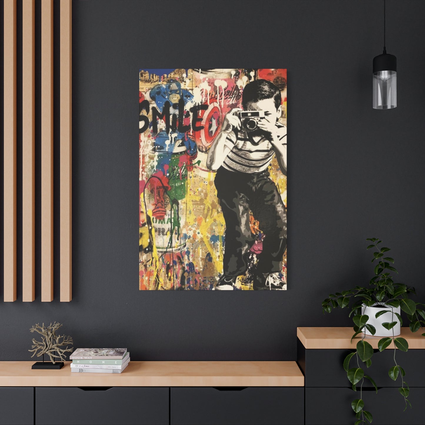
Smile Abstract Painting Mixed Media Wall Art & Canvas Prints
Smile Abstract Painting Mixed Media Wall Art & Canvas Prints
Couldn't load pickup availability


Abstract Expression: Painting Mixed Media Wall Art That Inspires Imagination
The world of contemporary art has witnessed a remarkable evolution in how artists express emotion and joy through visual mediums. Among the most captivating developments is the emergence of smile-themed abstract paintings that combine multiple artistic techniques to create stunning wall art suitable for canvas prints. This comprehensive exploration delves into every aspect of creating, understanding, and appreciating these dynamic artworks that bring warmth and positivity into living spaces.
The Artistic Philosophy Behind Smile-Themed Abstract Creations
Abstract art centered around the concept of smiles represents more than just curved lines or happy imagery. It embodies a philosophy of spreading joy and positive energy through visual communication. Artists who specialize in this genre understand that a smile transcends cultural boundaries and speaks a universal language of happiness. When rendered in abstract form, the smile becomes a symbolic representation rather than a literal depiction, allowing for greater creative freedom and interpretive depth.
The philosophical foundation of smile abstract paintings rests on the belief that art should elevate the human spirit. These works challenge viewers to see beyond conventional representations and engage with emotional content on a deeper level. By abstracting the smile, artists remove the specificity of individual identity and create something universally relatable. This approach makes the artwork accessible to diverse audiences while maintaining sophisticated artistic merit.
Creating art with smile themes requires artists to tap into their own experiences of joy and translate those feelings into visual form. The process often involves meditation on positive memories, contemplation of what brings happiness, and consideration of how color, form, and texture can evoke emotional responses. This introspective approach results in artworks that carry authentic emotional weight rather than superficial cheerfulness.
The integration of mixed media techniques amplifies the philosophical intent by adding layers of meaning and texture. Each material chosen contributes to the overall narrative of joy and positivity. Acrylic paints might represent bold, immediate happiness, while softer mediums like watercolor could suggest gentle contentment. Collage elements might introduce nostalgia or cultural references that deepen the connection between artwork and viewer.
Brushwork Techniques for Expressive Mark Making
Brush selection significantly impacts the character of painted marks. Flat brushes create angular, geometric strokes suitable for constructing shapes and blocking color. Round brushes produce varied lines from fine details to bold curves. Filbert brushes combine qualities of flats and rounds, creating softly angular marks. Fan brushes create feathered, textured effects. Each brush type contributes distinct qualities to smile abstract compositions, and using multiple brush types within single paintings creates visual diversity.
Brushstroke direction influences compositional energy and movement. Vertical strokes suggest stability and strength. Horizontal strokes create calm, peaceful feelings. Diagonal strokes generate dynamic energy. Curved strokes naturally suggest motion and joy, making them particularly effective in smile abstracts. Varying stroke direction throughout compositions prevents monotony while creating visual pathways that guide viewer attention. Consistent stroke direction within specific areas creates unified fields that contrast with varied adjacent areas.
Pressure variation during brushwork creates dynamic line quality. Heavy pressure produces thick, bold marks that command attention. Light pressure creates delicate, whisper-soft lines that add subtlety. Modulating pressure within single strokes creates lines that swell and taper, adding organic quality. This variation mimics natural forms and creates more engaging marks than uniform lines. In abstract smile paintings, pressure variation might suggest the varying intensities of joy from gentle contentment to exuberant laughter.
Dry brush techniques create broken, textured marks that add atmospheric quality to compositions. Loading brushes with minimal paint and dragging them across canvas surfaces creates marks that skip and catch on canvas texture. This technique works beautifully for suggesting movement, creating transition areas between colors, and adding surface interest to large color fields. Dry brushing in lighter values over darker grounds creates luminous effects that suggest light and energy.
Gestural brushwork emphasizes spontaneity and emotional expression over precision. Large, sweeping movements engage the entire arm and body, creating marks that convey physical energy. This approach connects to action painting traditions established by abstract expressionists. Gestural marks communicate emotion directly and add raw, authentic energy to smile abstracts. Balancing gestural passages with more controlled areas creates compositions that feel both free and intentional.
Layered brushwork builds complexity through accumulated marks. Initial brushstrokes establish foundations, while subsequent layers add refinement and detail. Some underlying strokes remain visible, creating color complexity and suggesting depth. This archaeological quality, where earlier artistic decisions show through, adds richness and implies the painting's history. In smile abstracts, layered brushwork might suggest that joy builds through accumulated moments rather than existing as a single state.
Acrylic Painting Methods for Vibrant Results
Acrylic paint's versatility makes it ideal for mixed media smile abstracts. Its fast-drying nature allows rapid layering without extended waiting periods. However, quick drying can challenge artists attempting to blend colors smoothly. Using retarder medium extends working time, enabling subtle gradations. Alternatively, working quickly with confident strokes embraces acrylic's rapid drying as an asset rather than fighting it. Many artists combine both approaches, using retarders for specific areas requiring blending while working quickly in gestural sections.
Acrylic pouring techniques create flowing, organic forms perfect for abstract compositions. Mixing paint with pouring medium reduces viscosity, allowing it to flow freely across surfaces. Multiple colors poured simultaneously interact in unpredictable ways, creating unique patterns. Tilting canvases controls pour direction. Torch or heat gun application eliminates bubbles and activates color interactions. Pouring creates backgrounds with dynamic movement that enhance smile elements applied in later layers. The technique's inherent unpredictability keeps artworks fresh and prevents overworked, tight compositions.
Acrylic mediums modify paint properties for specific effects. Gloss medium increases shine and transparency, creating jewel-like colors. Matte medium reduces sheen for more subdued, sophisticated surfaces. Gel mediums thicken paint, enhancing impasto techniques and texture creation. Iridescent medium adds shimmer that shifts with changing light. Flow improver increases paint fluidity without diluting pigment concentration. Understanding these mediums transforms acrylic paint from a single material into an infinitely variable system.
Acrylic undergoes color shift during drying, typically becoming slightly darker and less saturated. Experienced artists compensate by mixing colors slightly lighter and more vibrant than desired end results. Testing color samples and allowing them to dry completely before committing to large areas prevents disappointing surprises. This characteristic actually benefits smile abstracts since the slight darkening adds depth and sophistication, preventing colors from appearing garish or unsophisticated.
Acrylic paint's water resistance when dry enables aggressive overpainting without disturbing underlying layers. Once layers dry completely, artists can scrub, scrape, or paint over them without muddying colors. This forgiving quality encourages experimentation and bold revision. Unsuccessful areas can be covered or scraped away and repainted. This flexibility reduces anxiety about permanent mistakes, freeing artists to work more confidently and spontaneously, resulting in livelier, more engaging smile abstracts.
Acrylic's compatibility with numerous materials makes it the ideal medium for mixed media works. It adheres to nearly any non-oily surface. Once dry, it accepts collage elements attached with compatible mediums. It can be combined with oil pastels, crayons, pencils, inks, and markers. This material compatibility allows artists to incorporate diverse elements within unified compositions. Smile abstracts benefit from this versatility, as varied materials can represent different aspects of joy and happiness.
Incorporating Collage Elements for Added Dimension
Collage introduces literal layering that adds both physical and conceptual depth to smile abstracts. Paper selection communicates specific qualities. Vintage book pages suggest nostalgia and accumulated wisdom. Sheet music implies rhythm and harmony. Magazine cutouts introduce contemporary references and pop culture elements. Handmade papers add organic texture and artisanal quality. Choosing papers thoughtfully ensures each collage element contributes meaningfully rather than cluttering compositions arbitrarily.
Adhering collage elements requires appropriate adhesives for permanent bonding. Matte medium provides strong adhesion for most papers while remaining nearly invisible when dry. Gel medium works for heavier materials and creates textural interest itself. Some artists prefer PVA glue for paper collage. Testing adhesives on scrap materials prevents frustrating failures in finished works. Applying adhesive to both surface and collage element ensures complete bonding without bubbles or lifting edges.
Integrating collage seamlessly requires painting over edges to blend them into surrounding areas. Hard collage edges create abrupt transitions that can feel jarring. Softening edges with paint, glazes, or pastels creates gradual transitions that feel organic. Some artists intentionally preserve sharp edges for graphic, contemporary effects. The choice depends on overall aesthetic goals. Smile abstracts often benefit from softened collage integration, creating cohesive surfaces where collage and paint feel unified rather than separate.
Torn paper edges create organic, irregular shapes more interesting than cut edges. Tearing reveals paper's fibrous nature, adding textural quality. Directional tearing controls shape character. Tearing toward yourself creates different edges than tearing away. These subtle variations add handmade quality and visual interest. For smile abstracts, torn paper curves might echo smile shapes themselves, reinforcing the central theme through multiple means.
Transparent collage materials create layered effects where underlying elements remain partially visible. Tissue paper provides delicate color washes and subtle texture. Vellum creates translucent effects. These materials build depth through accumulated layers without completely obscuring earlier work. Transparent collage particularly enhances smile abstracts by creating ethereal, luminous qualities suggesting joy's intangible nature.
Three-dimensional collage elements transform paintings into relief constructions. Found objects, fabric, or sculpted paper create actual depth. These elements cast shadows that change with lighting conditions, ensuring artworks transform throughout the day. Dimensional collage requires careful consideration of weight and support. Heavy elements need strong adhesives or mechanical fasteners. For works intended as wall art, dimensional elements must remain secure during shipping and hanging. Balancing visual impact with structural stability challenges artists but creates memorable, distinctive works.
Paint Pouring Techniques for Fluid Abstract Effects
Paint pouring creates spontaneous, flowing effects impossible through traditional brushwork. Preparing paint properly ensures successful pours. Mixing ratios typically involve one part paint to two parts pouring medium, though exact ratios depend on desired viscosity and specific paint brands. Consistency should resemble warm honey, flowing smoothly without being watery. Each color requires individual mixing, and testing small amounts before committing to full pours prevents waste and disappointment.
Pouring methods vary in complexity and effect. Dirty pour technique layers multiple colors in a single cup before pouring, creating immediate color interaction. Flip cup method places a paint-filled cup upside down on the canvas and lifts it, releasing paint in a cascading puddle. Individual color pours in sequence allow more control over color placement. Swipe technique drags one color through others, creating dramatic cells and lacing effects. Each method produces distinctive results, and experimenting reveals personal preferences.
Tilting canvases controls paint flow direction and coverage. Gentle tilting extends working time, allowing deliberate color placement. Aggressive tilting creates dynamic, energetic flows but reduces control. Most artists combine both approaches, initially tilting gradually to establish composition, then making final quick tilts for excitement. Canvas edges collect excess paint that can be wiped away or preserved as organic borders. Some artists tape canvas edges before pouring for clean edges, while others embrace organic, paint-covered edges.
Cells and lacing, prized effects in acrylic pouring, occur when paint layers separate and create organic patterns. Adding silicone oil or dimethicone to paint mixtures encourages cell formation. Torching the wet paint surface with a heat gun or kitchen torch causes rapid expansion and cell creation. These unpredictable patterns add visual interest and organic quality. In smile abstracts, cells might suggest the bubbling effervescence of laughter and joy.
Drying time for poured paintings extends beyond traditionally painted works due to paint thickness. Proper drying prevents surface hardening over wet paint beneath, which causes cracking later. Most pours require several days to one week for complete drying depending on paint thickness and environmental humidity. Protecting wet pours from dust and debris requires covering them loosely with plastic or moving them to dust-free locations. Patience during drying ensures the stunning effects remain intact long-term.
Finishing poured paintings often requires adding painted or drawn elements to create focal points and compositional direction. Pure pours create beautiful effects but may lack compositional intention. Adding smile forms, mark-making, or other elements after the pour dries transforms random effects into intentional compositions. This combination of spontaneity and control creates exciting works that feel both free and purposeful. Balancing poured backgrounds with intentional foreground elements creates dynamic smile abstracts.
Creating Focal Points That Draw Viewer Attention
Focal points anchor compositions and provide entry points for viewer engagement. In smile abstracts, focal points often feature the most recognizable smile elements, whether abstracted curves suggesting mouths or radial patterns suggesting facial structures. Concentrating detail, contrast, and saturation in focal areas naturally draws attention. Surrounding focal points with simpler areas creates contrast that enhances their impact. Without focal points, compositions become visually democratic but potentially unengaging, as the eye has no clear path through the work.
Contrast creates focal points effectively. Value contrast between light and dark elements generates immediate visual impact. Color contrast, particularly complementary colors, creates vibration and energy. Textural contrast between smooth and rough areas adds physical dimension. Size contrast, positioning a large element among smaller ones or vice versa, establishes hierarchy. Combining multiple contrast types in focal areas ensures they command attention without being heavy-handed. Smile abstracts benefit from strategic contrast placement that reinforces emotional content.
Strategic positioning determines focal point effectiveness. Placing focal points according to the rule of thirds creates classically balanced compositions. Centering focal points creates symmetry and calm. Off-center placement generates tension and energy. Multiple focal points of varying strengths create visual hierarchies that guide attention through the composition in intended sequences. Primary focal points should dominate clearly, with secondary focal points supporting without competing. Tertiary elements provide visual interest without distracting from the main narrative.
Isolation makes elements function as focal points simply through separation. A single curved smile form surrounded by geometric angular elements stands out through shape contrast and isolation. Empty space surrounding elements enhances their importance. This negative space principle works particularly effectively in smile abstracts, as the isolation can represent the clarity and singularity of a perfect moment of joy against life's complexity.
Directional lines lead viewer attention toward focal points. Actual painted lines, implied lines created by aligned elements, or lines suggested by color gradients all function as visual pathways. Converging lines create strong directional movement toward convergence points. Curved lines sweep attention along their paths. Strategic line placement ensures viewers naturally navigate toward intended focal areas. In smile abstracts, lines might suggest movement toward smile elements, reinforcing the theme of moving toward joy.
Size and scale establish focal point dominance. Larger elements naturally attract attention before smaller ones. However, a single small, highly detailed element surrounded by large, simple areas can function as an effective focal point through contrast. Varying scale throughout compositions creates visual interest and guides attention hierarchically. Smile forms rendered at varying scales create rhythm and repetition while establishing clear compositional structure.
Mark-Making Tools Beyond Traditional Brushes
Alternative mark-making tools expand creative possibilities beyond what brushes offer. Palette knives create distinctive marks impossible with brushes. Their rigid blades apply paint in flat planes, creating smooth color fields or textured ridges depending on paint thickness and pressure. Angled knives access tight areas, while broad knives cover large areas quickly. Knife-applied paint has immediate, confident quality that adds energy to smile abstracts.
Found objects function as creative mark-making tools. Sponges create organic, textured marks. Credit cards or old gift cards work like squeegees, scraping paint smoothly or creating linear textures. Crumpled plastic wrap pressed into wet paint creates organic patterns. Combs dragged through paint make linear patterns. Each household item creates unique marks, and experimentation reveals unexpected effects that add personality to artworks. These unconventional tools prevent work from becoming formulaic and predictable.
Stencils and stamps introduce controlled pattern within spontaneous compositions. Commercially available stencils offer countless designs, while custom-cut stencils create unique patterns specific to artistic visions. Positioning stencils over painted areas and applying paint through them creates crisp patterns. Stamps carved from erasers, potatoes, or specialized carving materials create repeatable marks. These tools add decorative elements that enhance smile abstracts without overwhelming emotional content.
Drawing tools add linear quality distinct from painted marks. Oil pastels create bold, waxy lines that resist subsequent paint layers, creating interesting resist effects. Graphite creates subtle, grey lines for delicate mark-making. Charcoal produces rich, dark marks with soft edges. Colored pencils allow for fine detail and controlled color placement. Combining drawing and painting materials within mixed media compositions creates varied mark qualities that maintain visual interest across extended viewing.
Water-soluble crayons and markers combine properties of drawing and painting tools. Applied dry, they create linear marks. Activated with water, they dissolve and spread like watercolors. This dual nature allows for varied effects within single compositions. Artists might create detailed line work then selectively activate areas with water for soft, blended effects. This technique adds versatility and unpredictability that keeps creative processes engaging and results fresh.
Spray paint and airbrush techniques create atmospheric effects and smooth color gradations. Spray paint from cans allows for quick coverage and graffiti-inspired marks. Airbrushes provide controlled, even color application. Both techniques create effects difficult to achieve through brush application. Masking areas before spraying creates hard edges and preserved negative shapes. Multiple spray layers build complex color relationships. For smile abstracts, spray techniques might create glowing halos around smile elements or soft background atmospheres.
Color Mixing Strategies for Harmonious Palettes
Successful color mixing begins with understanding pigment properties. Transparent pigments allow underlying colors to show through, creating luminous mixes. Opaque pigments cover completely, creating solid colors. Staining pigments absorb into substrates and cannot be easily removed or covered. Non-staining pigments sit on surfaces and lift easily. Knowing these properties helps artists make informed mixing decisions and predict results accurately. Reference charts showing transparent, opaque, and staining qualities guide material selection.
Primary color mixing from quality primaries provides greater color range and vibrancy than purchasing numerous pre-mixed colors. A split primary palette including warm and cool versions of red, yellow, and blue creates more diverse mixtures than a single version of each primary. Cool primaries produce clear, vibrant secondary colors. Warm primaries create earthier secondaries. Combining cool and warm primaries expands mixing possibilities exponentially. This approach economizes paint purchases while ensuring maximum color flexibility.
Mixing complementary colors creates neutral greys and browns more interesting than black straight from the tube. These mixed neutrals harmonize naturally with compositions since they contain colors already present. Adjusting complementary mixing ratios creates warm or cool neutrals. Adding white produces range from light grey to deep charcoal. These mixed neutrals function beautifully in smile abstracts, providing sophisticated contrast without deadening the joyful color palette.
Creating custom color palettes before beginning paintings ensures color harmony throughout compositions. Limiting palettes to four to six colors creates cohesion. Selecting colors from a single color family creates analogous harmony. Choosing colors equally spaced on the color wheel creates energetic balance. Mixing small amounts of each palette color ensures they work together before committing to canvas. This planning prevents color chaos and directs energy toward compositional concerns rather than color troubleshooting mid-painting.
White paint significantly impacts color mixing. Adding white creates tints but also cools and dulutes colors, sometimes creating chalky, weak mixtures. Limiting white additions maintains color intensity. Using transparent mediums instead of white creates lighter values while preserving color vibrancy. This approach produces more sophisticated, nuanced color relationships. For smile abstracts, maintaining color intensity ensures emotional impact remains strong throughout compositions.
Color temperature mixing creates depth and atmosphere. Warm colors advance visually while cool colors recede. Placing warm colors in foreground focal areas and cool colors in backgrounds creates spatial depth. Mixing colors toward warm or cool temperature families unifies compositions tonally. Temperature shifts within single colors create subtle variation that adds complexity. Understanding temperature relationships elevates color mixing from mechanical exercise to expressive tool for spatial and emotional communication.
Surface Preparation for Optimal Paint Adhesion
Proper surface preparation prevents technical failures and ensures longevity. Canvas preparation begins with examining the weave for irregularities or damage. Staples should be secure and free from rust. Corners should be tight without wrinkles or looseness. Quality stretcher bars resist warping and support canvas tension properly. These structural concerns matter particularly for large works where stress on canvas increases proportionally with size.
Gesso application creates proper painting surfaces by sealing and smoothing canvas. Multiple thin coats produce better results than single thick applications. Each coat should dry completely before applying subsequent coats, typically requiring two to four hours depending on thickness and humidity. Sanding between gesso coats creates ultra-smooth surfaces for detailed work. Leaving final coats unsanded retains tooth that grabs paint effectively. Different surface finishes serve different artistic needs, and preparation should match intended techniques.
Alternative grounds modify surface characteristics for specific effects. Absorbent grounds soak up paint, creating stained, saturated appearances.
Retry
B
Continue
Clear gesso maintains canvas texture visibility while providing proper sizing. Colored grounds eliminate stark white, creating toned surfaces that influence color relationships throughout paintings. Warm grey, cool grey, or transparent color washes establish atmospheric foundations before actual painting begins. These ground choices particularly benefit smile abstracts by setting emotional tones from the start.
Texture addition during preparation creates unique surfaces. Mixing sand, pumice gel, or modeling paste into gesso creates rough, tactile grounds. Applying texture with palette knives, combs, or stamps patterns the surface before painting begins. These textures interact with subsequent paint layers, creating dimensional effects throughout the work. For mixed media smile abstracts, textured grounds provide additional visual interest and support the layered aesthetic characteristic of the genre.
Testing surface preparation adequacy prevents mid-project frustration. Applying small paint samples to prepared surfaces reveals absorption rates and adhesion quality. Well-prepared surfaces accept paint smoothly without excessive absorption or beading. Paint should neither sink in immediately nor sit on top without grabbing. Achieving this balance ensures consistent, predictable paint behavior throughout the creative process.
Edge treatment deserves attention during surface preparation. Some artists paint canvas edges to create finished presentations without frames. Others leave edges neutral for traditional framing. Wrapping painted compositions around edges creates contemporary gallery-wrapped presentations. Deciding edge treatment before beginning informs compositional planning, as gallery-wrapped works need compositional considerations extending to side edges. Planning prevents unpleasant surprises during finishing stages.
Working With Transparent and Opaque Layers
Understanding transparency allows sophisticated layering that creates optical depth. Transparent layers allow underlying colors to show through, creating optical mixing where viewers' eyes blend layers rather than physical mixing occurring on palette. This phenomenon creates luminous effects that glow with inner light. Multiple transparent glazes build complexity gradually, with each layer modifying rather than obscuring previous layers. This technique particularly enhances smile abstracts by creating atmospheric, ethereal qualities suggesting joy's intangible nature.
Opaque layers create solid coverage that completely conceals underlying work. These layers establish compositional structure and create bold statements. Opaque passages provide visual rest areas contrasting with complex transparent sections. In mixed media smile abstracts, opaque layers might define primary smile forms while transparent layers create surrounding atmospheres. This interplay between solid and transparent elements generates visual tension that maintains viewer engagement.
Scumbling technique drags opaque paint lightly over dried layers, creating broken color effects where underlying colors peek through. This creates optical mixing similar to glazing but with different visual character. Scumbled layers add texture and visual complexity, particularly effective for adding highlights or modifying areas without complete coverage. The technique requires confident handling and understanding of when to stop, as overworking creates muddy results rather than luminous complexity.
Semi-transparent layers bridge the gap between fully transparent glazes and opaque coverage. These layers modify underlying colors while maintaining some coverage. Mixing transparent and opaque paints creates semi-transparent colors impossible to achieve with either alone. This middle ground provides flexibility for adjusting compositions without committing to complete coverage or pure transparency. Semi-transparent layers allow for gentle corrections and subtle color shifts.
Planning transparency strategy before beginning paintings ensures intentional results. Deciding which areas will be transparent, opaque, or semi-transparent informs material selection and layering sequence. Transparent layers must be applied over completely dry opaque layers to maintain clarity. Opaque layers can be applied over wet or dry transparent layers depending on desired effects. This planning prevents technical missteps that compromise visual results.
Transparency in mixed media extends beyond paint to collage materials. Tissue paper, vellum, and other transparent materials allow underlayers to show through physically. Combining transparent paint and transparent collage creates dimensional depth where multiple layers contribute to visual complexity. This approach creates rich surfaces rewarding close examination while maintaining overall compositional clarity necessary for successful smile abstracts.
Canvas Print Production for Wall Art Display
Print-on-demand services democratize art reproduction, allowing artists to offer high-quality prints without inventory investment. These services typically print submitted digital files onto canvas using archival inks and stretch printed canvases over wooden frames. Understanding provider capabilities, pricing structures, and quality standards allows for informed selection. Reviewing samples before committing to providers ensures their quality matches artistic standards.
Canvas material selection affects print appearance and longevity. Cotton canvas provides traditional texture and excellent color reproduction. Polyester canvas offers greater dimensional stability and moisture resistance. Blended canvases combine advantages of both materials. Canvas weight affects durability and texture visibility, with heavier weights providing more substantial feel. Selecting appropriate materials based on print size and intended use ensures customer satisfaction.
Stretcher bar quality affects finished print presentation. Standard stretcher bars suffice for smaller prints, while larger prints require heavy-duty or cross-braced frames preventing sagging and warping. Gallery-wrapped presentation extends images around side edges, requiring sufficient image content to wrap without cutting off important compositional elements. Museum-wrapped presentation places staples on rear rather than sides, creating cleaner edge appearance. Understanding these options informs decisions about image preparation and customer offerings.
Coating options protect prints and affect appearance. Protective coatings prevent UV damage, moisture absorption, and surface scratching. Gloss coatings intensify colors and add sheen. Matte coatings reduce glare and create contemporary appearances. Satin coatings balance protection with moderate sheen. Selecting appropriate coatings based on artwork character and intended display environment enhances print longevity and customer satisfaction.
Pricing considerations balance profitability with market competitiveness. Production costs, time investment, and desired profit margins inform base pricing. Market research reveals competitive price ranges for similar products. Offering multiple size options at varied price points accommodates different customer budgets. Limited edition prints command premium prices while unlimited prints maximize accessibility. Understanding market dynamics and personal goals allows for strategic pricing that supports sustainable art businesses.
Quality control prevents customer disappointment and maintains reputation. Reviewing print samples before shipping identifies color accuracy issues, printing defects, or stretching problems. Establishing relationships with reliable printing partners ensures consistent quality. Providing clear product descriptions and accurate images sets appropriate customer expectations. Excellent customer service and reasonable return policies build trust and encourage repeat business and referrals.
Marketing Smile Abstract Art to Target Audiences
Understanding target audiences enables effective marketing. Smile abstract art appeals to individuals seeking positive, uplifting decor for homes and offices. Demographics typically include middle to upper-middle income individuals age thirty to sixty who value art and invest in quality home furnishings. Psychographics reveal values including optimism, wellness, mindfulness, and creating nurturing environments. Targeting marketing toward these audiences increases conversion rates and customer satisfaction.
Online presence establishes credibility and showcases work effectively. Professional websites function as digital galleries and sales platforms. High-quality images showing artworks in room settings help customers visualize pieces in their spaces. Artist statements explaining creative philosophy and inspiration build emotional connections. Email lists facilitate direct communication with interested collectors. Social media platforms particularly Instagram and Pinterest showcase visual work effectively and build engaged followings.
Content marketing attracts audiences through valuable, relevant content. Blog posts about creative processes, color theory, or decorating with abstract art establish expertise. Video content showing painting demonstrations or studio tours creates personal connections. Email newsletters sharing new work, inspiration sources, or special offers maintain audience engagement. Educational content positions artists as authorities while providing value beyond sales pitches, building trust and loyalty.
Search engine optimization increases online visibility. Keyword research identifies terms potential customers use when seeking smile abstract art. Incorporating these keywords naturally into website content, image alt text, and product descriptions improves search rankings. Local SEO strategies help artists appear in local search results, particularly important for those offering original paintings through galleries or studios. Technical SEO ensures websites load quickly and function properly across all devices.
Paid advertising accelerates audience growth beyond organic reach. Social media advertising targets specific demographics, interests, and behaviors, ensuring ads reach likely customers. Google Ads capture search traffic from people actively seeking similar art. Retargeting campaigns reconnect with website visitors who didn't purchase initially. Setting clear budgets and monitoring campaign performance ensures advertising spending produces positive returns. Testing different ad creative and targeting strategies optimizes campaign effectiveness.
Collaboration and partnerships expand reach through established audiences. Partnering with interior designers introduces work to clients seeking art for specific projects. Collaborating with home decor brands creates cross-promotional opportunities. Participating in online art marketplaces provides exposure to buyers specifically seeking artwork. Gallery representation offers credibility and access to established collector bases. Strategic partnerships leverage existing audiences rather than building from scratch.
Interior Design Applications for Smile Abstract Pieces
Smile abstract paintings transform residential spaces by introducing color, texture, and positive energy. Living rooms benefit from large-scale pieces that serve as focal points and conversation starters. Positioning artwork above sofas or on prominent walls creates visual anchors that organize furniture arrangements. Color palettes drawn from artwork can inspire entire room schemes, creating cohesive designs where art and environment harmonize beautifully.
Bedroom applications require different considerations than public spaces. Calmer, softer smile abstracts promote relaxation and peaceful rest. Placing artwork opposite beds ensures it's visible upon waking, setting positive tones for days ahead. Smaller scale pieces work well in bedrooms, as intimate spaces don't require large dramatic statements. Artwork in bedrooms becomes deeply personal, often connecting to specific memories or aspirations.
Office and workspace installations boost morale and productivity. Studies demonstrate positive imagery improves mood and cognitive function. Smile abstracts in workspaces create encouraging environments that reduce stress and increase creative thinking. Size considerations depend on space scale, with corporate lobbies accommodating large impressive works while individual offices suit smaller pieces. Durable canvas prints withstand commercial environment demands better than delicate original works.
Healthcare settings benefit tremendously from positive artwork. Hospitals, dental offices, and therapy practices use smile abstracts to create welcoming, calming atmospheres that reduce patient anxiety. Evidence-based design research confirms artwork's therapeutic benefits in medical environments. Smile themes particularly suit healthcare applications by conveying hope, healing, and positive outcomes. Durable, easily cleaned canvas prints meet healthcare sanitation requirements while providing meaningful aesthetic experiences.
Commercial applications in restaurants, hotels, and retail spaces create memorable customer experiences. Smile abstracts contribute to brand identities focused on happiness, celebration, and positive experiences. Large installations make bold statements in lobbies and public areas. Series of related works create visual continuity through hallways and corridors. Commercial applications require considering viewing distances, traffic patterns, and lighting conditions to ensure maximum impact.
Seasonal rotation keeps spaces feeling fresh without complete redesigns. Creating collections of smile abstracts in different color palettes allows for changing pieces seasonally. Warm yellows and oranges suit autumn, cool blues and whites complement winter, fresh greens enliven spring, and vibrant multi-color works celebrate summer. This rotation approach maximizes art investments while maintaining dynamic, evolving environments.
Color Psychology in Smile-Themed Artworks
Color psychology profoundly impacts how smile abstract paintings affect viewers emotionally and psychologically. Yellow, strongly associated with happiness, sunshine, and optimism, naturally anchors smile-themed work. However, excessive yellow can become overwhelming or create anxiety. Balancing yellow with cooler colors prevents overstimulation while maintaining cheerful energy. Understanding these nuances allows artists to harness yellow's power appropriately.
Orange combines yellow's cheerfulness with red's energy, creating warm, inviting feelings. This secondary color represents enthusiasm, creativity, and social interaction. In smile abstracts, orange suggests the warmth of human connection and communal joy. Different orange values from soft peach to vibrant tangerine create varied emotional intensities, allowing nuanced emotional expression within single color families.
Red energizes and excites but requires careful handling to prevent aggressive or anxious feelings. In smile contexts, red represents passionate joy, celebration, and vitality. Small amounts create accent and emphasis without overwhelming. Mixing red toward orange or pink softens intensity while maintaining warmth. Understanding red's powerful psychological impact ensures its use enhances rather than contradicts smile themes.
Blue creates calm, peace, and serenity, seemingly contradictory to energetic joy. However, blue represents contentment, the peaceful satisfaction of true happiness rather than manic exuberance. In smile abstracts, blue provides visual and emotional balance, preventing compositions from becoming saccharine. Blue also represents reliability and trustworthiness, grounding joyful expressions in authentic emotion rather than superficial cheerfulness.
Green suggests growth, renewal, and harmony, connecting to nature and life's vitality. This balanced color combines yellow's energy with blue's calm, representing equilibrium and well-being. In smile abstracts, green can represent the organic, natural quality of genuine happiness rooted in healthy living rather than artificial stimulation. Green's associations with prosperity and abundance add additional positive connotations.
Purple traditionally represents luxury, creativity, and spirituality. In smile contexts, purple adds depth and sophistication, preventing works from appearing simplistic. Lighter purples create whimsical, playful feelings while deeper purples add mystery and richness. Purple's relative rarity in nature makes it feel special and precious, elevating smile abstracts beyond everyday cheerfulness into something more meaningful and profound.
Building Collections and Series of Related Works
Creating series of related smile abstracts provides collectors with coordinated pieces while demonstrating artistic depth. Series might explore single themes through varied approaches, use consistent color palettes across multiple pieces, or investigate similar compositional structures with different color arrangements. Series work particularly well for larger installations where multiple pieces create unified statements across extensive wall spaces.
Thematic series explore single concepts through multiple interpretations. A series might investigate different types of smiles from subtle contentment to exuberant laughter, translating these emotional variations into distinct abstract compositions. Another series might explore smiles across cultures, incorporating cultural color associations and symbolic elements. Thematic coherence creates intellectual and visual connections between pieces while allowing individual works to stand alone successfully.
Format variations within series maintain unity while preventing monotony. Creating smile abstracts in various sizes from small intimate pieces to large dramatic statements accommodates different collector needs and spaces. Varying orientations between horizontal, vertical, and square formats adds visual diversity. Triptychs and multi-panel works create expansive installations from coordinated components. These variations demonstrate versatility while maintaining recognizable artistic identity.
Technical explorations allow artists to investigate different materials and methods within consistent themes. One series might explore smile themes through acrylic pouring techniques while another uses heavy impasto. Comparing results reveals how techniques affect emotional communication. These explorations benefit artistic development while providing collectors varied options within cohesive aesthetic frameworks. Technical series often appeal particularly to collectors who appreciate artistic processes as much as final results.
Limited editions create urgency and exclusivity that enhance value. Numbering print series from editions of ten to one hundred balances exclusivity with accessibility. Limiting editions to specific color variations creates multiple series from single compositions. Retiring compositions after reaching edition limits maintains value for existing collectors. Limited editions require careful documentation and honesty about edition sizes to maintain collector trust and legal compliance.
Evolution within series demonstrates artistic growth while maintaining recognizable style. Early series pieces might be simpler or more experimental, with later works showing increasing sophistication and confidence. This progression interests collectors who enjoy following artistic development. Documenting creation dates and evolution within series adds narrative dimension that deepens appreciation. Evolution also prevents artistic stagnation, keeping creative processes engaging and results fresh.
Framing and Presentation Options for Canvas Prints
Frame selection dramatically impacts how artwork appears and integrates into spaces. Traditional frames with ornate moldings suit classical interiors, while simple modern frames complement contemporary spaces. Wood frames add warmth and natural texture. Metal frames create sleek, industrial aesthetics. White or black frames provide neutral frameworks that suit varied environments. Frame selection should enhance rather than compete with artwork, supporting artistic vision while accommodating display contexts.
Gallery-wrapped presentation eliminates frames entirely, wrapping images around canvas edges and exposing stretcher bars. This contemporary presentation creates clean, modern appearances particularly suited to current interior design trends. Gallery wrapping requires compositional planning, ensuring important elements don't wrap around edges where they're less visible. This presentation reduces framing costs while creating seamless integrations with walls.
Float mounting suspends canvases within frames with visible gaps, creating dimensional shadow box effects. This presentation emphasizes artwork's physical presence and creates sophisticated appearances. Float mounting works particularly well for textured mixed media pieces where dimensional qualities deserve highlighting. The technique requires deeper frames than traditional mounting but creates striking presentations that justify additional expense and effort.
Matting creates visual breathing room between artwork and frames, though less common with canvas than paper prints. Fabric mats complement canvas texture while providing neutral transitions between art and frames. Mat colors should harmonize with artwork without competing. Wide mats create generous spacing appropriate for smaller works, while narrow mats suit larger pieces. Matting adds sophistication and protection, preventing artwork from touching glazing material.
Protective glazing shields artwork from UV damage, dirt, and physical contact, though rarely used with canvas prints. Museum glass eliminates reflections while providing maximum UV protection. Regular glass offers basic protection at lower cost. Acrylic glazing provides lightweight, shatter-resistant protection. For canvas prints, glazing typically appears unnecessary since protective coatings provide adequate protection without glass barriers that might diminish textural appreciation.
Installation hardware ensures secure, level hanging. D-rings attached to frame backs provide strong support. Wire strung between D-rings allows for hanging adjustment. Sawtooth hangers work for lightweight pieces. French cleats provide maximum security for heavy works. Proper installation prevents accidents and property damage while ensuring artwork displays at optimal height and angle. Professional installation services provide peace of mind for valuable or challenging installations.
Social Media Strategies for Showcasing Abstract Art
Instagram serves as primary social media platform for visual artists due to its image-focused format. High-quality photographs showcasing artwork in optimal lighting attract followers. Behind-the-scenes content showing creative processes builds personal connections. Time-lapse videos demonstrating painting techniques garner high engagement. Stories provide informal communication maintaining regular audience contact without polished content requirements. Strategic hashtag use increases discoverability among users seeking abstract art content.
Pinterest functions as visual search engine and inspiration source. Creating pins linking to artwork listings drives traffic to sales platforms. Rich pins provide enhanced information including pricing and availability. Organizing boards by theme, color palette, or room application helps users find relevant content. Pinterest's longevity exceeds other platforms, with content remaining discoverable years after posting. This makes Pinterest particularly valuable for building long-term traffic and sales.
Facebook communities allow direct engagement with art enthusiasts and collectors. Joining relevant groups and participating authentically builds presence within collector communities. Facebook marketplace provides sales platform reaching local audiences. Facebook Live enables real-time painting demonstrations and studio tours. Facebook's older demographic skews toward established collectors with purchasing power, making platform valuable despite younger artists sometimes dismissing it.
YouTube enables long-form content including detailed painting tutorials, creative process documentation, and artist interviews. Video content establishes expertise and builds deep connections impossible through images alone. Monetization through advertising provides potential income stream beyond art sales. YouTube's search functionality creates lasting value from content libraries. Producing quality video content requires time investment but builds audiences with high loyalty and engagement.
TikTok reaches younger demographics through short-form video content. Quick painting process videos, art tips, and personality-driven content perform well. TikTok's algorithm potentially delivers viral reach exceeding other platforms. However, converting TikTok engagement into sales proves challenging given platform demographics and culture. TikTok works best for brand building and reaching emerging collectors rather than immediate sales generation.
Cross-platform consistency maintains cohesive brand identity while adapting content to platform norms. Visual style, color palettes, and messaging should remain recognizable across platforms. Repurposing content appropriately for each platform maximizes efficiency without appearing repetitive. Linking platforms encourages followers to engage across multiple channels, deepening relationships. However, posting platform-specific content prevents audiences from feeling they're receiving identical content everywhere, which reduces engagement over time.
Commission Work and Custom Smile Abstract Pieces
Commission work provides income while creating deeply personal artwork for clients. Initial consultations establish expectations regarding size, color preferences, intended placement, and emotional qualities desired. Viewing clients' spaces through photographs or site visits provides context informing creative decisions. Discussing budget openly prevents misunderstandings. Setting realistic timelines accounting for creative processes and client approval stages prevents rushed work or disappointed clients.
Design development involves creating mockups or sketches for client approval before beginning final paintings. Digital mockups allow experimentation with color variations quickly. Small painted studies provide accurate representations of proposed techniques and textures. Presenting multiple options allows clients input while maintaining artistic control. Approval processes should be clearly outlined in contracts, specifying number of revisions included and charges for additional changes beyond agreed scope.
Contracts protect both artists and clients by documenting expectations and agreements. Detailed scope descriptions prevent scope creep. Payment schedules with deposits before beginning work protect artists from non-payment. Delivery timelines with allowances for complexity and revision processes set realistic expectations. Cancellation and refund policies address what happens if projects end prematurely. Copyright retention ensures artists maintain reproduction rights while transferring physical ownership. Legal review of commission contracts prevents future disputes.
Creative freedom within commission parameters challenges artists to balance client preferences with artistic integrity. Clients hire specific artists because they appreciate their styles, yet often want input into final pieces. Successful commission artists maintain core aesthetic identities while accommodating client preferences. Clear communication about negotiable versus non-negotiable aspects prevents conflicts. Some artists decline commissions conflicting with their artistic visions, maintaining brand integrity even if declining income.
Progress updates keep clients engaged and excited throughout creation processes. Sharing work-in-progress photographs demonstrates progress and allows for course corrections before significant investment in incorrect directions. However, excessive updates can invite excessive client input resulting in unfocused work. Balancing transparency with creative space requires judgment and experience. Many artists provide scheduled updates at specific project stages rather than constant communication.
Final delivery includes proper presentation enhancing perceived value. Quality framing or gallery wrapping creates finished presentations ready for immediate display. Certificates of authenticity document commission details and artist signatures. Care instructions help clients maintain artwork properly. Installation assistance ensures proper hanging and optimal positioning. These finishing touches demonstrate professionalism and create satisfying conclusions to commission processes, encouraging future commissions and referrals.
Conclusion
The world of abstract expression mixed media wall art offers a transformative approach to interior decoration, where creativity, emotion, and imagination converge into a compelling visual experience. Unlike traditional art forms, abstract expressionism does not confine itself to representational imagery or strict structure; instead, it invites viewers to engage directly with color, texture, form, and movement. Mixed media adds an additional layer of richness, incorporating materials such as fabric, paper, metal, or unconventional elements to create multidimensional artworks that challenge perception and inspire curiosity. When displayed on walls, these pieces do more than adorn—they transform spaces into arenas of contemplation, energy, and personal interpretation.
At its core, abstract expressionism is about emotional resonance. The artist’s gestures, brushstrokes, and layering techniques convey feelings that transcend literal representation, allowing each viewer to experience the work in a deeply personal way. Mixed media amplifies this effect, offering tactile depth, visual intrigue, and unexpected juxtapositions that keep the eye engaged. In a home or office environment, these artworks provide dynamic focal points that can redefine the tone of a room—whether by energizing a creative studio, adding sophistication to a living area, or introducing conversation-starting intrigue into a gallery wall. The ability of abstract expression mixed media art to evoke thought and emotion makes it an essential tool for those seeking a distinctive and stimulating environment.
From an interior design perspective, these works offer unparalleled versatility. Their bold forms, vibrant color palettes, and layered textures can complement contemporary, eclectic, or minimalist décor, acting as the visual anchor of a space. A large-scale mixed media painting can fill a living room wall, commanding attention while setting the mood, while smaller pieces can be arranged in cohesive groupings to create rhythm and narrative along corridors or above furniture. The abstract nature of the art allows it to harmonize with other design elements, such as metallic accents, natural wood tones, or soft textiles, providing both contrast and cohesion that enhances the overall aesthetic.
The emotional impact of abstract expression mixed media wall art is equally significant. Because the style is intentionally non-representational, it engages viewers’ imagination and interpretation, encouraging reflection, creativity, and dialogue. Each layer of paint, paper, or texture invites exploration, revealing subtle nuances that may only become apparent after repeated viewing. This dynamic quality ensures that the artwork evolves with the viewer, offering new experiences and emotional responses over time. In spaces designed for creativity or introspection, this transformative potential is invaluable, inspiring new ideas and perspectives while fostering an environment of intellectual and emotional engagement.
Additionally, the fusion of media encourages a tactile richness and complexity not found in traditional painting alone. Elements such as textured fabrics, metallic foils, or layered papers introduce dimensionality, making the artwork both visually and physically compelling. This multi-sensory approach draws viewers closer, inviting them to examine details, explore contrasts, and connect with the piece on multiple levels. It also allows artists to experiment, blending techniques and materials in innovative ways that continually expand the boundaries of contemporary visual expression.
