


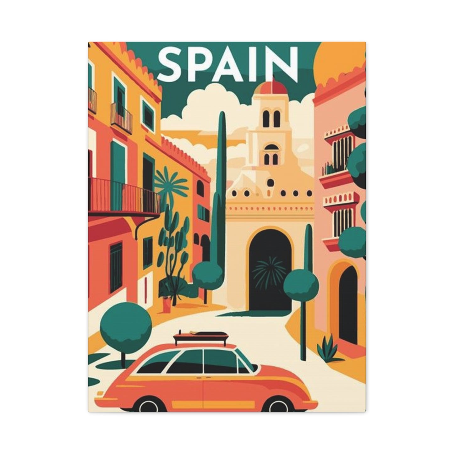
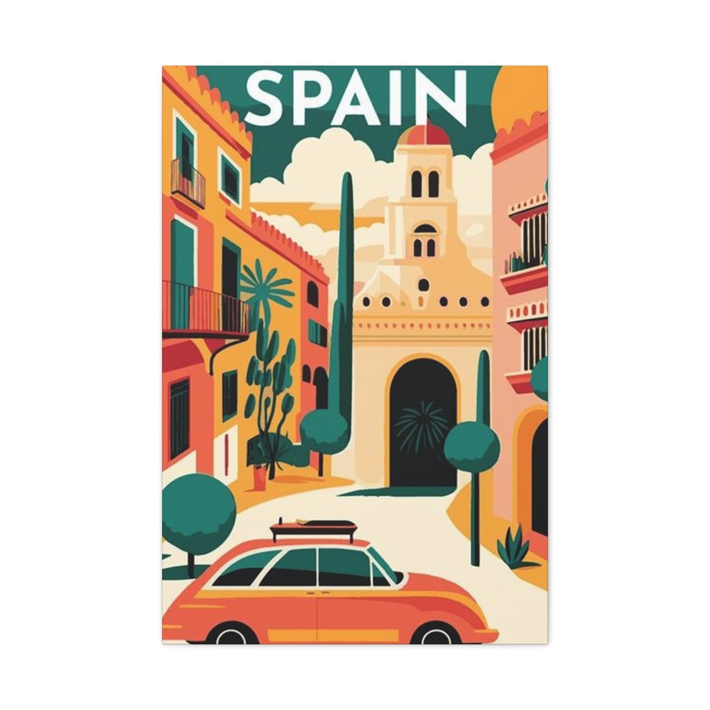
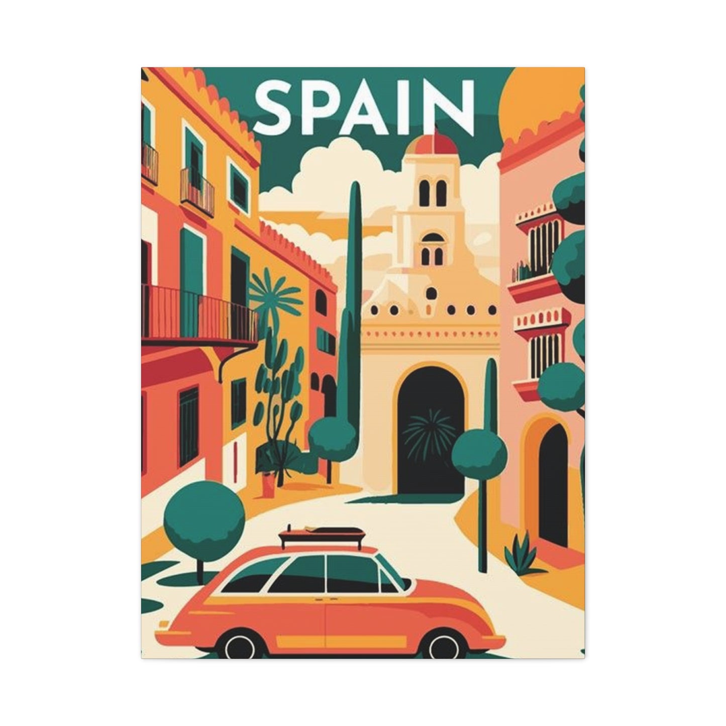
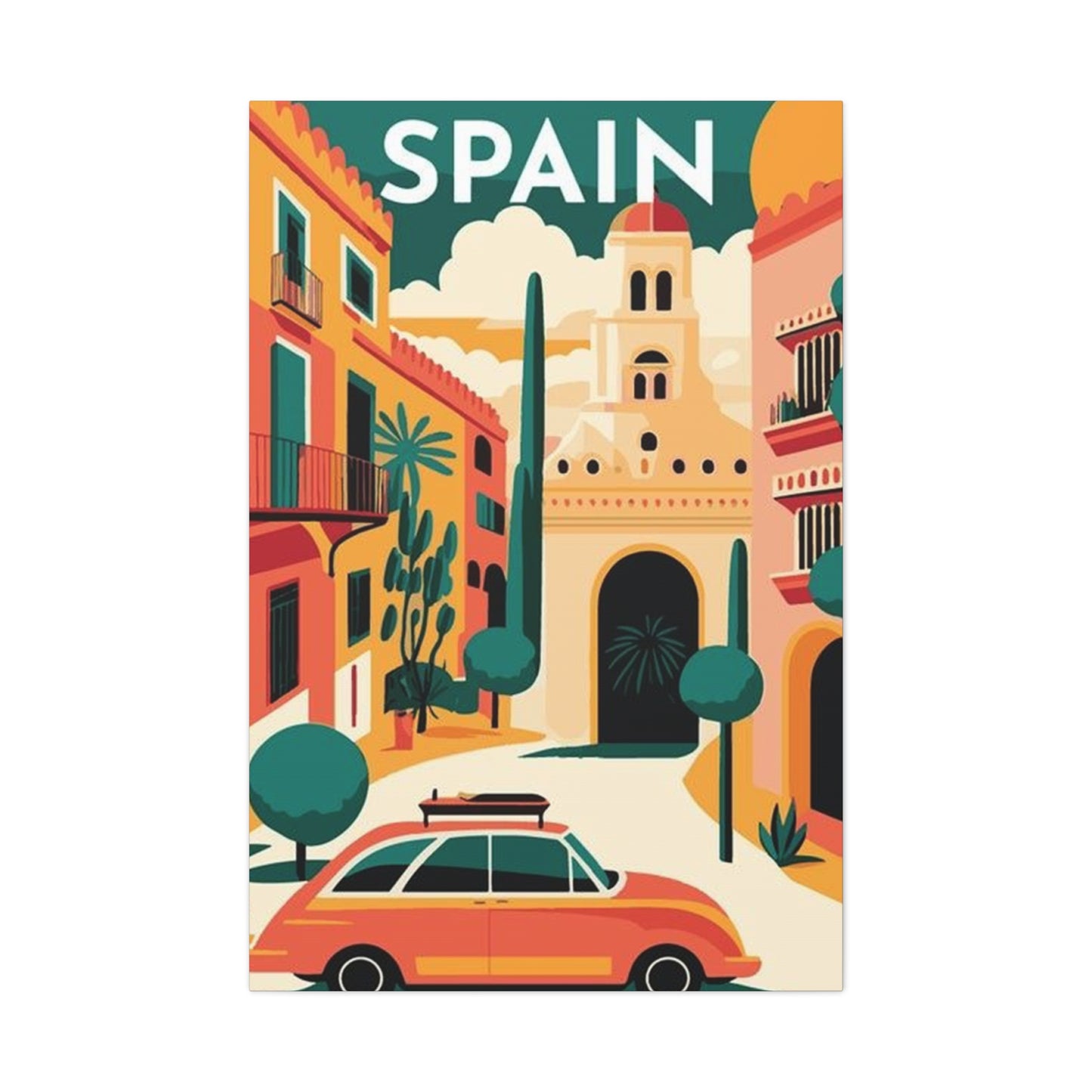
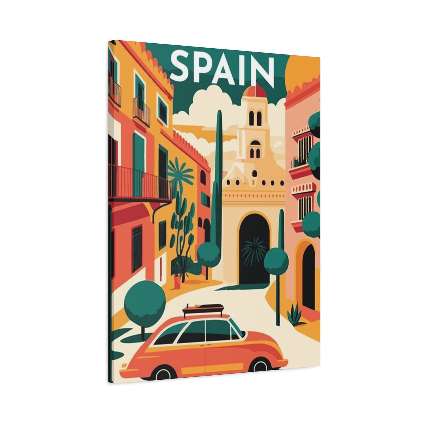
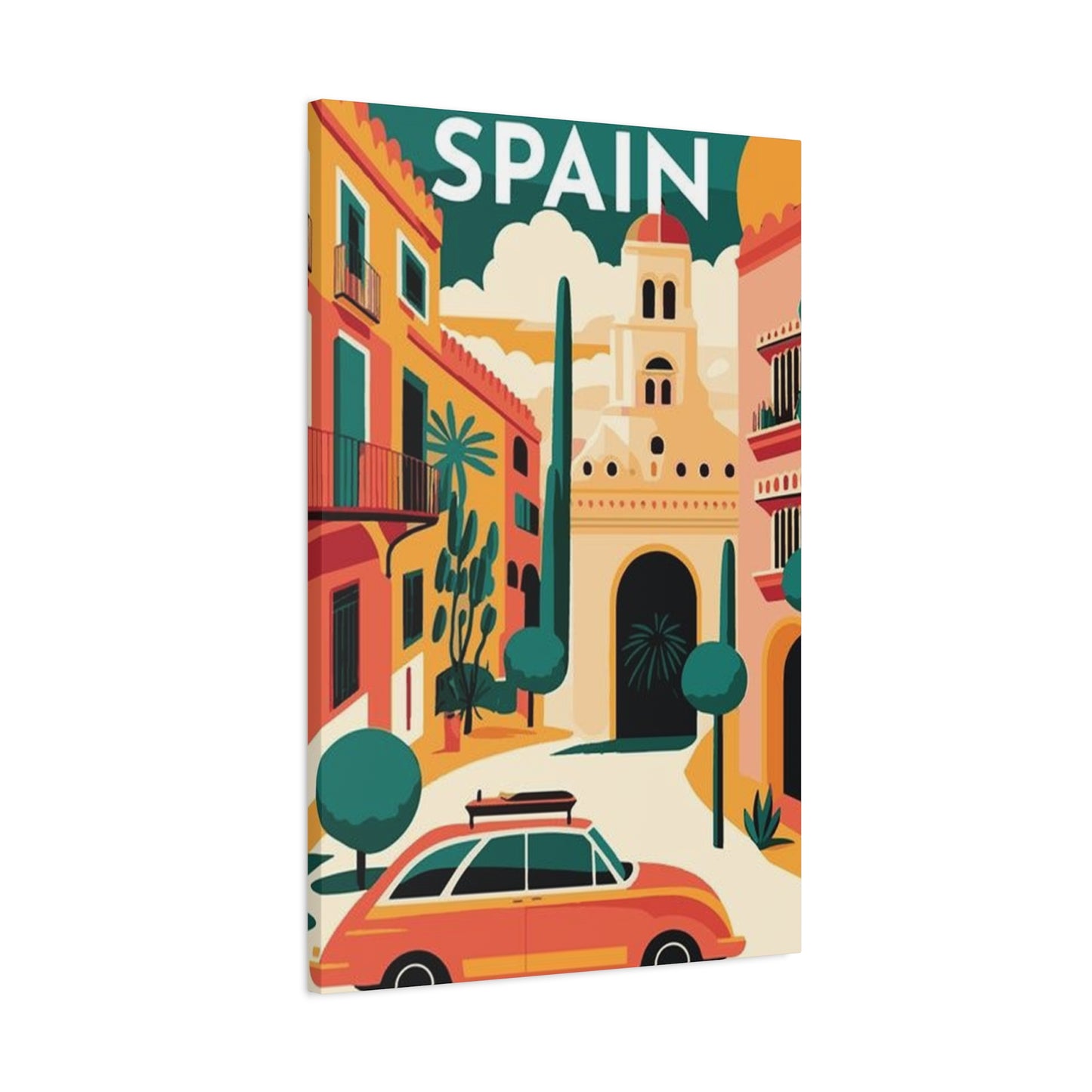
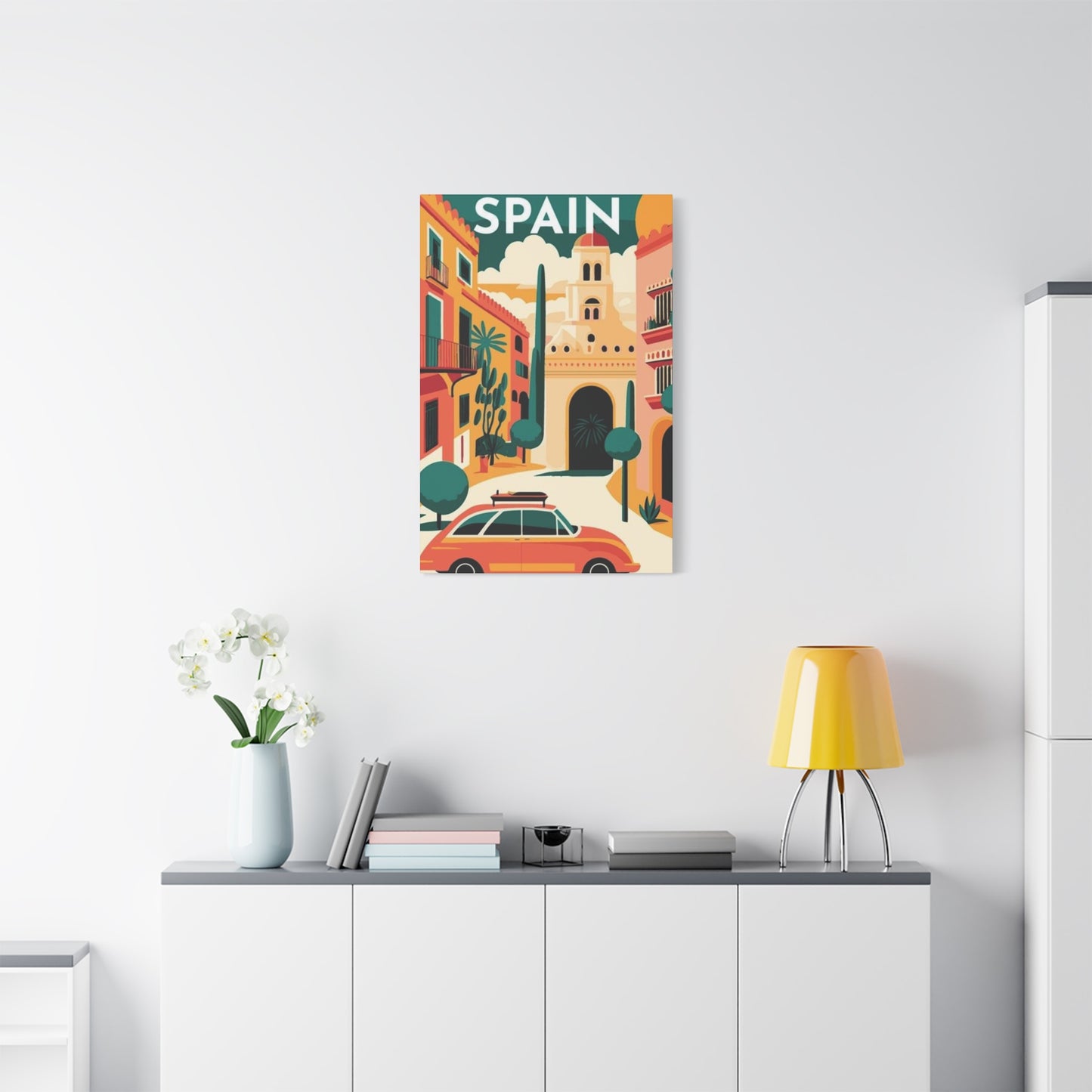
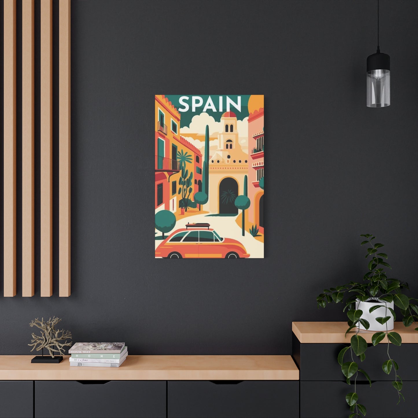
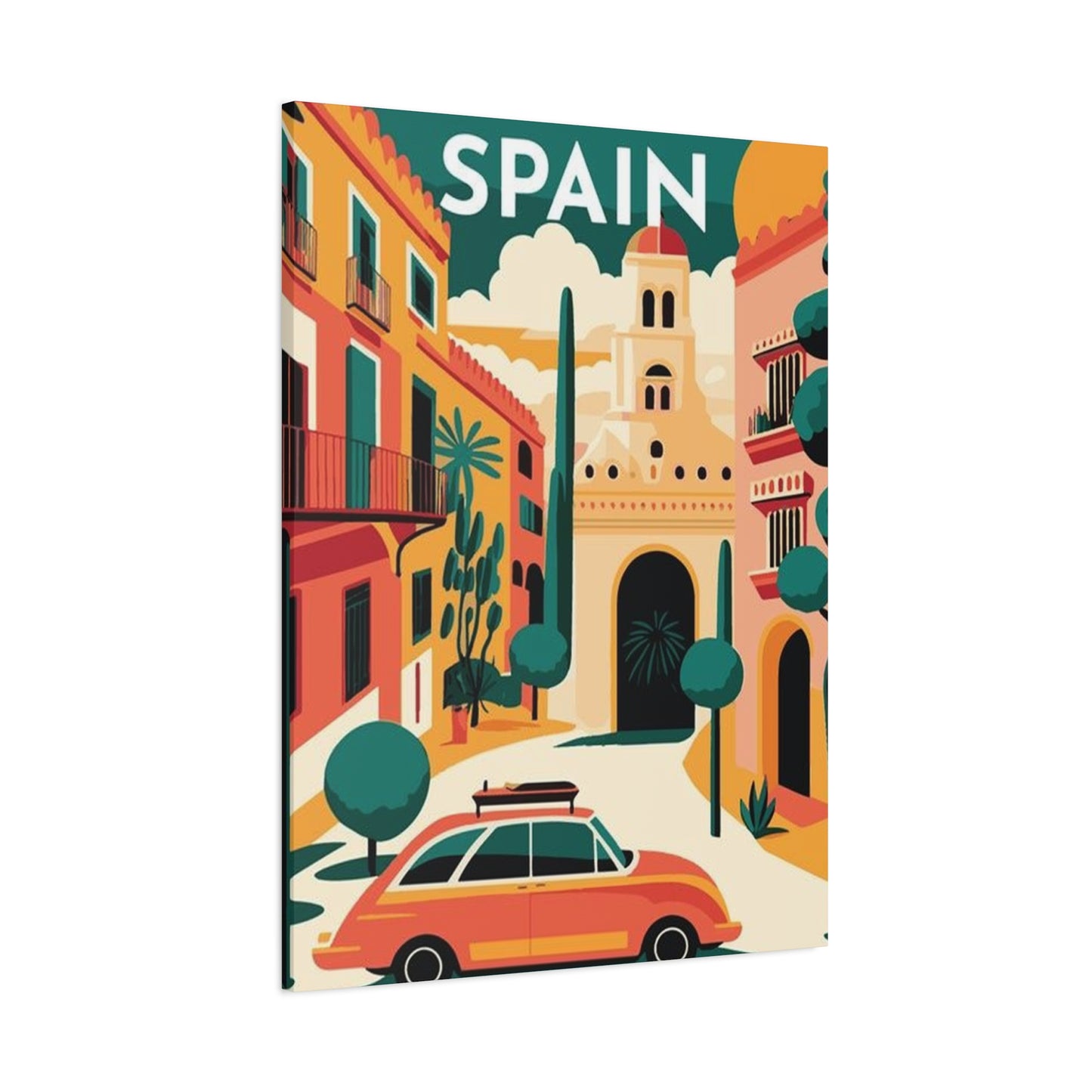
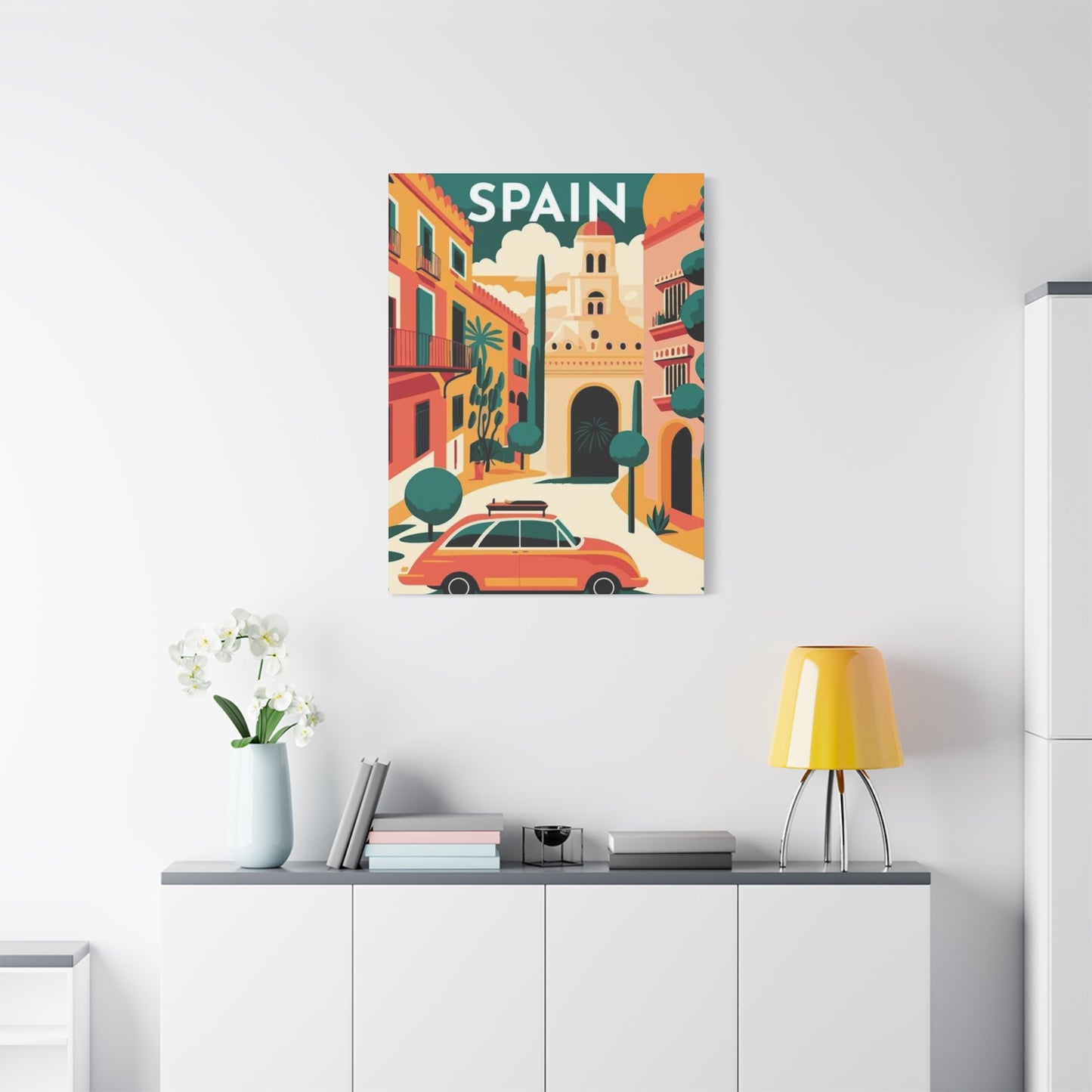
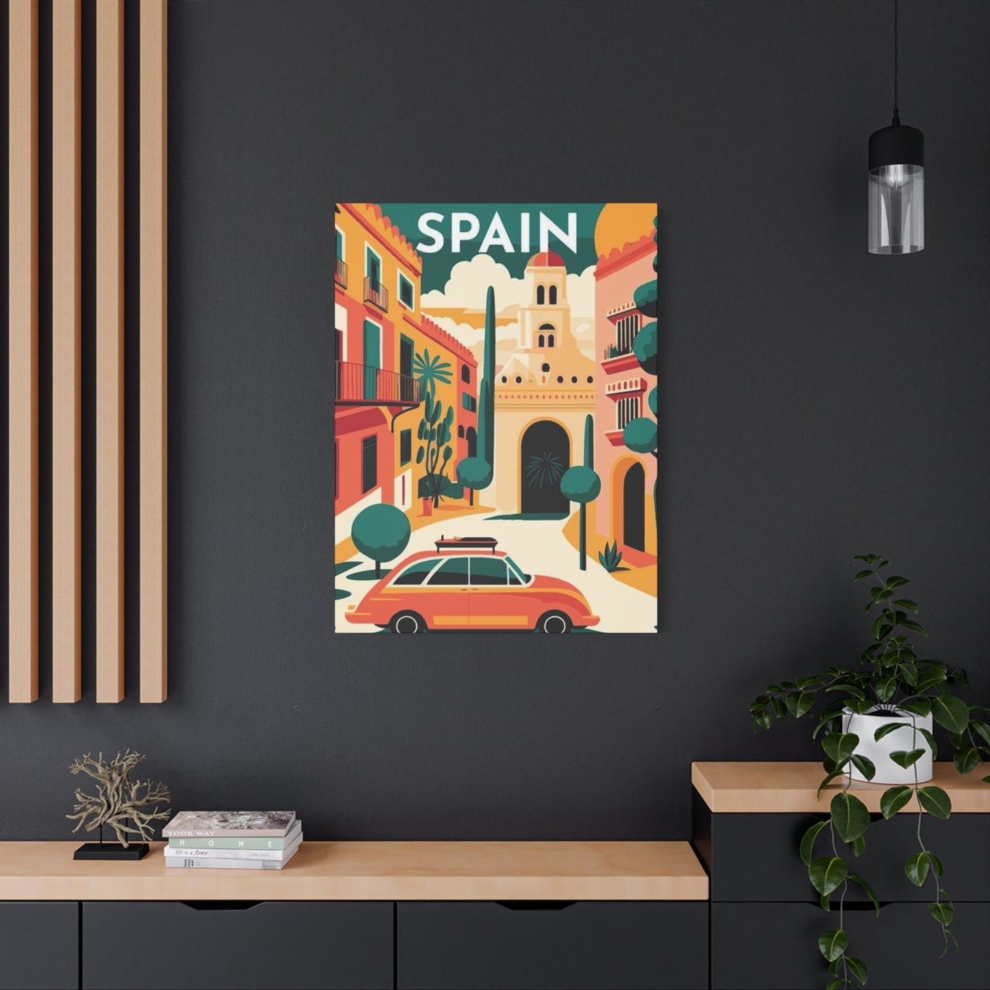
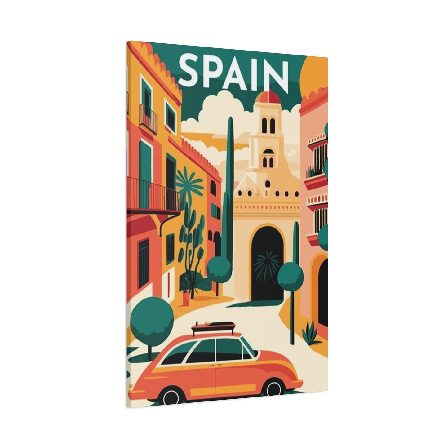
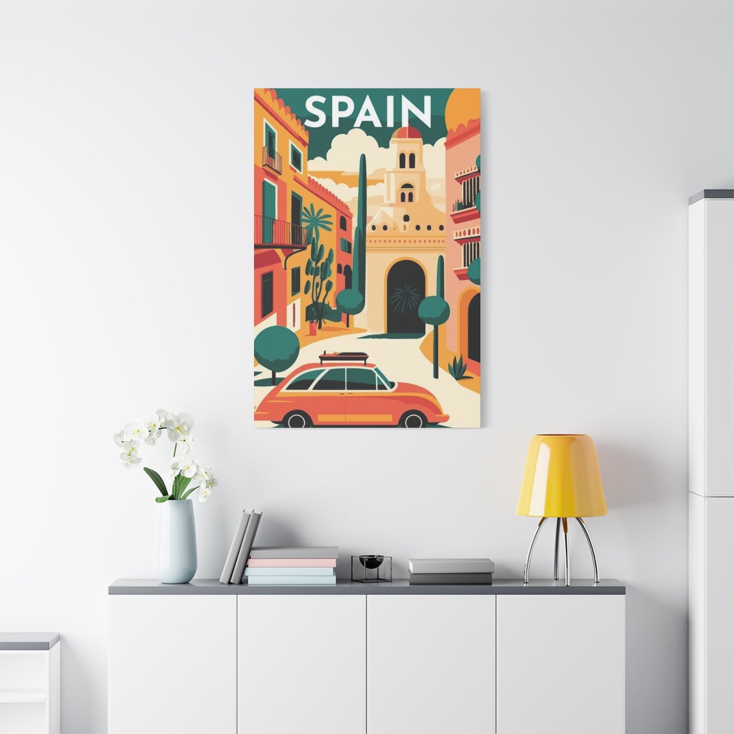
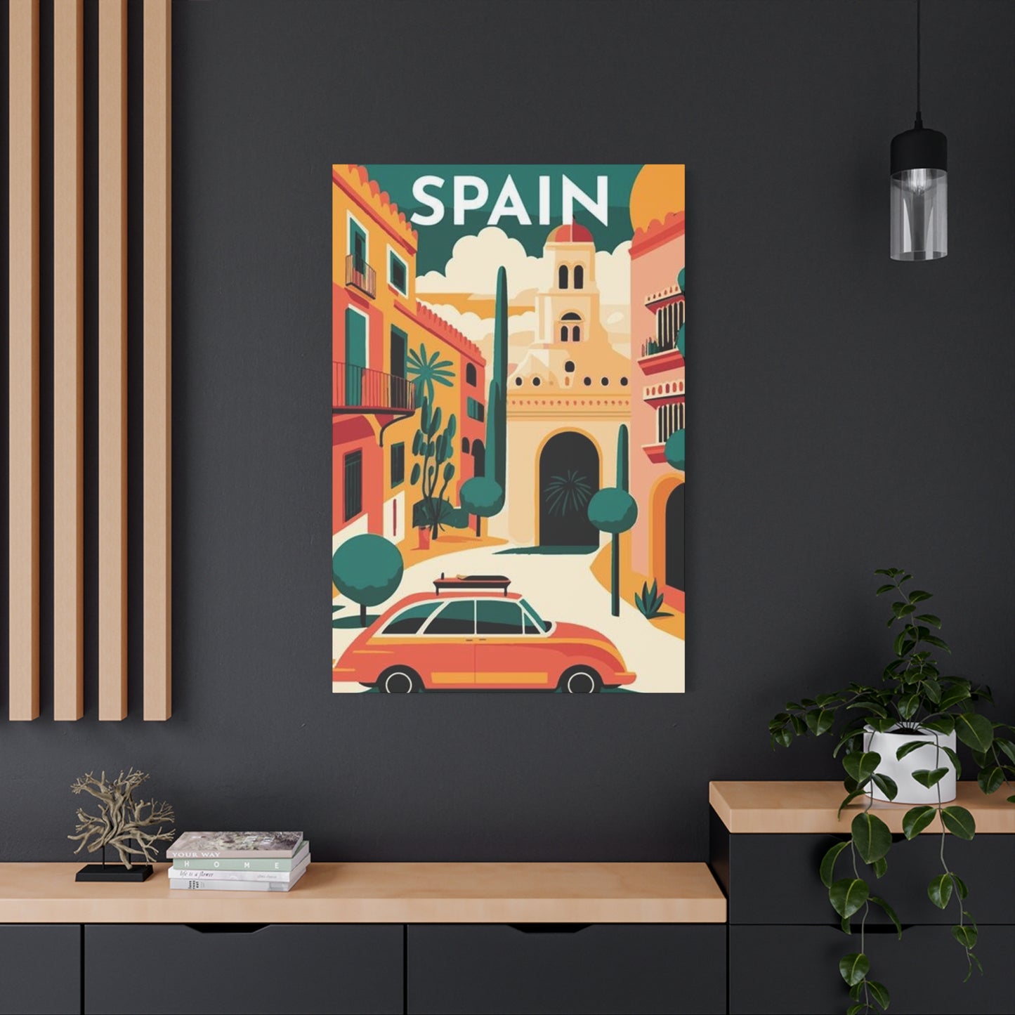
Spain Abstract Wall Art & Canvas Prints
Spain Abstract Wall Art & Canvas Prints
Couldn't load pickup availability
Mediterranean Modernism: The Allure of Spanish Abstract Wall Art in Contemporary Décor
The world of interior decoration has witnessed a remarkable evolution in recent years, with homeowners and designers increasingly gravitating towards pieces that tell stories and evoke powerful emotions. Among the most captivating trends emerging in contemporary home styling is the incorporation of Spanish-inspired abstract wall art canvas prints. These striking pieces seamlessly blend the passionate spirit of Iberian culture with modern artistic expression, creating visual statements that transform ordinary rooms into extraordinary spaces filled with character and sophistication.
Spanish abstract wall art represents more than mere decoration; it embodies centuries of artistic tradition, cultural richness, and the vibrant energy that defines the Mediterranean region. From the bold color palettes reminiscent of Barcelona's modernist architecture to the fluid forms echoing Andalusian landscapes, these canvas prints capture the essence of Spanish creativity while maintaining the versatility required for contemporary interiors. The fusion of traditional Spanish artistic elements with abstract design principles results in artwork that speaks to both the heart and the mind, offering viewers an opportunity to experience the warmth and passion of Spanish culture within their own living spaces.
The appeal of these artistic pieces extends far beyond their aesthetic value. Spanish-inspired abstract canvas prints serve as conversation starters, focal points, and expressions of personal taste that reflect an appreciation for cultural diversity and artistic innovation. Whether displayed in residential settings, commercial establishments, or hospitality venues, these artworks bring an unmistakable sense of sophistication and worldliness to any environment. The versatility of abstract art allows these pieces to complement various interior design styles, from minimalist modern spaces to richly decorated traditional rooms, making them an invaluable addition to any art collection.
As we delve deeper into the world of Spanish abstract wall art canvas prints, we will explore the multifaceted nature of these captivating pieces, examining their cultural origins, design characteristics, placement strategies, and the profound impact they can have on interior environments. This comprehensive exploration will provide valuable insights for anyone seeking to enhance their living or working spaces with the timeless beauty and passionate energy of Spanish-inspired abstract art.
The Cultural Heritage Behind Spanish Abstract Artistic Expression
Spanish art has long been celebrated for its boldness, passion, and innovative spirit, qualities that have influenced artistic movements worldwide. The rich cultural tapestry of Spain, woven from diverse regional traditions, historical influences, and artistic revolutions, provides the foundation upon which contemporary Spanish-inspired abstract art is built. From the cave paintings of Altamira to the groundbreaking works of twentieth-century masters, Spanish artistic tradition has consistently pushed boundaries and challenged conventional perspectives.
The connection between traditional Spanish art and modern abstract expressions runs deep, with historical movements providing inspiration for contemporary artists. The dramatic chiaroscuro techniques employed during Spain's Golden Age, the emotional intensity of religious iconography, and the revolutionary approaches of modernist pioneers all contribute to the visual vocabulary found in today's Spanish-inspired abstract pieces. These historical influences manifest in the bold color contrasts, dynamic compositions, and emotional depth that characterize this artistic style.
Regional diversity within Spain itself offers a wealth of inspiration for abstract interpretations. The sun-drenched landscapes of Andalusia inspire warm color palettes featuring terracotta oranges, golden yellows, and deep burgundies. The rugged coastlines of Galicia suggest cooler tones and more turbulent compositions. The architectural grandeur of Catalonia influences geometric abstractions and bold structural elements. Each region's unique character contributes distinct aesthetic qualities that artists incorporate into their abstract creations, resulting in a rich variety of styles all unified by their Spanish inspiration.
The influence of Spanish festivals and cultural celebrations also permeates abstract artistic interpretations. The vibrant colors of flamenco dresses, the dynamic movement of traditional dances, and the passionate energy of local celebrations all find expression in abstract forms. These cultural elements translate into visual rhythms, color harmonies, and compositional dynamics that capture the spirit of Spanish festivity without literal representation. The resulting artwork conveys emotion and energy through pure visual elements, allowing viewers to experience the essence of Spanish culture in an accessible, contemporary format.
Spanish architecture, from medieval fortresses to modernist masterpieces, provides another significant source of inspiration for abstract artistic expression. The organic curves of Antoni Gaudí's creations, the geometric precision of Moorish tile work, and the imposing strength of Romanesque structures all influence abstract compositions. These architectural elements translate into visual patterns, spatial relationships, and structural frameworks that give Spanish-inspired abstract art its distinctive character. The interplay between solid forms and flowing lines creates a visual language that speaks to both strength and grace, stability and movement.
Color Palettes Defining Spanish Abstract Artistic Style
The color schemes employed in Spanish-inspired abstract wall art canvas prints are perhaps the most immediately recognizable feature of this artistic style. These palettes draw directly from the Spanish landscape, culture, and artistic tradition, creating visual experiences that evoke the warmth, passion, and vitality of the Iberian Peninsula. The careful selection and combination of colors play a crucial role in establishing the emotional tone and visual impact of each piece, making color choices one of the most important considerations in both creating and selecting Spanish abstract art.
Warm earth tones form the foundation of many Spanish-inspired color schemes, reflecting the sun-baked landscapes and terracotta-rich architecture found throughout the region. Burnt sienna, raw umber, and ochre create a sense of warmth and groundedness, evoking the feeling of ancient stone walls heated by the Mediterranean sun. These colors provide stability and richness to compositions, serving as anchors for more vibrant accent colors. The earthy quality of these hues connects viewers to the land itself, creating a visceral response that transcends mere visual appreciation.
Vibrant reds and deep burgundies feature prominently in Spanish abstract art, symbolizing the passion and intensity associated with Spanish culture. These bold colors reference everything from the crimson capes of matadors to the deep wines of Rioja, from the blooming bougainvillea adorning white-washed walls to the dramatic sunsets over the Mediterranean. When incorporated into abstract compositions, these powerful reds create focal points and add emotional intensity, commanding attention and evoking strong feelings in viewers. The strategic use of red tones can transform an entire composition, injecting energy and drama into the artwork.
Blues inspired by the Mediterranean Sea and Spanish skies offer cooling counterpoints to warmer tones, creating visual balance and depth. From the deep navy of the ocean depths to the brilliant turquoise of coastal shallows, from the pale azure of morning skies to the rich cobalt of twilight, blue tones add dimension and atmosphere to Spanish abstract pieces. These colors introduce tranquility and spaciousness, allowing compositions to breathe and creating visual rest areas that balance more intense color zones. The interplay between warm and cool tones generates visual tension and harmony simultaneously, adding complexity to the viewing experience.
Golden yellows and sunny oranges capture the intense Mediterranean sunlight that bathes Spain throughout much of the year. These luminous colors bring light and warmth to compositions, creating uplifting and energizing effects. Whether used as bold statements or subtle accents, these solar-inspired hues add vitality and optimism to abstract pieces. The inclusion of golden tones also references Spain's artistic heritage, echoing the gilded religious artwork and the warm glow of candlelit cathedrals that have long been part of Spanish visual culture.
Black and white elements provide structure and definition within Spanish abstract compositions, creating contrast and visual clarity. The stark whites evoke the famous white-washed villages of Andalusia, while deep blacks add drama and sophistication. These neutral tones allow other colors to shine more brilliantly while also contributing their own aesthetic value. The interplay between light and dark creates depth, defines shapes, and adds visual interest to compositions, demonstrating that Spanish abstract art encompasses the full spectrum of tonal values.
Compositional Elements Characteristic of Spanish Abstract Design
The structural organization of Spanish-inspired abstract wall art canvas prints reflects both traditional artistic principles and contemporary design sensibilities. These compositional elements work together to create visual experiences that are both aesthetically pleasing and emotionally engaging. Understanding these structural characteristics helps viewers appreciate the sophistication of Spanish abstract art and assists collectors in selecting pieces that will have the desired impact in their spaces.
Dynamic movement represents a key compositional element in Spanish abstract art, reflecting the energy and passion associated with Spanish culture. Sweeping curves, diagonal lines, and flowing forms create a sense of motion within static images, suggesting the rhythmic movements of flamenco dancers or the rolling hills of Spanish countryside. This visual dynamism prevents compositions from feeling static or lifeless, instead infusing them with vitality and energy. The eye travels across the canvas following these directional cues, creating an engaging viewing experience that reveals new details with each observation.
Layering techniques add depth and complexity to Spanish abstract compositions, creating visual richness that rewards sustained viewing. Multiple levels of color, texture, and form overlap and interact, suggesting the accumulated history and cultural depth of Spanish civilization. These layers create spatial ambiguity, allowing viewers to perceive different depths and relationships within the composition. The technique also adds a tactile quality to the work, even in printed reproductions, as viewers sense the buildup of visual elements and the complex relationships between different compositional layers.
Geometric elements inspired by Spanish architectural traditions frequently appear in abstract interpretations, particularly those influenced by Moorish design heritage. Repeating patterns, tessellations, and mathematical precision create structure and order within compositions, contrasting with more organic, fluid elements. These geometric components reference the intricate tile work found in historic Spanish buildings, translating architectural decoration into abstract visual language. The balance between geometric precision and organic flow creates tension and interest, preventing compositions from becoming either too rigid or too chaotic.
Negative space plays an important role in Spanish abstract compositions, providing visual breathing room and allowing positive elements to achieve greater impact. The strategic use of empty areas creates balance and prevents compositions from becoming overwhelming or cluttered. These quiet zones also contribute to the overall rhythm of the piece, creating pauses that enhance the impact of more densely worked areas. The thoughtful incorporation of negative space demonstrates compositional sophistication and ensures that artworks remain visually accessible rather than exhausting to view.
Focal points and visual hierarchy guide viewer attention through Spanish abstract compositions, ensuring that artworks communicate effectively despite their non-representational nature. Artists create these focal areas through contrast, color intensity, detail concentration, or size relationships, directing the eye to key zones within the composition. The establishment of clear visual hierarchy prevents confusion and provides entry points for viewer engagement, making abstract art more approachable and understandable. These carefully constructed focal points anchor compositions while allowing supporting elements to enrich the overall visual experience.
Textural Qualities Enhancing Spanish Abstract Canvas Prints
The textural dimension of Spanish-inspired abstract wall art canvas prints adds a crucial layer of visual and tactile interest that elevates these pieces beyond simple color compositions. Texture introduces variety, creates visual intrigue, and adds a physical quality that engages viewers on multiple sensory levels. Even when texture exists only as visual suggestion in printed reproductions, it significantly impacts the overall aesthetic and emotional effect of the artwork.
Impasto techniques, where paint is applied thickly to create raised surfaces, generate dramatic textural effects in original Spanish abstract paintings. When reproduced on canvas prints, these textures can be simulated through high-quality printing techniques that capture the dimensional quality of the original work. The resulting visual texture adds energy and spontaneity to compositions, suggesting the passionate, immediate nature of artistic creation. These thick, gestural applications of paint convey emotion and intensity, allowing viewers to sense the artist's physical engagement with the work.
Smooth, flowing areas provide contrast to rougher textures, creating visual variety and preventing monotony. These sleek surfaces might suggest polished marble, calm water, or clear sky, offering respite from more agitated textural zones. The juxtaposition of smooth and rough textures creates visual interest and adds sophistication to compositions. This textural variation also supports the creation of depth, as smoother areas often recede visually while rougher textures advance, contributing to the spatial complexity of the artwork.
Layered glazing techniques create luminous, translucent effects that add depth and richness to color application. Multiple thin layers of paint allow underlying colors to show through, creating complex color relationships and atmospheric effects. When reproduced in high-quality canvas prints, these subtle tonal variations and color depths are preserved, maintaining the sophistication of the original work. The luminosity achieved through glazing adds a jewel-like quality to Spanish abstract pieces, enhancing their visual appeal and creating artwork that seems to glow with inner light.
Scraping, scratching, and incising techniques introduce linear textural elements that cut through painted surfaces, revealing underlying layers. These marks add energy and spontaneity to compositions while also creating interesting linear rhythms that complement broader color areas. The visible evidence of the artistic process adds authenticity and character to works, connecting viewers to the creative act. These textural marks also contribute to the overall composition by introducing directional elements and creating focal points through concentrated detail.
Pattern integration through textural repetition creates visual rhythms and adds decorative richness to Spanish abstract compositions. Repeated marks, stamps, or textural motifs reference traditional Spanish craft techniques like embroidery, tile work, or metalwork, translating these cultural elements into abstract visual language. These patterned textures add complexity without cluttering compositions, demonstrating the sophisticated balance between decoration and restraint characteristic of Spanish artistic tradition. The rhythmic quality of patterned texture also enhances the musical, dance-like quality often associated with Spanish abstract art.
Size Considerations for Spanish Abstract Wall Art Displays
Selecting the appropriate size for Spanish-inspired abstract wall art canvas prints is crucial for achieving the desired visual impact and ensuring proper integration with the surrounding space. Size decisions affect not only the aesthetic success of the artwork but also the way it functions within the room's overall design scheme. Careful consideration of dimensional relationships ensures that Spanish abstract art enhances rather than overwhelms or gets lost within interior spaces.
Large-scale statement pieces measuring six feet or more in width or height create dramatic focal points that command attention and define spaces. These oversized canvases work exceptionally well in expansive areas like open-plan living rooms, commercial lobbies, or above king-sized beds. The generous dimensions allow for bold, sweeping compositions that viewers can appreciate from a distance while also offering intricate details to discover upon closer inspection. Large Spanish abstract pieces establish immediate visual impact, setting the tone for entire spaces and demonstrating confidence in artistic expression.
Medium-sized artworks ranging from three to five feet in their longest dimension offer versatility and work well in most residential spaces. These proportions provide sufficient presence to serve as focal points without overwhelming rooms or requiring vast wall expanses. Medium-scale Spanish abstract prints suit dining rooms, bedrooms, home offices, and living areas with moderate ceiling heights. The balanced proportions of medium-sized pieces make them approachable and allow for comfortable viewing distances in typical room configurations, ensuring that viewers can appreciate compositional details without strain.
Small-format pieces measuring under three feet in their longest dimension excel in intimate settings and work beautifully as part of gallery walls or grouped arrangements. These compact canvases suit hallways, bathrooms, small bedrooms, or nook spaces where larger artwork would feel oppressive. Small Spanish abstract prints also allow collectors to acquire multiple pieces, creating varied displays that can be rearranged according to mood or seasonal preferences. The accessibility of smaller formats makes Spanish abstract art available to those with limited wall space or budget constraints while still delivering authentic artistic expression.
Horizontal orientations emphasize width over height, creating compositions that feel grounded and stable. These landscape-format pieces work particularly well above furniture like sofas, beds, or sideboards, where their horizontal emphasis complements the furniture's linear quality. Horizontal Spanish abstract canvases can make rooms feel wider and more expansive, an effect particularly valuable in narrow spaces. The width of these pieces allows for panoramic compositions that can reference sweeping Spanish landscapes or architectural vistas, creating visual experiences that draw the eye across the canvas.
Vertical formats emphasize height, creating dramatic upward movement and making spaces feel taller. These portrait-orientation pieces suit narrow wall sections, spaces beside windows or doors, or areas where vertical emphasis serves the architectural character. Vertical Spanish abstract prints can reference architectural elements like cathedral columns or the upward growth of cypress trees, creating compositions with inherent elegance and grace. The height of these pieces draws the eye upward, an effect that adds sophistication and visual interest to interior spaces.
Square formats offer balanced, centered compositions that feel stable and harmonious. These equal-dimension pieces work well in symmetrical arrangements or as standalone statements where their balanced proportions create calm, orderly visual effects. Square Spanish abstract canvases suit modern, minimalist interiors where their geometric format complements clean-lined architecture and furniture. The equality of dimensions in square pieces creates focused, contained compositions that feel complete and self-sufficient, requiring no additional elements to achieve visual balance.
Material Quality Standards for Canvas Print Reproduction
The technical quality of Spanish-inspired abstract wall art canvas prints significantly impacts their appearance, longevity, and overall value. Understanding the material specifications and production standards helps collectors make informed decisions and ensures that purchased artwork will maintain its beauty over time. High-quality reproduction preserves the integrity of original designs and delivers viewing experiences that honor the artist's creative vision.
Canvas substrate selection forms the foundation of quality reproduction, with premium cotton or linen canvases offering superior texture, durability, and color receptivity compared to synthetic alternatives. High-quality natural fiber canvases provide the authentic texture and appearance of fine art substrates, creating prints that feel legitimate and substantial. The weight of canvas, measured in ounces per square yard, indicates durability and stability, with heavier weights providing better structural integrity and resistance to warping. Premium canvas substrates ensure that Spanish abstract prints maintain their appearance over decades of display.
Printing technology determines color accuracy, detail resolution, and overall image quality in canvas reproductions. Giclée printing, utilizing archival pigment inks and high-resolution output, represents the gold standard for fine art reproduction. This process delivers exceptional color fidelity, subtle tonal gradations, and sharp detail rendering that faithfully reproduces original artwork. The superior quality of giclée printing ensures that Spanish abstract designs maintain their visual impact and artistic integrity in printed form, making reproductions worthy of serious art collections.
Ink quality directly affects color vibrancy, accuracy, and longevity in canvas prints. Archival pigment-based inks resist fading, color shifting, and degradation far better than dye-based alternatives, ensuring that prints maintain their appearance for generations. UV-resistant ink formulations provide additional protection against the primary cause of artwork deterioration, allowing Spanish abstract prints to withstand normal indoor lighting conditions without significant color change. The use of premium inks represents an essential investment in artwork longevity and aesthetic preservation.
Coating applications protect canvas prints from environmental damage while enhancing color vibrancy and surface appearance. Protective varnishes or UV-resistant coatings add a barrier against dust, moisture, and light damage, extending the life of artwork significantly. Some coatings also enhance color depth and add subtle sheen, enriching the visual experience. The application of appropriate protective finishes ensures that Spanish abstract canvas prints remain vibrant and beautiful throughout many years of display.
Stretching and mounting techniques affect both the appearance and longevity of canvas prints. Gallery-wrap stretching, where canvas wraps around frame edges with the image continuing on sides, creates finished presentations suitable for frameless display. Quality stretcher bars made from kiln-dried wood resist warping and provide stable support for canvas tension. Proper stretching ensures that canvases remain taut and flat, preventing sagging or waviness that would compromise visual quality. The care taken in mounting directly impacts the professional appearance and durability of Spanish abstract canvas prints.
Color calibration throughout the reproduction process ensures that printed canvases accurately represent original artwork or digital designs. Professional color management systems account for variations in monitor displays, printer characteristics, and viewing conditions, delivering consistent, accurate color reproduction. This technical precision preserves the carefully considered color relationships in Spanish abstract designs, ensuring that the emotional and aesthetic impact of the artwork translates faithfully to printed form. Color accuracy represents a crucial quality standard that separates professional reproductions from inferior alternatives.
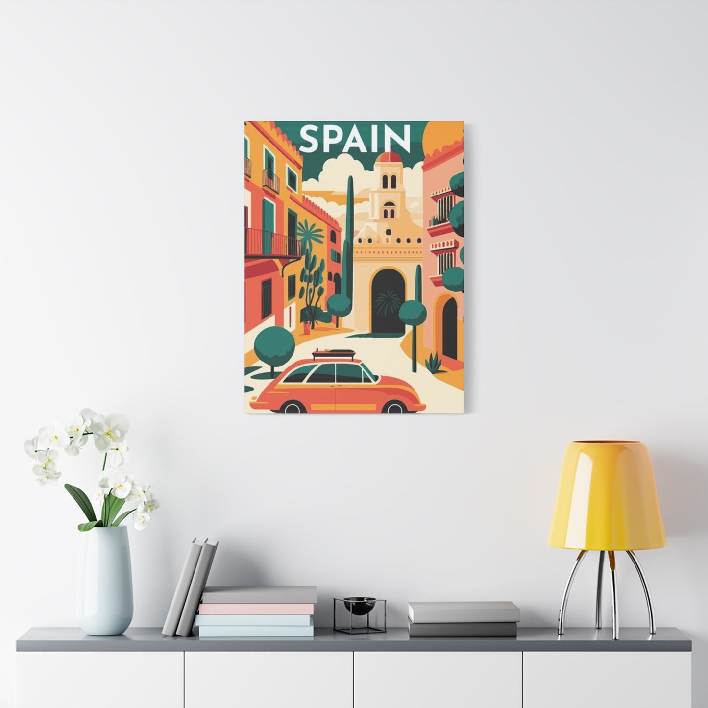
Strategic Placement Principles for Maximum Visual Impact
The location and installation of Spanish-inspired abstract wall art canvas prints significantly influences their visual effectiveness and the overall success of interior design schemes. Thoughtful placement considers multiple factors including viewing angles, lighting conditions, spatial relationships, and functional requirements. Proper positioning ensures that Spanish abstract artwork achieves its full potential as both aesthetic enhancement and expressive statement.
Focal wall identification represents the first step in strategic artwork placement, determining which wall surface will serve as the primary visual anchor in a room. Focal walls typically face the main entry point, receive favorable natural or artificial lighting, or occupy central positions in seating arrangements. Placing Spanish abstract canvas prints on focal walls ensures maximum visibility and impact, allowing the artwork to fulfill its role as visual centerpiece. The focal wall location should offer sufficient uninterrupted surface area to accommodate the artwork without crowding or competing visual elements.
Height positioning affects both the aesthetic impact and viewing comfort of wall-mounted artwork. The standard guideline places artwork so that its center point sits at approximately sixty to sixty-five inches from the floor, representing average eye level for standing viewers. This positioning ensures comfortable viewing without neck strain and creates proper visual weight distribution within the space. However, contextual factors like furniture placement, ceiling height, and viewer characteristics may warrant adjustments to this baseline. Spanish abstract pieces positioned above furniture typically sit eight to twelve inches above the furniture top, creating visual connection while maintaining distinction.
Lighting considerations dramatically affect the appearance and impact of Spanish-inspired abstract canvas prints, making illumination planning essential to successful placement. Natural light from windows provides dynamic, changing illumination that can bring artwork to life, though direct sunlight should be avoided to prevent fading and damage. Artificial lighting using picture lights, track lighting, or strategically positioned accent fixtures allows precise control over artwork illumination. The angle, intensity, and color temperature of lighting all influence how Spanish abstract colors appear and how textural elements read visually. Proper lighting transforms good artwork into spectacular displays that capture attention and reward viewing.
Spatial relationships between artwork and surrounding architectural features or furnishings create visual harmony or discord depending on their alignment. Spanish abstract canvas prints should relate proportionally to nearby furniture, maintaining neither excessive nor insufficient scale relationships. The artwork's width ideally spans approximately two-thirds to three-quarters of the furniture width below it, creating balanced visual relationships. Consideration of surrounding elements like windows, doorways, or adjacent walls ensures that artwork integrates smoothly into the architectural context rather than feeling randomly placed or visually isolated.
Grouping strategies allow multiple Spanish abstract pieces to create cohesive displays with greater visual impact than individual works alone. Gallery wall arrangements combine multiple canvases in organized layouts that function as unified visual statements. Symmetrical groupings create formal, balanced effects suitable for traditional spaces, while asymmetrical arrangements offer dynamic, contemporary aesthetics. Consistent spacing between grouped pieces maintains visual coherence, typically ranging from two to four inches depending on frame sizes and overall arrangement scale. Themed groupings using Spanish abstract pieces with related colors, subjects, or styles create stronger impact through repetition and variation.
Room-specific placement strategies account for the unique functional and aesthetic requirements of different spaces. Living rooms benefit from large, bold Spanish abstract statements that establish room character and provide conversation focus. Bedrooms suit calmer, more contemplative pieces positioned where they're visible from the bed. Dining areas accommodate artwork scaled to table dimensions, creating ambiance without dominating the space. Home offices benefit from inspiring, energizing Spanish abstract pieces positioned within sightlines from work positions. Hallways and transitional spaces offer opportunities for gallery wall arrangements or series of related pieces that create visual interest in otherwise functional areas.
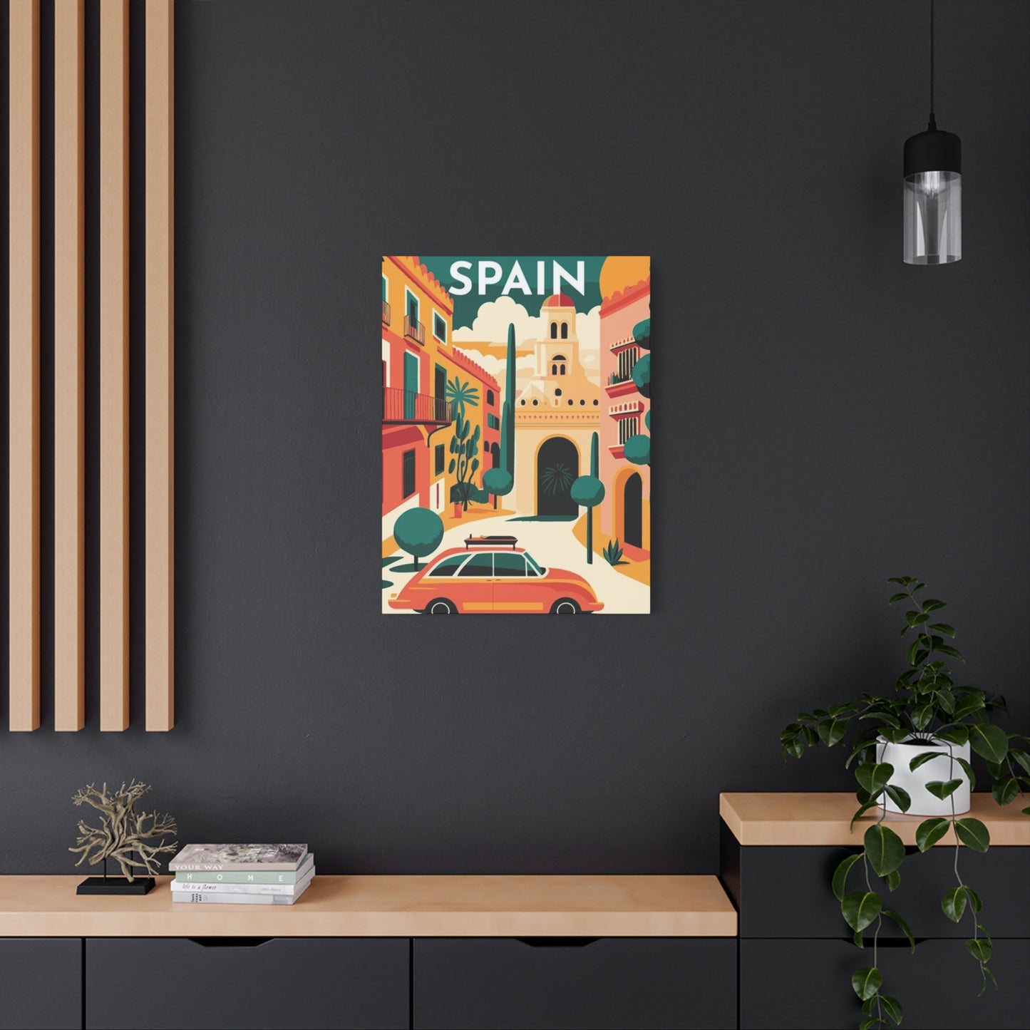
Color Coordination Between Artwork and Interior Design
Successfully integrating Spanish-inspired abstract wall art canvas prints into existing interior design schemes requires thoughtful consideration of color relationships between artwork and surrounding décor elements. Effective color coordination creates visual harmony while allowing artwork to maintain distinctive presence and impact. Understanding color theory principles and practical coordination strategies enables designers and homeowners to create cohesive, aesthetically pleasing spaces where Spanish abstract art enhances overall design success.
Complementary color schemes create vibrant, high-energy effects by pairing colors opposite each other on the color wheel. Spanish abstract pieces featuring warm oranges and reds complement rooms decorated in cool blues or greens, creating dynamic visual tension and making both artwork and décor elements appear more vibrant. This bold approach suits contemporary, energetic spaces where visual excitement is desired. The strong contrast inherent in complementary schemes ensures that artwork commands attention while the opposition prevents either artwork or room from overwhelming the other.
Analogous color coordination uses colors adjacent on the color wheel, creating harmonious, unified effects that feel naturally cohesive. Spanish abstract artwork featuring reds, oranges, and yellows integrates seamlessly into warm-toned rooms decorated in similar hues. This approach creates sophisticated, flowing color relationships where artwork and décor enhance each other without competition. Analogous schemes suit spaces seeking calm, cohesive atmospheres where all elements work together toward unified aesthetic goals. The natural harmony of adjacent colors creates effortless coordination that requires minimal planning while delivering professional results.
Monochromatic approaches focus on variations of a single color, using different saturations, values, and tones to create visual interest through subtle variation rather than contrast. Spanish abstract pieces emphasizing various blues, from pale sky tones to deep navy, coordinate beautifully with rooms decorated in the same color family. This sophisticated strategy creates serene, unified spaces with subtle depth and complexity. Monochromatic coordination allows texture, pattern, and form to provide visual interest while color creates calm continuity throughout the space.
Neutral backgrounds allow Spanish abstract artwork to take center stage without color competition from surrounding décor. White, gray, beige, or black walls and furnishings provide quiet backdrops that emphasize artwork colors and allow them to achieve maximum impact. This approach particularly suits bold, colorful Spanish abstract pieces that might overwhelm rooms with competing color schemes. Neutral coordination creates gallery-like environments where artwork receives proper focus and attention, an effect that honors the art while creating sophisticated, refined interiors.
Accent color extraction identifies specific colors within Spanish abstract artwork and repeats them in smaller doses throughout the room through accessories, textiles, or decorative objects. This strategy creates visual connection between artwork and décor while maintaining the piece's distinctive character. Throw pillows, vases, or area rugs incorporating key colors from the canvas create cohesive schemes without requiring extensive redecorating. Accent color coordination represents an accessible, flexible approach that works with existing décor while honoring new artwork additions.
Contrast strategies intentionally pair Spanish abstract artwork with dramatically different room colors, creating bold, statement-making effects. A piece dominated by warm earth tones might hang in a room with cool gray walls, the contrast making both more striking. This approach requires confidence and careful balance but delivers distinctive, memorable interiors that showcase both art and design. Successful contrast coordination maintains enough shared elements, through secondary colors or neutral bridges, to prevent total visual discord while celebrating difference and creating dynamic tension.
Style Compatibility Across Interior Design Movements
Spanish-inspired abstract wall art canvas prints demonstrate remarkable versatility across various interior design styles, from classic traditional spaces to cutting-edge contemporary environments. Understanding how these artworks interact with different design vocabularies helps ensure successful integration and allows collectors to confidently incorporate Spanish abstract pieces into their existing décor. The adaptability of abstract art, combined with the timeless appeal of Spanish cultural references, creates compatibility across a broad spectrum of aesthetic approaches.
Contemporary minimalist interiors provide ideal settings for Spanish abstract canvas prints, where their bold colors and dynamic forms create striking contrast against simplified backgrounds. The clean lines and uncluttered aesthetic of minimalism allow artwork to assume primary focus without visual competition. Spanish abstract pieces introduce warmth, energy, and cultural depth to spaces that might otherwise feel sterile or impersonal. The balance between minimalist restraint and abstract expressiveness creates sophisticated tension that energizes spaces while maintaining the calm essential to minimalist philosophy.
Modern mid-century spaces embrace Spanish abstract artwork as a natural complement to their clean-lined furniture, organic forms, and emphasis on artistic expression. The warm wood tones common in mid-century design harmonize beautifully with earthy Spanish color palettes, while the period's appreciation for bold color and geometric form aligns with abstract aesthetic principles. Spanish-inspired pieces add cultural richness and contemporary relevance to mid-century interiors, bridging historical design movements with current artistic expressions. The combination creates timeless, sophisticated spaces that honor design history while remaining fresh and current.
Mediterranean and Spanish Colonial interiors find natural affinity with Spanish abstract canvas prints that reference their cultural origins. These artwork choices reinforce the cultural authenticity of design schemes while introducing contemporary artistic sensibilities. Abstract interpretations prevent literal, theme-park aesthetics, instead offering sophisticated cultural references that appeal to educated tastes. The shared color palettes, textural richness, and emotional warmth create seamless integration where artwork feels inherently appropriate to the architectural and decorative context.
Industrial loft spaces benefit from the warmth and cultural richness that Spanish abstract artwork introduces to otherwise hard-edged environments. The soft colors and organic forms typical of Spanish-inspired pieces contrast effectively with exposed brick, concrete surfaces, and metal fixtures characteristic of industrial style. This juxtaposition humanizes industrial spaces, adding emotional warmth without compromising the raw, authentic character that defines the style. Spanish abstract canvas prints provide essential softness and cultural depth that transform industrial spaces from stark to sophisticated.
Traditional and transitional interiors accommodate Spanish abstract artwork when pieces are selected with appropriate color palettes and framing treatments. More subdued, earth-toned Spanish abstracts coordinate with traditional wood furnishings and classic decorative elements, introducing contemporary artistic expression without disrupting the timeless character of traditional design. The cultural depth and artistic sophistication of Spanish-inspired pieces appeal to traditional sensibilities while the abstract format provides visual interest and prevents dated appearances. This combination allows traditional spaces to feel current and vital without abandoning their fundamental character.
Eclectic and bohemian interiors embrace Spanish abstract canvas prints as perfect expressions of worldly sophistication and artistic appreciation. The cultural diversity and creative freedom characteristic of these design approaches align naturally with artwork that references Spanish heritage while expressing contemporary artistic vision. Spanish abstract pieces contribute to the layered, collected appearance essential to eclectic success, adding artistic credibility and visual interest to spaces that celebrate diversity and individual expression. The versatility of abstract art allows it to coexist harmoniously with varied decorative elements from multiple cultures and periods.
Framing Options Enhancing Spanish Abstract Presentations
While many Spanish-inspired abstract wall art canvas prints are displayed as gallery-wrapped canvases without additional framing, frame choices can significantly impact artwork presentation and integration with surrounding décor. Understanding framing options and their aesthetic effects allows collectors to customize artwork appearance and achieve specific design goals. The right framing enhances artwork while respecting its inherent character and maintaining visual integrity.
Floating frames create contemporary presentations where a gap exists between canvas edge and frame interior, making artwork appear to float within the frame structure. This modern treatment adds dimension and sophistication while providing protective boundaries without overwhelming the artwork. Floating frames work particularly well with gallery-wrapped canvases, preserving their frameless aesthetic while adding refined definition. The dimensional quality created by floating frames adds subtle shadow effects that enhance artwork presence and importance.
Traditional wooden frames in natural finishes complement the warm, earthy qualities of many Spanish abstract pieces while adding classical refinement. Wood species like walnut, oak, or cherry contribute their own color and grain character, creating harmony with artwork while providing substantial, quality presentation. Traditional frames suit formal spaces and coordinate effectively with existing wood furniture and architectural elements. The substantial presence of wooden frames adds weight and importance to artwork, signaling its value and significance within the space.
Sleek metal frames in black, silver, or gold finishes create contemporary, gallery-style presentations that focus attention on artwork while adding minimal visual weight. Thin metal profiles provide definition without competing for attention, making them ideal for bold, colorful Spanish abstract pieces that require no enhancement. Metal frames suit modern, minimalist, and industrial interiors where their clean lines and reflective finishes coordinate with contemporary design vocabularies. The precision and simplicity of metal framing allows artwork to speak for itself without decorative interference.
White or colored frames can create dramatic effects by either blending with or contrasting against wall colors. White frames on white walls create subtle definition while maintaining an airy, open feeling. Colored frames matching key artwork colors create strong visual statements and clear connections between art and frame. Bold contrast frames create striking presentations that command attention and make strong style statements. Frame color selection represents a powerful tool for controlling artwork impact and integration with surrounding décor.
Frameless gallery-wrap presentations allow Spanish abstract canvas prints to speak entirely for themselves without any additional ornamentation. The image continues around canvas edges, creating finished presentations suitable for contemporary spaces that favor minimal aesthetic intervention. This approach maximizes artwork visibility and creates clean, modern presentations that suit various design styles. Gallery-wrap displays work particularly well with abstract pieces where composition extends naturally to edges without critical elements requiring protection.
Custom framing solutions address specific design challenges or express particular aesthetic visions through tailored frame profiles, finishes, and dimensions. Professional framers can create frames that precisely match existing décor elements or introduce specific design accents that enhance overall room schemes. Custom framing allows for creative solutions like double matting, specialty finishes, or unusual proportions that transform standard artwork into distinctive design elements. The investment in custom framing demonstrates commitment to design excellence and ensures perfect integration of Spanish abstract pieces into carefully curated interiors.
Creating Gallery Walls with Spanish Abstract Collections
Gallery walls featuring multiple Spanish-inspired abstract wall art canvas prints create dynamic, personalized displays that showcase artistic appreciation while making powerful design statements. These curated arrangements transform blank walls into engaging visual experiences that reflect collector personality and sophisticated design sensibilities. Successful gallery wall creation requires planning, patience, and understanding of compositional principles that guide effective multi-piece displays.
Layout planning represents the crucial first step in gallery wall creation, determining spatial relationships between multiple Spanish abstract pieces. Templates made from paper or digital planning tools allow arrangement experimentation before committing to wall installation. Symmetrical grid layouts create formal, organized effects suitable for traditional spaces or collectors preferring visual order. Asymmetrical organic arrangements offer dynamic, contemporary aesthetics that feel more casual and personal. The layout should account for negative space between pieces, maintaining consistent spacing that provides breathing room while creating unified visual statements.
Size variation within gallery walls adds visual interest and prevents monotonous, repetitive effects. Combining large anchor pieces with smaller supporting works creates hierarchy and guides viewer attention through the display. The largest pieces typically occupy central or upper positions, establishing primary focal points around which smaller works orbit. Varied sizes allow collectors to include multiple pieces within limited wall areas while maintaining visual complexity and interest. The interplay between different scales creates rhythm and movement within gallery wall compositions.
Color coordination across multiple Spanish abstract pieces ensures cohesive gallery wall presentations despite individual artwork differences. Shared color families, complementary palettes, or graduated color progressions create visual threads connecting separate pieces into unified displays. While perfect color matching is unnecessary, some color relationships should exist to prevent chaotic, disconnected appearances. Color coordination allows diverse pieces to coexist harmoniously while maintaining their individual character and interest.
Thematic connections strengthen gallery wall coherence when Spanish abstract pieces share conceptual, stylistic, or cultural relationships. Grouping works by single artists, specific color stories, or related subjects creates intellectual and visual unity that elevates collections beyond random assemblages. Thematic coherence allows gallery walls to tell stories or express particular aesthetic visions, making displays more meaningful and engaging. The shared theme provides underlying structure that unifies diverse pieces while allowing individual expression.
Frame consistency versus variety represents an important stylistic decision affecting gallery wall appearance. Uniform framing creates clean, unified presentations that emphasize artwork over frames, suitable for formal spaces or minimalist preferences. Mixed frames add casual, collected character that suggests personal accumulation over time rather than coordinated purchase. The choice depends on desired aesthetic effects and existing room style. Consistent matting with varied frames offers middle-ground solutions that maintain some unity while introducing visual variety.
Installation techniques for gallery walls require careful measurement, leveling, and secure mounting to achieve professional results. Template arrangements transferred to walls guide precise placement before hanging begins. Quality hanging hardware appropriate to artwork weight and wall type ensures secure, long-term installation. Starting with largest pieces and adding smaller works allows adjustment of supporting pieces to achieve desired overall composition. The methodical, planned approach to installation ensures gallery walls appear intentional and professional rather than haphazard or temporary.
Seasonal Rotation Strategies for Dynamic Interior Refreshment
Implementing seasonal rotation of Spanish-inspired abstract wall art canvas prints introduces dynamic change to interior spaces, maintaining freshness and preventing visual stagnation. This approach maximizes artwork collections by allowing multiple pieces to enjoy display time while creating seasonal ambiance appropriate to changing times of year. Strategic rotation keeps spaces feeling current and responsive while honoring the full range of Spanish abstract expressions within a collection.
Warm season displays favor lighter, brighter Spanish abstract pieces featuring yellows, sky blues, and sun-washed whites that evoke summer Mediterranean coasts. These luminous artworks create refreshing, energizing environments appropriate to long daylight hours and outdoor-oriented lifestyles. The lighter palette reflects seasonal weather while maintaining year-round Spanish cultural connections. Warm season rotation creates visual cooling effects that complement physical cooling strategies, making spaces feel airier and more comfortable during hot months.
Conclusion
Mediterranean Modernism: The Allure of Spanish Abstract Wall Art in Contemporary Décor encapsulates the seamless fusion of heritage, color, and modern sophistication that defines Spain’s artistic identity. Spanish abstract wall art is not merely about patterns and paint—it’s a reflection of Mediterranean light, emotion, and rhythm. It brings together the passion of Spanish culture, the tranquility of coastal living, and the vibrancy of modern design, offering homeowners and designers an opportunity to create interiors that are both timeless and alive with artistic spirit.
The allure of Spanish abstract wall art lies in its ability to bridge the old and the new. Rooted in a rich cultural history shaped by masters such as Picasso, Miró, and Gaudí, contemporary Spanish abstraction draws from this heritage while embracing innovation and minimalism. These artworks often feature fluid forms, bold geometric structures, and warm earth tones reminiscent of terracotta, sunlit stone, and the Mediterranean landscape. When integrated into modern interiors, they infuse spaces with warmth and character—balancing structure and spontaneity in a way that few art forms can achieve.
Color plays a defining role in this aesthetic. Spanish abstract wall art captures the palette of the Mediterranean—deep blues reflecting the sea, ochres and golds symbolizing sunlight, and reds and oranges echoing the region’s passionate energy. These hues not only create visual harmony but also evoke emotional resonance. In a minimalist modern space, a bold abstract canvas with Mediterranean tones becomes the soul of the room, adding vibrancy without overwhelming the overall design. In more eclectic interiors, it serves as a unifying element that ties together diverse materials, textures, and cultural influences.
Texture and technique further elevate the experience of Spanish abstract art. Many artists employ layered brushstrokes, mixed media, and tactile surfaces to capture the raw energy and dynamism of Mediterranean life. The use of natural materials—sand, plaster, or organic pigments—adds depth and authenticity to the art, making each piece feel alive. This textural complexity makes the artwork not just visually compelling but emotionally immersive, inviting viewers to feel the rhythm and spirit of Spain’s modernist movement.
Placement and proportion are also key to achieving balance. A large Spanish abstract painting can serve as a commanding focal point in a living room, drawing the eye and establishing a bold artistic statement. Smaller prints or diptychs can introduce subtle accents to hallways, bedrooms, or dining areas, creating a sense of flow and continuity throughout the space. Whether hung against a whitewashed wall or contrasted with natural wood tones, Spanish abstract art adapts beautifully to its surroundings, maintaining harmony with modern design principles while infusing cultural depth.
Lighting, too, enhances the magic of these pieces. Natural sunlight accentuates their rich pigments and textures, while warm artificial lighting brings out the intricate details and layers that make Spanish abstracts so captivating. When illuminated thoughtfully, these artworks come alive—creating shifting moods and visual interplay that change throughout the day, much like the Mediterranean light that inspired them.
Beyond visual appeal, Spanish abstract wall art carries symbolic and emotional meaning. It embodies the essence of Mediterranean living—open, expressive, and full of life. The fluid forms and vibrant colors reflect the movement of the sea, the warmth of the sun, and the joy of human expression. By integrating these artworks into contemporary interiors, homeowners bring not just beauty but a sense of story and emotion into their spaces. It is art that speaks to the senses and the soul, blurring the boundaries between culture, nature, and modern design.
What makes Spanish abstract wall art truly enduring is its versatility. It complements both traditional Mediterranean architecture and sleek urban apartments. Whether paired with rustic terracotta floors, minimalist furnishings, or bold accent walls, it adapts effortlessly—enhancing the mood and elevating the aesthetic value of any environment. This adaptability makes it an invaluable element for those seeking to create interiors that are both elegant and expressive.
In essence, Mediterranean Modernism reflects a way of living that values warmth, artistry, and authenticity. Spanish abstract wall art transforms spaces into reflections of that lifestyle—a perfect blend of history, creativity, and modern elegance. It connects viewers to the emotional richness of the Mediterranean world while resonating with the simplicity and sophistication of contemporary design.
