


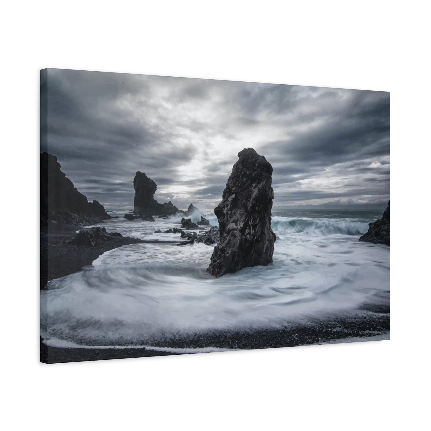
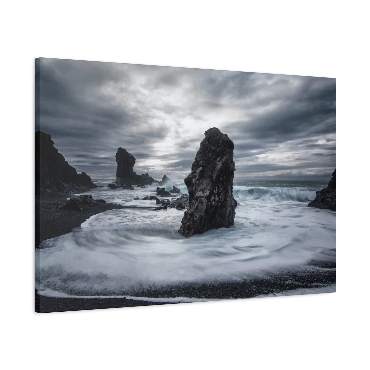
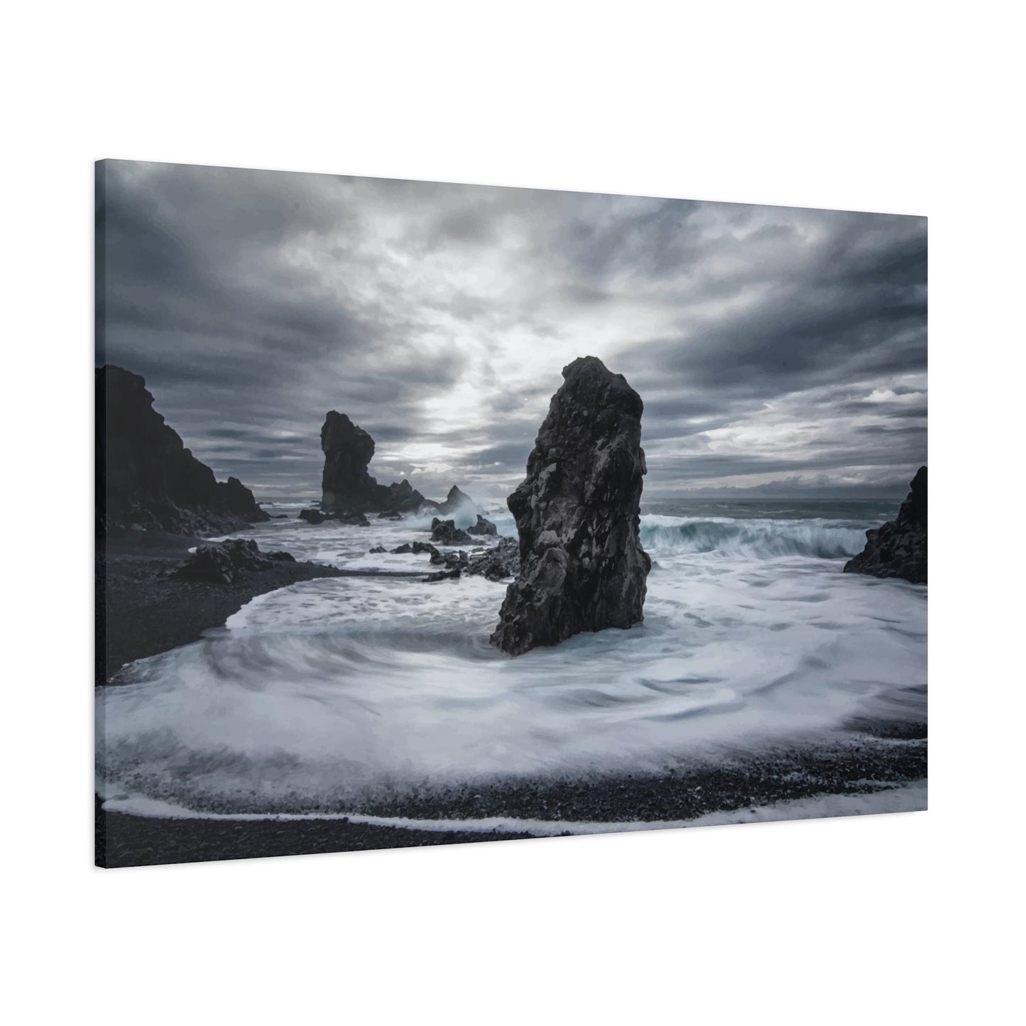
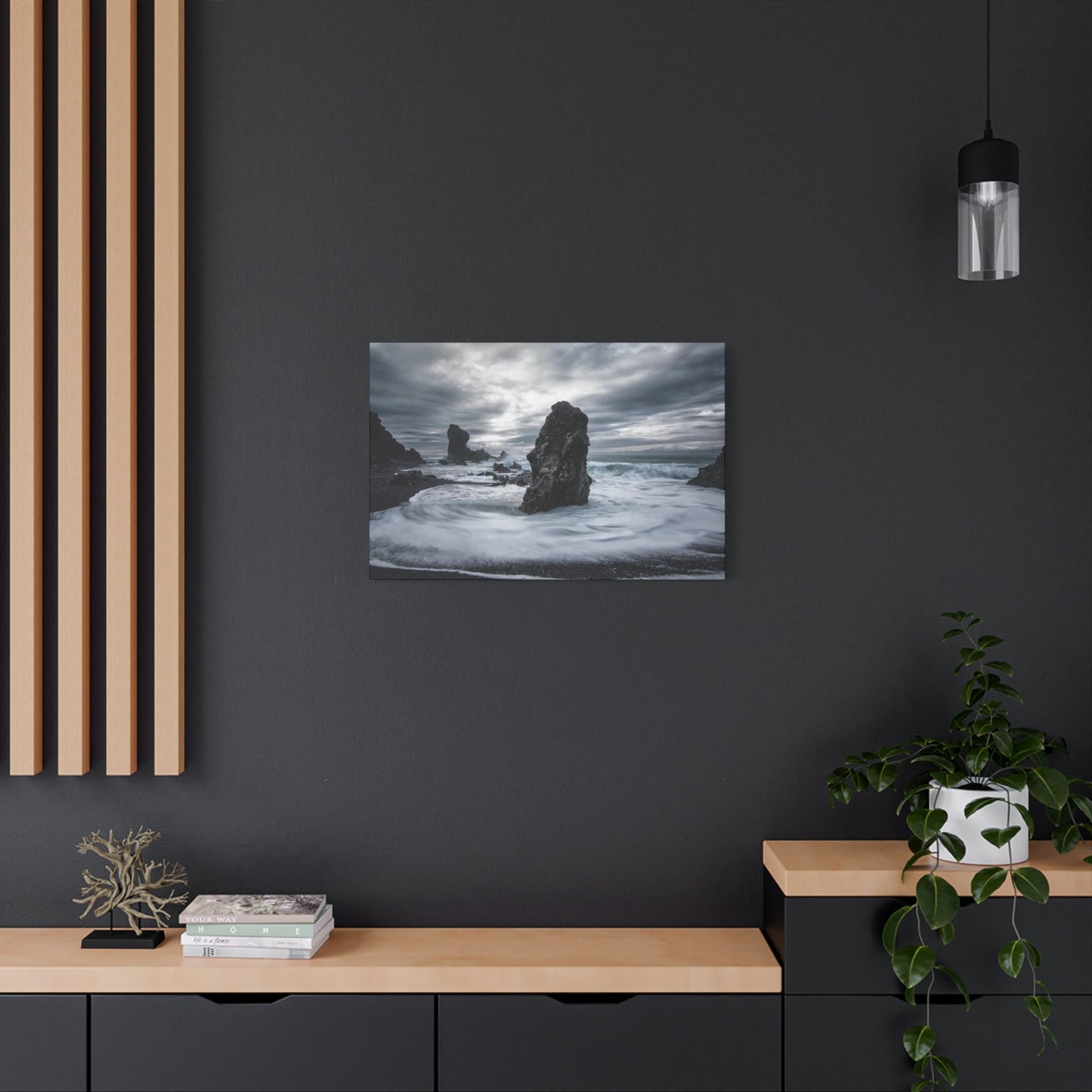
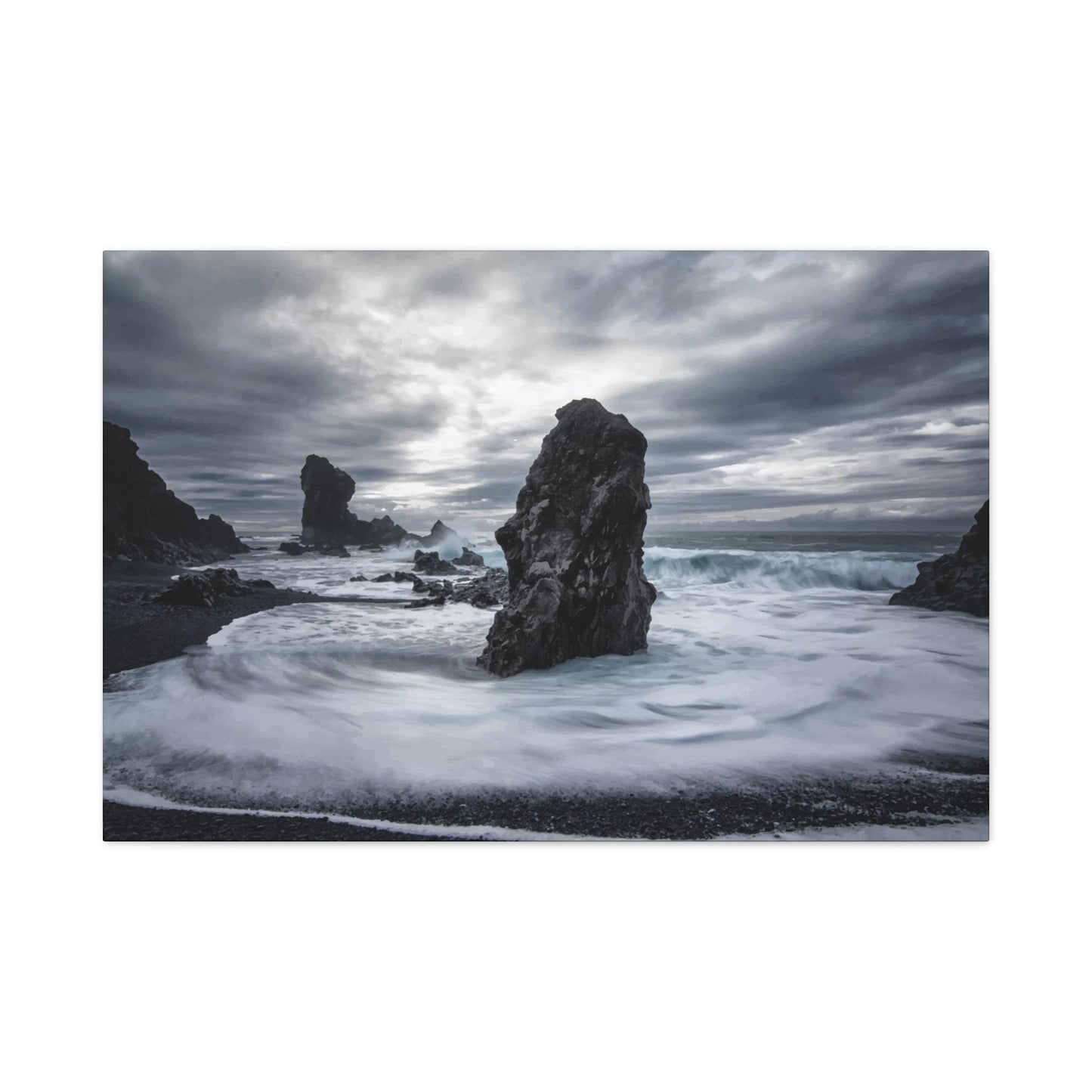
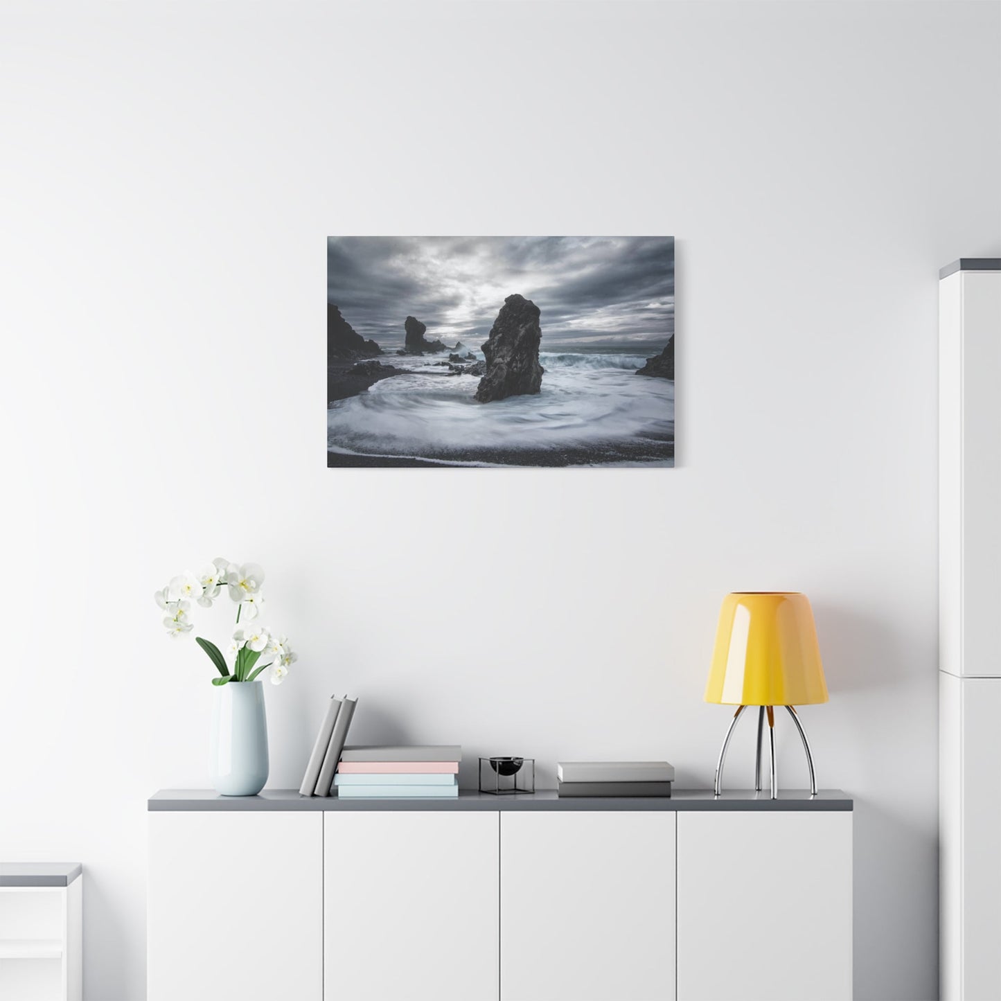
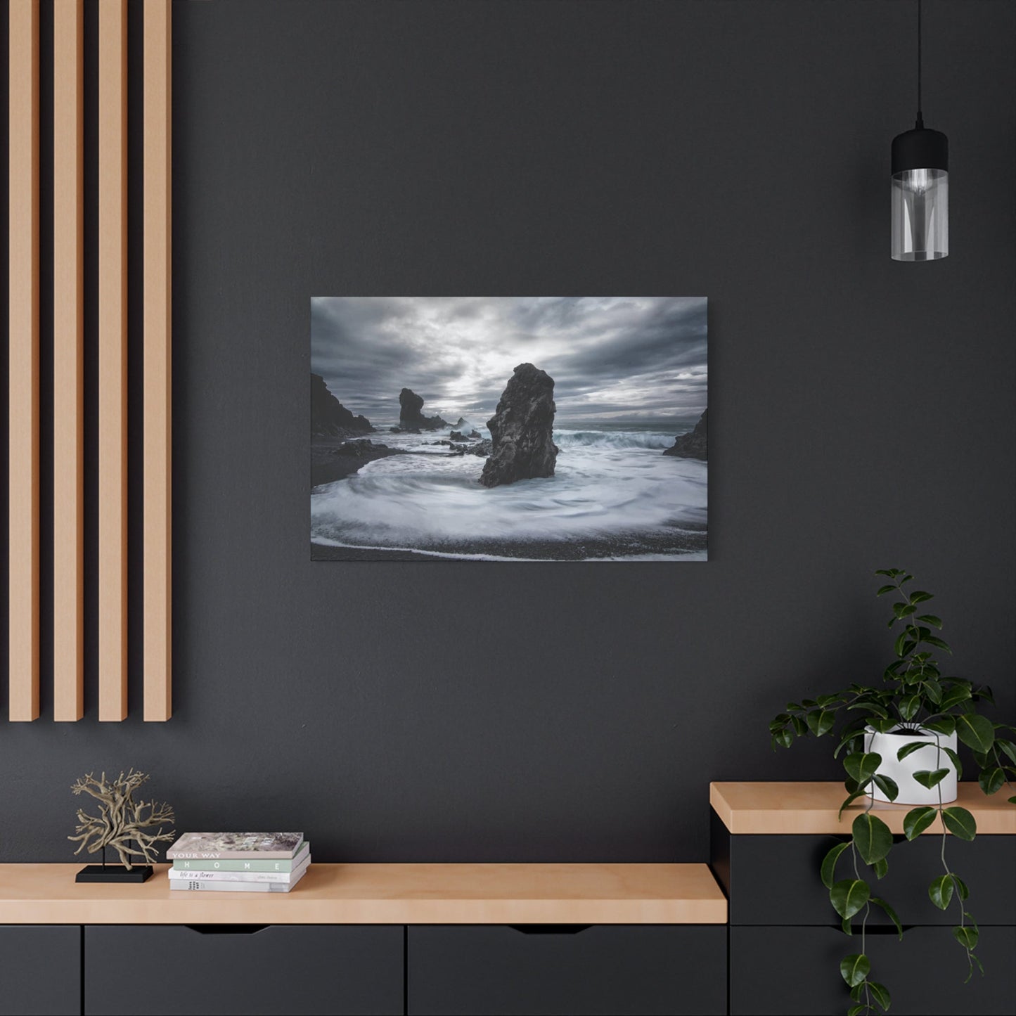
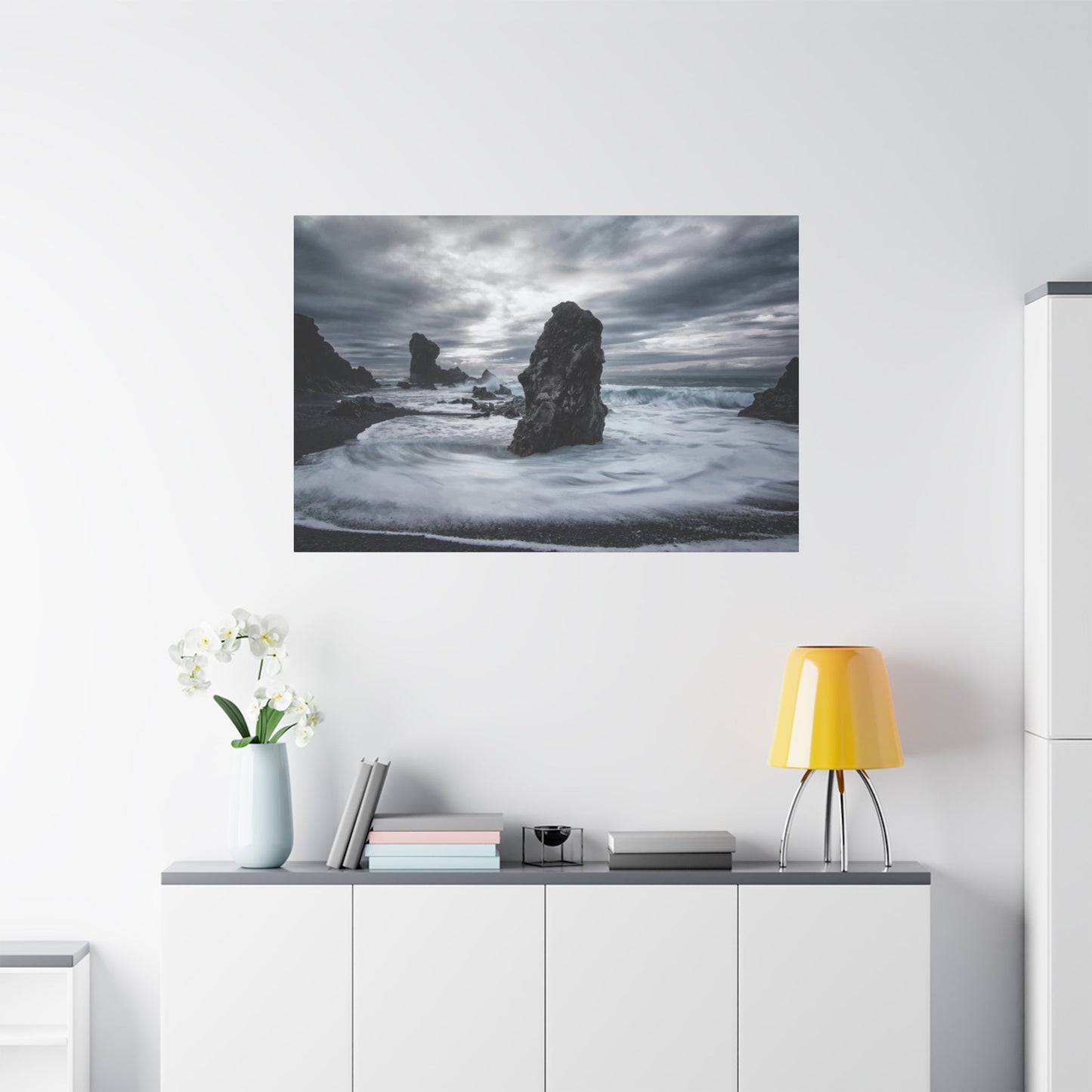
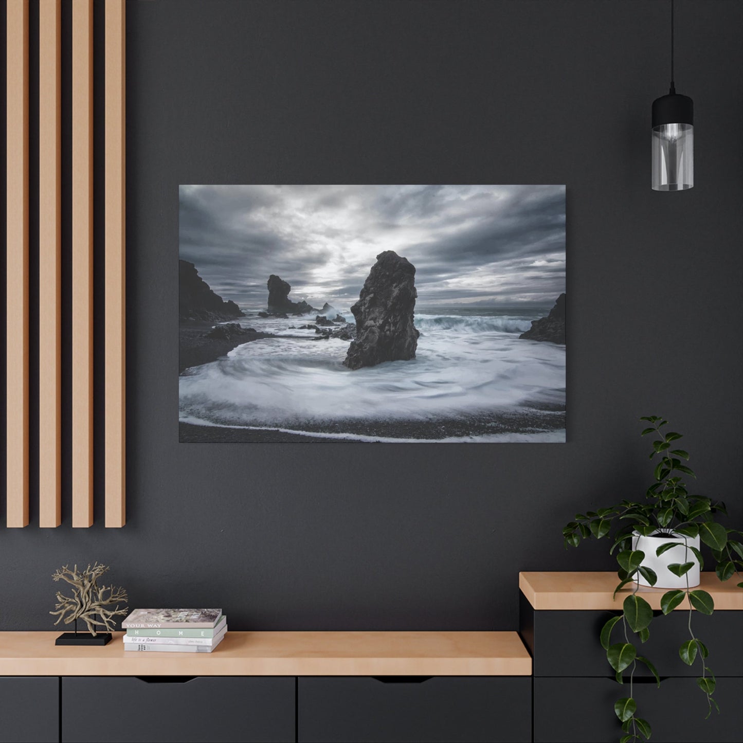
Stormy Wall Art & Canvas Prints
Stormy Wall Art & Canvas Prints
Couldn't load pickup availability


Understanding the Power of Mood in Stormy Wall Art: Ultimate Design Inspiration
The untamed beauty of tempestuous weather has captivated humanity throughout history, inspiring countless artists to capture its raw power and emotional depth. Today, storm-themed wall art has emerged as a powerful design element that transforms ordinary rooms into dramatic, contemplative spaces. This comprehensive exploration delves into the multifaceted world of weather-inspired decor, examining how these dynamic pieces can revolutionize your interior environment while reflecting the magnificent force of nature's most spectacular displays.
Storm-themed artwork represents more than mere decoration—it embodies the profound connection between human emotion and natural phenomena. When thunderclouds gather and lightning fractures the sky, we witness nature's most theatrical performance, a display of power that simultaneously intimidates and mesmerizes. Translating these moments into wall art creates spaces that resonate with depth, energy, and atmospheric intrigue. Whether you gravitate toward photographic realism or abstract interpretations, the world of tempest-inspired decor offers endless possibilities for personal expression and environmental transformation.
The psychological impact of incorporating weather-themed elements into your living space cannot be overstated. These pieces serve as constant reminders of nature's grandeur, grounding us in a world that extends far beyond our immediate surroundings. They provoke contemplation, stir emotions, and create focal points that command attention while maintaining an air of sophisticated mystery. As we explore the various dimensions of this captivating design trend, you'll discover how to harness the aesthetic and emotional power of nature's most dynamic displays to create interiors that truly reflect your personality and design sensibilities.
Commanding Tempest Imagery to Transform Your Interior Walls
The selection of powerful weather imagery for your walls requires careful consideration of both aesthetic impact and emotional resonance. These commanding pieces capture moments when nature unleashes its full fury, creating visual narratives that speak to something primal within us. When choosing such artwork, consider how the energy and movement within the piece will interact with your existing space and the atmosphere you wish to cultivate.
Photographic captures of severe weather events offer unparalleled realism and dramatic impact. These images preserve split-second moments of natural drama—towering supercells, shelf clouds rolling across prairies, or the ominous approach of a squall line. The authenticity of these photographs creates an immediate emotional connection, transporting viewers to the moment of capture. Professional weather photographers spend years pursuing these fleeting moments, positioning themselves in nature's path to document phenomena that most people experience only from the safety of shelter.
Painted interpretations of tumultuous weather bring an entirely different dimension to wall decor. Artists working in oils, acrylics, or mixed media infuse their work with personal interpretation and emotional layering that transcends literal representation. These pieces often feature bold brushwork that mirrors the chaotic movement of wind and water, with color applications that capture both the darkness of gathering clouds and the unexpected brilliance of light breaking through atmospheric turmoil. The textured surfaces of painted works add physical depth, creating shadows and highlights that shift with changing room lighting throughout the day.
Digital compositions and manipulated imagery have opened new frontiers in weather-themed art. Contemporary artists combine multiple exposures, enhance natural phenomena, or create entirely imagined scenarios that push beyond what nature itself produces. These pieces often feature surreal elements—impossibly structured clouds, color palettes intensified beyond natural occurrence, or composite scenes that merge multiple weather events into single, breathtaking compositions. Such works appeal to those seeking statement pieces that blur the line between documentation and imagination.
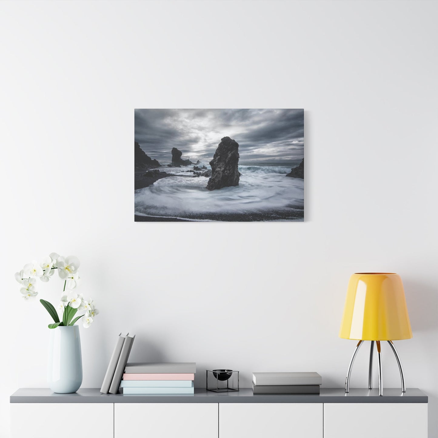
The scale of your chosen piece dramatically affects its impact within your space. Oversized prints command entire walls, creating immersive experiences that dominate sightlines and anchor room designs. These large-format pieces work exceptionally well in open-concept spaces, above substantial furniture pieces, or as focal points in minimalist environments where they can breathe without visual competition. Medium-sized works offer flexibility, adapting to various placement options and working well in gallery wall arrangements or as standalone features in more intimate spaces.
Consider the emotional tenor of your selected imagery. Some weather photographs capture the quiet menace of distant storms, with dark horizons and subtle gradations of gray that evoke contemplative moods. Others freeze moments of violent action—waves crashing against coastal barriers, funnel clouds touching down, or lightning strikes illuminating entire cloudscapes. Your choice should reflect not only your aesthetic preferences but also the emotional atmosphere you wish to establish in your space.
Atmospheric Heavens: Tempestuous Visual Concepts
The exploration of brooding atmospheric conditions through artistic interpretation opens vast creative territories. These concepts move beyond literal storm documentation to capture the emotional essence of turbulent weather—the weight of humidity-laden air, the electric tension preceding lightning strikes, or the melancholic beauty of endless gray skies. Artists working within this realm tap into collective human experiences with weather, creating pieces that resonate on intuitive levels.
Monochromatic approaches to sky imagery create particularly striking results. By stripping away color, artists force viewers to engage with form, texture, and tonal variation. The subtle gradations within gray-scale cloud formations reveal complexity that might otherwise be overshadowed by dramatic color. These pieces often evoke film noir aesthetics or classic landscape photography traditions, lending sophistication and timelessness to contemporary spaces. The absence of color allows these works to complement virtually any color scheme while maintaining their atmospheric power.
Color-saturated interpretations take the opposite approach, amplifying natural hues to create visceral emotional impacts. Deep purples and blues suggest the otherworldly quality of severe thunderstorms, while incorporating unexpected touches of green, yellow, or orange captures the strange luminosity that precedes violent weather. These intensified palettes transform familiar weather phenomena into almost alien landscapes, challenging viewers' perceptions while maintaining recognizable natural elements.
Abstract representations of atmospheric conditions distill weather to its essential elements—movement, energy, and transformation. These pieces might suggest clouds through gestural brushwork, imply wind through directional compositional elements, or capture the sound of thunder through bold color contrasts. Abstraction allows for personal interpretation, making these works particularly engaging as they invite viewers to project their own experiences and emotions onto the canvas.
Layered compositions create depth and complexity by overlapping multiple atmospheric elements. These pieces might combine cloud formations at various distances, integrate rain or fog effects, or superimpose lightning over detailed skyscapes. The resulting visual complexity rewards extended viewing, revealing new details and relationships with each encounter. These multilayered works particularly suit spaces where people spend extended periods, as they provide ongoing visual interest without becoming tiresome.
The integration of celestial elements within stormy compositions adds dramatic contrast. Breaks in cloud cover revealing moon or starlight create powerful focal points and suggest narratives of transformation from chaos to calm. These liminal moments—when clearing begins but turbulence remains—capture transitional states that mirror human emotional experiences. Such pieces often carry hopeful undertones despite their dramatic presentations, appealing to those who find beauty in complexity and change.
Seasonal storm variations offer distinct aesthetic opportunities. Summer thunderstorms bring particular qualities of light and color—brilliant blues contrasted against white anvil clouds, golden hour illumination of building storms, or the greenish cast that sometimes precedes severe weather. Winter storms feature muted palettes, horizontal snow streaks, and the stark beauty of naked trees against turbulent skies. Spring and autumn storms each carry unique atmospheric signatures that skilled artists capture and emphasize.
Photographic Captures of Tempests That Generate Powerful Impressions
Professional weather photography represents one of the most challenging and rewarding photographic specializations. These images demand technical excellence, extensive meteorological knowledge, and willingness to work in uncomfortable and sometimes dangerous conditions. The resulting photographs capture moments of such spectacular natural drama that they become coveted artistic statements suitable for prominent display in sophisticated interiors.
The pursuit of exceptional storm photography requires understanding atmospheric science. Photographers must interpret weather data, recognize cloud formations that signal developing severe weather, and position themselves in the paths of approaching systems. This combination of scientific knowledge and artistic vision separates true professionals from casual observers. The best storm photographs result from careful planning, perfect timing, and sometimes significant personal risk, factors that contribute to their value as artistic works.
Technical considerations in storm photography influence final image quality dramatically. Photographers must balance exposure settings to preserve detail in both brilliant lightning strikes and surrounding darkness, manage issues like rain-spattered lenses, and stabilize equipment against powerful winds. Many of the most striking images result from specialized techniques—long exposures to capture multiple lightning strokes, high-speed photography to freeze rain droplets, or HDR processing to manage extreme dynamic range. Understanding these technical achievements helps viewers appreciate the expertise embedded in professional weather photography.
Geographic diversity in storm imagery offers collectors worldwide variety. Great Plains supercells differ dramatically from coastal hurricanes, mountain thunderstorms, or tropical squalls. Each region produces distinctive weather phenomena with unique visual characteristics. Midwestern tornado alleys generate the most photogenic severe thunderstorms, with structured supercells and dramatic light. Coastal regions provide opportunities for capturing storms interacting with ocean surfaces, creating powerful compositions that merge sea and sky turbulence. Mountain regions produce their own spectacular displays as storms navigate complex terrain.
Seasonal variations produce distinctly different photographic opportunities. Spring brings volatile atmospheric conditions that spawn severe weather and the most dramatic cloud structures. Summer storms often feature brilliant colors and intense rainfall displays. Autumn transitional weather creates unique light quality and interesting cloud formations. Winter storms, while less conventionally dramatic, offer stark beauty and unusual photographic challenges. Collectors building comprehensive weather art collections might seek representations across seasons to capture the full spectrum of atmospheric drama.
Shadowy Vapor Formations and Daring Interior Design
The incorporation of dark, dramatic cloudscapes into interior design creates immediate visual impact and establishes sophisticated atmospheric moods. These pieces bring depth and gravitas to spaces, challenging the conventional wisdom that suggests interiors should always emphasize light and airiness. When thoughtfully integrated, dark cloud imagery adds complexity and emotional resonance that lighter, brighter artwork cannot achieve.
The psychology of dark imagery in living spaces deserves examination. Rather than creating oppressive or gloomy environments, well-chosen dark cloudscapes often produce the opposite effect—they provide visual anchors that make surrounding spaces feel more expansive and lighter by contrast. The dramatic tension in these images creates focal points that draw attention and imagination, giving rooms distinctive character that sets them apart from conventional design approaches.
Balancing dark artwork within overall room design requires careful consideration. These powerful pieces work best when counterbalanced with lighter elements—neutral walls, natural light sources, or lighter furniture pieces. The goal is creating dynamic tension rather than overwhelming darkness. Consider how your dark cloudscape will interact with surrounding elements throughout different lighting conditions. Natural daylight reveals details and textures that artificial lighting might obscure, while evening illumination creates different moods and emphasizes different aspects of the artwork.
Scale relationships between dark cloud imagery and room proportions significantly affect design success. Oversized dark pieces in compact spaces can feel oppressive, while small dark artworks in expansive areas may seem timid or lost. Match scale to your specific environment, ensuring your chosen piece commands appropriate attention without dominating to the point of discomfort. In open-concept spaces, large-scale dark cloudscapes can effectively define zones and create visual destinations that organize spatial flow.
Material considerations influence how dark imagery presents in your space. Canvas prints often soften dark imagery slightly, creating more approachable presentations suitable for intimate spaces. Metal prints amplify darkness and contrast, producing striking, contemporary looks perfect for modern interiors. Traditional photographic papers offer the most detailed tonal gradations, allowing viewers to perceive subtle variations within dark cloud masses. Your material choice should reflect both your aesthetic preferences and the technical demands of your specific image.
Lighting strategies for displaying dark cloud artwork require special attention. These pieces need adequate illumination to reveal their full detail and tonal range, but excessive or poorly positioned lighting creates glare and washes out the very qualities that make them compelling. Picture lights, track lighting, or strategically positioned spotlights can effectively illuminate dark artwork without causing problems. Consider adjustable lighting that allows you to modify illumination levels based on time of day and occasion.
Non-Representational Tempest Visuals for Contemporary Living Spaces
Abstract interpretations of storm phenomena represent the intersection of natural inspiration and artistic innovation. These works distill weather experiences to essential elements—energy, movement, tension, and release—creating pieces that suggest rather than depict their subjects. For contemporary homes embracing minimalism, clean lines, and conceptual depth, abstract storm art offers ideal solutions that provide visual interest without literal representation.
The conceptual approach to weather abstraction varies widely among artists. Some begin with observational studies, gradually simplifying and distilling until only essential gestures remain. Others work entirely from memory and emotion, allowing personal experiences with storms to guide intuitive creation processes. Still others apply systematic approaches, using geometry, color theory, or mathematical concepts to construct images that suggest atmospheric phenomena through formal relationships rather than recognizable imagery. Understanding an artist's conceptual approach enriches appreciation and helps collectors identify works that resonate with their own sensibilities.
Color strategies in abstract storm art range from strictly limited palettes to complex chromatic symphonies. Monochromatic abstractions explore tonal relationships within single hue families, creating subtle, sophisticated pieces that reward contemplation. Analogous color schemes using blues, purples, and grays directly reference natural storm palettes while allowing artistic interpretation. Complementary contrasts—orange against blue, yellow against purple—create visual electricity that mirrors the energy of atmospheric turbulence. Some artists employ unexpected color choices completely divorced from natural weather, using psychological color associations to evoke storm emotions without depicting actual phenomena.
Compositional strategies guide viewer experience and emotional response. Horizontal orientations suggest expansive landscapes and distant horizons, creating contemplative moods. Vertical compositions emphasize towering cloud structures and upward motion, generating feelings of awe or intimidation. Centered focal points create stability within chaos, while asymmetrical compositions maintain tension and dynamic energy. Diagonal elements introduce movement and directionality, guiding the eye across picture planes and suggesting wind or rain trajectories. Thoughtful composition distinguishes successful abstract work from random mark-making.
Textural variety adds physical dimension to abstract storm pieces. Heavy impasto application creates literal three-dimensional surface variations that catch light and cast shadows, adding temporal variation as lighting conditions change. Scraped, scratched, or abraded surfaces suggest wind-worn terrain or rain-streaked windows. Smooth, glossy areas contrast with matte sections, creating visual pathways and focal points. Mixed media approaches incorporating sand, paper, or fiber introduce unexpected elements that expand conceptual possibilities. These textural decisions transform two-dimensional surfaces into complex sensory experiences.
Maritime Tempests Rendered on Textile Surfaces
The translation of oceanic storm imagery onto canvas creates powerful marriage between subject and medium. The textile surface of canvas contributes physical texture that complements the visual texture of churning seas and wind-driven spray. These works capture one of nature's most dramatic performances—the collision of atmospheric and oceanic forces—producing scenes of breathtaking power and beauty.
The artistic tradition of maritime storm painting extends centuries into the past, with each era bringing distinctive approaches and techniques. Romantic era painters emphasized human vulnerability against overwhelming natural forces, often depicting struggling vessels amid towering waves. Impressionists explored light and color effects in maritime settings, capturing transient moments of storm passage. Contemporary artists bring new perspectives—from hyperrealistic portrayals enabled by photography reference to expressionistic interpretations emphasizing emotional over literal accuracy. This rich tradition informs current works while contemporary artists continue pushing boundaries.
Technical execution in maritime storm painting demands mastery of complex visual phenomena. Water in motion presents particular challenges—capturing translucency, foam patterns, wave structure, and the interaction between liquid and light. Skilled artists understand how waves form, break, and dissipate, knowledge that informs convincing representation. They master techniques for depicting spray, mist, and rain, each requiring different approaches. Sky rendering in maritime contexts adds additional complexity as storm clouds interact with reflected ocean surfaces, creating intricate light scenarios.
Color palettes in ocean storm artwork vary dramatically based on geographic location, time of day, and weather severity. Tropical storms often feature surprising color intensity—deep blues and turquoises contrasting with brilliant whites. Northern waters under stormy skies tend toward steel grays, greens, and deep blue-blacks. Coastal storms where land meets sea introduce earth tones and vegetative greens. Sunset or sunrise storms create spectacular color opportunities as light pierces atmospheric moisture. Understanding these natural color relationships helps viewers appreciate artistic choices and select pieces matching their aesthetic preferences.
Compositional approaches to maritime storm scenes significantly impact emotional effect. Low horizons emphasize sky drama, allowing clouds to dominate compositions while waves provide grounding elements. High horizons shift focus to turbulent seas, with skies becoming secondary elements. Central horizon placements create balanced, stable compositions even when depicting chaotic subjects. The inclusion or exclusion of land masses, vessels, structures, or figures dramatically alters narrative and emotional tenor, with each element changing how viewers relate to depicted scenes.
The physical properties of canvas as a medium contribute meaningfully to maritime storm presentations. Canvas texture adds visual and tactile dimension that enhances the organic, natural quality of ocean subjects. The slight give of canvas over time contributes to a lived-in quality that can enhance rather than diminish artistic value. Stretched canvas creates three-dimensional objects that cast subtle shadows and possess physical presence beyond flat prints. These qualities make canvas particularly well-suited to maritime subjects that benefit from material authenticity.
Display considerations for canvas ocean storms include protecting artwork from environmental factors that could degrade it over time. While canvas possesses inherent durability, prolonged direct sunlight fades pigments, humidity variations can affect tension, and temperature extremes may cause expansion or contraction issues. Position canvas artworks away from direct sun exposure, maintain stable environmental conditions, and consider UV-protective glazing for particularly valuable pieces. Proper care ensures these powerful works maintain their visual impact for generations.
The emotional resonance of maritime storm imagery connects to deep human experiences. Oceans represent both life-giving abundance and existential threat, primal forces that have shaped human civilization and consciousness. Storm-tossed seas trigger responses related to survival, adventure, respect for nature, and contemplation of our place within larger natural systems. Artwork capturing these moments taps into collective unconscious elements, explaining why maritime storm imagery maintains enduring appeal across cultures and eras.
Electrical Discharge Artwork Selections for Interior Surfaces
Lightning imagery represents perhaps the most dramatic and instantaneous of all weather phenomena, capturing moments when atmospheric electrical potential achieves visible, violent release. Artwork featuring these spectacular natural events brings electricity—both literal and metaphorical—into interior spaces, creating focal points of undeniable power and visual excitement.
The physics underlying lightning creates unique visual characteristics that fascinate and challenge artists. Lightning bolts follow paths of least resistance through the atmosphere, creating fractal branching patterns unlike any other natural phenomenon. The intense heat generated by electrical discharge—hotter than the sun's surface—creates brilliant illumination that lasts mere fractions of seconds. Capturing these events requires either exceptional technical skill in photography or deep observational knowledge for painted interpretations. The resulting images possess inherent drama that few other subjects can match.
Photographic lightning captures employ specialized techniques that influence final image characteristics. Long exposure photographs capture multiple strikes during single exposures, creating complex networks of electrical pathways across dark skies. These images often feature surprising numbers of lightning channels, as multiple discharges occur during exposure times ranging from seconds to minutes. Single-strike captures using high-speed photography or perfect timing preserve individual bolt characteristics—the main channel, branching leaders, and sometimes ground return strokes. Some photographers deliberately capture daytime lightning, a significantly more difficult undertaking that produces entirely different aesthetic results than nocturnal captures.
Painted and illustrated lightning artwork offers opportunities for creative interpretation impossible in photography. Artists can exaggerate lightning brilliance, emphasize certain structural characteristics, incorporate impossible color palettes, or integrate lightning into broader narrative or symbolic contexts. These works often carry dramatic emotional power as artists imbue their subjects with personal interpretation and symbolic meaning. Abstract treatments reduce lightning to pure energy and movement, creating pieces that suggest rather than literally depict their electrical inspiration.
Color considerations in lightning artwork extend beyond the typical blue-white of natural lightning. While most lightning appears blue-white due to nitrogen ionization, atmospheric conditions sometimes produce color variations—orange, red, or green tinges. Artists frequently take creative license with lightning color, using purples, pinks, or even impossible hues to achieve desired aesthetic effects or evoke particular emotions. When selecting lightning artwork, consider how color choices interact with your existing design palette and the mood you wish to establish.
Compositional approaches to lightning imagery determine viewer experience and emotional impact. Lightning as central subject creates immediate focal points that dominate compositions. Distant lightning, partially obscured by clouds or land masses, creates mystery and suggests broader narratives beyond frame edges. Forked lightning branching across entire compositions creates energetic, active pieces, while single powerful channels generate focused, concentrated drama. The relationship between lightning and surrounding elements—clouds, landscapes, structures—influences whether pieces feel threatening, awe-inspiring, or scientifically fascinating.
The placement of lightning artwork within interiors deserves careful thought. These inherently powerful images work best in spaces that can accommodate their visual intensity. Large lightning photographs or paintings suit spacious rooms with high ceilings and substantial furniture—environments scaled to match the artwork's power. Smaller lightning pieces can effectively accent specific areas, particularly when strategically illuminated. Consider positioning lightning artwork in spaces designed for contemplation or creativity, where its energy can inspire and invigorate without overwhelming daily activities.
Mixed media approaches to lightning representation expand creative possibilities. Some artists combine photographic lightning with painted or digitally created backgrounds, merging documentation with imagination. Others integrate lightning imagery into assemblage works, surrounding photographs or paintings with three-dimensional elements that extend conceptual depth. These hybrid approaches create unique pieces that transcend traditional media boundaries, appealing to collectors seeking truly distinctive works.
The symbolic and metaphorical dimensions of lightning imagery enrich its appeal beyond pure aesthetics. Lightning represents sudden inspiration, divine communication, destructive power, natural force, and transformative energy across various cultural contexts. Artwork incorporating these multivalent symbols carries layers of meaning that invite ongoing contemplation and interpretation. This depth elevates lightning imagery from mere decoration to meaningful artistic statement, making it particularly appropriate for those who value conceptual content alongside visual impact.
Grayscale Tempest Imagery for Timeless Appeal
Monochromatic storm photography represents a powerful artistic choice that strips weather imagery to its essential elements—form, light, texture, and composition. By eliminating color, these works force viewers to engage with fundamental visual relationships, often revealing subtleties that chromatic information might overshadow. The resulting images carry timeless aesthetic appeal that transcends design trends and integrates seamlessly into diverse interior environments.
The artistic decision to work in monochrome reflects intentional creative philosophy rather than technical limitation. With color photography universally accessible, choosing grayscale represents a deliberate aesthetic stance. This decision signals that the artist values form, tonal relationships, and compositional purity over chromatic impact. For collectors and designers, this choice often indicates sophisticated artistic sensibility and produces works that age gracefully as color trends evolve.
Technical excellence in monochromatic storm photography demands mastery of tonal range and contrast management. Without color separation to distinguish elements, tonal variation becomes critical for creating depth, directing attention, and establishing mood. Exceptional black and white storm images display rich tonal ranges with deep blacks, pure whites, and numerous distinct gray values. Skilled photographers expose and process their images to maximize this tonal information, creating prints with dimensional depth that engages viewers through subtle gradations rather than chromatic drama.
The historical associations of monochromatic imagery lend gravitas and artistic legitimacy to contemporary works. Black and white photography carries connections to the medium's earliest days and its development as fine art form. Classic landscape photographers established traditions of black and white mastery that contemporary storm photographers honor and extend. Displaying monochromatic storm photography connects your space to this artistic heritage while making distinctly contemporary statements.
Different monochromatic approaches produce varied aesthetic effects. True black and white images contain only neutral grays with no color cast. Sepia or warm-toned treatments introduce nostalgic qualities and soften overall mood. Cool-toned monochrome maintains dramatic tension while suggesting specific atmospheric conditions. Some photographers apply subtle color tinting that verges on monochrome while retaining minimal chromatic information. These variations allow selection of monochromatic works that precisely match your design needs and emotional preferences.
Compositional considerations gain heightened importance in monochromatic work. Without color to create focal points or guide viewer attention, composition and tonal contrast must accomplish these functions. Strong diagonal lines, powerful rule-of-thirds placements, or dramatic foreground-background relationships become essential structural elements. Light direction and quality—side light revealing texture, backlight creating silhouettes, diffuse light producing subtle gradations—determines success or failure of monochromatic compositions.
The versatility of grayscale storm imagery represents one of its greatest practical advantages. These pieces complement virtually any color scheme without chromatic conflict. They succeed in minimalist environments where color might introduce unwanted complexity. They enhance traditional spaces through classic aesthetic associations. They ground contemporary interiors through tonal anchoring. This adaptability makes monochromatic storm photographs particularly valuable for those who refresh their interiors periodically without replacing artwork.
Material and presentation choices significantly impact how monochromatic storm images present. Traditional fiber-based photographic papers produce especially beautiful tonal renditions with subtle glossiness that adds depth. Matte papers emphasize texture and detail while minimizing reflections. Metal prints of black and white storm images create stunning contemporary presentations with exceptional sharpness and contrast. Canvas transfers soften images slightly while adding tactile texture. Consider which material qualities best serve your specific image and installation context.
Encased Thunder Cloud Wall Embellishments
Framed presentations of thunderstorm imagery elevate dramatic weather photography and artwork to refined decorative statements suitable for sophisticated interiors. The framing process transforms raw imagery into finished artwork, with frame selection significantly influencing how pieces integrate into spaces and how viewers perceive their value and importance.
Frame style selection requires balancing several considerations—enhancing the artwork, complementing room design, establishing appropriate visual weight, and protecting the image. Traditional frames with ornate profiles suit classical interiors and can add gravitas to powerful storm imagery. Simple, clean-lined contemporary frames maintain focus on the artwork itself while providing finished edges. Rustic or distressed frames create interesting tensions when paired with storm photography, suggesting connections between human craft and natural forces.
Material choices in frame construction affect both aesthetics and longevity. Wood frames offer warmth and traditional appeal, with grain patterns adding subtle texture. Metal frames provide sleek modernity and come in numerous finishes—brushed aluminum, matte black, weathered steel, or polished brass. Composite materials offer budget-friendly alternatives that can convincingly replicate more expensive materials. For valuable storm photography, invest in archival-quality framing materials that resist deterioration and protect your artwork investment.
Color coordination between frames and imagery requires thoughtful consideration. Black frames provide maximum contrast and drama, especially effective with high-contrast storm photography. White or light-colored frames soften presentations and work particularly well with ethereal or misty storm scenes. Natural wood tones complement earth elements often present in storm landscapes—trees, fields, coastlines. Metallic finishes echo the steel-gray color palette common in storm imagery while adding reflective elements that catch and play with light.
Matting decisions significantly impact how storm imagery presents. Generous matting creates breathing room around images, allowing them to float within frames and suggesting preciousness. This approach works especially well for smaller prints in larger frames, creating sophisticated presentations that command wall space without requiring oversized images. Minimal or absent matting allows images to extend to frame edges, creating more immediate, immersive viewing experiences. Double or triple matting in coordinating colors adds depth and luxury while providing opportunities for color coordination with room palettes.
Gallery-style framing techniques create museum-quality presentations appropriate for valuable storm photography. These approaches emphasize archival preservation, using acid-free materials, conservation-grade adhesives, and spacing techniques that prevent artwork from contacting glazing. UV-filtering glazing protects against light damage. Sealed backing prevents environmental contaminants from reaching artwork. While more expensive than basic framing, gallery-standard approaches ensure your storm imagery remains pristine for decades or generations.
Custom framing versus ready-made options presents cost-versus-personalization decisions. Custom framing allows precise control over every element—frame style, color, finish, matting configuration, glazing type—ensuring perfect harmony between artwork and presentation. Professional framers provide expertise in archival techniques and design coordination. Ready-made frames offer budget-friendly alternatives, particularly for standard sizes, though options limit creative control. For significant storm pieces, custom framing represents worthwhile investment that maximizes both aesthetic impact and preservation.
Installation hardware and techniques ensure secure, level presentation. French cleats provide extremely secure hanging for heavy frames while allowing easy removal and repositioning. Wire hanging offers simplicity and adjustability but can create stability issues with large, heavy pieces. Direct wall-mounting hardware creates the most stable installations but requires precise positioning during initial installation. Consider consulting professional installers for particularly valuable or large storm pieces, as proper installation protects both artwork and walls.
Lighting integration transforms framed storm imagery from passive decoration to actively illuminated focal points. Picture lights mounted directly to frames provide dedicated illumination that enhances detail and creates gallery-like presentations. Track lighting or spotlights offer flexible illumination options that can be adjusted for different effects. LED strip lighting concealed behind frames creates dramatic halo effects. When lighting storm imagery, aim for even illumination that reveals tonal detail without creating hotspots or glare on glazing surfaces.
Natural Force Captured in Interior Design Elements
The representation of nature's overwhelming power through wall art serves multiple functions within interior environments—aesthetic enhancement, emotional engagement, and philosophical statement. These pieces proclaim respect for natural forces, acknowledge realities beyond human control, and celebrate the spectacular beauty inherent in nature's most dramatic displays.
The conceptual framework surrounding power-themed natural imagery influences how we relate to these works. Some viewers approach storm art with scientific curiosity, appreciating the atmospheric physics and natural processes that create the documented phenomena. Others respond emotionally, connecting personal experiences with weather to artistic representations. Still others engage philosophically, contemplating human relationships with forces beyond our mastery. The best storm art accommodates all these approaches simultaneously, offering multiple entry points for varied viewers.
Scale relationships between depicted natural forces and human elements create narrative tension and establish perspective. Storm imagery that includes human structures—buildings, lighthouses, boats, roads—emphasizes weather's overwhelming scale through contrast. These comparative elements help viewers grasp the magnitude of depicted phenomena while introducing narrative possibilities and human connection points. Imagery excluding human presence altogether creates more abstract, elemental experiences focused purely on natural forces interacting without reference to human concerns.
The educational dimension of high-quality storm imagery deserves recognition. Professional weather photography documents atmospheric phenomena with scientific accuracy, preserving visual records of meteorological events. Detailed images reveal cloud structures, precipitation patterns, and light behaviors that casual observation might miss. Living with such imagery gradually educates viewers about atmospheric science, seasonal patterns, and weather characteristics. This educational value adds intellectual dimension to aesthetic appreciation.
Historical storm documentation carries particular significance and value. Images capturing historically significant weather events—devastating hurricanes, unprecedented tornado outbreaks, record-breaking blizzards—function as both artwork and historical documentation. These pieces preserve visual memory of events that shaped communities and influenced human history. Collectors interested in specific regions or time periods might seek storm imagery documenting weather that affected their areas, creating personal connections between art and place.
The dynamic between chaos and order within storm imagery creates compelling visual tension. Storms represent nature at its most chaotic and unpredictable, yet atmospheric processes follow physical laws and exhibit recognizable patterns. Skilled artists capture this duality—presenting weather's violence while revealing underlying structure and beauty. This balance between chaos and order resonates with human experience, reflecting how we navigate unpredictability while seeking pattern and meaning.
Contemporary environmental awareness adds political and ethical dimensions to nature-power imagery. As climate change intensifies weather extremes, storm imagery gains additional layers of meaning. These works document changing atmospheric conditions, bear witness to increasing severity, and remind viewers of nature's responses to anthropogenic environmental impacts. For some collectors, acquiring and displaying storm art represents subtle environmental advocacy, keeping climate realities visible within daily life.
The preservation of natural power imagery ensures future generations can experience weather phenomena they might never witness personally. As climate patterns shift and extreme weather becomes either more common or differently distributed, today's storm photography preserves visual records of current conditions. Archival-quality prints function as time capsules, allowing viewers decades hence to see storms as they appeared in our era—a consideration that adds historical significance to contemporary acquisitions.
Tempestuous Environments as Understated Design Features
The seemingly paradoxical concept of using dramatic storm imagery within minimalist design contexts reveals sophisticated understanding of visual dynamics and spatial psychology. When thoughtfully integrated, powerful weather scenes enhance rather than compromise minimalist environments, providing necessary focal points while respecting principles of restraint and intentionality.
Minimalist design philosophy emphasizes reduction to essential elements, careful editing of visual information, and intentional placement of each component. Storm imagery aligns perfectly with these principles when selected and positioned thoughtfully. A single powerful storm photograph against expansive neutral walls creates maximum impact through contrast and isolation. The surrounding emptiness amplifies the artwork's presence while the artwork justifies and activates the surrounding space.
Color palette considerations become especially important when introducing storm art into minimalist contexts. Monochromatic storm images integrate most seamlessly, their grayscale tones complementing the neutral palettes typical of minimalist interiors. Color storm imagery can work equally well when its palette echoes or thoughtfully contrasts with room colors. A single vibrant storm piece might provide the only chromatic information in an otherwise neutral space, making it the uncontested focal point that draws and holds attention.
The quality versus quantity principle defines minimalist approaches to art display. Rather than filling walls with multiple pieces, minimalist design privileges few exceptional works that earn their visual real estate through undeniable quality. This approach perfectly suits investment in museum-quality storm photography or paintings—single spectacular pieces that justify dedicated wall space through their artistic merit and emotional impact. Such installations make clear statements about values, prioritizing meaningful content over decorative abundance.
Negative space surrounding storm imagery in minimalist contexts serves active rather than passive functions. Empty walls aren't merely absence of content but positive elements that frame, emphasize, and amplify the displayed work. This negative space provides visual rest, allowing eyes and minds to process the complexity and emotional content of storm imagery without competition or distraction. Proper respect for negative space separates successful minimalist installations from sparse, incomplete ones.
Material selections throughout minimalist interiors influence how storm art integrates and presents. Natural materials—stone, concrete, wood, leather—create organic contexts that complement weather imagery's natural subject matter. Clean-lined furniture and uncluttered surfaces maintain visual order that allows storm art to introduce controlled complexity. Reflective surfaces—polished concrete floors, glass tables, metallic accents—can create interesting relationships with storm imagery through subtle reflections and light play.
Lighting design in minimalist spaces strongly affects storm art presentation. These environments typically feature carefully controlled lighting schemes with few sources providing focused illumination. Dedicated lighting for storm artwork ensures it receives necessary attention while maintaining overall lighting restraint. The interplay between illuminated artwork and surrounding dimmer spaces creates dramatic focal points consistent with minimalist emphasis on intention and hierarchy.
The psychological function of storm imagery within minimalist environments addresses potential criticisms that such spaces feel cold or emotionally empty. Powerful weather scenes introduce emotional content, narrative possibility, and connection to natural world—elements that humanize stark interiors without compromising design integrity. This emotional anchoring makes minimalist spaces more livable and personally meaningful while respecting aesthetic discipline.
Seasonal considerations affect how storm imagery functions in minimalist contexts. The same piece might feel different as natural light changes throughout the year, as indoor temperatures vary, or as outdoor weather shifts. This temporal variation adds dimension to static artworks, creating evolving relationships that prevent minimalist interiors from feeling too controlled or static. Observing how your storm art changes character across seasons deepens appreciation and sustains engagement.
Precipitation and Atmospheric Movement Through Paint Application
The artistic challenge of capturing rain and wind through painted media demands technical skill, observational acuity, and creative problem-solving. Unlike photography, which mechanically records reality, painting requires translating three-dimensional, temporal phenomena into static, two-dimensional representations through deliberate mark-making and color application.
Rain representation in painting employs various technical approaches, each creating different visual effects and emotional responses. Fine linear strokes suggest individual droplets, particularly effective for depicting light rain or distant precipitation. Broader, gestural marks indicate heavy rainfall or wind-driven sheets of water. Stippling or splatter techniques create textural variety suggesting rain's random, chaotic nature. Some artists build up multiple translucent layers, creating depth and atmospheric complexity that mirrors actual rain's visual characteristics.
Wind's invisibility presents unique representational challenges—painters must depict wind through its effects rather than directly. Bent vegetation, moving clouds, disturbed water surfaces, flying debris, and billowing fabric all indicate wind presence and intensity. Directional brushwork creates movement sensation even when depicting static objects. Diagonal compositions suggest wind's force pushing across picture planes. The most successful wind paintings make viewers almost feel the air movement through purely visual means.
Color choices in rain and wind paintings significantly affect mood and authenticity. Rain generally mutes and cools color palettes, as water vapor and cloud cover filter light. Skilled painters capture this atmospheric perspective, gradually desaturating and cooling colors with distance to suggest rain-thick air. However, certain rain conditions—sunlit showers, storm edges, or post-storm clearings—create intense color opportunities as light interacts with atmospheric moisture, producing effects from subtle pastels to dramatic rainbows.
Brushwork techniques separate mediocre weather painting from exceptional work. Gestural, energetic strokes convey wind and rain's kinetic energy, translating physical motion into visual marks. Controlled, precise brushwork captures delicate rain droplets or subtle atmospheric gradations. Some painters work wet-into-wet, allowing colors to blend and flow on canvas in ways that mirror atmospheric moisture's behavior. Others build up paintings through multiple dry-layer applications, creating complex surfaces that reward close examination.
The interplay between detail and suggestion determines painting style and viewer experience. Hyperrealistic approaches meticulously render every droplet and wind-bent blade, creating almost photographic results. Impressionistic treatments capture essential characteristics through suggestive brushwork, inviting viewers to complete images mentally. Expressionistic approaches prioritize emotional communication over literal accuracy, using exaggerated color, distorted forms, and energetic application to convey weather's felt experience rather than precise appearance.
Abstract representations of rain and wind distill these phenomena to pure movement, energy, and atmospheric conditions. Diagonal marks across canvas suggest precipitation without depicting individual drops. Color transitions indicate humidity gradients without rendering visible moisture. Gestural energy conveys wind force without showing bent objects. These abstract approaches often communicate weather's essential character more effectively than literal representations, resonating with viewers' kinesthetic and emotional weather memories.
Technical mediums influence achievable effects and final appearance. Oil paints allow extended working time, enabling subtle blendings and complex layering that suit atmospheric subjects. Acrylics dry rapidly, supporting gestural techniques and allowing quick buildup of layers. Watercolors possess inherent fluidity that naturally suits rain subjects, though controlling wet media presents challenges. Mixed media approaches combine materials' strengths—perhaps oil for sky areas, acrylic for rain effects, and ink for linear elements.
The temporal dimension of painted weather distinguishes it from photographic captures. Paintings represent extended observation periods, synthesizing multiple moments into single compositions. A painter depicting a storm works from memory, preliminary studies, and photographic references, combining elements observed at different times. This temporal compression allows painters to capture weather's essence in ways that instantaneous photography cannot, presenting idealized versions that feel more true than literal documentation.
Conclusion
Stormy wall art captures the raw intensity, drama, and emotional depth of nature, transforming ordinary spaces into evocative environments that inspire reflection and imagination. Whether depicting tempestuous skies, crashing waves, or windswept landscapes, these artworks harness the power of mood to create a visceral experience that resonates with viewers. Incorporating storm-themed art into your home allows you to explore the interplay of light and shadow, tension and calm, and movement and stillness, elevating interior design from simple decoration to immersive storytelling.
The appeal of moody, storm-inspired art lies in its ability to evoke emotion and atmosphere. Stormy scenes symbolize both power and vulnerability, reminding us of nature’s grandeur and the beauty found within turbulence. Dark clouds, dramatic contrasts, and fleeting bursts of light can transform a room, adding depth, sophistication, and a contemplative energy that engages both the eye and the mind. These works are perfect for creating spaces that feel alive, charged with emotion, and visually compelling.
From a design standpoint, stormy wall art is incredibly versatile. The rich palette of grays, deep blues, muted purples, and occasional flashes of gold or white harmonizes with a wide range of décor styles. Large-scale canvases create bold statement pieces in living rooms, offices, or entryways, while smaller prints can be grouped into gallery walls to craft a cohesive narrative of mood and movement. The dramatic contrasts and textured details found in storm-themed art enhance both minimalist and eclectic interiors, bringing character, energy, and sophistication to every space.
Beyond aesthetic appeal, stormy art carries symbolic and emotional significance. Storms represent change, intensity, resilience, and transformation. Displaying storm-inspired pieces in your home encourages contemplation, introspection, and appreciation for life’s dynamic nature. The tension between darkness and light depicted in these works mirrors the challenges and triumphs of human experience, allowing viewers to connect emotionally with the artwork while cultivating a reflective, atmospheric environment.
Moreover, the artistry in stormy wall art highlights the skill of artists who translate fleeting, volatile moments into enduring visual statements. The play of light through clouds, the motion of turbulent waters, and the textures of wind-blown landscapes all require careful observation and technical mastery. These elements draw viewers in, creating immersive experiences that are both visually stunning and emotionally resonant. Storm-themed art invites us to slow down, absorb, and appreciate the dramatic beauty of nature in all its complexity.
Ultimately, stormy wall art elevates interiors by merging visual intensity, emotional depth, and sophisticated design. It transforms walls into canvases of narrative and mood, offering a space where drama, elegance, and introspection coexist. Whether displayed as a focal point or as part of a curated gallery, these artworks infuse energy, sophistication, and atmospheric intrigue into your home.
In essence, storm-inspired wall art is more than decoration—it is an exploration of mood, emotion, and nature’s dramatic beauty. It allows your living space to resonate with power, elegance, and depth, turning every glance at the wall into a moment of contemplation, inspiration, and artistic appreciation.
