


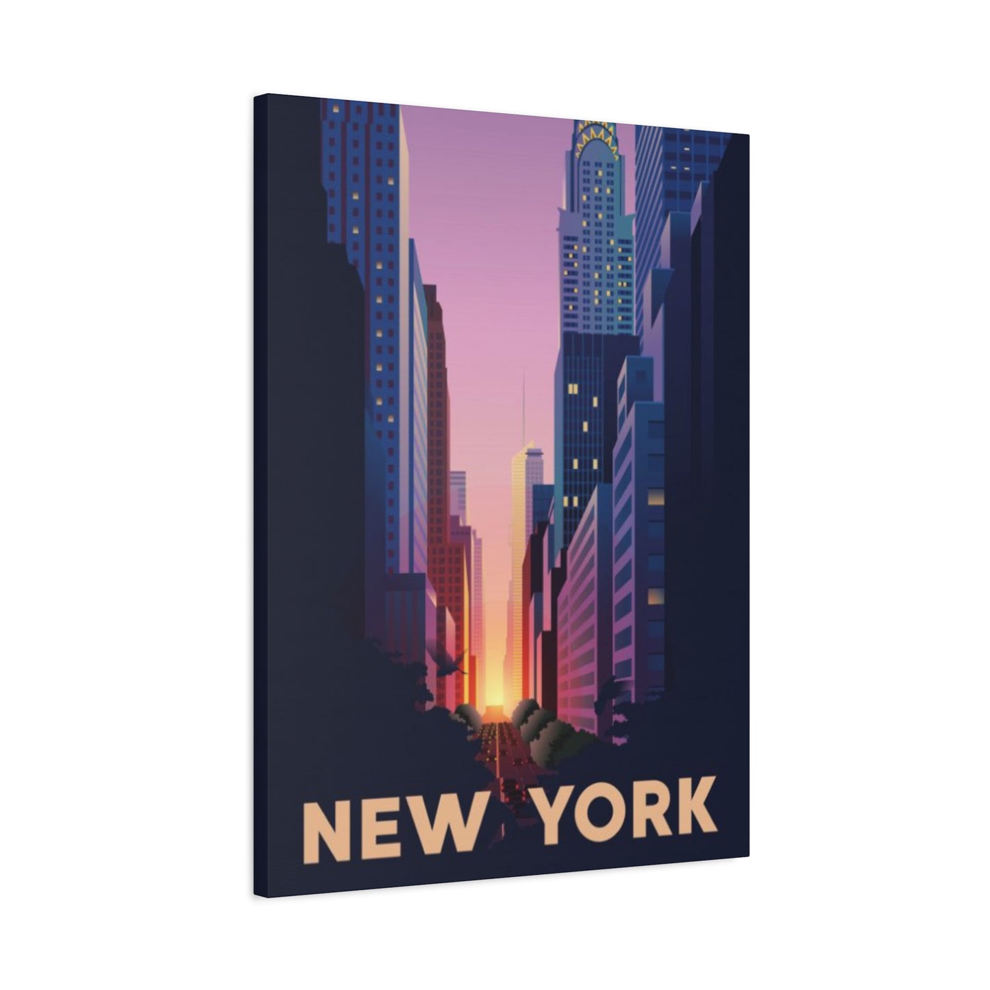
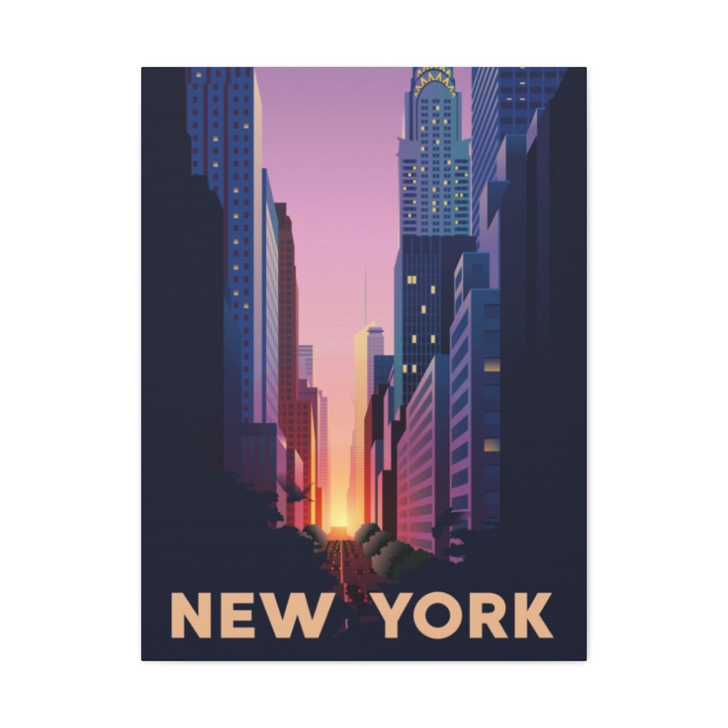
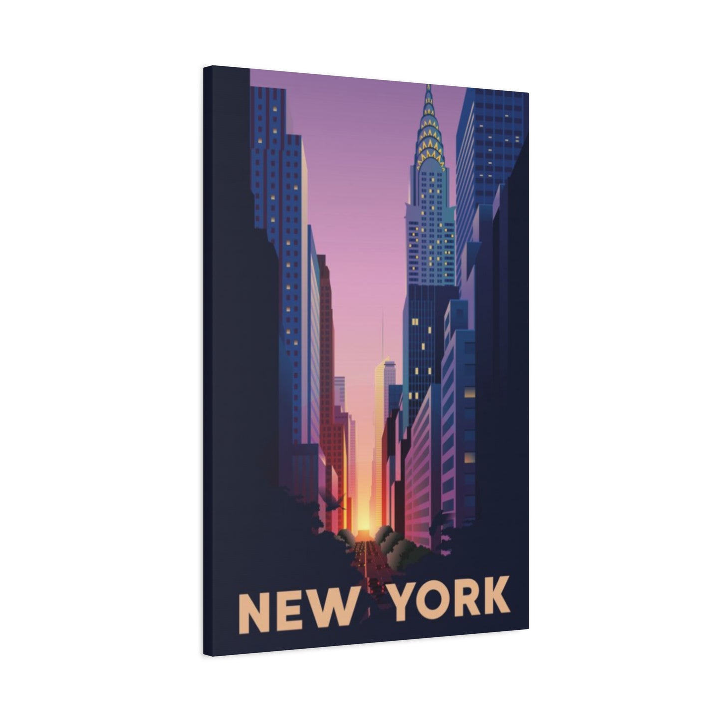
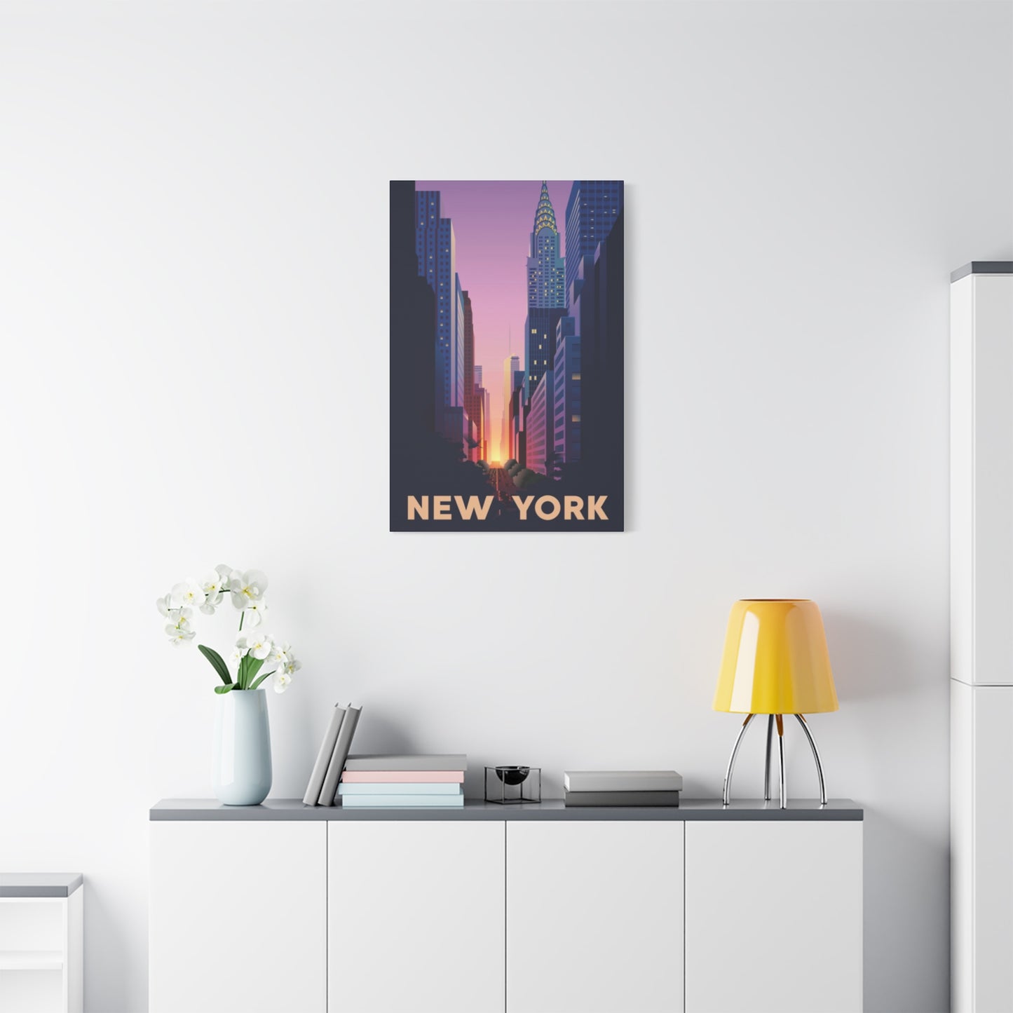
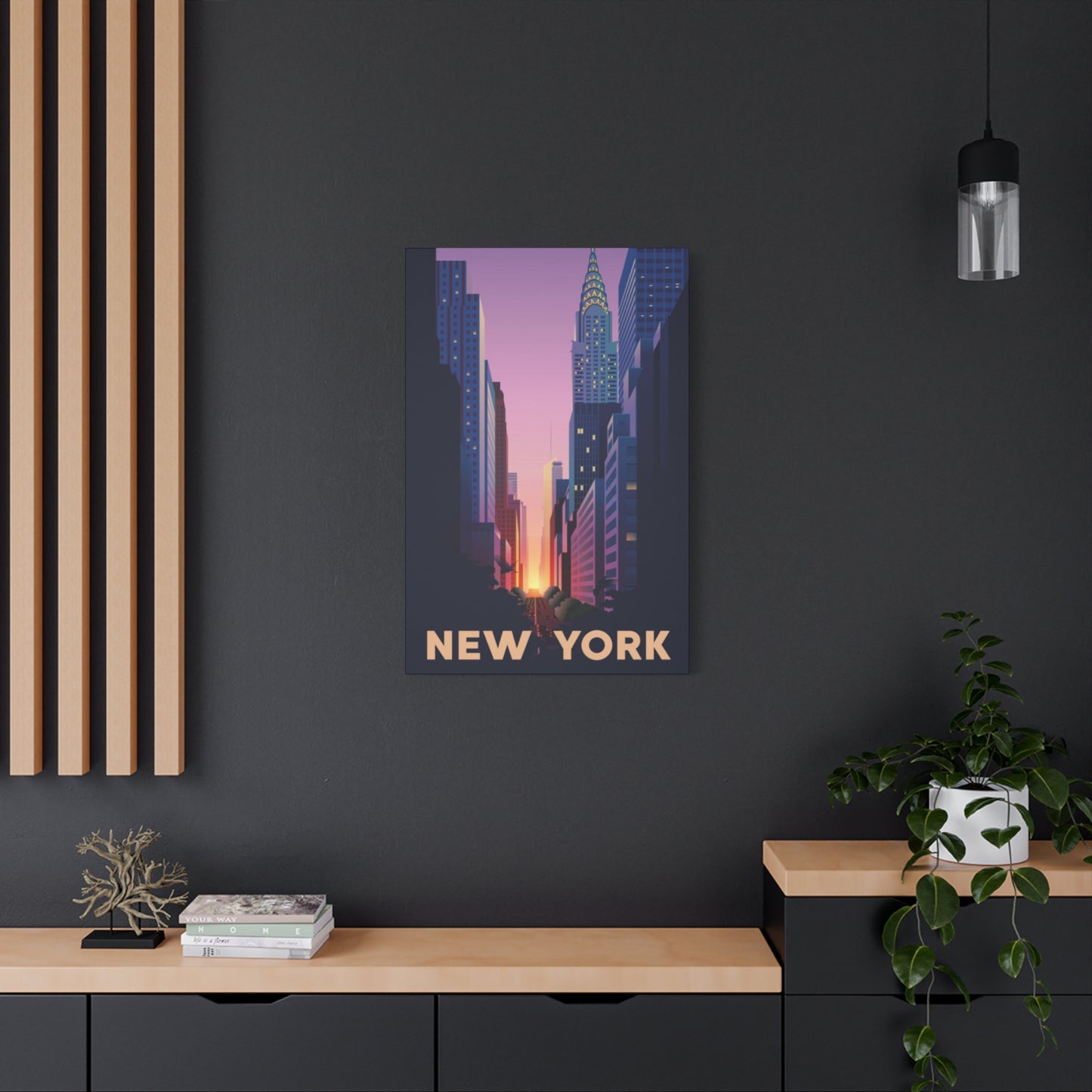
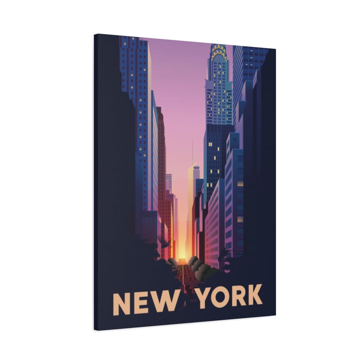
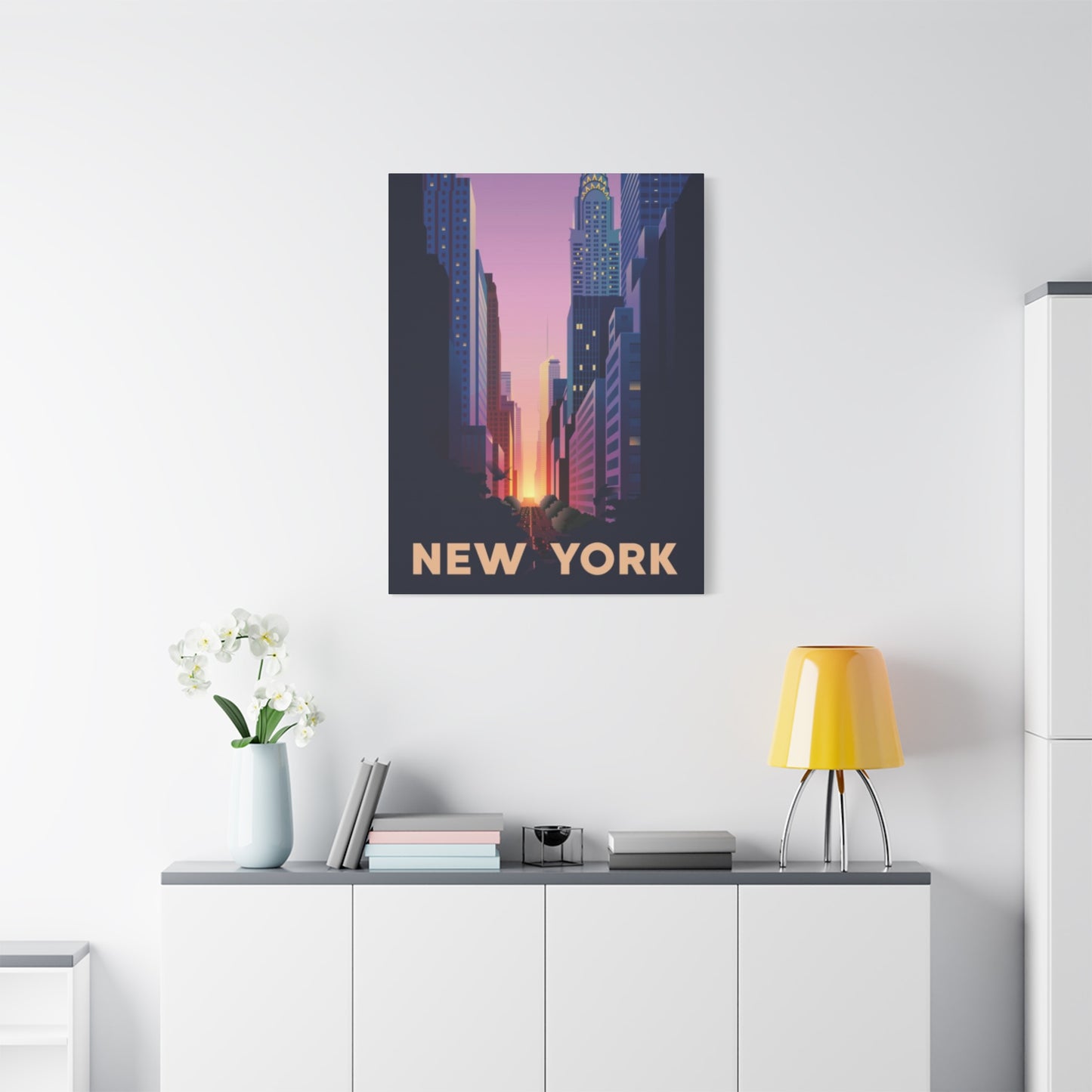
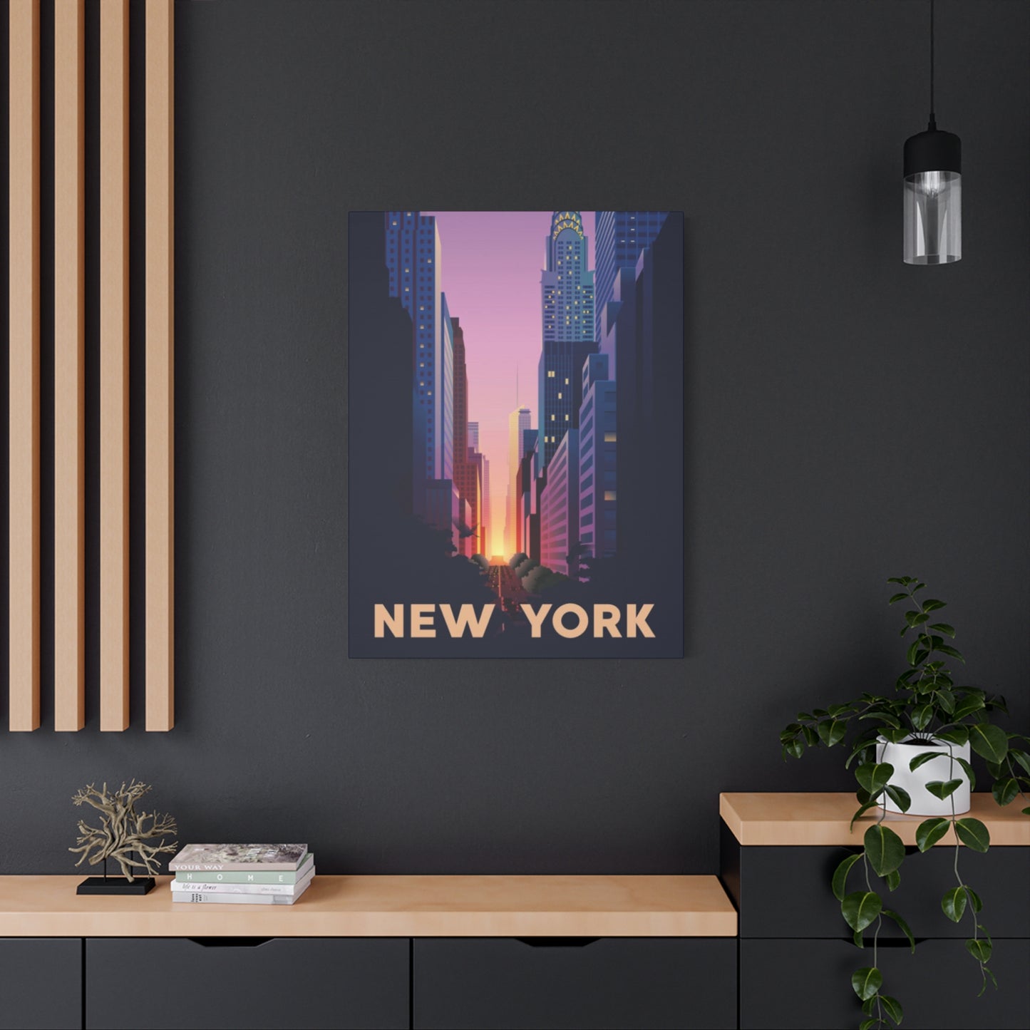
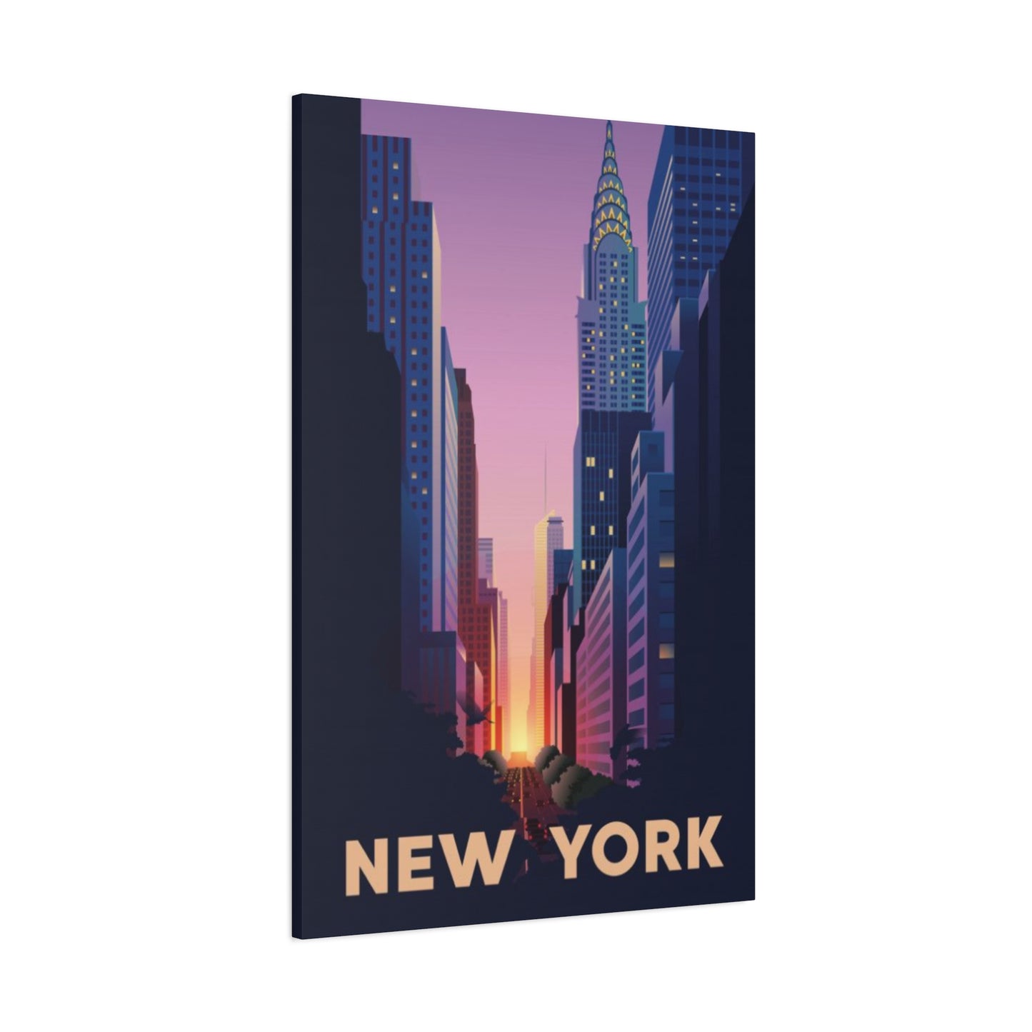
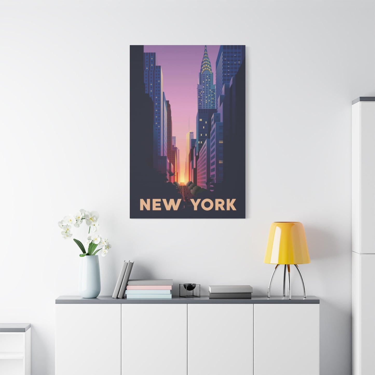
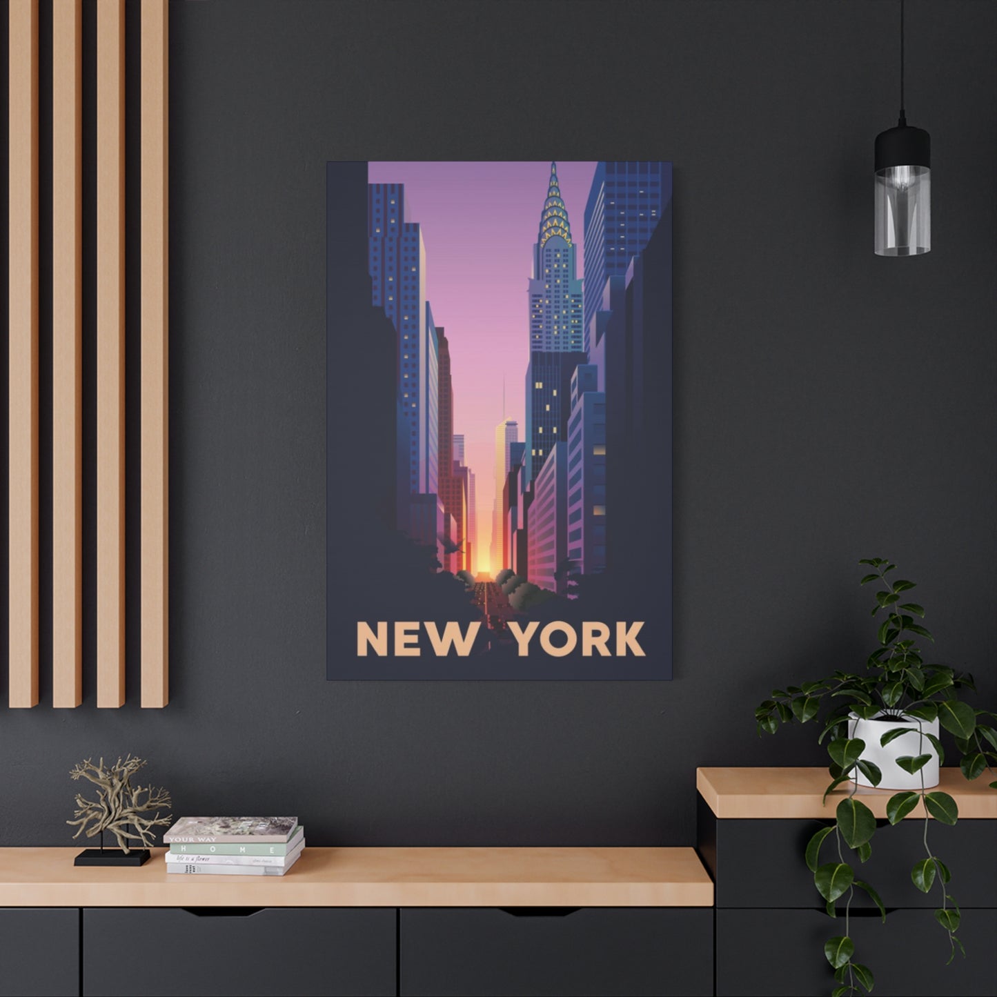
Streets Sunset Of New York City Wall Art & Canvas Prints
Streets Sunset Of New York City Wall Art & Canvas Prints
Couldn't load pickup availability
The Ultimate Guide to Choosing Vibrant New York City Sunset Street Art for Your Home
The magic of evening skies over Manhattan creates an unparalleled visual experience that artists have sought to capture for generations. When golden rays pierce through towering buildings and paint the horizon in shades of amber, crimson, and violet, the metropolis transforms into a living masterpiece. Bringing these breathtaking moments into your living environment through carefully selected canvas pieces allows you to experience that enchantment daily, regardless of where you call home.
Capturing NYC Sunsets on Canvas
The process of translating evening skies over the city into canvas artwork requires exceptional skill and understanding of both light behavior and urban architecture. Artists who specialize in these scenes must master the delicate balance between realistic representation and artistic interpretation. The challenge lies in freezing a fleeting moment when the sun dips below the horizon, casting its final rays across glass facades and stone structures.
Photographers and painters approach this subject with different techniques, yet both aim to preserve the atmospheric quality that makes these moments so memorable. Photography captures the precise instant when light conditions reach their peak, while traditional painting allows for creative liberty in emphasizing certain elements or adjusting color saturation to evoke stronger emotional responses.
The technical aspects of creating these pieces involve understanding how natural light interacts with urban elements. Glass buildings reflect and amplify warm tones, creating secondary light sources that illuminate streets below. Water surfaces, whether from the Hudson River or East River, mirror the sky's palette and double the visual impact. Artists must consider these reflections, the way shadows lengthen across avenues, and how artificial lighting begins to compete with natural illumination during the transition from day to night.
Many artists position themselves at specific vantage points throughout the five boroughs to capture optimal views. Rooftops, bridges, and waterfronts provide elevated perspectives that showcase the city's silhouette against colorful skies. Some prefer the intimate feeling of street-level compositions, where buildings frame the sky and create dramatic contrasts between dark architectural forms and brilliant atmospheric displays.
The emotional resonance of these artworks stems from their ability to transport viewers to a specific moment and location. Even those who have never visited Manhattan can feel the energy and beauty these pieces convey. The universal appeal of dramatic evening skies combined with the iconic urban landscape creates artwork that speaks to diverse audiences across cultural and geographical boundaries.
Contemporary artists employ various mediums to achieve different effects. Oil paints allow for rich, textured applications that add depth and dimension. Acrylics provide vibrant, quick-drying solutions that maintain color intensity. Watercolors offer delicate, atmospheric qualities that can beautifully represent the ephemeral nature of these scenes. Digital artists manipulate photographs to enhance certain qualities while maintaining photographic realism or pushing toward more stylized interpretations.
The canvas material itself plays a crucial role in the final presentation. High-quality cotton or linen canvases properly prepared with gesso provide the foundation for longevity and color retention. The weave density affects how paint sits on the surface and influences the texture visible in the finished piece. Gallery-wrapped canvases, where the printed or painted image extends around the edges, offer a contemporary presentation that eliminates the need for traditional framing.
Warm Hues in New York Street Scenes
The color palette dominating evening cityscapes typically features warm tones ranging from soft peach and coral to deep orange and burgundy. These hues create an inviting atmosphere that adds comfort and energy to any room. Understanding how these colors work together and interact with your existing decor helps in selecting pieces that enhance rather than clash with your environment.
Warm colors psychologically affect viewers by evoking feelings of comfort, energy, and optimism. Orange tones stimulate conversation and social interaction, making them excellent choices for living rooms and dining areas. Red hues add drama and passion, while golden yellows bring cheerfulness and light. When these colors appear in urban scenes, they combine the excitement of city life with the calming effect of natural phenomena.
The interplay between warm sky tones and the cooler blues and grays of buildings creates visual interest and balance. This complementary relationship prevents the composition from becoming monotonous and adds depth to the scene. The contrast helps viewers' eyes move through the composition, discovering new details with each viewing.
Artists carefully orchestrate these color relationships to guide the viewer's attention. The brightest, warmest areas naturally draw the eye first, typically positioned in the sky or reflecting off glass surfaces. Cooler, darker tones in the foreground create a sense of depth and make the bright areas appear even more luminous by comparison. This push and pull between warm and cool, light and dark, creates the dynamic quality that makes these pieces so captivating.
The time of year affects the specific quality of light and color in these scenes. Summer evenings produce warmer, more golden tones that linger longer in the sky. Autumn brings richer oranges and deeper reds as the sun's angle changes. Winter sunsets often feature more dramatic, intense colors concentrated in a shorter timeframe. Spring offers softer, more pastel variations with subtle pinks and lavenders mixing with traditional warm tones.
Geographic location within the city also influences color characteristics. Western-facing streets receive direct light longer, while eastern avenues experience more subdued, reflected light. Areas near water benefit from expanded color displays as the sky's palette mirrors onto liquid surfaces. Industrial areas with particular atmospheric conditions sometimes produce uniquely intensified colors.
Different neighborhoods offer distinct architectural backdrops that interact with warm evening light in unique ways. The glass towers of Midtown create kaleidoscopic reflections that multiply and scatter warm hues. The brownstone-lined streets of Brooklyn present warm tones bouncing off traditional materials that have their own inherent warmth. The steel and concrete of downtown Manhattan provide stark contrasts that make the soft, warm sky colors appear even more remarkable.
Sunset Glow Over NYC Streets
Street-level compositions offer an intimate perspective on how evening light transforms urban canyons into galleries of natural beauty. These artworks capture the unique quality of light filtering between buildings, creating dramatic shafts of illumination that highlight specific architectural details or street elements.
The geometry of city streets provides natural leading lines that draw viewers into the composition. Receding perspectives created by building facades converging toward vanishing points guide the eye toward the light source, creating a sense of depth and journey. This compositional device makes viewers feel as if they could step into the scene and walk toward the glowing horizon.
Traffic, pedestrians, and urban fixtures add life and context to these scenes. Silhouetted figures backlit by golden light become anonymous characters in an urban narrative. Vehicles with their headlights and taillights add complementary points of artificial light that begin their nightly dominance as natural light fades. Street signs, lampposts, and traffic signals become compositional elements that add authenticity and specific character.
The timing of these captures is critical, as the quality of light changes dramatically within minutes during the golden hour. The moments immediately before the sun disappears below the horizon produce the most intense colors and dramatic lighting effects. Photographers and plein air painters must work quickly to capture these fleeting conditions, while studio artists working from reference materials can take more time to carefully develop their interpretations.
Different weather conditions create varied atmospheric effects. Clear skies produce clean, crisp colors with well-defined boundaries between light and shadow. Clouds add texture and interest to the sky, catching and scattering light to create more complex color gradations. Light pollution from the city itself contributes to the glow, especially visible in evening scenes where artificial light begins to compete with natural illumination.
The vertical nature of Manhattan's architecture creates unique opportunities for dramatic lighting. When the sun reaches a low angle, it can illuminate the upper portions of tall buildings while streets below fall into shadow. This creates a striking visual effect where glowing towers seem to float above darkened canyons. Artists who capture this phenomenon create pieces with strong vertical emphasis and dramatic tonal ranges.
Seasonal variations in foliage add another dimension to street scenes. Spring blossoms and summer greenery soften the hard edges of urban architecture and add intermediate tones between the warm sky and cool buildings. Autumn leaves echo the warm colors above, creating visual harmony between natural and built elements. Winter's bare branches create delicate patterns that add graphic interest without blocking views.
Small vs Large Sunset City Prints
Determining the appropriate size for your chosen artwork involves considering multiple factors including room dimensions, viewing distance, available hanging locations, and the desired visual impact. Both modest and substantial pieces offer distinct advantages depending on your specific situation and preferences.
Smaller prints typically measuring between twelve and twenty-four inches work well in intimate settings like bedrooms, bathrooms, home offices, or hallways. These sizes allow for closer viewing distances where details become more apparent. They also offer flexibility for creating gallery arrangements where multiple pieces work together to create a larger visual statement. The lower price point of smaller pieces makes them accessible for those beginning to collect or wanting to refresh their decor without significant investment.
These compact artworks excel in creating focal points in confined areas where larger pieces would overwhelm. A nightstand, desk, or narrow hallway wall becomes an opportunity to introduce color and interest without dominating the surroundings. The modest scale also makes these pieces easy to relocate as your living situation or design preferences evolve.
Medium-sized prints ranging from twenty-four to forty inches represent a versatile middle ground suitable for most residential applications. These dimensions provide enough visual presence to anchor a seating area or dining arrangement without requiring extensive wall real estate. The scale allows for appreciating both overall composition and finer details from typical furniture arrangements.
This size category often represents the sweet spot for balancing impact and practicality. Large enough to make a statement, yet manageable enough to move, hang, and afford, these prints satisfy most decorating needs. They work well as standalone pieces or can be paired with complementary artworks to create dynamic arrangements.
Large-scale pieces exceeding forty inches and extending to seventy-two inches or beyond create dramatic focal points that anchor entire rooms. These substantial works demand attention and establish the visual hierarchy within a environment. They work best in rooms with high ceilings and spacious walls where their size can be properly appreciated without overwhelming the setting.
The immersive quality of large-format artworks allows viewers to feel transported into the scene. The expanded canvas provides room for intricate details while maintaining the broad, sweeping quality of urban vistas. Standing before a substantial canvas depicting an evening cityscape can evoke the sensation of actually being present at that location and time.
Viewing distance plays a crucial role in determining appropriate sizing. Art professionals often recommend hanging pieces so that viewers stand back at a distance approximately equal to the diagonal measurement of the artwork. This allows the composition to be taken in as a unified whole while still permitting closer inspection of details. In smaller rooms where viewing distances are limited, oversized pieces may not be fully appreciated.
Ceiling height influences size selection as well. Standard eight-foot ceilings limit vertical dimensions for maintaining proper proportions and leaving appropriate space above and below the artwork. Rooms with higher ceilings can accommodate taller pieces that draw the eye upward and emphasize vertical space. The dramatic vertical emphasis of city architecture particularly suits tall, narrow formats that echo the subject matter's inherent geometry.
Framing Tips for Sunset Wall Art
The presentation of canvas artwork significantly affects its visual impact and longevity. While many contemporary pieces arrive ready to hang with gallery-wrapped edges, others benefit from traditional framing that adds an additional design element and provides extra protection.
Gallery-wrapped canvases feature images that continue around the sides, eliminating the need for frames and creating a clean, modern aesthetic. This presentation style suits contemporary interiors and allows the artwork to maintain its connection to traditional canvas painting despite often being photographic reproductions. The depth of the stretcher bars varies, with deeper options creating more substantial, sculptural presence on the wall.
When opting for frameless presentation, ensure the sides of the canvas are finished to a professional standard. Some artists and printers leave sides blank or poorly finished, which detracts from the overall appearance. Quality gallery wraps should present clean, mitered corners and sides that complement the front image, either continuing the scene or featuring a solid complementary color.
Traditional framing adds a border that separates the artwork from its surroundings and can enhance or modify the piece's character. Frame selection should complement both the artwork and the room's existing decor without overwhelming the image itself. The frame serves as a transition between the art and the environment, ideally enhancing the viewer's focus on the piece rather than drawing attention to itself.
Frame width and profile depth affect the overall presence of the framed piece. Narrow frames provide subtle definition without much visual weight, suitable for contemporary settings or when the artwork should dominate. Wider frames create more substantial presence and can add formality or traditional character. Deeper profiles that project further from the wall add sculptural dimension and create dramatic shadow lines.
Color and finish choices in framing should harmonize with the artwork's palette and the room's color scheme. Neutral tones like black, white, silver, and natural wood work with most pieces and environments. Black frames add sophistication and create strong contrast, making colors appear more vibrant. White frames lighten the overall appearance and work well in bright, airy environments. Natural wood adds warmth and organic character that complements urban scenes by introducing a contrasting material quality.
Metal frames offer sleek, contemporary aesthetics particularly suited to modern cityscapes. Aluminum and steel frames in brushed, polished, or powder-coated finishes provide clean lines and minimal visual weight. These frames reinforce the industrial character inherent in urban subjects while maintaining a refined appearance.
Matting creates additional separation between image and frame, typically used with framed prints behind glass rather than canvas pieces. When employed, mats should be substantial enough to provide adequate breathing room around the image, with neutral colors that don't compete with the artwork. However, canvas pieces rarely benefit from matting, as it contradicts the tactile, painterly quality that makes canvas appealing.
Glazing options for framed pieces include regular glass, non-glare glass, and UV-protective acrylic. Regular glass provides clarity but creates reflections that can obscure viewing under certain lighting conditions. Non-glare options reduce reflections but slightly diminish color vibrancy and clarity. UV-protective materials prevent fading caused by light exposure, essential for preserving valuable pieces or those displayed in bright locations.
Using Sunset NYC Art to Set Mood
The emotional atmosphere of a room stems from the cumulative effect of color, light, furnishings, and decorative elements. Carefully selected artwork serves as a powerful tool for establishing or enhancing the desired ambiance, with evening cityscapes offering particular advantages for creating warm, inviting environments.
The inherent warmth of these pieces radiates throughout a room, psychologically affecting occupants and visitors. Warm colors trigger emotional responses associated with comfort, energy, and optimism. When these hues appear in recognizable urban contexts, they combine the excitement of city life with the calming beauty of natural phenomena, creating a unique emotional blend.
Placement significantly affects how artwork influences room atmosphere. Positioning pieces at eye level when seated ensures they remain within the natural field of vision, allowing their influence to permeate the environment continuously. In living areas where people gather, placing artwork opposite seating arrangements creates a natural focal point that draws attention and provides a visual anchor.
Lighting plays a crucial role in maximizing artwork's mood-setting potential. Natural daylight brings out true colors and creates dynamic viewing experiences as changing light throughout the day alters the piece's appearance. Artificial lighting should illuminate artwork evenly without creating glare or hot spots. Picture lights, track lighting, or strategically placed accent fixtures highlight pieces after dark, ensuring they continue contributing to the atmosphere during evening hours.
The relationship between artwork and existing decor either reinforces or conflicts with intended mood. Coordinating furniture, textiles, and accessories with the artwork's color palette creates cohesive environments where all elements support the overall atmosphere. This doesn't require exact matching, but rather complementary relationships where colors and styles work in harmony.
Multiple pieces can be coordinated to amplify mood-setting effects. A series of related cityscapes creates visual rhythm and reinforces the urban evening theme throughout a home. Varying sizes and specific scenes within the consistent theme adds interest while maintaining unity. This approach allows for more extensive visual storytelling and stronger atmospheric impact.
Different rooms benefit from mood-setting in distinct ways. Living areas thrive with energetic, conversation-stimulating artwork that encourages social interaction. Bedrooms require calmer, more serene pieces that promote relaxation while still providing visual interest. Dining areas benefit from artwork that enhances appetite and creates sophisticated ambiance. Home offices need pieces that inspire and energize without overwhelming or distracting.
The scale of artwork relative to room size affects its psychological impact. Substantial pieces in appropriately sized rooms create immersive experiences that transport viewers. Oversized artwork in small rooms can feel oppressive, while undersized pieces in large rooms fail to establish adequate presence. Proper proportion ensures artwork enhances rather than overwhelms or disappoints.
Abstract Styles of NYC Sunsets
While photographic realism captures specific moments with documentary precision, abstract interpretations offer artists freedom to emphasize emotional and aesthetic qualities over literal representation. These stylized approaches range from slightly impressionistic treatments to completely non-representational works inspired by urban evening scenes.
Impressionistic techniques employ loose brushwork and emphasis on light effects rather than precise details. These pieces capture the essence and feeling of a scene without getting bogged down in specifics. Colors may be heightened beyond reality, and forms simplified to their most essential elements. This approach creates dreamy, atmospheric artworks that evoke memories and emotions rather than documenting specific locations.
The broken color techniques characteristic of impressionism work particularly well for capturing the shimmering quality of light during golden hour. Small strokes of pure color placed side by side mix optically when viewed from appropriate distances, creating vibrant, luminous effects. This method captures the dynamic, ever-changing quality of atmospheric light more effectively than smooth, blended applications.
Expressionistic interpretations prioritize emotional content over visual accuracy. Artists working in this mode might exaggerate colors, distort forms, or employ aggressive brushwork to convey the intense feelings inspired by urban evening scenes. These pieces provoke strong responses and add dramatic energy to environments, suitable for those seeking bold, statement-making artwork.
The emotional intensity of expressionistic work stems from its subjective nature. Rather than showing viewers what the city looks like, these pieces communicate how it feels. The chaos of rush hour, the excitement of nightlife beginning, the solitude of empty streets bathed in dying light—all these experiences find expression through exaggerated visual language.
Minimalist approaches strip scenes down to essential elements, eliminating details to create simplified compositions focused on fundamental forms, colors, and relationships. A minimalist city evening might reduce the skyline to geometric shapes, the sky to bands of color, and the overall composition to a balanced arrangement of simplified elements. These pieces offer calm, contemplative alternatives to busier, more detailed representations.
The restraint of minimalism creates its own power. By removing distractions, these works focus attention on pure aesthetic relationships—how shapes interact, how colors complement or contrast, how negative and positive elements balance. This reductionist approach suits contemporary interiors that emphasize clean lines and uncluttered aesthetics.
Contemporary abstract artists sometimes use cityscapes as starting points for works that barely reference their origins. Gestural marks, color fields, and compositional structures might derive from observations of urban evenings while resulting in pieces that function independently as abstract art. These works appeal to viewers seeking sophisticated, non-literal artwork that still carries subtle references to recognizable subjects.
Mixed media approaches combine various materials and techniques to create layered, textural pieces. Artists might incorporate collage elements, incorporate texture mediums, or combine painting with printmaking techniques. These complex surfaces add tactile interest and visual depth that engages viewers through multiple sensory dimensions.
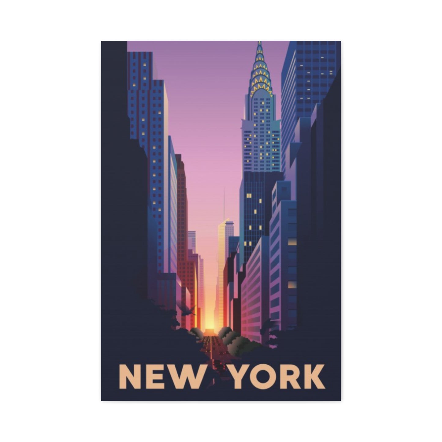
Iconic NYC Streets at Sunset
Certain thoroughfares and intersections have achieved worldwide recognition through their frequent appearance in photography, film, and art. These locations offer instantly recognizable settings that carry cultural significance beyond their visual appeal, making them popular subjects for artists and sought-after acquisitions for collectors.
Times Square represents perhaps the most iconic urban location, where brilliant digital advertisements compete with evening skies in a spectacular display of light. Artists capturing this location face unique challenges in balancing natural and artificial illumination, creating pieces where technology and nature coexist in visual harmony. The energy and excitement of this tourist destination translates into dynamic artwork suitable for those seeking vibrant, energetic pieces.
The geometric perfection of this crossroads, where Broadway intersects with avenues creating triangular building configurations, provides strong compositional structure. Artists often position viewers at ground level looking up at towering buildings, or from elevated vantage points looking down on the perpetual activity below. Evening scenes here capture the transition moment when artificial lighting begins to compete with and eventually overcome natural light.
Brooklyn Bridge presents another immediately recognizable subject, its Gothic arches and suspension cables creating dramatic foreground elements that frame views of lower Manhattan and the surrounding waterways. Evening scenes featuring this landmark offer opportunities for capturing reflections in water, silhouetted architectural details, and the interplay between historic structure and modern skyline.
The pedestrian walkway provides an ideal vantage point for artists seeking to capture both the bridge structure itself and the views it affords. Looking back toward Brooklyn presents one perspective, while facing Manhattan offers another. Each direction provides distinct compositional opportunities and different relationships between sunset sky and urban elements.
Fifth Avenue's prestigious retail corridor transforms during golden hour as the sun illuminates elaborate architectural details of historic buildings. This thoroughfare represents elegance and sophistication, qualities that transfer to artwork featuring its distinguished streetscapes. Pieces showcasing this avenue appeal to those drawn to classic New York glamour and timeless urban beauty.
Central Park South, where the green expanse meets dense urban development, creates striking contrasts between natural and built environments. Evening light washing over treetops while illuminating the facades of luxury hotels and residential towers produces scenes of remarkable beauty. This boundary area offers artists opportunities to include both natural and architectural elements in harmonious compositions.
Wall Street and the Financial District's narrow streets create dramatic urban canyons where evening light behaves in spectacular ways. The historic architecture of this area, combined with modern towers, provides varied textural and formal qualities. These scenes carry connotations of power, ambition, and economic importance that resonate with certain collectors.
The High Line, an elevated park built on former railway infrastructure, provides unique perspectives looking down streets from above typical ground level but below rooftop heights. This intermediate elevation creates interesting compositional possibilities and frames the city in unexpected ways. Evening views from this linear park capture a contemporary approach to urban development and design.
Combining Sunset Colors with City Scenes
Successfully integrating warm evening hues with urban architecture requires understanding color theory and how different tones interact. Artists must balance the vibrancy of colored skies with the typically more neutral grays and browns of buildings, creating compositions that feel cohesive rather than disconnected.
Complementary color relationships provide natural harmony and visual interest. The warm oranges and reds of evening skies find their complement in the cooler blues and blue-grays often present in shadowed areas of buildings. This opposition creates vibrancy and makes both color families appear more intense. Artists consciously exploit these relationships to create dynamic, balanced compositions.
Analogous color harmonies employ colors adjacent on the color wheel, creating more subtle, harmonious relationships. An evening scene might feature yellows, oranges, and reds in the sky, with warm-toned buildings echoing these hues in modified, less intense versions. This approach creates unified, warm-toned compositions particularly suited to cozy, intimate environments.
Color temperature variation adds depth and dimension to compositions. Foreground elements rendered in cooler tones appear to recede, while warmer tones advance toward the viewer. Artists manipulate these perceptual qualities to create convincing three-dimensional illusions on two-dimensional surfaces. The naturally warm sky and potentially cooler foreground buildings work together to establish spatial depth.
Saturation levels require careful calibration to prevent discord. Highly saturated sky colors might overwhelm if not balanced by more neutralized foreground elements. Conversely, overly muted palettes fail to capture the vibrancy that makes evening urban scenes so captivating. Successful pieces find the sweet spot where colors feel alive and intense without becoming garish or oversaturated.
Value contrast—the relationship between light and dark tones—provides compositional structure independent of color choices. Strong value contrasts create dramatic, attention-grabbing pieces with clear focal points. Subtler value ranges produce quieter, more contemplative works. The best city evening scenes typically employ strong value contrasts, as the bright sky naturally contrasts with darker buildings.
The direction of light influences how colors appear on various surfaces. Direct light illuminates building facades in warm tones, while reflected light adds secondary color notes. Glass surfaces create mirror images of the sky, spreading warm hues throughout the composition. Artists must observe and understand these lighting behaviors to create convincing, cohesive scenes.
Atmospheric perspective affects color appearance based on distance. Distant elements appear hazier, bluer, and less distinct than foreground objects. This natural phenomenon helps establish depth in compositions. Artists incorporate atmospheric effects by modifying the color and clarity of distant buildings, making them recede while foreground elements maintain sharpness and color intensity.
Caring for NYC Sunset Canvas Prints
Proper maintenance ensures your investment retains its visual appeal and value over time. Canvas prints, while durable and relatively low-maintenance, benefit from attention to environmental factors and occasional cleaning to prevent deterioration and preserve appearance.
Light exposure represents the primary threat to canvas longevity. Ultraviolet radiation causes pigments to fade, gradually diminishing the vibrancy that makes these pieces attractive. Positioning artwork away from direct sunlight prevents accelerated degradation. Windows with UV-filtering film or glass provide protection when sun exposure cannot be avoided. Artificial lighting using LED bulbs generates less UV radiation than incandescent or fluorescent alternatives.
The cumulative effect of light exposure means even indirect daylight gradually affects pigments over time. Rotating pieces between locations occasionally distributes exposure, preventing any single work from bearing all the degrading effects. This practice particularly matters for valuable or limited-edition prints where preservation is paramount.
Temperature and humidity fluctuations stress canvas materials and can lead to expansion, contraction, and eventual deterioration. Maintaining stable environmental conditions between sixty-five and seventy-five degrees Fahrenheit with relative humidity between forty and fifty percent provides ideal preservation conditions. Avoid hanging canvas in bathrooms where humidity spikes dramatically or near heating vents where temperature varies significantly.
Dust accumulation dulls appearance and can abrade surfaces if allowed to build up excessively. Regular light dusting using soft, clean cloths removes particles before they become problematic. For surface-printed canvases, gentle dry dusting suffices. Textured, traditionally painted canvases require extra care to avoid catching fibers in paint texture.
More thorough cleaning occasionally becomes necessary for pieces displayed in kitchens or other areas where airborne particles settle on surfaces. Slightly damp cloths can be used on properly sealed canvases, though moisture should never saturate the material. Work from top to bottom using gentle, overlapping strokes. Avoid cleaning products unless specifically designed for canvas artwork, as chemicals can damage protective coatings or affect pigments.
Handling canvas requires care to avoid dents, punctures, or tears. Always grasp frames rather than canvas surfaces when moving pieces. If the canvas itself must be touched, use clean hands and handle edges only. Pressure on printed or painted surfaces can create permanent deformations or transfer oils from skin to the artwork.
Backing protection shields canvas from physical damage and environmental factors. Dust covers fitted to frame backs prevent particles from accumulating on the reverse and provide some humidity buffering. These covers should be secure but not completely sealed, as canvas needs some air circulation to prevent moisture buildup and mold growth.
Professional restoration can address issues that develop despite preventive care. Specialists can clean, repair tears, re-stretch sagging canvas, and sometimes restore faded colors. However, prevention remains more effective and economical than correction. Establishing proper care routines from the moment artwork arrives protects your investment for decades.
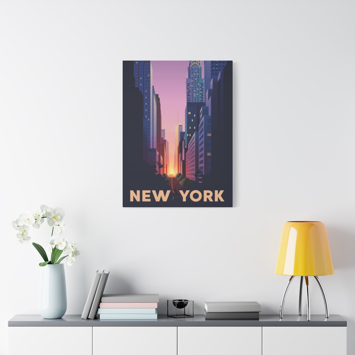
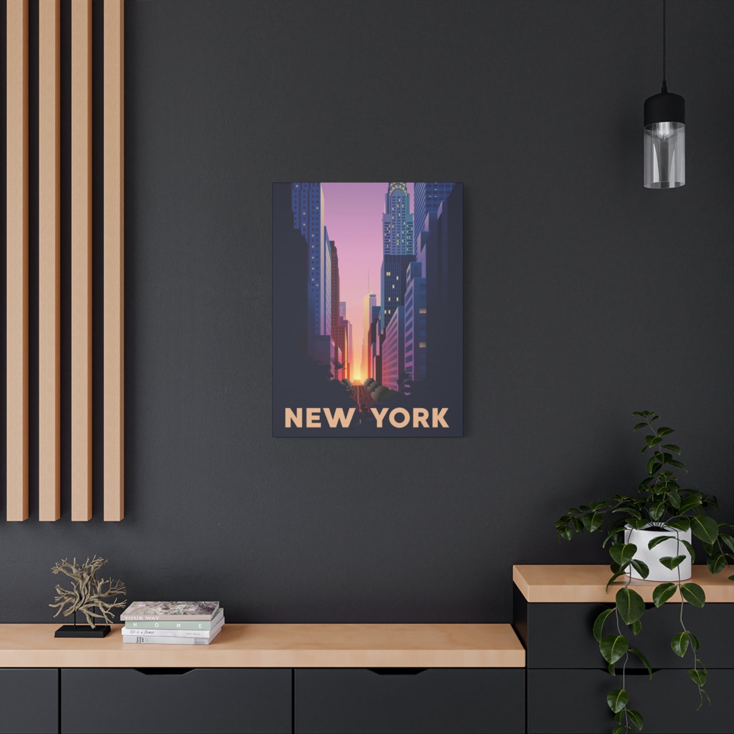
Display Ideas for Sunset City Wall Art
Maximizing the visual impact of your chosen pieces involves thoughtful consideration of placement, arrangement, and integration with existing furnishings and architectural features. Various display strategies suit different collection sizes, room configurations, and aesthetic preferences.
Single statement pieces work best when given adequate breathing room to command attention. Center the artwork on the primary wall of a room, typically the first wall visible upon entering. Ensure adequate blank surroundings—generally several inches of empty wall on all sides—prevents the piece from feeling cramped. The center point should align approximately sixty inches from the floor, matching average eye height.
This positioning places artwork at an optimal viewing height for standing visitors while remaining visible from seated positions. In rooms with particularly tall ceilings, the piece can be hung slightly higher to maintain proper proportions with the room's vertical scale. However, resist the temptation to hang artwork too high, a common error that forces viewers to strain their necks and disconnects the art from furniture groupings.
Gallery arrangements group multiple pieces to create unified visual statements. Symmetrical arrangements offer traditional, formal aesthetics with pieces of matching sizes arranged in regular grids. Asymmetrical groupings create dynamic, contemporary looks using varied sizes arranged to achieve visual balance without perfect symmetry. The negative space between pieces becomes an active design element in these arrangements.
Planning gallery arrangements before hanging prevents multiple nail holes and frustration. Create paper templates matching frame dimensions and use removable tape to position them on the wall, adjusting until the arrangement feels balanced. This technique allows experimentation without commitment. Maintain consistent spacing between pieces—typically two to three inches works well—to create cohesive groupings rather than scattered collections.
Vertical arrangements work well in narrow spaces like hallways or next to doorways. Stacking pieces vertically draws the eye upward and emphasizes ceiling height. This approach suits tall, narrow pieces or combinations of smaller works. Ensure the vertical stack maintains proper alignment and spacing for a polished, intentional appearance.
Horizontal arrangements expand along wall length, suitable for hanging above sofas, beds, or console tables. These configurations emphasize width and can help long, narrow rooms feel more proportional. A series of related cityscapes arranged horizontally creates a panoramic effect, suggesting a sweeping view across the urban landscape.
Ledge or shelf displays provide flexible alternatives to traditional hanging. Floating shelves allow pieces to lean against walls with easy rotation when you desire change. This approach particularly suits renters or those who enjoy frequently refreshing their decor. Mixing framed artwork with books and decorative objects on shelves creates curated, collected looks with personal character.
Built-in solutions like picture rails or gallery systems with suspended cables offer adaptable hanging methods that preserve wall surfaces. These systems allow easy height adjustments and piece swapping without new nail holes. Though requiring initial installation, they provide long-term flexibility particularly valuable for serious collectors or those who enjoy regular rotation.
Corner arrangements activate often-overlooked areas where walls meet at angles. Pieces positioned to wrap around corners can create visual bridges between adjacent walls, improving flow and drawing attention to unique architectural features. This strategy requires careful consideration of sightlines from various room positions to ensure effectiveness.
Above furniture placement creates visual connections between functional and decorative elements. Artwork hung above sofas should span approximately two-thirds to three-quarters of the furniture's width to maintain proper proportions. Leave six to eight inches between furniture top and frame bottom to establish clear separation while maintaining visual relationship.
Emotional Impact of Sunset Cityscapes
The psychological effects of viewing artistic representations of urban evening scenes extend beyond simple aesthetic appreciation. These pieces tap into deep emotional responses related to memory, aspiration, and our complex relationships with both natural beauty and human achievement.
Nostalgia plays a significant role in how viewers connect with cityscapes. For those who have visited or lived in Manhattan, these scenes trigger specific memories of experiences associated with the location. Walking through familiar streets, visiting for special occasions, or daily commutes all create personal histories that resonate when encountering artistic representations. These works become visual anchors for treasured memories and meaningful life chapters.
Even without personal experience of the depicted locations, viewers respond to the universal appeal of urban energy combined with natural beauty. Cities represent human aspiration, achievement, and opportunity. The concentrated creativity, commerce, and culture of major metropolitan areas attracts people worldwide. Artwork featuring these themes allows participation in that excitement regardless of physical location.
The specific emotional quality of evening scenes carries particular significance. Twilight represents transition, endings, and new beginnings. The day's activities wind down as night's possibilities emerge. This liminal quality imbues evening cityscapes with reflective, contemplative character despite their dynamic subjects. Viewers may connect with themes of transformation, reflection on daily experiences, or anticipation of what's to come.
The warm color palette inherent in these pieces generates positive emotional responses. Warm hues are associated with comfort, security, and happiness across cultures. These colors can elevate mood, reduce stress, and create welcoming atmospheres. Surrounding yourself with warm-toned artwork provides subtle but meaningful psychological benefits that accumulate over time.
The contrast between organic natural elements and geometric human constructions creates visual and conceptual interest. Nature's irregular, flowing forms juxtaposed against architecture's straight lines and regular patterns highlight both beauty types. This combination suggests harmony between human activity and natural world, or alternatively, tension between these forces. Individual interpretation depends on personal philosophy and life experience.
Scale and perspective within these compositions affect emotional response. Wide panoramic views suggesting vastness and limitless possibility inspire feelings of freedom and potential. Intimate street-level scenes create connection with human-scaled environments and daily life. Elevated views looking down on the city can evoke feelings of achievement, superiority, or alternatively, detachment and isolation depending on treatment and viewer disposition.
The presence or absence of people within compositions influences emotional tone. Crowded scenes with visible pedestrians and traffic convey energy, community, and bustling life. Empty streets at twilight suggest solitude, peace, or potentially loneliness depending on mood established through lighting and color treatment. Artists manipulate these elements to guide emotional interpretation.
Popular Artists Painting NYC Sunsets
Throughout art history and into contemporary practice, numerous talented individuals have dedicated significant portions of their careers to capturing urban evening scenes. Understanding the work of recognized practitioners provides context for personal collecting and appreciation while identifying styles that resonate with individual tastes.
The Ashcan School of the early twentieth century brought gritty urban realism to American art, with members frequently depicting city life including atmospheric lighting conditions. While not focused exclusively on evening scenes, these artists established traditions of finding beauty in urban settings that continue influencing contemporary practitioners. Their work demonstrated that cities deserved serious artistic attention comparable to traditional landscape painting.
Edward Hopper, though more famous for interior scenes, created powerful urban landscapes that captured specific lighting conditions with remarkable sensitivity. His ability to convey mood through light quality influenced generations of artists working with urban subjects. The isolation and contemplative quality in his work continues resonating with modern viewers and artists.
Contemporary painters working in various styles have made city evening scenes central to their practice. Some maintain traditional representational approaches using oil or acrylic paint, creating works that continue long-standing artistic traditions while incorporating contemporary sensibilities. These artists often work from photographs but interpret and modify reference materials to enhance emotional or aesthetic qualities.
Photorealist painters create meticulously detailed works that rival or exceed photographic precision. These technical virtuosos spend hundreds of hours on single pieces, rendering every architectural detail, reflection, and atmospheric nuance with astonishing accuracy. While controversial in some art circles, photorealism demonstrates undeniable skill and creates impactful artworks popular with collectors seeking impressive technical achievement.
Urban landscape photographers have elevated their practice to fine art status, with many specializing in dramatic lighting conditions that make evening scenes so compelling. These artists combine technical mastery of camera equipment with compositional sophistication and patience to capture optimal moments. Limited edition prints from recognized photographers command significant prices and deserve consideration alongside traditional paintings.
Digital artists represent a newer category, using software to create works ranging from photo-manipulations to completely original digital paintings. These practitioners employ tablets and styluses to create brushwork in virtual environments, often achieving results indistinguishable from traditional media in final printed form. Digital methods offer unique possibilities for color manipulation, atmospheric effects, and experimental techniques impossible with physical paint.
Street artists and muralists have brought urban evening scenes to building facades and public locations, democratizing access to this subject matter. While these large-scale works cannot be collected traditionally, many street artists produce gallery pieces, prints, and smaller works that adapt their distinctive styles to collectible formats. The energy and contemporary edge of street art aesthetics appeal to younger collectors and those seeking cutting-edge artistic expressions.
Local artists working in cities worldwide create personal interpretations of their home environments. Supporting emerging or mid-career artists provides opportunities to acquire quality work at accessible prices while helping creators sustain their practices. Local art fairs, gallery exhibitions, and studio tours offer direct connection with artists and insight into creative processes behind finished works.
Conclusion
In conclusion, selecting vibrant New York City sunset street art for your home is more than just choosing a piece that looks beautiful—it’s about bringing emotion, energy, and narrative into your living space. As we’ve explored throughout this guide, there are multiple layers to consider, all of which together shape how the artwork interacts with your décor, your personality, and the atmosphere you want to create.
First, the interplay between color and light is paramount. Sunset hues—fiery oranges, deep purples, glowing pinks, and velvety indigos—can harmonize with your existing palette or introduce a bold new contrast. Pay close attention to where and how natural light enters a room; a piece that glows under soft morning light may behave very differently under harsh afternoon rays. Select finishes—glossy, matte, or semi-gloss—that complement the light conditions and enhance the intensity of the sunset tones without overwhelming other elements in the room.
Second, think about the scale and placement of the artwork. Oversized canvases or murals can serve as dramatic focal points in open spaces like living rooms, lofts, or stairwells, while smaller pieces may be ideal for more intimate settings such as bedrooms, hallways, or reading nooks. Measure your wall space, consider the size of furniture nearby, and leave enough margin around the artwork so it can breathe—this helps maintain balance and allows the colors and composition to stand out without feeling cramped.
Third, subject matter and artistic style matter just as much as color and scale. NYC street art captures a wide range of moods and motifs—from gritty, stylized graffiti to romantic skyline silhouettes, abstract interpretations, photographic realism, or more whimsical, illustrative designs. Choose a style that speaks to you—whether you want something raw and edgy, elegant and refined, or playful and surreal. Let the story behind the piece or the artist’s vision resonate with your own experiences or aspirations in the city.
Fourth, consider medium, texture, and framing. Whether you go with paint, mixed media, photography, or digitally printed reproductions, each medium carries its own texture and finish that influences how vivid the sunset appears. Framing choices—if applicable—can either amplify the piece or subtly contain it; sleek metal or floating frames tend to work well with modern interiors, while rustic or wood frames may lend warmth and complement eclectic or traditional spaces.
Finally, remember that art is deeply personal. Trust your instincts: if a piece makes you pause, smile, or feel transported to a rooftop in Brooklyn or a pier by the East River at sunset, that’s a strong sign it’s right for you. Don’t shy away from mixing multiple pieces or creating an art wall if that better reflects your story and style.
Choosing vibrant NYC sunset street art for your home is a blend of aesthetic judgment, emotional connection, and thoughtful design. If you combine careful evaluation of light, color, composition, style, and scale—and above all, what moves you—you’ll end up with a piece that not only elevates your space but becomes a constant source of inspiration. May your home glow with golden hours, city lights, and the captivating energy of a New York sunset.
