


Sunlight On Houses Of Spain Wall Art & Canvas Prints
Sunlight On Houses Of Spain Wall Art & Canvas Prints
Couldn't load pickup availability
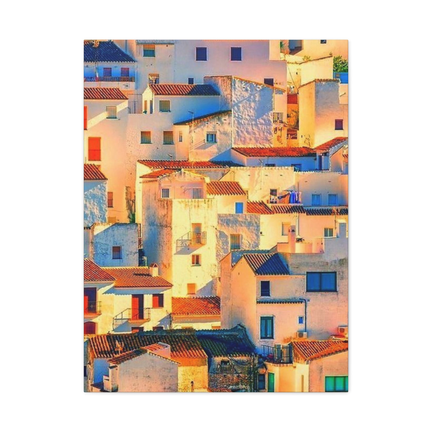
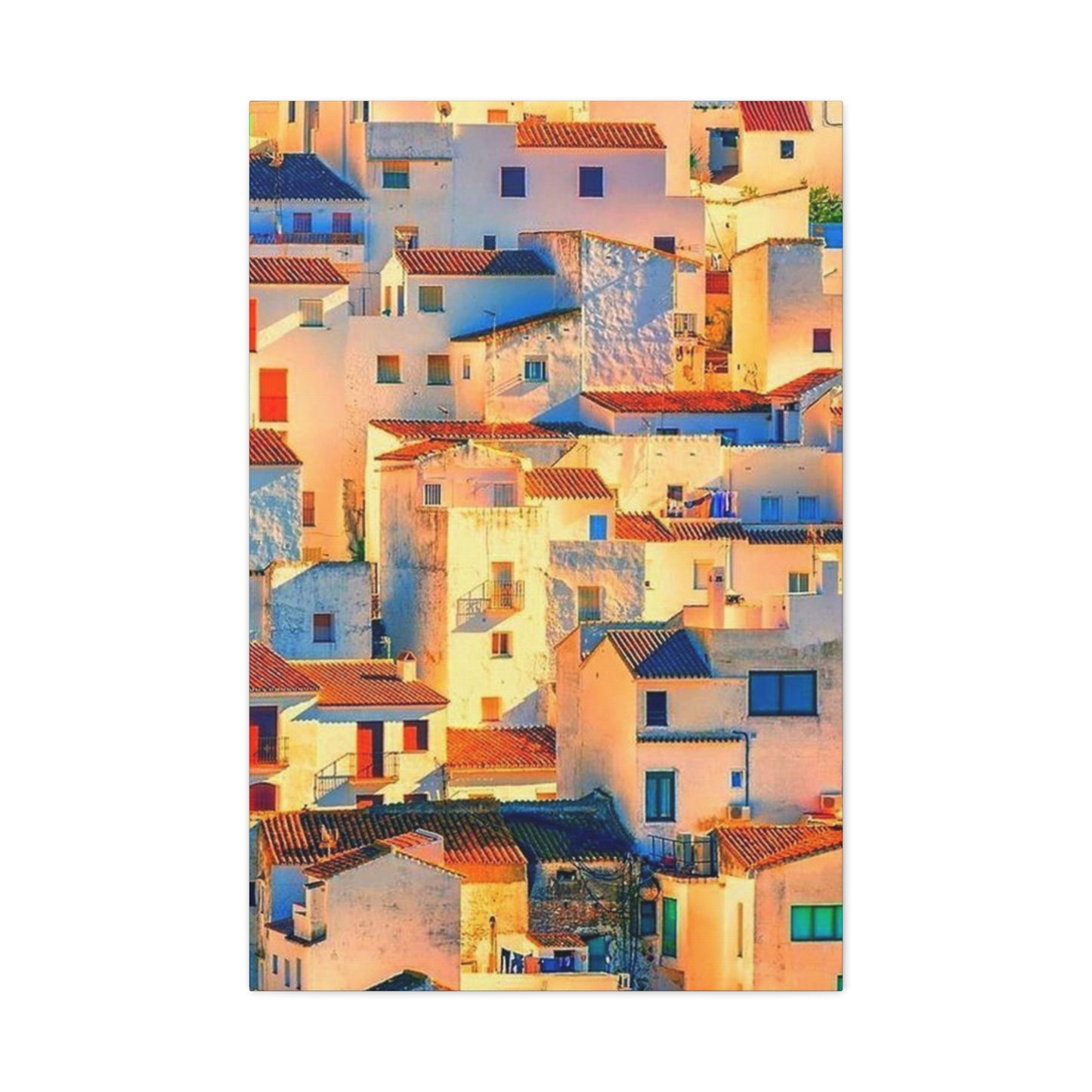

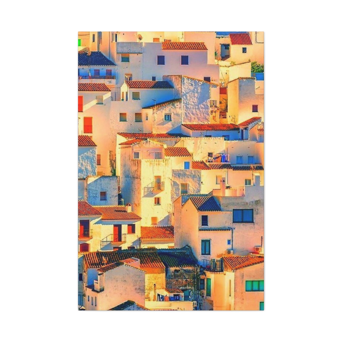
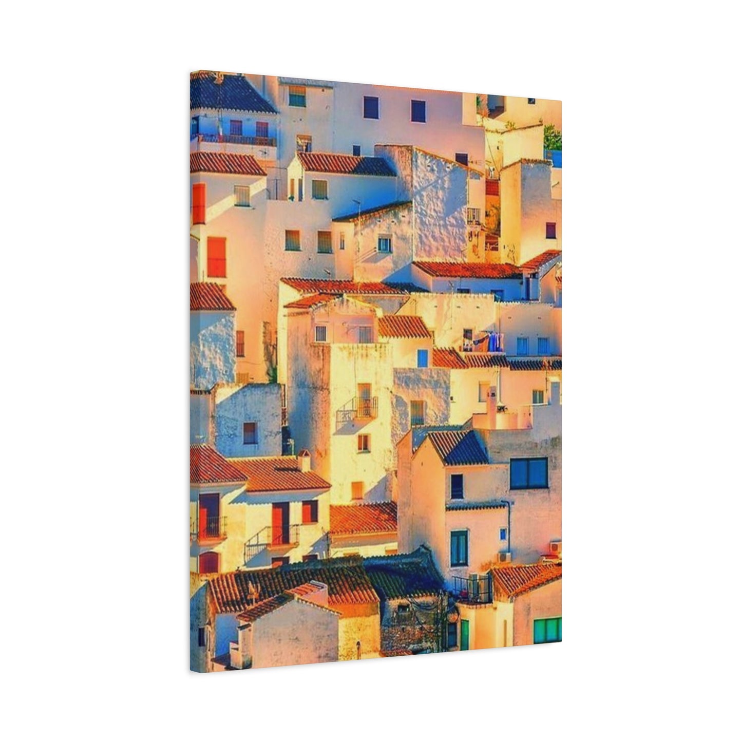
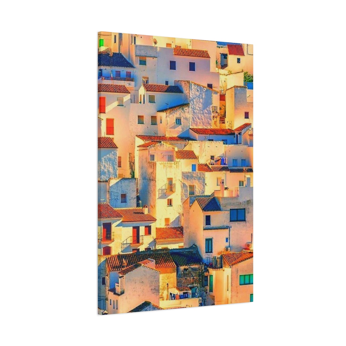
Red Roofs and White Walls: Iconic Spanish House Wall Art Ideas
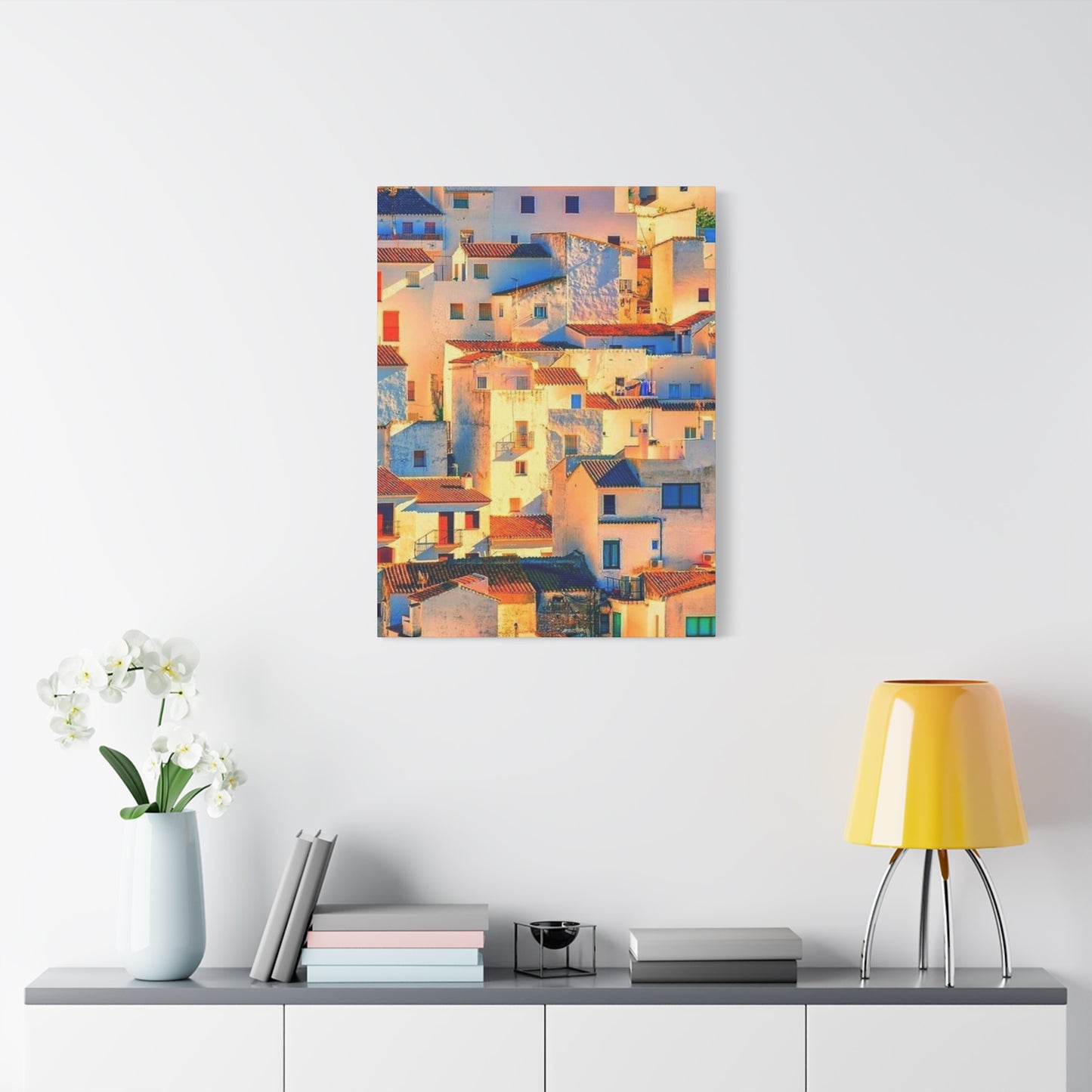
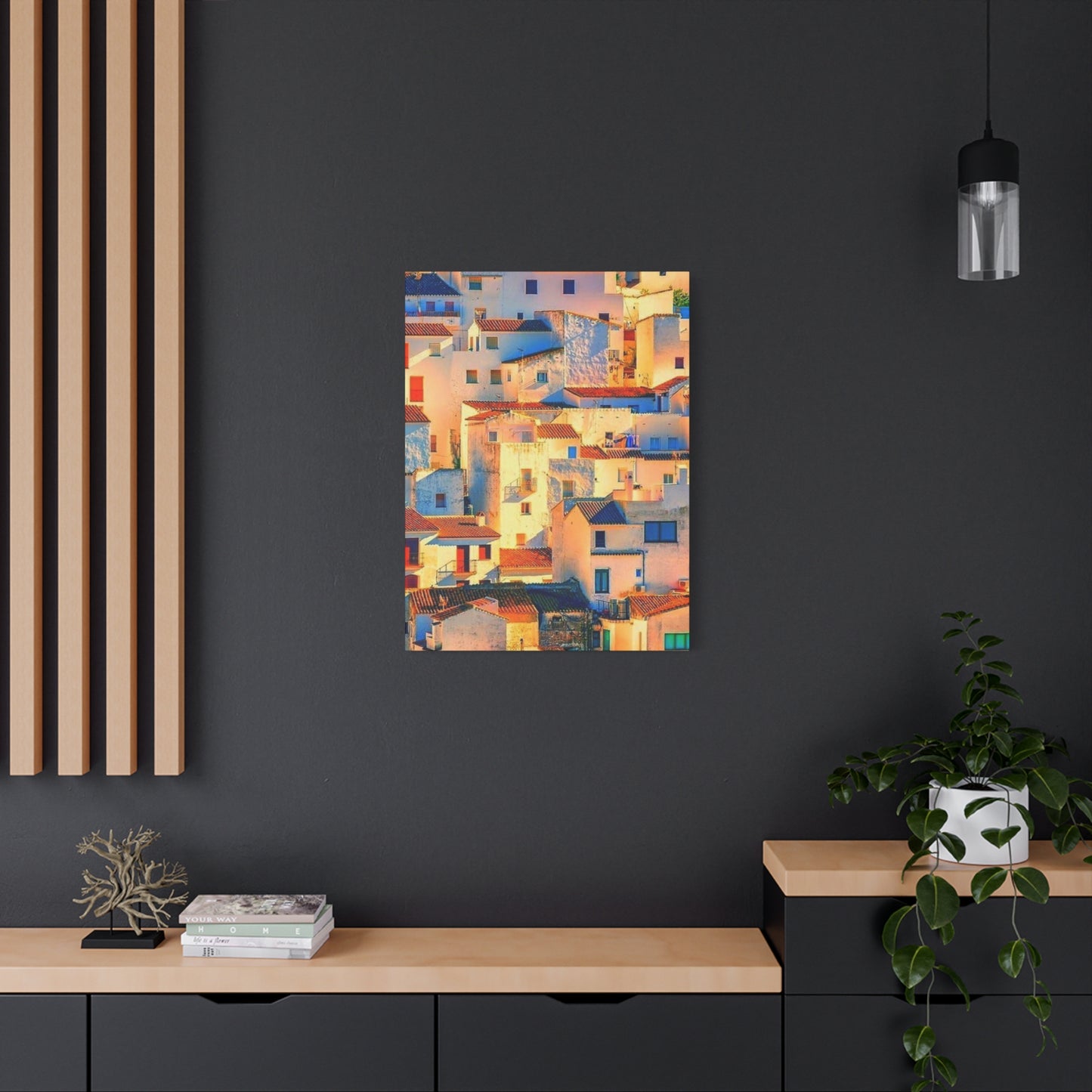
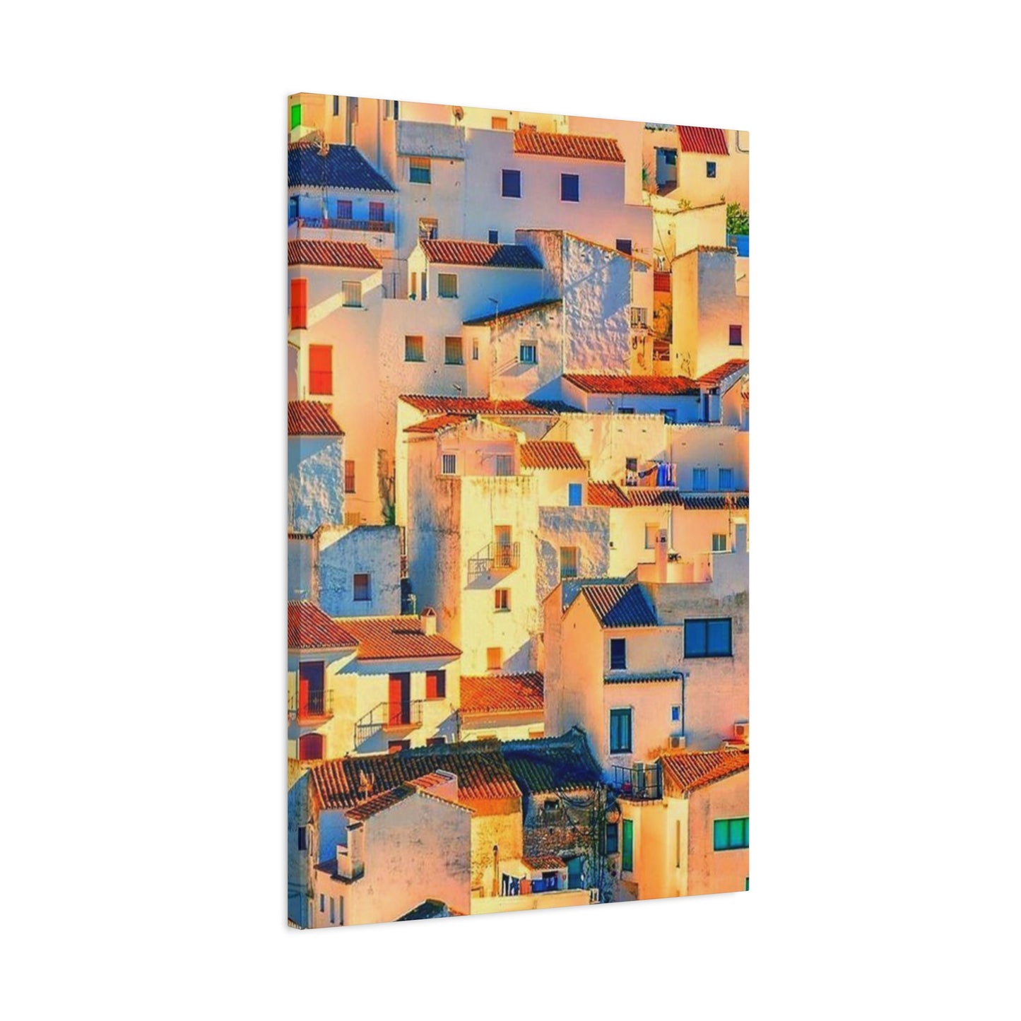
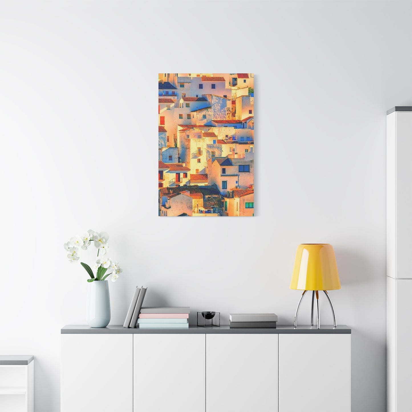
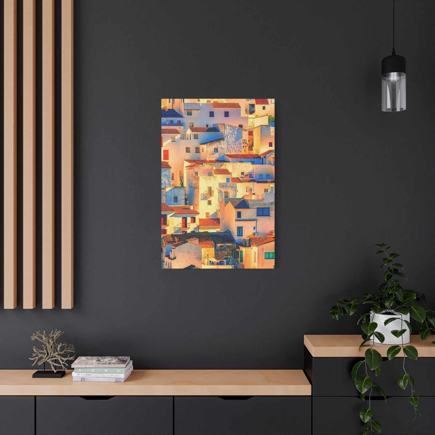
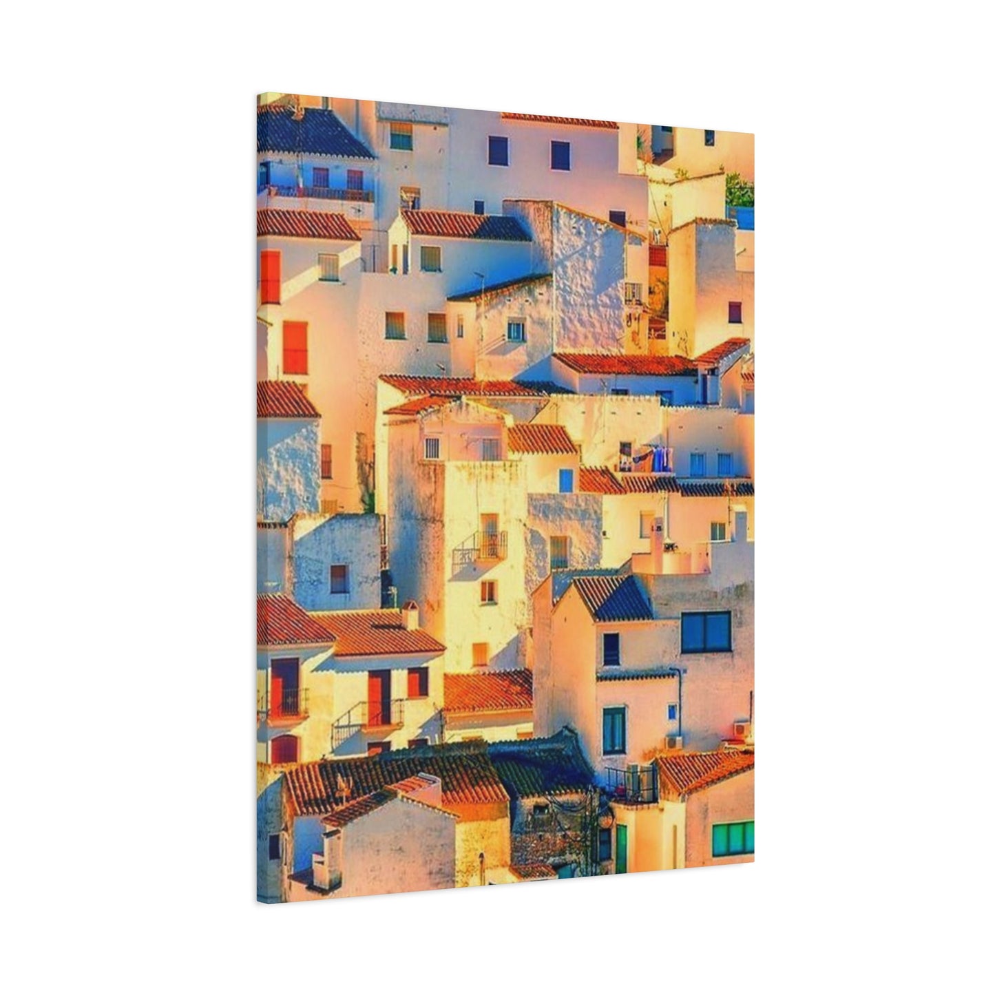
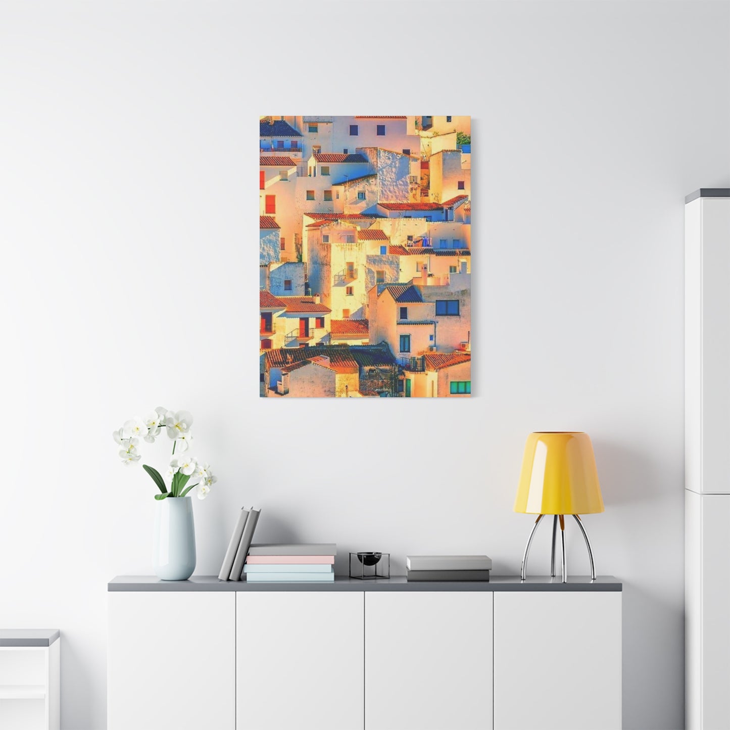
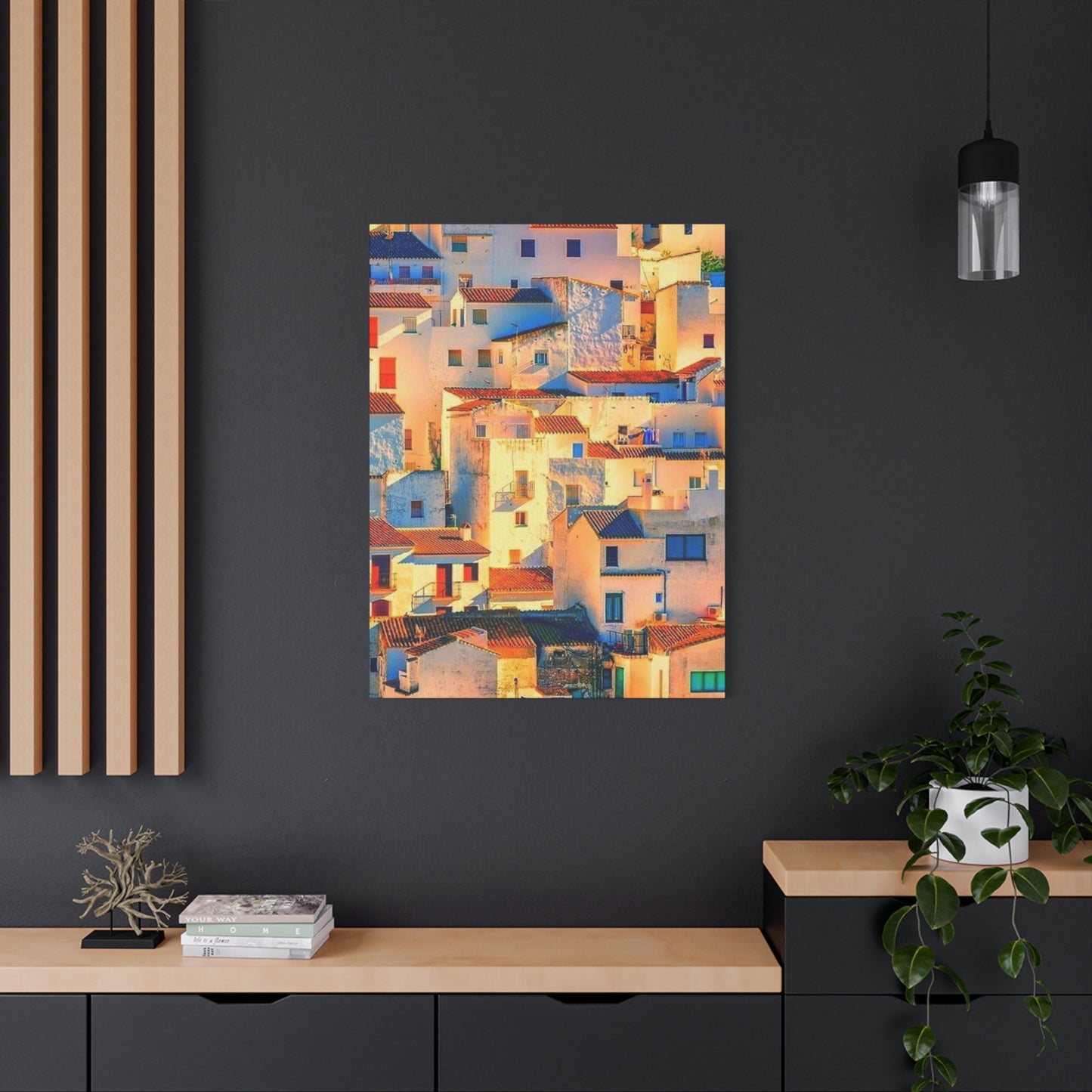
The allure of Mediterranean architecture has captivated artists and homeowners for centuries. Among the most enchanting subjects are the sunlit houses of Spain, where golden rays illuminate terracotta roofs, whitewashed facades, and cobalt blue shutters. These scenes, captured on canvas, offer more than mere decoration—they transport viewers to winding cobblestone streets, lazy afternoon siestas, and the intoxicating scent of orange blossoms carried on warm breezes.
Spanish residential architecture represents a visual feast that combines Moorish influences, Mediterranean practicality, and centuries of cultural evolution. When translated into canvas prints, these structures become portals to another world, inviting contemplation and evoking powerful memories of travels past or dreams of future adventures. The interplay between shadow and illumination in these artworks creates dramatic contrasts that animate any room, while the warm color palette introduces an immediate sense of comfort and vitality.
The growing popularity of Spanish architectural prints reflects a broader cultural appreciation for authentic, handcrafted aesthetics in an increasingly digital world. Homeowners seek connections to tangible places, real histories, and genuine beauty—qualities abundantly present in depictions of Spanish dwellings bathed in natural light. Whether you've wandered through the narrow alleys of Seville, climbed the hillsides of Granada, or simply admired photographs of these enchanting structures, bringing their essence into your living environment can profoundly impact your daily experience.
This comprehensive exploration examines every aspect of incorporating Spanish architectural imagery into your home through canvas prints. From understanding the technical considerations of different sizes to mastering display techniques, preservation methods, and the emotional resonance these artworks provide, you'll discover how to select, maintain, and showcase pieces that genuinely reflect your aesthetic sensibilities while honoring the remarkable architectural heritage of Spain.
Warm Spanish Sunlight Scenes: Capturing Golden Hour Magic
The quality of light in Spain differs markedly from other regions, possessing a distinctive warmth and intensity that has drawn artists for generations. This luminosity results from geographic latitude, atmospheric conditions, and the reflective properties of traditional building materials. When sunlight strikes whitewashed walls at particular angles, it creates a soft, diffused glow that seems to emanate from the structures themselves rather than merely reflecting off their surfaces.
Morning light in Spanish villages arrives gently, gradually warming terracotta roof tiles until they radiate a burnt orange hue visible from kilometers away. This gradual transition from cool dawn shadows to full illumination provides artists with endless compositional possibilities. Canvas prints capturing these early hours often feature long shadows stretching across narrow streets, creating dramatic geometric patterns that add visual interest and depth to the composition.
The midday sun in Mediterranean climates produces an almost blinding brightness that bleaches colors and compresses shadows into narrow bands directly beneath objects. While this harsh light might seem unflattering, skilled photographers and painters leverage it to emphasize architectural details—the texture of stucco, the weathered grain of wooden doors, the play of light through wrought iron balconies. These high-contrast images command attention and work particularly well in contemporary settings where bold visual statements complement minimalist furnishings.
Golden hour represents the pinnacle of Spanish sunlight photography and painting. As the sun descends toward the horizon, it casts a honeyed glow across everything it touches, transforming ordinary buildings into extraordinary subjects worthy of prolonged contemplation. The warmth of this light enhances earth tones naturally present in Spanish architecture—ochres, umbers, siennas—while simultaneously softening cooler accent colors like Mediterranean blues and greens. Canvas prints featuring golden hour scenes bring this magical quality into homes, creating focal points that draw the eye and warm the heart.
Evening light introduces another dimension entirely, as fading daylight mingles with artificial illumination from windows, streetlamps, and doorways. This transitional period, known as the blue hour, occurs when the sky retains a deep azure hue while buildings begin to glow from within. Artworks capturing these moments convey a sense of homecoming and domestic tranquility, making them ideal for private quarters like bedrooms or reading nooks where relaxation and reflection are priorities.
The seasonal variation of sunlight in Spain adds yet another layer of complexity and beauty to architectural imagery. Summer light arrives early and lingers late, creating extended opportunities for photography and painting while emphasizing the heat-reflective properties of traditional construction methods. Winter sunlight, though less intense, travels at lower angles that can illuminate facades in unexpected ways, revealing architectural details often lost in summer's overhead glare.
Artists who specialize in Spanish architectural scenes often spend years studying how light interacts with specific buildings at different times of day and year. Their expertise translates into canvas prints that don't merely document structures but capture fleeting moments of perfect illumination—instants when every element aligns to create visual harmony. When selecting prints for your home, consider how the depicted light quality will interact with your existing natural and artificial lighting conditions to create cohesive atmospheres.
The emotional impact of warm sunlight scenes extends beyond aesthetic appreciation into psychological territory. Research in environmental psychology consistently demonstrates that warm color temperatures and natural light imagery positively affect mood, productivity, and overall wellbeing. Incorporating Spanish sunlight scenes into your living environment effectively brings some of this benefit indoors, particularly valuable in climates or seasons where natural sunlight is limited.
Understanding the technical aspects of how these sunlight effects are captured helps in selecting high-quality reproductions. Premium canvas prints should faithfully reproduce the subtle gradations between highlight and shadow that characterize superior Spanish light photography. Inferior printing processes often lose these nuances, resulting in flat, lifeless images that fail to convey the three-dimensional quality and atmospheric depth that make the originals so compelling.
Bright Colors on Spanish Houses: A Vibrant Palette
The chromatic richness of Spanish residential architecture stems from centuries of cultural cross-pollination, practical considerations, and regional material availability. Unlike the uniform gray or beige often dominating modern developments, traditional Spanish dwellings celebrate color as both functional necessity and artistic expression. This vibrant approach to facade treatment creates visually stimulating neighborhoods where every structure contributes to a larger, organic composition.
Whitewashed walls represent perhaps the most iconic element of Spanish architectural color schemes. Far from being a default choice, this brilliant white serves multiple purposes: reflecting intense summer heat to keep interiors cool, providing a neutral backdrop against which colorful accents can shine, and creating striking contrasts with surrounding landscapes. The white used in Spain isn't sterile or clinical but possesses subtle warm undertones that harmonize with natural light, giving it a creamy, inviting quality that pure white lacks.
Terracotta and clay colors appear throughout Spanish architecture, from roof tiles to decorative elements and entire facades. These earthy hues connect buildings to their landscape, as they often derive from local clay deposits used in traditional construction. The range within this color family is remarkably diverse—from pale peachy tones barely distinguishable from off-white to deep russet shades that border on burgundy. Canvas prints highlighting these warm earth tones bring grounding, organic energy into homes, making them particularly suitable for living areas where family gatherings occur.
Mediterranean blues transform Spanish streetscapes into seaside fantasies even when the ocean lies kilometers away. These blues vary from pale sky tones to deep navy, often appearing on doors, shutters, window frames, and decorative tiles. The color's prominence reflects both Moorish influences and practical maritime traditions, as blue pigments historically offered superior durability against salt air and intense sunlight. In canvas prints, these blue accents provide visual coolness that balances the warm overall palette, creating dynamic tension that holds viewer attention.
Ochre and golden yellows add sunshine to Spanish facades even on cloudy days. These colors range from subtle buttery tones to intense saffron hues reminiscent of the spice that features prominently in Spanish cuisine. Buildings painted in these shades seem to glow from within, particularly during golden hour when natural light amplifies their inherent warmth. Selecting canvas prints that feature these yellows can brighten darker rooms or add energy to areas that feel too sedate or formal.
Green appears less frequently but no less effectively in Spanish architectural palettes, typically in sage or olive tones that reference the surrounding vegetation—olive groves, herb gardens, and climbing vines. These muted greens provide visual respite from warmer colors while maintaining harmony with the overall Mediterranean aesthetic. When present in canvas prints, green elements can bridge the gap between architectural subjects and natural landscapes, creating cohesive compositions that feel complete rather than fragmented.
Pink and coral tones, though associated more with coastal regions and southern provinces, inject playful femininity into Spanish architectural imagery. These colors often appear as accent walls, decorative elements, or wash effects that create subtle variations across a facade. Canvas prints featuring these softer hues work beautifully in bedrooms, bathrooms, or other personal sanctuaries where gentle, nurturing atmospheres are desired.
The strategic use of color in Spanish architecture extends beyond individual choices to consider how different hues interact across entire neighborhoods. Walking through traditional Spanish villages reveals carefully orchestrated color relationships—complementary schemes, analogous harmonies, and strategic accents that guide the eye and create visual rhythms. Superior canvas prints capture not just isolated buildings but these broader color relationships, offering glimpses into the sophisticated aesthetic intelligence underlying seemingly spontaneous chromatic choices.
Understanding color theory enhances appreciation for Spanish architectural imagery and guides selection for your home. Complementary color schemes, like blue shutters against ochre walls, create vibrant energy and visual excitement appropriate for active areas like kitchens or home offices. Analogous schemes, such as various warm earth tones in close proximity, generate harmony and unity suitable for bedrooms or meditation areas. Triadic schemes, though less common, occasionally appear in Spanish architecture and provide balanced visual interest without overwhelming complexity.
The intensity or saturation of colors in Spanish house imagery significantly affects the artwork's impact and versatility. Highly saturated colors command attention and work best as statement pieces in otherwise neutral environments. Desaturated or pastel versions of the same hues offer subtler alternatives that integrate more easily into varied decorating schemes while still conveying Mediterranean character. When evaluating canvas prints, consider whether the color intensity matches your existing palette or whether you're prepared to adjust surrounding elements to accommodate a bolder piece.
Color permanence represents a critical technical consideration when purchasing canvas prints featuring Spanish architectural subjects. The brilliant hues that make these images so appealing also make them vulnerable to fading if inferior inks or protective treatments are used. Archival-quality inks and UV-resistant coatings ensure that the vibrant colors you initially admire will remain true for decades rather than gradually washing out into pale shadows of their former glory.
Spain's Architecture in Art: Centuries of Artistic Inspiration
Spanish architecture has captivated artists across movements, media, and centuries, from Romantic period painters to contemporary digital photographers. This enduring appeal stems from the unique fusion of influences—Roman engineering, Visigothic elements, Moorish sophistication, and Christian symbolism—that creates structures unlike anything else in Europe. When artists render these buildings, they're not merely documenting construction but interpreting layers of cultural history embedded in every archway, tile pattern, and facade treatment.
The Moorish legacy profoundly shapes Spanish architectural aesthetics in ways that continue resonating in contemporary artwork. During centuries of Islamic rule in Iberia, advances in mathematics, astronomy, and decorative arts transformed Spanish construction. Horseshoe arches, intricate tile work, interior courtyards with central fountains, and mashrabiya screening all originated in this period and remain defining features of Spanish architectural identity. Artists drawn to geometric complexity, pattern repetition, and the interplay between enclosure and openness find endless inspiration in these Moorish elements.
Renaissance influences introduced symmetry, proportion, and classical orders into Spanish architecture, creating fascinating hybrids where Gothic verticality meets Renaissance humanism. Plateresque style, unique to Spain, covers facades with elaborate sculptural decoration resembling silverwork, providing artists with richly textured subjects that reward careful observation. Canvas prints featuring these ornate buildings appeal to viewers who appreciate detail, craftsmanship, and historical depth in their artwork.
Baroque extravagance reached particular heights in Spain, where the Catholic Church commissioned elaborate structures designed to inspire awe and reinforce faith. Churrigueresque style, named after the Churriguera family of architects, pushed Baroque principles to dramatic extremes with spiral columns, explosive decorative elements, and theatrical compositions. While religious structures dominate this category, residential architecture absorbed these influences in more modest ways—elaborate doorways, decorative ironwork, and dramatic rooflines that translate beautifully into artistic compositions.
Regional architectural variations provide artists with diverse subject matter across Spain's geography. Andalusian architecture, with its whitewashed walls and Moorish influences, differs dramatically from Catalan Modernisme's organic forms and colorful ceramics, which in turn contrasts with Galicia's granite stone construction and distinctive hórreos. This regional diversity means that Spanish architectural art encompasses an extraordinarily broad range of aesthetics, from spare Mediterranean minimalism to exuberant Art Nouveau fantasy.
Vernacular architecture—ordinary houses built by and for common people using local materials and traditional methods—increasingly attracts contemporary artists seeking authenticity and cultural connection. These humble structures, though lacking the grandeur of palaces or cathedrals, embody centuries of practical wisdom about climate adaptation, community living, and sustainable construction. Canvas prints featuring vernacular Spanish architecture appeal to viewers who value unpretentious beauty, historical continuity, and the quiet dignity of everyday life.
Contemporary artists approach Spanish architectural subjects with diverse techniques and perspectives. Photorealists meticulously recreate every detail, celebrating the skill of original builders while demonstrating their own technical mastery. Impressionists capture fleeting light effects and emotional atmospheres rather than literal accuracy. Abstract artists extract essential forms, colors, and rhythms from architectural subjects, creating pieces that suggest rather than depict Spanish structures. This stylistic variety ensures that regardless of personal aesthetic preferences, you can find Spanish architectural artwork that resonates.
The medium through which artists render Spanish architecture significantly affects the final artwork's character. Traditional oil paintings offer richness, depth, and a painterly quality that emphasizes the artist's hand. Watercolors provide luminosity and spontaneity particularly suited to capturing Mediterranean light. Photographs deliver documentary precision and can capture moments impossible to achieve through painted media. Digital art enables manipulations and stylizations unavailable through traditional methods. Understanding these medium-specific qualities helps in selecting canvas prints that align with your aesthetic preferences and display context.
Street photography focusing on Spanish residential architecture has evolved into a recognized genre, with dedicated practitioners documenting everything from grand boulevards to hidden courtyards. This approach emphasizes authentic moments—laundry hanging from balconies, elderly residents conversing in doorways, cats sunning themselves on steps—that humanize architectural subjects and tell stories beyond mere structural documentation. Canvas prints from this genre bring narrative richness into homes, providing conversation starters and windows into daily life in distant places.
Architectural illustration and rendering, whether hand-drawn or computer-generated, offers yet another perspective on Spanish structures. These images often emphasize specific qualities—the play of light and shadow, the relationship between building and landscape, the details of construction methods—in ways that enhance understanding and appreciation. While perhaps less spontaneous than photographs, these carefully composed images demonstrate deep knowledge of architectural principles and can serve educational functions alongside their decorative purposes.
The artistic interpretation of Spanish architecture extends beyond two-dimensional representation into sculptural, mixed-media, and installation works that explore these structures through different spatial relationships. While canvas prints cannot replicate these three-dimensional explorations, they can document them or present architectural subjects in ways that acknowledge their physicality and spatial presence. Selecting prints that emphasize depth, texture, and dimensional qualities brings some of this sculptural sensibility into your home environment.
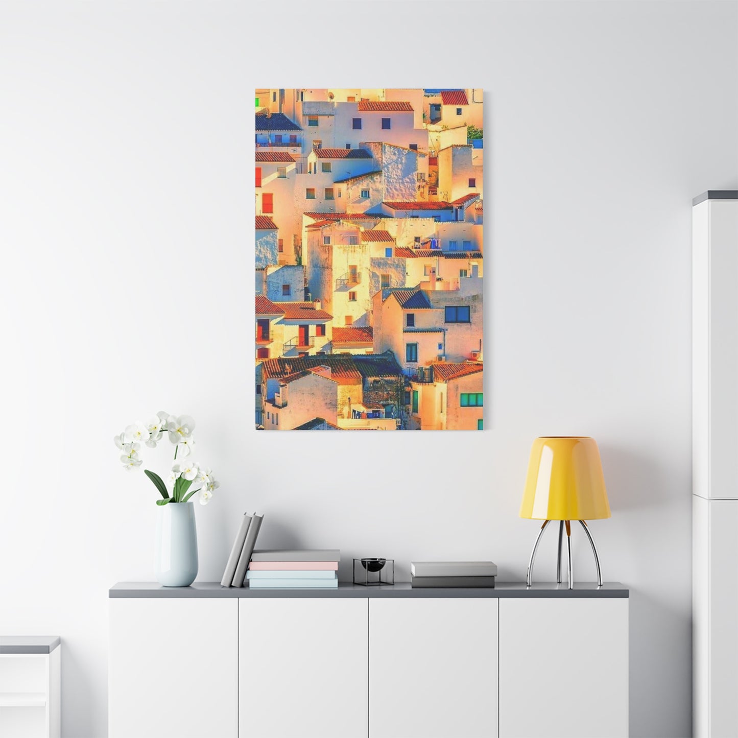
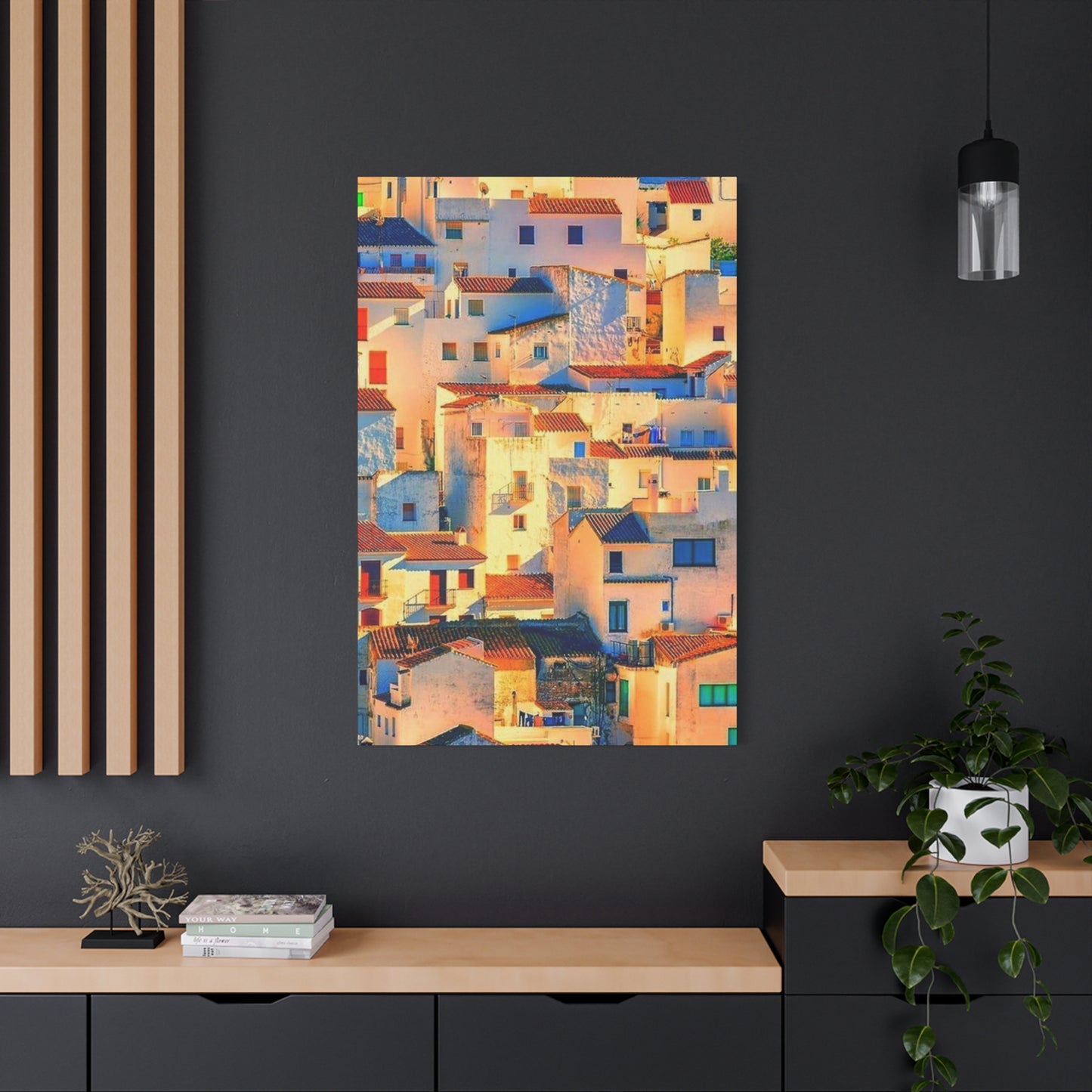
Small vs Large Canvas Prints: Choosing the Right Dimensions
Selecting the appropriate dimensions for Spanish house canvas prints involves balancing multiple factors: available wall area, viewing distance, budget constraints, and desired visual impact. Neither small nor large formats are inherently superior—each offers distinct advantages depending on your specific circumstances and intentions. Understanding these differences enables informed decisions that enhance rather than compromise your decorating vision.
Small canvas prints, typically ranging from eight by ten inches to sixteen by twenty inches, offer versatility and accessibility that larger formats cannot match. Their modest footprint allows placement in locations where larger pieces would overwhelm—narrow hallways, small bathrooms, crowded bookshelves, or grouped arrangements with other artworks. For apartment dwellers or those with limited wall area, small prints enable art collection without spatial sacrifice. Additionally, their lower cost facilitates experimentation, allowing you to try different images, styles, or arrangements without significant financial commitment.
The intimate viewing experience small prints provide shouldn't be underestimated. These pieces invite close examination, rewarding careful observation with details that might go unnoticed in larger formats viewed from greater distances. For Spanish architectural subjects featuring intricate tile work, weathered textures, or subtle color variations, small prints can actually enhance appreciation by encouraging proximity and sustained attention. Placed in personal areas like bedside tables, home offices, or reading nooks, small prints create private connections between viewer and image.
Gallery walls and clustered arrangements benefit particularly from small to medium prints, which can be combined to create dynamic compositions greater than their individual parts. Mixing Spanish house images of varying sizes, orientations, and color palettes generates visual interest while maintaining thematic coherence. This approach works exceptionally well for collectors who want to display multiple aspects of Spanish architecture—different regions, architectural styles, or lighting conditions—within a unified presentation. The flexibility to add, remove, or rearrange pieces over time keeps the display fresh and responsive to evolving tastes.
Medium-sized canvas prints, approximately twenty by thirty inches to thirty by forty inches, occupy a sweet spot for many homeowners. Large enough to function as focal points yet manageable enough for most living situations, these dimensions suit a wide range of applications. A single medium print can anchor a furniture grouping—above a sofa, console table, or bed—without dominating the entire room. Pairs of medium prints create balanced, symmetrical arrangements that work well flanking windows, doorways, or architectural features.
Large canvas prints, exceeding forty inches in any dimension, make bold statements that transform entire rooms. These substantial pieces command immediate attention and can serve as decorating foundations around which other elements organize. For Spanish architectural subjects, large formats do full justice to sweeping vistas, elaborate facades, or dramatic light effects that would lose impact at smaller scales. The immersive quality of large prints can transport viewers, creating the sensation of looking through a window onto a Spanish street rather than merely viewing a framed image.
Viewing distance directly correlates with optimal print size. Artworks intended for close viewing in small rooms should generally be smaller, while pieces meant to be appreciated from across larger rooms can and should be proportionally larger. A useful guideline suggests that optimal viewing distance equals approximately one and a half to two times the diagonal measurement of the artwork. A sixty-inch wide print, for instance, works best when viewed from about ten feet away, making it ideal for living rooms or open-concept areas but problematic for narrow hallways or small bedrooms.
Ceiling height influences how print size is perceived and should factor into dimension decisions. In rooms with standard eight-foot ceilings, very large prints can feel oppressive, while the same pieces might appear perfectly proportioned in spaces with ten or twelve-foot ceilings. The relationship between ceiling height and artwork size affects psychological comfort—oversized pieces in low-ceilinged rooms can create feelings of confinement, while appropriately scaled prints maintain spatial harmony and psychological ease.
Furniture scale relative to artwork size affects overall composition and should be considered during selection. Large, substantial furniture pieces benefit from equally substantial artwork to maintain visual balance. Conversely, delicate or minimalist furniture can be overwhelmed by massive prints, creating jarring disconnects between elements. When hanging Spanish house canvas prints above sofas or beds, a helpful rule suggests the artwork should span approximately two-thirds to three-quarters of the furniture width for pleasing proportions.
Budget considerations often influence size decisions, as larger canvas prints typically cost significantly more than smaller ones due to increased material and production expenses. However, cost per square inch usually decreases with size, making large prints better value in purely economic terms. For budget-conscious collectors, purchasing one stunning large piece may provide greater long-term satisfaction than multiple smaller prints of lesser quality. Alternatively, starting with smaller prints and gradually adding larger pieces as budget allows creates an evolving collection that grows alongside your appreciation and resources.
The architectural subject depicted should influence size selection. Intimate street scenes, detailed doorways, or close-up architectural elements often work beautifully at smaller scales, where viewers can appreciate fine details and subtle qualities. Panoramic vistas, expansive plazas, or views incorporating multiple buildings typically require larger formats to maintain proper scale relationships and avoid appearing cramped or reduced. Matching print size to subject matter ensures that the artwork realizes its full potential rather than fighting against dimensional constraints.
Multiple-panel or triptych presentations offer alternatives to single large prints while maintaining substantial visual impact. These split-panel artworks, where a single image is divided across multiple canvases, create distinctive contemporary looks while offering installation flexibility. For Spanish architectural subjects, this approach can emphasize horizontal expansion—stretching a street scene across three panels to enhance the sense of perspective—or create rhythmic repetitions that echo architectural patterns found in the subject itself.
Caring for Spain House Art: Preservation and Maintenance
Proper care and maintenance ensure that your Spanish house canvas prints remain vibrant, structurally sound, and visually stunning for decades rather than deteriorating into faded, damaged shadows of their original glory. While canvas prints are generally durable and low-maintenance compared to some art forms, they do require specific considerations to prevent common problems like fading, warping, dirt accumulation, and physical damage.
Light exposure represents the most significant threat to canvas print longevity, particularly ultraviolet radiation that breaks down inks and causes irreversible fading. Direct sunlight is especially harmful, capable of visibly damaging prints within months. Even indirect natural light, though less immediately destructive, gradually degrades colors over years of constant exposure. When positioning Spanish house prints, avoid walls that receive direct sunlight during any part of the day. If room configuration makes this impossible, consider UV-filtering window films or curtains that can be drawn during peak sunlight hours.
Artificial lighting also contributes to print degradation, though typically at slower rates than natural light. Halogen bulbs emit significant UV radiation and should be avoided in artwork spotlighting applications. LED lighting offers the safest option, producing minimal UV output while offering excellent color rendering and energy efficiency. When installing directional lighting for Spanish house prints, position fixtures to minimize direct beam exposure—lighting that grazes across the surface rather than pointing directly at it reduces intensity while still illuminating the artwork.
Humidity fluctuations cause canvas material to expand and contract, potentially leading to warping, loosening from stretcher bars, or cracking of the printed surface. Ideal humidity for canvas preservation ranges between forty and fifty-five percent relative humidity. Excessive humidity encourages mold growth, while extremely dry conditions make canvas brittle and prone to cracking. In regions with dramatic seasonal humidity variations, consider using humidifiers or dehumidifiers to maintain stable conditions, particularly in rooms housing valuable prints.
Temperature extremes and fluctuations similarly stress canvas prints and should be avoided when possible. Consistent temperatures between sixty and seventy-five degrees Fahrenheit are ideal. Hanging prints above heat sources—radiators, heating vents, fireplaces—subjects them to damaging temperature variations and excessive dryness. Similarly, positioning prints against exterior walls in uninsulated buildings exposes them to greater temperature swings than interior walls would, potentially accelerating degradation.
Regular, gentle cleaning prevents dust and dirt accumulation from becoming ingrained and difficult to remove. For routine maintenance, use a clean, soft, dry microfiber cloth to very gently wipe the canvas surface, working from top to bottom in gentle strokes. Never use water, cleaning solutions, or abrasive materials, which can damage the printed surface or protective coatings. For glass or acrylic-covered prints, clean the protective glazing with appropriate glass cleaner sprayed onto the cloth rather than directly onto the surface, preventing liquid from seeping behind the glazing onto the canvas.
Professional cleaning becomes necessary when home maintenance proves insufficient or when prints have sustained damage requiring expert intervention. Conservators specializing in printed materials can address stubborn staining, mold remediation, restoration of faded areas, and structural repairs beyond amateur capabilities. While professional services require investment, they can salvage damaged pieces and extend the life of valuable prints significantly, making them economically justified for important artworks.
Protective coatings and treatments applied during production or afterward significantly influence canvas print durability. UV-resistant coatings filter harmful radiation before it reaches the printed surface, substantially slowing fade rates. Water-resistant treatments protect against accidental spills and humidity damage. When purchasing Spanish house prints, inquire about protective treatments included in the production process. For unprotected prints or to enhance existing protection, aftermarket spray coatings are available, though professional application is recommended to ensure even coverage without creating texture changes or color shifts.
Proper stretching and mounting ensure canvas prints maintain their intended appearance and structural integrity. Canvas should be stretched taut but not overstressed, secured to rigid stretcher bars that prevent sagging. Gallery-wrapped presentations, where the image continues around the edges of stretcher bars, require particularly careful stretching to avoid distortion at corners. Low-quality stretcher bars made from inadequately dried wood may warp over time, causing canvas to pucker or sag. When purchasing prints, verify that premium, kiln-dried stretcher bars are used.
Handling canvas prints carefully prevents unnecessary damage from fingerprints, punctures, or tears. Always grasp prints by their stretcher bars or frames rather than touching the canvas surface, where oils from skin can create permanent stains. During transport or storage, use corner protectors and wrap prints in acid-free paper or glassine rather than standard materials that might transfer acids or stains. Never stack unprotected canvas prints face-to-face or face-to-back, as friction can damage printed surfaces.
Storage conditions for Spanish house prints not currently displayed require the same environmental considerations as displayed works. Store prints in climate-controlled areas with stable temperature and humidity, away from attics, basements, or garages where conditions fluctuate dramatically. Keep prints away from floor level where flooding risk is highest. Store vertically when possible rather than stacked horizontally, as stacking creates pressure points that can leave impressions or cause warping. If horizontal storage is unavoidable, limit stack height and place largest, sturdiest pieces at the bottom.
Insurance and documentation provide financial protection and recovery options in case of damage or loss from fire, theft, or disaster. Photograph your Spanish house print collection from multiple angles, capturing both overall images and close-ups of distinguishing features or artist signatures. Record purchase information, including date, source, price, and any certificates of authenticity or edition information. Store these records in multiple locations—both physical and digital copies kept separately from the artworks themselves—so documentation survives even if the prints are damaged or destroyed.
Periodic inspection catches developing problems before they become serious. Schedule regular examinations of your Spanish house prints, looking for early signs of fading, particularly in bright colors like blues and yellows. Check for canvas loosening from stretcher bars, corner separation, or warping. Inspect for surface changes like cracking, flaking, or developing stains. Early detection enables timely intervention that can prevent minor issues from escalating into major conservation challenges requiring expensive professional remediation.
Framing Spanish Wall Art: Enhancing Presentation
The framing choices you make for Spanish house canvas prints significantly impact their visual presentation, longevity, and integration into your home's aesthetic. While many canvas prints are sold and displayed as gallery-wrapped pieces without additional framing, traditional frames offer protection, formality, and opportunities to customize appearance. Understanding framing options, materials, and techniques enables decisions that enhance rather than detract from the artwork itself.
Gallery-wrapped or gallery-style presentation, where the canvas image continues around the stretcher bar edges, creates a clean, contemporary look that requires no additional framing. This approach emphasizes the artwork itself without introducing framing elements that might compete for attention. For Spanish architectural subjects, gallery wrapping allows the image to appear as an unmediated window onto the scene, enhancing immersive quality. The three-dimensional quality created by substantial stretcher bar depth adds physical presence without the visual weight of traditional frames.
Floater frames, specifically designed for canvas prints, create the illusion that the canvas floats within the frame, with a small gap between canvas edge and frame interior. This presentation combines gallery wrapping's contemporary aesthetic with the protective and decorative benefits of framing. Floater frames work particularly well for Spanish house prints, as they add definition and finished appearance without interrupting the image or requiring matting. The frame gap allows appreciation of canvas edges and depth while protecting vulnerable corners from damage.
Traditional frames with rabbets or lips that overlap canvas edges offer maximum protection and more formal presentation. While this approach covers canvas edges, it provides superior support and guards against environmental damage more effectively than unframed presentations. For valuable or particularly meaningful Spanish architectural prints, traditional framing may justify the loss of edge visibility through enhanced preservation. This approach works well in traditional or transitional decorating schemes where contemporary gallery wrapping might feel incongruous.
Frame material selection influences both aesthetic impact and practical performance. Wood frames offer warmth, natural beauty, and tremendous variety in species, finishes, and profiles. Dark woods like walnut or mahogany provide rich elegance suitable for formal rooms and classical Spanish architectural subjects. Light woods like maple or ash create casual, approachable aesthetics that work well with bright, sunlit Spanish scenes. Metal frames, typically aluminum, offer sleek modernity and come in various finishes from brushed silver to matte black. Their slim profiles minimize visual intrusion while providing substantial strength.
Frame profile—the width, depth, and shape of the frame molding—dramatically affects how artwork appears and integrates into its surroundings. Narrow profiles create minimal separation between artwork and wall, maintaining visual continuity and contemporary simplicity. Wide profiles add substantial presence and work well for large Spanish house prints in spacious rooms where generous proportions are needed to avoid artwork appearing lost or undersized. Profile depth—how far the frame projects from the wall—affects shadow casting and three-dimensional presence, with deeper frames creating more dramatic depth effects.
Frame color and finish should complement rather than compete with Spanish house print colors. Neutral frames—black, white, natural wood tones, metallics—offer versatility and allow artwork to remain the focal point. For prints featuring warm Spanish color palettes dominated by terracotta, ochre, and golden tones, warm-toned wood frames enhance color harmony. For coastal Spanish scenes emphasizing blues and whites, lighter frames or metallic finishes maintain the cool, breezy atmosphere. In some cases, pulling a specific color from the artwork into the frame creates cohesive integration, though this approach requires restraint to avoid appearing overly coordinated or matchy.
Protective glazing—glass or acrylic placed over artwork—rarely applies to canvas prints, as their textured surface and dimensional quality are essential characteristics that glazing would obscure. However, for particularly valuable prints or in high-risk environments where splash damage or physical contact is likely, conservation glazing might be considered. UV-filtering acrylic offers protection without the weight and fragility of glass, though it still flattens the three-dimensional quality that makes canvas prints distinctive. This trade-off requires careful consideration of priorities—preservation versus presentation—before proceeding.
Matting, the paper or fabric border between artwork and frame, traditionally doesn't apply to canvas prints, which are designed for edge-to-edge presentation. However, creative framing approaches sometimes incorporate floating mats or fabric liners that create visual breathing room between image and frame. For Spanish architectural subjects, simple linen liners in neutral tones can add sophistication and transitional space that eases the artwork into traditional decorating schemes. This approach works particularly well for smaller prints that might otherwise appear overwhelmed by substantial frames.
Custom framing versus ready-made frames presents a cost-benefit consideration requiring honest assessment of artwork value and personal priorities. Custom framing allows precise specification of every element—frame material, profile, finish, mounting method—ensuring perfect matches for specific artworks and decorating schemes. This personalization comes at premium prices that may not be justified for inexpensive prints or temporary decorating solutions. Ready-made frames offer significant cost savings and immediate availability but require finding existing options that acceptably suit your prints, which may involve compromises.
Professional framing services provide expertise that ensures proper mounting, protection, and presentation, particularly valuable for important Spanish house prints or when navigating technical challenges. Framers can advise on appropriate materials, prevent common mistakes like using acidic materials that damage artwork over time, and execute mounting techniques that protect rather than harm prints. The cost of professional services typically includes materials, labor, and expert consultation that can prevent expensive errors and ensure your prints receive presentation quality they deserve.
Do-it-yourself framing offers cost savings and creative control but requires tools, materials, and skills to achieve professional-quality results. For those with carpentry abilities and attention to detail, framing Spanish house prints can be rewarding and economical. Numerous resources—books, online tutorials, videos—teach framing fundamentals, though some techniques require practice to master. DIY framers must invest in proper tools, work carefully to achieve precise measurements and cuts, and source quality materials to ensure longevity rather than merely immediate appearance.
Sunlight Effects in Spain Prints: Technical and Aesthetic Considerations
The interplay between sunlight and Spanish architecture creates visual phenomena that photographers and artists work diligently to capture and that viewers find endlessly compelling. Understanding these effects—how they're achieved technically and why they resonate aesthetically—enhances both the selection process for Spanish house prints and appreciation for the artistry involved in their creation.
Directional lighting, where illumination arrives from a specific angle rather than diffused from all directions, creates the dramatic shadows and highlights that give Spanish architectural photography its distinctive character. Side lighting, arriving from left or right relative to the camera position, reveals texture by casting small shadows in surface irregularities—cracks in plaster, weathered wood grain, individual roof tiles. This texturing adds tactile quality to two-dimensional images, engaging viewers' sense of touch alongside vision.
Backlighting, where primary illumination comes from behind the subject toward the camera, creates silhouettes and rim lighting effects that emphasize shape over detail. For Spanish architectural subjects, backlighting transforms buildings into graphic forms defined by outline rather than surface characteristics. This technique works beautifully for distinctive profiles—church towers, chimneys, rooflines—creating iconic images with immediate visual impact. The halo effect backlighting produces around subjects adds ethereal quality that elevates ordinary structures into poetic subjects.
High-key lighting, where the overall tonal range skews toward brightness with minimal deep shadows, conveys the brilliance and heat of Mediterranean summers. Spanish architectural photographs employing this technique feature nearly blown-out whites, pale shadows, and saturated bright colors that communicate visual intensity matching the physical sensation of standing under fierce Spanish sun. These high-key images bring energy and brightness into homes, particularly effective in rooms lacking abundant natural light.
Low-key lighting, emphasizing darker tonal ranges with strategic highlights, creates moody, dramatic interpretations of Spanish architecture. While less common than high-key approaches for this subject matter, low-key techniques can produce striking results that emphasize form, texture, and selective illumination. These darker interpretations suit contemporary or masculine decorating schemes where lighter, breezier typical Spanish scenes might feel too feminine or casual.
Chiaroscuro, the Italian term for strong contrasts between light and dark, describes the dramatic illumination effects that Spanish architectural subjects naturally provide. Deep shadows cast by intense Mediterranean sun against brilliant white walls create almost abstract compositions of interlocking light and dark shapes. Artists and photographers who master chiaroscuro transform architectural documentation into powerful visual statements that transcend mere recording to approach fine art territory.
Golden hour photography captures the warm, low-angled sunlight occurring shortly after sunrise and before sunset. This lighting produces long shadows, warm color temperatures, and soft illumination that flatters virtually every subject. For Spanish architecture, golden hour light emphasizes warm earth tones, creates three-dimensional modeling through graduated shadows, and bathes scenes in romantic glow that triggers emotional responses alongside aesthetic appreciation. Canvas prints featuring golden hour illumination bring this magic into homes, creating focal points that radiate warmth regardless of actual ambient lighting conditions.
Conclusion
The allure of Spanish house wall art lies in its ability to capture the warmth, vibrance, and timeless charm of Mediterranean living. The signature contrast of red-tiled roofs against crisp white walls has long symbolized Spain’s sun-soaked beauty and architectural grace. Through art, these scenes transport us to winding coastal villages, quiet courtyards, and terracotta terraces bathed in golden light. Hanging such pieces in your home isn’t just about decoration—it’s about infusing your space with the rhythm, romance, and radiant simplicity of Spanish culture.
At its heart, Spanish-inspired wall art celebrates harmony—between tradition and modernity, between light and shadow, between human craftsmanship and nature’s brilliance. The rustic textures of white stucco walls and the warmth of clay tiles evoke both comfort and character, creating a visual balance that feels at once earthy and refined. When translated into canvas prints or digital paintings, these elements come alive, bringing Mediterranean serenity into even the most contemporary settings.
From a design perspective, red roof and white wall art works beautifully with a wide range of interiors. Its neutral tones, punctuated by rich reds and warm ochres, pair effortlessly with wood, rattan, stone, and linen. In minimalist homes, such art provides a gentle splash of color and texture, while in eclectic or rustic spaces, it enhances the inviting, sunlit aesthetic of coastal charm. Whether placed in a dining area, hallway, or living room, Spanish architecture wall prints act as focal points that exude authenticity and timeless elegance.
Emotionally, these artworks evoke a sense of peace and nostalgia. They remind us of slower days—the laughter echoing through narrow streets, the scent of citrus in sunlit patios, and the soft hum of life beneath the Mediterranean sky. Incorporating Spanish architectural art into your home allows you to relive those feelings daily, transforming walls into doorways that open onto faraway places and cherished memories.
Moreover, the cultural richness of Spain’s architecture adds depth to any art collection. Each red roof and white wall tells a story of craftsmanship shaped by centuries of Moorish, Gothic, and Renaissance influences. Artists who depict these scenes blend history with modern sensibility, allowing the viewer to experience both nostalgia and newness. Displaying such pieces in your space not only elevates its aesthetic but also serves as a tribute to architectural artistry and cultural legacy.
Beyond beauty, Spanish house wall art embodies warmth—both visual and emotional. It radiates positivity and light, making it ideal for homes that seek to feel open, welcoming, and full of life. The red roofs, like sunlit accents, bring vibrance, while the white walls ground the composition in purity and calm. Together, they create a visual symphony that mirrors Spain’s soulful lifestyle—joyful yet tranquil, elegant yet approachable.
