


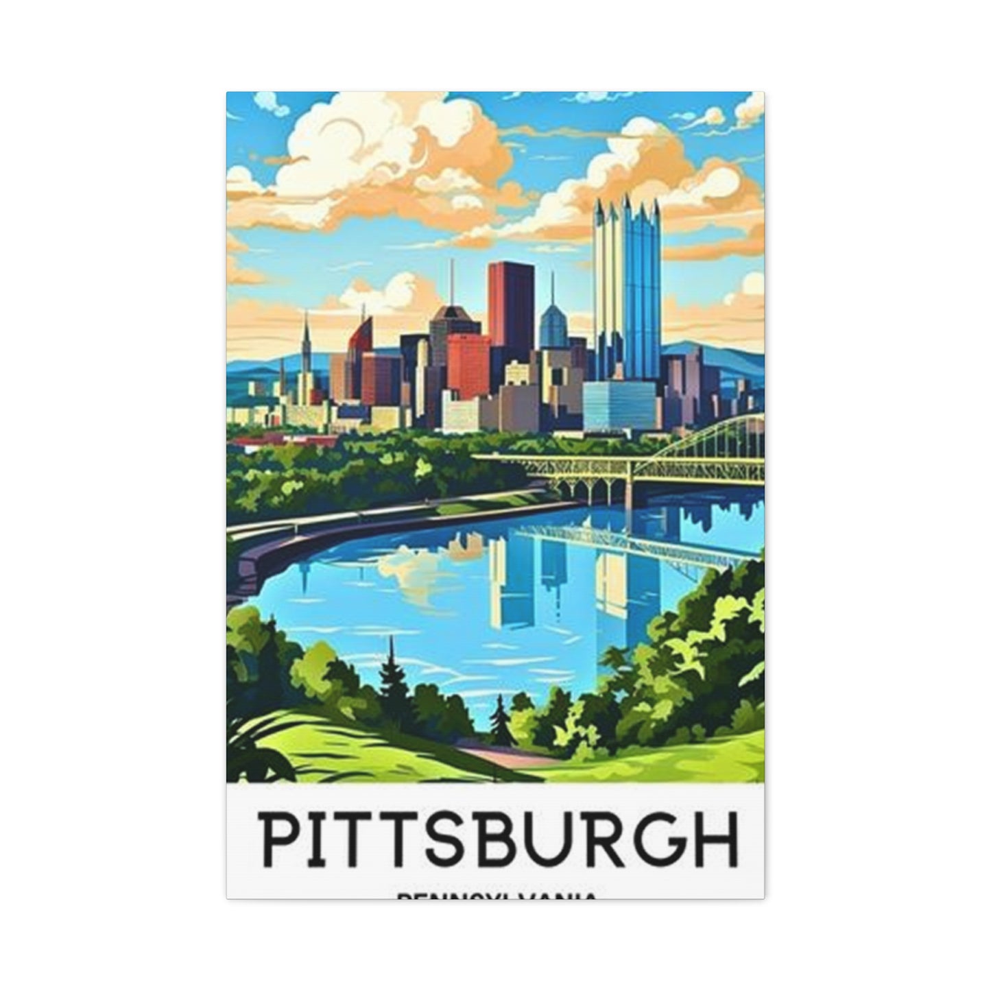
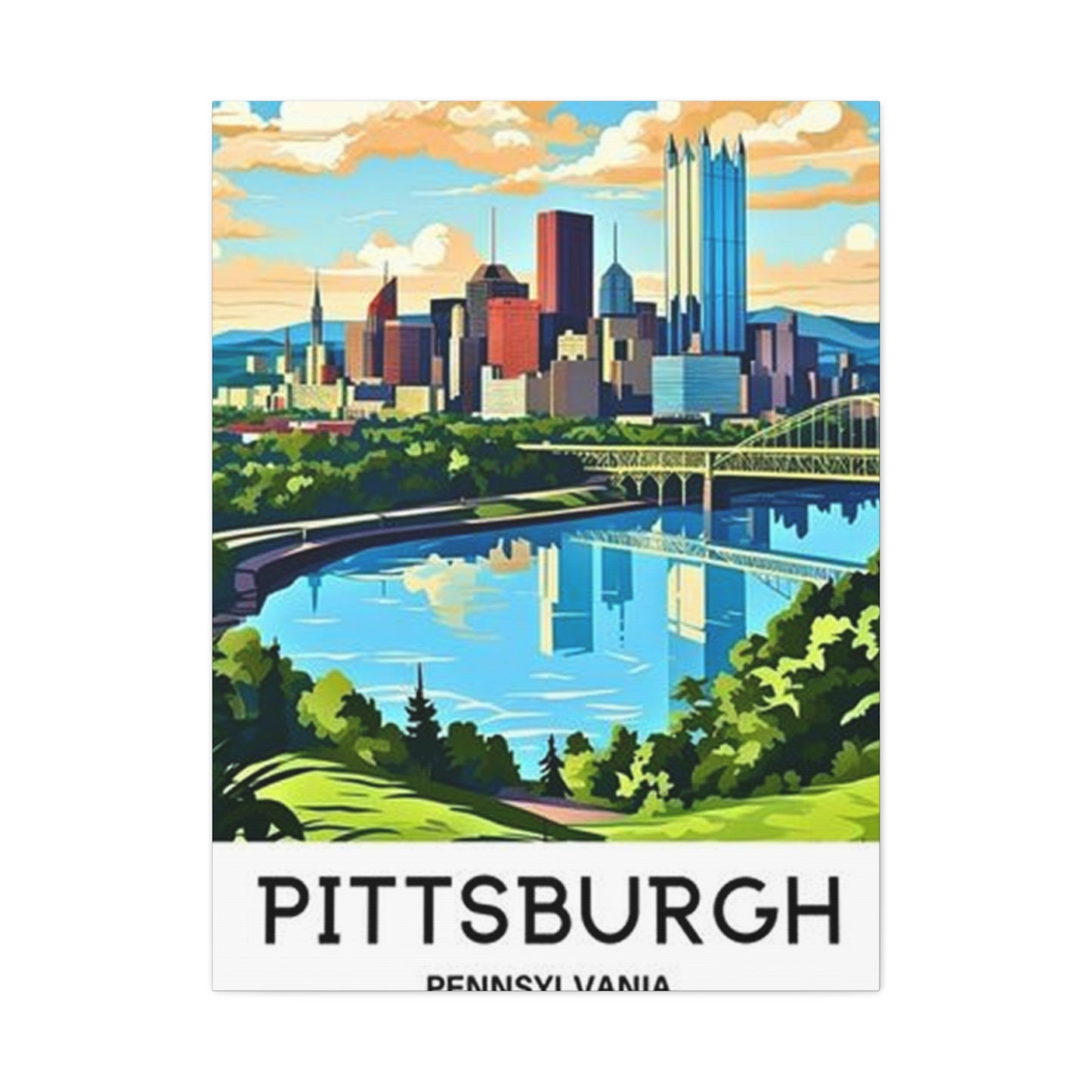
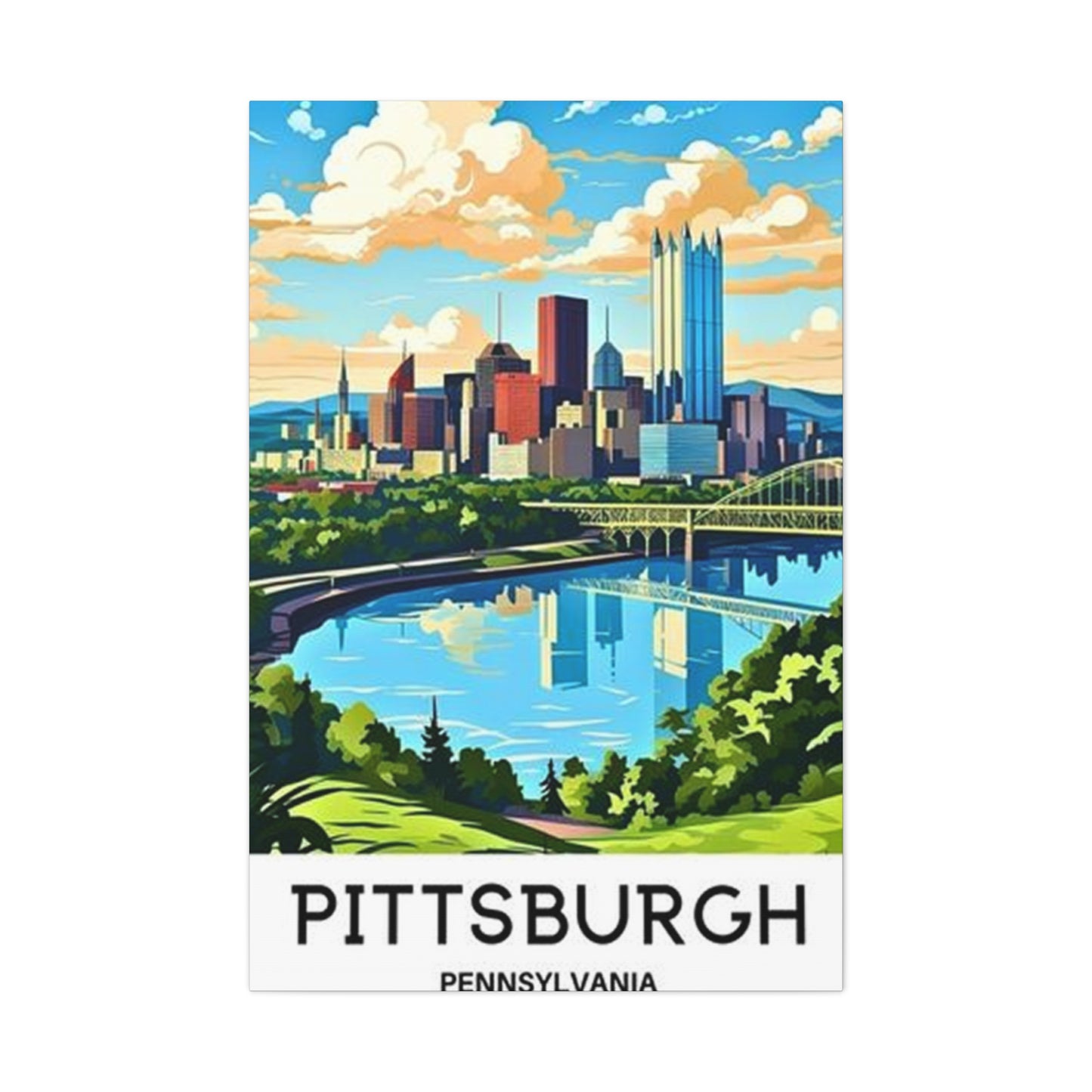
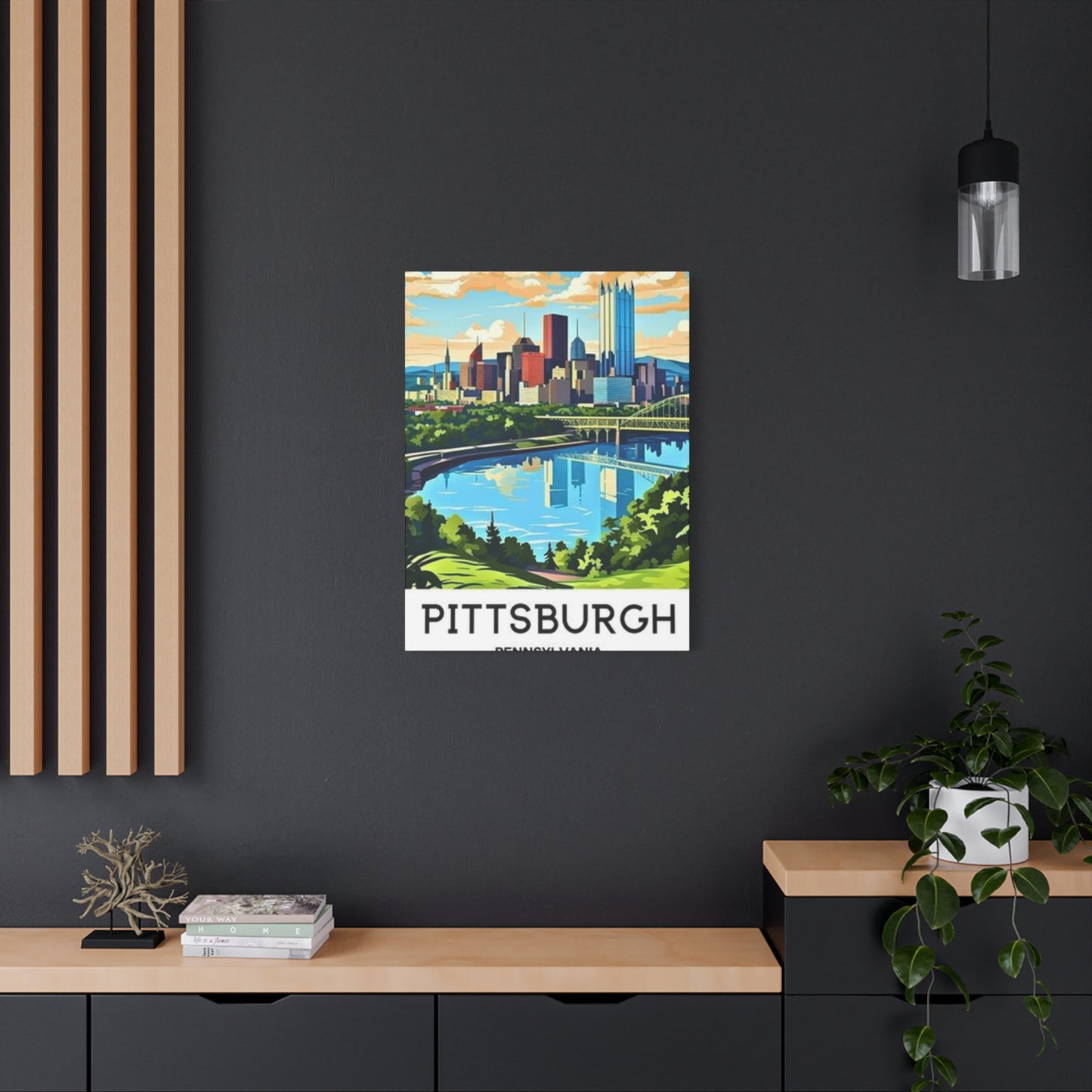
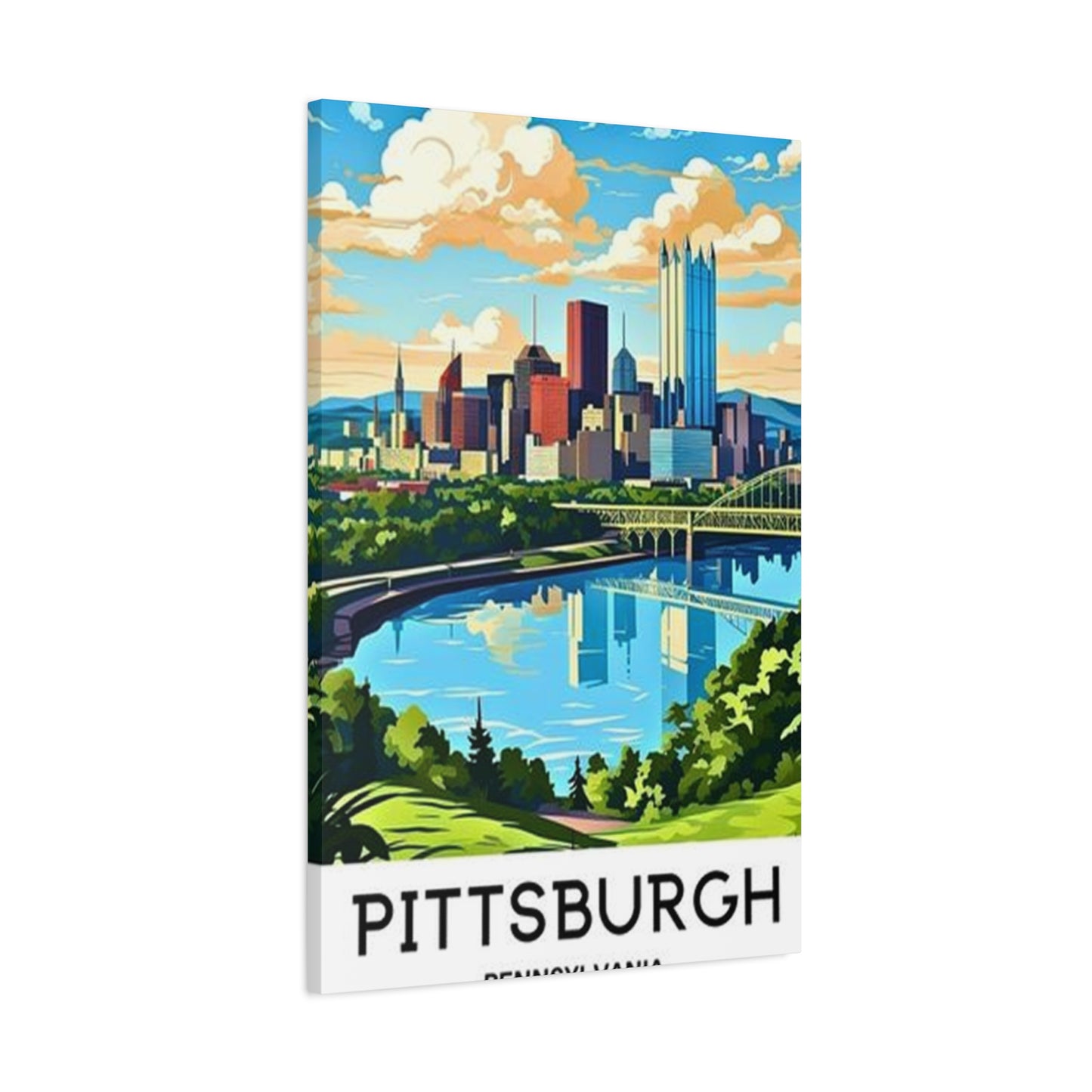
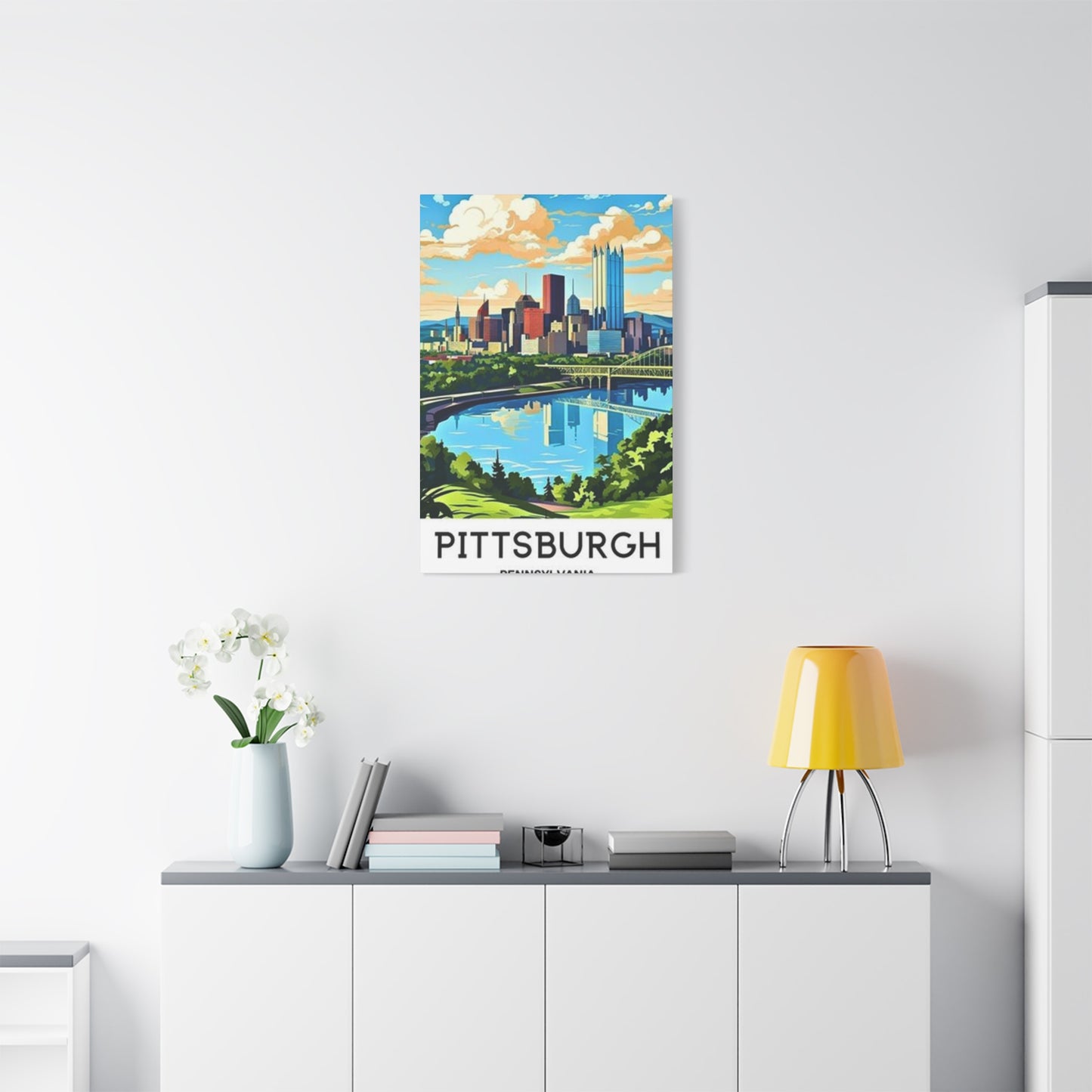
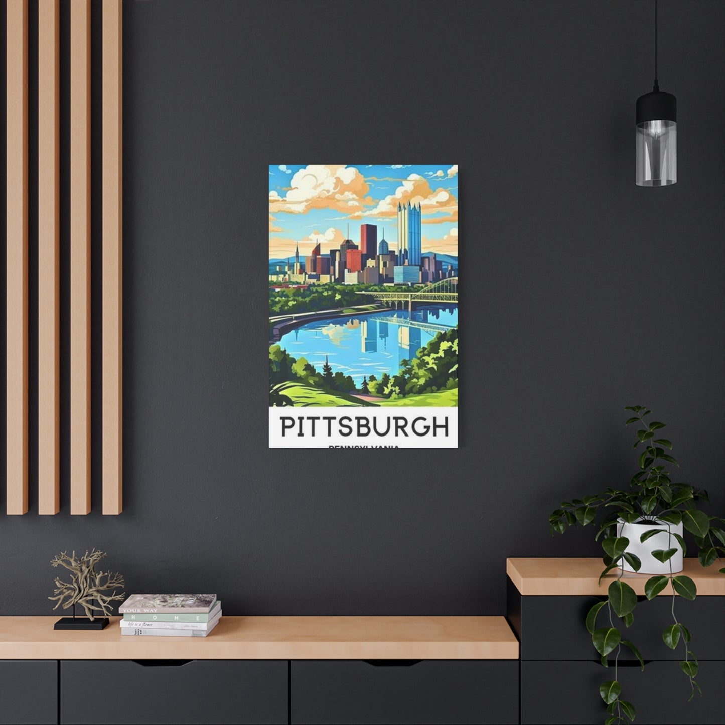
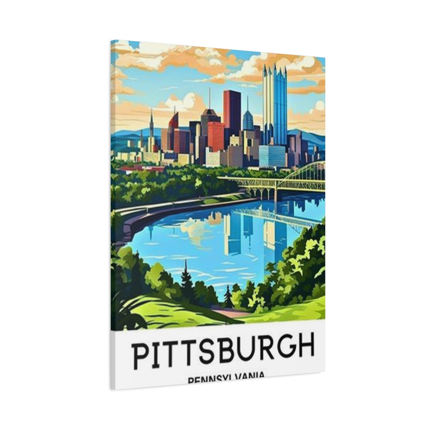
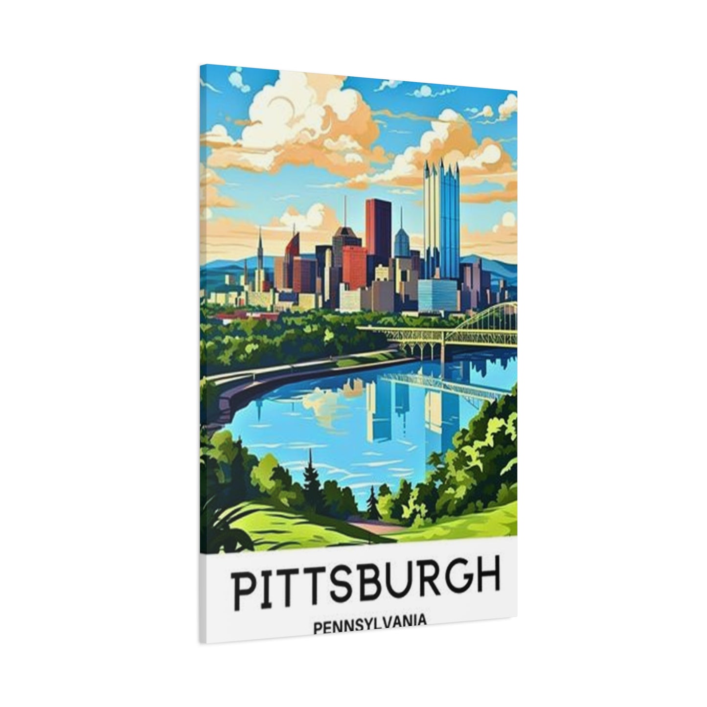
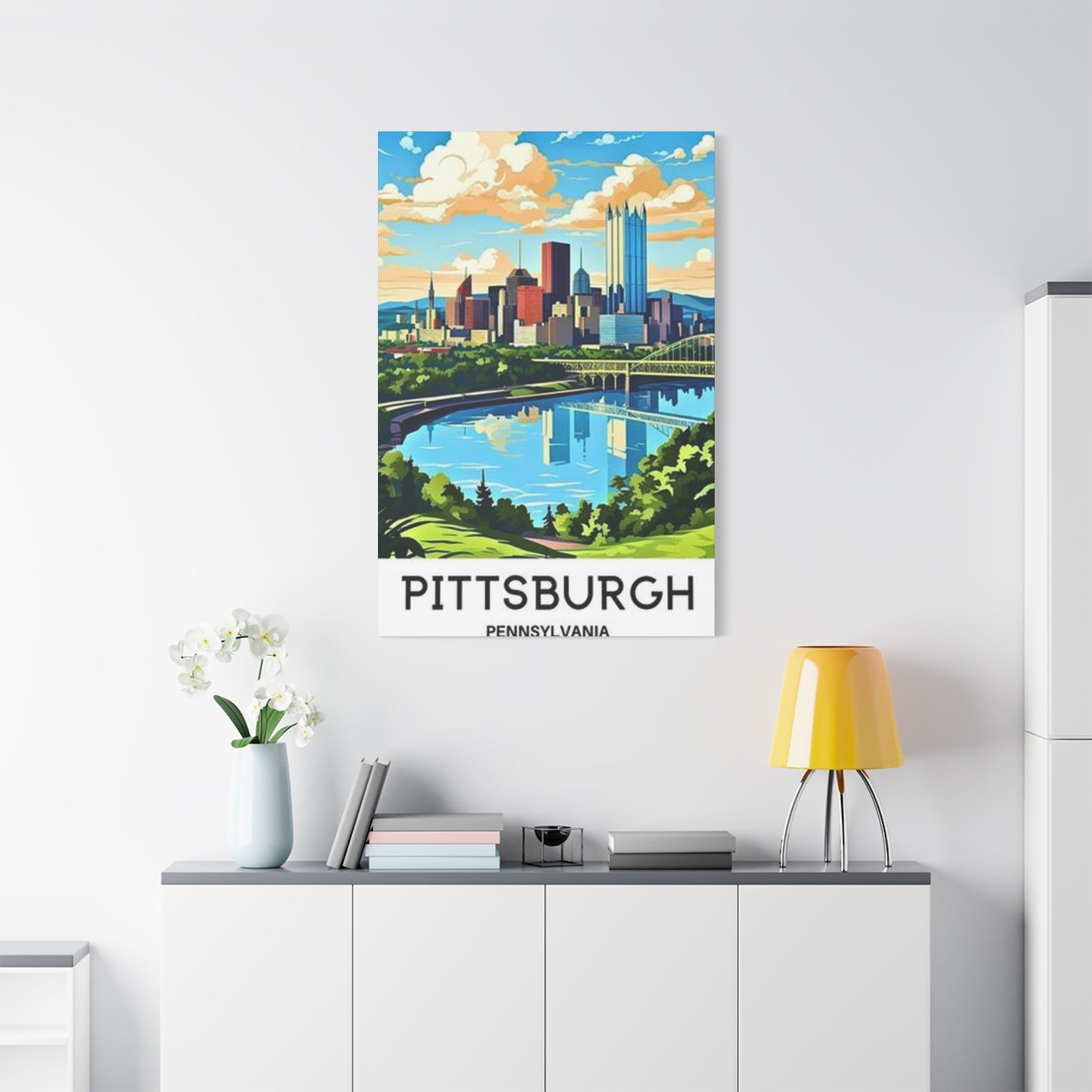
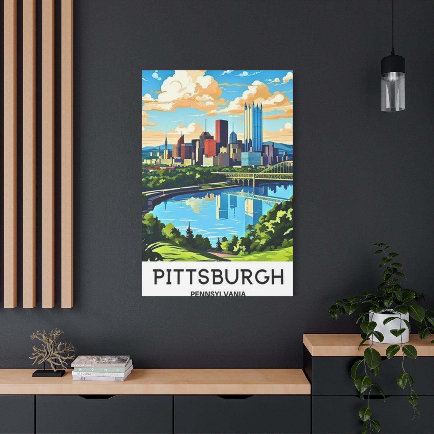
Sunny Sky Pittsburgh Poster Wall Art & Canvas Prints
Sunny Sky Pittsburgh Poster Wall Art & Canvas Prints
Couldn't load pickup availability


Captivating Sunny Pittsburgh Wall Art: A Complete Guide to Brightening Your Home
Pittsburgh, known for its stunning skyline and picturesque landscapes, offers countless opportunities for visual celebration through artistic representations. The radiant skies that grace this remarkable city have inspired artists and homeowners alike to bring these moments into their living environments. Whether you're a longtime resident, a former visitor with fond memories, or simply someone who appreciates the beauty of urban landscapes bathed in golden light, incorporating these artistic pieces into your home can create an atmosphere of warmth and positivity.
This comprehensive guide explores everything you need to know about selecting, displaying, and caring for artwork that captures the essence of Pittsburgh under brilliant, sun-filled skies. From understanding different artistic styles to making informed purchasing decisions, we'll cover all aspects of this increasingly popular decorating trend.
Bright Skies Over Pittsburgh
The skies above Pittsburgh possess a unique quality that photographers and artists have long admired. Throughout different seasons, the atmosphere above this historic city transforms dramatically, offering endless inspiration for visual creativity. The way sunlight interacts with the city's architecture, rivers, and surrounding hills creates scenes that are both dynamic and memorable.
During spring months, the heavens above the city come alive with soft pastels and brilliant blues that seem to stretch endlessly. These lighter tones create a sense of renewal and energy that perfectly complements the awakening of nature throughout the region. Artists who capture these moments often emphasize the crispness of the atmosphere and the way buildings appear to shimmer in the clear light.
Summer brings an entirely different character to the skies overhead. The intense azure that dominates on cloudless days provides a stunning backdrop to the city's iconic structures and bridges. During this season, the sun's path across the firmament creates dramatic shadows and highlights that change throughout the day, offering artists numerous perspectives to explore in their work.
Autumn presents perhaps the most photographed season for Pittsburgh's skyline. The combination of brilliant blue expanses above and the changing foliage below creates a spectacular visual feast. This is when many photographers and painters venture out to capture the city's most iconic views, as the contrast between the warm earth tones and cool sky colors creates particularly striking compositions.
Even winter, despite shorter days, offers its own brand of luminous beauty. The low angle of the sun during colder months casts a golden glow across buildings and bridges, creating long shadows and emphasizing architectural details. Clear winter days produce some of the most crystalline atmospheric conditions, allowing for exceptionally sharp and vibrant representations of the cityscape.
The quality of natural illumination in Pittsburgh has improved dramatically over recent decades as industrial changes have reduced atmospheric haze. This transformation has made the city's skyline increasingly photogenic, contributing to a surge in artistic representations. Today's artists can capture details and colors that would have been impossible to see clearly just a generation ago.
When selecting artwork featuring brilliant skies over the Steel City, consider which season resonates most with your personal preferences. Each period offers distinct characteristics that evoke different emotional responses. Spring pieces tend to feel optimistic and fresh, while autumn scenes convey warmth and richness. Summer representations burst with energy and vitality, whereas winter captures can feel serene and contemplative.
The perspective from which these celestial views are captured also significantly impacts the overall impression of the artwork. Pieces shot from elevated positions emphasize the expansiveness of the atmosphere and often include dramatic cloud formations. Ground-level perspectives tend to showcase how the urban environment interacts with the sky, creating interesting juxtapositions between human-made structures and natural phenomena.
Many collectors appreciate artwork that captures specific weather conditions, such as partly cloudy days when sunbeams break through to illuminate portions of the cityscape. These dynamic scenes add visual interest and can serve as conversation starters. The interplay between light and shadow in such pieces creates depth and dimension that draws viewers into the scene.
The time of day captured in the artwork dramatically affects its mood and utility in home decor. Midday scenes with the sun directly overhead tend to be bright and energizing, making them excellent choices for areas where you want to promote activity and alertness. Morning light captures often have a softer, more gentle quality that works well in bedrooms or meditation areas.
Warm Hues in Pittsburgh Wall Art
The color palette present in artistic representations of Pittsburgh varies widely depending on the time of day, season, and artistic interpretation. Warm tones ranging from golden yellows to deep oranges and soft pinks create an inviting atmosphere that many homeowners seek when selecting decorative pieces. These hues have the power to transform rooms, making them feel cozier and more welcoming.
Sunrise and sunset periods offer the most dramatic warm color displays above the city. During these golden hours, photographers and artists capture moments when the entire skyline appears bathed in amber and coral light. These times provide ideal conditions for creating artwork with inherently warm characteristics that need little artistic enhancement to convey a sense of comfort and tranquility.
The reflection of warm light on Pittsburgh's three rivers adds another dimension to artwork featuring these color schemes. Water surfaces act as mirrors, doubling the impact of golden hour illumination and creating symmetrical compositions that are visually satisfying. Artists often emphasize these reflections to enhance the overall warmth of their pieces and to create more complex, layered visual experiences.
Architectural elements in Pittsburgh, particularly the city's numerous bridges and historic buildings, take on special qualities when illuminated by warm light. Steel structures that might appear cold or industrial in midday light become almost inviting when bathed in sunset hues. This transformation makes these structural elements ideal subjects for artwork intended to create warm, welcoming environments.
When incorporating pieces with warm color palettes into your home, consider the existing color scheme of your rooms. Warm-toned artwork complements spaces decorated in earth tones, creams, and beiges particularly well. However, these pieces can also create interesting contrasts when placed in cooler-toned environments, adding a focal point that draws the eye and warms the overall atmosphere.
The intensity of warm hues in artwork varies considerably based on artistic style and processing techniques. Some photographers enhance natural colors to create more dramatic effects, while others prefer subtle, realistic representations. Neither approach is inherently superior; the choice depends on personal preference and the desired impact in your particular setting.
Paintings and illustrated pieces often take more liberties with color than photographic works, sometimes exaggerating warm tones for emotional effect. These interpretations can range from slightly enhanced naturalism to highly stylized representations where colors bear little resemblance to reality. Such artistic freedom allows for unique pieces that make bold statements in contemporary decorating schemes.
The psychological effects of warm colors are well-documented. These hues tend to stimulate feelings of comfort, security, and happiness. In home environments, they can make large rooms feel more intimate or cold rooms appear warmer. This makes warm-toned Pittsburgh artwork particularly valuable for north-facing rooms or areas that receive limited natural light.
Seasonal considerations also play a role in color preference. Many people find themselves drawn to warmer tones during autumn and winter months when days are shorter and temperatures drop. Having artwork that provides visual warmth can help maintain a positive atmosphere during these darker periods. Conversely, cooler tones might be preferred during summer months to create a sense of refreshment.
The finish and texture of the artwork surface can significantly impact how warm colors are perceived. Glossy finishes tend to reflect light, potentially intensifying color vibrancy and creating highlights. Matte finishes absorb more light, resulting in softer, more subdued color presentation. Canvas textures add another layer of visual interest that can either enhance or temper color intensity depending on lighting conditions.
Combining multiple pieces with varying intensities of warm hues can create compelling gallery walls that tell a more complete story. For example, pairing a dramatically golden sunset scene with a softer dawn image provides visual variety while maintaining a cohesive color theme. This approach allows you to create more complex and interesting displays than single pieces alone might achieve.
Capturing Sunny Days on Canvas
The process of translating brilliant daylight scenes onto canvas involves both technical skill and artistic vision. Artists who specialize in these representations must understand how light behaves, how colors interact, and how to convey the feeling of being present in a sun-drenched location. The medium of canvas offers particular advantages for depicting these luminous scenes.
Canvas provides a textured surface that interacts with paint in ways that can enhance the perception of light and atmosphere. The weave of the fabric creates subtle variations in how colors appear, adding depth and richness that smooth surfaces cannot replicate. This characteristic makes canvas particularly well-suited for scenes where atmospheric conditions are a primary focus.
Traditional oil painting techniques remain popular for creating these artistic works. Oil paints offer exceptional blending capabilities and rich color saturation that are ideal for depicting the complex color gradations found in natural light. The extended drying time of oils allows artists to work slowly and thoughtfully, building up layers of color to achieve desired luminosity effects.
Acrylic paints have gained popularity as an alternative medium for canvas works. While they dry more quickly than oils, modern acrylics offer excellent color permanence and can be manipulated to achieve various effects. Many contemporary artists appreciate the faster workflow that acrylics enable, allowing them to capture the spontaneous quality of light more immediately.
Mixed media approaches combine multiple techniques and materials on canvas to create unique textural effects. Artists might incorporate elements like metallic leaf, textured gel mediums, or collage elements to add dimension and visual interest. These techniques can be particularly effective for emphasizing the brilliance of sunlight or creating focal points within compositions.
The size of the canvas significantly impacts the viewer's experience of the artwork. Larger formats create immersive experiences that can make viewers feel as though they're looking through a window at the actual scene. Smaller pieces offer intimacy and can be easier to incorporate into various decorating schemes, but they may lack the dramatic impact of larger works.
Color mixing and palette selection are critical aspects of successfully rendering daylight scenes. Artists must carefully observe and recreate the subtle color shifts that occur across the sky and landscape. Even what appears to be a simple blue sky contains numerous color variations that must be captured to create convincing depth and atmosphere.
The application technique used by the artist affects the final appearance of the work. Some painters prefer smooth, blended applications that create realistic, photographic effects. Others use more expressive brushwork where individual strokes remain visible, adding energy and movement to the piece. Both approaches have their merits and appeal to different aesthetic preferences.
Capturing the essence of brilliant daylight often requires artists to work quickly, particularly when painting en plein air. The quality and direction of sunlight change constantly, so artists must make quick decisions about composition and color. This immediacy often results in works that convey a sense of spontaneity and freshness that carefully planned studio paintings might lack.
Many contemporary canvas works begin with photographic reference but diverge significantly in the artistic interpretation. Photographs serve as starting points, capturing specific moments and details, but the artist's hand transforms these references into something unique. This process allows for idealized representations that emphasize the most appealing aspects of the scene while minimizing less attractive elements.
The preparation and priming of canvas affects how paints behave and how the final work appears. Different primer colors create different undertones that can influence the overall color harmony of the piece. Some artists prefer bright white grounds that maximize luminosity, while others choose toned grounds that provide a midpoint value to work from.
Glazing techniques involve applying thin, transparent layers of paint over dried underlayers. This method is particularly effective for creating the luminous quality of sunlit skies, as light penetrates the transparent layers and reflects back through them, creating an inner glow. Master painters have used this technique for centuries to achieve unparalleled depth and richness in their work.
Small vs Large Pittsburgh Prints
Choosing between different sizes of printed artwork involves considering multiple factors including available display area, visual impact, viewing distance, and budget constraints. Both compact and expansive formats offer distinct advantages, and understanding these differences helps ensure you select pieces that work optimally in your specific context.
Smaller prints, typically ranging from eight by ten inches to sixteen by twenty inches, offer versatility that larger pieces cannot match. These modest formats work well in tight arrangements, such as gallery walls where multiple pieces create a cohesive display. They're also ideal for smaller rooms where oversized artwork might overwhelm the available visual area or make the environment feel cramped.
The affordability of smaller prints makes them accessible to a broader range of collectors and decorators. Lower price points allow people to experiment with different styles, subjects, and arrangements without significant financial commitment. This accessibility also makes smaller pieces excellent options for gift-giving, as they're more universally appropriate and easier to transport than their larger counterparts.
Compact formats are particularly well-suited for detailed images where the subject matter benefits from closer viewing. Intricate architectural details or complex compositions can be appreciated more fully when viewers can approach closely without losing the sense of the overall composition. In home offices or personal areas, these intimate pieces create personal connections without demanding attention from across the room.
However, smaller prints have limitations in terms of visual impact. From a distance, they may not register as significant elements in a room's design. In large rooms with high ceilings or open floor plans, modest-sized artwork can appear insignificant or get lost among furniture and other decorative elements. These limitations must be considered when planning your overall decorating strategy.
Large format prints, ranging from twenty-four by thirty-six inches upward, create immediate visual impact. These substantial pieces serve as focal points that anchor a room's design and draw attention from the moment someone enters. The presence they establish makes them ideal for living rooms, dining areas, or any context where you want to make a strong design statement.
The immersive quality of oversized prints allows viewers to feel drawn into the scene. When depicting expansive skylines or panoramic views, larger formats more accurately convey the scope and grandeur of the subject. This quality makes them particularly effective for creating the illusion of expanded boundaries, which can make rooms feel larger and more open.
However, large prints require careful consideration of viewing distance and placement. Artwork that's too large for its viewing distance can be difficult to appreciate as a complete composition, forcing viewers to scan across it rather than taking it in as a unified whole. Adequate wall area is also necessary; a substantial piece needs breathing room around it to maintain visual balance.
The cost difference between small and large formats can be substantial. Larger prints require more materials and more complex production processes, particularly when using high-quality printing methods and premium papers or canvases. This price differential means that while larger pieces create more impact, they represent a more significant investment that requires careful consideration.
Medium-sized options, typically in the eighteen by twenty-four to twenty-four by thirty-six inch range, often provide the best balance between impact and practicality. These intermediate formats are large enough to serve as focal points yet versatile enough to work in various contexts. They're substantial without being overwhelming and offer good value relative to their visual presence.
When deciding on size, consider the golden ratio principle, which suggests that artwork should occupy approximately two-thirds to three-quarters of the available wall width over furniture. This proportion creates pleasing visual relationships between furniture and artwork that feel balanced and intentional. Measuring your available area before purchasing helps ensure appropriate sizing.
Another consideration is whether you plan to display a single piece or create a grouping. Multiple smaller prints can collectively provide the visual weight of a larger single piece while offering more flexibility in arrangement. This approach allows for more dynamic, personalized displays that can evolve over time as you add or rearrange pieces.
The architectural characteristics of your home should influence size selection. Rooms with high ceilings can accommodate taller vertical pieces that emphasize the height of the surroundings. Low, horizontal formats work better in rooms with standard ceiling heights or in areas where you want to emphasize width rather than height.
Technical print quality can vary between sizes, particularly with enlargements. Images that look sharp and detailed at smaller sizes may show limitations when printed large, depending on the resolution of the source file. When considering larger formats, inquire about the source image resolution to ensure the final product will maintain acceptable sharpness and detail.
Caring for Pittsburgh Poster Art
Proper maintenance ensures that your artwork remains vibrant and attractive for years or even decades. Different materials and production methods require specific care approaches, but some general principles apply across most types of printed materials. Understanding these fundamentals helps protect your investment and maintain the visual appeal of your collection.
The primary enemy of paper-based artwork is prolonged exposure to direct sunlight. Ultraviolet radiation causes fading, discoloration, and deterioration of both inks and paper substrates. Even pieces displayed in well-lit rooms should be positioned to avoid direct sun contact, particularly during peak hours when sunlight is most intense. North-facing walls typically receive the least direct sun exposure in the Northern Hemisphere, making them ideal locations.
Temperature and humidity fluctuations pose significant risks to paper products. Extreme heat can cause warping, while high humidity promotes mold growth and can lead to foxing, those brown spots that appear on aged paper. Ideal conditions maintain relative humidity between thirty and fifty percent with temperatures in the sixty-five to seventy-five degree Fahrenheit range. While maintaining perfect conditions isn't always practical in living situations, avoiding extreme variations is important.
Framing provides the first line of defense against environmental damage. Quality frames with proper glazing protect artwork from dust, pollutants, and physical damage. UV-filtering glass or acrylic significantly reduces harmful light exposure while maintaining visibility. Museum-grade glazing offers the highest protection but represents a premium investment that may be unnecessary for less valuable or replaceable pieces.
Matting creates separation between the artwork and glazing, preventing moisture condensation from damaging the print surface. Acid-free mats prevent chemical migration that can cause yellowing or deterioration over time. The mat also provides visual breathing room that enhances the overall presentation while serving these protective functions.
Backing boards provide structural support and protect the artwork from environmental conditions on the wall side. Acid-free or archival-quality backing materials prevent acidic compounds from migrating into the artwork. The backing should be rigid enough to maintain flatness and prevent warping but not so tight that it creates tension that could damage the piece.
Regular dusting prevents buildup that can become embedded in the texture of the frame or glazing. Use a soft, clean cloth or feather duster and avoid applying pressure that might shift the artwork within the frame. Never use cleaning solutions on the glazing without first testing them in an inconspicuous area, as some chemicals can damage protective coatings or finishes.
Inspect your artwork periodically for signs of deterioration or damage. Look for color fading, which often begins subtly and becomes more obvious over time. Check for signs of moisture damage, including warping, staining, or mold growth. Early detection of problems allows for intervention before damage becomes severe or irreversible.
If you need to store artwork temporarily, do so in a cool, dry, dark location. Keep pieces flat when possible, or store vertically with adequate support to prevent bending. Interleave pieces with acid-free tissue paper to prevent surfaces from contacting each other. Avoid attics, basements, or garages where temperature and humidity extremes are common.
For unframed pieces, handle them minimally and always with clean, dry hands. Oils and dirt from skin can transfer to paper surfaces, causing staining over time. When necessary to handle unframed artwork, hold it by the edges or use clean cotton gloves. Never eat or drink near unframed pieces, as spills or food particles can cause permanent damage.
Transportation requires special care to prevent creasing, tearing, or other damage. Flat rigid containers provide ideal protection for smaller pieces. Larger works may need to be rolled, but this should be done with the print facing outward around a large-diameter tube to minimize stress on the paper. Always use protective wrapping to prevent surface damage during transit.
Professional conservation becomes necessary when artwork shows significant deterioration or damage. Conservators can often reverse or minimize damage from water, sun exposure, or physical trauma. However, prevention is far more cost-effective than restoration, making proper care from the beginning essential for maintaining your collection's condition and value.
For particularly valuable or irreplaceable pieces, consider professional appraisal and documentation. Photographs of your collection assist with insurance claims if loss or damage occurs. Keep purchase receipts and certificates of authenticity in a safe location separate from the artwork itself. This documentation proves provenance and value if you decide to sell pieces in the future.
Framing Sunny Sky Wall Art
The frame selection process significantly impacts how artwork integrates into your existing decor while providing necessary protection. A well-chosen frame complements and enhances the piece without overwhelming it, creating a complete presentation that feels intentional and polished. Understanding framing options empowers you to make choices that serve both aesthetic and practical purposes.
Frame style should harmonize with both the artwork and your room's existing aesthetic. Traditional carved wood frames in gold or dark finishes suit classical or formal settings and work particularly well with paintings or artistic interpretations. Simple, clean-lined frames in black, white, or natural wood complement contemporary and minimalist environments while allowing the artwork to remain the primary focus.
Material choice affects both appearance and durability. Solid wood frames offer timeless appeal and substantial quality but typically cost more than alternatives. Metal frames, particularly in aluminum or steel, provide sleek, modern aesthetics and excellent durability at moderate price points. Composite materials offer budget-friendly options that can successfully mimic more expensive materials while providing adequate protection.
The frame width or profile depth impacts the overall presence of the framed piece. Narrow profiles create subtle borders that minimize the frame's visual presence, keeping attention focused on the artwork. Wider frames create more substantial boundaries that can make pieces appear more formal or important while providing greater protection from bumps and impacts.
Color selection involves considering both the artwork's palette and surrounding decor. Neutral frames in black, white, or natural wood tones work with virtually any image and decorating scheme, making them safe choices that won't clash with future decor changes. Colored frames can either complement dominant hues in the artwork or create deliberate contrast for more dynamic presentations.
The relationship between frame finish and lighting conditions deserves consideration. Glossy or metallic finishes reflect light, which can create glare under certain lighting conditions but also adds visual interest through reflective qualities. Matte finishes eliminate glare concerns and typically provide more subdued presentations that some prefer for residential settings.
Custom framing allows for precise sizing and personalized design choices but represents a significant investment compared to ready-made options. For standard-sized artwork, quality pre-made frames offer excellent value and immediate availability. However, custom framing becomes necessary for non-standard sizes or when specific design requirements demand tailored solutions.
The glazing selection protects your artwork from environmental damage while affecting how it appears. Regular glass provides basic protection at the lowest cost but offers no UV protection. UV-filtering glass blocks harmful radiation that causes fading while maintaining clarity and true color representation. Museum glass eliminates reflections while providing maximum UV protection but represents the premium pricing tier.
Acrylic glazing offers a lighter-weight alternative to glass with excellent shatter resistance, making it safer in homes with children or in earthquake-prone regions. Modern acrylic formulations provide clarity comparable to glass with UV protection options available. However, acrylic scratches more easily than glass and develops static electricity that attracts dust.
Mat selection and sizing create visual separation between the artwork and frame while affecting the overall proportions of the finished piece. Standard matting creates borders of equal width on all sides, providing balanced presentation. Weighted matting features slightly wider bottom margins, following traditional framing conventions that some find more visually pleasing.
Multiple mats in contrasting colors add depth and sophistication to presentations. A thin inner mat in a color pulled from the artwork, bordered by a wider outer mat in a neutral tone, creates layered visual interest without overwhelming the piece. This technique works particularly well for artwork with specific accent colors you want to emphasize.
Spacers or float mounting creates dimensional separation between the artwork and glazing without visible matting. This contemporary technique works well with pieces where you want to show the full paper edges or create a floating effect. The three-dimensional quality adds sophistication while providing adequate protection from moisture condensation on glazing.
Conservation framing techniques extend the life of valuable or meaningful artwork through specialized materials and methods. Archival-quality materials prevent chemical deterioration, while proper mounting techniques allow for paper expansion and contraction without damage. These methods cost more but prove worthwhile for pieces with monetary or sentimental value you want to preserve indefinitely.
Hardware selection affects both installation ease and long-term security. D-rings or sawtooth hangers work for lighter pieces, while heavy works require wire hanging systems or picture-hanging brackets. Ensure hardware is rated for the weight of the completed frame, as inadequate hardware creates safety hazards and risks damage to walls and artwork.
Light Effects in Pittsburgh Prints
The interplay between illumination and artistic representation creates much of the emotional impact and visual appeal in cityscape artwork. Understanding how light functions both within the depicted scene and in the display environment helps you maximize the effectiveness of your selections and installations. These considerations influence everything from initial artwork selection to final placement decisions.
Natural light within the depicted scene creates mood and atmosphere that defines the piece's character. Morning light tends toward cooler tones with soft, gentle quality that evokes calm and new beginnings. This quality makes sunrise representations popular for bedrooms and meditation areas where peaceful energy is desired.
Midday illumination produces the brightest, most intense light conditions with minimal color cast. Artwork captured during these hours features strong contrasts between light and shadow, creating dramatic compositions with bold visual impact. These pieces work well in active areas where energy and clarity are appropriate, such as home offices or exercise rooms.
The golden hour, occurring shortly after sunrise and before sunset, produces the warm, flattering light that photographers and artists prize. During these periods, sunlight travels through more atmosphere, filtering out cooler wavelengths and creating the amber glow that makes subjects appear radiant and inviting. Artwork from these times brings inherent warmth that enhances comfort in living areas.
Atmospheric conditions dramatically affect light quality in photographs and paintings. Hazy or humid conditions diffuse sunlight, creating soft, even illumination without harsh shadows. Clear, dry atmospheric conditions produce crisp, sharp light with distinct shadows and high contrast. Each condition creates different moods suitable for different decorating intentions.
The direction of light within the composition influences how the scene feels. Front lighting, where the light source is behind the viewer, illuminates subjects evenly but can appear flat. Side lighting creates modeling and dimension through shadows, adding drama and visual interest. Backlighting produces silhouettes and rim lighting effects that create striking, memorable images.
Reflection and refraction add complexity to light effects in urban waterfront scenes. Water surfaces mirror skylight and architectural illumination, creating symmetrical compositions and amplifying the brightness of the scene. Ripples and waves break these reflections into abstract patterns that add textural interest and movement to otherwise static compositions.
The physical lighting in your display environment interacts with artwork to either enhance or diminish its effectiveness. Natural window light can make pieces appear vibrant and true to their intended appearance but must be managed to prevent fading. The direction and intensity of natural light change throughout the day, meaning artwork appearance varies with time.
Artificial lighting provides consistent illumination but requires careful selection to avoid color distortion. Warm-toned bulbs (2700-3000K color temperature) enhance warm-colored artwork but may make cool-toned pieces appear muddy. Cooler bulbs (3500-4100K) present more neutral color rendering suitable for broader artwork types. Daylight-balanced bulbs (5000-6500K) provide the truest color representation.
Picture lights mounted above frames create focused illumination that draws attention to artwork while minimizing ambient light requirements. These dedicated fixtures come in various styles from traditional brass to contemporary LED strips. Adjustable models allow you to direct light precisely, preventing glare while ensuring even coverage across the artwork surface.
Track lighting and recessed ceiling fixtures provide flexible accent lighting without visible hardware on walls. Positioning these sources at thirty-degree angles from the artwork minimizes glare on glazing while providing adequate illumination. Dimmer controls allow adjustment of light intensity to suit different times of day and activities.
The distance between light source and artwork affects both illumination intensity and evenness of coverage. Lights positioned too close create hot spots and uneven lighting, while those too far provide insufficient illumination. The optimal distance typically equals the height of the artwork, adjusted based on beam spread and desired effect.
Avoiding direct sunlight on displayed artwork remains critical regardless of the light conditions depicted within the piece. The same brilliant sunshine that makes skyline scenes appealing causes rapid fading and deterioration of printed materials. Position artwork on walls that receive indirect light, or use window treatments to filter direct sun exposure.
Abstract Sunny Sky Pittsburgh Art
Abstraction offers artists freedom to emphasize emotional qualities and visual elements beyond literal representation. These interpretive works capture the essence and feeling of radiant days over the city without being bound by photographic accuracy. This artistic liberty creates opportunities for bold, expressive pieces that function as much for their pure visual impact as for any representational content.
Color field approaches use large areas of solid or subtly varied color to suggest atmospheric conditions. An artist might represent a clear afternoon with expansive fields of blue punctuated by geometric shapes suggesting architectural elements. These simplified compositions create calm, meditative effects while maintaining connection to the subject through palette choices and compositional structure.
Gestural abstraction captures the energy and movement of light and atmosphere through expressive brushwork and dynamic compositions. Quick, confident strokes might suggest clouds racing across the heavens or the shimmering quality of heat rising from sun-warmed surfaces. These works convey feeling and experience rather than specific details, connecting with viewers on an intuitive level.
Geometric abstraction breaks down cityscape elements into fundamental shapes and forms. Angular compositions might suggest the verticality of buildings against horizontal sky planes, while simplified bridge forms become pure curves or lines. This reduction to essential elements creates sophisticated, modern pieces that work particularly well in contemporary settings.
Impressionistic approaches blur details to capture overall color harmonies and light effects. Rather than depicting individual buildings clearly, these works might show color masses and value relationships that suggest the cityscape without defining it precisely. This technique creates dreamy, atmospheric pieces that evoke nostalgia and romantic feeling.
Mixed media abstractions incorporate various materials and techniques to create textured, layered compositions. An artist might combine painting with collaged elements, metallic leaf, or three-dimensional additions that create physical depth. These complex surfaces interact with light in fascinating ways, changing appearance as lighting conditions shift throughout the day.
Color gradations in abstract works can beautifully represent the transitional qualities of sky colors during different times of day. Smooth transitions from deep blue through pale azure to warm horizon colors create serene, harmonious compositions. These gradient pieces provide visual interest without specific focal points, making them versatile for various applications.
Expressive color choices in abstract pieces need not correspond to natural appearances. An artist might represent a sunny afternoon using unexpected colors like vibrant purples or intense oranges, prioritizing emotional impact over realistic representation. These bold choices create conversation pieces that make strong design statements.
Pattern and repetition in abstract compositions can suggest rhythmic elements found in urban environments. Repeated vertical elements might reference buildings or bridge cables, while horizontal patterns could represent the layered quality of atmosphere and horizon. These structured approaches create visual order that many find satisfying.
The scale and proportion of abstract elements within compositions affect how pieces read from different distances. Large, simple forms maintain coherence when viewed from across rooms, making them suitable for substantial display areas. More complex abstractions with intricate detail reward closer viewing and work well in intimate settings.
Textural variation in painted abstractions adds sensory richness beyond purely visual elements. Thick impasto application creates physical dimension that casts its own shadows and catches light. Smooth, flat areas provide contrast and visual rest between more active passages. This interplay of textures creates sophisticated surfaces that remain interesting over time.
The emotional accessibility of abstract work varies by style and execution. Some pieces read immediately as joyful, energetic, or calming, while others present more ambiguous emotional content. When selecting abstractions, trust your instinctive responses to how pieces make you feel, as this emotional connection proves more important than intellectual understanding of artistic intentions.
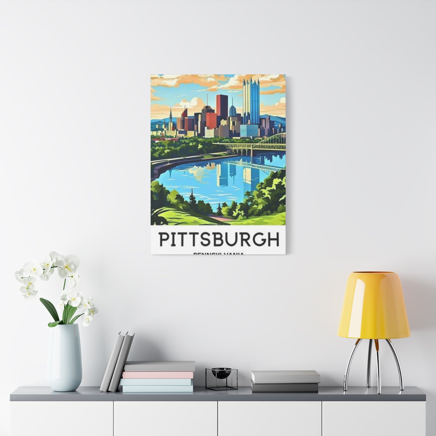
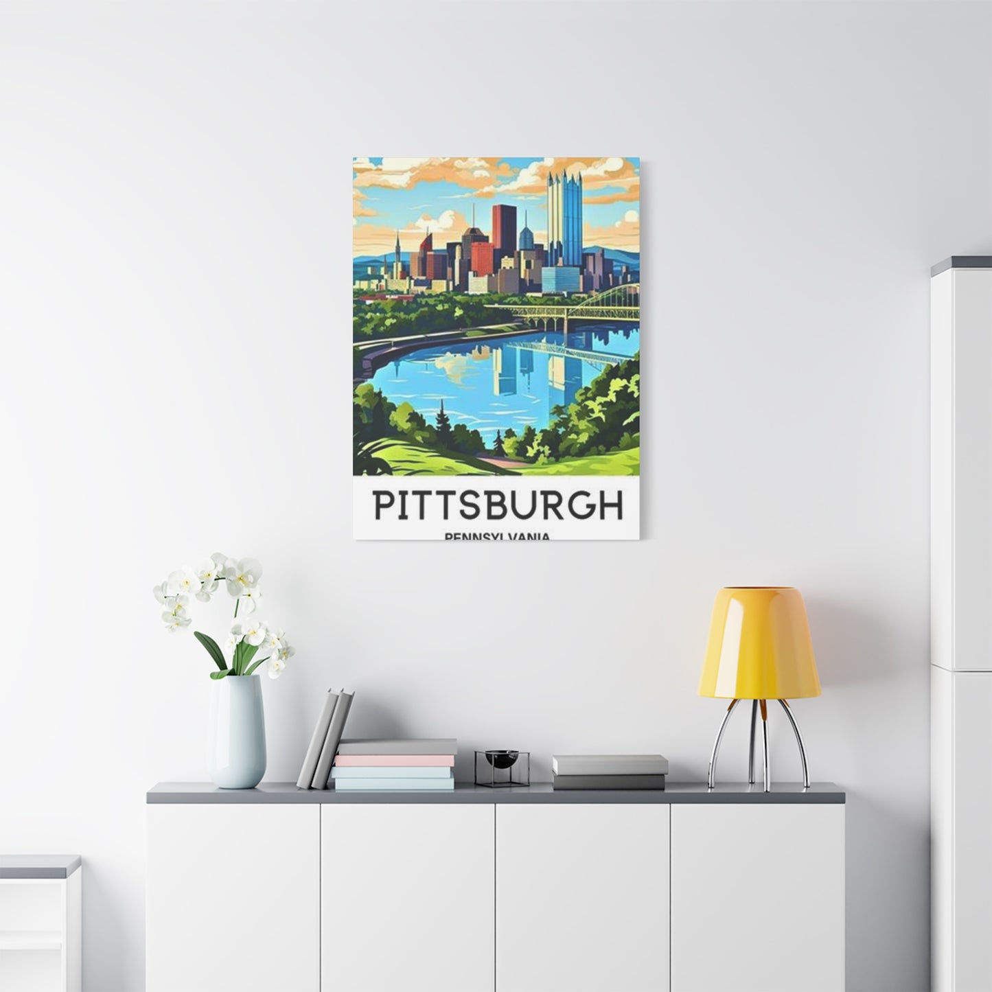
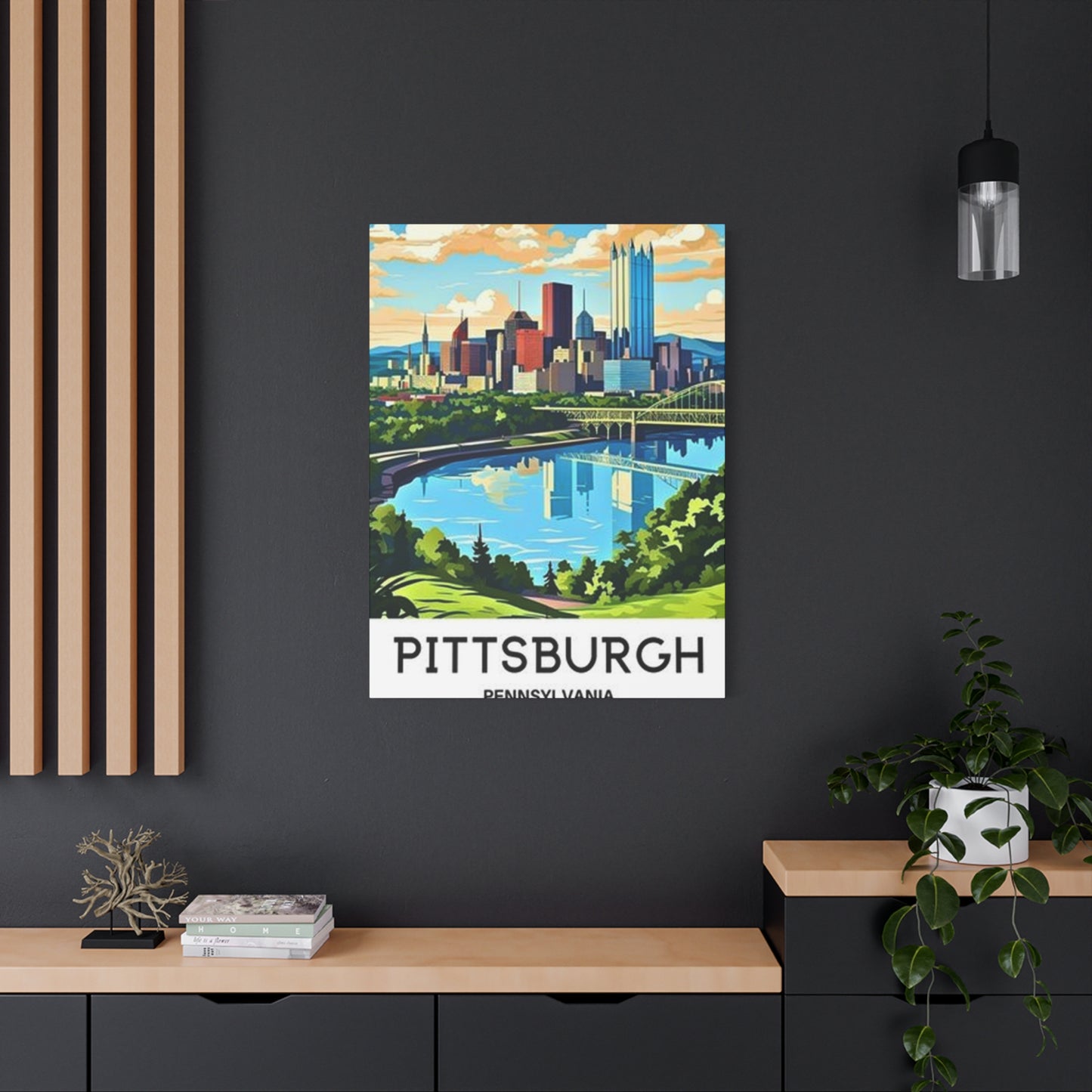
Displaying Pittsburgh Canvas Prints
Strategic placement and thoughtful arrangement transform individual pieces into cohesive design elements that enhance your living environment. The relationship between artwork, architecture, and furnishings requires consideration to create balanced, attractive presentations. These principles help you make the most of your pieces regardless of your decorating style or budget constraints.
Height placement significantly affects how artwork integrates into a room. The standard guideline suggests hanging pieces so their center falls at eye level, typically fifty-seven to sixty inches from the floor. However, this rule adjusts based on ceiling height, furniture placement, and the primary viewing position for each area.
Above furniture, artwork should relate proportionally to the pieces below. The general recommendation suggests centering the art approximately eight to ten inches above sofa or console tops, with the art width measuring two-thirds to three-quarters of the furniture width. This relationship creates visual connection between furniture and artwork without either element overwhelming the other.
Creating gallery walls allows you to display multiple pieces in organized arrangements that have greater impact than scattered individual pieces. Begin by laying out your arrangement on the floor, experimenting with spacing and relationships before committing to wall installation. This planning prevents unnecessary holes in walls and ensures satisfying final arrangements.
Symmetrical arrangements create formal, orderly presentations suitable for traditional decorating schemes. Equal spacing between pieces and balanced placement create calm, predictable effects. This approach works particularly well in formal dining rooms or living areas where orderly sophistication is desired.
Asymmetrical arrangements offer more dynamic, contemporary feels with varied spacing and piece sizes creating visual interest through controlled imbalance. This approach requires careful attention to visual weight and spacing to avoid appearing haphazard. When executed successfully, asymmetrical displays feel energetic and modern while maintaining cohesion.
Color coordination within multi-piece displays helps create unity. Selecting pieces with related color palettes ensures arrangements feel intentional rather than random. You might choose all warm-toned pieces, all cool-toned pieces, or use strategic color repetition across different images to create visual connections.
Consistent framing creates cohesive gallery walls regardless of image content. Using identical frame styles, colors, and mat treatments makes collections of diverse images read as unified presentations. This approach works particularly well when displaying works from different artists or time periods that might otherwise appear incompatible.
Varied framing can work successfully in eclectic arrangements where diversity is intentional. Mixing frame styles, widths, and finishes creates more casual, collected-over-time appearances. This approach requires careful balancing to prevent chaos, often working best when other unifying factors like color palette or subject matter create coherence.
Lighting considerations affect both the visibility and longevity of displayed pieces. Ensure adequate illumination without creating glare or harmful exposure. Consider how natural light changes throughout the day and whether artificial lighting sufficiently illuminates artwork during evening hours when you're most likely to enjoy your home.
Room-specific placement strategies recognize that different areas serve different purposes. Entry halls benefit from immediately visible artwork that creates strong first impressions. Living rooms typically feature larger, more significant pieces in primary viewing areas. Bedrooms often showcase more personal or calming selections.
Creating focal points through artwork placement guides visual attention and organizes room layouts. Large or particularly striking pieces naturally draw the eye, making them effective tools for emphasizing desired areas. Position these focal pieces where they're visible from main entry points to maximize their organizational impact.
Balancing artwork with other decorative elements prevents visual competition. Busy wallpaper or heavily patterned furnishings may overwhelm artwork, while simple, neutral backgrounds allow pieces to command appropriate attention. Consider your complete decorating scheme when determining how prominent to make artwork displays.
Seasonal rotation keeps displays fresh and allows you to enjoy varied selections throughout the year. Storing pieces properly when not displayed protects them while giving you flexibility to change your environment according to season, mood, or occasion. This practice makes collecting more pieces practical even when display locations are limited.
Emotional Feel of Sunny Skies
The psychological impact of visual elements in our surroundings significantly influences mood, energy levels, and overall well-being. Artwork depicting brilliant atmospheric conditions carries particular emotional weight due to universal human associations with weather and light. Understanding these effects helps you select and place pieces strategically to support your desired emotional environment.Bright, clear skies universally evoke positive associations tied to good weather and pleasant outdoor experiences. These connections run deep in human psychology, likely stemming from evolutionary advantages of good weather for survival and resource gathering.
Conclusion
Sunny Pittsburgh wall art captures more than just the city’s skyline—it encapsulates its energy, warmth, and unique charm. From sunlit bridges and bustling streets to tranquil riverside views, these artworks bring a slice of Pittsburgh’s character into your home. By featuring bright, vibrant imagery, they transform interiors, infusing spaces with light, positivity, and a welcoming atmosphere. Whether you’re a longtime resident, a visitor who fell in love with the city, or simply someone who appreciates urban beauty, Pittsburgh-themed wall art offers a visual connection to a place brimming with culture, history, and heart.
The appeal of city-inspired wall art lies in its ability to balance aesthetic beauty with emotional resonance. A sunny depiction of Pittsburgh conveys optimism, vitality, and inspiration, reminding viewers of both the city’s iconic landmarks and the everyday charm found in its neighborhoods. The interplay of light, architecture, and natural surroundings in these artworks creates a dynamic yet harmonious composition, making them perfect focal points in living rooms, offices, or hallways. They transform ordinary walls into vibrant reflections of urban life.
From a design perspective, Pittsburgh wall art is versatile and adaptable. Bright tones and warm hues complement neutral interiors, adding visual interest without overwhelming the space. Large canvas prints can serve as statement pieces, commanding attention and setting the tone for the room, while smaller framed works offer the flexibility to create galleries or pairings with complementary artwork. Whether your home features modern, industrial, or eclectic décor, sunny Pittsburgh art integrates seamlessly, enhancing both color schemes and spatial dynamics.
Beyond aesthetics, these artworks carry cultural and emotional significance. Pittsburgh, known for its bridges, rivers, and diverse architecture, embodies resilience, creativity, and community spirit. Capturing this essence in wall art allows homeowners to celebrate the city’s identity and their personal connection to it. Every glance at a sunlit skyline or a familiar street corner becomes a reminder of heritage, inspiration, and the vibrancy of urban life. It encourages reflection and appreciation for both the city’s beauty and its character.
Moreover, the artistic techniques used in sunny Pittsburgh wall art—through photography, painting, or digital illustration—highlight the subtle interplay of light and shadow, color saturation, and composition. These elements create a sense of depth and warmth, making the artwork feel alive and inviting. They not only enhance interior spaces aesthetically but also evoke a positive emotional response, brightening moods and encouraging a sense of connection to the city.
Ultimately, Captivating Sunny Pittsburgh wall art does more than decorate a room; it transforms your home into a space filled with warmth, energy, and personality. It invites the charm and vibrancy of Pittsburgh into your everyday life, bridging the gap between urban beauty and personal expression. With every glance, these artworks serve as reminders of light, community, and the inspiring qualities of the city itself.
