


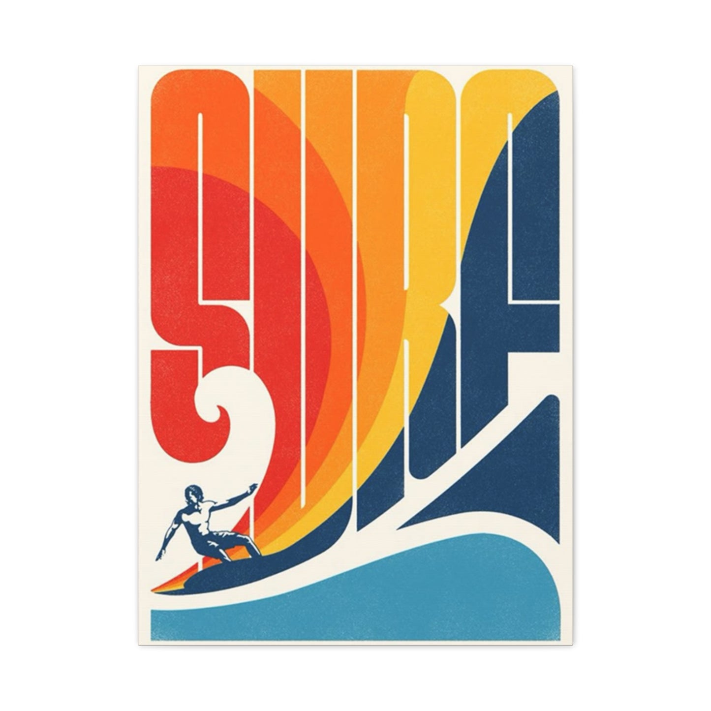
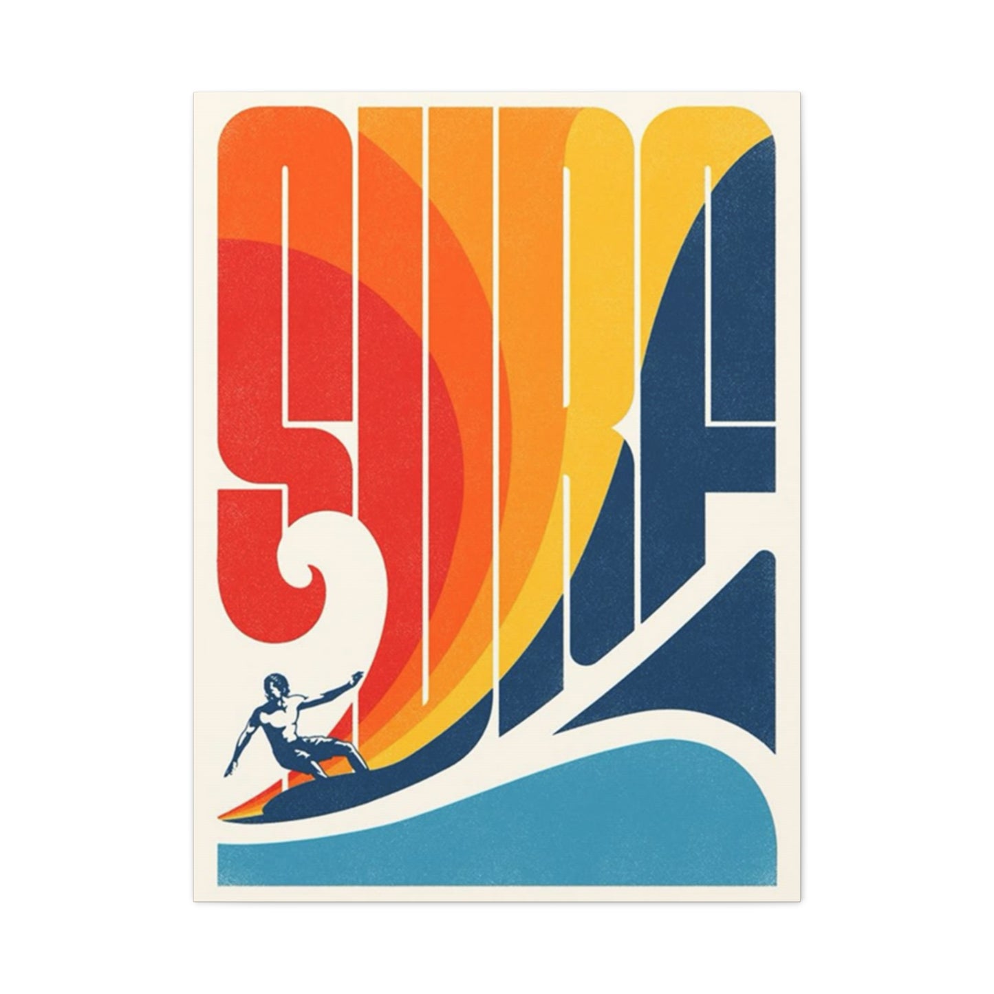
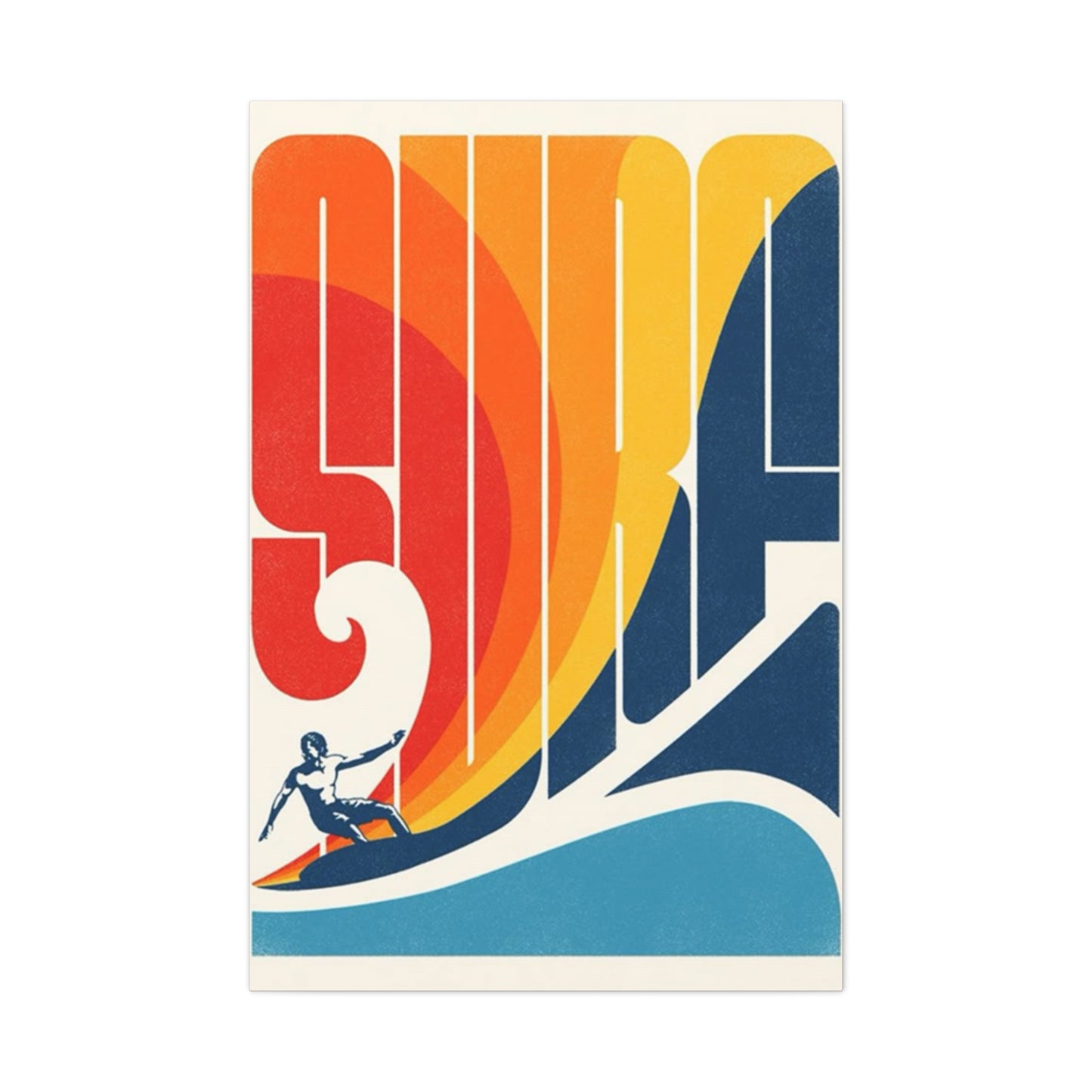
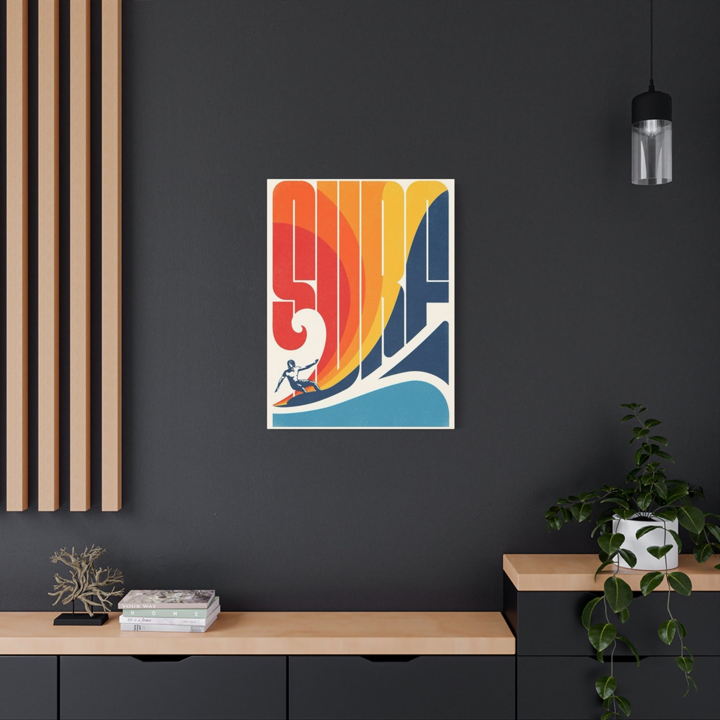
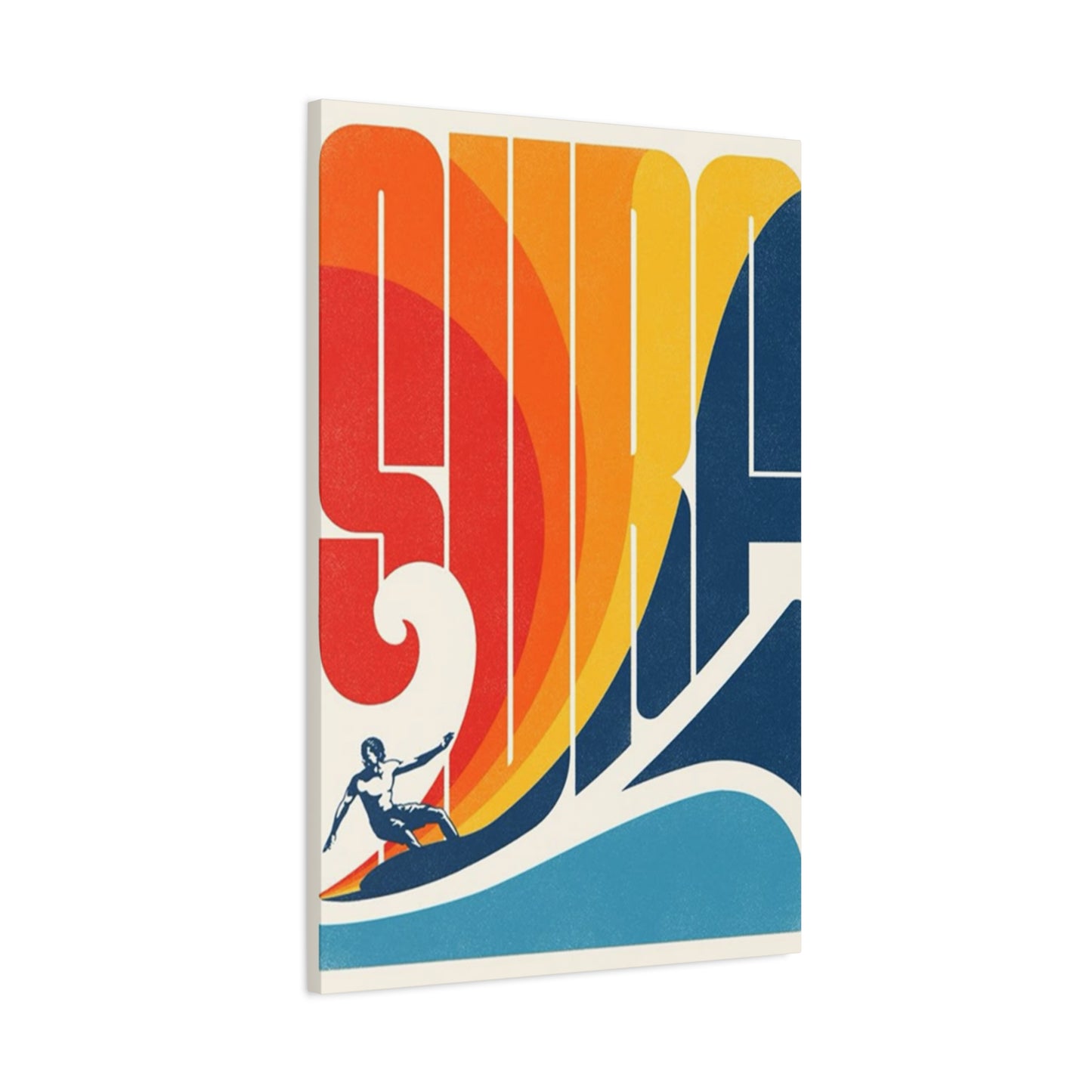
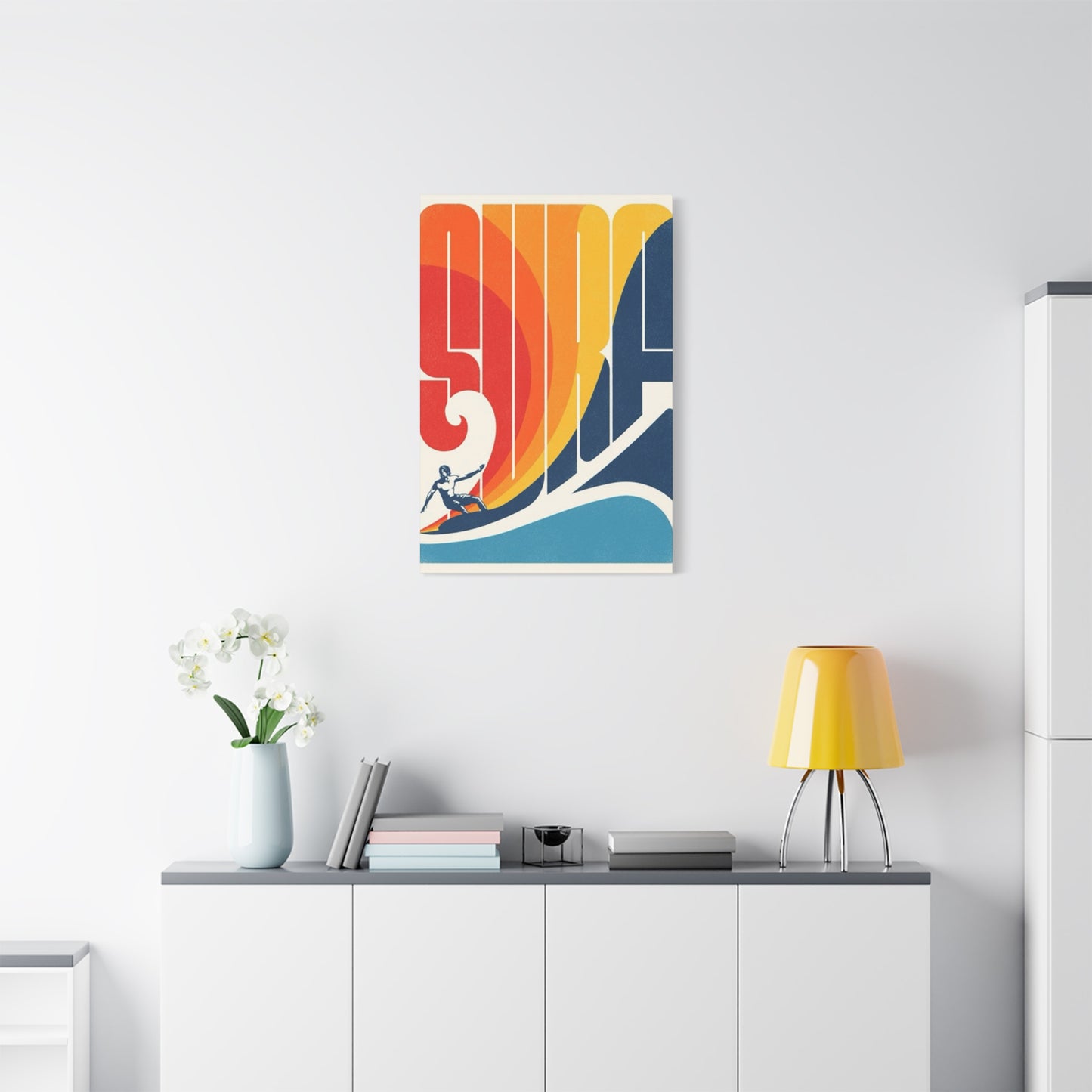
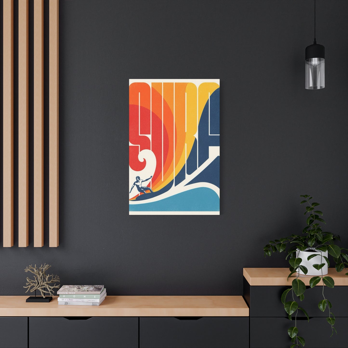
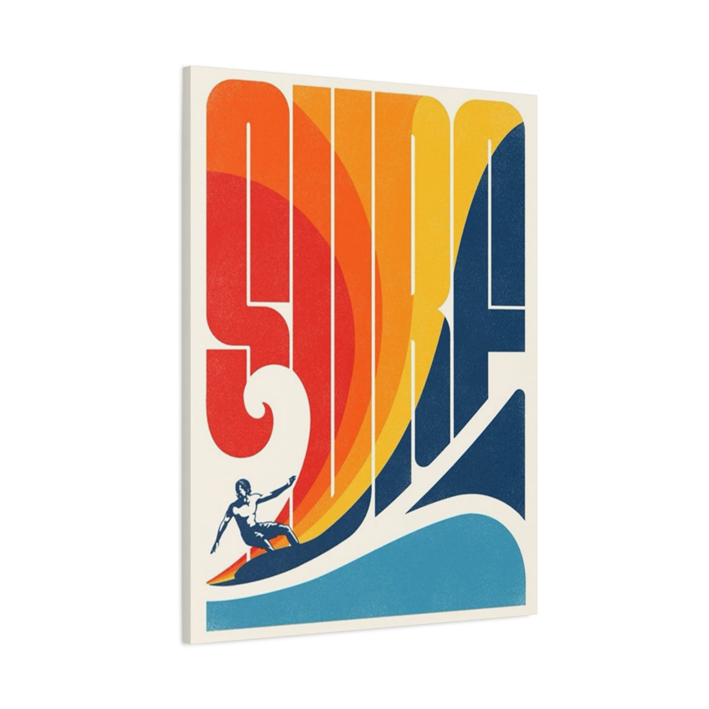
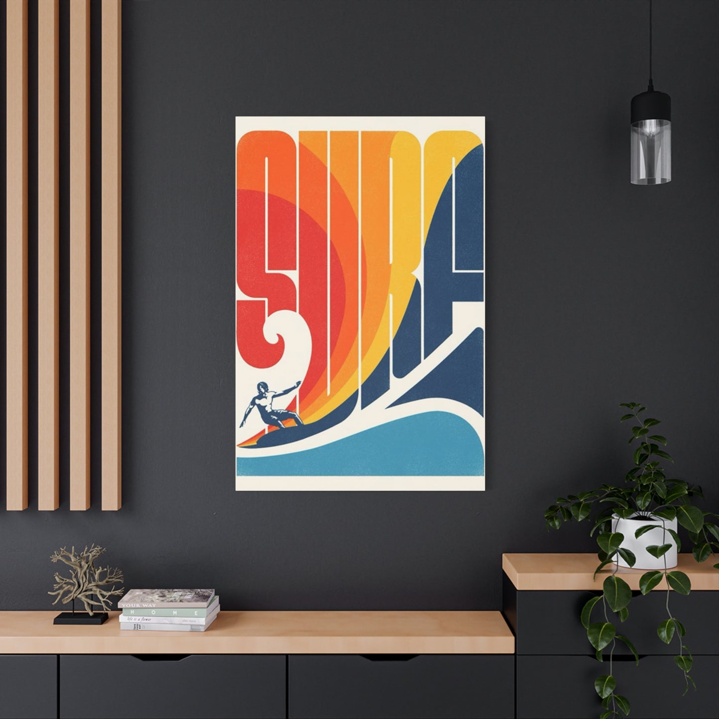
Surf Poster Wall Art & Canvas Prints
Surf Poster Wall Art & Canvas Prints
Couldn't load pickup availability


How Surf Poster Wall Art Can Inspire Your Adventurous Spirit
The allure of ocean waves crashing against sandy shores has captivated humanity for generations. This fascination extends beyond mere appreciation of nature, manifesting itself in various forms of artistic expression that bring the essence of coastal living into our daily environments. Canvas prints featuring surfing imagery and wave dynamics have emerged as powerful decorative elements that transform residential and commercial spaces into sanctuaries of tranquility and adventure.
The integration of ocean-themed artwork into interior spaces represents more than simple decoration. These pieces serve as visual anchors that evoke memories of sun-drenched beaches, the rhythmic sound of breaking waves, and the exhilarating sensation of riding powerful swells. For surf enthusiasts and coastal lifestyle admirants alike, these artistic representations create an immediate connection to the sea, regardless of geographical location.
Canvas prints depicting surfing scenes and wave formations offer remarkable versatility in design applications. From minimalist modern aesthetics to bohemian coastal themes, these artworks adapt seamlessly to diverse interior styles. The tactile quality of canvas material combined with high-resolution printing technology produces images that capture every nuance of water movement, foam texture, and light refraction that makes ocean photography so compelling.
The market for beach-inspired wall decorations has experienced substantial growth as more individuals seek to incorporate natural elements into their living spaces. This trend reflects a broader cultural shift toward biophilic design principles that emphasize human connection with natural environments. Surfing imagery specifically appeals to those who value adventure, freedom, and the raw power of nature, making it an ideal choice for creating spaces that inspire and energize.
Professional photographers and digital artists have developed sophisticated techniques for capturing wave dynamics in ways that translate beautifully to canvas format. These methods preserve the explosive energy of breaking waves, the serene beauty of glassy morning sessions, and the dramatic contrast between turbulent water and peaceful horizons. The result is artwork that functions as both aesthetic enhancement and emotional catalyst, transforming ordinary rooms into extraordinary environments.
Understanding the various aspects of surfing-themed canvas prints helps consumers make informed decisions about incorporating these pieces into their spaces. From selecting appropriate sizes and compositions to coordinating with existing decor elements, each consideration contributes to creating cohesive and visually impactful environments. The following comprehensive exploration examines every facet of these decorative elements, providing valuable insights for anyone interested in bringing coastal energy into their home or workspace.
Significance of Ocean Wave Imagery in Contemporary Art
Ocean wave imagery holds profound cultural significance across numerous societies and artistic traditions. Throughout human history, the sea has represented both opportunity and danger, serving as a source of sustenance, transportation, and spiritual connection. These symbolic associations infuse wave-themed artwork with layers of meaning that extend beyond surface aesthetics, creating pieces that resonate on emotional and psychological levels.
In contemporary artistic contexts, wave imagery particularly appeals to audiences seeking connections with nature amid increasingly urbanized lifestyles. The visual representation of ocean swells and breaking waves provides a tangible link to wild, untamed environments that many people encounter infrequently in their daily lives. This disconnect from natural spaces has fueled demand for artwork that brings elements of the outdoors inside, creating visual escapes within domestic settings.
Surfing culture specifically has contributed to the popularization of wave imagery in mainstream design. What began as a subcultural phenomenon along coastal regions has evolved into a global lifestyle aesthetic embraced by individuals far from any shoreline. The values associated with surfing, including freedom, adventure, environmental consciousness, and physical vitality, translate powerfully through visual representations of waves and surfing action.
The artistic interpretation of waves varies considerably across different cultural contexts. Pacific Island traditions view waves as manifestations of ancestral spirits and natural forces deserving respect and reverence. Japanese art history features iconic wave imagery, most notably in Hokusai's famous woodblock print, which has influenced countless contemporary interpretations. Western surf culture tends to emphasize the athletic and adventurous aspects of wave riding, celebrating human interaction with powerful natural forces.
Contemporary artists working with wave imagery employ diverse techniques and perspectives to capture the essence of ocean dynamics. Some focus on abstract representations that emphasize color, movement, and emotional impact rather than photographic accuracy. Others pursue hyperrealistic depictions that showcase technical mastery and attention to minute details. Both approaches offer valuable contributions to the genre, providing options for consumers with varying aesthetic preferences.
The democratization of photography through digital technology has expanded the pool of artists creating wave imagery. Professional surf photographers spend years developing expertise in capturing perfect moments when wave formation, lighting conditions, and surfing action align harmoniously. However, amateur photographers equipped with modern camera technology increasingly produce compelling images suitable for canvas printing, broadening the diversity of available artwork.
Environmental awareness has added another dimension to wave imagery appreciation. As coastal ecosystems face increasing pressures from climate change, pollution, and development, artistic representations of pristine ocean environments take on preservation-oriented significance. These images serve as reminders of what exists and what deserves protection, functioning as both aesthetic objects and subtle environmental advocacy.
The therapeutic potential of ocean imagery has gained recognition within wellness and healthcare communities. Studies examining biophilic design principles suggest that visual connections with natural elements can reduce stress, improve mood, and enhance overall psychological wellbeing. Wave imagery specifically offers dynamic yet rhythmic visual qualities that many find calming and restorative, making it particularly suitable for spaces dedicated to relaxation and recovery.
Commercial applications of wave imagery extend beyond residential decoration into hospitality, corporate, and retail environments. Hotels, restaurants, and businesses leverage coastal aesthetics to create memorable brand experiences and appealing atmospheres. The universal appeal of ocean imagery makes it effective across diverse demographic groups, contributing to its widespread adoption in commercial design contexts.
The intersection of wave imagery with other artistic movements and styles creates fascinating hybrid aesthetics. Minimalist interpretations reduce wave forms to essential lines and colors, while maximalist approaches layer multiple elements to create complex, visually dense compositions. Vintage-inspired treatments apply retro color palettes and printing techniques to create nostalgic effects, whereas contemporary digital manipulations produce surreal and fantastical interpretations.
Selecting Appropriate Dimensions for Maximum Visual Impact
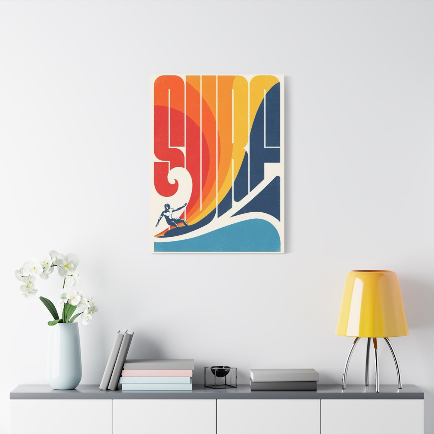
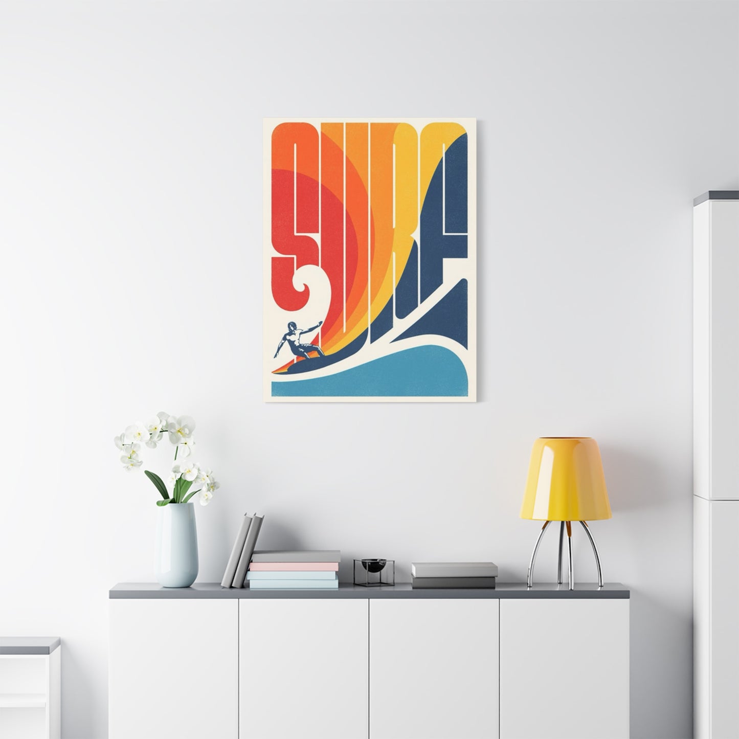
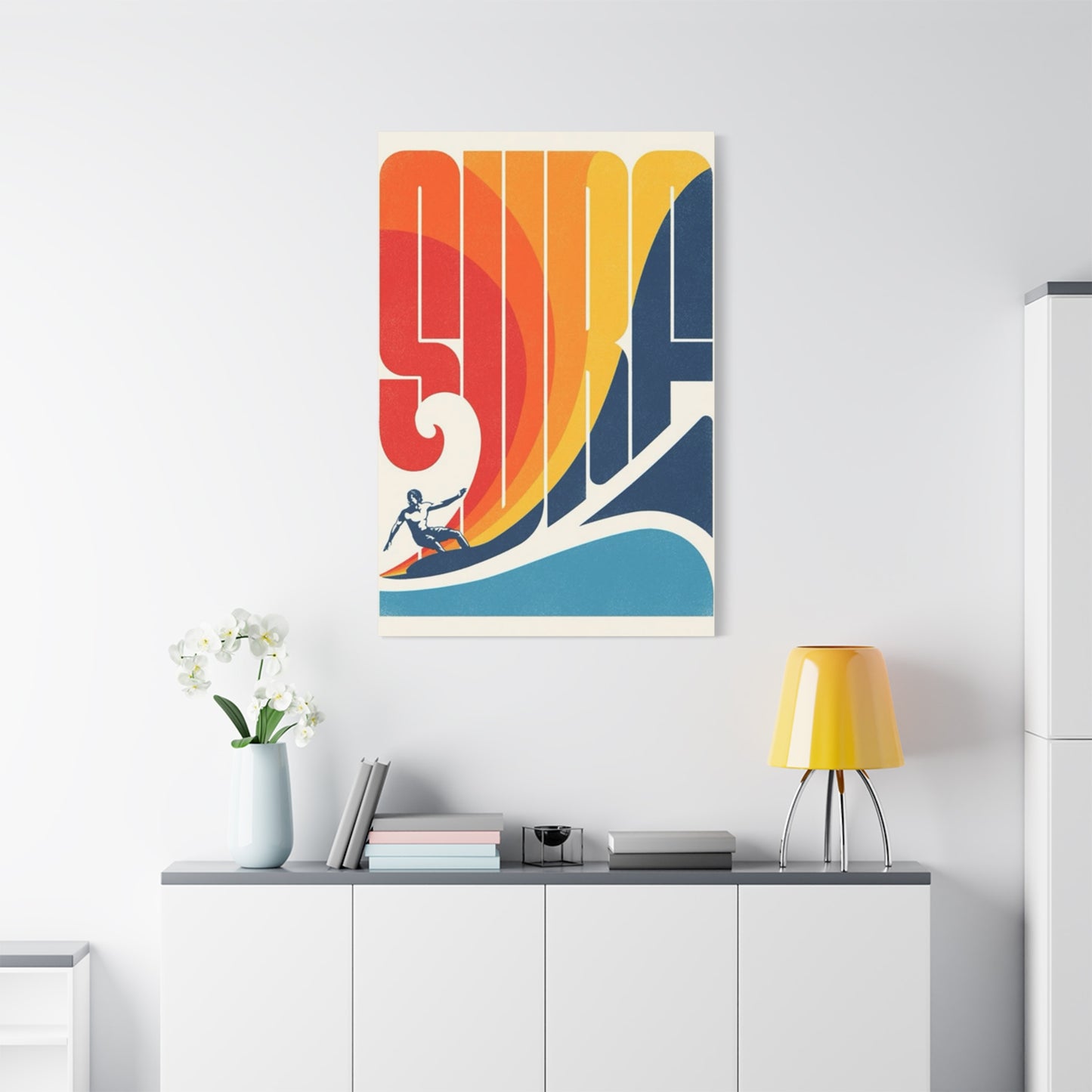
Choosing the correct size for canvas prints significantly influences their visual impact and integration within existing spaces. Dimension selection involves careful consideration of wall space, room proportions, viewing distances, and surrounding decorative elements. Understanding these relationships enables creation of balanced, harmonious environments that showcase artwork effectively without overwhelming other design components.
Large-format canvas prints make bold statements suitable for spacious walls requiring dominant focal points. These substantial pieces typically measure beyond three feet in any dimension, commanding attention and establishing design direction for entire rooms. Expansive wave imagery works particularly well in open-concept living areas, above substantial furniture pieces, or in commercial settings where visual impact matters greatly.
Medium-sized prints offer versatility appropriate for most residential applications. Ranging approximately from two to three feet in primary dimensions, these pieces provide sufficient presence without dominating spaces. They work effectively above sofas, beds, console tables, and other furniture pieces where artwork enhances rather than overwhelms. Medium formats also facilitate creation of gallery walls combining multiple pieces into cohesive arrangements.
Smaller canvas prints serve specific decorative purposes within comprehensive design schemes. These compact pieces excel in creating intimate visual moments, filling narrow wall spaces, or contributing to eclectic gallery arrangements. Small wave images work beautifully in bathrooms, home offices, hallways, and other spaces where scaled-down artwork proves more appropriate than large-format pieces.
Proportional relationships between artwork dimensions and wall space follow established design principles that promote visual balance. The general guideline suggests artwork should occupy roughly two-thirds to three-quarters of the width of furniture pieces it hangs above. For freestanding walls without furniture anchors, artwork should fill approximately two-thirds of available wall space to avoid appearing either lost or cramped within its setting.
Vertical versus horizontal orientation affects both aesthetic impact and spatial perception. Horizontal compositions emphasize width and can make rooms appear broader, making them suitable for narrow spaces requiring visual expansion. Vertical orientations draw eyes upward, creating impressions of height that benefit rooms with low ceilings. Wave imagery adapts naturally to both orientations depending on compositional elements and artistic treatment.
Multi-panel arrangements, often called triptychs or polyptychs, create dramatic visual effects by spreading single images across multiple canvases. These configurations add dimensional interest through physical depth variation between panels. Wave imagery particularly suits multi-panel treatment, as progressive wave formation or extended shoreline vistas naturally divide into sequential segments that maintain visual continuity while creating dynamic presentations.
Viewing distance significantly impacts optimal artwork size selection. Pieces intended for close viewing in intimate spaces can incorporate finer details that reward careful examination, whereas artwork viewed from greater distances requires bolder compositions with clear, readable elements. Wave prints in large open spaces benefit from simplified compositions with strong contrast and clear focal points visible across room lengths.
Ceiling height influences appropriate artwork scale, with taller rooms accommodating proportionally larger pieces. Standard eight-foot ceilings typically support artwork up to approximately forty inches in height without appearing overwhelming, while rooms with nine-foot or higher ceilings can accommodate substantially larger pieces. Extremely tall spaces may even warrant floor-to-ceiling installations for proper proportional relationships.
Furniture scale provides important reference points for artwork sizing decisions. Substantial, oversized furniture pieces require correspondingly robust artwork to maintain visual equilibrium, whereas delicate, refined furnishings pair better with more modestly sized pieces. Mismatched scales create unsettling visual relationships that undermine overall design cohesion and aesthetic appeal.
Creating gallery walls with multiple wave-themed canvas prints requires careful planning regarding individual piece sizes and their relationships within overall compositions. Successful gallery walls typically incorporate size variation while maintaining some unifying elements such as frame style, color palette, or subject matter consistency. Asymmetrical arrangements often prove more visually interesting than rigidly symmetrical layouts, though both approaches can succeed with proper execution.
Custom sizing options available through specialized printing services enable perfect dimensional matches for unique spaces. When standard sizes prove inadequate, custom dimensions ensure optimal fit and visual impact. This flexibility particularly benefits individuals with architectural features like narrow wall segments, unusual ceiling heights, or non-standard room proportions requiring tailored solutions.
Digital visualization tools help preview how different artwork sizes appear within specific spaces before purchase commitment. Many retailers and artists offer augmented reality applications or digital room planning tools enabling virtual placement of artwork options. These technologies reduce uncertainty and increase confidence in size selection, minimizing likelihood of disappointing results after installation.
Color Palette Coordination with Existing Interior Design Elements
Color coordination between canvas artwork and existing interior elements creates visual harmony essential for cohesive, professionally designed spaces. Understanding color theory principles and their application in residential contexts enables effective selection of wave-themed prints that enhance rather than clash with established design schemes. Successful color integration considers wall colors, furniture upholstery, flooring materials, window treatments, and decorative accessories.
Monochromatic color schemes featuring single color families in varying intensities create sophisticated, unified aesthetics. Wave imagery rendered in grayscale or single-color treatments integrates seamlessly with monochromatic interiors, adding visual interest through compositional elements rather than color contrast. These approaches suit minimalist and contemporary design styles emphasizing restraint and refinement.
Complementary color relationships pair hues opposite each other on color wheels, creating vibrant, energetic contrasts. Blue wave imagery against orange-toned walls or warm beige backgrounds produces dynamic visual tension that energizes spaces without overwhelming senses. These high-contrast pairings work effectively in casual, playful environments where visual stimulation enhances desired atmospheric qualities.
Analogous color schemes employ hues adjacent on color wheels, producing harmonious, naturally cohesive palettes. Wave prints featuring blues, greens, and teals coordinate effortlessly with similarly colored interior elements, creating seamless visual flow throughout spaces. These relationships feel organic and peaceful, making them particularly suitable for bedrooms, bathrooms, and other relaxation-oriented environments.
Neutral color foundations provide versatile backdrops accommodating diverse artwork colors. Spaces featuring predominantly white, beige, gray, or taupe elements accept wave imagery in virtually any color palette without risk of clashing. This flexibility makes neutral-based interiors ideal for homeowners wanting artwork flexibility or those who frequently update decorative accessories.
Color temperature considerations affect emotional responses to spaces. Cool colors including blues, greens, and purples create calming, serene atmospheres appropriate for relaxation and contemplation. Wave imagery naturally emphasizes these cool tones, making it especially effective in creating peaceful environments. Warm color accents within predominantly cool compositions add visual interest and prevent spaces from feeling cold or sterile.
Saturation levels influence visual intensity and energy. Highly saturated, vivid colors create bold, attention-grabbing effects suitable for accent walls and focal points, whereas desaturated, muted tones produce subtle, sophisticated aesthetics. Wave prints are available across the full saturation spectrum, from vibrant tropical blues to soft, almost ethereal pastels, enabling precise matching with existing color intensities.
Undertone coordination ensures color harmony even when exact matching proves impossible. Blues may carry green, purple, or gray undertones that significantly affect their appearance alongside other colors. Identifying undertones in both artwork and existing interior elements prevents subtle clashing that undermines overall design cohesion. Professional color consultation can help uncertain homeowners identify these nuanced relationships.
Pattern and color interaction requires careful consideration when incorporating wave prints into spaces with existing patterned elements. Busy, complex patterns in upholstery or wallpaper may overwhelm detailed wave imagery, whereas simple, graphic wave prints complement pattern-rich environments by providing visual relief. Balancing pattern density across room elements prevents chaotic, overstimulating results.
Seasonal color rotation offers opportunities for refreshing spaces without major design overhauls. Wave imagery exists in various color treatments suitable for different seasons—bright, saturated summer palettes, soft pastels for spring, muted earth tones for autumn, and cool grays for winter. Rotating artwork seasonally maintains visual interest and allows expression of different moods throughout the year.
Lighting conditions dramatically affect color perception and should inform artwork selection. Natural daylight reveals colors most accurately, while artificial lighting can shift color appearance significantly. Warm incandescent lighting emphasizes yellows and oranges while suppressing blues, potentially altering wave imagery appearance substantially. Testing artwork under actual installation lighting conditions before final commitment prevents disappointing surprises.
Accent color extraction from artwork creates cohesive design schemes. Identifying secondary or tertiary colors within wave prints and repeating them in throw pillows, blankets, vases, or other accessories establishes visual connections that unify spaces. This technique proves particularly effective with multi-colored artwork containing several distinct hues that can inform broader decorative choices.
Color psychology principles suggest that color choices affect mood and behavior. Blues generally promote calmness and productivity, greens encourage balance and harmony, and turquoise evokes tropical relaxation. Understanding these associations helps select wave imagery colors aligned with desired emotional responses within specific spaces. Bedrooms might benefit from softer, more subdued palettes, while exercise rooms might embrace more energetic, vibrant treatments.
Material Quality and Canvas Construction Considerations
Canvas material quality significantly impacts both aesthetic presentation and longevity of printed artwork. Understanding construction methods, fabric types, and finishing techniques enables informed purchasing decisions that ensure satisfaction and durability. Superior materials and construction methods justify higher price points through enhanced appearance and extended lifespan compared to economy alternatives.
Cotton canvas represents the traditional choice for fine art printing applications. Natural cotton fibers accept ink beautifully, producing rich color saturation and excellent detail rendering. Cotton canvas also offers superior texture that adds tactile dimension to artwork, creating depth and visual interest. Archival-quality cotton canvas resists yellowing and degradation when properly cared for, maintaining appearance for decades.
Polyester canvas provides contemporary alternatives with specific performance advantages. Synthetic fibers resist moisture and humidity more effectively than natural cotton, making polyester options suitable for bathrooms, kitchens, and other high-moisture environments. Polyester canvas also typically costs less than cotton while still delivering acceptable image quality for most applications. However, purists often prefer cotton for its superior texture and traditional fine art associations.
Blended canvas materials combine cotton and polyester to balance performance characteristics and cost considerations. These hybrid fabrics attempt to capture cotton's aesthetic qualities while incorporating polyester's practical benefits. Quality blended canvases perform admirably in most applications, offering middle-ground solutions for consumers seeking balance between premium and economy options.
Canvas weight, measured in grams per square meter or ounces per square yard, indicates fabric thickness and durability. Heavier canvases ranging from eight to twelve ounces provide substantial feel and superior durability suitable for large-format prints or high-traffic commercial applications. Lighter canvases around four to six ounces suffice for smaller prints or temporary installations, though they may appear less substantial and prove less durable long-term.
Weave tightness affects both appearance and print quality. Finely woven canvas with tight thread spacing produces smooth surfaces that render fine details accurately, making it ideal for photographic reproductions requiring precise detail. Loosely woven canvas displays more prominent texture that adds artistic character but may obscure fine details. Matching weave characteristics to image type optimizes results.
Canvas stretching methods significantly influence final appearance and structural integrity. Gallery-wrapped canvases extend printed images around frame edges, creating finished appearances suitable for frameless hanging. Museum-wrapped options leave frame edges blank or mirrored, requiring framing for complete presentation. Proper stretching tension prevents sagging and warping while maintaining flat, professional surfaces.
Wooden stretcher bar quality affects structural stability and longevity. Solid wood bars provide superior strength and durability compared to particle board or composite alternatives. Kiln-dried wood resists warping and moisture-related movement that can create canvas distortion. Corner reinforcement through proper joinery techniques or metal brackets adds stability, particularly important for larger pieces subject to greater gravitational stress.
Coating applications enhance canvas performance and appearance. Protective coatings shield printed surfaces from moisture, dust, and UV radiation, extending artwork lifespan significantly. Glossy coatings create vibrant color depth and light-reflective surfaces, while matte finishes reduce glare and create sophisticated, gallery-quality appearances. Satin finishes offer compromise characteristics between high-gloss and matte extremes.
Ink technology employed in printing processes dramatically affects color accuracy, vibrancy, and fade resistance. Pigment-based inks offer superior longevity and fade resistance compared to dye-based alternatives, maintaining color integrity for generations under proper conditions. Archival-quality inks meeting industry standards for permanence ensure artwork remains vibrant and true to original appearance throughout its lifespan.
Color profile management ensures accurate color reproduction matching artist intentions and customer expectations. Professional printing services employ calibrated equipment and standardized color management workflows that consistently produce accurate results. Consumer-grade printing may exhibit color shifts, inaccurate tones, or inconsistent results across multiple prints, highlighting importance of professional production for optimal outcomes.
Edge finishing techniques affect both aesthetics and durability. Mirrored edges extend border image areas around frame sides, creating seamless appearances from multiple viewing angles. Black edges provide modern, contemporary looks suitable for minimalist aesthetics. White edges offer clean, traditional presentations. Properly finished edges prevent fraying and extend canvas lifespan while contributing to overall aesthetic impact.
Backing board inclusion adds structural support and protection, particularly beneficial for thinner canvases or larger formats. Rigid backing prevents canvas distortion, protects against physical damage from behind, and blocks dust infiltration. While adding slight thickness and weight, backing boards substantially improve durability and professional appearance, justifying their inclusion in quality canvas construction.
Installation Methods and Hardware Selection for Optimal Display
Proper installation ensures canvas artwork displays safely, attractively, and securely while preventing damage to both artwork and walls. Understanding available mounting methods, appropriate hardware selection, and installation techniques enables confident, successful hanging that showcases artwork effectively. Different wall types, artwork weights, and aesthetic preferences require varied approaches for optimal results.
Traditional hanging wire systems remain popular for their flexibility and ease of use. Wire attached to frame backing hardware allows adjustable positioning and simplified leveling during installation. Quality braided steel wire provides strength adequate for most canvas weights while remaining virtually invisible during display. Wire systems accommodate standard picture hooks or wall anchors, making them adaptable to various wall types.
D-ring hardware offers direct mounting alternatives to wire systems. Metal D-shaped rings screwed into frame backs accept picture hooks directly, creating secure, stable mounting with minimal hardware visibility. Two-ring installations at frame corners provide superior stability for larger pieces, preventing tilting and ensuring level display. D-rings particularly suit heavier canvases requiring more robust support than wire alone provides.
Sawtooth hangers provide economical mounting solutions for lightweight canvases. These small metal brackets featuring serrated edges hook directly onto nail or screw heads, creating simple, straightforward installation. However, sawtooth hangers offer less adjustment flexibility than wire or D-ring systems and prove less suitable for heavy or large-format pieces requiring more substantial support.
Cleat mounting systems deliver gallery-quality installation with professional appearance. French cleats consist of matching interlocking pieces, one mounted to wall studs and the corresponding piece attached to artwork backing. This system distributes weight broadly, supports substantial pieces securely, and allows easy removal for cleaning or rearrangement. Professional installers frequently employ cleat systems for premium installations.
Adhesive mounting solutions accommodate situations where wall penetration proves undesirable or impossible. Heavy-duty mounting strips, command hooks, and specialized adhesive systems support moderate canvas weights without nails or screws. These options suit rental properties, damage-sensitive walls, or temporary installations. However, weight capacity limitations restrict their use to smaller, lighter pieces, and removal may still risk wall surface damage.
Wall anchor selection depends on wall construction materials and artwork weight. Drywall anchors ranging from plastic expansion anchors to metal toggle bolts provide varying load capacities for hollow wall installations. Masonry walls require specialized anchors designed to grip concrete, brick, or stone effectively. Using appropriate anchor types prevents installation failures and potential damage from falling artwork.
Stud mounting provides maximum strength for heavy canvas installations. Locating wall studs through electronic detectors or physical probing enables direct fastening into structural framing members. This approach eliminates concerns about anchor capacity or drywall strength, supporting even extremely heavy pieces indefinitely. When stud locations don't align with desired artwork positioning, spanning hardware distributes load across multiple studs.
Leveling techniques ensure professional-appearing installations without frustrating trial-and-error adjustments. Laser levels project perfectly horizontal reference lines for precise initial placement. Traditional bubble levels confirm levelness before permanent fastening. Measuring carefully from ceiling or floor references ensures consistent alignment when installing multiple pieces. Taking time for accurate leveling prevents crooked displays requiring frustrating reinstallation.
Height considerations affect both visual impact and functional accessibility. Standard gallery practice positions artwork centers approximately sixty inches from floor level, aligning with average eye height. However, this guideline adjusts based on ceiling height, furniture relationships, and room function. Artwork above furniture typically hangs six to twelve inches above furniture tops, creating visual connection without awkward gaps.
Grouping arrangements for multiple canvas pieces require comprehensive planning regarding spacing, alignment, and visual balance. Maintaining consistent gaps between pieces, typically two to four inches, creates cohesive appearances. Aligning edges or centers across multiple rows ensures intentional, organized presentations. Laying out arrangements on floors before wall installation allows experimentation without multiple wall penetrations.
Lighting integration enhances artwork display and visual impact. Picture lights mounted above frames provide focused illumination highlighting textures and colors. Track lighting or adjustable spotlights offer flexibility for changing displays. Avoiding direct sunlight prevents fading and deterioration while strategic artificial lighting creates dramatic effects drawing attention to featured pieces.
Security considerations become relevant for valuable artwork in public spaces or high-traffic environments. Security hardware including locking hangers, theft-deterrent fasteners, and alarm systems protects against unauthorized removal. While excessive for most residential applications, these measures provide peace of mind for commercial installations or valuable collections requiring additional protection beyond standard hanging methods.
Maintenance Practices for Preserving Canvas Artwork Longevity
Proper maintenance extends canvas artwork lifespan substantially while preserving aesthetic qualities and value. Understanding cleaning methods, environmental controls, and protective measures enables artwork owners to enjoy their investments for decades. Regular attention and appropriate care prevent common deterioration causes including dust accumulation, moisture damage, light fading, and physical injury.
Dust removal represents the most frequent maintenance requirement for canvas artwork. Soft, clean brushes with natural bristles gently remove surface dust without abrading canvas or printed surfaces. Microfiber cloths designed for delicate surfaces provide alternative cleaning tools suitable for canvas care. Feather dusters, while traditional, may snag on canvas texture and should be avoided. Establishing regular dusting schedules prevents accumulation requiring more aggressive cleaning approaches.
Vacuum cleaning using soft brush attachments offers efficient dust removal for larger pieces or extensive collections. Operating vacuums at reduced suction levels prevents canvas damage from excessive force. Maintaining slight distance between attachment and canvas surface while allowing bristles to gently contact surfaces achieves effective cleaning without risk. This approach particularly suits heavily textured canvases where simple dusting may prove insufficient.
Spot cleaning addresses localized soiling without subjecting entire pieces to unnecessary cleaning processes. Slightly dampened, clean white cloths very gently blot soiled areas, taking care not to rub aggressively or oversaturate canvas. Testing cleaning approaches on inconspicuous areas first prevents visible damage in prominent locations. For stubborn stains or valuable pieces, professional conservation services provide expertise preventing irreversible damage from improper cleaning attempts.
Moisture control prevents mold growth, canvas warping, and ink deterioration. Maintaining relative humidity between forty and sixty percent creates stable environments preventing moisture-related damage. Dehumidifiers in humid climates and humidifiers in arid regions help maintain optimal conditions. Avoiding canvas placement in bathrooms, kitchens, or other high-moisture areas extends lifespan significantly unless pieces specifically manufactured for such applications.
Light exposure management prevents fading and color deterioration. Ultraviolet radiation from sunlight and certain artificial lights causes gradual fading and yellowing of canvas materials and inks. Positioning artwork away from direct sunlight, using UV-filtering window treatments, and selecting LED lighting minimize harmful exposure. Protective coatings with UV inhibitors add additional defense against light-induced deterioration.
Temperature stability prevents physical stress causing canvas expansion, contraction, and eventual deterioration. Maintaining consistent temperatures between sixty-five and seventy-five degrees Fahrenheit prevents thermal cycling damage. Avoiding placement near heat sources like radiators, fireplaces, or heating vents protects canvas from extreme temperature exposure. Air conditioning in summer and adequate heating in winter maintain stable conditions supporting artwork preservation.
Physical damage prevention requires conscious placement decisions and handling practices. Positioning artwork away from high-traffic areas reduces collision risk. Avoiding locations where doors, furniture, or moving objects might impact pieces prevents dents, tears, and frame damage. When moving or cleaning around artwork, exercising care prevents accidental contact causing irreparable harm.
Professional inspection and conservation services provide expert assessment and treatment for valuable or antique pieces. Conservation specialists identify developing problems before they become severe, recommend appropriate interventions, and perform restorations when necessary. While representing additional expense, professional care preserves significant artwork investments and family heirlooms maintaining sentimental or monetary value.
Storage practices for temporarily displayed or rotated artwork influence long-term condition. Wrapping canvas pieces in acid-free tissue paper or clean cotton sheets protects surfaces during storage. Storing flat rather than rolled prevents canvas distortion and cracking. Climate-controlled storage areas with stable temperature and humidity maintain condition during periods when pieces aren't displayed.
Pest prevention protects organic canvas materials from insect damage. Regular inspection for signs of insect activity enables early intervention before significant damage occurs. Maintaining clean environments without food debris discourages pest activity. For severe infestations, professional pest control services experienced with fine art protection provide effective solutions minimizing risks to artwork.
Documentation practices including photographs, purchase records, and condition reports support insurance claims, resale activities, and conservation efforts. Recording artwork condition at acquisition and periodically thereafter creates valuable reference materials tracking changes over time. Maintaining organized records simplifies estate planning, insurance updating, and authentication processes that may become necessary.
Frame and stretcher inspection identifies structural issues requiring attention. Checking corners for separation, examining stretcher bars for warping, and assessing canvas tension prevents problems from progressing. Tightening loose corners, replacing damaged stretcher bars, or re-stretching sagging canvas restores structural integrity and prevents additional deterioration. Addressing small problems promptly prevents them from becoming major conservation projects requiring professional intervention.
Design Style Integration Across Diverse Aesthetic Approaches
Wave-themed canvas artwork adapts to remarkably diverse interior design styles through careful selection of imagery treatment, color palette, and compositional approach. Understanding how coastal themes integrate with specific design aesthetics enables creation of cohesive spaces that feel intentional rather than randomly assembled. Successful integration considers both artwork characteristics and broader design elements defining each aesthetic category.
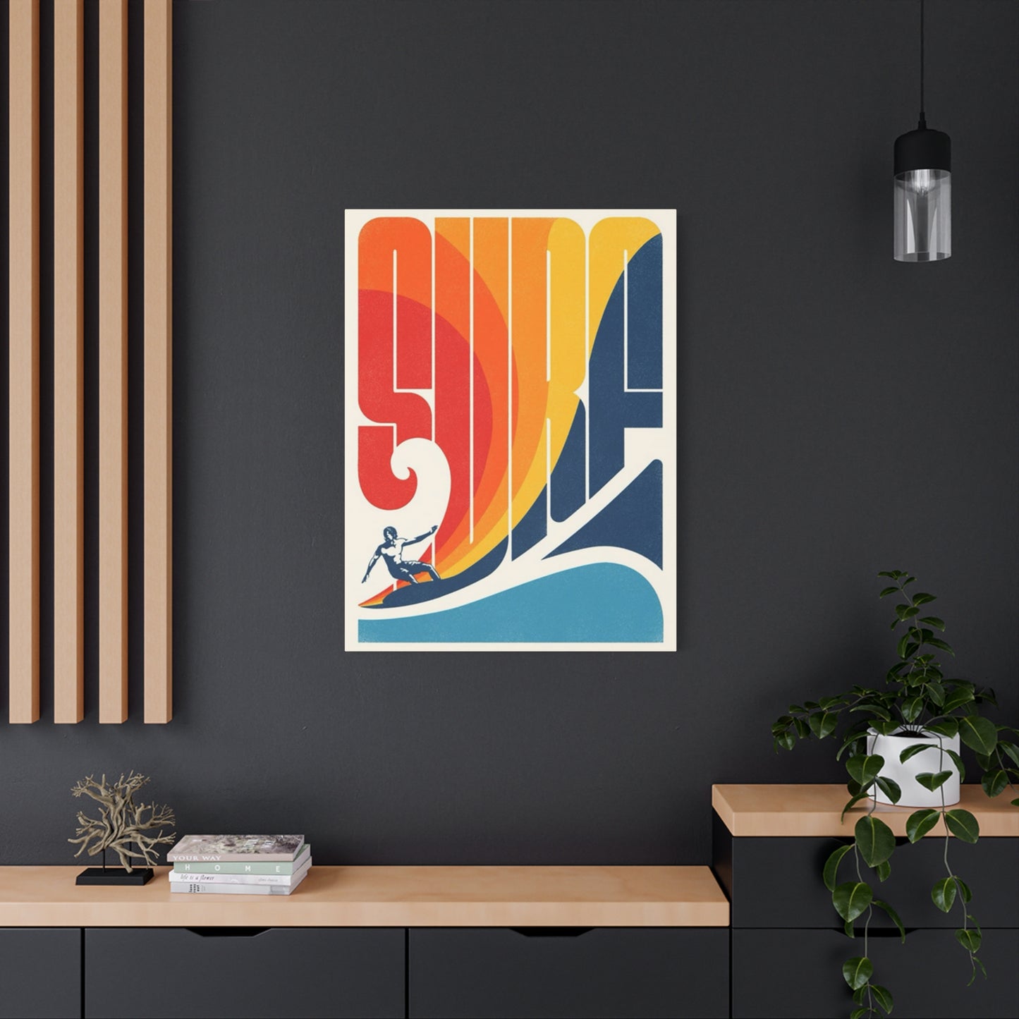
Coastal design styles naturally embrace wave imagery as core thematic elements. Traditional coastal aesthetics featuring nautical blues, whites, and sandy neutrals provide perfect contexts for realistic wave photography emphasizing natural color palettes. Weathered wood finishes, rope accents, and beach-inspired accessories complement wave artwork, creating unified environments celebrating seaside living. These spaces feel relaxed, welcoming, and connected to maritime traditions.
Modern coastal or "coastal contemporary" aesthetics combine beach themes with sleek, minimalist sensibilities. Clean-lined wave imagery in restrained color palettes pairs beautifully with contemporary furnishings, creating sophisticated spaces avoiding typical beach house clichés. Abstract wave interpretations, minimalist photographic treatments, and graphic design approaches align with modern aesthetic preferences while maintaining coastal connections. These spaces feel fresh, current, and elegantly restrained.
Bohemian or "boho" design styles incorporate wave imagery as part of eclectic, layered environments. Vibrant wave prints in saturated colors complement rich textile patterns, global-inspired accessories, and collected objects defining bohemian aesthetics. Multiple small wave pieces arranged gallery-style contribute to the collected-over-time appearance characteristic of boho environments. These spaces feel personal, creative, and visually abundant.
Scandinavian design principles emphasizing simplicity, functionality, and natural elements accommodate wave imagery when executed with appropriate restraint. Minimal color palettes featuring soft blues, grays, and whites align with Nordic aesthetic preferences. Simple, clean compositions without excessive detail suit Scandinavian sensibilities. These integrations create serene, uncluttered spaces promoting the hygge comfort central to Scandinavian design philosophy.
Industrial design styles can surprisingly accommodate wave imagery when selections emphasize contrast rather than thematic consistency. Black and white wave photography provides organic counterpoint to industrial elements like exposed brick, metal fixtures, and concrete surfaces. The raw power of breaking waves echoes industrial aesthetic values celebrating strength and authenticity. These unexpected combinations create dynamic, memorable spaces defying conventional design expectations.
Rustic design incorporating natural materials, organic textures, and earth-toned palettes benefits from wave imagery connecting to natural world themes. Weathered-appearing wave prints or images emphasizing natural colors coordinate with reclaimed wood, stone, and natural fiber elements defining rustic aesthetics. These combinations create grounded, organic spaces celebrating nature in multiple forms.
Tropical design styles featuring lush plants, vibrant colors, and exotic influences naturally incorporate wave imagery representing essential tropical environment elements. Bright, saturated wave prints complement bold tropical colors and patterns without visual conflict. Palm fronds, exotic flowers, and ocean waves together create immersive tropical experiences transporting occupants to paradise destinations. These spaces feel energizing, exotic, and vacation-inspired.
Minimalist design philosophies emphasizing "less is more" principles accommodate wave imagery when selections demonstrate appropriate restraint. Single large-format pieces in neutral tones or simple black and white treatments provide visual interest without cluttering minimalist environments. Abstract wave interpretations reducing forms to essential elements align particularly well with minimalist aesthetic values. These spaces feel calm, purposeful, and mentally uncluttered.
Traditional design styles featuring classic furnishings, rich materials, and formal arrangements initially seem incompatible with casual wave imagery. However, sophisticated wave photography with classical composition principles or vintage-inspired treatments can integrate successfully. Framing choices, particularly ornate gilded frames, help bridge stylistic gaps between artwork and traditional furnishings. Careful selection creates interesting contrasts adding personality to potentially stiff traditional spaces.
Transitional design blending traditional and contemporary elements provides flexible frameworks accommodating diverse wave imagery styles. Neither fully traditional nor completely modern, transitional spaces welcome varied approaches to wave themes. This flexibility makes transitional design particularly accessible for homeowners uncertain about committing fully to single aesthetic directions. Wave imagery serves as neutral ground transcending stylistic boundaries.
Eclectic design celebrating intentional combinations of diverse styles and periods thrives on unexpected juxtapositions including wave imagery alongside seemingly unrelated elements. Successfully eclectic spaces demonstrate underlying unity through color repetition, scale consistency, or thematic threads connecting disparate pieces. Wave prints contribute natural elements balancing ornate or heavy design components. These spaces feel curated, personal, and visually interesting.
Contemporary design emphasizing current trends and cutting-edge aesthetics embraces wave imagery executed with modern techniques and fresh perspectives. Digital manipulations, unconventional color treatments, and experimental compositions align with contemporary values celebrating innovation and pushing boundaries. These spaces feel current, forward-thinking, and stylistically confident.
Effects of Ocean Imagery on Human Wellbeing
Scientific research increasingly documents the psychological and physiological effects of nature exposure, including visual engagement with ocean imagery. Understanding these impacts helps explain wave-themed artwork's popularity and informs its strategic placement within homes and commercial environments. The benefits extend beyond aesthetic pleasure to measurable improvements in mental health, stress reduction, and cognitive function.
Stress reduction represents one of the most significant benefits associated with ocean imagery exposure. Studies examining physiological stress markers including cortisol levels, heart rate, and blood pressure document measurable decreases following nature imagery viewing. Wave imagery specifically combines movement suggesting rhythm and flow with vast horizons suggesting openness and possibility, creating particularly effective stress-reduction stimuli. Bedrooms, home offices, and meditation spaces benefit especially from these calming effects.
Attention restoration theory explains how natural environments, including visual representations, help recover from mental fatigue. Modern life demands sustained attention to specific tasks while filtering numerous distractions, eventually depleting cognitive resources. Natural imagery allows "soft fascination" that holds attention without requiring effort, permitting restoration of directed attention capacities. Wave imagery's combination of pattern and variation creates ideal conditions for this restorative process.
Biophilic design principles recognize humans' innate connection to natural environments and incorporate natural elements into built spaces. This connection evolved over millennia when human survival depended on reading natural environmental cues. Although modern life minimizes direct nature contact, psychological and physiological benefits persist when natural elements appear in living spaces. Ocean imagery satisfies biophilic needs, contributing to occupant wellbeing even absent direct nature access.
Color psychology principles explain emotional responses to blue-dominant wave imagery. Blue hues generally promote calmness, tranquility, and mental clarity. These effects likely stem from evolutionary associations between blue colors and safe water sources, clear skies, and favorable weather conditions. Wave imagery capitalized on these deep-seated associations, creating environments promoting desired emotional states through color influence.
Movement and rhythm in wave imagery engage visual systems in ways static patterns cannot replicate. The implied motion in captured wave moments creates dynamic visual interest while suggesting natural rhythms and cycles. These qualities prevent visual boredom while avoiding overstimulation, striking balance between interesting and overwhelming. Spaces where concentration matters, including home offices and study areas, benefit from this balanced stimulation.
Symbolic associations with waves extend beyond immediate visual qualities to cultural meanings and personal memories. Waves represent power, persistence, natural cycles, adventure, freedom, and connection to something larger than oneself. These symbolic dimensions add psychological depth to wave imagery, creating meaning beyond surface aesthetics. Artwork embodying personally significant meanings creates stronger emotional connections than purely decorative elements.
Nostalgia and memory activation through wave imagery provides emotional benefits for individuals with positive beach or ocean experiences. Visual reminders of pleasurable memories trigger associated positive emotions, temporarily transporting viewers mentally to meaningful places and times. This effect proves particularly valuable for individuals unable to access coastal environments regularly, providing visual bridges to cherished experiences.
Meditation and mindfulness practices often incorporate ocean imagery to support focused attention and present-moment awareness. Waves' rhythmic, repetitive nature mirrors breathing patterns often used in meditation, creating visual analogues supporting meditative states. Dedicated meditation spaces benefit from carefully selected wave imagery supporting contemplative practices without distraction.
Social connection facilitation occurs when artwork prompts conversations, shared experiences, and relationship building. Wave imagery frequently triggers discussions about travel experiences, surfing adventures, environmental concerns, or shared appreciation for natural beauty. These conversational opportunities strengthen social bonds and create positive associations with spaces where such interactions occur.
Productivity enhancement in work environments results from appropriate nature imagery including ocean scenes. Research documents improved focus, creativity, and problem-solving abilities in spaces incorporating natural elements. However, imagery selection matters, with calming scenes proving more beneficial than agitating ones. Gentle wave imagery supports productive work environments without creating excessive distraction or agitation.
Conclusion:
Surf poster wall art is more than just a decorative addition to your living space—it’s a reminder of the spirit of adventure, freedom, and the connection to the natural world. By bringing the vibrant energy of the ocean into your home, these posters serve as a daily source of inspiration, encouraging you to embrace new challenges, take risks, and live with an adventurous mindset. Whether you’re a surfer yourself or someone who simply admires the bold and dynamic lifestyle associated with the surf culture, these pieces can transform your space and your outlook on life.
Surfing is synonymous with pushing limits—riding waves, conquering fears, and feeling the thrill of being fully immersed in nature. A surf poster captures that energy, inviting you to remember what it feels like to be completely free and in the moment. The striking images of surfers in motion, the vivid colors of the waves, and the dramatic ocean landscapes evoke a sense of excitement and possibility. This type of artwork encourages you to not just admire the beauty of the ocean but also to adopt the fearless, go-for-it attitude that surfing embodies.
The beauty of surf posters lies in their ability to convey the essence of adventure without needing words. A picture of a surfer carving through a massive wave or riding an almost impossible swell can inspire you to take on challenges in your own life. It’s about more than just surfing; it’s about pushing boundaries, living authentically, and constantly striving for the next wave, whatever that might be for you. Surf posters can serve as a visual metaphor for tackling obstacles and embracing the unknown, reminding you to take life’s challenges in stride with the same resilience and passion that surfers do when they hit the waves.
In addition to inspiring boldness and adventure, surf posters also offer a deep connection to the ocean and the natural world. For many, surfing represents a spiritual connection to the earth, a way of being present in the moment while immersed in the beauty of nature. Displaying surf art in your home is like bringing a piece of that serenity and power into your environment. It serves as a daily reminder to find peace in the natural world, to appreciate the beauty of the ocean, and to remain grounded amidst life’s busyness.
Moreover, surf posters are a perfect way to incorporate the beach’s vibrant energy into your decor. Whether the artwork features a classic vintage surf ad, a modern surfer catching a massive wave, or a colorful abstract interpretation of the sea, each piece captures the diverse emotions tied to surfing—from joy and exhilaration to relaxation and peace. These visuals can help infuse your space with a sense of energy, making it a dynamic and inspiring place to spend time. Every glance at your surf poster can transport you to a place of possibility, where you are reminded to keep your spirit of adventure alive, no matter where you are.
As a decor choice, surf posters can also create a relaxed yet invigorating atmosphere in your home. Whether displayed in your living room, home office, or bedroom, these images have the power to lift your mood and evoke a sense of calm energy. By surrounding yourself with the art of surfing, you not only enrich your living space but also fuel your inner drive to explore, take chances, and live with enthusiasm.
In conclusion, surf poster wall art is a powerful tool to inspire your adventurous spirit. It evokes the feeling of freedom and the thrill of the ride while offering a visual connection to the ocean and its natural beauty. Whether it’s a vintage image from surfing’s golden age or a modern artistic interpretation of the waves, these pieces can motivate you to live boldly, chase your dreams, and never stop seeking the next wave of adventure in life. So, bring the ocean’s energy into your home with surf posters and let their vibrant, inspiring visuals push you to embrace the adventure that awaits around every corner.
