


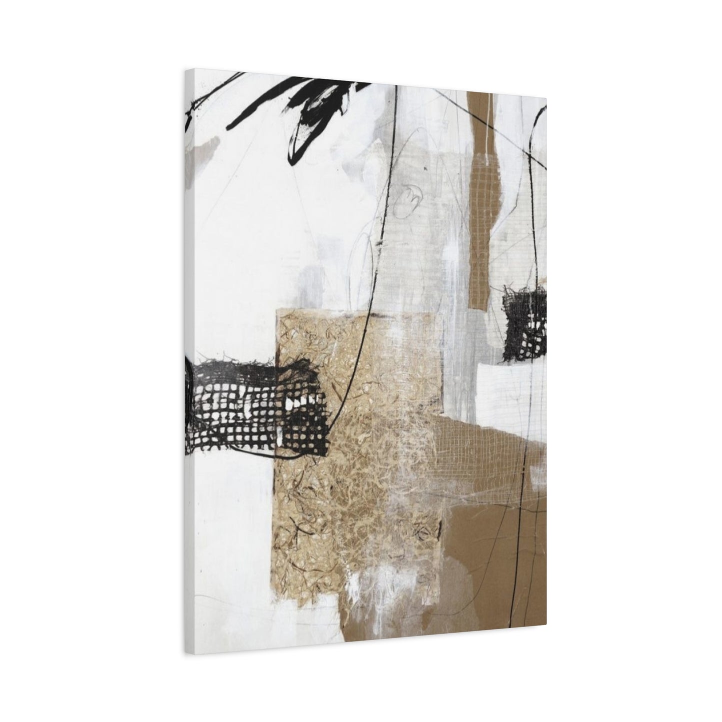
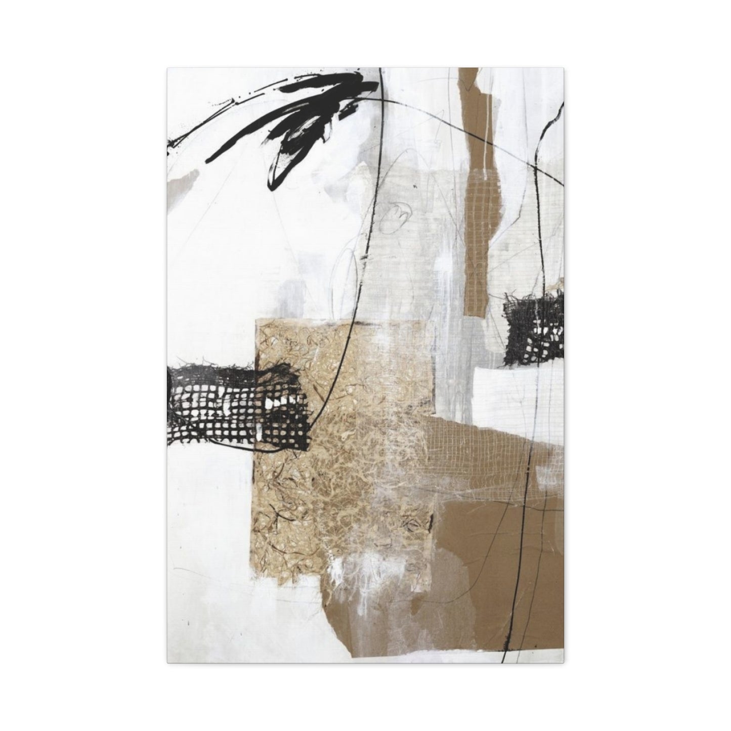
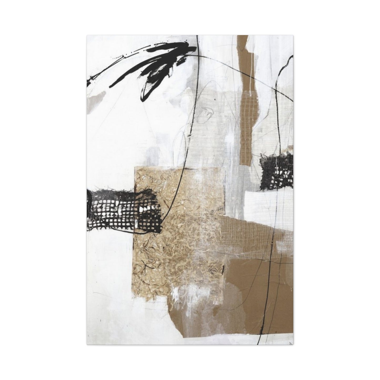
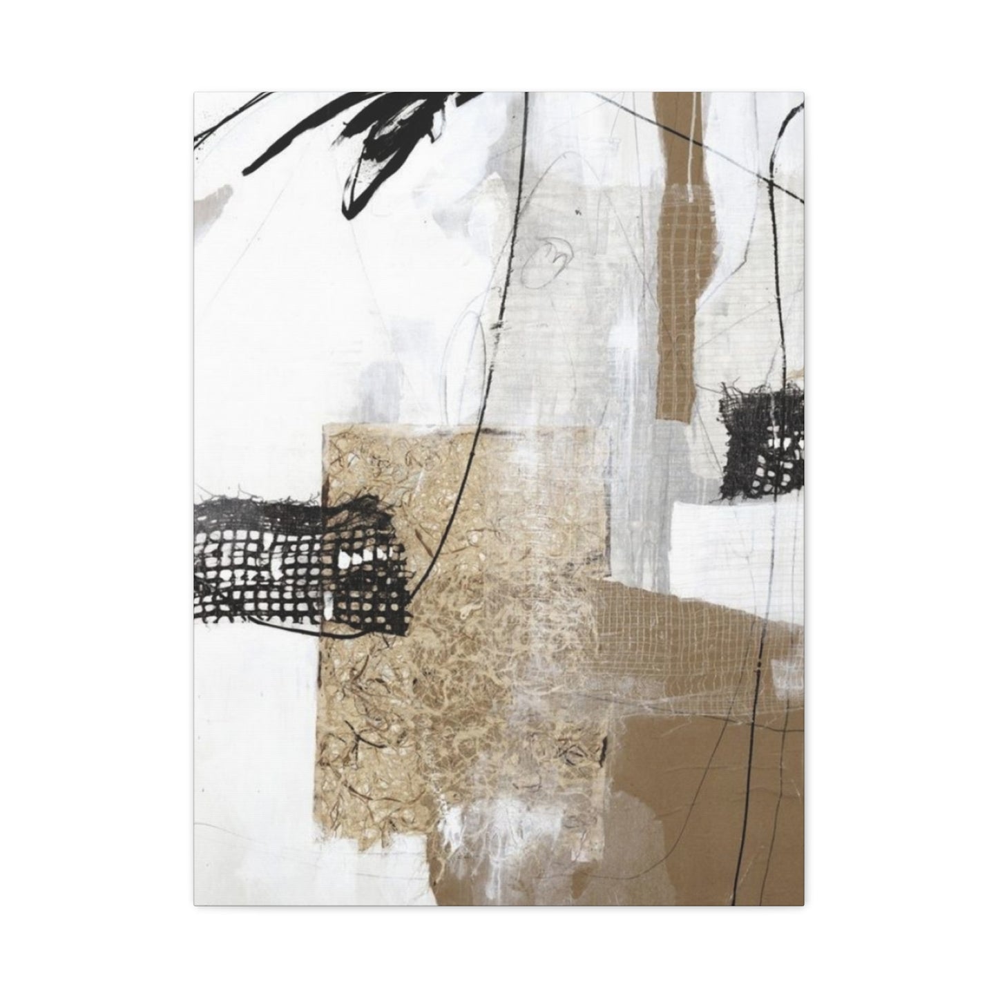
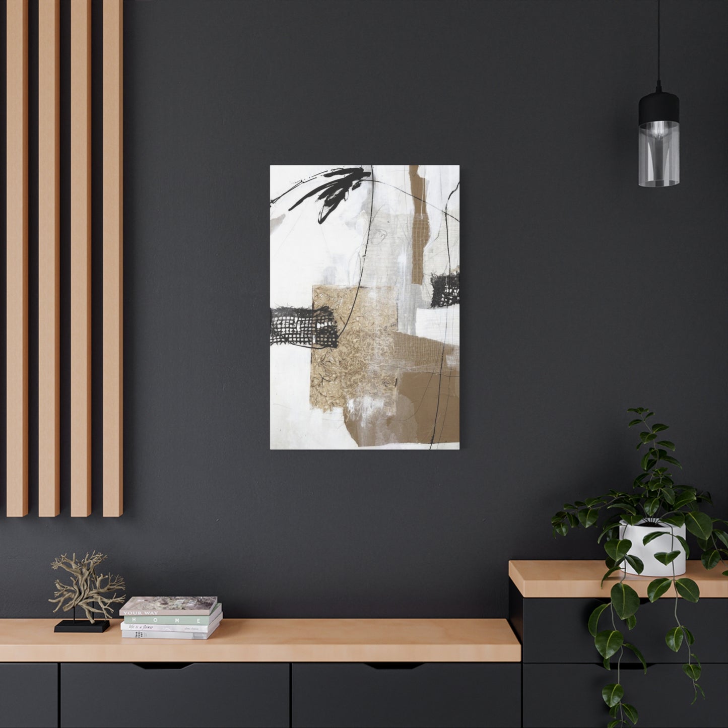
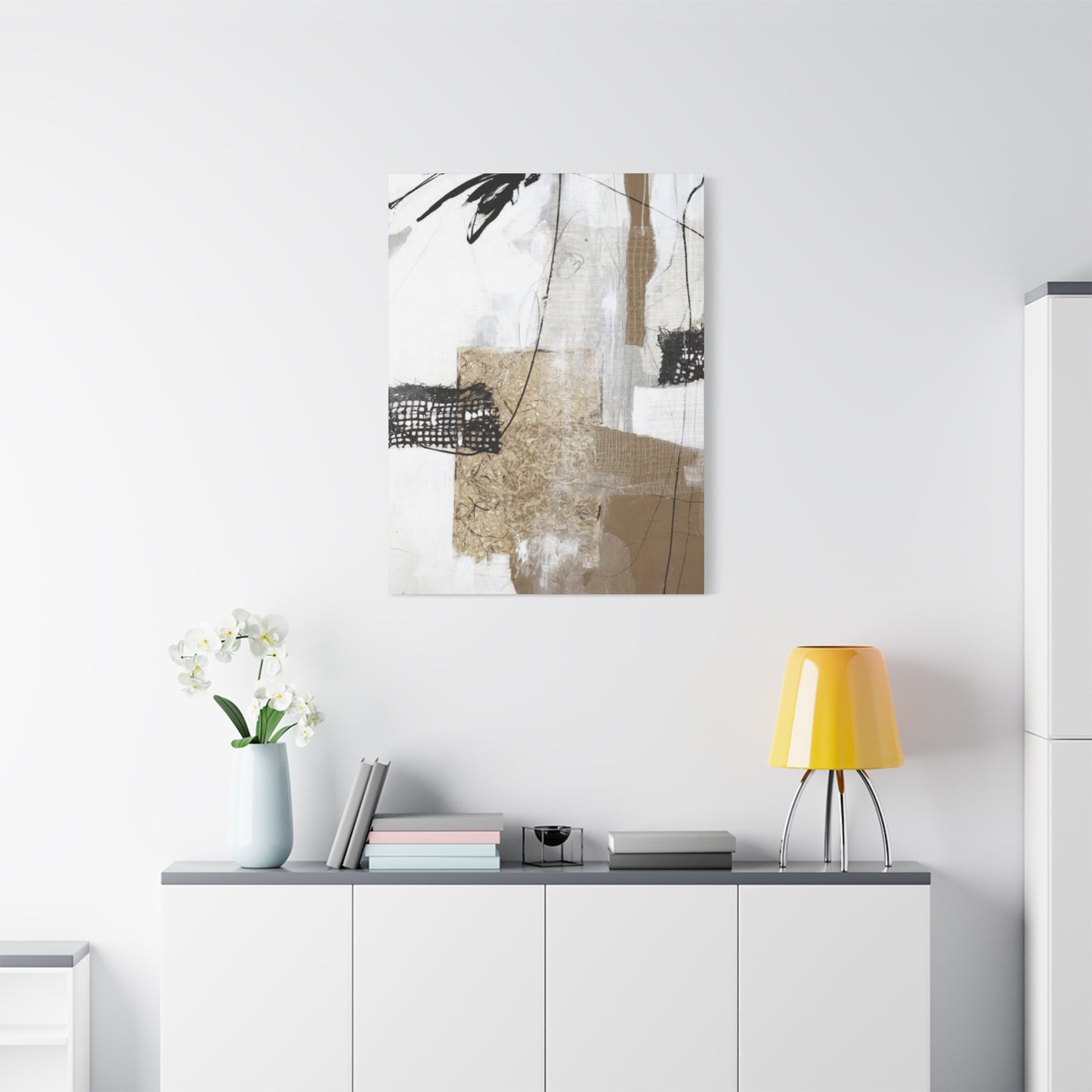
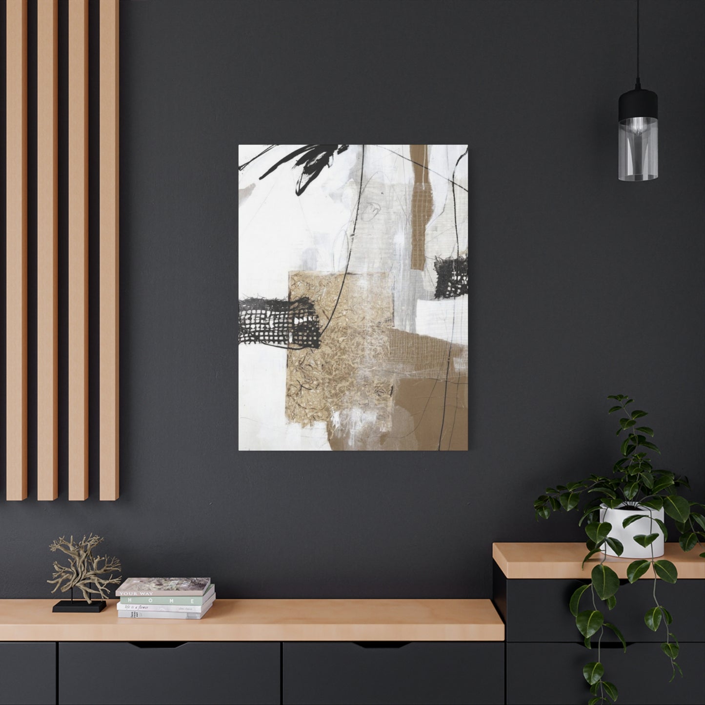
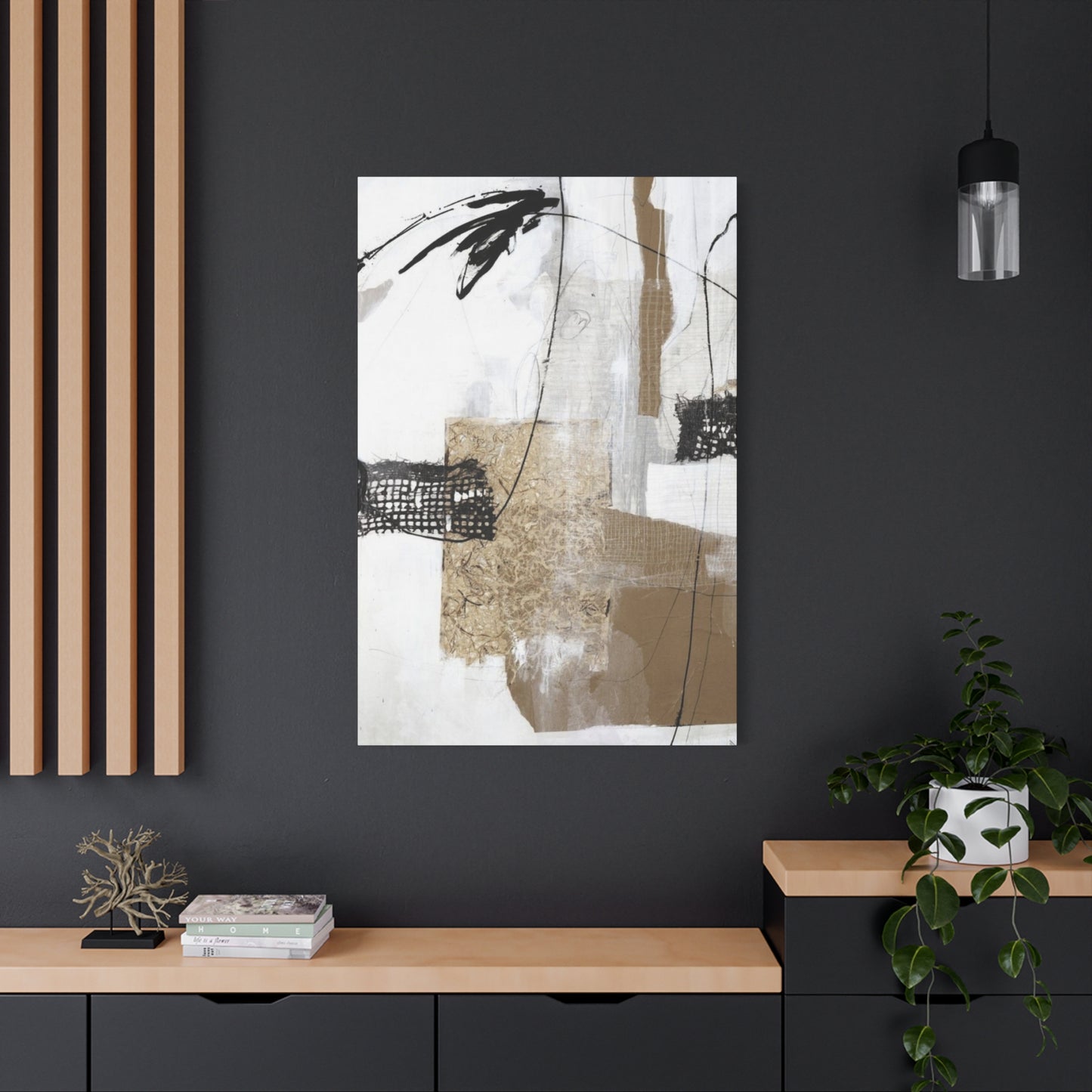
Texture Abstract Painting Mixed Media Wall Art & Canvas Prints
Texture Abstract Painting Mixed Media Wall Art & Canvas Prints
Couldn't load pickup availability


Abstract Mixed Media Wall Art: Creating Stunning Textured Paintings for Modern Spaces
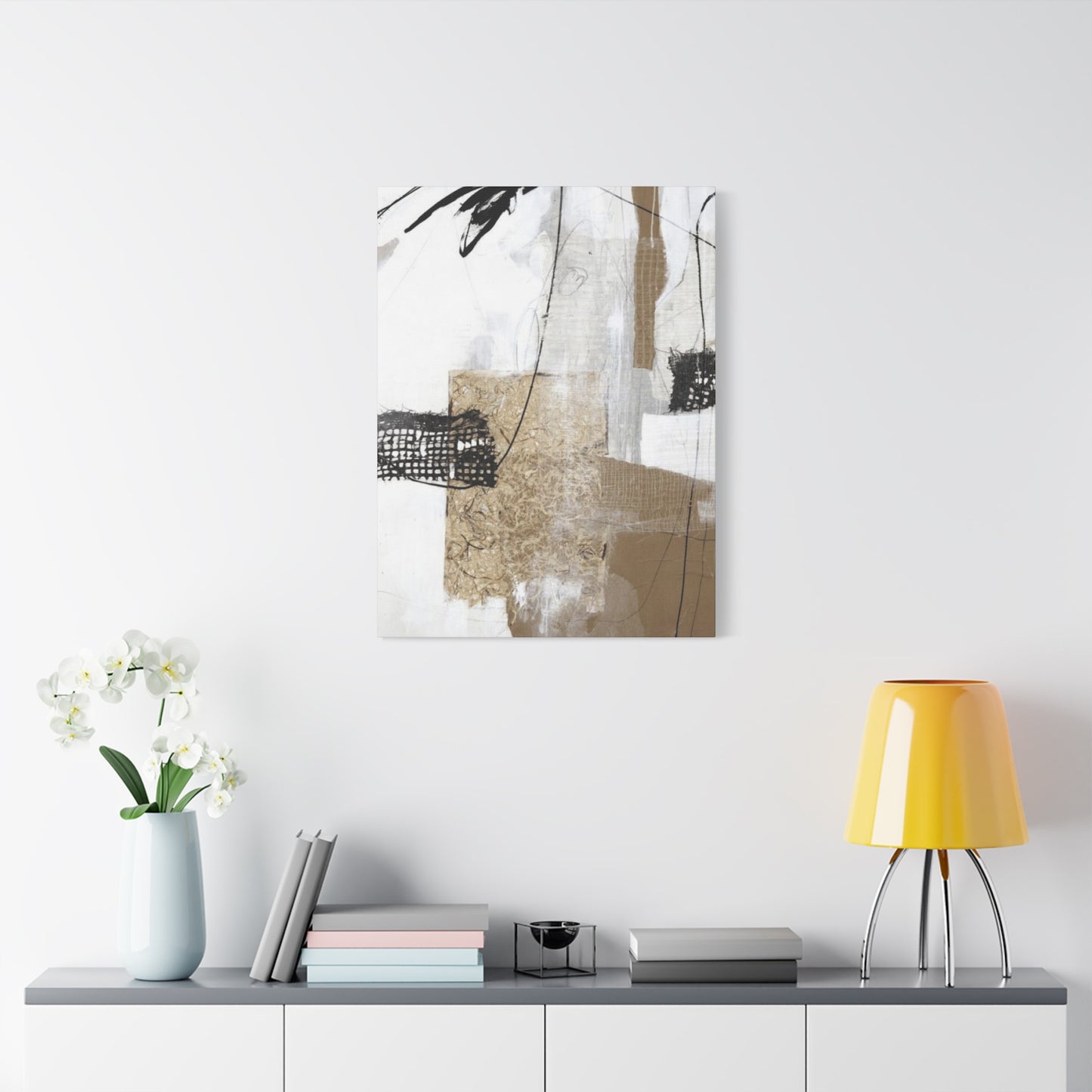
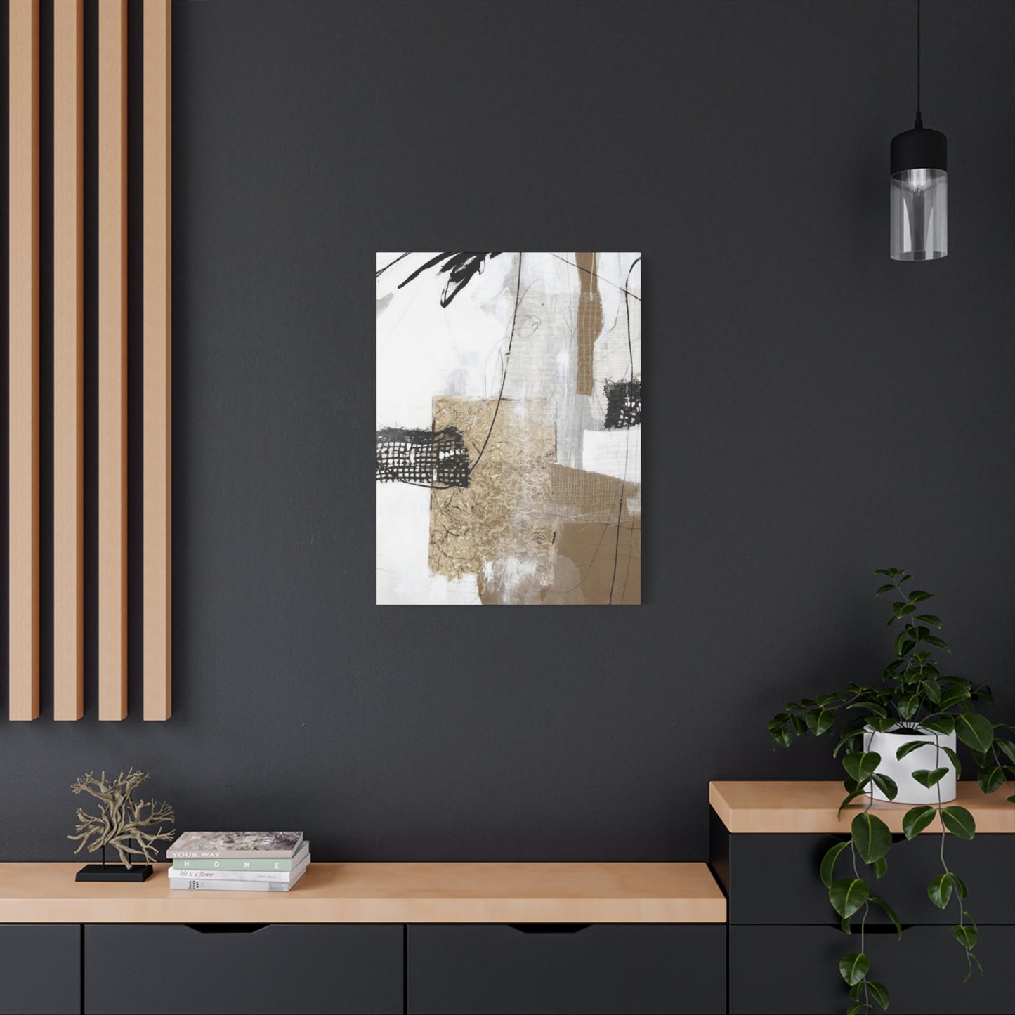
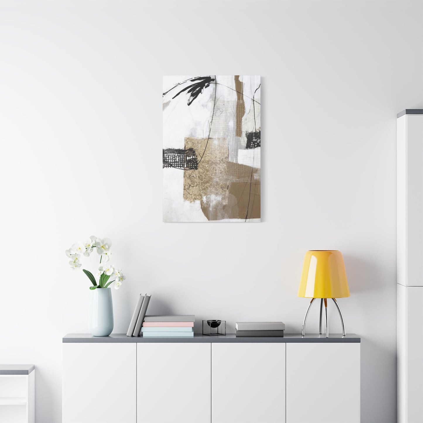
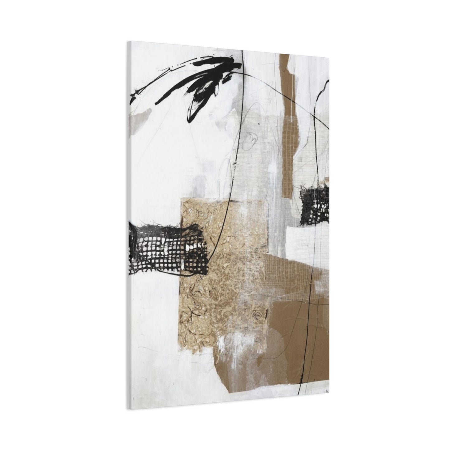
The world of contemporary interior design has witnessed a remarkable surge in the appreciation of textured abstract paintings that incorporate mixed media techniques on canvas. These artistic creations serve as focal points in modern living spaces, offering depth, dimension, and visual interest that flat artwork simply cannot match. The combination of various materials, layering techniques, and creative applications transforms ordinary canvases into extraordinary pieces that capture light, shadow, and emotion in ways that engage viewers on multiple sensory levels.
Abstract painting with mixed media represents more than just a decorative choice; it embodies a philosophy of artistic expression that breaks traditional boundaries. Artists working in this medium combine acrylics, oils, fabrics, papers, metals, and countless other materials to build surfaces that invite touch as much as they command visual attention. The textured nature of these works creates an interactive experience where changing light throughout the day reveals new aspects of the composition, making each viewing a unique encounter.
Canvas prints featuring texture abstract mixed media designs have become increasingly accessible to art enthusiasts and interior designers alike. Modern printing technologies now allow for the reproduction of original textured works with remarkable fidelity, capturing not just the colors and composition but also the dimensional qualities that make these pieces so compelling. These reproductions bring museum-quality art into homes, offices, and commercial spaces at prices that make sophisticated design accessible to a broader audience.
The Evolution of Mixed Media Artwork in Contemporary Spaces
Mixed media artwork has undergone significant transformation over recent decades, moving from experimental studios into mainstream acceptance as a legitimate and highly valued art form. The historical progression of this medium reflects broader cultural shifts toward embracing complexity, layering, and the integration of diverse elements into cohesive wholes. Early pioneers of abstract expressionism laid groundwork by challenging conventions about what painting could be, but contemporary mixed media artists have expanded these concepts exponentially.
The journey from traditional single-medium paintings to complex textured abstracts mirrors society's increasing comfort with complexity and multiplicity. Where previous generations might have valued the purity of oil on canvas or watercolor on paper, modern audiences appreciate the richness that comes from combining unexpected materials. This shift reflects a broader cultural appreciation for hybridity, fusion, and the creative possibilities that emerge when boundaries dissolve.
In contemporary art markets, textured abstract mixed media pieces command attention from collectors and casual buyers alike. The tactile quality of these works creates an immediate connection that transcends the purely visual. When someone encounters a heavily textured canvas, the natural impulse is to reach out and explore its surface, creating a multi-sensory engagement that flat paintings cannot provide. This physical dimension adds layers of meaning and experience that deepen the relationship between viewer and artwork.
The rise of social media platforms has amplified interest in textured abstract work considerably. Photographs and videos of these pieces reveal how light plays across dimensional surfaces, creating shadows and highlights that shift with viewing angle and time of day. This dynamic quality translates beautifully to digital formats, where artists can showcase their work from multiple perspectives, revealing the full complexity of their creative process and the finished piece.
Materials and Components in Textured Abstract Creation
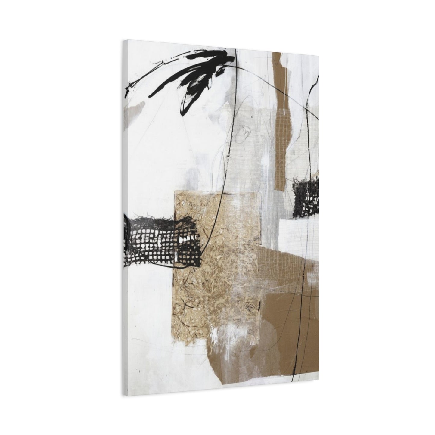
Creating textured abstract mixed media artwork requires an extensive palette of materials that extends far beyond traditional paints and brushes. Artists working in this medium often maintain studios filled with an eclectic collection of components gathered from art suppliers, hardware stores, fabric shops, and even nature itself. Each material brings unique properties that contribute to the final composition's visual and tactile character.
Acrylic paints form the foundation for many textured abstract pieces due to their versatility, quick drying time, and ability to accept additional materials. Heavy body acrylics provide substantial coverage and can be manipulated to create raised surfaces and bold strokes. Fluid acrylics allow for pouring techniques and smooth blending, while acrylic inks add intense color concentration. The water-based nature of acrylics makes them compatible with numerous other materials, and their quick drying time allows for rapid layering and building of complex surfaces.
Modeling paste, texture gels, and similar mediums enable artists to create substantial dimensional effects on canvas. These thick, paste-like substances can be applied with palette knives, trowels, or improvised tools to build up surfaces that project significantly from the canvas plane. Some texture mediums include aggregates like sand, pumice, or glass beads that add both visual and tactile interest. Others remain smooth but provide sufficient body to hold peaks, ridges, and sculptural forms that catch light dramatically.
Collage elements introduce entirely different visual languages into mixed media compositions. Papers of various weights, colors, and patterns can be adhered to canvas surfaces, then painted over, torn to reveal layers beneath, or left exposed as compositional elements. Fabric scraps bring textural variety and can suggest movement through their drape and weave. Metallic foils add reflective qualities that contrast beautifully with matte painted surfaces, creating focal points that shimmer as viewers move around the piece.
Found objects and unconventional materials push mixed media work into truly experimental territory. Artists incorporate everything from coffee grounds and sand to metal hardware, dried plants, and industrial materials. Each addition must be carefully considered for both aesthetic impact and practical concerns like adhesion, weight, and long-term stability. The most successful pieces integrate these diverse elements so thoroughly that they feel essential rather than arbitrary, each component contributing meaningfully to the overall composition.
Resin and varnishes serve dual purposes in textured abstract work, providing both protection and additional visual effects. Poured resin creates glossy, glass-like surfaces that can encase other materials, preserving collage elements and adding incredible depth to painted layers. Resin can be tinted, mixed with pigments, or left clear to showcase work beneath. Varnishes in various finishes allow artists to control surface sheen, from completely matte to high gloss, and protect vulnerable materials from environmental damage.
Layering Techniques That Create Dimensional Impact
The art of layering distinguishes truly compelling textured abstract work from simple painted surfaces. Successful layering involves strategic decisions about sequence, materials, and techniques that build visual complexity while maintaining compositional coherence. Artists must think simultaneously as painters and sculptors, considering how each addition affects not just color and form but also physical depth and shadow patterns.
Building an underpainting establishes the foundational structure upon which all subsequent layers rest. This initial stage often involves bold color choices, gestural mark-making, and establishing primary compositional movements. Many artists work loosely at this stage, allowing intuition and spontaneity to guide decisions. The underpainting may be partially or completely obscured by later layers, but its influence remains, providing glimpses of color that peek through and establishing an energetic foundation that informs everything built upon it.
Texture application typically occurs in multiple passes rather than a single heavy layer. This approach allows for more nuanced control over surface quality and prevents cracking or separation that can occur when very thick layers are applied all at once. Artists might apply a medium-weight texture layer, allow it to dry completely, then add another layer that partially covers the first, creating interesting transitions and varied surface heights. This incremental approach also allows for course corrections as the piece develops.
Glazing techniques add luminosity and color depth that transforms textured surfaces. Thin, transparent layers of diluted paint or glazing medium allow underlying layers to show through while shifting their color values. On textured surfaces, glazes settle differently in peaks and valleys, creating automatic shading effects that enhance dimensional qualities. Multiple glaze layers can be built up to achieve incredibly rich, complex colors that seem to glow from within the canvas.
Scraping, sgraffito, and subtractive techniques introduce deliberate imperfections and reveal hidden layers. After applying paint or texture medium, artists can use various tools to remove material selectively, creating patterns, revealing underlayers, or simply adding visual variety. This push-pull relationship between adding and removing creates surfaces with authentic character that reflects genuine creative process rather than overly controlled perfection.
Incorporating collage elements mid-process rather than at the beginning or end creates the most integrated results. When papers, fabrics, or other flat materials are added to partially completed pieces, then painted over and worked into, they become truly part of the composition rather than appliques sitting on top. Edges can be softened with paint, portions can be torn away to reveal layers beneath, and the entire piece develops as a unified whole.
Color Theory Applications in Abstract Mixed Media Compositions
Color selection and application in textured abstract mixed media work requires understanding how hues interact not just side by side but also in layered, dimensional contexts. The physical texture of surfaces affects how colors are perceived, with the same pigment appearing different on smooth versus heavily textured areas due to how light strikes and reflects from varied surfaces. Artists working in this medium must consider color theory fundamentals while also accounting for these textural variables.
Complementary color schemes create dynamic tension that energizes abstract compositions. When colors opposite each other on the color wheel appear in close proximity, they intensify each other's appearance, creating vibrant contrasts that draw the eye. In textured work, these relationships can be enhanced by applying complementary colors to different surface levels, with one hue dominating raised areas and its complement settling into recesses, creating dimension through both physical structure and color relationship.
Analogous color palettes offer harmonious, cohesive feeling that works beautifully in spaces where artwork should provide visual interest without overwhelming. Using colors adjacent on the color wheel creates smooth transitions and gentle progressions that feel naturally related. Textured surfaces with analogous colors create subtle variety through how light interacts with dimensional elements, allowing the same hue to appear slightly different depending on whether it occupies a peak, valley, or flat plane.
Monochromatic approaches prove that texture can carry visual interest even when color variety is minimal. Working with a single hue in various values and saturations demonstrates how much richness can be achieved through dimensional manipulation alone. These pieces often translate particularly well to spaces with established color schemes, as they provide substantial visual impact without introducing competing color elements that might clash with existing decor.
Temperature contrast between warm and cool colors creates spatial illusion and emotional resonance. Warm colors like reds, oranges, and yellows appear to advance toward viewers, while cool blues, greens, and purples recede. In abstract compositions with varied texture, these temperature relationships can be emphasized by applying warm colors to raised elements and cool colors to recessed areas, or inverted for different effects. The psychological associations of warm colors with energy and cool colors with calm can be manipulated to create desired emotional responses.
Neutral foundations provide breathing room within complex compositions and allow brighter colors to achieve maximum impact. Whites, grays, blacks, and earth tones create visual rest areas that prevent compositions from becoming overwhelming. In heavily textured pieces, neutrals also showcase dimensional qualities effectively, as light and shadow become more prominent when not competing with intense hues. Many successful mixed media works feature extensive neutral areas with strategic color accents that draw focus to specific compositional elements.
Metallic and iridescent pigments introduce additional complexity to color relationships by shifting appearance based on viewing angle and lighting conditions. These special-effect colors can appear completely different from various perspectives, adding an element of discovery and change that keeps pieces visually engaging over time. When incorporated into textured surfaces, metallics catch light on raised areas while leaving recesses dark, creating dramatic contrasts that emphasize dimensional qualities.
Compositional Strategies for Balanced Abstract Work
Creating compelling composition in abstract mixed media requires balancing freedom and spontaneity with underlying structural principles that guide viewer attention and create visual satisfaction. Unlike representational work where subject matter provides inherent focus, abstract pieces must rely entirely on formal elements including line, shape, value, texture, and color distribution to achieve balanced, engaging compositions.
The rule of thirds, borrowed from photography and traditional painting, provides a framework for positioning key compositional elements. Dividing the canvas into a three-by-three grid creates four intersection points where placing focal areas tends to create more dynamic, interesting compositions than centering elements. In abstract work, these focal points might be marked by color intensity, textural concentration, contrasting elements, or any feature that commands visual attention. Even when working intuitively, awareness of these compositional sweet spots helps create balanced pieces.
Directional movement guides viewer eyes through compositions, creating visual journeys that keep engagement high. Artists can establish movement through gestural marks, repeated shapes, color progressions, or any element that creates implied motion. In textured abstract work, physical ridges, valleys, and applied elements can literally point in directions that lead eyes through the piece. Circular movements create contained, contemplative feelings, while diagonal movements generate energy and dynamism.
Balance can be achieved through symmetry or asymmetry, each creating different effects. Symmetrical compositions feel stable, formal, and calm, with visual weight distributed evenly across a central axis. Asymmetrical balance requires more nuanced judgment, distributing different elements of varying visual weight across the composition so that no area feels abandoned or overwhelmed. A small area of intense color or heavy texture can balance a larger area of more subtle elements, creating dynamic equilibrium.
Contrast serves as the primary tool for creating visual interest and establishing hierarchy within compositions. High contrast between light and dark values, smooth and rough textures, or intense and muted colors creates dramatic focal points and energetic tension. Lower contrast produces gentler, more harmonious effects. Strategic contrast placement directs viewer attention to intended focal areas while allowing other regions to support without competing.
Negative space, the empty or less-active areas within compositions, provides essential breathing room and helps define positive elements. In abstract mixed media work, negative space might be relatively smooth areas that offset heavily textured regions, or quiet color zones that make active areas more prominent. The relationship between active and quiet areas creates rhythm and prevents visual exhaustion from too much stimulation across the entire canvas.
Unity and variety must be carefully balanced to create compositions that feel coherent yet interesting. Unity comes from repeated elements, consistent color relationships, or overarching themes that tie disparate parts together. Variety prevents monotony through introducing differences in scale, texture, color, or treatment across the composition. The most successful pieces achieve enough unity that all elements feel related while incorporating sufficient variety to maintain visual engagement.
Surface Preparation Methods for Canvas Foundation
Proper canvas preparation establishes the foundation for successful textured abstract mixed media work, affecting how materials adhere, how the surface accepts paint, and the long-term stability of the finished piece. While it might be tempting to skip preparatory steps in eagerness to begin the creative process, time invested in proper preparation pays dividends in better results and lasting quality.
Stretched canvas remains the most popular support for mixed media work, offering flexibility, lightweight portability, and compatibility with various materials. Pre-stretched canvases provide convenience, but many artists prefer to stretch their own, allowing complete control over tension, corner construction, and canvas quality. The stretching process itself becomes meditative preparation for creative work ahead, and custom stretching enables unusual sizes or proportions not available commercially.
Priming creates a barrier between canvas fibers and applied materials, preventing paints from soaking into fabric and causing degradation over time. Gesso, a white primer composed of binder, pigment, and sometimes calcium carbonate, provides traditional priming that creates a bright, slightly absorbent surface ideal for accepting paint and texture mediums. Multiple thin coats applied with brush or roller create better surfaces than single thick applications, which can crack when canvas flexes.
Tinted grounds eliminate stark white surfaces and establish immediate color context for subsequent layers. Adding small amounts of acrylic paint to gesso creates custom-colored primers that can dramatically affect the mood and appearance of finished work. Warm-tinted grounds push colors toward warmth, while cool grounds create different effects. Some artists prepare multiple canvases with various ground colors, then select the most appropriate for specific pieces as compositions develop.
Texture can be introduced at the priming stage, creating interesting surfaces before painting even begins. Applying gesso with palette knives, combs, or textured rollers establishes dimensional foundations that influence everything built upon them. Some artists deliberately create rough, uneven grounds that will catch paint interestingly or provide unexpected visual effects as work progresses. Others prefer smooth grounds that won't interfere with intentional texture additions later.
Sealing particularly absorbent canvases prevents excessive paint absorption that can dull colors and waste materials. Some lower-quality canvases or those made from very absorbent fibers benefit from additional sealing beyond standard priming. Clear acrylic mediums can be applied over primed surfaces to reduce absorbency without affecting color. This proves especially useful when working with expensive pigments or when saturated colors are desired.
Hardboard, wood panels, and other rigid supports offer alternatives to stretched canvas for mixed media work. These surfaces provide absolutely flat planes that don't flex, making them ideal for very heavy texture applications or pieces incorporating weighty found objects. Rigid supports require similar priming to canvas but won't bounce or spring when pressure is applied during texture building. They also eliminate concerns about sagging over time from heavy material applications.
Color Mixing Strategies for Nuanced Palette Development
Developing sophisticated color palettes through strategic mixing separates amateur efforts from professional-quality work in abstract mixed media painting. While convenience might suggest using colors straight from containers, custom-mixed hues create visual coherence and subtle relationships that unify compositions. Understanding color mixing empowers artists to achieve exactly the tones desired rather than settling for approximations from available manufactured colors.
Primary color systems provide frameworks for mixing virtually any hue from limited starting palettes. Traditional primaries of red, yellow, and blue offer one approach, while modern color theory often uses cyan, magenta, and yellow as primaries that create brighter secondaries. Many professional artists maintain two versions of each primary, one warm and one cool, providing six core colors that enable mixing of virtually any hue without muddiness. This limited palette approach forces color relationships that create natural harmony throughout pieces.
Understanding color bias prevents disappointment when mixtures turn muddy or unexpected. Every manufactured color leans toward either warmth or coolness relative to its nominal hue. A red might lean orange or purple, a blue might tend toward green or violet. When mixing secondaries, using primaries that lean toward the desired outcome produces cleaner, brighter results. Combining a yellow leaning toward orange with a red leaning toward orange produces vibrant oranges, while mixing a yellow leaning toward green with a red leaning toward purple creates duller, browner results.
Value control through mixing with white or black requires understanding how different pigments respond. Some colors, particularly earth tones, accept substantial white before losing color identity, while others, especially intense transparents, become chalky quickly when lightened. Black added to most colors creates dead, muddy versions rather than simply darker values. Better results come from darkening colors with complementary hues or darker versions of related colors, creating richer, more complex darks that maintain color vitality.
Creating transitional colors that bridge between major hues establishes color relationships that unify compositions. When using several distinct colors in a piece, mixing portions of adjacent colors together creates intermediary tones that smooth transitions and relate all elements. If working with blue and orange, for instance, creating several blue-orange mixtures in varying proportions provides transition tones that connect these complementary colors harmoniously rather than creating jarring jumps.
Neutrals mixed from complementary pairs or triads create sophisticated grays and browns more interesting than those mixed from black and white alone. Combining complements in varying proportions produces neutral tones that lean toward one component or the other, creating related families of neutrals with underlying color character. These colored neutrals feel vibrant even in their subtlety, providing sophisticated alternatives to pure black or gray that would feel dead by comparison.
Recording color formulas enables consistent palette development and helps build personal color libraries over time. When achieving particularly successful mixtures, noting the proportions and components allows recreation for later use or future pieces. Some artists maintain color journals with painted swatches and mixing notes, building personalized references that document their evolving color sensibilities and providing inspiration for new work.
Tool Selection and Application Methods for Texture Building
The tools used to apply and manipulate materials dramatically affect the character of textured abstract mixed media work. While brushes remain relevant, expanding the tool collection to include unconventional implements opens creative possibilities that generate unexpected, exciting results. Professional artists often maintain extensive collections of application tools gathered from art suppliers, hardware stores, kitchens, and anywhere else promising implements appear.
Palette knives in various shapes and sizes enable direct, gestural application of thick materials and create distinctive mark-making opportunities. Straight-bladed knives work well for spreading texture mediums smoothly or creating flat planes of color. Angular knives facilitate precision work and detailed manipulations. Flexible knives bend to canvas contours and enable smooth blending, while stiffer blades maintain their shape, producing more definite marks and edges. The edge of a palette knife creates fine lines and can scrape through wet layers to reveal colors beneath.
Squeegees, trowels, and spatulas borrowed from construction and kitchen contexts provide larger-scale texture application capabilities. These tools enable covering significant canvas areas quickly with texture mediums or paint, creating bold, confident surfaces that smaller tools cannot match. The hard edges of these implements produce clean, definite marks with character distinctly different from softer brush applications. Variations in pressure create interesting effects, from thin, dragged applications to thick, built-up deposits.
Textured rollers, stamps, and printing tools transfer patterns onto surfaces through pressing actions. These tools can apply paint, texture medium, or simply create impressions in wet materials already on canvas. Found objects with interesting textures become stamps when pressed into wet texture paste, leaving their patterns embedded in surfaces. Bubble wrap, corrugated cardboard, mesh screens, and countless other materials create distinctive pattern effects that would be impossible to achieve through painting alone.
Brushes remain valuable for specific applications despite the expanded tool palette. Stiff bristle brushes enable aggressive scrubbing that forces paint into canvas weave or texture medium valleys, ensuring complete coverage. Soft brushes facilitate smooth glazing and delicate color applications. Fan brushes create unique mark qualities useful for suggesting movement or vegetation. Worn-out brushes with splayed bristles produce effects impossible with new brushes, making them valuable for specific applications.
Sprayers, drippers, and pouring techniques introduce elements of controlled chaos that energize abstract compositions. Spray bottles filled with diluted paint create mist effects and spatter patterns that add visual excitement. Dripping paint from brushes or directly from containers produces organic lines and splashes that reference action painting traditions. Pouring creates flowing, unpredictable color interactions that can be guided but never completely controlled, introducing spontaneity that keeps work feeling alive and fresh.
Alternative mark-making tools including sticks, cardboard edges, sponges, rags, and even fingers enable expressive, varied surface development. Each tool produces characteristic marks that become part of an artist's visual vocabulary. Experimentation reveals unexpected tool behaviors, with discoveries often leading to signature techniques that distinguish individual artistic voices. Building a diverse tool collection and remaining open to unconventional implements expands creative possibilities exponentially.
Creating Focal Points Through Strategic Texture Concentration
Successful abstract compositions require clear focal areas where viewer attention naturally settles, even within pieces that reject representational imagery. Texture provides powerful tools for creating these focal points, with concentrated dimensional activity drawing eyes irresistibly. Strategic placement and treatment of heavily textured areas guides viewer experience and prevents compositions from diffusing into undifferentiated surfaces without visual hierarchy.
Texture concentration creates focal points through simple visual principle that areas of greatest activity attract attention first. Placing the most dramatic texture variations, highest relief, or most complex surface treatments in intended focal zones ensures viewer eyes settle there initially. These areas become compositional anchors from which exploration of the rest of the piece proceeds. The contrast between highly textured focal areas and relatively calmer surrounding regions emphasizes the importance of textured zones.
Color intensity combined with texture amplifies focal point strength significantly. While texture alone draws attention, pairing dimensional emphasis with saturated, vivid color creates nearly irresistible visual magnetism. The combination works synergistically, with color attracting attention across distance while texture maintains interest upon closer approach. This double emphasis ensures focal areas command attention from both far away and near viewing distances.
Directional elements leading toward focal points enhance their effectiveness by guiding viewer eyes deliberately. Lines, shapes, or textural ridges that point toward or flow into focal zones create visual pathways that channel attention purposefully. These directional cues can be subtle, requiring only slight alignments of compositional elements, or obvious, using bold linear elements that unmistakably direct focus. Multiple directional indicators converging on focal points from different canvas areas create particularly strong effects.
Scale variation creates focal emphasis through simple contrast between large and small elements. An area featuring many small, detailed texture variations surrounded by broader, simpler expanses becomes a natural focal point. Conversely, a single large textured element amidst smaller-scale surface treatments commands attention through its dominating presence. The principle operates regardless of specific scale; what matters is the contrast between focal point scale and surrounding area scale.
Edge quality affects focal point definition and character. Hard, definite edges separating focal areas from surroundings create bold, graphic emphasis that reads clearly even from distance. Soft, gradual transitions produce gentler focal points that invite sustained contemplation without announcing themselves dramatically. Some focal points benefit from mixed edge quality, with portions sharply defined and others softly transitioning, creating visual interest through this variation alone.
Multiple focal points require careful management to prevent competition that leaves viewers uncertain where to look. When compositions include several emphasis areas, varying their strength creates hierarchy with primary, secondary, and tertiary focal zones. The strongest focal point typically occupies compositionally significant locations while secondary emphasis areas provide supporting interest that enriches exploration without competing for primary attention. Balance and spacing between multiple focal points ensures they enhance rather than fragment overall composition.
Incorporating Metallic Elements for Reflective Dimension
Metallic materials introduce unique visual properties into textured abstract mixed media work, adding reflective qualities that shift dramatically with lighting changes and viewing angles. These special elements create dynamic surfaces that never appear quite the same twice, as moving light sources or shifting viewer positions reveal different aspects. Strategic metallic incorporation adds sophistication and contemporary appeal while creating genuine dimensional interest through reflective properties.
Metallic paints and pigments provide accessible entry into reflective effects without requiring specialized techniques. Acrylic metallic paints come in various metal tones including gold, silver, copper, bronze, and modern metallics like rose gold. These paints can be applied directly or mixed with regular acrylics to create custom metallic tones. When used on textured surfaces, metallics catch light on raised areas while leaving valleys dark, automatically emphasizing dimensional qualities and creating sparkling effects that animate surfaces.
Metallic leaf application requires specialized techniques but produces unmatched brilliance and authentic metal appearance. Gold, silver, and copper leaf come in extremely thin sheets that adhere to surfaces coated with sizing adhesive. Applying leaf to textured substrates creates especially dramatic effects, with metal conforming to dimensional surfaces and catching light intensely. Leaf can be applied smoothly for continuous metal surfaces or broken into fragments for more varied, weathered effects.
Metallic foils and transfer films offer alternatives to traditional leaf that accommodate different aesthetic goals. These materials come in sheets that can be cut into shapes, then transferred to canvas surfaces using adhesive or heat. Foils produce bright, modern metallic effects perfect for contemporary abstract work. The variety of available colors and patterns, including holographic effects, creates options beyond traditional metal tones. Layering foils under subsequent paint applications allows metallic glimpses to emerge, creating mysterious depth.
Metal hardware and findings incorporated as collage elements introduce genuine metal presence with three-dimensional projection. Washers, mesh, chains, wire, and other metal objects bring industrial character and authentic metallic qualities that painted or leafed effects cannot fully replicate. These elements require secure attachment and consideration of weight distribution, but they create compelling focal points with strong material presence that contrasts beautifully with softer painted and textured surfaces.
Interference and iridescent mediums create color-shifting effects that change with viewing angle even without metallic content. These special acrylic mediums contain particles that refract light, producing colors that shift from blue to purple, green to gold, or other combinations depending on perspective. When mixed with regular paints or applied over textured surfaces, they create subtle, mysterious color changes that reward close attention and extended viewing.
Strategic metallic placement maximizes impact while avoiding overwhelming compositions. Rather than coating entire surfaces with metallic materials, selective application creates accents that draw attention to specific areas. Metallic elements work particularly effectively in focal points or areas where highlighting serves compositional goals. Balancing metallic passages with matte surfaces creates contrast that emphasizes both the sparkle of metallics and the absorption of flat areas.
Incorporating Papers and Fabrics Into Mixed Media Layers
Paper and fabric collage elements introduce different visual textures and material qualities that enrich abstract mixed media compositions significantly. These additions bring inherent patterns, weaves, and physical character distinct from painted surfaces, creating visual complexity through actual material variety. Successful integration requires thinking beyond simple adhesion to consider how papers and fabrics interact with surrounding elements and contribute meaningfully to overall compositions.
Paper selection from the enormous variety available offers virtually unlimited options for color, pattern, texture, and transparency. Handmade papers bring organic texture with visible fibers and irregular edges that create authentic, artisanal character. Decorative papers featuring printed patterns, metallic inclusions, or special finishes introduce design elements impossible to achieve through painting alone. Tissue papers and other translucent options create layering effects where underlying elements remain visible through veils of color.
Fabric inclusion brings textile weaves, drapes, and material properties into compositions, creating tactile interest distinct from any other element. Natural fabrics like linen, cotton, or burlap introduce earthy, organic character with visible weave patterns that read strongly even under subsequent paint layers. Synthetic fabrics including sheers, metallics, and technical textiles offer contemporary material qualities perfect for modern abstract work. The way fabric wrinkles, folds, and drapes introduces movement suggestions that planar materials cannot match.
Adhesion techniques must be appropriate for specific papers and fabrics to ensure permanent bonding without warping or degradation. Gel mediums designed for collage work provide strong adhesion while remaining flexible enough to accommodate canvas movement. Matte mediums maintain surface consistency, while gloss mediums add sheen to adhered elements. The adhesive should be applied to both canvas and material back, then the element should be burnished firmly to ensure complete contact without air bubbles or lifting edges.
Layering collage elements with paint and texture mediums creates the most integrated results where all components feel unified rather than separate. Painting over portions of adhered papers and fabrics while leaving other areas exposed creates transition zones where collage and painting merge. Texture mediums applied over fabric edges soften transitions and help embed materials into surfaces. Tearing rather than cutting papers creates feathered edges that blend more naturally when painted over.
Transparency and translucency effects emerge when layering multiple collage elements or applying them over painted backgrounds. Sheer fabrics and thin papers allow underlying colors and patterns to show through, creating optical mixing effects and visual depth. Multiple layers of translucent materials build color intensity gradually while maintaining luminous quality. These effects create mystery and complexity that invites sustained observation.
Collage element aging and distressing creates authentic weathered character that enhances vintage aesthetics or adds visual interest through apparent history. Techniques including tea staining papers, burning edges, crumpling and smoothing, tearing, and sanding alter pristine materials into components with apparent age and use. These treatments create surfaces that feel lived-in and authentic rather than artificially perfect. Combined with painting and texture work, aged collage elements contribute to rich, complex surfaces with visual depth that suggests accumulated time.
Developing Personal Style Through Experimentation and Repetition
Establishing distinctive personal style in abstract mixed media work emerges through sustained practice, deliberate experimentation, and gradual refinement of preferred techniques and aesthetic directions. While studying other artists provides inspiration and technical knowledge, true artistic voice develops through personal exploration that reveals individual preferences, strengths, and unique perspectives. The journey toward mature style requires patience, as distinctive characteristics emerge gradually through accumulated work.
Experimentation with diverse materials and techniques expands creative vocabulary and reveals unexpected preferences. Trying new tools, unusual materials, or unfamiliar processes pushes beyond comfortable habits into territory where discoveries wait. Some experiments fail completely, but even failures provide valuable information about personal preferences and which directions feel authentic. Successful experiments often become signature techniques that define individual style over time.
Repetition allows deep exploration of specific approaches rather than constant surface-level variety. Creating multiple works using similar palettes, techniques, or compositional strategies enables thorough investigation that reveals nuances invisible in single attempts. This serial approach uncovers what truly interests an artist about particular directions and builds facility with chosen methods. Comfort and confidence developed through repetition eventually enable innovations impossible when constantly switching approaches.
Studying completed work reveals patterns and preferences that operate unconsciously during creation. Reviewing body of work objectively, perhaps after time away from studio, shows which pieces feel most successful and personally satisfying. Analyzing these preferred works for common elements including color preferences, compositional patterns, texture approaches, or subject matter reveals unconscious tendencies that can be consciously developed. Conversely, identifying elements that appear frequently but feel unsatisfying enables deliberate elimination.
Influences from other artists should be acknowledged and internalized rather than imitated directly. Admiring another artist's work naturally affects personal development, but copying specific stylistic elements results in derivative work lacking authentic voice. Instead, identifying what specifically appeals about admired work and translating those broader concepts into personal interpretation creates genuine development. An artist might appreciate another's color relationships without replicating exact palettes, or admire compositional boldness while developing completely different specific compositions.
Constraints and limitations paradoxically enhance creativity by forcing inventive solutions within boundaries. Self-imposed restrictions including limited palettes, specific size formats, or particular material choices prevent default habits from dominating and push toward fresh approaches within parameters. These constraints might be temporary experiments or longer-term commitments, but they consistently generate creative problem-solving that expands artistic capabilities.
Evolution remains constant throughout artistic careers, with mature style continuously developing rather than reaching static conclusion. Artists who thrive creatively maintain openness to growth while honoring core sensibilities that define their work. Personal style provides coherent thread connecting body of work while allowing sufficient flexibility for development, experimentation, and response to new influences. The balance between consistency and evolution keeps work fresh for both artist and audience.
Applying Glazing Techniques for Depth and Luminosity
Glazing represents one of the most powerful techniques for adding visual depth, color complexity, and luminous quality to textured abstract mixed media paintings. This traditional method, adapted from old master painting techniques, involves applying thin, transparent layers of color over dried underlayers, allowing light to penetrate, reflect from lower layers, and travel back through transparent veils, creating optical mixing effects impossible to achieve through direct painting alone.
Understanding transparency versus opacity in pigments establishes foundation for effective glazing. Some pigments are inherently transparent, allowing light to pass through even when applied straight from container, while others are naturally opaque, blocking light and completely covering underlayers. Transparent pigments including quinacridone colors, phthalo blues and greens, and many earth tones make ideal glazing colors. Opaque pigments like cadmiums and titanium white work better for underlayers or require significant dilution for glazing applications.
Mixing glazing mediums with paint creates ideal consistency for transparent application. Pure acrylic glazing medium dilutes paint while maintaining proper binder content for adhesion and durability. The typical ratio ranges from four parts medium to one part paint, though adjustments accommodate specific pigment transparency and desired effect intensity. Too much paint creates semi-transparent rather than truly transparent applications, while too little produces washes that sink into surfaces rather than resting on top as luminous veils.
Layering multiple glazes builds extraordinary color complexity that direct mixing cannot replicate. When transparent red glaze covers dry blue underlayer, the optical mixing creates purple that appears to glow from within, distinctly different from purple mixed on palette then applied directly. Three, four, or more glazes can be built up, with each addition enriching color depth and creating sophisticated hues. Drying time between layers remains crucial, as applying glazes over even slightly damp underlayers can cause lifting and muddying.
Textured surfaces interact with glazes in particularly interesting ways, as transparent color settles differently in peaks versus valleys. Glazes naturally concentrate in recessed areas while remaining thinner on raised surfaces, automatically creating shading effects that enhance dimensional appearance. Multiple glazes amplify this effect, with each application further darkening valleys while raised areas remain relatively lighter. This automatic shading makes textured surfaces appear more three-dimensional than they are physically.
Selective glazing over specific composition areas rather than entire surfaces creates focal emphasis and color variety. Applying warm glazes to some regions while leaving others neutral or cooling with blue-green glazes creates temperature contrast that activates compositions. Concentrating multiple glaze layers in focal areas builds color intensity there while surrounding zones remain simpler, reinforcing visual hierarchy. This selective approach prevents uniformity that can flatten spatial interest.
Conclusion:
In conclusion, abstract mixed media wall art offers a dynamic and innovative way to infuse modern spaces with texture, depth, and visual intrigue. By combining various materials—such as acrylic paints, charcoal, fabric, metal, or even found objects—artists create multi-dimensional pieces that engage both the eye and the imagination. This form of art breaks free from traditional boundaries, allowing for a unique expression of emotion, movement, and creativity, making it an ideal choice for contemporary interiors.
The beauty of abstract mixed media lies in its ability to evoke different feelings and interpretations. Each piece invites viewers to explore and form their own connections to the textures, layers, and color contrasts. Whether it’s a bold splash of color, intricate patterns, or a more subdued, earthy tone, the abstract nature of mixed media art allows for infinite possibilities. In a modern home, such pieces become not just décor but conversation starters, offering endless layers of meaning and aesthetic appeal.
Incorporating textured abstract paintings into your space can instantly elevate a room, adding a contemporary flair and a sense of sophistication. These artworks have the ability to transform even the most minimalistic or traditional settings into visually stimulating environments, thanks to their vibrant energy and tactile quality. Abstract mixed media art allows you to play with color, form, and material, creating a balanced contrast that complements other modern elements in the room, such as sleek furniture, metallic accents, or minimalist décor.
Ultimately, abstract mixed media wall art is more than just a piece of decoration—it is a reflection of modern creativity and expression. The texture and layered depth of the artwork not only draw attention but also invite deeper exploration, making it a perfect addition to any modern space. Whether displayed in a living room, office, or gallery wall, these textured paintings bring a sense of energy, individuality, and contemporary style that can transform your home into a space of visual inspiration.
