


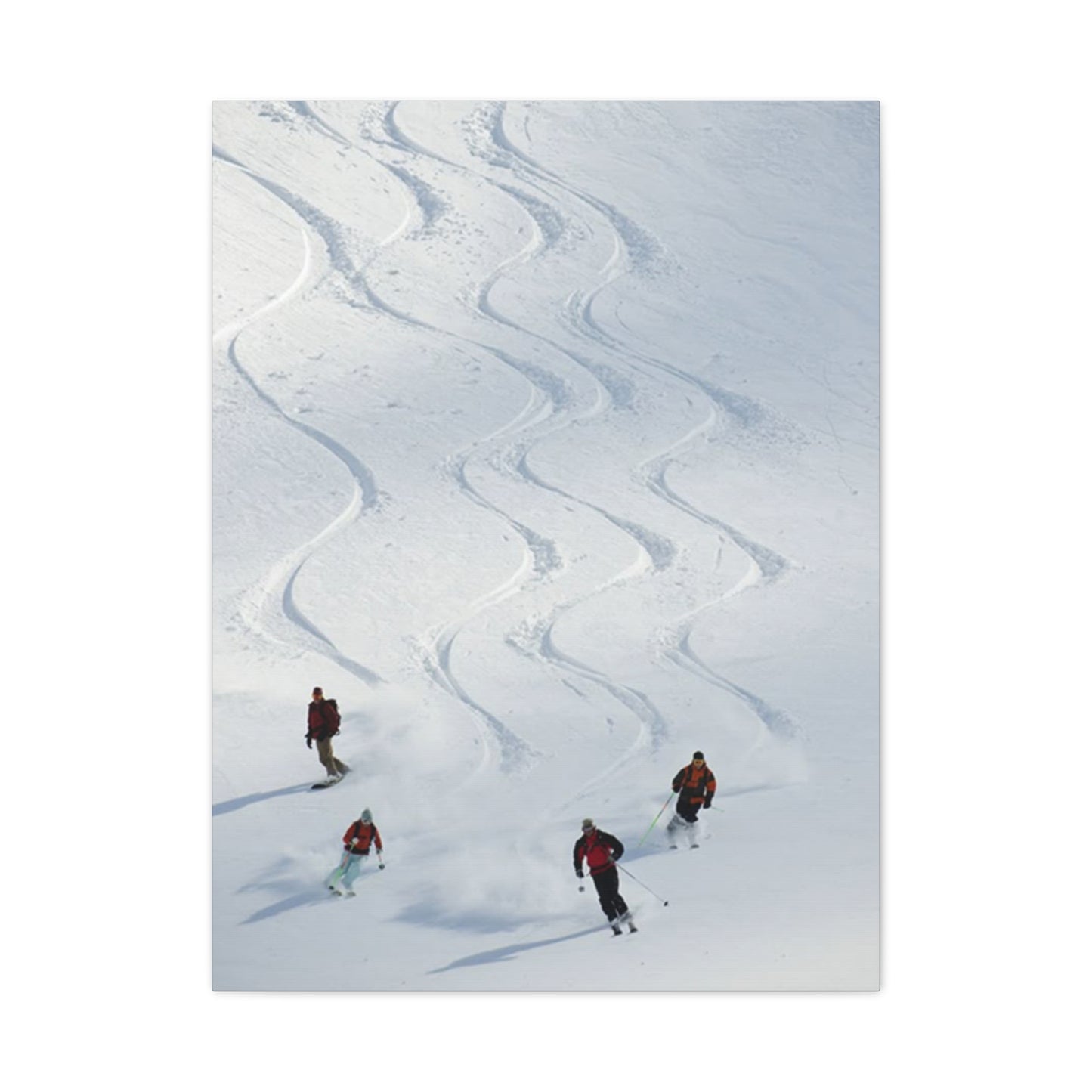
The Four Skiers Wall Art & Canvas Prints
The Four Skiers Wall Art & Canvas Prints
Couldn't load pickup availability

Decorating with Passion: Incorporating The Four Skiers Wall Art into Your Home
The world of interior design constantly evolves, bringing fresh perspectives on how we personalize our living environments. Among the most captivating trends emerging in contemporary home decoration is the incorporation of dynamic sports imagery, particularly winter athletics scenes that capture the essence of mountain adventures. Wall art featuring winter sports enthusiasts has become increasingly popular among homeowners, designers, and sports lovers who seek to infuse their spaces with energy, movement, and natural beauty.
When considering artwork that depicts athletic pursuits in snowy landscapes, the visual impact extends beyond simple decoration. These pieces serve as conversation starters, mood enhancers, and personal statements about lifestyle preferences and values. The representation of athletic figures navigating pristine mountain slopes creates an immediate connection with viewers, evoking memories of winter vacations, adrenaline-filled descents, and the crisp mountain air that invigorates the senses.
The appeal of such artwork transcends seasonal boundaries. While winter sports imagery naturally resonates during colder months, the timeless quality of well-executed pieces ensures year-round relevance. The dynamic composition of figures in motion against dramatic alpine backdrops creates visual interest that remains engaging regardless of the calendar date. Homeowners increasingly recognize that quality wall decor should not be confined to temporary seasonal rotations but should instead contribute to the permanent aesthetic identity of their spaces.
Canvas prints have emerged as the preferred medium for reproducing such imagery, offering numerous advantages over traditional framing methods. The gallery-wrapped presentation eliminates the need for additional framing, creating a contemporary, clean appearance that complements modern interior design philosophies. The texture of canvas adds depth and dimension to printed images, enhancing the visual experience in ways that flat paper prints cannot achieve.
Artistic Representation of Mountain Sports in Home Decoration
The intersection of sports photography and fine art creates unique opportunities for home decoration that satisfy multiple aesthetic and emotional needs. Mountain sports imagery occupies a special niche within this intersection, combining the raw power of athletic performance with the majestic beauty of natural landscapes. When selecting artwork for residential or commercial spaces, the visual narrative becomes paramount. Pieces that tell compelling stories through composition, color, and subject matter create lasting impressions that generic decorative items cannot match.
Artwork depicting winter athletes in action captures fleeting moments of human achievement against challenging environmental conditions. The contrast between human figures and vast mountain expanses emphasizes themes of determination, courage, and the pursuit of excellence. These universal themes resonate with diverse audiences, making such artwork suitable for various settings including family homes, professional offices, fitness facilities, and hospitality venues.
The technical aspects of capturing winter sports action require exceptional skill from photographers and artists. The high-speed nature of downhill activities demands precise timing and anticipation. The harsh lighting conditions typical of snowy environments present additional challenges, with bright reflective surfaces creating exposure difficulties that must be expertly managed. When these technical hurdles are successfully overcome, the resulting images possess dramatic qualities that translate beautifully to large-format canvas prints.
Color palettes in mountain sports artwork typically feature cool tones dominated by blues, whites, and grays, occasionally punctuated by the vibrant colors of athletic apparel. This natural color scheme offers versatility in interior design applications, complementing both warm and cool color schemes in existing decor. The predominantly neutral background allows the artwork to integrate seamlessly into various design contexts while the pops of color from clothing and equipment provide focal points that draw the eye and energize the space.
The compositional elements common in winter sports imagery often include diagonal lines created by slopes, vertical elements from trees and mountain peaks, and the curved trajectories of athletes in motion. These geometric components create visual dynamism that prevents the artwork from feeling static or lifeless. The eye naturally follows these lines through the composition, creating an engaging viewing experience that encourages prolonged contemplation rather than casual glances.
Selection Criteria for Quality Canvas Artwork
Choosing appropriate wall art requires consideration of multiple factors that extend beyond simple aesthetic preference. The quality of the print itself forms the foundation of any successful art installation. Canvas prints vary dramatically in quality depending on printing technology, ink formulations, canvas material, and finishing techniques employed during production. Understanding these variables enables informed purchasing decisions that result in satisfying long-term ownership experiences.
Print resolution stands as perhaps the most critical technical specification affecting perceived quality. High-resolution printing ensures that images remain sharp and detailed even when viewed at close distances. Insufficient resolution creates pixelation and blurriness that immediately identifies artwork as low-quality reproduction. Professional-grade canvas prints should utilize printing technologies capable of reproducing fine details, subtle color gradations, and smooth tonal transitions that preserve the integrity of original photographic images.
Canvas material selection significantly impacts both appearance and durability. Premium canvas fabrics feature tight weaves that prevent visible texture from interfering with image detail while still providing the characteristic tactile quality that distinguishes canvas from other printing substrates. The weight and thickness of canvas material affect how the finished piece hangs and how well it maintains tension over the stretcher bars. Heavier canvas generally provides superior longevity and resistance to environmental factors like humidity and temperature fluctuations.
Ink quality determines color accuracy, vibrancy, and fade resistance. Archival-quality inks formulated specifically for canvas printing ensure that artwork maintains its original appearance for decades rather than fading or shifting in color over time. UV-resistant inks provide additional protection against the damaging effects of sunlight exposure, which remains the primary environmental threat to printed artwork. Investing in prints produced with premium inks may cost more initially but provides vastly superior value over the ownership period.
The stretching and gallery wrapping process affects both aesthetics and structural integrity. Properly stretched canvas should exhibit uniform tension across the entire surface without wrinkles, waves, or loose areas. Gallery wrapping refers to the technique of continuing the printed image around the edges of the stretcher frame, eliminating white borders and creating a finished appearance without requiring additional framing. The depth of the stretcher bars influences the three-dimensional presence of the finished piece, with deeper stretchers creating more dramatic shadow effects and greater perceived substance.
Optimal Placement Strategies for Maximum Visual Impact
The effectiveness of any artwork depends heavily on thoughtful placement within the intended space. Even exceptional pieces can fail to achieve their potential impact when poorly positioned or inappropriately scaled relative to their surroundings. Developing strategic approaches to art placement ensures that investments in quality decor yield maximum aesthetic and emotional returns.
Scale relationships between artwork and furniture represent fundamental considerations in placement planning. Oversized pieces dominating small spaces create overwhelming effects, while undersized artwork disappears against large walls or above substantial furniture pieces. General design principles suggest that artwork above sofas or beds should span approximately two-thirds to three-quarters of the furniture width to achieve visual balance. However, these guidelines allow for creative interpretation based on specific spatial characteristics and overall design objectives.
Viewing height significantly affects how artwork is perceived and appreciated. The center point of artwork should typically align with average eye level, approximately fifty-seven to sixty inches from the floor. This standard accounts for typical adult height and creates comfortable viewing angles that neither force viewers to crane their necks upward nor look downward uncomfortably. Adjustments to this guideline may be necessary in spaces with unusually high ceilings or when artwork must accommodate furniture heights that alter the visual baseline.
Lighting conditions dramatically influence how artwork appears and how well details can be appreciated. Natural light provides ideal viewing conditions but introduces risks of UV damage and creates variable lighting that changes throughout the day. Strategic positioning relative to windows can harness natural light while minimizing direct sun exposure that accelerates fading. Artificial lighting should be positioned to eliminate glare while providing adequate illumination to showcase colors and details effectively. Track lighting and picture lights offer flexibility for highlighting specific pieces while maintaining overall ambient lighting appropriate to the space.
Contextual relationships between artwork and surrounding decor elements affect overall aesthetic coherence. Color coordination ensures that artwork complements rather than clashes with existing palettes. Thematic consistency creates narratives that tie together multiple design elements, though contrasts can also generate interesting tensions when deliberately employed. The spacing between multiple pieces in gallery wall arrangements requires careful planning to maintain visual balance while preventing cluttered appearances.
Manufacturing Processes Behind High-Quality Canvas Prints
Understanding the production methods used to create canvas artwork enhances appreciation for quality craftsmanship and enables more discerning purchasing decisions. The journey from original photograph or artwork to finished canvas print involves multiple specialized processes, each contributing to the final product's appearance and longevity.
Digital printing technology has revolutionized the reproduction of artwork, making high-quality prints accessible at various price points. Giclée printing, derived from the French word meaning "to spray," represents the gold standard in fine art reproduction. This process utilizes specialized inkjet printers equipped with numerous color cartridges, often eight to twelve individual inks compared to the four used in standard printing. The expanded color gamut enables more accurate color reproduction and smoother gradations between tones, particularly important for photographic images with subtle variations.
The printing process begins with digital file preparation, where images are optimized for size, resolution, and color space. Professional print services employ color management systems that ensure accurate translation of digital files to physical prints. This involves calibrating monitors and printers to maintain consistency and using standard color profiles that account for how inks interact with canvas substrates. Without proper color management, final prints may exhibit unexpected color shifts that disappoint customers expecting accurate reproductions.
After printing, canvas must be allowed to cure properly before further handling. This drying period ensures that inks fully set and bond with the canvas fibers, preventing smearing or transfer that could damage the printed image. Some production facilities apply protective coatings at this stage, adding layers of UV-resistant or water-resistant compounds that extend the artwork's lifespan and facilitate easier cleaning and maintenance.
The stretching process requires both technical skill and physical effort. Canvas is wrapped around wooden stretcher bars and secured along the back edges with staples or tacks. Achieving uniform tension without distorting the image requires experience and attention to detail. Corners must be neatly folded to prevent bunching or gaps that create unprofessional appearances. The stretcher bars themselves should be constructed from properly dried, straight lumber that won't warp over time, potentially distorting the canvas.
Quality control procedures separate premium products from inferior alternatives. Reputable manufacturers inspect each finished piece for defects including printing errors, color inconsistencies, physical damage, improper stretching, and finishing flaws. Multi-point inspection processes catch problems before products reach customers, ensuring satisfaction and reducing returns. Companies that prioritize quality control build reputations for reliability that justify premium pricing and generate loyal customer bases.
Architectural Considerations for Art Display
The architectural characteristics of interior spaces significantly influence how artwork is perceived and which pieces work most effectively in particular settings. Successful art integration requires analyzing spatial properties and selecting pieces that complement rather than conflict with existing architectural features.
Ceiling height affects the scale of artwork that appears appropriately proportioned within a space. Rooms with standard eight-foot ceilings accommodate most artwork sizes but may feel cramped with extremely large pieces that leave insufficient space above the artwork before reaching the ceiling. Conversely, spaces with vaulted or cathedral ceilings can accept and often require larger pieces to avoid appearing dwarfed by the surrounding volume. Vertical orientation artwork draws the eye upward, emphasizing height, while horizontal pieces make rooms feel wider and more expansive.
Wall color and texture provide the immediate backdrop against which artwork is viewed. Light-colored walls create neutral backgrounds that allow artwork to stand out prominently, while dark walls can create dramatic gallery-like settings that add sophistication but require careful lighting to prevent artworks from disappearing into shadow. Textured walls such as brick or stone introduce additional visual complexity that may complement rustic artwork but compete with detailed images requiring clear visibility. In some cases, creating a painted accent wall behind featured artwork provides a defined space that enhances presentation.
Architectural features including windows, doors, built-in shelving, and molding create framework constraints that inform artwork placement. Centering artwork within defined wall sections creates balanced, intentional appearances. Aligning artwork edges with architectural elements establishes visual connections that integrate art into the overall spatial composition. Ignoring these relationships often results in awkward placements that feel arbitrary rather than designed.
Room function influences appropriate subject matter and aesthetic approaches. Private spaces like bedrooms allow for more personal, reflective artwork choices, while public areas including living rooms and entryways typically feature pieces with broader appeal and stronger visual impact. Professional environments such as offices require careful consideration of image appropriateness, with dynamic sports imagery often well-suited to spaces emphasizing achievement, teamwork, and goal-oriented values.
Traffic patterns and viewing distances affect how artwork is experienced. Pieces in hallways or other transitional spaces are typically viewed while moving and from various angles, suggesting bolder compositions with strong visual impact that registers quickly. Artwork in conversation areas or dining spaces receives prolonged viewing from seated positions, rewarding more detailed compositions that reveal subtleties over extended observation.
Cultural Significance of Winter Sports in Art
Winter sports carry rich cultural associations that extend beyond simple athletic pursuits into realms of national identity, social class, regional pride, and lifestyle values. Artwork depicting these activities therefore communicates layered meanings that resonate differently across various audiences based on personal experiences and cultural backgrounds.
Alpine regions of Europe have long histories intertwined with winter sports development. Countries including Switzerland, Austria, France, and Italy claim mountain recreation as integral components of national identity and cultural heritage. The visual vocabulary of alpine sports imagery therefore carries European cultural associations that may evoke sophistication, international travel, and engagement with elite sporting traditions. For audiences with personal connections to these regions, such imagery triggers nostalgic responses and reinforces cultural identity.
In North American contexts, winter sports connect to both recreational traditions and natural heritage. The Rocky Mountains, Sierra Nevada, Cascades, and other ranges define regional landscapes that shape local identity. Displaying mountain sports imagery in homes within or near these regions expresses connection to place and participation in local culture. For residents of warmer climates or urban areas distant from mountains, such artwork may represent aspirational leisure activities and escape from routine surroundings.
The democratization of winter sports over recent decades has expanded participation beyond traditional elite contexts. Modern equipment advances and the proliferation of accessible ski areas have made mountain recreation available to middle-class populations. However, economic barriers remain significant, and winter sports retain associations with disposable income and leisure time availability. Artwork depicting these activities therefore still carries subtle socioeconomic signals that viewers may consciously or unconsciously interpret.
Environmental consciousness adds contemporary cultural dimensions to mountain imagery. As climate change threatens snow-dependent sports and alpine ecosystems, imagery depicting pristine winter landscapes takes on additional poignancy. For environmentally conscious audiences, such artwork may inspire protective impulses toward threatened ecosystems while simultaneously celebrating the beauty and recreational opportunities at risk. This environmental dimension adds depth to seemingly straightforward sports imagery.
The athletic excellence displayed in quality sports photography connects to broader cultural values surrounding achievement, dedication, and pushing personal limits. Societies that emphasize individual accomplishment and competitive success respond positively to imagery celebrating athletic prowess. The solitary nature of many individual winter sports resonates with cultural narratives about self-reliance and personal challenge, distinguishing this subject matter from team sports imagery that emphasizes collective effort.
Practical Maintenance and Preservation of Canvas Art
Proper care extends the lifespan of canvas artwork and maintains its appearance over decades of display. Understanding appropriate maintenance procedures and environmental considerations ensures that investments in quality decor provide lasting value and continued aesthetic pleasure.
Regular dusting prevents accumulation of particulate matter that can degrade canvas surfaces and dull printed images. Soft, dry microfiber cloths or specialized art dusters remove surface dust without risking damage to the canvas or printed layers. Dusting should proceed gently in consistent directions rather than vigorous circular motions that might work particles into canvas texture. Frequency depends on environmental conditions, with dustier environments requiring more frequent attention.
Environmental control protects artwork from primary degradation factors including light exposure, humidity fluctuations, and temperature extremes. Direct sunlight represents the most significant threat to printed artwork, with UV radiation breaking down inks and canvas fibers over time. Positioning artwork away from windows or using UV-filtering window films mitigates this risk. Artificial lighting should employ LED bulbs that emit minimal UV radiation compared to incandescent or fluorescent alternatives.
Humidity levels affect canvas tension and dimensional stability. Excessive humidity can cause canvas to sag while very dry conditions may lead to excessive tension and potential cracking. Maintaining stable relative humidity between forty and sixty percent protects artwork while remaining comfortable for human occupants. Sudden humidity changes pose greater risks than consistent conditions, suggesting that gradual seasonal variations are preferable to dramatic fluctuations from heating and cooling systems.
Temperature stability similarly protects canvas integrity. Extreme heat can affect ink bonding and cause canvas materials to deteriorate, while cold temperatures may make materials brittle. Standard comfortable indoor temperatures ranging from sixty-five to seventy-five degrees Fahrenheit provide safe conditions for artwork. Avoiding placement near heat sources including radiators, fireplaces, and heating vents prevents localized temperature stress.
Protective coatings applied during manufacturing or added later provide additional defense against environmental factors and physical contact. UV-resistant sprays or liquids create transparent barriers that filter harmful radiation while allowing artwork to remain visible. Water-resistant coatings protect against incidental moisture exposure and facilitate easier cleaning of surface dirt. These treatments should be applied carefully following manufacturer instructions or entrusted to professional conservators for valuable pieces.
Physical protection prevents mechanical damage from impacts, scratches, or other contact. While gallery-wrapped canvas lacks protective glass covering, reasonable care during handling and awareness of surrounding objects prevents most damage. When relocating artwork, proper packaging with corner protectors and adequate cushioning prevents damage during transport. Storage of artwork not currently displayed should occur in climate-controlled environments with protective wrapping that allows air circulation while preventing dust accumulation and physical contact.
Integration with Contemporary Interior Design Trends
Current interior design movements emphasize specific aesthetic principles and values that influence how artwork functions within residential and commercial spaces. Understanding these trends enables selection of pieces that feel current and compatible with contemporary design sensibilities.
Minimalism continues influencing interior design philosophy despite evolving toward warmer interpretations sometimes termed warm minimalism. This approach maintains clean lines and uncluttered spaces while incorporating natural materials and personal touches that prevent sterility. Within minimalist frameworks, artwork serves as one of few decorative elements and therefore assumes heightened importance as a focal point and expression of personality. Bold, striking pieces with clear subject matter and strong composition work effectively in minimalist settings where they receive undivided visual attention.
Biophilic design principles emphasizing connections to natural environments have gained prominence as research confirms the psychological benefits of nature integration in built spaces. Artwork depicting outdoor scenes and natural landscapes serves biophilic objectives by bringing nature imagery into interiors. Mountain sports scenes uniquely combine human activity with dramatic natural settings, satisfying both nature connection and dynamic visual interest. This dual function makes such imagery particularly valuable in biophilic design contexts.
Industrial aesthetics incorporating exposed materials, neutral color palettes, and raw textures create settings where artwork must compete with visually complex backgrounds. Strong contrast helps artwork stand out against brick walls, concrete surfaces, or weathered wood. The cool tones and clean lines typical of winter sports imagery complement industrial settings well, with the natural subject matter softening hard architectural elements while the dynamic action prevents the space from feeling overly harsh.
Scandinavian design emphasizing simplicity, functionality, and natural light creates contexts where artwork should enhance rather than overwhelm carefully balanced spaces. The cool color palettes and natural subjects of mountain imagery align perfectly with Scandinavian aesthetic preferences. The active, outdoor-focused lifestyle values embedded in Scandinavian culture make winter sports imagery thematically appropriate, reflecting cultural priorities and lifestyle aspirations.
Eclectic approaches combining diverse influences and periods allow greater freedom in artwork selection. Within eclectic schemes, winter sports imagery can provide modern, energetic counterpoints to vintage or traditional elements. The key to successful eclectic design lies in identifying connecting threads such as color, theme, or style that create coherence despite surface diversity. Mountain sports artwork can bridge contemporary and traditional elements through timeless subject matter presented with modern production techniques.
Multiple Subject Compositions and Visual Storytelling
Artwork depicting multiple athletes engaged in parallel activities creates compositional opportunities and narrative possibilities unavailable in single-subject pieces. The interaction between multiple figures generates visual dynamics and storytelling elements that enhance viewer engagement and artistic interest.
Compositional balance becomes more complex when distributing multiple subjects across the picture plane. Artists and photographers must consider the visual weight of each figure, ensuring that no single element dominates inappropriately while preventing the composition from feeling scattered or disorganized. Triangular arrangements often provide stable foundations, with subjects positioned at points that create geometric stability. Linear arrangements along diagonals generate dynamic energy as the eye follows the line of figures across the composition.
Implied movement and directional flow guide viewer attention through multi-figure compositions. When subjects move in consistent directions, the eye naturally follows their implied trajectories, creating kinetic energy even in still images. Varied positioning along the path of travel suggests temporal progression, as if capturing different moments of a single descent. This temporal dimension adds narrative depth, implying past positions and future movements beyond the frozen moment.
The relationships between figures introduce social and competitive elements absent from solitary subjects. Multiple athletes might suggest friendly competition, shared adventure, or training scenarios. The spacing between figures influences interpretation, with tight groupings suggesting camaraderie and wider spacing implying individual challenges within shared environments. These subtle relational cues enrich the narrative possibilities viewers construct around the imagery.
Skill variation among depicted athletes can make imagery more relatable to diverse audiences. Not all viewers identify with elite athletic performance, and seeing varied skill levels represented validates different experience levels and encourages identification with subjects matching their own abilities. However, too much variation might compromise the aesthetic unity of the composition, requiring careful balance between relatability and visual coherence.
Environmental integration of multiple subjects requires careful attention to lighting, scale, and spatial relationships that maintain believability. All figures must receive consistent lighting that respects the overall light source and environmental conditions. Scale relationships must remain constant, with foreground subjects appearing appropriately larger than background figures according to perspective principles. Spatial distribution should respect the actual terrain, with figure positions plausible given the topography and snow conditions.
Digital Printing versus Traditional Reproduction Methods
The evolution of printing technology has dramatically altered how artwork is reproduced and distributed, with digital methods largely displacing traditional techniques in most applications. Understanding the differences between approaches provides context for evaluating quality and making informed purchasing decisions.
Traditional lithographic printing dominated commercial reproduction for much of the twentieth century, utilizing photographic processes to transfer images to printing plates that applied ink to paper or canvas. This method excelled at producing large quantities of identical prints efficiently, making it economically viable for mass production. However, setup costs were substantial, requiring minimum production quantities to justify the investment. Color accuracy depended on the skill of press operators making adjustments throughout production runs, introducing variability between prints nominally from the same edition.
Digital printing eliminated most setup requirements, enabling economic production of single prints or small quantities. This democratization of printing technology expanded access to custom artwork and allowed on-demand production that reduced inventory costs and waste. The consistency of digital printing ensures that every print from a file appears virtually identical, eliminating the variability inherent in traditional methods. This consistency particularly benefits customers ordering replacement pieces or additions to existing collections who require perfect color matching.
Resolution capabilities differ significantly between printing methods. Modern digital printers achieve resolutions exceeding the human eye's ability to distinguish individual dots, even at very close viewing distances. This enables reproduction of extremely detailed photographs with perfect fidelity to original files. Traditional offset printing resolution, while adequate for many applications, cannot match the precision available through contemporary digital methods, particularly for photographic reproductions requiring smooth tonal gradations.
Color gamut represents the range of colors a printing process can produce. Traditional four-color process printing combining cyan, magenta, yellow, and black inks creates acceptable but limited color ranges. Digital giclée printing employing expanded ink sets with eight to twelve colors dramatically expands available color gamut, enabling accurate reproduction of colors that four-color process cannot achieve. This expanded gamut proves particularly important for sports photography where vibrant apparel colors and subtle natural tones must be rendered accurately.
The physical characteristics of prints vary between methods. Traditional lithographic processes typically produce flatter, more uniform ink layers, while digital inkjet methods create very slight texture from the individual ink droplets. On canvas, this textural variation is insignificant and imperceptible to casual observation. The archival qualities of modern digital inks rival or exceed traditional methods when premium formulations are employed, with properly produced digital prints lasting well beyond human lifespans under appropriate display conditions.
Frame Styles and Gallery Wrap Alternatives
The presentation method for canvas artwork significantly affects both aesthetic appearance and practical considerations including cost, maintenance, and installation. Gallery-wrapped canvas and traditional framing each offer distinct advantages that suit different situations and design preferences.
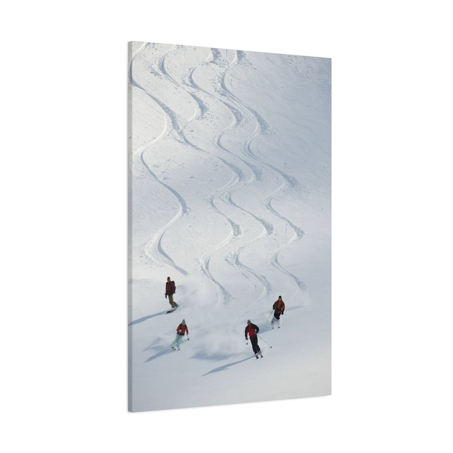
Gallery wrapping extends the printed image around the edges of stretcher bars, eliminating visible borders and creating finished appearances without additional framing. This contemporary presentation method has become increasingly popular, particularly for photographic and modern artwork where clean, minimalist aesthetics are desired. The three-dimensional quality of gallery-wrapped pieces creates subtle shadow effects that add depth and presence on walls. The elimination of framing costs makes gallery wrapping economically attractive while the simplified, streamlined appearance suits modern design sensibilities.
The depth of stretcher bars in gallery-wrapped presentations affects visual impact. Standard depths range from three-quarters of an inch to two inches or more. Deeper stretchers create more dramatic three-dimensional effects and greater presence projecting from walls. The increased depth also distances the printed surface from walls, improving air circulation that can help preserve artwork. However, very deep stretchers require appropriate wall mounting hardware to support the increased weight and leverage forces.
Custom framing services provide expertise in selecting appropriate frame styles and materials for specific artworks and settings. Professional framers consider factors including artwork style, color palette, room decor, and preservation requirements when recommending options. The consultation process educates customers about available choices and helps navigate decisions that affect both immediate aesthetic results and long-term preservation. While custom framing represents significant investment, the craftsmanship and personalized attention often justify costs for artwork of special importance or value.
Ready-made frames offer economical alternatives for standard-sized artwork when custom solutions exceed budget constraints. Mass-produced frames in common sizes provide acceptable presentation at fraction of custom framing costs. However, standardized options limit creative expression and may not perfectly match artwork characteristics or room decor. The quality of ready-made frames varies substantially, with careful selection necessary to avoid poor construction that detracts from artwork rather than enhancing it.
Floating frames create distinctive presentations where artwork appears suspended within frame structures with visible gaps between the canvas edges and frame interior. This contemporary approach emphasizes the artwork itself while the frame provides subtle definition without dominating the visual experience. The floating effect creates sophisticated appearances particularly suited to modern and transitional design contexts where traditional heavy frames might feel incongruous.
The decision between gallery wrapping and framing often relates to permanence considerations. Gallery-wrapped pieces cannot easily be reframed in different styles if aesthetic preferences change or if artwork relocates to spaces requiring different presentation approaches. Traditionally framed pieces offer flexibility to change frames without affecting the artwork itself, preserving options for future modifications. This adaptability provides value for collectors who may display artwork in multiple locations over time or who anticipate evolving design preferences.
Material Quality and Construction Standards
The physical materials and construction methods employed in producing canvas prints directly determine their longevity, appearance, and overall quality. Discriminating buyers benefit from understanding these technical aspects to make informed decisions that ensure satisfaction with purchased artwork.
Canvas fabric composition affects texture, durability, and how well materials accept printed inks. Cotton canvas represents the traditional choice, offering natural fibers with proven longevity and desirable texture characteristics. The natural appearance and feel of cotton appeals to purists who value traditional materials and time-tested performance. Polyester canvas provides alternative characteristics including superior dimensional stability that resists sagging and maintains tension better than cotton in varying humidity conditions. Synthetic materials also resist mildew and insects that can damage natural fibers over time.
Blended canvas fabrics combine cotton and polyester to leverage advantages of both materials while mitigating individual weaknesses. The cotton component provides natural aesthetic qualities and traditional texture while polyester adds strength and stability. These blends represent practical compromises that serve many applications effectively without significant disadvantages compared to pure cotton or polyester options.
Canvas weight, measured in ounces per square yard, indicates thickness and substantiality. Heavier canvas generally provides superior quality with better texture, improved durability, and reduced transparency that prevents wall colors from showing through the printed surface. Professional-grade canvas typically weighs between ten and fourteen ounces per square yard, providing robust foundations for high-quality prints. Lighter-weight canvas may be adequate for smaller pieces or temporary displays but lacks the heft and presence that distinguishes premium products.
Stretcher bar materials and construction significantly affect structural integrity and long-term performance. Solid wood stretcher bars from properly dried lumber provide traditional construction with proven reliability. The wood must be straight, free from warps and twists, and adequately dried to prevent dimensional changes after assembly. Finger-jointed stretcher bars created from shorter wood pieces joined with interlocking cuts offer economical alternatives that use materials efficiently while providing adequate strength for most applications.
The joining methods used at stretcher bar corners affect strength and stability. Traditional mortise and tenon joints create strong mechanical connections that resist separation under tension. Simple butt joints reinforced with staples or corner braces provide adequate strength for standard applications at lower cost. The choice depends on size, required durability, and budget considerations, with larger or more demanding applications justifying premium joinery methods.
Back finishing details distinguish professional-quality products from basic alternatives. Properly finished backs include dust covers that protect the canvas back from contamination while creating neat appearances. Hanging hardware should be securely attached with appropriate weight ratings for the finished piece. Wire or D-rings positioned correctly facilitate easy installation and level hanging. Signed or labeled backs add provenance information and professional touches that enhance perceived value.
Color Coordination with Existing Interior Design
Successfully integrating new artwork into established interior spaces requires consideration of existing color palettes and design elements. Strategic color coordination creates harmonious environments where artwork enhances overall aesthetics rather than creating discord.
Monochromatic color schemes featuring variations of single hues create sophisticated, cohesive appearances. Introducing artwork with dominant colors matching the established scheme maintains unity while variations in value and saturation add interest without disruption. The predominantly blue and white palette common in winter sports imagery integrates beautifully into monochromatic blue schemes, adding dynamic focal points that enrich the color story without contradicting it.
Analogous color harmonies incorporate hues adjacent on the color wheel, creating gentle transitions and related tones. Blue-dominant winter imagery works within analogous schemes including blues, greens, and purples, providing natural compatibility with many cool-toned interiors. The relationships between these related colors feel intuitive and comfortable, creating pleasing visual experiences without dramatic contrasts.
Complementary color approaches pair opposite hues from the color wheel, creating vibrant contrasts and energetic visual dynamics. Blue snow and sky tones complement orange and yellow athletic apparel, creating naturally balanced compositions within individual artworks. In interior applications, rooms with warm-toned walls and furnishings benefit from cool-toned artwork that provides complementary balance, while cool environments gain energy from warm accents in the artwork.
Neutral base strategies employ whites, grays, beiges, and blacks as dominant environmental colors with artwork providing color interest and focal points. This approach offers maximum flexibility since artwork colors can be bold and varied without clashing with neutral surroundings. Winter sports imagery with its dramatic color contrasts against neutral snow works exceptionally well in neutral-based interiors where it provides visual excitement while maintaining overall restraint.
Accent color repetition creates connections between artwork and other room elements including pillows, throws, rugs, and accessories. Identifying prominent colors within artwork and echoing them in smaller decorative elements throughout the space establishes thematic consistency and intentional design. This technique makes artwork feel integrated rather than arbitrarily placed, demonstrating thoughtful curation and attention to aesthetic details.
The principle of sixty-thirty-ten guides proportional color distribution in interiors, with sixty percent of the room featuring a dominant color, thirty percent a secondary color, and ten percent an accent color. Artwork often functions as part of the accent ten percent, providing concentrated color impact without overwhelming the established palette. This balanced approach prevents rooms from feeling chaotic or oversaturated while ensuring sufficient visual interest and variety.
Lighting Design for Artwork Enhancement
Proper illumination transforms artwork presentation from adequate to exceptional, revealing details and colors that remain obscured under poor lighting conditions. Strategic lighting design maximizes aesthetic impact while protecting artwork from damage associated with inappropriate light exposure.
Natural lighting provides the most accurate color rendition and creates dynamic displays that change throughout the day as light angles and intensities vary. North-facing windows in northern hemisphere locations provide consistent, indirect natural light without harsh direct sun exposure, creating ideal conditions for artwork display. However, all natural light contains UV radiation that degrades artwork over time, requiring protective measures including UV-filtering window films or treatments.
The positioning of artwork relative to windows affects both lighting quality and preservation concerns. Hanging artwork perpendicular to windows rather than opposite them reduces direct sun exposure while allowing natural illumination to strike the surface at angles that minimize glare. Morning sun from east-facing windows and afternoon sun from west-facing exposures create different lighting conditions that should inform placement decisions based on desired viewing times.
Artificial lighting offers controllable, consistent illumination independent of natural light availability or time of day. Track lighting systems provide flexibility to direct light precisely where needed while allowing adjustments as artwork is added, removed, or relocated. Individual track heads can be positioned and aimed to illuminate specific pieces with appropriate intensities and angles that minimize glare while maximizing visibility.
Picture lights mounted directly above or below artwork provide focused illumination that creates gallery-like presentations. These fixtures attach to frames or walls and direct light across artwork surfaces. LED picture lights offer energy efficiency, minimal heat generation, and longevity that make them practical for continuous operation. The close proximity to artwork requires careful selection of fixtures that do not produce excessive heat that might damage prints over extended exposure periods.
Recessed ceiling spotlights integrate cleanly into architectural settings while providing directional lighting for artwork. Proper aiming during installation ensures that light strikes artwork at appropriate angles without creating hotspots or glare. Adjustable trim recessed fixtures allow beam direction changes to accommodate different artwork sizes and positions. The permanent nature of recessed installation requires careful planning during construction or renovation phases.
Light color temperature affects how artwork colors appear and the overall ambiance created. Warm light sources between 2700K and 3000K create cozy, intimate atmospheres similar to incandescent lighting. Neutral white light around 3500K to 4000K provides balanced illumination suitable for general applications. Cool white light above 5000K creates bright, energizing environments but may render warm colors less attractively. Most artwork displays benefit from warm to neutral white sources that render colors naturally without excessive coolness.
Dimming capabilities allow lighting intensity adjustments based on time of day, natural light availability, and desired ambiance. Dimmable LED systems provide flexibility to create bright conditions for detailed viewing or reduce lighting to ambient levels during evening relaxation. This controllability enhances both the artwork viewing experience and overall environmental quality, accommodating different activities and moods within the same space.
Gift Selection and Personalization Opportunities
Canvas artwork serves as thoughtful gift options for numerous occasions, combining aesthetic value with personal meaning that demonstrates consideration for recipient preferences and interests. Understanding how to select and personalize artwork for gifting purposes ensures appropriate choices that recipients appreciate and enjoy displaying.
Recipient interest assessment forms the foundation of successful gift selection. Individuals who participate actively in winter sports naturally appreciate imagery depicting their favorite activities. The artwork validates their passion and provides visual representation of identity-defining pursuits. Gifts that acknowledge and celebrate important aspects of recipients' lives demonstrate understanding and appreciation that generic gifts cannot match.
Occasion appropriateness varies across different celebrations and milestones. Housewarming gifts benefit from neutral subject matter with broad appeal that newcomers can incorporate into yet-undefined decor schemes. Winter sports imagery works well for mountain region relocations or when recipients' athletic interests are known. Anniversary gifts might commemorate shared experiences such as ski trips or mountain vacations, with artwork serving as permanent reminders of meaningful moments together.
Customization options add personal dimensions that transform generic artwork into uniquely meaningful pieces. Some services allow incorporating personal photographs into canvas prints, creating one-of-a-kind artworks that capture specific memories and experiences. Adding text elements including names, dates, or meaningful quotes personalizes pieces further, though such additions should be tasteful and well-designed to avoid appearing amateurish.
Size considerations for gift giving require careful assessment of likely display locations in recipients' homes. Without direct knowledge of available wall space and existing decor, medium-sized pieces offer safest options that work in various locations including bedrooms, offices, and smaller wall sections. Extremely large pieces risk being impractical for recipients' spaces, while very small pieces may disappoint by appearing insignificant.
Presentation quality affects gift impact and perceived value. Professional packaging with protective materials demonstrates care and builds anticipation during unwrapping. Including informative materials about the artwork, artist, or subject matter adds educational dimensions that enhance appreciation. Gift certificates for canvas prints allow recipients to select preferred images and sizes, combining the thoughtfulness of giving artwork with the practicality of recipient choice.
The timing of gift giving relative to recipients' life circumstances affects appropriateness. New homeowners actively decorating spaces appreciate artwork contributions. Recent retirees might enjoy imagery celebrating activities they now have time to pursue regularly. Young professionals establishing first independent households often need artwork to personalize rented apartments or purchased homes. Matching gifts to life stages and current needs increases relevance and likelihood of actual use.
Conclusion
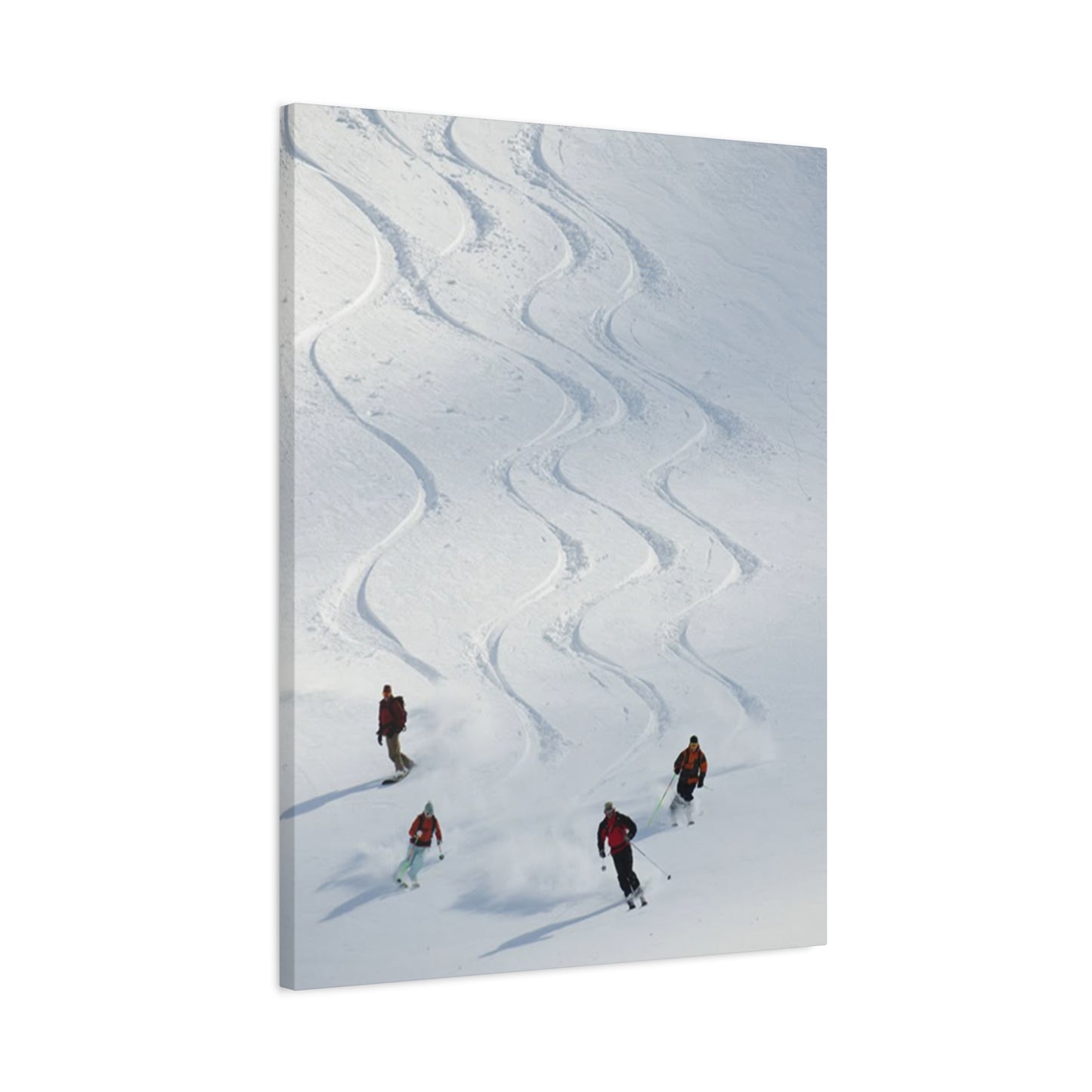
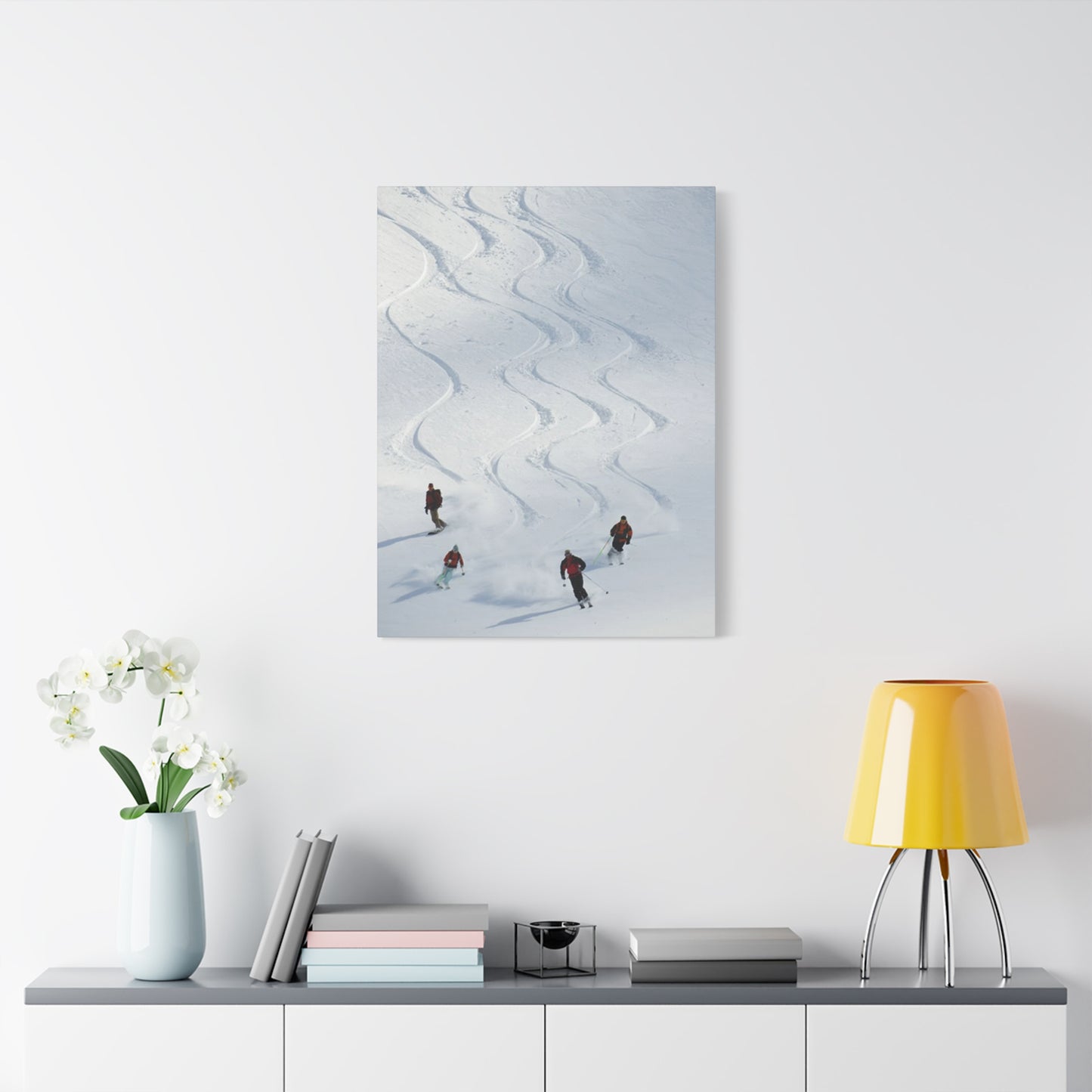
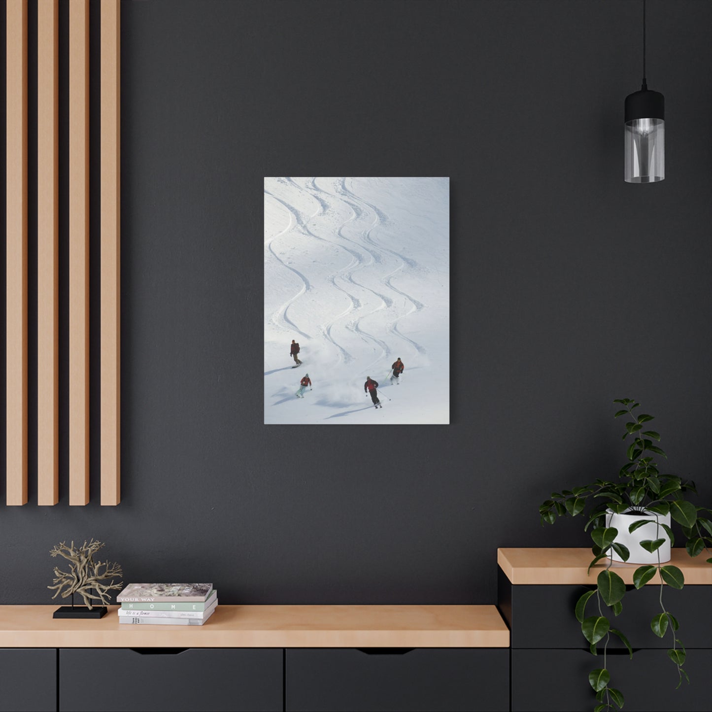
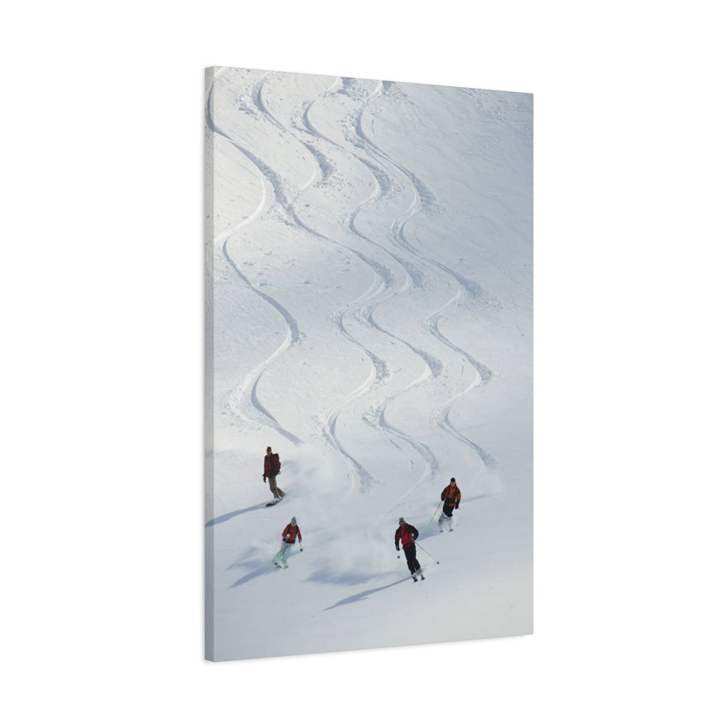
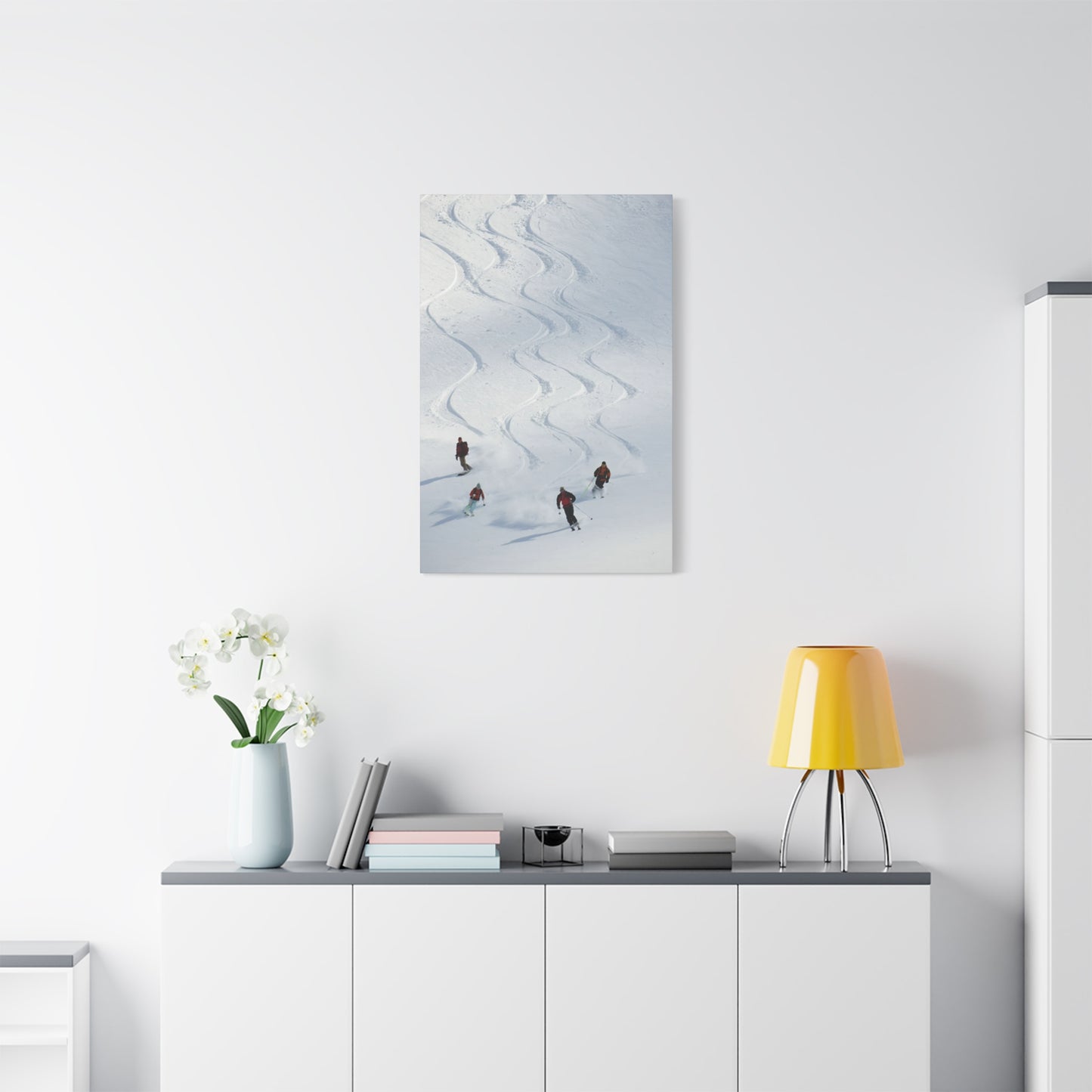
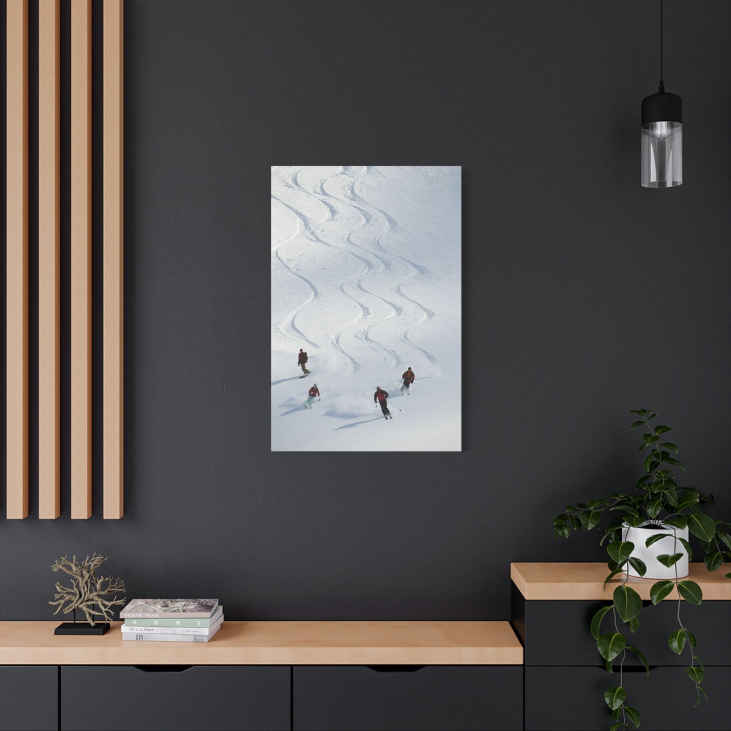
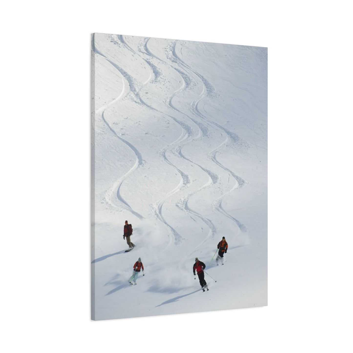
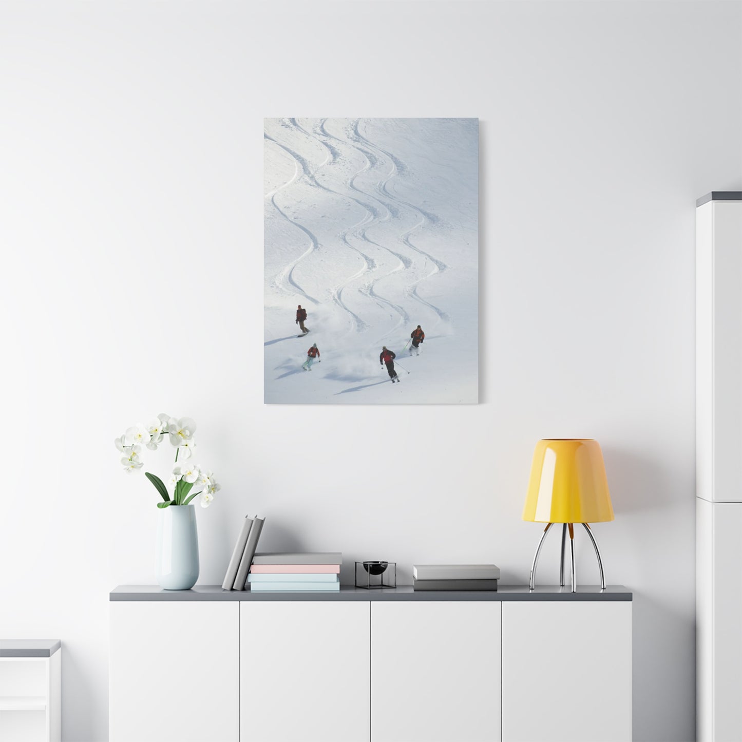
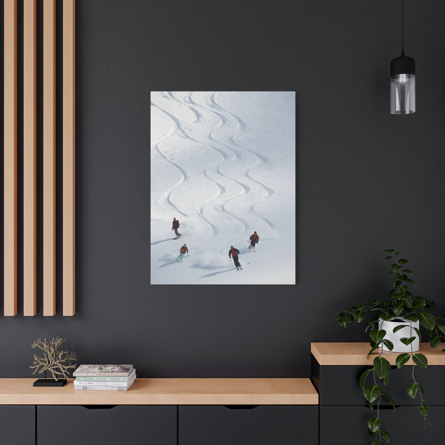
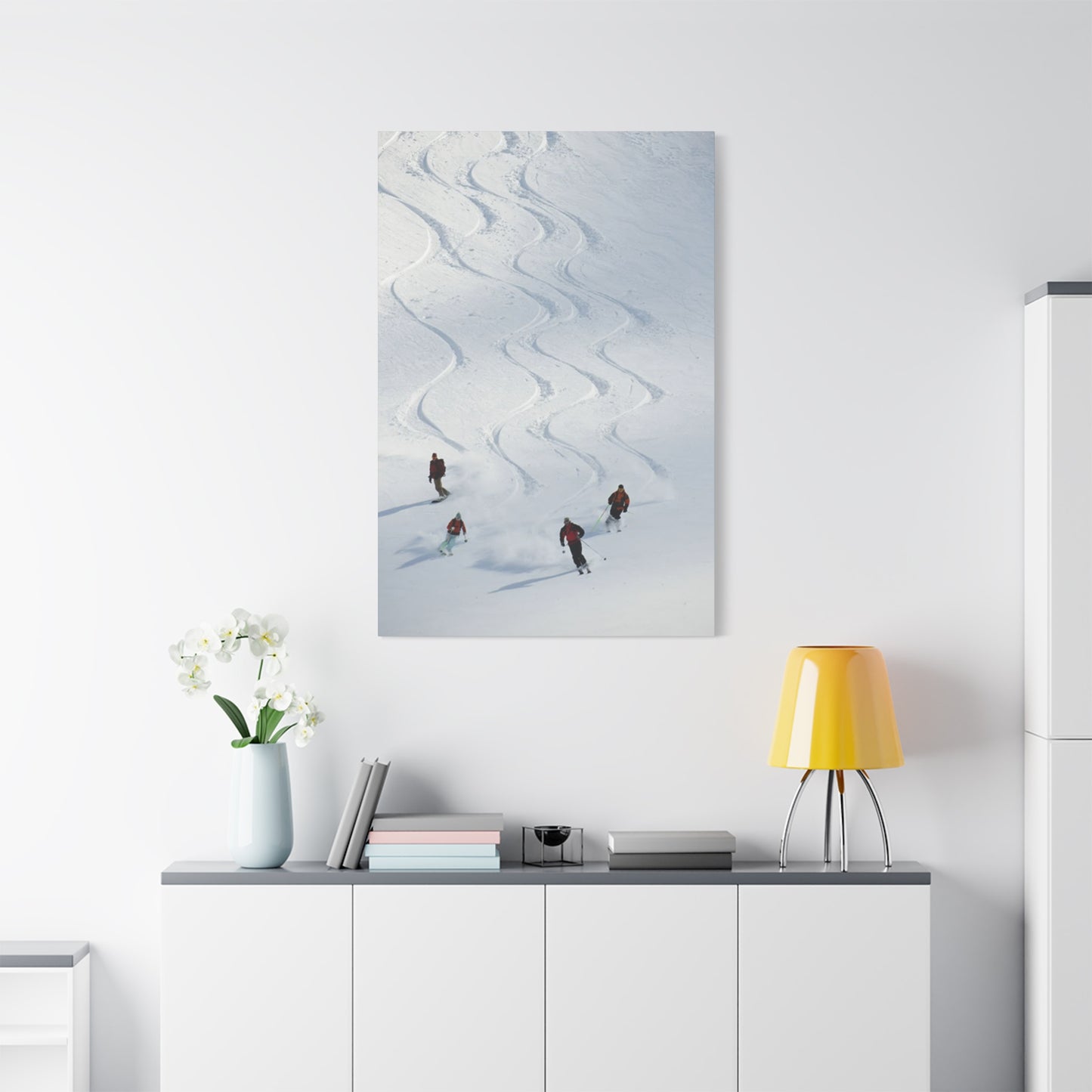
In conclusion, incorporating The Four Skiers wall art into your home offers a dynamic way to celebrate the thrill of winter sports and the beauty of outdoor adventure. Whether you’re an avid skier or simply appreciate the energy and motion of the sport, this artwork brings a sense of vitality, movement, and excitement to any room. The piece captures the spirit of skiing through vibrant colors, detailed figures, and the fluidity of motion, making it not just a decoration, but a reflection of passion and adventure.
The Four Skiers is more than just a depiction of athletes on the slopes—it’s a celebration of camaraderie, skill, and the joy of conquering challenging terrains. This type of artwork evokes feelings of freedom, energy, and the great outdoors, which can transform any space, especially in mountain-themed homes, ski lodges, or winter retreats. By incorporating this artwork, you bring the essence of the alpine lifestyle indoors, creating an atmosphere that inspires adventure and excitement, while also adding a sense of elegance to the space.
Incorporating this energetic piece into your décor can be both bold and subtle. The movement of the skiers, combined with the high-energy composition, can serve as a vibrant focal point in your living room, hallway, or even your home office, sparking a conversation or inspiring motivation. The color palette and design can easily complement other elements of modern or rustic interiors, and its dynamic nature can tie together a theme focused on movement, nature, or personal achievement.
Ultimately, decorating with The Four Skiers wall art is about more than just filling a space—it’s about bringing to life the passion, excitement, and sense of freedom that skiing represents. It’s an opportunity to showcase your love for the sport or your admiration for the skill it takes to navigate the slopes. Whether you're an athlete or a lover of the outdoors, this piece helps to create a home that celebrates the beauty of movement, winter landscapes, and the spirit of adventure.
