


The Last Jedi Poster Wall Art & Canvas Prints
The Last Jedi Poster Wall Art & Canvas Prints
Couldn't load pickup availability

The Ultimate Collector's Piece: Exploring The Last Jedi Poster Wall art For Modern Cinema Decor
The visual artistry behind Star Wars promotional materials has captivated audiences for decades, creating an enduring legacy that extends far beyond the silver screen. Among the most striking examples of contemporary cinema marketing stands the promotional artwork for the eighth installment of the Skywalker saga, which has become a phenomenon in its own right. This particular piece of visual storytelling has captured the imagination of enthusiasts worldwide, transforming living spaces into tributes to one of cinema's most beloved franchises. The striking imagery, bold color choices, and symbolic representation of conflict and redemption make this artwork a centerpiece in any collection dedicated to science fiction or contemporary film history.
The cultural significance of Star Wars memorabilia has grown exponentially since the franchise first appeared in theaters, creating a robust market for officially licensed products and collectible items. Fans who grew up with the original trilogy now have the means and motivation to surround themselves with artifacts that celebrate their passion. This eighth chapter in the saga arrived at a unique moment in cultural history, when nostalgia for the original films merged with excitement for new storytelling directions. The promotional artwork created for this film reflects that transitional moment, capturing both the reverence for what came before and the bold innovation of pushing the narrative forward.
Interior design trends have increasingly embraced pop culture elements, with film-related artwork gaining acceptance in sophisticated living spaces. What was once relegated to basement recreation rooms or teenage bedrooms now finds pride of place in carefully curated galleries and contemporary homes. This shift reflects a broader cultural acceptance of fandom as a legitimate form of self-expression and artistic appreciation. The promotional materials for the eighth episode exemplify this evolution, offering artwork that functions both as nostalgic tribute and striking visual composition worthy of serious aesthetic consideration.
The intersection of commerce and art in cinema promotion has produced some truly memorable images throughout film history. Studios invest significant resources in creating visual campaigns that capture the essence of their productions while appealing to diverse audiences. The result of this creative process for the eighth Star Wars film resulted in imagery that transcends its original commercial purpose, becoming recognized as legitimate artistic achievement. Collectors recognize this distinction, understanding that certain promotional pieces achieve cultural significance that extends beyond mere advertising material.
The emotional resonance of visual storytelling plays a crucial role in determining which promotional materials become truly collectible. Images that capture pivotal moments, essential character relationships, or thematic core elements of their source material tend to achieve lasting value. The artwork created for this particular installment accomplished all three objectives simultaneously, presenting a visual narrative that speaks to both longtime fans and newcomers. The composition tells a story about conflict, legacy, and the perpetual struggle between darkness and light that defines the franchise.
Why Collectors Treasure This Eighth Episode Promotional Art
The collectibility of promotional film artwork depends on numerous factors that extend beyond simple aesthetic appeal. Rarity, cultural significance, artistic merit, production quality, and emotional resonance all contribute to determining which pieces become truly valuable within collecting communities. The promotional materials for this eighth chapter possess all these attributes in abundance, making them particularly desirable for those building serious collections. The limited availability of certain versions, combined with the film's position within the larger saga, creates a perfect storm of collectibility factors.
Historical context plays an enormous role in determining collectible value. This film arrived at a moment when the franchise had been successfully revitalized after a decade-long cinematic absence, bringing unprecedented attention to all associated merchandise. The cultural conversation surrounding this installment reached beyond typical fan communities, engaging mainstream media and casual viewers in debates about storytelling, character development, and the franchise's future direction. This broader cultural engagement elevated all associated materials, including promotional artwork, to a level of significance rarely achieved by film memorabilia.
The artistic quality of this particular promotional campaign set new standards for science fiction film marketing. Rather than relying on generic action shots or simple character portraits, the design team created compositions that functioned as standalone artistic statements. The sophisticated use of color, the deliberate positioning of figures to suggest relationships and conflicts, and the overall visual impact demonstrated a level of artistry that collectors immediately recognized. This elevated approach transformed what might have been disposable marketing material into legitimate art objects worthy of preservation and display.
Nostalgia represents a powerful driving force in collectible markets, and items connected to beloved franchises command premium prices and sustained interest. The eighth episode connects to childhood memories for millions of fans who grew up with the original trilogy while simultaneously creating new memories for younger audiences. This dual appeal creates a broader collector base spanning multiple generations, each bringing their own emotional investment to the acquisition process. The promotional artwork serves as a tangible connection to these emotional experiences, making it far more than simple decoration.
Investment potential cannot be ignored when discussing high-end collectibles. Savvy collectors recognize that certain items appreciate significantly over time, particularly those associated with culturally significant entertainment properties. The promotional materials for this film have already demonstrated strong value retention and growth, suggesting they represent sound investments in addition to their aesthetic and emotional appeal. The combination of artistic merit, cultural significance, and franchise connection creates a compelling case for long-term value appreciation.
The community aspect of collecting enhances the desirability of sought-after pieces. Collectors enjoy sharing their acquisitions, discussing provenance, and participating in a larger community of enthusiasts. The promotional artwork for this eighth installment provides numerous conversation opportunities, from discussions about design choices to debates about the film's themes and their visual representation. This social dimension adds another layer of value beyond the physical object itself, creating connections between like-minded individuals who share passionate interests.
Limited edition versions and variant covers have become increasingly important in collectible markets. The promotional campaign for this film included numerous versions with different compositions, color schemes, and focal points. This variety creates opportunities for specialized collecting, with some enthusiasts seeking every available version while others focus on particularly rare or artistically superior examples. The challenge of completing a comprehensive collection adds excitement and motivation to the acquisition process, sustaining long-term interest.
Authentication and provenance matter tremendously in collectible markets, protecting both buyers and sellers from fraud while establishing clear value hierarchies. Official merchandise from authorized sources carries inherent value advantages over unlicensed reproductions, regardless of aesthetic similarities. Collectors prioritize officially sanctioned materials, understanding that authenticity significantly impacts both current value and future appreciation potential. The promotional materials for this film benefit from clear licensing and production documentation, making authentication relatively straightforward for knowledgeable collectors.
The storytelling inherent in the composition separates truly valuable promotional art from generic marketing materials. This particular campaign created images that function as visual narratives, suggesting character arcs, thematic concerns, and emotional journeys without requiring motion or dialogue. The ability to convey complex storytelling through static imagery represents remarkable artistic achievement, one that collectors appreciate and reward with sustained demand. Each viewing reveals new details and subtleties, creating lasting engagement that transcends initial impressions.
Effective Display Techniques for Eighth Episode Wall Decoration
Proper presentation dramatically impacts the visual effectiveness and preservation of collectible artwork. The materials used, techniques employed, and environmental considerations all influence how these pieces appear in living spaces while ensuring their long-term protection. Thoughtful approach to display transforms simple decoration into curated presentation worthy of the artwork's artistic merit and cultural significance. Understanding professional framing principles allows collectors to showcase their acquisitions while maximizing both aesthetic impact and preservation quality.
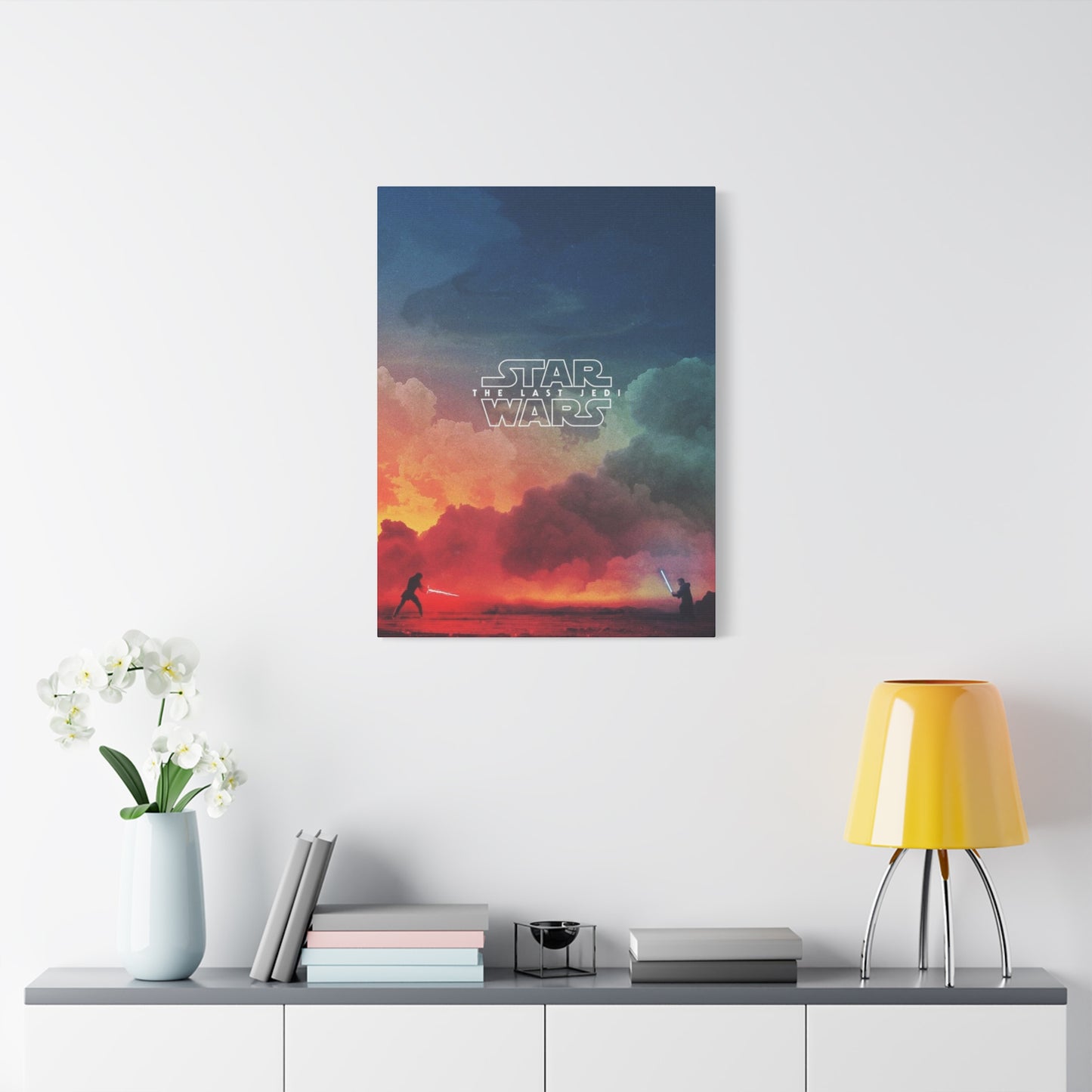
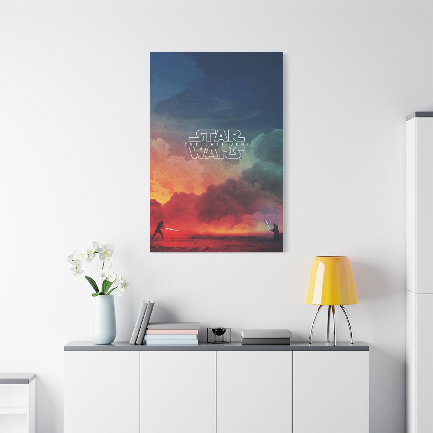
Frame selection represents the first and most crucial decision in presentation planning. The frame serves multiple functions simultaneously: protecting the artwork from environmental damage, creating visual boundaries that define the piece as art object rather than casual decoration, and contributing to the overall aesthetic impact through its own design elements. For promotional materials from this eighth installment, frame choices should complement rather than compete with the bold imagery and vibrant colors that characterize the composition. Simplicity often proves most effective, allowing the artwork itself to command attention.
Material quality in framing components directly impacts both appearance and preservation. Acid-free matting prevents chemical reactions that cause discoloration over time, ensuring the artwork maintains its original vibrancy for decades. UV-protective glazing shields the piece from light damage that causes fading and deterioration, particularly important for items displayed in naturally lit spaces. Conservation-grade mounting techniques secure the artwork without causing damage, allowing future removal if necessary while preventing warping or distortion during display. These professional touches distinguish serious collectors from casual decorators.
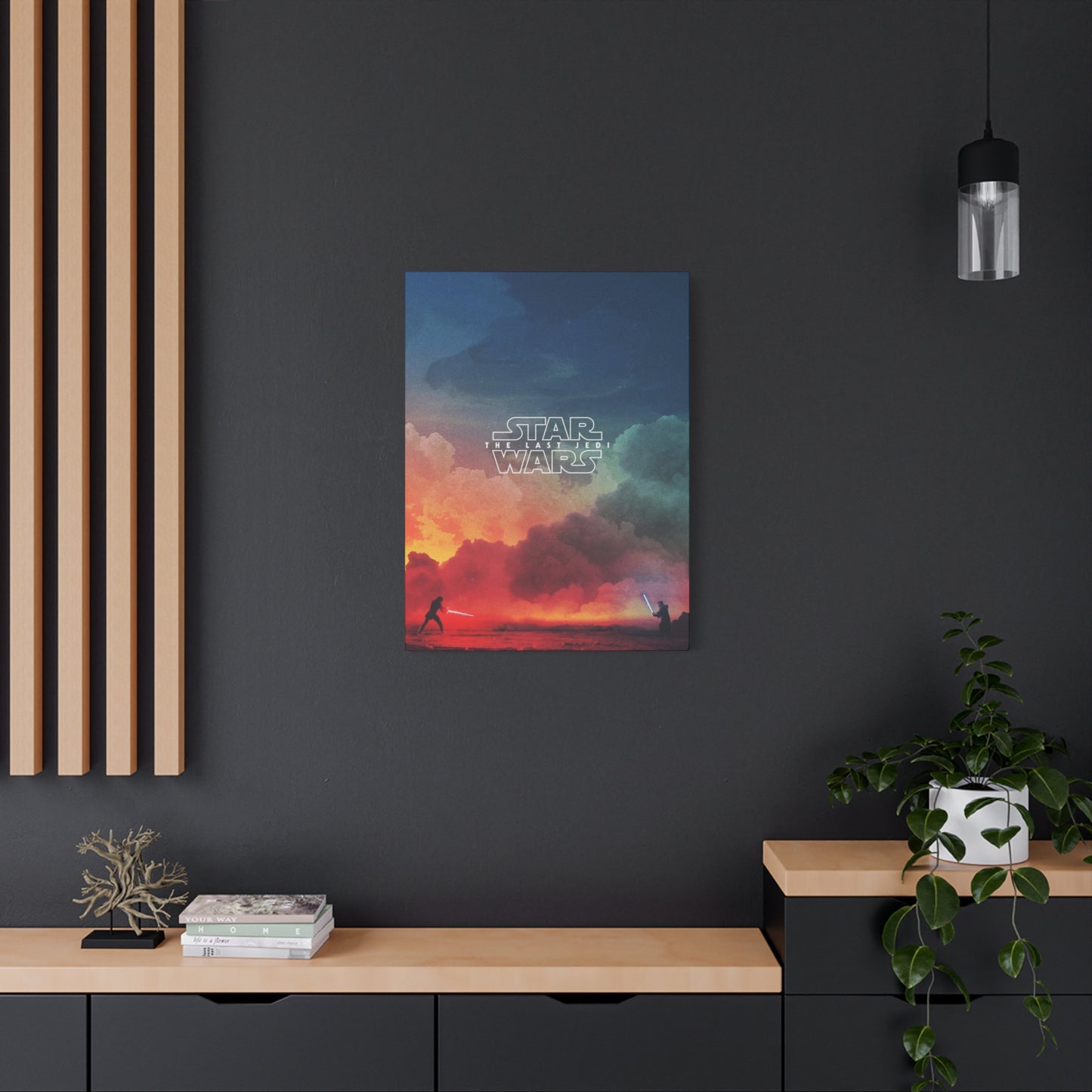
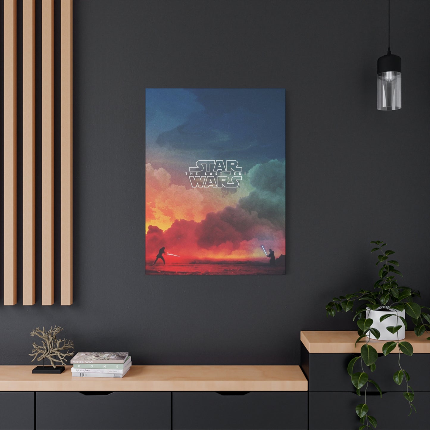
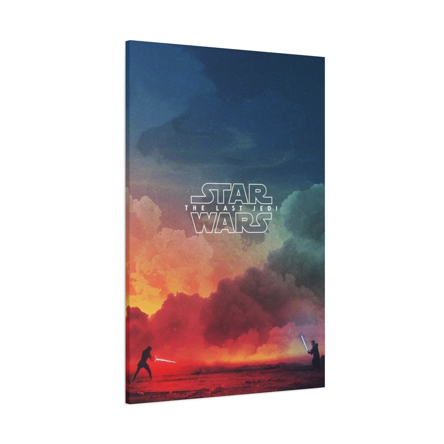
Color coordination between frame and artwork requires careful consideration of multiple factors. The dominant colors in this particular promotional campaign include deep reds, stark whites, and dramatic blacks, creating a bold palette that makes strong visual statements. Frame colors should either harmonize with these dominant tones or provide neutral contrast that allows the artwork's colors to appear even more vibrant. Black frames offer classic elegance and tend to recede visually, focusing attention on the artwork itself. White or light gray frames create modern, gallery-like presentations that emphasize the piece as serious art object. Metallic frames in silver or gold can add sophistication but risk overwhelming subtler design elements.
Matting serves both protective and aesthetic functions, creating space between the artwork and glazing while adding visual breathing room around the composition. The width of matting significantly impacts perceived importance and formality, with wider borders suggesting museum-quality presentation. For this particular artwork, matting colors should be selected to either match dominant tones within the composition or provide neutral backgrounds that enhance contrast. Double matting techniques create additional depth and visual interest, using complementary colors to create sophisticated layering effects that elevate the overall presentation.
Size considerations affect both visual impact and spatial planning. These promotional pieces were created in various dimensions, from standard poster sizes to oversized theatrical displays. Larger formats create dramatic focal points that command attention and anchor entire rooms, while smaller versions allow for more flexible placement and can be grouped with complementary pieces. The viewing distance in the intended display location should inform size selection, ensuring the artwork can be appreciated without overwhelming the space or requiring excessive distance for comfortable viewing.
Placement height follows established art gallery conventions that optimize viewing comfort and aesthetic balance. The general rule positions the center of the artwork at average eye level, typically between fifty-seven and sixty inches from the floor. This standard creates comfortable viewing angles for most people while maintaining professional appearance. Adjustments may be necessary based on furniture placement, ceiling height, and intended viewing context. Artwork displayed above seating areas can be positioned slightly higher to remain within comfortable sightlines for seated viewers.
Grouping strategies allow collectors to create thematic displays combining multiple related pieces. The promotional campaign for this film included numerous complementary images that work beautifully together when thoughtfully arranged. Grid arrangements create modern, organized presentations with equal spacing between pieces. Gallery wall layouts appear more organic, combining different sizes and orientations in carefully balanced asymmetrical arrangements. Horizontal sequences can suggest narrative progression or character development. Each approach creates different visual effects and emotional impacts, allowing personalization based on available space and aesthetic preferences.
The Striking Visual Design of Eighth Episode Promotional Materials
Visual composition separates memorable promotional artwork from forgettable marketing materials. The design choices made for this eighth installment demonstrate sophisticated understanding of color theory, compositional balance, symbolic imagery, and emotional resonance. Every element was carefully considered to create maximum impact while conveying essential information about the film's themes, characters, and tone. Analyzing these design decisions reveals the artistry involved in creating promotional materials that transcend their commercial origins.
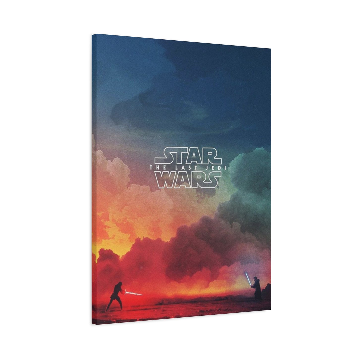
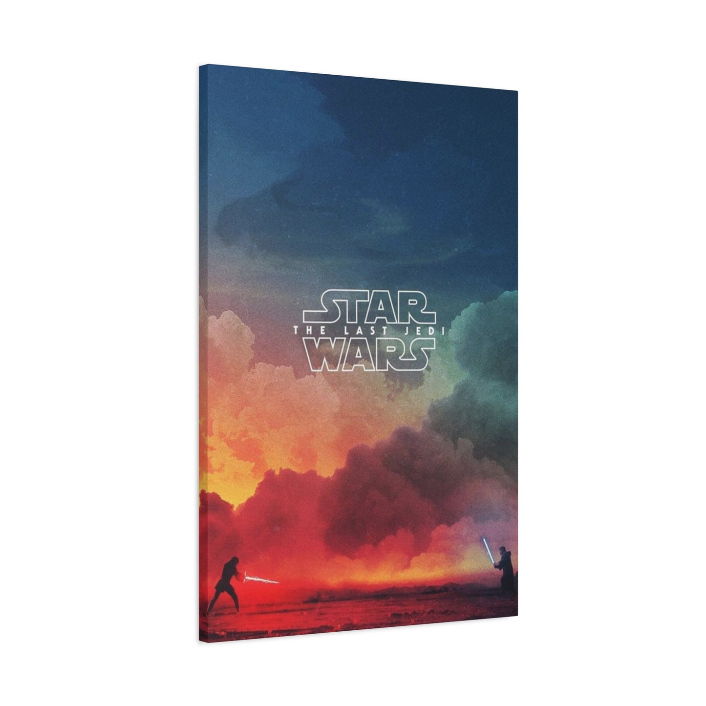
Color psychology plays a fundamental role in emotional communication through visual media. The dominant red tones throughout this promotional campaign immediately convey passion, danger, conflict, and intensity. This warm, aggressive color creates visceral responses in viewers, preparing them for the dramatic confrontations and emotional stakes within the film itself. The strategic use of red connects to franchise visual traditions while pushing into more dramatic territory, suggesting evolution and escalation from previous installments. White elements provide stark contrast, representing purity, hope, and the light side of eternal conflicts that define the narrative universe.
Compositional symmetry creates visual stability while suggesting balance between opposing forces. The central positioning of key figures draws the eye immediately to focal points while surrounding elements provide context and supporting information. Vertical orientation emphasizes the heroic stature of characters while creating natural hierarchies that guide viewer attention through the composition. The careful balance between negative space and detailed imagery prevents visual clutter while ensuring every element serves clear communicative purposes. This sophisticated approach to composition demonstrates professional design expertise rarely seen in film marketing.
Figure positioning communicates relationships, conflicts, and character dynamics without requiring motion or dialogue. The spatial arrangement of characters suggests alliances and oppositions, with proximity indicating connection while distance suggests separation or opposition. Scale variations emphasize relative importance within the narrative, with larger figures commanding more attention and suggesting central roles. Orientation and posture convey attitude and intention, with confrontational stances indicating conflict while unified positioning suggests alliance. These subtle visual cues create narrative understanding that enhances anticipation for the film itself.
Typography choices affect readability, brand consistency, and emotional tone. The franchise has established distinctive typographic traditions over decades, creating instant recognition and connection to the larger brand identity. The promotional materials for this eighth installment honor those traditions while introducing subtle variations that distinguish this particular chapter. Font selection, sizing, spacing, and positioning all receive careful consideration to ensure clarity without overwhelming the visual composition. The integration of text elements with imagery creates unified designs rather than simply overlaying words on pictures.
Symbolic imagery adds layers of meaning that reward close examination and reflection. Visual references to earlier films create connections across the saga while suggesting thematic continuity. Character positioning and costume details hint at character arcs and development without revealing specific plot points. Environmental elements and background details provide atmospheric context that establishes mood and setting. These symbolic touches create depth that extends beyond immediate visual impact, inviting repeated viewing and continued discovery of new details.
Contrast management ensures visual clarity and dramatic impact. The interplay between light and dark elements creates depth, defines forms, and establishes mood. High contrast creates dramatic tension and clearly defined boundaries between elements, while softer transitions suggest ambiguity or connection. The promotional artwork for this film employs sophisticated contrast strategies that create visual punch while maintaining subtlety in rendering and detail work. This balance prevents the composition from appearing either washed out or overly harsh, maintaining viewer comfort while maximizing impact.
Texture and detail work add richness and depth to promotional imagery. While maintaining overall compositional clarity, the designers incorporated subtle textures that reward close examination. Fabric rendering, environmental details, and surface qualities create realism and visual interest without overwhelming the primary compositional elements. This attention to detail demonstrates professional craftsmanship and elevates the artwork beyond simple marketing graphics to legitimate artistic achievement worthy of serious consideration.
The visual hierarchy guides viewer attention through the composition in deliberate sequences. Primary focal points capture immediate attention, drawing the eye to the most important narrative and thematic elements. Secondary elements provide supporting information and context without competing for primary attention. Background details create atmosphere and depth without distracting from foreground subjects. This carefully orchestrated visual flow ensures viewers receive intended messages while maintaining freedom to explore the composition at their own pace.
Creating Cohesive Interiors with Eighth Episode Artwork
Integrating film-related artwork into living spaces requires thoughtful consideration of existing design elements, color schemes, spatial relationships, and overall aesthetic goals. Successfully incorporating these bold promotional materials creates spaces that reflect personal passions while maintaining sophisticated visual appeal. The key lies in treating the artwork as legitimate design elements worthy of the same consideration given to furniture, lighting, and architectural features rather than afterthought decorations awkwardly added to completed spaces.
Color palette coordination ensures visual harmony between artwork and surrounding design elements. The bold reds, stark whites, and deep blacks characteristic of this promotional campaign can either complement or clash with existing room colors depending on implementation strategy. Spaces with neutral color schemes provide ideal canvases for these dramatic pieces, allowing the artwork to introduce bold color accents without competing with equally strong environmental colors. Rooms already featuring red elements benefit from the reinforcement and coordination the artwork provides, creating unified color stories throughout the space.
Furniture selection and arrangement should acknowledge and complement featured artwork rather than competing with it for visual attention. Low-profile furniture in neutral tones allows dramatic wall art to command focus without visual conflict. Conversely, bold furniture pieces require careful consideration to ensure they enhance rather than clash with equally strong artwork. The spatial relationship between furniture and art affects viewing angles, lighting conditions, and overall room flow. Seating arrangements that facilitate comfortable viewing of featured artwork create spaces specifically designed for appreciation and contemplation.
Complementary decorative elements extend thematic consistency throughout spaces. Collectors might incorporate additional franchise-related items in ways that support rather than overwhelm the featured artwork. Subtle references through color choices, geometric shapes, or thematic elements create layered design narratives without resorting to obvious or heavy-handed approaches. The goal is creating sophisticated spaces that reward observation and reflection rather than hitting viewers over the head with single-note themes.
Architectural features provide opportunities for enhanced presentation and integration. Built-in shelving can frame artwork while providing display space for complementary objects. Accent lighting specifically designed to highlight featured pieces creates gallery-like presentation while adding functional illumination to spaces. Accent walls in coordinating colors create dedicated zones for artwork display, setting these areas apart from general living spaces while maintaining overall design cohesion. These architectural interventions demonstrate commitment to artwork as central design elements rather than decorative afterthoughts.
Scale relationships between artwork and surrounding elements affect perceived importance and visual balance. Oversized artwork commands attention and creates dramatic focal points that anchor entire rooms. Smaller pieces work well in intimate spaces or when grouped with complementary items to create larger visual units. The surrounding furniture, architectural features, and spatial dimensions all influence optimal artwork sizing. Pieces that appear perfectly scaled in retail settings may prove overwhelming or insignificant in specific home environments, requiring careful consideration before purchase.
Texture variation creates visual interest and prevents monotonous appearance. While the artwork itself provides dramatic visual elements, surrounding materials should offer complementary textural experiences. Smooth walls contrast with canvas texture, creating subtle visual variety. Fabric elements in furnishings add softness that balances the graphic quality of promotional materials. Metallic accents in lighting fixtures or decorative objects introduce reflective qualities that play against matte artwork surfaces. These textural variations create layered, sophisticated spaces that engage multiple senses.
Style consistency prevents disjointed appearance that undermines design cohesion. While mixing design periods can create interesting juxtapositions, successful execution requires careful planning and sophisticated design sense. The contemporary, graphic quality of this promotional artwork integrates most naturally with modern or contemporary design schemes, though creative approaches can successfully incorporate these pieces into transitional or even traditional settings. The key lies in finding common threads that link disparate elements, whether through color, scale, or thematic content.
Personal expression balanced with design sophistication creates spaces that feel both authentic and professionally executed. The goal is not creating museum-like environments that sacrifice comfort and livability for aesthetic purity. Rather, successful integration allows passionate interests to shine while maintaining spaces that function effectively for daily living. This balance requires honest assessment of priorities, thoughtful planning, and willingness to make compromises that serve both aesthetic and practical concerns.
Flexibility for future changes prevents design decisions that lock spaces into static configurations. Life circumstances, evolving tastes, and new acquisitions all create pressure for design evolution. Choosing neutral backgrounds for featured artwork allows easy rotation or replacement without requiring complete room redesigns. Avoiding overly specific or themed design elements outside the artwork itself creates flexibility for future direction changes. This forward-thinking approach acknowledges that passionate interests evolve while protecting investment in quality design implementation.
Narrative and Symbolism in Eighth Episode Visual Design
The visual narrative embedded in promotional artwork provides insight into films before audiences enter theaters. For this eighth installment, the design choices communicated essential information about tone, themes, and character relationships while maintaining sufficient ambiguity to preserve plot surprises. Understanding the storytelling techniques employed in these compositions reveals the sophisticated communication strategies that transform simple marketing materials into rich visual narratives worthy of sustained analysis and appreciation.
Central conflict representation forms the emotional and thematic core of effective promotional design. This particular campaign centered on the relationship between two key characters representing opposing philosophical and spiritual perspectives. Their positioning, relative scale, and visual treatment communicate the tension between them while suggesting deeper connections that transcend simple opposition. The composition hints at the complicated relationship that develops throughout the film, preparing audiences for nuanced character dynamics rather than simplistic hero-villain confrontations.
Legacy and tradition themes permeate the franchise's visual language, creating continuity across generations of storytelling. The promotional materials for this eighth installment referenced visual motifs from earlier films while introducing new elements that signaled evolution and change. This balance between honoring tradition and embracing innovation mirrors thematic concerns within the film itself, where characters struggle with the weight of history while forging new paths forward. The visual echo of these themes in promotional materials demonstrates sophisticated storytelling that extends beyond dialogue and plot into pure visual communication.
Color symbolism operates on both conscious and subconscious levels, creating emotional responses that enhance narrative understanding. The dramatic red that dominates this promotional campaign carries multiple meanings simultaneously: danger and passion, anger and love, destruction and creation. This symbolic complexity mirrors the moral ambiguity explored within the film, where characters navigate complicated ethical landscapes rather than following clearly defined paths between absolute good and evil. The visual sophistication of these color choices elevates the material beyond simple adventure storytelling into more complex thematic territory.
Character positioning reveals relationship dynamics and power structures without explicit exposition. The relative placement of figures within the composition suggests hierarchies, alliances, and tensions that provide narrative context. Characters positioned above others gain visual dominance suggesting authority or power. Proximity indicates connection while separation suggests distance or opposition. These spatial relationships create subconscious understanding of character dynamics that enhances conscious narrative comprehension, demonstrating how visual design supports storytelling across multiple levels simultaneously.
The hero's journey reflected in visual composition creates archetypal resonance that connects with deep narrative patterns. The central figure's positioning, posture, and visual treatment all communicate their role as protagonist navigating challenging circumstances. Surrounding elements provide context for their journey, suggesting obstacles to overcome and allies to assist. This visual storytelling taps into universal narrative structures that have resonated with audiences across cultures and throughout history, creating immediate emotional connection and narrative understanding.
Duality and balance themes appear repeatedly throughout the franchise's visual language, reflecting philosophical concerns that define the narrative universe. Light and dark, order and chaos, tradition and innovation all find visual expression through compositional choices, color palettes, and symbolic imagery. The promotional materials for this eighth installment emphasized these dualities while suggesting the possibility of synthesis and transcendence. This sophisticated thematic communication prepared audiences for a narrative that questions binary thinking while acknowledging the power of oppositional forces.
Environmental symbolism establishes mood, setting, and thematic context through background elements and atmospheric conditions. The promotional artwork incorporated environmental details that suggested both the harsh conditions characters face and the epic scale of their conflicts. These environmental elements function as more than simple background, becoming active participants in the visual narrative that enhance emotional impact and thematic depth. The careful integration of character and environment creates unified compositions where every element contributes to overall storytelling effectiveness.
Costume and character design elements visible in promotional materials communicate social roles, character personalities, and narrative functions. The visual language of clothing provides immediate information about characters, their allegiances, and their roles within the story. Traditional elements connect characters to established factions and histories, while innovative details signal change and evolution. These costume elements reward close observation, revealing details that enhance character understanding and create visual interest that sustains repeated viewing.
Symbolic objects and props carry narrative weight that extends beyond their literal presence. Weapons suggest conflict and capacity for violence, their design and positioning communicating character relationships to power and aggression. Iconic franchise elements create instant recognition and connection to larger mythologies. The careful inclusion and positioning of these symbolic objects layers additional meaning into compositions already rich with visual information, creating depth that rewards sustained engagement and analytical viewing.
Emotional tone establishment through visual means prepares audiences for the experience awaiting them. The dramatic, intense quality of these promotional materials signals serious, emotionally demanding storytelling rather than lightweight entertainment. This tonal communication manages audience expectations, preparing viewers for challenging content while generating excitement about the emotional journey ahead. The sophisticated visual communication of tone demonstrates mature understanding of how promotional materials function as bridges between creators and audiences.
Optimal Display Locations for Eighth Episode Visual Art
Strategic placement maximizes both the visual impact of artwork and its integration within living spaces. Different locations offer distinct advantages and challenges that affect viewing experience, preservation conditions, and overall aesthetic effect. Thoughtful consideration of these factors ensures artwork achieves its full potential as both decorative element and meaningful personal expression. Understanding how different spaces function allows collectors to make informed decisions that enhance daily living while protecting valuable items.
Living rooms represent prime locations for featured artwork, offering high visibility and opportunities for appreciation during regular activities. These central gathering spaces typically provide wall space appropriate for larger pieces, allowing dramatic presentation that creates strong first impressions. The social nature of living rooms means artwork becomes conversation pieces, creating opportunities to share passions with visitors while expressing personal interests. Lighting conditions in living rooms often combine natural and artificial sources, requiring careful planning to ensure proper illumination without causing preservation concerns.
Home theaters and media rooms create thematically appropriate contexts for film-related artwork. These dedicated entertainment spaces naturally accommodate movie-themed decoration without seeming forced or incongruous. The controlled lighting typical of media rooms benefits artwork preservation while creating dramatic presentation opportunities. Viewers already in entertainment mindsets appreciate thematic decoration that enhances their viewing experiences. The combination of appropriate context and favorable environmental conditions makes media rooms ideal locations for valuable film-related collections.
Bedroom placement creates personal sanctuaries that reflect individual passions without requiring consensus or compromise. These private spaces allow more focused thematic expression than public areas where diverse tastes must be accommodated. The intimate scale of bedrooms often works well with medium-sized artwork, creating comfortable viewing distances that allow appreciation of detail. Controlled lighting and environmental conditions in bedrooms generally favor preservation, though care must be taken to avoid placing artwork near heat sources or areas with high humidity.
Office spaces benefit from artwork that inspires and motivates while expressing professional identity. Film-related pieces can communicate creativity, cultural awareness, and willingness to think outside conventional boundaries. The presence of meaningful artwork in work environments reduces stress and increases satisfaction with physical surroundings. However, professional contexts may require more subtle or sophisticated approaches to film-themed decoration, emphasizing artistic merit and design quality over obvious fandom.
Hallways and transitional spaces offer underutilized opportunities for artwork display. These connecting areas receive regular traffic, ensuring consistent viewing opportunities while maintaining clear sight lines that favor artwork appreciation. The linear nature of hallways accommodates sequential arrangements of multiple related pieces, creating gallery-like presentations. However, these spaces often suffer from limited natural light and narrow dimensions that may not accommodate larger pieces comfortably.
Stairwell walls provide dramatic vertical spaces that accommodate larger artworks or multi-piece installations. The changing viewing angles as viewers ascend or descend creates dynamic viewing experiences that reveal different aspects of compositions. However, stairwell placement presents challenges including difficult installation, limited lighting options, and awkward viewing angles that may not show artwork to best advantage. Careful planning addresses these challenges while exploiting the unique opportunities these spaces offer.
Dining rooms balance public visibility with more formal presentation contexts. Artwork in dining spaces contributes to atmosphere during meals while remaining visible during daily household activities. These spaces typically offer good lighting and stable environmental conditions favorable to preservation. However, proximity to food preparation areas requires consideration of potential exposure to cooking-related humidity, temperature fluctuations, and airborne particles that could damage artwork over time.
Libraries and study areas create contemplative contexts appropriate for artwork that rewards sustained attention. The quiet, focused atmosphere of these spaces encourages appreciation of artistic detail and symbolic content. Surrounded by books and other intellectual pursuits, film-related artwork signals cultural engagement and sophisticated taste. The typically controlled environment in these spaces favors preservation while adequate lighting supports both reading and artwork appreciation.
Entryways and foyers create immediate impressions for visitors while framing departure and arrival experiences for household members. Artwork in these transitional spaces establishes tone and provides glimpses into residents' interests and values. The high visibility of entry spaces ensures consistent viewing opportunities, though these areas often present challenging environmental conditions including direct sunlight, temperature fluctuations from opening doors, and limited wall space competing with functional elements like coat storage.
Bathroom placement remains controversial, with some collectors viewing these private spaces as opportunities for personal expression while others consider environmental conditions too risky for valuable items. Modern bathrooms with good ventilation and separation between shower areas and other spaces can accommodate artwork safely. However, the humidity inherent in bathroom environments presents legitimate preservation concerns that argue against displaying valuable or irreplaceable pieces in these locations regardless of ventilation quality.
Clean Aesthetic Approaches to Eighth Episode Presentation
Minimalist design philosophy emphasizes essential elements while eliminating unnecessary decoration, creating calm, focused environments that highlight featured pieces. Applying minimalist principles to the display of film-related artwork creates sophisticated presentations that emphasize artistic merit while avoiding cluttered or overly themed appearance. This approach respects both the artwork and the living spaces it inhabits, creating harmonious environments that feel intentional and carefully considered rather than haphazard accumulations of related items.
Simple frame selection exemplifies minimalist principles, using clean lines and neutral colors that focus attention on artwork rather than competing for visual interest. Thin metal frames in black, white, or silver create nearly invisible boundaries that define artwork without overwhelming it. The lack of ornate detail or decorative elements ensures the frame serves its protective and presentational functions without adding extraneous visual information. This restraint demonstrates confidence in the artwork's ability to carry visual interest without supplemental decoration.
Negative space appreciation represents a core minimalist principle that applies directly to artwork display. Rather than filling every available wall surface, minimalist approaches select single powerful pieces that command attention through their isolation. The empty wall surrounding featured artwork creates visual breathing room that prevents overwhelmed feelings while emphasizing the importance of displayed pieces. This selective approach communicates that featured items merit individual attention rather than competing within crowded arrangements.
Monochromatic color schemes create unified environments where artwork provides carefully controlled color accents. Spaces decorated primarily in whites, grays, or blacks allow the dramatic reds and contrasting elements in this promotional campaign to achieve maximum impact. The restraint shown in environmental color choices prevents visual competition while ensuring featured artwork functions as intended focal point. This approach requires discipline and commitment to simplified aesthetic but rewards with powerful, memorable spaces.
Furniture minimalism complements artwork-focused design by eliminating visual clutter and competition for attention. Low-profile pieces in neutral colors recede visually, keeping attention focused on featured wall art. The clean lines and simple forms typical of minimalist furniture echo the graphic quality of contemporary promotional design, creating visual harmony through shared aesthetic principles. Reduced furniture quantities open spaces physically and visually, creating calm environments where individual elements receive proper attention.
Lighting precision directs attention and creates dramatic effects through careful control of illumination. Minimalist spaces often feature carefully placed spotlights or picture lights that illuminate artwork while leaving surrounding areas in relative shadow. This theatrical approach creates gallery-like presentation while reinforcing the importance of featured pieces. The contrast between illuminated artwork and darker surroundings focuses attention and creates sophisticated atmosphere that elevates displayed items.
Material quality replaces decorative quantity in minimalist philosophies. Rather than accumulating numerous inexpensive items, minimalist approaches invest in fewer pieces of superior quality. This principle applies directly to artwork selection and framing, encouraging collectors to choose fewer pieces presented with professional-quality materials and techniques. The resulting displays communicate sophistication and serious intent while avoiding the cluttered appearance of quantity-focused collections.
Grid arrangements create ordered, contemporary presentations when multiple pieces require display. The geometric precision of evenly spaced artwork arranged in straight lines creates visual calm and modern aesthetic. This approach works particularly well with series or related pieces from the same promotional campaign, creating unified presentations that function as single larger artworks. The discipline required for successful grid arrangements epitomizes minimalist principles of order and restraint.
Single focal point strategies create powerful visual statements through concentration rather than dispersion of interest. Identifying one extraordinary piece for featured display allows it to achieve full impact without competing elements. This approach requires careful selection of truly exceptional items worthy of singular attention, but rewards with unforgettable presentations that create lasting impressions. The surrounding space becomes supporting context that enhances rather than distracts from the featured piece.
Texture control maintains visual calm while preventing monotonous appearance. Minimalist spaces carefully balance smooth and textured surfaces, creating subtle interest without visual chaos. The graphic quality of promotional artwork provides one texture, while frame materials, wall surfaces, and nearby furnishings contribute complementary textural elements. The key lies in controlling contrast and variation to create interest without overwhelming simplified aesthetic goals.
Functional integration ensures every element serves clear purposes, eliminating purely decorative additions that clutter spaces without providing value. Artwork itself functions as primary decoration, reducing or eliminating need for additional wall decoration. Furniture serves clear functional purposes rather than filling space for appearance sake. Lighting illuminates effectively while creating atmosphere. This functional clarity creates efficient, purposeful spaces that feel intentional and carefully considered.
Marketplace Options for Eighth Episode Promotional Materials
The marketplace for officially licensed film memorabilia includes numerous retail channels serving collectors with different priorities, budgets, and acquisition strategies. Understanding available options allows informed decision-making that balances quality, authenticity, price, and convenience. The proliferation of purchasing venues creates opportunities but also challenges as collectors navigate varying quality levels, pricing structures, and authenticity concerns. Successful collecting requires knowledge of marketplace dynamics and careful evaluation of sources.
Official studio stores represent the most direct source for licensed merchandise, offering guaranteed authenticity and highest quality standards. These retail operations, whether physical locations or online platforms, sell products directly authorized by rights holders. The assurance of authenticity eliminates concerns about counterfeit or unlicensed items, though prices typically reflect this guarantee. Official sources often offer exclusive items unavailable through other channels, creating unique opportunities for collectors seeking comprehensive holdings.
Specialty retailers focusing on collectibles and pop culture merchandise provide curated selections targeting serious collectors. These businesses understand collector priorities and typically stock higher-quality items appropriate for long-term holding. Staff expertise helps customers make informed decisions while providing authentication assistance and provenance information. The retail environment often encourages browsing and discovery, exposing collectors to items they might not have specifically sought. However, physical location limitations may restrict access for geographically distant collectors.
Online marketplaces create unprecedented access to global inventory, connecting buyers and sellers regardless of geographic location. These platforms aggregate offerings from numerous sellers, creating competitive pricing while offering selection impossible for any single retailer. However, online purchasing eliminates opportunities for physical inspection before purchase, requiring trust in seller descriptions and photographs. Authentication concerns increase when purchasing from unfamiliar sellers, particularly for higher-value items where counterfeiting becomes economically attractive.
Conclusion:
The Ultimate Collector's Piece: Exploring The Last Jedi Poster Wall Art for Modern Cinema Decor is a perfect fusion of cinematic history, artistic expression, and fan culture. As one of the most visually iconic and culturally significant entries in the Star Wars saga, The Last Jedi has captured the hearts and minds of audiences worldwide. By incorporating The Last Jedi poster wall art into modern cinema decor, fans and collectors alike can immerse themselves in the immersive galaxy of Star Wars, while adding a striking visual focal point to their living spaces. This conclusion will explore why this art piece is not just a decor item, but a statement of nostalgia, enthusiasm, and elevated taste, serving as a timeless addition to any fan’s collection.
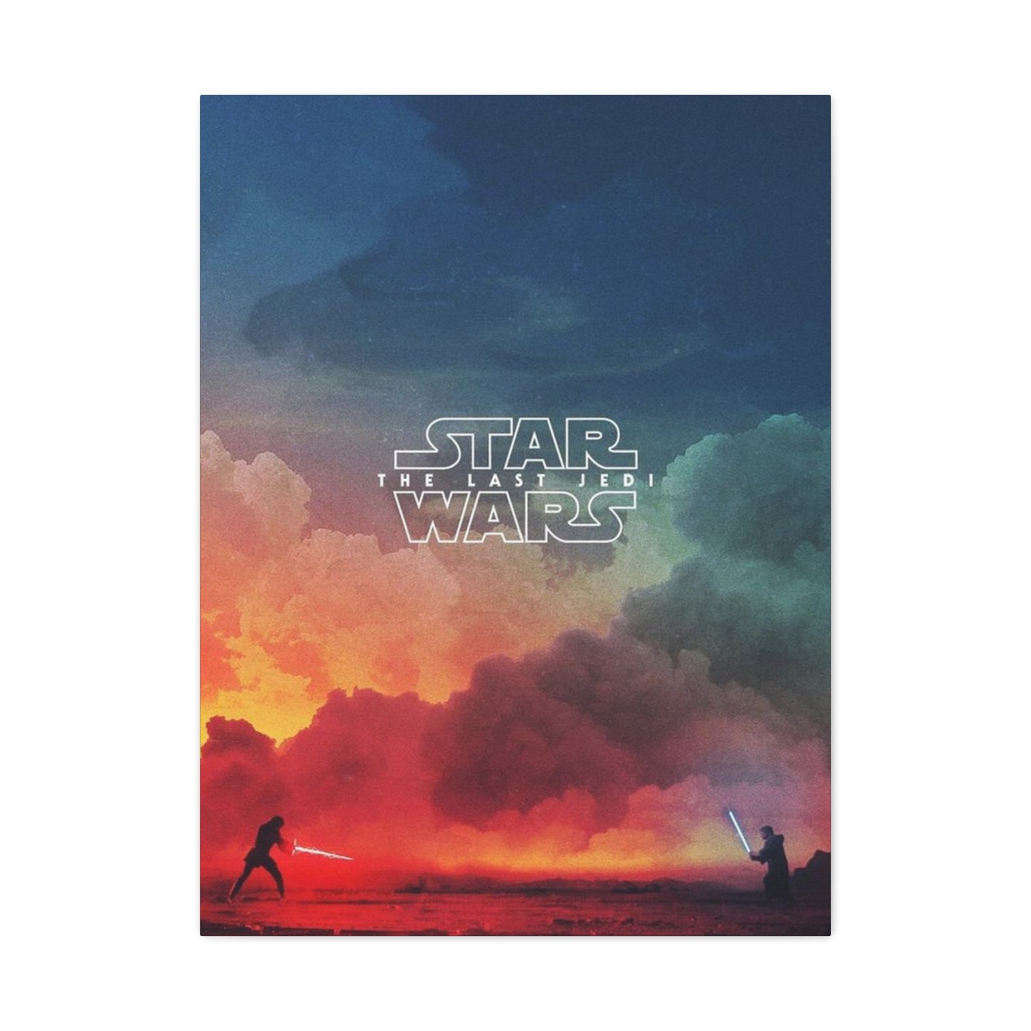
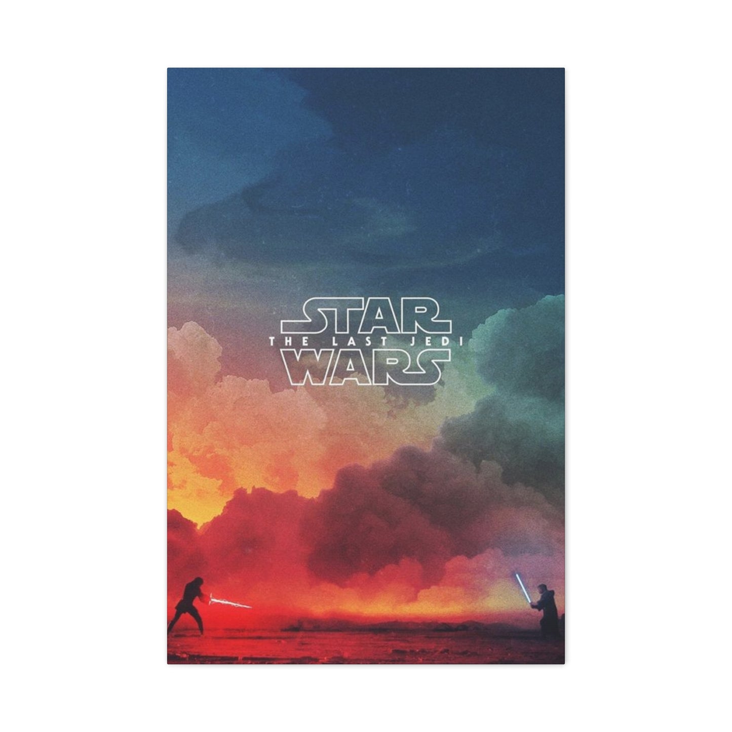
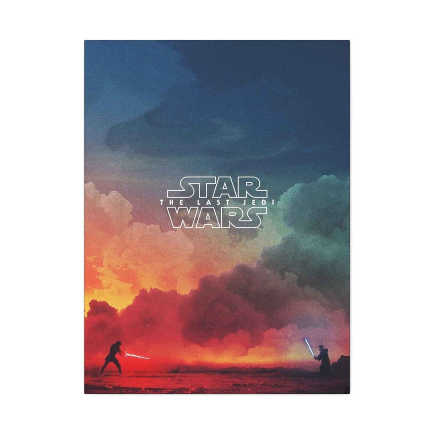
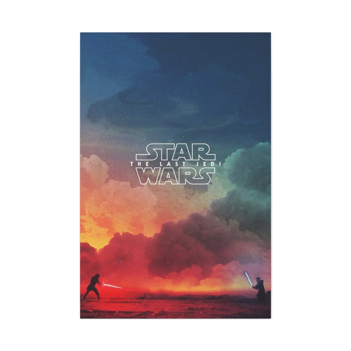
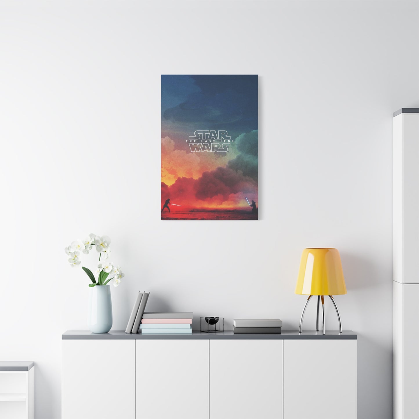
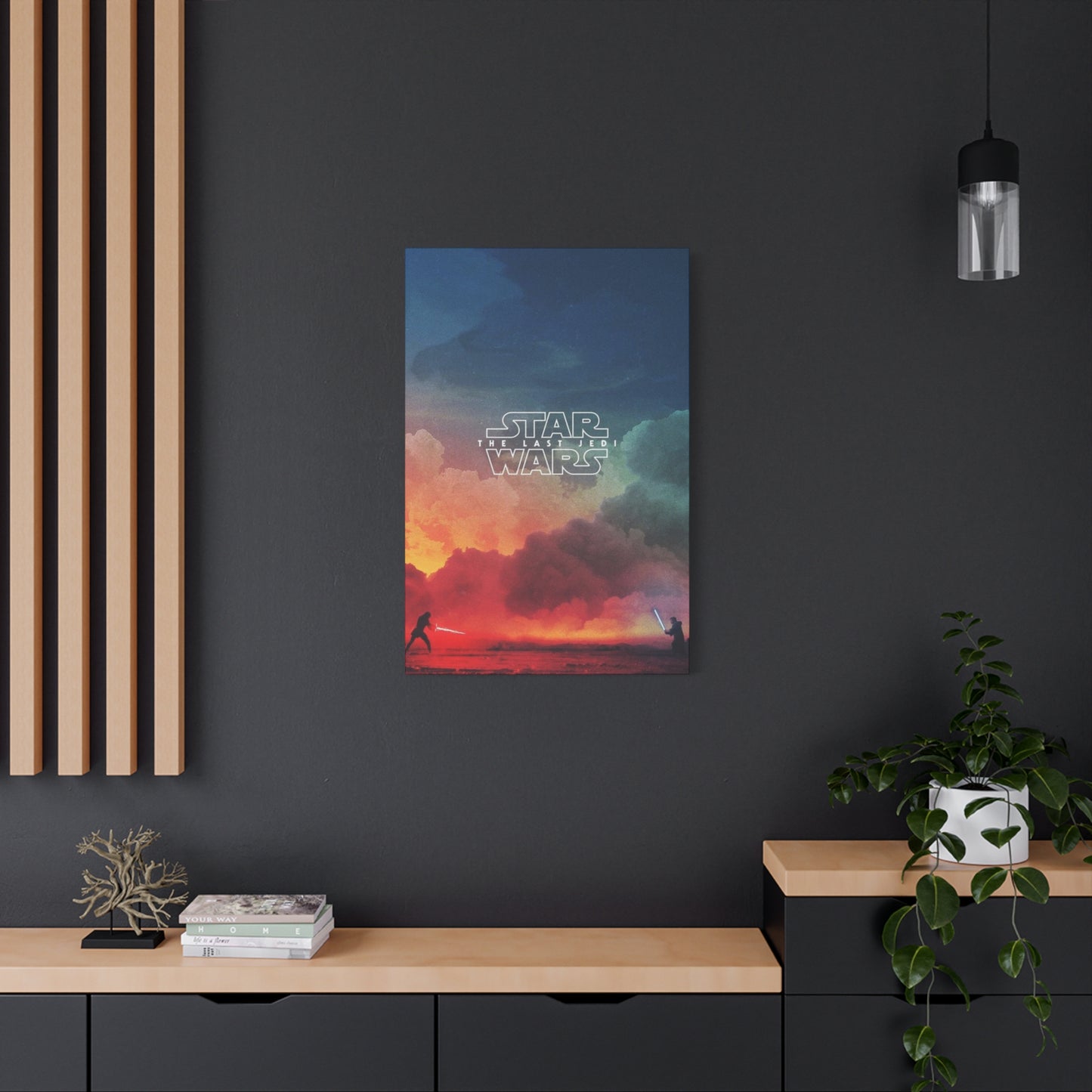
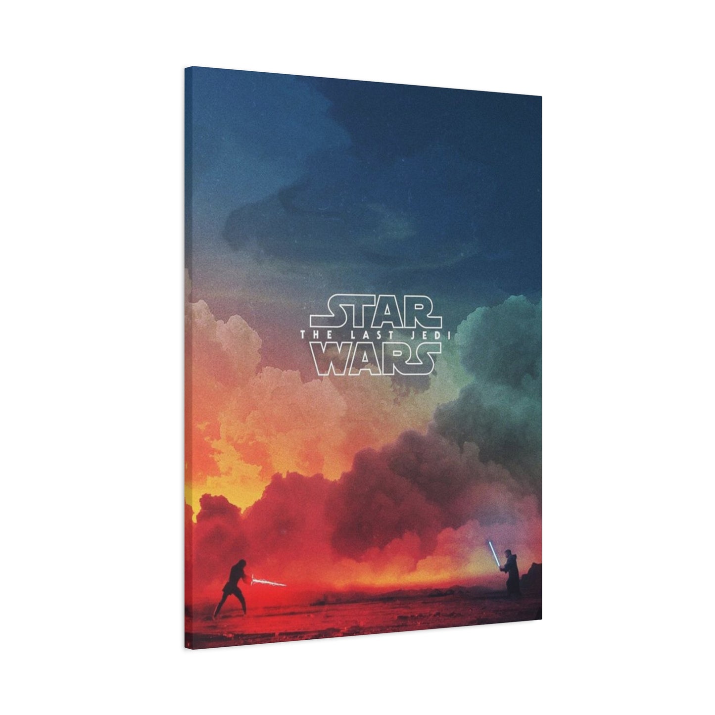
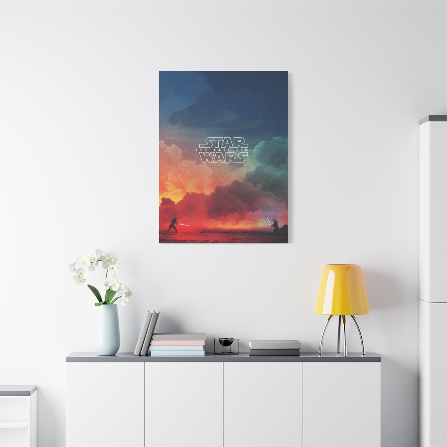
At its core, The Last Jedi poster wall art serves as a tribute to one of the most dynamic and ambitious films in the Star Wars franchise. The movie itself, which boldly challenged expectations, both visually and narratively, is echoed in the artwork. The bold imagery and stunning visuals of the poster capture pivotal moments from the film—whether it’s Rey's epic training scenes with Luke Skywalker, the clash between Kylo Ren and Rey, or the grandeur of the Resistance’s struggle against the First Order. Each element in the poster art embodies the gripping emotional stakes, high-stakes battles, and rich storytelling that define The Last Jedi. The poster isn't just a passive decoration; it’s an active piece of storytelling that invites viewers to reconnect with the themes of hope, resistance, and personal growth portrayed in the film.
In terms of modern cinema decor, The Last Jedi poster wall art stands as an iconic reminder of the film’s cultural impact. This movie, released in 2017, sparked debates, discussions, and reflections on its deeper themes of identity, legacy, and choice within the Star Wars universe. The artwork reflects the same complexity, with its deep contrasts, ethereal colors, and strong character portrayals. From the iconic red and black tones that represent the conflict between the light and dark sides, to the visually arresting image of Rey holding Luke's lightsaber—every aspect of the poster is designed to elicit emotional resonance and awe. Incorporating such a rich piece into modern decor instantly elevates any room, blending pop culture appeal with sophisticated design elements that can easily integrate into contemporary or minimalist spaces.
Moreover, The Last Jedi poster wall art is a testament to the lasting appeal of Star Wars in popular culture. For many fans, this poster serves not only as a tribute to their love for the series but also as a statement about the enduring legacy of the Star Wars saga. The franchise has touched multiple generations, inspiring countless individuals to embrace themes of hope, adventure, and personal transformation. Displaying the poster as part of modern cinema decor becomes a way to keep that legacy alive—both for long-time fans and newcomers. It acts as a symbol of continuity, connecting different eras of Star Wars fandom and cementing the film’s place in the larger cultural narrative. As Star Wars continues to evolve, The Last Jedi stands as a pivotal chapter, and owning its artwork honors both the past and the future of this beloved series.
The collector’s appeal of The Last Jedi poster wall art cannot be understated. For fans, this piece becomes more than just a decorative object; it is a collector's item that holds both emotional and historical value. The film itself was marked by its boldness in taking the Star Wars story in unexpected directions, and the poster—featuring striking visuals like Rey and Kylo Ren's duality—represents that same daring spirit. Owning this art piece is not just about appreciating the visual artistry of the poster, but also about recognizing its role in the evolution of modern cinema. As one of the most iconic franchises of all time, Star Wars continues to inspire cinematic artistry and innovation, and this artwork is a visual testament to that enduring legacy.
What makes The Last Jedi poster wall art especially significant is how it transcends the movie itself and becomes a representation of the Star Wars fandom as a whole. Star Wars isn’t just a franchise; it’s a shared cultural phenomenon that connects fans of all ages, backgrounds, and experiences. The poster serves as a point of unity for fans, a symbol of their collective appreciation for a universe that has given them more than just entertainment, but also life lessons, moral challenges, and cultural touchstones. Displaying this artwork in your home or office creates a sense of community and belonging, inviting those who share the same love for the franchise to engage in discussions and reminiscences. It becomes a physical manifestation of the emotional ties that Star Wars fans share, linking them to one of the most beloved cinematic universes ever created.
Additionally, the design and quality of The Last Jedi poster make it an exceptional addition to any modern home. Whether in a home theater, a dedicated Star Wars collection, or as a standalone statement piece in a living room or office space, the poster adds a layer of style and sophistication to any room. Its dramatic colors, dynamic compositions, and iconic characters make it a visual centerpiece that seamlessly integrates into both classic and modern interiors. The sharpness of the imagery and the high-quality printing techniques used for the artwork ensure that the poster maintains its vividness and clarity over time, making it a timeless collector’s piece that retains its appeal for years to come.
