Three Shades Of Olive Green Wall Art & Canvas Prints
Three Shades Of Olive Green Wall Art & Canvas Prints
Couldn't load pickup availability
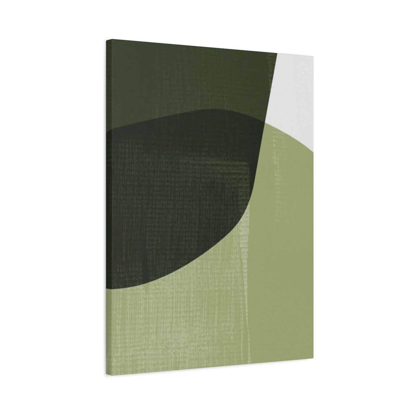

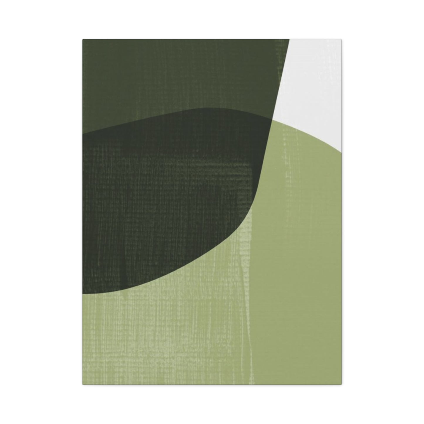
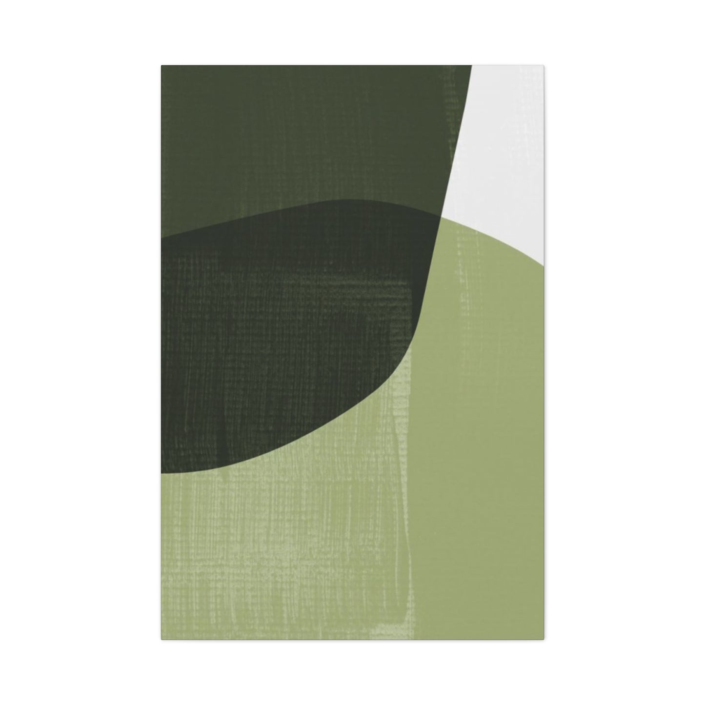

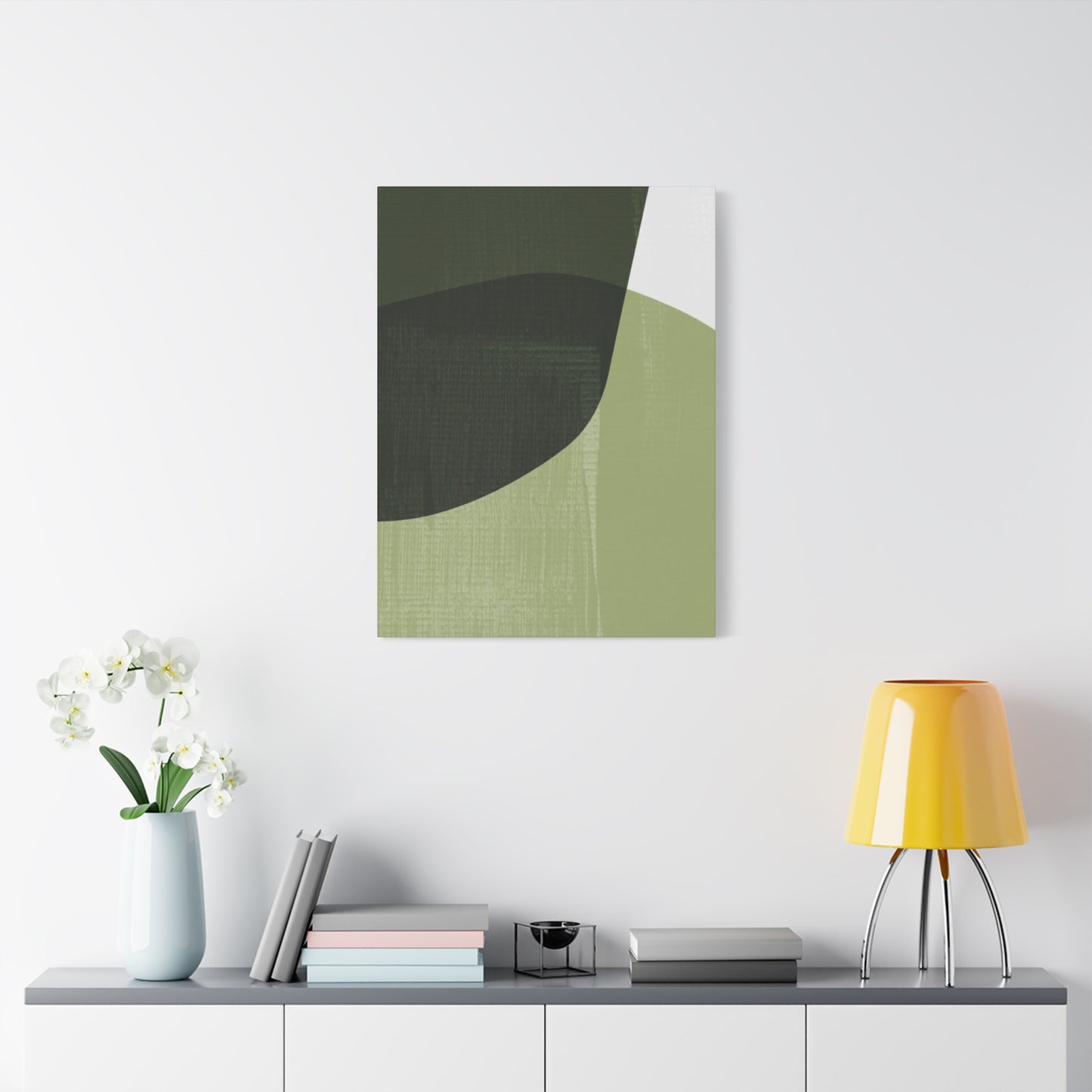
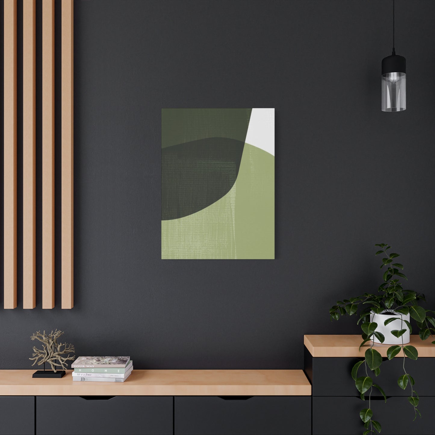
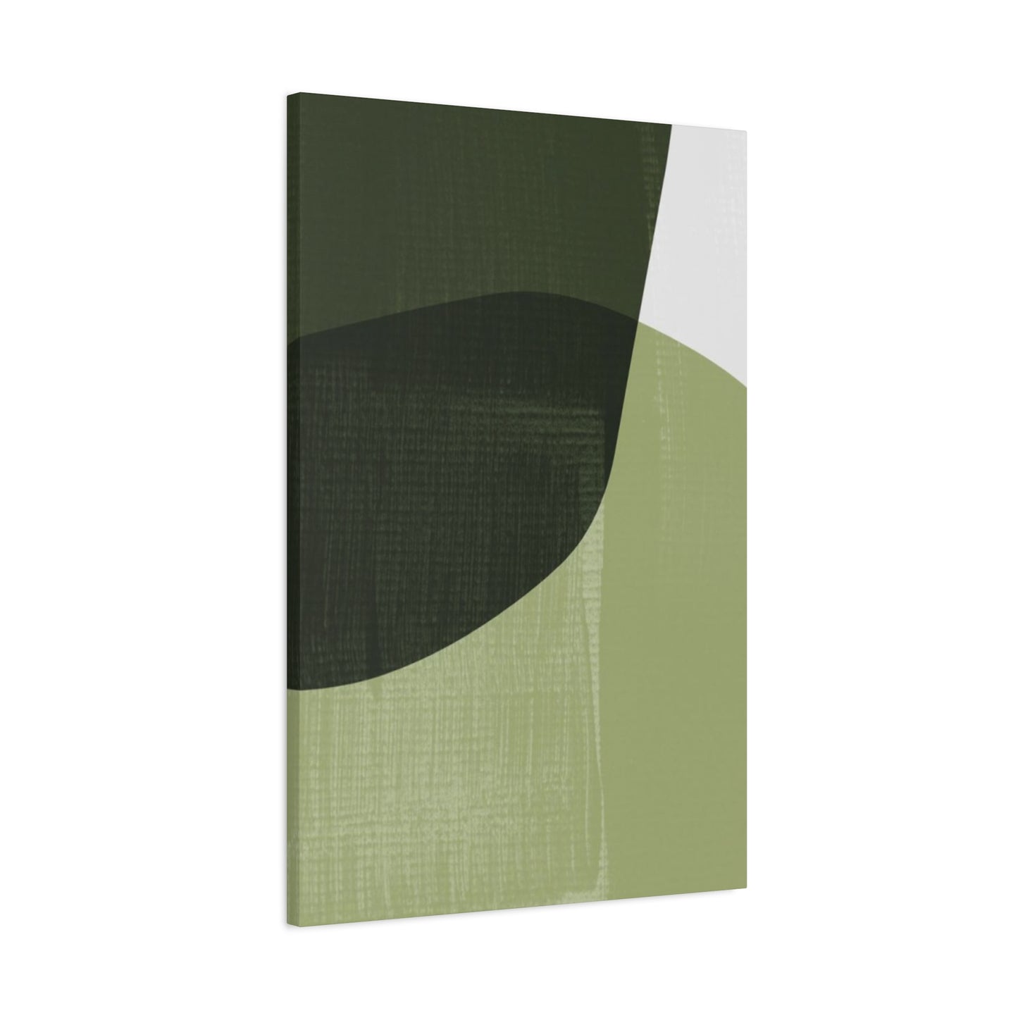
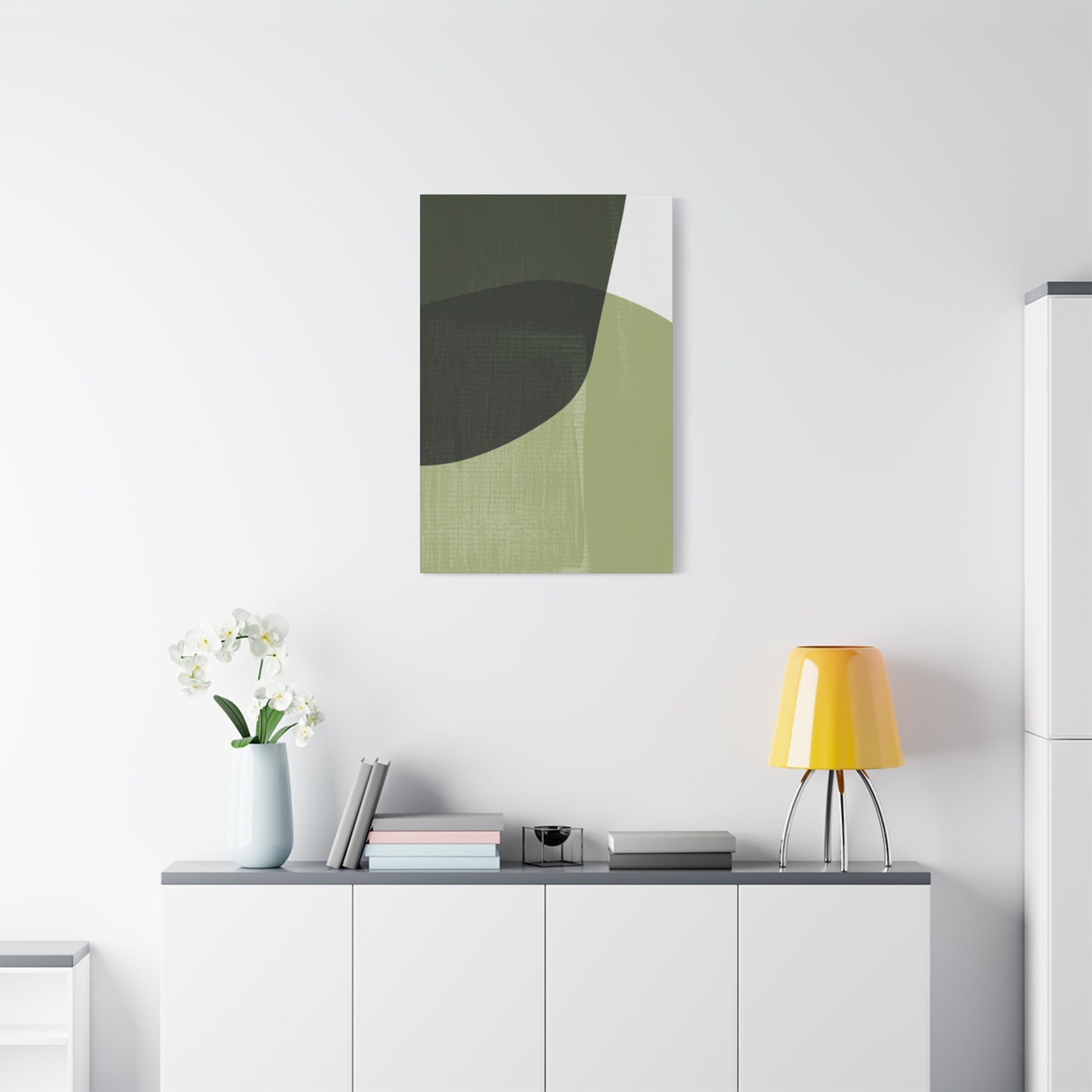
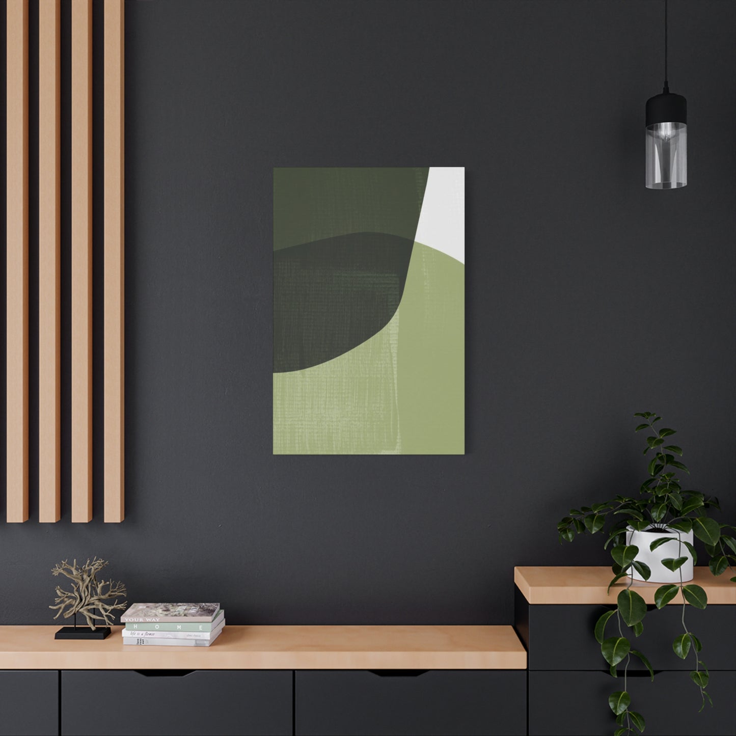
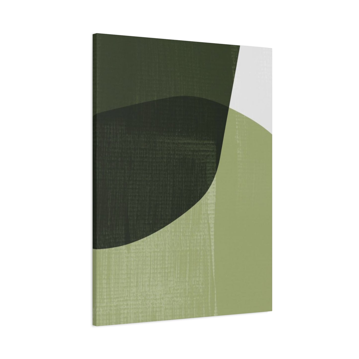
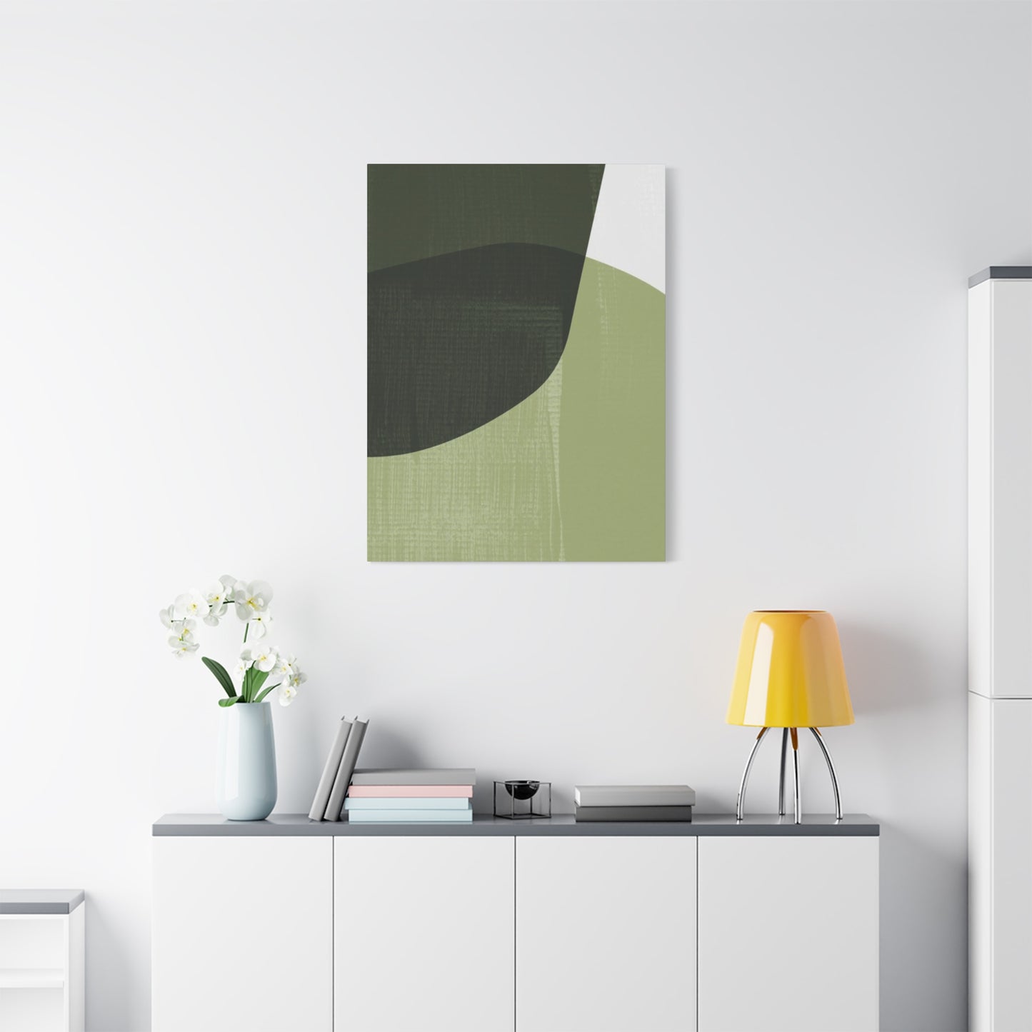
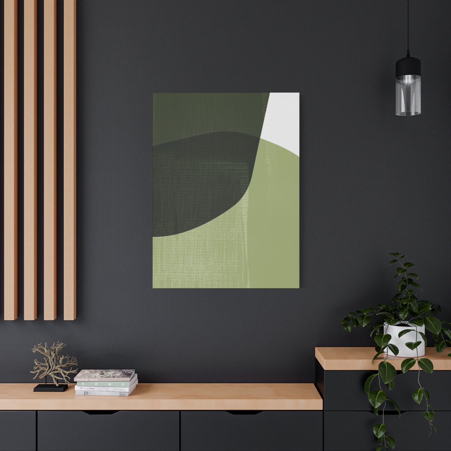

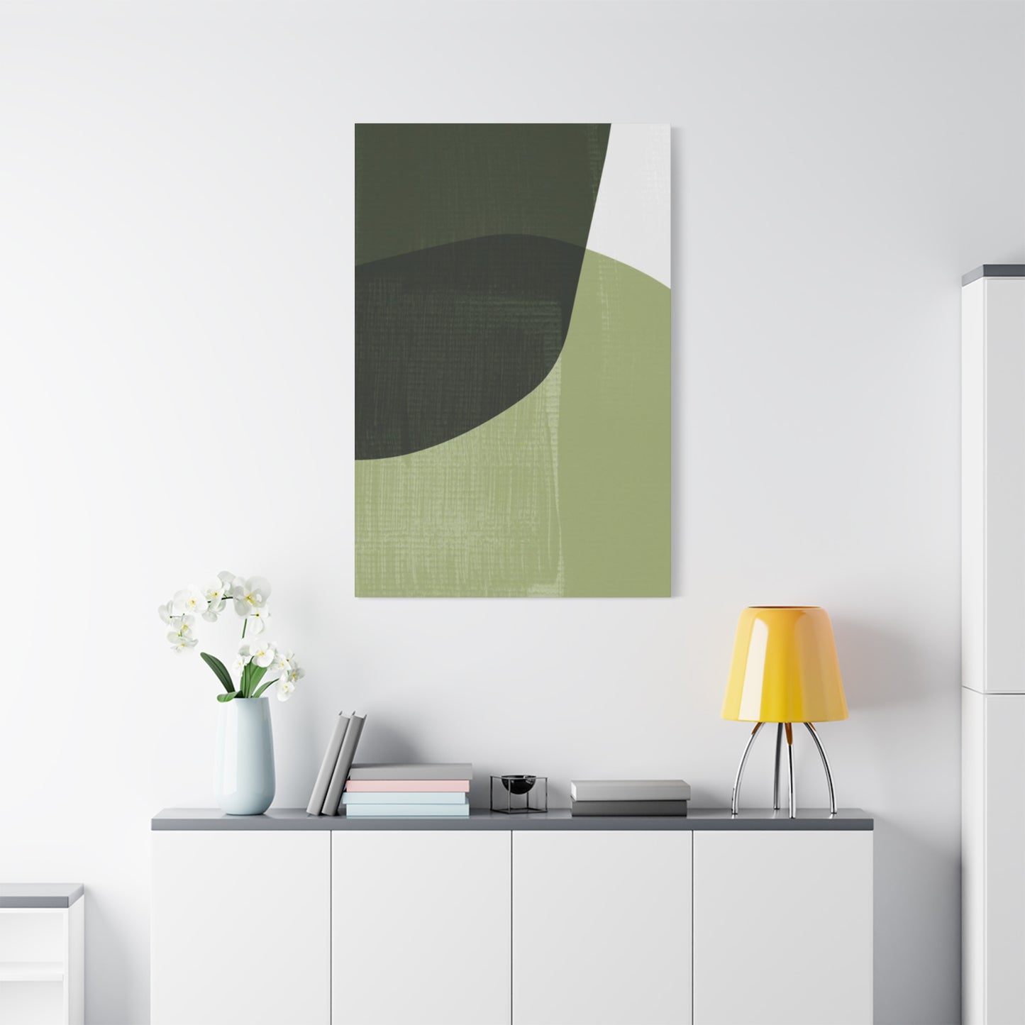
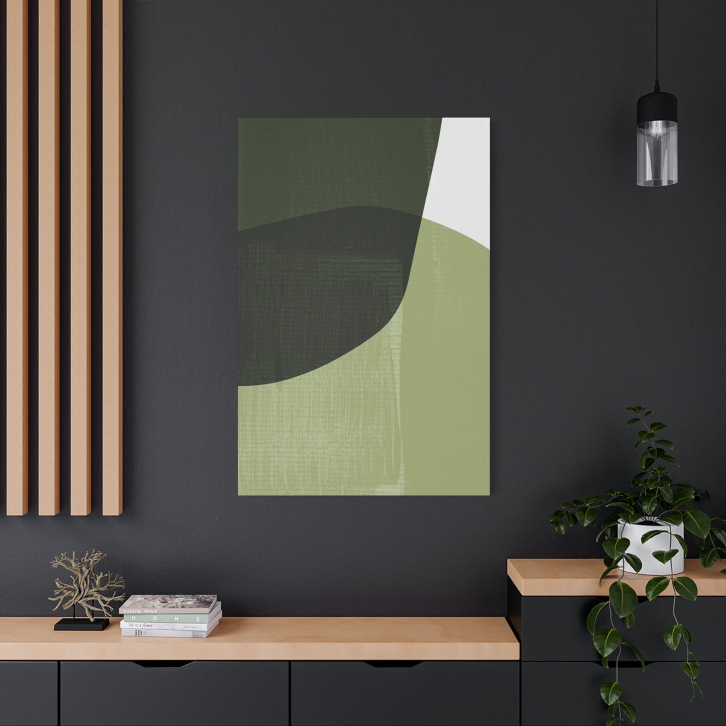
Shades of Olive Green Wall Art: Elevating Your Home with Nature's Most Sophisticated Hue
The world of interior design constantly evolves, yet certain colors maintain their timeless appeal while adapting to modern aesthetics. Among these enduring hues, olive green stands out as a versatile and sophisticated choice that brings the tranquility of nature into our living spaces. This comprehensive exploration delves into the multifaceted world of olive green wall art, particularly focusing on how three distinct shades of this magnificent color can revolutionize your home environment.
When we talk about incorporating olive green into interior spaces, we're discussing more than just a color choice. We're exploring a design philosophy that connects us to the natural world while maintaining contemporary elegance. The beauty of using multiple shades in a single piece creates visual interest that single-tone artwork simply cannot achieve. This layered approach to color application produces depth, dimension, and a dynamic presence that transforms ordinary walls into captivating focal points.
The journey through olive green wall art reveals how this particular hue bridges the gap between bold statement pieces and subtle background elements. Whether you're redesigning your entire home or simply seeking to refresh a single room, understanding the nuances of olive green and its various applications will empower you to make confident design decisions that reflect your personal style while creating spaces that feel both inviting and sophisticated.
The Soothing Influence of Olive Green in Artistic Displays
The human response to color runs deeper than mere visual preference. When olive green appears in our living spaces, particularly through carefully crafted wall art, it triggers a cascade of psychological responses that promote relaxation and mental clarity. This phenomenon isn't accidental but rather the result of our evolutionary connection to natural environments where green hues dominated our ancestral landscapes.
Scientific research into color psychology reveals that green tones, especially the muted sophistication of olive, activate the parasympathetic nervous system. This activation leads to decreased heart rate, lowered blood pressure, and reduced cortisol levels, the hormone associated with stress. When we display olive green art in our homes, we're essentially creating miniature sanctuaries that offer refuge from the constant stimulation of modern life.
The specific quality of olive green sets it apart from brighter, more saturated greens. While vibrant lime or emerald might energize or even overwhelm a space, olive's earthy undertones provide grounding without heaviness. This balance makes it particularly effective in rooms where we seek both alertness and calm, such as home offices or reading nooks. The color stimulates enough to keep us engaged with our surroundings while maintaining the tranquility necessary for focused thought.
Art featuring olive green tones also benefits from the color's ability to reduce eye strain. In our screen-dominated world, our eyes constantly adjust to harsh blue lights and stark contrasts. Olive green offers a visual respite, giving our eyes a comfortable focal point that doesn't demand constant adjustment. This quality makes it especially valuable in spaces where we spend extended periods, whether working, relaxing, or socializing.
The calming effect extends beyond individual psychology to influence social dynamics within spaces. Rooms featuring olive green art tend to facilitate easier conversation and deeper connection among occupants. The color doesn't compete for attention in the way that more aggressive hues might, allowing the people in the space to become the focus rather than the décor. This subtle facilitation of human connection makes olive green particularly valuable in living rooms, dining areas, and other gathering spaces.
Moreover, the seasonal associations of olive green contribute to its calming properties. Unlike colors strongly associated with specific seasons, olive green evokes the transitional periods of spring and autumn, times traditionally associated with renewal and reflection. This timeless quality means that olive green art never feels out of place regardless of the season, maintaining its calming influence year-round without requiring seasonal décor rotations.
The texture implied by olive green also plays a role in its psychological impact. Even in flat, printed art, the color suggests the tactile qualities of natural materials: aged wood, weathered stone, dried herbs, and forest floors. This textural association adds depth to the calming effect, engaging not just our visual sense but also our memory of how natural materials feel, creating a more immersive sensory experience.
Infusing Your Environment with Cozy Ambiance Through Layered Green Tones
The concept of warmth in interior design extends beyond temperature to encompass the emotional quality of a space. When we describe a room as warm, we're referring to its ability to make us feel welcomed, comfortable, and at ease. Artwork featuring three distinct shades of olive green achieves this warmth through the interplay of tones that create visual harmony while maintaining interest.
The layering of multiple olive green shades mimics patterns found in nature, where a single color rarely appears in isolation. Consider a forest canopy where sunlight filters through leaves at various heights, creating gradations from deep shadow to dappled light. Similarly, a seascape transitions from the rich green of deep water to the pale aquamarine of breaking waves. Artwork that incorporates three shades of olive green taps into these natural patterns, creating an instinctive sense of rightness in viewers.
This tonal variation serves practical purposes beyond aesthetics. In rooms with varying natural light throughout the day, multi-toned art maintains its visual interest regardless of lighting conditions. Morning light might emphasize the lighter olive shades, creating an airy, optimistic feel. As afternoon progresses, the medium tones gain prominence, providing steady visual comfort. Evening artificial light brings depth to the darkest shade, adding richness and intimacy as day transitions to night.
The warmth generated by layered olive tones also derives from the color's inherent versatility in working with other elements in your space. Olive green contains both warm yellow undertones and cool blue notes, allowing it to bridge different color families. This chameleon-like quality means that three-shade olive art can harmonize with warm wood tones, cool gray textiles, crisp white walls, or even bolder accent colors without creating visual discord.
From a design perspective, the gradation between three shades creates what designers call "color flow," a visual journey that guides the eye through the piece and, by extension, through the room. This movement prevents spaces from feeling static or boring. Even in minimalist interiors where furnishings are deliberately simple, the subtle complexity of multi-toned art provides the visual interest necessary to keep spaces feeling alive and engaging.
The warmth of layered olive tones also manifests in how they interact with artificial lighting. Under warm-toned bulbs, the yellow undertones in olive green become more pronounced, creating a cozy, intimate atmosphere perfect for evening relaxation. Under cooler daylight-balanced lights, the color's more neutral qualities emerge, maintaining freshness and clarity. This adaptability means your art investment continues performing aesthetically across different lighting scenarios and design evolutions.
Cultural associations further enhance the warmth of olive green. In Mediterranean regions, olive trees symbolize peace, prosperity, and hospitality. These positive associations transfer to interior spaces featuring olive hues, unconsciously signaling welcome and abundance to occupants and guests. The layering of shades amplifies this effect, suggesting not just the presence of olive but the richness of an entire grove or landscape.
Finally, the warmth of three-shade olive art comes from its ability to anchor a room without overwhelming it. Unlike artwork featuring jarring contrasts or competing colors, harmonious olive tones provide a stable visual foundation. This stability allows other design elements, from throw pillows to decorative objects, to shine while maintaining overall cohesion. The result is a space that feels intentionally designed yet comfortably livable, sophisticated yet approachable.
Integrating Earthy Tones into Residential Spaces Through Artistic Expression
The movement toward biophilic design, which seeks to connect building occupants with nature, has elevated olive green from a simple color choice to a design strategy. Wall art serves as one of the most accessible and impactful ways to introduce these earthy tones into homes, requiring no structural changes while delivering significant aesthetic and psychological benefits.
When incorporating olive green through wall art, the first consideration involves understanding your space's existing palette. Homes with neutral foundations in whites, grays, or beiges provide an ideal canvas for olive green art. The earthy tone adds visual interest without requiring extensive redecorating. For those with warmer palettes featuring browns, tans, or creams, olive green art creates harmonious continuity that reinforces the natural theme. Even in spaces with existing color commitments, olive green's neutrality allows it to complement rather than compete.
The scale of your artwork dramatically impacts its effectiveness in incorporating olive into your home. Large-scale pieces make bold statements, instantly transforming a room's character and establishing olive as a key element in your color story. These work particularly well in rooms with high ceilings or expansive walls that might otherwise feel empty or institutional. Conversely, smaller olive green pieces can be clustered to create gallery walls that build the color presence gradually, allowing for more personalized arrangements and easier updates as your style evolves.
Placement strategy significantly affects how successfully olive green art incorporates into your space. In living rooms, positioning olive artwork above seating areas creates a visual anchor that grounds conversation zones. The calming properties of olive enhance the room's function as a gathering space while the three-shade variation maintains visual engagement during extended socializing. In dining areas, olive green art contributes to the appetite-friendly nature of green hues while adding sophistication that elevates meal experiences from routine to special.
Bedrooms present unique opportunities for olive green art integration. As spaces dedicated to rest and rejuvenation, bedrooms benefit maximally from olive's calming properties. Positioning three-shade olive art where it's visible from the bed creates a focal point for pre-sleep meditation and a pleasant first sight upon waking. The color's association with nature supports healthy circadian rhythms by unconsciously connecting indoor spaces with outdoor environments where natural light cycles regulate sleep patterns.
Home offices and study spaces represent another ideal venue for olive green art. These areas require a delicate balance between stimulation for productivity and calm for concentration. Olive green's position in the color spectrum achieves this balance naturally. Three-shade variations add enough visual complexity to prevent monotony during long work sessions while maintaining the focus-supporting properties of more unified color schemes. Positioning such art within the peripheral vision of workspace occupants provides subconscious stress relief without becoming a distraction from tasks.
Bathrooms, often overlooked in art placement, transform beautifully with olive green additions. The color's natural associations make it perfect for spaces dedicated to cleansing and renewal. Moisture-resistant prints or canvas treatments allow olive green art to thrive even in humid conditions. The three-shade approach adds spa-like sophistication, elevating daily routines into self-care rituals.
Hallways and transitional spaces benefit from olive green art's ability to create visual continuity throughout a home. These often-neglected areas become intentional parts of your design story when olive green artwork connects them to other rooms. The color's versatility means it can bridge different design schemes in adjacent spaces, creating flow rather than jarring transitions as inhabitants move through the home.
The incorporation of olive green through wall art also offers flexibility for renters or those hesitant about permanent color commitments. Unlike paint, which requires significant investment and effort to change, art can be easily repositioned or replaced as tastes evolve. This flexibility makes olive green art an ideal starting point for those wanting to experiment with the color before committing to larger applications like furniture or window treatments.
Deeper Meanings Behind Olive Hues in Living Space Design
Beyond its aesthetic appeal, olive green carries rich symbolic weight that adds layers of meaning to interior spaces. Understanding these associations helps homeowners make intentional design choices that align their environments with their values and aspirations. When olive green appears in wall art, it brings these symbolic dimensions into daily life, creating spaces that resonate on both conscious and subconscious levels.
Historically, olive branches have symbolized peace across numerous cultures and millennia. From ancient Greek traditions to contemporary diplomatic imagery, the olive represents reconciliation, harmony, and the cessation of conflict. Incorporating olive green into home interiors through wall art subtly invokes these peaceful associations, creating environments that feel like refuges from external chaos. This symbolism proves particularly valuable in our current era, where many people seek their homes to serve as sanctuaries from increasingly tumultuous world events.
The olive tree's remarkable longevity, with specimens documented living over a thousand years, imbues olive green with associations of endurance, stability, and timelessness. In interior design, this translates to choices that transcend temporary trends. Wall art featuring olive tones signals intentionality and confidence in one's aesthetic choices, suggesting that the homeowner values lasting quality over fleeting fashion. This symbolic dimension adds gravitas to spaces, making them feel established and trustworthy rather than hastily assembled or superficial.
In Mediterranean cultures, where olive cultivation has sustained civilizations for millennia, olive green symbolizes abundance and prosperity. The connection between olive oil production and economic wellbeing created deep cultural associations between olive hues and successful harvests, full pantries, and comfortable living. These positive associations transfer to modern interiors featuring olive green, unconsciously communicating sufficiency and comfort. This makes olive green particularly appropriate for dining rooms and kitchens, where abundance symbolism reinforces these spaces' roles in nourishment and hospitality.
Religious and spiritual traditions have long incorporated olive imagery into their symbolism. In Christian tradition, the olive branch returned by Noah's dove signaled the end of the flood and God's renewed covenant with humanity. In Islamic tradition, the olive is mentioned prominently in sacred texts and associated with light and blessing. In Jewish tradition, olive oil fueled the temple menorah and represents divine presence. These diverse spiritual associations give olive green a sacred quality that can add depth to meditation spaces, prayer corners, or any area dedicated to contemplation and inner work.
From a feng shui perspective, olive green represents the wood element, associated with growth, vitality, and new beginnings. Unlike brighter greens that might represent vigorous spring growth, olive's muted tones suggest mature wood, stable growth, and established energy. This makes it particularly appropriate for spaces where steady progress rather than explosive change is desired. Home offices, study areas, and creative studios benefit from olive's symbolic support of consistent, sustainable development.
The color's military associations, while sometimes overlooked in design contexts, contribute to its symbolic depth. Military olive drab was chosen for its practical camouflaging properties, creating associations with protection, preparedness, and strategic thinking. In home contexts, these associations translate to feelings of security and confidence. A space featuring olive green art communicates that the inhabitants are grounded, capable, and ready to handle life's challenges, not through aggression but through preparedness and resilience.
In color symbolism systems, olive green occupies a unique position as a tertiary color, created through mixing primary and secondary colors. This complexity gives it symbolic associations with sophistication, nuance, and maturity. Unlike primary colors that can feel juvenile or overly simplistic, olive's composite nature suggests complexity and depth. Homes featuring olive green art communicate that the inhabitants appreciate subtlety and possess refined tastes, comfortable with ambiguity and complexity rather than requiring bold, simple statements.
The harvest associations of olive green add another symbolic layer. As a color associated with autumn and gathering, olive green evokes themes of culmination, gratitude, and preparation for quieter seasons. In interior spaces, this creates an atmosphere of contentment and reflection, ideal for homes that serve as retreats from productive public life. This symbolism makes olive particularly appropriate for empty-nesters, retirees, or anyone seeking to create spaces that celebrate life's accumulated wisdom and experiences.
Building Visual Dimension Using Graduated Olive Tones on Wall Surfaces
Depth perception in interior spaces extends beyond physical dimensions to encompass visual depth created through color, contrast, and layering. Artwork featuring three shades of olive green excels at creating this visual dimension, transforming flat walls into dynamic surfaces that engage viewers and enhance spatial perception. This dimensional quality proves particularly valuable in smaller spaces or rooms with architectural limitations.
The human eye naturally perceives lighter colors as receding and darker colors as advancing. Art that incorporates three distinct shades of olive leverages this perceptual phenomenon to create implied depth even in flat media. The lightest olive shade suggests distance or highlight, the medium tone represents the middle ground, and the darkest shade appears to advance toward the viewer. This tonal progression creates a sense of space and complexity that single-shade artwork cannot achieve, making walls appear less flat and more architecturally interesting.
Shadows and highlights in multi-shade olive art mimic the way light interacts with three-dimensional forms. Even though the artwork itself is two-dimensional, the gradation of tones suggests volumetric form, tricking the eye into perceiving depth. This illusionistic quality adds sophistication to the piece while preventing the visual monotony that can result from large expanses of uniform color. The varied shades create movement across the surface, guiding the eye through the composition and maintaining viewer interest through implied spatial complexity.
In rooms with limited architectural features, three-shade olive art compensates for this simplicity by adding visual complexity. Modern construction often produces rooms with flat walls, minimal molding, and simple geometries. While this provides a clean canvas, it can feel austere or institutional. Strategic placement of multi-toned olive art introduces the visual interest that architectural details would otherwise provide, creating focal points and visual texture without requiring renovations or structural modifications.
The depth created by tonal variation also affects how a room feels spatially. Rooms with dimensional art appear larger and more complex than their physical measurements suggest. This perception stems from the visual interest created by the tonal interplay, which occupies the viewer's attention and creates the impression of a more complex environment. For apartment dwellers or those with smaller homes, this perceptual expansion proves invaluable in preventing spaces from feeling cramped or claustrophobic.
Lighting dramatically affects how three-shade olive art creates depth. Different light sources emphasize different tones within the piece, causing the perceived depth to shift throughout the day. Morning light might emphasize lighter tones, creating an airy feel. Midday light reveals all three shades with equal clarity, showcasing the full dimensional effect. Evening light may emphasize darker tones, adding intimacy and depth. This dynamic quality means the artwork effectively functions as multiple pieces, changing character with lighting conditions while maintaining cohesive beauty.
The placement of three-shade olive art within a room influences the depth it creates. Positioning such art on the wall perpendicular to windows maximizes the interplay between natural light and the piece's tonal variations. The changing angle of sunlight throughout the day creates evolving shadow patterns that enhance the implied three-dimensionality. Conversely, placement opposite windows creates more consistent lighting, emphasizing the inherent tonal variations rather than light-created shadows.
From a compositional perspective, how the three shades are arranged within the artwork affects depth perception. Horizontal bands of graduated tone can make walls appear wider, beneficial in narrow rooms. Vertical arrangements of the three shades can make ceilings appear higher, addressing low-ceiling challenges. Circular or radial arrangements create focal points that draw the eye inward, adding depth through implied perspective. Organic, irregular distributions of the three tones create natural depth reminiscent of landscapes, where color appears in irregular patterns based on topography and lighting.
The frame or mounting of three-shade olive art also impacts its dimensional qualities. Floating frames that create physical space between the artwork and wall enhance the perception of depth by adding actual three-dimensionality. Canvas wraps that continue the image around the edges increase dimensional illusion by suggesting the composition extends beyond visible borders. Traditional framing with matting creates layered depth through the physical separation between image, mat, and frame, with color choices in these elements either emphasizing or softening the dimensional effect.
Adaptable Applications of Earthy Green Artwork Across Different Areas
The true measure of a design element's value lies in its versatility, its ability to function successfully across diverse settings and purposes. Olive green wall art demonstrates exceptional adaptability, performing beautifully in virtually any room of a home while accommodating a wide range of design styles. This universal applicability makes it a safe yet sophisticated investment for homeowners seeking pieces that can evolve with their changing needs and tastes.
In living rooms, olive green art adapts to serve multiple functions. Above a sofa, it provides a grounding focal point that anchors seating arrangements without overwhelming the space. Flanking a fireplace, paired pieces in three olive shades create symmetry while maintaining organic appeal. In conversation areas, olive green's calming properties facilitate social interaction by creating a relaxed atmosphere that encourages genuine connection. The color's neutrality means it coordinates with diverse furniture styles, from mid-century modern to traditional to contemporary, without requiring complete redesigns when furnishing preferences evolve.
Dining spaces gain particular benefit from olive green art's versatility. The color's appetite-enhancing properties, shared with most greens, make it appropriate for areas dedicated to meals and gathering. Unlike more aggressive colors that might dominate the dining experience, olive green provides pleasant background ambiance that supports rather than overshadows culinary presentations and table settings. Whether your dining style trends toward formal dinner parties or casual family meals, olive green art adapts to the occasion, sophisticated enough for entertaining yet comfortable enough for everyday use.
Kitchens present unique challenges in art selection due to practical considerations like splatter potential and humidity fluctuations. Olive green art proves particularly suitable for these spaces through both practical and aesthetic dimensions. Practically, olive's mid-tone value disguises minor imperfections or accumulated kitchen grime better than lighter colors while avoiding the cave-like feeling darker colors might create. Aesthetically, olive's natural associations complement the farm-to-table movement in contemporary cooking, reinforcing connections between food and its natural origins while adding visual interest to this highly functional space.
Bedrooms across all demographic groups benefit from olive green's versatile properties. In master suites, the color's sophistication creates retreat-like atmospheres that support rest and intimacy. In children's rooms, olive's gender-neutral quality provides longevity as kids grow and their color preferences evolve, avoiding the need for frequent redecorating. In teen spaces, olive's current trendiness appeals to youth sensibilities while maintaining the mature appearance parents prefer. Guest rooms furnished with olive green art feel welcoming without imposing strong personality, allowing visitors to feel comfortable rather than overwhelmed by the host's design preferences.
Home offices require careful color selection to balance productivity with comfort, stimulation with calm. Olive green art excels in this setting through its positioning in color psychology. Unlike blues, which can feel cold during long work sessions, or reds, which might prove too stimulating for sustained concentration, olive green occupies the goldilocks zone of visual stimulation. It's interesting enough to prevent the visual monotony that causes attention to wander while calm enough to support the sustained focus knowledge work demands. As remote work continues reshaping domestic spaces, this versatility makes olive green art an excellent choice for dedicated offices and multipurpose spaces serving work functions.
Bathrooms transform from purely functional spaces into personal spas with the addition of olive green art. The color's natural associations enhance the cleansing and renewal purposes these rooms serve. Moisture-resistant treatments allow olive green prints to thrive even in humid shower rooms and powder baths. The versatility extends to coordinating with various bathroom aesthetics, from sleek modern designs with chrome fixtures to rustic farmhouse styles with weathered wood elements to classic designs featuring traditional tile work.
Hallways and entryways, often challenging to decorate due to their transitional nature and typically limited square footage, work beautifully with olive green art. These spaces benefit from the color's ability to create visual interest without overwhelming narrow passages. Vertical arrangements of three-shade olive art can make low ceilings appear taller in cramped entries, while horizontal arrangements can make narrow hallways feel wider. The color's versatility in coordinating with both warm and cool tones allows it to bridge different color schemes in adjacent rooms, creating flow throughout the home.
Outdoor living spaces increasingly blur the boundaries between interior and exterior design. Covered patios, screened porches, and three-season rooms benefit from olive green art that reinforces their connection to surrounding landscapes. Weather-resistant materials allow these pieces to withstand the environmental challenges these spaces present while the color harmonizes with visible plantings and natural settings. The versatility of olive means it complements various outdoor furniture materials, from wicker to metal to wood, adapting to diverse outdoor design schemes.
Integration of Muted Green Tones in Simplified Interior Approaches
Minimalism as a design philosophy prioritizes intentionality over abundance, quality over quantity, and space over clutter. Within this context, every element must justify its presence through either function or significant aesthetic contribution. Artwork featuring three shades of olive green thrives in minimalist environments by offering visual interest through subtle complexity rather than overwhelming detail or bold contrasts that might conflict with minimalist principles.
The color restraint inherent in three-shade olive art aligns perfectly with minimalist color palettes. Rather than introducing multiple competing colors, this approach explores depth within a single color family, creating sophistication through nuance rather than variety. This discipline resonates with minimalist philosophy's emphasis on finding richness in limitation. The piece provides the visual interest necessary to prevent minimalist spaces from feeling stark or institutional while maintaining the color discipline that defines successful minimalism.
In minimalist interiors, negative space functions as an active design element rather than simply unused area. Olive green art respects this principle by not visually overwhelming the space surrounding it. The muted, natural tones recede appropriately, allowing walls to maintain their spacious quality while providing focal points that organize the visual field. This balance proves difficult to achieve with artwork featuring bold colors or busy compositions that can dominate rather than complement minimal surroundings.
The organic nature of olive green, even in abstract compositions, introduces the natural elements that soften minimalist interiors' sometimes austere character. Pure minimalism, with its emphasis on geometric forms and man-made materials, can feel cold or unwelcoming. Olive green art provides organic warmth that humanizes these spaces without compromising their minimalist integrity. This natural touch prevents minimalist rooms from resembling showrooms or institutional spaces, maintaining the philosophy's clean aesthetic while adding livability.
Texture takes on heightened importance in minimalist spaces where decorative abundance doesn't provide visual interest. Three shades of olive create implied texture through tonal variation, suggesting dimensionality and tactile qualities even in flat media. This textural implication compensates for the reduced actual texture common in minimalist interiors, where smooth, simple surfaces predominate. The eye reads the tonal variations as texture, providing visual complexity that prevents the sensory understimulation minimalist spaces sometimes create.
Scale considerations become critical in minimalist environments where fewer objects means each piece's proportions dramatically affect the space. Three-shade olive art proves versatile across scales, functioning successfully as large-scale statement pieces that provide the visual weight minimalist rooms need or as more modestly sized works that offer interest without dominance. The color's neutral quality means even large pieces don't overwhelm spaces in the way bold colors might, maintaining the open, uncluttered feeling essential to successful minimalism.
The philosophy of wabi-sabi, which embraces imperfection and transience within Japanese minimalist traditions, finds expression in olive green's natural associations. Unlike synthetic colors that suggest artifice, olive's obvious connection to natural phenomena aligns with wabi-sabi's acceptance of natural imperfection. Three-shade variations might be read as natural color variance in organic materials rather than deliberate artistic choice, creating the authentic, unpretentious quality wabi-sabi values.
In minimalist spaces, the longevity of design choices matters significantly because updating requires more dramatic intervention than in maximalist spaces where elements can be easily added or subtracted. Olive green's timeless quality and demonstrated staying power across design movements makes it a safe long-term choice. Unlike trendy colors that may feel dated within years, olive's natural basis and historical presence in design ensures it remains appropriate across evolving aesthetic preferences. This longevity aligns with minimalist values of thoughtful consumption and sustainable living.
Lighting in minimalist spaces often receives special attention, with fixtures serving as sculptural elements and natural light maximized through unobstructed windows. Three-shade olive art responds beautifully to various lighting scenarios, maintaining visual interest under both warm and cool light temperatures. The tonal variations create subtle shadows and highlights that change with lighting angles throughout the day, providing the dynamic quality that prevents minimalist spaces from feeling static despite their spatial simplicity.
Establishing Interior-Exterior Connections Through Plant-Inspired Visuals
Biophilic design recognizes humans' innate need for connection with nature, a need increasingly difficult to satisfy in urbanized, indoor-focused modern life. Olive green wall art serves as a powerful tool for meeting this need by bringing natural colors and associations into interior spaces. This connection to nature provides benefits extending far beyond aesthetics, influencing mental health, productivity, stress levels, and overall wellbeing.
The specific shade of olive green directly references natural landscapes, from the silvery-green of Mediterranean olive groves to the khaki tones of dried grasslands to the muted green of forest understories. These associations trigger biophilic responses in viewers, activating the same neural pathways that respond to actual nature exposure. While not as potent as spending time outdoors, these responses still produce measurable psychological benefits, making olive green art a practical supplement to outdoor experiences, particularly valuable for those with limited access to natural environments.
Research into biophilic design demonstrates that even indirect nature experiences, including representations through color and imagery, reduce stress hormones and increase cognitive function. Office workers with views of nature or nature-representative art show lower stress levels and higher job satisfaction than those without such access. Olive green wall art brings these benefits into homes, creating environments that support rather than tax psychological resources. This proves particularly valuable in urban apartments where actual nature views are limited and outdoor spaces may be inaccessible or unpleasant.
The three-shade approach to olive green art amplifies biophilic benefits by mimicking nature's complexity. Natural environments rarely feature uniform colors; instead, they display gradients, variations, and irregular patterns created by varying light, moisture, and plant maturity. Art that incorporates three olive shades reproduces this natural variety, creating more convincing nature-representative environments. The complexity engages attention in the same way natural settings do, providing the restoration and stress recovery that attention restoration theory associates with nature exposure.
Seasonal disconnection represents a significant challenge in modern climate-controlled environments where interior conditions remain constant regardless of outdoor changes. This disconnection can disrupt circadian rhythms and seasonal mood regulation. Olive green art helps maintain seasonal awareness through its associations with particular times of year. The color's harvest and autumn connections provide subtle seasonal markers that help occupants maintain temporal orientation, supporting healthy biological rhythms even in controlled interior environments.
For children, developing connections with nature supports healthy development, environmental awareness, and long-term wellbeing. However, contemporary childhood increasingly occurs indoors, limiting nature contact. Olive green art in children's spaces helps maintain nature connections, providing visual reminders of natural environments and potentially encouraging outdoor interest. While not replacing actual outdoor play, such art creates interior environments that value and reference nature rather than ignoring or opposing it.
Plant care has become increasingly popular as an interior design element, driven partly by the same biophilic needs that make olive green art effective. However, not everyone has the time, light conditions, or ability to maintain living plants successfully. Olive green art provides nature-representative benefits without the maintenance requirements, making it particularly valuable for travel-heavy households, those with limited natural light, or individuals intimidated by plant care. The art and living plants can also work synergistically, with olive green tones complementing rather than competing with actual greenery.
The psychological restoration provided by nature connections proves particularly valuable in spaces dedicated to recovery and rest. Bedrooms featuring olive green art may facilitate better sleep through the calming associations the color carries. Recovery spaces for those dealing with illness or injury benefit from the stress-reducing properties of nature-representative colors. Even bathrooms, dedicated to daily cleansing and renewal, gain from olive green's reinforcement of these restorative purposes through natural associations.
Environmental psychology research indicates that nature-connected interiors promote pro-environmental behaviors and attitudes. Occupants of spaces featuring natural colors and nature-representative art demonstrate greater environmental concern and more sustainable behaviors than those in nature-disconnected spaces. Olive green wall art might therefore serve not just aesthetic purposes but also as subtle encouragement toward more sustainable living practices, creating a virtuous cycle where interior design choices reflect and reinforce environmental values.
Psychological Dimensions of Earthy Green Hues in Living Environments
Color psychology explores how different hues affect human emotion, cognition, and behavior. Olive green occupies a particularly interesting position within this field, combining the growth associations of pure green with the grounding qualities of brown and the optimism of yellow. Understanding these psychological dimensions helps homeowners make informed decisions about where and how to incorporate olive green art for maximum beneficial impact.
Green in general associates strongly with growth, renewal, and life itself through its connection to photosynthesis and plant life. These associations trigger positive emotional responses in most viewers, connecting to deep evolutionary patterns where green signaled food availability, water presence, and safe environments. Olive green maintains these positive associations while adding sophistication through its muted, complex tone. This complexity creates associations with maturity rather than youth, established growth rather than new beginnings, and steady progress rather than explosive change.
The calming properties of olive green stem partly from its position in the visible light spectrum. Green wavelengths fall in the middle of the spectrum visible to human eyes, requiring minimal adjustment from the eye's focusing mechanisms. This reduces eye strain compared to colors at the spectrum's extremes like red or violet. The result is physical comfort that translates to psychological ease, making spaces featuring olive green art feel literally easier to be in than spaces dominated by more extreme colors.
Olive green's complexity as a color created through mixing multiple pigments gives it psychological associations with sophistication and maturity. Simple, pure colors can feel juvenile or simplistic, while complex tertiary colors like olive suggest nuanced thinking and refined taste. Spaces featuring olive green art communicate that the inhabitants appreciate complexity and possess the confidence to embrace ambiguity rather than requiring bold, simple statements. This psychological messaging affects both residents and visitors, shaping perceptions and interactions within the space.
The color's historical associations with military applications, while potentially problematic in some contexts, contribute positive psychological dimensions in domestic settings. Military olive suggests preparedness, capability, and resilience without aggression. In home environments, these qualities translate to feelings of security and confidence. A space featuring olive green art feels grounded and stable, as if the inhabitants have things under control and can handle whatever challenges arise. This psychological grounding proves particularly valuable during uncertain times or life transitions.
Cultural variations in color psychology mean that olive green's psychological impact varies somewhat across different cultural contexts. In Western cultures, olive's associations with peace, harvest, and nature predominate. In Middle Eastern cultures, where olive cultivation has ancient roots, the color carries additional associations with hospitality, prosperity, and blessing. In Asian contexts, where olive trees are less common, the color might associate more generally with earth elements and stability. These varying associations don't contradict but rather layer upon each other in multicultural households or when hosting diverse guests.
The psychological principle of color harmony explains why olive green art creates calm environments. Harmony arises when colors relate to each other in natural, expected ways. The three-shade approach to olive green art creates inherent harmony through analogous color relationships, where colors sit near each other on the color wheel. This harmony feels instinctively right to viewers, creating comfort and ease that more contrasting color schemes cannot achieve. The psychological result is spaces that feel coordinated and intentional without appearing rigid or overthought.
Mood regulation represents another psychological dimension where olive green demonstrates effectiveness. Unlike colors that might energize to the point of agitation or calm to the point of depression, olive green occupies a psychological middle ground. It lifts mood without overstimulating and calms without sedating. This balanced quality makes it appropriate for spaces serving multiple functions or used by individuals with varying mood regulation needs. A room featuring olive green art can accommodate high-energy activities and quiet contemplation with equal grace.
The psychological concept of affordances, which refers to what an environment appears to offer or allow, applies to olive green's impact. Colors communicate implicit messages about how spaces should be used and what behaviors they support. Olive green's natural, organic qualities suggest spaces are suitable for authentic, unguarded behavior. They feel safe for vulnerability, appropriate for genuine conversation, and conducive to being oneself rather than performing for others. This psychological permission proves particularly valuable in homes.
Conclusion:
Olive green, with its rich, earthy tones, has long been a color that speaks of elegance, harmony, and connection to nature. In recent years, it has surged in popularity within interior design, becoming a go-to choice for homeowners seeking a sophisticated yet soothing aesthetic. When used in wall art, olive green has the unique ability to create an atmosphere that feels both grounded and serene, bringing a natural beauty into any room. Whether you opt for vibrant, abstract patterns or more muted, minimalist designs, olive green can be the perfect medium for expressing personal style while making a bold yet subtle statement.
One of the most compelling aspects of olive green as a choice for wall art is its versatility. It is a color that complements a wide range of other hues, making it an ideal backdrop or focal point in virtually any space. From deep, muted shades to lighter, more yellow-toned greens, olive green pairs beautifully with neutrals like beige, gray, and white, as well as with richer, darker colors like charcoal, navy, and even gold. This adaptability means that olive green wall art can suit a variety of interior styles, from contemporary urban apartments to rustic, country-inspired homes, and everything in between. It seamlessly fits into both modern and traditional settings, adding warmth without overwhelming the senses.
Furthermore, olive green is not just visually appealing but also emotionally resonant. Green, in general, is often associated with calmness, growth, and renewal. As a muted and sophisticated version of green, olive green carries these associations while also invoking feelings of maturity, stability, and peace. In the context of home decor, this makes it an ideal color choice for creating spaces that feel relaxing and welcoming. Olive green wall art can help foster a sense of tranquility, whether it’s a serene landscape painting, a botanical print, or a more abstract design inspired by nature. By incorporating olive green into your home, you bring a touch of the outdoors inside, allowing your living space to feel more connected to the natural world.
In addition to its aesthetic and emotional benefits, olive green wall art also offers a practical advantage. Because olive green is a more muted, earthy tone, it can help balance out rooms with brighter, bolder colors or more intense patterns. If your space already features vibrant furniture or a dynamic color palette, olive green can serve as a neutralizing element, softening the overall look while still adding depth and interest. Whether you're decorating a living room, bedroom, or office, olive green art can act as a calming counterpoint to busy decor, creating a visually pleasing and cohesive environment.
Another key advantage of olive green wall art is its ability to reflect a modern, eco-conscious sensibility. As the world grows increasingly aware of the importance of sustainability and environmental mindfulness, olive green, with its natural connotations, can symbolize your commitment to both nature and style. The color evokes the lush greenery of forests, fields, and gardens—imagery that reflects the planet’s beauty and reminds us of the need to protect and preserve it. Whether through prints of outdoor landscapes or abstract designs that evoke natural forms, olive green wall art can subtly reinforce the values of sustainability, eco-friendliness, and a balanced way of living.
Moreover, the enduring appeal of olive green is its timelessness. Unlike trendy colors that may quickly fall out of fashion, olive green remains a classic choice, continuing to evolve and adapt to new design trends without losing its charm. It is a color that speaks to both contemporary aesthetics and historical traditions. Whether you're decorating in a minimalist style, embracing mid-century modern, or working with a more eclectic, bohemian vibe, olive green wall art can seamlessly transition across different periods and trends, ensuring that your space remains fresh and relevant for years to come.
In conclusion, olive green wall art is much more than just a color choice—it's a design statement that brings sophistication, calm, and nature into your home. Its versatility, emotional resonance, and timeless appeal make it an ideal addition to any space, whether you're aiming for a soothing retreat, a stylish focal point, or a naturalistic atmosphere. With the right pieces, olive green wall art can elevate your home, creating a space that is both visually captivating and emotionally nurturing. By selecting olive green art that resonates with your personal style, you can create a space that reflects your connection to nature, your aesthetic sensibilities, and your love for timeless, sophisticated design.


