


Tree & Lake Wall Art & Canvas Prints
Tree & Lake Wall Art & Canvas Prints
Couldn't load pickup availability
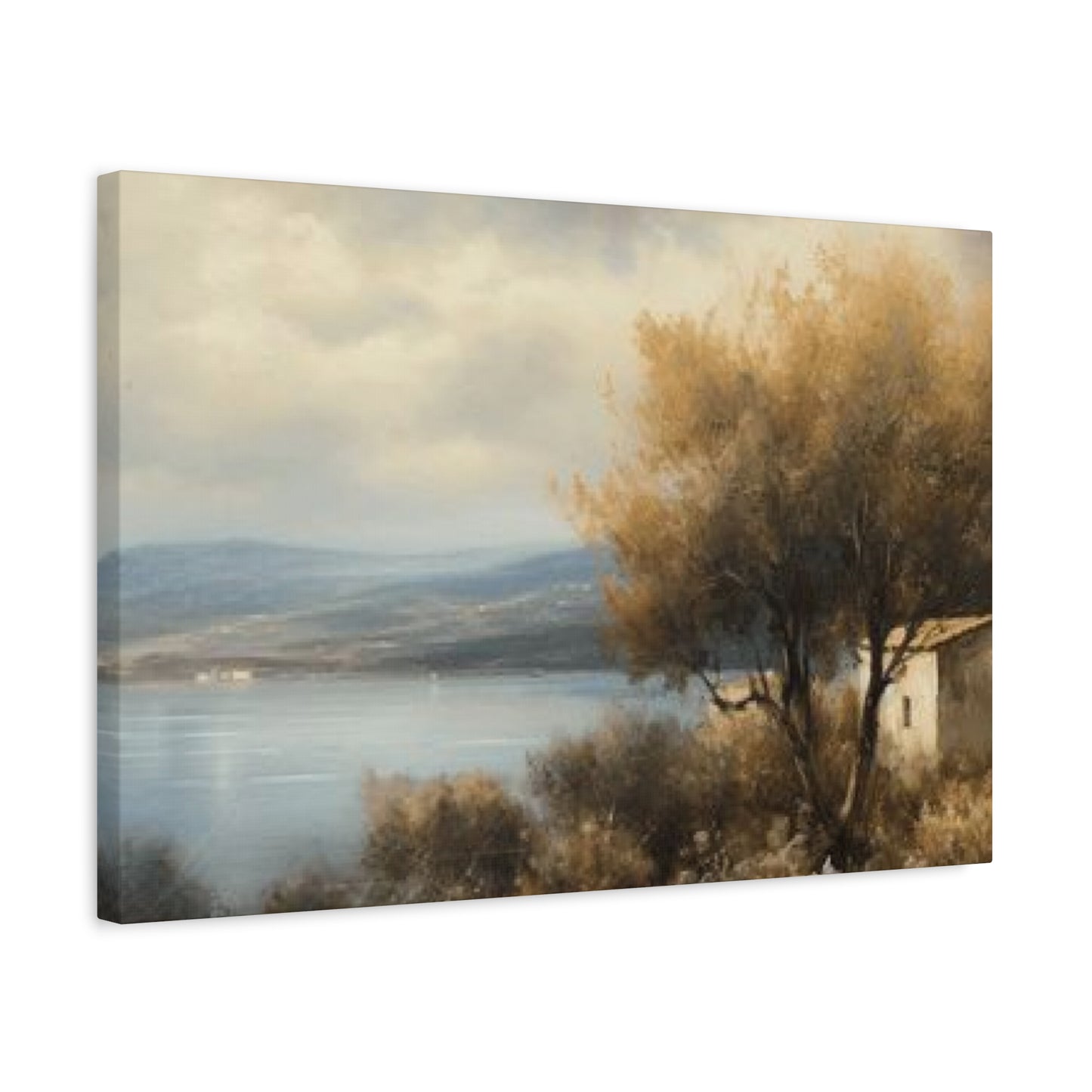
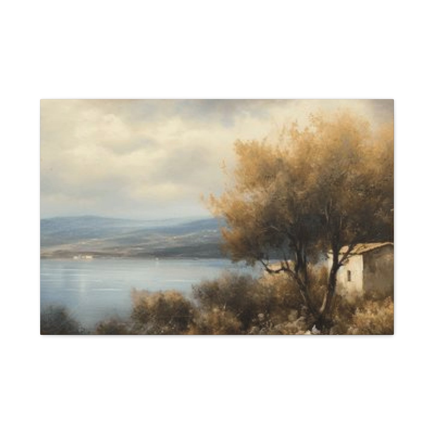

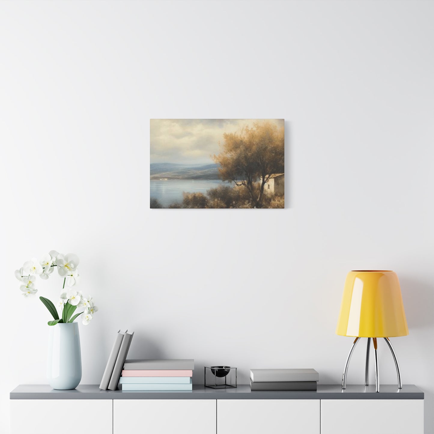

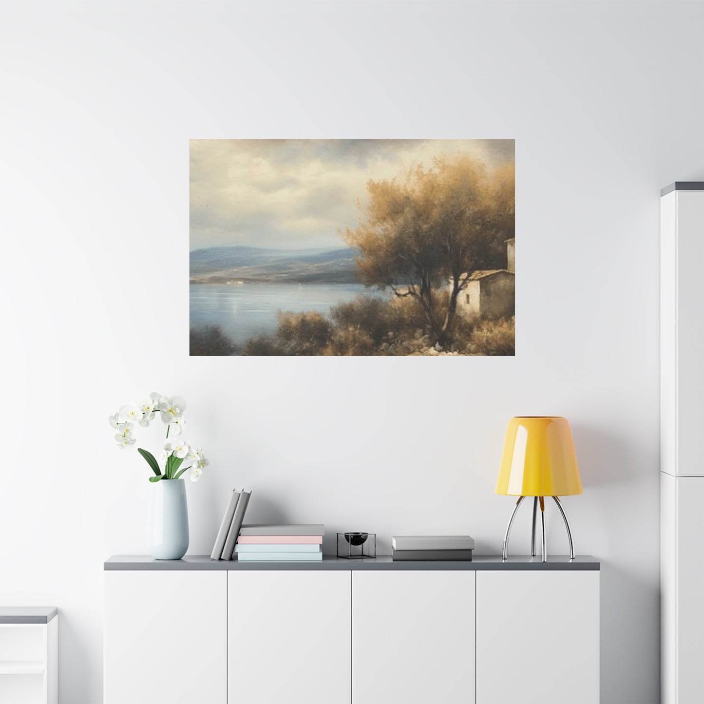
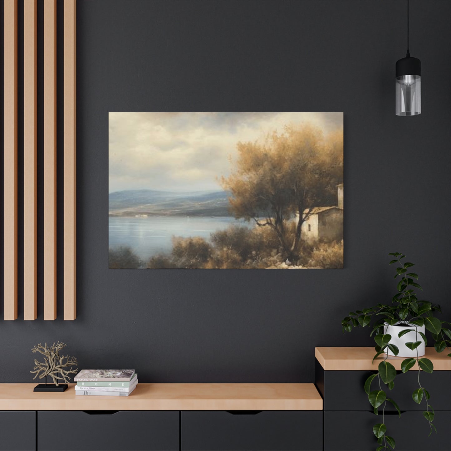
Tree-Lake Wall Art for Bedrooms: Calm, Comfort, and Natural Harmony
When it comes to decorating your home with artwork that speaks to the soul, few themes capture the essence of natural beauty quite like imagery combining trees and lakes. These timeless nature scenes offer a perfect blend of earth and water elements, creating visual harmony that transforms any room into a peaceful sanctuary. Whether you're drawn to vibrant autumn colors reflecting on still waters or minimalist compositions in monochrome tones, incorporating these natural landscapes into your interior design provides endless possibilities for creating spaces that feel both grounded and serene.
The connection between humans and nature runs deep in our consciousness, and bringing these elements indoors through carefully selected artwork serves as more than mere decoration. It becomes a daily reminder of the natural world's calming presence, offering visual respite from our increasingly digital and fast-paced lives. The combination of trees standing along shorelines with their reflections dancing on water surfaces creates a sense of balance and symmetry that appeals to our innate appreciation for natural beauty.
In this comprehensive exploration, we'll delve into every aspect of selecting, styling, and enjoying nature-inspired artwork featuring lakeside tree scenes. From understanding different artistic styles and seasonal variations to practical tips for placement and coordination with existing decor, you'll discover how these peaceful images can enhance your living environment in meaningful ways.
Bringing Nature's Serenity Into Your Living Spaces Through Lakeside Imagery
Creating a peaceful atmosphere within your home starts with understanding how natural imagery affects our mood and perception of space. Artwork depicting trees along lake shores works particularly well because it combines vertical elements with horizontal expanses, creating visual interest while maintaining a sense of calm. The vertical lines of tree trunks draw the eye upward, making rooms feel more spacious, while the horizontal stretch of water provides grounding and stability.
When you incorporate these scenes into your interior design, you're not simply adding decoration to empty walls. You're creating focal points that can influence the entire atmosphere of a room. Research has shown that views of nature, even in pictorial form, can reduce stress levels and improve overall well-being. A thoughtfully chosen piece featuring lakeside trees can serve as a visual anchor in your space, providing a point of meditation and calm whenever you need it.
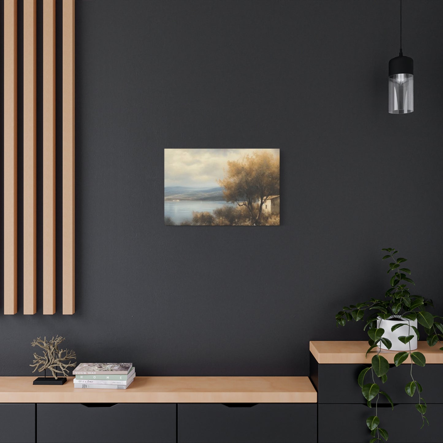
The beauty of this particular theme lies in its versatility across different rooms and design styles. Whether your home leans toward contemporary minimalism, cozy rustic charm, or elegant traditional decor, you can find interpretations of lakeside tree scenes that complement your aesthetic perfectly. The key is understanding how different artistic approaches and color palettes align with your existing design elements.
Consider the emotional resonance these images carry. Morning mist rising from a glassy lake surface, autumn foliage creating vibrant reflections, or bare winter branches against a frozen landscape all evoke different feelings and suit different spaces within your home. By matching the mood of the artwork to the function of each room, you create cohesive environments that support how you want to feel in those spaces.
Natural light plays a crucial role in how these artworks appear throughout the day. Pieces with reflective water elements can catch and play with changing light, creating dynamic visual interest that evolves from morning to evening. This living quality makes them particularly engaging as permanent fixtures in your home.
Water Reflections Combined With Forest Elements in Decorative Artwork
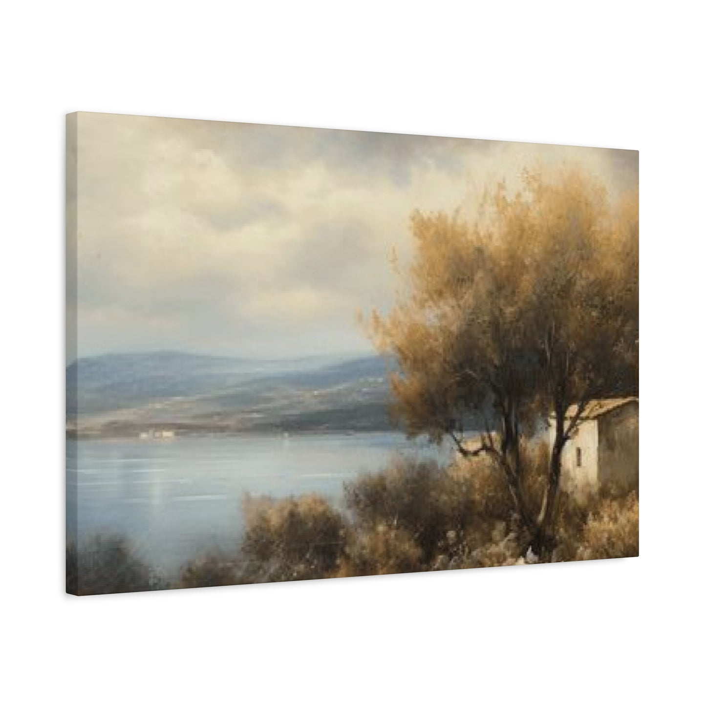
The mirror-like quality of calm lake surfaces creates some of the most captivating visual effects in nature photography and painting. When trees line the shores and cast their images onto still waters, the result is a doubling effect that enhances the composition's impact. These reflections create perfect symmetry, which our minds find inherently pleasing and restful to observe.
Artists have long been fascinated by the challenge of capturing water reflections convincingly. In photography, the perfect reflection shot requires specific conditions: calm weather, proper lighting, and the right vantage point. When these elements align, the resulting images possess an almost surreal quality, as the reflected trees appear just as detailed and vibrant as their physical counterparts. Some compositions play with this symmetry so effectively that viewers might momentarily struggle to distinguish between the actual trees and their reflections.
In painted interpretations, artists have more freedom to emphasize or abstract these reflections according to their style. Impressionist approaches might suggest the shimmering movement of reflections with loose brushstrokes and blended colors, while realistic painters painstakingly recreate every detail of light dancing on water. Abstract artists might use reflections as a starting point for bold color experiments or geometric compositions that capture the essence rather than the literal appearance of the scene.
The presence of reflections in these artworks serves multiple purposes in interior design. First, they add visual complexity without creating chaos, as the reflected elements are familiar rather than introducing new information. Second, they enhance the sense of depth in the composition, making even smaller pieces feel more expansive. Third, they reinforce the natural theme by emphasizing the water element alongside the botanical subjects.
When selecting artwork featuring prominent reflections, consider how it will interact with actual reflective surfaces in your room, such as mirrors, glass tables, or polished floors. Sometimes creating an echo of this reflective quality throughout your space enhances the cohesive feel, while in other cases, you might want the artwork to be the singular source of this visual effect.
The color temperature of reflected light differs from direct light, often appearing slightly cooler and more muted. This subtle variation in tones adds sophistication to the overall composition and provides additional color notes you can pick up in your decor accessories. The blues and greens typically present in water reflections pair beautifully with natural materials like wood, stone, and organic textiles.
Natural Landscape Photography Designed for Interior Walls
Photography captures lakeside scenes with a level of detail and authenticity that resonates differently than painted interpretations. The inherent truthfulness of the photographic medium creates an immediate connection for viewers, who recognize these as genuine moments captured in real locations. This authenticity makes photographic prints particularly effective for those seeking to bring literal nature into their homes.
Contemporary nature photographers employ sophisticated techniques to capture these scenes at their most compelling. Long exposure photography smooths water surfaces into glassy perfection, creating ethereal effects where reflections become almost dreamlike. Golden hour shooting, during the first hour after sunrise or last hour before sunset, bathes scenes in warm, magical light that enhances colors and creates long, dramatic shadows. Careful composition ensures that tree placement, horizon lines, and reflection balance create visually satisfying arrangements.
The equipment and expertise required to create gallery-quality nature photography mean that investing in professional prints supports artists who have dedicated significant time and resources to their craft. Many nature photographers return to locations repeatedly, waiting for ideal conditions, changing seasons, or specific weather phenomena to capture their vision perfectly. The resulting images represent not just a single moment but often years of dedication to a particular place or subject.
Black and white photography offers a different approach to lakeside tree imagery, stripping away color to focus on form, texture, contrast, and composition. Monochromatic treatments can feel more timeless and sophisticated, often integrating more easily with varied decor styles since color coordination becomes a non-issue. The absence of color draws attention to patterns in tree bark, the play of light on water, and the structural elements of the composition in ways that color images sometimes obscure.
Limited edition prints from recognized nature photographers become collectible items that may appreciate in value over time. Even if investment potential isn't your primary concern, knowing you own a numbered print from a limited series adds special significance to the piece. Documentation of authenticity, artist signatures, and edition numbers should accompany these purchases, particularly for higher-end acquisitions.
Digital manipulation in contemporary nature photography exists on a spectrum from minimal adjustments that simply optimize the captured image to extensive compositing that creates scenes impossible in reality. Most professional nature photographers fall somewhere in the middle, enhancing colors, adjusting exposure, and optimizing sharpness while maintaining the essential truth of the scene. Understanding the photographer's approach helps you select pieces that align with your preference for naturalistic versus artistic interpretation.
Bordered Lakeside Scenery Suitable for Family Living Areas
Framing elevates artwork from casual decoration to curated design element, and lakeside landscapes particularly benefit from thoughtful frame selection. The frame serves as a transition between the artwork and your room, either blending the piece into existing decor or creating deliberate contrast that makes it stand out as a focal point. Getting this balance right significantly impacts how successfully the artwork integrates into your space.
Material choice in framing affects both aesthetics and longevity. Wood frames offer warmth and versatility, with options ranging from light natural finishes that maintain an airy feel to rich, dark stains that create formal elegance. Metal frames provide contemporary sophistication and work particularly well with modern or minimalist interiors. Their clean lines don't compete with the natural subject matter while adding a refined finish. Composite materials offer budget-friendly alternatives that can convincingly mimic more expensive options.
The width and profile of the frame impact how the artwork reads from a distance. Wider frames create more separation between the image and the wall, making the artwork feel more important and intentional. This works especially well for larger pieces or in rooms with strong architectural details. Thinner frames maintain focus on the image itself and suit smaller prints or spaces where the artwork is part of a gallery wall rather than a standalone statement piece.
Mat selection introduces another layer of design consideration for framed pieces under glass. White or off-white mats provide classic, clean presentations that never go out of style, while colored mats can pick up specific tones from the artwork to create cohesive color flow. Double matting, with an inner mat in a contrasting color, adds sophistication and depth to the overall presentation. The width of matting affects proportion, with wider borders generally making artwork feel more formal and gallery-like.
Glass or acrylic glazing protects prints from dust, moisture, and damage while affecting how you view the piece. Standard glass offers clarity at a budget-friendly price but can create glare issues in bright rooms. Museum glass, while more expensive, virtually eliminates reflection and provides UV protection that prevents fading over time. This investment makes sense for valuable prints or pieces in rooms with abundant natural light. Acrylic glazing weighs less than glass, making it safer for larger pieces, though it scratches more easily.
Frame color coordination with your lakeside imagery requires considering the dominant tones in the piece. Artwork featuring warm autumn colors often pairs beautifully with golden, honey, or amber-toned wood frames. Cooler compositions with blues, grays, and winter themes might benefit from silver-toned metal, white-washed wood, or deep espresso frames that don't introduce competing warmth. Bringing paint chips or fabric swatches from your room when selecting frames helps ensure the final presentation works harmoniously with your existing decor.
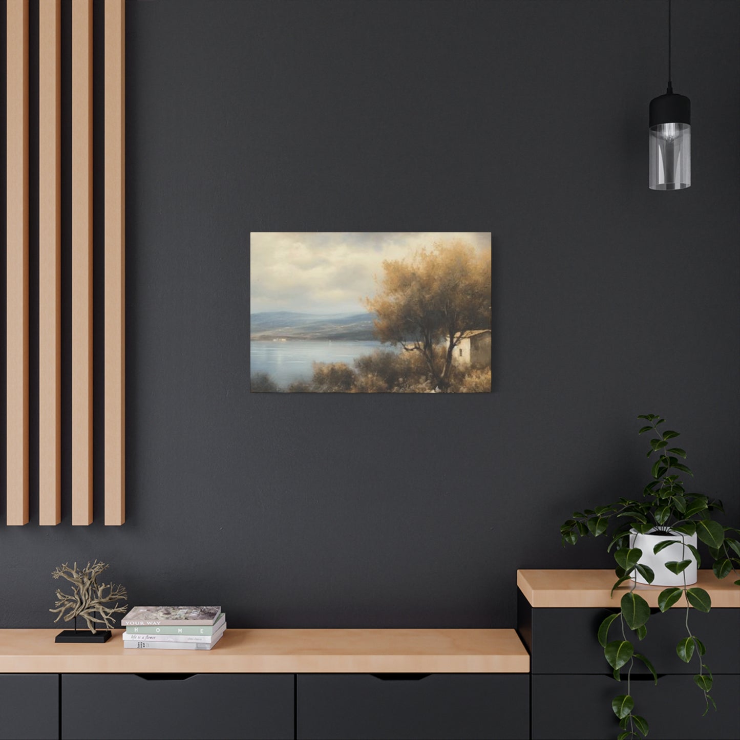
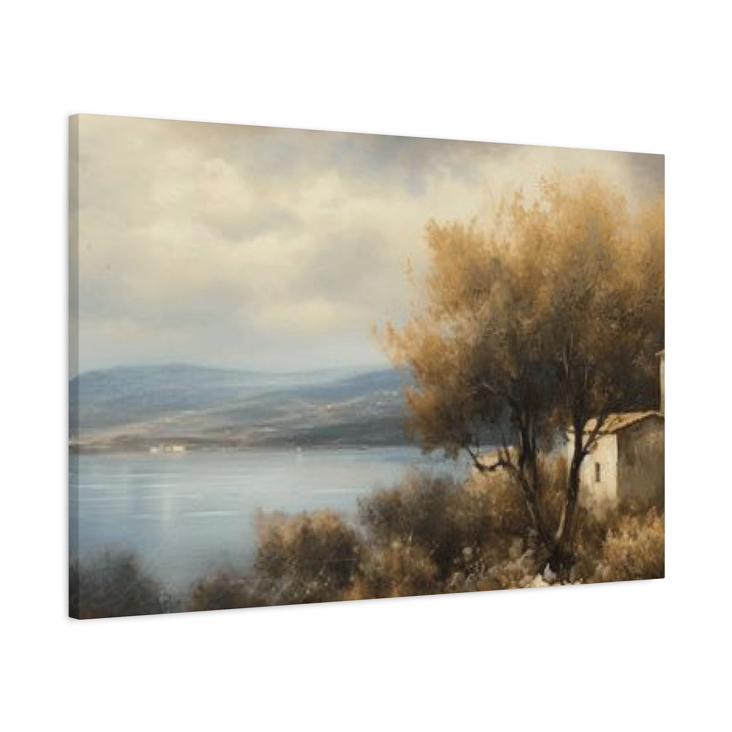
Fall Lake Perspectives Featuring Vibrant Foliage
Autumn transforms lakeside forests into spectacular displays of color, making this seasonal interpretation one of the most popular choices for home decor. The brilliant reds, oranges, and yellows of changing leaves create warmth and energy that can enliven any space. When these colors reflect on water surfaces, the effect intensifies, creating compositions that feel almost impossibly vibrant and alive.
The appeal of autumn imagery extends beyond mere beauty. These scenes carry associations with harvest, transition, and the satisfying conclusion of the growing season. Psychologically, autumn colors are often described as cozy and inviting, which makes them particularly suitable for spaces where comfort and warmth are priorities. Living rooms, dens, and dining areas all benefit from the welcoming energy these pieces provide.
Different tree species create distinct autumn palettes, which affects the overall feeling of the artwork. Maples produce brilliant reds and oranges that feel bold and energetic. Aspens and birches offer golden yellows that glow with softer, more ethereal beauty. Oak trees provide rich bronzes and deep burgundies that feel more subdued and sophisticated. Understanding these variations helps you select pieces that match your personal preference and design goals.
Capturing autumn scenes requires precise timing, as peak foliage periods last only one to two weeks in most locations before leaves begin falling. Professional photographers often scout locations throughout the growing season, identifying promising compositions and then returning at exactly the right moment to capture them at their peak. This dedication results in images that represent nature at its most spectacular moment, a fleeting perfection preserved for year-round enjoyment.
Autumn lake scenes work particularly well in homes with wood elements, whether exposed beams, hardwood floors, or wooden furniture. The warm tones in the foliage complement natural wood grains, creating cohesive color flow throughout the space. They also pair beautifully with earth-toned textiles like terra cotta, rust, chocolate brown, and warm grays commonly found in throws, pillows, and upholstery.
For those who love autumn aesthetics but want to avoid seasonal decorating, high-quality autumn lake artwork provides a permanent way to keep those beloved colors in your home year-round. Unlike seasonal decorations that require storage and rotation, a well-chosen piece becomes a constant feature that you appreciate continuously rather than in just a few months each year.
The composition of autumn lakeside scenes often includes fallen leaves floating on water surfaces or carpeting the shoreline, adding additional layers of color and texture. These details provide visual interest and emphasize the seasonal specificity of the scene. Some compositions focus tightly on reflections and color, creating almost abstract effects, while others pull back to show broader landscape context with mountains, sky, and expansive water views.
Monochrome Lakeside Nature Imagery for Modern Interiors
Removing color from lakeside scenes creates an entirely different aesthetic that appeals to those drawn to sophistication, timelessness, and graphic impact. Black and white photography or artwork featuring trees and water focuses attention on elements that color sometimes overwhelms: composition, texture, contrast, tonal range, and the interplay of light and shadow. These pieces often feel more artistic and contemplative than their color counterparts.
The versatility of monochrome artwork makes it particularly valuable for cohesive interior design. Without color to coordinate, these pieces integrate effortlessly with any existing palette, making them ideal for rooms where you change accent colors seasonally or frequently update textiles and accessories. The neutral nature of black and white also means these pieces maintain their appeal as design trends evolve, ensuring they never feel dated or out of style.
Different approaches to black and white conversion create varied effects. High-contrast treatments with deep blacks and bright whites create dramatic, bold images that command attention. These work well as statement pieces in minimalist spaces or contemporary settings where strong graphic elements are valued. Low-contrast interpretations with predominantly gray tones feel softer and more subtle, suiting spaces where calm and understated elegance are priorities.
The absence of color reveals textures that might otherwise go unnoticed. Tree bark becomes a study in pattern and relief, water surfaces show every ripple and reflection gradation, and clouds display their sculptural forms with new clarity. This emphasis on texture adds visual interest that remains engaging even after years of daily viewing, as there's always something new to notice in the details.
Many iconic nature photographers are known specifically for their black and white landscape work, having elevated monochrome nature photography to fine art status. Ansel Adams remains the most famous example, though many contemporary artists continue this tradition with their own unique visions. Owning prints from photographers who specialize in black and white nature scenes means acquiring pieces from artists who have mastered this specific discipline.
Framing considerations for black and white pieces often lean toward simplicity that doesn't compete with the graphic nature of the images. Black frames create cohesive, sophisticated presentations, while white frames provide clean, gallery-like contexts. Metal frames in silver or black finishes offer contemporary polish. Wide white mats create breathing room around the image and enhance its importance, while frameless mounting creates sleek, modern presentations.
Black and white lakeside scenes particularly suit bedrooms, bathrooms, offices, and other spaces where a calming, focused atmosphere supports the room's function. The lack of color stimulation can actually promote relaxation and concentration, making these pieces excellent choices for areas dedicated to rest or productivity. They also work beautifully in spaces with bold accent colors, as they complement rather than compete with those color choices.
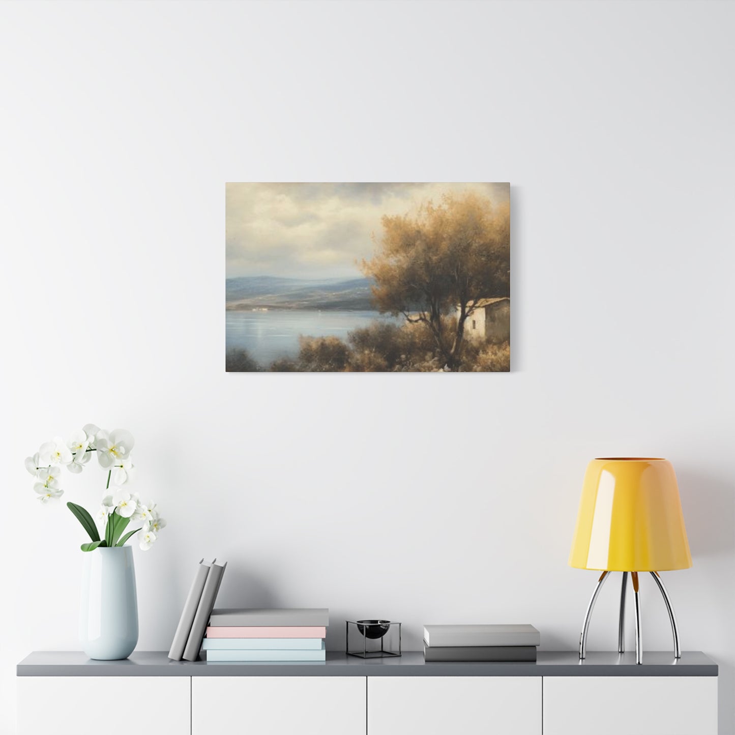
Natural Imagery Promoting Rest in Personal Sleep Quarters
Bedrooms serve as personal sanctuaries where atmosphere significantly impacts sleep quality and relaxation. Artwork selection for these intimate spaces requires special consideration, as the images you fall asleep viewing and wake up seeing influence your mental state more than pieces in any other room. Lakeside tree scenes offer ideal subject matter for bedrooms due to their inherently peaceful nature and lack of visual stimulation that might interfere with rest.
The biological connection between nature imagery and relaxation is well-documented. Studies show that viewing natural scenes, particularly those featuring water, reduces cortisol levels and activates the parasympathetic nervous system responsible for rest and recovery. Including this imagery in your bedroom creates an environment that physiologically supports the room's primary function. The gentle horizontal lines of lake horizons and the organic forms of trees provide visual calm without demanding attention or processing effort.
Color temperature in bedroom artwork affects the space's overall feel and can influence circadian rhythms. Cooler tones like blues, soft greens, and grays promote calmness and are traditionally recommended for sleep spaces. However, warmer tones in moderation, particularly in earthier registers rather than bright, stimulating versions, can create cozy intimacy that many find conducive to relaxation. Lakeside scenes naturally incorporate both warm and cool tones, offering balanced compositions that avoid being too stimulating in either direction.
Placement considerations in bedrooms differ from other rooms. Artwork positioned opposite the bed provides the last image you see before sleep and the first upon waking, making this prime real estate for particularly meaningful pieces. Artwork above the bed should be securely mounted and not so large or heavy as to create subconscious anxiety about safety. Pieces on side walls can create visual interest while maintaining clear sight lines and not disrupting the flow of movement through the space.
Scale in bedroom artwork should complement rather than overwhelm the space. Bedrooms typically feel more intimate than living areas, which often means moderately-sized pieces work better than dramatic oversize statements. However, a generous piece above the bed or on a focal wall can anchor the room beautifully without creating the sense of intrusion that the same size might cause in a smaller room.
Multiple smaller pieces arranged thoughtfully can work well in bedrooms, perhaps flanking a bed or creating a gallery arrangement on one wall. When using this approach with lakeside imagery, maintaining thematic consistency while varying perspectives or seasons creates visual interest without chaos. For example, combining images of the same lake in different seasons or different times of day tells a story that unfolds across the arrangement.
Lighting considerations affect how bedroom artwork appears and functions. These spaces often have softer, more varied lighting than other rooms, with options for bright overhead fixtures, task lighting, and ambient mood lighting. Testing how your chosen artwork looks under each lighting scenario ensures it remains effective throughout the day and evening. Pieces with dramatic contrast or clear focal points typically read better in dim lighting than those relying on subtle detail or complex compositions.
Shoreline Forests Interpreted Through Simplified Artistic Approaches
Minimalist interpretations of lakeside scenes reduce complex natural environments to their essential elements, creating artwork that feels both modern and timeless. This aesthetic approach aligns perfectly with contemporary design trends that value simplicity, clean lines, and uncluttered spaces. By stripping away extraneous detail, minimalist artists focus attention on fundamental forms, relationships between elements, and the emotional essence of the scene rather than its literal appearance.
The minimalist approach to trees and lakes might involve reducing tree forms to simple vertical lines or geometric shapes while representing water as an unbroken horizontal plane of color. Alternatively, it might focus on a single tree or small cluster against an expansive water view, using negative space as actively as the depicted elements. These compositions often feature limited color palettes, sometimes working in just two or three tones, which creates visual harmony and prevents overwhelm.
For homes decorated in minimalist or Scandinavian styles, these simplified interpretations of nature scenes integrate seamlessly. They provide the psychological benefits of nature imagery without introducing the visual complexity that might conflict with deliberately sparse design schemes. The artwork becomes an accent rather than a focal point, supporting the overall aesthetic without dominating it.
Japanese aesthetic principles heavily influence minimalist nature art, particularly concepts like ma (negative space), kanso (simplicity), and shizen (naturalness without pretense). Artwork informed by these principles often features asymmetrical compositions, abundant empty space, and a sense of restraint that Western maximalist traditions lack. These pieces reward contemplation, revealing their depth gradually rather than making an immediate bold statement.
Abstract minimalist approaches to lakeside scenes might reduce recognizable elements to pure color field compositions or geometric arrangements that suggest rather than depict trees and water. These pieces function almost as meditative objects, where the viewer's knowledge that they're inspired by nature informs the viewing experience even when the connection isn't immediately obvious. This creates interesting ambiguity that suits sophisticated design sensibilities.
The restraint inherent in minimalist art requires exceptional skill to execute successfully. With no extraneous elements to hide behind, every decision about line, form, color, and composition becomes critical. High-quality minimalist pieces demonstrate masterful understanding of fundamental design principles, making them valuable additions to art collections despite their apparent simplicity.
Minimalist lakeside artwork particularly suits modern apartments, loft spaces, and homes with open floor plans where visual flow between areas matters more than traditional room divisions. These pieces provide points of interest without creating boundaries or disrupting sight lines. They also work well in professional settings like offices or waiting rooms where calming presence matters but bold statements might feel inappropriate.
Morning Fog Shrouding Waterside Woodland Scenes
Misty lake scenes possess a ethereal, dreamlike quality that sets them apart from clear-day compositions. Morning fog transforms familiar landscapes into mysterious, atmospheric environments where visibility fades gradually into whiteness and familiar forms become ghostly suggestions. These conditions create some of the most evocative and emotionally resonant lakeside imagery available.
The soft, diffused light characteristic of foggy conditions eliminates harsh shadows and bright highlights, creating gentle gradations of tone that feel restful to view. Colors become muted and subtle, often shifting toward cooler registers with prominent grays, soft blues, and desaturated greens. This limited palette creates cohesive, sophisticated artwork that integrates easily with many interior design schemes, particularly those favoring neutral or monochromatic approaches.
Fog adds layers of depth to compositions in unique ways. Objects closer to the viewer appear with greater clarity while those farther away fade progressively into obscurity, creating natural depth cues that make even two-dimensional artwork feel dimensional and expansive. Trees at the water's edge might show clear detail while those just behind become shadowy forms, and distant shorelines disappear entirely into gray veils, suggesting endless space beyond the visible scene.
The mood evoked by misty lake imagery leans toward contemplation, mystery, and tranquility. These aren't scenes of bright clarity and cheerful energy but rather moments of hushed stillness where the world feels suspended and peaceful. This makes them excellent choices for spaces dedicated to quiet activities: meditation rooms, reading nooks, studies, and bedrooms all benefit from this calming atmospheric quality.
Photographing foggy lake scenes requires patience and often early morning dedication, as mist typically burns off as the day warms. Professional nature photographers set alarms for predawn departures, arriving at locations while fog still blankets the water and hoping conditions persist until light becomes adequate for shooting. The temporal nature of these conditions means successful fog images represent special moments captured with skill and dedication.
Seasonal variations in fog create different effects worth considering. Autumn fog against colorful foliage creates beautiful softness that tames potentially overwhelming color intensity, making these pieces more versatile for year-round display than crisp autumn scenes might be. Spring fog amid fresh green growth suggests renewal and gentle beginnings. Winter fog can feel stark and dramatic, particularly when ice forms on trees create textural interest against the soft atmospheric backdrop.
Artistic interpretations of foggy conditions range from photorealistic renderings that meticulously recreate atmospheric effects to impressionistic paintings that use loose brushwork and blended colors to suggest rather than detail the scene. Both approaches capture the essential mood, though they serve different aesthetic purposes in home decor. Photographs provide authentic moments while paintings offer artist interpretation that can feel more personal and expressive.
Nature-Inspired Imagery Perfect for Mountain Homes and Retreat Properties
Cabin and lodge environments naturally pair with lakeside forest imagery, as these settings already embrace nature-oriented themes in their architecture and overall design philosophy. Rustic retreats benefit from artwork that reinforces their connection to the surrounding environment, creating continuity between indoor and outdoor spaces while celebrating the natural beauty that drew people to these locations.
The style of lakeside artwork for cabin settings often skews toward authentic, representational approaches rather than abstract or highly stylized interpretations. Photographs capturing genuine wilderness moments or paintings with realistic detail honor the authentic nature of these environments. However, vintage-inspired treatments, folk art styles, or works by local artists add character while maintaining thematic appropriateness.
Scale considerations in cabin spaces differ from urban homes. Many mountain retreats feature dramatic architectural elements like vaulted ceilings, exposed timber framing, and large windows that demand equally substantial artwork. Oversized pieces that might overwhelm typical living rooms work beautifully in these settings, filling expansive wall areas and matching the impressive scale of the architecture itself. Multiple large pieces creating a gallery wall can be particularly effective.
Material choices for cabin artwork often emphasize natural, durable finishes that complement wood-heavy interiors. Canvas prints without additional framing create casual, unpretentious presentations. Wood frames in finishes that coordinate with the cabin's timber bring cohesion to the space. Metal prints offer a contemporary option that's extremely durable and works well in high-traffic areas or locations where humidity fluctuates.
Color coordination in rustic settings typically centers on earth tones, forest greens, deep blues, and warm wood tones already present in the space. Lakeside tree artwork naturally incorporates these colors, making integration straightforward. Seasonal variations let you choose pieces that either match local seasons, creating strong place-based connections, or introduce contrast by featuring seasons not currently visible outside.
Local artist work adds special significance in retreat properties. Pieces created by artists familiar with the specific region carry authentic sense of place that generic nature imagery cannot match. Commissioning work from local painters or purchasing photographs taken in the immediate area creates meaningful connections between the artwork and the property's location, essentially bringing views from the broader area into the cabin itself.
Artwork placement in open-concept cabin spaces requires considering sight lines from multiple areas. A piece visible from the kitchen, dining area, and living space simultaneously needs to work well from each vantage point and viewing distance. Similarly, artwork in sleeping lofts visible from main living areas should coordinate with the overall design scheme rather than existing as isolated bedroom decor.
Twilight Sky Colors Reflecting Over Water and Wooded Shores
Sunset imagery captures nature in transition, that magical period when day yields to night and light transforms from bright clarity to golden warmth to dusky softness. Lakeside sunset scenes combine the drama of colorful skies with the tranquility of still water, often showing brilliant oranges, pinks, and purples reflected on mirror-smooth surfaces while silhouetted trees frame the composition.
The emotional resonance of sunset imagery differs from daytime or overcast scenes. Sunsets feel romantic, nostalgic, and contemplative, carrying associations with endings, beauty, and the passage of time. These qualities make sunset pieces particularly meaningful for spaces associated with reflection and connection: dining rooms where families gather, living rooms for conversation, or master bedrooms for couples.
Color intensity in sunset artwork varies from subtle, pastel-toned scenes where soft pinks and lavenders barely tint the sky to dramatic displays where electric oranges and magentas dominate the composition. Your choice should consider the room's existing color scheme and the atmosphere you want to create. Vivid sunsets energize spaces and work well as bold focal points, while gentler interpretations maintain calm while adding warmth and color interest.
The positioning of the sun itself within the composition significantly affects the piece's impact. Centered suns create symmetrical, balanced compositions that feel formal and intentional. Suns positioned according to the rule of thirds generate more dynamic arrangements with natural visual flow. Setting suns just touching the horizon or partially hidden behind trees create different moods than those higher in the sky, with lower positions generally feeling more conclusive and dramatic.
Silhouettes created by backlighting at sunset add graphic strength to compositions. Trees reduced to dark forms against colorful skies become almost abstract shapes, emphasizing their structure while eliminating distracting detail. This contrast between the light sky and dark foreground creates immediate visual impact that reads clearly even from a distance, making these pieces effective in larger rooms or at the end of hallways where they're viewed from far away.
Sunset conditions change rapidly, making successful photography dependent on careful timing and quick work. The best color often lasts just minutes, requiring photographers to have compositions planned and equipment ready well before the critical moment. This narrow window means sunset images represent genuinely special captures, not just pleasant scenes anyone could record casually.
For canvas presentations of sunset scenes, the wrap-around edges of gallery-style mounting let the colorful sky continue around the sides, creating an immersive effect where the light seems to emanate from the piece itself. This approach works particularly well with sunset images because the continuous color field enhances the sense of being enveloped by the scene's warmth and beauty.
Selecting Appropriate Dimensions for Nature Artwork in Various Rooms
Size selection significantly impacts artwork's effectiveness, and getting proportions right ensures pieces enhance rather than overwhelm or disappear in their intended spaces. Each room presents different size considerations based on dimensions, furniture scale, viewing distances, and functional requirements. Developing confidence in choosing appropriate artwork sizes eliminates guessing and leads to professional-looking results.
Living rooms typically accommodate the largest artwork in homes, as they combine substantial wall space with seating arrangements that allow comfortable viewing from multiple distances. Over a sofa, pieces ranging from 40 to 60 inches wide create appropriate scale for standard 7 to 8 foot sofas, while smaller sofas or loveseats need proportionally smaller art. Stand-alone focal walls can handle even larger pieces, sometimes spanning 72 inches or more for dramatic impact in spacious rooms.
Dining rooms benefit from statement pieces that create interest without distracting from the gathering purpose of these spaces. Above a buffet or console, artwork spanning about two-thirds the furniture width looks balanced. On open walls, consider how the piece looks both from seated positions at the table and when entering the room. Artwork that reads clearly from both perspectives serves the space well. Vertical or square pieces sometimes work better than wide horizontal ones in dining rooms, depending on wall proportions.
Bedrooms, as discussed earlier, typically feel more intimate and support moderately-sized pieces better than oversized statements. Above a queen bed, artwork in the 40 to 48 inch range provides substance without overwhelming. King beds can handle slightly larger pieces. For walls opposite the bed or on side walls, consider the room's overall dimensions and ensure artwork feels proportional to the space rather than floating awkwardly or dominating the room.
Hallways present unique challenges, as they're typically narrow with limited viewing distance. Artwork in hallways should be sized to be appreciated from just a few feet away rather than requiring distance for full effect. Series of smaller pieces running the hallway length work particularly well, creating progression and visual interest that makes hallways feel intentional rather than transitional. Horizontal orientations suit hallway proportions better than tall vertical pieces.
Bathrooms often get overlooked for artwork, but they're spaces where people spend time and can benefit from beautiful imagery. Smaller pieces work best, as bathroom walls rarely offer expansive uninterrupted space. Water-resistant materials protect against humidity, so canvas prints or properly sealed frames with moisture-resistant backing boards make practical choices. The calming nature of lakeside scenes particularly suits these private retreat spaces.
Entryways and foyers create first impressions and set tones for entire homes. If space allows, statement pieces make strong welcomes, telling visitors about your aesthetic preferences immediately. If space is limited, smaller pieces still matter, as they're seen every time you enter or exit your home. These high-traffic areas benefit from securely mounted pieces with durable finishes that withstand exposure to outside elements when doors open.
Home offices require artwork that remains engaging through extended viewing without becoming distracting. Medium-sized pieces positioned in view from your desk provide visual breaks during work without dominating sight lines. Multiple smaller pieces create gallery interest if you have more wall space than a single piece would fill. The calming nature of lakeside scenes helps moderate work stress while maintaining professional atmospheres appropriate for video calls.
Hand-Painted Lake Environments Ideal for Reading Areas
Reading nooks deserve special attention when selecting artwork, as these intimate spaces support specific activities requiring concentration and relaxation. The right piece enhances the cozy, retreat-like feeling that makes reading nooks successful while avoiding distraction from the books themselves. Painted lakeside scenes offer handcrafted beauty that complements the analog, unplugged nature of reading.
Scale in reading nooks typically leans smaller than in main living areas, as these spaces are intimate by nature. Pieces from 16x20 inches to 24x30 inches often hit the sweet spot, providing substance without overwhelming compact areas. If your reading nook is simply a chair in a room corner rather than a separate alcove, the artwork helps define the space as distinct from surrounding areas, creating psychological separation that enhances the nook feeling.
The brushwork visible in paintings adds texture that rewards close viewing, which happens naturally in reading nooks where artwork hangs near your chair. Impressionistic pieces with visible strokes, impasto work with dimensional paint application, or detailed realistic paintings with subtle color variations all offer discoveries upon repeated viewing. This detail-rich quality ensures the piece remains interesting even though you see it constantly while reading.
Color temperature affects reading nook atmosphere significantly. Cooler palettes create calm, focused environments that support concentration, while warmer tones generate coziness that invites settling in for hours. Many reading nooks benefit from warmer approaches, as these spaces are about comfort and retreat. Autumn lake scenes or sunset compositions provide this warmth naturally while maintaining the peaceful qualities of water and trees.
Lighting in reading nooks must serve dual purposes: providing adequate illumination for reading while creating ambiance. Task lighting directed at your book should not create glare on nearby artwork. Picture lights or directional adjustable fixtures let you illuminate the artwork independently from reading lights, ensuring both receive appropriate lighting. Testing arrangements before permanent installation prevents frustrating glare issues.
Personal meaning in reading nook artwork matters more than in public spaces, as these areas are primarily for your own enjoyment. Choosing painted pieces by artists you admire, scenes from places meaningful to you, or works that align with your personal aesthetic preferences creates spaces that feel genuinely personal. Reading nooks often become favorite spots in homes, and artwork that speaks to you personally enhances that special quality.
Matching the artwork's mood to your reading preferences creates coherent experiences. If you primarily read mysteries or thrillers, dramatic lake scenes with storm clouds or sunset drama might amplify your reading mood. Literary fiction readers might prefer contemplative, atmospheric pieces. Non-fiction readers might enjoy scientifically accurate nature paintings that reward observation with natural history details. This matching isn't required but adds an extra layer of intentionality to your space.
Forest Water Features Supporting Country-Style Home Design
Country-style homes emphasize connection to land, natural materials, and unpretentious comfort over formal elegance. Lakeside forest imagery aligns perfectly with these values, bringing outdoor beauty inside in ways that feel authentic to rural and country living. Integrating these pieces into country-style interiors requires understanding the aesthetic's core principles and making selections that enhance rather than conflict with established design.
Authenticity matters tremendously in country style. Artwork that appears mass-produced or generic risks feeling at odds with spaces full of unique, meaningful items collected over time. Seeking pieces with character, whether through artistic style, framing choices, or subject matter, ensures better integration. Photography from local areas, paintings by regional artists, or vintage prints from specific time periods all carry authenticity that resonates with country sensibilities.
Natural subject matter in country homes often extends beyond artwork to include actual natural objects: driftwood, stones, pressed flowers, bird nests, or other found treasures. Lakeside tree artwork integrates beautifully with these collections, as both celebrate nature's beauty. Creating vignettes that combine artwork with three-dimensional natural objects and other meaningful items tells richer stories than artwork alone.
Country style often incorporates handmade or handcrafted items throughout homes, valuing the imperfect, human qualities of handwork over machine-made precision. Paintings fit this aesthetic naturally, but even photography prints benefit from custom framing with handcrafted touches. Distressed frames, hand-cut mats, or frames with visible joinery celebrate craftsmanship in ways that feel appropriate to country values.
The color palette in country-style homes tends toward earth tones, faded or muted colors, and colors found in nature. Bright, saturated colors appear sparingly as accents rather than dominant forces. Lakeside artwork naturally provides appropriate colors: the greens of foliage, blues of water, browns of earth and tree trunks, and seasonal variations that add controlled color interest. This natural color harmony makes integration straightforward.
Pattern mixing characterizes successful country interiors, with florals, checks, stripes, and other patterns coexisting harmoniously. Lakeside artwork provides visual rest areas among patterns, as most nature photography and realistic painting don't introduce additional pattern complexity. This balance prevents spaces from feeling too busy while maintaining the collected, layered aesthetic country style embraces.
Furniture arrangement in country homes prioritizes comfort and conversation over formal arrangements. Artwork should support these layouts rather than dictating them. Pieces positioned to be viewed from favorite seating spots, above frequently used pieces like buffets or desks, or in sight lines through doorways all integrate naturally with how country spaces are actually used and lived in.
Mixing antiques or vintage items with newer pieces is standard practice in country decorating. Artwork follows this principle, with combinations of older and contemporary pieces creating collected-over-time impressions. A vintage botanical print might hang near a contemporary lake photograph, united by natural subject matter and complementary frames rather than matching exactly. This approach feels authentic to how country homes evolve across generations.
Peaceful Nature Prints Creating Atmosphere in Quiet Contemplation Areas
Spaces dedicated specifically to meditation, prayer, or quiet contemplation deserve artwork selections that support rather than distract from their purpose. While all serene lakeside scenes offer some level of calm, pieces for these special spaces require particular attention to ensure they enhance rather than interfere with contemplative practices.
Symbolism in contemplative traditions often includes water as representing purification, clarity, and the flowing nature of mind. Lakes specifically can symbolize still-mind meditation practice, where the surface becomes calm enough to reflect reality clearly. Choosing imagery that captures this stillness aligns the visual environment with meditation goals. Perfectly calm water reflecting trees creates this mirror-like quality that works as both beautiful imagery and visual metaphor.
Minimizing distraction means avoiding compositions with too many competing elements or strong narratives that pull attention outward into story rather than inward toward awareness. Simple compositions featuring fewer trees against expansive water or sky provide gentle focal points without overwhelming complexity. The eye finds resting points easily rather than constantly moving to process visual information.
Some meditation traditions use specific images as concentration objects, where practitioners gaze at the image while cultivating focused attention. Lakeside scenes can serve this purpose, particularly symmetrical compositions where reflections create natural focal points. The repetition of tree forms in both tree and reflection gives the mind something to settle on without excessive stimulation.
Natural elements in artwork remind practitioners of impermanence, interconnection, and other philosophical concepts central to contemplative practice. Trees changing through seasons demonstrate impermanence directly. Reflections show dependent arising, as the reflection cannot exist without the tree and water working together. These deeper readings add meaning layers that enrich meditation practice beyond simple aesthetic appreciation.
Avoiding human presence in contemplative space artwork maintains focus on natural elements and prevents viewers from creating narratives about depicted people. Empty landscapes invite projection and imagination while maintaining peaceful neutrality. The absence of human figures also emphasizes our connection to nature itself rather than human interaction with nature.
Quality of execution matters in contemplative spaces, as poor reproductions or amateur work can feel jarring in environments dedicated to heightened awareness. High-quality prints with accurate colors, proper exposure, and sharp focus, or skilled paintings with confident technique show respect for the space's purpose. Beautiful craftsmanship supports the mindful attention you're cultivating through practice.
Natural materials in artwork presentation suit contemplative spaces well. Wood frames in natural finishes, canvas prints without frames, or mounting on wood panels all emphasize connection to nature and avoid feeling overly processed or artificial. Some traditions favor specific materials for spiritual significance, which might guide your choices if working within particular contemplative frameworks.
Conclusion
As the day winds down and the world outside fades into stillness, the bedroom becomes more than just a place to rest—it becomes a sanctuary of peace, reflection, and renewal. Tree-Lake Wall Art captures this essence perfectly, merging the tranquility of water with the stability of trees to create a visual symphony of calm, comfort, and natural harmony. It turns blank bedroom walls into portals of serenity, where every glance brings you closer to nature’s quiet rhythm.
The presence of Tree-Lake Wall Art does more than beautify your space—it transforms the emotional energy within it. The imagery of calm lakes surrounded by trees carries deep symbolic meaning. Lakes represent emotional clarity, reflection, and peace, while trees symbolize grounding, strength, and growth. Together, they form a perfect visual metaphor for balance—a union of fluidity and stability that nurtures both the heart and mind. In the soft light of a bedroom, these images act as daily reminders to pause, breathe, and embrace stillness amidst life’s noise.
Bedrooms are personal spaces meant to soothe and restore, and Tree-Lake Wall Art complements this purpose effortlessly. Its tranquil tones—soft blues, muted greens, earthy browns, and silvery grays—evoke nature’s calm palette. These colors gently harmonize with most bedroom décor styles, whether modern minimalist, rustic, Scandinavian, or boho-chic. When paired with soft lighting, natural fabrics, and simple textures, the art creates an atmosphere that invites deep rest and emotional comfort. Every element works together to foster an environment where stress fades and serenity blooms.
