


Warm Wall Art & Canvas Prints
Warm Wall Art & Canvas Prints
Couldn't load pickup availability


Incorporating Warm Wall Art in Small Spaces: Tips for Cozy Corners
When you step into a room that feels immediately welcoming and comfortable, there's often one element working behind the scenes to create that sensation: color. The warmth that radiates from walls, artwork, and furnishings has an extraordinary ability to transform not just the physical appearance of a space, but also the emotional experience of everyone who enters it. This comprehensive guide explores how to harness the power of warm tones, from rich earth-inspired hues to golden accents and terracotta elements, to create interior spaces that feel like a genuine embrace.
The concept of creating cozy atmospheres through thoughtful color selection has become increasingly important as more people recognize the connection between their physical environment and their emotional wellbeing. Whether you're designing a bedroom sanctuary, a living room gathering space, or any other room in your home, understanding how to layer warm tones effectively can mean the difference between a space that feels generic and one that feels authentically yours.
Creating Intimate Atmospheres with Warm Wall Colors
The foundation of any warm interior begins with understanding how color psychology works in residential spaces. Warm colors, which include oranges, yellows, reds, and their variations, naturally stimulate feelings of comfort, security, and belonging. When you're planning your wall palette, the goal is to select shades that resonate with your personal aesthetic while still maintaining the inviting quality that makes spaces feel like home.
Walls represent the largest visual surface in any room, which means they set the tone for everything else that happens in that space. When you're considering warm options for your walls, you're not limited to bright or intense shades. In fact, some of the most sophisticated warm wall treatments involve muted, understated tones that create depth and complexity rather than overwhelming the senses.
The beauty of warm wall colors lies in their versatility. A soft, warm beige can feel completely different depending on the undertones it contains and how it interacts with natural light throughout the day. Morning light filtered through windows might make the same wall appear almost golden, while evening light could bring out subtle peachy or taupe characteristics. This dynamic quality means that your walls aren't static backgrounds but rather living elements of your design scheme that evolve with changing light conditions.
When selecting warm wall colors for different rooms, consider the function of each space and the mood you want to establish. In bedrooms, softer versions of warm tones create an atmosphere conducive to relaxation and sleep. These might include warm whites with subtle undertones, pale versions of terra cotta, or muted apricot shades that feel gentle without being clinical. In living spaces meant for gathering and activity, you might choose slightly richer warm tones that energize without overwhelming.
The application of color on walls also matters significantly. A single accent wall in a deeper warm tone can create dramatic visual interest without committing the entire room to an intense hue. Alternatively, wrapping a room in a consistent warm tone creates continuity and can make spaces feel more cohesive and intentional. Some designers recommend using multiple related warm tones in adjacent rooms to create a flowing experience as people move through a home.
Lighting interacts dramatically with warm wall colors, making this consideration crucial in your planning process. Incandescent bulbs naturally emit warm light that complements warm wall colors beautifully, while cool LED lighting can make warm walls appear different and potentially less flattering. If your home has variable lighting sources, you might need to select wall colors that work across this range, or consider updating light fixtures to maintain your desired aesthetic.
Earth-Inspired Palettes That Create Natural Warmth
Earth tones have been central to human design and decoration for millennia because they connect us to the natural world that surrounds us. When you incorporate earth-inspired colors into your interior spaces, you're tapping into a deep psychological comfort that comes from colors we've evolved seeing in nature.
The earthy palette spans an incredible range of possibilities. Browns in various depths, from light tan to rich chocolate, form the foundation of earth-tone decorating. These aren't cold, corporate browns but rather warm, complex versions that might contain subtle hints of red, orange, or gold. Ochres and siennas provide additional warm earth options, offering colors that feel ancient and grounded while still being contemporary in aesthetic.
One particularly effective approach involves layering multiple earth tones within a single room. You might paint walls in a warm, muted tan, introduce deeper brown through wooden furniture or structural elements, incorporate burnt sienna through artwork, and add touches of gold or copper through accessories and lighting. This layered approach creates visual richness that prevents the space from feeling flat or one-dimensional.
The psychological effects of earth-inspired colors shouldn't be underestimated. Research in environmental psychology suggests that spaces featuring natural colors and materials promote feelings of stability, grounding, and wellbeing. When you're stressed or overwhelmed, returning to a room decorated in earthy tones provides a sense of calm and sanctuary that bright, artificial colors simply cannot replicate.
Many people who initially hesitate about committing to earth tones worry about their spaces feeling too brown or dated. However, when earth colors are selected thoughtfully and paired with clean lines, modern artwork, and contemporary furnishings, they feel decidedly current and sophisticated. The key lies in avoiding muddy, dull versions of these colors in favor of tones that have depth and complexity.
Natural materials work beautifully alongside earth-tone color schemes. Wood surfaces, stone accents, natural fiber textiles, and organic-inspired artwork all reinforce the earthiness of your palette while creating a cohesive, intentional design scheme. When every element of your room speaks to natural inspiration, the result is a space that feels intentionally curated rather than accidentally assembled.
Incorporating Golden Accents Throughout Your Home
Gold represents one of the most versatile and sophisticated accent options in interior design, offering warmth without the potential heat of reds or oranges. Whether you're working with warm metallics, golden-toned artwork, or furnishings with golden undertones, this color adds a touch of elegance and luxury to any space.
The relationship between gold accents and warm color schemes is particularly powerful. While golden accents can work in cooler color palettes through contrast, they feel most natural and cohesive when surrounding colors also lean warm. A wall painted in warm taupe or soft tan is enhanced by gold-framed mirrors, golden lighting fixtures, or artwork featuring golden tones.
There are multiple ways to introduce gold without making a room feel ostentatious or overly formal. Subtle gold leaf details on artwork, thin golden frames around mirrors or prints, and delicate gold lighting fixtures all add richness without dominating the visual space. For those who prefer bolder statements, larger gold-framed artwork, substantial gold accent tables, or extensive use of gold metallics in a gallery wall arrangement creates striking visual interest.
Lighting fixtures in gold finishes serve a dual purpose in warm interior schemes. They introduce the golden accent color while simultaneously emitting light that complements warm wall colors and reflects off golden surfaces to create a gentle glow throughout the room. Pendant lights, floor lamps, and even picture lights in gold finishes work beautifully in spaces designed around warm palettes.
The type of gold you select matters for the overall aesthetic you're creating. Brighter, more obviously golden metallics feel contemporary and bold. Softer, more muted golds work beautifully in traditional or transitional spaces. Aged or antiqued gold finishes provide vintage appeal and work well in eclectic or bohemian-inspired designs. Understanding your overall style helps guide gold accent choices that feel intentional rather than random.
Art pieces featuring golden tones or golden frames become natural focal points in warm-toned rooms. An abstract painting incorporating golds and warm oranges, a print with golden undertones, or even simple geometric artwork in a gold frame all reinforce your warm color story while adding visual complexity and interest to wall spaces.
Soft Neutral Tones with Powerful Emotional Impact
Neutral colors are often misunderstood as boring or safe, but in reality, soft neutral tones used thoughtfully can create spaces of remarkable sophistication and emotional power. The distinction lies in moving beyond standard whites and grays toward warmer, more complex neutrals that still provide the versatility of neutral backgrounds while offering the comfort of warmth.
Soft neutrals encompass a broad range of colors: warm whites with cream or beige undertones, soft taupes, gentle greiges (the blend of gray and beige), muted terracotta-tinted neutrals, and pale versions of warm browns. Each of these offers neutrality in terms of design flexibility while maintaining the cozy, inviting quality of warmer color families.
The beauty of soft neutral palettes lies in their ability to let other design elements shine while still establishing a warm, cohesive atmosphere. When your walls are a soft, warm neutral, they provide an ideal backdrop for colorful artwork, patterned textiles, and statement furniture pieces. Yet simultaneously, this neutral foundation ensures that visual chaos doesn't result from layering multiple colors and patterns.
In smaller homes or apartments where visual simplicity is important for maintaining a sense of spaciousness, soft neutral walls create an expansive feeling while the warm undertones prevent the space from feeling cold or sterile. You can then introduce personality and visual interest through artwork, accessories, and textiles rather than through competing wall colors in each room.
Soft neutrals work particularly well in transition spaces like hallways, bathrooms, and entryways. These areas often lack significant natural light or distinct purposes that demand particular color palettes. A soft, warm neutral in these spaces creates a soothing transition between rooms while making these often-overlooked areas feel intentional and cared-for.
The emotional power of neutral spaces often surprises people who haven't considered how neutral environments can be deeply comforting. There's something psychologically restful about spaces that don't demand visual attention or create sensory stimulation. By combining this neutral simplicity with warm undertones, you create a sophisticated environment that supports relaxation and mental clarity.
Autumn Shades Indoors: Bringing Seasonal Warmth Year-Round
Autumn presents one of nature's most compelling color palettes, and there's no reason that this seasonal inspiration should remain limited to the months of fall. By bringing autumn shades indoors through your wall colors, artwork, and furnishings, you create a year-round environment that captures the essence of this visually rich season.
Autumn shades encompass rich oranges, deep golds, warm reds, russet browns, and deep burgundies. These colors feel grounded and natural because they reflect the actual colors of leaves, earth, and harvested crops that we see during fall months. When these colors appear in interior spaces, they trigger associations with comfort, warmth, gathering, and abundance that make spaces feel welcoming and festive.
One approach to incorporating autumn shades involves dedicating specific rooms to deeper autumn tones while keeping other areas lighter and more neutral. A living room or den could embrace warm terracotta walls, while bedrooms and bathrooms maintain softer neutral tones. This allows different areas of your home to serve different purposes and moods while creating a cohesive warm aesthetic throughout.
Autumn shades work beautifully in combination with natural materials and textures. Wooden furniture takes on additional richness when surrounded by autumn-toned walls. Leather upholstery in warm tones complements autumn palettes perfectly. Woven textiles, ceramic accents, and artwork featuring autumn imagery all reinforce the seasonal inspiration while creating a design scheme that feels intentional and complete.
The seasonal connection to autumn shades also provides an opportunity to refresh your space with minimal effort. If you have favorite autumn artwork or seasonal decorative pieces, displaying them in rooms with autumn-inspired walls creates beautiful synergy. When the colors of your permanent decor align with your seasonal pieces, the transitions between seasons feel natural rather than disjointed.
Autumn shades maintain their visual interest and beauty throughout the year because they're drawn from nature rather than from temporary seasonal trends. While some people associate deep oranges and burgundies exclusively with fall, these colors have been valued in interior design for centuries and work beautifully year-round when selected and applied thoughtfully.
Abstract Art and Modern Artistic Expression in Warm Tones
Contemporary abstract art offers limitless possibilities for introducing warm colors and artistic sophistication to your interior spaces. Unlike representational art that must depict recognizable objects or scenes, abstract art prioritizes color, form, texture, and composition, making it ideal for exploring warm palettes in exciting and unexpected ways.
Abstract artwork in warm tones can range from gentle, subtle compositions featuring soft layered washes of warm colors to bold, dramatic pieces with striking contrasts between different warm shades. This versatility means there's abstract art to suit every taste and design sensibility, whether your preference leans toward minimalist simplicity or maximalist complexity.
The beauty of abstract art lies in its ability to convey emotion and energy through pure visual means rather than through recognizable subject matter. A piece featuring abstract shapes in various warm oranges, golds, and browns might evoke feelings of warmth, energy, movement, or tranquility depending on how these colors are arranged and what visual dynamics the artist creates. This emotional openness means that people view abstract art through their own interpretative lens, creating a personal connection to pieces.
When selecting abstract artwork for warm-toned rooms, consider not just the colors featured but also the scale, medium, and visual energy of the piece. A large abstract canvas in an energetic composition with high contrast becomes a focal point that dominates visual attention. Smaller abstract pieces or those with more subtle color transitions work beautifully in gallery walls or groupings where multiple artworks interact.
Creating a gallery wall of abstract pieces in warm tones allows you to showcase multiple artworks while creating layered visual interest on your walls. The pieces don't need to be identical in style or approach; in fact, variety in artistic styles, mediums, and specific warm tones often creates more interesting visual results than if all pieces matched perfectly.
Digital art, traditional painting, printmaking, and photography all offer abstract possibilities in warm palettes. Photography featuring close-ups of warm-colored natural objects, abstract paintings created through expressive brushwork, and digital art exploring warm color combinations all represent valid options for those seeking abstract warm artwork for their spaces.
Terracotta Elements: Earthy Heritage in Contemporary Homes
Terracotta, derived from earth materials and traditionally used in pottery and architectural elements for millennia, represents one of the most authentic earth-tone options available. The warm reddish-orange-brown color of traditional terracotta speaks to human history and our connection to natural materials, making it a powerful choice for creating spaces with deep roots and grounded aesthetic.
Modern terracotta doesn't necessarily mean clay pots or rustic pottery, though those certainly have their place. Contemporary interior design features terracotta in wall colors, which range from soft peachy-terracotta tones to rich, complex versions with burgundy undertones. Terracotta-colored artwork, textiles, and furnishings provide additional ways to incorporate this evocative color without making walls the primary vehicle for the hue.
The challenge many people face with terracotta is avoiding a space that feels too themed or specifically decorator-designed around this single color. The solution lies in balancing terracotta with complementary colors and elements that create a more nuanced, sophisticated space. Terracotta walls paired with soft neutrals in textiles, natural wood furnishings that provide grounding earthiness, and artwork featuring multiple colors creates a cohesive design that celebrates terracotta without allowing it to overwhelm the visual field.
Terracotta has historic and cultural significance in many design traditions. Mediterranean design, Southwestern aesthetics, and various indigenous design traditions have long featured terracotta as a primary color choice. Drawing inspiration from these traditions can help you create terracotta-dominated spaces that feel culturally aware and aesthetically intentional rather than trend-following or superficial.
Lighting interacts beautifully with terracotta colors, often making them glow warmly when properly illuminated. Warm-toned lighting fixtures highlight terracotta walls and furnishings, creating an atmosphere that genuinely feels warm and inviting. In spaces where terracotta is a significant color element, paying attention to lighting quality becomes increasingly important for achieving the desired aesthetic effect.
The versatility of terracotta means it works across multiple design styles. In minimalist interiors, a single terracotta accent wall with sparse, clean-lined furniture creates striking visual interest. In bohemian or eclectic spaces, multiple layers of terracotta-inspired colors, patterns, and textures create rich, visually complex environments. In contemporary designs, soft terracotta tones provide warmth without the intensity of pure orange or red.
Rust Tones for Modern Wall Applications
Rust represents a sophisticated take on warm earth tones, incorporating deeper reds and browns with orange undertones to create a color that feels both contemporary and grounded. Unlike some warmer colors that might feel retro or dated if not carefully applied, rust tones in modern interior design contexts feel current and intentional.
Modern wall applications of rust tones range from all-over paint treatments to accent walls, color blocking, and artistic techniques that create textured or patterned effects. Many contemporary interior designers appreciate rust tones for their ability to provide visual depth and complexity while still maintaining the warmth that makes spaces feel inviting rather than cold or sterile.
Rust pairs beautifully with cool gray tones, creating a sophisticated contrast that feels neither too warm nor too cool but rather balanced and intentionally designed. This combination has become increasingly popular in contemporary design, with many designers pairing rust accent walls or furnishings with cool gray elements to create visual interest and prevent warm-toned rooms from feeling overwhelming.
When rust is incorporated through artwork rather than wall color, the impact can be equally striking while maintaining greater flexibility. A large-scale abstract painting featuring rust tones becomes a focal point that influences the overall feel of a room without the permanence of painted walls. This approach allows for greater experimentation and easier adjustment of your design scheme over time.
Rust-toned textiles, including pillows, throws, and area rugs, introduce this earthy color in ways that can be easily rotated seasonally or updated as design preferences change. Layering rust-toned textiles onto neutral-colored furniture creates visual interest and warmth without architectural commitment.
The modern application of rust tones often emphasizes the weathered, authentic quality of this color. Rather than selecting bright, perfect versions of rust, contemporary design often features deeper, more complex rust tones that acknowledge the inherent beauty of natural oxidation and aging. This aesthetic connects to broader design trends toward authenticity, sustainability, and appreciation for materials as they genuinely exist rather than artificial perfection.
Minimalist Warmth: Simplicity with Emotional Resonance
The intersection of minimalist design principles and warm color palettes creates a particularly compelling aesthetic. While minimalism traditionally emphasizes neutral colors and simplicity, there's no inherent contradiction between minimalist values and warm-toned interiors. In fact, warm minimalism might represent one of the most sophisticated design approaches available.
Warm minimalist spaces reduce visual complexity and excess while maintaining the psychological comfort of warmth. Rather than cool whites, grays, and blacks that characterize many minimalist interiors, warm minimalism features soft, warm neutrals, gentle beiges, pale creams, and muted warm tones on walls and major surfaces. This creates spaces that are visually simple while still emanating the comfort associated with warmth.
The principles of warm minimalism involve selecting every design element with intention and ensuring that nothing in the space feels superfluous or included simply for decoration. A single piece of abstract warm-toned artwork becomes a focal point when every other surface remains simple and uncluttered. A single warm-hued throw pillow provides color interest in a room of neutral tones without creating visual noise.
This approach appeals to people who appreciate the clarity and calm of minimalist spaces but worry that cool-toned minimalism might feel too austere or unwelcoming. By incorporating warmth through color selection and carefully chosen artworks or textiles, you create spaces that support the mental clarity minimalism provides while offering the emotional comfort of warm environments.
Natural materials feature prominently in warm minimalist design. Wooden furniture in warm tones, stone surfaces, linen textiles, and other natural materials introduce visual interest and texture while maintaining the simplicity minimalism values. These natural materials inherently warm a space while reinforcing the intentional, considered aesthetic minimalism promotes.
Lighting in warm minimalist spaces deserves particular attention because it plays such a prominent role in these visually simplified environments. Warm lighting becomes a design element rather than a background necessity, with the quality and color temperature of light affecting how surfaces and colors appear. Thoughtful fixture selection ensures that lighting reinforces your warm, minimalist aesthetic.
Soft Lighting That Enhances Warm Color Schemes
The relationship between lighting and color cannot be overstated when designing warm interior spaces. The same wall color appears dramatically different under cool fluorescent lighting versus warm incandescent or carefully selected warm LED lighting. Understanding and controlling lighting becomes essential for achieving your desired warm aesthetic.
Warm lighting in the 2700 Kelvin range or lower most naturally complements warm wall colors and furnishings. This lighting temperature mimics the warmth of natural daylight during golden hours, creating an atmosphere that feels naturally inviting and comfortable. Many people find that switching from cool lighting to warm lighting transforms entire rooms, making them feel more welcoming and intentionally designed.
Layered lighting approaches work beautifully in warm-toned spaces. Ambient lighting from overhead fixtures provides general illumination, accent lighting highlights artwork or architectural features, and task lighting supports specific activities like reading or working. By varying the intensity and positioning of warm-toned light sources, you create visual depth and interest while ensuring the entire space maintains its warm, welcoming quality.
Dimmer switches become particularly valuable in warm-toned interiors. The ability to adjust lighting intensity allows you to shift the atmosphere of a room throughout the day and evening. Bright, warm lighting during daytime hours supports activity and engagement, while dimmed warm lighting in evening hours creates a more intimate, relaxing atmosphere that encourages rest and connection.
Natural light should be considered alongside artificial lighting when planning warm interior schemes. Warm afternoon light streaming through west-facing windows creates its own golden glow that complements warm wall colors beautifully. Understanding how natural light moves through your space throughout the day helps inform decisions about artificial lighting that maintains consistency regardless of time of day or weather conditions.
The specific fixtures you select also matter significantly. Warm-toned lamp bases, shades with warm-tinted materials, and gold-finished hardware all contribute to the overall warm aesthetic while supporting the functionality lighting must provide. Fixture design that aligns with your room's overall style creates cohesion and prevents lighting from feeling like an afterthought or addition rather than an integral design element.
Inviting Bedroom Design with Warm Atmospheres
Bedrooms represent particularly important spaces for warm color design because these rooms fundamentally serve relaxation and rest. Creating a bedroom environment that supports quality sleep and genuine relaxation requires thoughtful color selection, lighting choices, and overall design that prioritizes comfort and tranquility.
Soft, warm colors in bedrooms create a psychological environment conducive to rest. Neuroscience research suggests that our brains respond to warm colors with decreased stress responses compared to cool colors, particularly in dimly lit environments. This makes warm bedroom palettes not just aesthetically appealing but potentially beneficial for sleep quality and stress reduction.
Wall colors for warm bedroom design might include soft taupes with warm undertones, pale versions of terracotta or rust, gentle creams with golden undertones, or sophisticated greiges that lean warm. These colors provide visual warmth and comfort without the stimulating quality of brighter or more saturated warm tones. They create a cocoon-like quality that makes bedrooms feel like genuine sanctuaries from the busier parts of your home.
Artwork in bedrooms should generally support relaxation rather than demand visual attention. Soft abstract paintings in warm tones, nature photography featuring warm light and colors, or gentle representational art all work beautifully in bedroom spaces. Very large, dramatic, or visually complex artwork might create stimulation that interferes with rest, while smaller, more subtle pieces integrate into the space without overwhelming it.
Textiles in warm bedrooms extend the comfort aesthetic. Warm-toned bedding, throw blankets in earth tones, and soft pillows in coordinating warm colors create visual warmth and provide genuine physical comfort. Layering textiles of varying warm tones creates visual richness while maintaining the cohesive, intentional aesthetic of warm minimalism or warm traditionalism depending on your design preference.
Furniture placement and selection in warm bedrooms should prioritize comfort and support rest-oriented activities. Wooden beds with natural finishes complement warm wall colors while introducing natural material warmth. Soft seating areas with warm-toned upholstery provide comfortable spaces for reading, reflection, or simply resting before sleep. Every element should contribute to the primary purpose of the space: supporting genuine rest and relaxation.
Creating Warm Focal Points with Wall Accents
Focal points in interior design serve to draw the eye, provide visual interest, and create a sense of intentional design rather than random assembly. In warm-toned spaces, creating compelling focal points allows you to showcase your design aesthetic while ensuring the room doesn't feel flat or one-dimensional.
Accent walls painted in deeper or more saturated versions of your room's warm palette create natural focal points. If your room features soft, pale warm walls, an accent wall in a richer warm tone immediately draws attention and creates visual interest. This approach works particularly well behind beds in bedrooms, behind sofas in living rooms, or on walls visible from entryways.
Large-scale artwork functions beautifully as a focal point in warm spaces. A substantial abstract painting, a collection of warm-toned prints arranged in a gallery wall format, or even a single large print becomes the visual anchor of a room. When properly lit and positioned, artwork creates a focal point that influences how people perceive and interact with the entire space.
Architectural features and surface treatments can also create focal points in warm interiors. Textured wall treatments, geometric patterns in warm tones, or artistic techniques like color blocking create visual interest that focal point lighting can further emphasize. These approaches allow for greater creativity and personalization than simply painting an accent wall.
When creating focal points in warm spaces, ensure they feel intentional and connected to your overall design rather than appearing random or overly decorative. A focal point should represent the pinnacle of your design aesthetic, showcasing the best of your color choices, artistic selections, and overall vision for the space. This intentionality ensures that focal points enhance rather than detract from the warm, welcoming atmosphere you're cultivating.
Lighting plays a crucial role in establishing focal points. Strategic placement of accent lighting or picture lights can highlight artwork or architectural features, ensuring they command visual attention. In warm-toned spaces, this lighting should itself be warm-toned to maintain aesthetic consistency while drawing attention to your focal points.
Bohemian Warmth: Eclectic and Artistic Expression
Bohemian design celebrates artistic expression, cultural diversity, and eclectic layering of colors, patterns, and textures. When bohemian aesthetics incorporate warm color palettes, the result is an environment that feels creative, welcoming, and deeply personal without appearing chaotic or overwhelming.
Warm bohemian spaces often feature multiple warm tones used throughout, creating visual richness and complexity. Walls might be painted in warm terracotta or gold-toned cream, while textiles layer in rust, orange, warm brown, and golden tones. Artwork from various traditions and time periods, when united through warm color harmony, creates a cohesive design narrative that celebrates diversity.
Pattern plays a significant role in warm bohemian design. Geometric patterns, ethnic-inspired textiles, organic patterns, and artistic prints all find harmonious coexistence in bohemian spaces when they share warm color palettes. The key to preventing this layering from becoming chaotic lies in ensuring that warm tones serve as the unifying element, with all patterns and colors complementing the warm foundation.
Natural materials and handcrafted elements exemplify bohemian warmth. Wooden furniture, woven baskets, pottery, hand-stitched textiles, and artisanal artwork all contribute to the handmade, personal quality bohemian aesthetics celebrate. The inherent warmth of natural materials aligns perfectly with warm color palettes, creating spaces that feel authentic and intentionally curated rather than commercially designed.
Lighting in bohemian spaces often features warm sources like string lights, lanterns, or warm-bulb fixtures that create ambient, intimate atmospheres. These lighting choices support the eclectic, artistic aesthetic while ensuring the entire space maintains warmth throughout evening hours when artificial lighting becomes dominant.
Personal collections and meaningful objects feature prominently in warm bohemian spaces. Rather than following a prescribed design formula, bohemian warmth celebrates individual expression through the thoughtful display of collected items, family photographs, and artworks that hold personal significance. This personal curation is what transforms warm bohemian spaces from theme-decorated rooms into genuine expressions of individual personality and taste.
Golden Hour Inspiration: Capturing Sunset Warmth Indoors
The golden hour, that magical time near sunset when daylight takes on warm, golden qualities, represents one of nature's most visually compelling phenomena. Many interior designers draw inspiration from golden hour light to create spaces that capture this ephemeral warmth and beauty year-round.
Golden hour color palettes emphasize deep golds, warm oranges, rich ambers, and the sophisticated play of light and shadow that characterizes sunset conditions. Translating these natural color characteristics into interior design creates spaces that evoke the peaceful, contemplative quality of sunset without requiring actual sunset conditions to feel that way.
Wall colors inspired by golden hour light include warm golds with depth and complexity, peachy-orange tones that suggest sunset clouds, and warm amber shades that capture the color of light itself. These colors, when properly selected and lit, create an interior environment that feels perpetually bathed in golden hour light regardless of external conditions.
Artwork featuring golden hour inspiration might include photography capturing actual sunset scenes, paintings exploring warm light and color interplay, or abstract pieces in golden hour color palettes. These artworks serve as reminders of the natural beauty inspiring your interior design while providing focal points that reinforce your warm aesthetic.
Textiles in golden hour color schemes extend this inspiration throughout spaces. Pillows, throws, rugs, and other soft furnishings in warm golds, soft oranges, and amber tones create layered visual interest while maintaining the cohesive aesthetic of your golden hour-inspired design. Mixing matte and slightly reflective textures creates subtle interplay of light and material that echoes the complexity of actual golden hour light.
The psychological impact of spaces inspired by golden hour light deserves consideration. Sunset carries cultural significance as a time of transition, reflection, and peace across numerous traditions and contexts. Creating interior spaces that evoke this time of day provides ongoing reminders of that peaceful, contemplative quality, supporting mental clarity and relaxation in daily life.
Warm Patterns and Textiles Creating Comfort
While solid wall colors provide the foundation for warm interior design, patterns and textiles create the texture, depth, and personal character that transform neutral color schemes into genuinely inviting spaces. Warm-toned patterns and textiles offer infinite possibilities for adding visual interest while maintaining cohesive design aesthetics.
Patterned wallpapers in warm palettes create visual richness without requiring multiple paint colors or artistic installations. Warm geometrics, botanical patterns in earthy tones, abstract designs in warm color combinations, and traditional patterns featuring warm hues all introduce pattern while supporting your overall design. Wallpaper allows for greater complexity of pattern than most people feel comfortable achieving with painted designs.
Textile patterns in warm tones span incredible range from traditional to contemporary, minimalist to maximalist. Ethnic-inspired patterns, botanical prints, geometric designs, and abstract patterns all appear regularly in warm-toned textiles. When coordinating multiple patterned textiles within a single space, ensuring that warm tones serve as the unifying element prevents visual chaos and creates intentional, cohesive design.
Area rugs in warm patterns ground spaces while providing visual warmth from floor level upward. A room featuring neutral wall colors and furnishings becomes immediately warmer and more inviting with the addition of a warm-patterned area rug. Similarly, patterned rugs in warm tones add to the already warm aesthetic of rooms with warm walls, creating enhanced visual richness.
Upholstered furniture in warm patterns allows for greater stylistic expression while maintaining comfort and functionality. A sofa in a warm-patterned fabric becomes a design statement piece while providing the seating your space requires. Pairing patterned upholstery with more solid-colored accessories and wall treatments prevents overwhelming visual stimulation while allowing the pattern to shine.
Window treatments in warm patterns or warm-toned materials filter light, enhance privacy, and contribute significantly to the overall aesthetic of warm-designed spaces. Warm-toned curtains, warm-patterned drapes, or warm-colored shades integrate into your design while serving practical purposes. Natural fiber materials like linen in warm tones provide both visual appeal and genuine warmth through natural insulation properties.
Warmth in Domestic Environments
Understanding the psychological effects of warm color environments helps explain why so many people instinctively gravitate toward warm design schemes and why spaces featuring warm colors and atmospheres often feel more welcoming than cool-toned alternatives. Psychological research consistently demonstrates relationships between environmental color and emotional and physiological responses.
Warm colors, particularly reds, oranges, and warm yellows, stimulate parasympathetic nervous system responses that promote relaxation and comfort in moderate intensities. Cool colors, by contrast, tend toward sympathetic nervous system stimulation, which increases alertness but can feel overstimulating in contexts meant for rest and relaxation. In spaces designed primarily for comfort, relaxation, and connection, warm colors have inherent psychological advantages.
The concept of color temperature extends beyond its technical definition in lighting contexts into broader associations between colors and actual physical warmth. Our brains interpret warm colors as physically warmer even when actual room temperature remains constant. This psychological warmth creates comfort and reduces stress in ways that purely rational understanding of actual temperature cannot replicate.
Environmental psychology research also demonstrates that warm-colored environments promote social connection and positive emotional states more effectively than cool-colored environments. Spaces designed for gathering, connection, and shared experiences benefit from warm color schemes that support the underlying psychological and social purposes of these spaces.
The historical use of warm-colored natural pigments in human dwellings supports the idea that warm interiors represent a deep, culturally universal preference. Across numerous cultures and historical periods, humans have gravitatingly toward warm earth tones when available, suggesting that preferences for warmth in domestic environments might have evolutionary and cultural roots beyond mere fashion or trend.
Individual personality factors also influence preferences for warm versus cool environments. Research in environmental psychology suggests that introverts often prefer the cocooning quality of warm, enclosed spaces, while extroverts might gravitate toward more open, cool-toned environments. Recognizing your own personality patterns and preferences helps ensure your warm interior design scheme genuinely serves your needs and preferences rather than following design trends disconnected from your authentic aesthetic.
Muted Tones Creating Sophisticated Spaces
The sophistication of muted warm tones lies in their complexity and subtlety. Unlike bright, bold warm colors that immediately grab attention, muted tones contain layers of underlying hues that reveal themselves gradually, adding depth and visual interest. For example, a muted warm brown might at first glance seem simple, but a closer look uncovers hints of gold, red, and peach—all working together to enrich the color’s character.
This understated richness is why muted warm tones are favored in elegant, refined interiors. These colors don’t shout for attention; instead, they create a quiet confidence that speaks to intentional, thoughtful design. A room painted in a carefully chosen muted warm tone signals sophistication and a nuanced understanding of color, rather than relying on loud or overly cheerful hues that can feel generic or fleeting.
Muted warm tones also offer remarkable versatility. Their layered nature means they interact beautifully with a wide spectrum of other colors, textures, and materials. This makes them ideal for spaces that need to harmonize with diverse furnishings and accessories. For instance, a muted terracotta wall can complement everything from natural wood finishes and leather to brass accents and soft textiles in cream or sage. This adaptability allows designers and homeowners to mix and match pieces confidently, knowing the background color will support and elevate rather than clash.
In addition, muted warm tones have a calming and inviting quality that helps create comfortable yet sophisticated environments. They balance warmth and restraint, making spaces feel cozy without being overpowering or overly dramatic. This balance is perfect for living rooms, bedrooms, and offices where people want to feel both relaxed and inspired.
In summary, muted warm tones are powerful tools in creating sophisticated spaces. Their complexity and subtlety provide visual richness, while their versatility ensures harmony with a variety of design elements. When used thoughtfully, muted warm colors transform interiors into elegant, inviting environments that reflect refined taste and creative intentionality.
Conclusion:
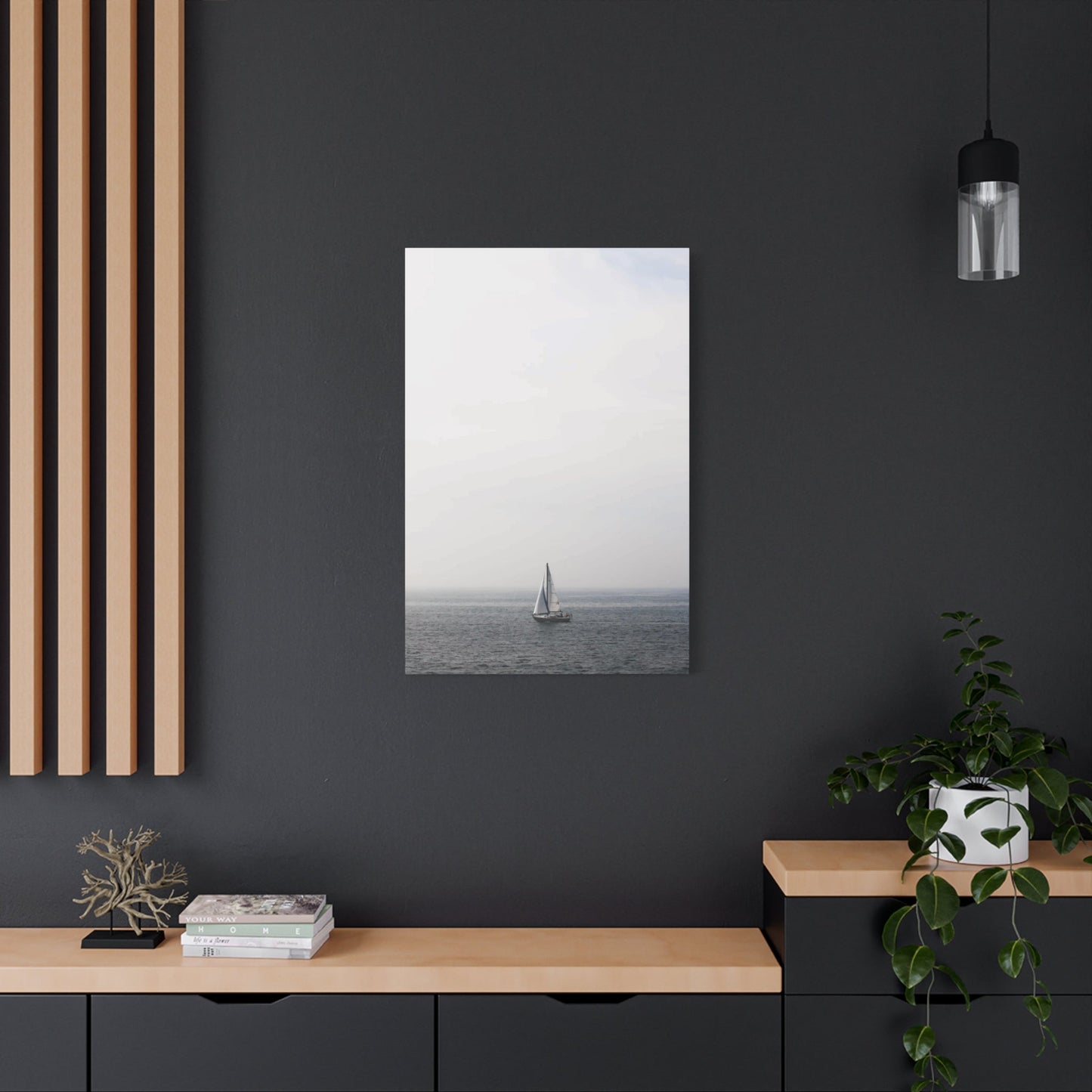
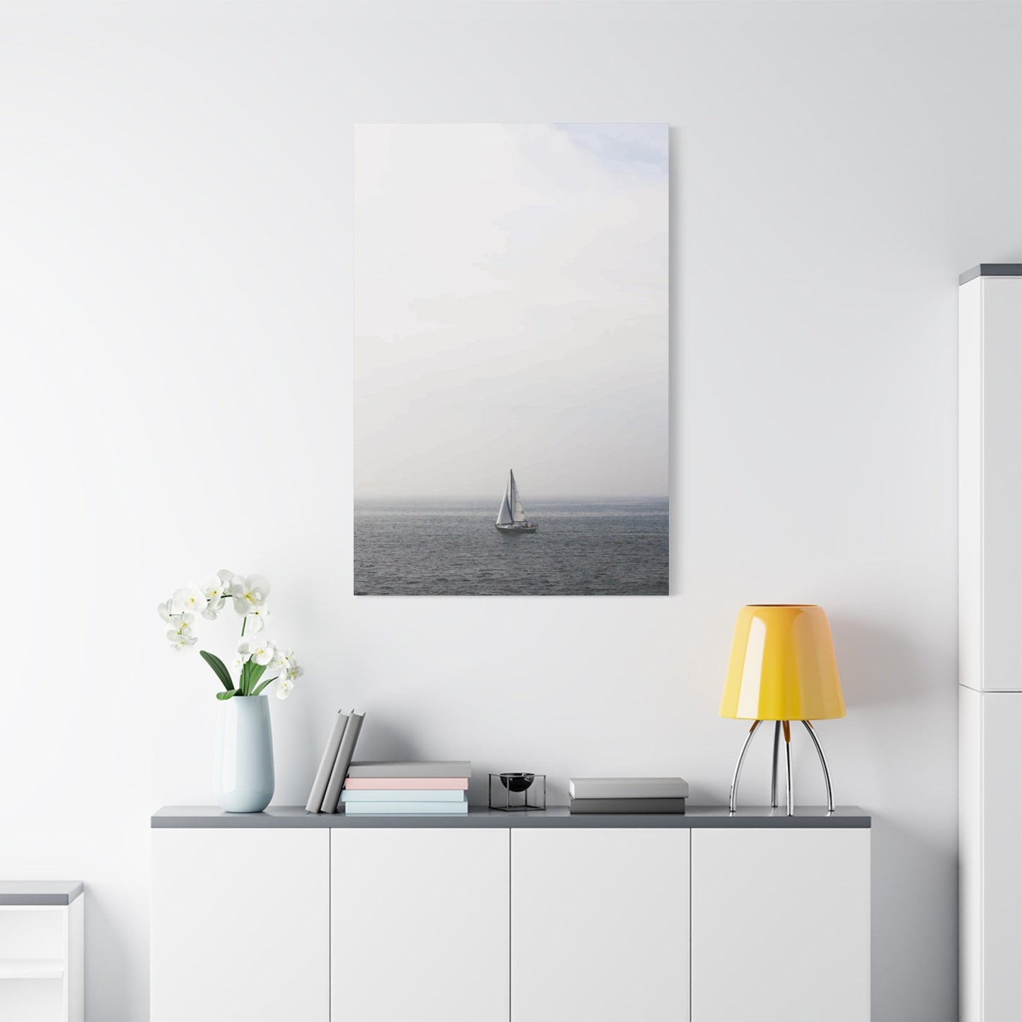
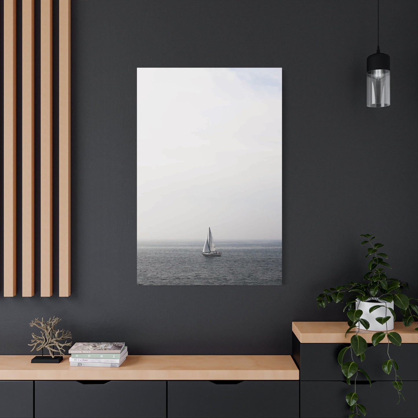
Incorporating warm wall art into small spaces is a powerful way to create cozy, inviting corners that enhance both the aesthetic and emotional atmosphere of your home. Warm colors—such as rich reds, soft oranges, golden yellows, and earthy browns—bring a sense of comfort and vibrancy that can transform even the most compact areas into welcoming retreats. When thoughtfully selected and strategically placed, warm-toned art helps to make small spaces feel more intimate, energized, and visually appealing.
One of the key advantages of using warm wall art in small spaces is its ability to influence perception. Warm colors naturally draw the eye and create a sense of closeness, which can make tiny rooms or corners feel intentionally designed and full of personality rather than cramped or cluttered. Art with warm hues adds layers of depth and texture, breaking up monotony and preventing small areas from feeling cold or impersonal. This makes it ideal for cozy reading nooks, compact living rooms, home offices, or even entryways where first impressions matter.
Moreover, warm wall art offers incredible versatility in style and subject matter. Whether you prefer abstract compositions bursting with fiery energy, serene landscapes bathed in golden light, or intimate portraits rendered in soft terracotta tones, there’s an artwork that can perfectly complement your space and taste. The key lies in balancing scale, color intensity, and framing to ensure the art feels harmonious with the room’s proportions and existing decor. Opting for medium-sized pieces or carefully curated gallery walls can provide visual interest without overwhelming the space.
Lighting also plays a critical role in amplifying the warmth and coziness that wall art brings to small spaces. Natural light enhances the vibrancy of warm colors, while soft artificial lighting can be used to create inviting focal points and highlight the artwork’s textures. Consider adjustable spotlights or warm-toned bulbs to accentuate your chosen pieces and add ambiance after dark. Thoughtful lighting design elevates the emotional impact of the art and contributes to the overall mood of comfort and relaxation.
In addition, incorporating warm wall art allows for greater personalization and emotional connection within small spaces. Art often reflects your tastes, memories, and passions, and when displayed in intimate areas, it becomes a daily source of inspiration and joy. Warm hues tend to evoke feelings of happiness, passion, and energy, fostering an uplifting environment even in limited square footage. This emotional resonance enhances the sense of home and well-being, turning small corners into cherished spaces.
In conclusion, warm wall art is a transformative tool for small spaces, offering a unique blend of aesthetic beauty, emotional warmth, and spatial enhancement. Its rich colors and varied styles can breathe life into compact areas, making them feel cozy, stylish, and thoughtfully designed. By carefully choosing artwork that complements your space, balancing scale and color, and optimizing lighting, you can create cozy corners that invite relaxation and reflect your personal style.
Whether you’re decorating a tiny apartment, a snug bedroom nook, or a compact office space, warm wall art provides an accessible and impactful way to enhance comfort and character. Embracing warm hues in your art selection is not just a design choice—it’s a way to cultivate a welcoming and vibrant atmosphere where every small space feels big on style and heart.
