


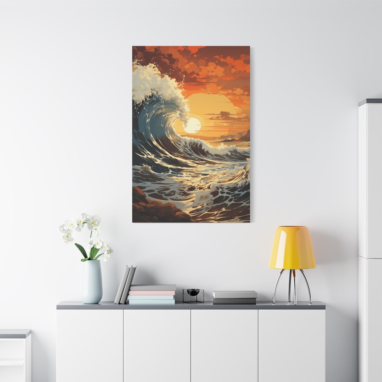
Wave Wall Art & Canvas Prints
Wave Wall Art & Canvas Prints
Couldn't load pickup availability


Transform Your Space with Wave Wall Art: Tips for Placement and Styling
The timeless appeal of ocean-inspired interior design has captivated homeowners and decorators for generations, offering a refuge from the chaos of modern life. Wave art represents more than just decorative elements hung on walls; these pieces embody the eternal rhythm of nature, the peaceful motion of water, and the boundless horizon where sky meets sea. In contemporary homes, offices, and creative spaces, incorporating oceanic imagery has become a powerful tool for creating environments that promote relaxation, creativity, and emotional balance. This comprehensive exploration delves into the multifaceted world of wave-inspired decor, examining how these artistic representations can transform ordinary rooms into sanctuaries of tranquility while maintaining modern aesthetic sensibilities.
Calm Vibes with Wave Art
Wave art possesses an inherent ability to infuse spaces with a sense of peace that few other decorative elements can match. The visual representation of rolling waters, whether captured through photography, painting, or digital illustration, creates an immediate psychological response in viewers. This connection stems from humanity's ancient relationship with water as a life source and gathering place. When you incorporate wave imagery into your interior environment, you're not simply adding decoration; you're introducing an element that speaks to something fundamental in human consciousness.
The calming effect of wave art operates on multiple sensory and psychological levels. Visually, the flowing lines and organic curves of waves provide a stark contrast to the rigid geometry that dominates most built environments. Our eyes find rest in these natural forms, moving smoothly along the contours rather than stopping abruptly at corners and edges. This visual journey mimics the meditative experience of watching actual waves, where the mind enters a state of gentle focus without strain or tension.
Color psychology plays an equally significant role in how wave art influences mood and atmosphere. Most wave imagery incorporates shades of blue, turquoise, seafoam green, and white, colors scientifically proven to lower blood pressure, reduce anxiety, and promote mental clarity. These hues trigger associations with open skies, fresh air, and the cleansing nature of water. Even in completely landlocked locations, a well-chosen wave print can transport occupants mentally to coastal environments, providing a brief mental vacation during stressful days.
The scale and composition of wave art significantly impact its calming properties. Large-scale pieces depicting gentle, rolling swells create a sense of spaciousness and freedom, making rooms feel larger and more open. Conversely, smaller pieces showing intimate water details like foam patterns or surface textures invite closer contemplation, encouraging viewers to pause and observe carefully. This versatility allows wave art to serve different calming functions depending on the specific needs of a space and its occupants.
Texture representation in wave art adds another dimension to its calming influence. Whether rendered through brushstrokes that suggest water movement, photographic grain that captures spray and mist, or smooth digital gradients that emphasize fluidity, these textural qualities engage viewers on a tactile level even when experienced purely visually. This engagement creates a richer, more immersive experience that deepens the sense of connection between the artwork and the viewer.
The temporal quality captured in wave imagery contributes to its peaceful impact. Waves represent a moment frozen in perpetual motion, suggesting ongoing change while remaining constant in the frame. This paradox mirrors meditative concepts about accepting change while finding stability within oneself. A wave print becomes a visual reminder that motion and stillness can coexist, offering philosophical comfort alongside aesthetic pleasure.
Placement strategies maximize the calming potential of wave art. Positioning these pieces in spaces dedicated to relaxation, such as bedrooms, reading nooks, or meditation areas, reinforces their peaceful message. However, placing wave art in high-stress environments like home offices or kitchen spaces can create pockets of visual calm within busier settings, offering momentary respite during demanding activities. The key lies in considering sightlines and ensuring the artwork remains visible from primary seating or standing positions.
Lighting dramatically affects how wave art communicates calm. Natural light brings out the subtle variations in blue and green tones, creating a living quality as the artwork changes with the sun's movement throughout the day. This dynamic relationship between light and image prevents the art from becoming static or ignored. Evening artificial lighting should be warm and indirect, allowing the cooler tones of the wave imagery to provide visual balance without creating harsh contrasts that undermine the peaceful atmosphere.
Why Waves Inspire Decor
The inspiration that waves provide for interior design extends far beyond simple aesthetic preference, touching on fundamental aspects of human psychology, cultural history, and our evolutionary relationship with natural environments. Understanding why waves hold such powerful appeal helps in making more intentional design choices that leverage this inspiration effectively.
Humans evolved in close proximity to water sources, making aquatic environments psychologically significant at a deep, instinctual level. This evolutionary heritage means that water imagery, including waves, triggers positive responses connected to survival, sustenance, and security. Coastal environments offered our ancestors abundant food resources, freshwater access, and natural boundaries for settlement. These ancient associations persist in modern consciousness, making wave imagery feel inherently welcoming and restorative even to those who have never lived near oceans.
The mathematical and visual properties of waves contribute significantly to their decorative appeal. Waves demonstrate natural patterns that follow predictable yet endlessly variable forms, creating visual interest without chaos. The sinuous curves, repeating rhythms, and self-similar structures at different scales exemplify natural geometry that human eyes and brains find inherently satisfying. This mathematical beauty translates seamlessly into decorative applications, providing structure and organization while maintaining organic spontaneity.
Cultural and artistic traditions across virtually all maritime societies have celebrated wave imagery for millennia. From Japanese woodblock prints depicting towering swells to Mediterranean mosaics showing gentle ripples, waves have consistently appeared in decorative arts throughout human history. This rich artistic heritage provides contemporary designers with an extensive visual vocabulary and multiple stylistic approaches to wave representation, ensuring that wave-inspired decor can suit virtually any aesthetic preference from traditional to cutting-edge contemporary.
The symbolic meanings associated with waves add layers of significance to their decorative use. Waves represent concepts like strength and gentleness, power and grace, constancy and change. They embody both the journey and the destination, the challenge and the reward. These rich symbolic associations allow wave art to communicate complex ideas and emotions without words, making spaces feel more meaningful and personally resonant to their occupants.
The versatility of wave imagery makes it exceptionally adaptable to various design contexts. Waves can be represented realistically through photography, abstractly through geometric interpretation, impressionistically through painterly approaches, or minimally through simple line drawings. This range of representational possibilities means wave inspiration works equally well in modern minimalist spaces, traditional coastal cottages, eclectic bohemian environments, or professional corporate settings. The core wave concept remains recognizable across all these interpretational variations.
Seasonal and temporal neutrality contributes to waves' enduring decorative appeal. Unlike some nature imagery that evokes specific seasons or times of day, waves remain perpetually relevant. They don't feel mismatched during winter months or seem out of place during summer. This temporal flexibility means wave-inspired decor maintains its appropriateness year-round, providing lasting value and eliminating the need for seasonal redecorating.
The accessibility of wave imagery in contemporary design markets makes this inspiration particularly practical. Advances in printing technology, photography, and digital art creation have made high-quality wave imagery available at various price points, from affordable prints to investment-worthy original artworks. This accessibility democratizes ocean-inspired design, allowing people regardless of budget to incorporate these elements into their spaces.
Waves inspire decor because they represent a rare combination of elements: universal appeal, deep psychological resonance, rich cultural significance, remarkable versatility, timeless relevance, and practical accessibility. These factors converge to make wave-inspired design not just a passing trend but an enduring approach to creating spaces that feel both personally meaningful and aesthetically accomplished.
Soft Blue Wave Trends
The contemporary design landscape has witnessed a significant evolution in how blue-toned wave imagery is interpreted and implemented in residential and commercial spaces. Current trends favor softer, more nuanced approaches to color that move beyond the saturated navy and bright turquoise that dominated earlier coastal design movements. These gentler interpretations reflect broader shifts in color psychology awareness and changing preferences for more calming, sophisticated interior environments.
Powder blue and dusty azure tones have emerged as particularly popular choices in contemporary wave art. These desaturated blues create a sense of airiness and light while maintaining clear connections to water and sky. Unlike their more vibrant predecessors, these softer blues work harmoniously with a wider range of neutral backgrounds, integrating seamlessly into spaces dominated by white, cream, gray, or natural wood tones. This compatibility makes soft blue wave art an accessible choice for those hesitant to introduce bold color statements into their homes.
The trend toward soft blues reflects increased understanding of how color intensity affects psychological states. While bright blues can feel energizing and dramatic, softer variations promote deeper relaxation and mental clarity. Interior designers working with clients experiencing high stress levels or sleep difficulties often recommend gentle blue wave imagery specifically for its proven calming effects. These recommendations are backed by color psychology research demonstrating that desaturated cool tones reduce cortisol levels and promote parasympathetic nervous system activation.
Layering techniques have become central to soft blue wave trends, with designers combining multiple shades within single compositions. A piece might feature pale sky blue in the upper portions, transitioning through seafoam and aqua in the middle, and incorporating touches of slate or periwinkle in the shadows. This layered approach creates depth and visual interest while maintaining an overall gentle color palette. The technique mimics how actual ocean scenes present varied blues depending on depth, light angle, and atmospheric conditions, adding realistic subtlety to the artwork.
Texture incorporation distinguishes current soft blue wave trends from earlier, flatter interpretations. Contemporary artists and photographers emphasize the textural qualities of water through various techniques. Painters might use impasto methods to build physical texture that catches light and creates shadows, adding dimensional interest. Photographers select images showing foam detail, surface tension patterns, or the interplay between water and sand. Digital artists incorporate subtle gradients and noise patterns that suggest natural imperfection. These textural elements prevent soft blue pieces from feeling too calm to the point of blandness, adding engaging visual complexity.
Metallic accents have entered soft blue wave design as a sophisticated complement to the gentle color palette. Silver, brushed gold, or copper elements might appear as highlights suggesting sunlight on water, as frame choices, or as mixed-media additions to the artwork itself. These metallic touches add warmth and glamour without overwhelming the peaceful primary composition. The reflective qualities of metallics also interact dynamically with changing light conditions, giving the artwork a living quality that evolves throughout the day.
The pairing of soft blue waves with natural materials represents another significant trend. Designers frequently mount blue wave prints on reclaimed wood panels, frame them with driftwood, or display them alongside natural fiber textiles like linen or jute. These combinations ground the ethereal quality of soft blues with tangible, earthy elements, creating balanced compositions that feel both elevated and approachable. This pairing strategy works particularly well in spaces aiming for coastal-modern or organic-contemporary aesthetics.
Minimalist composition approaches dominate current soft blue wave trends. Rather than busy, detailed scenes, popular pieces feature simplified wave forms, negative space, and clean lines. A single gentle curve suggesting a wave's profile against an expansive pale background captures attention through restraint rather than abundance. This minimalist approach aligns with broader design movements favoring edited, intentional spaces over cluttered, busy environments. It also allows the peaceful qualities of the imagery to communicate more directly without visual competition.
Coastal Prints at Home
Bringing coastal prints into residential spaces involves more than simply purchasing ocean-themed artwork and hanging it on walls. Successfully integrating these elements requires thoughtful consideration of how the prints interact with existing design elements, architectural features, and the lifestyle needs of the home's occupants. The goal is creating cohesive environments where coastal imagery enhances daily life rather than appearing as disconnected decorative afterthoughts.
Living rooms present ideal opportunities for coastal print integration, serving as primary gathering spaces where art can be appreciated by both residents and guests. Large-scale wave photographs or paintings positioned above sofas create strong focal points that anchor furniture arrangements while providing conversation starters. The scale of the piece should correspond to the furniture below it, typically spanning two-thirds to three-quarters of the sofa's length. This proportional relationship ensures the print feels intentional rather than arbitrarily placed. Surrounding the main piece with smaller complementary coastal images creates gallery walls that build on the ocean theme without overwhelming the space.
Bedroom applications of coastal prints prioritize calming qualities above all else. Positioning wave imagery where it's visible from the bed, either on the wall opposite the headboard or on the ceiling in creative installations, creates a peaceful last image before sleep and a serene first sight upon waking. Color choices in bedroom coastal prints should lean toward the softer end of the spectrum, avoiding highly saturated or contrasting compositions that might feel too stimulating. Pairing the prints with appropriate lighting allows for adjustment based on time of day and desired mood, with dimmer switches enabling a transition from energizing morning brightness to evening calm.
Kitchen and dining areas benefit from coastal prints that incorporate warmth alongside the typical cool blue tones. Sunrise or sunset wave scenes that include golden, coral, or amber tones complement the food preparation and consumption functions of these spaces. These warmer coastal images stimulate appetite and social engagement while maintaining connection to ocean themes. Practical considerations like moisture resistance and cleanability become important in kitchens, making framed prints under glass or acrylic-mounted photographs preferable to unprotected canvases or paper prints.
Home office integration of coastal prints serves both aesthetic and functional purposes. The stress-reducing qualities of wave imagery help counteract the tension associated with work tasks, while the visual representation of vast horizons can combat the claustrophobic feelings that sometimes develop in dedicated work spaces. Positioning coastal prints where they're visible during brief mental breaks, perhaps to the side of computer monitors rather than directly behind them, allows for momentary visual escapes that refresh focus. The prints become tools for maintaining work-life balance even within dedicated professional spaces.
Bathroom spaces naturally accommodate coastal themes given their water-related functions. Small to medium-sized coastal prints in bathrooms should be properly sealed or protected against humidity to prevent damage. The intimate scale of most bathrooms allows for more experimental approaches to coastal art, including collections of smaller prints arranged in unexpected configurations or three-dimensional elements like shadow boxes containing beach findings alongside wave imagery. These more playful approaches feel appropriate in private spaces where personal expression takes priority over universal appeal.
Entryways and hallways benefit from coastal prints that create welcoming first impressions while managing often-challenging narrow spaces. Vertical wave compositions work particularly well in hallways, drawing eyes upward and making corridors feel less confined. Series of related coastal prints arranged along hallway walls create visual rhythm that makes the transitional space feel intentional rather than leftover. In entryways, coastal imagery immediately establishes the home's aesthetic priorities, signaling to visitors the atmosphere they can expect throughout the residence.
Children's spaces allow for more whimsical interpretations of coastal themes. Stylized wave prints featuring brighter colors, playful patterns, or incorporated sea creatures create age-appropriate connections to ocean environments. These prints can grow with children as they mature, with abstract or simplified wave designs maintaining relevance from nursery through teenage years. Educational elements can be incorporated through prints that accurately depict marine environments, turning bedroom walls into informal learning spaces about ecosystems and environmental stewardship.
Multi-room coordination ensures coastal prints feel like an intentional design thread rather than repetitive monotony. Varying the style, scale, and specific ocean focus of prints in different rooms maintains the coastal theme while preventing visual fatigue. A realistic wave photograph in the living room might be complemented by an abstract water interpretation in the bedroom and a vintage-style coastal illustration in the office. These variations all reference ocean themes while offering diverse visual experiences throughout the home.
Abstract Wave Designs
Abstract interpretations of wave forms represent a sophisticated approach to ocean-inspired decor that appeals to those seeking connection to natural themes without literal representation. These designs distill the essential qualities of waves, water movement, rhythm, and fluidity into compositions that emphasize color, form, and emotion over recognizable imagery. The abstract approach opens creative possibilities that realistic representations cannot achieve while maintaining the psychological and aesthetic benefits associated with wave inspiration.
Color field abstractions using ocean-inspired palettes create immersive experiences that suggest water without depicting it directly. Large canvases dominated by layered blues, turquoises, and aquas with subtle variations and bleeding boundaries evoke the experience of being surrounded by water. These pieces work through color psychology and scale rather than recognizable forms, creating powerful atmospheric effects in spaces large enough to accommodate them. The lack of distinct edges or focal points in color field work allows viewers' eyes to wander freely across the surface, mimicking the meditative experience of gazing at open water.
Geometric interpretations reduce waves to their essential curves and rhythms, translating organic forms into structured compositions. Repeating arcs, undulating lines, or tessellated patterns that suggest water movement create visual interest through rhythm and variation. These geometric abstractions appeal to those who appreciate both natural inspiration and mathematical order, bridging the gap between organic chaos and human-imposed structure. The predictability of geometric patterns provides comfort while their clear inspiration from natural wave forms maintains connection to more primal, intuitive responses to ocean imagery.
Gestural abstract wave designs capture the energy and motion of water through expressive mark-making. Bold brushstrokes, drips, splashes, and sweeping movements across canvas or paper convey the force and vitality of waves without rendering them literally. These energetic pieces bring dynamic qualities into interior spaces, creating focal points that suggest action and vitality. The gestural approach particularly suits active spaces like fitness rooms, creative studios, or social areas where energy and movement are desirable qualities.
Minimalist abstractions reduce wave concepts to their absolute essence, often using single curved lines or simple tonal gradients to suggest water. These spare compositions require viewers to complete the image mentally, engaging imagination and creating personal interpretations. The emptiness surrounding the minimal elements suggests the vastness of oceanic spaces, bringing a sense of expansiveness into rooms. Minimalist abstract wave designs work exceptionally well in contemporary spaces where visual restraint is valued and where the artwork must coexist with other strong design elements without creating visual competition.
Mixed media abstractions combine various materials and techniques to create textured, layered interpretations of wave concepts. Artists might incorporate sand, shells, resin, metal leaf, or fabric alongside traditional painting or printing methods. These multi-dimensional pieces engage viewers on tactile levels even when observed visually, adding physical depth that flat prints cannot provide. The varied surfaces catch and reflect light in complex ways, making the artwork appear to change based on viewing angle and lighting conditions. This dynamic quality mirrors the ever-changing nature of actual ocean surfaces.
Digital abstractions leverage contemporary technology to create wave-inspired designs impossible to achieve through traditional media. Algorithmic generation, fractal patterns based on wave mathematics, or manipulated photography transformed beyond recognition all represent digital approaches to abstract wave art. These pieces often feature precision and complexity that appeal to technically-minded viewers while maintaining emotional resonance through their ocean inspiration. The uniquely contemporary character of digital abstractions makes them particularly suitable for modern, technology-embracing environments.
Monochromatic abstract wave designs explore the full range of a single hue, from pale tints to deep shades, creating sophisticated compositions that work with various color schemes. A piece exploring the full range of blues from nearly white to deep navy provides remarkable visual interest while maintaining restraint that allows it to integrate easily into diverse interiors. Monochromatic approaches emphasize form, texture, and tonal variation over color contrast, creating subtle rather than dramatic statements that reward careful viewing.
Sculptural abstractions extend wave concepts into three-dimensional space, creating artwork that physically occupies rooms rather than simply hanging on walls. Flowing metal forms, suspended fabric pieces, or carved wood installations all can embody wave qualities in spatial rather than pictorial terms. These sculptural approaches transform abstract wave design from something observed at a distance into environmental elements that viewers can move around, under, or through. The dimensional aspect adds experiential qualities that two-dimensional abstractions cannot provide, creating memorable interactions between art and daily life.
Beach Energy Indoors
Capturing the distinctive vitality and atmosphere of beach environments within interior spaces presents both creative opportunities and practical challenges. Beach energy encompasses more than visual elements; it includes the sensory richness, emotional openness, and physical invigoration associated with coastal areas. Successfully bringing this energy indoors requires understanding what makes beach environments feel uniquely energizing and identifying design strategies that translate those qualities into livable interior spaces.
The expansive openness characteristic of beaches directly influences how they affect mood and energy. Beaches offer unobstructed views to distant horizons, creating a sense of freedom and possibility that contrasts sharply with the contained, bounded nature of most interior spaces. Wave art incorporating expansive sky areas, distant horizons, and minimal foreground elements can evoke this openness. Large-scale pieces that dominate walls push the perceived boundaries of rooms outward, psychologically enlarging spaces. Positioning such pieces on walls opposite windows maximizes the sense of openness by creating visual continuity between actual outdoor views and artistic representations.
The dynamic movement constant in beach environments contributes significantly to their energizing qualities. Wind, waves, shifting sand, and changing tides create perpetual motion that stimulates alertness and engagement. Artwork capturing motion through techniques like motion blur in photography, gestural brushwork in painting, or implied movement through composition brings dynamic energy indoors. Pieces showing breaking waves, windswept water, or birds in flight add vitality to spaces that might otherwise feel static. The suggestion of movement activates spaces psychologically, making them feel alive and engaging rather than dormant.
Natural light abundance at beaches plays a crucial role in their energizing effect. The reflective qualities of water and sand amplify available sunlight, creating bright, shadow-free environments. Interiors seeking to capture beach energy should maximize natural light through window treatments that filter rather than block, reflective surfaces that bounce light deeper into rooms, and light-colored walls that maintain brightness. Wave art with high-key compositions dominated by whites, pale blues, and light tones enhances rather than absorbs available light, contributing to the bright, energized atmosphere characteristic of actual beaches.
The sensory richness of beaches extends beyond vision to include sound, smell, touch, and even taste. While artwork cannot directly provide these additional sensory inputs, design choices surrounding wave art can suggest them. Textured frames or mounting surfaces invite touch, fabric choices in nearby furniture can suggest the softness of sand, and complementary scenting strategies using salt air, coconut, or citrus fragrances create olfactory connections. Sound elements, whether actual recordings of surf or music with wave-like rhythmic qualities, complete the multisensory suggestion. These layered approaches transform single artworks into anchors for fully developed sensory environments.
The color saturation typical of beach environments energizes through both psychological and physiological mechanisms. The intense blues of water and sky stimulate alertness and mental clarity, while warm sand tones ground and comfort. Beach-energy interiors balance these cool and warm elements, often using wave art as the cool component while incorporating warm natural materials in floors, furniture, and accessories. This thermal color balance prevents spaces from feeling either too cold and austere or too warm and sleepy, maintaining the alert but relaxed energy characteristic of ideal beach days.
Social openness represents another energizing quality of beach environments. Beaches function as democratic public spaces where diverse people gather, interact, and share experiences. Interior spaces incorporating wave art can capture this social energy through furniture arrangements that encourage gathering and conversation, with artwork serving as focal points around which seating clusters. The lack of barriers in beach environments translates to interior layouts minimizing walls and partitions, using wave art to define zones within open floor plans rather than requiring physical divisions.
The connection between physical activity and beach environments contributes to their energizing reputation. Beaches invite walking, swimming, running, and play in ways that more constrained environments do not. Interiors celebrating beach energy should accommodate movement and activity, with wave art positioned where it can be appreciated from various angles and locations rather than from single seated positions. Placing coastal artwork in transition spaces, near fitness equipment, or in areas dedicated to active hobbies reinforces the connection between beach inspiration and physical vitality.
Seasonal variations in beach appearance and atmosphere provide changing energy throughout the year. Summer beaches offer different experiences than winter ones, with distinct light qualities, water colors, and emotional tones. Rotating wave art seasonally, or choosing pieces that capture different beach moods, allows interior energy to evolve in harmony with natural cycles. A collection of coastal prints depicting various seasons and conditions provides options for refreshing spaces without complete redesigns, maintaining interest and preventing the artwork from becoming invisible through overfamiliarity.
Waves + Minimalism
The intersection of wave imagery and minimalist design philosophy creates a powerful aesthetic that appeals to contemporary sensibilities while maintaining meaningful connection to natural forms. Minimalism's emphasis on essential elements, negative space, and visual restraint finds natural partnership with the simplified representation of waves, resulting in interiors that feel both calm and intentional, spare yet deeply satisfying.
Minimalist wave imagery typically reduces complex ocean scenes to their fundamental components: a single curve suggesting a wave's profile, a horizon line dividing sea from sky, or a subtle gradient implying water depth. These simplified representations eliminate visual noise while preserving the essence that makes wave imagery psychologically effective. The reduction process requires careful consideration of what elements are truly essential to communicate "wave" or "water" and what can be removed without losing recognition or impact. Successful minimalist wave art achieves maximum effect with minimum means, embodying the classic minimalist principle that less is indeed more.
Negative space, the empty areas surrounding and within compositions, plays a crucial role in minimalist wave designs. Rather than viewing unpainted or unphotographed areas as wasted space, minimalist approaches recognize these voids as active participants in the composition. Extensive negative space around a simple wave form emphasizes the ocean's vastness and the insignificance of individual elements within it. This use of emptiness creates breathing room both visually and psychologically, allowing viewers' minds to rest and reset. In interior applications, the generous negative space in minimalist wave art prevents walls from feeling cluttered even when other design elements compete for attention.
Monochromatic or limited color palettes characterize minimalist wave aesthetics. A piece might employ only three shades of blue, or even restrict itself to black, white, and gray tones. This color restraint focuses attention on form, composition, and the interplay between presence and absence rather than on chromatic variety. The limited palette also ensures easy integration into minimalist interiors, where color is typically used sparingly and strategically. A minimalist wave piece becomes a quiet presence that complements rather than dominates its environment, aligning with minimalism's broader goals of creating harmonious, non-competitive relationships between objects within spaces.
Line quality in minimalist wave designs carries significant weight since fewer elements mean each one receives greater attention. Clean, precise lines suggest calm, controlled water surfaces and align with minimalism's appreciation for clarity and definition. Alternatively, slightly imperfect hand-drawn lines introduce human warmth to the minimalist aesthetic, preventing it from feeling cold or sterile. The choice between mechanical precision and organic imperfection allows minimalist wave art to serve different emotional purposes while maintaining stylistic consistency with minimalist principles.
Material choices in minimalist wave art emphasize quality and authenticity. Rather than elaborate frames or decorative mounting, minimalist presentations might use simple wooden frames in natural finishes, frameless edge-mounting that allows the substrate itself to become part of the composition, or floating installations that create subtle shadows on walls. These presentation choices draw attention to the artwork itself rather than its surroundings, maintaining focus on the essential wave imagery. The emphasis on material quality over decorative elaboration reflects minimalism's preference for honest, enduring elements over trendy embellishments.
Scale relationships between minimalist wave art and surrounding spaces require careful consideration. In minimalist interiors where walls often remain largely bare, even modestly sized pieces can make strong statements. However, the generous negative space typical of minimalist wave compositions allows larger pieces to occupy significant wall areas without overwhelming spaces. A large canvas dominated by white space with a small but precisely placed wave element creates dramatic impact through contrast and unexpected scale relationships. This play with scale adds visual interest to minimalist environments that might otherwise risk monotony.
The philosophical alignment between minimalism and ocean imagery extends beyond aesthetics to deeper conceptual territory. Both invite contemplation of vastness, simplicity within complexity, and the essential nature of existence. Oceans reduce to water and motion; minimalism reduces to form and space. This shared concern with fundamentals creates meaningful resonance between the design approach and its subject matter. Viewers sensitive to these conceptual layers find minimalist wave art particularly satisfying, experiencing it as not just decoration but as visual philosophy.
Integration of minimalist wave pieces into broader minimalist environments requires attention to overall composition. The placement becomes part of the art, with the relationship between the piece and its surrounding wall space carefully considered. A minimalist wave image positioned off-center might balance an asymmetrical furniture arrangement, or centering might provide calm stability in otherwise dynamic spaces. The deliberate positioning demonstrates the minimalist principle that every element serves a purpose and occupies its space intentionally, with nothing arbitrary or accidental in the final composition.
Ocean Mood Boost
The capacity of ocean imagery to improve emotional states and mental wellbeing is well-documented in psychological research, with wave art serving as an accessible means of accessing these benefits within everyday environments. Understanding the specific mechanisms through which ocean visuals influence mood allows for more strategic selection and placement of wave prints to maximize their positive psychological effects.
Biophilia, the innate human attraction to nature and natural processes, provides the foundational explanation for why ocean imagery affects mood. Humans evolved in natural environments and maintain deep psychological connections to natural elements even in built environments far removed from wilderness. Ocean imagery satisfies biophilic needs by bringing natural content into interior spaces, reducing the nature deficit that contributes to stress, anxiety, and depression in modern populations. Wave art serves as a readily available form of nature connection for people whose daily lives include minimal outdoor time or limited access to natural settings.
The specific color properties of ocean imagery contribute significantly to mood enhancement. Blue hues dominate most wave art, and blue consistently demonstrates mood-improving effects in color psychology studies. Blue light exposure, even when purely visual rather than direct, influences circadian rhythms and neurotransmitter production. Viewing blue-toned artwork triggers subtle physiological responses including reduced heart rate, lowered blood pressure, and decreased production of stress hormones like cortisol. These biological changes translate to subjective feelings of calm, contentment, and mental clarity that constitute improved mood states.
Attention restoration theory explains another mechanism behind ocean imagery's mood-boosting properties. Modern life demands sustained directed attention to multiple competing stimuli, leading to mental fatigue that manifests as irritability, difficulty concentrating, and reduced emotional regulation. Natural scenes allow attention to operate in a different, less effortful mode called soft fascination. Wave imagery captures attention gently without demanding intensive processing, allowing the directed attention system to rest and restore. This restoration reduces mental fatigue and its associated negative mood states, leaving viewers feeling refreshed and emotionally balanced.
The association between oceans and positive life experiences amplifies the mood effects of wave art. Many people's happiest memories involve beach vacations, coastal walks, or water activities. Wave imagery triggers recall of these positive experiences through associative memory processes, bringing forward the emotions connected to those memories. Even if the specific artwork doesn't depict the exact beaches from someone's past, the general oceanic content activates these memory networks. This triggered recall provides momentary boosts in happiness and wellbeing as the brain re-experiences positive emotions from past events.
The suggestion of vastness in ocean imagery addresses feelings of being overwhelmed or constrained that frequently contribute to negative mood states. When daily life feels filled with pressures, deadlines, and obligations, viewing expansive water scenes provides psychological relief by representing unlimited space and possibility. The horizon line visible in many wave pieces suggests that beyond current circumstances lie other places, other opportunities, other ways of being. This sense of possibility counteracts the trapped, helpless feelings that drive depression and anxiety, offering hope and perspective that improve emotional states.
Rhythmic elements in wave imagery engage brain processes associated with self-regulation and emotional stability. The repetitive patterns of rolling waves, even when captured as still images, suggest ongoing rhythm and pattern. Human nervous systems naturally synchronize with perceived rhythms, a phenomenon called entrainment. While static artwork cannot provide the full entrainment effect of watching actual moving waves, even the suggestion of rhythm can influence breathing patterns and heart rate variability toward more regulated states. These physiological changes support emotional stability and resistance to mood disturbances.
The meditative qualities of wave imagery support mood enhancement through promoting present-moment awareness. The flowing forms and lack of sharp edges in wave art encourage relaxed, wandering visual attention rather than focused, analytical viewing. This soft visual engagement resembles the mental state cultivated in mindfulness practices, where attention rests lightly on present experiences without judgment or analysis. Regular exposure to wave art, particularly when viewed intentionally rather than ignored as background decoration, can reinforce mindfulness habits that protect against depressive rumination and anxious future-focused thinking.
Strategic placement of wave art maximizes mood-boosting effects by positioning imagery where it will be encountered during emotionally significant moments. Placing wave prints in morning spaces where they're seen during wake-up routines sets positive emotional tone for entire days. Positioning them in transition areas where they're glimpsed between activities provides mini mood-boost opportunities throughout daily routines. Locating wave art in spaces dedicated to stress recovery, such as bedrooms or meditation areas, reinforces these locations' functions as emotional restoration zones. Thoughtful placement transforms wave art from passive decoration into active mood management tools.
Big Waves, Small Rooms
Successfully incorporating large-scale wave imagery into compact interior spaces requires understanding how scale, proportion, and visual weight interact within confined areas. While conventional wisdom might suggest small rooms require small art, dramatic oversized wave prints can actually enhance small spaces when selected and positioned strategically, creating unexpected spaciousness and impact.
The psychology of scale in small spaces operates somewhat counterintuitively. Instead of making rooms feel cramped, a single large statement piece can make spaces appear larger than collections of smaller items. Multiple small artworks divide walls into segments, emphasizing the wall's limited dimensions. A single large wave image that occupies most of a wall eliminates these divisions, allowing the eye to read the entire surface as one continuous element. This visual unity makes the wall itself seem larger, and by extension, the room more spacious. The key lies in choosing the right wall and ensuring the scale is genuinely bold rather than awkwardly intermediate.
Subject matter selection within wave imagery significantly impacts how large pieces function in small rooms. Expansive wave scenes showing distant horizons and extensive sky create depth perception that pushes walls back visually. The horizon line acts as a vanishing point, suggesting three-dimensional space extending far beyond the room's physical boundaries. Close-up wave details, while dramatic, can feel more confined since they don't suggest distance. For small rooms where spaciousness is priority, wide-angle wave perspectives that emphasize breadth and distance over intimate detail deliver better spatial results.
Color choices in large-scale wave art dramatically affect how much visual space the piece consumes in small rooms. Light-dominated images with extensive whites, pale blues, and soft tones create minimal visual weight despite physical size, allowing walls to maintain their receding quality. Darker images with navy depths, stormy grays, or heavy contrast carry more visual weight, making them feel more present and potentially dominating in tight quarters. This doesn't make dark options wrong choices, but they require confidence and commitment to bold design. In small rooms with dark large-scale wave art, the piece becomes the room's defining feature, with everything else supporting its presence.
Placement height influences how large wave pieces interact with small room proportions. Hanging large art with its center at standard eye level, approximately five to six feet from the floor, might not be optimal in compact spaces with low ceilings. Slightly lower placement can make ceilings appear higher by increasing the vertical distance between the artwork's top edge and the ceiling. Conversely, in small rooms with good ceiling height, placing large wave pieces higher draws eyes upward, emphasizing the one dimension where the room might offer generosity. These strategic adjustments use the artwork to manipulate perception of the room's proportions.
The relationship between large wave art and furniture scale requires careful orchestration in small rooms. A large wave piece above a bed or sofa creates natural partnership when the furniture's horizontal dimension roughly aligns with the artwork's width. This alignment creates visual harmony that makes both elements feel appropriately scaled. When large art towers over petite furniture, the scale mismatch can make both elements uncomfortable. In small rooms where furniture must remain compact, large wave art should be positioned on walls without major furniture beneath it, allowing the art to dominate intentionally rather than awkwardly overwhelming undersized furniture.
Conclusion
Wave wall art is far more than a decorative choice—it’s a statement of serenity, strength, and timeless elegance. By bringing the fluid beauty of the ocean indoors, it transforms ordinary walls into captivating focal points that evoke calmness and inspire creativity. Whether your style leans toward coastal charm, modern minimalism, or artistic abstraction, wave-inspired artwork has a unique ability to harmonize with any interior, creating a space that feels both refreshing and refined.
What makes wave wall art truly exceptional is its versatility. The graceful movement of water, captured through brush strokes, photography, or mixed media, lends itself beautifully to different design aesthetics. A large, dramatic wave canvas can serve as a bold centerpiece in a living room, drawing the eye and anchoring the space. Smaller, softer pieces with gentle water patterns work wonderfully in bedrooms or reading nooks, where tranquility and comfort are key. This adaptability allows homeowners and designers to incorporate wave art in creative and meaningful ways, enhancing the personality of each room.
Beyond its aesthetic value, wave art carries deep emotional and symbolic meaning. Waves often represent strength, resilience, and the ever-changing flow of life. Including such imagery in your home can create a subtle but powerful reminder of nature’s rhythm, encouraging a sense of peace and balance. This emotional connection is what elevates wave wall art from mere decoration to a meaningful design element that influences mood and atmosphere.
Strategic placement is essential to maximizing its impact. Placing wave art above a sofa, bed, or mantel can instantly create a striking focal point, while gallery-style arrangements can add layered depth and dimension to large, empty walls. Using complementary color palettes—such as soft neutrals, sandy tones, and oceanic blues—ensures a cohesive and visually pleasing result. Additionally, pairing wave artwork with natural textures like wood, rattan, linen, or stone can enhance the coastal or organic feel of your space.
Lighting also plays a crucial role in bringing wave wall art to life. Soft ambient lighting can highlight delicate brush strokes and enhance the artwork’s sense of movement, while directional spotlights can draw attention to specific details, making the piece feel dynamic and immersive. Even in minimal spaces, thoughtful lighting can elevate the overall design, making the artwork a true statement feature.
In conclusion, wave wall art offers an elegant and versatile way to transform any space. It blends visual beauty with emotional resonance, infusing your home with a sense of fluidity, calm, and timeless charm. Whether you choose a bold, oversized piece or a subtle, minimalist interpretation, wave art creates a connection to nature that enriches your interior design. By carefully selecting, placing, and styling it, you can craft a home that feels balanced, inspiring, and uniquely yours.
So, if you’re ready to refresh your walls with something meaningful and visually stunning, consider incorporating wave wall art into your space. It’s more than just an aesthetic choice—it’s a way to bring the ocean’s rhythm into your home, transforming your environment into a serene, elegant retreat.
