


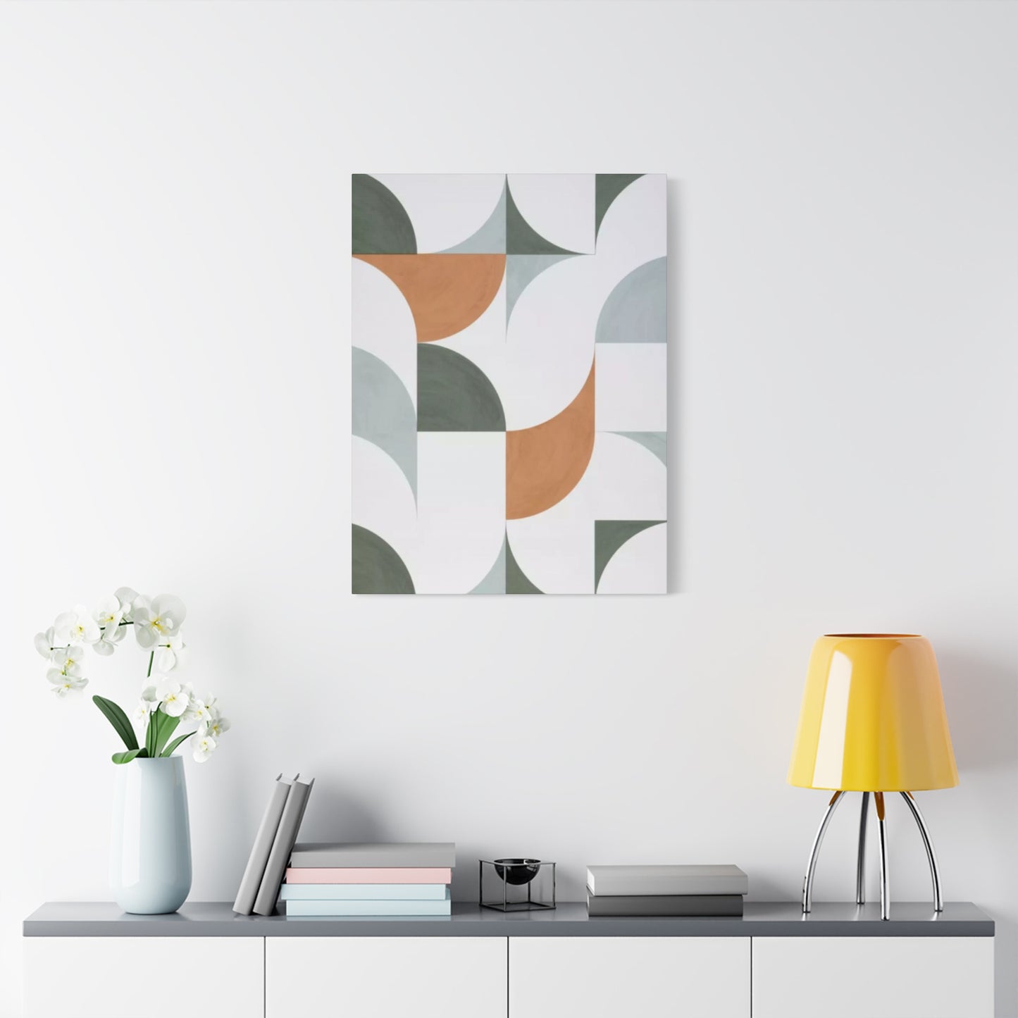
White & Olive Green Pattern Drawing Wall Art & Canvas Prints
White & Olive Green Pattern Drawing Wall Art & Canvas Prints
Couldn't load pickup availability


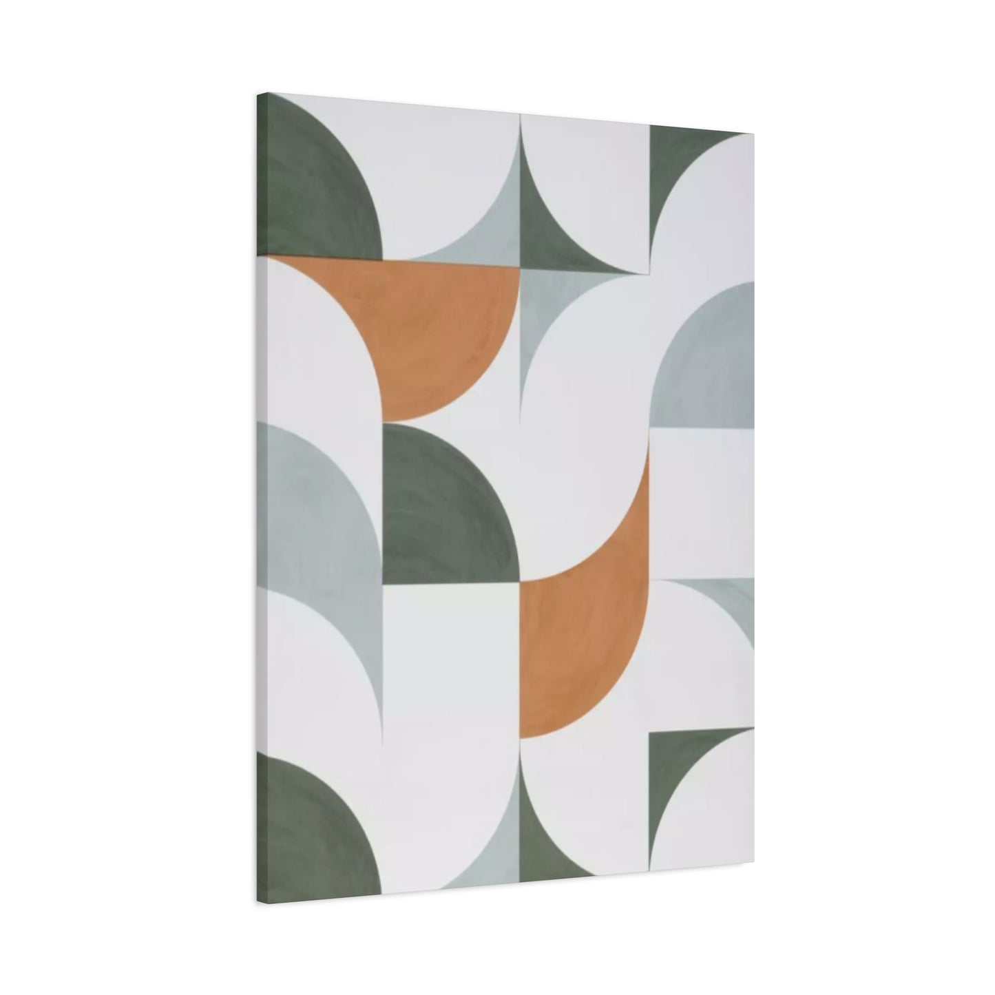
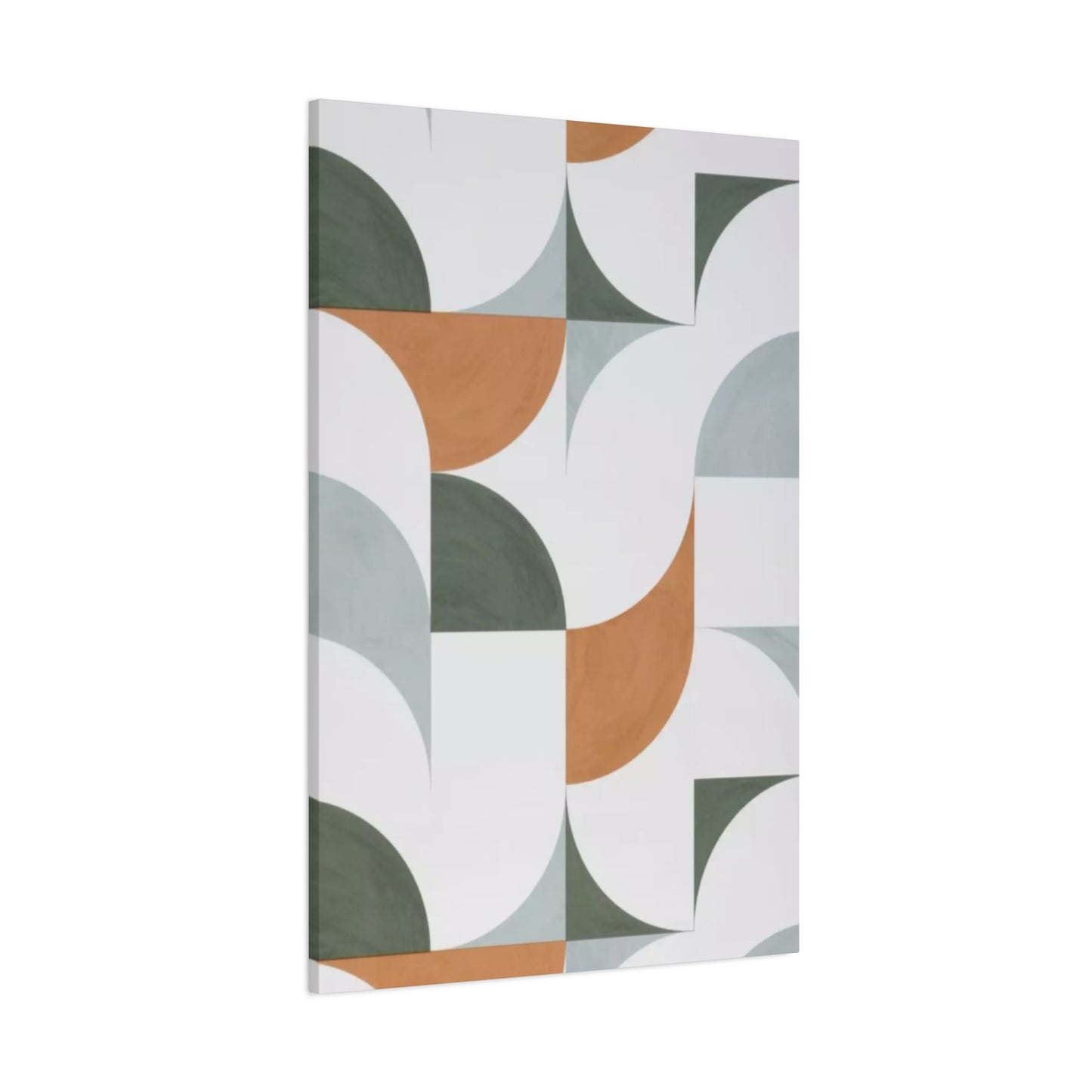
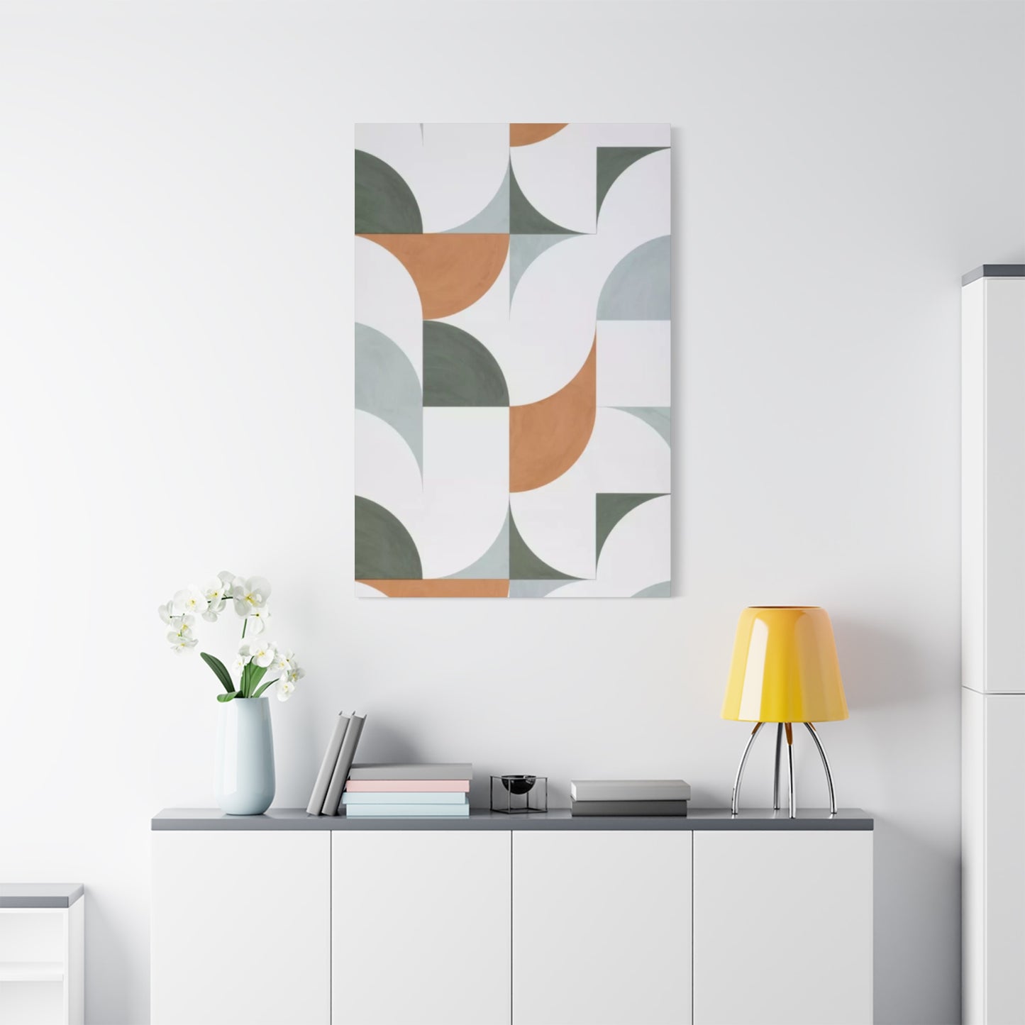
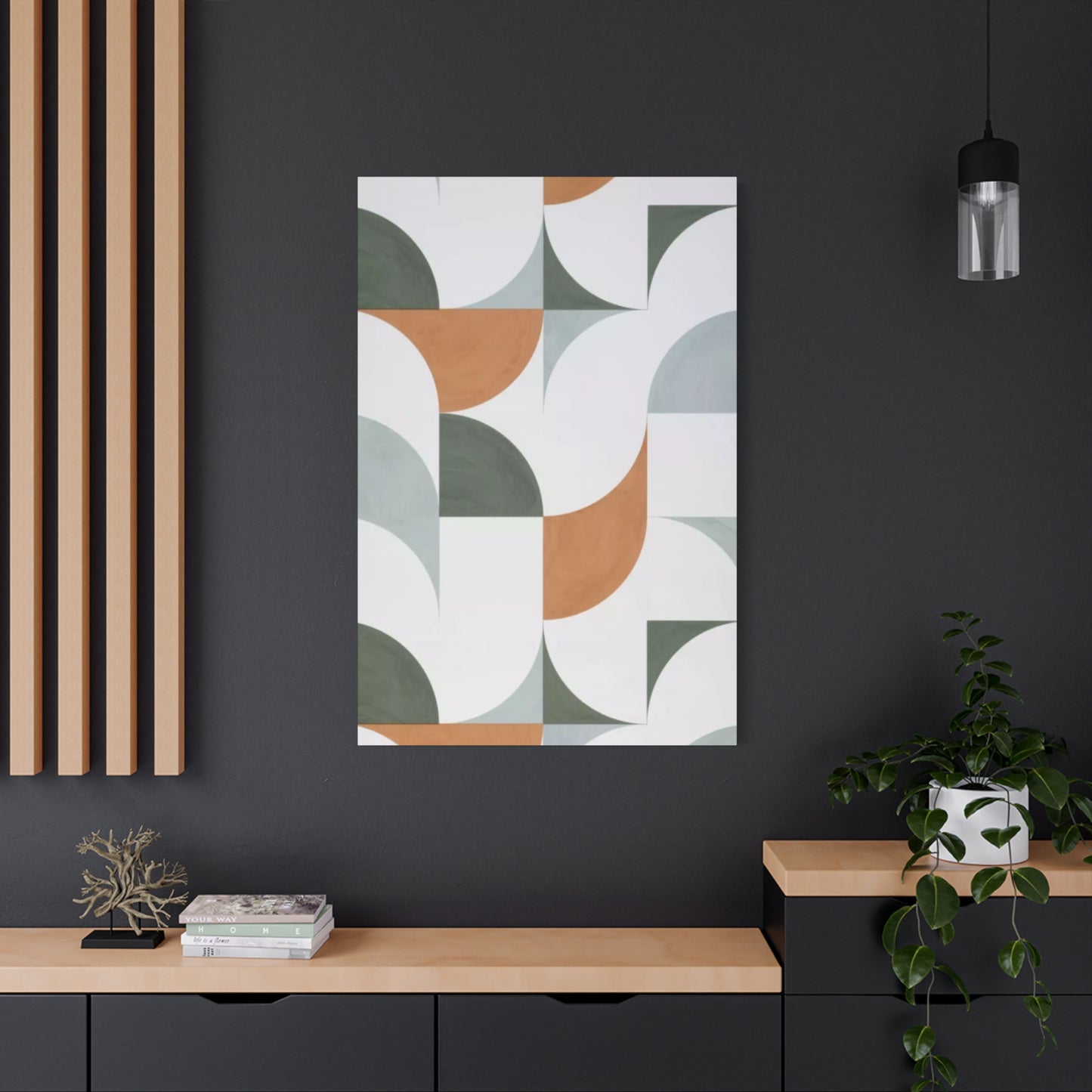
Modern Olive Green Abstract Painting Wall Art: Harmony of Color and Simplicity
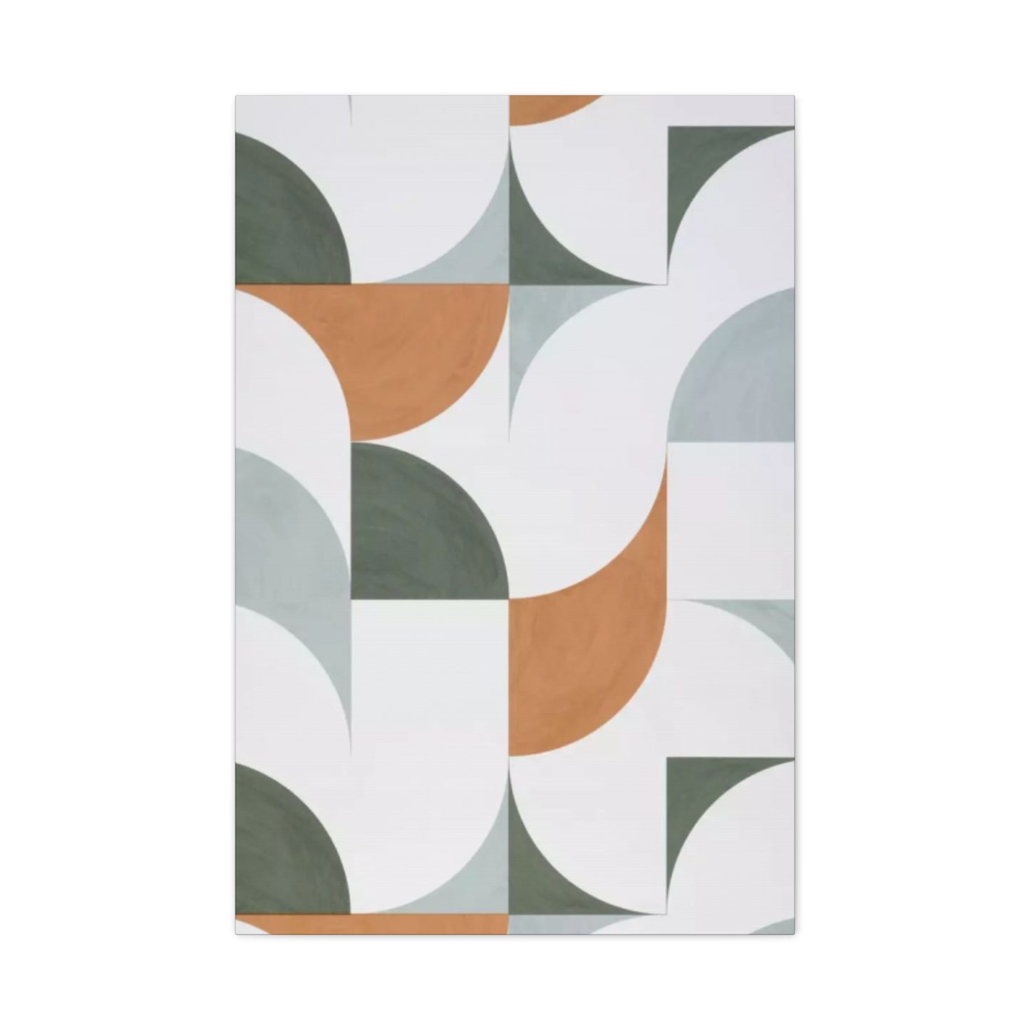
The marriage of white, olive green, and intricate patterns in wall art represents a timeless approach to interior decoration that continues to captivate homeowners, designers, and art enthusiasts worldwide. This color combination draws inspiration from the natural world, evoking the serene landscapes of Mediterranean olive groves, the fresh simplicity of coastal environments, and the organic beauty found in botanical settings. When these hues are combined with carefully crafted patterns and drawing techniques, they create visual narratives that transform ordinary walls into extraordinary focal points.
The appeal of this aesthetic lies in its remarkable versatility and ability to adapt to various design philosophies. Whether your space embraces contemporary minimalism, rustic farmhouse charm, Scandinavian simplicity, or bohemian eclecticism, the combination of white and olive green with patterned elements provides a foundation that feels both grounded and sophisticated. The neutral quality of white serves as a canvas that allows olive green to shine without overwhelming the senses, while patterns add depth, movement, and visual interest that prevent the palette from feeling flat or monotonous.
Understanding the psychology behind these color choices reveals why this combination resonates so deeply with people seeking to create calming yet engaging environments. White represents purity, clarity, and spaciousness, making it an ideal backdrop for any artistic endeavor. Olive green, a muted and earthy shade, brings the tranquility of nature indoors, offering a sense of balance, renewal, and connection to the organic world. When patterns enter the equation, they introduce rhythm, structure, and complexity that engage the eye and mind, creating layers of visual storytelling that reveal new details with each viewing.
The practical benefits of incorporating white and olive green patterned wall art extend beyond aesthetics. This color scheme works exceptionally well in spaces with varying light conditions, as the neutral tones adapt gracefully to both bright natural light and softer artificial illumination. The versatility of this palette also means that it serves as an excellent starting point for those who wish to experiment with accent colors, textures, and decorative elements without committing to bold or potentially overwhelming choices. Additionally, the timeless nature of these colors ensures that your wall art investment will remain relevant and appealing for years to come, transcending fleeting trends.
The Cultural Significance of Olive Green in Artistic Expression
Olive green occupies a unique position in the spectrum of colors used throughout art history. Unlike brighter, more saturated greens that demand attention, olive green possesses a subtle sophistication that speaks to refinement and understated elegance. This shade has been celebrated across cultures and time periods for its connection to peace, wisdom, and prosperity. In ancient civilizations, olive branches and the associated green hues symbolized victory, harmony, and divine favor, associations that continue to influence how we perceive and respond to this color in contemporary settings.
The use of olive green in artistic contexts dates back centuries, with master painters incorporating various shades of muted greens to create depth, shadow, and naturalistic representations of foliage and landscapes. During the Renaissance period, artists developed sophisticated techniques for mixing pigments to achieve the perfect olive tones that would bring their compositions to life. These historical applications inform modern interpretations of olive green in wall art, connecting contemporary pieces to a rich artistic lineage.
In Mediterranean cultures, olive green holds particular significance due to the economic and cultural importance of olive cultivation. The silvery-green leaves of olive trees, which shimmer in sunlight and create ever-changing patterns of light and shadow, have inspired countless artists to capture their unique beauty. This connection to agriculture, sustenance, and the rhythms of rural life imbues olive green with associations of abundance, patience, and the rewards of careful cultivation, making it particularly appealing for spaces where people seek respite from urban intensity.
The symbolic weight of olive green extends into modern design psychology, where it functions as a bridge between cool and warm tones. This transitional quality makes it exceptionally compatible with white, as the two colors together create a balanced environment that feels neither too stark nor too heavy. The presence of olive green can soften the potentially clinical feel of all-white spaces while maintaining the airiness and light-reflecting properties that make white so valuable in interior design.
Contemporary artists working with olive green often explore its ability to convey different moods depending on context and application. In abstract compositions, olive green can suggest organic growth, natural cycles, or environmental themes. In representational work, it accurately depicts the subtle variations found in nature, from weathered wood to moss-covered stones to the undersides of leaves. This versatility ensures that olive green remains relevant across artistic styles and movements, adapting to express both traditional and avant-garde concepts.
Pattern Drawing Techniques That Elevate Wall Art
The incorporation of patterns into wall art transforms simple color combinations into complex visual experiences that engage viewers on multiple levels. Pattern drawing encompasses a vast array of techniques, from geometric precision to organic freeform expressions, each offering distinct aesthetic and emotional qualities. Understanding these various approaches helps in selecting or creating wall art that aligns with your space's character and your personal aesthetic preferences.
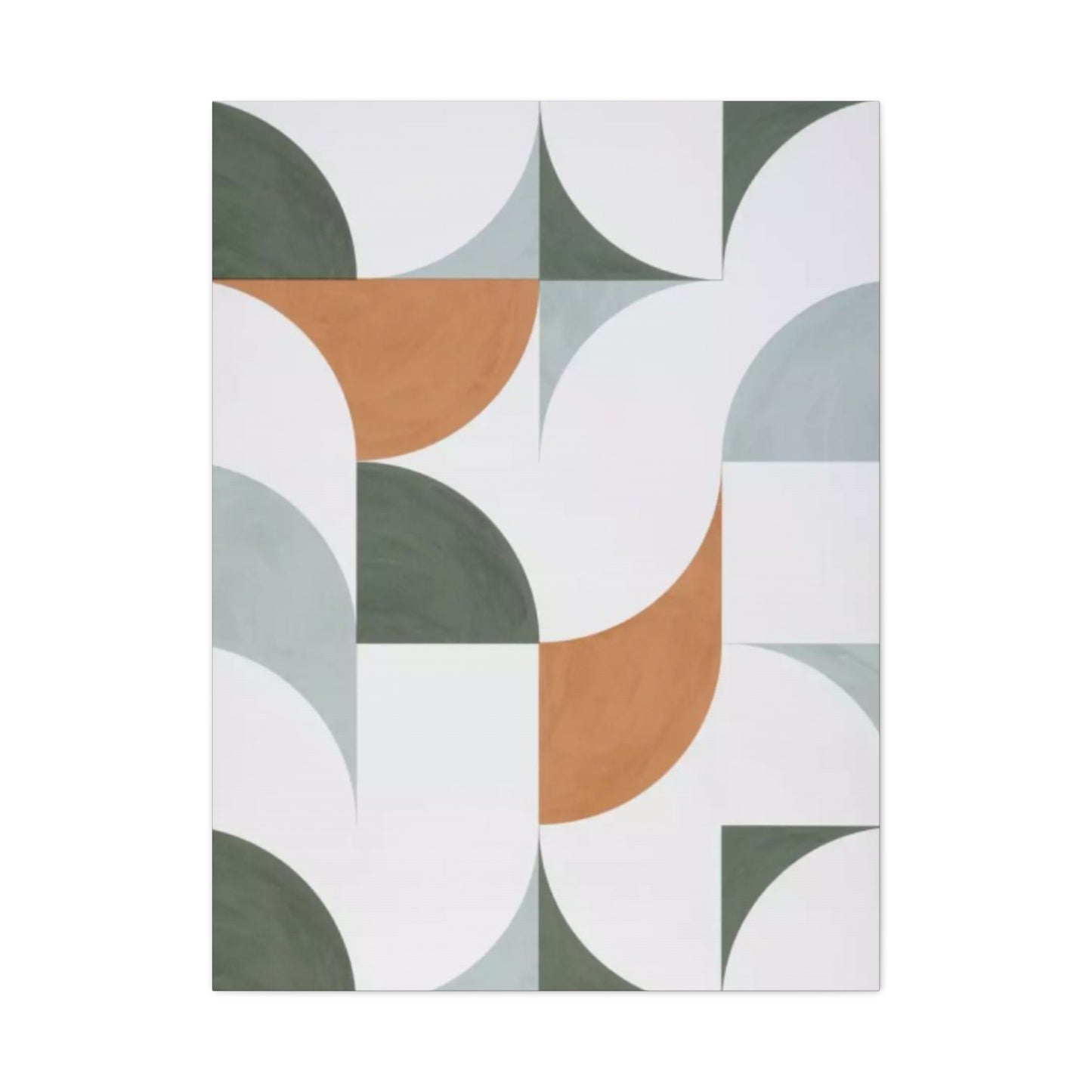
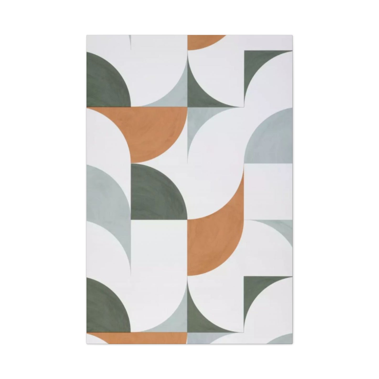
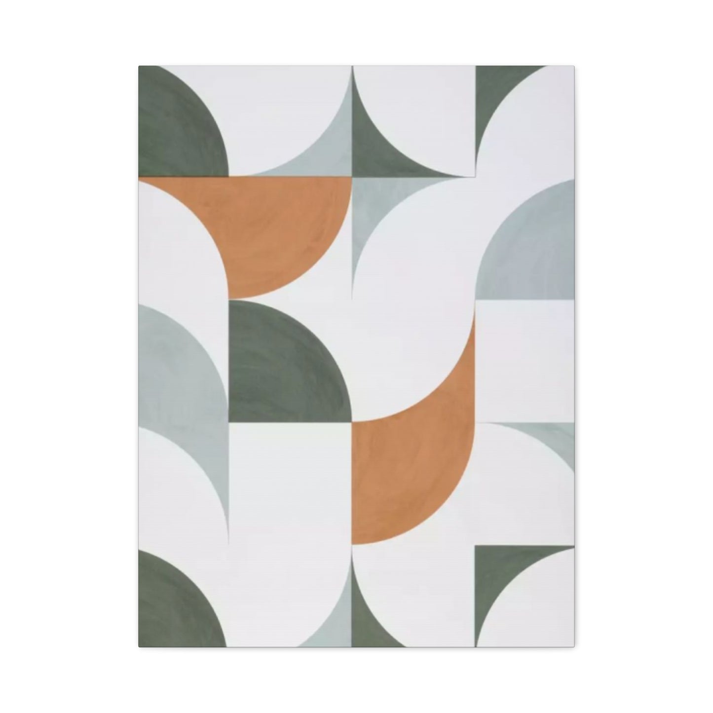
Geometric patterns represent one of the most enduring categories in decorative art. These designs, built from repeated shapes such as circles, triangles, squares, and hexagons, create order and rhythm that the human eye finds inherently pleasing. In white and olive green wall art, geometric patterns might manifest as tessellations that create seamless, interlocking designs, or as more spacious compositions where shapes float against neutral backgrounds. The mathematical precision of geometric patterns provides a sense of stability and intentionality that works particularly well in modern and contemporary settings.
Botanical patterns draw directly from the natural world, incorporating representations of leaves, flowers, vines, and other plant elements. These patterns can range from highly realistic botanical illustrations to stylized interpretations that capture the essence of plant forms through simplified lines and shapes. The combination of white backgrounds with olive green botanical patterns creates a fresh, garden-inspired aesthetic that brings the outdoors inside. Such patterns work beautifully in spaces where you want to emphasize natural themes, such as sunrooms, breakfast nooks, or bedroom retreats.
Abstract patterns offer artists maximum creative freedom, allowing for expressive mark-making that follows intuition rather than predetermined rules. In abstract patterned wall art, olive green might appear as gestural brushstrokes, dripped or splattered paint, or layered washes that create depth through transparency and opacity variations. These patterns often evoke emotions or atmospheres rather than representing specific objects, making them ideal for spaces where you want art that sparks conversation and personal interpretation.
Tribal and ethnic patterns draw from the rich decorative traditions of cultures worldwide. These patterns often carry deep symbolic meanings and reflect the aesthetic values of their communities of origin. When executed in white and olive green, tribal patterns take on a softer, more contemporary feel while still honoring their cultural roots. Such patterns might include African mudcloth designs, Native American geometric motifs, or patterns inspired by traditional textiles from various regions.
Repeating motifs create rhythm through the regular recurrence of particular elements throughout a composition. This technique can produce meditative, almost hypnotic effects as the eye follows the pattern's flow across the artwork. In white and olive green wall art, repeating motifs might include waves, arches, scales, or any number of shapes that gain meaning and impact through repetition. The key to successful repetition lies in maintaining enough variation to prevent monotony while preserving enough consistency to establish clear pattern recognition.
Selecting the Right Scale for Your Space
The scale of patterned wall art significantly impacts how it functions within a room and how viewers experience it. Understanding scale considerations helps ensure that your chosen artwork enhances rather than overwhelms or gets lost within your space. Large-scale patterns make bold statements and work best in spacious rooms with high ceilings and minimal visual competition from other decorative elements. These oversized designs can serve as dramatic focal points that anchor entire rooms and establish strong design themes.
In contrast, small-scale patterns create intricate, detailed surfaces that reward close inspection. These delicate designs work beautifully in intimate spaces such as powder rooms, reading nooks, or gallery walls where viewers can appreciate fine details. Small patterns also tend to read as texture from a distance, creating visual interest without demanding attention, making them suitable for spaces where you want subtle sophistication rather than dramatic impact.
Medium-scale patterns occupy a sweet spot that works in most residential spaces. These patterns are large enough to be clearly visible and appreciated from normal viewing distances but not so large that they dominate or overwhelm. Medium-scale designs offer versatility, functioning well in living rooms, dining rooms, bedrooms, and home offices. They provide visual interest without requiring extensive wall space or competing aggressively with furniture and other decorative elements.
The relationship between pattern scale and room size requires careful consideration. In smaller rooms, large-scale patterns can make spaces feel even more confined if not handled thoughtfully. However, when executed with restraint and plenty of white space, even substantial patterns can work in compact areas by creating the illusion of expanded space through their bold presence. The key lies in balancing the pattern's visual weight with the room's proportions and other design elements.
Viewing distance also influences ideal pattern scale. Wall art placed in hallways or opposite seating areas should be legible and engaging from its typical viewing distance. Artwork that will be viewed primarily from across a room can feature larger, bolder patterns, while pieces positioned near chairs or beds should offer interesting details that reveal themselves upon closer inspection. Considering how people will actually experience the artwork in daily life ensures that scale serves the practical function of creating an enjoyable visual environment.
Creating Depth Through Layering and Transparency
Sophisticated patterned wall art often employs layering techniques to create depth and complexity that elevate simple designs into rich visual experiences. Layering involves placing multiple elements, colors, or patterns at different depths within a composition, creating the illusion of dimensional space on a flat surface. In white and olive green wall art, layering might manifest as transparent olive green washes over white backgrounds, creating subtle variations in tone and value that add sophistication and nuance.
Transparency effects allow underlying elements to show through subsequent layers, creating complex color interactions and visual depth. When olive green pigments are applied with varying degrees of transparency over white surfaces, they produce a range of values from pale sage to deep forest tones. This variation within a restricted color palette prevents monotony while maintaining overall cohesion. Transparent layers can suggest atmospheric perspective, where distant elements appear lighter and less distinct than foreground components.
Overlapping patterns create dynamic intersections where different design elements meet and interact. These moments of convergence often become the most visually engaging parts of a composition, as the eye puzzles out how patterns relate to one another. In white and olive green artwork, overlapping might involve geometric shapes intersecting with organic botanical forms, or different scales of the same pattern type creating moiré-like visual effects that shimmer and shift as viewing angles change.
Textural layering adds physical dimension to artwork through the application of materials with different surface qualities. Even within a two-dimensional drawing or painting, artists can simulate texture through mark-making techniques that suggest rough, smooth, matte, or glossy surfaces. White areas might be kept pristine and smooth, while olive green sections receive textured treatment through stippling, cross-hatching, or other techniques that create visual interest through varying mark density and directionality.
Shadow and highlight relationships establish light sources within compositions, contributing to perceived depth and three-dimensionality. Even abstract patterned work benefits from consideration of how light might interact with depicted forms. Subtle tonal variations within olive green elements can suggest volume and form, while strategic use of pure white creates highlights that bring certain areas forward in space. These lighting effects make patterns feel more alive and responsive to environmental conditions.
The Role of Negative Space in Pattern Design
Negative space, the areas in artwork that remain unoccupied by primary design elements, plays a crucial role in creating balanced, readable compositions. In white and olive green patterned wall art, white typically functions as negative space, providing breathing room that allows olive green patterns to register clearly and maintain visual impact. Understanding how to use negative space effectively separates amateur designs from professional-quality artwork that displays sophisticated compositional awareness.
The ratio between positive and negative space dramatically affects artwork's overall feeling and energy. Compositions dominated by negative space feel airy, calm, and minimalist, emphasizing quality over quantity. These sparse designs allow each element maximum impact and create contemplative environments conducive to relaxation and focus. In contrast, compositions with minimal negative space feel energetic, dense, and visually stimulating, appropriate for spaces where you want to generate excitement and engagement.
Strategic placement of negative space guides viewer attention through compositions by creating visual pathways and rest points. Large areas of white space naturally draw the eye before directing it toward olive green pattern elements. By controlling where negative space appears, artists can orchestrate viewing experiences that unfold in intentional sequences, revealing design elements in particular orders that enhance narrative or aesthetic impact.
Negative space can also function as positive design element in its own right, creating shapes and forms through the absence of pattern rather than its presence. This reversal of traditional figure-ground relationships creates visual intrigue and encourages viewers to consider alternative ways of seeing and interpreting compositions. In white and olive green wall art, white negative space might form recognizable shapes surrounded by olive green patterns, creating a push-pull dynamic that activates the entire picture plane.
Cultural perspectives on negative space vary significantly, with Eastern artistic traditions often emphasizing emptiness as essential to composition, while Western approaches historically favored fuller, more densely packed designs. Contemporary wall art frequently draws from both traditions, creating hybrid aesthetics that honor negative space while still providing satisfying visual complexity. This cross-cultural synthesis results in artwork that feels both restful and engaging, combining contemplative openness with areas of concentrated interest.
Combining Multiple Patterns Successfully
Working with multiple patterns in a single composition or space requires careful consideration to avoid visual chaos. When executed thoughtfully, however, multi-pattern designs create rich, layered environments with significant visual interest. The key to successful pattern mixing lies in establishing clear hierarchies, maintaining consistent elements, and ensuring adequate variation to prevent patterns from competing or blending into muddy confusion.
Scale variation provides one of the most effective tools for combining patterns harmoniously. When patterns of different scales coexist, each occupies its own visual register, allowing them to share space without competition. A large-scale geometric pattern might anchor a composition, while smaller botanical patterns fill supporting areas, and tiny dotted or linear patterns add fine detail. This scalar hierarchy creates visual organization that helps viewers process complex compositions without feeling overwhelmed.
Consistency in color palette unifies diverse patterns, ensuring that even when shapes and structures vary widely, overall cohesion remains intact. In white and olive green wall art incorporating multiple patterns, the restricted palette automatically provides significant unity. Additional consistency might come from shared line weights, similar levels of contrast, or common stylistic approaches that give disparate patterns a family resemblance despite their differences.
Balancing busy and calm areas prevents pattern overload by providing visual rest stops within compositions. When multiple patterns appear in artwork, intervening areas of solid color or minimal pattern density allow the eye to recover before encountering the next complex section. This rhythm of activity and rest creates more comfortable viewing experiences than unrelenting pattern density, which can exhaust rather than engage viewers.
Thematic connections between patterns strengthen conceptual unity even when visual approaches differ. Patterns sharing common themes, such as nature, geometry, or cultural references, feel related even when their execution varies. In white and olive green wall art, all patterns might draw from botanical sources but express these inspirations through different means, from realistic representation to geometric abstraction. This thematic thread ties the composition together while still offering visual variety.
Drawing Methods for Creating Patterned Wall Art
The technical execution of patterned wall art involves various drawing methods, each producing distinct visual qualities and requiring different skill sets. Understanding these techniques helps in both appreciating existing artwork and creating original pieces. Traditional drawing methods remain relevant despite technological advances, offering direct, tactile engagement with materials that many artists and collectors value.
Line drawing forms the foundation of most patterned work, using continuous or broken lines to define shapes, create textures, and build compositions. Line quality, including thickness, consistency, and character, significantly impacts artwork's overall feeling. Uniform mechanical lines create precise, technical aesthetics suitable for geometric patterns, while varied hand-drawn lines introduce organic warmth and personality. In white and olive green wall art, olive green lines might range from delicate hairlines to bold strokes, with line weight variations creating visual hierarchy and emphasis.
Stippling involves creating tones and textures through countless small dots, with density variations producing lighter or darker areas. This meticulous technique generates subtle gradations and atmospheric effects while maintaining crisp, precise quality. Stippled patterns in olive green against white backgrounds create distinctly textured surfaces that shift in appearance depending on viewing distance. Close inspection reveals individual dots, while from across a room, stippled areas read as cohesive tonal fields.
Hatching and cross-hatching build value and texture through parallel or intersecting lines. This classical drawing technique allows for sophisticated modeling and shading while maintaining graphic clarity. In patterned wall art, hatching might create shadows within patterns, add dimensionality to flat shapes, or become pattern elements in itself. The directional quality of hatched lines can suggest movement, form, and light direction, adding narrative and dynamism to compositions.
Wash techniques apply diluted pigments to create translucent color fields and soft transitions. Olive green washes over white surfaces produce ethereal, atmospheric effects quite different from opaque applications. Multiple wash layers build color intensity gradually, allowing for nuanced control over final tonality. Washes work beautifully for creating background atmospheres or subtle pattern elements that support more defined foreground details.
Mixed media approaches combine multiple drawing and painting methods within single artworks, leveraging each technique's strengths to create rich, complex surfaces. A piece might feature precise ink line work, watercolor washes, colored pencil details, and collage elements all working together. This technical diversity creates visual interest and allows artists to achieve effects impossible through single-method approaches. Mixed media work particularly suits contemporary aesthetics that value complexity and layered meaning.
Botanical Patterns Inspired by Nature
Nature provides endless inspiration for patterned wall art, with botanical elements offering particularly rich source material. The structural beauty of plants, from cellular organization to overall growth patterns, translates beautifully into decorative designs. Olive green serves as a natural choice for botanical patterns, immediately suggesting plant life while offering sophisticated alternative to brighter, more obvious greens.
Leaf patterns capture the incredible diversity of plant foliage, from simple rounded forms to complex pinnate structures. Artists might render leaves with botanical accuracy, carefully depicting veining and edge details, or abstract leaf shapes into simplified silhouettes that retain recognizable plant character while emphasizing design qualities. Olive green leaf patterns against white backgrounds create fresh, garden-inspired aesthetics suitable for various interior styles from traditional to contemporary.
Floral patterns range from tightly realistic flower portraits to loose, interpretive blooms that suggest rather than document botanical subjects. While flowers often feature bright colors, rendering them in olive green creates unexpected sophistication. Monochromatic floral patterns emphasize form and structure over color, directing attention to petal arrangement, flower geometry, and compositional placement rather than chromatic relationships.
Vine and tendril patterns introduce movement and flow to compositions through their natural curving growth. These linear elements connect other design components, creating pathways for the eye to follow through artwork. Vine patterns can be delicate and sparse or dense and jungle-like, offering considerable range in mood and visual impact. The climbing, reaching quality of vines suggests growth, aspiration, and natural vitality.
Seed pod and fruit patterns celebrate plant reproductive structures with their often remarkable forms and textures. From dandelion seed heads to pinecones to various nuts and berries, botanical patterns drawing from these sources introduce geometric regularity found in natural forms. Many seed structures display mathematical sequences and spiral patterns that bridge natural and geometric design approaches.
Tree bark and wood grain patterns bring texture and organic structure to wall art. The irregular, organic quality of bark patterns contrasts beautifully with geometric precision, offering visual variety within compositions. Olive green wood grain patterns suggest weathered wood, moss-covered surfaces, or the undertones visible in certain tree barks, all evoking outdoor environments and natural materials.
Geometric Precision Meets Organic Flow
The interplay between geometric precision and organic flow creates dynamic tension in patterned wall art. These seemingly opposing approaches each offer distinct qualities, and their combination often produces the most engaging compositions. Geometric elements provide structure, order, and visual stability, while organic forms introduce movement, unpredictability, and natural reference. Skilled artists balance these qualities to create work that feels both organized and alive.
Sacred geometry patterns draw from mathematical relationships and proportions that appear throughout nature and have been recognized as aesthetically significant across cultures. These include the golden ratio, Fibonacci sequences, and various symmetrical arrangements that resonate with innate human preferences for particular proportions and relationships. Incorporating sacred geometry into white and olive green wall art adds layers of meaning and creates inherently harmonious compositions based on universal mathematical principles.
Tessellations create seamless, repeating patterns where shapes fit together without gaps or overlaps. Islamic art traditions developed tessellation to extraordinary levels, creating complex geometric patterns of stunning intricacy. Contemporary artists continue exploring tessellation possibilities, sometimes combining geometric tiles with organic elements that flow through and around rigid structures. The mathematical challenge of tessellation appeals to artists interested in the intersection of art and mathematics.
Fractals replicate patterns at different scales, creating self-similar structures that mirror forms found throughout nature. From branching tree structures to coastline irregularities to snowflake symmetries, fractal patterns appear widely in the natural world. Artists incorporating fractal principles into wall art create pieces with remarkable depth and complexity, where similar patterns recur at various scales, rewarding sustained viewing with continually revealed details.
Organic geometry finds mathematical structures within natural forms, recognizing that nature often follows geometric principles despite appearing irregular. Honeycomb hexagons, spiral shells, and radial flower arrangements all demonstrate nature's geometric tendencies. Patterns based on organic geometry bridge rigid mathematical structures and flowing natural forms, creating designs that feel simultaneously ordered and alive.
Asymmetrical balance challenges perfectly symmetrical arrangements while maintaining overall equilibrium. Many natural forms display asymmetry despite underlying organizational principles. Incorporating asymmetrical balance into patterned wall art creates more dynamic, unexpected compositions than strict symmetry while still achieving visual stability. This approach feels more contemporary and less formal than traditional symmetrical designs, suitable for modern living spaces.
Color Theory Applications in Limited Palettes
Working within the restricted white and olive green palette requires sophisticated understanding of color theory to achieve visual richness despite limited chromatic range. Value, the relative lightness or darkness of colors, becomes paramount when hue variety is constrained. By exploring the full value range from pure white through pale sage tints to deep olive shadows, artists create dramatic compositions despite chromatic limitation.
Temperature variations exist even within restricted palettes. Olive green can lean warmer toward yellow-greens or cooler toward blue-greens, creating subtle temperature shifts that add complexity. These nuanced variations might not be immediately obvious but contribute to overall sophistication and prevent flat, monotonous appearance. Understanding how to manipulate color temperature within narrow ranges demonstrates advanced color knowledge.
Saturation control involves adjusting color intensity from vibrant, pure hues to grayed, muted tones. Olive green inherently tends toward lower saturation compared to bright greens, but further desaturation creates sage and grayish-green tones that read as distinctly different despite belonging to the same color family. Varying saturation levels within compositions creates visual hierarchy and prevents uniform appearance.
Simultaneous contrast effects occur when colors influence how adjacent colors are perceived. Even within a limited palette, these perceptual phenomena impact color appearance. Olive green surrounded by white appears darker and more saturated than the same green surrounded by darker tones. Understanding simultaneous contrast allows artists to manipulate color perception strategically, making colors appear lighter, darker, warmer, or cooler through careful control of surrounding colors.
Proportion and distribution of colors within compositions dramatically affect overall impact. Even when using only white and olive green, the ratio between these colors changes artwork's character significantly. Compositions dominated by white with sparse olive green accents feel light, airy, and minimalist. Pieces with more balanced color distribution create different energy, while olive green-dominant work with white accents produces bold, dramatic results. Considering color proportion helps achieve intended moods and aesthetics.
Material Choices for Wall Art Creation
The materials used to create patterned wall art significantly influence final aesthetic qualities, longevity, and environmental impact. Traditional materials continue offering unique qualities that digital alternatives cannot replicate, while modern innovations expand creative possibilities. Understanding material options helps in both selecting existing artwork and planning original creations.
Paper selection affects how drawing and painting materials behave and how finished artwork appears. Hot-pressed smooth papers work beautifully for precise line work and detailed patterns, while cold-pressed textured surfaces add visual interest and suit looser, more expressive approaches. Paper weight influences durability and how much liquid medium the surface can accept without warping. For wall art, heavier archival papers ensure longevity and professional presentation quality.
Natural pigments derived from earth, plants, and minerals offer unique color qualities and connect contemporary work to historical artistic traditions. Olive green can be achieved through various natural pigments including terre verte, a natural clay pigment used since ancient times. Natural pigments often display complex color properties with subtle variations that synthetic alternatives lack, though they may be less consistent and permanent than modern alternatives.
Synthetic pigments provide reliability, consistency, and often superior lightfastness compared to natural alternatives. Modern olive greens might be mixed from phthalocyanine blues and yellows, creating stable, permanent colors that resist fading when properly used. Understanding pigment properties helps ensure that wall art maintains its appearance over time, particularly important for pieces exposed to natural light.
Ink formulations include permanent, waterproof varieties suitable for detailed line work and patterns requiring precision. India ink creates rich, deep blacks or can be diluted for gray washes, while colored inks in olive green tones offer alternatives to paint. Archival inks ensure longevity, resisting fading and degradation over time. The fluid quality of ink suits certain drawing styles and pattern types, particularly work emphasizing line and calligraphic qualities.
Acrylic paints offer versatility, quick drying times, and durability suitable for wall art intended to last. Acrylics can be applied thinly for transparent effects or built up thickly for texture and opacity. They dry to waterproof finishes and resist environmental damage better than some alternatives. The consistency and working properties of acrylics suit various application methods from detailed brushwork to bold gestural marks.
Watercolors create luminous, transparent effects impossible to achieve with opaque media. The glow of white paper showing through watercolor washes gives these paintings distinctive beauty. Watercolors suit delicate, atmospheric interpretations of patterns, particularly botanical subjects and flowing organic designs. Their transparency and unpredictability introduce qualities of spontaneity and naturalism that align well with organic pattern approaches.
Framing and Presentation Considerations
Proper framing and presentation enhance patterned wall art, protecting pieces while ensuring they display to best advantage. Frame selection influences how artwork interacts with surrounding spaces and either reinforces or contrasts with the art itself. Thoughtful presentation decisions can elevate even modest pieces into significant design elements.
Frame style choices range from traditional ornate moldings to sleek contemporary profiles to frameless presentations. For white and olive green wall art, frame selection should consider whether to blend with the artwork's palette or provide contrasting boundaries. Natural wood frames in light oak or maple complement the organic quality of olive green while maintaining overall lightness. White frames create seamless integration, allowing artwork to appear as extension of wall surfaces. Dark frames provide strong contrast that intensifies artwork impact.
Mat board selection affects both protection and presentation. Generous white matting around patterned artwork creates breathing room and focuses attention on the piece itself. Colored mats in cream or soft gray can warm or cool overall appearance while maintaining neutrality. The mat window size influences how much artwork shows versus how much is concealed, with proper proportions essential for professional presentation. Conservation-quality mats prevent artwork degradation caused by acidic materials.
Glazing options protect artwork from environmental damage including dust, moisture, and harmful light. Standard glass provides basic protection but can produce glare that interferes with viewing. Non-glare glass eliminates reflections but can slightly reduce color clarity. UV-filtering acrylic glazing offers the best protection for valuable pieces, blocking harmful ultraviolet light that causes fading while remaining lighter and more shatter-resistant than glass.
Mounting methods should preserve artwork while ensuring it remains flat and secure within frames. Archival mounting techniques avoid adhesives that might damage or discolor artwork over time. Proper mounting allows slight expansion and contraction with humidity changes, preventing buckling or wrinkling. Professional framing ensures that mounting supports rather than compromises artwork longevity.
Presentation alternatives to traditional framing include canvas stretching, mounting on wood panels, or encapsulation between acrylic sheets. These approaches suit different aesthetic preferences and display contexts. Unframed presentations create contemporary, casual feels while emphasizing artwork itself over decorative surroundings. These options may work better in certain design contexts while being less appropriate in others.
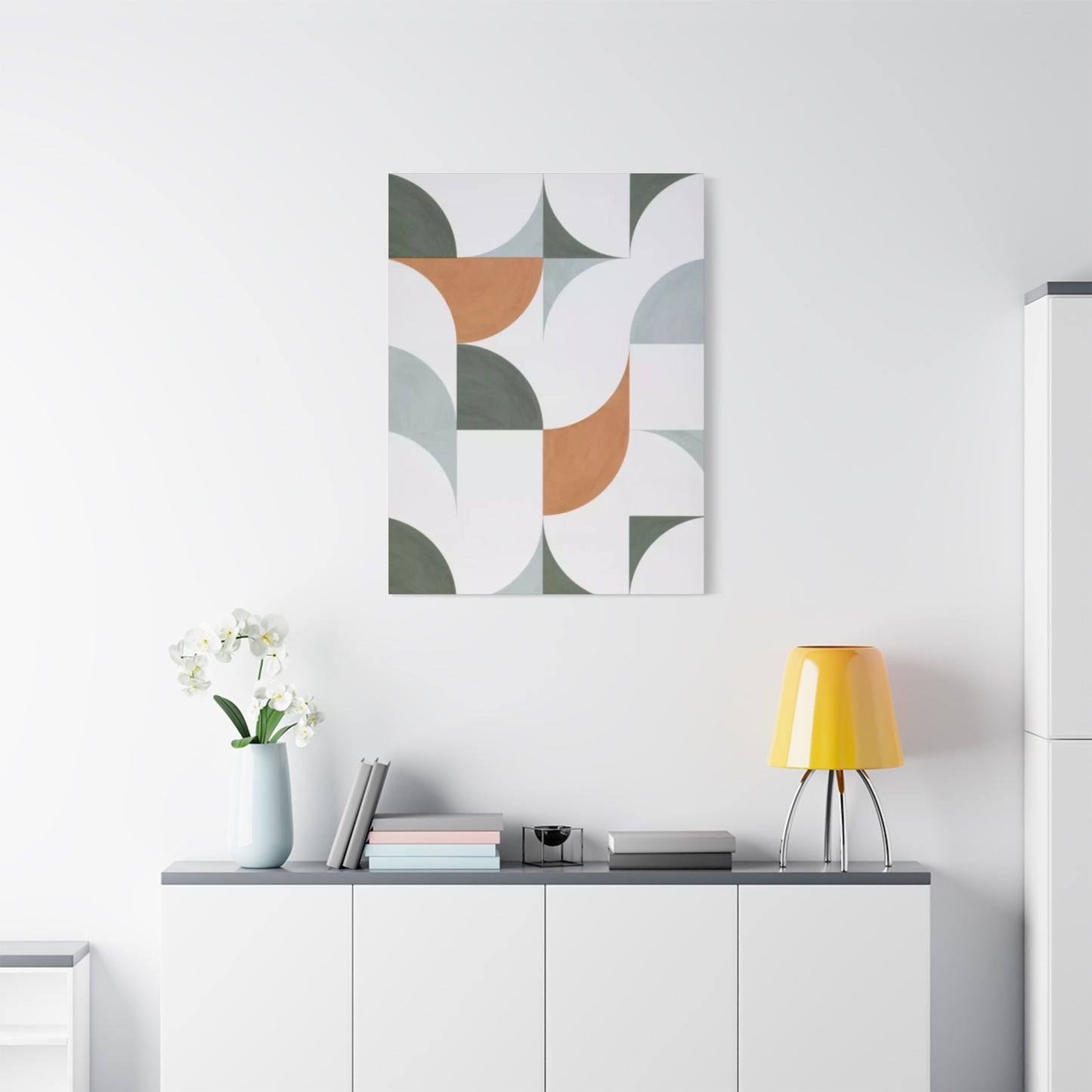
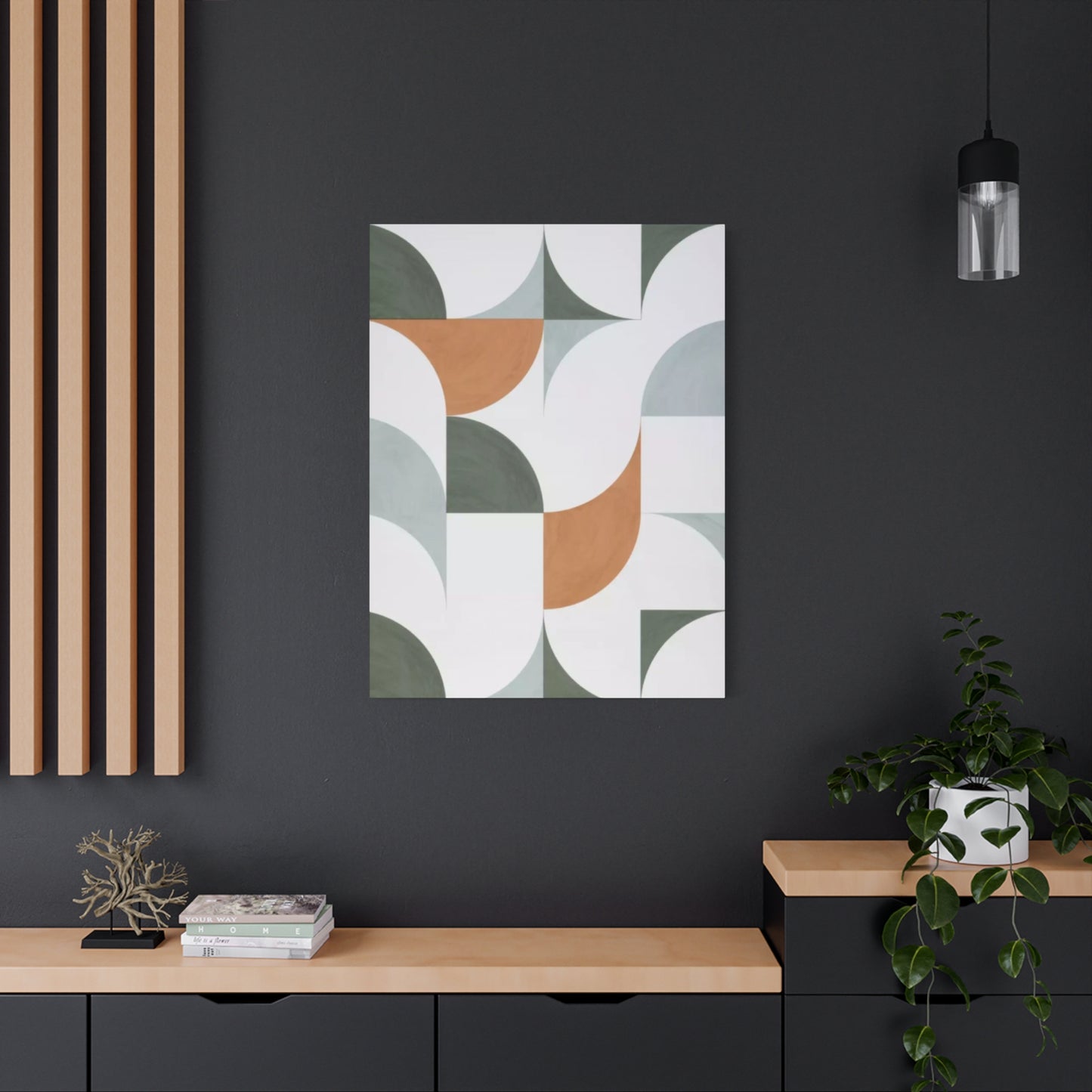
Placement Strategies for Maximum Impact
Strategic placement of patterned wall art within rooms significantly affects visual impact and spatial perception. Artwork positioning should consider viewing angles, lighting conditions, and relationships with other room elements. Thoughtful placement transforms good artwork into central design features that enhance entire environments.
Focal point creation establishes visual anchors that organize room perception and provide central references for other design elements. Large patterned pieces or gallery wall arrangements work beautifully as focal points, particularly when placed on primary walls visible from room entrances. Seating arrangements can orient toward focal walls, creating conversation areas centered around visual interest. Focal point artwork should command attention without overwhelming spaces or competing with functional considerations.
Height placement affects viewing comfort and spatial perception. The general guideline of hanging artwork so that centers align with average eye level creates comfortable viewing experiences. However, this rule flexes depending on viewing context. Artwork in dining rooms might hang lower to accommodate seated viewing, while hallway pieces might position slightly higher for standing viewers. Scale also influences ideal height, with larger pieces potentially hanging lower than smaller works.
Lighting considerations determine how artwork appears under various conditions. Natural light brings artwork alive but varies throughout the day and seasons, creating changing presentations. Artificial lighting should illuminate artwork without creating glare or hot spots. Picture lights, track lighting, or strategically placed lamps can highlight wall art while preventing damage from excessive heat or light exposure. Adjustable lighting allows control over how artwork appears during different times and activities.
Relationship to furniture and architectural features influences artwork placement decisions. Artwork hung above sofas or beds should relate proportionally to furniture width, neither appearing too small and insignificant nor so large that it feels precarious. Aligning artwork with architectural features like windows, doors, or built-ins creates organized, intentional arrangements. Conversely, breaking from these alignments can create dynamic, unexpected placements that energize spaces.
Gallery wall arrangements allow multiple pieces to function as unified installations larger than individual components. Successful gallery walls balance variety and consistency through common elements like color palette, frame style, or subject matter. Layout options range from symmetrical grid arrangements to organic, salon-style configurations. Planning gallery walls before installation through paper templates prevents damage from multiple nail holes and ensures pleasing final arrangements.
Seasonal Variations and Rotating Displays
The white and olive green palette adapts beautifully across seasons while allowing subtle adjustments that acknowledge changing times of year. While artwork itself remains constant, its appearance shifts with seasonal light changes, and complementary decorative elements can emphasize different seasonal associations. Some collectors enjoy rotating artwork seasonally, creating fresh perspectives and preventing visual fatigue.
Spring associations with the olive green and white palette emphasize renewal, growth, and fresh beginnings. The colors naturally evoke new plant growth, with olive green suggesting tender shoots and early foliage. Spring styling might emphasize lighter, brighter presentations with maximum white space and delicate, graceful patterns. Natural light increases during spring, making this ideal season for artwork to shine without supplementary lighting.
Summer interpretations bring associations with established gardens, mature foliage, and abundant growth. The palette suggests lush but sophisticated plantings rather than the riotous colors often associated with summer. Summer styling might incorporate patterns with fuller coverage and more complex layering, reflecting season's abundance. Natural materials in room styling, from woven textiles to natural wood finishes, enhance summer's organic character.
Autumn connections highlight the olive green palette's earthy quality as the shade bridges summer greens and brown tones that dominate fall. The color scheme suggests preservation and preparation rather than decay, maintaining freshness while acknowledging seasonal transition. Autumn styling might emphasize warmer lighting and richer accent colors in surrounding decor, allowing wall art's coolness to provide welcome balance against warm seasonal palette.
Winter presentations highlight the white component, creating clean, crisp environments that embrace season's minimalism. Olive green prevents winter whites from feeling cold or stark, adding just enough color warmth to maintain coziness. Winter's lower light levels make artificial lighting especially important, with proper illumination ensuring artwork remains visible and engaging despite shortened days and longer nights.
Year-round consistency represents another valid approach, with artwork selections transcending seasonal changes to provide constant visual foundation. The neutral, natural quality of white and olive green supports this timeless strategy, maintaining relevance regardless of season. This approach appeals to those who prefer stable environments and want to develop long-term relationships with their wall art rather than constantly refreshing displays.
Future Directions in Pattern Art
Pattern art continues evolving through technological innovations, changing aesthetic preferences, and renewed appreciation for handcraft traditions. Anticipating future developments helps position current work within broader trajectories while suggesting possibilities for continued exploration. The future likely combines technological capabilities with enduring human desires for beauty, meaning, and connection.
Augmented reality applications could allow dynamic, changing patterns that respond to environmental conditions, viewer presence, or programmed variations. Static artwork might be supplemented with digital overlays visible through devices, creating layered experiences combining physical and virtual elements. While this technology exists, its application to wall art remains nascent, suggesting significant future development potential.
Sustainable materials development addresses growing environmental concerns by creating eco-friendly alternatives to traditional art supplies. Bio-based pigments, recycled papers, and sustainably harvested materials will likely become standard rather than specialty options. Artists prioritizing sustainability may gain competitive advantages as consumers increasingly consider environmental factors in purchasing decisions.
Generative artificial intelligence tools present both opportunities and challenges for pattern artists. AI can generate pattern variations, suggest color combinations, and accelerate certain production aspects. However, questions about creativity, authorship, and artistic value arise when machines produce designs. The likely future involves hybrid approaches combining human creativity and judgment with AI capabilities, rather than complete replacement of human artists.
Customization demand continues growing as consumers seek personalized products rather than mass-produced generic options. Technology enabling economical small-batch production supports this trend. Pattern artists who can efficiently create custom work tailored to specific spaces and client preferences will likely thrive. Digital design tools combined with print-on-demand services make customization increasingly practical.
Cross-cultural fusion patterns blend elements from different traditions, creating new aesthetic languages for globalized world. As cultural exchange accelerates, pattern vocabularies mix and recombine in fresh ways. These hybrid patterns can celebrate diversity while creating aesthetics that resonate across cultural boundaries. However, this fusion must proceed respectfully, honoring source traditions rather than thoughtlessly appropriating sacred or significant designs.
Biometric integration might allow artwork responding to viewer physiological states, shifting patterns to promote calmness when stress detected or energizing when fatigue sensed. While this remains speculative, technology enabling such responsiveness exists. Future wall art might actively support wellbeing through real-time environmental adjustments based on occupant needs.
Building Collections Over Time
Developing wall art collections represents rewarding long-term project that evolves with changing tastes, living situations, and financial capacity. Thoughtful collecting creates personally meaningful assemblages that tell stories and reflect journeys through life. Understanding collection-building principles helps whether starting fresh or expanding existing holdings.
Cohesive themes create unity within collections while allowing individual pieces to maintain distinct identities. Collections might focus on particular pattern types, specific artists, certain time periods, or common color palettes like white and olive green. Thematic coherence makes collections feel intentional and curated rather than randomly accumulated. However, themes should allow enough flexibility to accommodate unexpected finds and evolving interests.
Quality prioritization over quantity builds collections of lasting value and significance. Better to own few exceptional pieces than many mediocre ones. Quality manifests in various aspects including artistic skill, material excellence, conceptual depth, and emotional resonance. High-quality pieces maintain interest over decades, rewarding repeated viewing with continually revealed depths. They also tend to hold or increase financial value better than lesser works.
Provenance documentation preserves information about artwork origins, artists, creation dates, and ownership history. This documentation increases both sentimental and monetary value while providing context that enriches appreciation. Maintaining records of purchase prices, condition reports, and any restoration work protects investment and aids eventual estate settlement or resale if necessary.
Display rotation prevents visual fatigue while protecting artwork from continuous light exposure. Periodically changing which pieces display and which rest in storage keeps collections feeling fresh and allows renewed appreciation for works that had become overly familiar. Rotation also accommodates seasonal preferences or room redesigns without requiring acquisition of entirely new artwork.
Strategic acquisition pacing builds collections steadily without financial strain. Rather than impulse buying, thoughtful collectors develop wish lists, track market prices, and wait for right opportunities. This disciplined approach generally results in more satisfying collections aligned with genuine preferences rather than reflecting momentary enthusiasms. Patient collectors often discover better pieces at better prices than those rushing to fill walls immediately.
Diverse price points within collections balance investment pieces with more affordable works. Not every piece must represent significant financial commitment. Mixing established artists with emerging talents, originals with limited prints, large statements with smaller accents creates varied collections interesting at multiple levels. This diversity also makes collecting more accessible and less intimidating for those early in their collecting journeys.
Professional Practice for Pattern Artists
Artists pursuing pattern work professionally navigate business considerations alongside creative development. Building sustainable art practices requires attention to marketing, pricing, production efficiency, and client relations in addition to artistic skills. Understanding professional aspects helps artists transition from hobbyists to professionals earning viable livings through their work.
Portfolio development showcases artistic range and capabilities while demonstrating consistent quality. Professional portfolios include high-quality photographs of work, artist statements explaining approaches and inspirations, curriculum vitae documenting exhibitions and achievements, and client testimonials where applicable. Digital portfolios accessible through websites provide 24/7 availability to potential clients and collaborators worldwide. Physical portfolios remain valuable for in-person meetings and certain presentation contexts.
Pricing strategies balance multiple factors including material costs, time investment, skill level, market demand, and comparable work pricing. Underpricing devalues work and makes sustainable practice impossible, while overpricing limits sales. Researching comparable artists' prices provides market context. As reputations grow, prices should increase to reflect enhanced demand and established track records. Transparent pricing builds trust, though some negotiation flexibility may be appropriate in certain contexts.
Marketing efforts make potential clients aware of artists' existence and work. Social media platforms provide powerful marketing tools for visual artists, allowing direct connection with global audiences. Consistent posting schedules, engaging content, and authentic voice help build followings. Email newsletters maintain contact with interested parties. Traditional marketing including exhibitions, art fairs, and print advertising still offer value depending on target markets. Most successful artists employ multi-channel marketing approaches.
Production efficiency becomes important when demand grows beyond what leisurely creation pace can satisfy. Developing systematic approaches, batching similar tasks, and streamlining processes increase output without compromising quality. Some artists employ assistants for routine tasks, reserving their own time for aspects requiring artistic judgment. Clear boundaries prevent burnout that destroys creativity and threatens sustainable practice.
Client relationship management requires communication skills, professionalism, and ability to translate client visions into artistic realities. Setting clear expectations about timelines, costs, and creative processes prevents misunderstandings. Regular updates during commission processes keep clients informed and engaged. Professional behavior including meeting deadlines, responding promptly to inquiries, and handling complaints gracefully builds reputations that generate referrals and repeat business.
Legal and financial administration includes contracts, copyright protection, tax obligations, and business structure decisions. While not creative work, these administrative aspects protect artists and enable professional operations. Consulting with lawyers and accountants experienced in arts-related matters helps navigate complex regulations. Proper administration prevents problems that could jeopardize entire practices.
Conclusion
The enduring appeal of white, olive green, and patterned wall art reflects fundamental human responses to color, form, and the natural world. This aesthetic combination offers remarkable versatility, adapting seamlessly to diverse interior design styles while maintaining timeless relevance that transcends fleeting trends. The sophisticated restraint of the olive green and white palette provides foundation upon which patterns create visual interest ranging from subtle whispers to bold statements, depending on scale, complexity, and execution.
Throughout this exploration, we have examined multiple dimensions of patterned wall art, from technical execution methods to psychological impacts, from historical influences to future possibilities. The depth of consideration these works merit reflects their significance beyond mere decoration. Patterned wall art functions as cultural expression, psychological support, educational tool, and design element that fundamentally shapes how we experience our living environments. The careful selection or creation of such artwork represents investment in daily quality of life and long-term environmental satisfaction.
The process of working with patterns, whether as artist or appreciative viewer, develops enhanced visual literacy and deeper connection with design principles that structure visual communication. Understanding how patterns function, what makes them successful, and how they interact with surrounding elements empowers more confident and sophisticated design decisions. This knowledge enriches experience of built environment generally, extending benefits far beyond any single artwork or space.
For those creating patterned wall art, the journey offers continuous learning opportunities and creative challenges that sustain engagement over lifetimes of practice. The medium rewards both technical refinement and conceptual exploration, providing paths for development regardless of where artists begin. The accessibility of basic pattern work combined with sophisticated possibilities at advanced levels creates inclusive field welcoming diverse participants. Whether pursuing pattern art professionally or as fulfilling hobby, practitioners find rich territory for expression and growth.
Collectors and consumers of patterned wall art participate in traditions connecting contemporary life to historical artistic practices spanning cultures and centuries. Choosing to live with patterned artwork represents decision to prioritize beauty, meaning, and visual interest in daily environments. This choice acknowledges that our surroundings significantly impact wellbeing, productivity, and life satisfaction. Thoughtfully selected artwork transforms houses into homes and generic spaces into personal sanctuaries reflecting individual values and aesthetics.
