


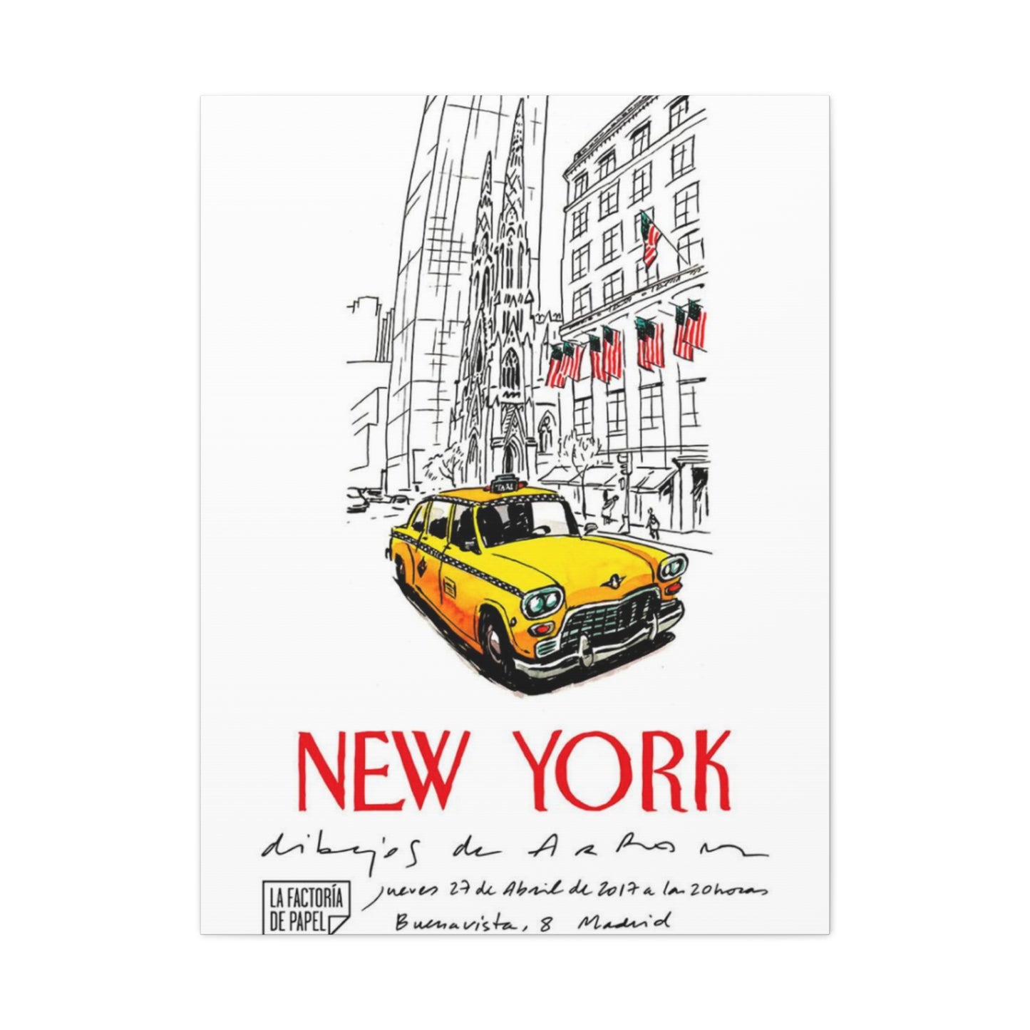
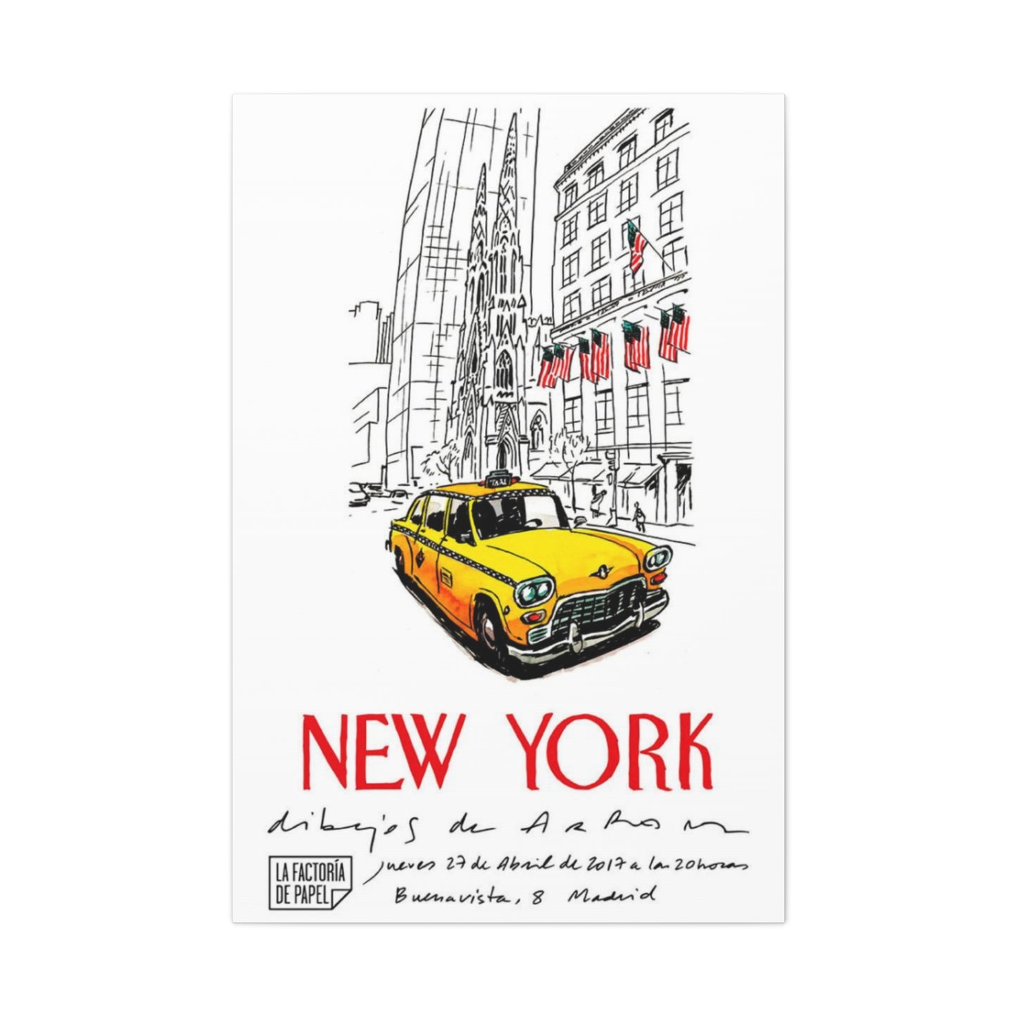
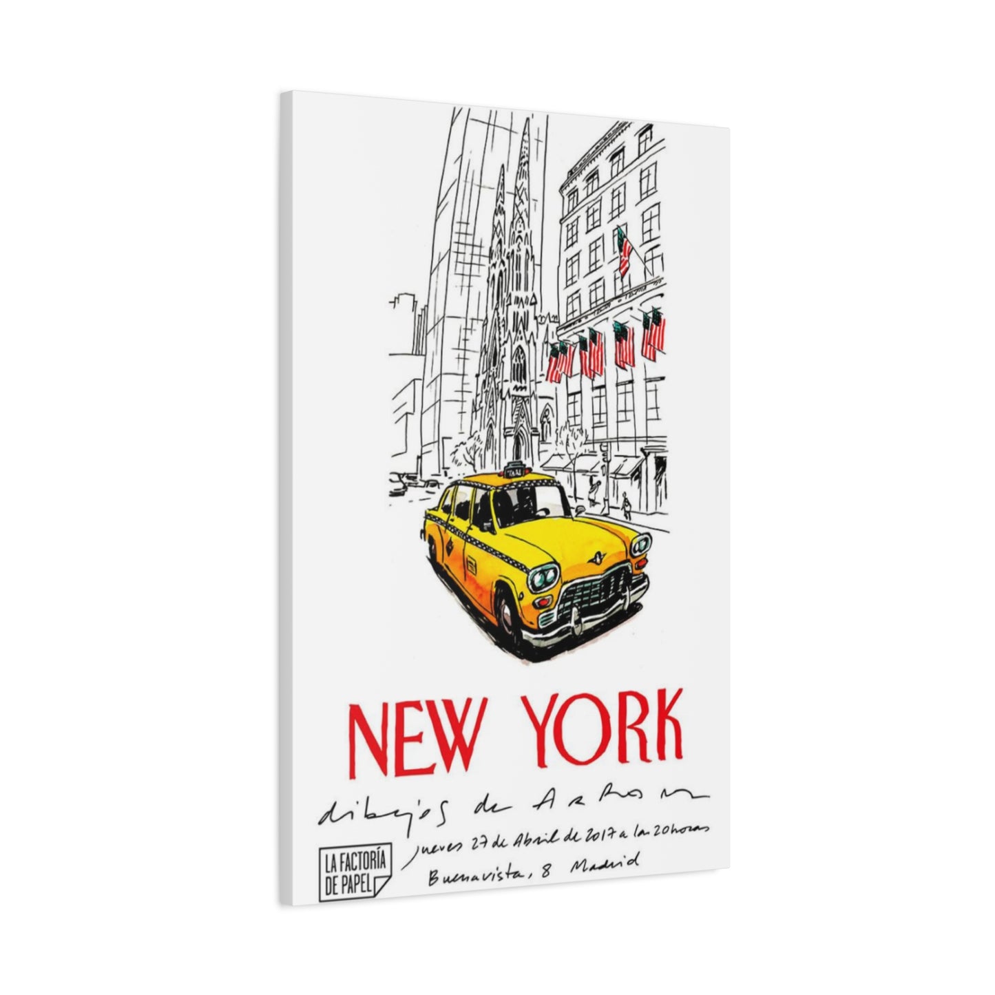
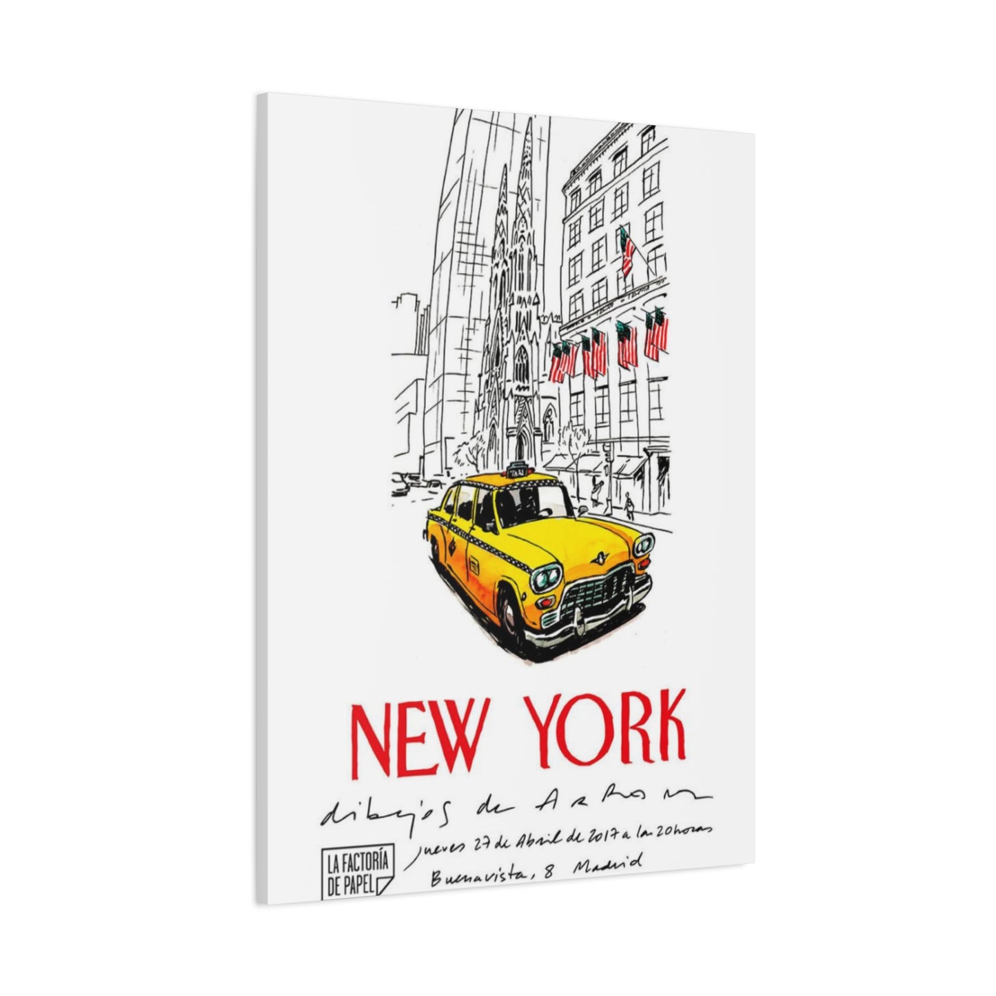
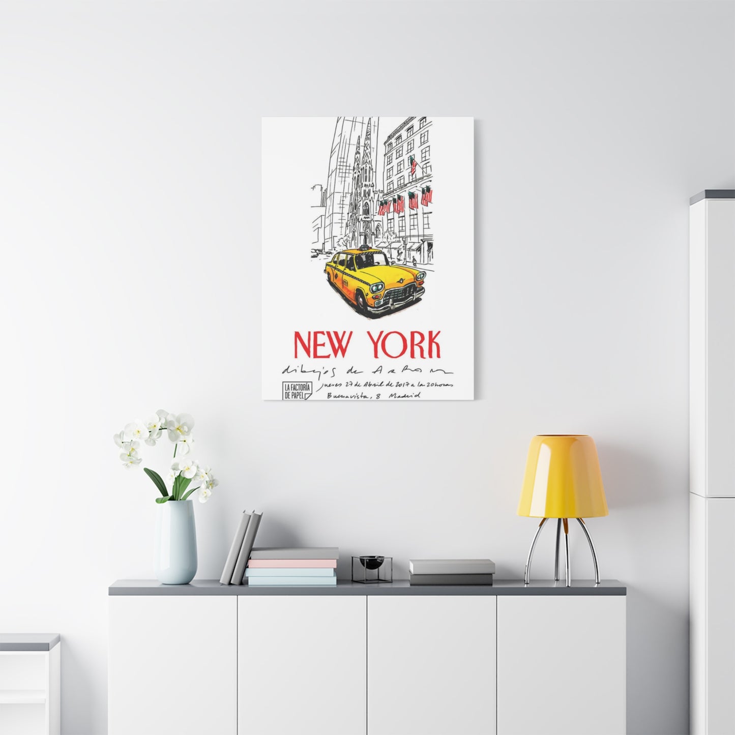
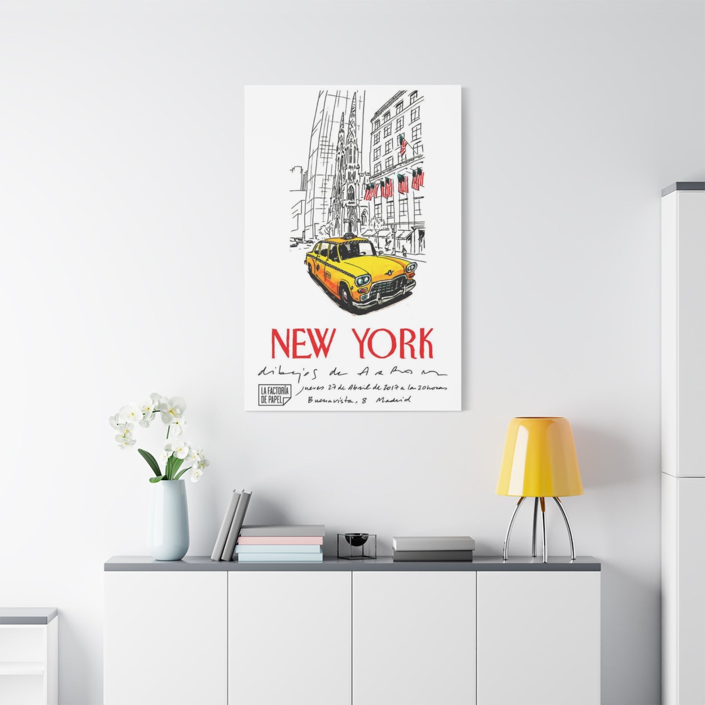
Yellow Taxi Of New York City Wall Art & Canvas Prints
Yellow Taxi Of New York City Wall Art & Canvas Prints
Couldn't load pickup availability


A Piece of the Big Apple: How Yellow Taxi Wall Art Reflects New York City's Uniqueness
The streets of Manhattan have long been defined by a particular shade of chrome yellow that speeds through avenues and navigates crowded intersections. These vehicles represent more than mere transportation; they embody the relentless energy, cultural diversity, and architectural magnificence of America's most populous metropolis. When transformed into artistic representations for interior spaces, these moving symbols become frozen moments that capture everything vibrant and dynamic about urban existence in one of the world's most recognizable cities.
Artistic interpretations featuring these vehicles have surged in popularity among collectors, decorators, and city enthusiasts who seek to incorporate metropolitan sophistication into residential and commercial environments. Whether rendered through photographic techniques, abstract paintings, vintage poster reproductions, or contemporary digital compositions, these pieces serve as powerful visual anchors that immediately communicate location, atmosphere, and cultural identity.
The appeal extends beyond nostalgia or tourism memorialism. These artistic works represent a specific aesthetic language—one that speaks of ambition, movement, accessibility, and the democratic nature of city life where anyone can hail a ride to anywhere. For those who have walked those bustling sidewalks or dreamed of experiencing the metropolitan lifestyle, these visual representations function as portals to memories or aspirations, bringing the unmistakable character of America's greatest urban center directly into living rooms, offices, and creative spaces.
The Street Energy of Manhattan Translated Into Visual Form
Few cities possess such instantly recognizable visual markers as the bright cab navigating through traffic-congded thoroughfares. The particular hue was not chosen arbitrarily but selected specifically for maximum visibility against the varied backdrop of steel, glass, brick, and stone that comprises the architectural landscape. This deliberate color choice has created an unintentional icon that now serves as shorthand for the entire metropolitan experience.
Artists working in various mediums have recognized the compositional power of these vehicles within urban landscapes. The contrast between the vibrant cab color and the surrounding environment—whether captured during rain-soaked evenings with reflected streetlights, sunny afternoons with sharp shadows, or misty mornings with softer atmospheric qualities—provides endless interpretational possibilities. Each rendering captures not just a vehicle but an entire moment within the continuous narrative of city life.
Contemporary photographers position these subjects within carefully considered frames that emphasize architectural lines, human activity, and the geometric patterns created by streets and buildings. The vehicle becomes a punctuation mark within larger compositional statements about urban density, movement, and the relationship between individuals and their constructed environments. These works often employ techniques that blur backgrounds while maintaining sharp focus on the subject, creating visual metaphors for how attention operates within stimulation-rich environments.
Painters approach the subject with different interpretative freedoms, sometimes exaggerating colors to heightened saturation levels, simplifying forms to essential shapes, or incorporating textural elements that photograph cannot capture. Abstract interpretations might reduce the vehicle to color blocks and geometric suggestions, allowing viewers to complete recognition through their own cultural knowledge and associations. More representational approaches might include meticulous attention to chrome details, advertising displays, meter equipment, and the particular wear patterns that working vehicles accumulate.
Mixed media artists have discovered fascinating possibilities by combining photographic elements with painted additions, collaged papers, textural compounds, and found materials. These hybrid approaches can emphasize the collision of natural and manufactured elements, the layering of experiences that defines metropolitan existence, or the transformation of functional objects into cultural symbols. Some incorporate actual materials associated with urban environments—newsprint, subway maps, street signs, or architectural fragments—creating multidimensional works that engage multiple senses and interpretative levels.
The vehicles themselves carry accumulated stories from countless passengers, destinations, conversations, and moments of transition. Artists sensitive to this narrative dimension create works that suggest these invisible histories through compositional choices, color relationships, and the inclusion or exclusion of human figures. Some pieces emphasize isolation despite crowding, others celebrate collective energy, and still others explore the liminal nature of being in transit between one place and another.
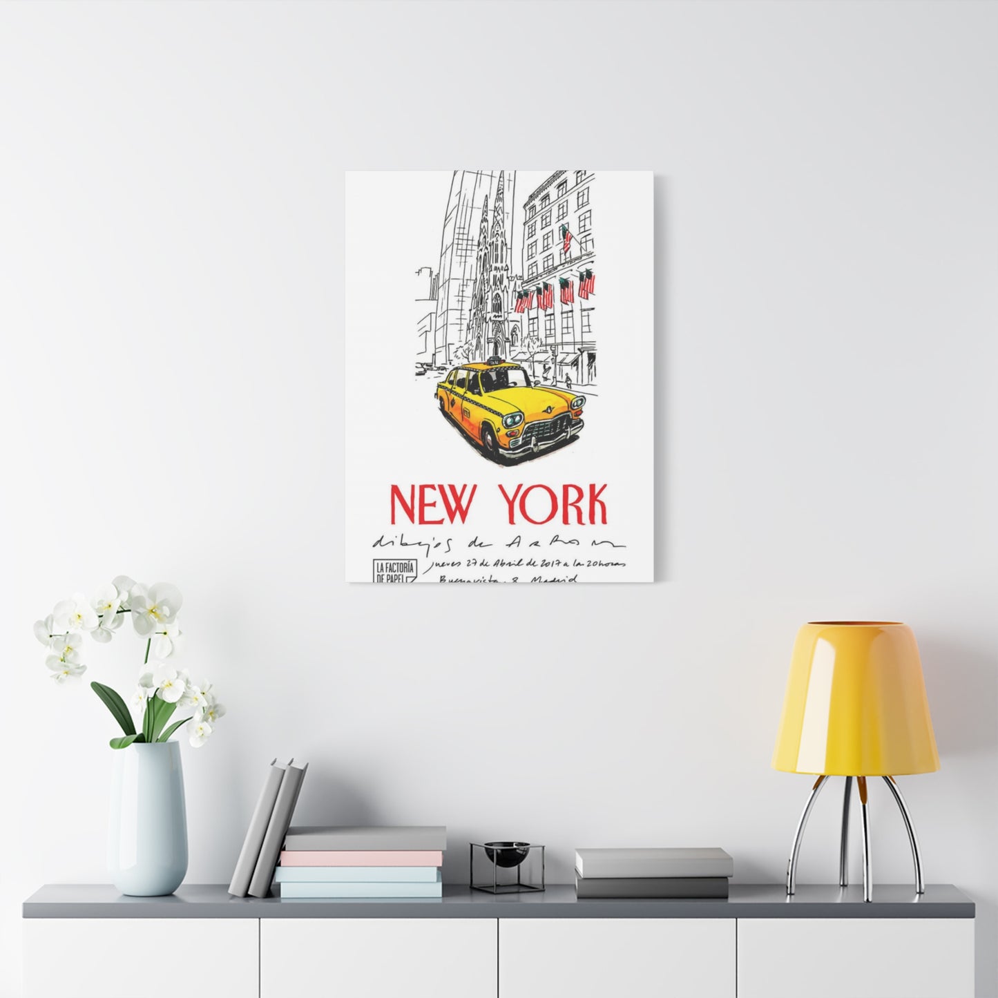
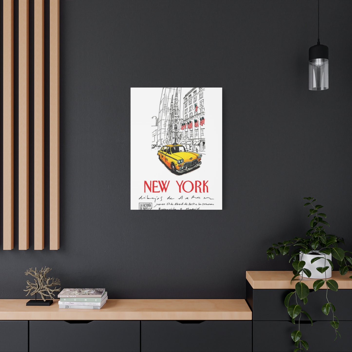
Residential Environments Enhanced by Metropolitan Visual Elements
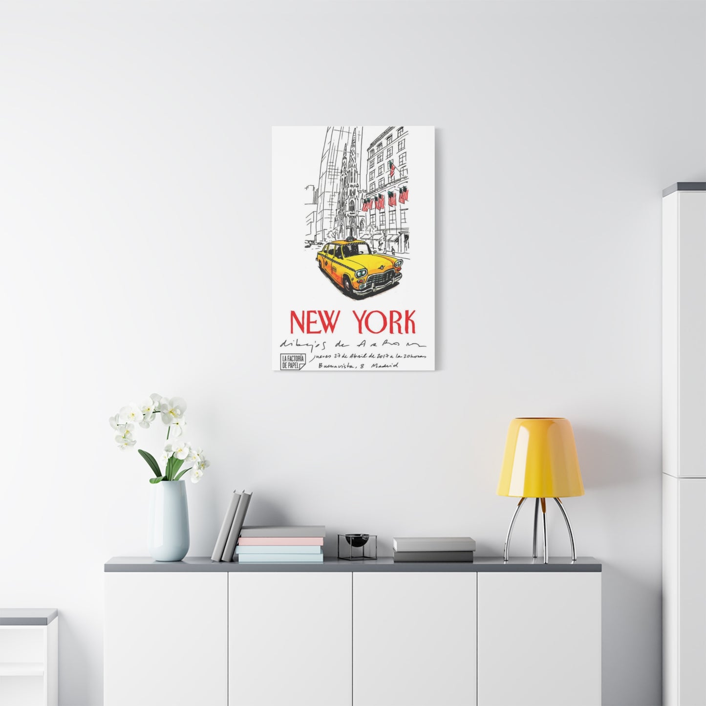
Incorporating artistic representations of these vehicles into home environments creates immediate stylistic impact while offering surprising versatility across different decorating approaches. The strong color presence and cultural associations provide focal points that anchor entire room compositions, yet the subject matter adapts effectively to various aesthetic sensibilities depending on artistic treatment and presentation choices.
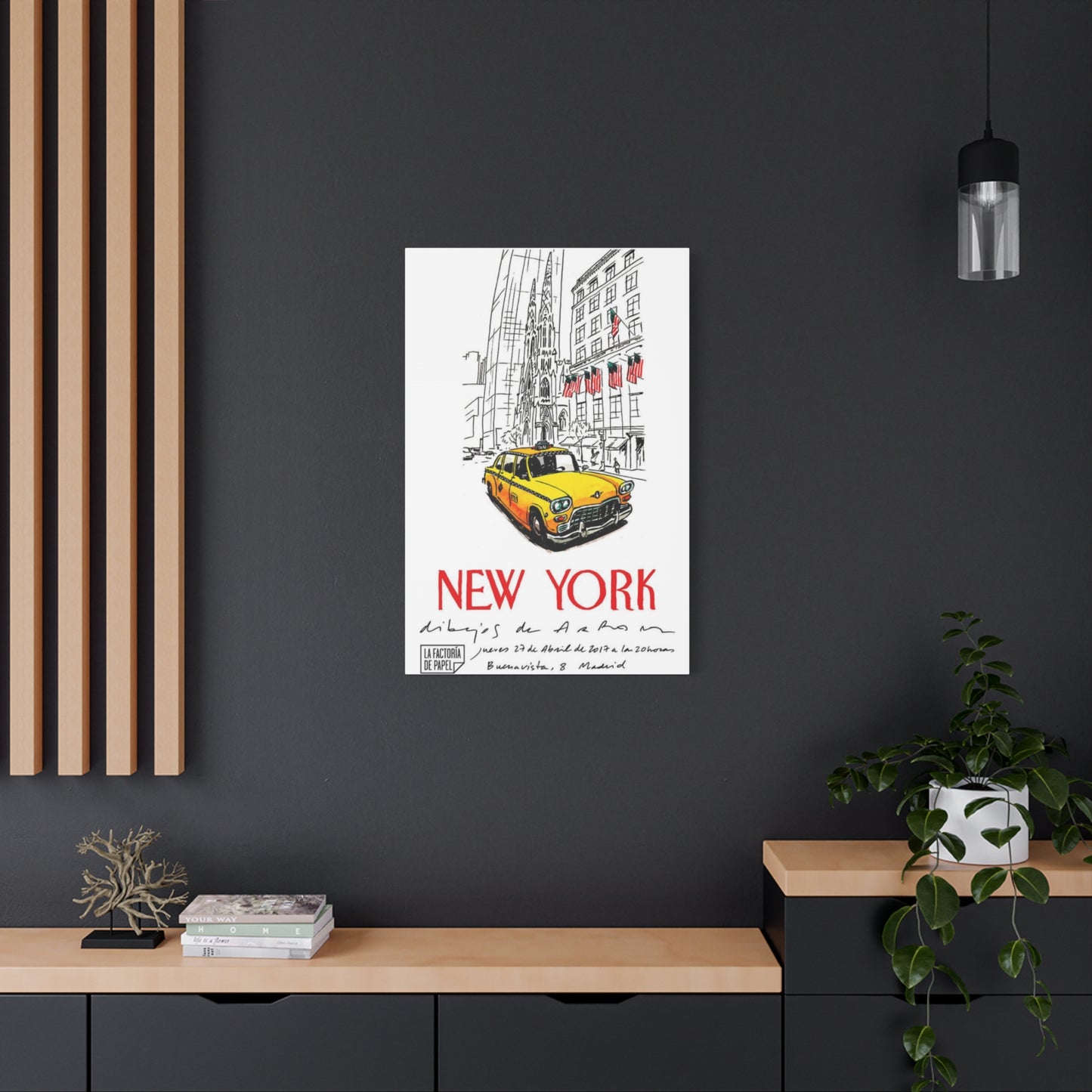
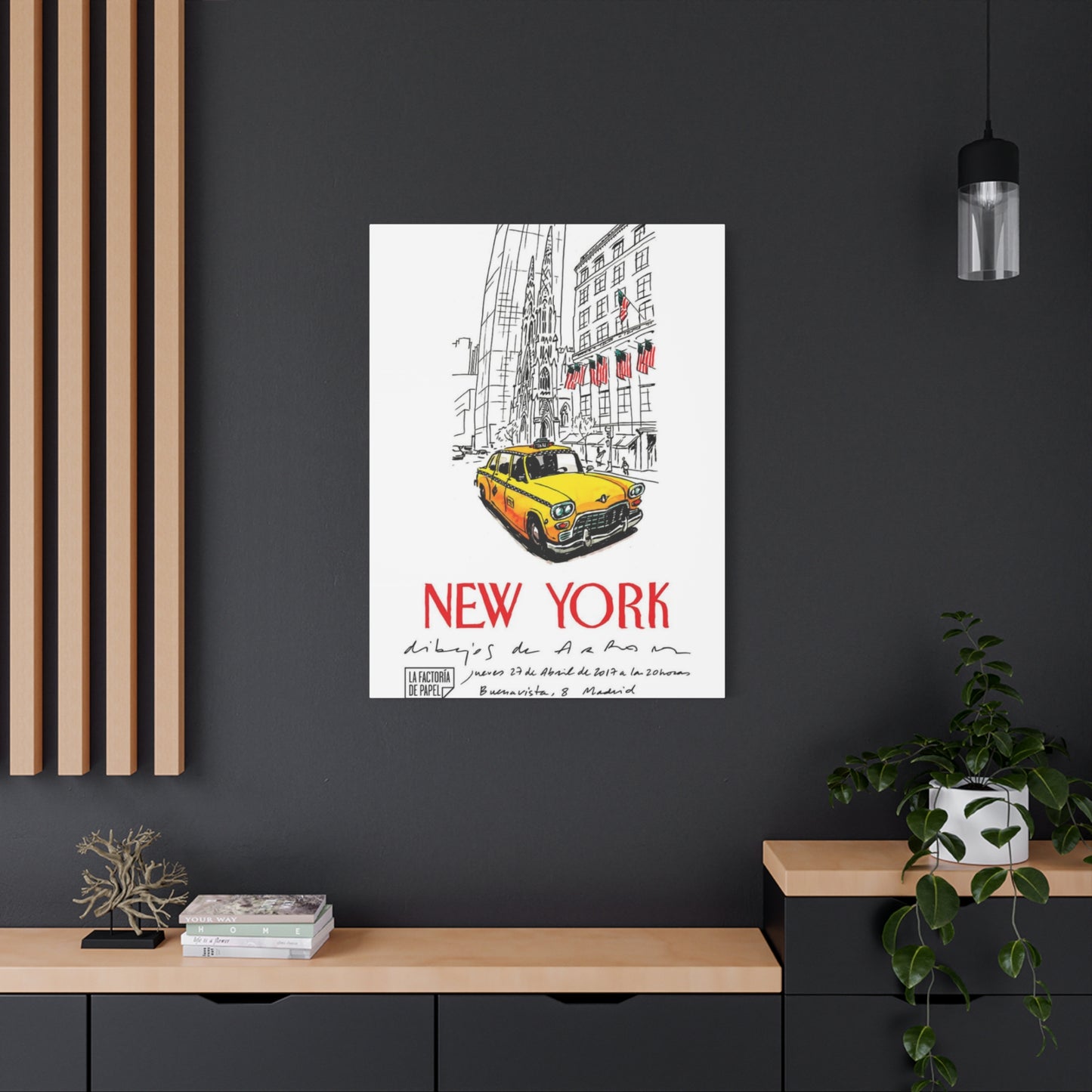
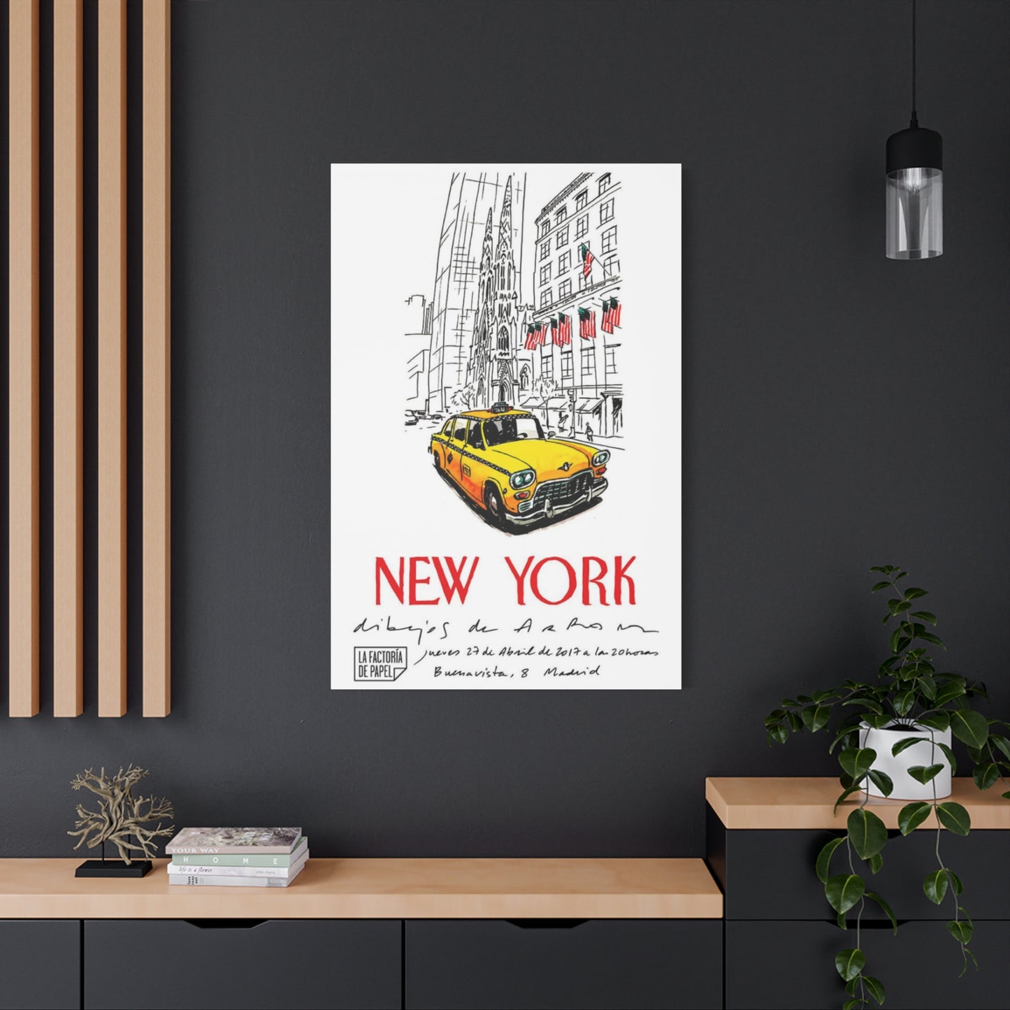
For spaces embracing industrial design principles—exposed brick, metal fixtures, concrete surfaces, and minimalist furnishing—these artworks reinforce the urban authenticity that such environments cultivate. Large-scale canvases featuring rain-slicked streets with the vehicle's reflection doubling its visual impact complement raw materials and simplified forms. The contrast between the bright subject and often darker surrounding compositions balances the sometimes austere quality of industrial spaces while maintaining stylistic coherence.
Contemporary interiors characterized by clean lines, neutral color palettes, and carefully edited furnishing selections benefit from the controlled color injection these pieces provide. A single vibrant canvas becomes a deliberate accent within otherwise restrained environments, demonstrating how strategic color placement creates visual interest without overwhelming spatial serenity. Selecting works with significant negative space—perhaps a lone vehicle against expansive sky or simplified street backgrounds—maintains the breathing room that contemporary design prioritizes.
Traditional spaces might seem unlikely candidates for such decidedly urban subject matter, yet thoughtful selection creates unexpected harmonies. Vintage-styled poster reproductions or artistic interpretations employing classical painting techniques can bridge the gap between conventional furnishing and metropolitan content. Sepia-toned photographs or illustrations with antique patinas reference historical periods when these vehicles first appeared on streets, creating temporal connections that traditional interiors often cultivate.
Eclectic environments that celebrate personality, collected objects, and stylistic diversity naturally accommodate these works as part of larger narratives about travel, cultural interests, and aesthetic preferences. Within such spaces, the artwork becomes one element among many that collectively communicate the inhabitant's experiences and values. Grouping these pieces with other travel-related imagery, vintage transportation posters, or architectural photography creates thematic collections that reward extended viewing.
Living areas benefit from larger-scale works that command attention and establish conversational focal points. The visual weight of substantial pieces anchors seating arrangements while providing sustained interest for occupants and visitors. Positioning such works on primary sight lines—opposite main seating areas or on walls immediately visible upon room entry—maximizes their spatial impact and ensures they fulfill their potential as design anchors.
Bedroom environments might employ more subdued interpretations featuring nighttime scenes with atmospheric lighting, misty morning compositions suggesting quieter moments, or abstract treatments that capture essence rather than literal representation. These softer approaches maintain thematic connections to the subject matter while creating the visual calm appropriate for restful spaces. Smaller works or diptychs and triptychs allow for creative arrangements that fill wall space without the visual dominance that single large pieces command.
Home office and study spaces particularly benefit from these metropolitan symbols, as they often reinforce professional aspirations, cosmopolitan identities, and connections to commercial centers. For remote workers or those building careers, these images function as daily reminders of larger professional worlds and the energy associated with major business districts. The inherent movement and activity suggested by the subject matter can provide psychological counterbalance to the stillness of solitary work.
Dining areas present opportunities for dramatic statements, as these spaces often receive more adventurous design treatments than primary living zones. Bold, large-scale works with saturated colors and dynamic compositions complement the social energy of shared meals while providing conversation catalysts. The cultural associations with the destination restaurants, diverse cuisines, and sophisticated dining scenes enhance the thematic appropriateness for these spaces.
Entryways and hallways, often overlooked in decorating schemes, benefit tremendously from these visually strong pieces. The immediate impact creates memorable first impressions while the subject matter suggests the inhabitant's cultural sophistication and design confidence. Narrow corridor spaces particularly suit vertical compositions featuring the vehicles within canyon-like street perspectives that emphasize architectural height.
Commercial Applications for Metropolitan Visual Themes
Businesses seeking to communicate specific brand qualities find these artistic representations particularly valuable for establishing desired atmospheric qualities and cultural associations. The vehicle's symbolism translates across various commercial contexts, each application emphasizing different aspects of the broader metropolitan narrative.
Hospitality establishments—hotels, restaurants, bars, and entertainment venues—frequently incorporate these images to signal location, celebrate local character, or create thematic coherence. For properties actually located within the metropolis, these works affirm place identity and enhance guest experiences by reflecting the environment outside. For establishments elsewhere, they function as aspirational imagery that associates the business with metropolitan sophistication, diversity, and cultural cachet.
Corporate offices, particularly those in creative industries, finance, media, or technology sectors, utilize these pieces to communicate dynamism, connectivity, and professional seriousness. Conference rooms benefit from the conversational interest these works provide, offering visual relief during extended meetings while subtly reinforcing messages about the company's market position and cultural values. Reception areas gain immediate visual impact that communicates brand identity before any verbal exchange occurs.
Retail environments selling urban fashion, travel services, photography equipment, or lifestyle products find natural thematic alignment with this imagery. The visual connection between product offerings and wall presentations creates coherent brand experiences that strengthen customer engagement and purchase rationalization. These works help transform commercial spaces into curated environments rather than mere transaction locations.
Professional services—law firms, consulting agencies, financial advisors—sometimes incorporate these metropolitan symbols to signal their connection to major business centers and the sophisticated client relationships such locations imply. The imagery communicates accessibility combined with professional stature, suggesting the firm operates at significant scale while remaining approachable.
Creative studios and agencies naturally gravitate toward these subjects as expressions of their own urban identities and creative sensibilities. Design firms, advertising agencies, architectural practices, and media production companies use these pieces to demonstrate their aesthetic judgment while creating inspiring work environments. The metropolitan associations suggest the creative energy and cultural awareness that such businesses cultivate as core competencies.
Educational institutions, particularly those with urban studies programs, architecture departments, photography courses, or cultural studies curricula, incorporate these images as both decoration and pedagogical tools. The works illustrate principles of urban design, visual communication, and cultural iconography while creating environments that inspire students toward creative and analytical thinking about constructed environments.
Fitness facilities and wellness centers might seem unlikely venues, yet urban-themed imagery increasingly appears in such spaces as designers recognize that contemporary wellness consumers often embrace city living rather than rejecting it. The energy and movement implicit in the imagery complements physical activity while the cultural sophistication appeals to urbane clientele. These installations acknowledge that wellness exists within, not apart from, metropolitan contexts.
Co-working spaces and shared office environments benefit particularly from these visual elements, as their clientele typically consists of entrepreneurs, freelancers, and remote workers who value urban culture and contemporary professional identities. The imagery reinforces the sense of participating in larger professional communities and commercial networks despite working outside traditional corporate structures.
Artistic Techniques and Stylistic Variations
The versatility of this subject matter manifests through the diverse artistic approaches applied to its representation. Each technique emphasizes different aspects of the subject while appealing to distinct aesthetic preferences and decorating requirements.
Photographic works range from documentary-style street photography capturing authentic moments to carefully constructed conceptual pieces where every element serves deliberate compositional purposes. High-contrast black-and-white treatments emphasize form, texture, and light relationships while removing the color that typically defines these vehicles, forcing viewers to recognize them through shape and context alone. This approach often creates more sophisticated, gallery-quality aesthetics that appeal to collectors and design professionals.
Color photography employs various technical approaches to enhance, modify, or reinterpret the subject's natural appearance. Selective colorization techniques might isolate the vehicle in full color against desaturated backgrounds, creating dramatic focal emphasis. High dynamic range processing reveals extraordinary detail in both highlight and shadow areas, producing almost hyper-real results that border on illustrative quality. Long exposure techniques blur surrounding traffic and pedestrian movement while maintaining the stationary vehicle in sharp focus, visualizing the constant motion that characterizes metropolitan existence.
Digital manipulation extends photographic possibilities into realms where objective recording meets interpretive vision. Artists composite multiple images, adjust proportions, introduce elements from different locations or times, and apply filters that transform photographic sources into results resembling paintings, sketches, or graphic designs. These hybrid works occupy fascinating territories between documentation and imagination, often achieving visual impact impossible through straightforward photography.
Traditional painting techniques applied to this subject matter span the full spectrum from tight photorealism to loose expressionism. Oil paintings might emphasize the sensual qualities of paint itself—thick impasto creating textural surfaces that respond to changing light, or thin glazes building luminous atmospheric effects. Acrylic works often feature bolder color relationships and harder edges that complement contemporary design sensibilities. Watercolor interpretations bring a delicacy and spontaneity that contrasts with the mechanical nature of the subject matter, suggesting the poetic possibilities within urban documentation.
Screen printing and other reproductive printmaking techniques have particular historical associations with metropolitan art movements. Limited edition prints combine artistic merit with broader accessibility, allowing collectors to acquire works by established artists at more approachable price points. The graphic qualities inherent to screen printing—flat color areas, simplified forms, registration variations—suit the subject matter well while referencing important artistic precedents.
Abstract interpretations reduce the subject to essential elements—color relationships, geometric forms, gestural marks—that evoke rather than depict. These works require viewers to bring their own knowledge and associations to complete the interpretive process, creating more open-ended viewing experiences. The yellow hue might appear as color field expanses, energetic brushstrokes, or geometric blocks within larger compositional structures. Such pieces function effectively in spaces where literal representation seems too obvious or decoratively limiting.
Collage and mixed media approaches incorporate diverse materials and techniques within single works. Artists might combine photographic fragments with painted areas, textured papers, found materials, and three-dimensional elements to create richly layered compositions. These works often reference the visual complexity of metropolitan environments where countless elements compete for attention simultaneously. The technique itself becomes metaphoric for the experience of navigating stimulus-rich urban spaces.
Illustrative styles ranging from technical diagram aesthetics to whimsical cartoon treatments offer alternative approaches that suit particular contexts and audiences. Technical illustrations might emphasize the vehicle's mechanical details, manufacturer specifications, or historical evolution. Cartoon and stylized interpretations bring playful qualities appropriate for casual environments or spaces frequented by children. Vintage poster styles reference specific historical periods and artistic movements, creating nostalgic atmospheres while celebrating earlier eras of metropolitan life.
Historical Context and Cultural Development
These vehicles have not always possessed their current iconic status. Their evolution from practical transportation to cultural symbol involves fascinating intersections of regulatory decisions, economic forces, and collective psychology that transformed functional objects into beloved metropolitan emblems.
The particular hue now so closely associated with these vehicles resulted from a 1960s regulatory decision intended to improve visibility and reduce accidents. Prior to this standardization, vehicles operated in various colors with minimal coordination. A businessman and cab operator conducted extensive research on visibility and safety, determining that this specific shade provided maximum recognition under diverse lighting conditions and weather circumstances. The subsequent mandate for all licensed vehicles to adopt this color created unintended aesthetic consequences that would define the city's visual character for decades.
Earlier periods featured vehicles in checkered patterns, various solid colors, and company-specific liveries that made the streets more visually diverse but less cohesively branded. Photographic documentation from mid-century periods reveals this greater variety alongside the architectural and fashion changes that mark different eras. Contemporary artists sometimes reference these historical variations, creating works that explore temporal themes or celebrate specific decades.
The vehicles themselves have evolved through numerous mechanical and design changes reflecting broader automotive industry developments. From the Checker Marathons that dominated for decades with their distinctive upright profiles to the various sedan models adapted for commercial service, each vehicle type carries specific associations for those who remember particular eras. Artists interested in historical accuracy or period atmosphere select vehicle models appropriate to their intended temporal references.
Cultural representations in film, literature, music, and visual art have progressively elevated these vehicles from background elements to starring roles. Countless movies feature memorable scenes within or around these vehicles, television shows use them as establishing shots that immediately communicate location, and songs reference them as part of larger metropolitan narratives. This accumulated cultural presence means that contemporary artistic representations tap into deep reserves of collective memory and association.
The drivers themselves represent remarkable diversity, with operators coming from dozens of countries and speaking hundreds of languages collectively. This international workforce creates daily encounters between people from vastly different backgrounds, making these vehicles unlikely spaces of cross-cultural exchange. Artists sensitive to these human dimensions sometimes incorporate driver portraits, passenger interactions, or multicultural elements that acknowledge the people within the machines.
Economic changes and technological disruptions have created uncertainty about these vehicles' futures. Ride-sharing platforms, changing urban planning priorities, environmental regulations, and autonomous vehicle development all pose questions about how long these symbols will remain relevant. This potential impermanence has actually increased their nostalgic and artistic appeal, as people recognize they may be witnessing the final decades of a transportation era. Contemporary works thus carry additional poignancy as potential documentation of a disappearing urban element.
Preservation efforts by historical societies, transportation museums, and private collectors ensure that actual vehicles will survive even if active commercial service eventually ends. These preserved examples provide reference materials for artists while serving as cultural artifacts in their own right. Some artists have created works specifically documenting these preservation efforts or exploring themes of obsolescence and cultural memory.
Color Theory and Compositional Considerations
The distinctive hue of these vehicles provides artists with unique opportunities and challenges regarding color relationships, spatial dynamics, and visual hierarchy. Successfully incorporating this intense chromatic element requires understanding how color functions within compositional structures and viewing environments.
The particular yellow employed exists in a fascinating position on the color spectrum—warm enough to convey energy and optimism but not so orange that it becomes aggressive or unstable. This carefully calibrated position makes the color simultaneously attention-grabbing and surprisingly harmonious with diverse surroundings. Artists working with color theory recognize how this shade advances visually, appearing to come forward in pictorial space, creating natural focal points without additional compositional manipulation.
Complementary color relationships offer dramatic possibilities, as the blue-violet opposite creates maximum chromatic contrast. Artists frequently incorporate twilight skies, shadowed building facades, or other blue elements to intensify the vehicle's visual impact. These complementary pairings create vibration effects at color boundaries that animate compositions and direct viewer attention. More sophisticated artists modulate these contrasts through value adjustments and saturation variations to control intensity levels appropriate to viewing contexts.
Analogous color schemes might incorporate oranges, greens, and related warm hues that create more harmonious but potentially less dramatic color relationships. These approaches suit spaces where chromatic intensity should remain moderate or where the artwork needs to integrate more subtly within existing color schemes. Sunset compositions, autumn street scenes, or dawn atmospheres naturally provide analogous color contexts that embrace rather than contrast with the vehicle color.
Neutral backgrounds—grays, blacks, whites, and earth tones—allow the vehicle color to dominate without chromatic competition. Many successful works employ extensively neutral palettes with the vehicle providing the only significant color presence. This approach works particularly well in contemporary and minimalist interiors where color restraint guides overall design philosophy. The neutral surround ensures the vehicle reads as pure color statement rather than one element within complex chromatic relationships.
Value contrast—the relationship between light and dark independent of color—proves equally important for compositional success. High-key images with overall light values create upbeat, optimistic atmospheres that emphasize openness and possibility. Low-key compositions with predominantly dark values suggest mystery, sophistication, and the particular energy of nighttime metropolitan environments. The vehicle's natural mid-range value allows it to function successfully in either context, appearing luminous against dark backgrounds or substantial against light surroundings.
Compositional placement determines how successfully the vehicle functions as focal point or supporting element. Central positioning creates formal, somewhat static compositions that emphasize the subject's iconic status. Off-center placement according to rule-of-thirds principles generates more dynamic, naturalistic compositions that suggest the subject was discovered rather than posed. Some artists employ radical cropping that shows only portions of the vehicle, trusting that viewers will complete recognition while creating more abstract, design-forward results.
Perspective and viewing angle significantly affect the emotional quality and spatial dynamics of compositions. Eye-level perspectives create democratic, accessible viewing positions that invite identification with street-level experience. Low angles emphasizing upward views toward surrounding buildings create dramatic, sometimes overwhelming spatial impressions that communicate the scale and density of metropolitan environments. Elevated perspectives looking downward present more comprehensive, organizational views that emphasize pattern, movement flow, and urban planning structures.
Depth cues including atmospheric perspective, size relationships, overlapping forms, and detail gradation establish spatial recession that helps viewers navigate pictorial space. Shallow depth of field photographic techniques or painted equivalents create spatial ambiguity that flatten compositions toward more graphic, design-oriented results. Deep spatial recession with clearly defined foreground, middle ground, and background encourages extended visual exploration as viewers examine successive spatial layers.
Material Choices and Presentation Options
The physical nature of artworks—their substrates, surface qualities, and presentation methods—substantially affects both aesthetic impact and practical suitability for different environments. Contemporary production technologies and traditional methods offer diverse options that allow precise matching between artwork characteristics and installation contexts.
Canvas remains the default substrate for painted works and many photographic prints, valued for its traditional associations, textural interest, and weight distribution that resists warping. Gallery-wrapped canvas stretched around substantial frames allows edge-to-edge imagery without visible borders, creating contemporary presentations that work particularly well in modern interiors. The three-dimensional quality of wrapped canvas creates actual shadows on mounting walls, adding subtle dimensional interest absent from flat-mounted works.
Metal prints have surged in popularity for metropolitan subjects, as the sleek, modern aesthetic complements urban content while the reflective surface quality creates luminous results particularly effective with nighttime or rain-reflected scenes. The printing process fuses inks directly to specially coated aluminum, producing archival results with extraordinary color saturation and sharpness. The inherent reflectivity means these works change appearance with viewing angle and ambient lighting, creating more dynamic viewing experiences than static prints.
Acrylic face mounting sandwiches photographic prints between acrylic sheets, protecting the image while creating glass-like depth and intensity. Light penetrates the acrylic layers and reflects back through the image, producing luminous results that seem internally lit. The contemporary, gallery-quality appearance suits upscale residential and commercial environments where sophisticated presentations signal quality and design consciousness.
Wood panels offer appealing alternatives for rustic or industrial installations where the visible wood grain adds textural interest that complements urban subject matter. Printing directly onto prepared wood surfaces allows grain patterns to show through, creating unique variations that ensure each piece differs slightly from others. The substantial weight and rigid flatness of wood panels creates authoritative physical presence appropriate for statement pieces.
Traditional paper prints maintain importance for fine art photography and certain illustrative techniques where paper choice affects final appearance significantly. Various papers—glossy, matte, textured, or specialty surfaces—alter how inks are absorbed and reflected, changing color characteristics and surface qualities. Archival papers ensure longevity when properly displayed and stored, preserving investments in significant works.
Framing choices dramatically affect how works integrate within spaces and what care requirements they entail. Simple metal frames in black, silver, or gold tones provide clean presentations that direct attention to imagery rather than surrounds. Wood frames in various finishes and profiles suit traditional or casual environments while providing protective structures. Float mounting creates separation between artwork and frame backing, generating shadow gaps that add dimensional interest. Frameless presentations maximize contemporary impact while requiring careful edge finishing to prevent damage.
Glazing options for framed works include regular glass, non-glare glass, conservation glass with UV filtering, and museum glass combining UV protection with minimal reflection. These choices balance protective qualities, viewing clarity, and budgetary considerations. Works displayed in high-light environments require UV filtering to prevent fading, while non-glare surfaces benefit high-traffic areas where reflected glare might interfere with viewing.
Scale decisions profoundly impact how works function within spaces. Oversized pieces exceeding six feet in dimension create architectural presence that transforms rooms and demands attention. Medium-sized works between three and five feet suit most residential spaces, providing substantial visual interest without overwhelming. Smaller pieces under two feet work well in groupings, intimate spaces, or locations where viewing distances remain short.
Series and groupings offer alternatives to single large pieces, distributing visual interest across multiple coordinated elements. Diptychs and triptychs create horizontal or vertical compositions from multiple panels that work together as unified statements. Grid arrangements of multiple smaller pieces can cover substantial wall areas while maintaining individual work accessibility. Salon-style groupings of various sizes create more casual, collected appearances appropriate for eclectic interiors.
Installation Strategies and Spatial Relationships
Proper installation maximizes artwork impact while ensuring security and longevity. Professional approaches consider sight lines, lighting conditions, neighboring elements, and maintenance accessibility alongside basic hanging mechanics.
Height positioning follows general guidelines suggesting that artwork centers should align roughly with average eye level—approximately sixty inches from floor to center point. This standard provides accessible viewing positions for most people while creating balanced spatial relationships with surrounding furnishings. Adjustments might account for whether viewing primarily occurs while seated or standing, with lower positioning favoring seated viewing and higher placement suiting stand-up social spaces.
Lighting dramatically affects how works appear and should receive careful consideration during installation planning. Natural daylight provides ideal viewing conditions but carries UV exposure risks that can damage works over time. Positioning away from direct sunlight while maintaining adequate natural illumination requires thoughtful placement relative to windows and sun angles throughout the day. Artificial lighting through dedicated picture lights, track systems, or recessed fixtures allows precise control over illumination angles, intensities, and color temperatures.
Wall colors significantly impact how artworks appear through simultaneous contrast effects and spatial framing. Lighter walls create open, spacious feelings while potentially reducing artwork contrast. Darker walls provide dramatic backdrops that make lighter elements advance visually but can create somber atmospheres if not balanced with adequate lighting. Accent walls in colors coordinating with artwork hues create cohesive relationships that unify spaces.
Surrounding elements including furniture, accessories, and architectural features should be considered for harmonious integration. Artworks positioned above seating furniture should relate to furniture width, generally staying within the horizontal boundaries or slightly beyond. Coffee tables, console tables, or other furnishings beneath wall art create anchoring relationships that ground compositions. Sufficient clearance between artwork edges and adjacent architectural features like doorways, windows, or corners prevents cramped appearances.
Hardware selection ensures security while potentially affecting presentation aesthetics. Professional hanging systems with adjustable cables allow vertical repositioning without new wall penetrations, offering flexibility for spaces that undergo regular rearrangement. Traditional picture hooks and nails suffice for lighter works but substantial pieces require anchoring into wall studs or using appropriate wall anchors rated for relevant weights. Security considerations for valuable works might include specialized hanging systems, alarm integration, or display locations that balance visibility with protection.
Grouping strategies for multiple works require careful planning to achieve balanced, intentional appearances rather than haphazard collections. Template creation using craft paper cut to artwork dimensions allows experimental arrangement directly on walls before any permanent installation. Maintaining consistent spacing between grouped works—typically two to four inches—creates visual relationships that unify collections. Alignment strategies including centering on vertical or horizontal axes, aligning top or bottom edges, or following architectural features like doorway heights help create organizational logic that viewers unconsciously recognize.
Gallery walls incorporating diverse sizes, subjects, and frame styles require particularly thoughtful composition balancing visual weights, color distribution, and spacing variations. Beginning with a central anchor piece and building outward often proves easier than attempting to visualize complete arrangements. Maintaining consistent spacing despite varying frame sizes requires measuring from frame edges rather than estimating. Photography before finalizing installations allows objective assessment and potential adjustments before committing to permanent placement.
Maintenance accessibility should inform placement decisions, as works require periodic cleaning and condition inspection. Positioning that prevents easy removal for maintenance leads to neglected works that accumulate dust, experience unnoticed damage, or suffer preventable deterioration. Maintaining clear floor space immediately below wall art facilitates ladder positioning for higher works.
Psychological Effects and Spatial Atmosphere
Visual elements within environments exert measurable influences on occupant mood, energy levels, and even behavioral patterns. Understanding these effects allows intentional environment creation that supports desired activities and emotional states.
The bright, warm hue associated with these vehicles inherently communicates energy, optimism, and forward motion. Color psychology research suggests yellow tones stimulate mental activity, encourage communication, and create uplifting atmospheres when used in moderation. The particular shade neither reaches the intensity that can cause anxiety nor remains so muted that it loses energizing qualities, occupying a psychologically optimal position for spaces intended for social interaction, creative work, or active engagement.
Urban imagery generally creates stimulating environments that suggest possibility, diversity, and connection to larger social contexts. For residents of smaller communities, these representations can satisfy desires for metropolitan sophistication while maintaining actual life in more manageable environments. For those living in the depicted metropolis, the imagery reinforces place identity and celebrates the distinctive character that drew them to or keeps them in demanding urban contexts.
The implied motion within these images—even static vehicles suggest potential movement—creates subtle psychological activation that can increase alertness and engagement. This quality makes such works particularly suitable for environments where mental energy and focus are desired: offices, creative studios, and active social spaces. Conversely, the same activating quality might prove less ideal for bedrooms or meditation spaces where visual calm supports rest and introspection.
Nostalgic responses constitute another significant psychological dimension, particularly for those who have visited, lived in, or maintain strong associations with the depicted location. Positive memories activated by visual triggers produce documented mood elevation and can even influence physical health markers. For these individuals, daily exposure to relevant imagery provides consistent, low-level positive reinforcement that contributes to overall environmental satisfaction.
Aspirational identification allows viewers without direct experience to project desires and imagined experiences onto depicted scenes. The vehicles become vehicles in both literal and metaphorical senses—transporting viewers imaginatively to places and experiences beyond their current circumstances. This escapist function, far from being trivial, serves important psychological purposes by maintaining hope, encouraging future-oriented thinking, and preventing the stagnation that comes from exclusive focus on immediate circumstances.
Social signaling through aesthetic choices allows individuals to communicate identity elements to others sharing their spaces. Displaying metropolitan imagery signals cosmopolitan values, cultural engagement, and perhaps professional aspirations connected to urban centers. These communications operate largely unconsciously but significantly affect how visitors perceive hosts and how inhabitants confirm their own identity narratives to themselves through environmental reflection.
Scale effects demonstrate that larger works create more immersive experiences that can temporarily transport viewers into depicted scenes, while smaller works function more as windows or references that acknowledge the subject without dominating spatial experience. The psychological impact scales roughly with physical size, though exceptional imagery can command attention disproportionate to dimensions while mediocre work remains ignorable regardless of scale.
Familiarity and repetition effects mean that highly visible works in frequently occupied spaces become semi-invisible through neural adaptation, while pieces in transitional spaces or locations visited intermittently maintain freshness and impact. This phenomenon suggests rotating collections periodically or reserving most impactful pieces for locations where viewing remains occasional rather than continuous.
Market Considerations and Acquisition Strategies
The marketplace for metropolitan-themed artwork encompasses everything from mass-produced commercial prints to museum-quality fine art photographs and paintings, with corresponding price variations spanning multiple orders of magnitude. Understanding market structures and value determinants enables informed acquisition decisions aligned with budgetary constraints and collecting goals.
Original artworks—unique pieces created directly by artists rather than reproduced—command premium prices reflecting creative labor, artistic reputation, and market scarcity. Established artists with exhibition histories, critical recognition, and collector demand price works according to size, medium, and current market positioning. Emerging artists offer acquisition opportunities at more accessible price points while carrying speculative elements regarding future value appreciation.
Limited edition prints strike balances between affordability and collectibility, with photographers and printmakers creating numbered editions typically ranging from small quantities under fifty to several hundred impressions. Edition size inversely correlates with individual print value—smaller editions command higher prices due to greater scarcity. Artist signatures, typically in pencil or ink on print margins, verify authenticity and edition status. Certificate documentation accompanies legitimate limited editions, providing provenance records important for insurance and potential resale.
Open edition prints lack quantity restrictions, allowing unlimited reproduction at lowest possible price points. While lacking collectible scarcity, these mass-produced options make artwork accessible to broader audiences with limited budgets. Quality varies enormously across commercial print sources, from cheap poster-quality reproduction to professionally produced archival prints that differ from limited editions primarily in availability rather than production quality.
Print-on-demand services enable individual customization including size variations, substrate choices, and framing options without inventory investment. Major online retailers offer enormous image selections with convenient ordering and delivery but typically sacrifice local gallery expertise, preview opportunities, and personalized service. These platforms democratize art access while shifting market power toward platforms and away from artists and traditional galleries.
Gallery relationships provide access to curated selections, professional framing, installation services, and artistic expertise that assist selection processes. Markups above artist direct pricing compensate for these services while supporting physical retail spaces that allow in-person viewing before purchase. Established relationships with gallery consultants can provide access to estate sales, private collections, and emerging artists before broader market exposure.
Online artist platforms and marketplaces directly connect creators with buyers, eliminating gallery intermediaries and their associated markup. Artists gain larger revenue percentages while buyers access lower prices, though they sacrifice gallery services and must conduct independent research regarding artist credibility and work quality. These platforms work best for knowledgeable collectors comfortable with independent decision-making.
Auction houses occasionally handle urban photography and contemporary paintings featuring metropolitan subjects, though dedicated photography and contemporary art auctions typically focus on established names with strong secondary market demand. Auction participation requires understanding buyer premiums, condition reporting, authentication processes, and competitive bidding strategies that newcomers find intimidating.
Art fairs and open studio events provide opportunities to view numerous artists' work concentrated in limited time frames while often enabling direct artist interaction. These events particularly benefit collectors interested in emerging artists, regional art scenes, or building relationships with creators whose work they follow. The temporary, event-driven nature creates urgency that can prompt purchase decisions but requires resisting pressure when uncertainty exists.
Corporate art consultants specialize in large-scale acquisitions for commercial installations, offering services including needs assessment, artist research, procurement, installation, and documentation. These professionals typically work on percentage-based compensation structures or project fees reflecting the scale and complexity of acquisitions. Their expertise proves valuable for organizations lacking internal art expertise or staff time for extensive research and coordination.
Environmental Factors and Preservation Practices
Proper care ensures artwork longevity while maintaining aesthetic qualities and protecting financial investments. Different media require specific preservation approaches, but general principles apply across categories.
Light exposure constitutes the primary environmental threat to most artworks, with ultraviolet radiation causing cumulative, irreversible damage including fading, discoloration, and material breakdown. Natural sunlight contains high UV levels that cause rapid deterioration, making direct sun exposure catastrophic for vulnerable works. Artificial lighting varies in UV content depending on source type—incandescent bulbs produce minimal UV while fluorescent lighting can generate significant exposure. LED lighting offers advantages of minimal UV emission combined with energy efficiency and heat reduction.
UV filtering solutions include specialized glazing for framed works, window films that block harmful wavelengths while maintaining visible light transmission, and UV-filtering sleeves for fluorescent tubes. These relatively inexpensive interventions dramatically extend artwork lifespans by eliminating the most damaging light component while allowing continued display and enjoyment.
Cumulative light exposure operates according to reciprocity principles—extended exposure to moderate light levels causes equivalent damage to shorter exposure at higher intensities. The total light dose received over time determines deterioration rather than instantaneous intensity alone. This principle suggests that limiting display hours, using lighting controls that activate only when spaces are occupied, and rotating particularly vulnerable works in and out of display all effectively reduce cumulative damage.
Temperature stability proves more important than specific temperature levels, with fluctuations causing expansion and contraction cycles that stress materials and accelerate degradation. Canvas and paper respond hygroscopically to humidity changes, expanding when moist and contracting when dry. Repeated cycling causes permanent deformation, cracking, and layer separation. Maintaining consistent temperature between sixty-five and seventy-five degrees Fahrenheit within climate-controlled interior spaces typically prevents temperature-related damage.
Humidity control presents similar concerns, with optimal levels between forty and fifty-five percent relative humidity preventing both desiccation damage from extreme dryness and biological growth risks from excessive moisture. Paper and canvas particularly require humidity stability to prevent dimensional changes that cause warping, cockling, and structural failure. Dehumidifiers in damp climates and humidifiers in dry environments maintain appropriate levels when natural conditions fall outside optimal ranges.
Conclusion
In conclusion, yellow taxi wall art embodies the spirit of New York City in a way that few other symbols can. The iconic yellow taxi, synonymous with the fast-paced, diverse, and ever-changing energy of the city, serves as an enduring representation of urban life. Through the lens of art, these taxis become more than just modes of transportation; they are a vivid expression of New York’s unique culture, blending the hustle and bustle of daily life with the city’s unmistakable charm and boldness.
New York City is a place where diversity, ambition, and creativity collide, and the yellow taxi is an integral part of this tapestry. As a visual symbol, the taxi is instantly recognizable, and its bright yellow hue cuts through the city's gray concrete, reflecting the vibrancy and optimism that characterize this metropolis. For many, the yellow taxi is not just a practical vehicle; it is a symbol of the city’s pulse, representing the rapid movement and constant flux of people and ideas that make New York City one of the most dynamic places on Earth.
When incorporated into wall art, this symbol of the taxi becomes a visual representation of the city’s energy. The dynamic, fast-moving nature of the city is captured in the movement of the taxi, whether in a realistic portrayal or a more abstract interpretation. In this way, yellow taxi wall art brings to life the experience of being in New York City, where the streets are always buzzing, and every corner has a story to tell. The painting of a yellow taxi can invoke feelings of excitement, anticipation, and even nostalgia for those who have experienced the city firsthand.
The use of yellow in the artwork also carries symbolic weight. As a color, yellow represents energy, optimism, and warmth—qualities that align perfectly with New York City’s image. The yellow taxi cuts through the chaos of the city like a beacon, offering not just a ride, but a sense of possibility and adventure. It reminds viewers of the city’s capacity to inspire and encourage movement—whether it’s the literal act of getting from point A to point B or the more figurative movement of chasing dreams and pursuing ambitions. The yellow taxi is, in many ways, a metaphor for New York itself: a city that never sleeps, never stops moving, and always offers something new and exciting around every corner.
Yellow taxi wall art also reflects the city’s rich history and its ongoing transformation. The yellow taxi has been a staple of New York City since the early 20th century, and it has come to represent a more universal symbol of urban life. For both residents and tourists, the image of a yellow taxi evokes memories of city streets, iconic landmarks, and even personal moments of navigating the city. Whether a piece of wall art depicts the taxi in an urban landscape, amidst the glowing lights of Times Square, or in a minimalist style, it captures the essence of New York’s vibrancy and its constant evolution.
Incorporating yellow taxi wall art into a home or office not only infuses the space with color and character but also connects the viewer to the city’s heartbeat. It’s a visual homage to the city’s uniqueness, where every ride tells a story, and every street corner holds the promise of something new. Ultimately, yellow taxi wall art is more than just decoration; it’s an artistic reflection of New York City’s unparalleled energy, its spirit of resilience, and its ability to inspire those who encounter it.
