


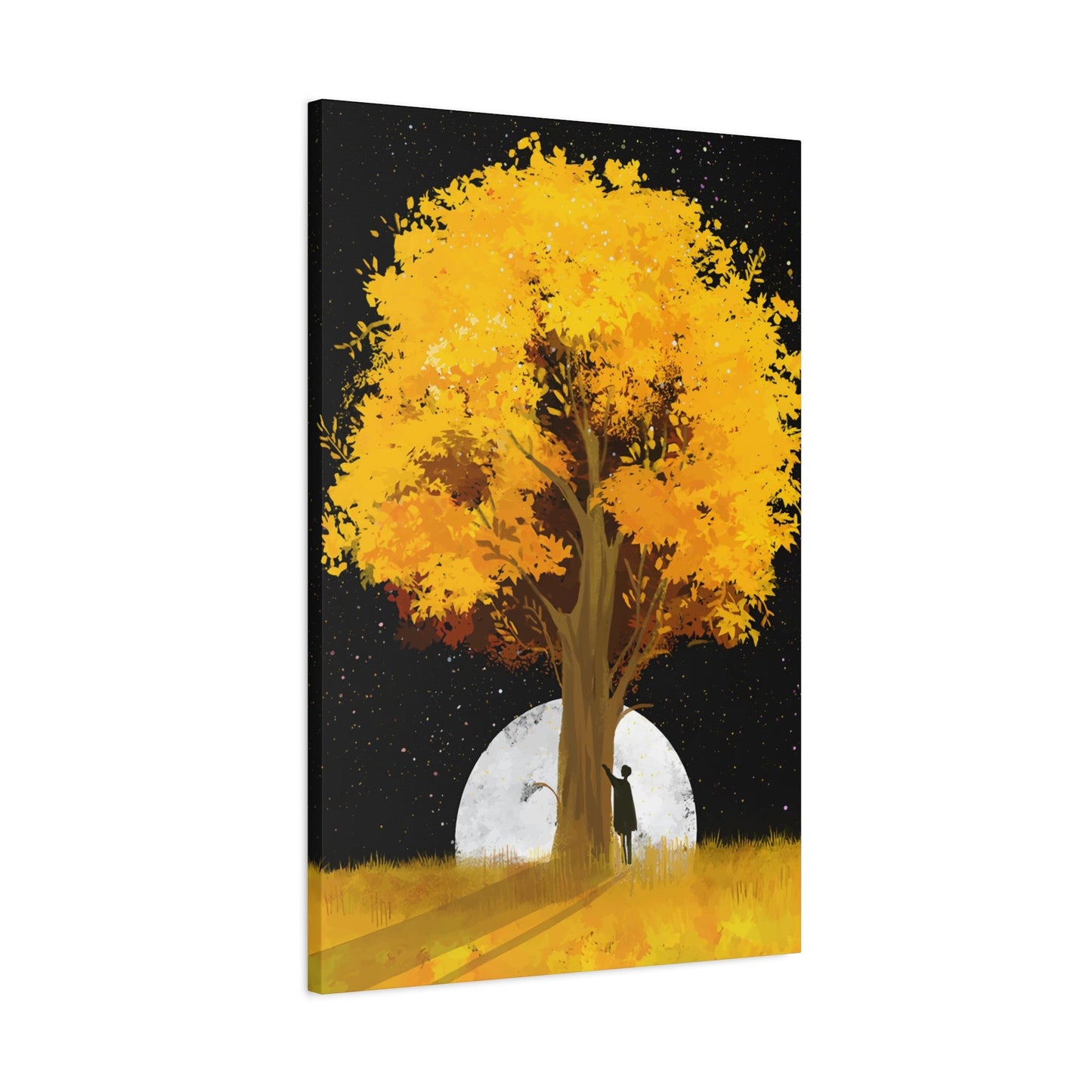
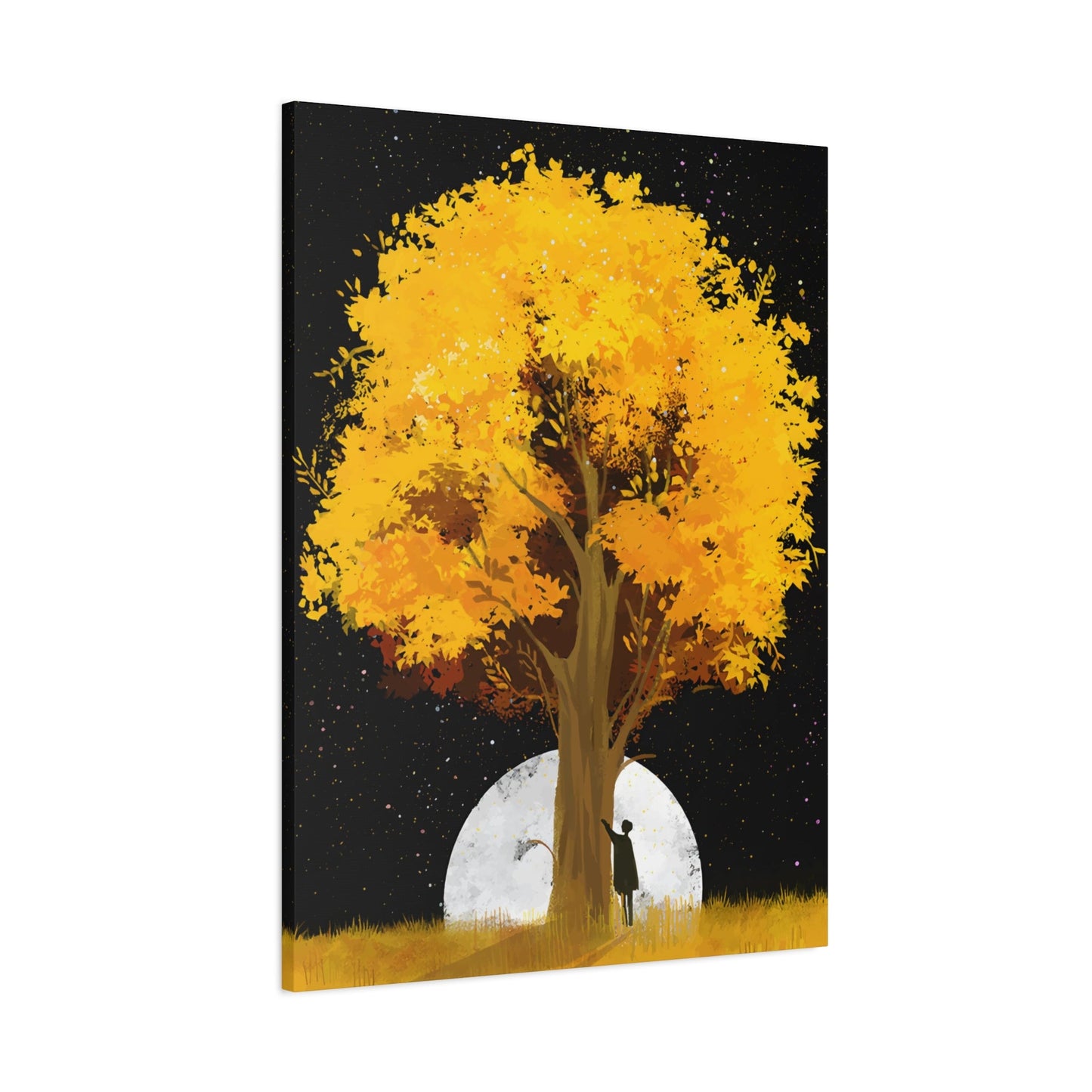
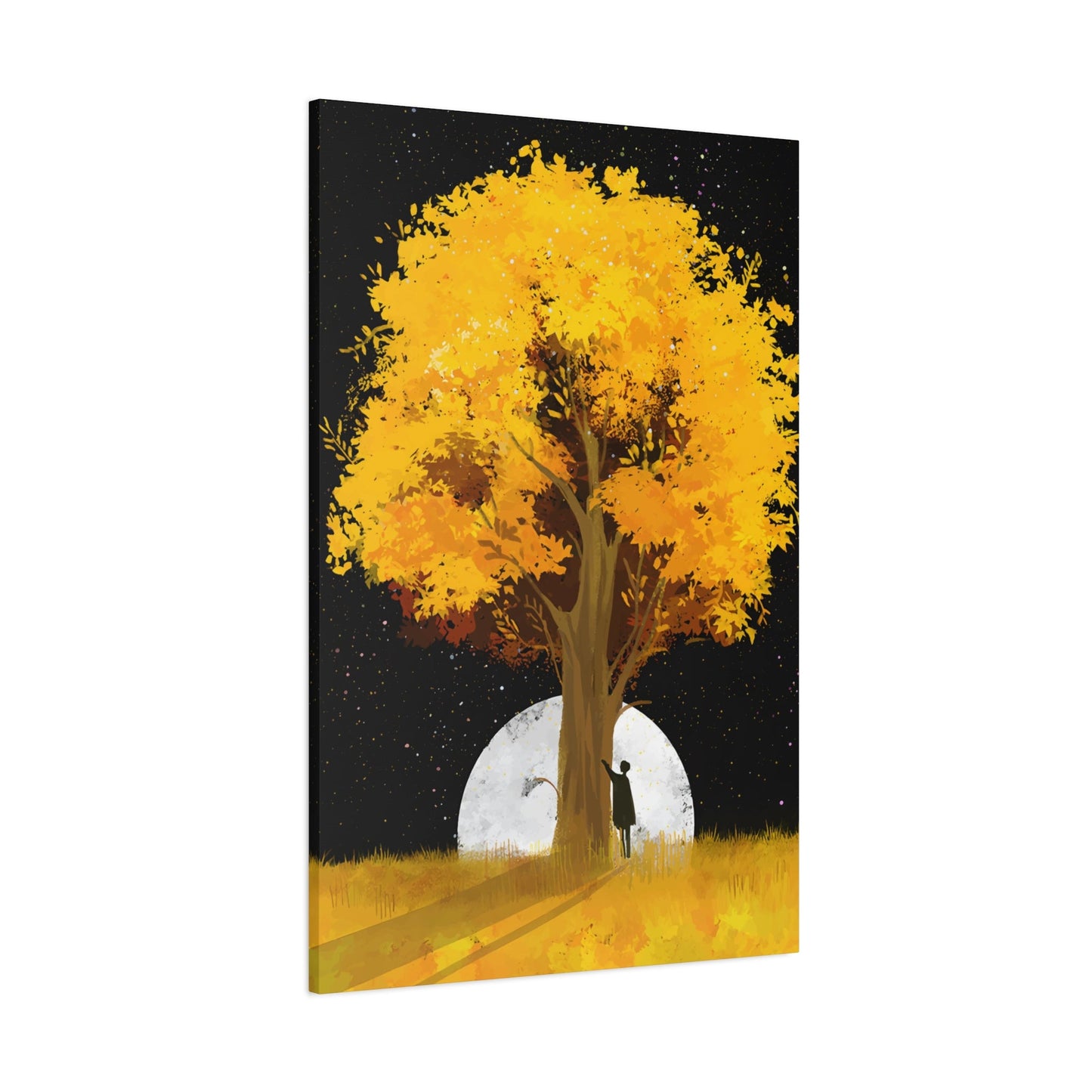
Yellow Tree Wall Art & Canvas Prints
Yellow Tree Wall Art & Canvas Prints
Couldn't load pickup availability
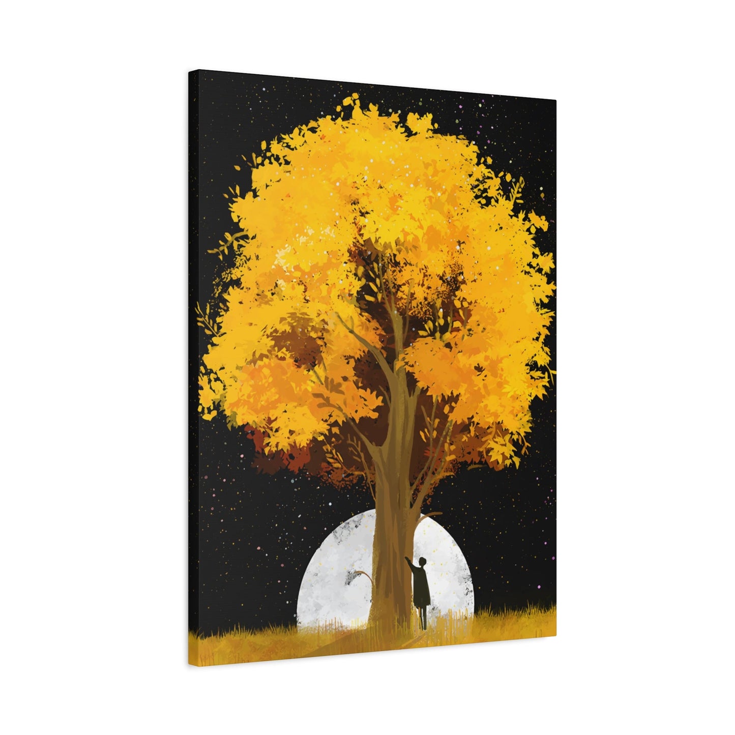
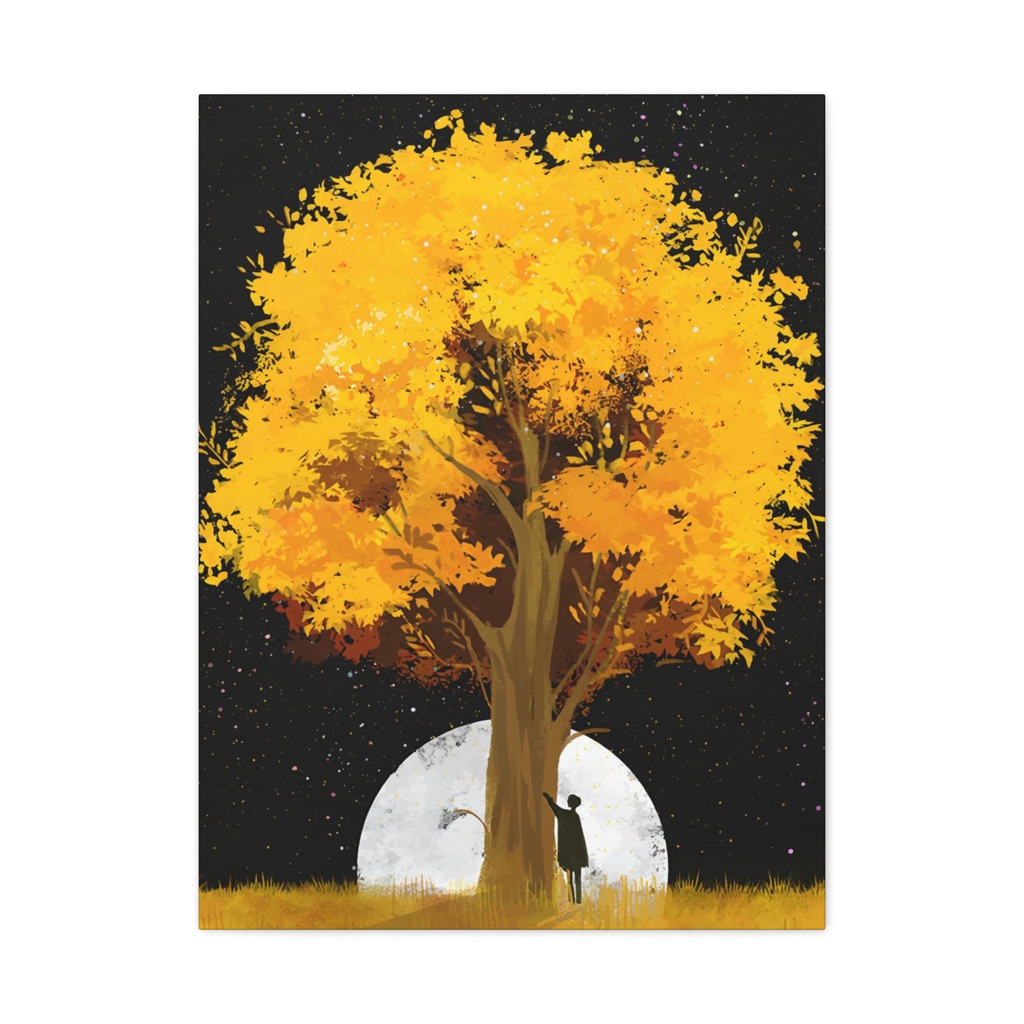
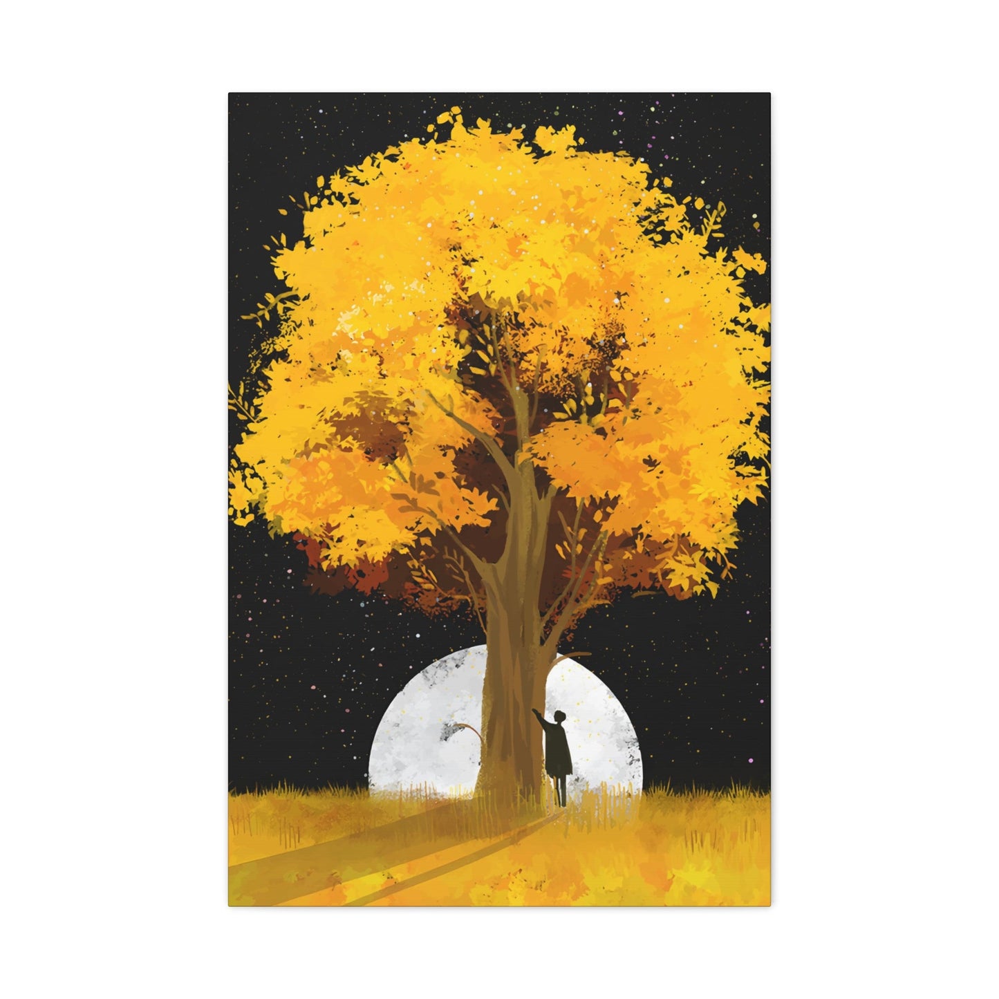
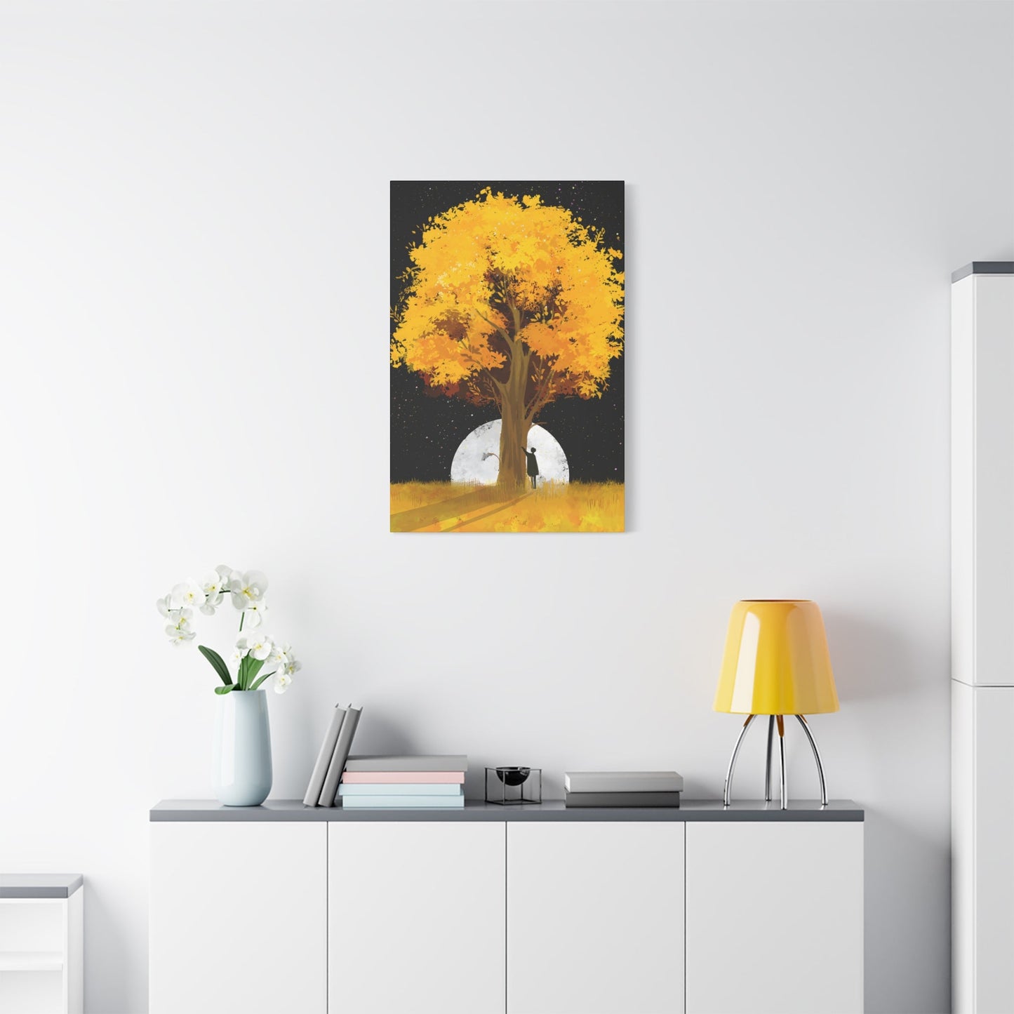
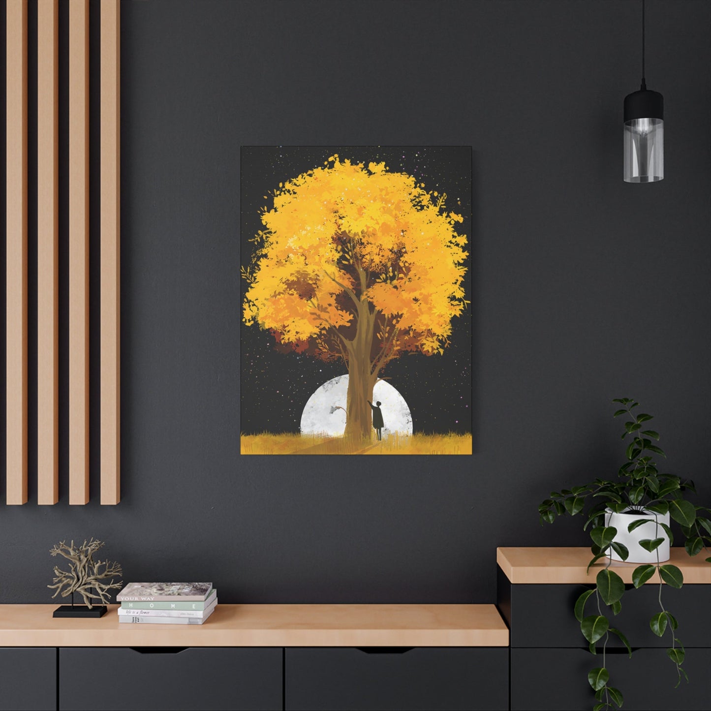
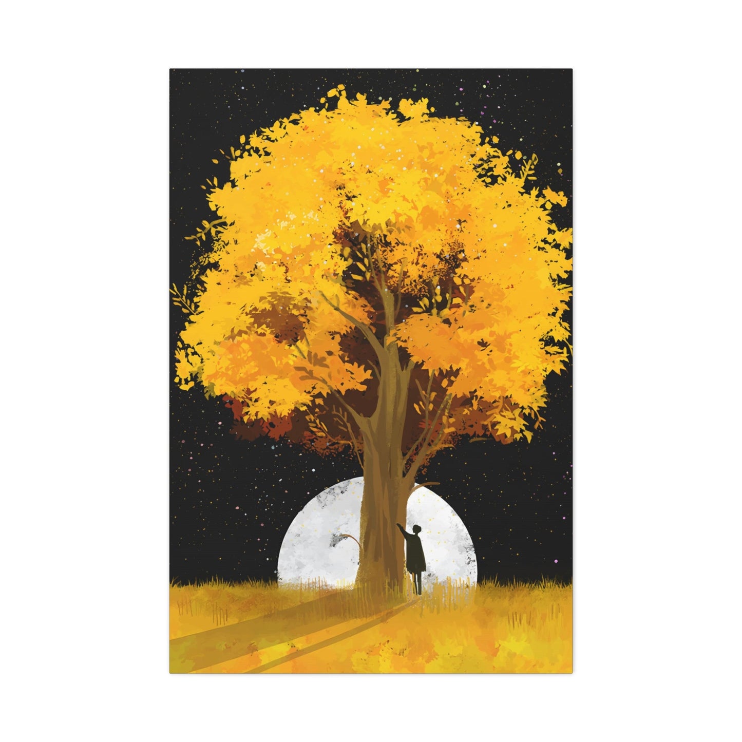
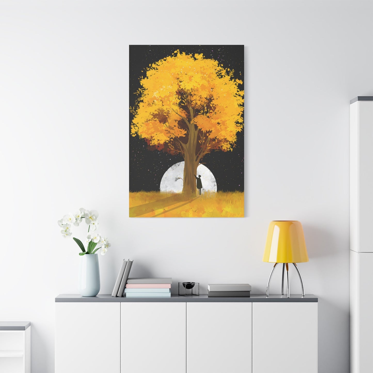
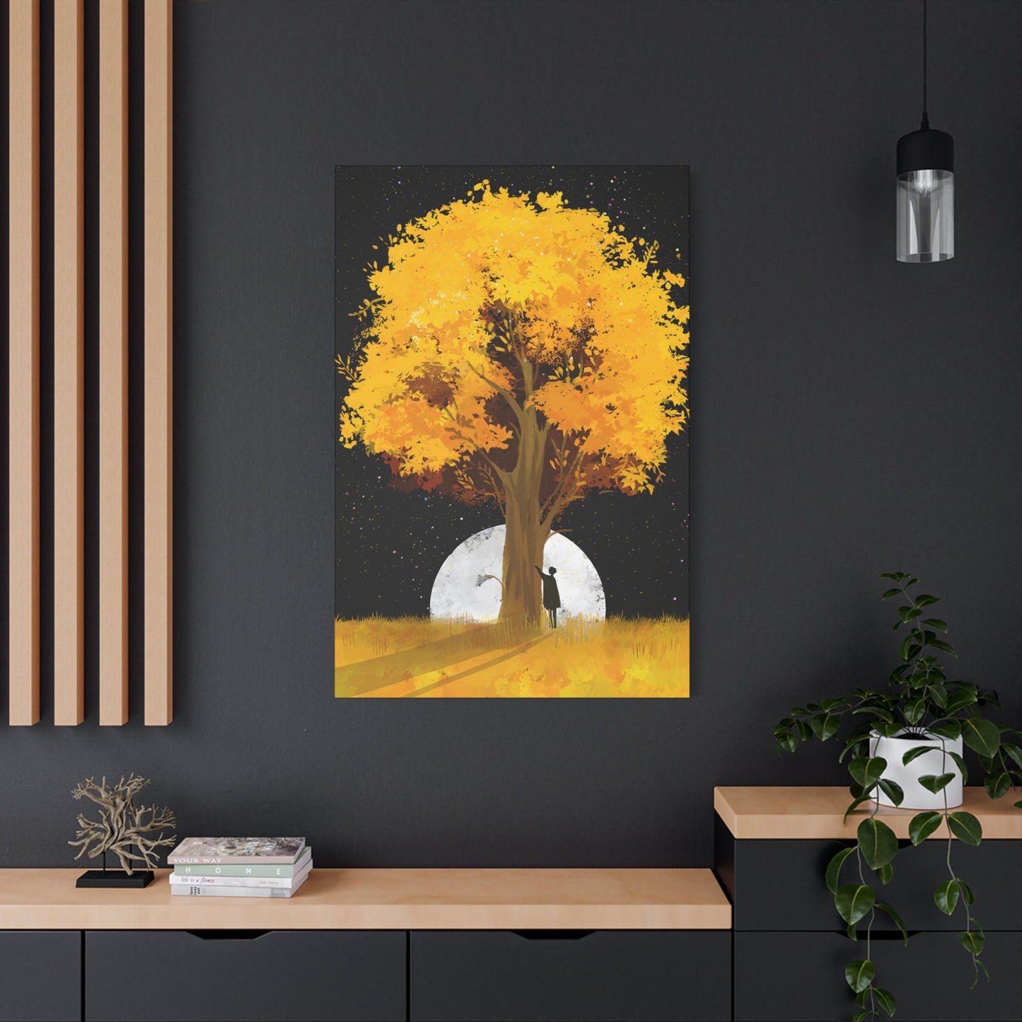
Golden Canopy: Why Yellow Tree Wall Art Remains a Timeless Décor Choice
Decorating your living space with natural elements brings warmth, tranquility, and a sense of connection to the outdoors. Among the most captivating choices for home decoration are pieces featuring radiant golden trees, amber foliage, and luminous forest scenes. These artistic representations transform ordinary walls into stunning focal points that evoke feelings of peace, optimism, and natural beauty. Whether you're drawn to realistic landscapes or contemporary interpretations, incorporating these nature-inspired pieces into your interior design creates an atmosphere that is both inviting and visually striking.
The appeal of golden tree imagery lies in its universal ability to capture the magic of changing seasons, particularly the breathtaking transformation that occurs during autumn months. When leaves shift from green to brilliant shades of gold, amber, and copper, nature puts on one of its most spectacular displays. Bringing this seasonal beauty indoors through carefully selected artwork allows you to enjoy these warm, glowing hues year-round, regardless of the weather outside your windows.
In this comprehensive exploration, we will delve into every aspect of selecting, displaying, and appreciating artwork featuring golden trees and yellow foliage. From traditional canvas prints to modern abstract interpretations, from small accent pieces to large statement installations, we will cover the full spectrum of options available to those seeking to enhance their spaces with these luminous natural motifs.
Radiant Tree Imagery for Interior Spaces
Artwork depicting trees with golden leaves offers an exceptional way to introduce warmth and natural beauty into any room. These pieces work beautifully in various settings, from residential homes to professional offices, and from cozy reading nooks to expansive living areas. The psychological impact of viewing nature scenes, even in artistic form, has been well documented, with studies showing that such imagery can reduce stress, improve mood, and create a more pleasant environment overall.
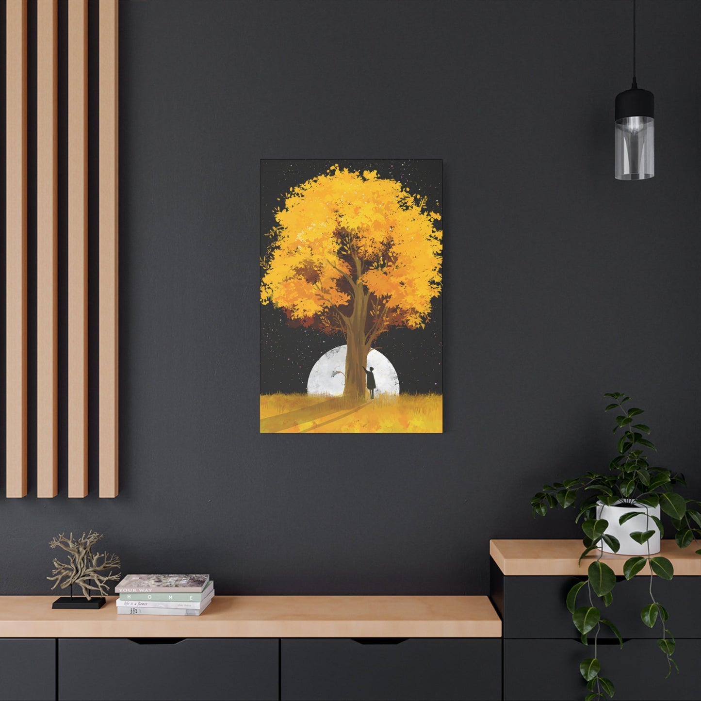
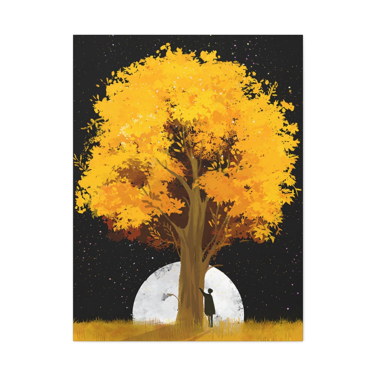
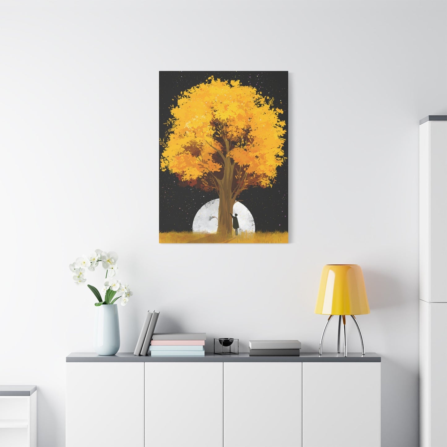
When selecting pieces featuring radiant tree imagery, consider the specific mood you wish to create in your space. Some artworks emphasize the peaceful, meditative qualities of a solitary tree standing in a field, while others capture the dynamic energy of an entire forest ablaze with autumn color. The composition, color intensity, and artistic style all contribute to the emotional resonance of the piece.
Radiant tree imagery can be found in numerous artistic styles, from photorealistic depictions that capture every detail of bark texture and individual leaves to impressionistic works that suggest form and color through loose brushwork and bold color choices. Each approach offers its own unique appeal and works best in different interior design contexts. Photorealistic works tend to suit traditional and transitional spaces, while more interpretive pieces often complement contemporary and modern interiors.
The versatility of this subject matter means it can adapt to virtually any color scheme. While golden yellows and warm oranges are the primary hues, these artworks often incorporate complementary colors such as deep blues in skies, rich browns in tree trunks, and touches of green in remaining foliage. This color diversity makes it easier to coordinate with existing decor elements while still making a strong visual statement.
Size considerations are equally important when selecting radiant tree imagery. A single large-scale piece can serve as a dramatic focal point above a sofa or bed, commanding attention and setting the tone for the entire room. Alternatively, a gallery wall arrangement featuring multiple smaller pieces allows for greater visual interest and the opportunity to tell a more complex story through varied compositions and perspectives.
Amber Forest Canvas Reproductions
Canvas reproductions of amber forests bring the majesty of autumn woodlands into interior spaces with remarkable effectiveness. These pieces capture the dense, layered beauty of forests in their golden phase, when thousands of trees collectively create a breathtaking display of warm color. The depth and complexity of forest scenes offer viewers endless details to discover, making these pieces endlessly engaging focal points.
The appeal of amber forest canvas reproductions lies partly in their ability to create a sense of immersion. When viewing a well-composed forest scene, viewers can almost feel themselves standing within the woods, surrounded by the glow of golden leaves and dappled sunlight filtering through the canopy. This immersive quality makes forest scenes particularly effective at transforming the feel of a room, creating a stronger sense of connection to nature than simpler compositions might achieve.
Canvas as a medium offers particular advantages for reproducing forest imagery. The texture of canvas adds subtle dimension to the printed image, enhancing the sense of depth and creating a more authentic, hand-crafted appearance. High-quality canvas reproductions can closely approximate the look and feel of original paintings, making fine art more accessible while still maintaining significant aesthetic impact.
Modern printing technologies have advanced to the point where canvas reproductions can capture incredible detail and color accuracy. Giclée printing, in particular, uses specialized inkjet technology and archival-quality inks to create reproductions that are virtually indistinguishable from original paintings in terms of color fidelity and tonal range. These prints resist fading and maintain their vibrancy for decades when properly cared for, making them excellent long-term investments for home decor.
The composition of amber forest scenes varies considerably across different artworks. Some pieces focus on the vertical lines of tree trunks, creating a sense of height and grandeur as the viewer's eye is drawn upward toward a canopy of golden leaves. Others emphasize the horizontal spread of the forest, capturing the way autumn color extends endlessly into the distance, creating a sense of vast natural space.
Perspective plays a crucial role in forest compositions. Pieces shot or painted from within the forest create intimacy and immersion, placing the viewer directly within the scene. Alternatively, forest views from slight elevation, looking across tree tops or down forest paths, offer a more expansive, panoramic quality that can make rooms feel larger and more open.
Autumn-Inspired Golden Tree Decoration
Decorating with autumn-inspired golden tree themes allows you to capture the essence of the most visually spectacular season and incorporate its warmth into your year-round decor. Autumn represents transformation, abundance, and the natural beauty of change, themes that resonate deeply with many people and translate beautifully into decorative elements.
Golden tree decoration in autumn themes can range from subtle accent pieces to bold, room-defining statements. The approach you choose should reflect your overall design philosophy and the specific character of the space you're decorating. Some people prefer to limit autumn themes to specific seasonal displays, while others embrace these warm tones as permanent features of their interior design.
The color palette associated with autumn golden trees extends beyond simple yellows to encompass a rich spectrum of warm tones. Deep golds, burnt oranges, russet browns, copper tones, and amber hues all play roles in creating authentic autumn atmosphere. These colors work harmoniously together, allowing for layered, complex color schemes that feel natural and organic rather than forced or artificial.
Incorporating autumn-inspired golden tree decoration doesn't require commitment to a single piece or style. You can create visual interest by combining different interpretations of the theme, mixing realistic depictions with stylized or abstract representations. This varied approach prevents monotony while maintaining thematic cohesion.
Luminous Tree Landscape Artwork
Landscape artwork featuring luminous trees captures the magical quality of light as it interacts with foliage, creating scenes that seem to glow from within. These pieces often emphasize the translucent nature of leaves when backlit by sun, the golden glow of trees at dawn or dusk, or the ethereal quality of forests in special lighting conditions.
The luminosity in tree landscape artwork creates an almost spiritual quality that elevates these pieces beyond simple decoration. The sense of inner light makes these artworks feel alive and dynamic, changing in apparent intensity depending on viewing angle and ambient lighting conditions. This quality gives them an enduring appeal that prevents them from becoming visually stale over time.
Creating luminosity in artwork requires sophisticated technique, whether through original painting methods or advanced reproduction technologies. Artists might use layered glazing techniques, strategic placement of light and dark values, or particular color combinations to create the illusion of glowing light. Understanding these techniques helps in appreciating the craftsmanship behind luminous tree landscapes.
The time of day depicted in luminous tree landscapes significantly affects their mood and impact. Dawn scenes feature cool, clear light gradually warming as it touches golden leaves, creating a sense of new beginnings and fresh starts. Midday scenes showcase bright, saturated colors and strong light-dark contrasts. Sunset and golden hour scenes offer the warmest, most intensely luminous effects as low-angle light creates maximum glow.
Atmospheric conditions contribute to the luminous quality of tree landscapes. Light mist or fog can create diffused, soft luminosity that feels mysterious and contemplative. Clear atmospheric conditions allow for crisp, bright luminosity with sharp contrasts. Partial cloud cover can create dramatic lighting effects as sunbeams break through to illuminate specific trees or portions of the landscape.
Dynamic Tree Display Artwork
Dynamic tree display artwork emphasizes movement, energy, and the living quality of trees rather than static portraiture. These pieces might capture wind-blown branches, trees in dramatic weather, changing light conditions, or use artistic techniques that suggest motion and vitality even in still images.
The sense of movement in tree artwork creates engagement and prevents visual stagnation. Rather than becoming background elements that fade into familiarity, dynamic pieces maintain viewer interest through implied motion and energy. This quality makes them particularly effective in active spaces like living rooms, family rooms, and offices.
Techniques for creating dynamism in tree artwork vary widely. Photographic approaches might use long exposures to blur moving leaves while keeping trunks sharp, creating contrast between stable structure and mobile foliage. Painting techniques like gestural brushwork or palette knife application create energy through application method itself.
Weather conditions play major roles in creating dynamic tree imagery. Wind creates obvious movement in branches and leaves. Rain adds vertical motion lines and creates reflective surfaces. Storm conditions bring dramatic skies and extreme contrast. Even calm conditions can be rendered dynamically through artistic technique.
Color vibrancy contributes to sense of dynamism. Highly saturated colors feel more energetic and alive than muted tones. Bold color contrasts create visual excitement. However, vibrant color must be balanced with composition and technique to avoid appearing garish or overwhelming.
Amber Foliage Display Decoration
Display decoration featuring amber foliage encompasses the rich, warm-toned leaves that characterize peak autumn. These decorative pieces celebrate the detailed beauty of individual leaves and massed foliage, bringing the intricate patterns and glorious colors of fall directly into living spaces.
The appeal of amber foliage decoration lies partly in its ability to preserve ephemeral beauty. Autumn leaves remain at their peak for relatively brief periods before falling and fading. Capturing this momentary perfection in permanent form allows year-round appreciation of nature's most spectacular color display.
Foliage pattern recognition adds intellectual interest to amber foliage decoration. Different tree species create distinctive leaf shapes, arrangements, and patterns. Learning to identify these patterns transforms simple decoration into educational opportunity and nature connection point.
Color variation within individual amber leaves creates remarkable complexity. Single leaves might graduate from green centers through yellow to orange and red at edges, with brown tones developing along veins and margins. This natural color complexity prevents monotony and provides endless visual interest.
The translucency of leaves adds special quality to amber foliage decoration. Leaves photographed or rendered with backlighting reveal internal vein structures and create luminous effects. This translucent quality gives amber leaves ethereal, jewel-like appearance that distinguishes them from opaque subjects.
Arrangement strategies for amber foliage displays balance between naturalistic and stylized approaches. Naturalistic arrangements suggest leaves as they might fall or cluster in nature, creating organic, casual effects. Geometric or symmetrical arrangements create more formal, designed appearances with stronger decorative intent.
Background choices dramatically affect how amber foliage appears. White backgrounds create clean, modern presentations emphasizing leaves as distinct objects. Black backgrounds make amber tones appear to glow and create dramatic sophistication. Natural wood or textured backgrounds provide context suggesting forest floors or trees themselves.
Conceptual Amber Tree Artwork
Conceptual amber tree artwork moves beyond literal representation to explore ideas, emotions, and interpretations through tree imagery rendered in warm golden tones. These pieces invite interpretation and engage viewers intellectually as well as aesthetically, creating opportunities for personal meaning-making.
The freedom of conceptual approaches allows artists to explore symbolism, metaphor, and abstract ideas while maintaining connection to recognizable tree forms. Trees might be fragmented, multiplied, transformed, or combined with unexpected elements to create images that challenge perception while remaining rooted in natural world.
Color use in conceptual tree artwork often emphasizes or exaggerates natural amber tones for expressive purposes. Hyper-saturated golds might emphasize vitality and energy. Subtle, muted ambers might suggest memory, nostalgia, or quiet contemplation. Color becomes communicative tool rather than merely descriptive element.
Geometric elements often appear in conceptual tree artwork, creating tension between organic tree forms and mathematical precision of geometric shapes. This contrast can represent relationships between nature and human order, growth and structure, or chaos and organization.
Multiple exposure or layered imagery creates complex, dreamlike tree compositions that suggest memory, time's passage, or multiple perspectives simultaneously. These techniques create visual density that rewards extended viewing and repeated observation.
The incorporation of text, symbols, or other non-natural elements into tree imagery creates additional layers of meaning. Words might name species, offer poetic fragments, or present concepts related to nature. Symbols might reference cultural meanings or personal associations with trees.
Surrealist approaches to amber tree artwork create unexpected juxtapositions and impossible scenarios that spark imagination. Trees might grow upside down, float in space, contain unexpected elements, or transform into other forms. These impossible scenarios invite viewers to embrace imagination and look beyond literal reality.
Minimalist conceptual tree artwork strips away detail to essential forms and colors, creating powerful simplicity. A few carefully placed lines suggesting tree form against amber background might communicate as powerfully as detailed rendering while offering cleaner, more contemporary aesthetic.
The emotional resonance of conceptual tree artwork often emerges from the space between recognition and interpretation. Viewers recognize tree forms but must work to understand the specific meaning or message, creating active engagement rather than passive viewing.
Installation considerations for conceptual amber tree artwork should provide adequate space and viewing time for interpretation. These pieces benefit from uncluttered surroundings that allow for focused attention without competing visual elements. Position them where viewers can pause and reflect rather than merely glance while passing.
Golden Seasonal Display Artwork
Display artwork celebrating golden seasons encompasses imagery from multiple times of year when golden light and color predominate. Beyond autumn, this includes late summer wheat fields, spring rapeseed blooms, golden hour landscapes, and scenes where light quality rather than specific season creates golden atmosphere.
The universality of golden seasonal imagery makes it accessible to broader audiences than season-specific decoration. By representing multiple golden moments across the year, these pieces avoid feeling tied to single season while maintaining cohesive warm color palette.
Agricultural imagery often features prominently in golden seasonal artwork. Golden wheat ready for harvest, sunflower fields in peak bloom, and ripe grain fields all provide spectacular subjects that combine natural beauty with associations of abundance and productivity.
The connection between golden light and special times of day creates artwork that captures specific transient moments. Golden hour, occurring briefly after sunrise and before sunset, provides exceptional light quality that photographers and artists prize for its warmth and visual drama.
Weather conditions contribute to golden seasonal atmospheres in distinctive ways. Clear conditions create bright, saturated golden tones. Hazy or slightly cloudy conditions diffuse light beautifully, creating soft golden glows. Storm clearings, when sun breaks through dissipating clouds, create dramatic mixed lighting.
The emotional resonance of golden seasons connects to cycles of growth, maturity, harvest, and completion. These natural cycles mirror human experiences of effort, development, achievement, and satisfaction, creating metaphorical depth beyond surface beauty.
Composition in golden seasonal artwork often emphasizes horizontal expanses that suggest land's scope and season's reach. Wide landscapes, fields stretching to horizons, and sweeping vistas create sense of abundance and plenty that reinforces seasonal themes.
Color harmony in golden seasonal pieces typically involves warm golden tones as primary elements balanced with complementary blues in skies or cooler accent colors in shadows. This warm-cool balance prevents golden dominance from becoming overwhelming while maintaining overall warmth.
The versatility of golden seasonal artwork makes it adaptable to varied interior styles. Traditional spaces appreciate the classical subject matter. Contemporary spaces respond to bold compositions and saturated colors. Natural or organic design styles find obvious connection to seasonal nature themes.
Display strategies for golden seasonal artwork should consider how to best showcase their warm, expansive qualities. Position them where they can spread visual warmth through spaces. Use them to balance cooler elements or to reinforce existing warm color schemes.
Amber Tree Peaceful Decoration
Peaceful decoration featuring amber trees emphasizes tranquility, calm, and restorative quiet qualities rather than dramatic color or dynamic composition. These pieces use amber tree imagery to create soothing, meditative environments that support relaxation and stress reduction.
The calming potential of nature imagery has solid research support. Studies consistently show that viewing nature scenes, particularly peaceful landscapes, reduces physiological stress markers and promotes psychological wellbeing. Amber tones add warmth without excitement, supporting calm alertness rather than sleep or high energy.
Composition in peaceful amber tree decoration typically avoids dramatic diagonals, strong contrasts, or busy detail that might create visual tension. Instead, these pieces favor balanced, harmonious arrangements with gentle transitions, soft focus, and simplified forms that allow easy visual rest.
Color saturation in peaceful decoration tends toward moderate rather than intense. Highly saturated colors create excitement and demand attention, while gentler saturation allows for relaxed viewing without visual strain. Peaceful amber pieces maintain warm tone without chromatic intensity.
The absence of obvious narrative or action in peaceful tree decoration contributes to their calming quality. Rather than suggesting stories or events, these pieces simply present beautiful natural forms in restful arrangements, allowing viewers to project their own meanings or simply rest in visual contemplation.
Scale and spacing in peaceful decoration arrangements should allow breathing room between elements. Crowded walls create visual stress, while thoughtfully spaced pieces allow each to be appreciated individually and create overall sense of openness and calm.
The meditative quality of peaceful amber tree decoration makes these pieces particularly appropriate for bedrooms, meditation spaces, healthcare settings, and any environment where stress reduction and relaxation are priorities. The imagery actively supports the intended function of these spaces.
Soft focus or slightly blurred imagery can enhance peaceful qualities by reducing visual detail that might engage analytical thinking. Subtle lack of sharpness encourages holistic viewing rather than detailed examination, supporting relaxed rather than active mental states.
The timelessness of peaceful amber tree scenes contributes to their enduring appeal. These pieces don't rely on novelty or surprise to create impact, so they remain visually satisfying over extended periods without becoming tiresome or demanding variation.
Pairing peaceful amber tree decoration with other calming elements creates cohesive environments optimized for relaxation. Combine with soft textiles, gentle lighting, minimal clutter, and other peaceful imagery to build spaces that feel like sanctuaries from stressful external world.
Lighting for peaceful decoration should be gentle and adjustable. Harsh overhead lighting can undermine peaceful imagery. Instead, use soft ambient lighting, dimmable options, and warm color temperatures that complement the amber tones while maintaining tranquil atmosphere.
The personal meaning viewers bring to peaceful amber tree decoration adds depth beyond visual qualities. Trees as symbols of growth, stability, and connection to nature carry significance that enhances their ability to provide comfort and peace to those who value these qualities.
Vibrant Tree Artwork Reproductions
Vibrant tree artwork reproductions emphasize intense color, strong contrast, and bold visual presence. These pieces make powerful statements and energize spaces with their dynamic color palettes and eye-catching compositions.
The energizing effect of vibrant color has psychological basis. Bright, saturated colors stimulate visual cortex more strongly than muted tones, creating increased alertness and engagement. Vibrant tree artwork brings this energizing quality while maintaining connection to natural subjects.
Color saturation in vibrant pieces pushes toward maximum intensity without crossing into unrealistic territory. The goal is vivid naturalism where colors appear true to life but enhanced to peak vibrancy. This requires careful balancing to maintain believability while maximizing impact.
Contrast levels in vibrant tree artwork tend toward strong, with clear differentiation between light and dark areas. This contrast creates visual drama and draws attention, making pieces effective focal points that command notice in any space.
The artistic enhancement of natural color in vibrant pieces might involve selective saturation increase, contrast adjustment, or careful color grading that emphasizes most visually exciting elements. These enhancements celebrate nature's color potential rather than documenting exact reality.
Composition in vibrant tree artwork often uses bold, simplified forms that allow color to take leading role. Rather than getting lost in complex detail, these pieces use clear shapes and strong color blocks to create immediate impact.
The emotional impact of vibrant tree reproductions leans toward excitement, energy, and positive activation. These pieces create upbeat, optimistic atmospheres that encourage engagement and social interaction rather than quiet contemplation.
Display considerations for vibrant tree artwork should account for their strong visual presence. These pieces work best as focal points rather than background elements. Give them prominent positions where their energy can be appreciated without overwhelming spaces.
Pairing vibrant tree artwork with interior elements requires some restraint elsewhere to prevent visual chaos. Let vibrant pieces provide primary color interest while keeping surrounding elements relatively neutral or complementary to avoid competing color stories.
The modern reproduction technology necessary for vibrant pieces must maintain color accuracy and saturation through production process. Poor reproduction can muddy vibrant colors or create unexpected color shifts that destroy the intended effect.
Lighting for vibrant tree artwork should be bright enough to showcase the intense colors effectively. Dim lighting can make vibrant pieces appear dull and defeat their purpose. Use adequate illumination that allows colors to shine.
The longevity of vibrant reproductions depends on quality of inks and materials. UV-resistant inks, archival substrates, and protective coatings ensure that vibrant colors remain vivid over time rather than fading to pale shadows of original intensity.
Amber Nature Canvas Display Artwork
Canvas display artwork featuring amber nature themes brings textured, substantial presentation to warm-toned natural subjects. Canvas as display medium adds tactile quality and artistic gravitas that enhances the perceived value and aesthetic impact of natural imagery.
The texture of canvas creates surface variation that prevents large color areas from appearing flat. This texture interacts with light, creating subtle shifts in appearance as lighting changes or viewing angles vary. The result feels more alive and dynamic than perfectly smooth surfaces.
Museum-quality canvas and stretching materials ensure longevity and maintain proper appearance over decades. Acid-free canvas, proper sizing, and stable stretcher bars prevent yellowing, warping, or sagging that can compromise cheaper canvas products.
The weight and substance of gallery-wrapped canvas creates physical presence that makes pieces feel more significant than paper prints. This substantial quality suits nature subjects well, reinforcing their importance and creating displays worthy of extended attention.
Edge treatment options in canvas display include image wrapping, where art continues around sides, creating frameless presentations that feel contemporary and clean. Alternatively, gallery wrap with solid-color sides provides finished appearance without extending image. Traditional framing over canvas offers more formal presentation.
Size options in canvas display range from small accent pieces measuring just inches across to massive wall-covering installations spanning many feet. The ability to produce canvas at virtually any size makes it adaptable to any space or design vision.
Amber Leaf Printed Wall Displays
Printed wall displays featuring amber leaves bring the intricate beauty of individual foliage into close focus, celebrating the exquisite detail and color variation found in nature's seasonal transformation. These pieces range from botanical-style studies of single leaves to artistic compositions featuring overlapping or arranged leaf forms.
The amber coloration of autumn leaves represents one of nature's most complex color events. Individual leaves might display gradients from green through yellow to orange and red, often with brown tones along edges and veins. This natural color complexity creates visual interest and prevents amber leaf displays from appearing flat or monotonous.
Botanical accuracy versus artistic interpretation offers two main approaches to amber leaf printed displays. Botanical prints emphasize scientific accuracy, capturing leaves with precise detail and often including information about species, structure, and characteristics. Artistic interpretations take creative liberty, emphasizing aesthetic qualities, experimenting with color enhancement, or arranging leaves in non-naturalistic compositions.
The scale at which leaves are depicted affects the character of the display significantly. Life-size or near-life-size representations maintain the intimate, touchable quality of actual leaves, allowing viewers to appreciate their true scale and detail. Oversized leaf prints create dramatic, almost abstract effects by revealing details invisible at normal viewing distances. Reduced-scale prints can be used to create patterns or collections.
Arrangement strategies for multiple amber leaf prints vary widely. Symmetrical grid arrangements create order and calm, working well in formal or traditional settings. Asymmetrical, organic arrangements feel more natural and dynamic, suggesting leaves as they might fall or scatter in nature. Shaped arrangements, such as circular wreaths or flowing paths, can create additional visual interest.
The background treatment in amber leaf prints significantly impacts their overall effect. White or light neutral backgrounds create clean, modern presentations that emphasize the leaves as distinct objects. Dark backgrounds create drama and make amber tones appear to glow by contrast. Textured or atmospheric backgrounds add context and mood, placing leaves within suggested environments.
Print medium choices affect the final appearance of amber leaf displays. Paper prints offer crisp detail and are often the most affordable option. Canvas prints add texture and a more substantial, artistic feel. Metal prints create contemporary, luminous effects with impressive color saturation. Acrylic prints offer depth and dimensional quality with modern aesthetic appeal.
Framing choices for amber leaf prints can emphasize different qualities. Simple, modern frames in black or natural wood maintain focus on the leaves themselves. Ornate traditional frames can give botanical-style prints a classical, museum-quality appearance. Matting adds breathing room and refinement, particularly for smaller prints.
Collection-building with amber leaf prints allows for interesting display evolution. You might collect prints featuring leaves from different tree species, creating an educational as well as decorative display. Alternatively, collecting various artistic interpretations of similar leaf forms explores different aesthetic approaches to common subjects.
The seasonal flexibility of amber leaf prints makes them versatile decoration elements. While clearly associated with autumn, their warm tones and natural beauty allow for year-round display without seeming seasonally inappropriate. They can serve as permanent decor or be brought out as part of autumn-specific seasonal decoration schemes.
Scientific and educational value adds an additional dimension to amber leaf prints, particularly those with botanical accuracy. These pieces can spark interest in botany, tree identification, and natural processes, making them especially appropriate for educational settings, libraries, or homes where learning and nature appreciation are valued.
Layering techniques can create additional depth in amber leaf display arrangements. By overlapping frames slightly or using shadow box techniques to create actual physical depth, you can create more complex, three-dimensional effects that enhance visual interest.
Color coordination with amber leaf prints is relatively straightforward given their warm, neutral-leaning palette. They coordinate beautifully with other autumn tones but also work well with cooler blues and greens that provide complementary contrast. Neutral environments allow amber leaf prints to provide primary color interest.
The contemplative quality of detailed amber leaf prints makes them particularly suitable for quiet spaces. The intricate vein patterns, color gradations, and organic forms invite close viewing and extended observation, creating opportunities for mindful moments and visual meditation.
Mixing photographic and illustrated leaf prints creates visual variety while maintaining thematic unity. Photography captures leaves as they truly appear, with all their imperfections and natural character. Illustrations can emphasize ideal forms, enhance colors, or add stylistic interpretation.
Golden Canopy Canvas Artwork
Canvas artwork depicting golden canopies captures the breathtaking view of looking upward into autumn trees, where branches and leaves create complex patterns against sky. These upward-gazing perspectives offer unique compositions that feel both expansive and intimate, modern and timeless.
The psychological impact of upward-looking perspectives has been noted by environmental psychologists. Looking up tends to evoke feelings of awe, wonder, and connection to something larger than ourselves. When combined with the warm beauty of golden foliage, these upward views create particularly moving and emotionally resonant artwork.
Compositional elements in golden canopy artwork include the complex branching patterns of trees, which create natural geometric forms radiating outward from trunks toward frame edges. These branch structures provide strong compositional lines that guide viewer attention and create visual rhythm. The interplay between structural branches and softer leaf masses creates textural contrast and visual interest.
Sky treatment in canopy artwork significantly affects mood and color relationships. Bright blue skies create strong warm-cool contrast with golden leaves, resulting in vibrant, energetic pieces. Overcast skies create softer, more muted effects with gentler contrasts. Sunset or sunrise skies add additional warm colors that harmonize with golden leaves for especially warm overall tonality.
Light direction and quality dramatically affect how golden canopies appear. Backlighting, where sun shines through leaves toward the viewer, creates luminous, translucent effects and dramatic leaf silhouettes. Diffused light on overcast days creates even illumination that reveals color and detail without strong shadows. Side-lighting creates dimensional modeling that emphasizes the three-dimensional structure of the canopy.
The density of foliage in canopy compositions affects the balance between leaves and sky. Thick canopies create enclosed, sheltered feelings with only glimpses of sky visible through leaf layers. Thin canopies, perhaps captured late in autumn as leaves begin to fall, create more open compositions with greater sky presence and an airier, lighter feeling.
Seasonal timing affects the specific qualities of golden canopy artwork. Early autumn canopies might show mixture of gold and green. Peak autumn canopies display maximum golden intensity. Late autumn canopies reveal more branch structure as leaves thin, creating delicate, intricate patterns against sky.
Canvas as a medium particularly suits canopy artwork because the texture adds dimension that enhances the sense of looking up into actual tree space. The fabric texture creates subtle surface variation that prevents large areas of color from appearing flat, maintaining visual interest across the entire composition.
Scale considerations are especially important for canopy artwork. Large-scale canopy pieces can create powerful immersive effects, making viewers genuinely feel as though they're lying beneath trees looking skyward. These oversized pieces work magnificently in spaces with high ceilings or as statement pieces in living areas.
The symmetry or asymmetry of tree arrangements in canopy compositions affects overall feel. Centered, symmetrical compositions create calm, balanced effects. Off-center or asymmetrical arrangements feel more dynamic and natural, creating visual tension and movement.
Multiple-canvas installations can create expansive canopy experiences. Triptychs or larger multi-panel arrangements allow canopy imagery to spread across wider wall areas, creating more immersive and impactful presentations. The breaks between panels can actually enhance the sense of looking through canopy gaps toward sky.
Color harmony in golden canopy artwork depends on successful balancing of the warm golden tones with sky colors and branch tones. The most successful pieces create pleasing color relationships where all elements work together without any single color overwhelming the composition.
The timeless quality of canopy perspectives makes them enduringly appealing. Unlike some subject matters that feel trendy or tied to specific design movements, looking up at trees is a fundamentally human experience that has inspired wonder throughout history. This timelessness ensures canopy artwork remains relevant regardless of changing design trends.
Pairing canopy canvas artwork with interior design elements benefits from considering the upward perspective. These pieces often work beautifully above sofas or beds, where people naturally recline and might look upward. The perspective aligns with the actual viewing angle, creating natural harmony.
Edge treatment in canvas canopy artwork affects presentation. Gallery-wrapped edges that continue the image around sides create contemporary, frameless presentations. Alternatively, solid-color gallery wraps provide clean finished edges without extending the image. Traditional framing offers more formal presentation options.
Amber Nature Printed Wall Decoration
Printed wall decoration featuring amber nature themes encompasses a broad range of natural subjects unified by warm autumn coloration. Beyond trees alone, these pieces might include meadows, mountains, waterways, and wildlife, all portrayed during the golden seasons or in warm, amber-toned lighting.
The breadth of amber nature decoration options allows for creating cohesive themed spaces without repetitive imagery. You might combine woodland scenes with meadow landscapes, close-up botanical studies with expansive vistas, wildlife portraits with habitat views, all unified by amber color palette and autumn theme.
Print quality considerations are paramount in nature decoration. High-resolution printing captures fine details like individual grass blades, bark texture, or distant landscape elements. Color accuracy ensures that the warm amber tones appear natural and appealing rather than artificially enhanced or strangely tinted.
Material choices for printed nature decoration include traditional photo paper, canvas, metal, acrylic, wood, and specialty materials. Each offers distinct aesthetic qualities and practical characteristics. Consider factors like desired finish, durability, maintenance requirements, and how material characteristics complement the specific image and room where it will hang.
Size selection for nature decoration should account for viewing distance and visual impact goals. Intimate spaces like powder rooms or office nooks might suit smaller prints that can be appreciated from close range. Larger spaces with greater viewing distances need proportionally larger prints to maintain visual presence and impact.
Series and collection approaches work particularly well with amber nature decoration. Multiple related images create narrative or thematic connections, building more complex visual stories across wall space. Collections might document single locations across different times, compare similar subjects in different settings, or explore variations on a theme.
The integration of amber nature decoration with biophilic design principles creates spaces that actively support wellbeing. Biophilic design emphasizes connection to nature as essential to human health and happiness. Nature imagery, particularly when rendered in warm, welcoming amber tones, serves as powerful biophilic element even in spaces without access to actual nature views.
Color psychology supports the use of amber tones in interior spaces. Warm colors like amber, gold, and orange stimulate feelings of comfort, optimism, and energy without the intensity of pure red. These hues create welcoming environments that encourage social interaction while maintaining warmth suitable for relaxation.
Mixing photographic and artistic nature prints creates visual variety and interest. Photography offers authenticity and specific moments captured, while paintings and illustrations provide artistic interpretation and creative vision. Combining both approaches within a cohesive color scheme creates richness without visual chaos.
The storytelling potential of amber nature decoration allows for meaningful personal expression. Selection of specific landscapes, species, or natural features can reflect personal experiences, favorite locations, meaningful memories, or aspirational connections to nature. These personal meanings add depth beyond pure aesthetic consideration.
Seasonal adaptability varies among amber nature pieces. Some clearly depict autumn and feel most appropriate for seasonal display. Others feature evergreen subjects in golden light or warm landscapes that don't specifically signal autumn, making them suitable for year-round use while maintaining the warm amber aesthetic.
Curatorial approaches to arranging amber nature decoration can draw inspiration from gallery and museum display strategies. Consistent framing or mounting creates cohesive presentation. Strategic spacing and alignment create visual order. Varying sizes within consistent style creates rhythm and hierarchy.
Radiant Forest Canvas Reproductions
Canvas reproductions of radiant forests capture the spectacular beauty of woodlands illuminated by golden light, whether from autumn foliage, golden-hour sunlight, or both combined. These pieces bring the majesty and serenity of forest environments into homes and workplaces, creating connections to nature even in urban settings.
The immersive quality of radiant forest reproductions derives from their ability to suggest depth and space. Skilled composition leads the viewer's eye into the scene, from foreground elements through middle distance and toward background. This sense of entering into the forest space creates engagement that keeps these pieces visually interesting over extended time.
Giclée printing technology has revolutionized the quality of canvas reproductions. This archival printing process uses fade-resistant pigment inks and produces incredibly fine detail with smooth color gradations. High-quality giclée reproductions on canvas can rival original paintings in visual impact while remaining far more affordable and accessible.
The stretching and mounting of canvas reproductions affects their presentation and longevity. Museum-quality stretching uses acid-free materials and proper tension to prevent warping or sagging. The depth of stretcher bars, typically ranging from three-quarters of an inch to two inches or more, affects the substantial physical presence of the piece.
Edge finishing options for canvas reproductions include image wrapping, where the printed image continues around the sides, mirror wrapping, where edge images are mirrored versions of the border, solid color wraps, and framed presentations. Each option creates different aesthetic effects and suits different decor styles.
The selection of specific forest scenes should consider the emotional tone you wish to establish. Sunlit forest paths create feelings of invitation and journey. Dense forest interiors suggest mystery and enclosure. Forest clearings offer balance between openness and shelter. Autumn forest peaks provide maximum warm color impact.
Regional characteristics in forest imagery add specificity and potential personal meaning. Birch forests have distinctive white bark and delicate leaves. Pine forests maintain green even in autumn but can feature golden understory. Mixed hardwood forests offer the greatest color variety during autumn.
The interplay of light and shadow in radiant forest reproductions creates depth and drama. Sunbeams breaking through canopy create almost theatrical effects. Dappled light creates complex patterns that add visual texture. Even, overcast light reveals color and detail without strong contrast.
Color saturation levels in reproductions should be carefully managed. Over-saturated images can appear artificial and garish. Under-saturated images lack impact and emotional warmth. The best reproductions achieve rich, natural color that feels vivid without crossing into unrealistic territory.
The protective coatings applied to canvas reproductions affect both appearance and durability. UV-protective coatings help prevent fading from sunlight exposure. Some coatings add subtle texture or sheen that enhances the painting-like quality. Matte, satin, and gloss finishes create different surface appearances.
Placement strategies for radiant forest reproductions should consider room function and traffic patterns. In living spaces, position forest scenes where they can be enjoyed from primary seating areas. In hallways or transitional spaces, forest paths create natural sight lines that draw people forward. In bedrooms, peaceful forest scenes support restful atmospheres.
Conclusion
The world of golden tree canvas and amber nature decoration offers remarkable opportunities to transform living spaces into warm, inviting environments that celebrate natural beauty. Throughout this comprehensive exploration, we have examined the many facets of incorporating these luminous, nature-inspired pieces into interior design, from understanding the emotional and psychological benefits they provide to mastering the practical considerations of selection, placement, and display.
The enduring appeal of golden tree imagery stems from its ability to capture one of nature's most spectacular transformations. When trees shift into their autumn glory, or when golden light bathes landscapes in warm radiance, something magical occurs that speaks to fundamental human appreciation for natural beauty. By bringing these moments indoors through thoughtfully selected artwork, we create year-round access to experiences that might otherwise exist only in fleeting seasonal windows.
The versatility of golden tree and amber nature decoration cannot be overstated. Whether you prefer photorealistic landscapes that transport you to actual forest settings, abstract interpretations that capture the essence of autumn through color and form, or anything in between, options exist to suit every aesthetic preference and design requirement. This flexibility allows golden tree themes to adapt to traditional, contemporary, transitional, and eclectic interiors with equal success.
The psychological and emotional benefits of incorporating nature imagery into our living spaces extend beyond simple aesthetic pleasure. Research consistently demonstrates that views of nature, even in artistic form, reduce stress, improve mood, enhance cognitive function, and support overall wellbeing. In our increasingly urbanized, technology-saturated world, these nature connections become ever more valuable. Golden tree and amber nature artwork serves as daily reminder of the natural world, providing visual respite and mental restoration in the midst of busy modern lives.
The practical aspects of selecting and displaying these pieces deserve careful consideration. Quality matters significantly in artwork that will occupy prominent positions in your home for years or decades. Investing in well-produced reproductions using archival materials and proper printing technologies ensures that your golden tree artwork maintains its vibrancy and beauty over time. Similarly, thoughtful consideration of size, placement, lighting, and integration with existing decor elements ensures that pieces achieve maximum impact and enhancement of your spaces.
The emotional resonance of golden trees and autumn imagery carries deep cultural and personal meanings. Trees symbolize growth, stability, connection to earth, and the cycles of life. Autumn represents harvest, abundance, transformation, and the beauty inherent in change. These powerful associations add layers of meaning to golden tree decoration beyond surface aesthetics, creating opportunities for personal reflection and emotional connection with your environment.
The technical advances in reproduction technology have democratized access to high-quality nature art. Giclée printing, improved canvas materials, and sophisticated color management mean that today's reproductions can rival original artwork in visual impact while remaining far more affordable and accessible. This accessibility allows more people to create homes filled with beautiful, meaningful art that reflects their values and aesthetic preferences.
The adaptability of golden tree themes across seasons is worth emphasizing. While clearly associated with autumn, the warm tones and natural beauty of these pieces allow for year-round display in most contexts. The warmth they provide becomes particularly valuable during darker winter months, when external landscapes may be bleak and cold. Golden tree artwork provides psychological warmth and visual comfort that transcends specific seasonal associations.
Creating cohesive design schemes with golden tree and amber nature decoration involves balancing consistency with variety. Unified color palettes provide thread that ties disparate pieces together, while variation in composition, scale, and artistic approach prevents monotony and maintains visual interest. The key lies in thoughtful curation that builds intentional, harmonious environments rather than random collections of unrelated pieces.
