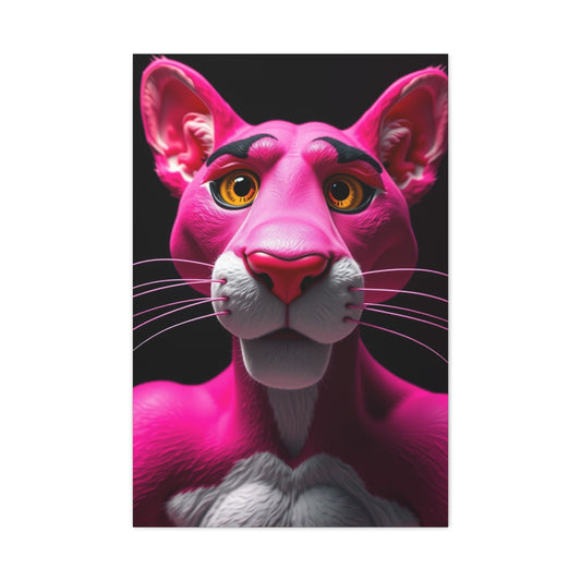
When most photographers think of monochrome photography, they automatically assume black and white. However, mastering the interplay of color within a monochromatic framework can elevate your images beyond conventional norms. By selectively emphasizing certain hues while maintaining overall tonal unity, you can create striking compositions that feel both minimalist and vibrant. Experimenting with materials and techniques that complement your vision enhances this approach. For inspiration on innovative display methods, consider exploring custom pictures that allow photographs to interact with surrounding textures and color schemes in unique ways.
Using subtle tints to differentiate objects in a scene can also create depth and visual interest. Even in scenes that appear entirely monochrome at first glance, color highlights can draw the viewer’s eye to specific points of interest. Photographers can work with complementary colors to create natural contrast or use analogous colors to maintain harmony within the frame. By carefully planning your lighting and exposure settings, you can maintain a consistent tonal structure while allowing certain colors to resonate. Additionally, experimenting with textures—such as reflective surfaces, matte finishes, or rough backgrounds—can enhance how color is perceived in monochrome compositions.
Another method to explore is selective de saturation in post-processing. This technique allows photographers to retain one or two colors while transforming the rest of the image into grayscale. It’s particularly effective for emphasizing subjects in crowded or complex scenes, such as flowers in urban environments or clothing in street portraits. Over time, developing a visual vocabulary of colors that work well within a monochrome palette can help create a consistent and recognizable photographic style.
Capturing Urban Mood with Color Accents
Cityscapes and street photography are ideal playgrounds for experimenting with color in monochrome compositions. Urban environments naturally contain reflective surfaces, neon signage, and contrasting textures that lend themselves to selective coloring techniques. A monochrome approach can help simplify chaotic city scenes, allowing key elements to stand out. Photographers can experiment with color isolation to make architectural features or fleeting street moments more impactful. A detailed reference on visual inspiration can be found in urban impressions cityscapes and street scenes for photographers looking to balance vibrancy and simplicity.Shooting during different times of day adds another layer to this exploration. The warm glow of sunset or the cool blues of twilight can be subtly integrated into monochrome frames to enhance mood. Artificial lighting, such as street lamps or storefronts, can also introduce unexpected color shifts that give life to otherwise muted compositions. Photographers should pay attention to reflections in windows or puddles, which can create layered color dynamics. Using long exposures during night shoots, for example, can turn moving car lights into streaks of color within an otherwise monochromatic cityscape, adding both motion and vibrancy.
Drawing from Historical and Cultural References
Incorporating historical or culturally rich subjects into monochrome photography encourages deeper narrative possibilities. Scenes inspired by classical art or historical architecture gain enhanced storytelling when selective color elements are used. For example, capturing the muted tones of aged stone with subtle highlights of color can transform a simple composition into a narrative-rich image. For artistic references that blend classical elegance with visual richness, the ancient Greece earthy opulence art prints collection provides compelling examples of how historical aesthetics translate into modern visual practices.
Photographers can further experiment with textures reminiscent of historical painting techniques, integrating color selectively to mimic aged patinas, faded fabrics, or illuminated manuscripts. Combining monochrome with hints of color allows for the evocation of time and place, making images feel both contemporary and timeless. For instance, a photograph of a centuries-old building might be rendered mostly in grayscale, while colorful graffiti or architectural accents are preserved, creating a bridge between history and modern expression.
Landscape Photography and Color Layering
While monochrome photography often emphasizes form and contrast, landscapes provide an opportunity to layer subtle color gradients without overwhelming the composition. Deserts, mountains, and coastal regions exhibit natural color variations that can be highlighted while preserving a predominantly monochrome aesthetic. Using specialized printing or display methods can enhance this effect, as demonstrated in Arizona landscape photo collections, which showcase regional hues that complement monochrome interpretations.
Techniques like graduated filters or post-processing adjustments help photographers maintain a tonal balance while subtly reinforcing natural colors. Foreground elements, such as foliage or rock formations, can be highlighted with gentle color shifts to create depth. Layering multiple images with varying degrees of color emphasis can produce panoramic results that guide the viewer’s eye through the landscape. By isolating specific color bands, photographers can evoke mood, temperature, and atmosphere, creating immersive scenes that feel both realistic and artistic.
Incorporating Artistic Design Principles
Monochrome photography enhanced with color requires careful attention to composition and design principles. Elements such as symmetry, leading lines, and negative space are crucial in guiding the viewer’s eye. Incorporating decorative influences or stylized design motifs can elevate the visual impact. For example, the art deco visual collection demonstrates how geometric shapes and repetitive patterns integrate with color emphasis, offering inspiration for photographers seeking structured yet dynamic compositions.
Using visual balance through deliberate placement of color accents ensures the photograph communicates effectively without becoming chaotic. Experimenting with framing techniques, such as off-center subjects or layered perspectives, can add visual tension and interest. Patterns in architecture, textiles, or natural forms can provide subtle cues that enhance the role of color in guiding interpretation. Understanding the principles of color psychology, such as warm colors evoking energy or cool tones suggesting calmness, further strengthens your compositional decisions.
Optimizing Digital Tools for Color Precision
Modern digital photography offers tools that allow for unprecedented control over color in monochrome work. Calibrated monitors, advanced photo editing software, and high-performance laptops are essential for evaluating subtle tonal differences accurately. Reviewing recommendations for equipment, such as those found in top laptops for photo editing in 2025, ensures your editing environment supports precise color management.
High-end monitors with color-accurate displays are particularly important for detecting subtle hues and ensuring your printed or displayed works maintain fidelity to your original vision. Layer-based editing workflows allow photographers to isolate color regions, fine-tune saturation, and create controlled contrasts. For professional photographers, investing in a color calibration tool is indispensable, as it ensures the colors you see on your monitor translate faithfully in prints or online galleries. Experimenting with blending modes, masks, and gradient maps can also offer creative ways to manipulate color emphasis without compromising the monochromatic integrity.
Enhancing Narrative Through Color Focus
Finally, using color selectively in monochrome photography can amplify storytelling. A single red detail against a muted backdrop can evoke strong emotional responses, create focal points, or convey symbolic meaning. For inspiration in combining color and narrative, consider monitors for photo editing guide, which emphasizes visual clarity and accuracy, helping photographers refine how subtle color nuances contribute to overall storytelling.
Narrative-driven color choices should always align with the intended emotional impact, whether highlighting human subjects, urban textures, or natural landscapes. Strategic placement of color can suggest movement, draw attention to themes, or indicate relationships within the frame. Even minimal color accents in large monochrome compositions can evoke a sense of drama, tension, or serenity. When color is thoughtfully applied, monochrome photography becomes a powerful storytelling medium, capable of conveying layered narratives that resonate with viewers on both visual and emotional levels.
Integrating Iconic Landscapes for Monochrome Photography
Photographers who shoot landscapes or travel scenes often find that certain locations inherently lend themselves to color accents even within a monochrome framework. Iconic coastal regions, for instance, offer natural gradients of light and shadow that can deepen the emotional resonance of an image when selective color is retained. A scenic example can be seen in the Amalfi Coast Italy travel photo reference, where warm earth tones and gentle pastel hues emerge from otherwise restrained palettes. Shooting in such environments encourages careful observation of reflective surfaces like water, which can subtly carry color hints that echo throughout the composition.
Capturing the interplay of sunlight on cliffs, waves, and urban structures along the coastline requires meticulous planning. By selectively highlighting these natural color variations, photographers can maintain a mostly monochrome aesthetic while creating depth and vibrancy that guide the viewer’s eye through the scene.
Using Symbolic Imagery as Color Anchors
Similarly, incorporating symbolic imagery within monochrome photography can add layers of meaning that transcend technical execution. National symbols or emblematic objects can be powerful focal points when rendered with a hint of their natural color while the surrounding frame remains muted. For instance, a photograph focusing on a waving flag can use its distinctive hues to anchor the viewer’s attention amid architectural textures or weathered stone, a technique demonstrated with the American flag visual symbolism in photography reference.This approach is particularly effective in documentary photography, where isolated color details suggest context and evoke emotion simultaneously.
Using symbols with strong cultural or national associations can enhance narrative depth without overcrowding the composition.
Enhancing Monochrome with Jewel-Tone Accents
Beyond iconic landmarks and symbols, subtle incorporation of rich, jewel-tone accents can transform otherwise understated compositions into visual statements. Consider scenes where natural elements or textiles contain deep hues; retaining selective color from those elements can draw the viewer into the narrative of the image. An example of this concept appears in the amethyst elegance ornamental palette guide, where gentle purple tones contrast with neutral surroundings to create dramatic focal interest.
Photographers can apply this technique to objects such as flowers, fabric, or jewelry to evoke sophistication and luxury within monochrome frames. The controlled use of such vibrant tones adds emotional resonance without detracting from overall tonal cohesion.
Drawing Inspiration from Cultural Motifs
Cultural motifs and regional design elements also provide fertile ground for enhancing monochrome photographs with color sensitivity. Photographers exploring markets, festivals, or architectural heritage sites often encounter color patterns that are visually striking and culturally meaningful. Integrating these elements while maintaining a monochrome approach requires awareness of how each hue contributes to the composition’s emotional and visual structure. Drawing on references such as the curated Asian decorative motif visual collection can inspire photographers to consider how shapes, patterns, and color cues interplay within a scene.
From textiles to signage, pottery, or architectural details, leveraging these cultural color accents enables the creation of imagery that feels authentic, immersive, and narratively rich. Observing traditional patterns and incorporating them selectively can create a delicate balance between vibrancy and restraint.
Balancing Depth, Focus, and Selective Color
These techniques collectively demonstrate that color in monochrome photography is not merely an additive detail but a strategic design choice that shapes meaning, mood, and viewer engagement. Balancing selective color with neutral tones enhances depth and draws attention to focal points. For example, foreground elements like foliage or architectural features can be slightly accentuated while keeping the background muted, guiding the viewer naturally through the frame.
Layering multiple elements with subtle color differences also encourages the eye to travel across the composition, creating a sense of movement and dimensionality. Combining natural, symbolic, and cultural color highlights allows for nuanced storytelling while preserving the visual serenity characteristic of monochrome photography.
Practical Application of Selective Color in Photography
Implementing these concepts requires both pre-shoot planning and post-processing finesse. Photographers should first identify key elements that will retain color during shooting, adjusting lighting and exposure to maximize tonal contrast. Post-processing software can then be used to fine-tune saturation, selectively desaturate unwanted areas, and emphasize color accents. Attention to detail ensures that the final image communicates its narrative clearly and effectively, whether through symbolic emphasis, emotional resonance, or aesthetic harmony.
These strategies underscore that monochrome photography enriched with selective color is both an artistic and technical pursuit, demanding a keen eye for balance, contrast, and composition.
Choosing the Right Paint Quality for Artistic Vision
When exploring monochrome photography enhanced with selective color, understanding how different artistic mediums interact can offer inspiration for photographic style. For instance, watercolor techniques emphasize subtle gradients and layering, which can be mirrored in monochrome images where delicate color highlights are essential. Selecting the appropriate medium—whether professional artist-quality paints or student-grade materials—affects the depth and vibrancy achievable in the final work. A detailed comparison of these options can be found in artist-quality versus student-grade watercolor paint, offering insight into how material quality influences artistic precision.
Using high-quality pigments often results in richer color retention, which translates to better inspiration when deciding which hues to isolate in monochrome photography. Conversely, even basic-grade materials can inspire experimental approaches, where unexpected textures and tonal variations add uniqueness to your images. Photographers can learn from painters by observing how layering, washes, and blending affect perception of depth and focus.
Applying Black and White Design Principles in Color Photography
Black and white aesthetics provide foundational lessons for photographers experimenting with color in monochrome compositions. Strong contrasts, minimalist compositions, and careful attention to light and shadow are all principles that guide visual storytelling. When color is selectively reintroduced into such frameworks, it must complement the overall tonal balance. The timeless elegance of black and white home decor illustrates how monochromatic foundations paired with occasional color accents create harmony and sophistication.
Incorporating these design principles involves observing negative space, balancing highlights and shadows, and applying consistent tonal structures. Color in this context is used sparingly to direct attention or evoke emotion, ensuring that every accent has purpose. Photographers can replicate these approaches by placing color strategically, for example in clothing, signage, or architectural elements, to maintain narrative coherence.
Learning from Contemporary Artists
Contemporary artists often use selective color to emphasize mood, draw focus, or create symbolic meaning. Observing these artistic strategies can inform how photographers approach monochrome compositions. Collections showcasing modern artistry, such as the curated artists creative collection, provide valuable references for understanding balance, contrast, and strategic color use. Analyzing these works allows photographers to extract compositional cues, understand proportion, and experiment with narrative emphasis.
By examining multiple mediums—painting, printmaking, or mixed media—photographers can learn how color isolation can convey abstract ideas or highlight key features. Translating these lessons into photography requires deliberate observation and careful post-processing to maintain fidelity to the intended mood.
Inspiration from Iconic Masterpieces
Studying the works of renowned artists like Pablo Picasso offers insight into the emotional and symbolic use of color within restrained compositions. Even in traditionally colorful works, certain palettes or isolated hues serve as focal points, guiding viewer attention and creating narrative tension. Insights can be drawn from top iconic masterpieces by Pablo Picasso, revealing how strategic color placement enhances thematic storytelling and emotional resonance.
In photography, similar techniques can be applied by retaining subtle color highlights in otherwise monochromatic frames. Observing how master artists manipulate space, proportion, and contrast informs how photographers can lead the eye naturally and evoke complex emotional responses.
Optimizing Studio Lighting for Color Accuracy
Controlling light is critical for capturing subtle color nuances in monochrome photography. Studio lighting provides precision over highlights, shadows, and tonal gradients, ensuring that color accents remain consistent and visually striking. Modern tools, including light boxes, enable photographers to experiment with intensity and placement without introducing unintended color casts. A curated guide on optimal equipment, such as top light boxes for photography in 2024, outlines best practices for achieving professional results.
Beyond technical setup, understanding how light interacts with surfaces, textures, and materials allows for more expressive imagery. Photographers can combine natural and artificial light sources to selectively enhance color accents, create layered shadows, and control reflections in reflective or metallic surfaces.
Incorporating Landscape and Environmental Color
Environmental photography provides opportunities to explore color subtleties in natural landscapes. Capturing sunrise or sunset lighting, for example, adds inherent color variation that can be emphasized while keeping the broader image monochromatic. The Alpine Dawn Dusk landscape masterpiece demonstrates how environmental colors, when carefully isolated, can create emotional depth and narrative focus in visual storytelling.Using techniques like selective focus, depth-of-field control, and graduated filters, photographers can enhance foreground and background color separation.
The combination of environmental color with a monochrome base allows for dramatic compositions that convey a sense of place, atmosphere, and mood simultaneously.
Integrating Fine Art Motifs into Photography
Fine art principles, including abstraction, composition, and texture, can translate seamlessly into monochrome photography enriched with selective color. For instance, abstract patterns, floral motifs, or structured forms can be highlighted by retaining select color elements, creating both aesthetic appeal and narrative emphasis. References such as a flower painting fine art guide provide inspiration on integrating natural forms and color accents for maximum visual impact.
Photographers can experiment with abstracting natural subjects, focusing on geometric patterns or repetitive textures, while allowing one or two colors to stand out. This approach adds layers of visual complexity, allowing viewers to engage with both form and color simultaneously.
Infusing Color Accents into Kitchen Spaces
Monochrome photography with selective color accents can transform kitchen interiors, adding vibrancy and focal interest to otherwise neutral or muted spaces. Kitchens, with their natural light, reflective surfaces, and functional objects, provide a perfect setting to experiment with subtle color injections. Photographers can use these elements to create compelling compositions that draw the viewer’s eye while maintaining overall harmony. For example, curated design references such as top blue kitchen design ideas you’ll adore illustrate how specific hues can complement monochrome tones, inspiring photographers to consider how environmental colors interact with their images.
Strategically placing monochrome photographs with small color accents within kitchen layouts emphasizes textures, shapes, and structural details. A bright object in the frame, such as a fruit bowl, utensil, or patterned tile, can serve as a visual anchor, guiding attention while enhancing storytelling. Combining these techniques with careful attention to perspective and lighting ensures that the selective color enhances both aesthetic appeal and narrative depth.
Transforming Large Walls with Monochrome Narratives
Large walls offer photographers the opportunity to present monochrome works with color accents as immersive visual experiences. The scale of the wall magnifies details, textures, and subtle tonal variations, making even minor color highlights significant in drawing attention and guiding viewer focus. Practical approaches for curating and installing such works are explored in transforming large walls a guide to stunning interior design, offering strategies on proportion, spacing, and thematic consistency to maximize visual impact.
When planning wall-scale installations, consider how color accents in your photographs interact with surrounding architecture, furniture, and ambient light. Color placement can create rhythm and cohesion across multiple frames, encouraging the eye to move naturally through the gallery-like space. Large wall displays also allow photographers to experiment with sequential storytelling, where each frame introduces a subtle color element that builds narrative momentum across the collection.
Elevating Abstract Compositions With Canvas Displays
Abstract monochrome photography benefits from the addition of selective color, particularly when translated into large-format displays. Prints amplify textures, tones, and color accents, creating a tangible presence that draws viewers into the composition. Dynamic abstract color artwork demonstrates how abstract elements paired with carefully placed color highlights produce thought-provoking works suitable for both gallery and interior settings.
In abstract compositions, selective color can define movement, suggest depth, or emphasize certain structural forms within the frame. When printing on canvas, consider how texture and finish influence perception: matte surfaces may soften color transitions, while gloss can enhance vibrancy. Photographers can further experiment with layering effects, juxtaposing monochrome elements with vibrant highlights to create multidimensional impact, ensuring the final work feels alive, expressive, and visually arresting.
Embracing Rustic Comfort in Home Photography
Monochrome photography with selective color accents can dramatically enhance the warmth and character of rustic interiors. These spaces often feature tactile materials such as wood, stone, and linen, which provide natural texture and depth. When placing monochrome imagery with subtle color highlights within such environments, photographers can enhance the visual cohesion of the room while emphasizing key elements. An inspiring reference for integrating artwork into warm, rustic interiors is the farmhouse living room cozy rustic makeover, which illustrates how selective color harmonizes with natural materials to create immersive, inviting spaces.
Lighting plays a crucial role in capturing the subtle interplay of color and tone in rustic interiors. Soft, diffused natural light highlights textures and casts gentle shadows, allowing color accents in monochrome photographs to stand out without overwhelming the space. By paying attention to the interaction between ambient light and image placement, photographers can create photographs that feel integrated rather than imposed, transforming interiors into experiential narratives of mood, texture, and style.
Mastering Metadata for Color Precision
Understanding technical metadata, such as DCR files, empowers photographers to capture subtle color variations with precision. DCR files store extensive information about camera settings, exposure, and tonal distribution, allowing for fine-tuned adjustments during post-processing. This is particularly important when incorporating selective color into monochrome compositions, as it ensures that color highlights are accurate and harmonious. For a detailed guide on working with these files, see how to use DCR photography files.Working with metadata allows photographers to maintain consistency across multiple shots, crucial for series-based projects or interior photography where lighting conditions vary.
By analyzing histogram data, white balance information, and exposure details, photographers can make informed adjustments that enhance the clarity and vibrancy of isolated colors within a monochrome framework. Mastery of metadata ensures that artistic intent is faithfully translated from capture to final display.
Crafting Elegant Tableaux for Visual Storytelling
Creating a visually compelling tableau within monochrome photography involves careful arrangement of subjects, textures, and color accents. A well-designed tableau guides the viewer’s gaze while highlighting narrative elements subtly embedded in the composition. For inspiration, the elegant wall tableau composition inspiration demonstrates how refined arrangements and strategic color placement elevate both emotional and aesthetic impact.
When building a tableau, consider the balance between negative space and clustered elements. Color accents should function as visual anchors that draw attention to critical details without disrupting the overall composition. The careful interplay of light, shadow, and selective color creates a dynamic narrative, encouraging viewers to explore multiple layers of meaning within the image.
Highlighting Natural Subjects With Selective Color
Nature photography is an excellent arena for exploring selective color in monochrome frames. Flowers, leaves, and other organic subjects offer natural opportunities to isolate color within a restrained tonal palette. To see practical applications of this approach, explore the natural flowers leaves color inspiration, which illustrate how subtle color choices can draw attention to focal points, enhance texture, and add narrative depth.
Techniques such as depth-of-field control, selective focus, and directional lighting allow photographers to isolate natural elements and emphasize their inherent color. By combining these technical approaches with thoughtful composition, even minimal color accents can dramatically alter the emotional resonance of the image. Layering tonal contrasts with gentle color inflections adds richness and dimensionality to natural subjects.
Expanding Creativity With Mixed Media Inspiration
Photographers can draw inspiration from painting and mixed media techniques to expand the expressive potential of monochrome photography with selective color. Experimenting with brush-like textures, overlays, and layered elements enables the creation of images that transcend traditional photography and enter the realm of visual art. A compelling reference is turner gouache Japanese color techniques, which shows how layering and color emphasis can inspire photographic experimentation.
Mixed media techniques encourage photographers to consider not just the subject, but the interaction of color, texture, and form within the frame. By translating painterly methods into digital or print photography, artists can create monochrome images that feel tactile, layered, and conceptually rich. Color becomes both a narrative device and a compositional tool, enhancing the overall expressiveness of the work.
Understanding Art Market Dynamics
Beyond creating visually compelling images, photographers who wish to sell their work must understand the art market and audience expectations. Selective color in monochrome photography can become a signature element that distinguishes an artist’s portfolio. For guidance on positioning and selling artwork effectively, see art sales tips for professional photographers, which outlines strategies for engaging collectors, curators, and galleries.
Art market success is not just about technical mastery—it also requires storytelling, thematic cohesion, and effective presentation. Photographers should build portfolios that emphasize consistent style, narrative clarity, and conceptual sophistication. Color accents within monochrome compositions can create recognizable visual language, helping the artist establish a unique presence in a competitive marketplace.
Presenting Works on Premium Canvas
Displaying monochrome photography with selective color on high-quality displays enhances texture, depth, and viewer engagement. Prints allow for subtle tonal variations and color highlights to be preserved while introducing a tactile, gallery-quality experience. The premium artists presentation techniques resource demonstrates how craftsmanship and material selection influence visual fidelity and aesthetic impact.
Canvas surfaces respond to light differently than traditional prints, so understanding how texture, finish, and scale affect perception is key. Photographers can experiment with matte or gloss finishes to emphasize different aspects of the image, enhancing selective color and creating dynamic visual interactions with the surrounding space.
Capturing Ethereal Perspectives
Exploring aerial and elevated viewpoints provides unique opportunities to isolate color within vast monochrome landscapes. By framing compositions from above, photographers can emphasize geometric patterns, natural forms, and human interactions, with selective color guiding viewer focus. A reference for aerial composition techniques is the aerial perspective artistry inspiration, which illustrates how strategic color placement transforms ordinary perspectives into compelling narratives.
Aerial photography requires careful attention to scale, perspective, and tonal contrast. Integrating selective color into these expansive compositions can create visual hierarchy, highlight critical subjects, and inject a sense of depth and dynamism, encouraging viewers to explore both the macro and micro elements within the frame.
Experimenting With Underwater Installations
Underwater photography introduces challenges such as altered light, color absorption, and fluid motion, making selective color both more difficult and more impactful. By retaining key color elements while rendering the surrounding environment in monochrome tones, photographers can create dreamlike, immersive images. For practical approaches, see underwater photography installation techniques, which provides insights into translating underwater visuals into physical art installations.
Technical considerations include color-corrected lighting, shutter speed, and water clarity. Selective color can enhance the sense of depth and drama while reinforcing thematic elements, creating a surreal yet harmonious visual experience. Integrating these techniques expands the expressive range of monochrome photography.
Developing Cohesive Thematic Collections
Creating a consistent visual identity strengthens the impact of monochrome photography with selective color. Grouping images into thematic collections allows for narrative continuity, stronger emotional resonance, and increased viewer engagement. A curated example is the arty guava collection inspiration guide, demonstrating how cohesive aesthetics and color strategy enhance the overall impact of a body of work.
When developing collections, photographers should ensure consistent use of selective color, tonal balance, and compositional strategies. Cohesion allows each individual image to contribute to a broader narrative, creating an immersive, gallery-quality experience that showcases technical skill, conceptual clarity, and creative vision.
Conclusion
In conclusion, exploring monochrome photography through the lens of selective color accentuation opens a vast realm of creative possibilities that go far beyond conventional black-and-white imagery. By strategically isolating colors within predominantly monochrome compositions, photographers can guide the viewer’s eye, emphasize focal points, and communicate subtle narratives that would otherwise remain hidden in fully grayscale representations. The interplay of tone, light, texture, and selective color creates layers of visual interest, transforming each image from a simple depiction into a compelling story imbued with emotion, depth, and sophistication.
Throughout this series, we have emphasized that monochrome photography does not necessitate the absence of color but rather invites a deliberate, thoughtful approach to its use. By carefully selecting which hues to highlight and which to suppress, photographers gain the ability to create striking contrasts, enhance spatial perception, and evoke moods that align precisely with their artistic vision. Whether capturing the structured elegance of urban environments, the timeless narratives of historical architecture, or the delicate forms of natural subjects, selective color acts as a visual language that can express subtlety, drama, or serenity depending on the intended effect.
The role of lighting and composition in this approach cannot be overstated. Light shapes form, defines textures, and sets the overall tonal balance of an image, while composition directs attention and establishes relationships between subjects and their surroundings. When these elements are combined with color isolation, the resulting imagery achieves both clarity and impact. Photographers must consider foreground and background relationships, depth of field, and perspective, ensuring that color highlights enhance rather than disrupt the visual harmony of the photograph. By mastering these technical elements, artists gain precise control over how viewers experience their work, allowing even minimal color accents to carry maximum emotional and visual weight.
Additionally, the thoughtful application of modern technology amplifies creative potential. Calibrated monitors, high-performance editing software, and detailed metadata like DCR files enable photographers to manage subtle color nuances with accuracy, ensuring that the final output remains faithful to their original vision. Advanced post-processing techniques, including layer adjustments, selective masking, and tonal refinement, allow for precise placement of color, giving artists unprecedented flexibility to experiment while maintaining cohesive aesthetics. These digital tools, when used skillfully, bridge the gap between concept and execution, transforming creative ideas into polished, impactful images.
Equally important is the consideration of display and presentation. From carefully curated interior installations in rustic or contemporary spaces to gallery-quality canvas reproductions and immersive wall tableaux, the medium through which a photograph is presented profoundly affects its reception. High-quality canvas prints, large-scale wall installations, and strategically placed exhibitions allow selective color accents to interact with ambient light and surrounding textures, enhancing the viewer’s engagement and deepening the emotional resonance of the work. When applied thoughtfully, presentation becomes an extension of the artistic intent, allowing monochrome photography with color highlights to communicate not only visually but experientially.
In essence, selective color in monochrome photography is not just a stylistic choice—it is a means of storytelling, a tool for emotional expression, and a pathway to creating timeless, memorable imagery. By applying the principles, techniques, and insights discussed throughout this series, photographers can push the boundaries of traditional photography, elevate their creative practice, and produce work that captivates, inspires, and endures. The potential of this approach is limitless, offering both novice and experienced photographers a framework for innovation, refinement, and meaningful visual communication that resonates with audiences across contexts, mediums, and cultures.


