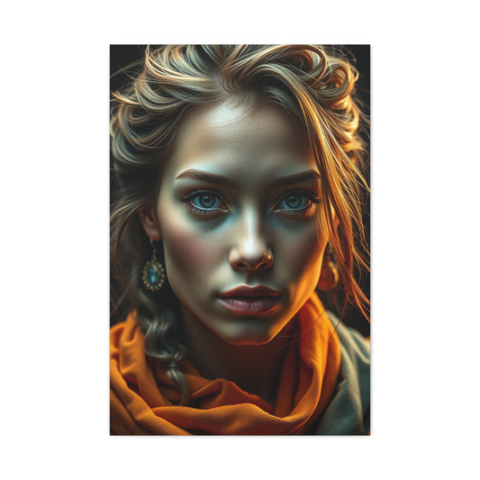
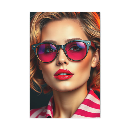
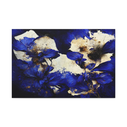
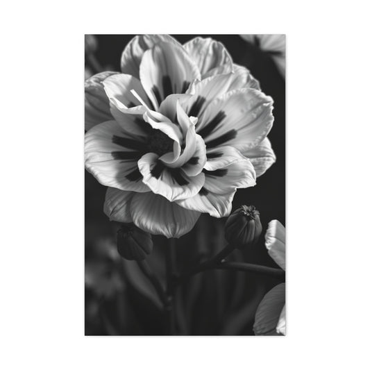
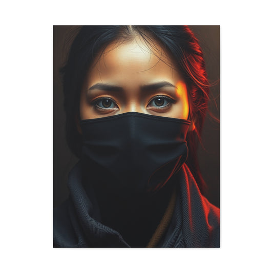
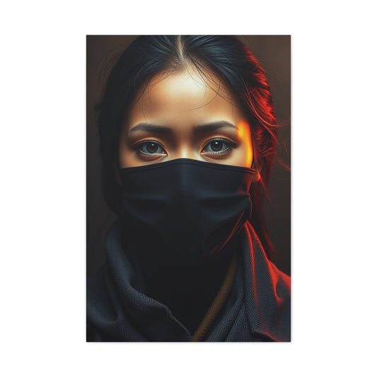
Contemporary home design has seen a dramatic shift toward embracing bold, vivid colors that make a statement while maintaining elegance. These daring palettes allow homeowners to infuse personality into every corner of their living spaces, whether through statement furniture, textiles, or decorative accessories. Using rich jewel tones such as sapphire, emerald, or ruby adds depth and sophistication, creating a visual experience that is both captivating and immersive. Incorporating these colors in subtle ways, like accent pieces or small decorative elements, ensures that spaces feel vibrant without being overwhelming. For those seeking inspiration, curated collections like modern vibrant prints for interiors offer guidance on integrating these colors into various rooms effectively.
Color trends in contemporary interiors go beyond mere aesthetics—they influence mood and perception. Warm, saturated tones can make a space feel cozy and inviting, while cool, bold colors add a sense of calm energy. Designers recommend balancing these colors with neutral foundations such as beige, gray, or soft whites to prevent visual fatigue. The key lies in selecting pieces that resonate with the overall theme of your home, ensuring that even small accents contribute to the harmony of the design.
Pattern Play and Color Contrast Techniques
Incorporating patterns into contemporary spaces has become essential for creating dynamic, engaging interiors. Bold geometric patterns, intricate designs, or abstract motifs in contrasting colors can bring life to otherwise neutral rooms. Carefully chosen patterns serve as focal points, drawing attention and creating visual rhythm. For example, repeating motifs in rugs, throw pillows, or curtains can enhance a space without overpowering it. Designers often suggest layering patterns of varying scales and textures to enrich the visual narrative of a room. Those exploring playful combinations can refer to practical guides such as baby shower thank you card wording made simple to understand how color and contrast can harmonize effectively, albeit in a different design context.
Strategic placement of patterned elements ensures that bold hues do not dominate the room. Small, repeated accents work best alongside larger neutral surfaces, while larger statement patterns are best confined to single walls or designated areas. This balance creates movement and interest while maintaining a cohesive aesthetic, allowing homeowners to experiment freely with daring color choices.
Cultural Inspirations Driving Color Choices
Global cultural influences play a significant role in contemporary interior color trends. Movements such as Afrofuturism blend traditional African motifs with futuristic aesthetics, resulting in rich color palettes that feel both vibrant and meaningful. Integrating these influences into home design allows spaces to tell stories, showcasing individuality and cultural appreciation. Whether through textiles, furniture, or decorative pieces, homeowners can celebrate heritage while maintaining a modern edge. Collections like Afrofuturism-inspired interiors provide a guide to blending these bold, saturated colors with contemporary design elements to create harmonious yet striking environments.
Cultural influences also inspire the use of unconventional color pairings. Mixing metallic finishes with vivid tones or combining patterns inspired by global art movements can create rooms that are visually rich and layered. This approach ensures that each space feels curated and intentional rather than chaotic, allowing bold color trends to shine without compromising sophistication.
Urban Energy and Cityscape Inspiration
City life provides endless inspiration for contemporary color schemes. Urban landscapes, bustling streets, and iconic skylines can influence the choice of hues and thematic design elements. Colors derived from city lights, skyscrapers, and evening sunsets create a sense of vibrancy and energy in interiors. Incorporating these urban-inspired tones, such as steel gray, cobalt blue, or sunset orange, can make spaces feel cosmopolitan and dynamic. To capture the essence of metropolitan living, homeowners can consider decor pieces like the Times Square poster NYC skyline, which introduces dramatic urban color contrasts into home interiors.
In addition to color, urban inspiration can extend to textures and materials. Reflective surfaces, metallic accents, and glass elements mimic city architecture, while industrial finishes like exposed concrete or brushed metals enhance the bold and contemporary aesthetic. When combined with carefully selected color palettes, these elements create a sophisticated and modern home environment.
Nature’s Influence Through Gemstone Hues
Natural elements continue to influence contemporary color trends, particularly through mineral and gemstone tones. Rich colors inspired by agates, geodes, and crystals such as deep amethyst, emerald, and citrine bring an organic luxury to interiors. These tones add depth and opulence without overwhelming the senses. Layering gemstone-inspired hues with complementary neutral shades, such as soft grays or warm tans, allows for a balanced yet striking interior design. Curated collections like agates and geodes for home interiors provide inspiration for integrating these rich colors into modern living spaces seamlessly.
Natural textures and finishes complement gemstone tones by adding tactile appeal. Polished stone surfaces, brushed metals, and textured fabrics create a multi-dimensional aesthetic that highlights the vibrancy of bold colors. This interplay between nature-inspired tones and contemporary design ensures interiors remain sophisticated, inviting, and visually compelling.
Travel-Inspired Color Stories
Air travel and global exploration have become significant influences on contemporary interiors. The palette inspired by flight—soft sky blues, crisp whites, and metallic silvers—adds a sense of openness and adventure to indoor spaces. Travel-inspired elements can be incorporated through thematic decor, printed maps, or aviation motifs, which provide both color inspiration and narrative interest. Those looking to explore these ideas further can reference collections like airplane travel-inspired interiors to bring thematic cohesion and adventurous color schemes into their homes.
Using travel as a design narrative allows for creative experimentation with global colors, patterns, and textures. For example, combining hues inspired by distant landscapes or iconic landmarks creates visually engaging interiors that evoke the energy of exploration. Integrating these colors thoughtfully ensures that bold palettes remain stylish and harmonized rather than chaotic.
Seasonal and Transitional Color Trends
Seasonal changes have a profound effect on interior color selection. Autumn, in particular, inspires a palette of warm, earthy tones such as deep ochres, burnt oranges, and rich browns, which balance vibrant accent colors. Incorporating these seasonal elements through soft furnishings, lighting, and smaller decorative pieces allows homeowners to refresh spaces without committing to permanent alterations. Resources like autumn home styling ideas provide practical guidance on achieving this balance, demonstrating how to incorporate bold colors effectively while maintaining seasonal relevance.
Transitional tones help bridge intense colors with neutral foundations, offering continuity throughout a home. Layering textures and introducing subtle variations in saturation ensures visual comfort and adaptability, making bold color schemes versatile across seasons. By embracing seasonal influences, contemporary interiors achieve both dramatic appeal and timeless elegance.
Art Deco Inspirations for Luxurious Interiors
The revival of Art Deco design has introduced bold color palettes, geometric patterns, and luxurious textures into contemporary homes. Jewel tones like sapphire, ruby, and emerald combined with metallic accents create a sophisticated and dramatic atmosphere. Incorporating elements inspired by Art Deco style, such as statement furniture, geometric motifs, or reflective surfaces, adds visual intrigue while maintaining cohesion. Homeowners can explore these influences through curated guides like art deco bedroom design inspiration to understand how color and form can create a lavish yet contemporary aesthetic.
Art Deco’s emphasis on symmetry and structured design pairs well with bold contemporary colors. By balancing ornate patterns with neutral spaces, interiors achieve a harmonious yet dramatic effect. The combination of luxurious textures, geometric motifs, and saturated colors ensures that rooms feel both stylish and personalized.
Intellectual and Inspirational Color Accents
Finally, incorporating intellectual or inspirational themes into interiors through iconic figures or symbolic motifs can enhance the depth of a space. Using imagery inspired by scientific, literary, or philosophical icons adds a thoughtful layer to contemporary design, complementing bold color choices. Collections like Albert Einstein-inspired decor allow homeowners to integrate symbolic accents that align with personal interests while reinforcing the overall aesthetic.
These thoughtful elements can serve as focal points or conversation starters, harmonizing with surrounding bold tones. Incorporating thematic or narrative elements ensures that vibrant interiors feel curated and purposeful, rather than merely decorative.
Personalizing Spaces with DIY and Interactive Ideas
For homeowners seeking to experiment creatively, DIY and interactive decor strategies provide the perfect opportunity to integrate bold color trends. Simple modifications to existing furnishings, playful accent arrangements, and hands-on projects allow for dynamic customization. Guidance from resources such as balcony decor DIY ideas showcases how small, interactive interventions can significantly impact overall aesthetics while keeping spaces modern and vibrant.
DIY approaches also encourage flexibility, enabling homeowners to adapt color schemes and design elements over time. This adaptability ensures that bold interiors remain fresh, engaging, and personally meaningful, reflecting both trends and individual tastes.
Eclectic and Nostalgic Inspirations
Eclectic interiors draw upon nostalgic influences, integrating vintage designs with contemporary colors to create dramatic, layered spaces. Incorporating retro motifs, timeless icons, or playful references from past decades adds texture and narrative to bold color palettes. For those seeking inspiration, curated guides like Tims modern eclectic ideas illustrate how to merge historical charm with contemporary vibrancy, creating spaces that are both visually rich and emotionally resonant.
Layering nostalgic influences alongside modern, bold colors ensures a sense of balance and cohesion. By integrating contrasting textures, tones, and thematic references, interiors achieve depth, complexity, and a sense of curated artistry that is uniquely personal.
Modern Door Trends and Interior Flow
Contemporary homes are increasingly embracing functional yet stylish sliding doors, which not only define spaces but also enhance visual flow and natural light. Choosing between aluminum and UPVC sliding doors can significantly impact both aesthetics and practicality. Aluminum frames provide a sleek, modern look with superior durability, while UPVC doors offer affordability and insulation advantages. Homeowners looking to optimize energy efficiency and long-term maintenance can find guidance in resources like aluminium vs UPVC sliding doors to make informed decisions that complement bold interior color schemes.
Sliding doors also contribute to spatial perception, making rooms appear larger and more open. When paired with dramatic accent colors, reflective surfaces, or textured walls, these doors help create a cohesive design narrative. Designers often recommend choosing door finishes and frames that harmonize with surrounding hues to ensure continuity while allowing statement colors to shine in adjacent spaces.
Festive Colors and Seasonal Vibrancy
Integrating seasonal and festive decorations into contemporary interiors provides an opportunity to experiment with bold, playful color schemes. Christmas-inspired palettes, for instance, combine rich reds, deep greens, and shimmering golds to create warmth and visual excitement. Seasonal decor is not limited to traditional motifs; creative arrangements of ornaments, lighting, and greenery can accentuate modern interiors while respecting personal taste. Guides like top Christmas decorations for a festive home offer insights on harmonizing seasonal colors with existing interior palettes, allowing for elegant and joyful spaces.
These seasonal trends also encourage homeowners to explore dynamic color layering and texture combinations. Combining reflective metallics with matte or textured surfaces amplifies visual interest, while strategic lighting highlights focal points, creating a festive yet sophisticated atmosphere that works year-round.
Pop Culture and Contemporary Accents
Pop culture icons provide an unexpected source of inspiration for bold interior color schemes. Artistic interpretations of characters like Tony Stark offer vibrant colors and dynamic forms that energize living spaces. Incorporating abstract or portrait-inspired accents adds personality and storytelling elements to a room, engaging both residents and visitors. For homeowners seeking contemporary inspiration, curated pieces such as Tony Stark abstract portrait ideas demonstrate how bold hues and iconic imagery can harmonize with modern design trends.
Integrating pop culture references also allows for playful experimentation with complementary colors and textures. Metallic tones, neon highlights, or striking contrasts can be balanced with neutral foundations, ensuring interiors feel intentional and cohesive rather than chaotic.
Iconic Landmarks and Urban Inspirations
Global landmarks serve as a source of color and thematic inspiration for contemporary interiors. Imagery inspired by sites like the Statue of Liberty introduces iconic green and copper tones into home palettes, offering a sense of history, scale, and sophistication. Incorporating such motifs through prints, decorative pieces, or thematic accessories allows homeowners to create a dialogue between interior spaces and global architecture. For a curated example, see Statue of Liberty-inspired design accents for ideas on integrating landmark-driven color schemes.
Landmark-inspired interiors encourage blending historical or cultural colors with modern finishes, such as matte neutrals, metallic highlights, or bold accent walls. This approach ensures a refined aesthetic while maintaining visual drama, allowing interiors to feel both modern and meaningful.
Harmonious Color Schemes Through Analogous Palettes
Color theory continues to play a crucial role in contemporary interior design. Analogous color schemes, which use colors adjacent on the color wheel, create a warm, inviting, and stylish atmosphere while supporting bold color trends. These harmonious palettes allow for subtle transitions between hues, minimizing visual tension and enhancing cohesion across living spaces. Resources like analogous colour painting ideas for living rooms provide guidance on combining adjacent shades to create rooms that are both vibrant and soothing.
Using analogous palettes also enables experimentation with texture and pattern without overwhelming the eye. Layering fabrics, furniture, and accent pieces in complementary tones enriches the visual experience and ensures interiors feel thoughtfully composed. Designers recommend incorporating a neutral anchor alongside analogous hues to provide balance and avoid monotony.
Apartment Transformations and Color Makeovers
Urban apartments offer a unique canvas for implementing bold color trends in compact spaces. Transformative design strategies, including painting, furniture rearrangement, and accent placement, can dramatically change the perception of a room. Small spaces benefit from well-chosen vibrant colors that draw the eye and create focal points without overwhelming the environment. For guidance on optimizing these transformations, explore apartment makeover ideas to refresh spaces, which offers practical solutions for integrating bold hues, patterns, and textures in urban interiors.
Apartment makeovers also emphasize multifunctional design. Using movable partitions, reflective surfaces, and accent lighting enhances both spatial perception and the visual impact of bold colors. By combining these techniques with dynamic color schemes, small spaces can achieve a dramatic and engaging aesthetic that rivals larger homes.
Futuristic Inspirations and Space Themes
Science fiction and space-inspired motifs continue to influence contemporary interior color trends. Cosmic colors, including deep blues, purples, and metallic silvers, evoke a sense of adventure and futuristic sophistication. Accessories, lighting, and art inspired by space exploration provide narrative depth while supporting bold palettes. For inspiration, collections like space odyssey design elements illustrate how celestial tones and futuristic aesthetics can coexist in modern interiors, creating dramatic yet refined living spaces.
Incorporating space-themed accents allows designers to experiment with reflective finishes, gradients, and bold contrasts. These approaches encourage innovative layering, balancing vibrant tones with grounding neutrals to maintain a contemporary yet otherworldly atmosphere.
Professional Tools for Striking Interior Photography
Photography plays a pivotal role in contemporary interiors, particularly when exploring bold colors, textures, and dramatic design elements. High-quality images capture the essence of a space, emphasizing the interplay of colors, materials, and focal points, while allowing homeowners to experiment visually before implementing changes. The use of professional tools, such as prime lenses, significantly enhances clarity, depth, and detail in interior photography. Understanding the benefits of equipment like the Canon EF 85mm F1.8 USM lens enables creatives and homeowners to capture striking images that elevate the look and feel of any room.
Prime lenses provide precise control over depth of field, focus, and perspective, which is essential when photographing interiors with bold accent walls or layered textures. These tools allow specific elements, such as statement furniture, vibrant textiles, or wall motifs, to stand out without distractions, creating images that feel professional and polished. Furthermore, interior photography captured through high-quality lenses can serve as a reference for future design updates, seasonal adjustments, or experimental color schemes, ensuring that every creative choice is both intentional and visually impactful.
Professional photography also helps in planning spatial arrangements and evaluating how lighting interacts with bold colors. By accurately documenting the way natural and artificial light interacts with different hues, homeowners can make informed decisions about paint choices, décor placement, and accent colors. In this way, investing in professional tools enhances both the aesthetic and functional aspects of bold interior design.
Photography Education for Interior Design
Beyond equipment, understanding the principles of photography and color theory is essential for effectively integrating imagery into contemporary interiors. Educational resources and structured programs provide knowledge on composition, lighting, color interactions, and thematic storytelling, all of which are critical for creating visually compelling spaces. Homeowners and interior designers can leverage these insights to ensure that photographic accents not only complement but also enhance bold color schemes. Programs like top universities and programs for photography offer guidance on how to combine technical skills with artistic vision, allowing photography to become an integral part of interior design planning.
By learning the principles of color theory and composition, photographers and homeowners can manipulate light, shadow, and perspective to highlight textures, patterns, and focal points within a space. Educational guidance also emphasizes the importance of storytelling through photography, enabling interiors to convey personality, mood, and narrative coherence. When applied thoughtfully, photography can transform bold design elements from static accents into dynamic visual experiences that engage viewers and enhance the overall atmosphere of a room.
Incorporating photography education into the design process allows for experimentation with new palettes, textures, and thematic arrangements. It encourages the use of images as reference tools for color coordination, furniture placement, and lighting optimization. Ultimately, combining technical skill with creative insight ensures that photographic elements in interiors are not just decorative, but functional, strategic, and aligned with the overall vision of bold and dramatic design.
Advanced Digital Techniques for Color Enhancement
Digital tools have become indispensable for interior design, allowing homeowners to experiment with colors, textures, and patterns virtually before implementation. Software like Photoshop offers advanced filters and plugins that enhance color vibrancy, create layered textures, and simulate various lighting conditions. Understanding these techniques enables designers to visualize bold palettes and refine choices efficiently. For practical guidance, resources such as top Photoshop filters and plugins for 2025 provide curated recommendations for optimizing digital design workflows in interior applications.
Integrating digital enhancements supports experimentation with daring combinations, allowing designers to test contrasts, harmonies, and accents without committing to physical changes. This approach ensures bold interiors are both functional and aesthetically refined, balancing creativity with practicality.
Lighting Strategies to Enhance Bold Hues
Lighting plays a crucial role in contemporary interiors, particularly when working with vibrant and dramatic color schemes. Proper lighting can enhance the depth, saturation, and mood of bold tones, creating spaces that feel lively, inviting, or serene depending on the desired effect. Designers recommend layering ambient, task, and accent lighting to highlight focal points, textures, and patterns effectively. Warm light enhances reds and golds, while cool light accentuates blues and greens, allowing homeowners to manipulate visual impact throughout the day.
Combining lighting with reflective surfaces and strategically placed accents amplifies the effect of bold colors. For instance, metallic finishes and glossy textures catch light differently across angles, creating dynamic visual interest that enhances the overall aesthetic. By thoughtfully integrating lighting strategies, interiors become immersive and responsive to both color trends and functional needs.
Abstract Inspirations for Bold Interiors
Contemporary homes increasingly draw inspiration from abstract forms, using dynamic shapes and vivid colors to create visually stimulating interiors. Abstract dance and motion-themed pieces evoke movement and energy, providing both aesthetic interest and a narrative element for living spaces. Incorporating such designs into bold interiors allows homeowners to experiment with vibrant color palettes without overwhelming the senses. For example, collections featuring Spain abstract dance poster inspiration demonstrate how fluid forms and rich hues can anchor a room while complementing modern furnishings.
Abstract designs also allow for experimentation with complementary and contrasting color schemes. By combining bold colors with subtle neutrals or metallic accents, homeowners can create a harmonious yet dramatic effect. This approach encourages creativity while maintaining a cohesive aesthetic, making abstract-inspired interiors both engaging and sophisticated.
Mythical and Magical Color Narratives
Incorporating mystical and fantastical themes into contemporary interiors introduces an element of storytelling and intrigue. Designs inspired by witches, folklore, or magical symbolism add depth and drama, transforming living spaces into immersive environments. Strategic placement of these thematic elements in accent areas enhances visual interest while supporting bold color palettes. For example, exploring Three Witches painting inspiration can provide guidance on integrating mystical motifs and saturated colors to create a compelling focal point in a room.
These mythical themes also encourage the use of dramatic lighting and texture to reinforce narrative impact. Deep jewel tones, reflective surfaces, and layered textiles work together to create immersive interiors, making bold color trends feel purposeful and evocative.
Digital Tools for Enhancing Color Accuracy
Advancements in digital photography and editing technology have revolutionized interior design, allowing for precise experimentation with bold colors. Lightroom presets, filters, and plugins enable homeowners to visualize dramatic color schemes, test combinations, and refine textures before implementation. For those interested in optimizing their digital workflow, guides like top free Lightroom presets for landscape photography provide a foundation for understanding how digital tools can inform real-world interior design.
Using digital enhancements allows designers to explore nuanced color interactions and lighting effects that are difficult to replicate physically. By simulating variations in saturation, hue, and contrast, homeowners can confidently select bold palettes that complement both furniture and architectural elements, ensuring cohesion and vibrancy.
Fresh Color Alternatives to Neutrals
Neutral tones, while timeless, are being reinterpreted with fresh alternatives that complement bold palettes. Classic grays, beiges, and whites can be substituted with muted pastels, soft taupes, or warm earth tones to maintain neutrality while offering subtle warmth and personality. For guidance on innovative neutral choices that harmonize with striking hues, resources like fresh alternatives to classic gray demonstrate how modern neutrals can act as the perfect backdrop for vibrant color statements.
These alternative neutrals also enhance layering techniques. By providing a subtle contrast to bold accent colors, they allow dramatic tones to stand out without overwhelming the eye. This balance ensures interiors feel lively yet comfortable, providing flexibility for seasonal or thematic updates.
Thematic Movie and Pop Culture Accents
Incorporating pop culture or cinematic themes adds personality and drama to contemporary interiors. Bold imagery, such as horror or thriller-inspired motifs, introduces striking contrasts and unique visual narratives, appealing to collectors and enthusiasts alike. Iconic designs like thriller horror movie poster inspirations showcase how dramatic imagery and color can become focal points, energizing living spaces and stimulating conversation.
These thematic elements also support experimentation with complementary color palettes. Pairing deep reds, blacks, or muted tones with neutrals and metallic accents allows bold visuals to integrate seamlessly, ensuring the interior remains cohesive while capturing a distinct personality.
Timeless Vintage Aesthetics
Vintage-inspired interiors continue to resonate within contemporary design trends, combining nostalgia with modern functionality. Classic motifs, ornate textures, and muted yet vibrant color combinations bring warmth and character to bold interiors. For guidance on integrating timeless elements without sacrificing contemporary appeal, references like timeless vintage interior ideas provide curated examples of how traditional aesthetics can coexist with dramatic, modern palettes.
Layering vintage textures with bold contemporary colors creates visual contrast and depth. Incorporating aged finishes, distressed materials, and rich textiles alongside saturated hues allows spaces to feel both historical and progressive, enhancing the drama and sophistication of interiors.
Maximizing Small Spaces with Impactful Hues
Even compact areas can achieve a grand impression when bold colors and thoughtful design principles are applied. Powder rooms, narrow hallways, and small studies benefit from vibrant palettes that create a sense of depth and personality without overwhelming the limited space. Practical strategies and inspiration can be found in resources like tiny spaces chic design ideas, which demonstrate how color, texture, and thematic accents can transform small interiors into visually compelling environments.
Designers recommend layering light, reflective finishes with bold accent hues to maximize perceived space. Strategic lighting, mirrored surfaces, and contrasting textures amplify the effect, allowing even the smallest rooms to feel expansive and dramatic.
African-Inspired Interior Design Ideas
Drawing inspiration from African design motifs can transform contemporary interiors into spaces full of life, warmth, and cultural depth. African design is renowned for its rich, saturated earthy tones, intricate tribal patterns, and dynamic compositions. These elements add narrative depth and provide a striking contrast when paired with modern furnishings or neutral backdrops. Colors such as deep ochre, terracotta, and rich umber can be layered with complementary textures like woven textiles, polished wood, or natural stone to create a space that feels both vibrant and grounded.
For homeowners who wish to integrate these elements into their interiors, curated resources like African-inspired interior collections offer guidance and inspiration. These collections show how traditional African aesthetics can coexist with contemporary design principles, allowing bold and dramatic color schemes to shine without overwhelming the space. For example, incorporating African patterns through accent rugs, cushions, or wall motifs can serve as focal points while harmonizing with existing color palettes.
In addition to color, African-inspired interiors often emphasize storytelling through decorative objects and art. Sculptures, masks, and handcrafted items can provide both cultural significance and visual interest. Layering these accents with bold colors ensures that interiors feel intentional, curated, and culturally rich. By balancing vibrant African tones with modern finishes, homeowners can achieve a sophisticated, global-inspired aesthetic that celebrates heritage while remaining contemporary.
Southwest-Inspired Color Palettes for Homes
Southwestern design continues to be a key influence in contemporary interiors, particularly for those seeking bold, sun-soaked color palettes. The region’s aesthetic is characterized by warm terracotta tones, sun-baked oranges, muted adobe shades, and deep desert blues. These colors evoke natural landscapes, creating interiors that feel warm, inviting, and visually stimulating. Southwest-inspired colors are particularly effective when used on accent walls, textiles, or statement furnishings, adding depth and richness to a room.
Homeowners can explore curated examples like Southwest interior inspiration to see how bold palettes can be combined with thematic elements. Decorative accents such as pottery, woven textiles, and rustic wood finishes complement these colors, reinforcing the thematic narrative while providing textural contrast. The key to successful southwestern-inspired interiors is balance: pairing bold earthy tones with lighter neutrals allows dramatic colors to pop without dominating the room.
Beyond color, southwestern-inspired interiors often embrace natural materials and handcrafted details. Leather accents, terracotta pots, and textured fabrics help ground bold colors, creating cohesion between modern design sensibilities and traditional southwestern motifs. By layering textures and integrating thematic décor, homeowners can achieve vibrant interiors that feel authentic, dynamic, and visually engaging.
Wildlife and Nature Accents in Contemporary Spaces
Nature and wildlife-inspired motifs are powerful tools for enhancing bold color schemes in contemporary interiors. Imagery of animals, lush landscapes, and organic forms adds drama, personality, and storytelling to living spaces. For instance, curated collections like Tiger on branch interior inspiration demonstrate how wildlife accents can serve as striking focal points, introducing rich, natural colors that complement modern furniture and decorative elements.
Incorporating wildlife motifs encourages a thoughtful approach to layering colors and textures. Deep greens, earthy browns, and subtle gold accents drawn from nature can be paired with vibrant primary colors or jewel tones, creating depth and visual harmony. Textural elements such as wooden furniture, woven baskets, and natural fabrics enhance this effect, providing tactile richness that complements bold hues.
Moreover, wildlife-inspired interiors can extend beyond color to inspire thematic arrangements and spatial flow. Positioning accent pieces, rugs, and prints strategically throughout a room helps guide the eye while creating visual rhythm. By integrating natural and animal-inspired motifs with contemporary furnishings and bold color palettes, homeowners can craft interiors that feel immersive, dramatic, and emotionally engaging. These spaces not only reflect a love for nature but also showcase the homeowner’s personality and style sensibilities.
Conclusion
Bold and dramatic color trends have emerged as a defining feature of contemporary interior design, offering homeowners the opportunity to create spaces that are expressive, vibrant, and highly personalized. These trends allow interiors to go beyond mere functionality, transforming ordinary rooms into visually captivating environments. From jewel-toned accents in living rooms to warm earthy hues in kitchens and bedrooms, the careful integration of bold colors creates spaces that are not only aesthetically striking but also reflective of personal taste, cultural influences, and artistic sensibilities. Colors in interiors do more than decorate; they influence mood, perception, and the overall experience of a space, making them powerful tools for intentional design.
A fundamental principle for successfully implementing bold colors is balance. While saturated hues such as emerald green, ruby red, cobalt blue, and rich oranges add drama and energy, pairing them with neutral tones helps prevent spaces from feeling overwhelming or chaotic. Contemporary neutrals, including soft taupes, muted pastels, and warm grays, act as anchors that allow vibrant accents to stand out while maintaining cohesion. Layering colors through textiles, furniture, decorative objects, and architectural elements further enhances depth and dimension, ensuring that bold tones integrate seamlessly into a well-composed space. Applying color theory through techniques such as analogous palettes, complementary contrasts, and gradient transitions enables homeowners to experiment confidently, creating harmonious interiors that are visually stimulating yet comfortable.
Cultural and geographic inspirations play a significant role in shaping dramatic interior color schemes. African design motifs, for example, bring earthy tones, tribal patterns, and dynamic compositions that add depth and narrative richness to contemporary spaces. These influences allow homeowners to introduce global elements that enrich both the aesthetic and storytelling qualities of a room. Similarly, southwestern-inspired palettes—featuring terracotta, desert oranges, and deep blues—bring warmth, vibrancy, and a grounded natural quality to interiors. These palettes work exceptionally well for accent walls, textiles, and statement furnishings, providing a bold backdrop that harmonizes with neutral foundations. Nature and wildlife-inspired motifs, such as depictions of majestic animals or lush landscapes, further enhance bold interiors by introducing organic colors and dynamic imagery that serve as striking focal points and add layers of texture and interest.
Urban and metropolitan influences have also significantly shaped contemporary color trends. Cityscapes, skyscrapers, and urban lights inspire palettes that combine steel grays, deep navies, and vibrant sunset hues. These tones evoke sophistication, energy, and modernity, translating the dynamism of city life into residential interiors. Similarly, landmarks and architectural motifs can serve as inspiration for dramatic color choices, encouraging layering, contrast, and strategic placement of accent pieces to create visually engaging focal points.
Abstract, pop culture, and narrative-driven elements offer additional avenues for integrating bold colors while reflecting personality and creativity. Artistic interpretations of movement, superhero themes, or mythical imagery provide both visual interest and storytelling potential, allowing homeowners to make spaces feel immersive and dynamic. Abstract designs introduce energy and rhythm into interiors, while thematic motifs engage the imagination, ensuring that bold colors are paired with a sense of purpose and cohesion. These elements encourage experimentation with complementary and contrasting hues, while reinforcing the home’s narrative and emotional resonance.
Ultimately, mastering bold and dramatic color trends in contemporary interiors is about more than choosing striking hues—it is about creating spaces that are expressive, cohesive, and reflective of individual style. By combining cultural inspirations, natural motifs, urban influences, abstract forms, and narrative elements, homeowners can craft interiors that are visually arresting, emotionally engaging, and uniquely personal. Layered textures, complementary neutrals, strategic lighting, and thoughtful placement of accents ensure that bold palettes remain sophisticated rather than overpowering. Contemporary interiors that embrace these principles celebrate creativity, personality, and the transformative power of color, offering spaces that inspire, energize, and leave a lasting impression on all who experience them.


